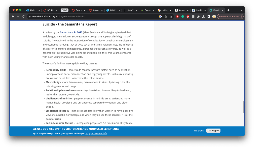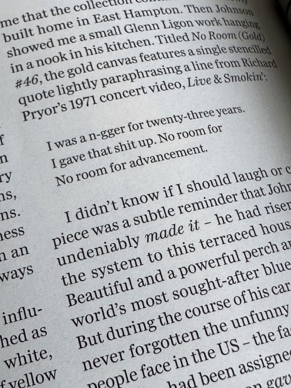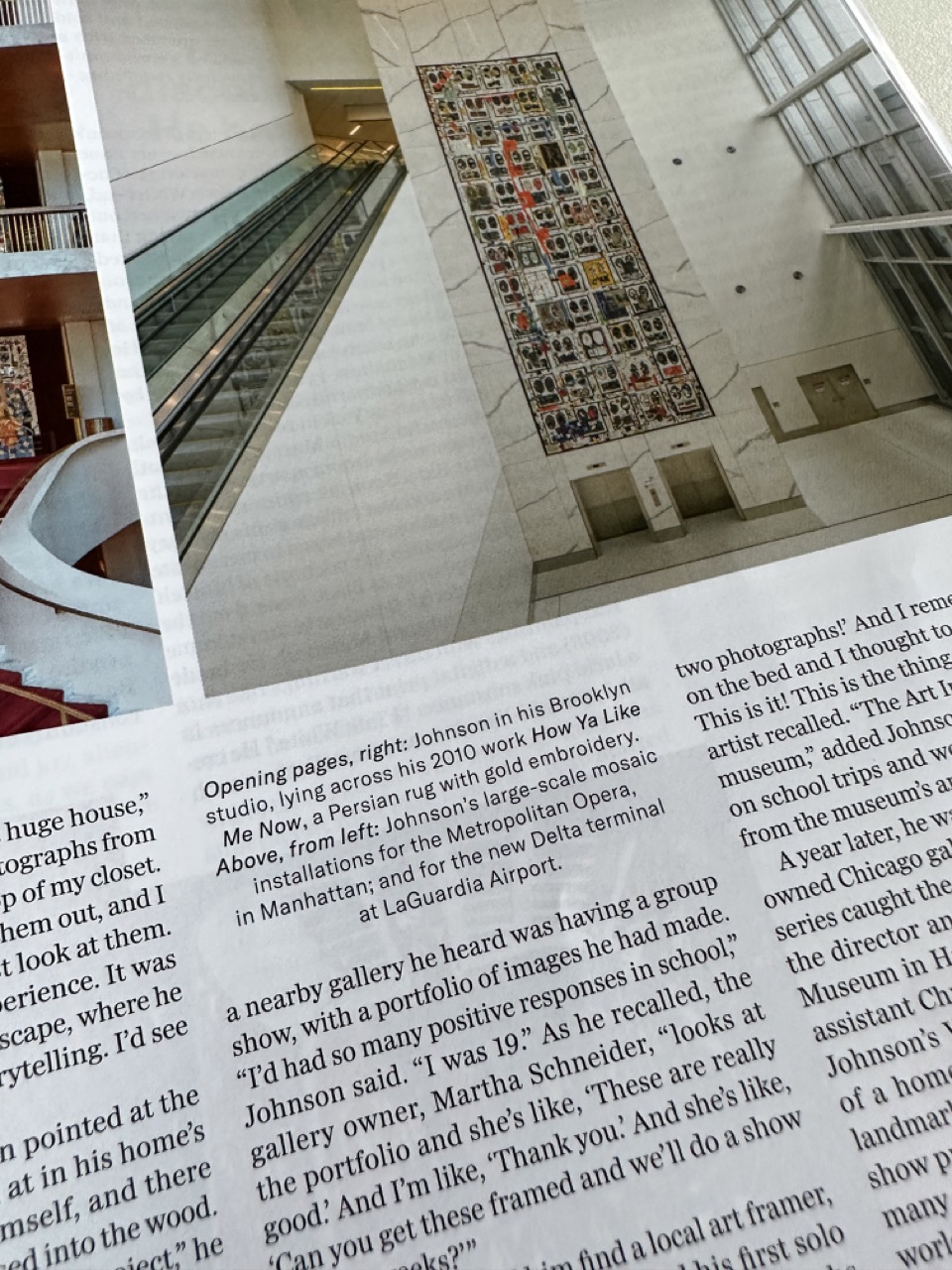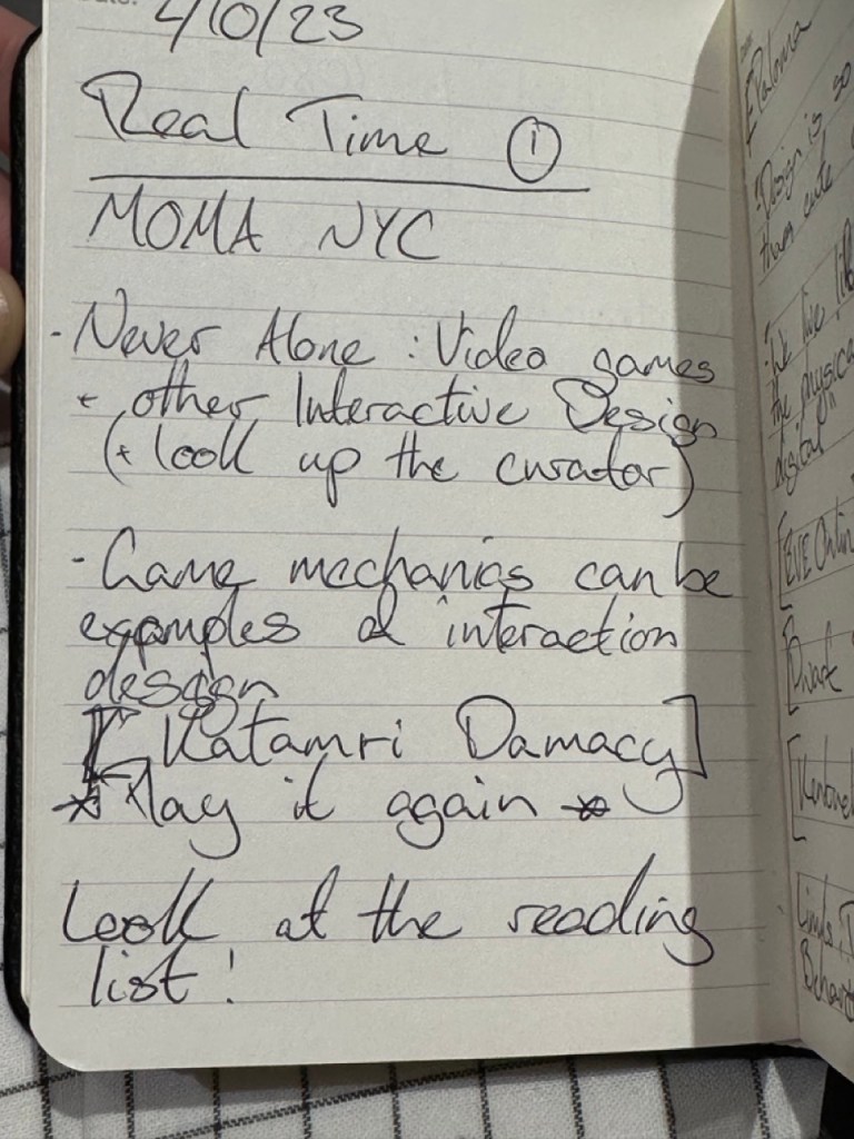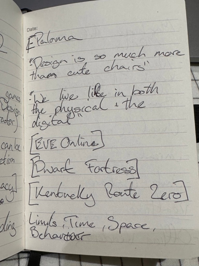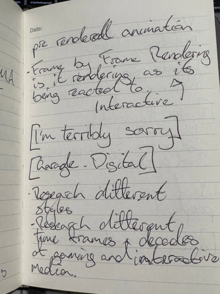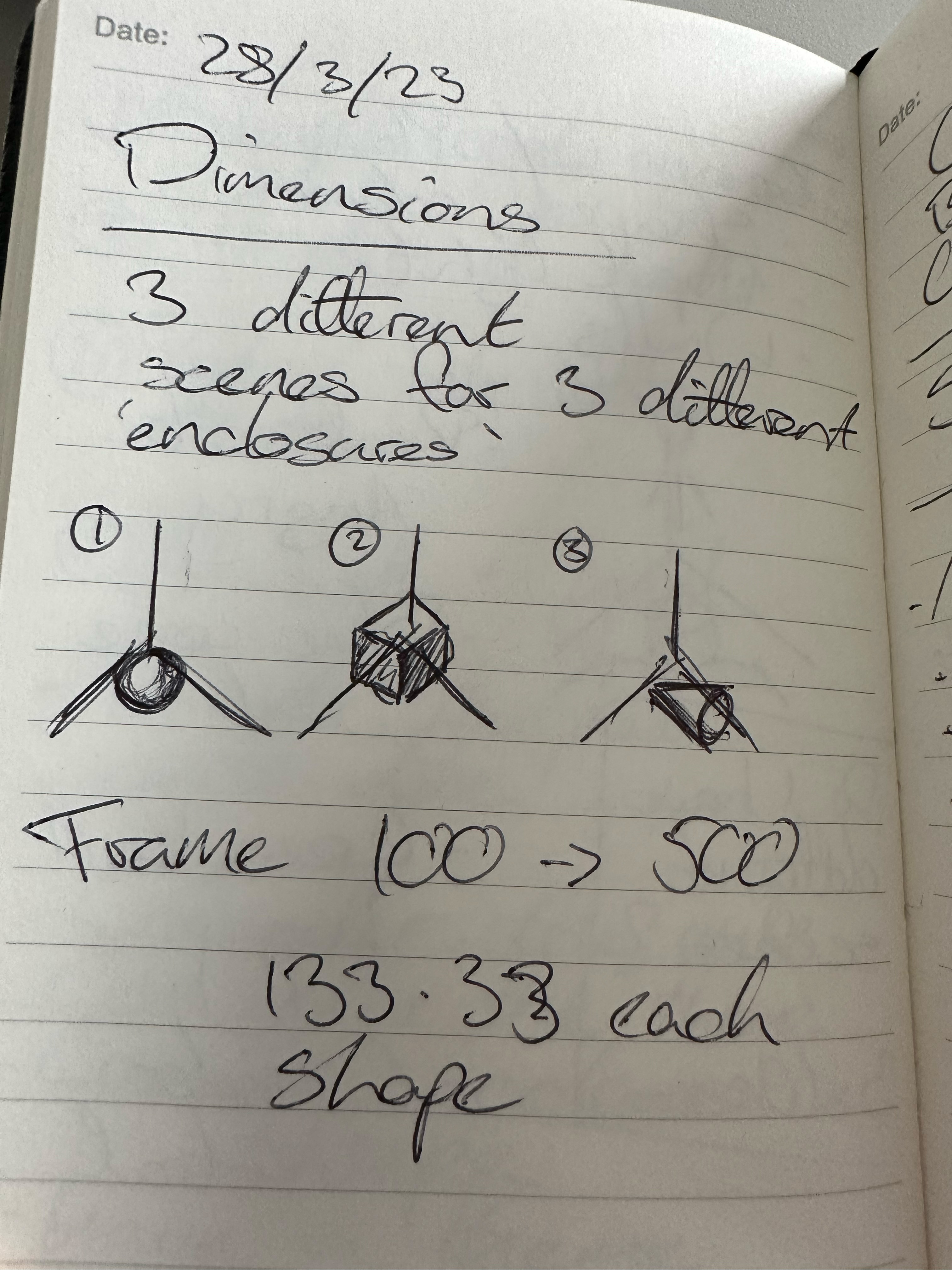

Project Plan:


Week One
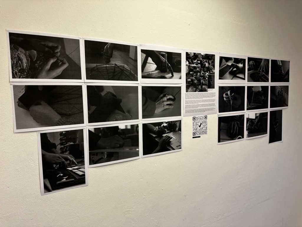
Research to solidify a game plan and direction for the project and Initial concepts informed by initial research personal artistic choices of where to take this project. Constant documentation.
Week Two
Further Research now with more focus into specific fields or aspects concerning the initial ideas as well as concept development driven by the research. And if I have enough to go on then starting to build. Constant documentation.
Week Three
Building the product all of this week in tandem with concept development if its required through the building process, as there might be problems I didn’t consider. Constant documentation.
Week Four
Finalising the building process along with time put aside to consider the exhibition of the build and ideally finalising the documentation, I am aware of the extra week for documentation but would rather have that finished before hand as to not bleed into the second half of Design Domain.
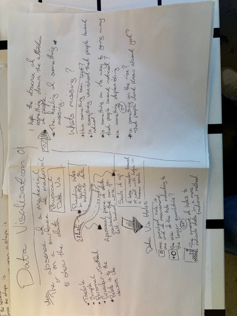
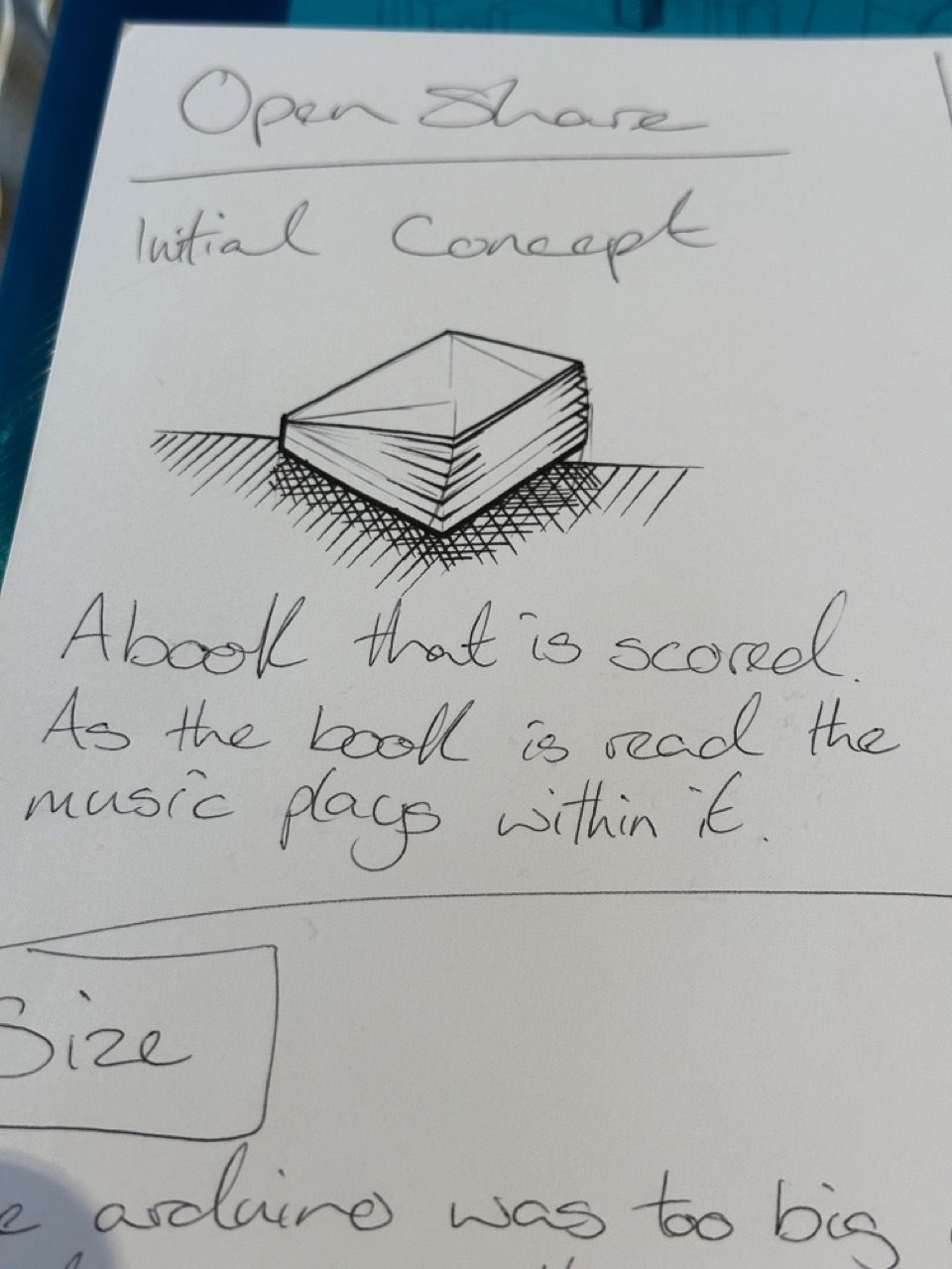
Concept :

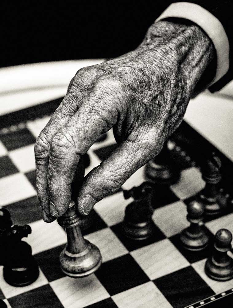
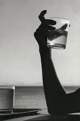
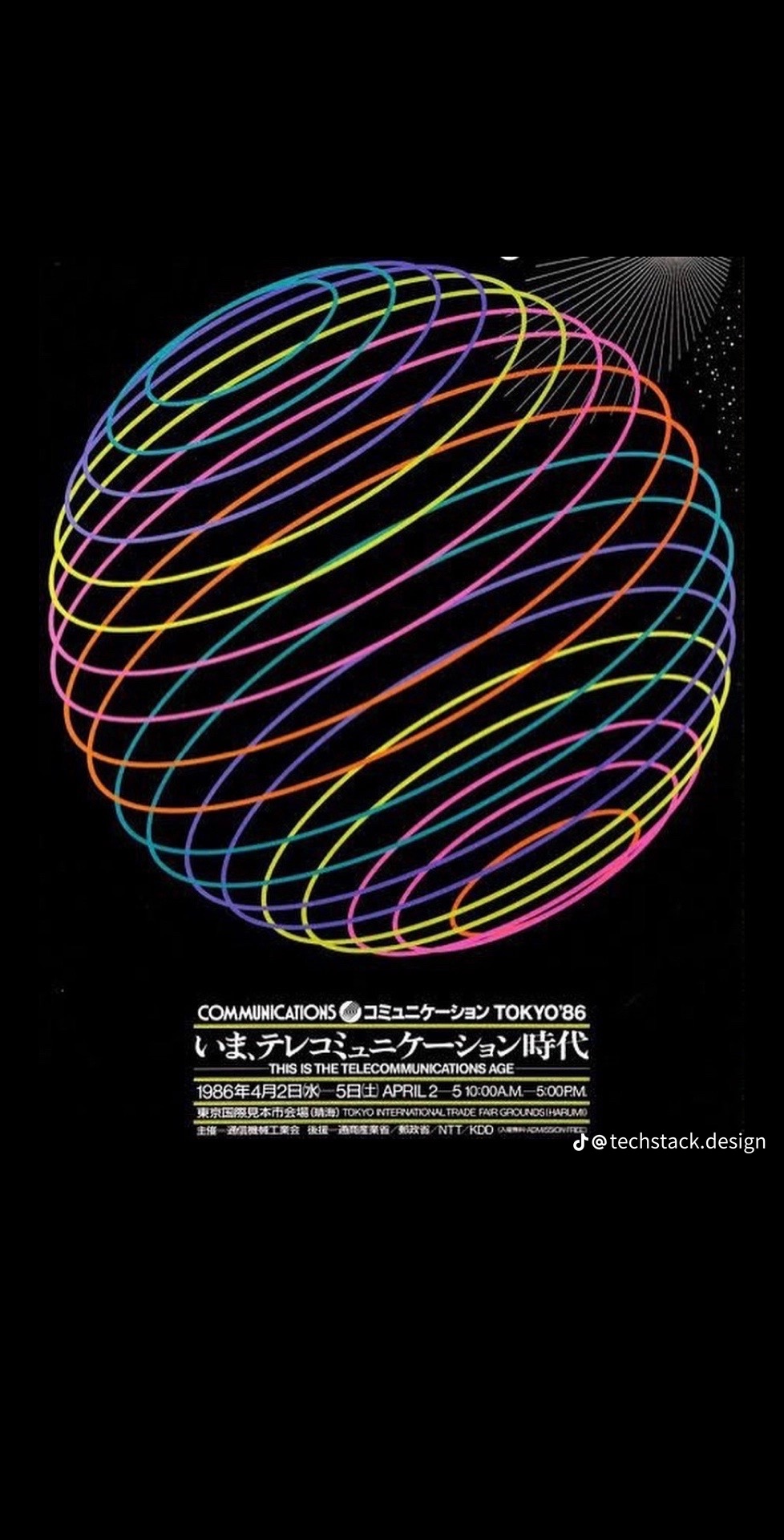
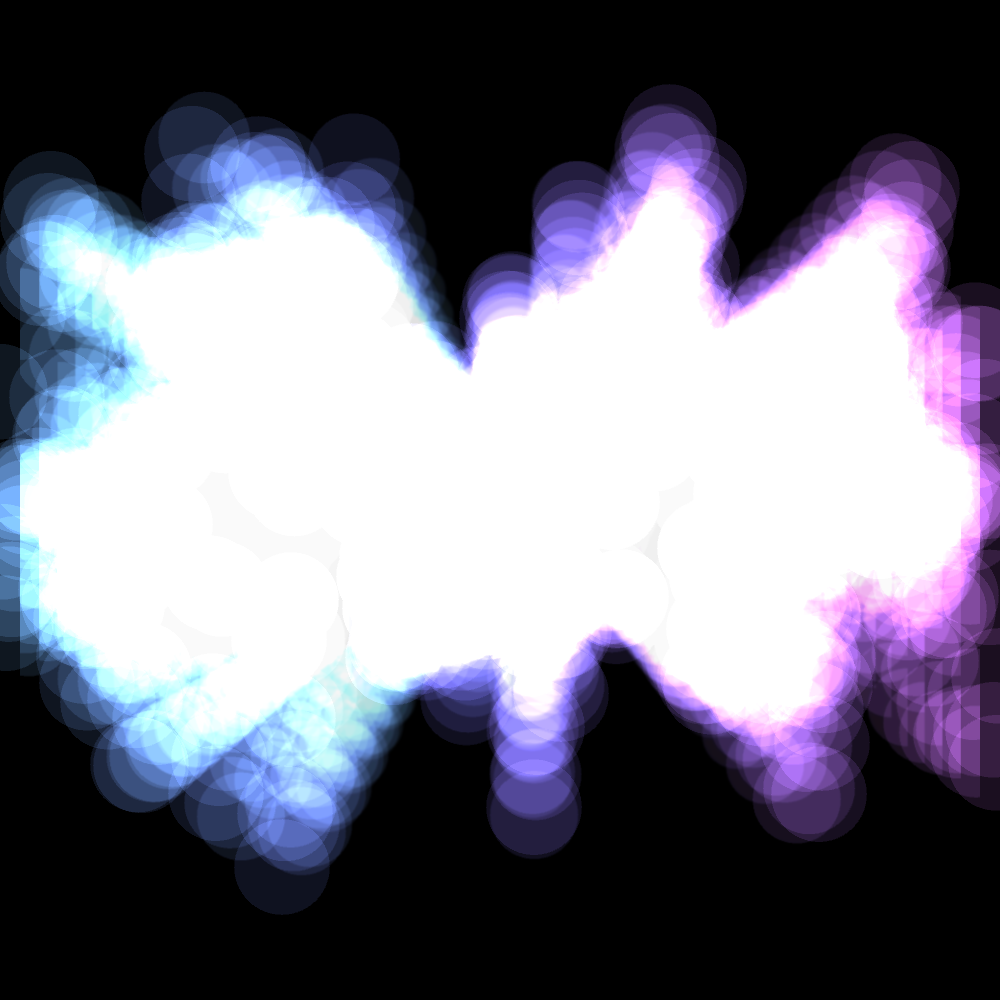
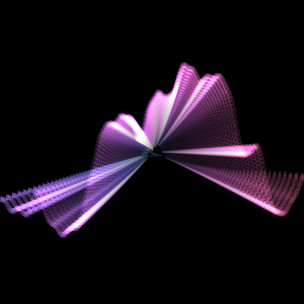
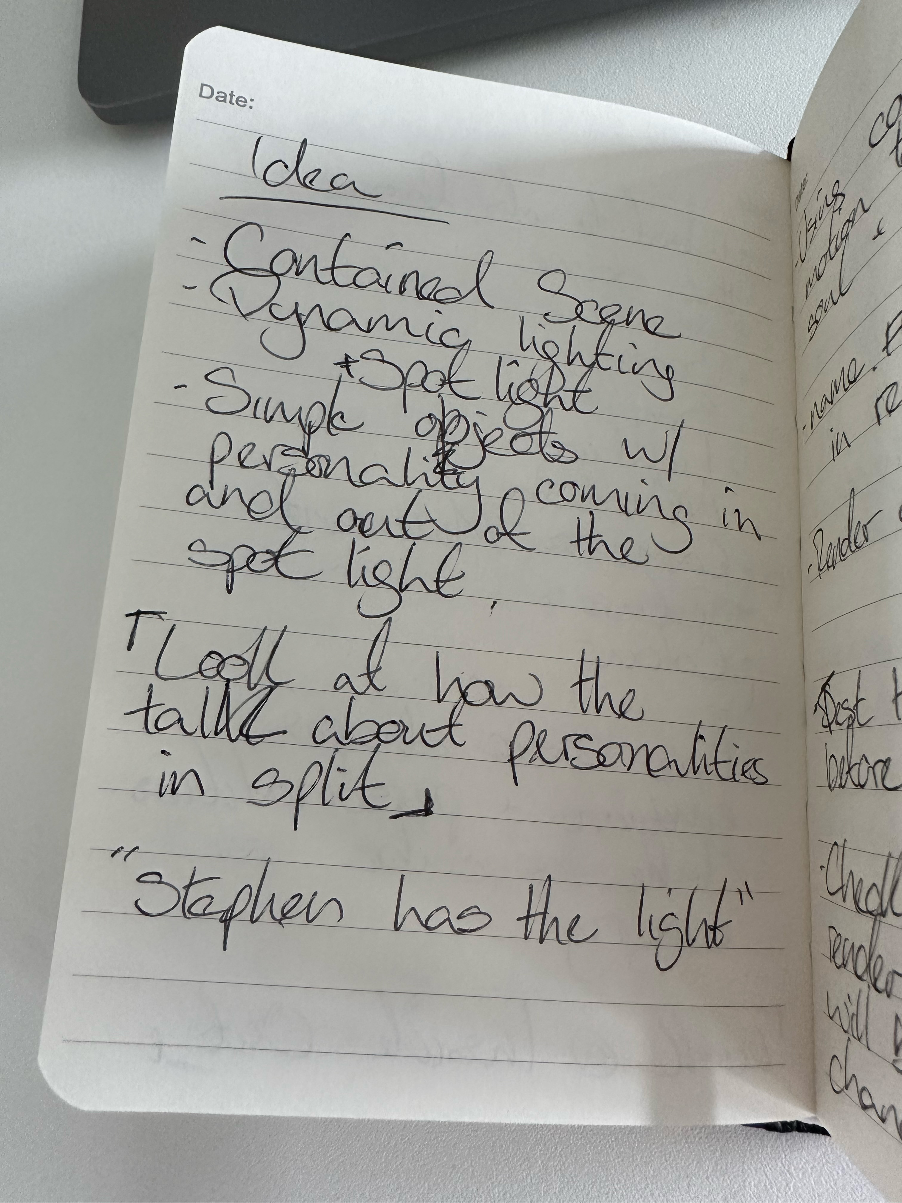
I want my Control project to bring joy/satisfaction.
me (2024)
Inspiration :
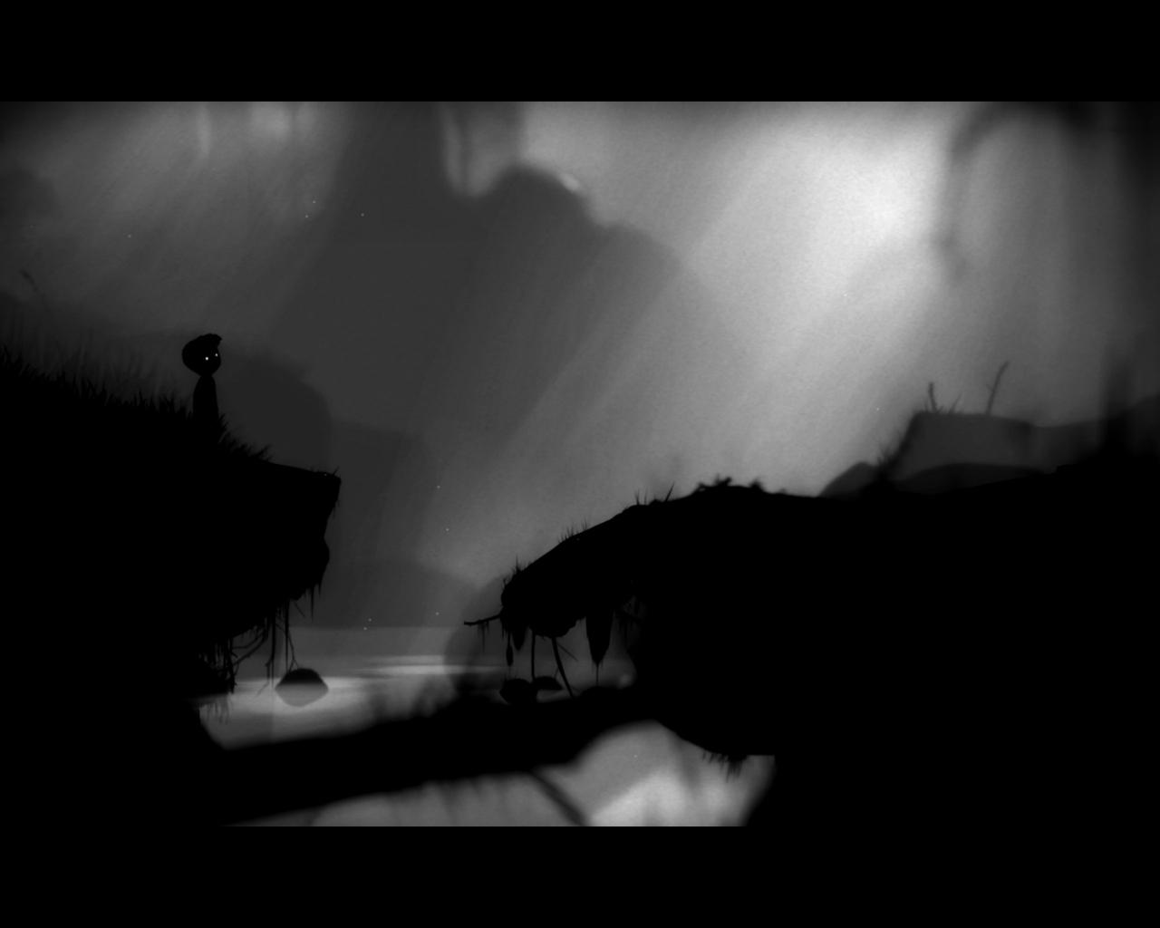
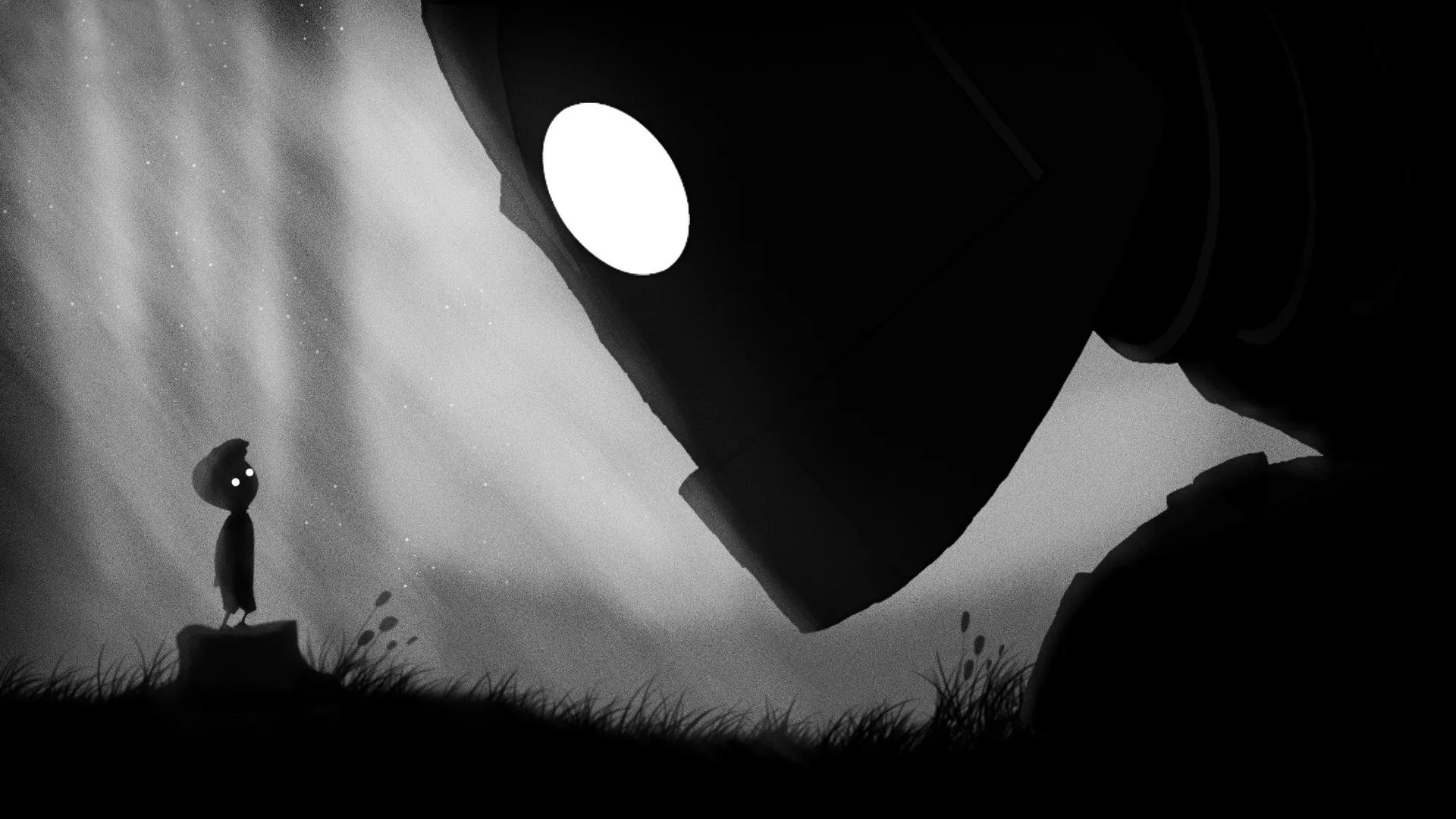
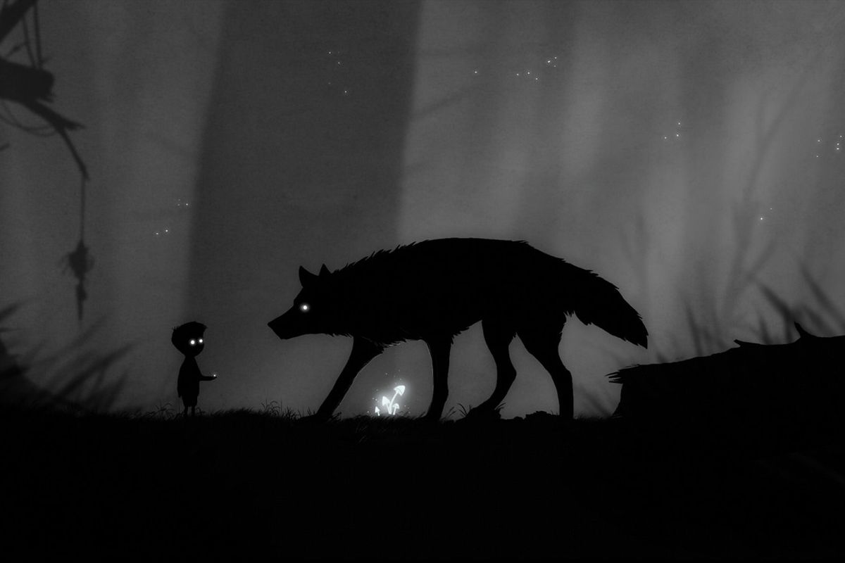
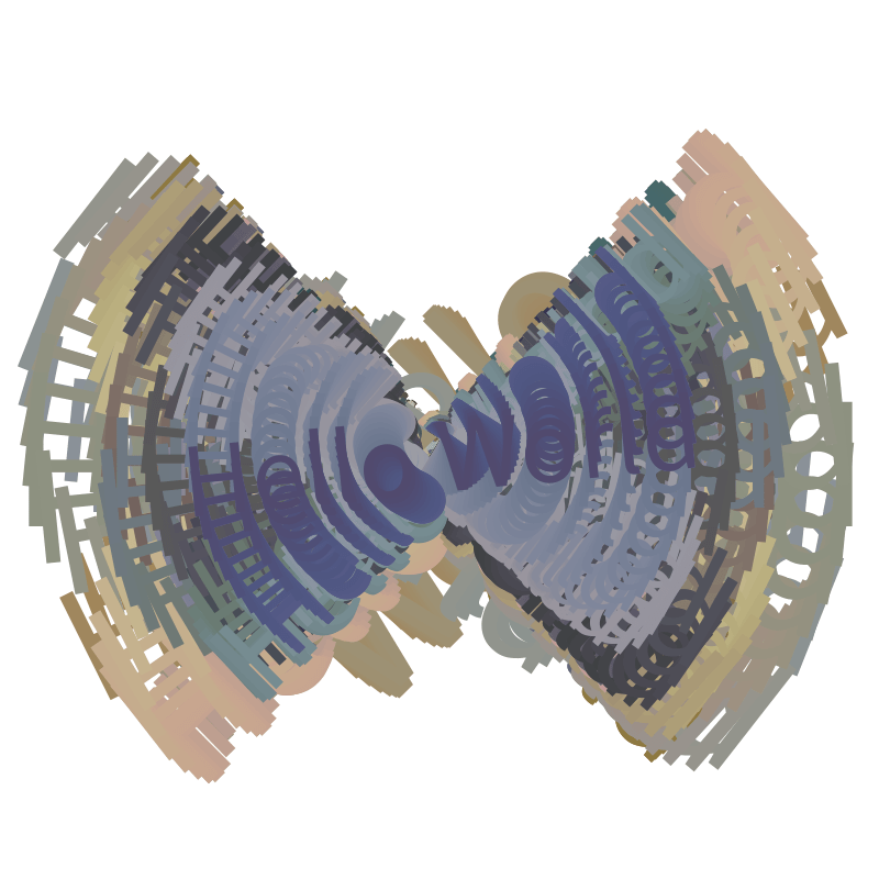
I know that I want to elicit joy from my build, and now, looking into different media, I think of eliciting pleasure in several ways and media.
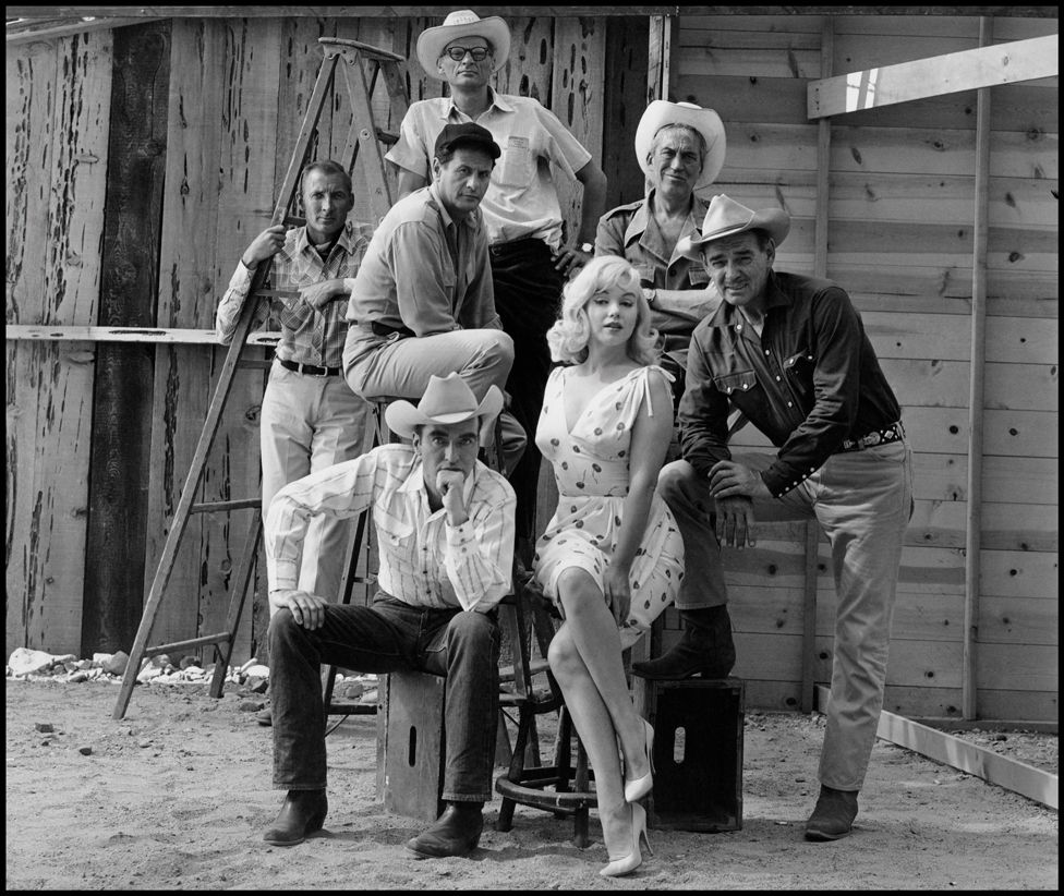
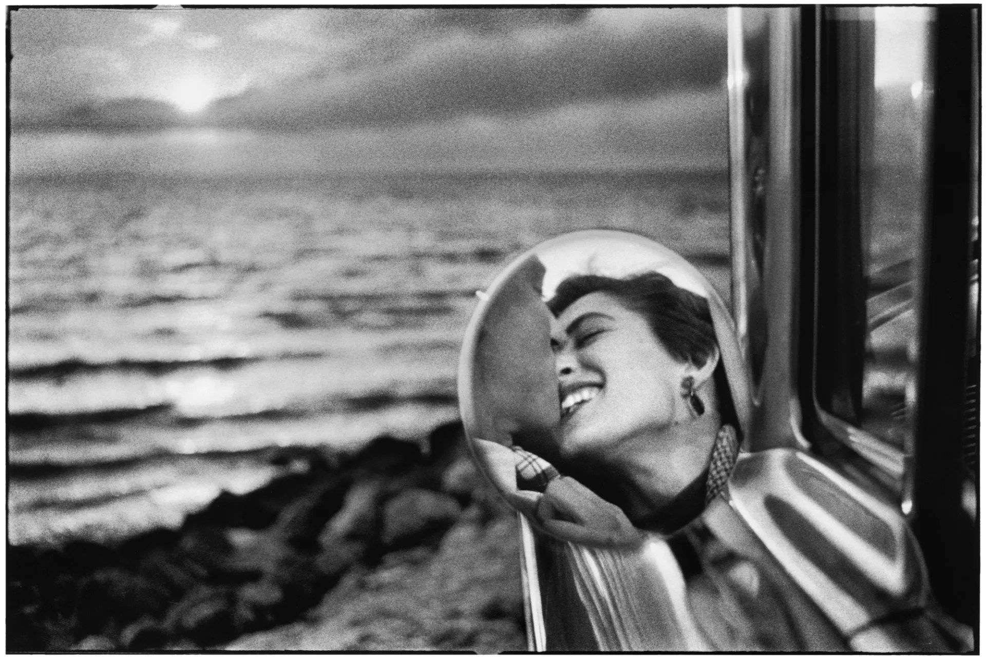
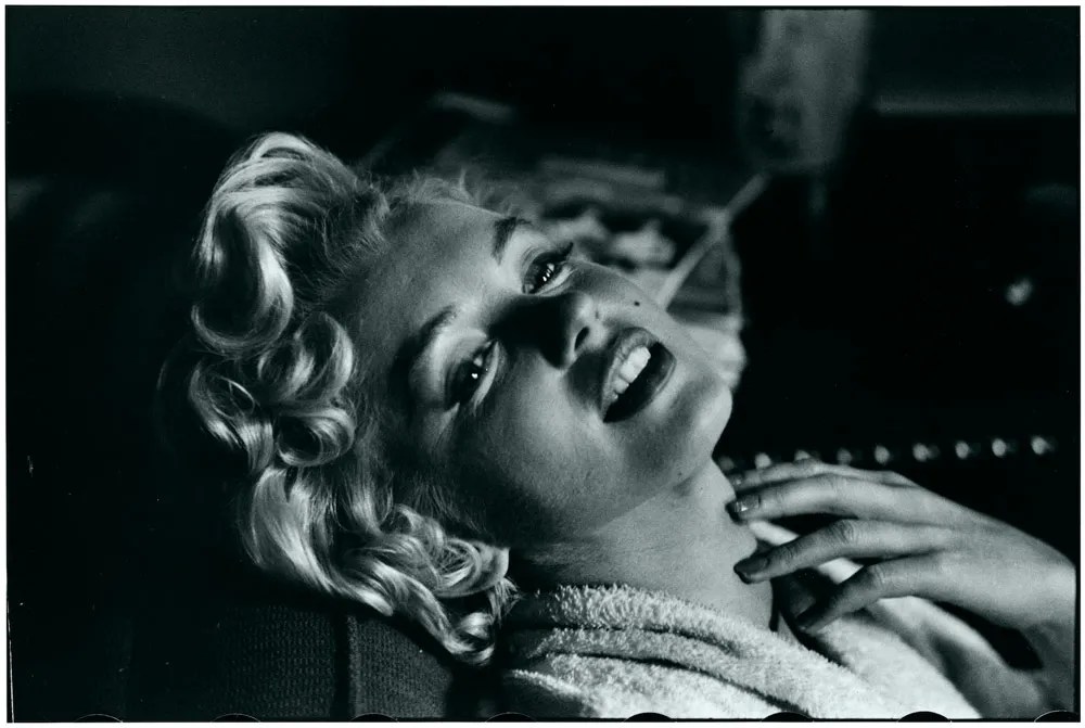
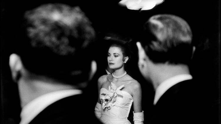
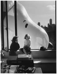
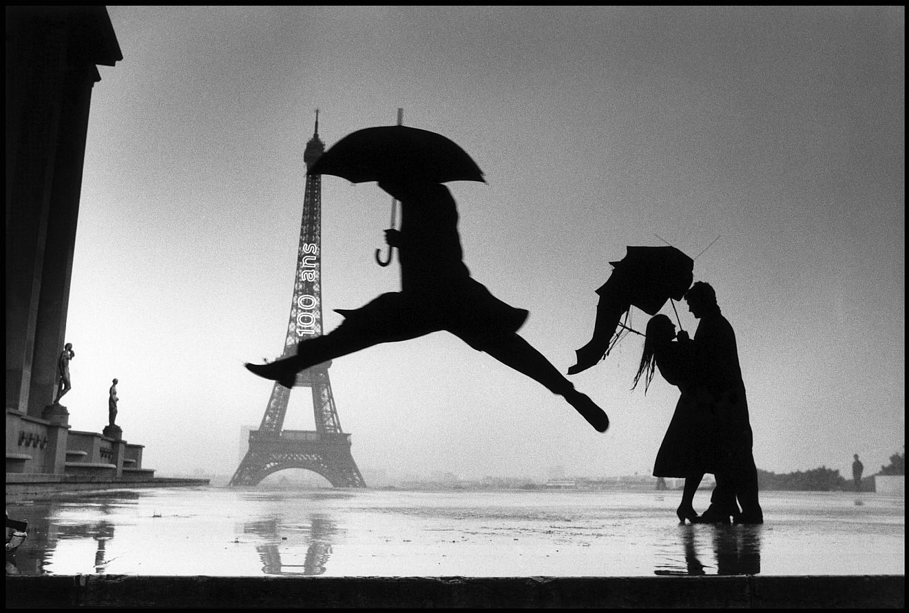
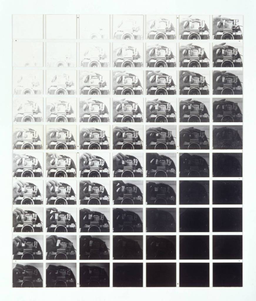
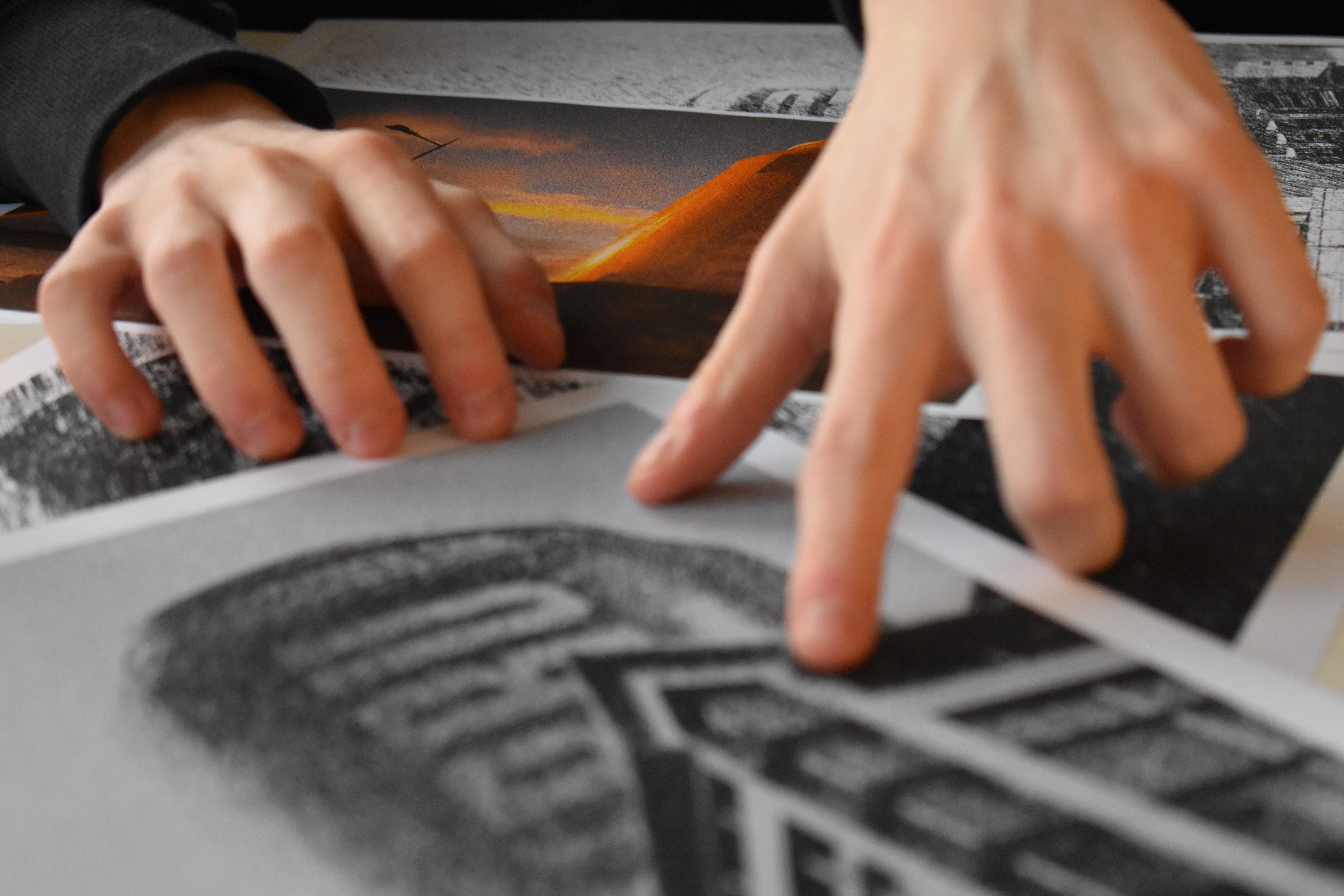
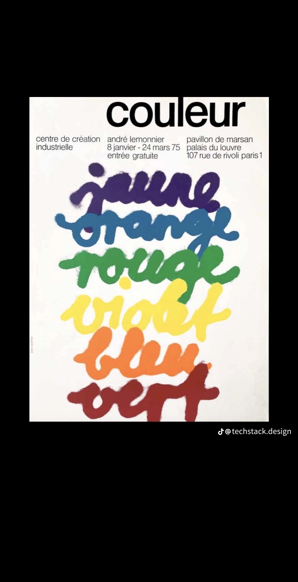
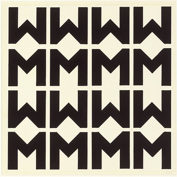
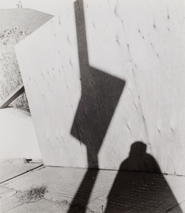
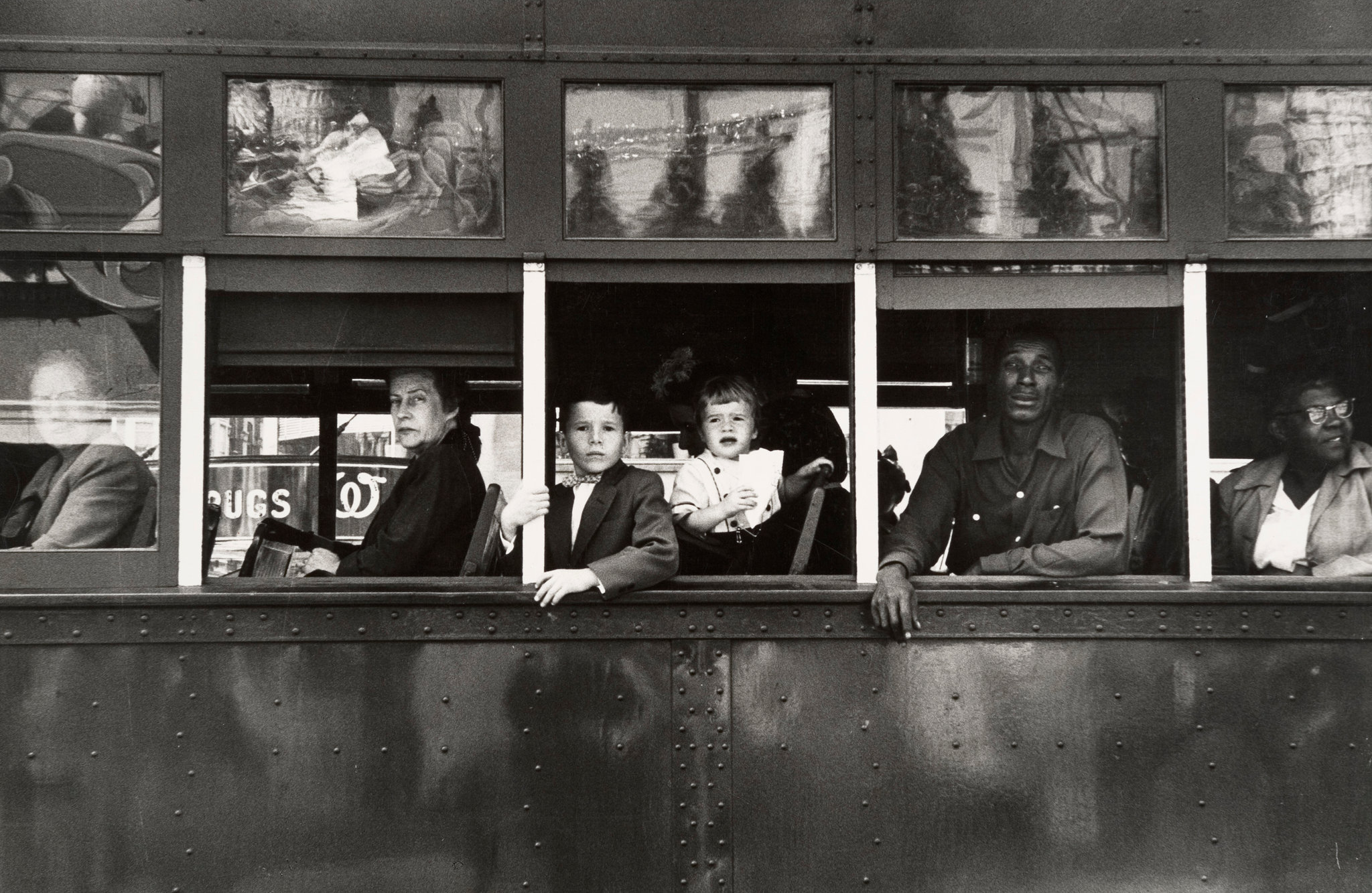
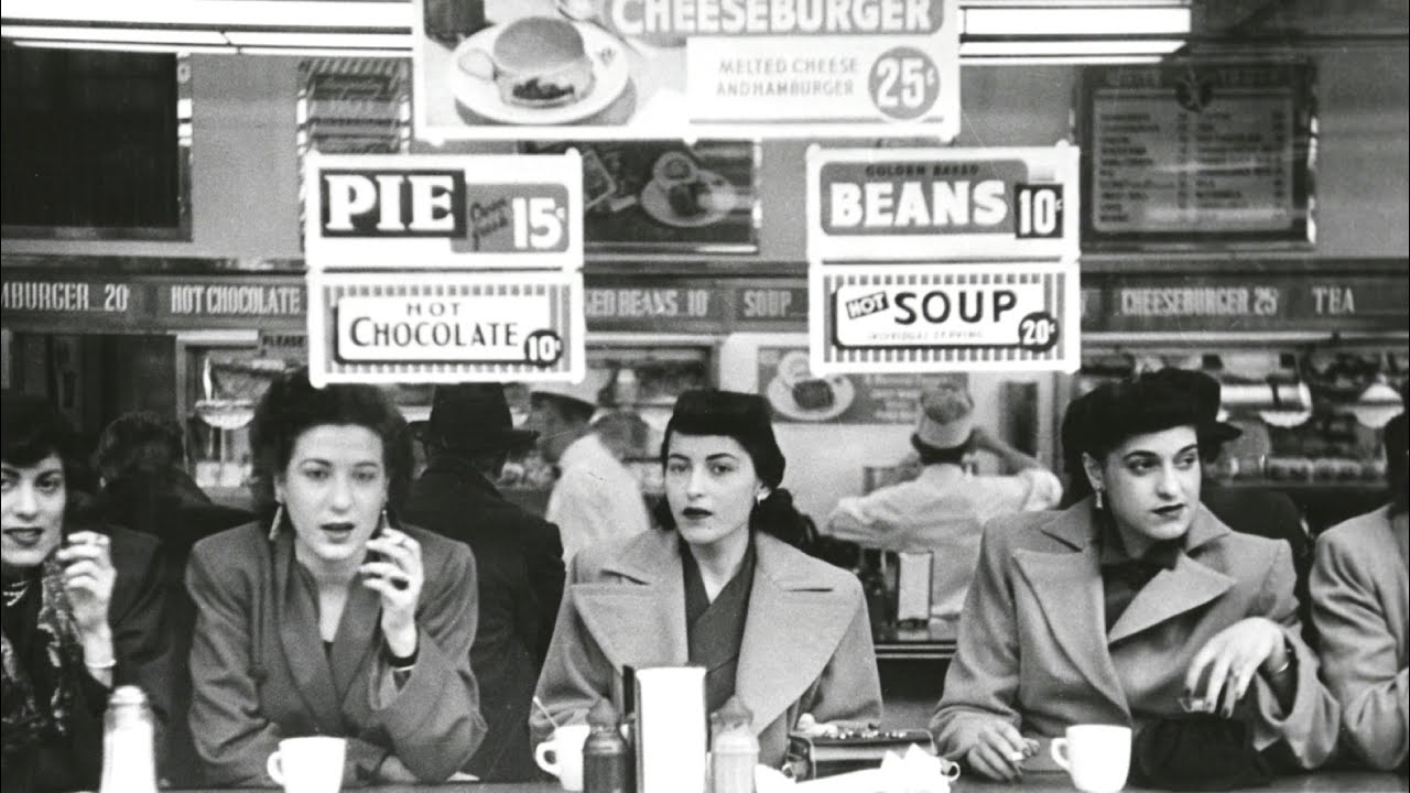
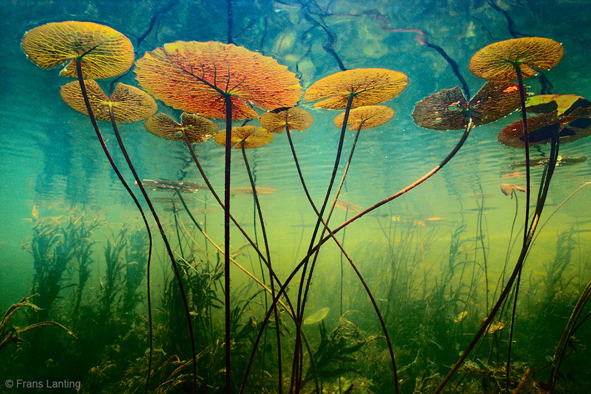
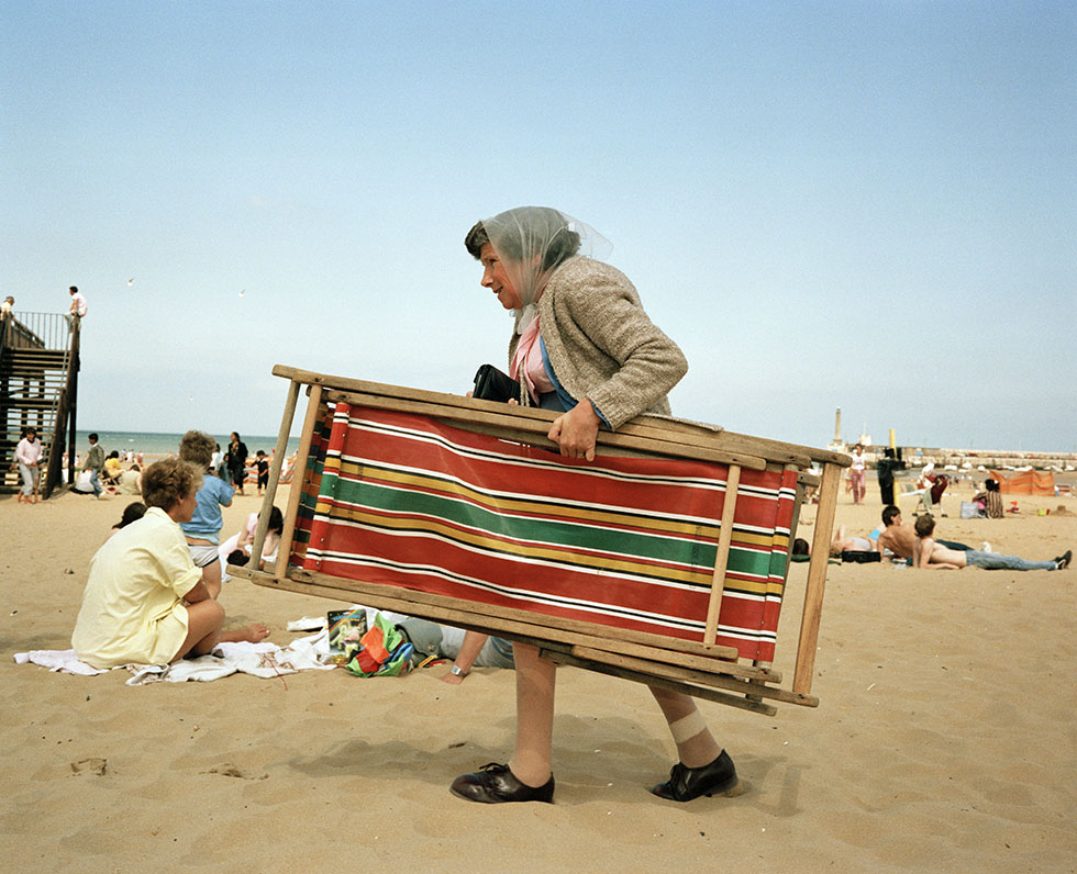
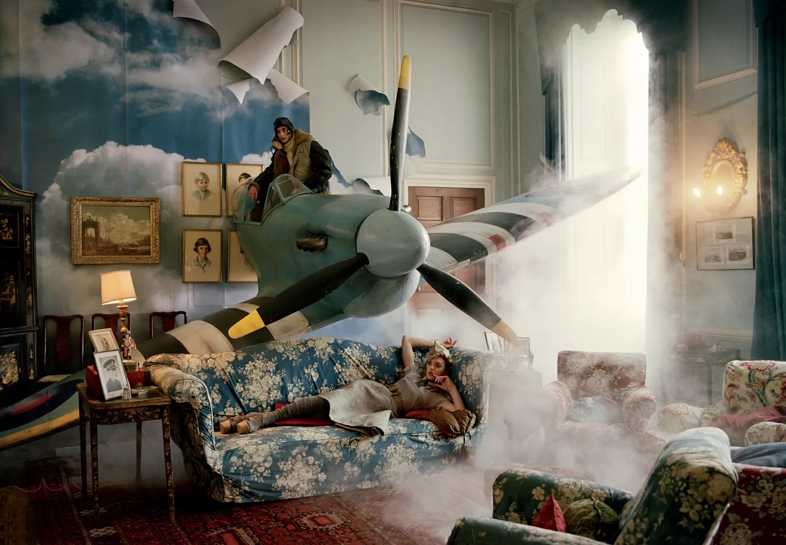
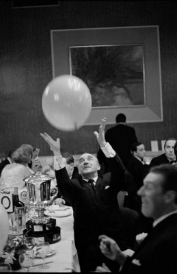
Martin Parr :

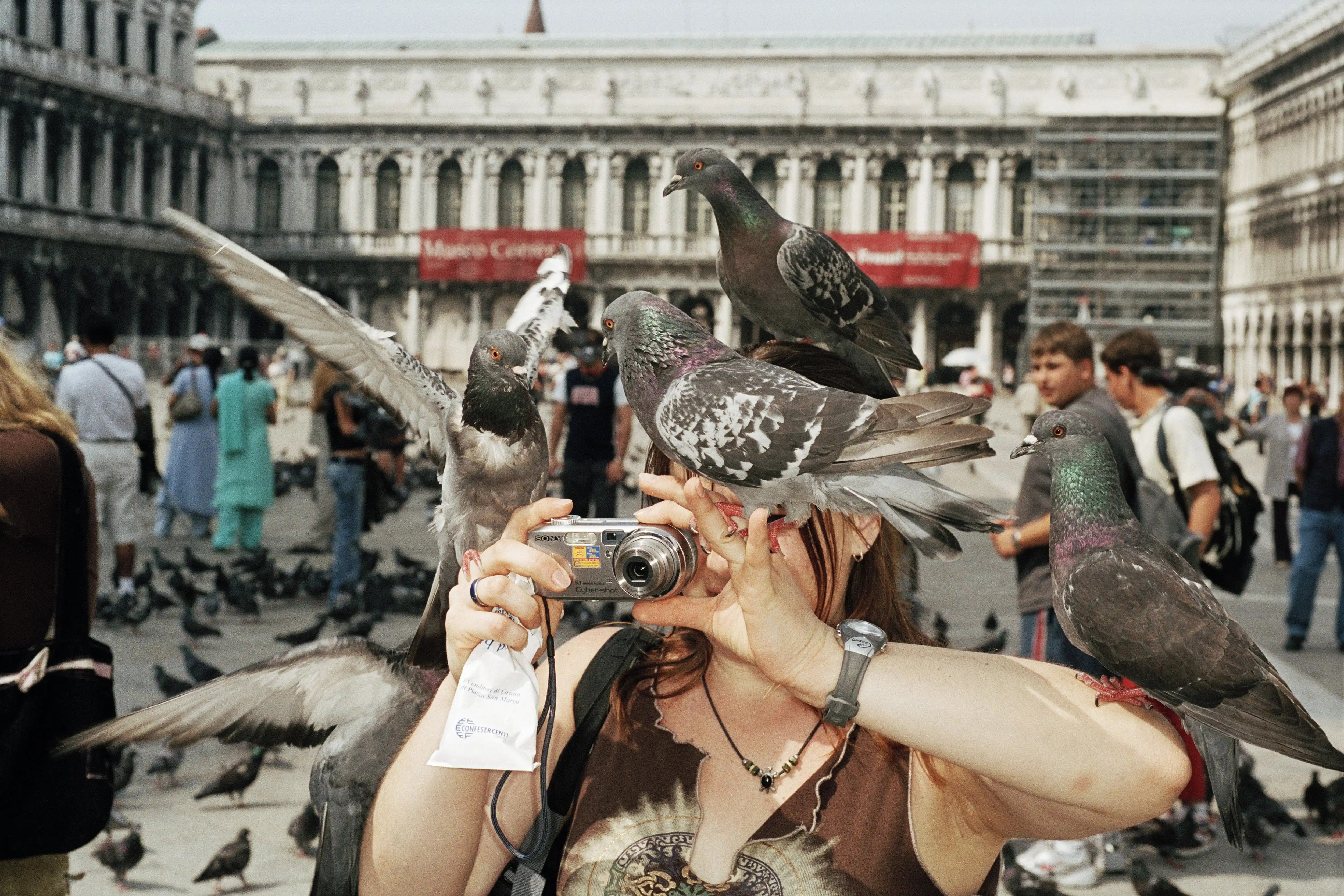
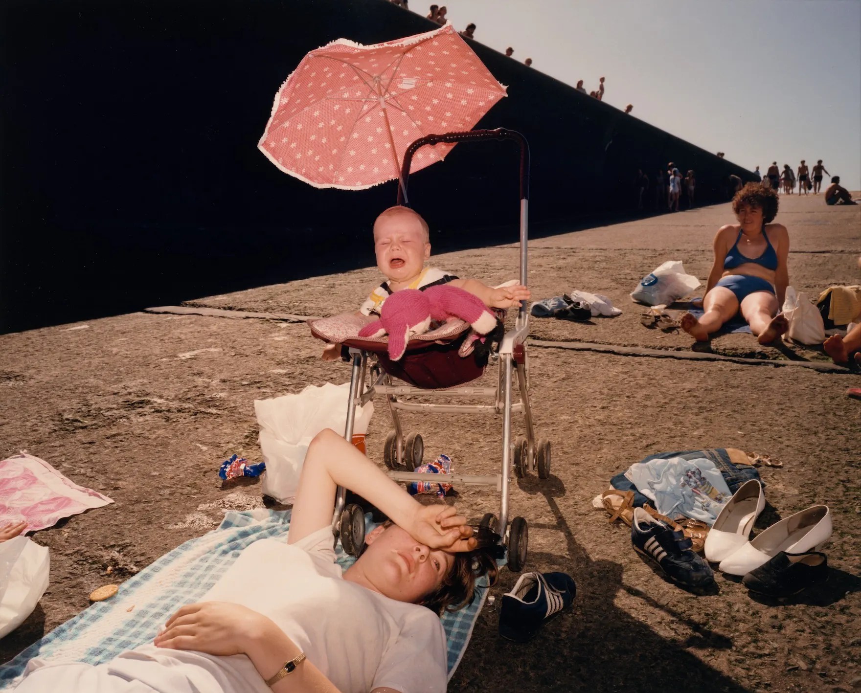

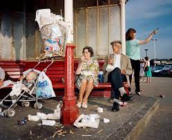
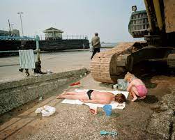

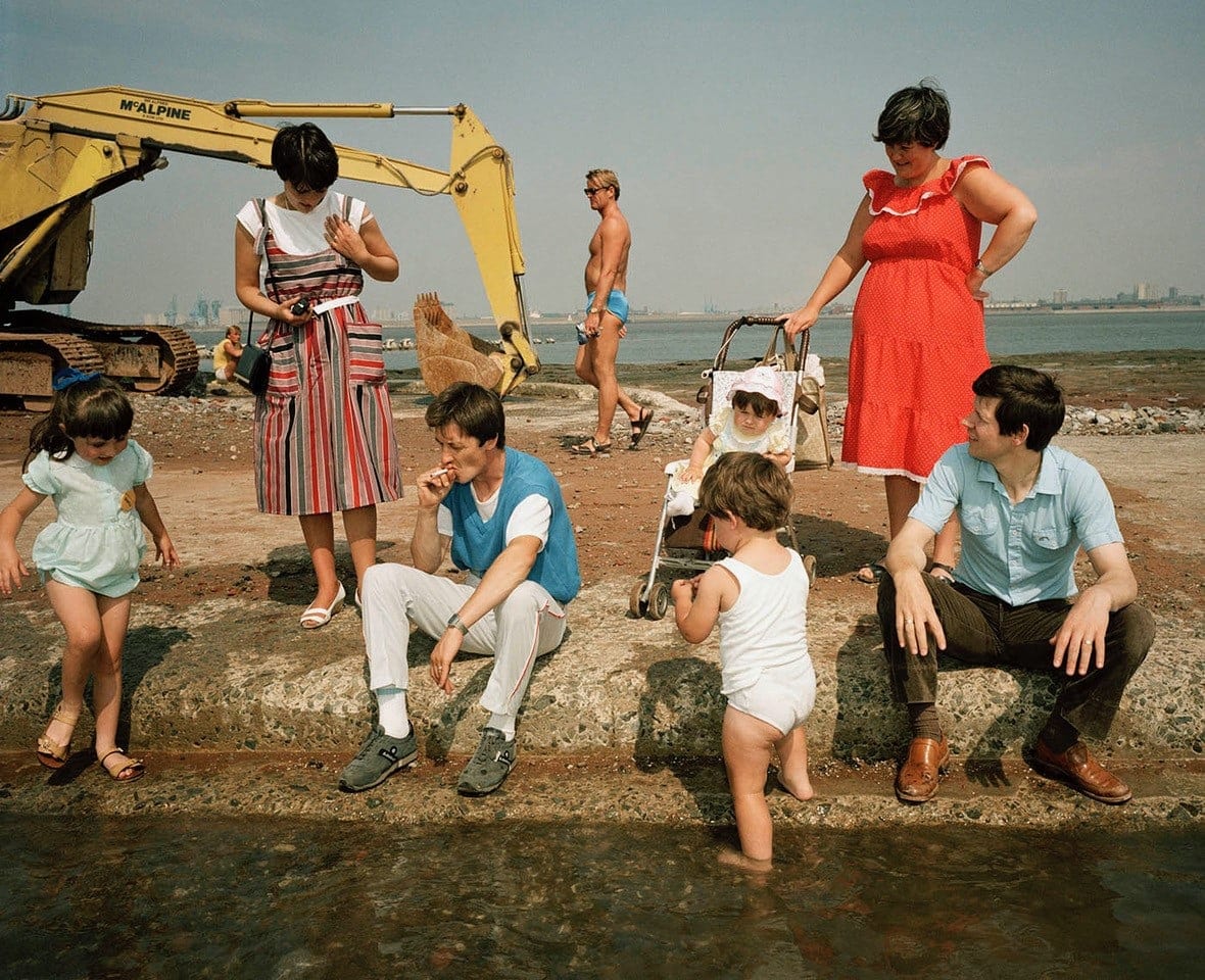
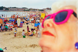


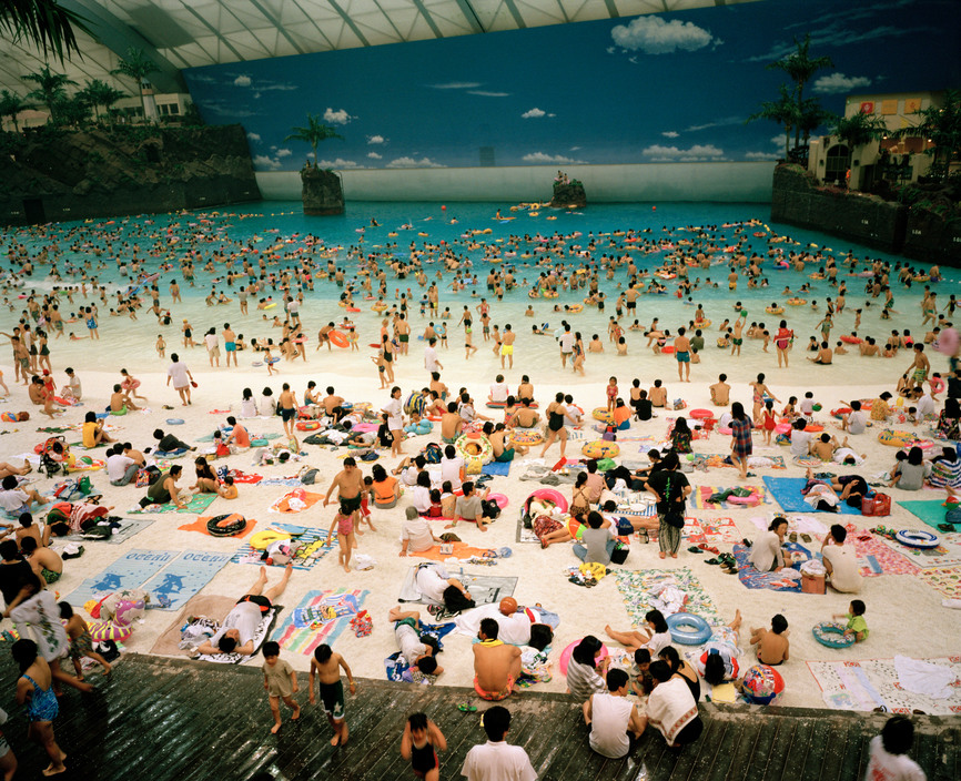
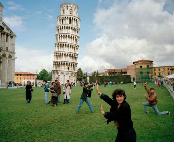
For inspiration, I’ve looked at the work of Martin Parr because, in my initial concepts, I want a sense of fun, joy and accessibility in the sense of classless art.
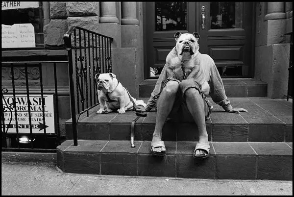
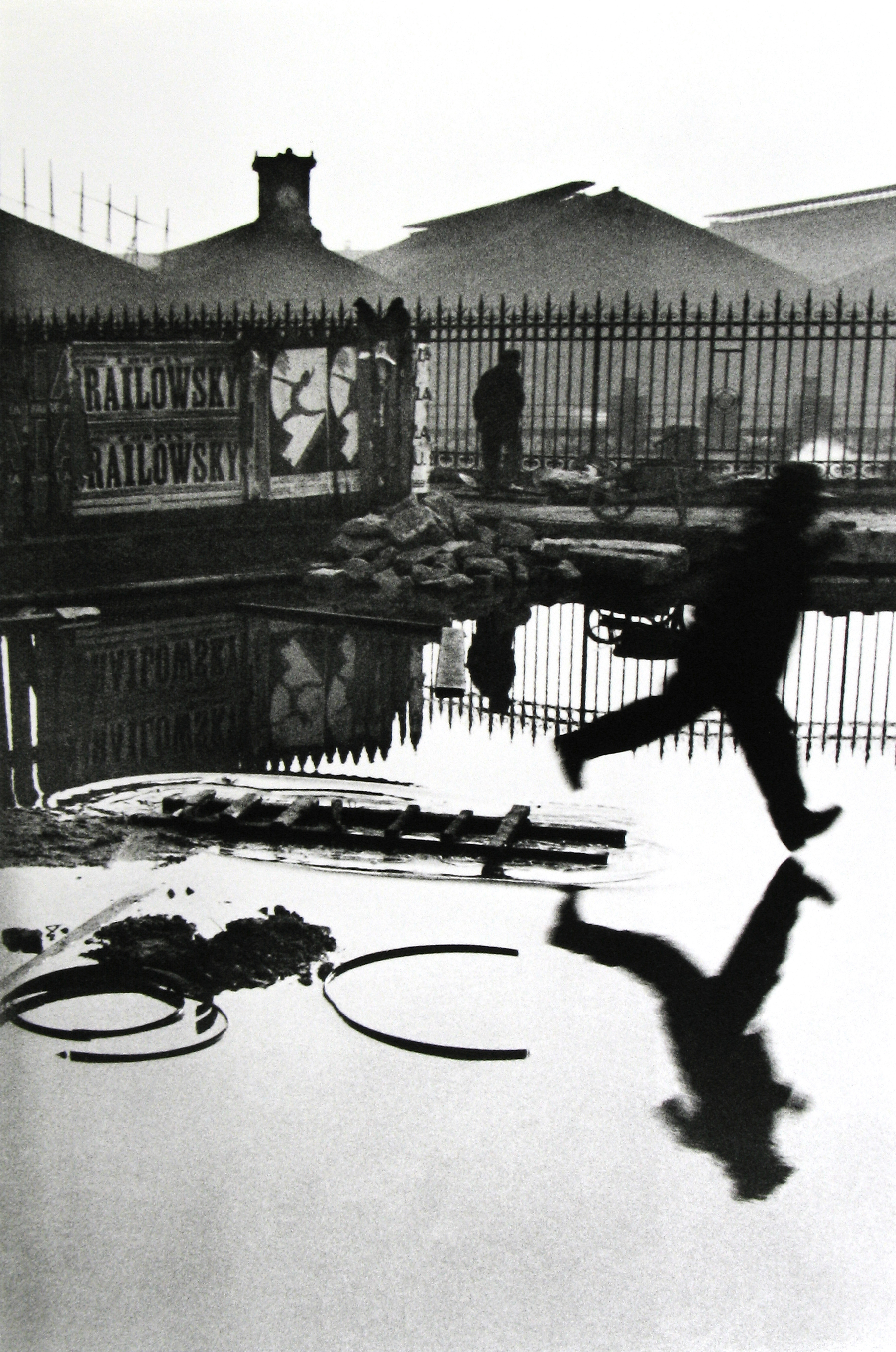
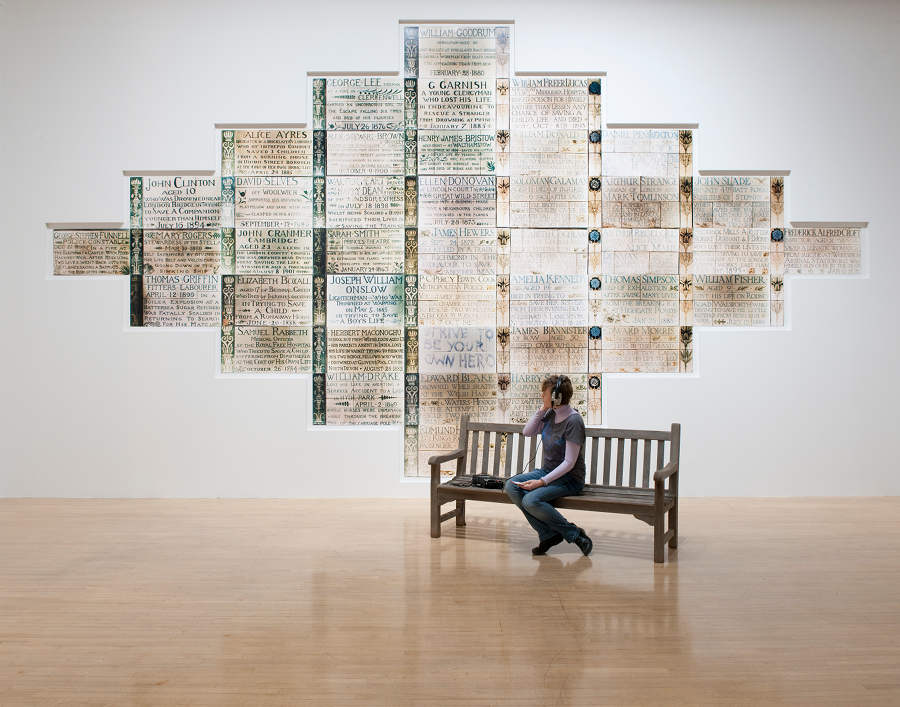
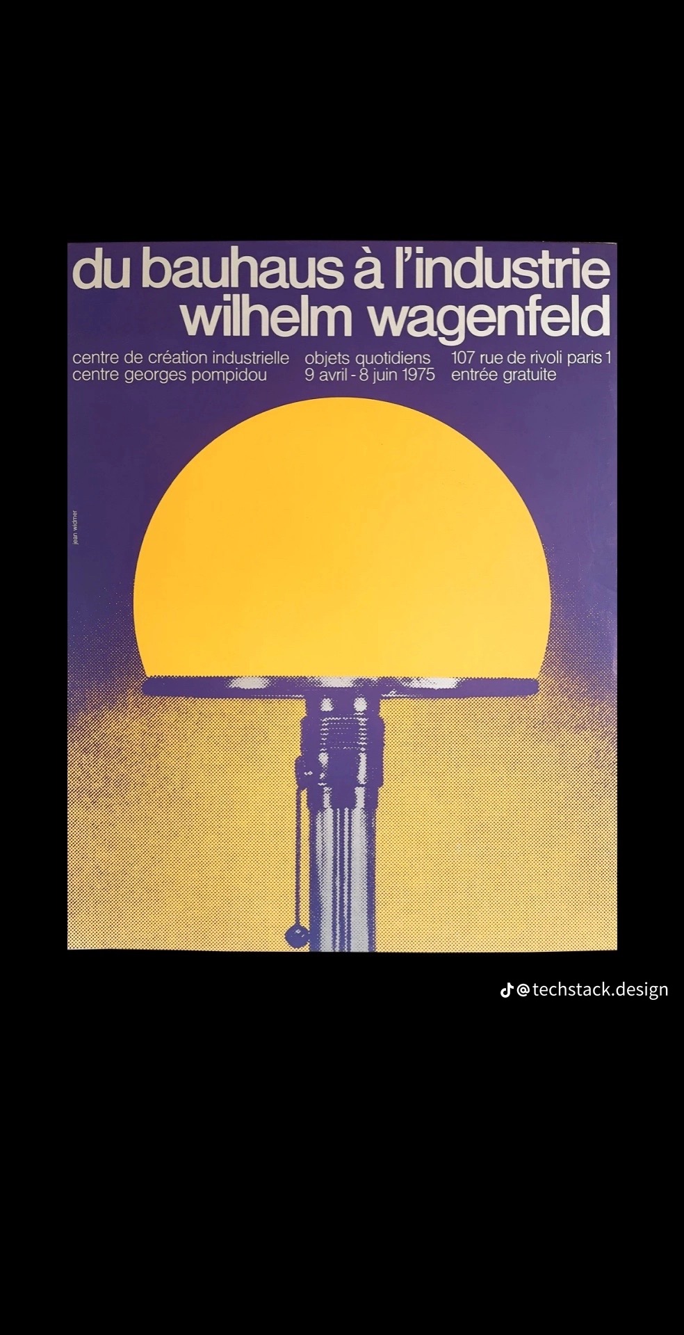
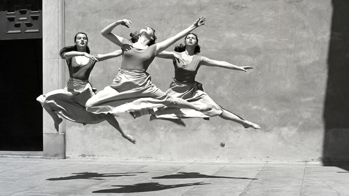
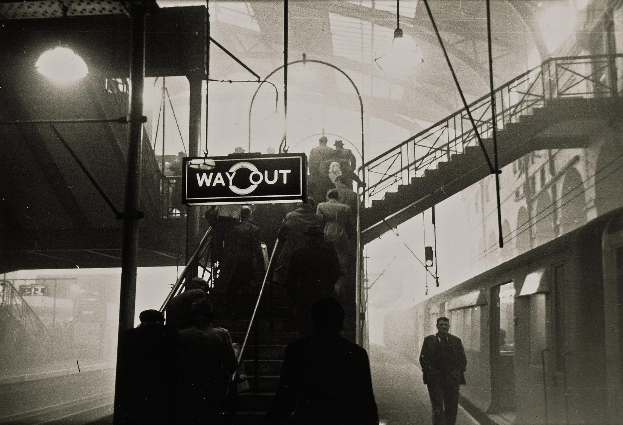
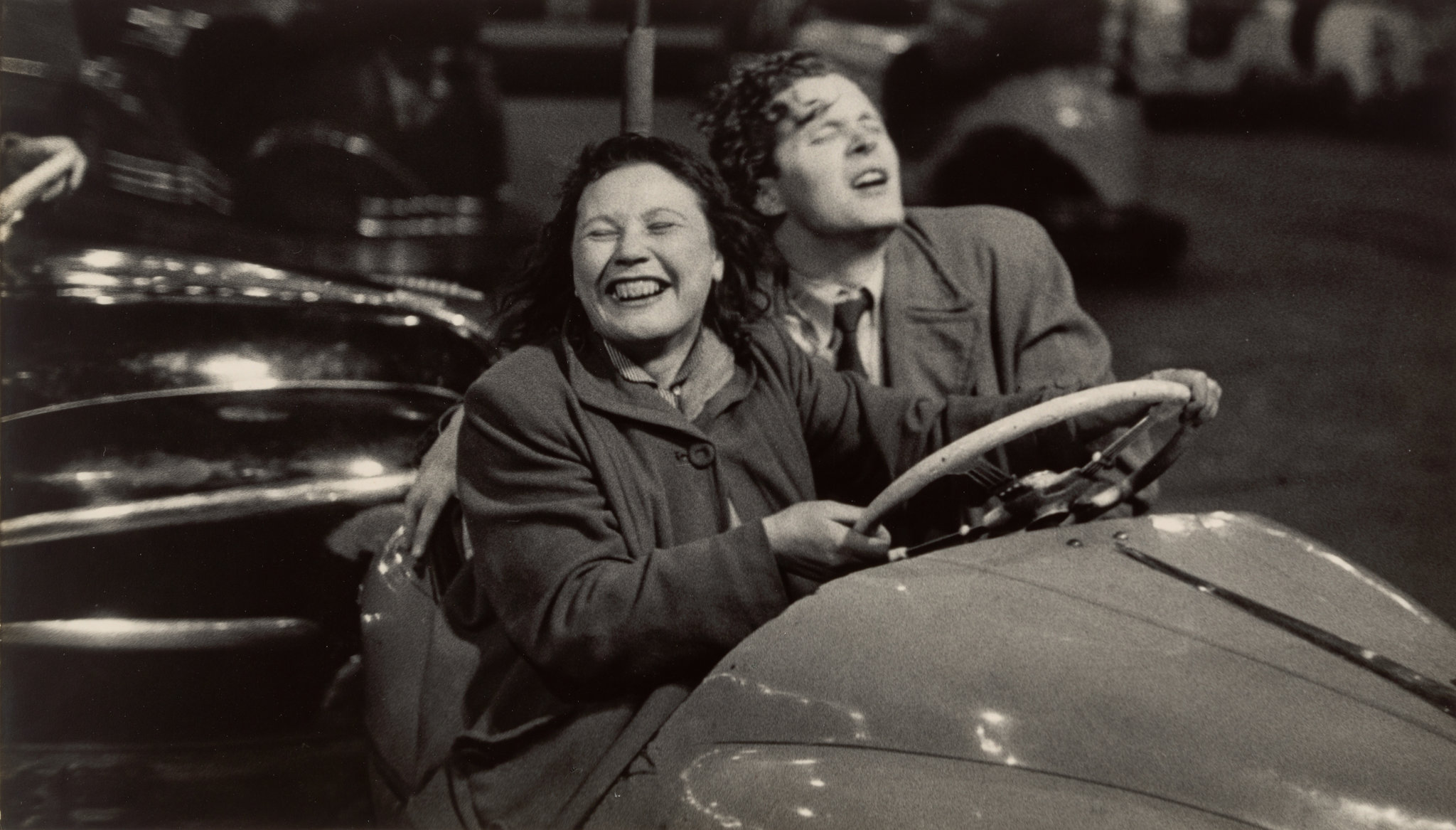
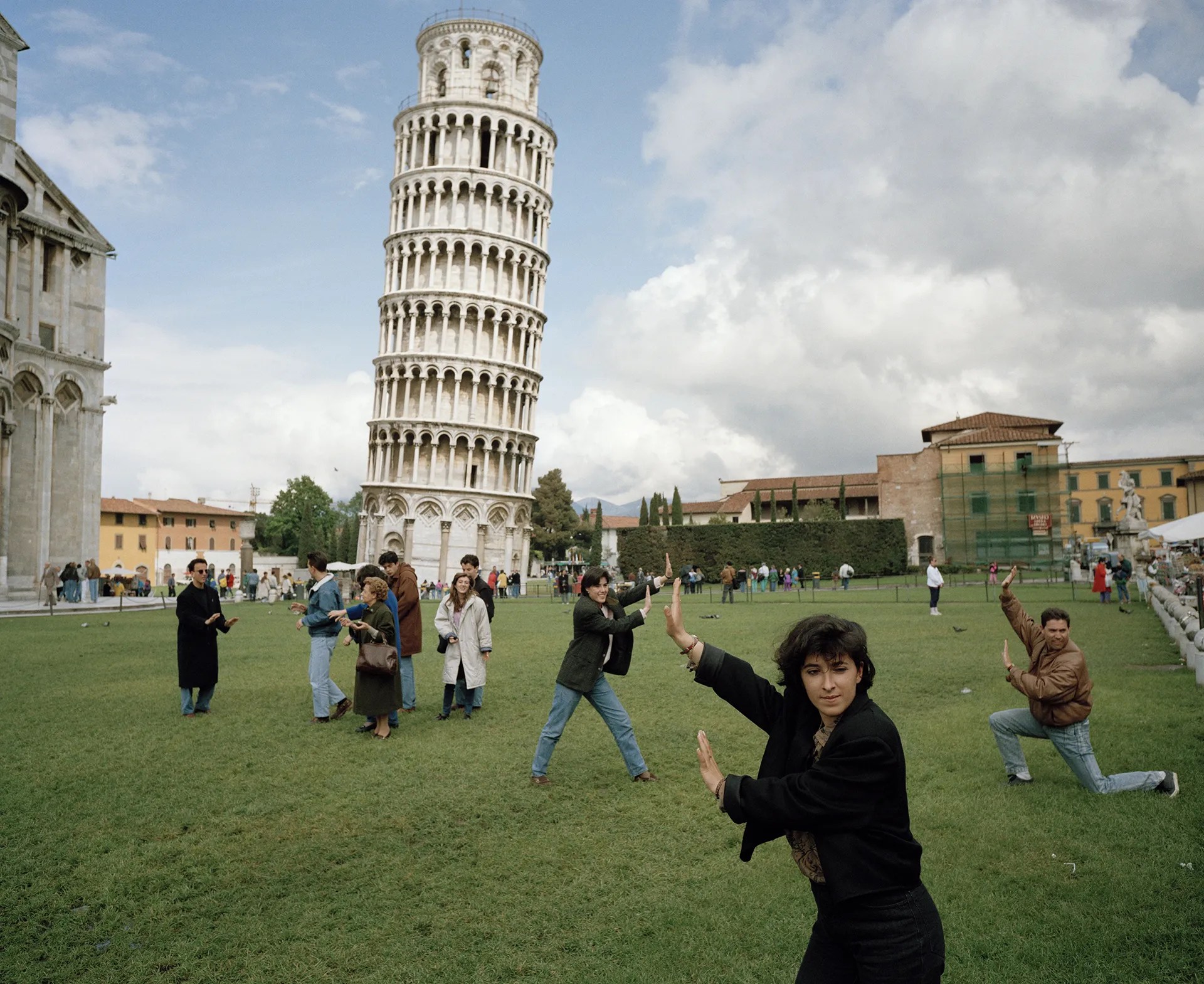
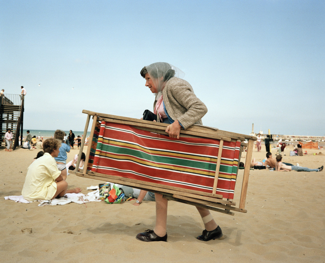
David Hurn :
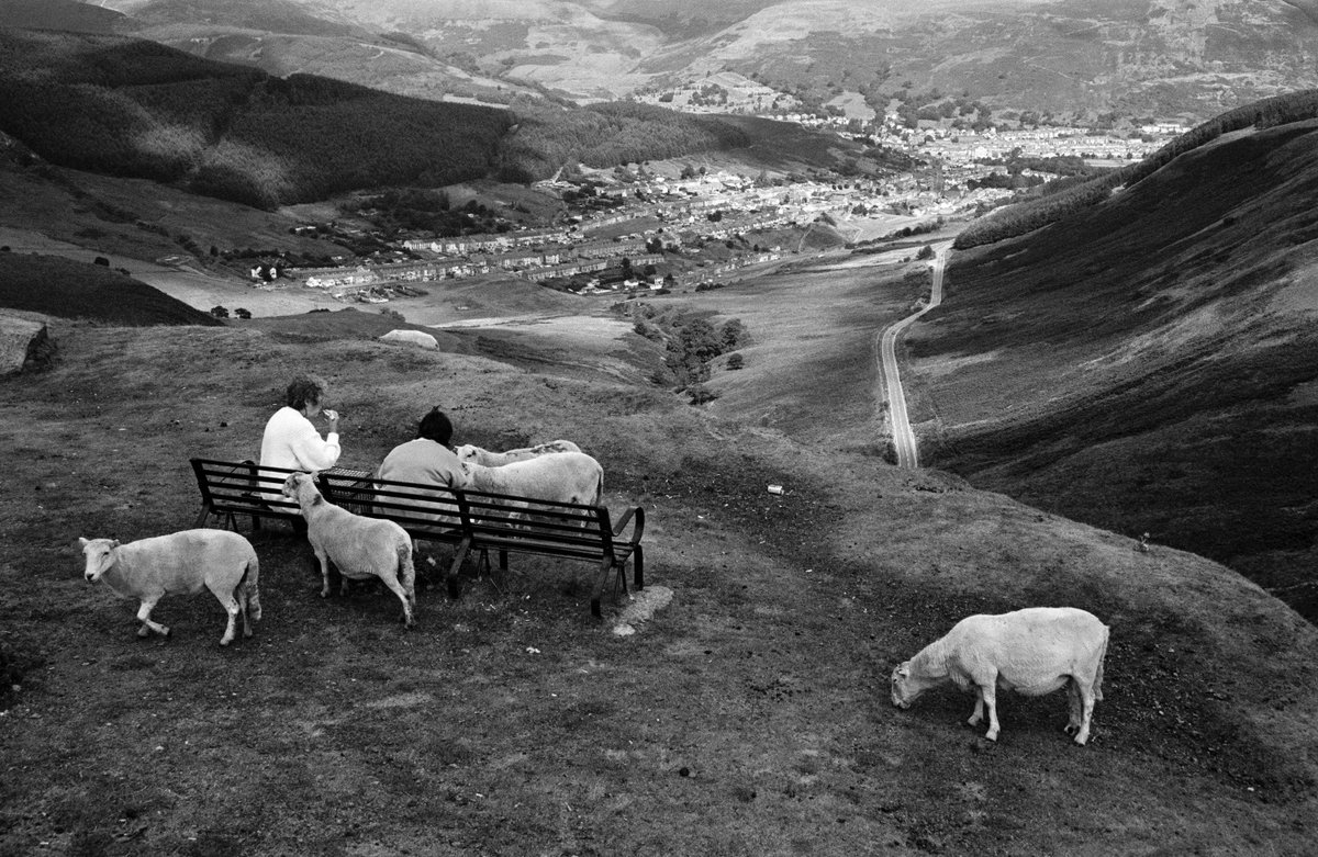

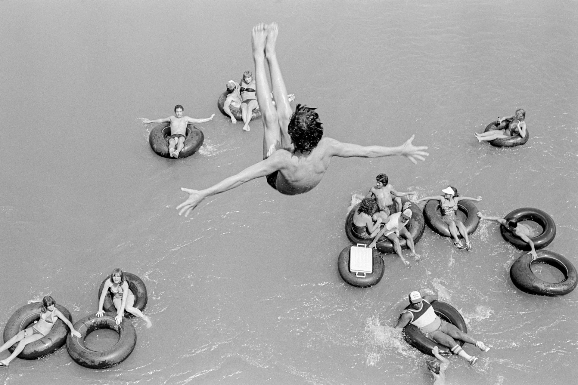
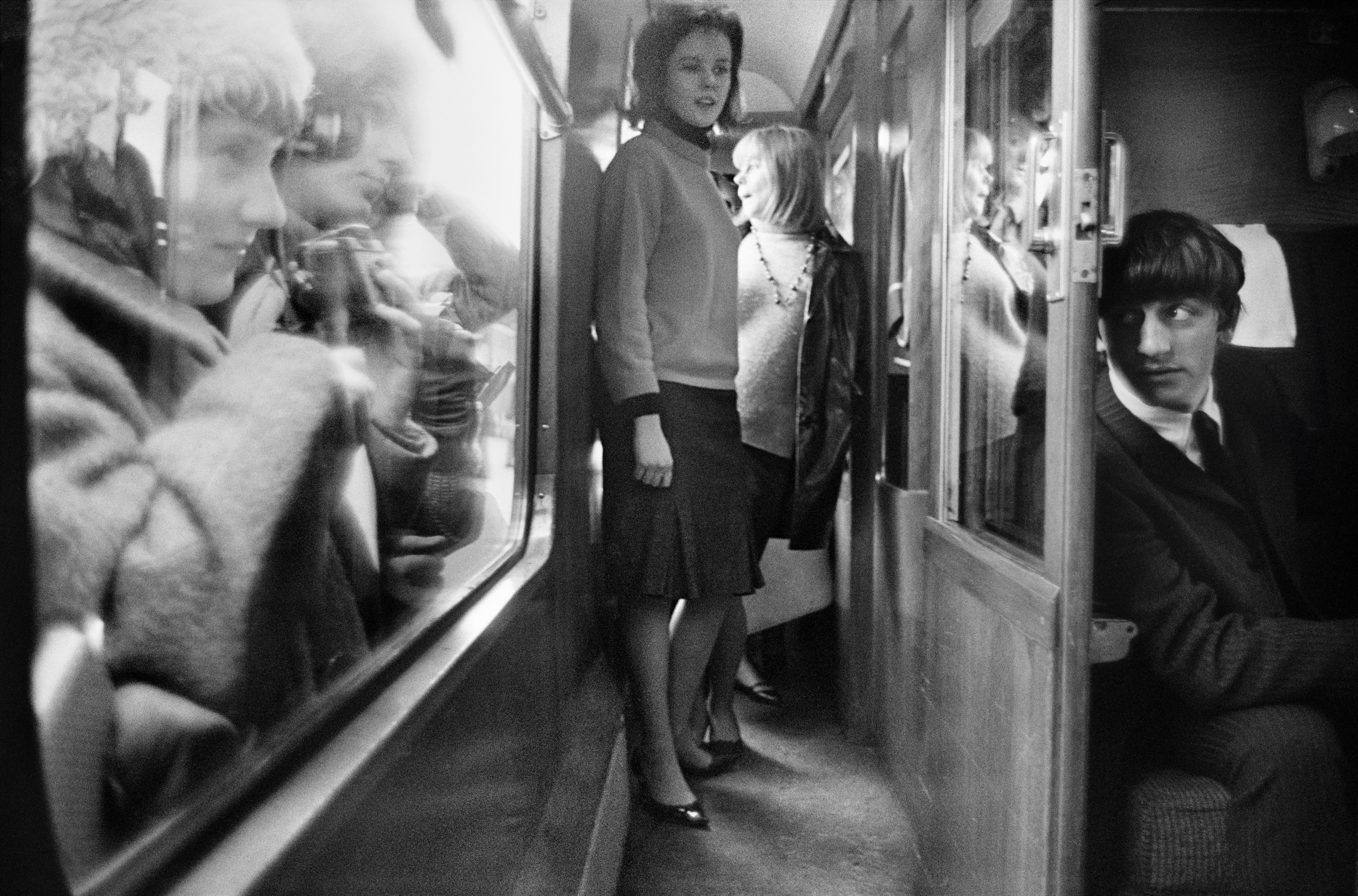
Looking at the work of David Hurn, the humour and joy of Hurn again inspires me, but within his work, there is both style and conventional class as well as spirit and joy.
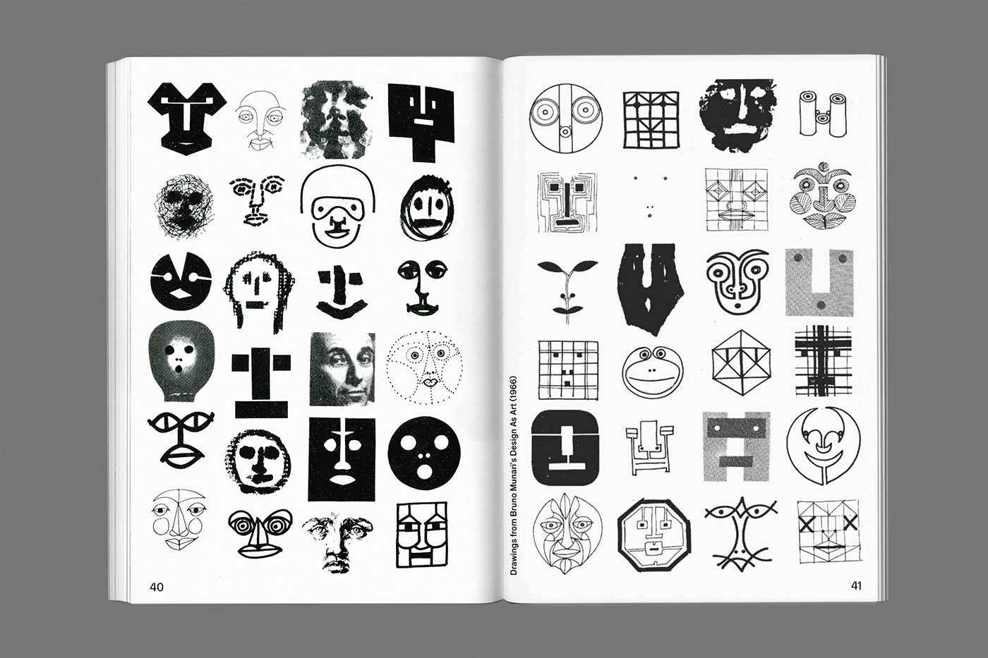
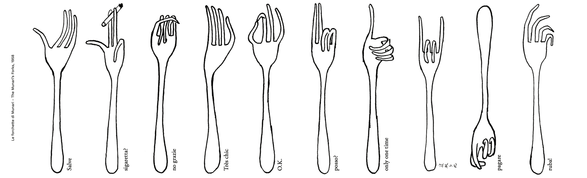
Bruno Munari :


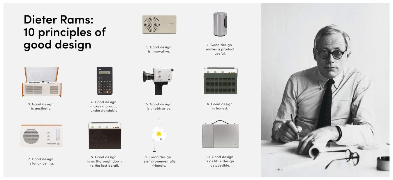
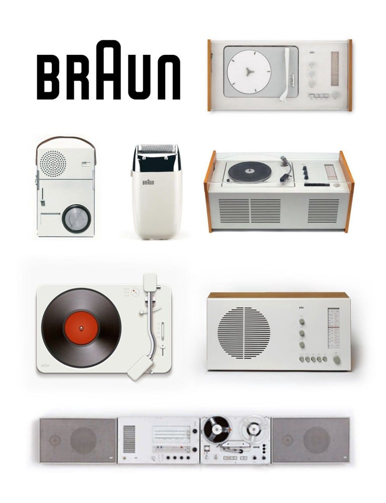
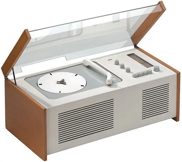
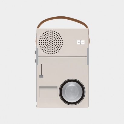
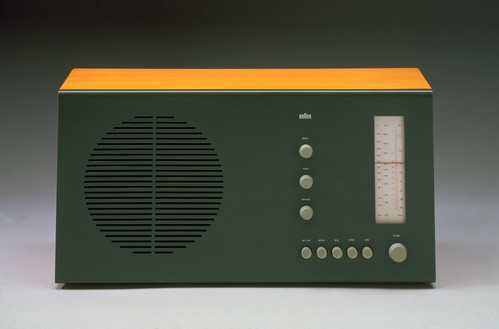
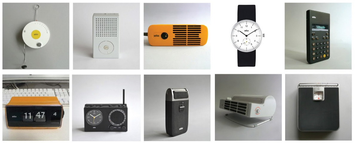
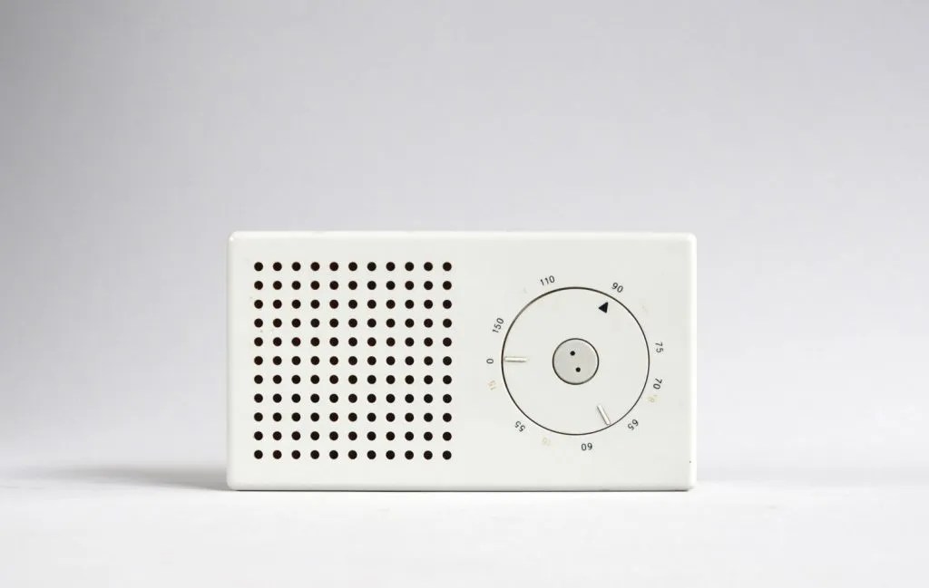
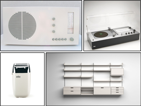
Dieter Rams :
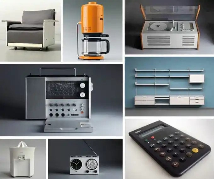

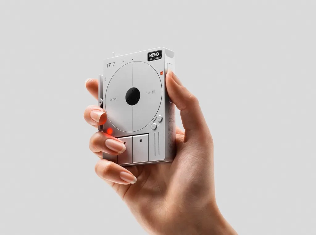
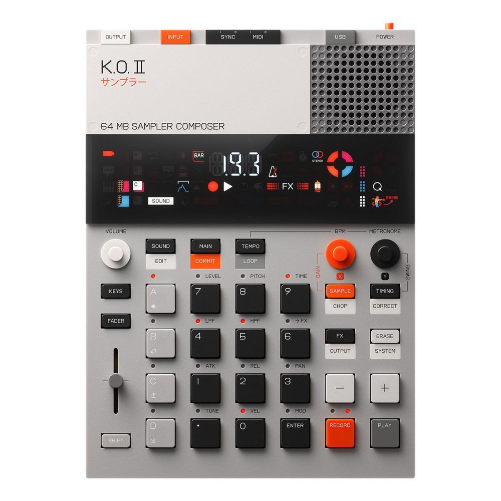
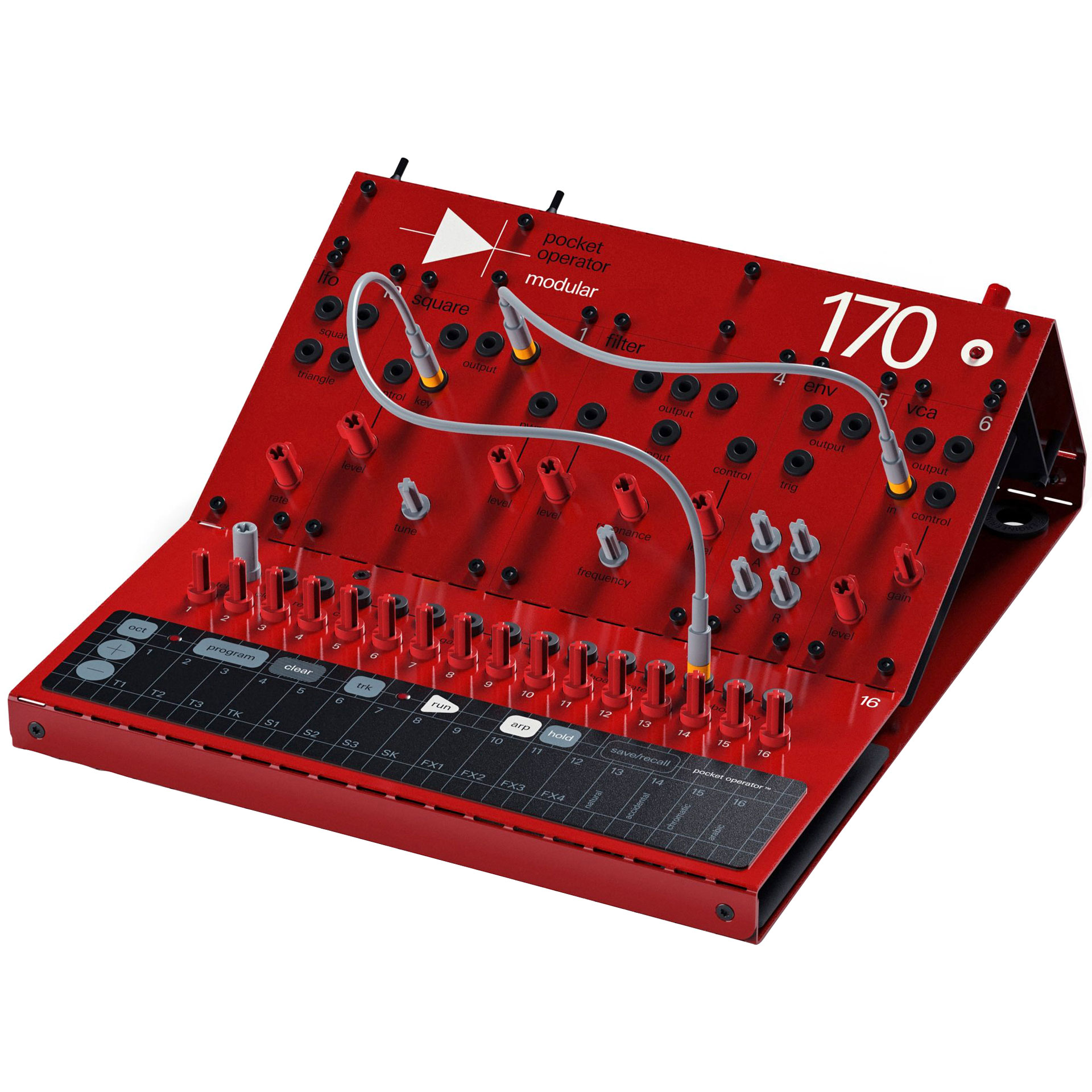
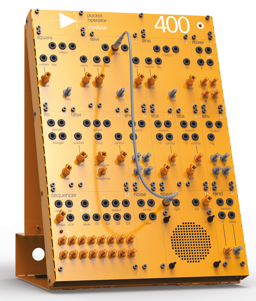
Teenage Engineering :


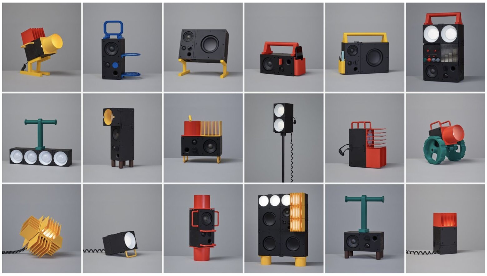

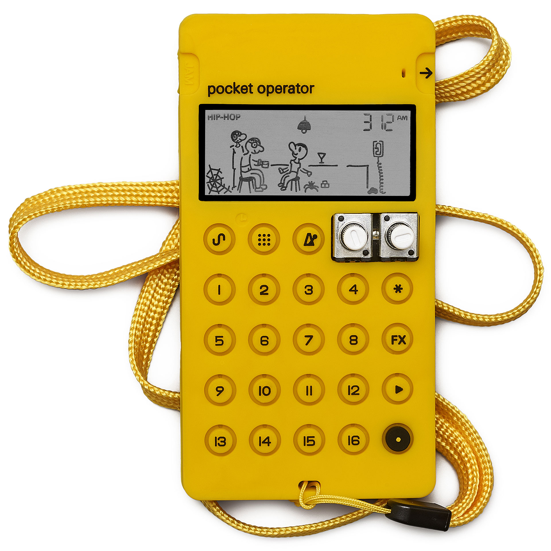

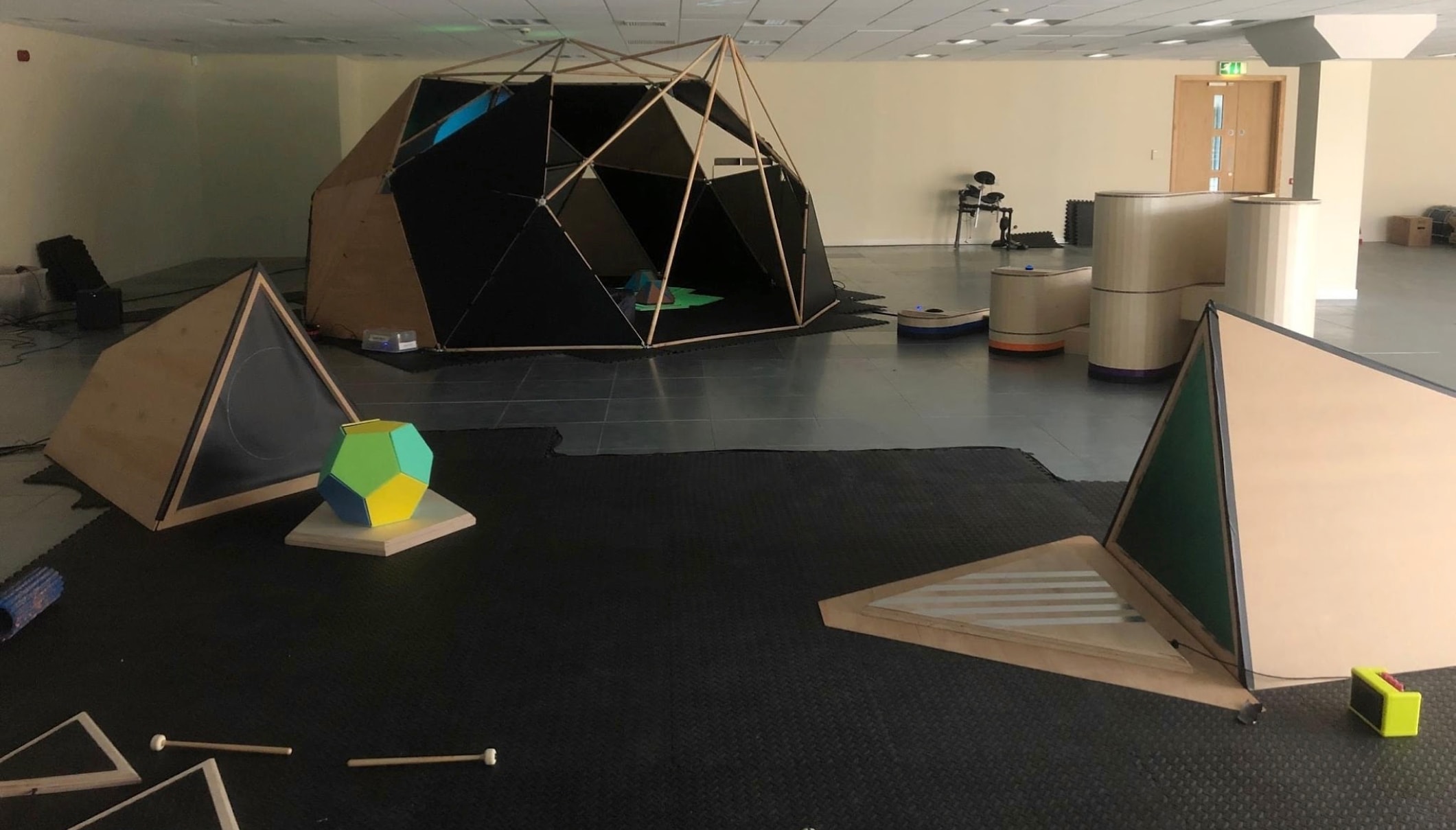
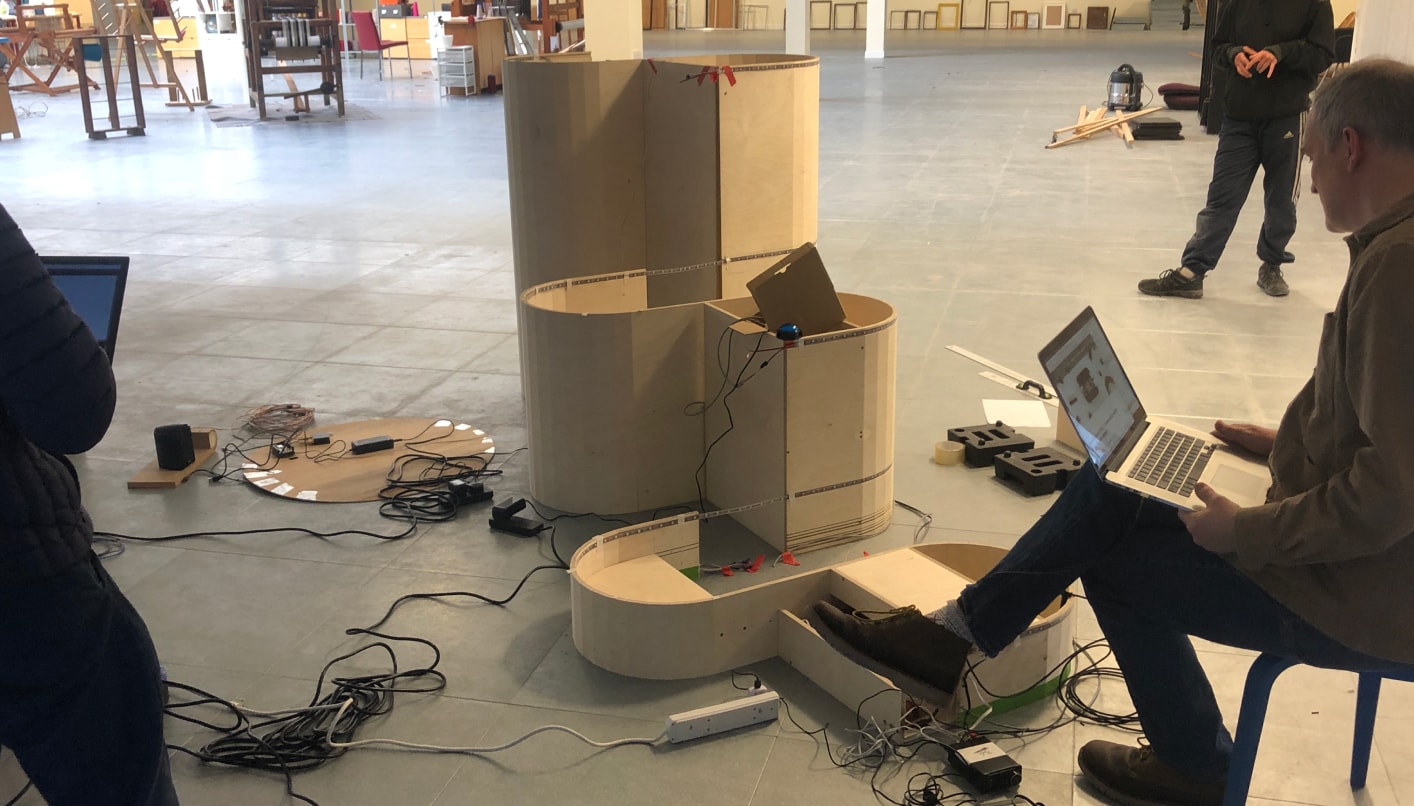
Sound Play Projects:
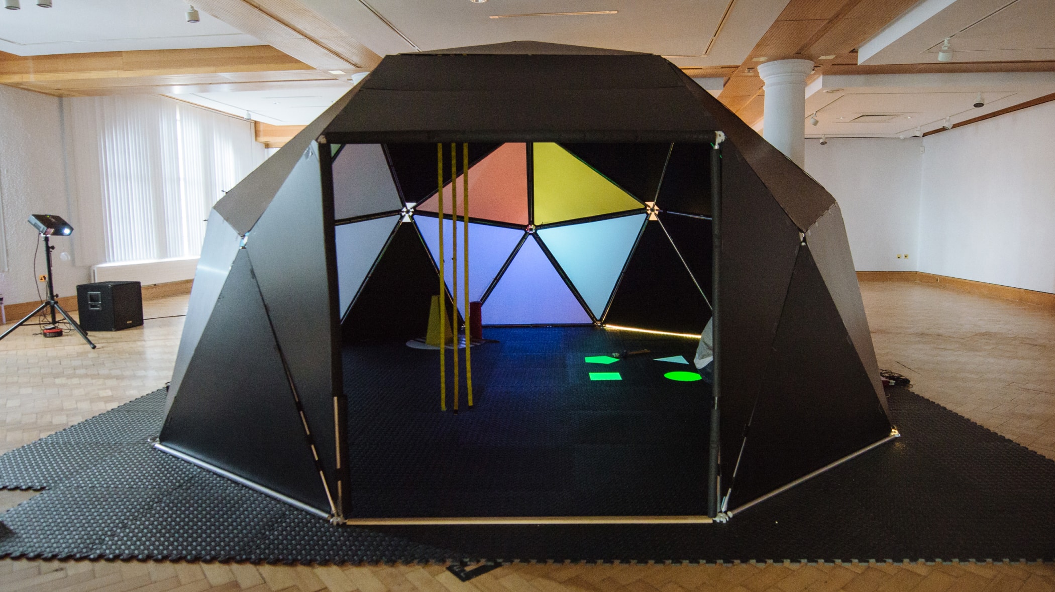
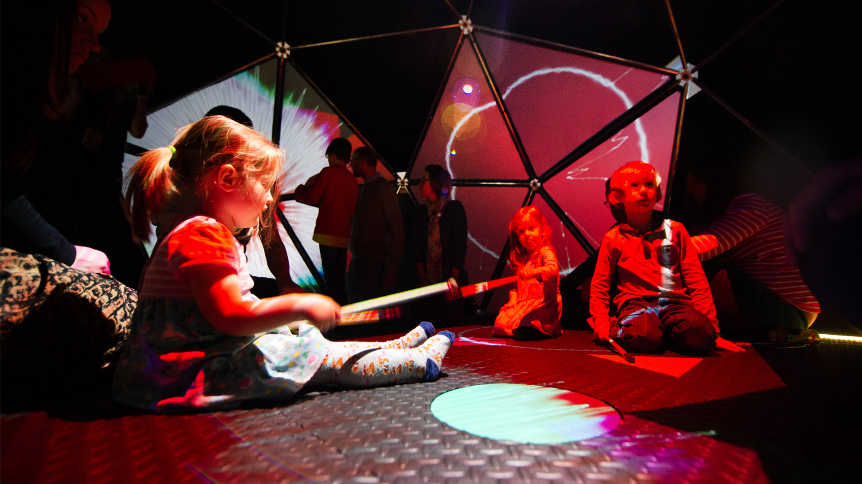
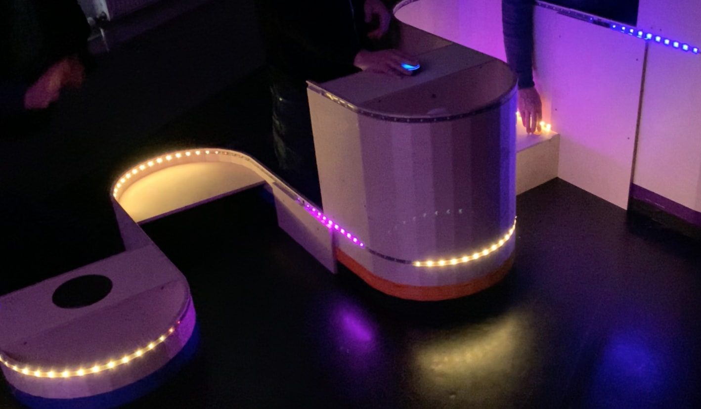
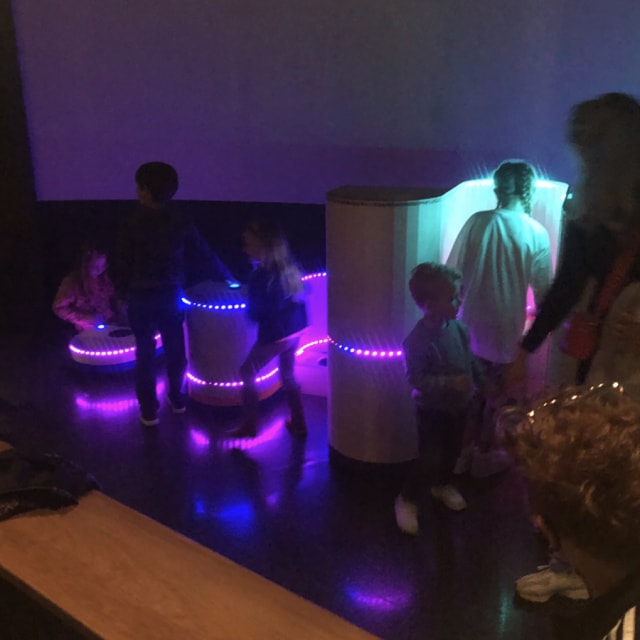
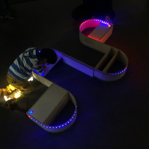

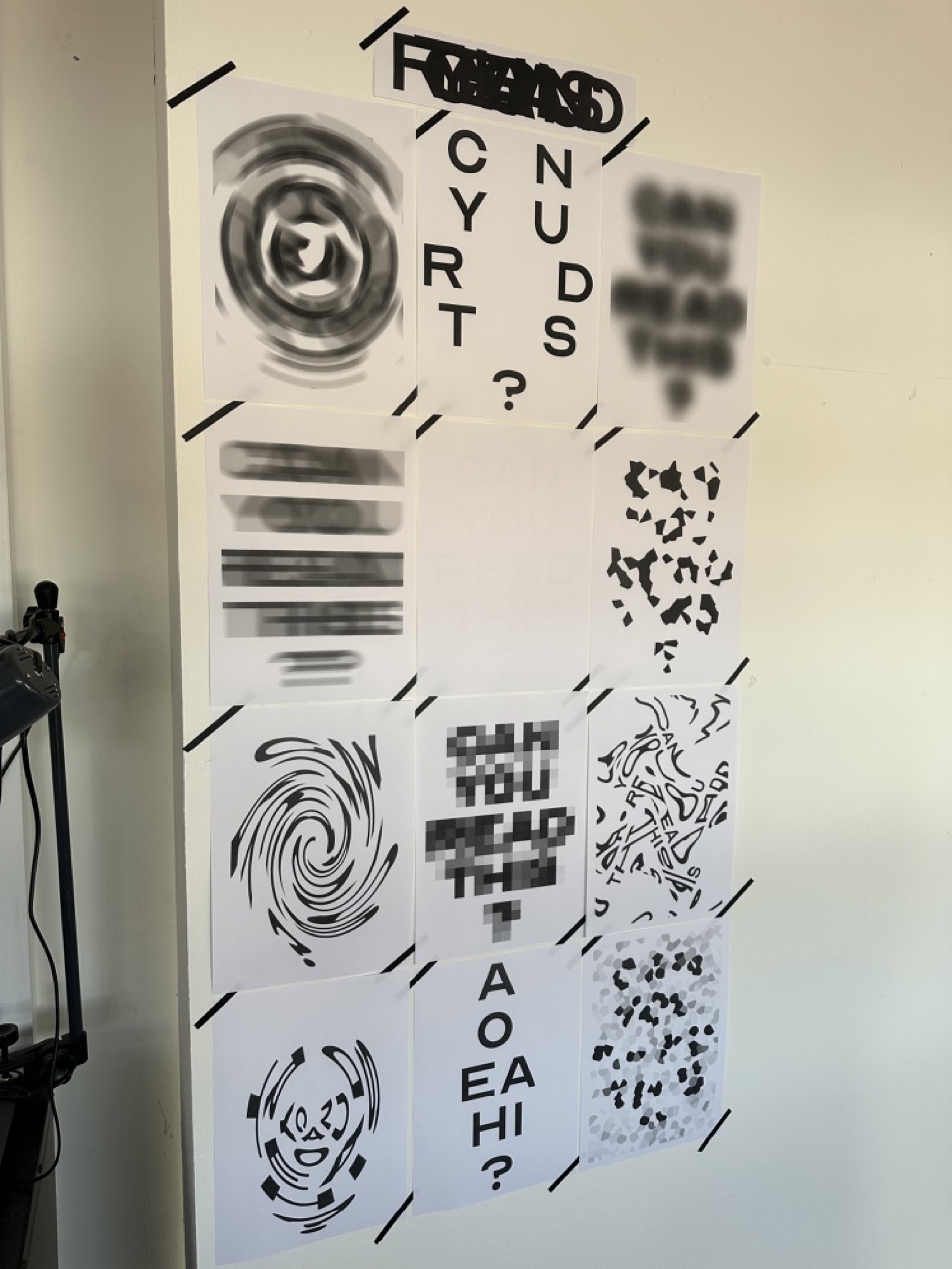
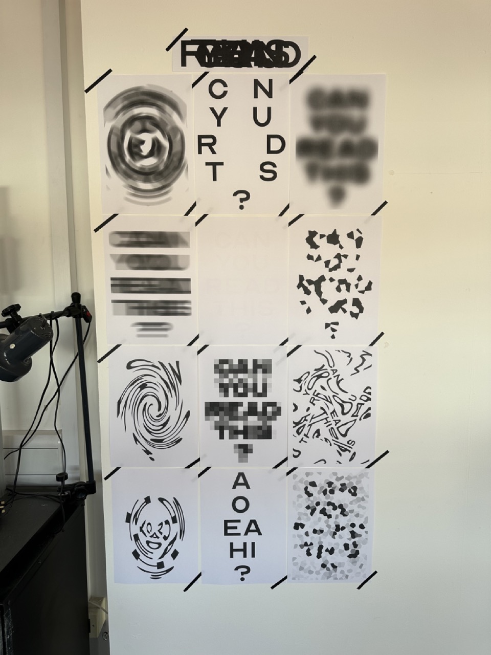
Pushing your buttons:
What buttons do we want to press? What will entice an interaction from the viewer from initial sight of the button and then after the interaction, what will be the most satisfying.

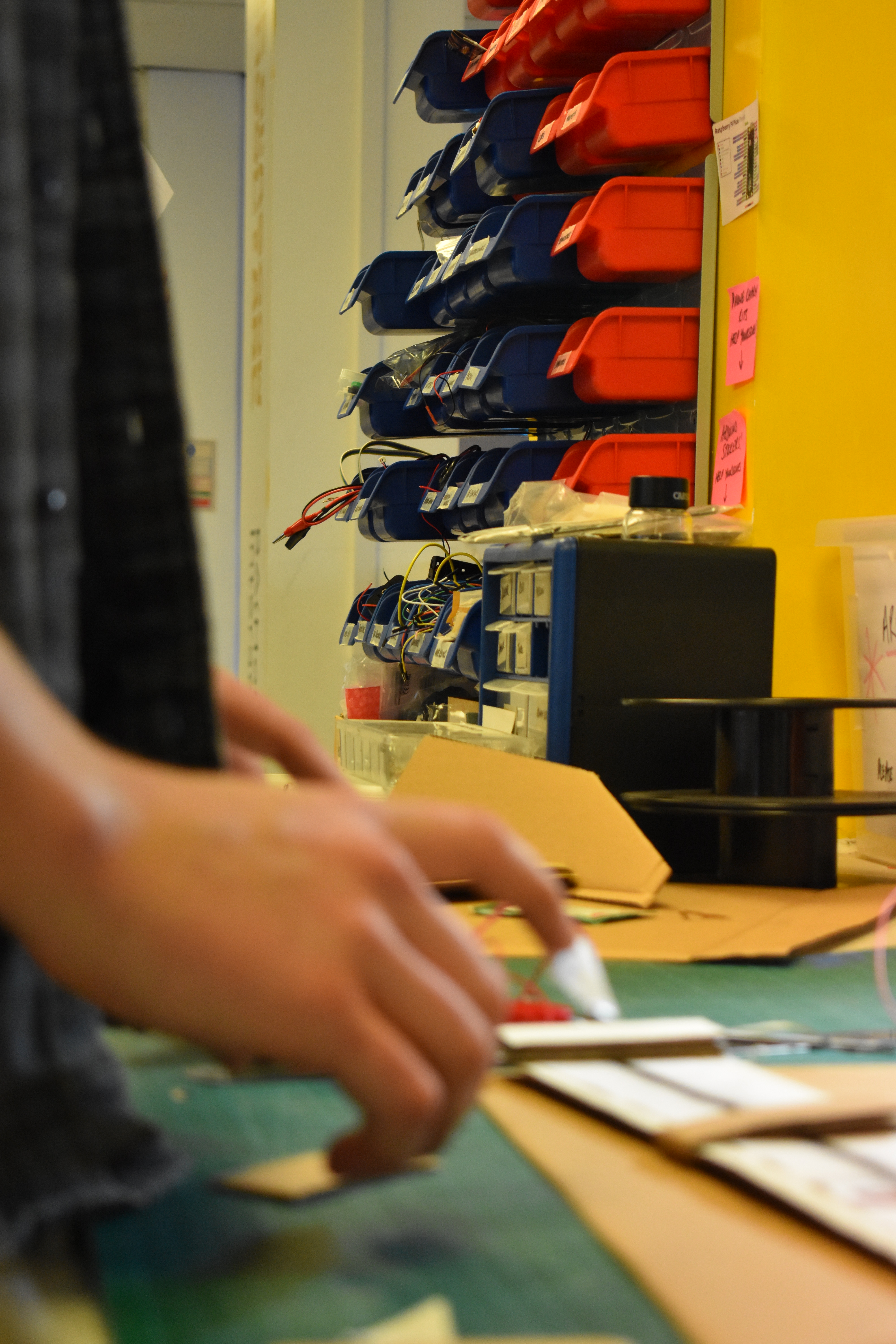
What we have in the studio:

What I might need to order:
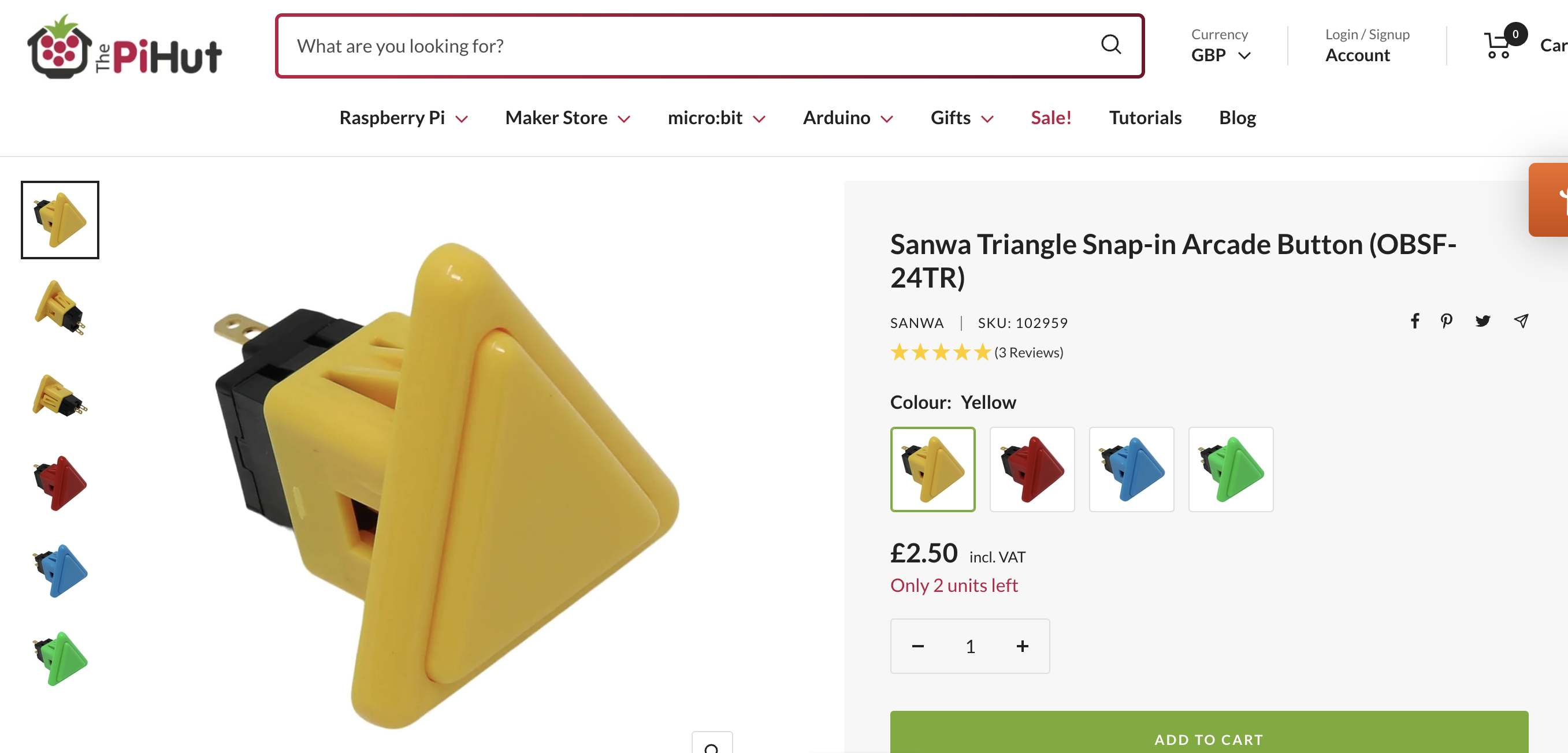
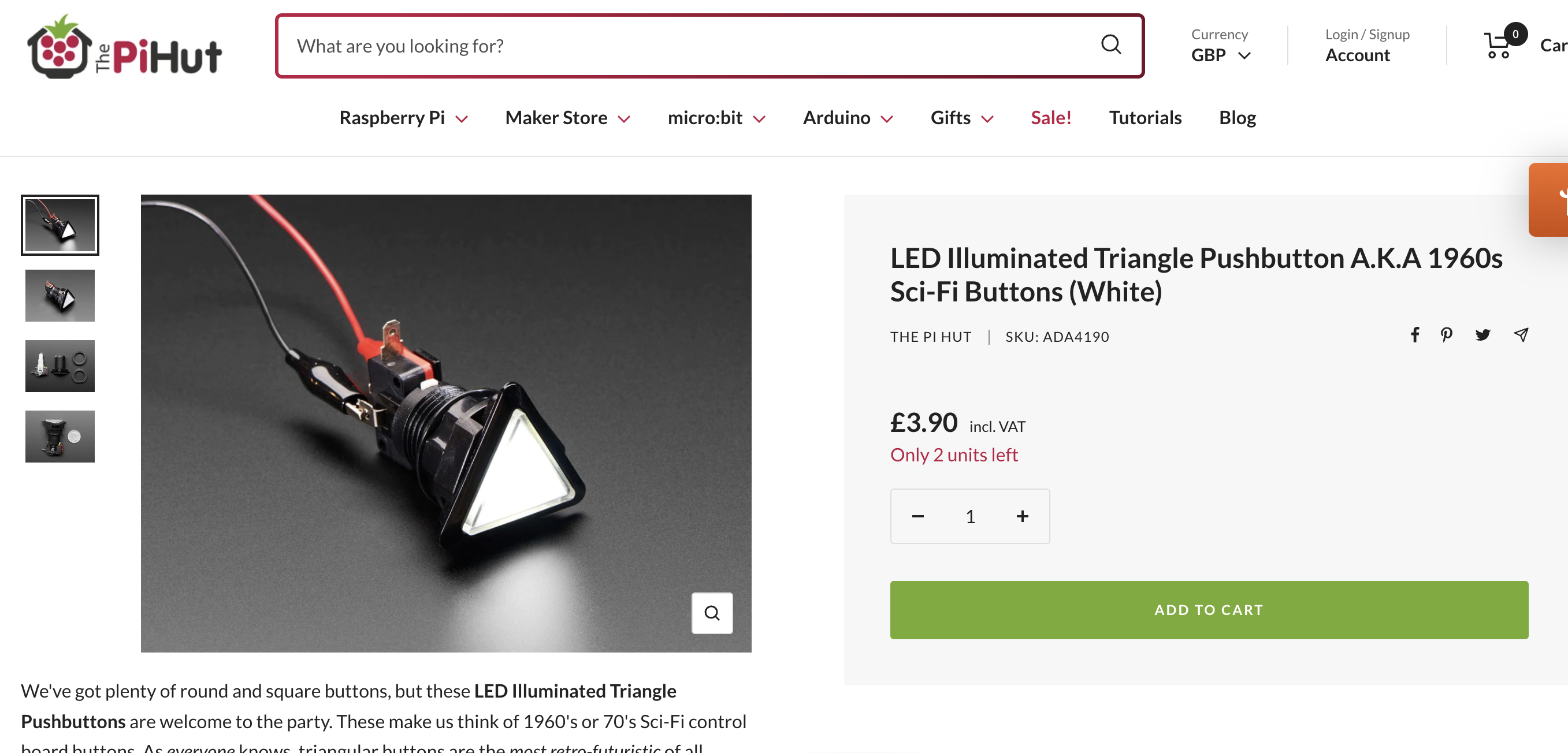
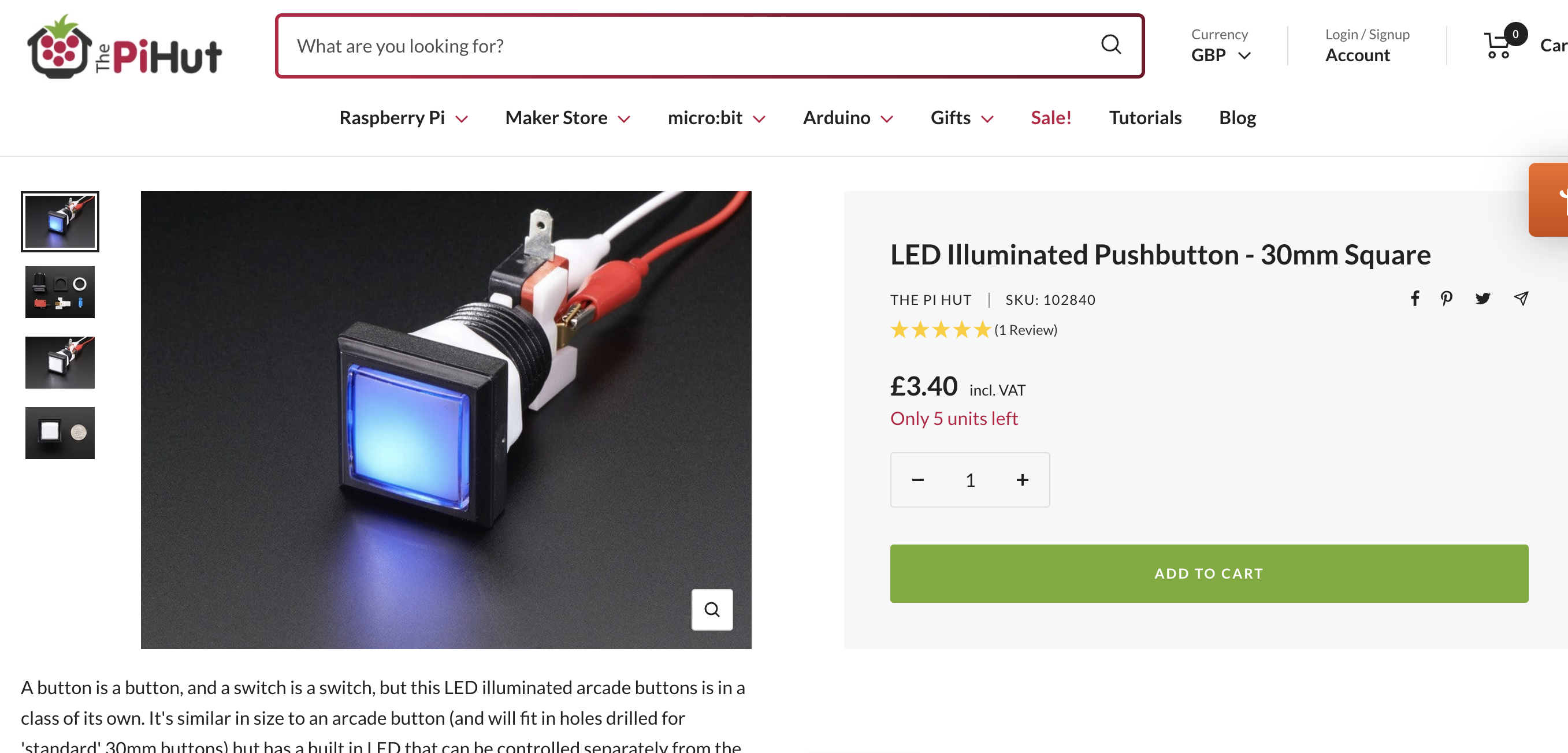
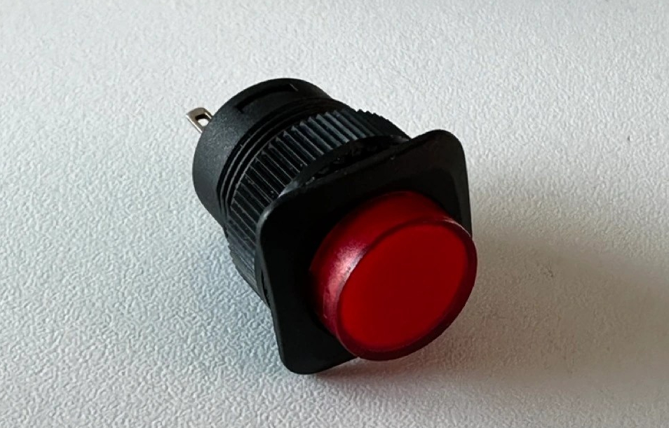
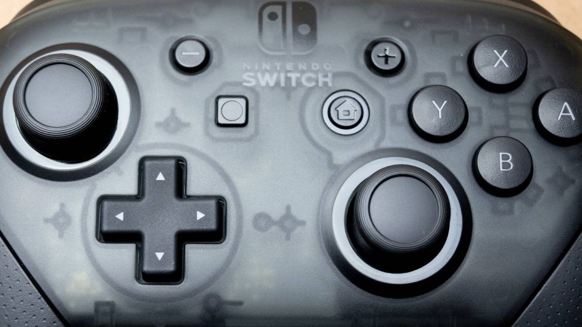
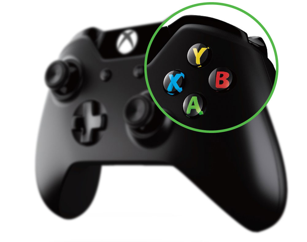
Controllers:
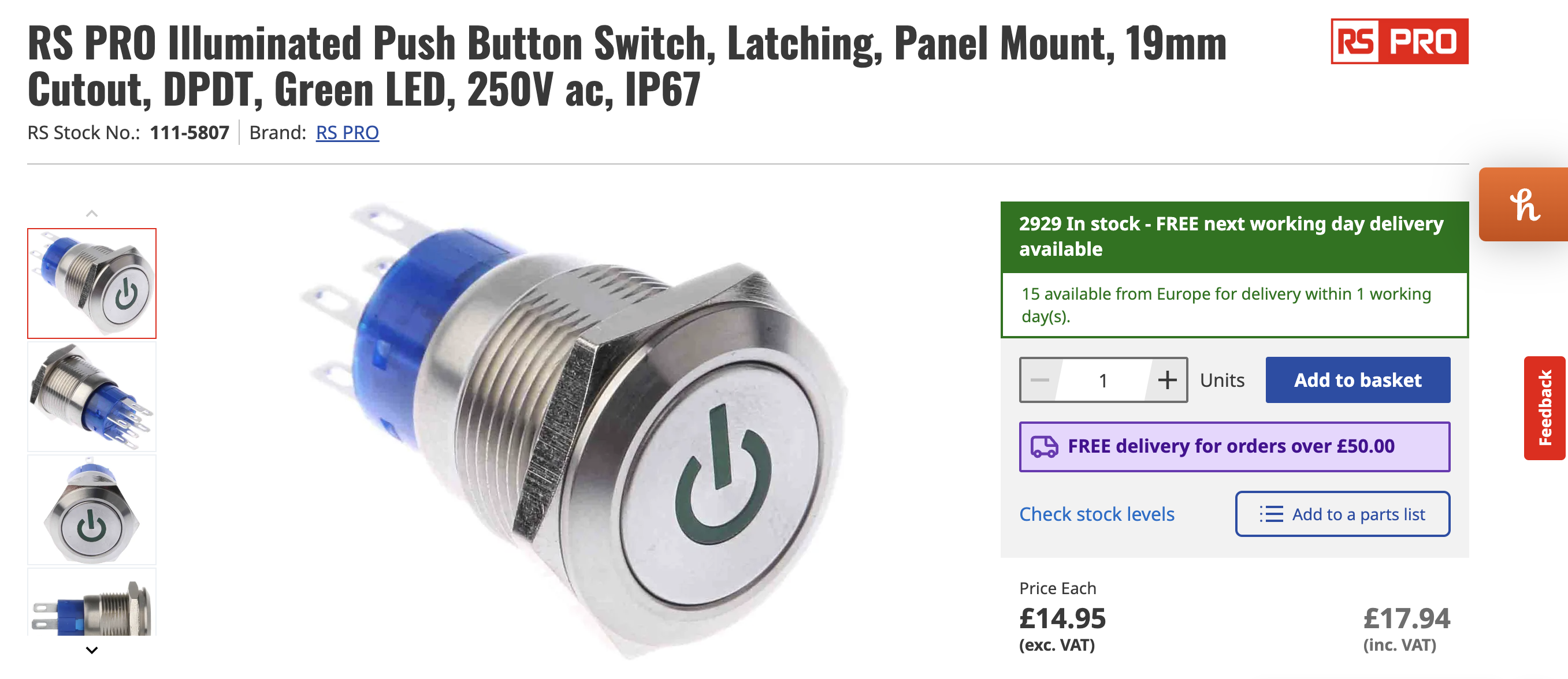
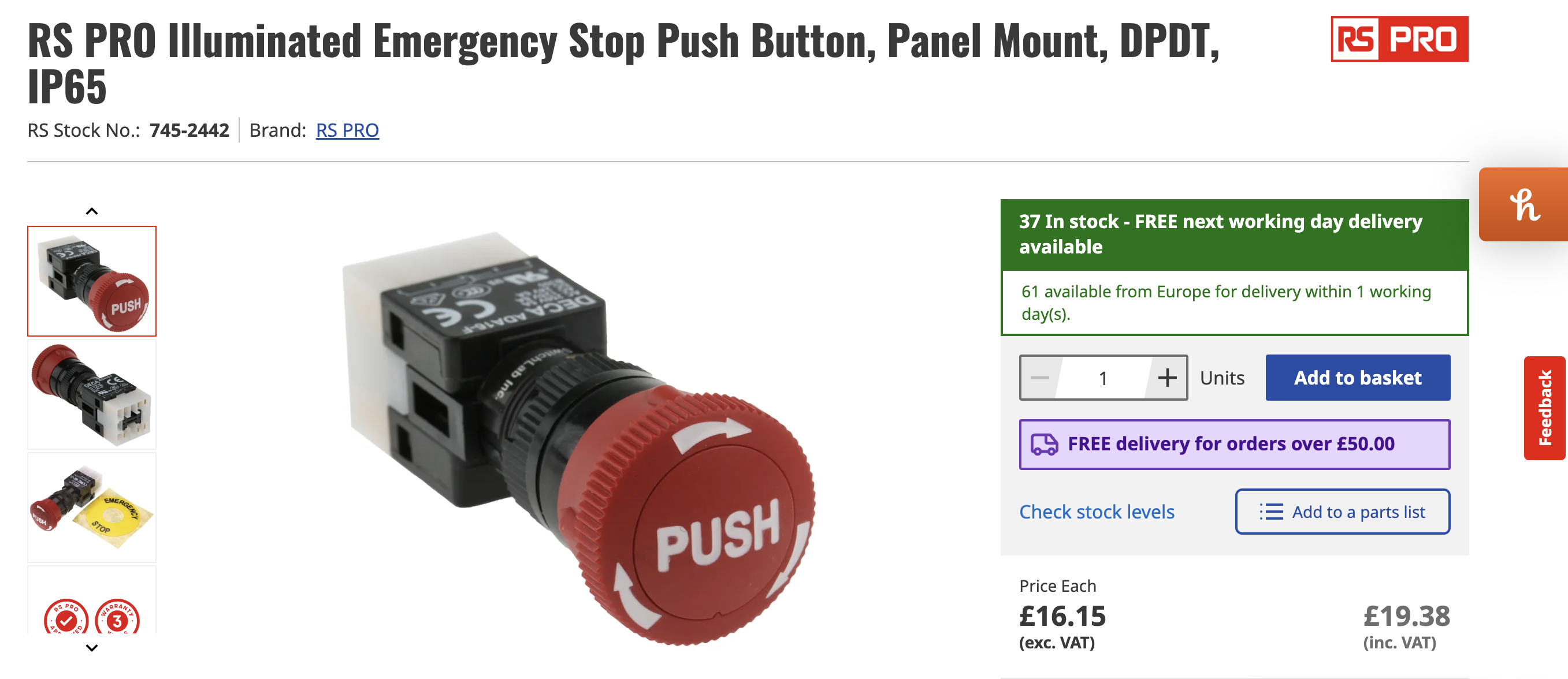
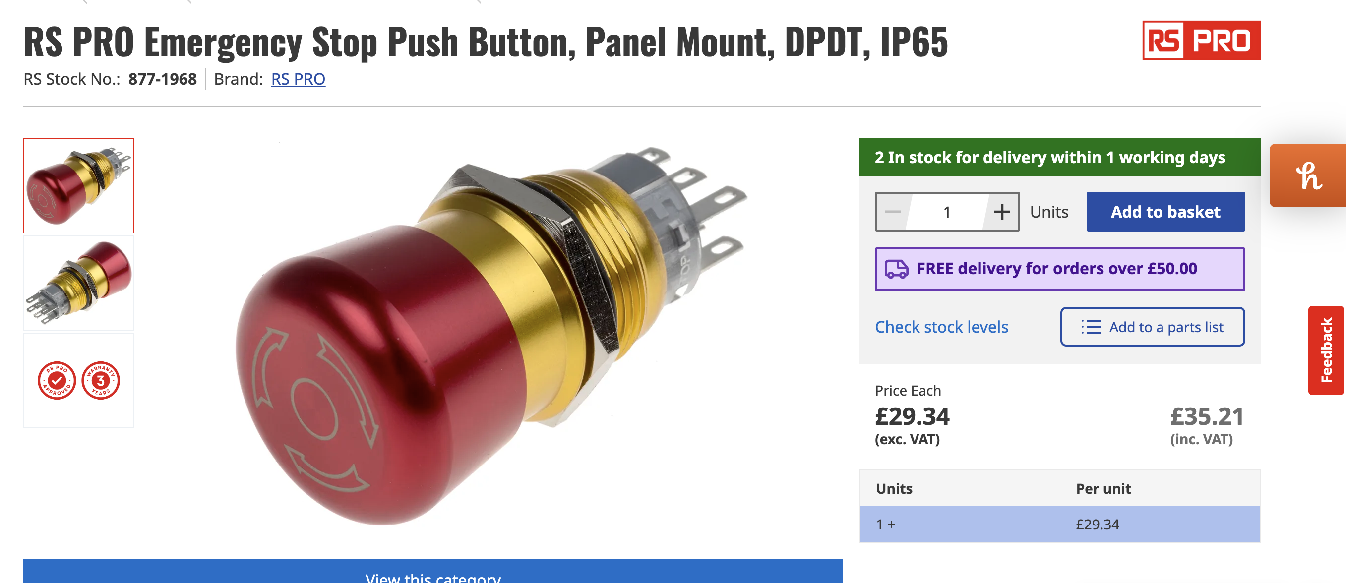
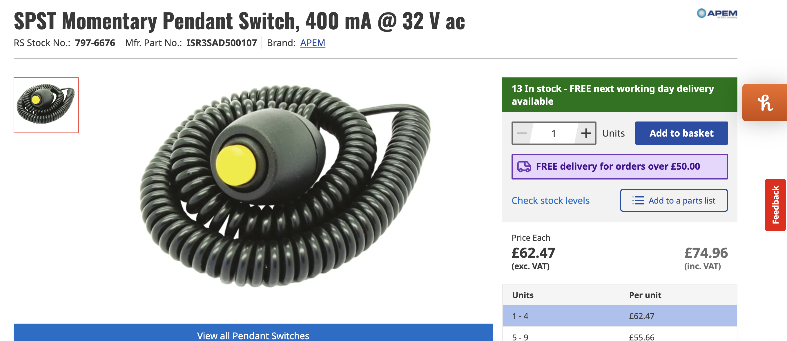
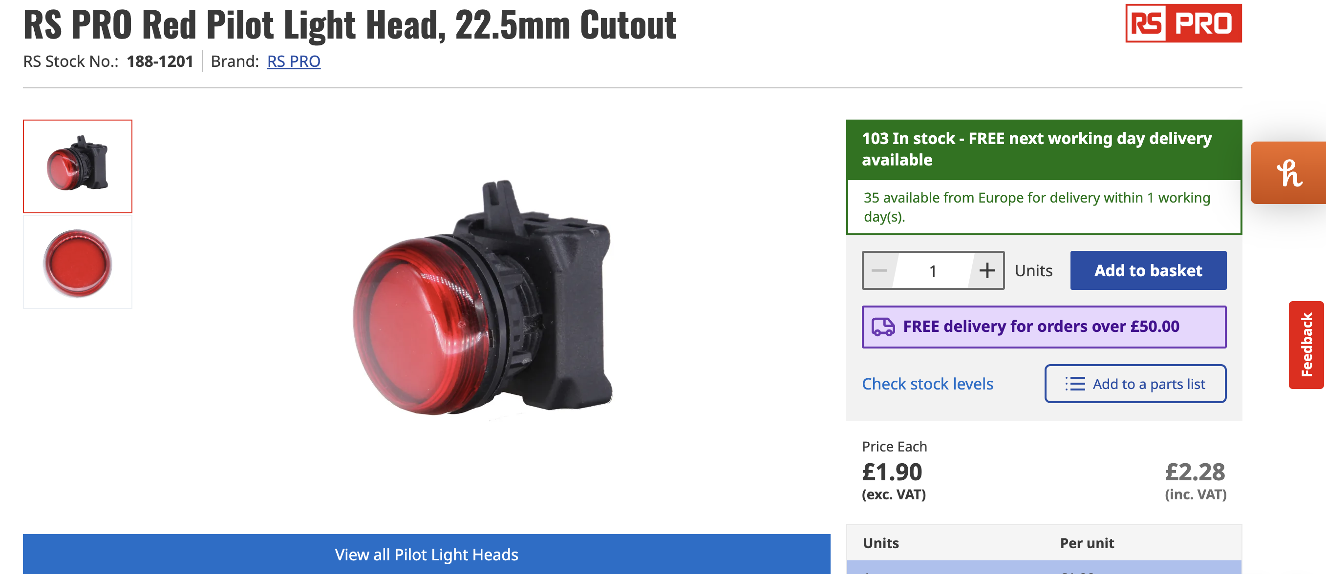
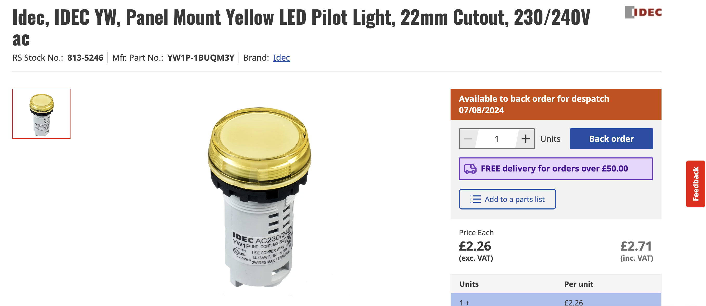
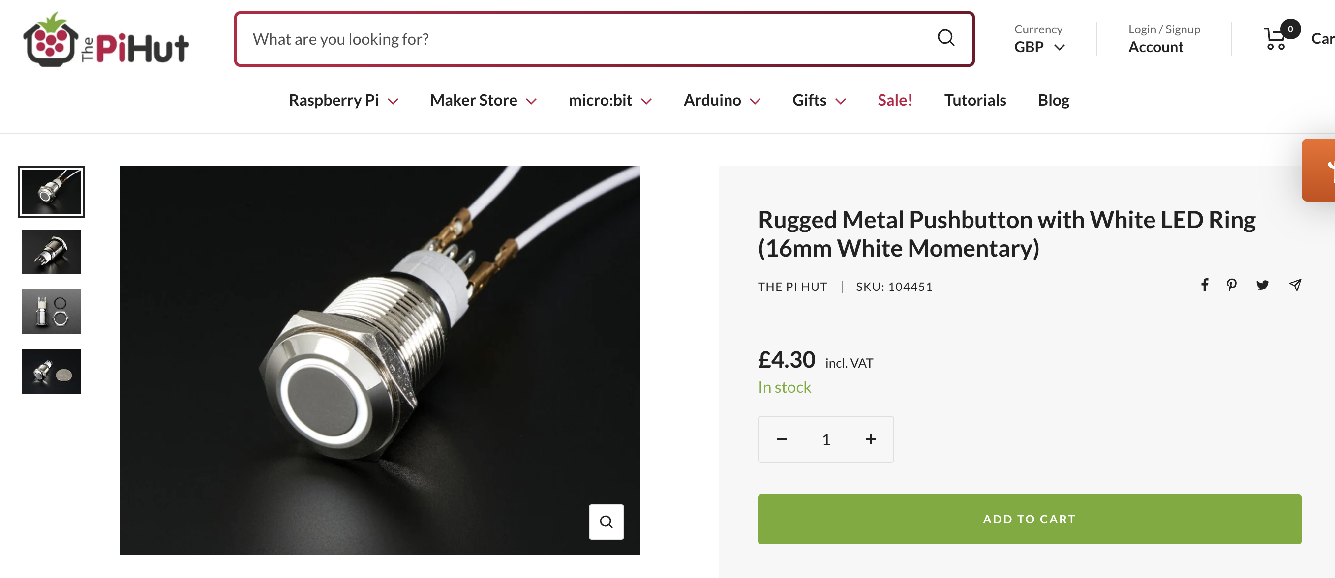
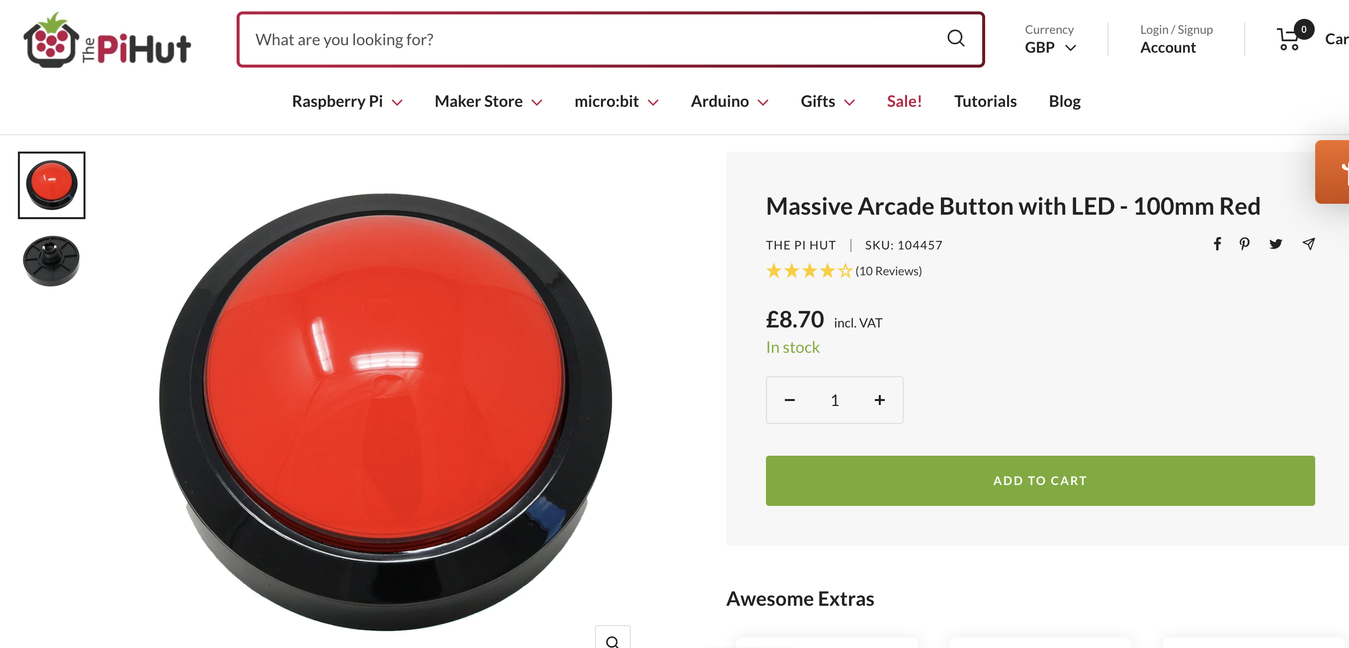
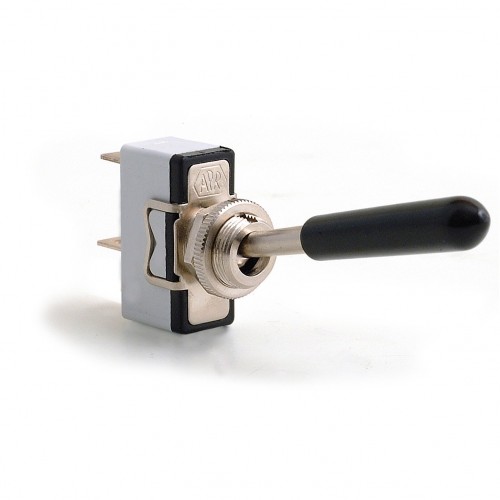
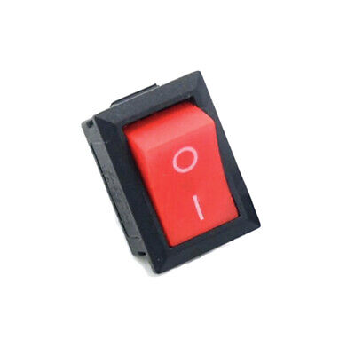
Switches:
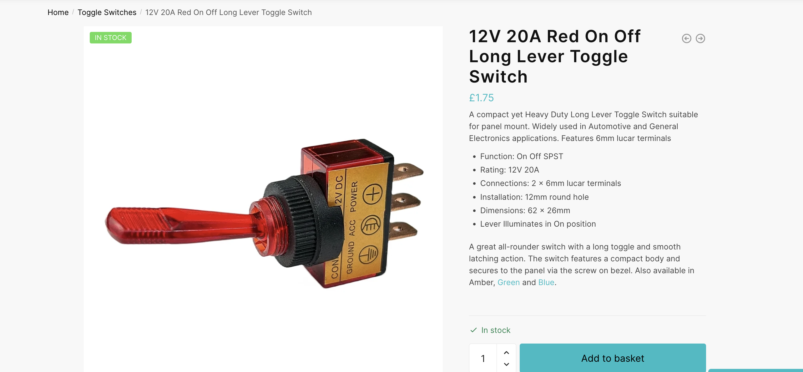
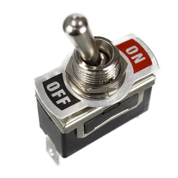
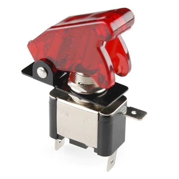

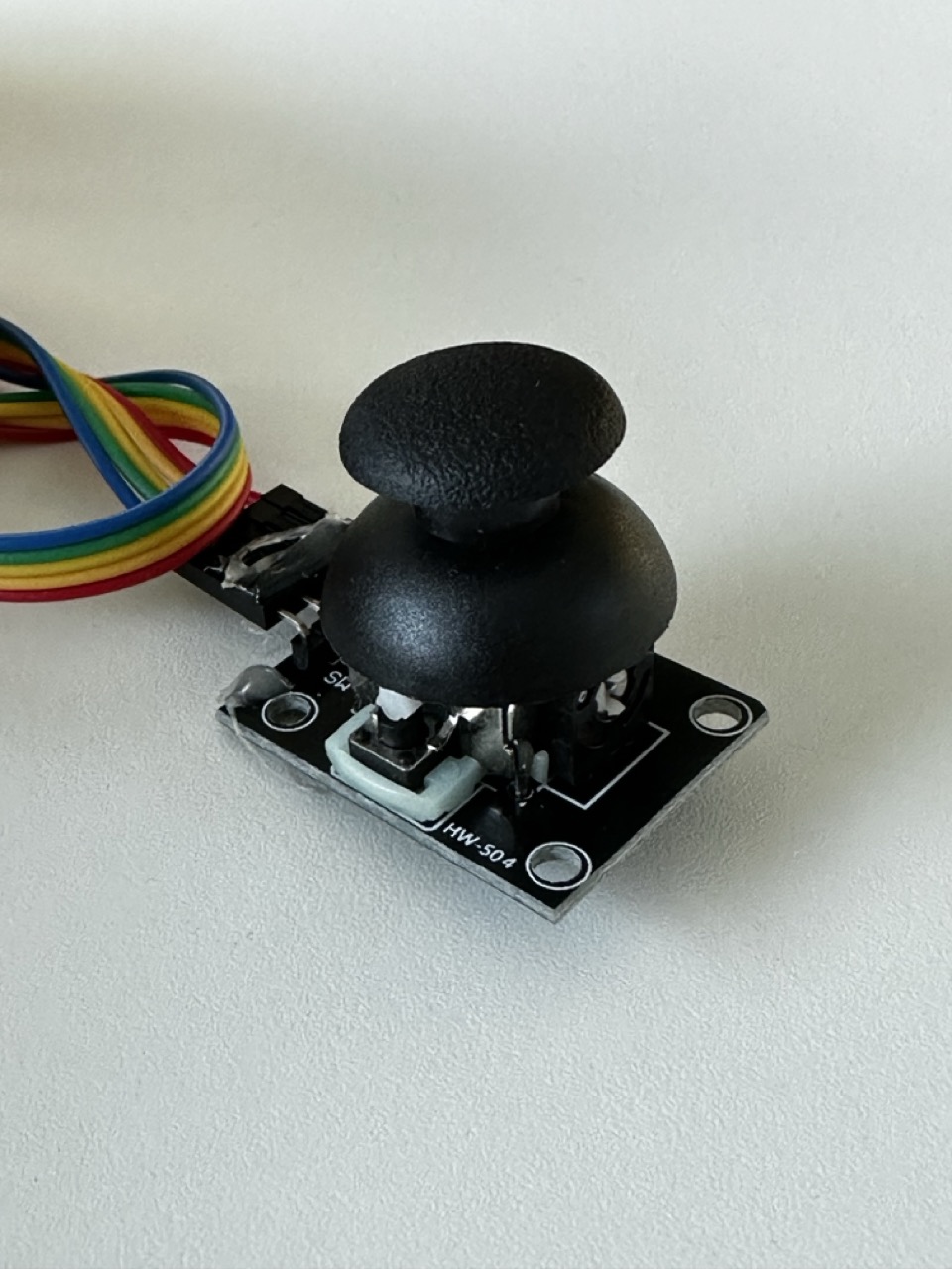
Initially I have no idea on what form my project will take but I think if I follow the direction of my thought process and research then I’ll find a fitting housing and inputs that has a tactile satisfying feeling.
Concept :
What art will the build produce ?
What art can I look at to inspire the controls or outcome of the build. Simple in elements but complex in beauty and concept.
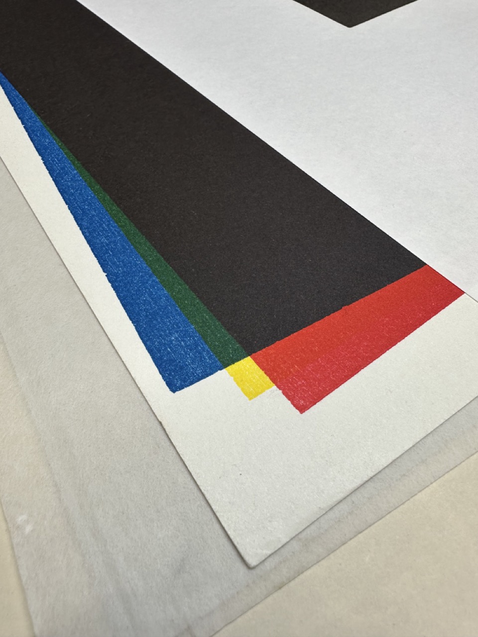
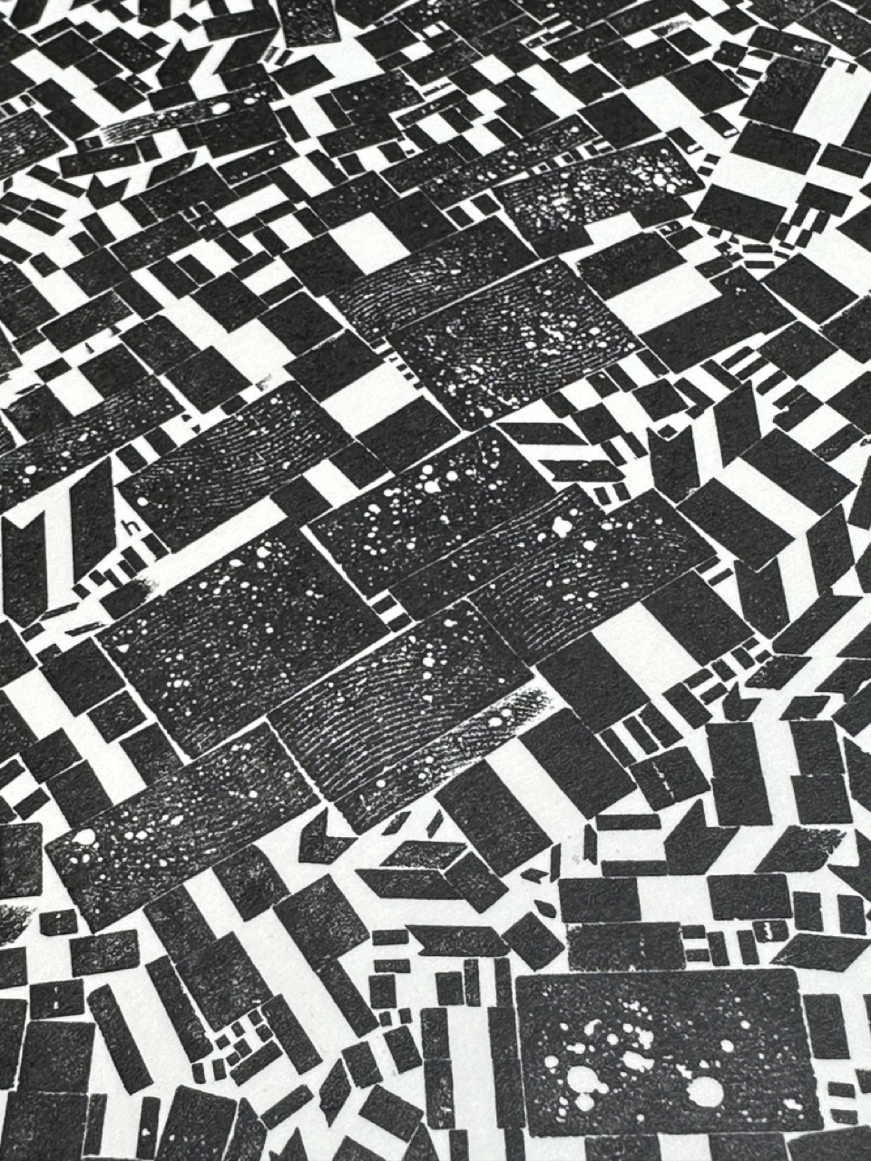
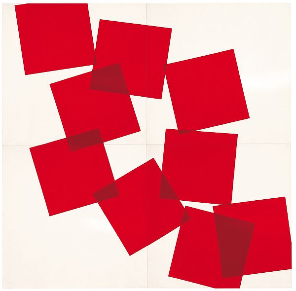
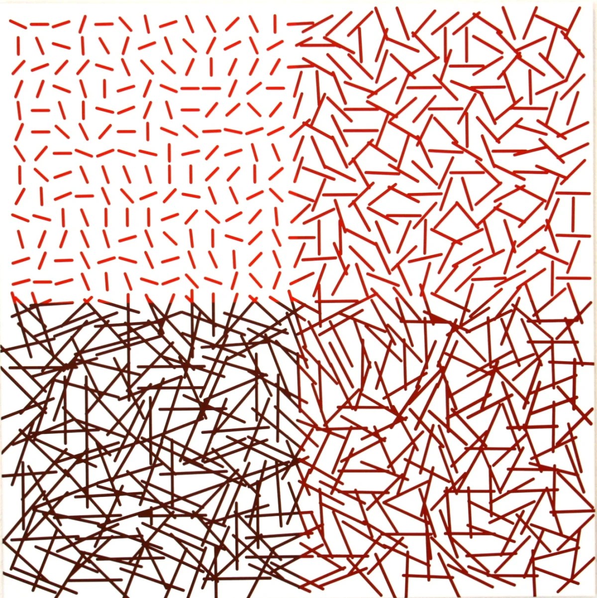
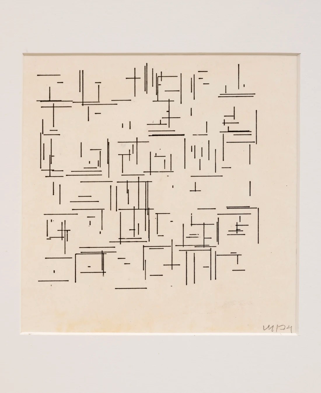
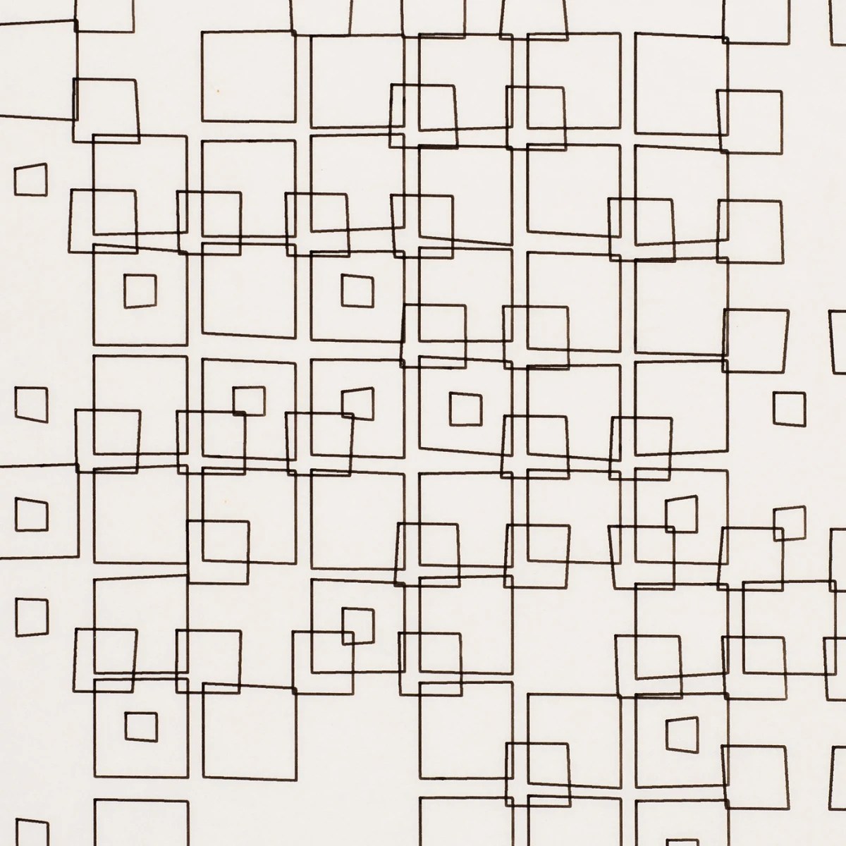
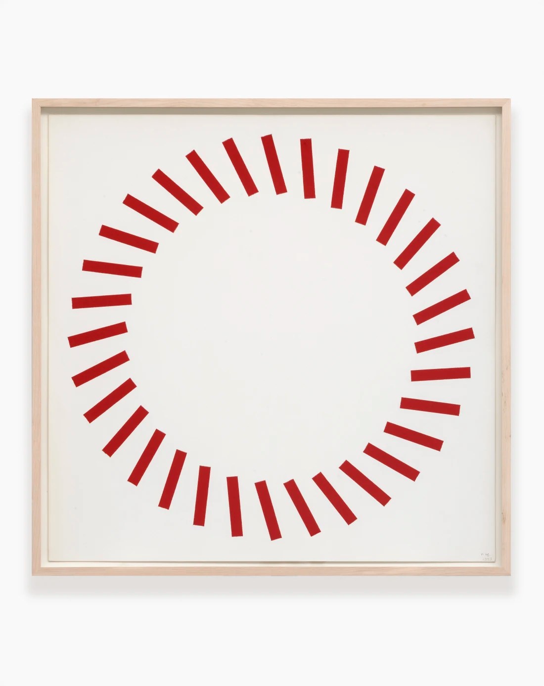
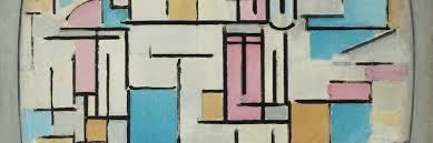
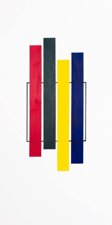
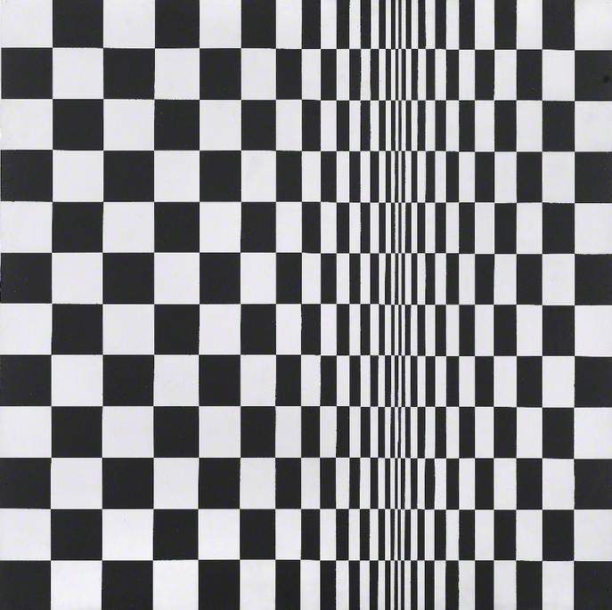
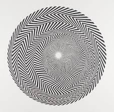
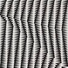
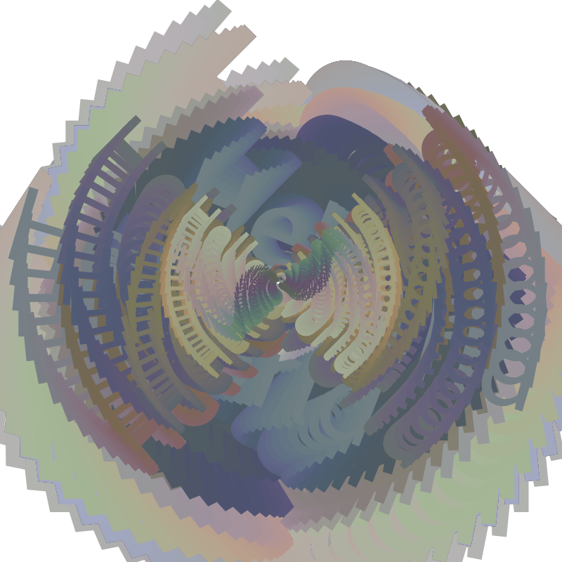
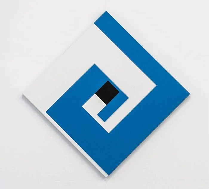
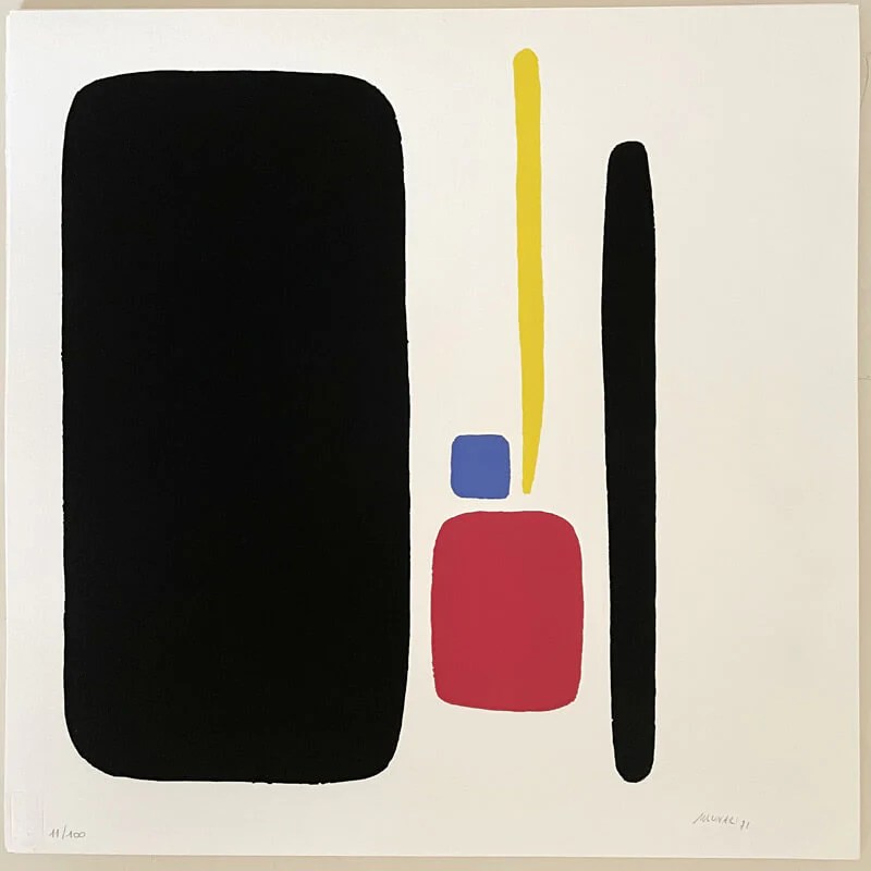
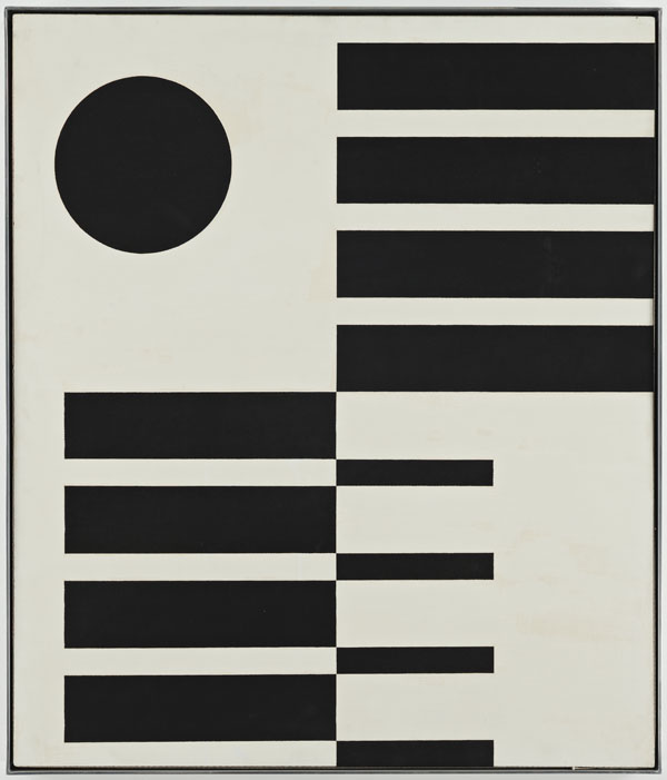
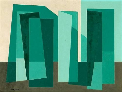
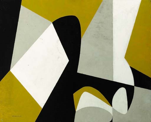
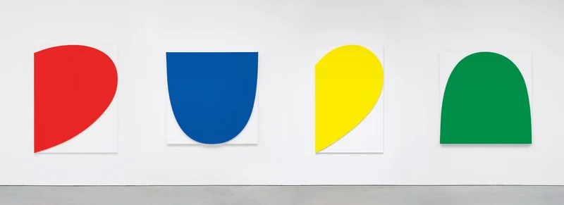
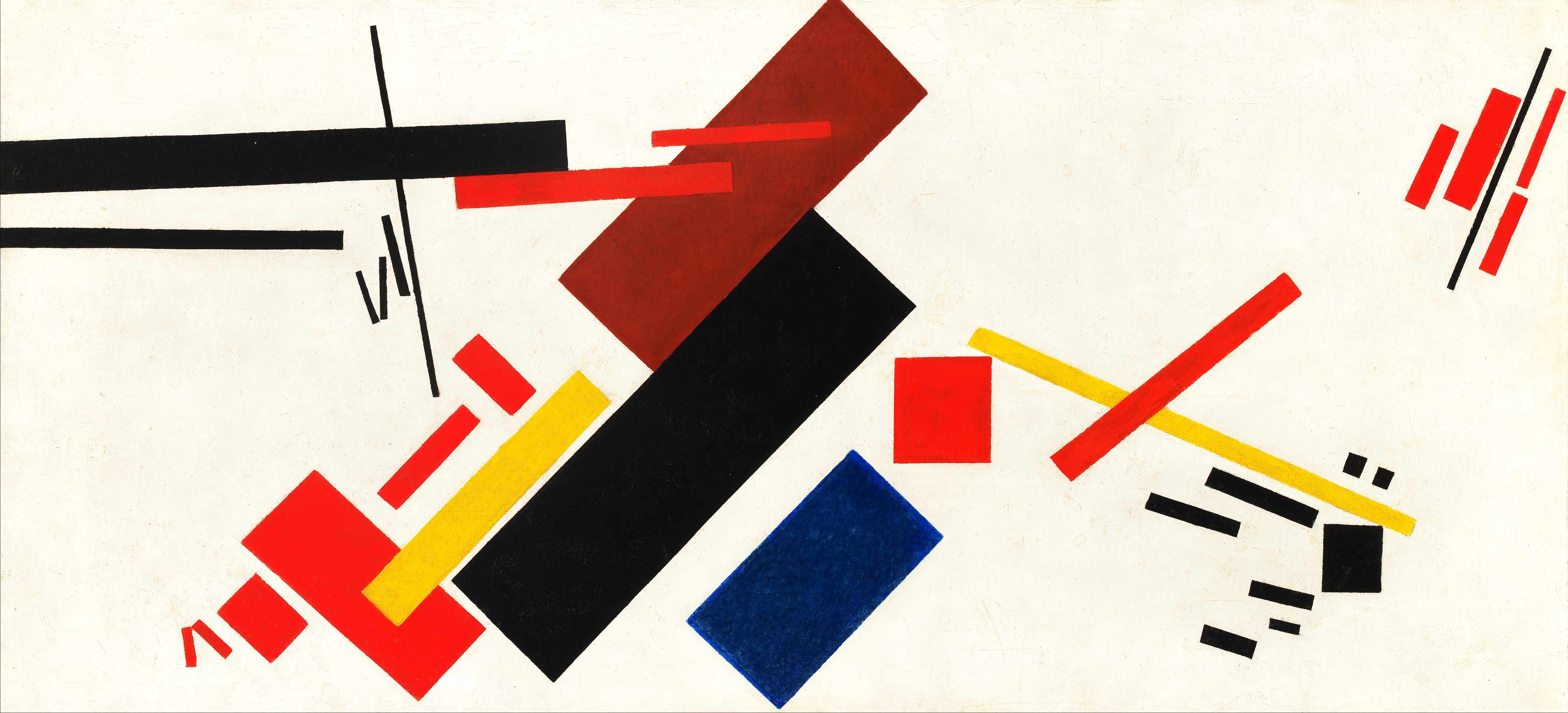
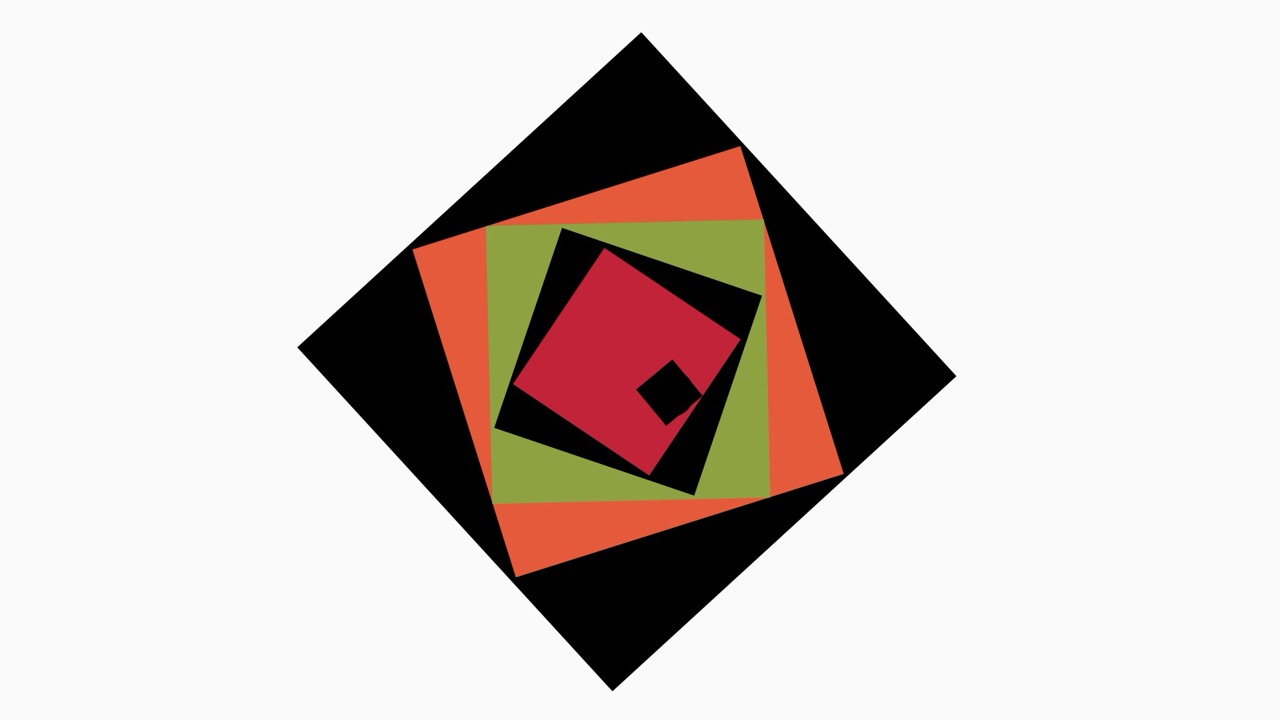
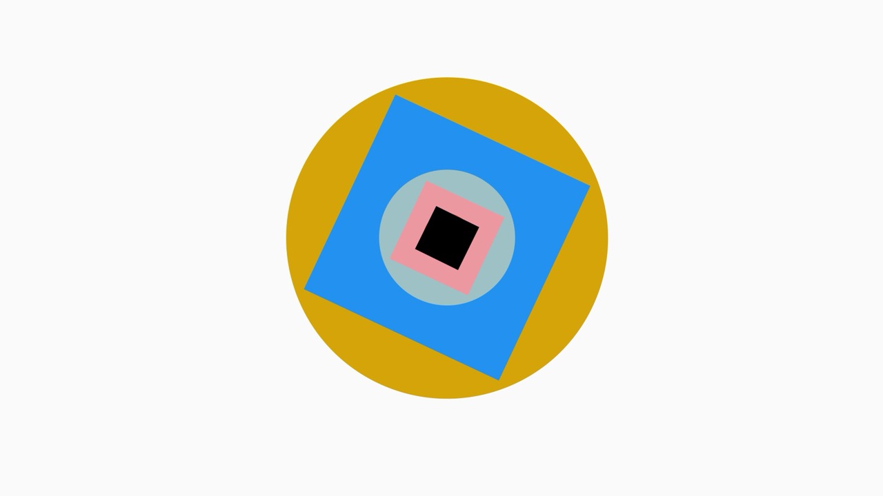
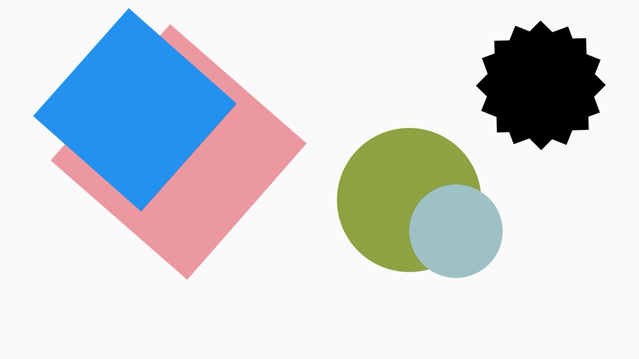
Hard Edge Painting :
John McLaughlin :
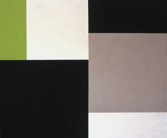
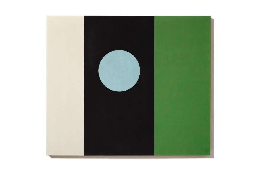
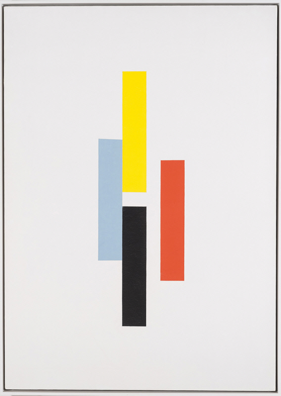
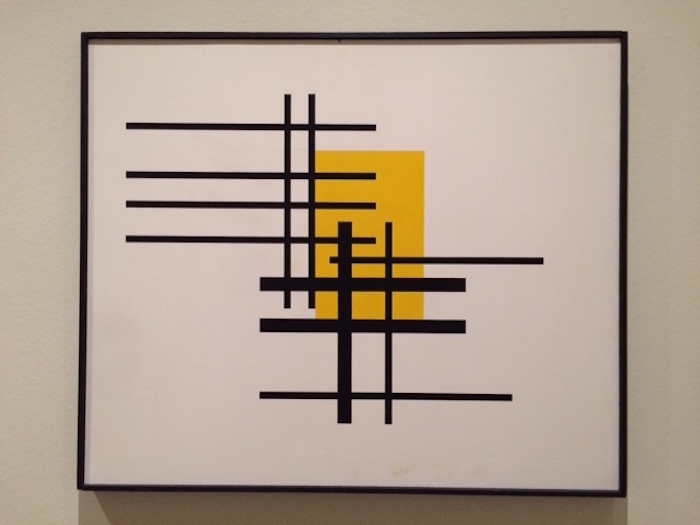
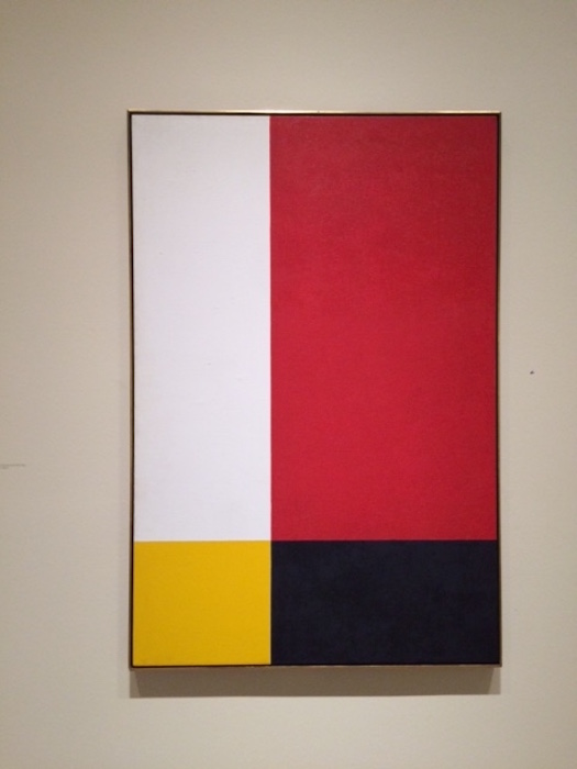
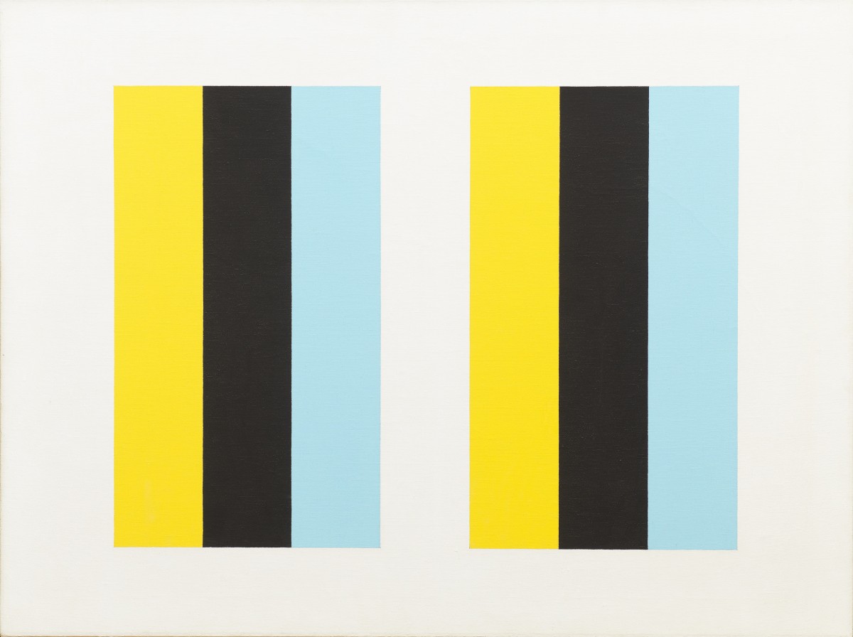

Ellsworth Kelly :
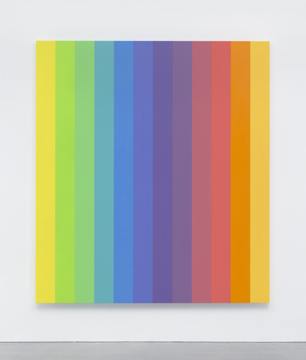

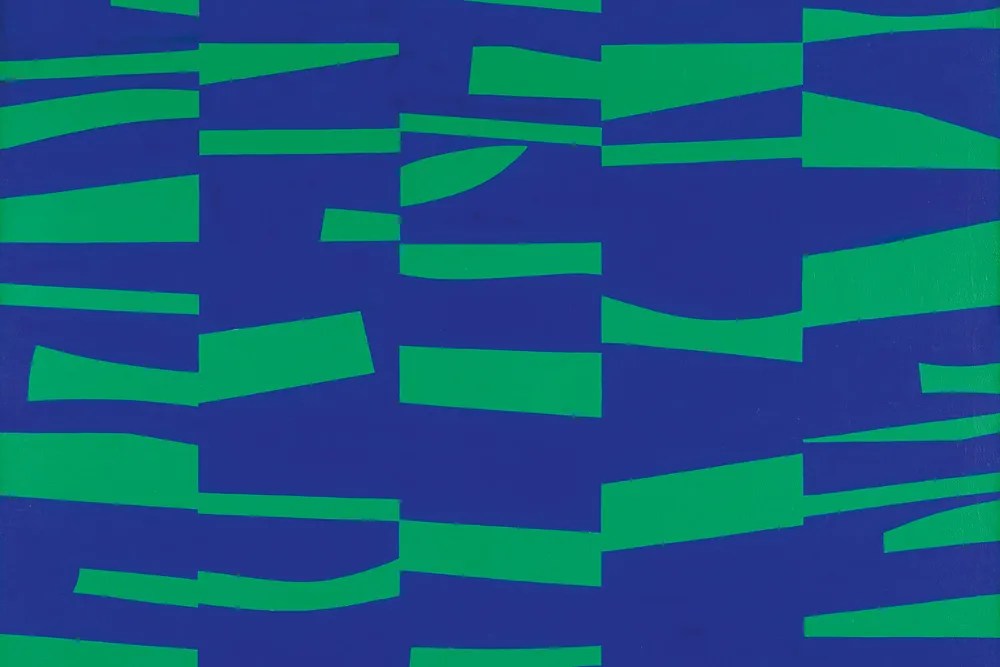

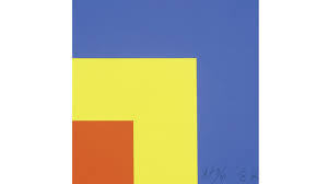
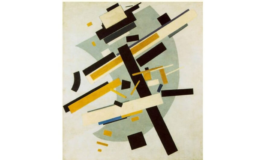
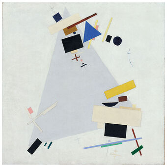
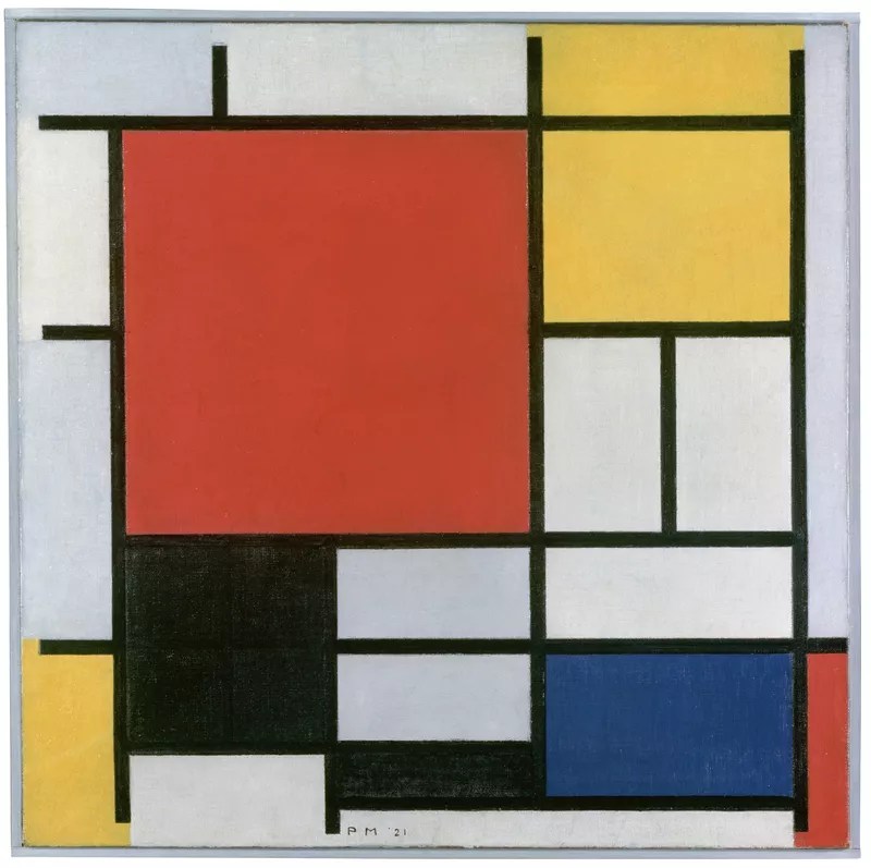
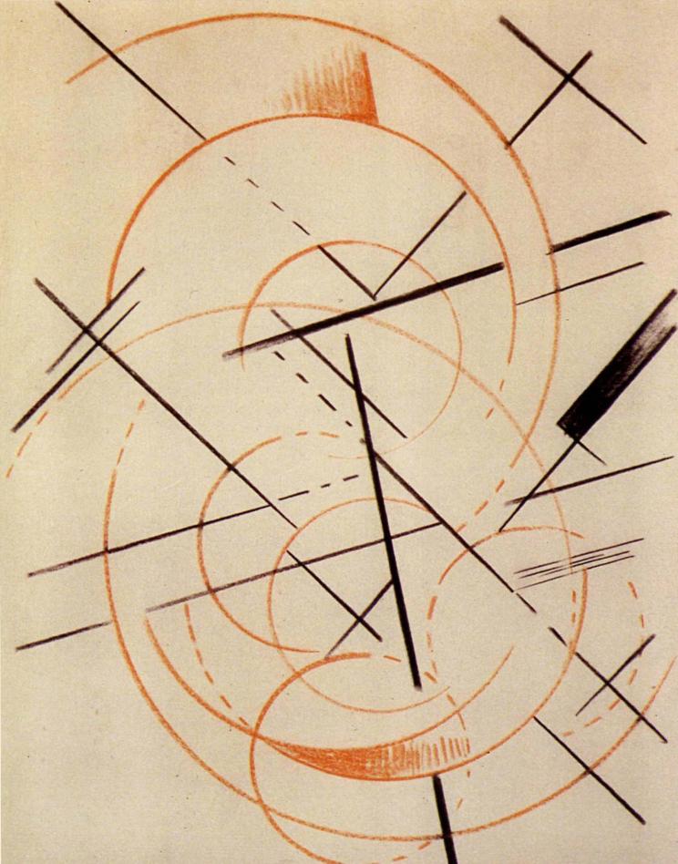
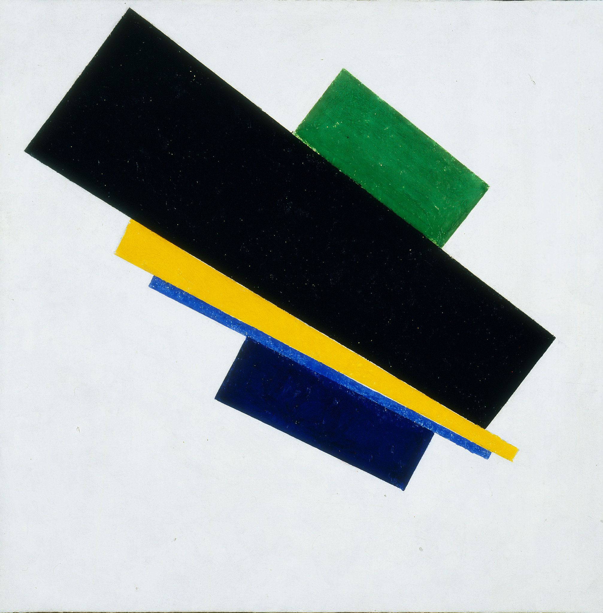
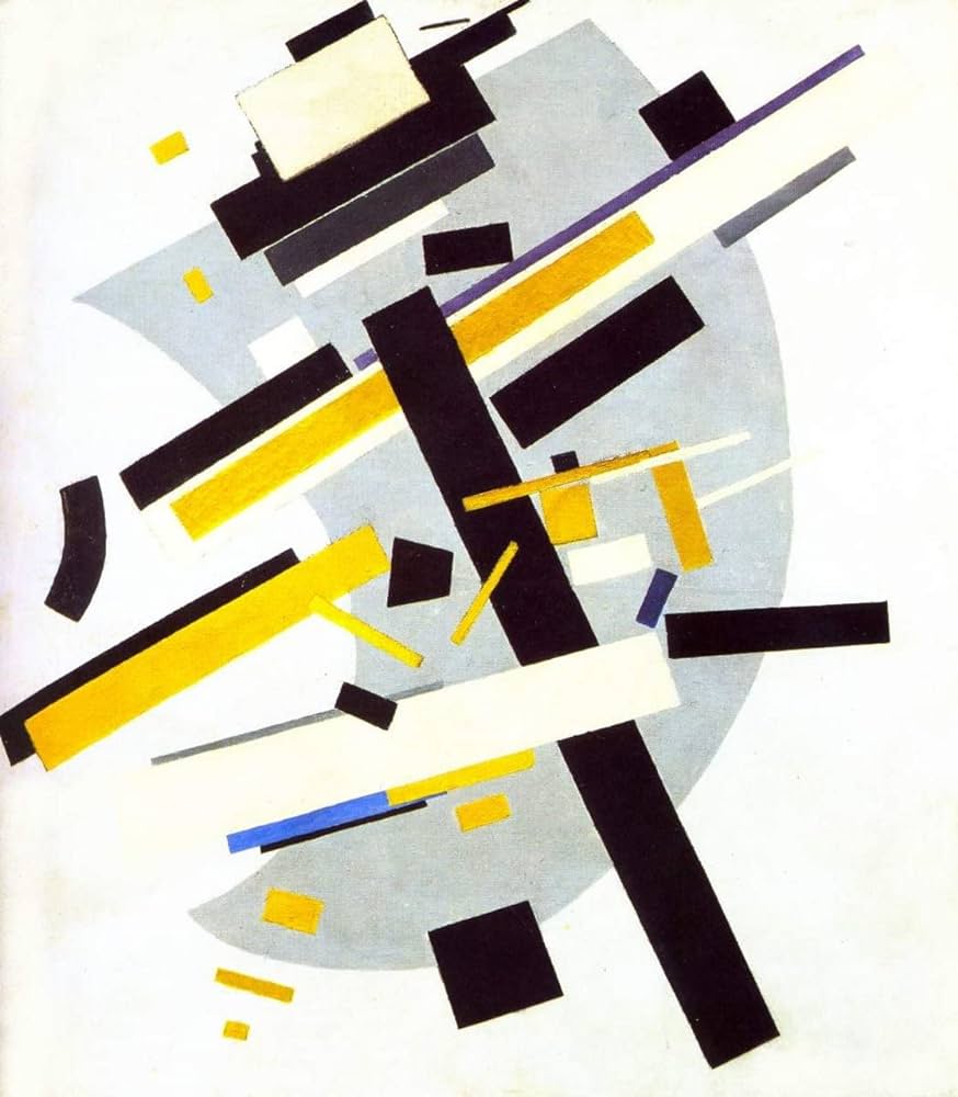
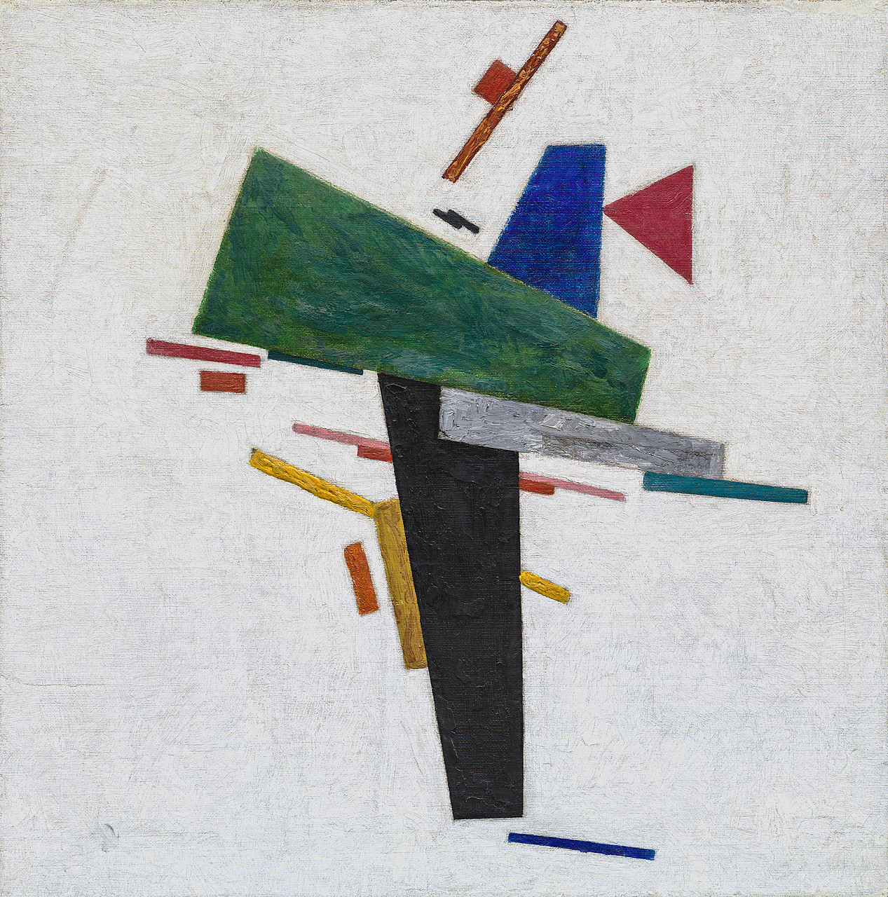
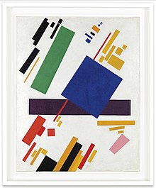
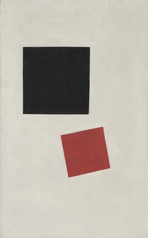
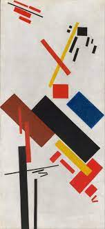
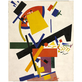
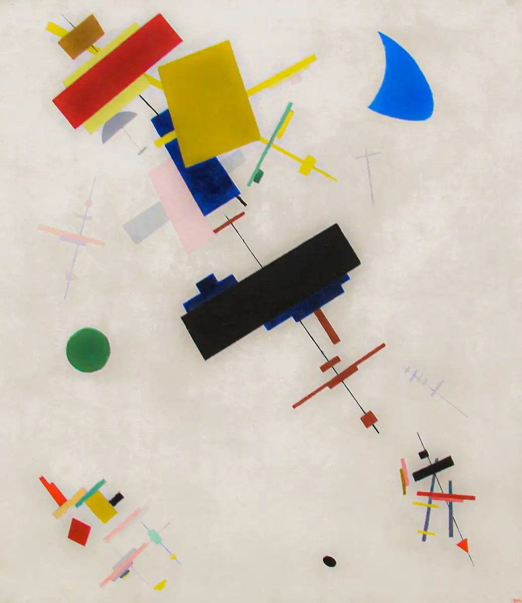
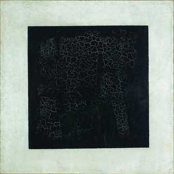
Kazimir Malevich :
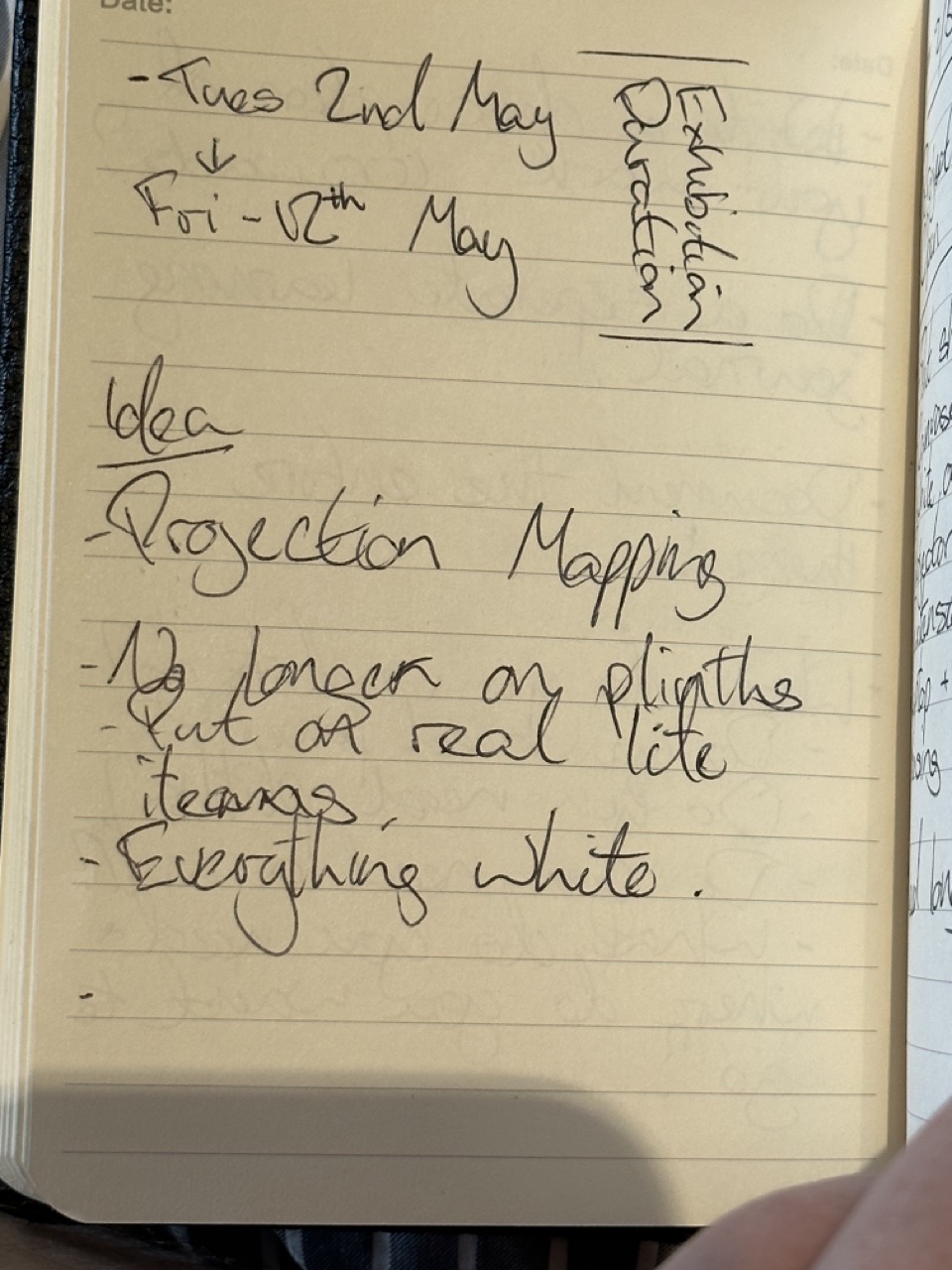
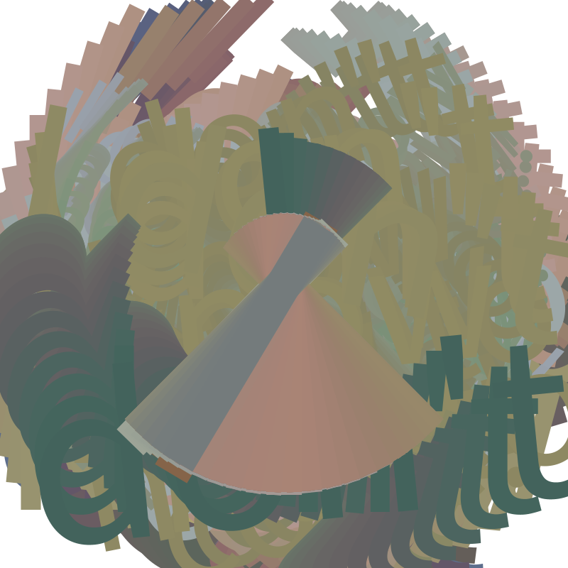
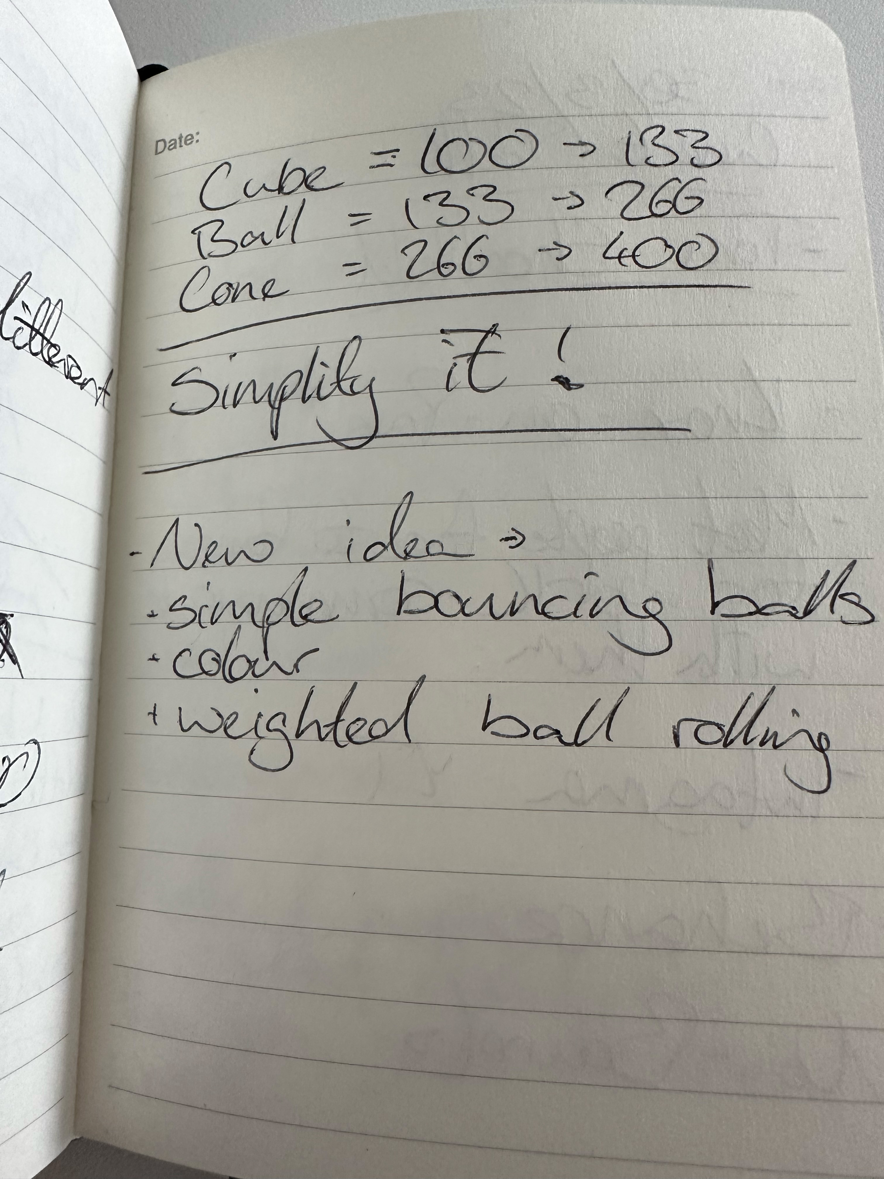
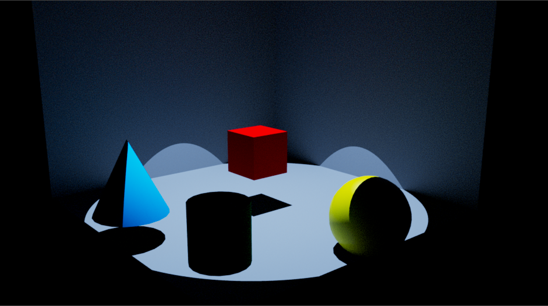
Concept :

The design is too complicated and with my current ability and time frame the initial design will either be too difficult or too time consuming. It has to be simplified.
Simplify the concept :
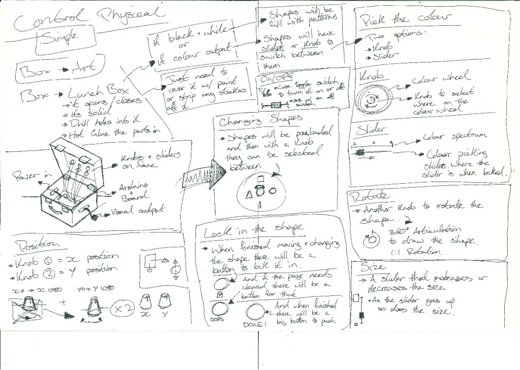
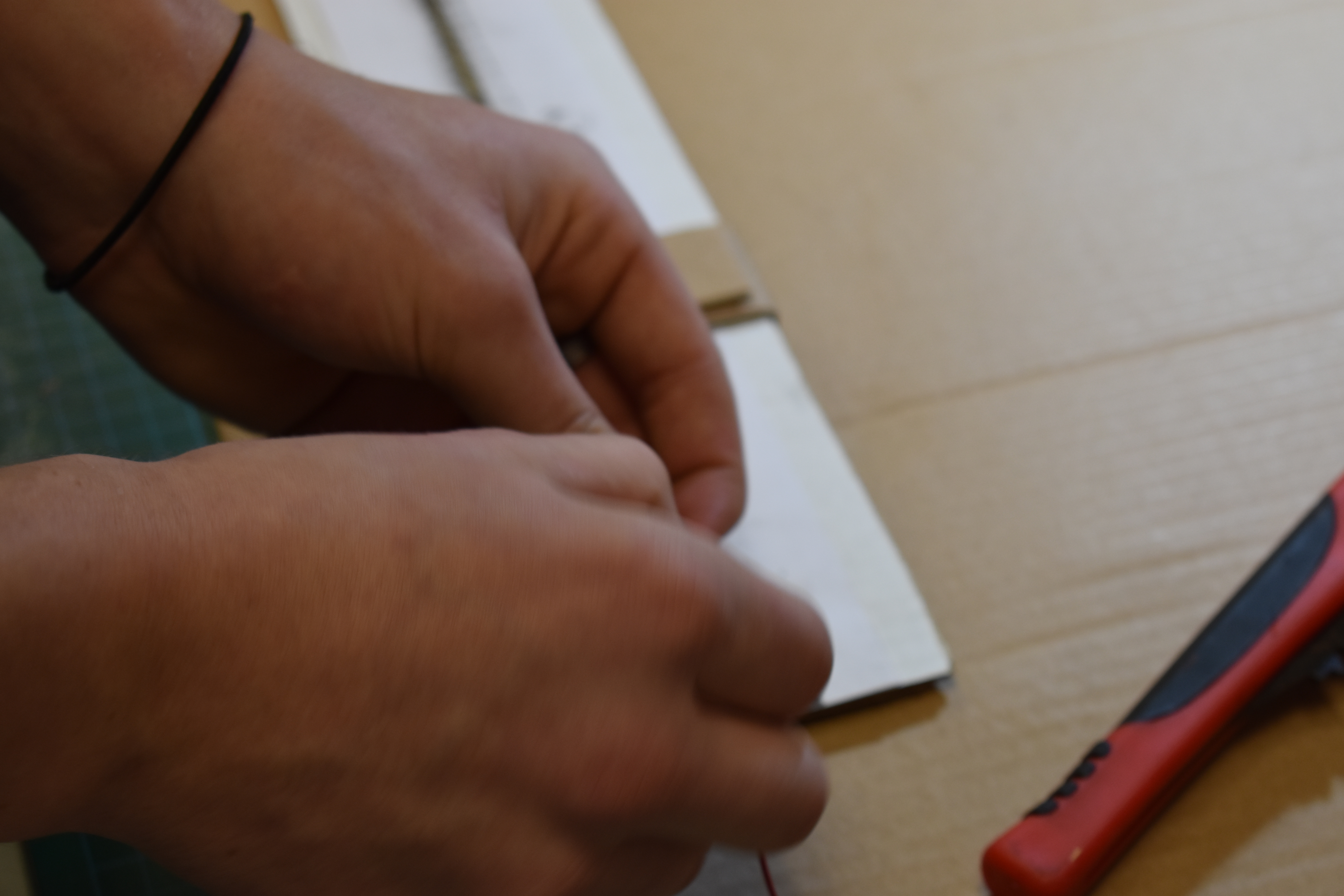
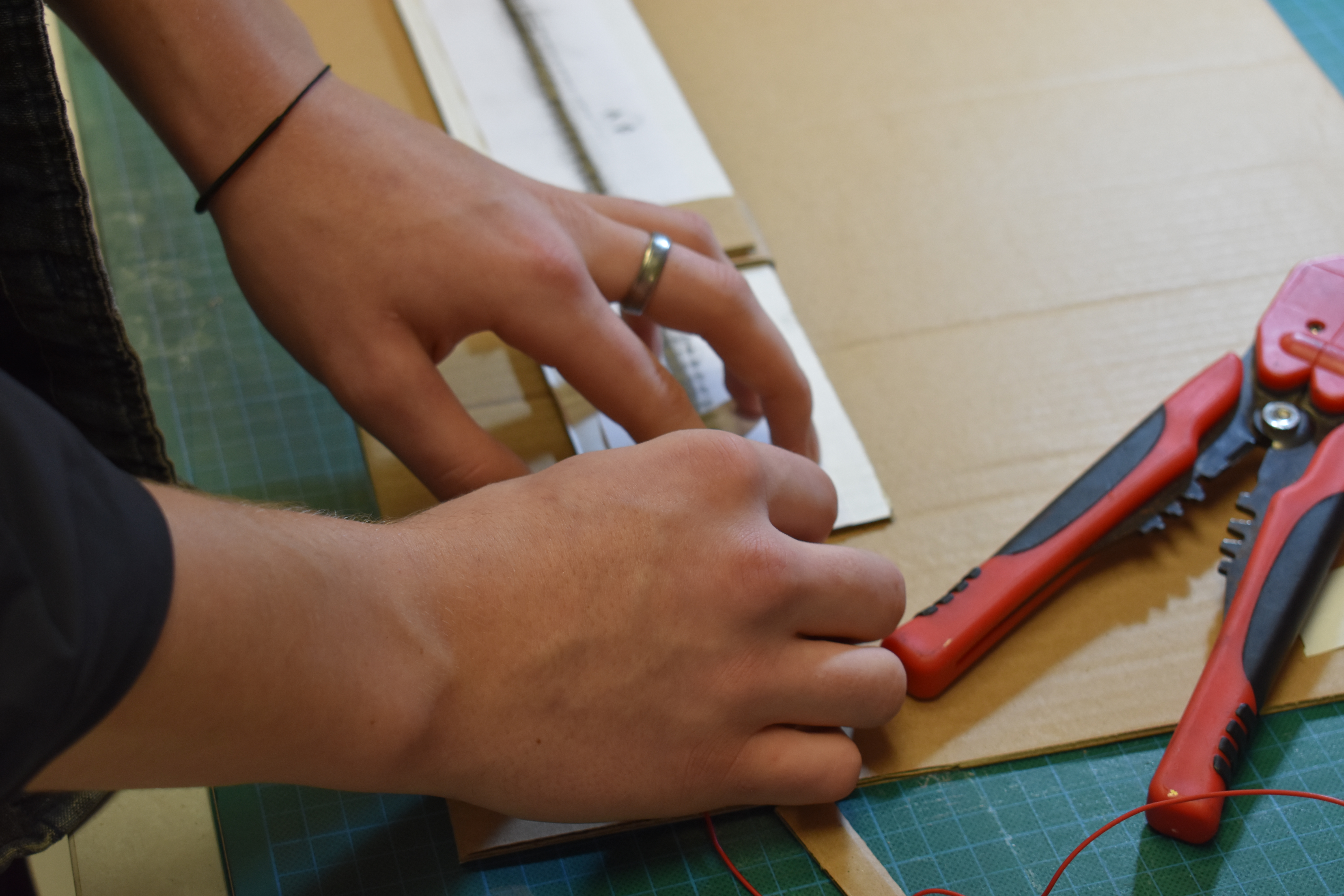
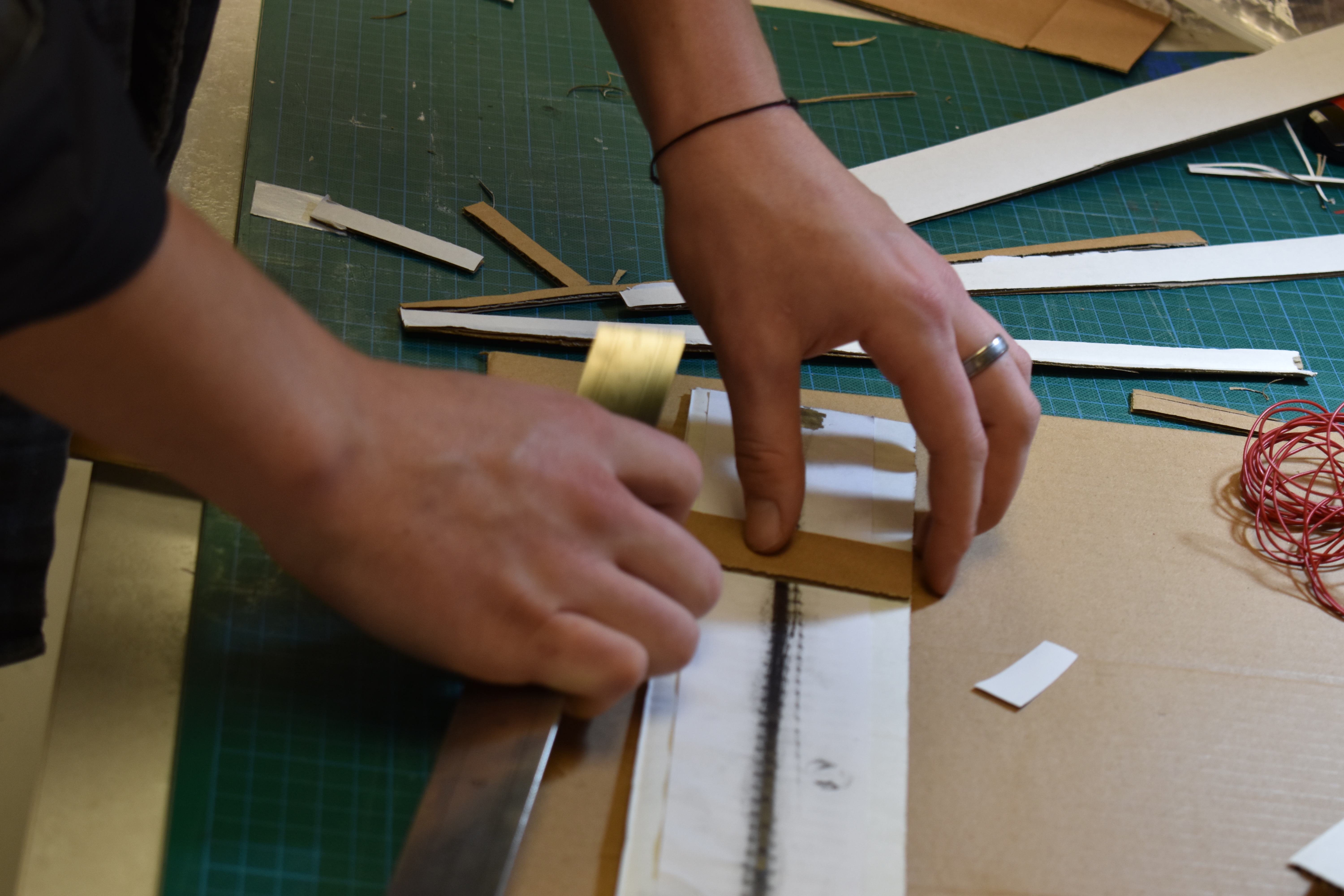
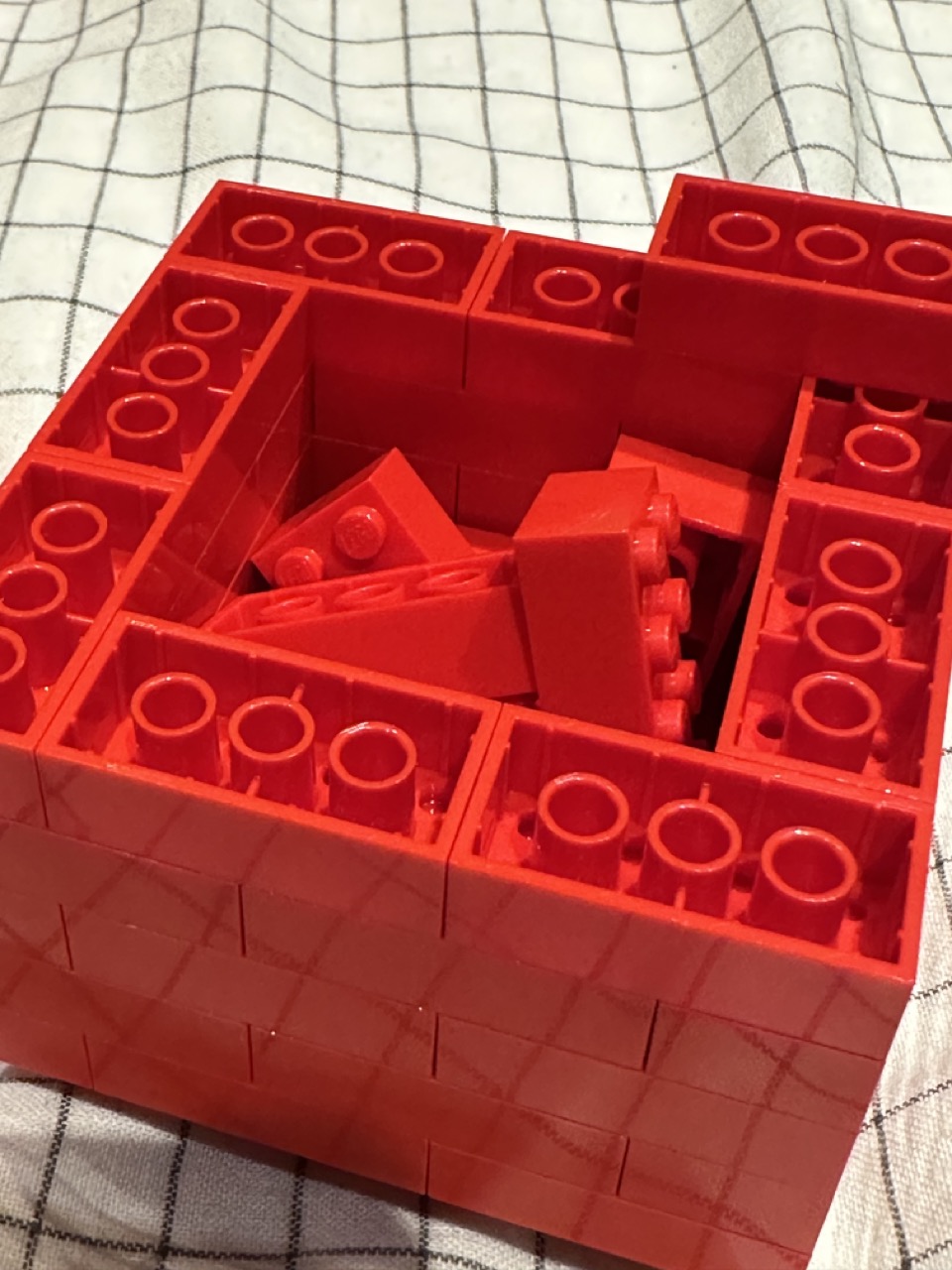
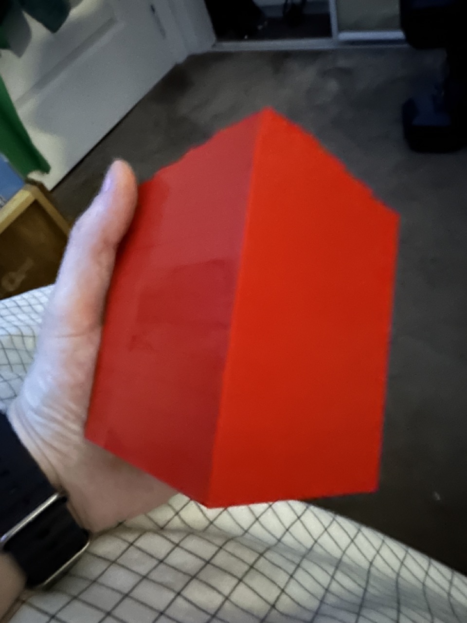
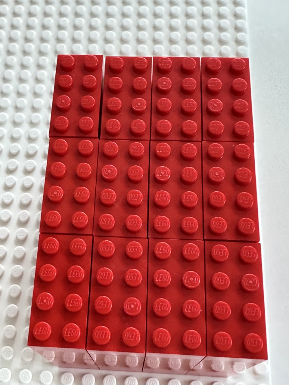
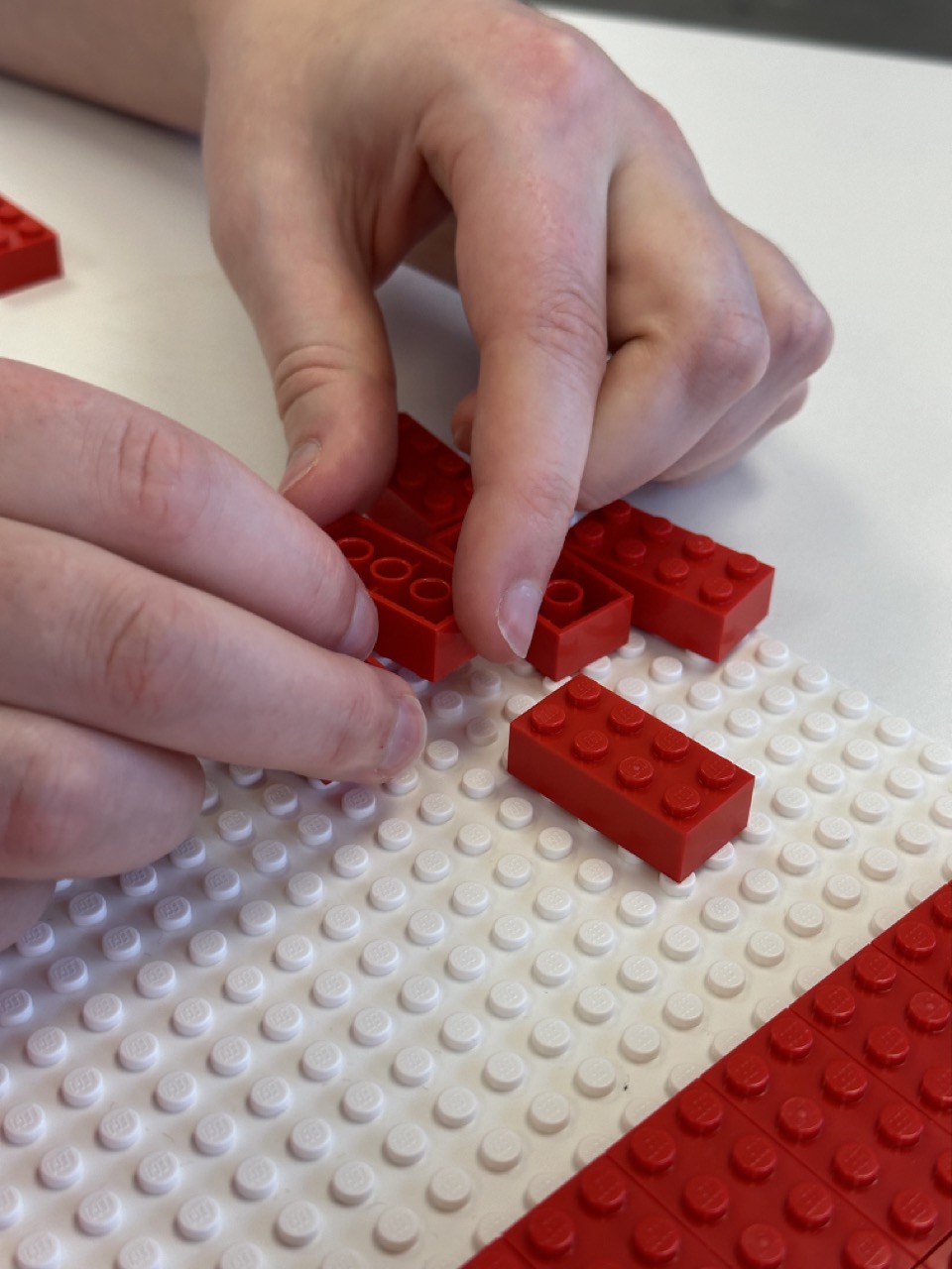
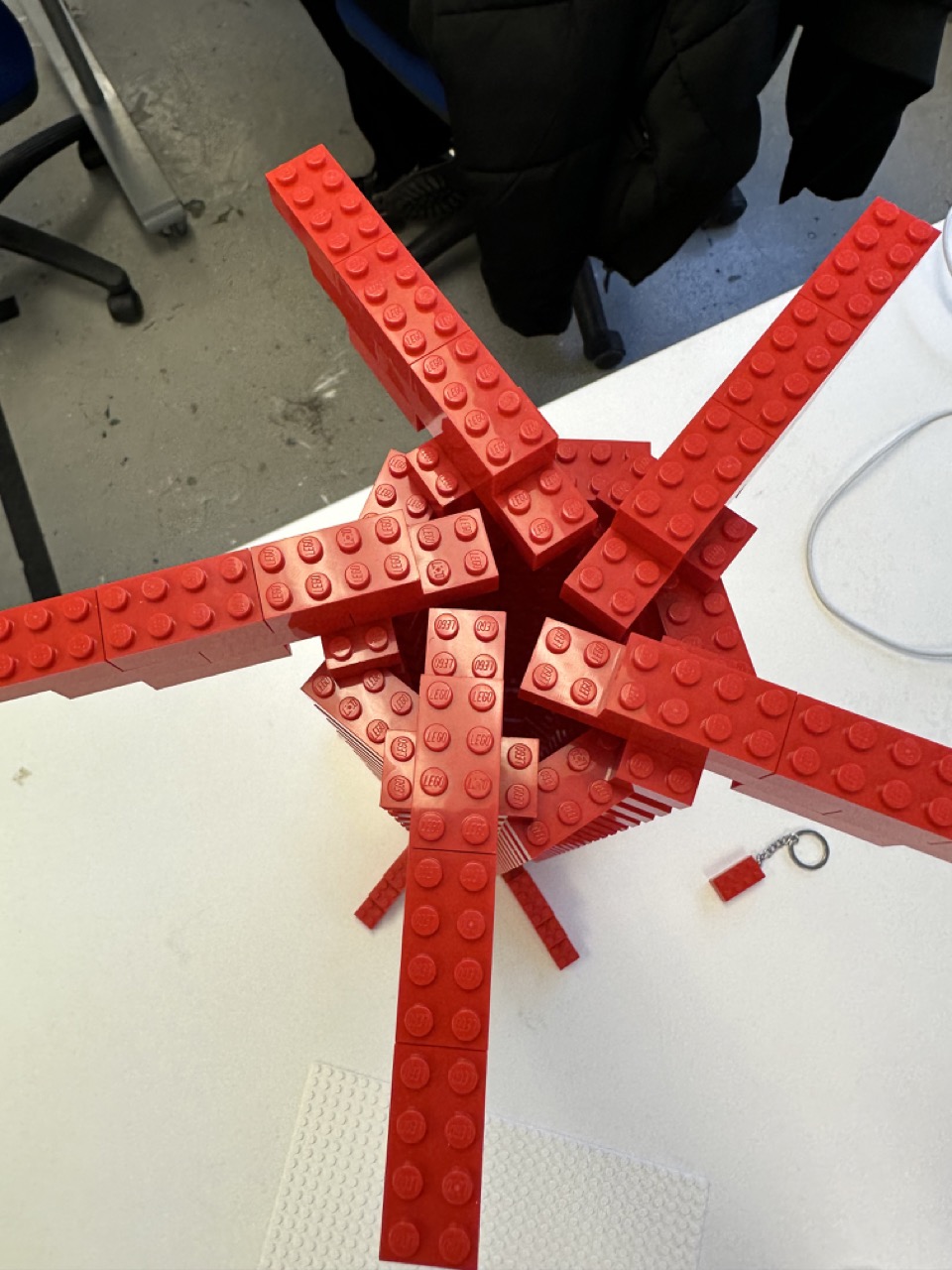
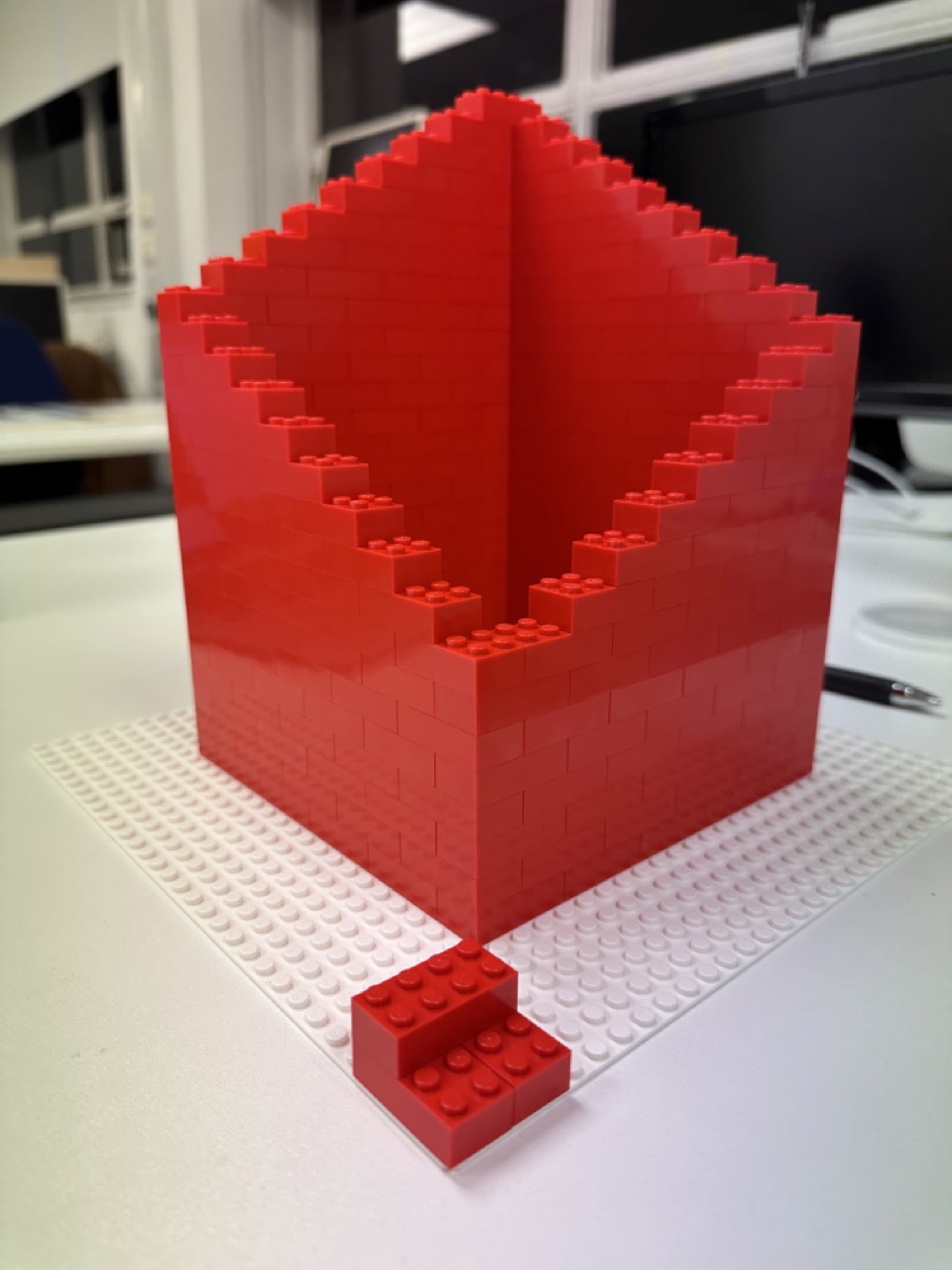
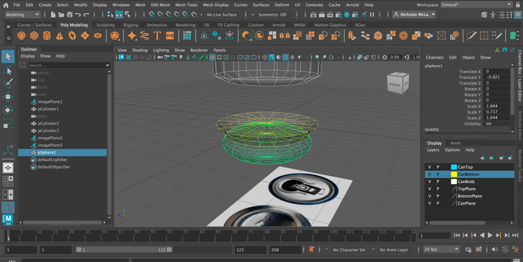
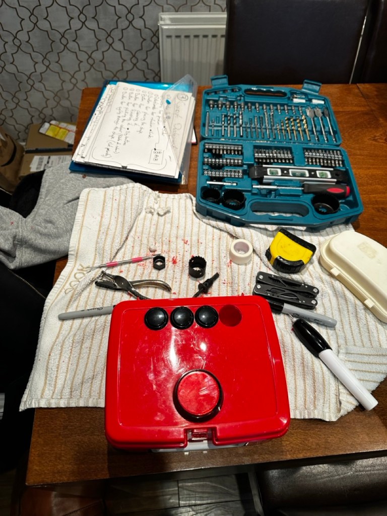
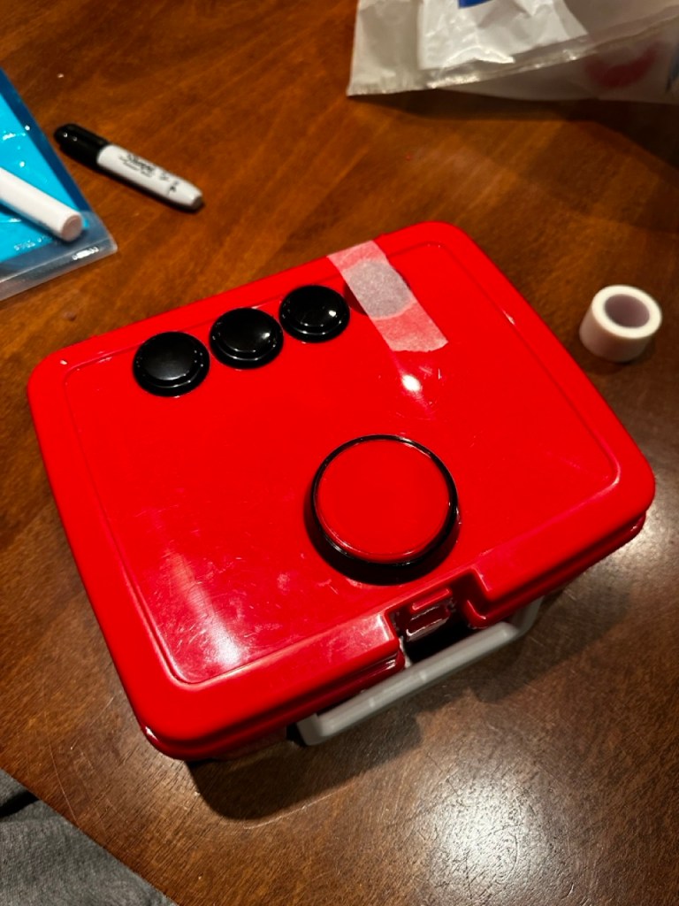
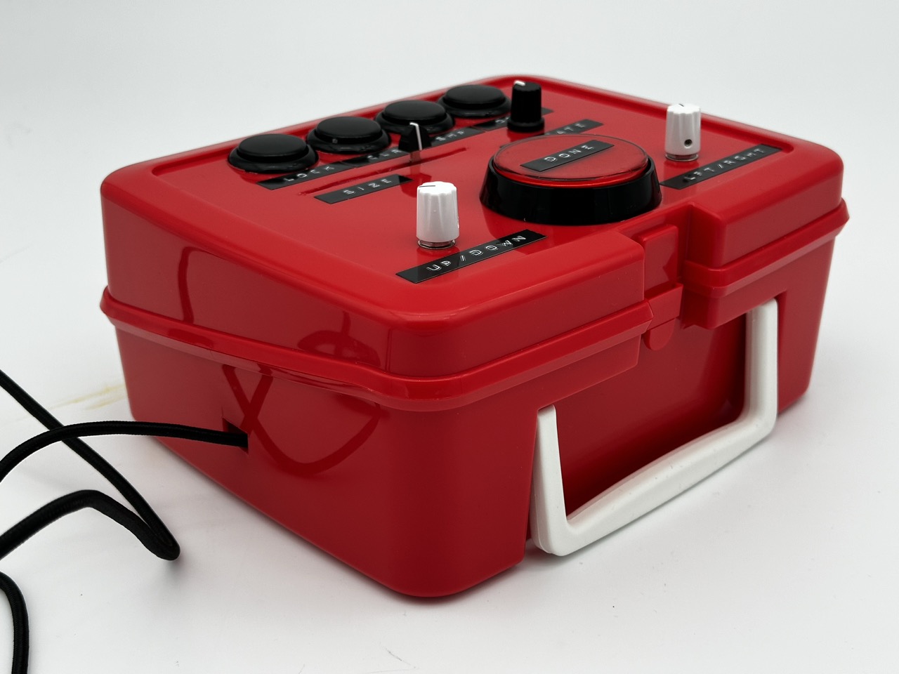
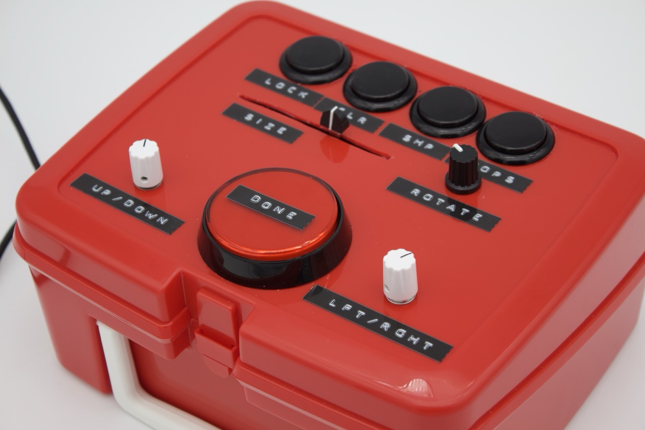
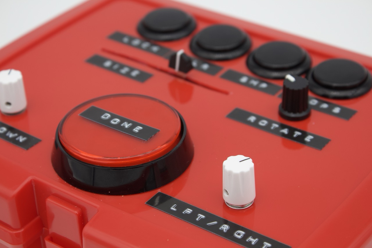
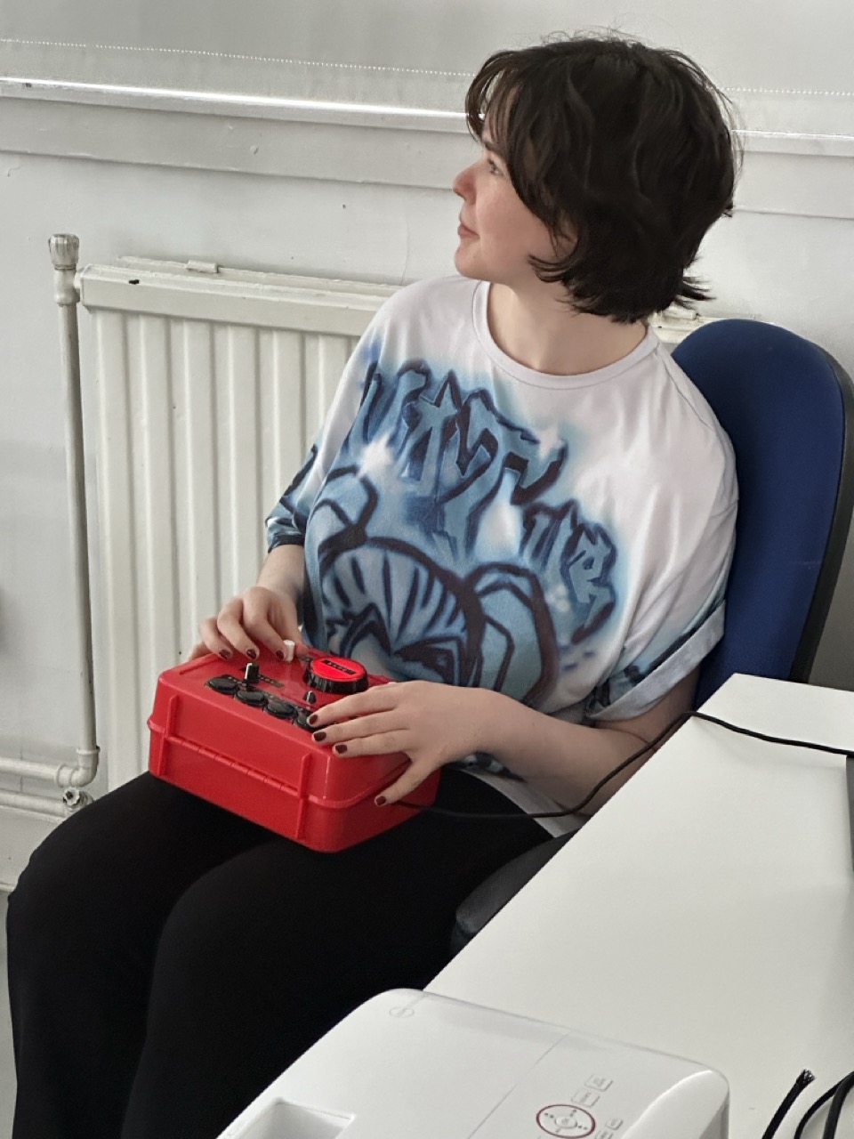
To save time cost and manufacturing I’ll be using a simple lunch box for the body, it can be opened and closed in ease and thew hard plastic body will be secure enough to work with/on.
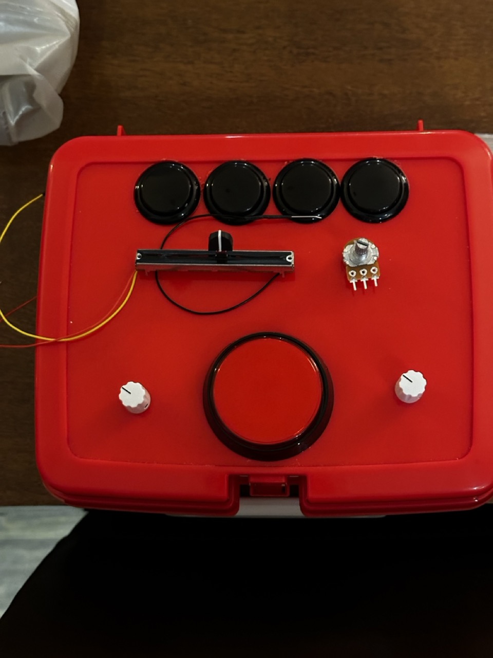
For the shape position on the controller I’ve removed the the joystick and went for a simpler two knob control system like an etch a sketch.
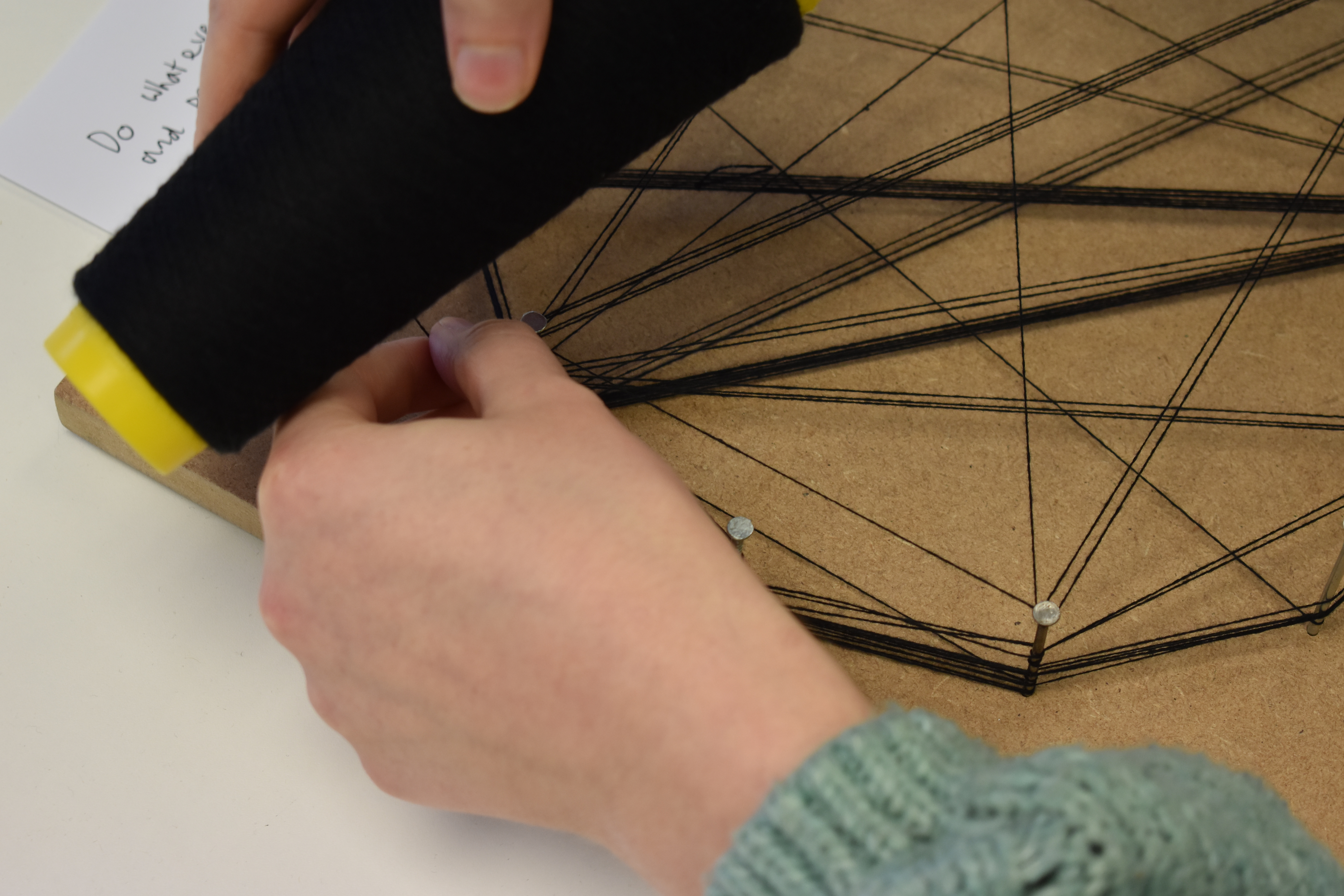
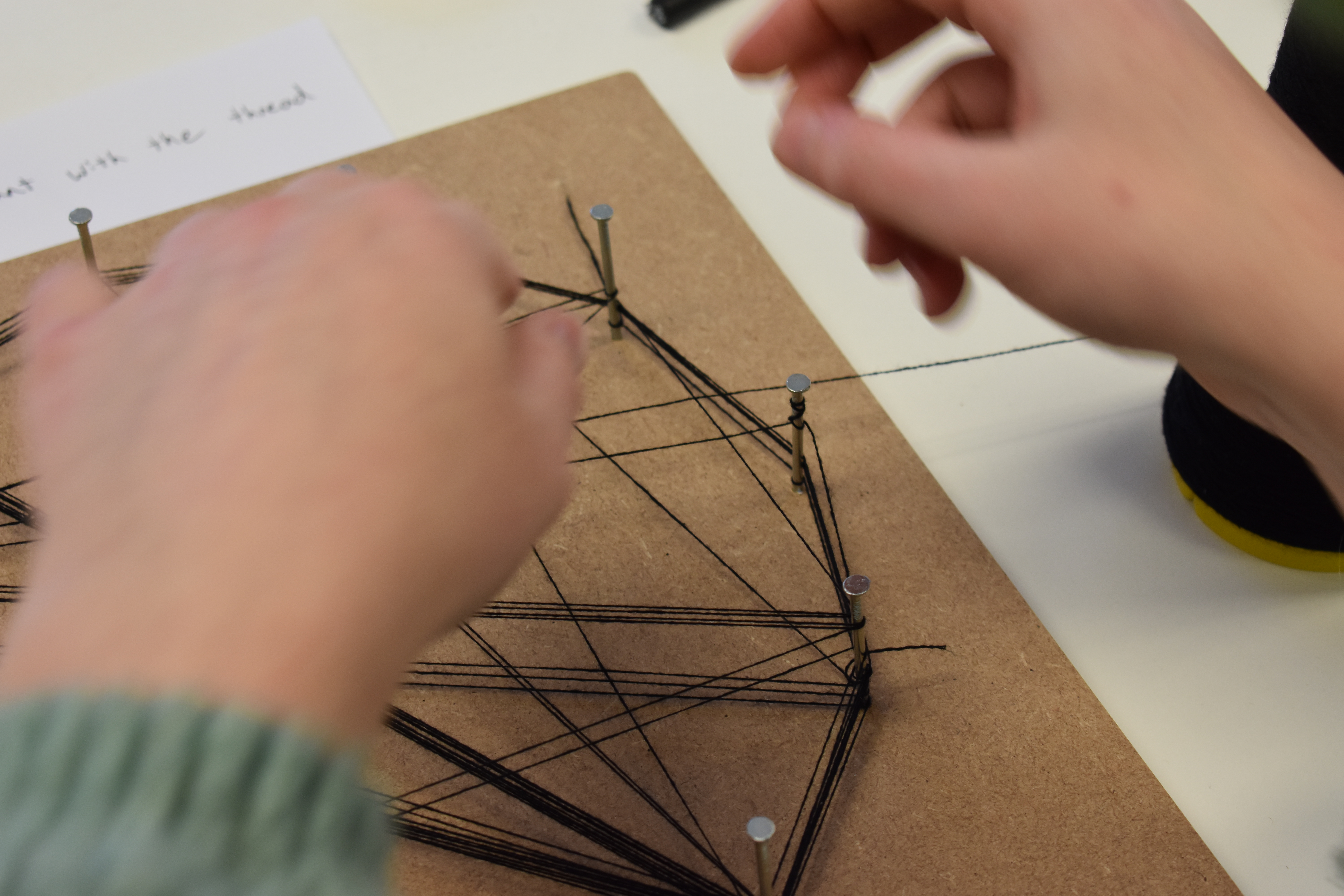
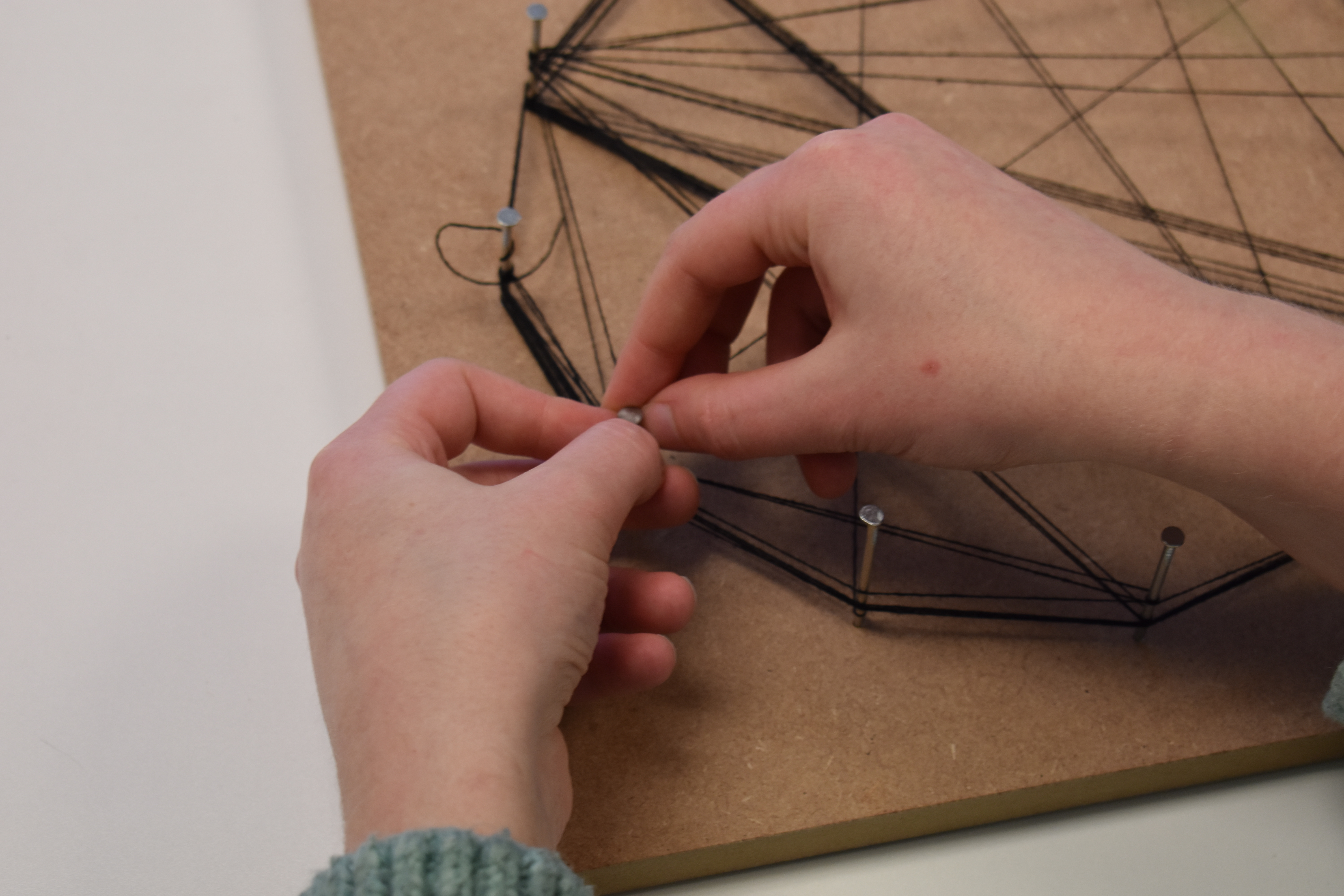
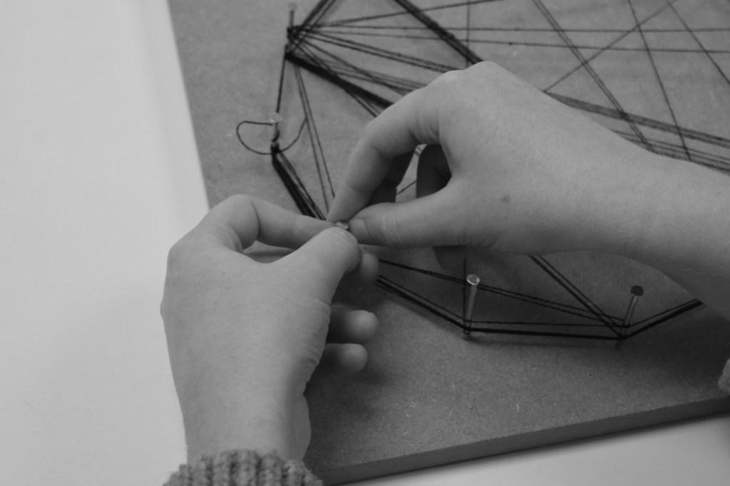
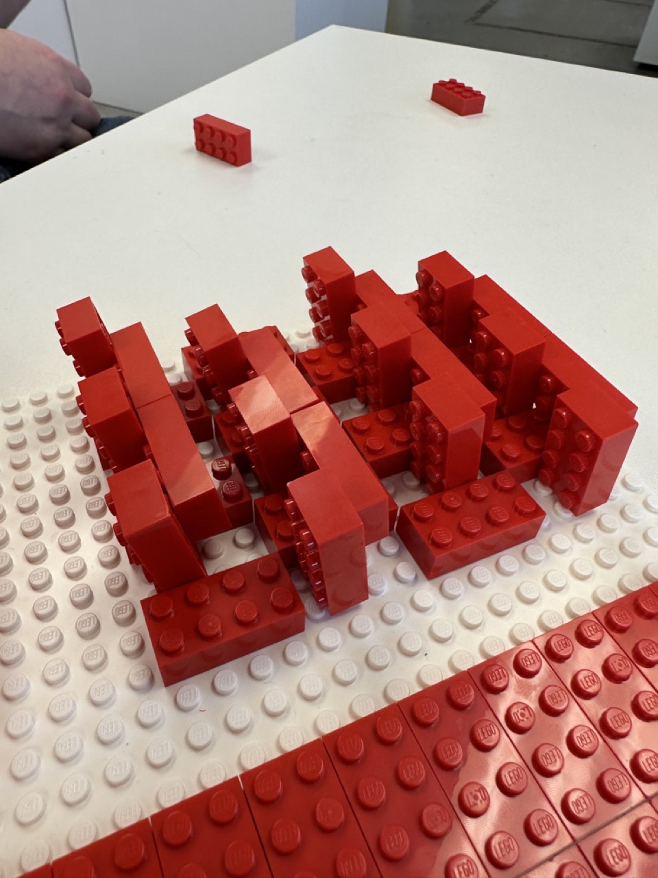
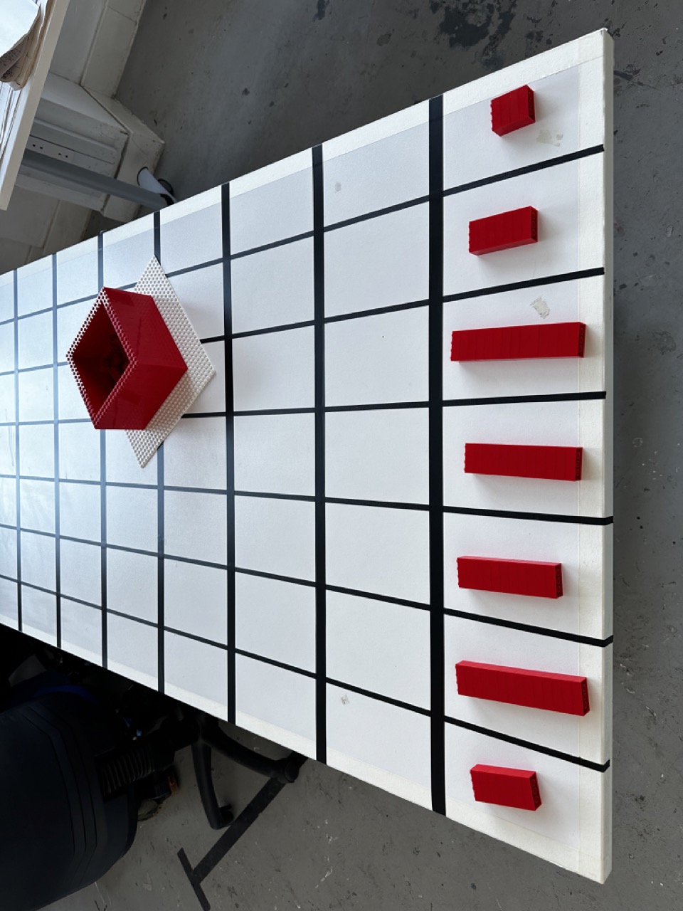
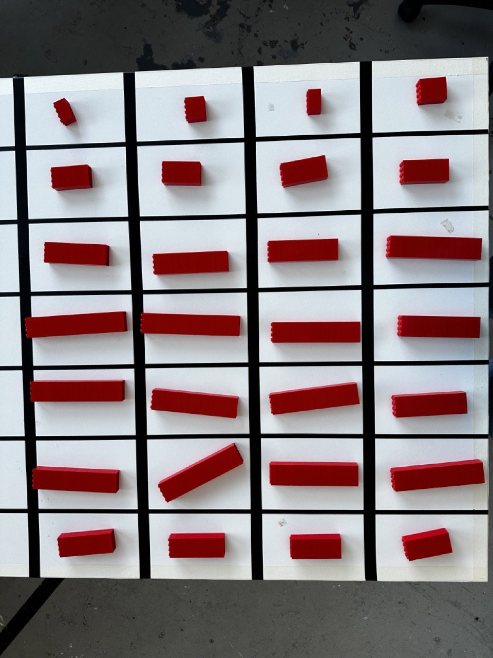
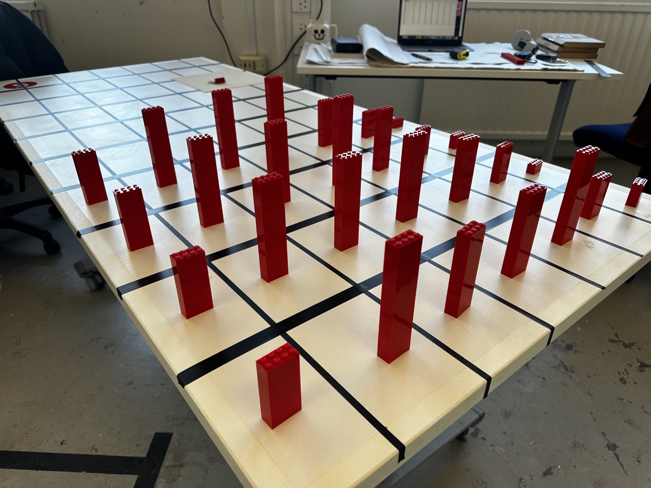
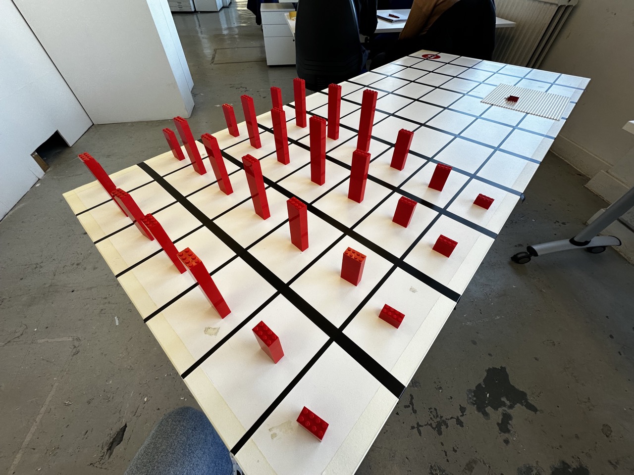
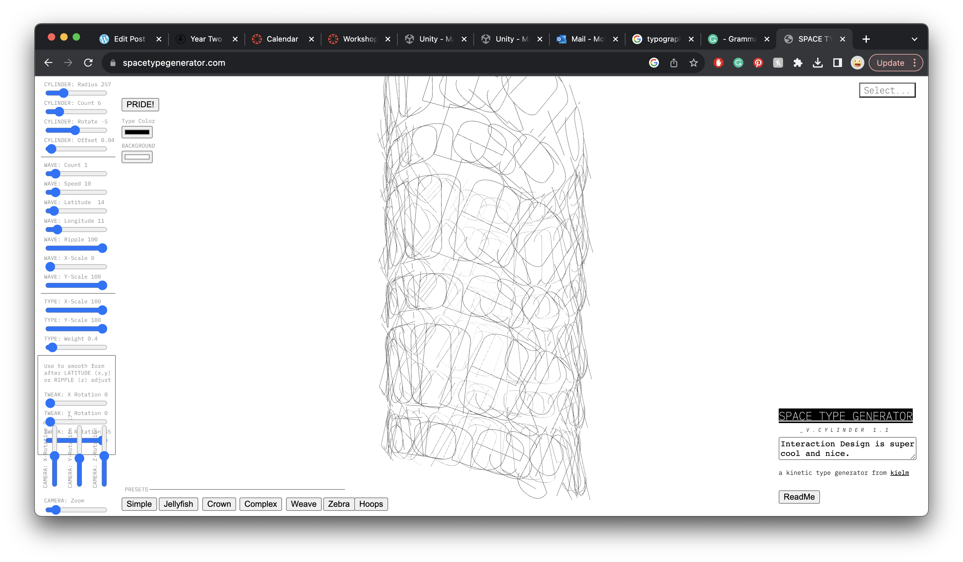
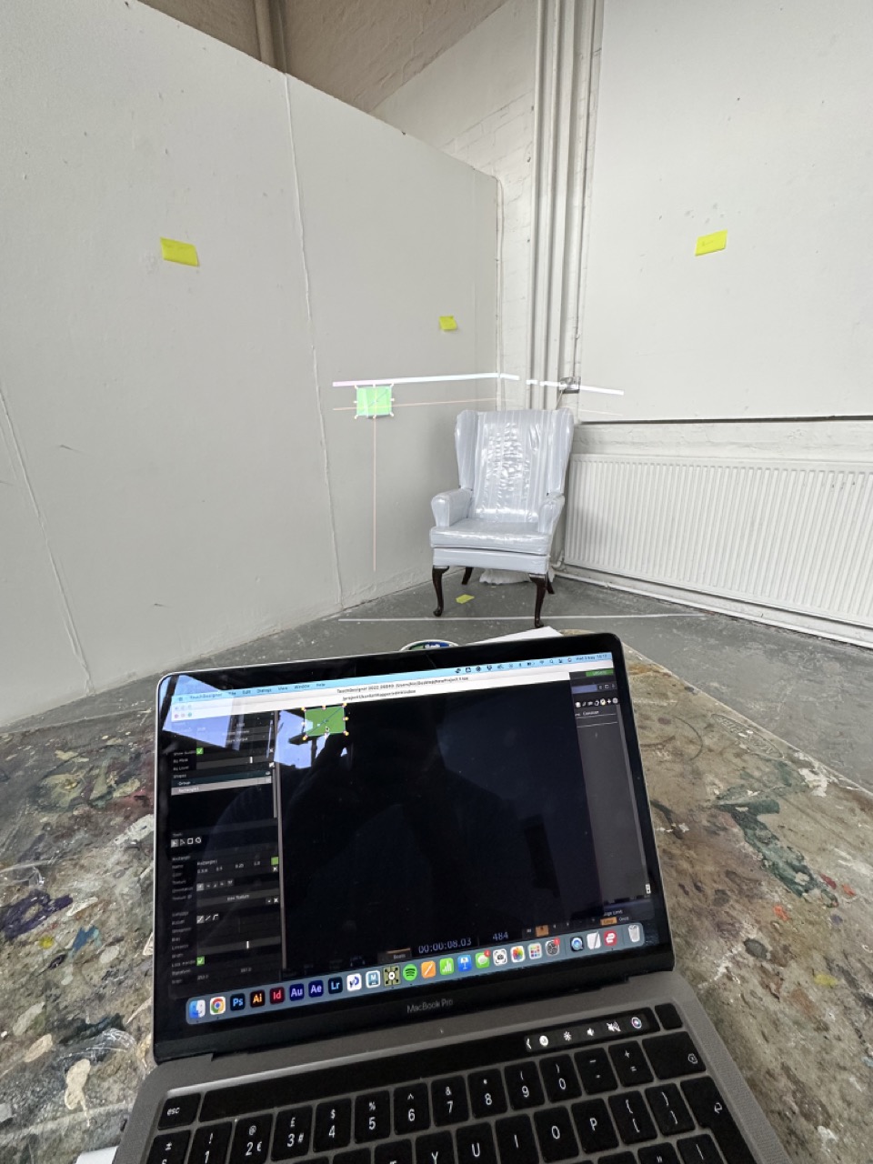
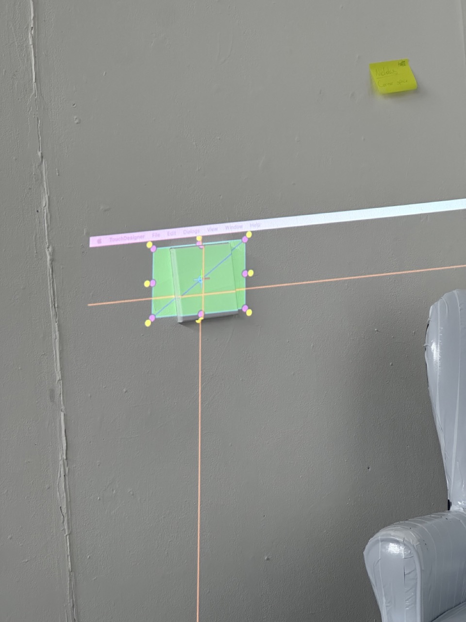
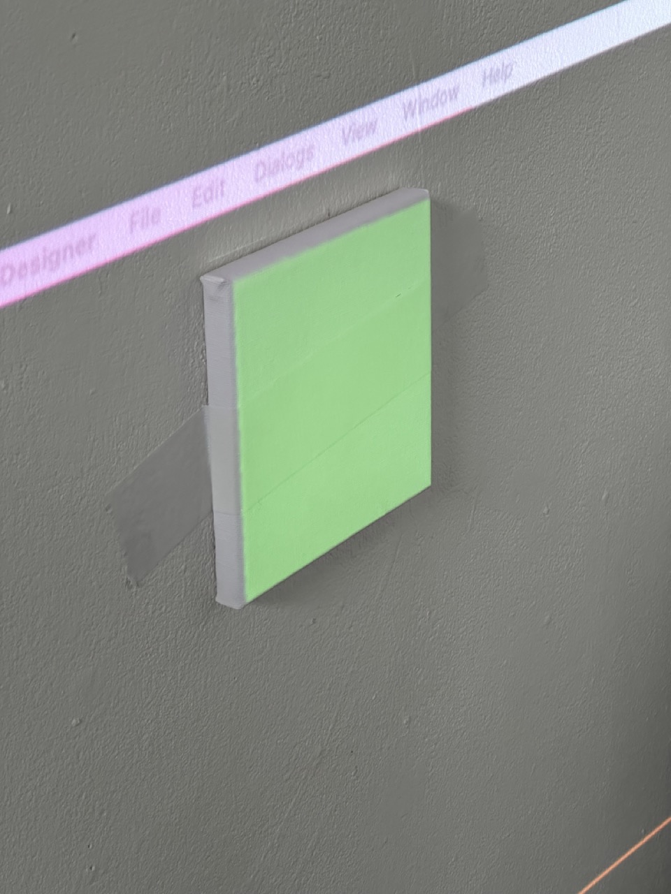
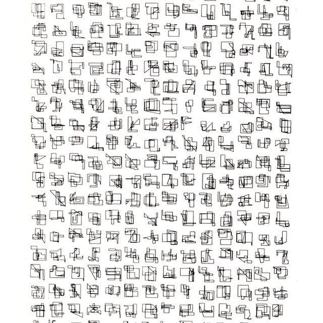
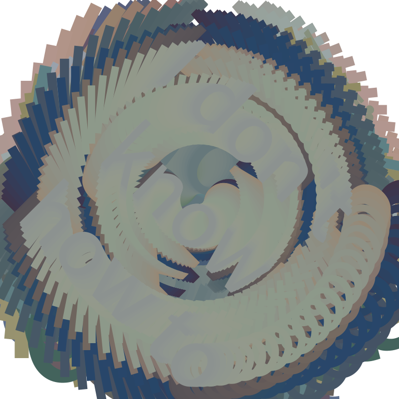
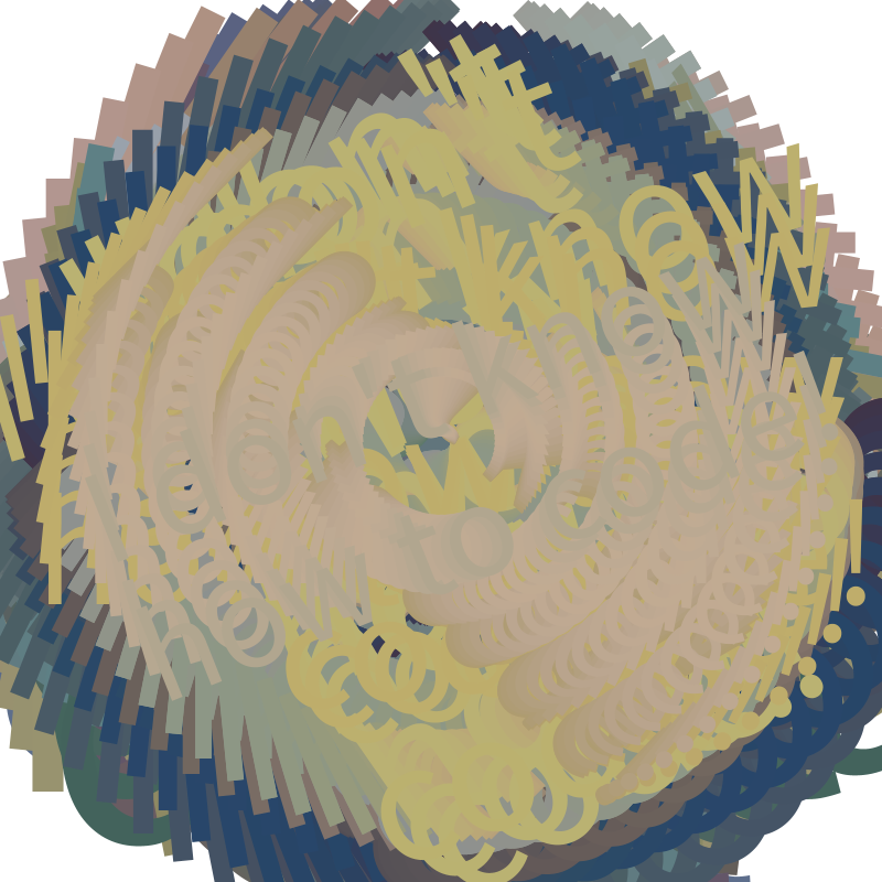
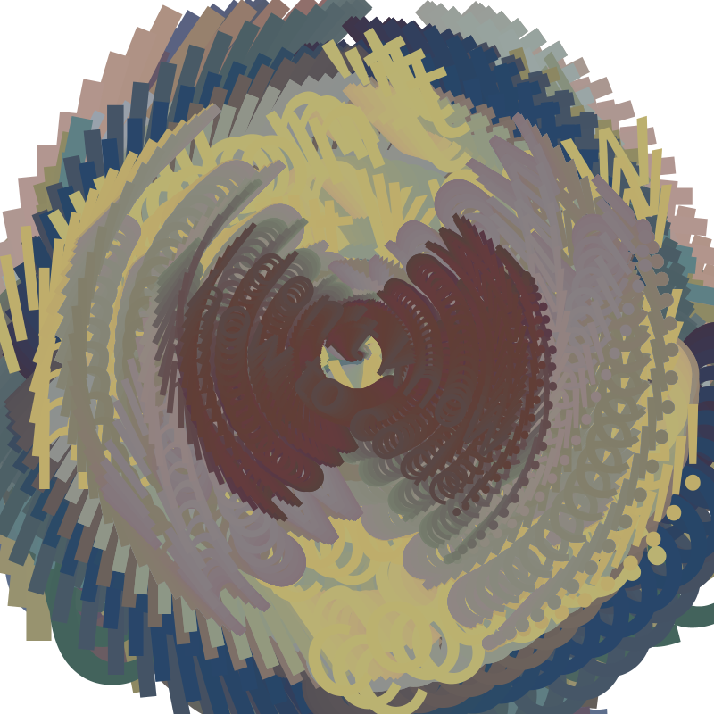
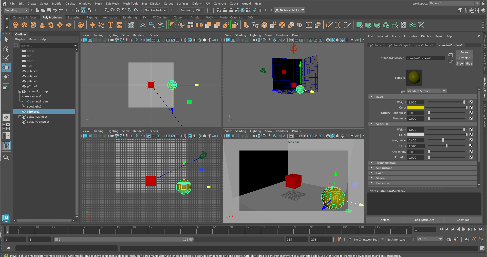
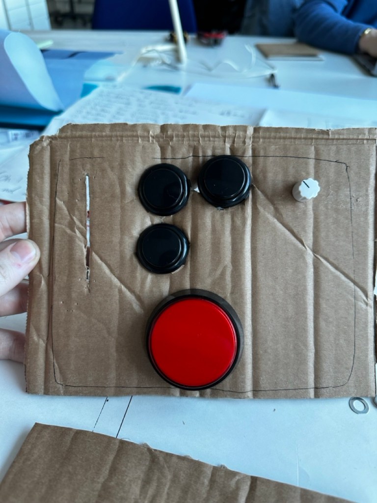
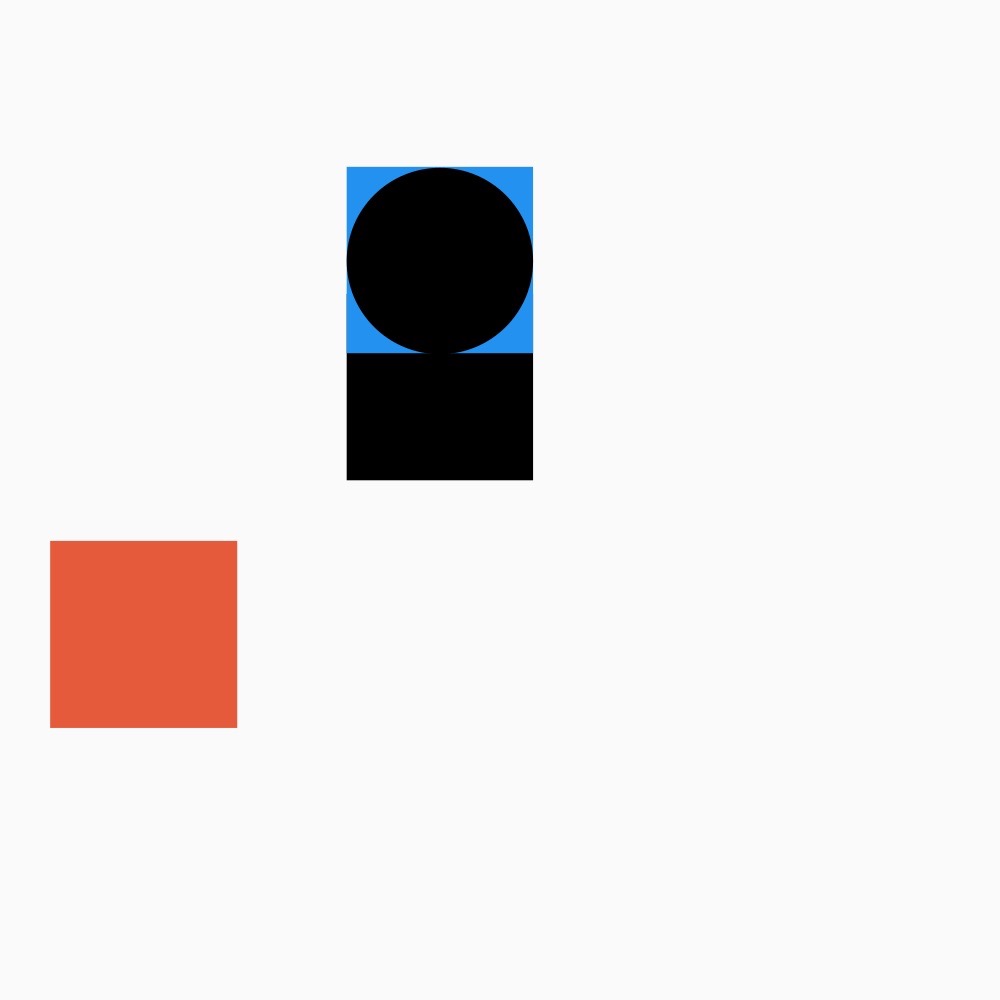
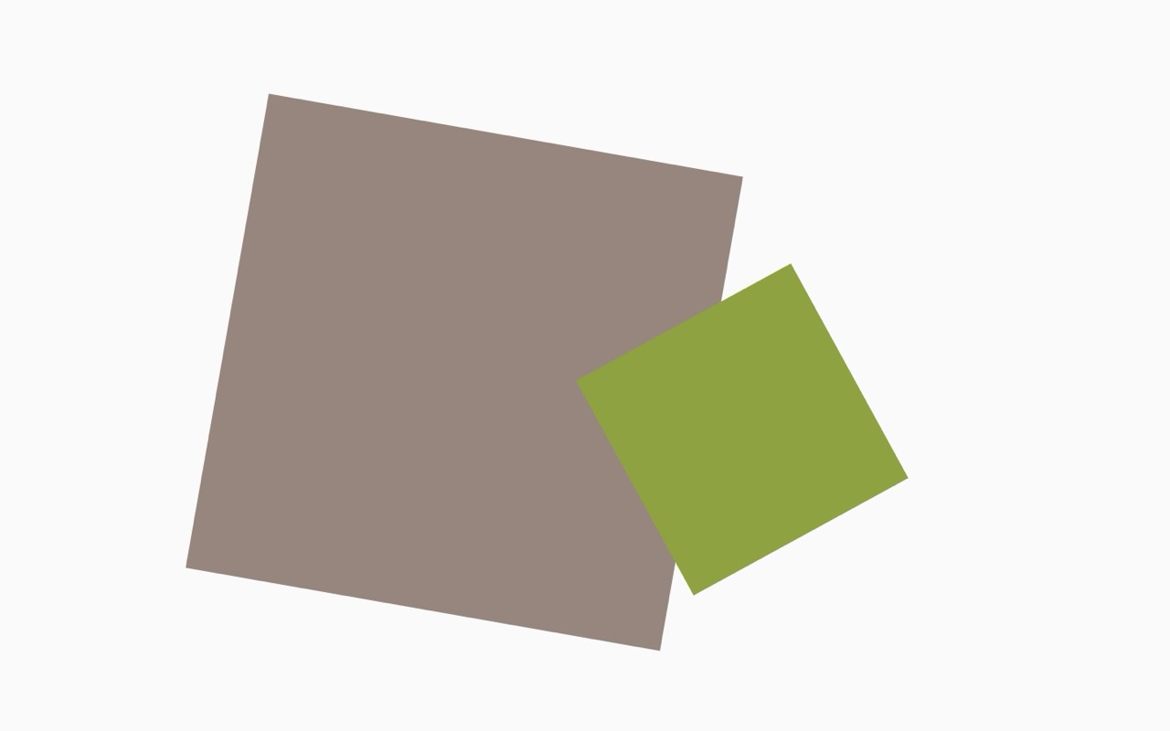
Button Layout Test :


For the XY of placing the square I
Components :
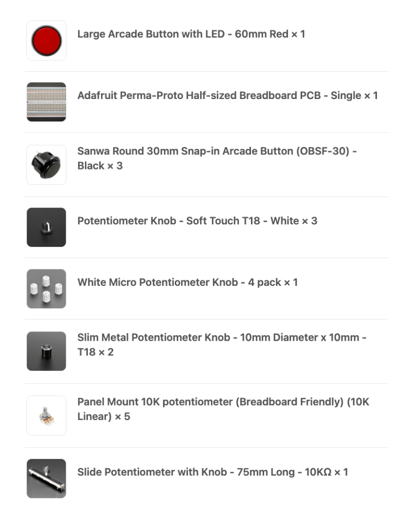
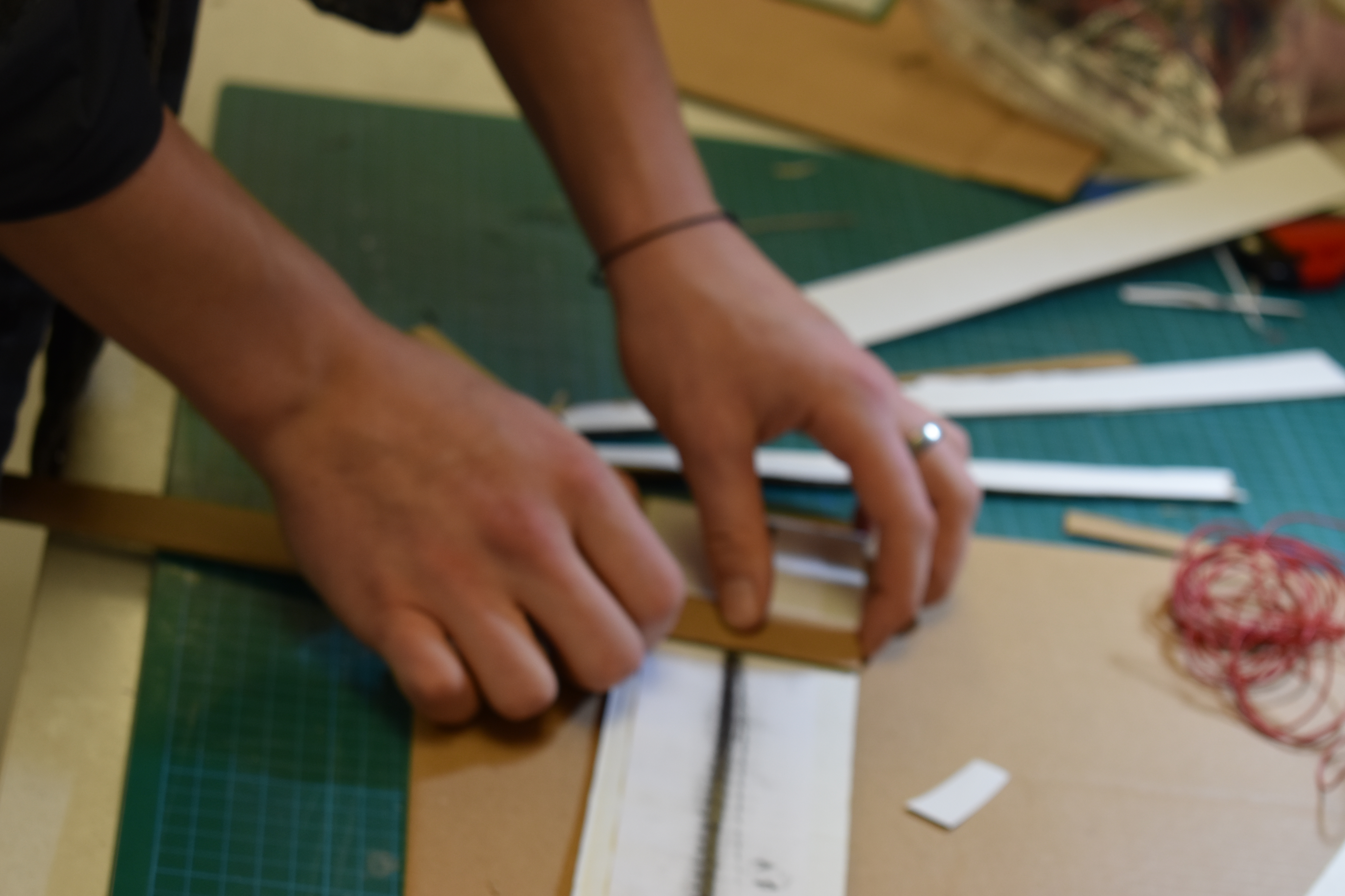
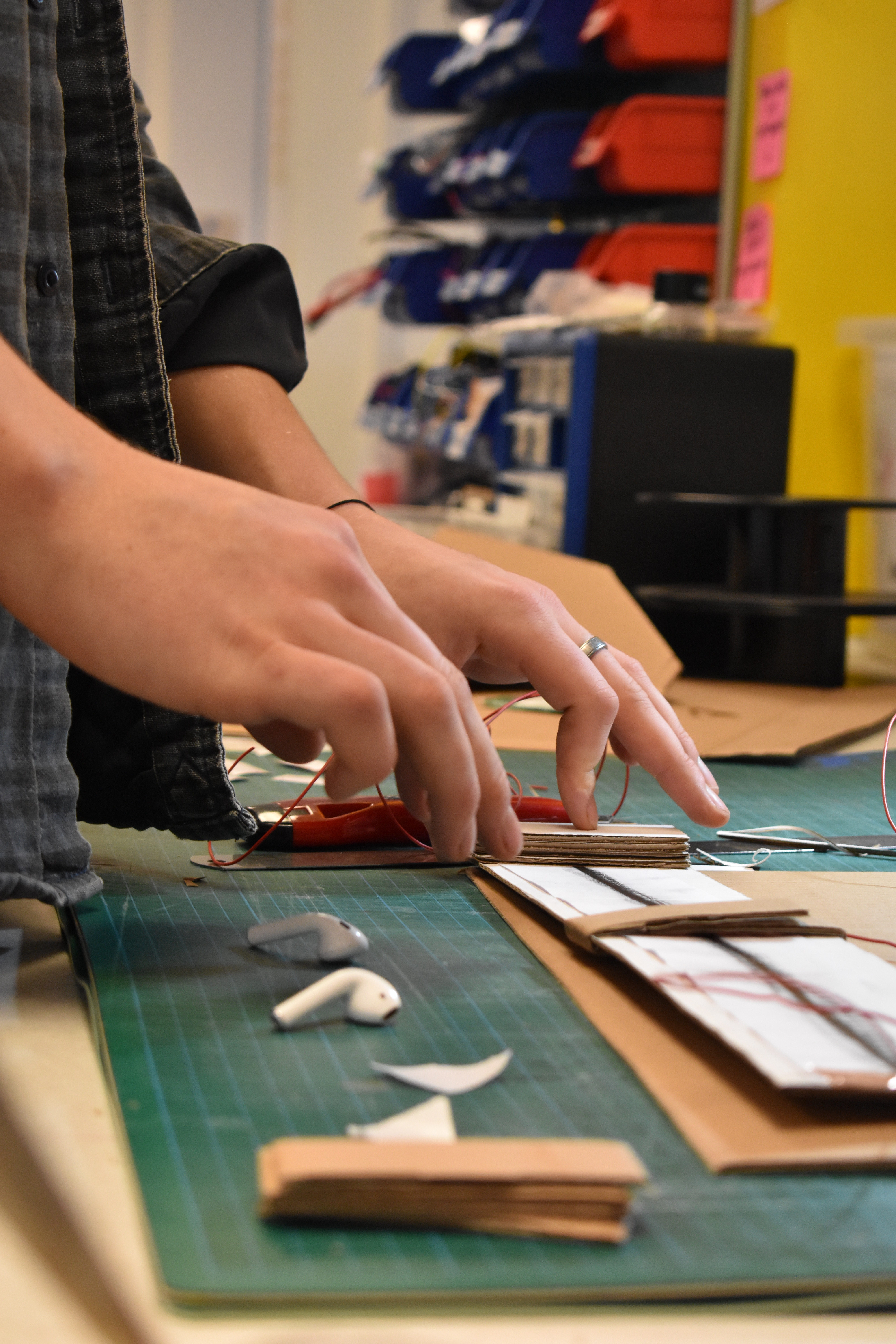
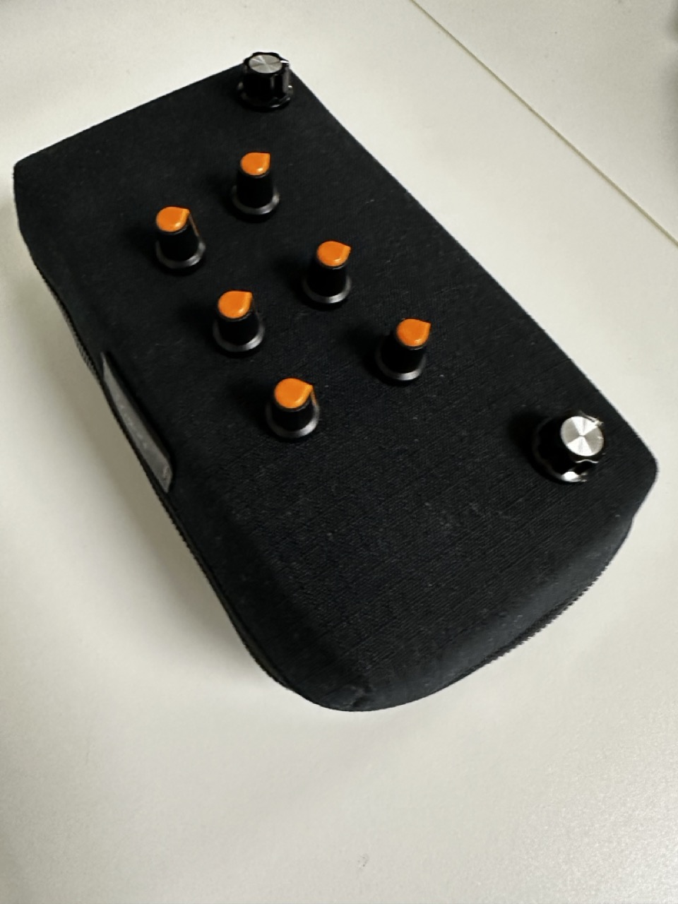
The components have been ordered and hopefully all sorted so that they can be soldered and all i have to do is put them into the lunch box.
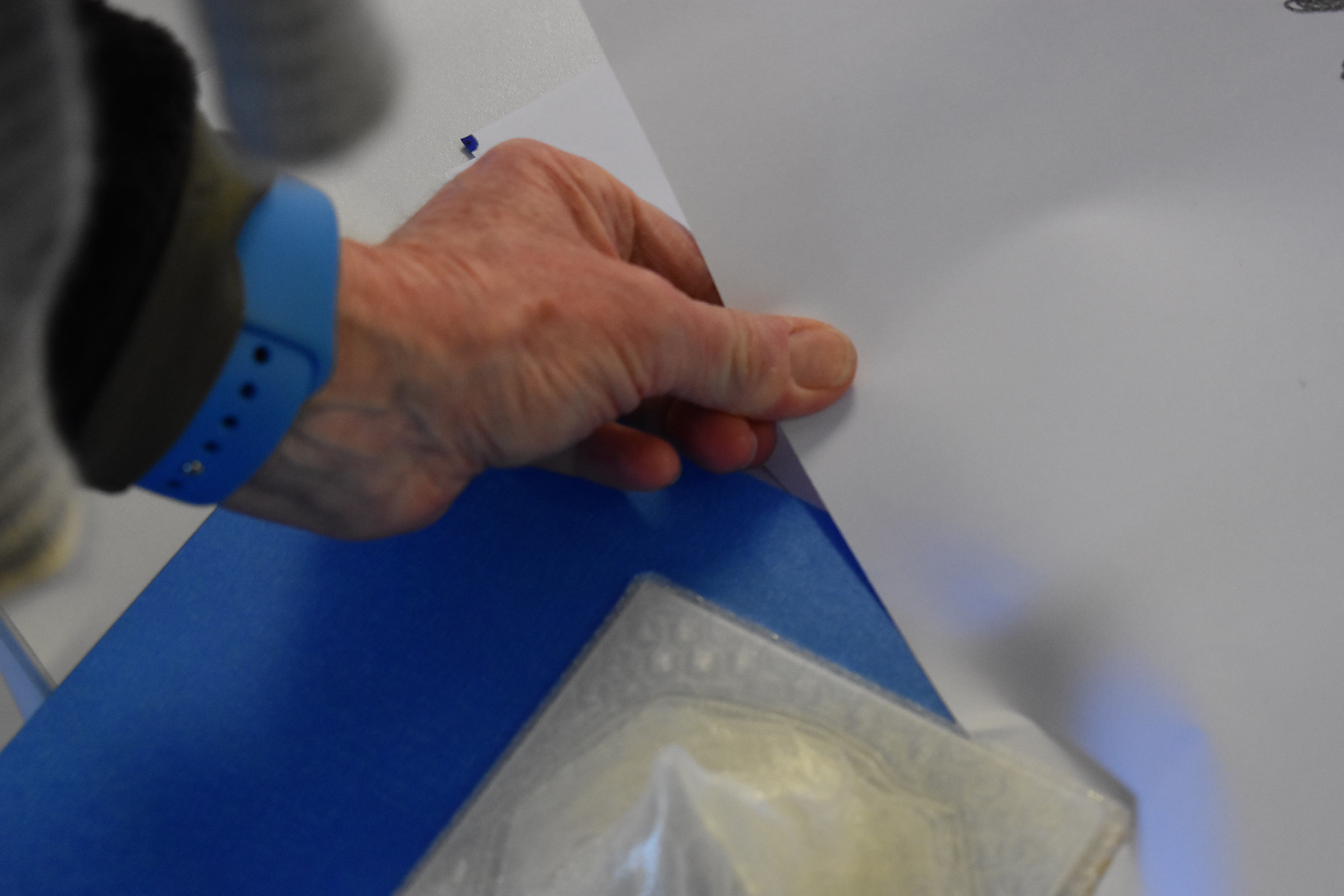
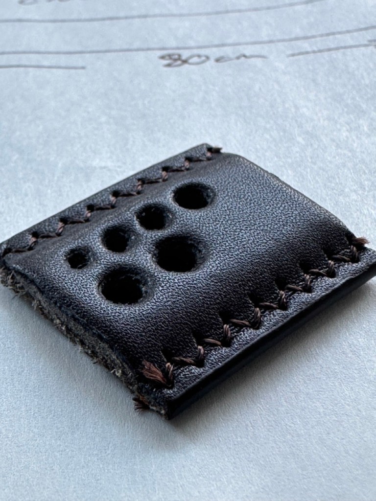
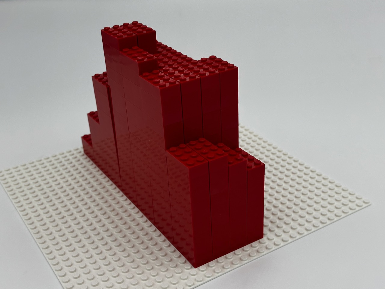
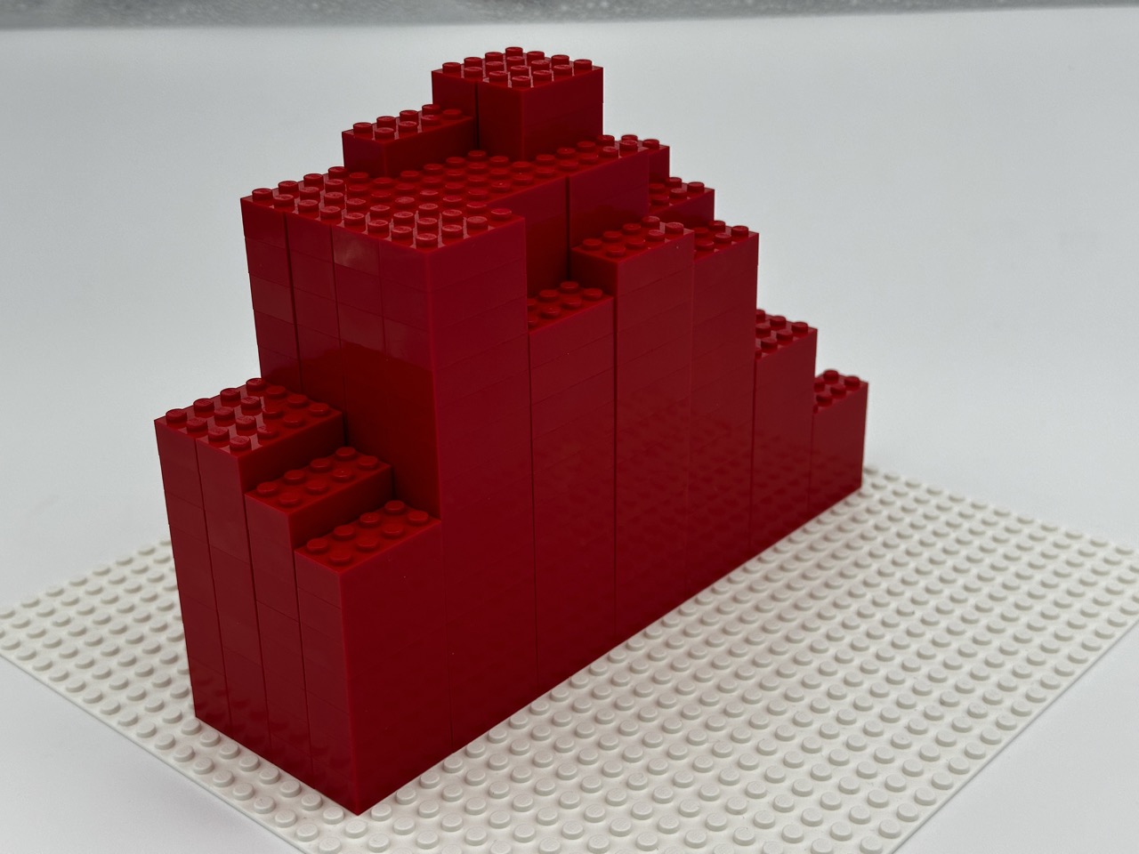
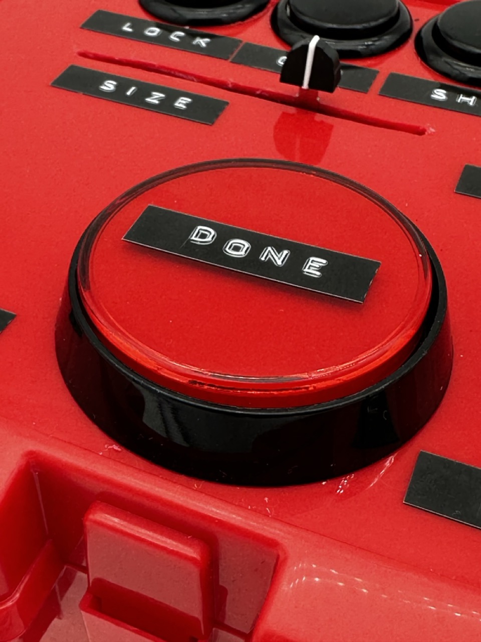
Housing :
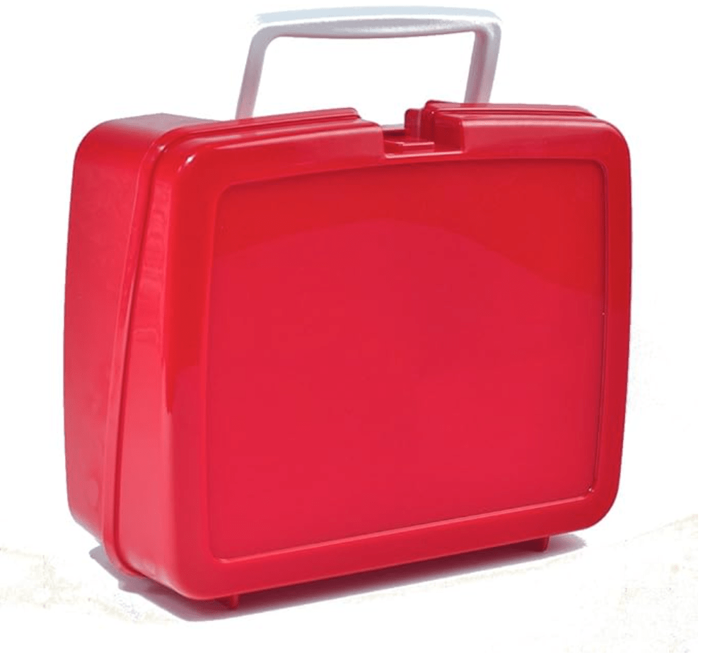
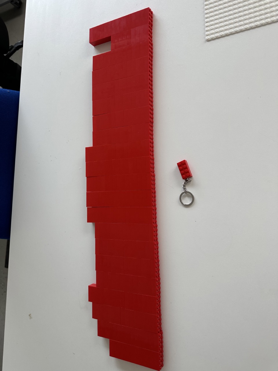
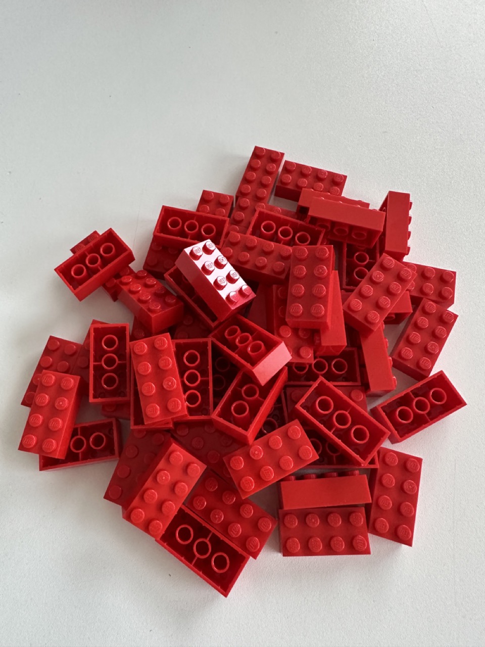
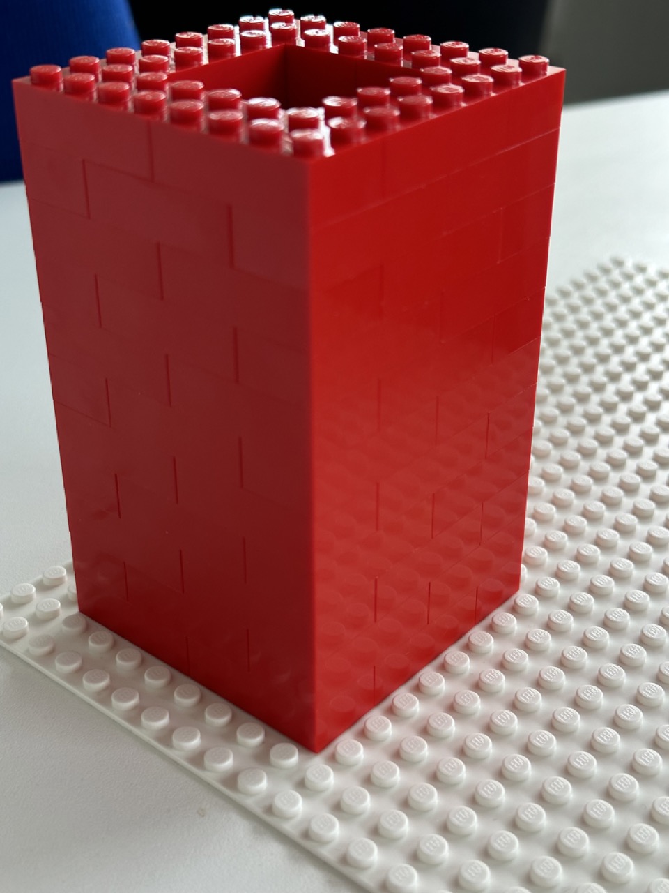
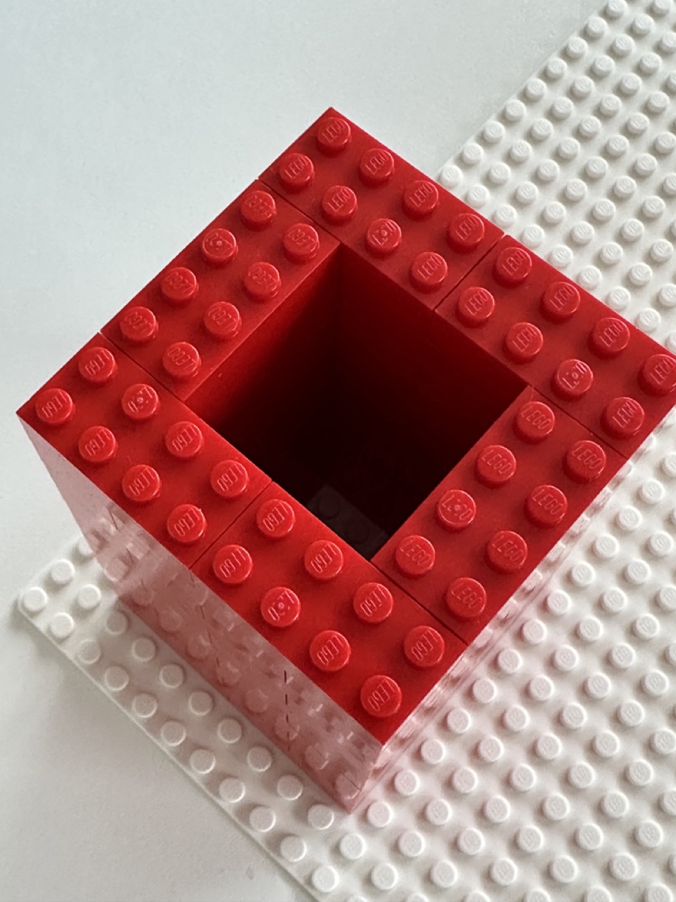
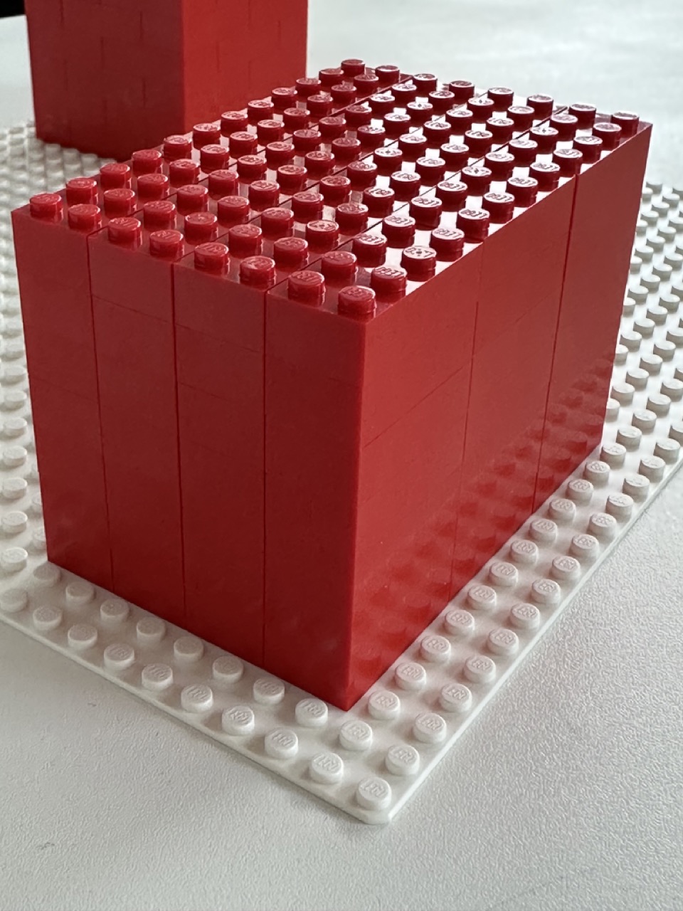
The classic red hard plastic lunchbox is the housing for this build.
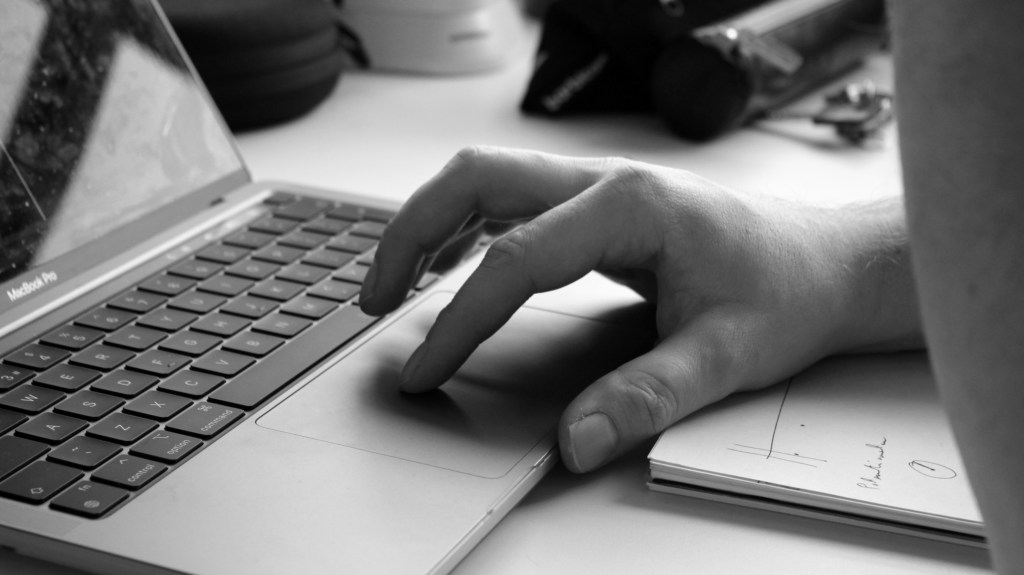
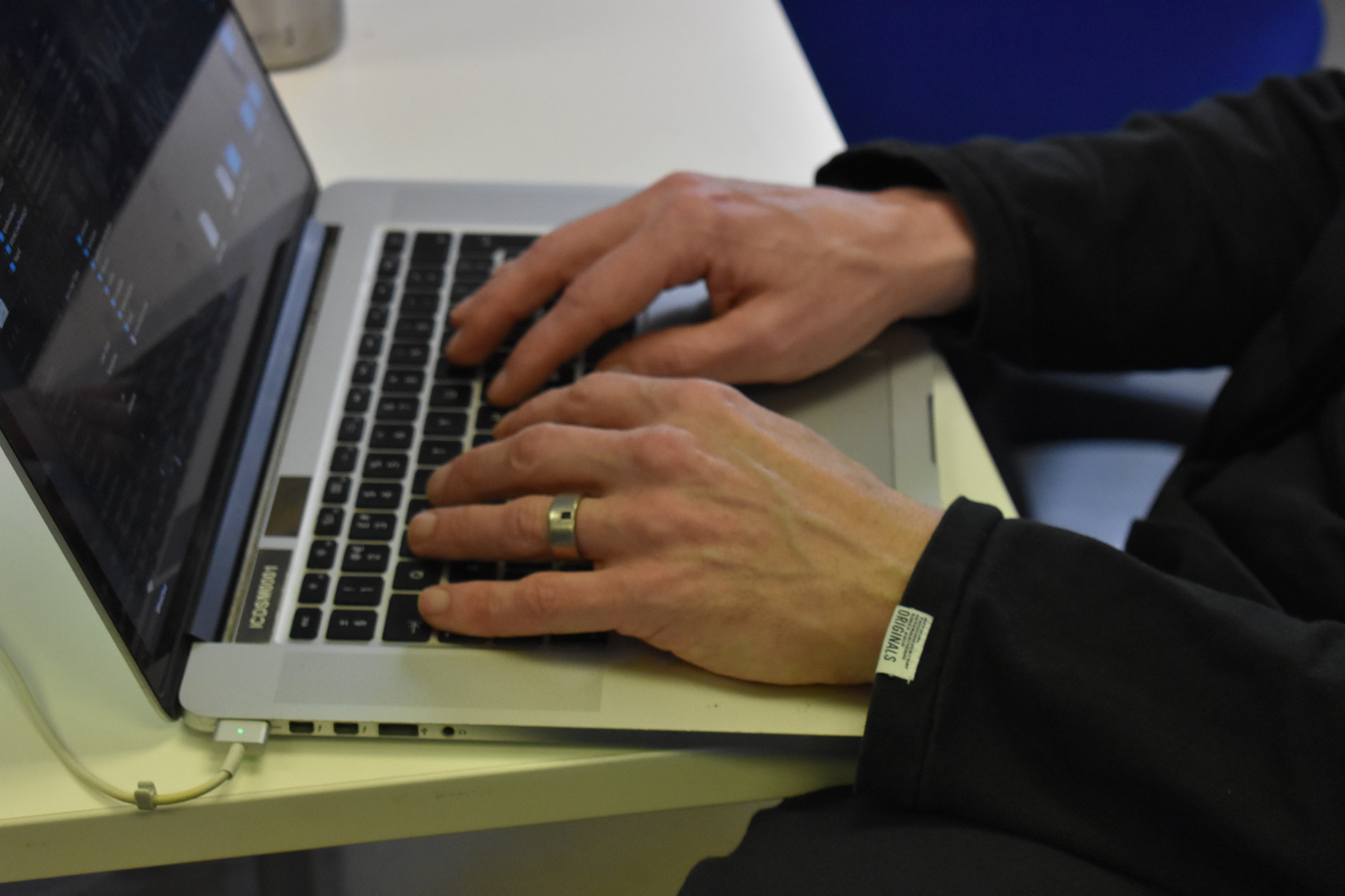
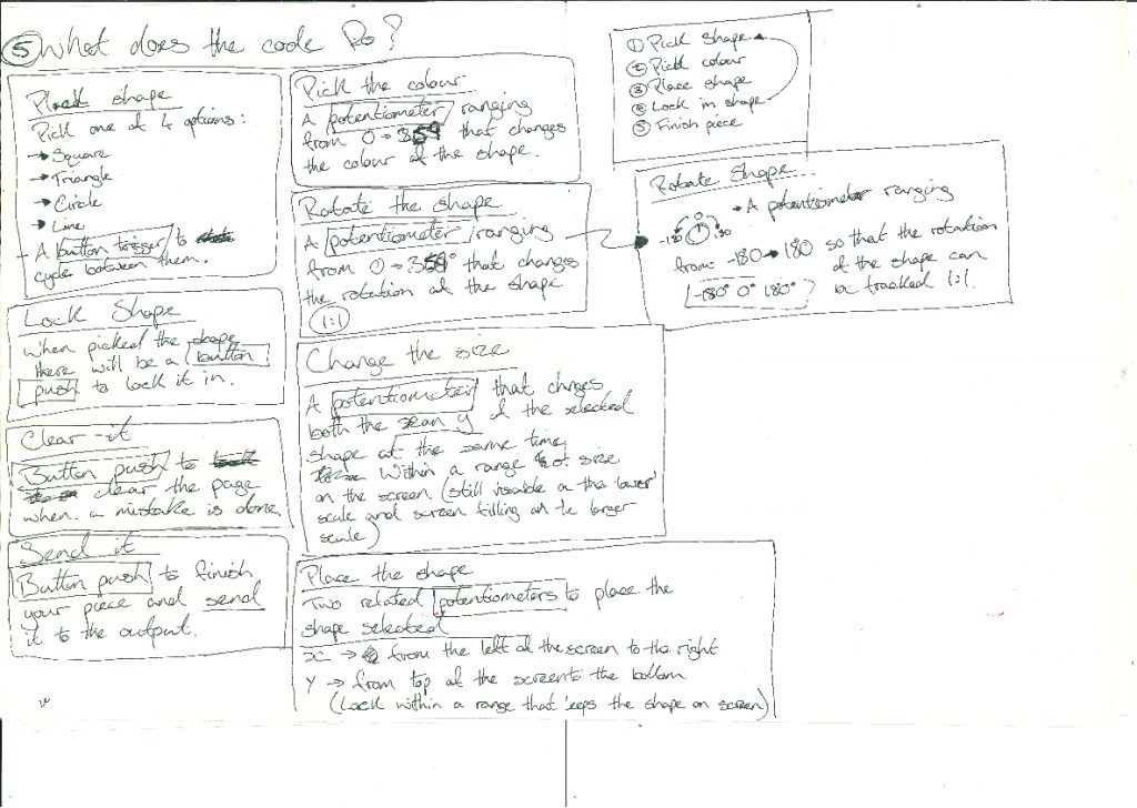
What do I actually want the code to do :
Making the code more manageable :
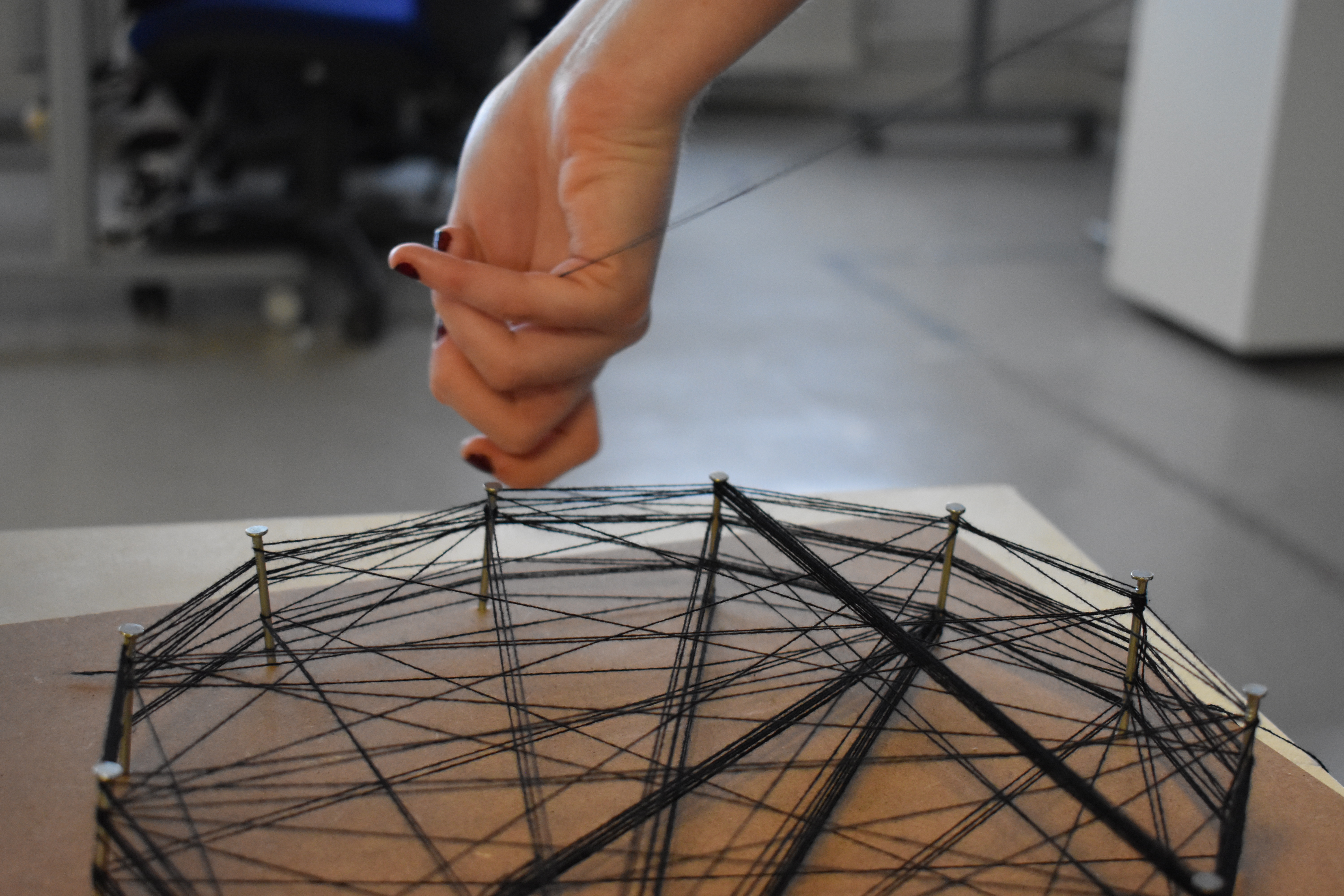
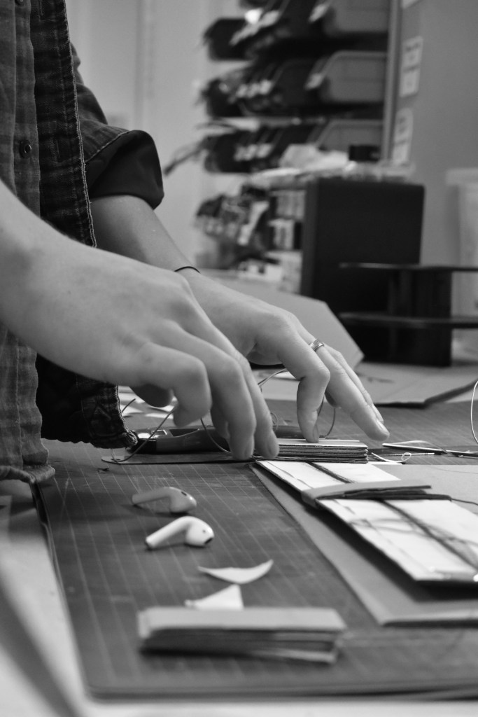
Developing the concept :

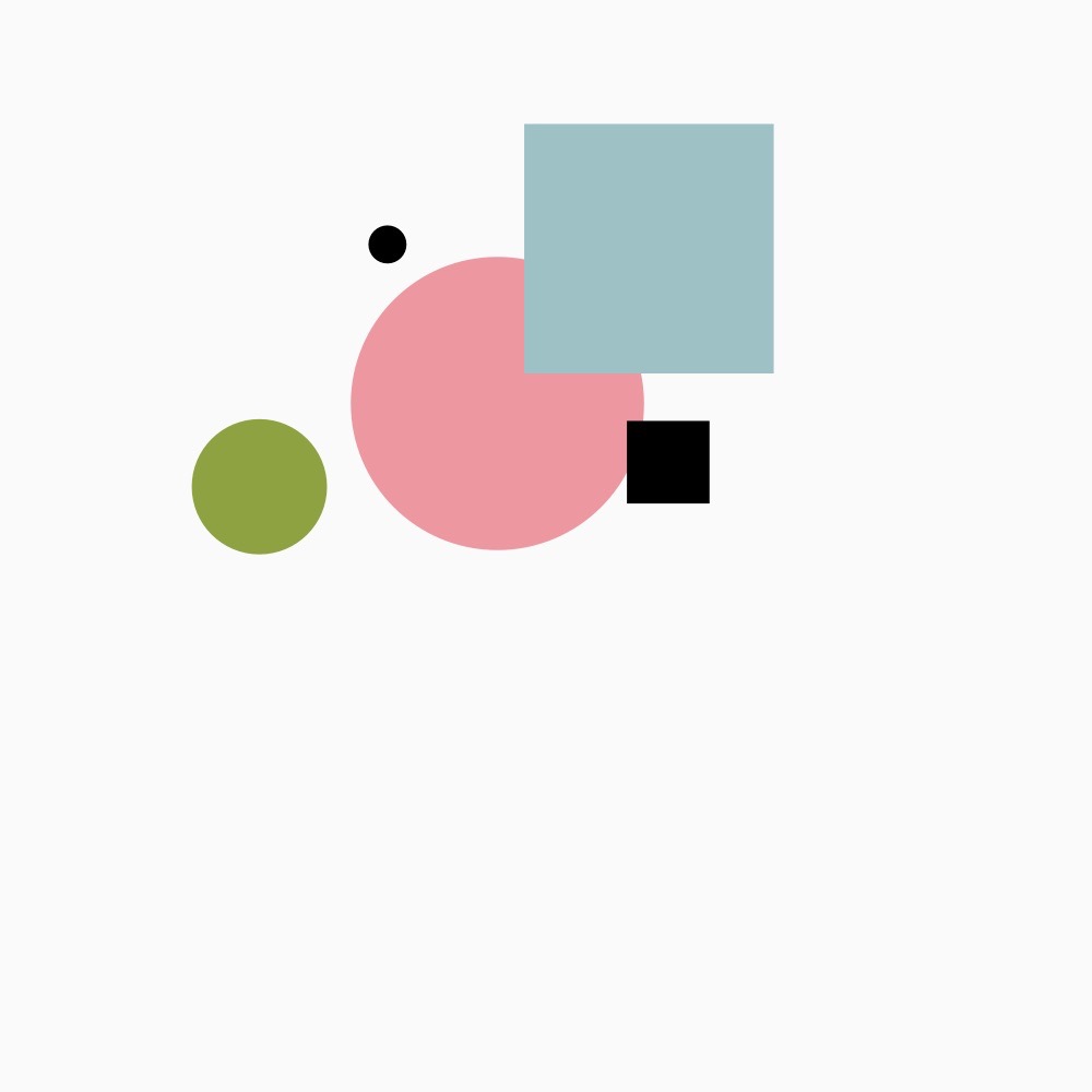
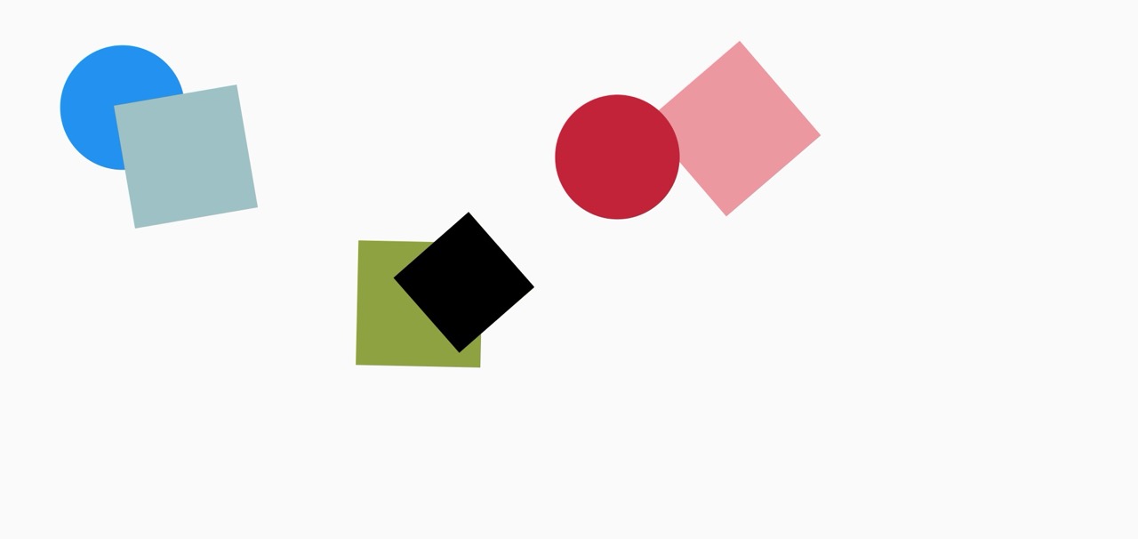
Button Layout Test :
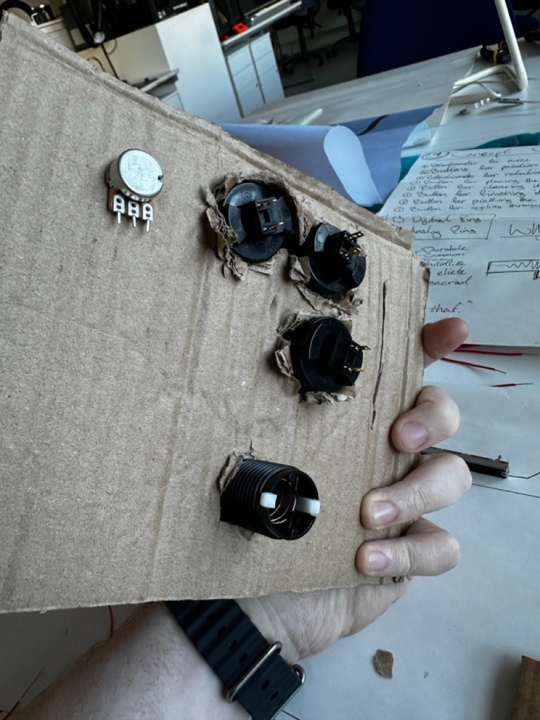
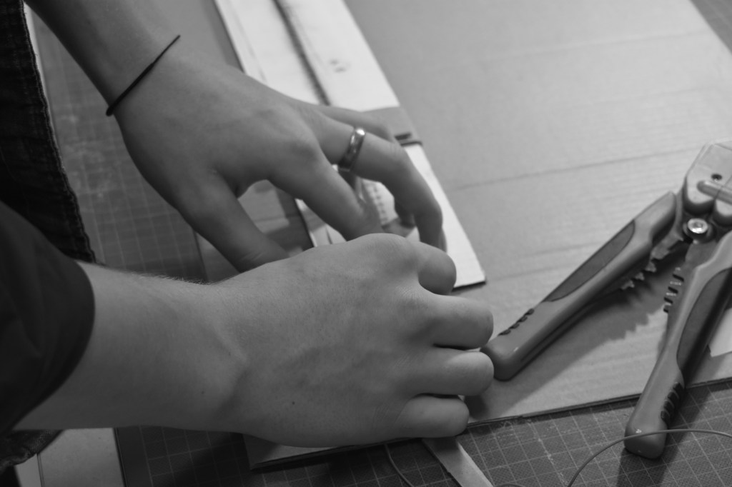
Drilling the holes :
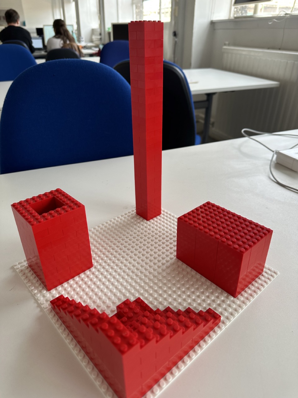
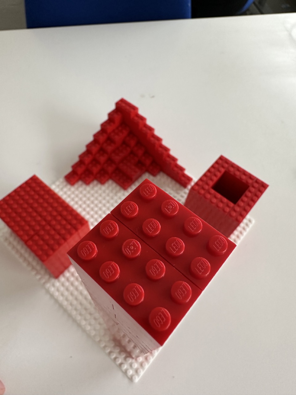
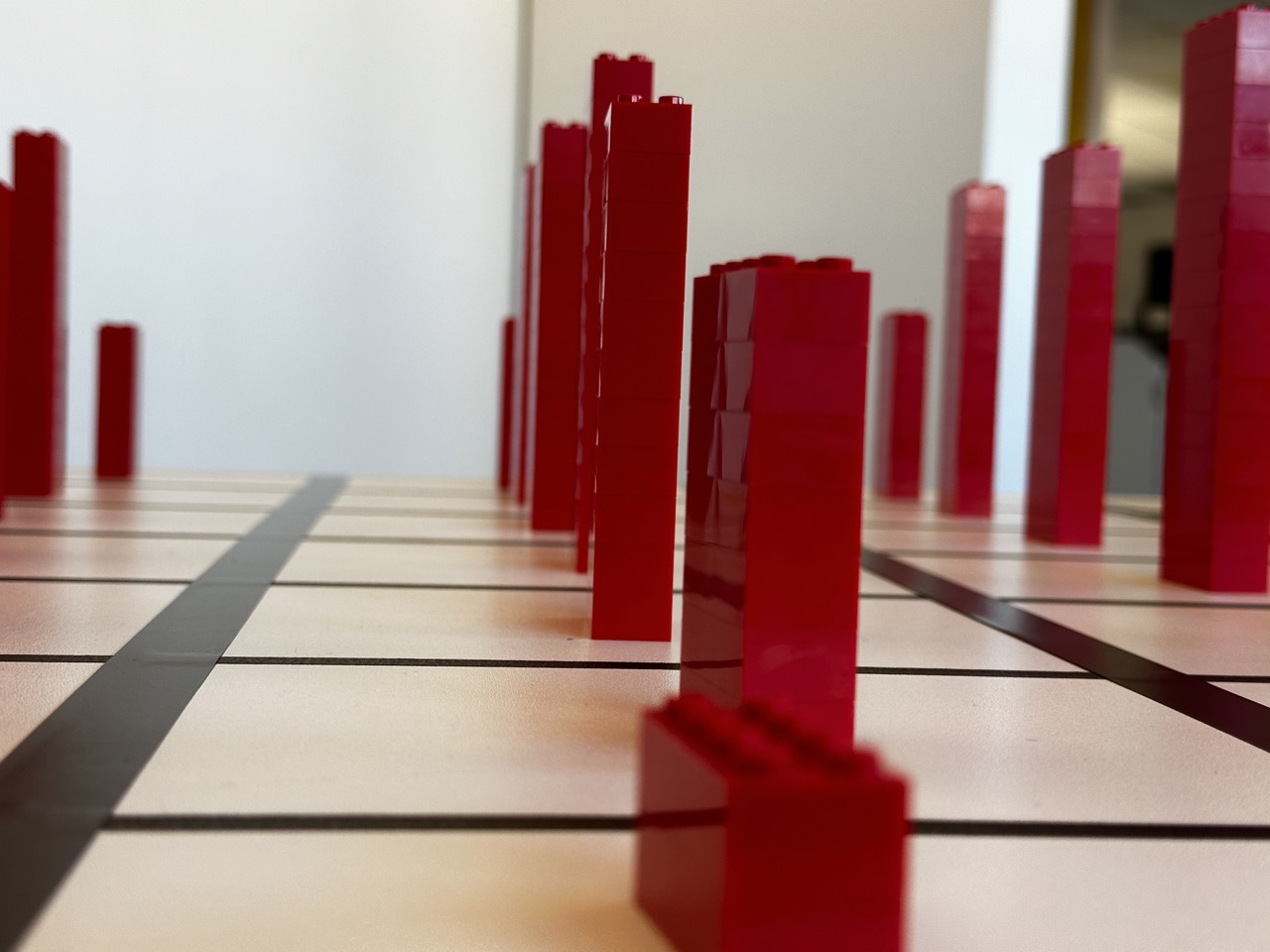
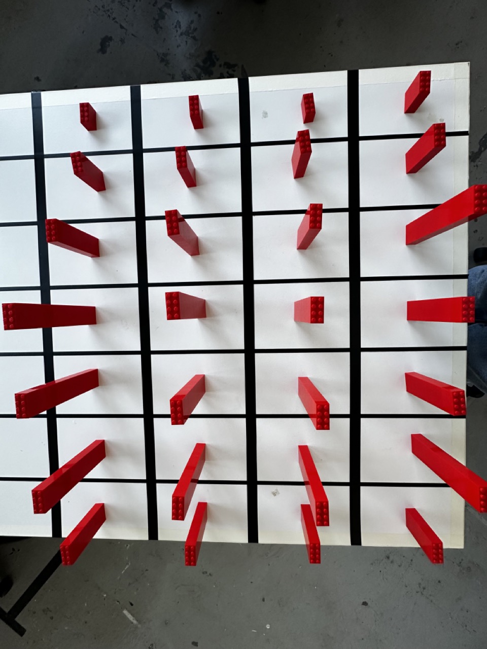
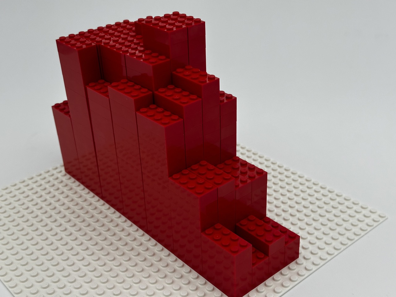
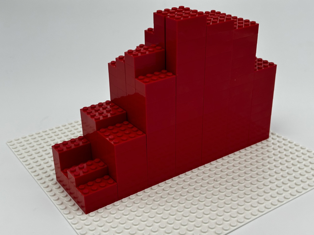
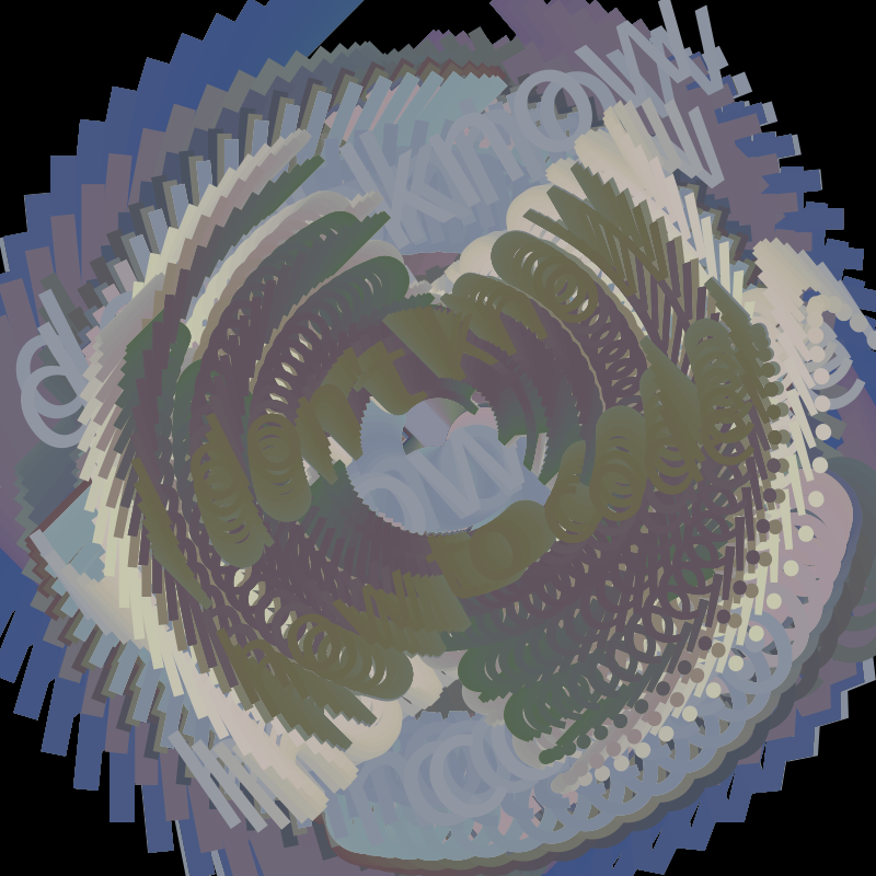
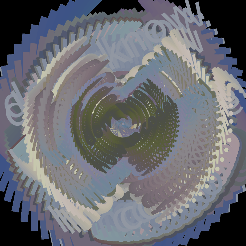
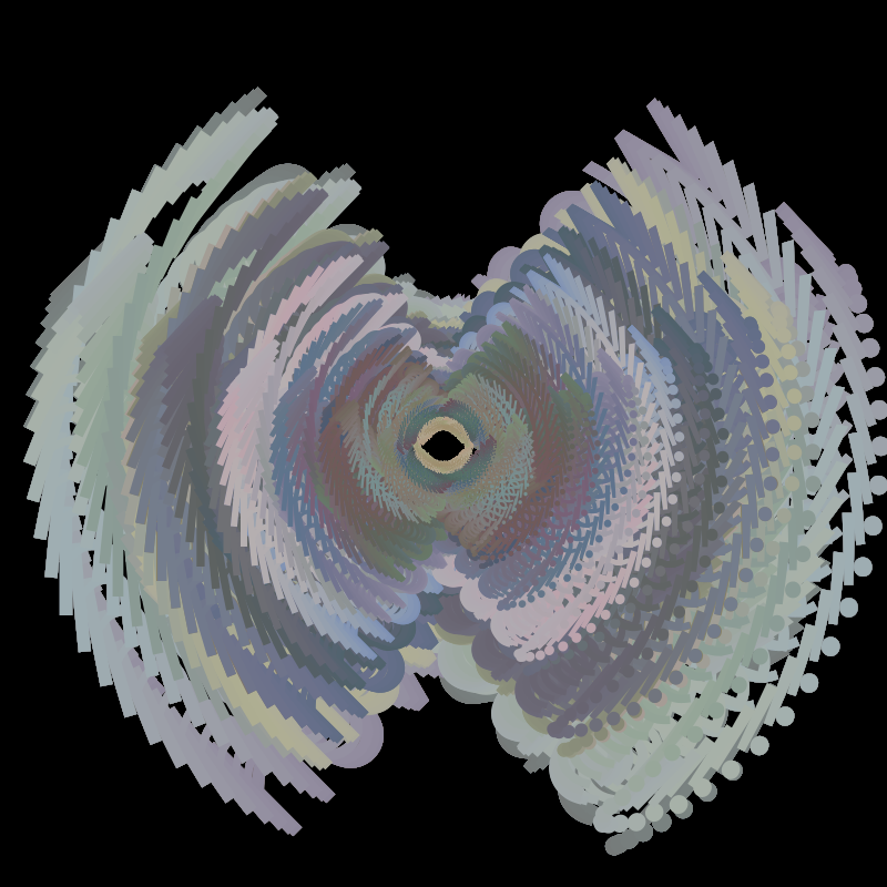
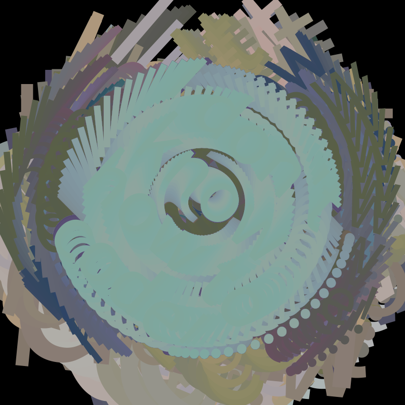
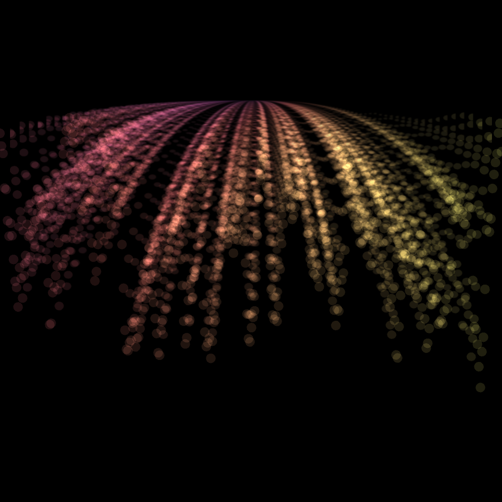
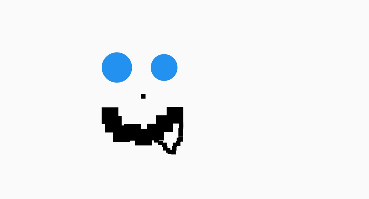
Seeing it everywhere :
Revisiting the etch a sketch :
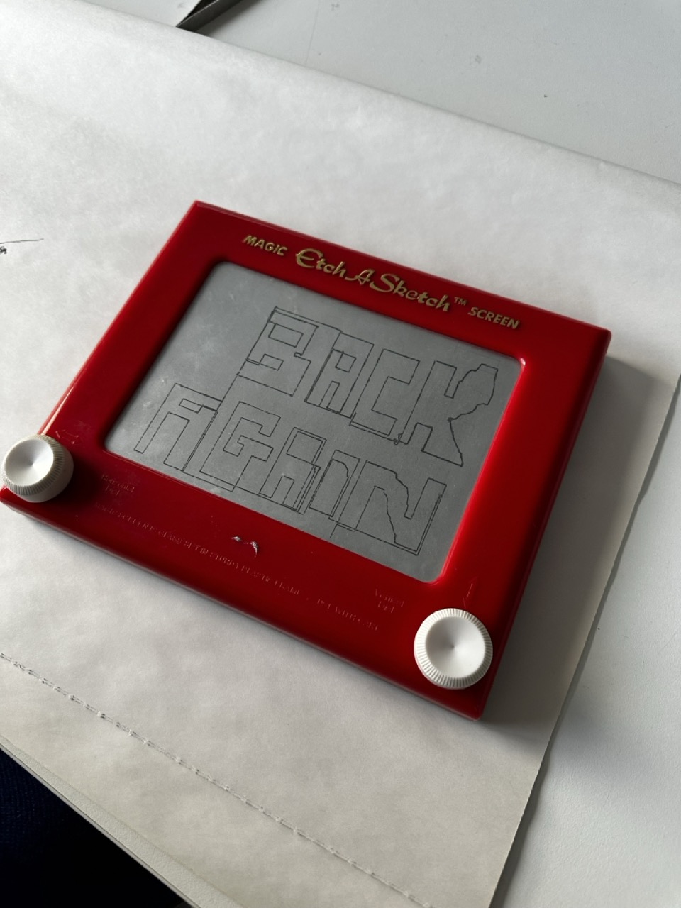

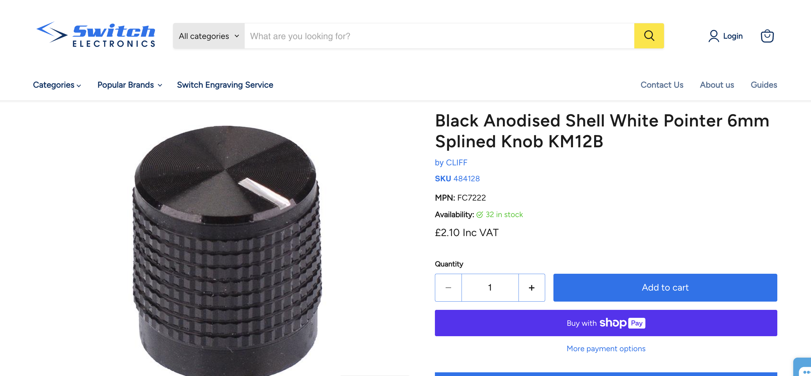
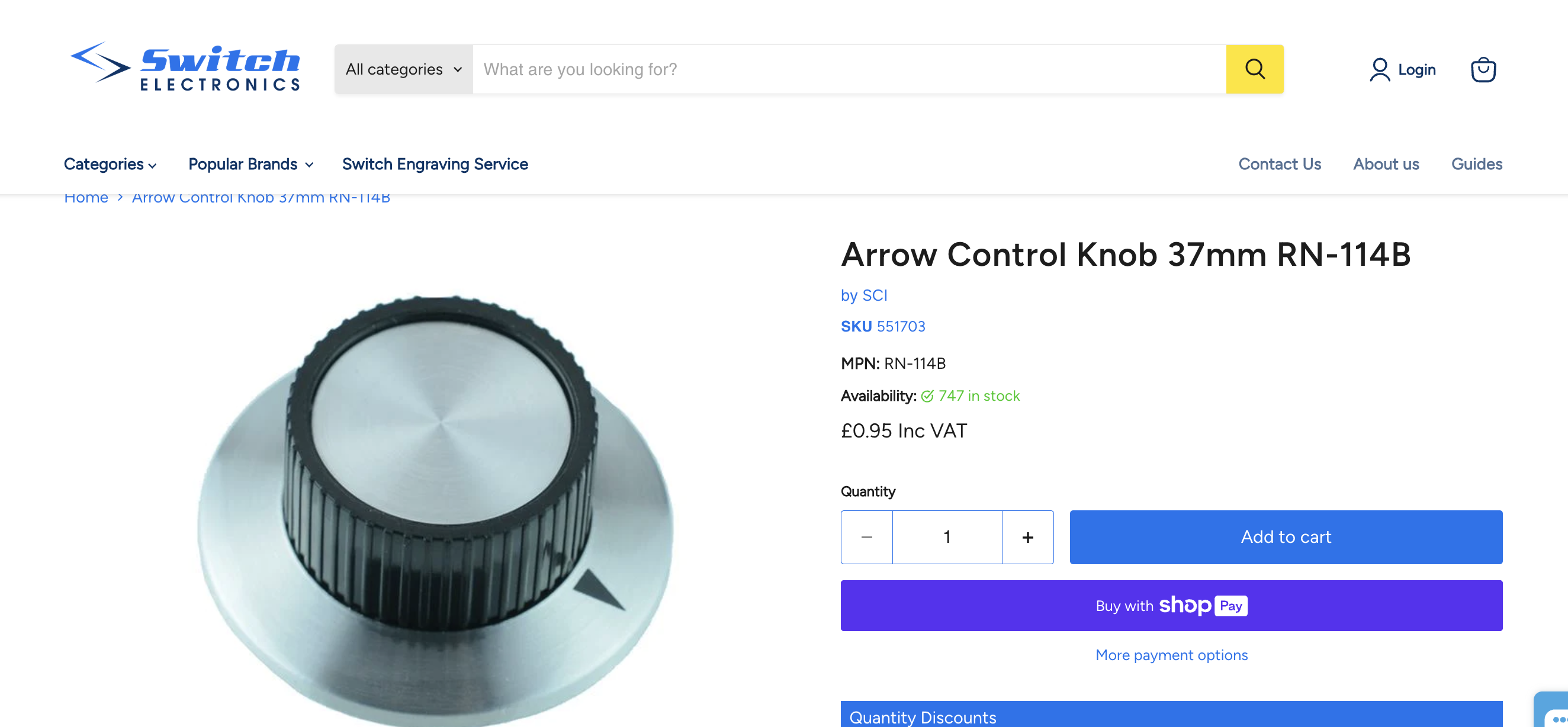
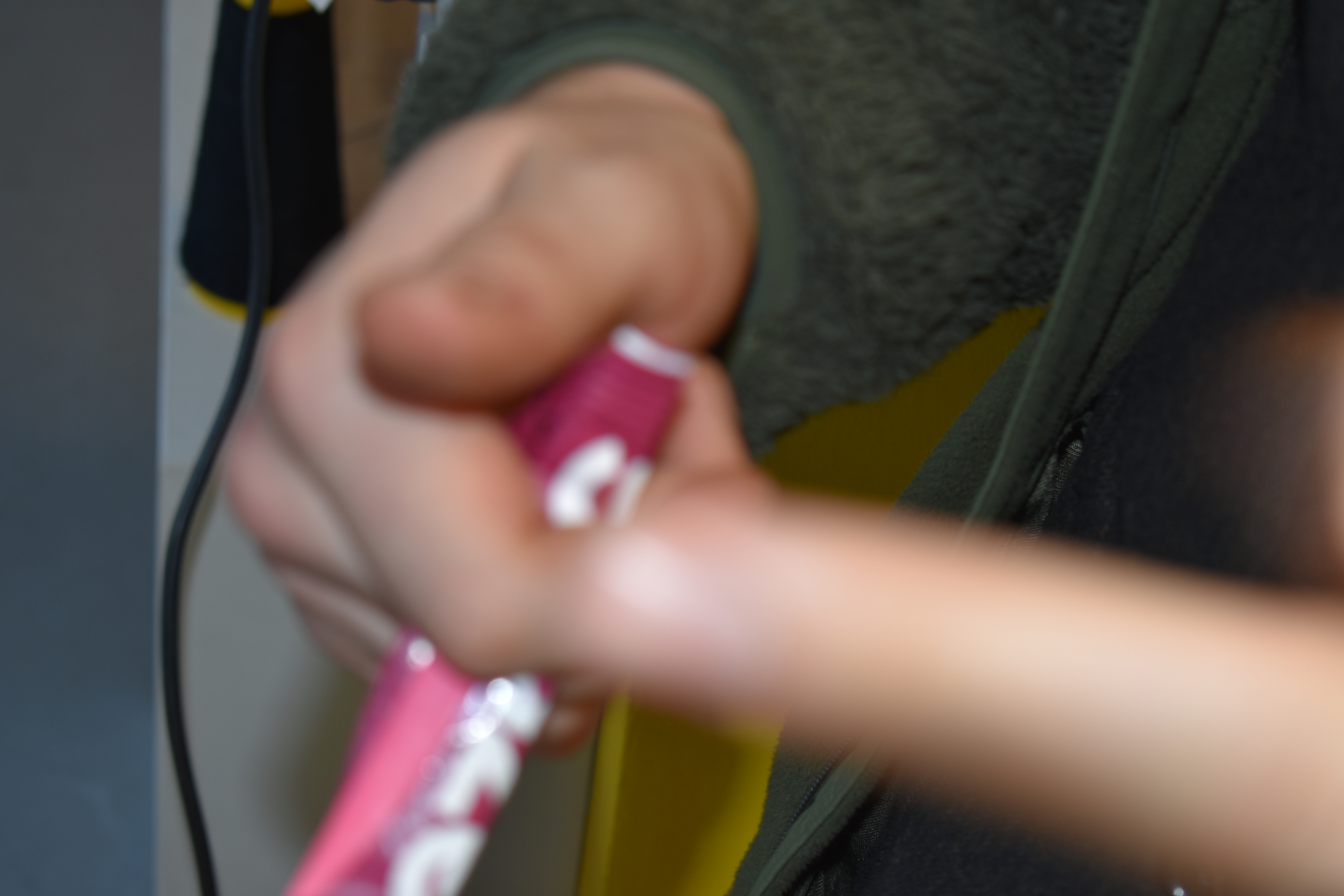
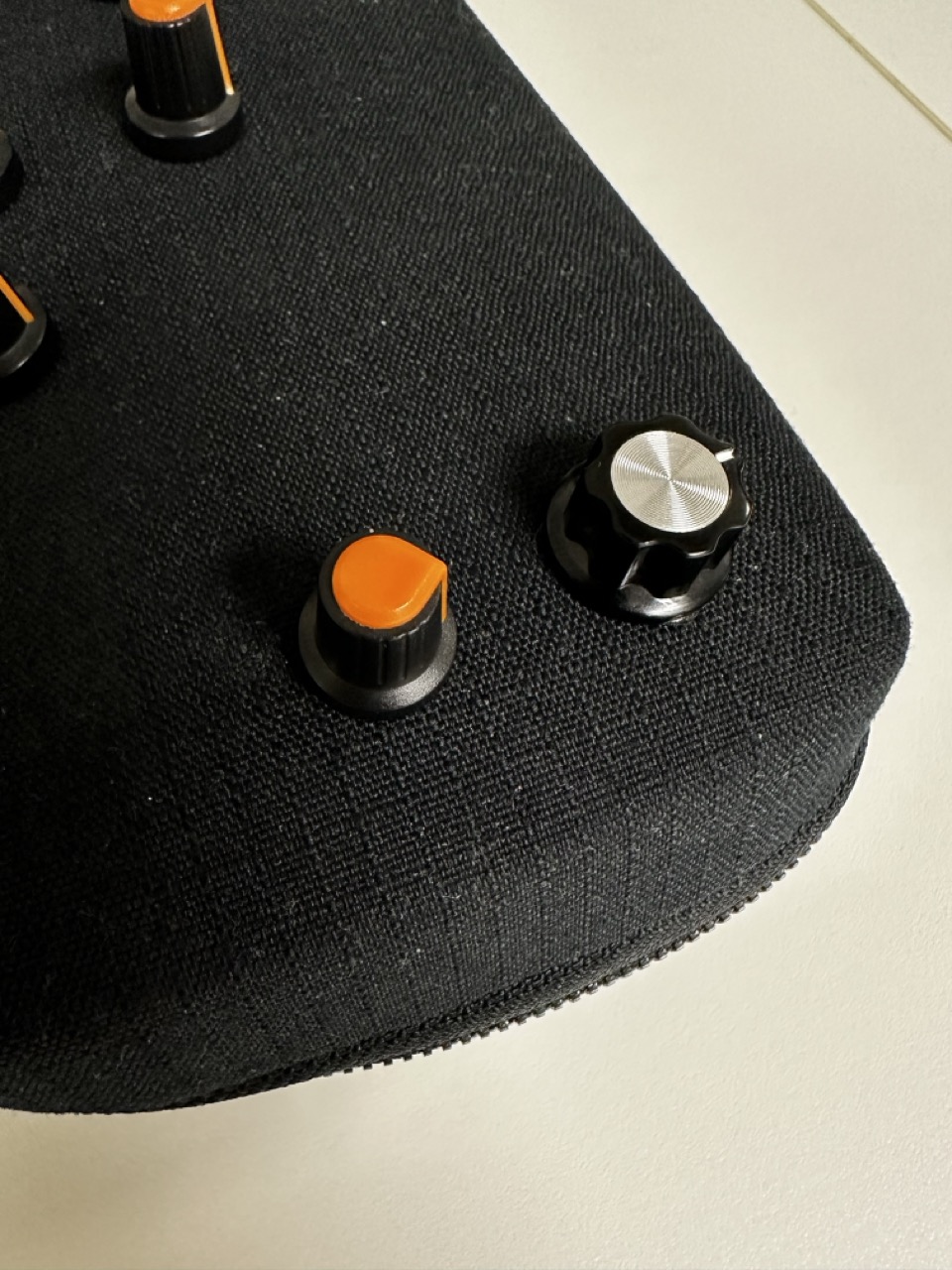
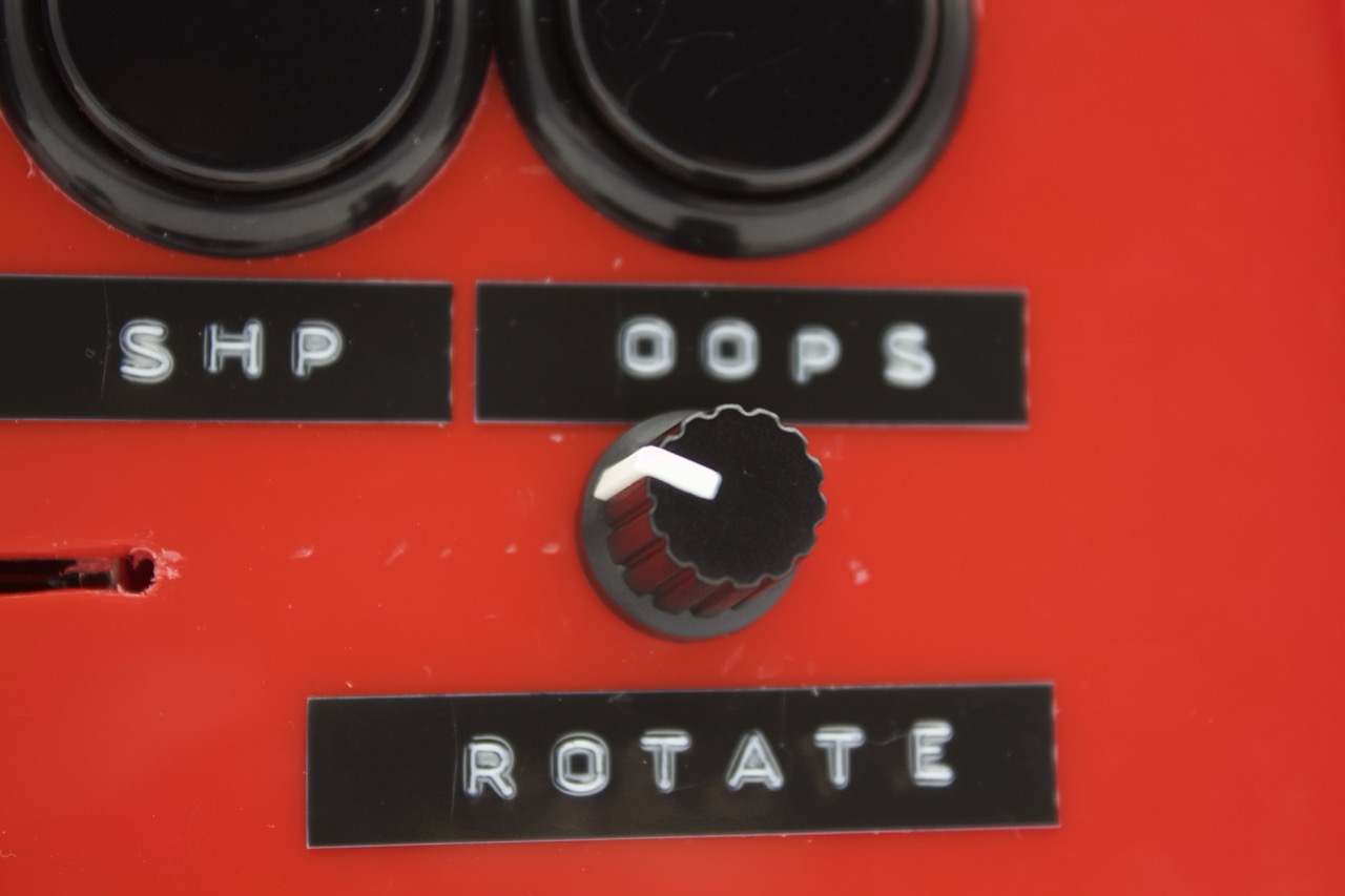
I would like the knobs for the directional potentiometers to be different, bigger or more attention-grabbing.
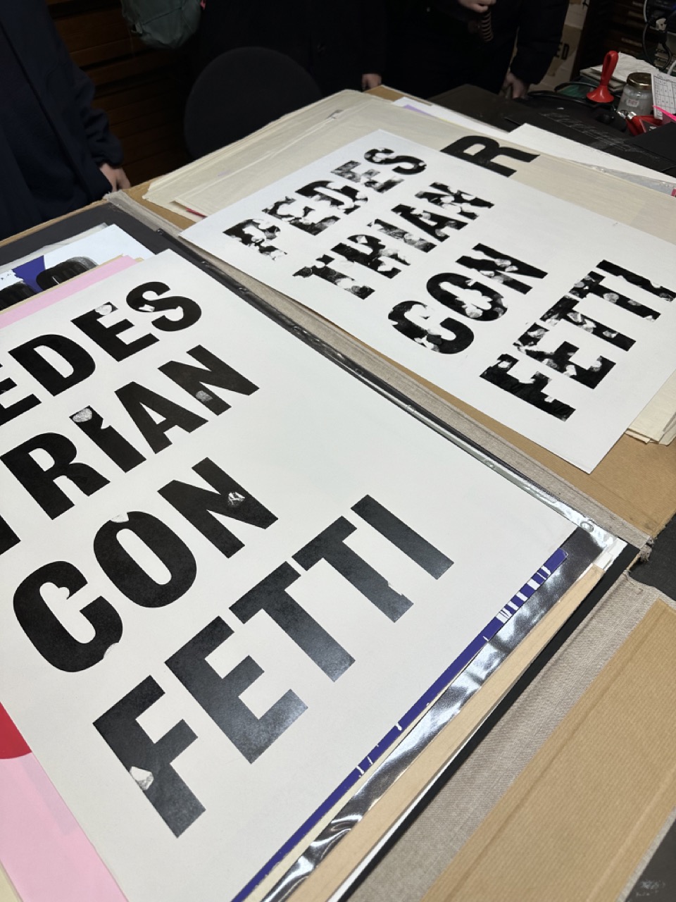
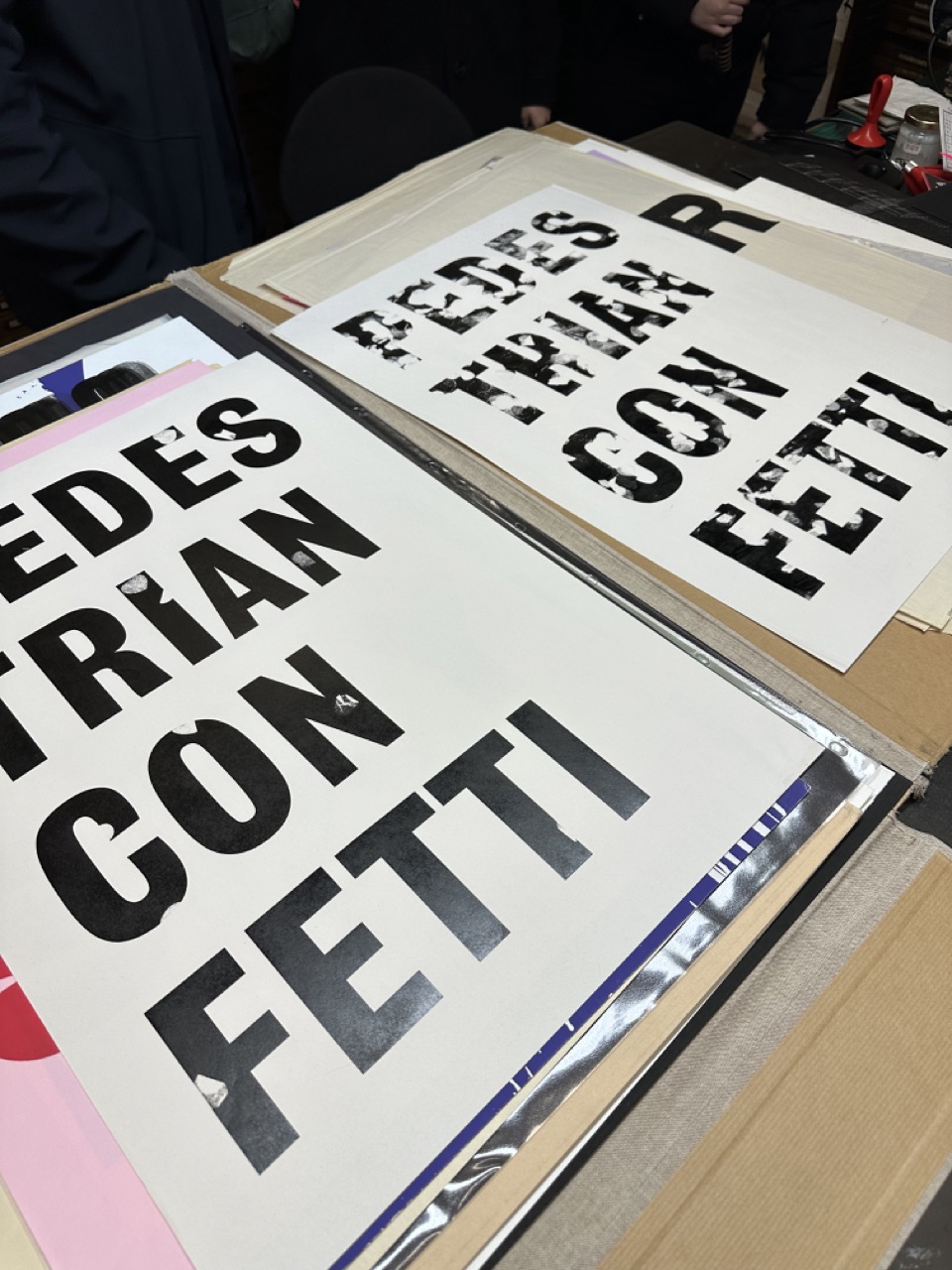
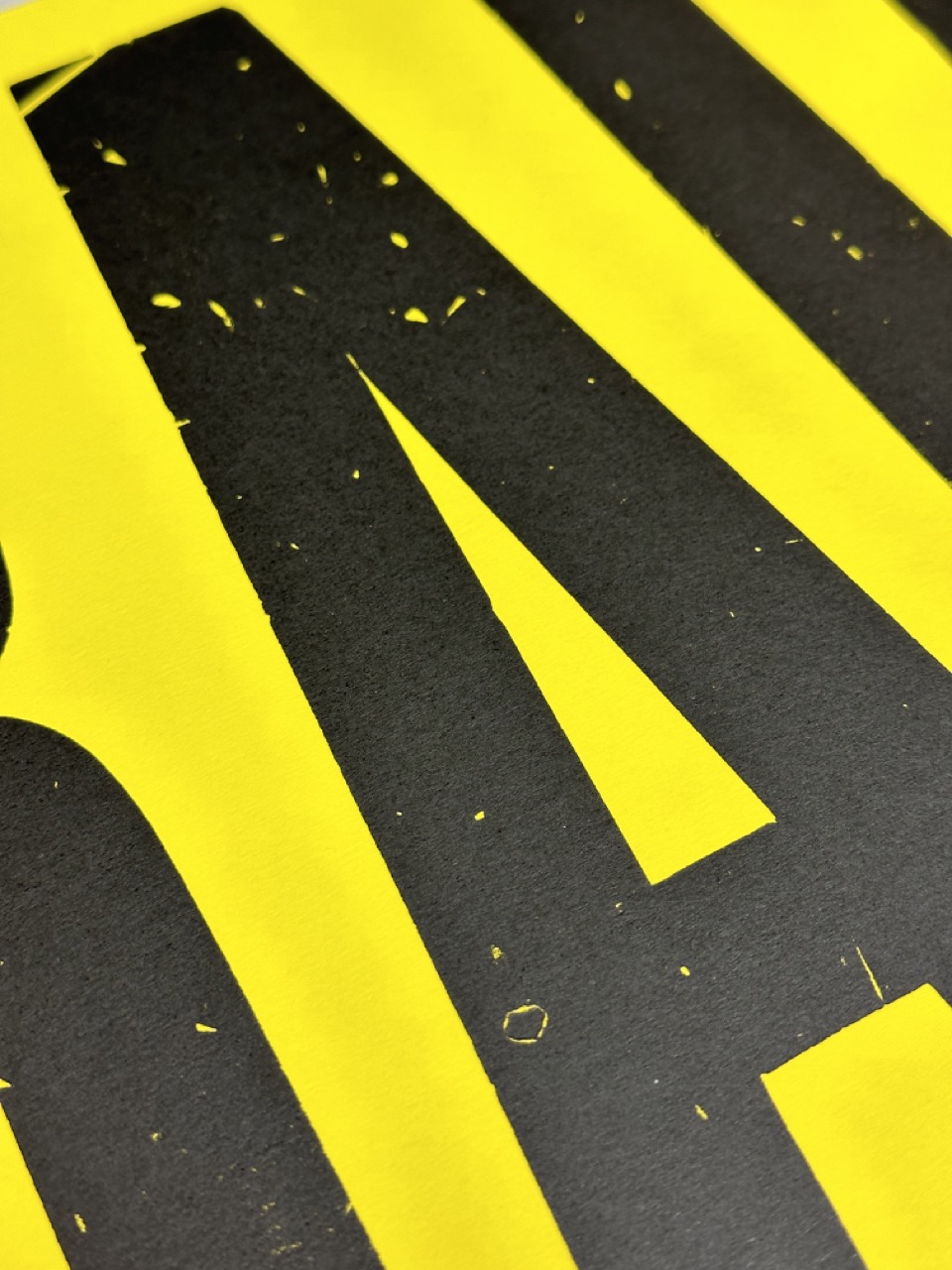
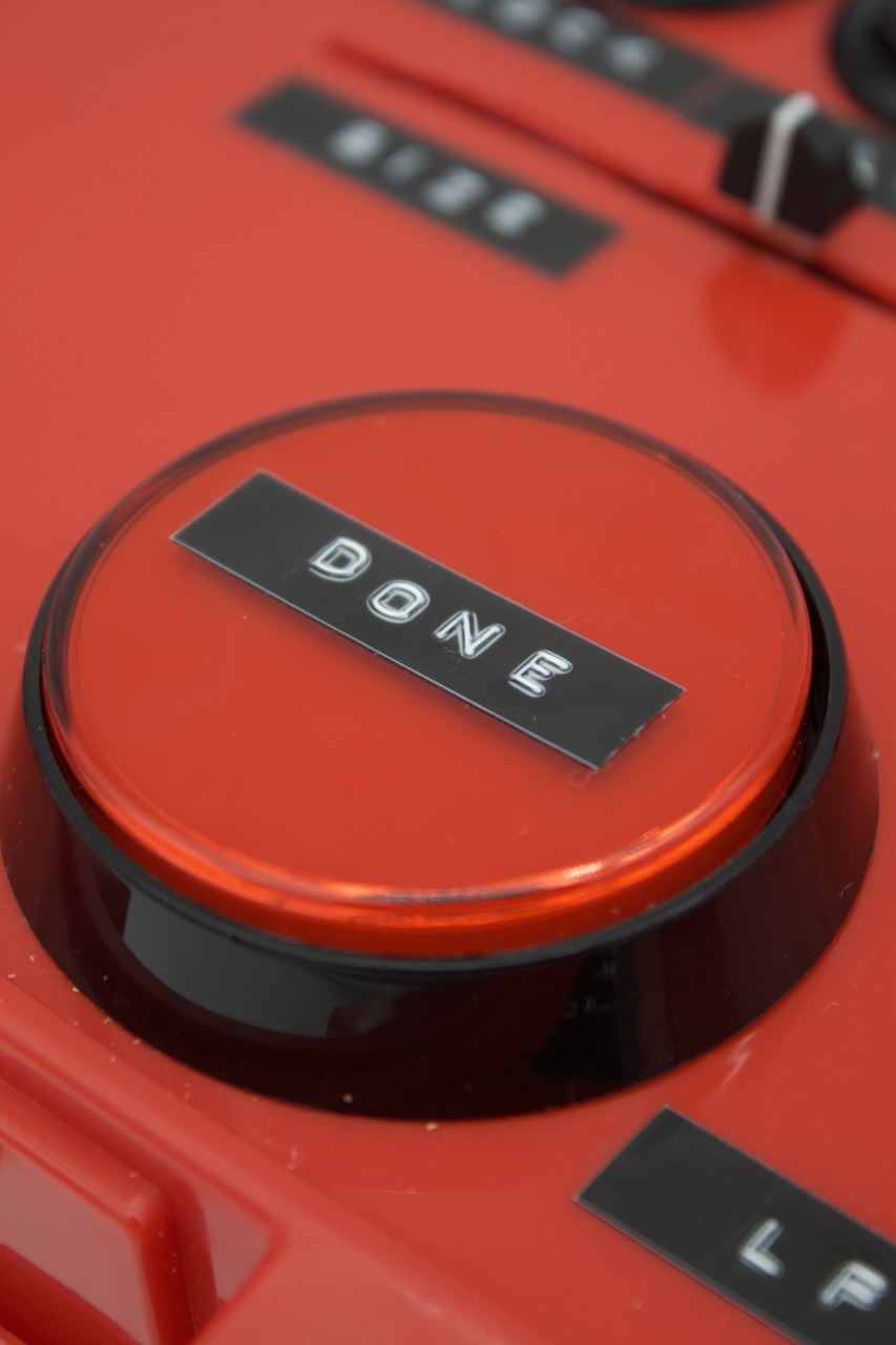
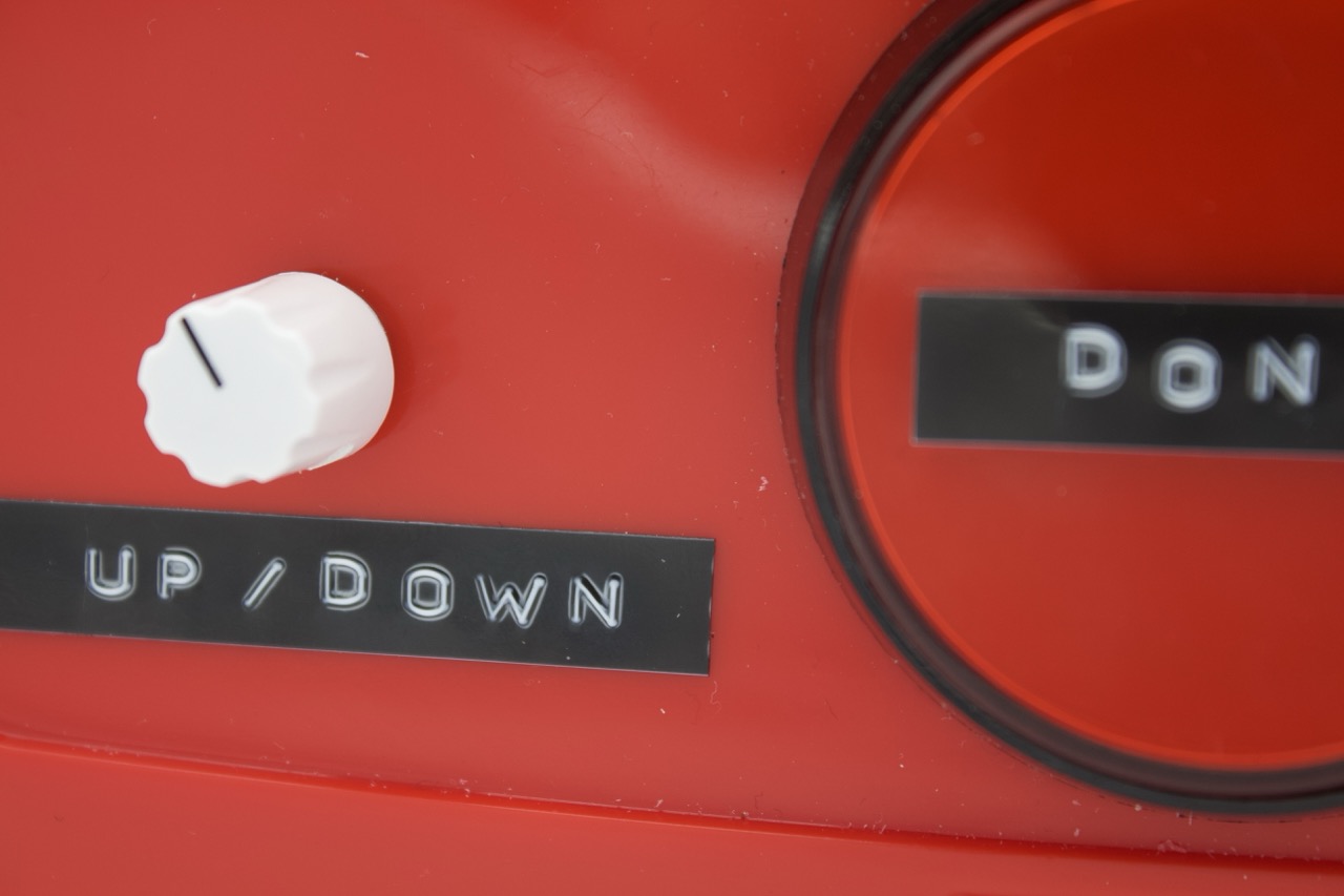
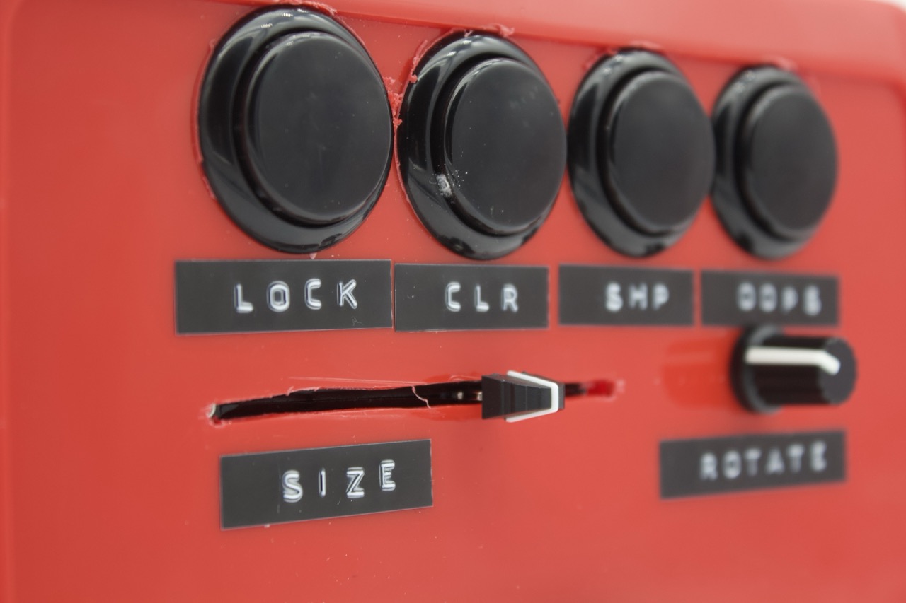
Labels:


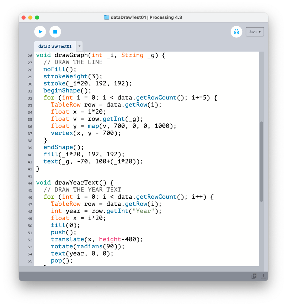
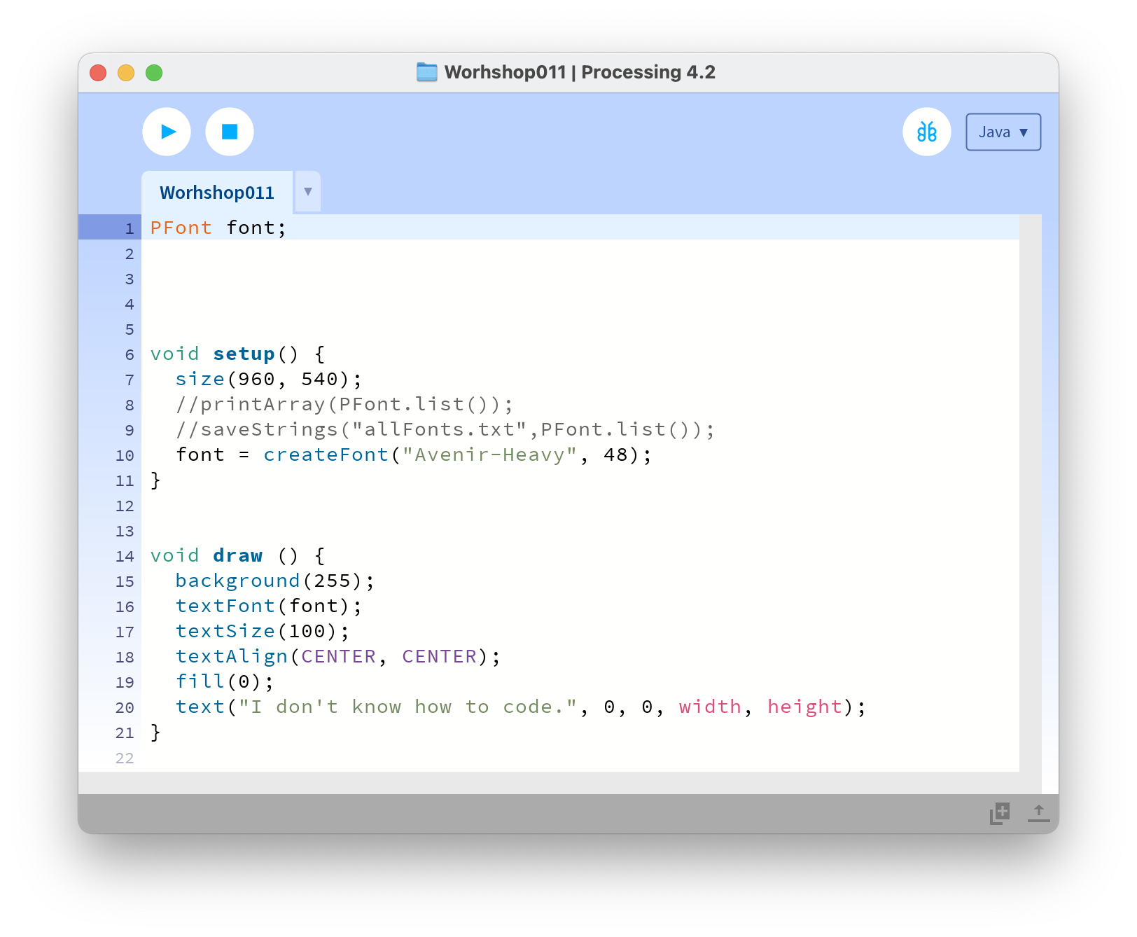
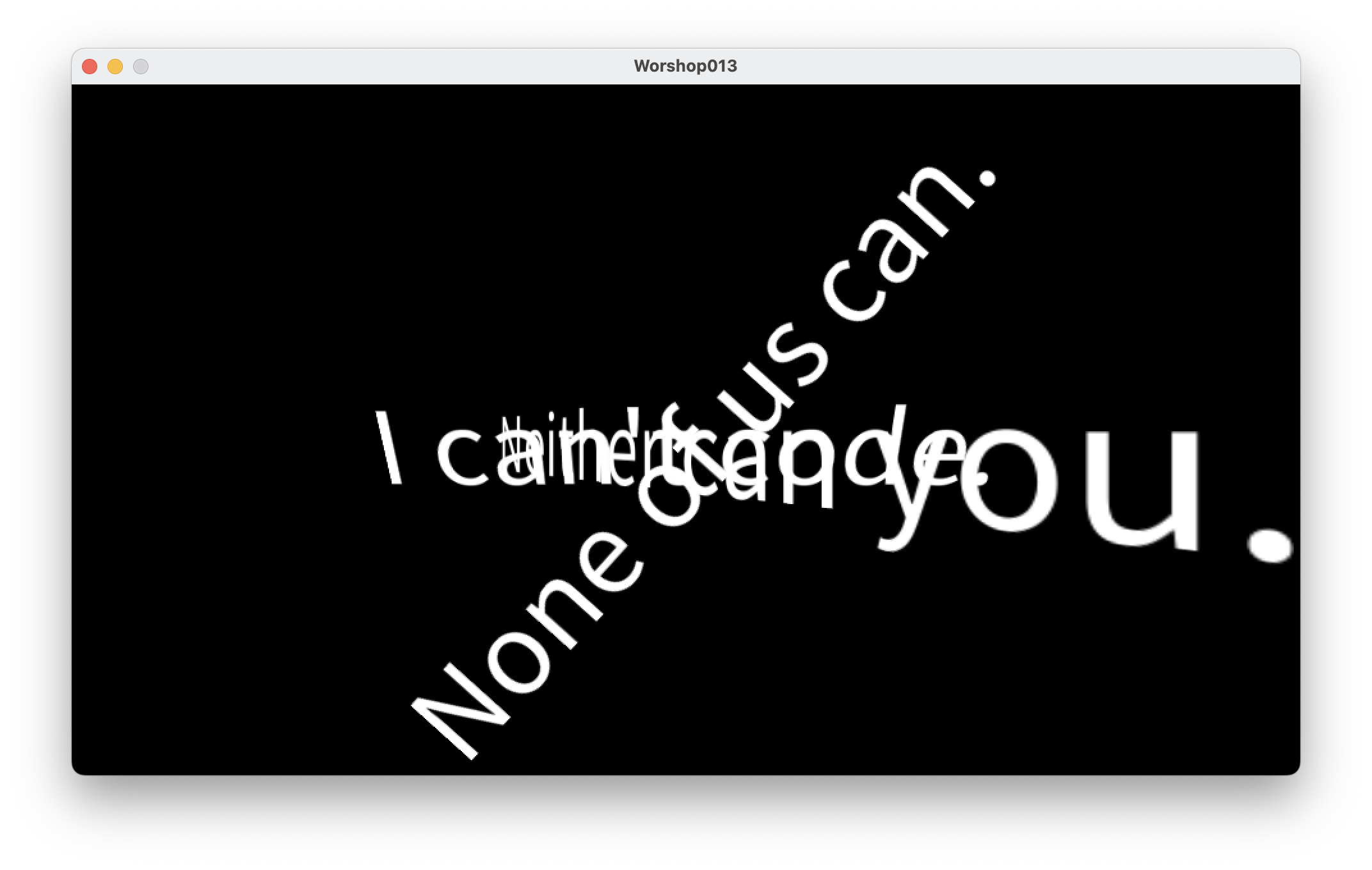
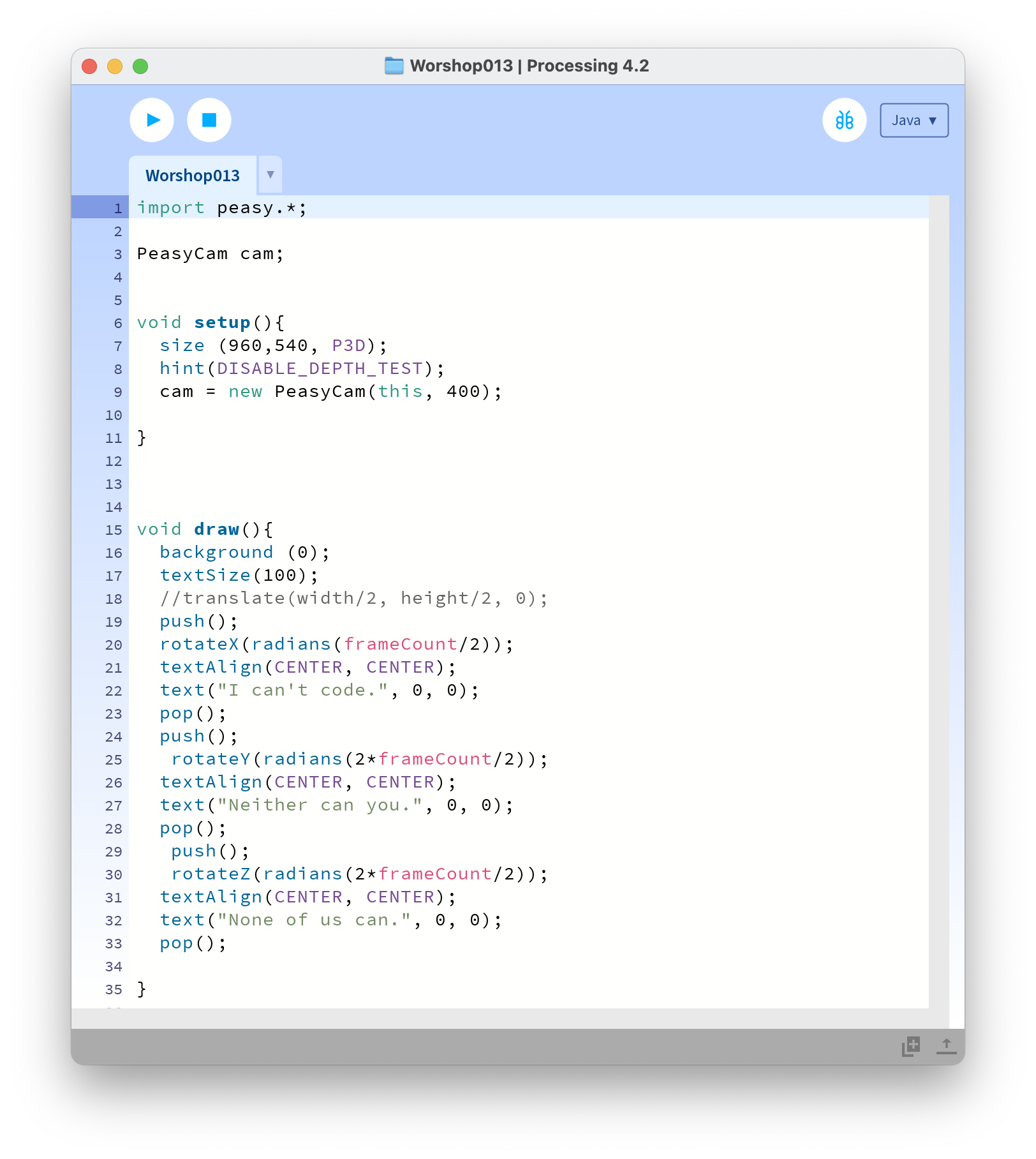
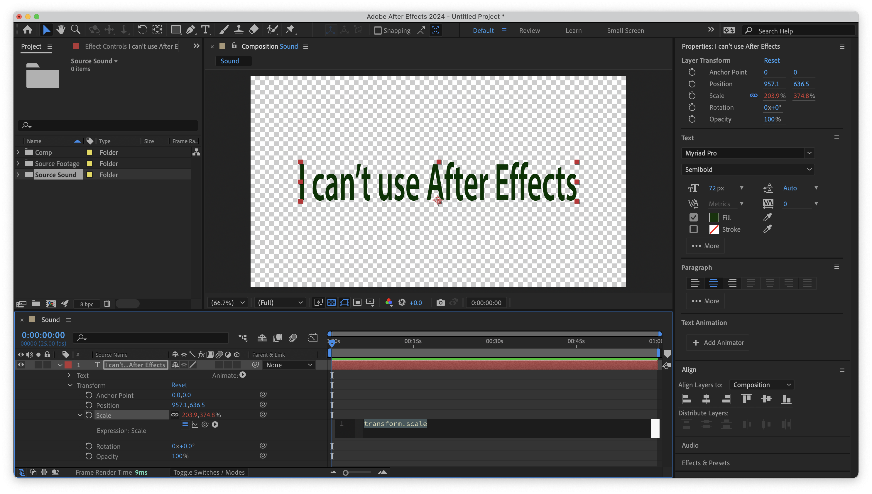
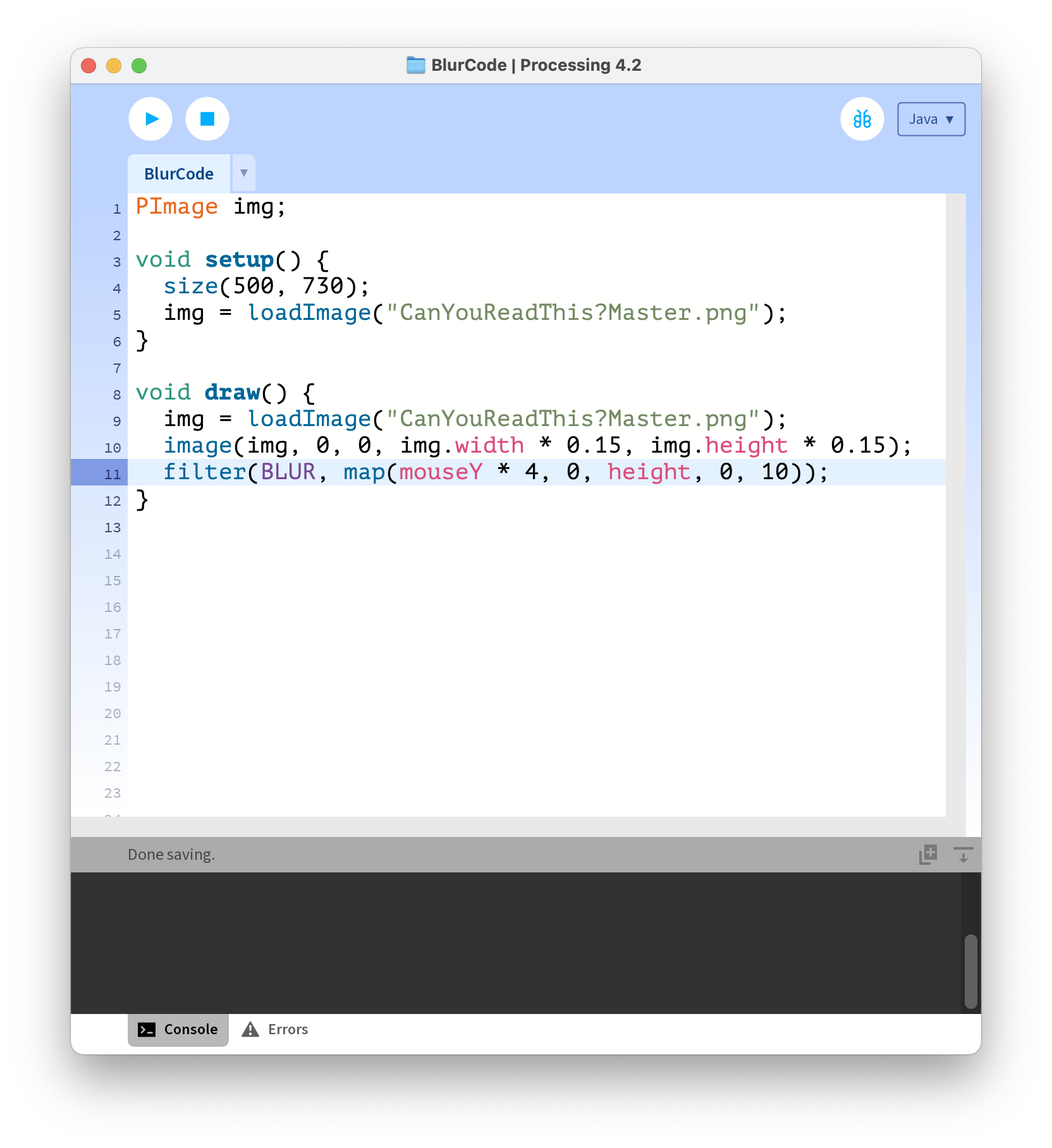
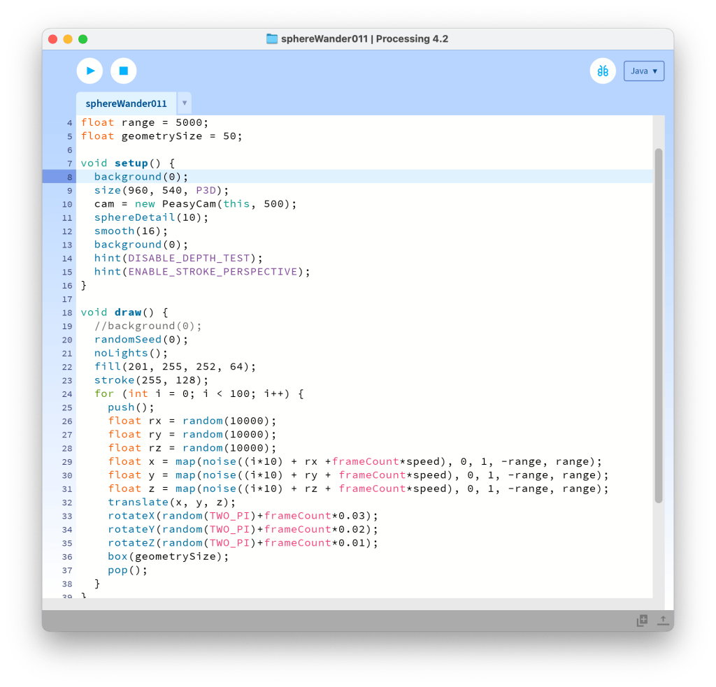
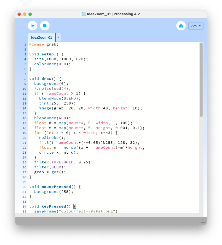
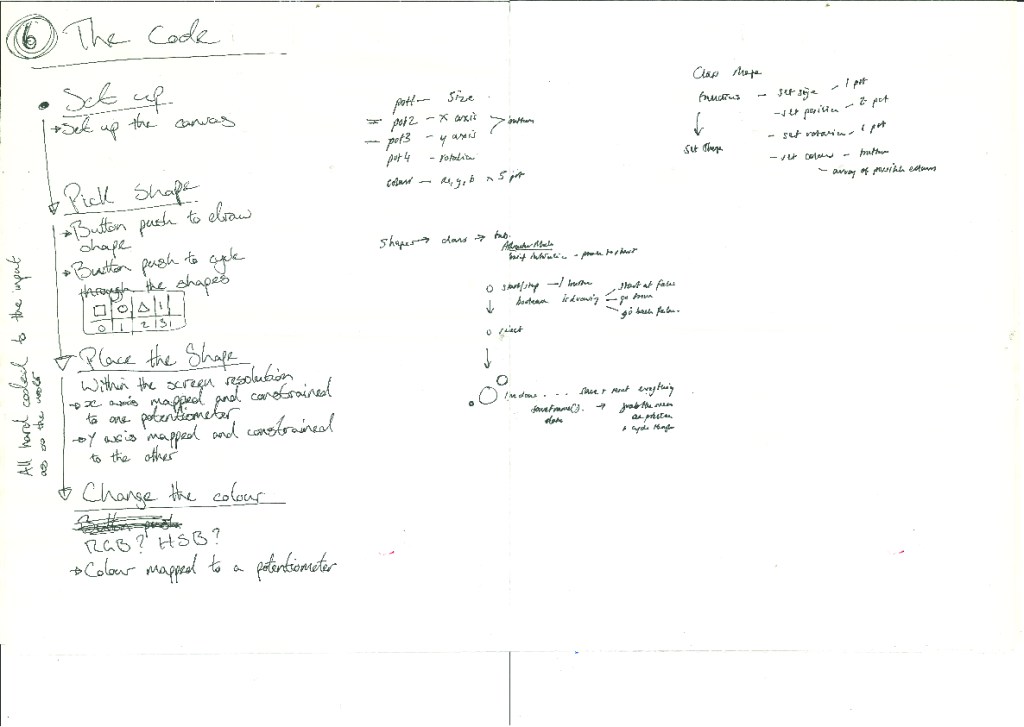
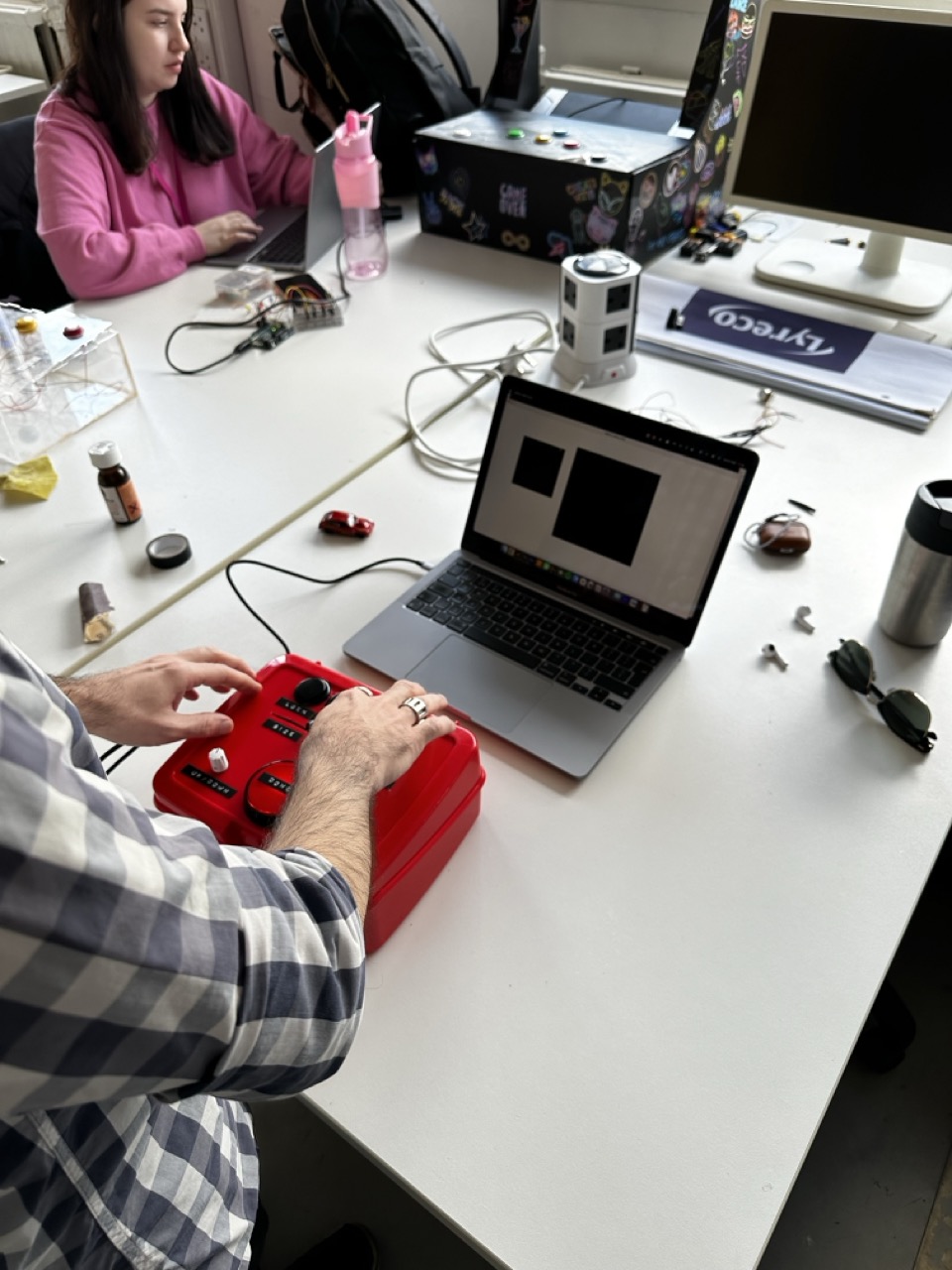
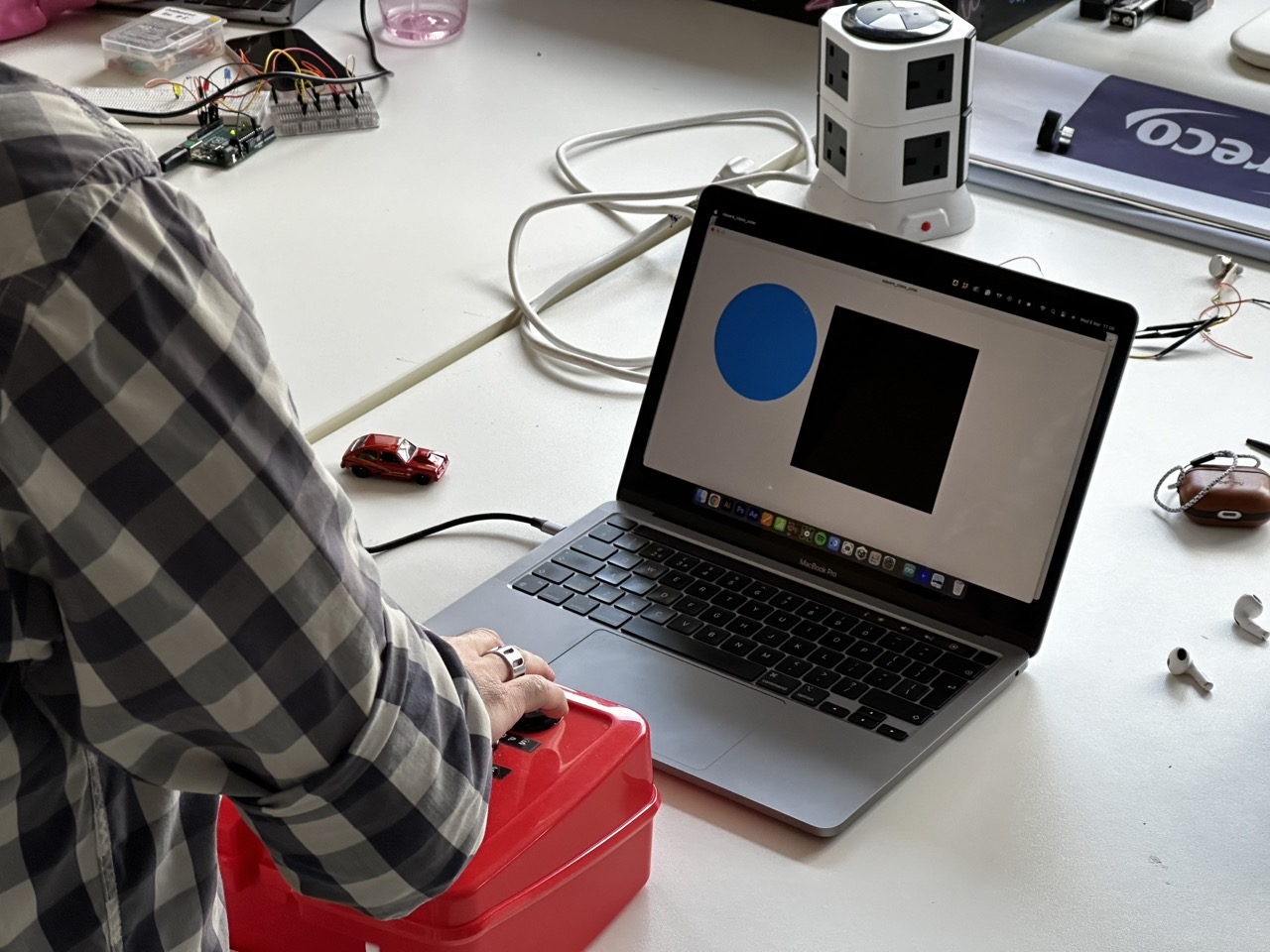
The Code :
//defining the buttons, potentiometers and leds coming in from the Arduinovoid setupArduino() { myArduino.pinMode(pot1, Arduino.INPUT); myArduino.pinMode(pot2, Arduino.INPUT); myArduino.pinMode(pot3, Arduino.INPUT); myArduino.pinMode(pot4, Arduino.INPUT); myArduino.pinMode(BigButton, Arduino.INPUT_PULLUP); myArduino.pinMode(button1, Arduino.INPUT_PULLUP); myArduino.pinMode(button2, Arduino.INPUT_PULLUP); myArduino.pinMode(button3, Arduino.INPUT_PULLUP); myArduino.pinMode(button4, Arduino.INPUT_PULLUP); myArduino.pinMode(BigButtonLed, Arduino.OUTPUT);}
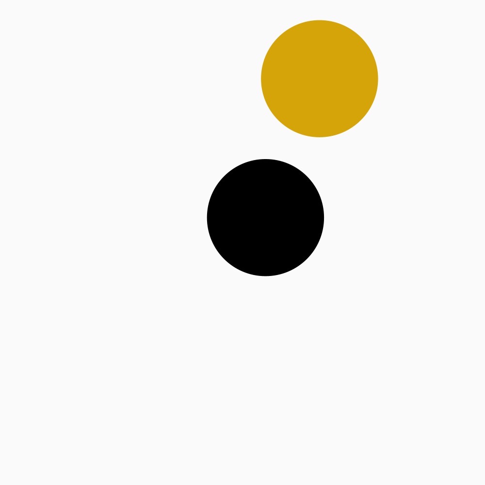
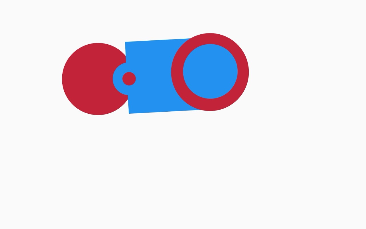
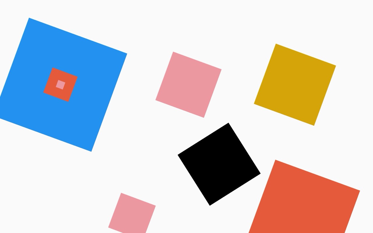
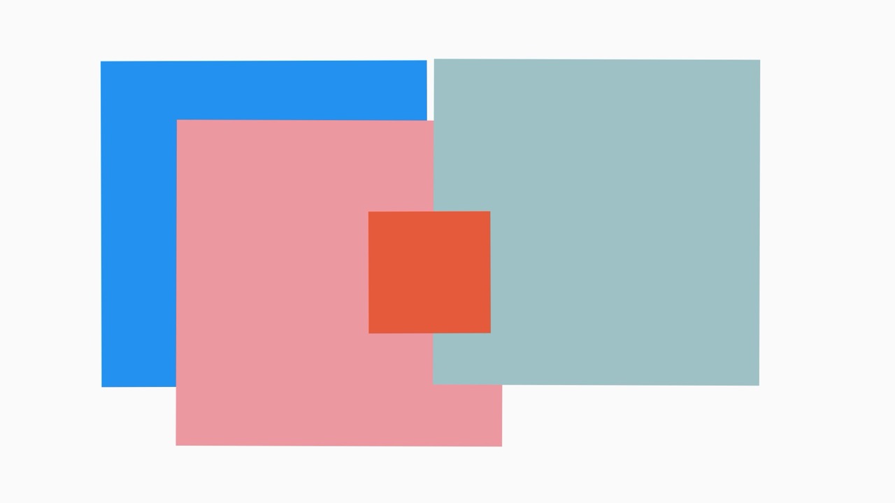
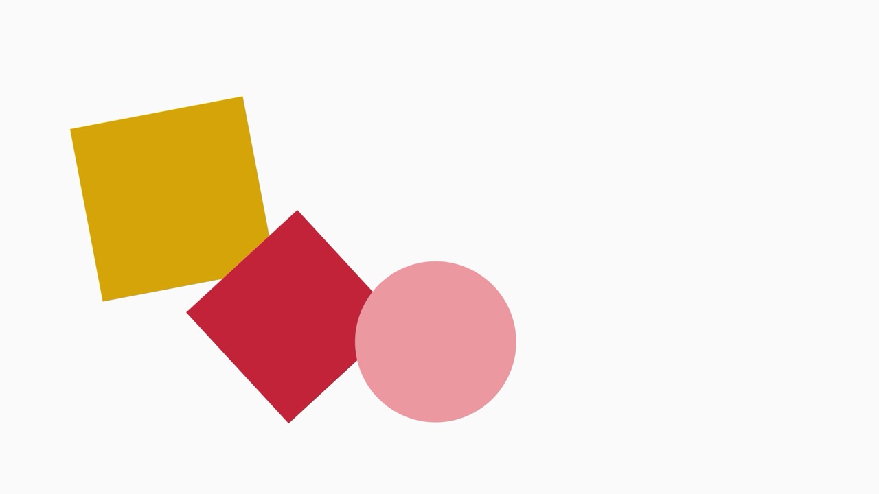
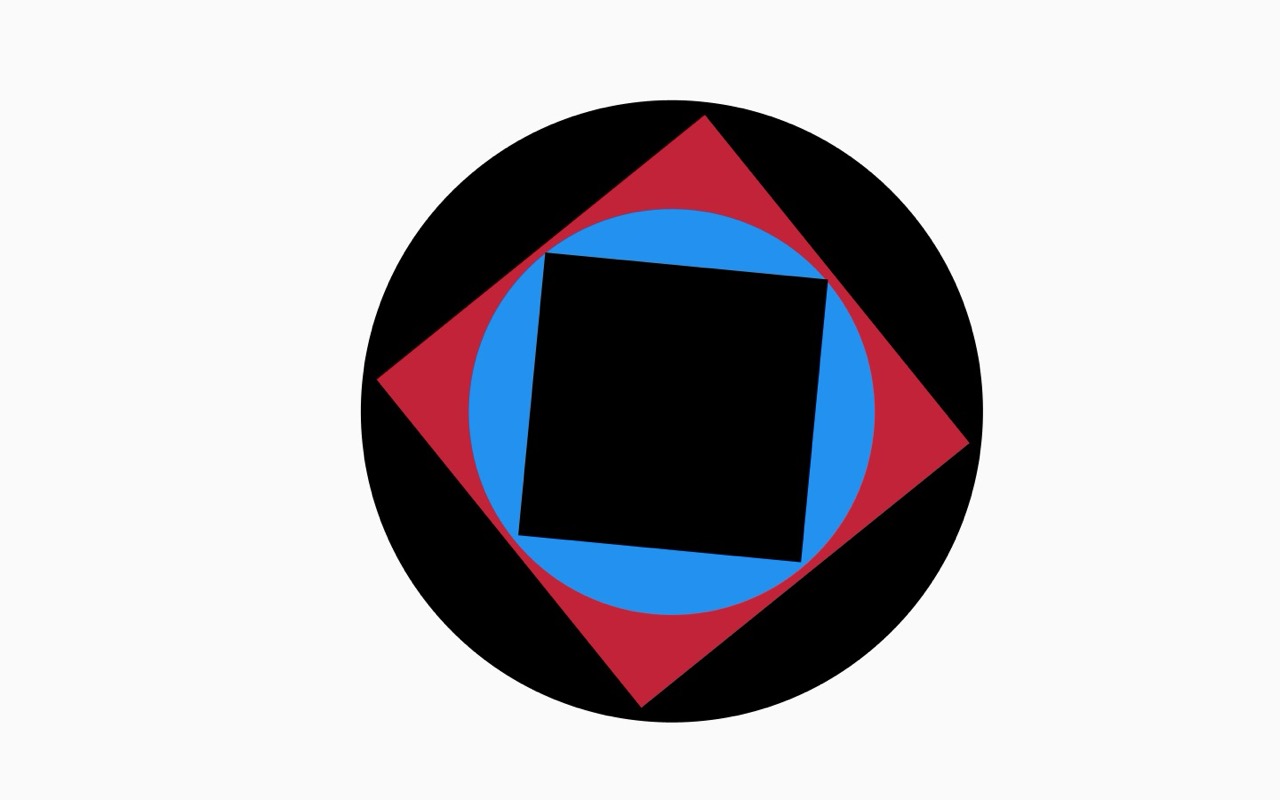
//a square class to draw the shape with a if/else loop to change the square to a circleclass Square { float x; float y; float size = 20; color col; float rot; int s = 0; Square(float _x, float _y) { x = _x; y = _y; } void display() { fill(col); noStroke(); pushMatrix(); translate(x, y); float r = radians(rot); rotate(r); if (s == 0) { square(0, 0, size); } else if (s == 1) { circle(0, 0, size); } popMatrix(); }}
// note of serial port coming from arduino ide
//serial point 02
///dev/cu.usbmodem1101
//using formata to talk to processing
import processing.serial.*;
import cc.arduino.*;
Arduino myArduino;
//set up which button, potentiometer and led is in which port
final int pot1 = 0;
final int pot2 = 1;
final int pot3 = 2;
final int pot4 = 3;
final int BigButton = 6;
final int button1 = 10;
final int button2 = 9;
final int button3 = 8;
final int button4 = 7;
final int BigButtonLed = 12;
//putting each button and potentiometer into an array, a tidier solution that writing out each function for each input
final int [] allButtons = {BigButton, button1, button2, button3, button4};
int [] lastButtonStates;
//final int [] allPot = {pot1, pot2, pot3, pot4};
Square [] squares;
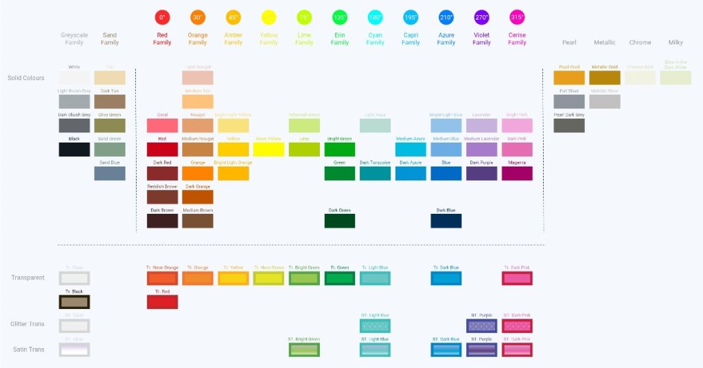
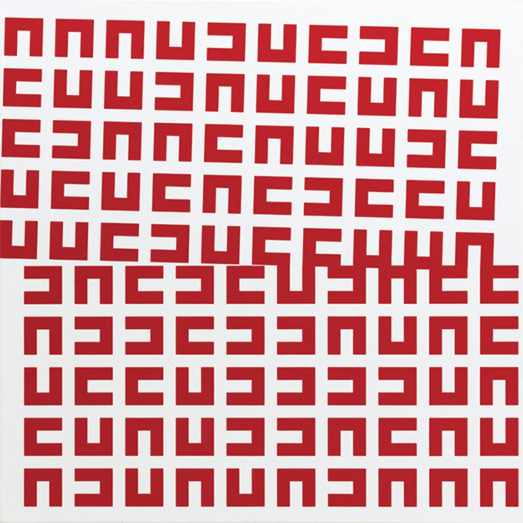
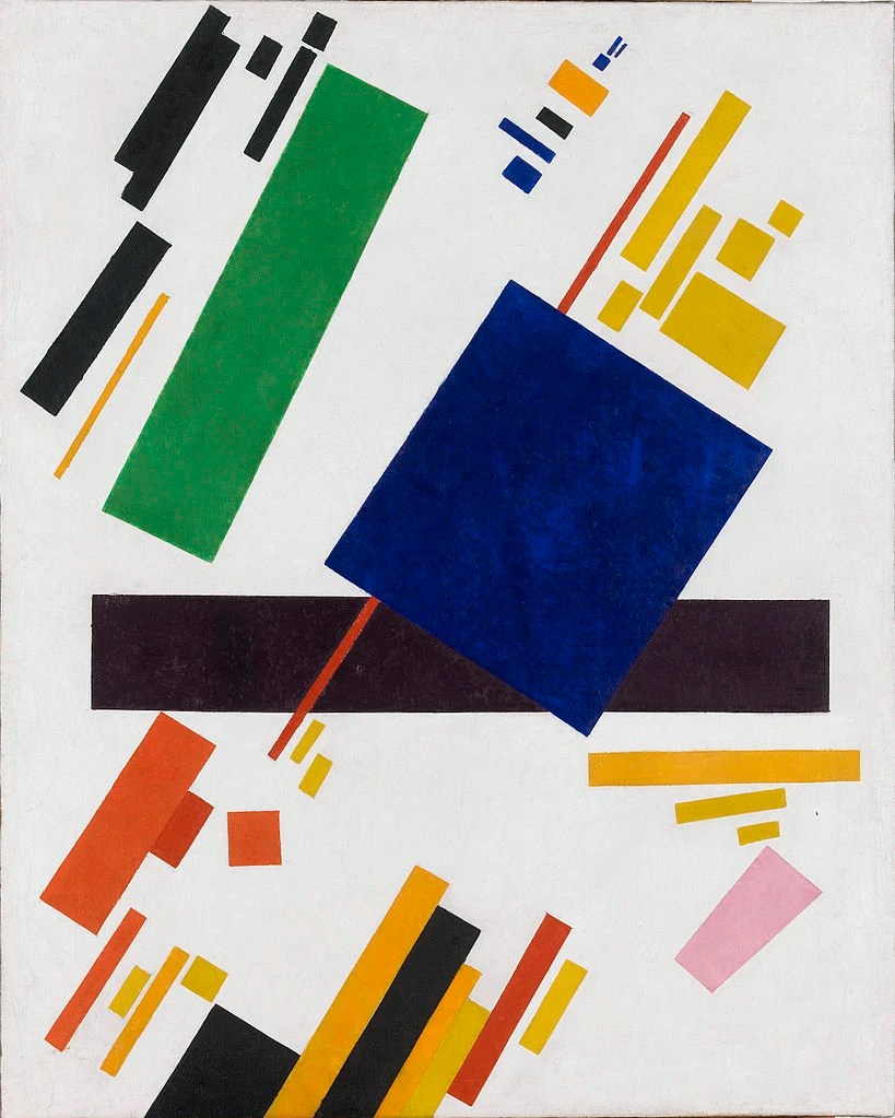
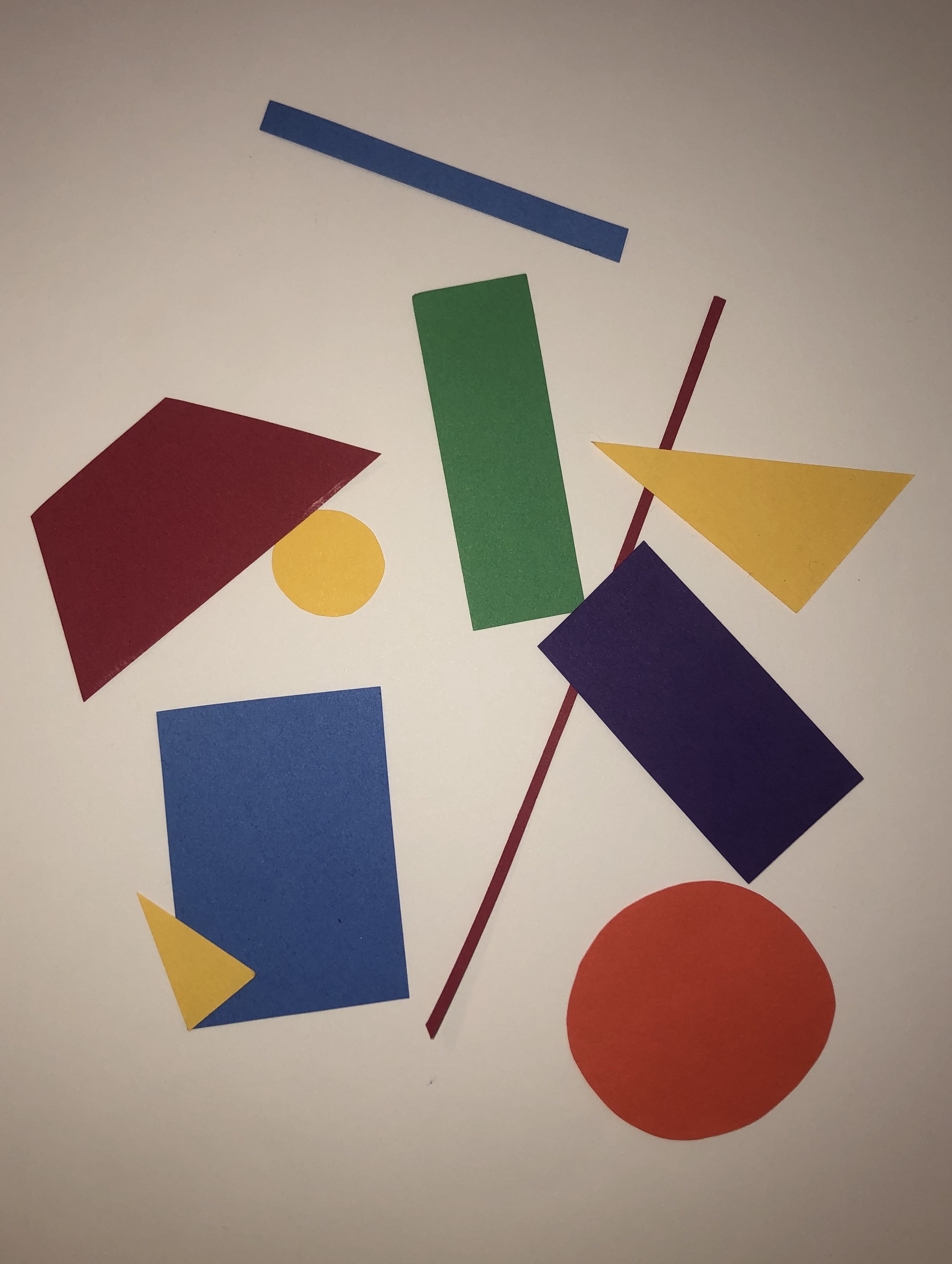
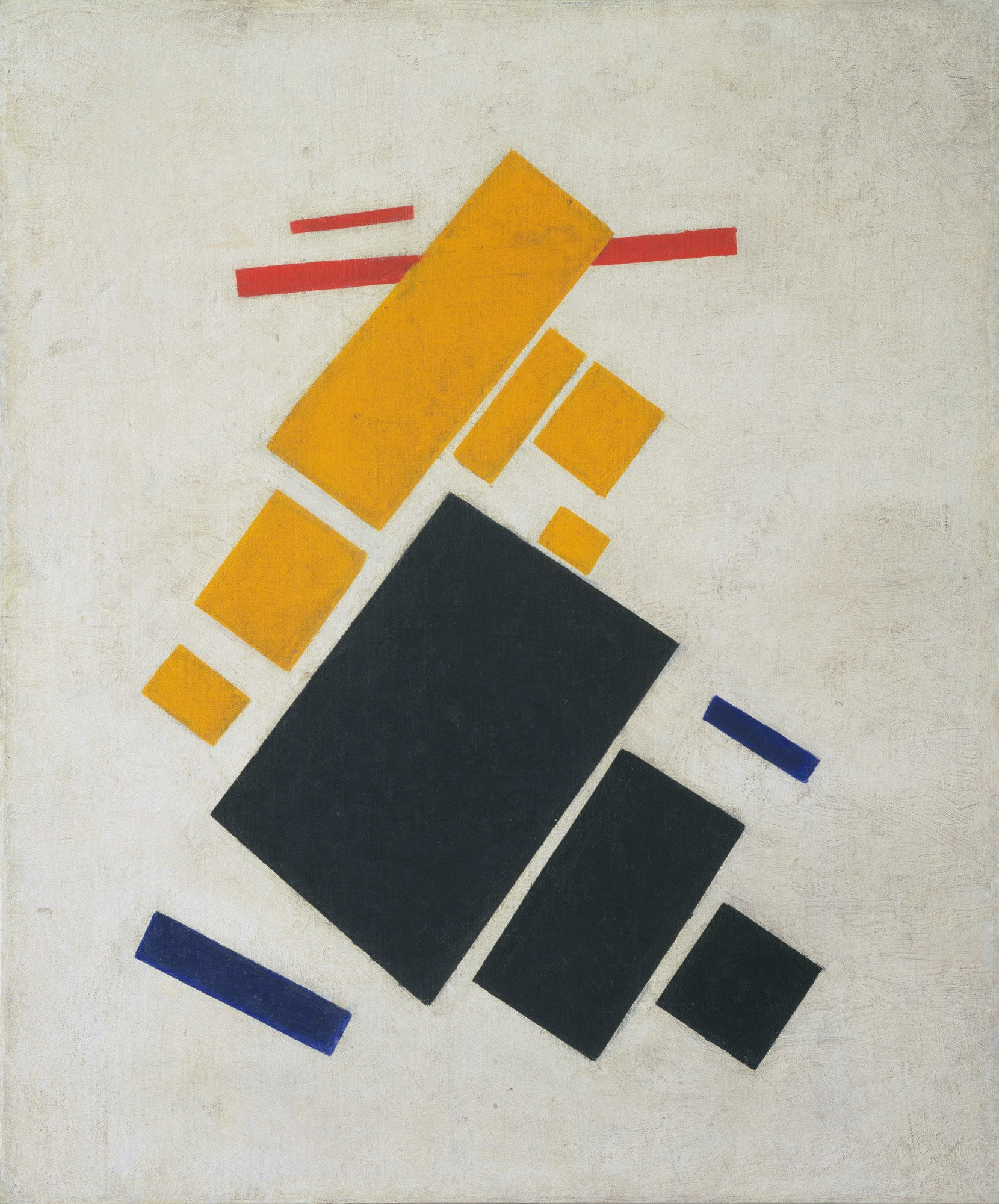
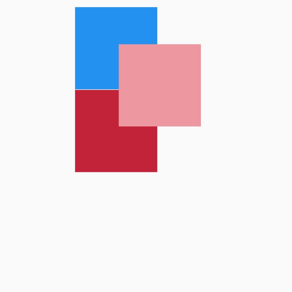
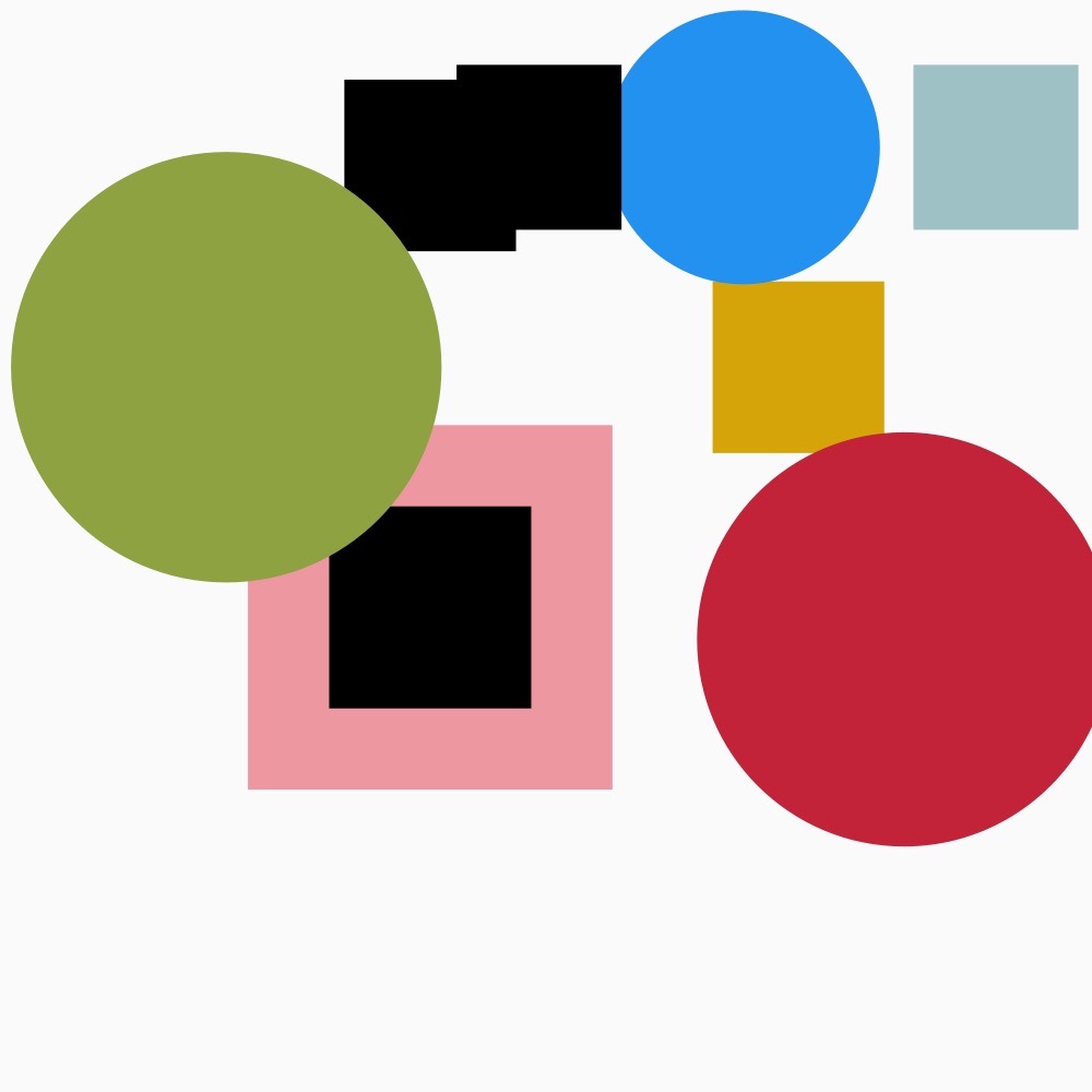
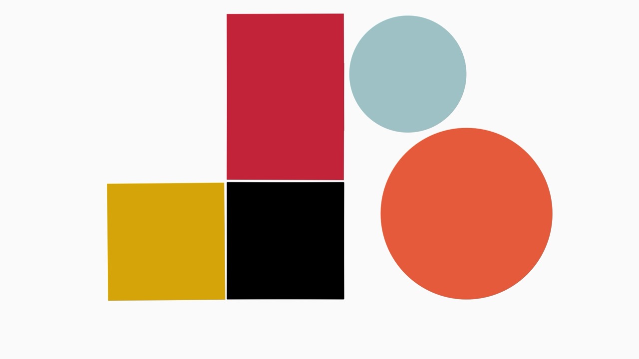
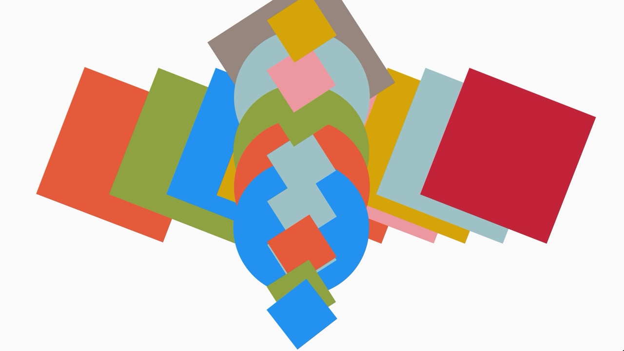
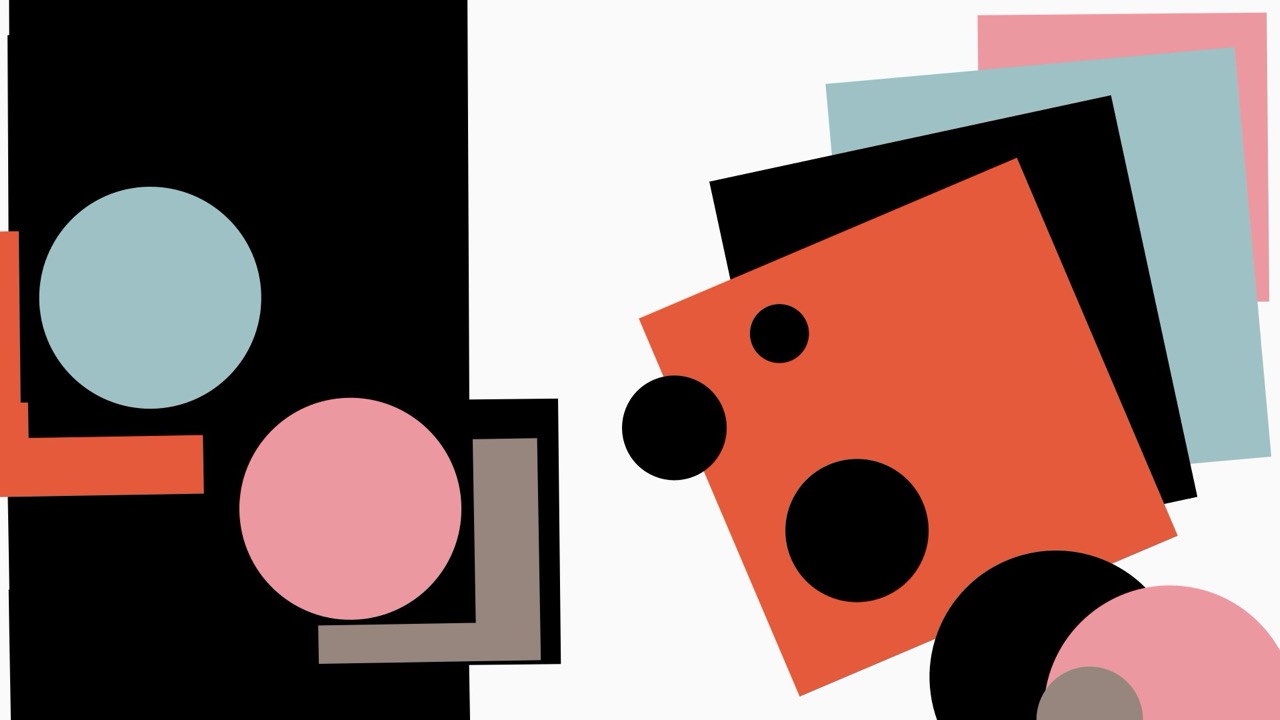
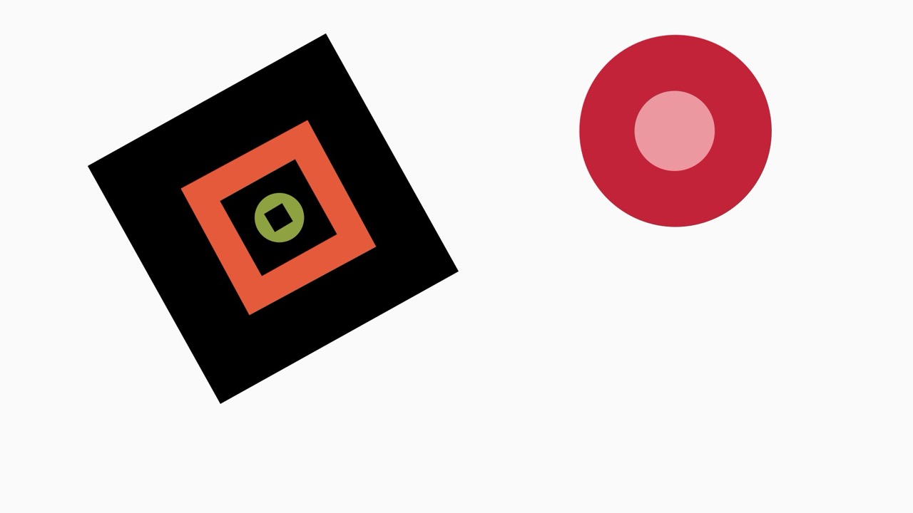
// a selected colour palette to replicate the colours used by Mclaughlin and Malevich from the 1960's hard edge paint movement and putting them into an array
color CGrey = color(151, 134, 126);
color CRed = color(194, 35, 56);
color CGreen = color(142, 162, 65);
color CBlue = color(34, 145, 240);
color CLBlue = color(158, 193, 197);
color CYellow = color(213, 164, 9);
color COrange = color(229, 90, 59);
color CPink = color(237, 152, 161);
color [] colours = {CGrey, CRed, CGreen, CBlue, CLBlue, CYellow, COrange, CPink};
int squareNum = 0;
int shape = 0;
void setup() {
fullScreen();
//fullScreen(2);
//size(1900, 900);
background(250);
rectMode(CENTER);
//printArray(Arduino.list());
myArduino = new Arduino(this, Arduino.list()[2], 57600);
setupArduino();
//drawing the square and taking the reading from the X and Y potentiometers
squares = new Square[1];
float x = xPotRead();
float y = yPotRead();
Square s = new Square(x, y);
// Square s = new Square(width/2, height/2);
squares[squareNum] = s;
lastButtonStates = new int[allButtons.length];
for (int i = 0; i < lastButtonStates.length; i ++) {
lastButtonStates[i] = Arduino.HIGH;
}
myArduino.pinMode(BigButtonLed, Arduino.OUTPUT);
}
void draw() {
background(250);
myArduino.digitalWrite(BigButtonLed, Arduino.HIGH);
for (int i = 0; i < squares.length; i ++) {
squares[i].display();
}
float s = adjustSize();
squares[squareNum].size = s;
float r = adjustRotation();
squares[squareNum].rot = r;
float x = xPotRead();
squares[squareNum].x = x;
float y = yPotRead();
squares[squareNum].y = y;
// a for loop to check each button state if they are pushed or not
for (int b = 0; b < allButtons.length; b ++) {
int buttonState = myArduino.digitalRead(allButtons[b]);
if (lastButtonStates[b] != buttonState) {
lastButtonStates[b] = buttonState;
if (buttonState == Arduino.LOW) {
switch(b) {
// each button has a case that defines which each button does
case 0:
saveSquare();
break;
case 1:
createSquare();
break;
case 2:
selectColor();
break;
case 3:
if (shape == 0) {
shape = 1;
} else {
shape = 0;
}
squares[squareNum].s = shape;
break;
case 4:
resetSquares();
break;
}
}
}
}
}
// reading the the potentiometer and adjusting the size of the shape
float adjustSize() {
int potRead = myArduino.analogRead(1);
float s = map(potRead, 0, 1023, 5, 700);
return s;
}
// reading the the potentiometer and adjusting the rotation of the shape
float adjustRotation() {
int potRead = myArduino.analogRead(4);
float r = map(potRead, 0, 1023, 0, 360);
return r;
}
// a save frame function that
void saveSquare() {
saveFrame();
shape = 0;
squares = new Square[1];
float x = xPotRead();
float y = yPotRead();
Square s = new Square(x, y);
// Square s = new Square(width/2, height/2);
squares[0] = s;
squareNum = 0;
}
void createSquare() {
shape = 0;
float x = xPotRead();
float y = yPotRead();
Square s = new Square(x, y);
squares = (Square[])append(squares, s);
println(squares.length);
squareNum ++;
}
//cycling through a random colour from the colour array
void selectColor() {
int r = (int)random(colours.length);
squares[squareNum].col = colours[r];
}
// clearing and resetting the square array
void resetSquares() {
shape = 0;
squares = new Square[1];
float x = xPotRead();
float y = yPotRead();
Square s = new Square(x, y);
//Square s = new Square(width/2, height/2);
squares[0] = s;
squareNum = 0;
}
//reading and mapping the x coordinates from the potentiometer
float xPotRead() {
int potRead = myArduino.analogRead(2);
float x = map(potRead, 0, 1023, 0, width);
return x;
}
//reading and mapping the y coordinates from the potentiometer
float yPotRead() {
int potRead = myArduino.analogRead(0);
float y = map(potRead, 0, 1023, 0, height);
return y;
}
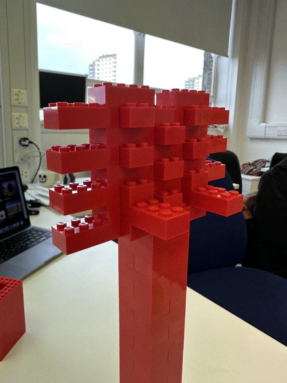
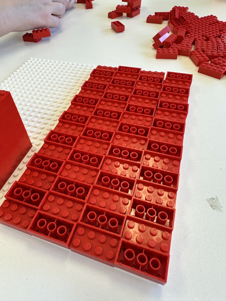
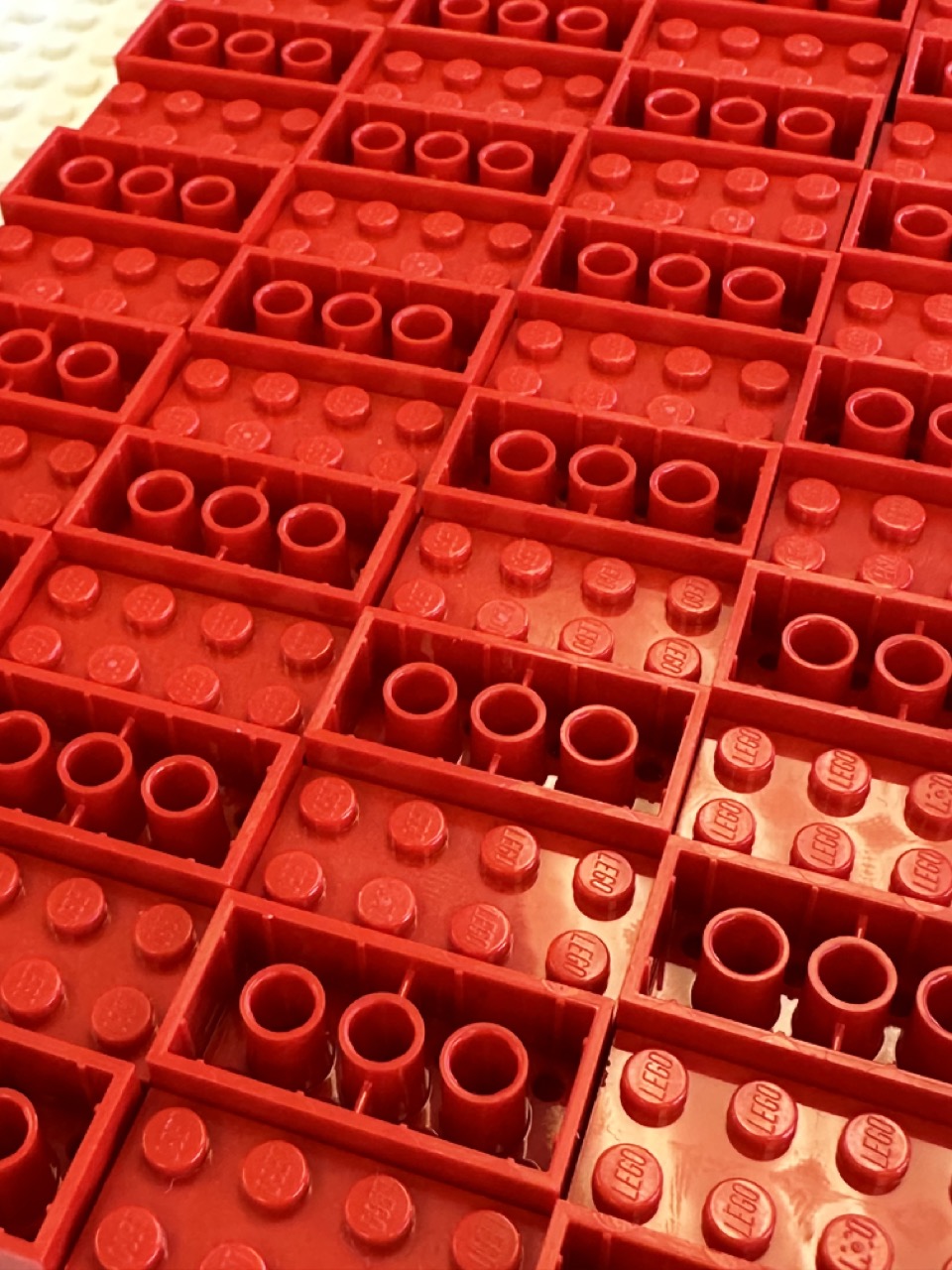
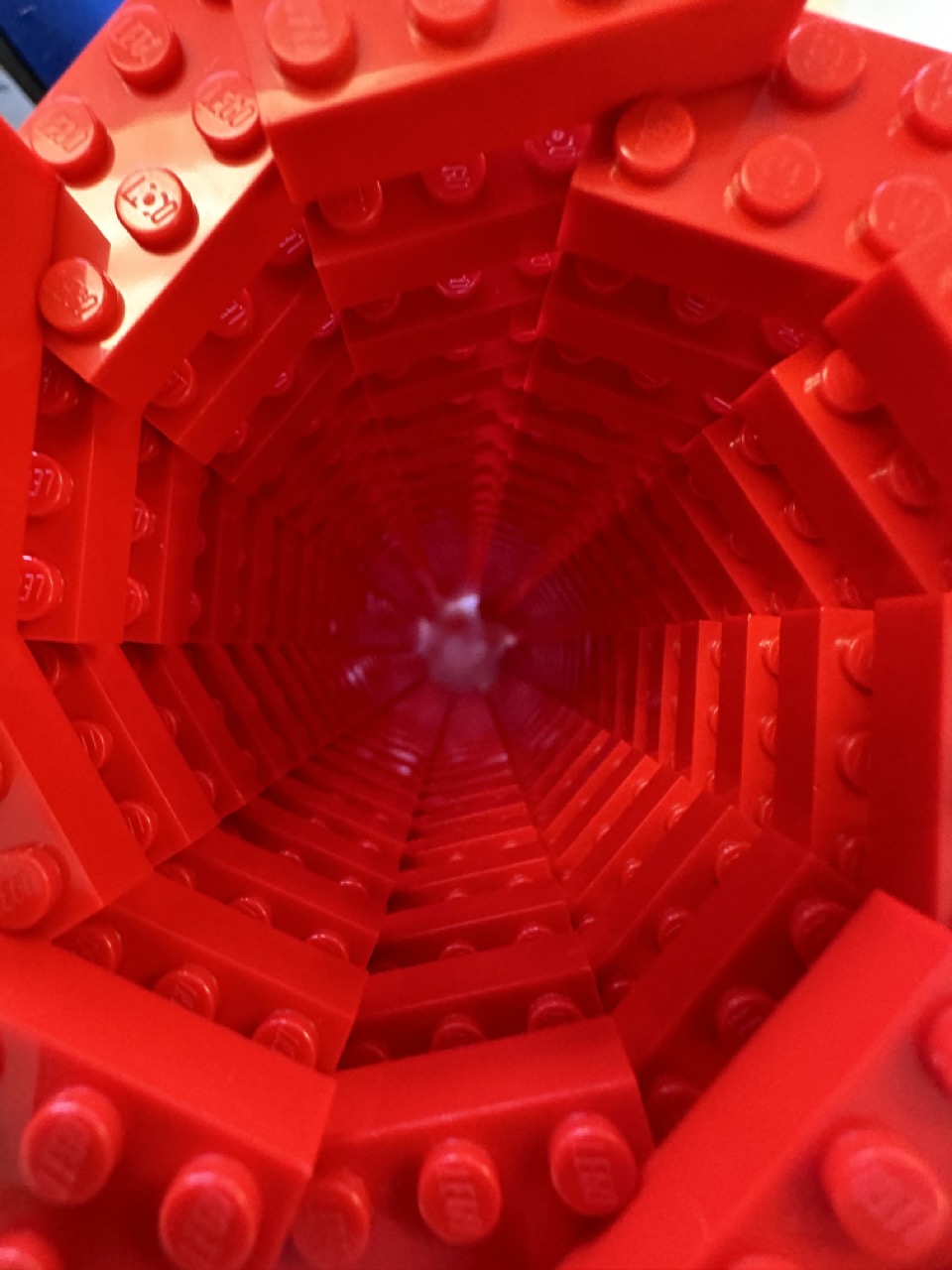
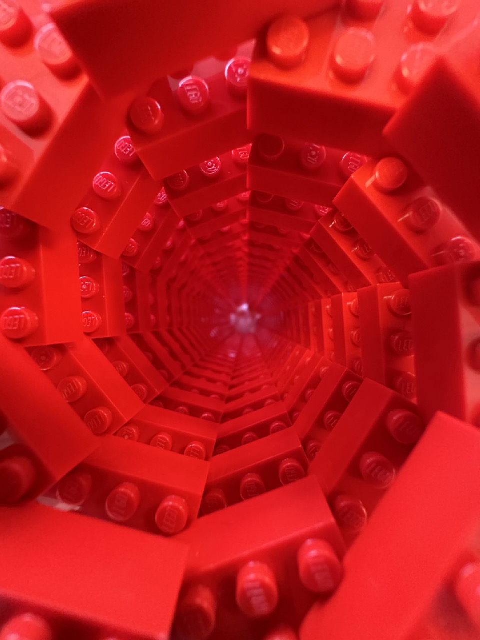
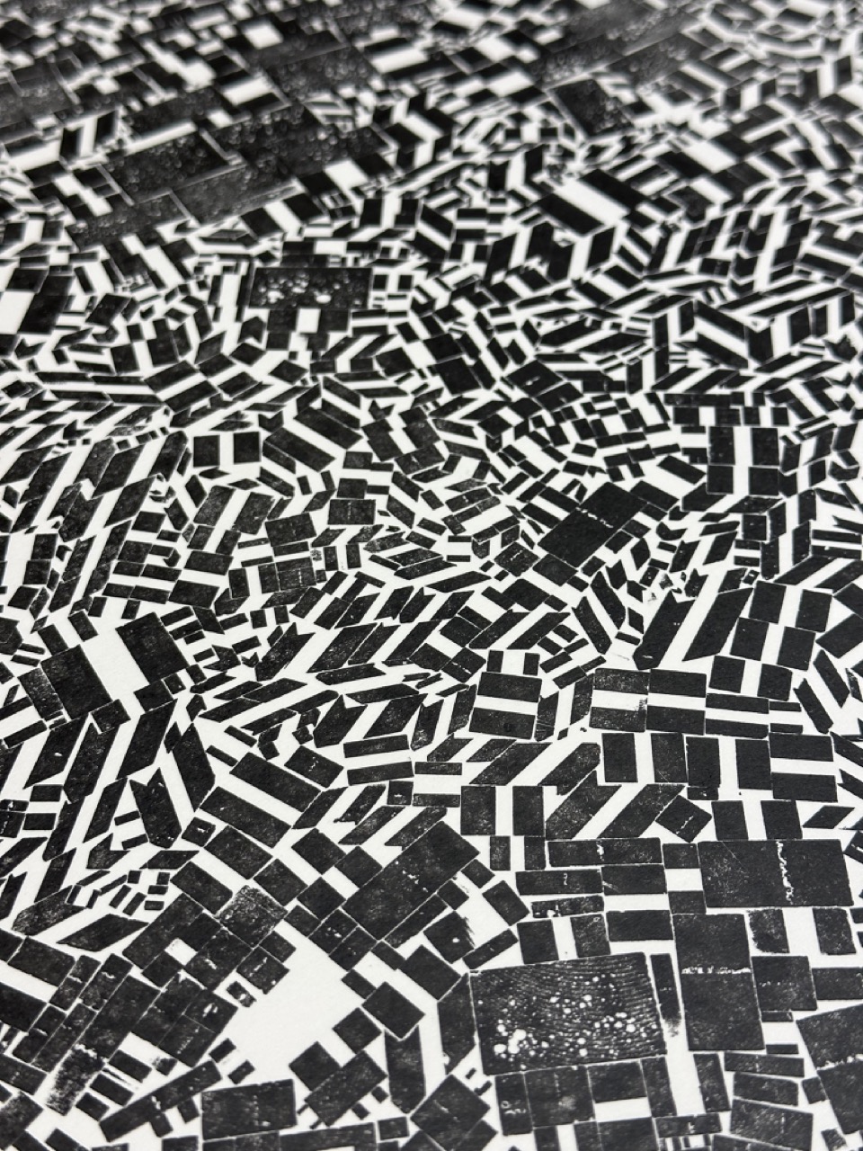
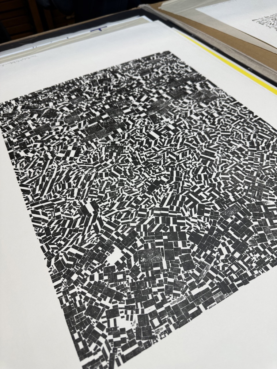
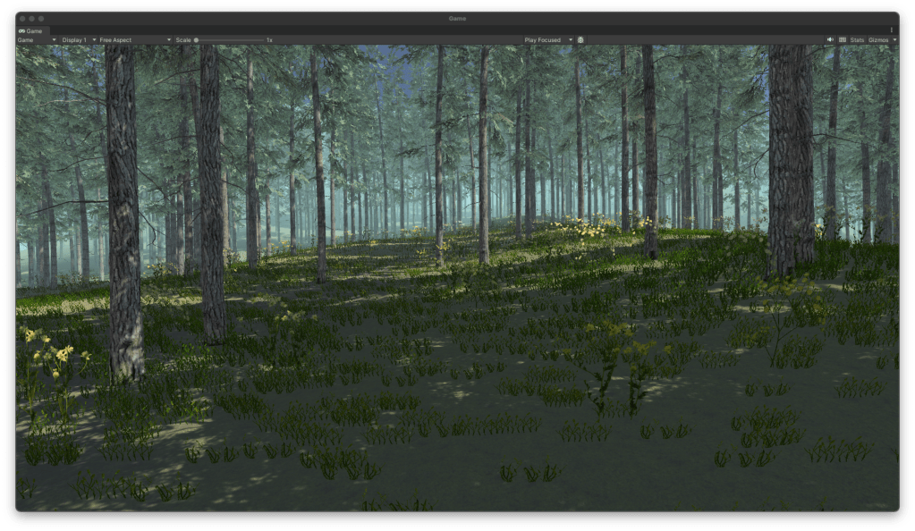
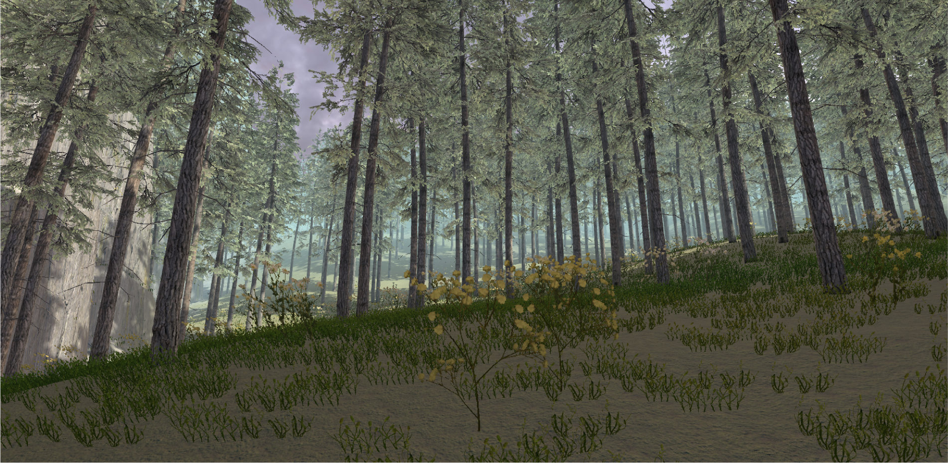
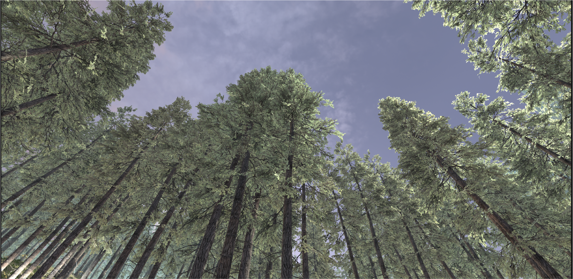
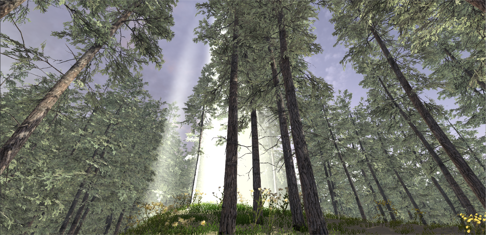
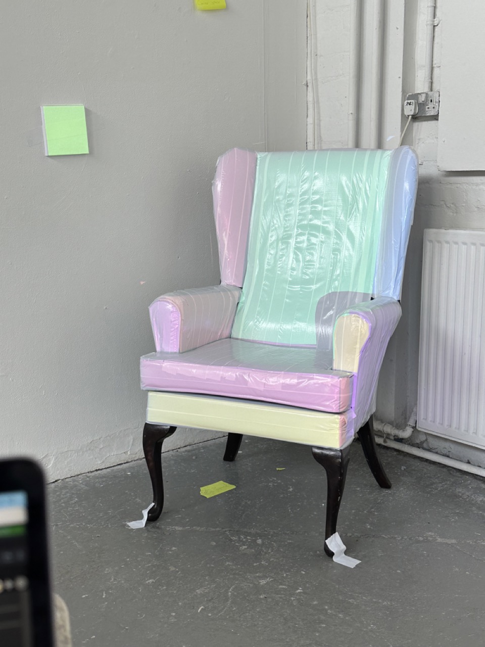
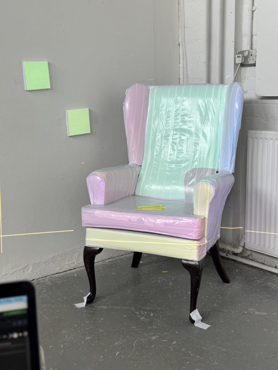
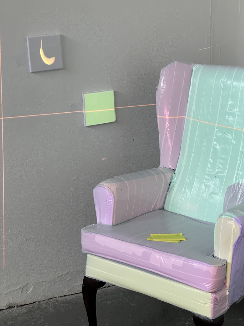
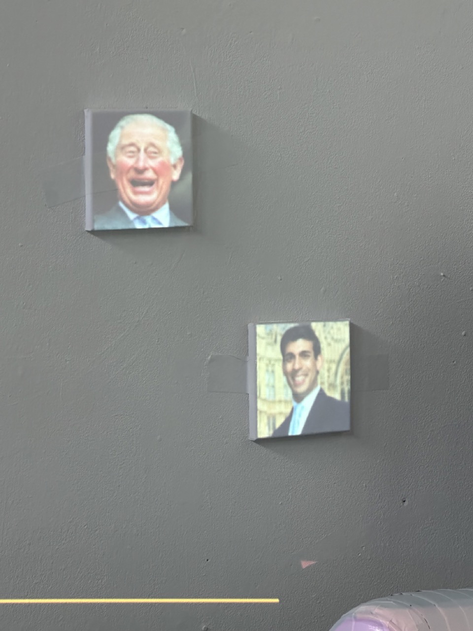
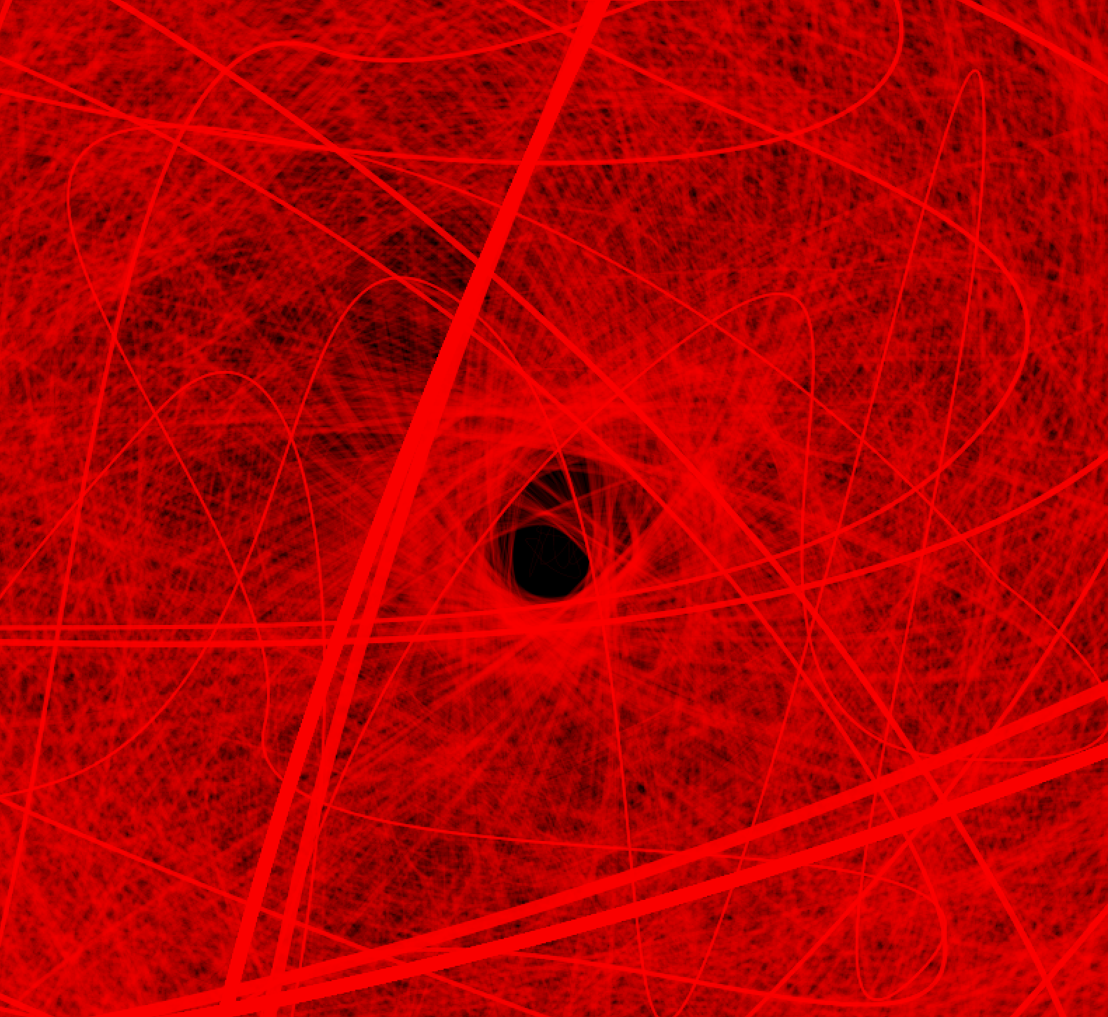
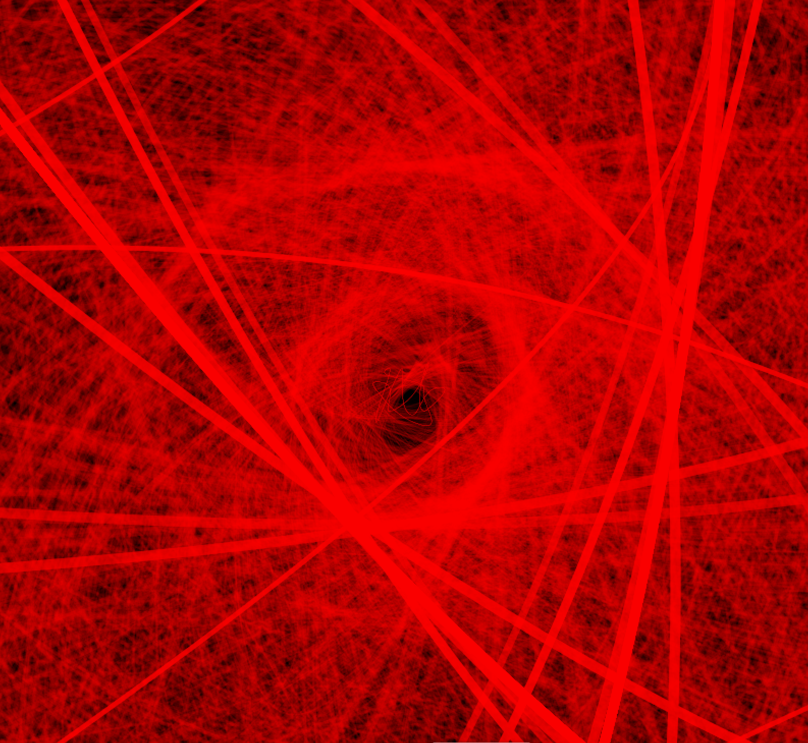
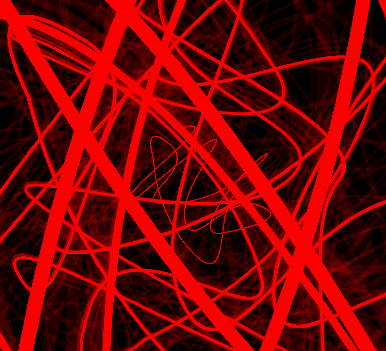
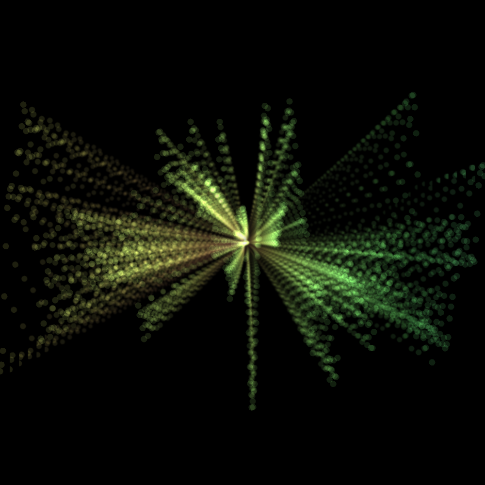
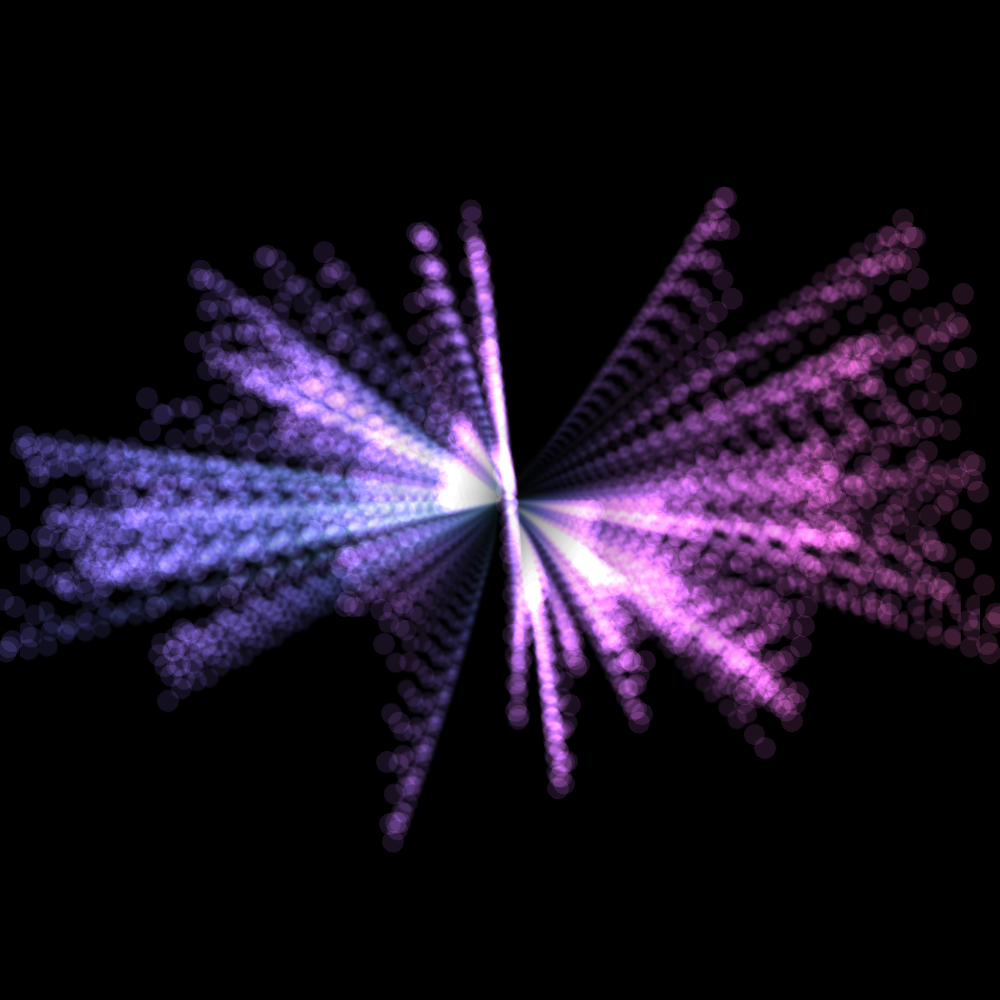
The Jungle :

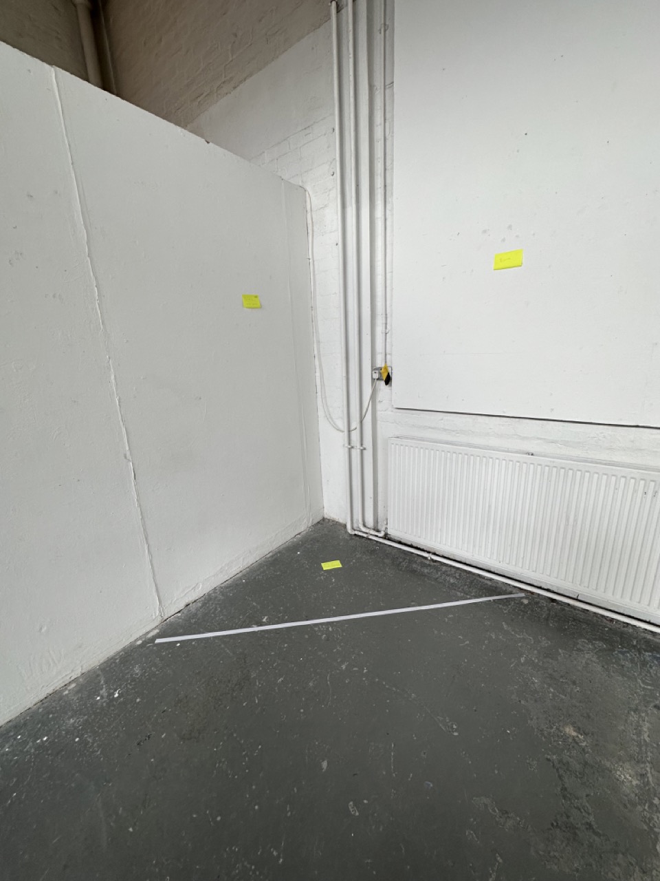
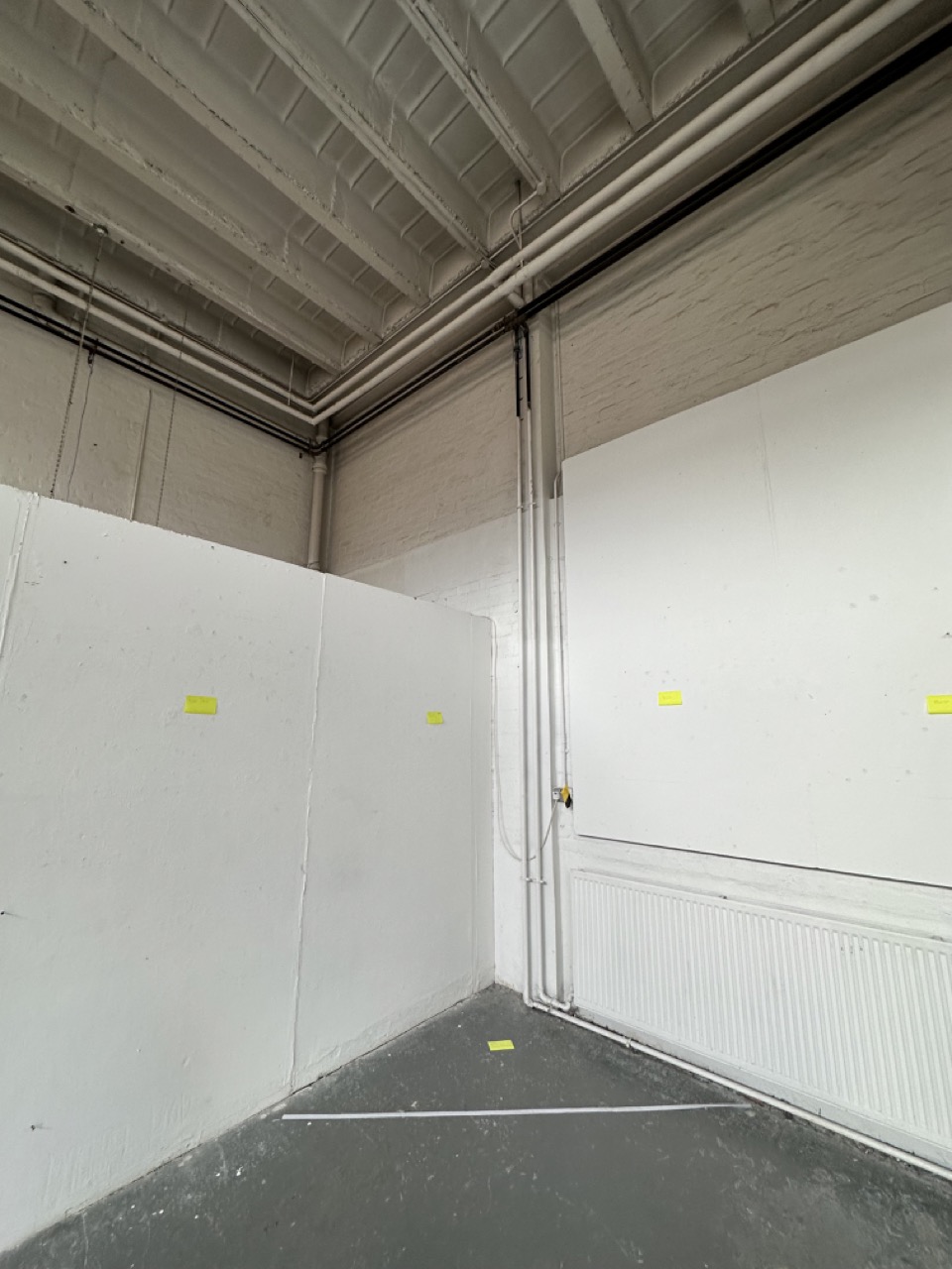
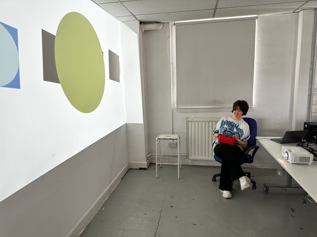
Final Build :


Box in use :


Reflection:
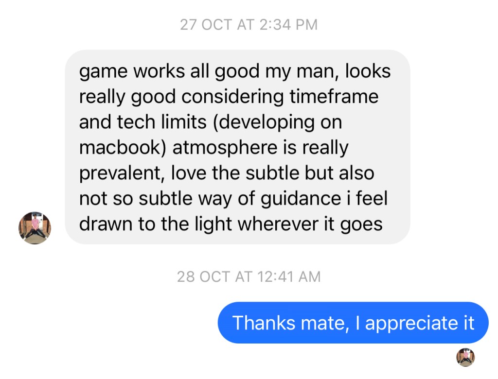
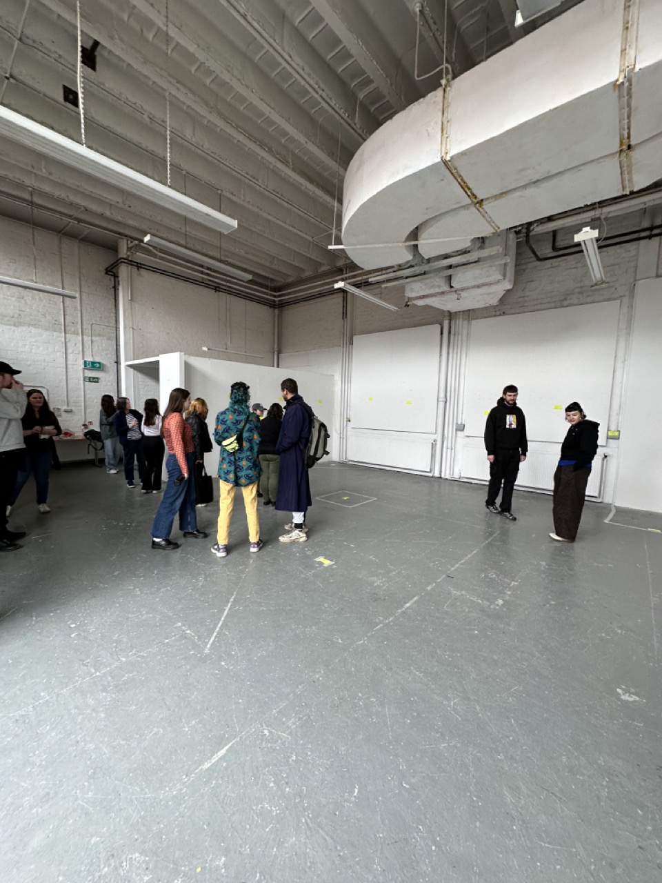
I enjoyed the reaction people had to my control project; the joy and excitement they had towards it was great.
I would love to develop this piece even further; as well as bringing the electronics to a solid professional standard, I would love to add an extra level of polish to the interface and the interactions people have with the box.
If I were to take it further, I would want to work on having the ideal buttons for the box, more chunky and durable, really focusing on the satisfaction of interacting with each component, as well as the iconography on the face of the box, replacing the English labels with universal symbols.