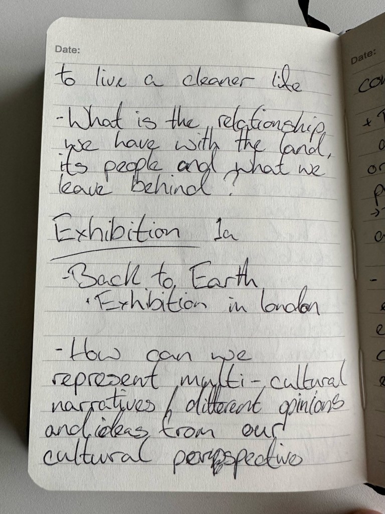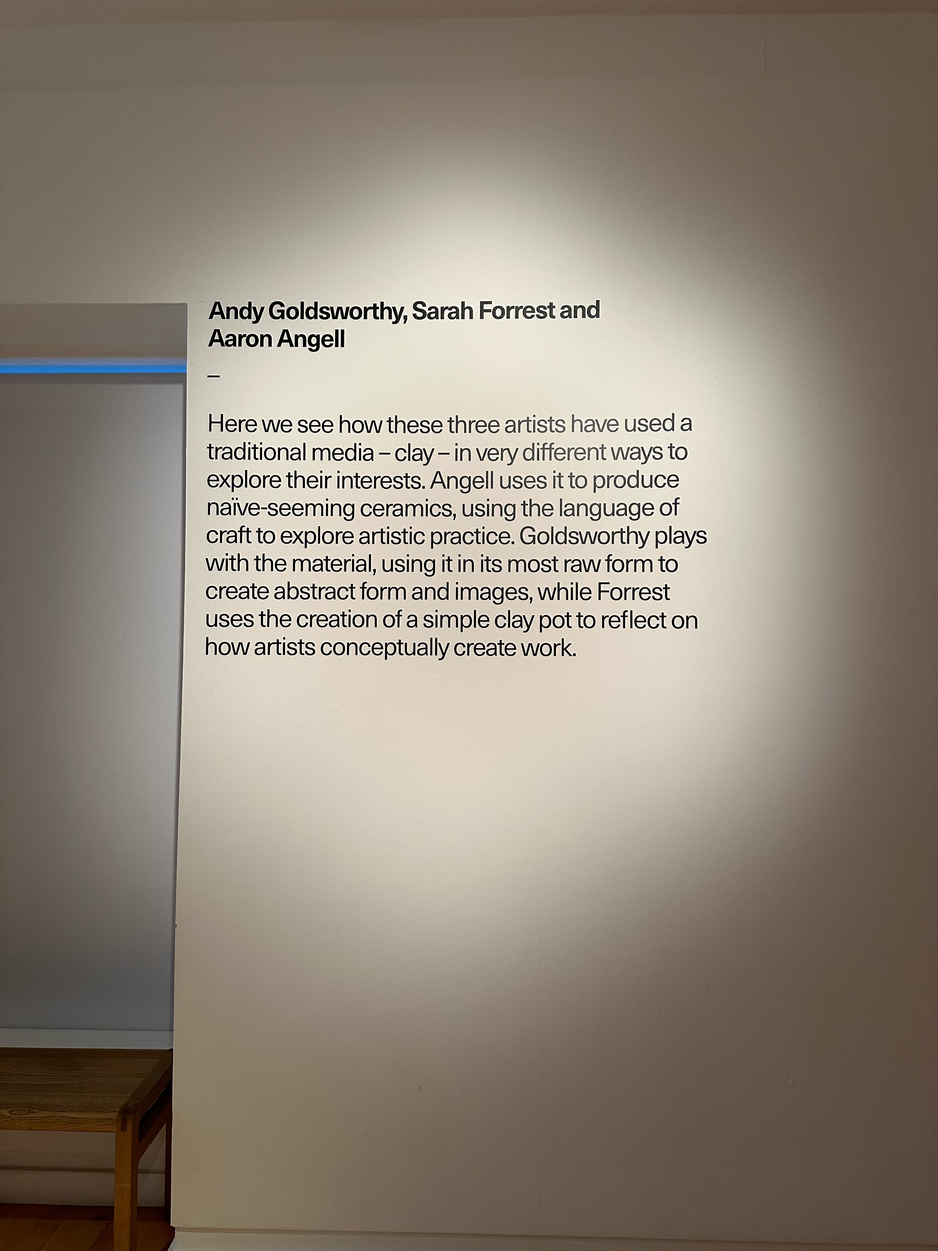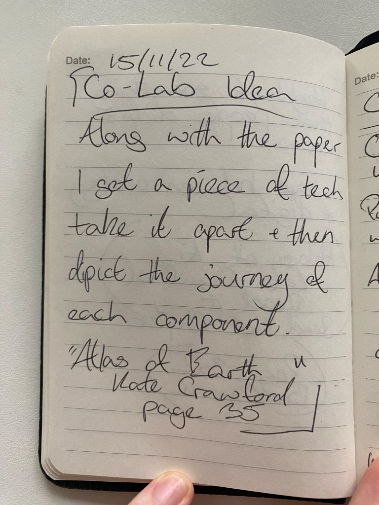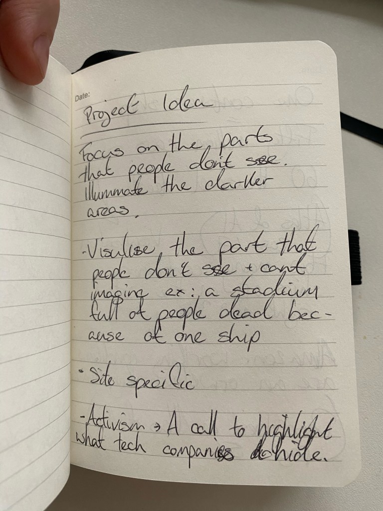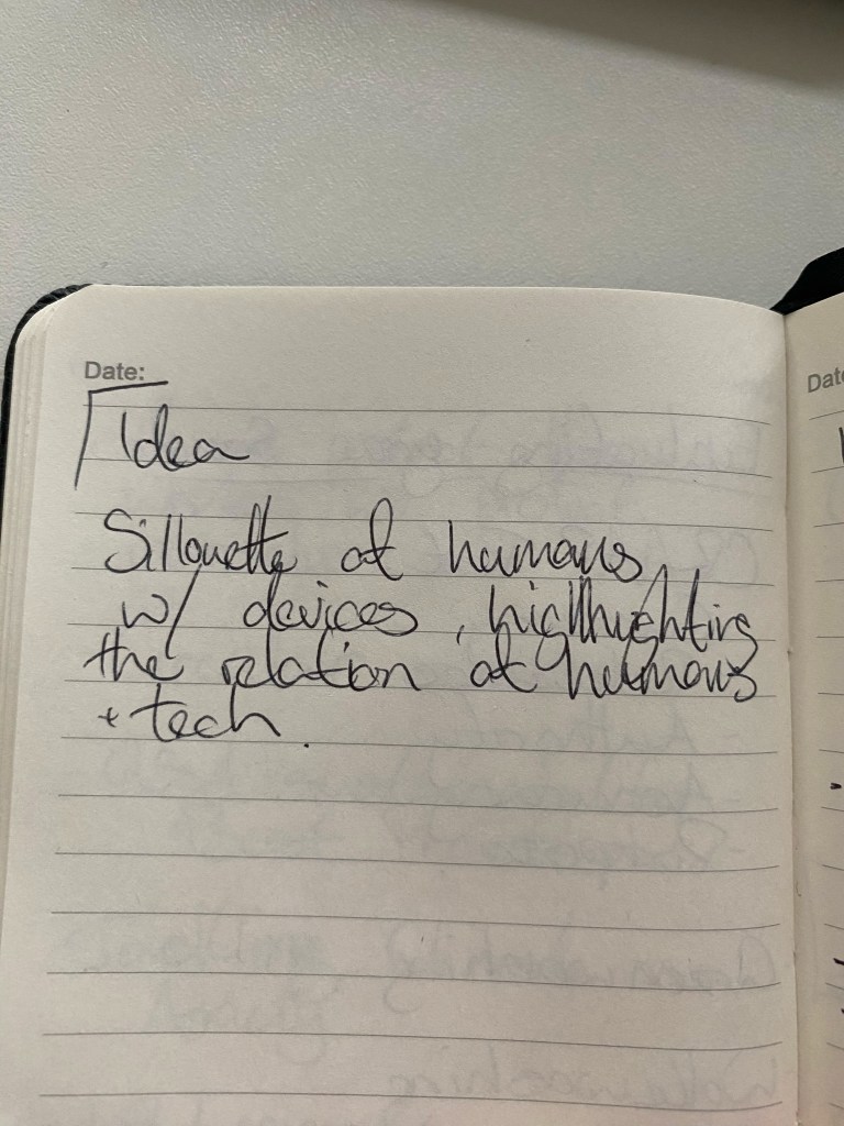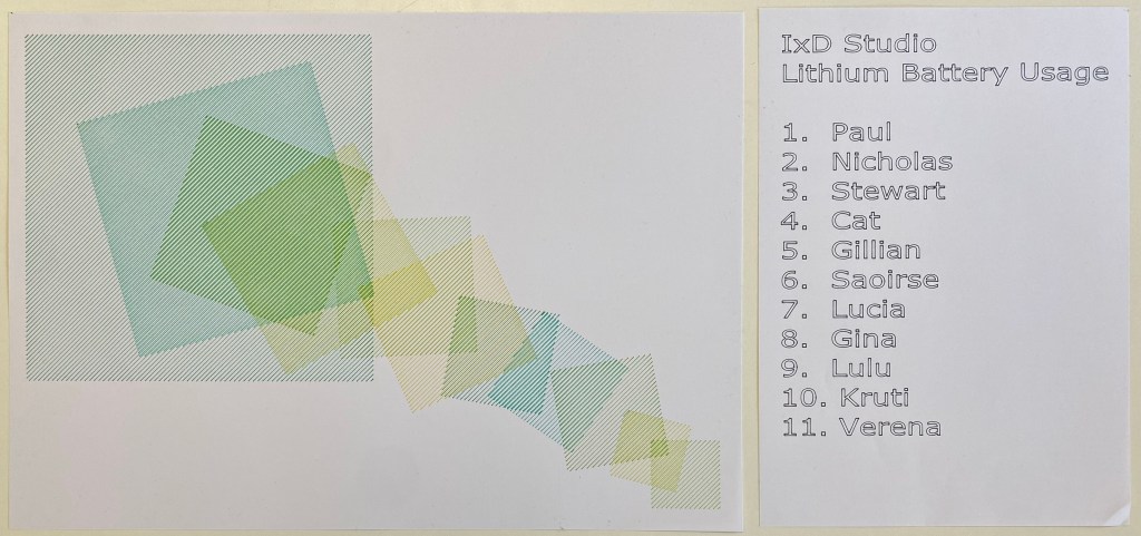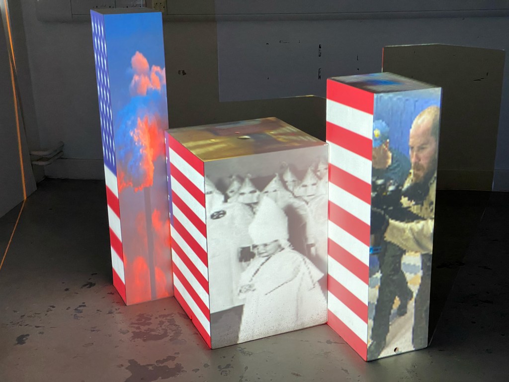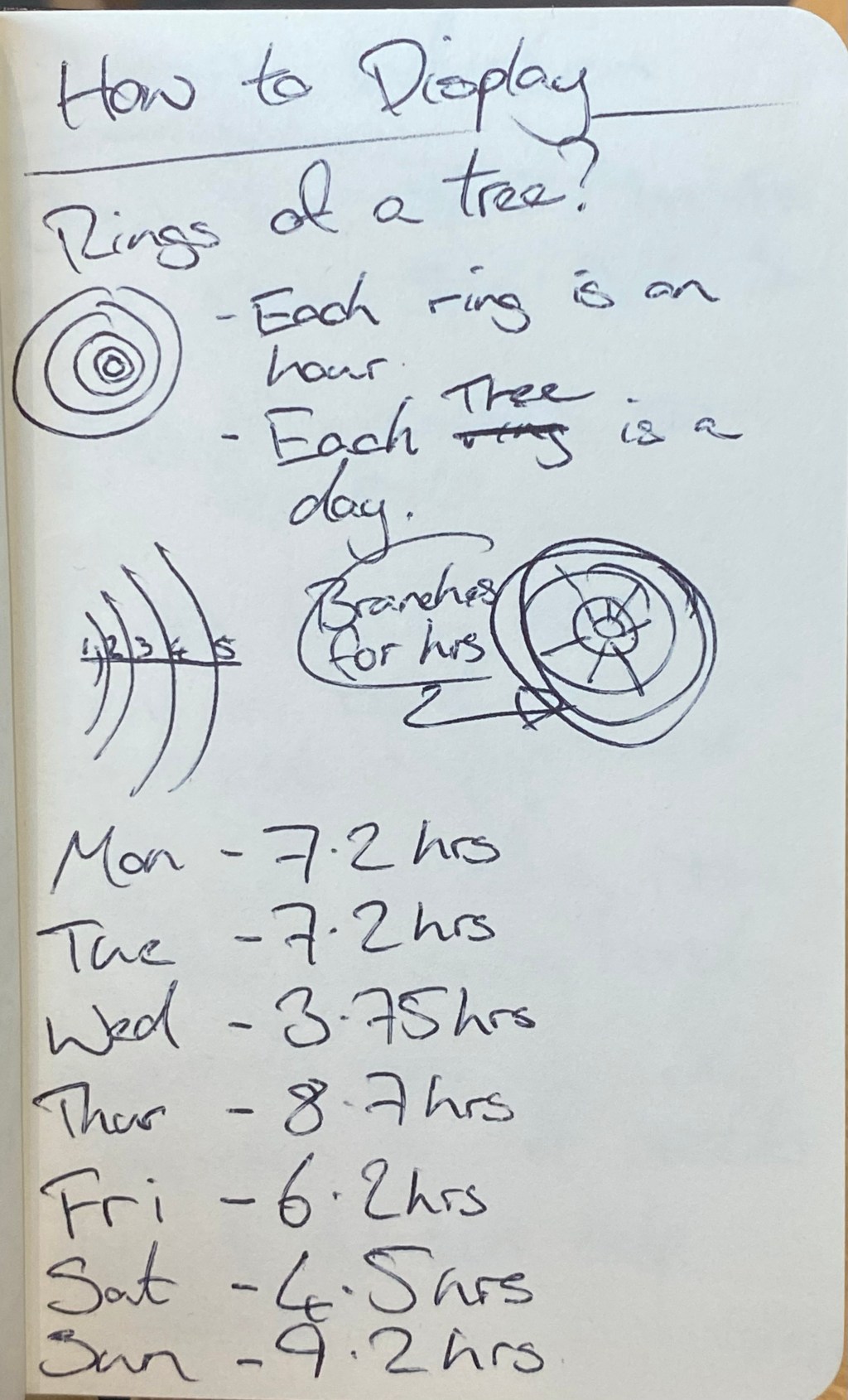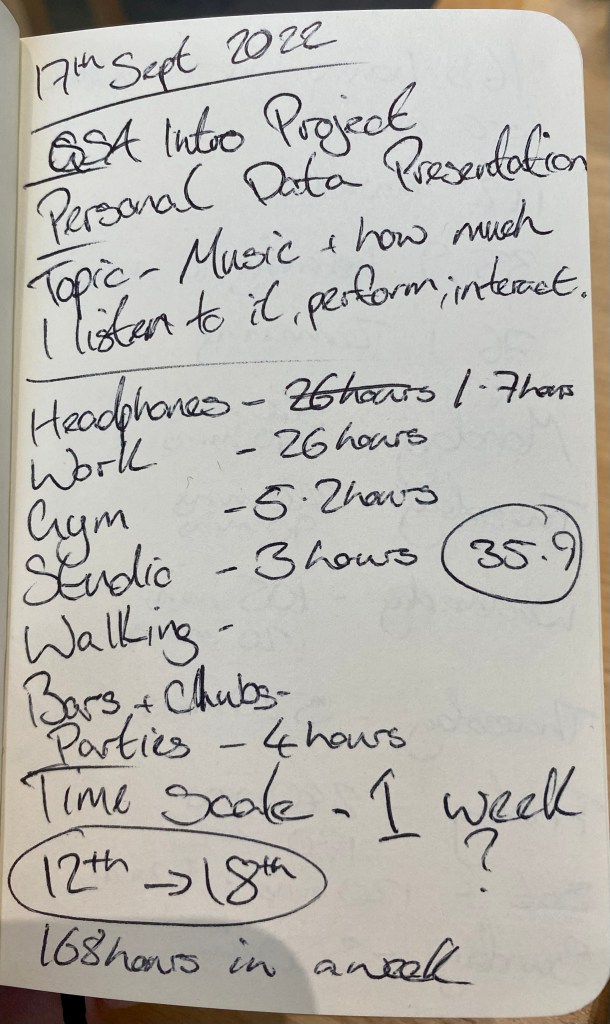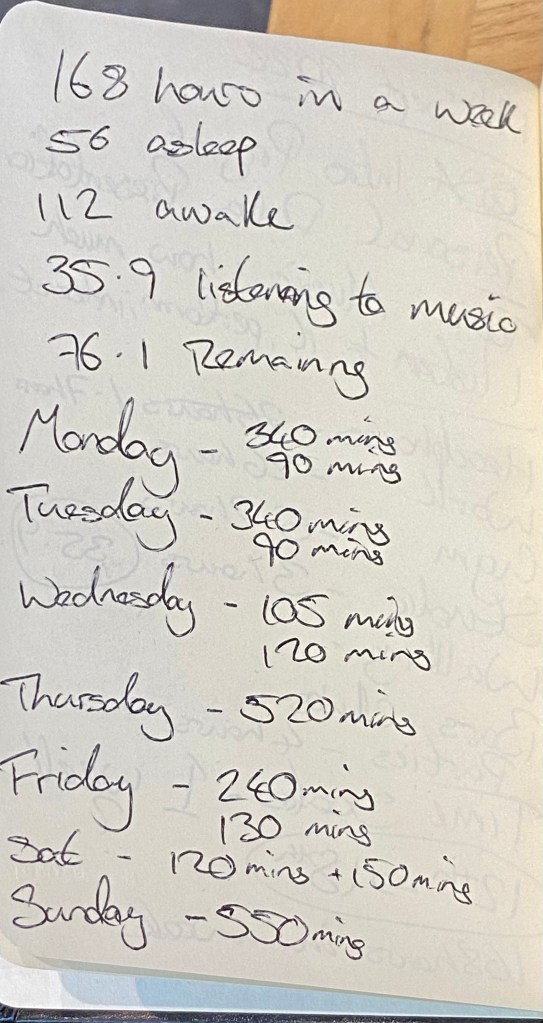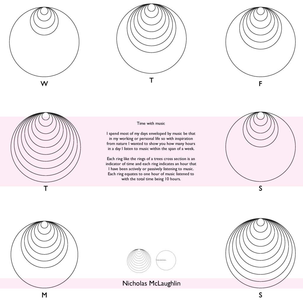
Class 01
Project launch. Using the Arduino Uno to change the sensory output of any household object.
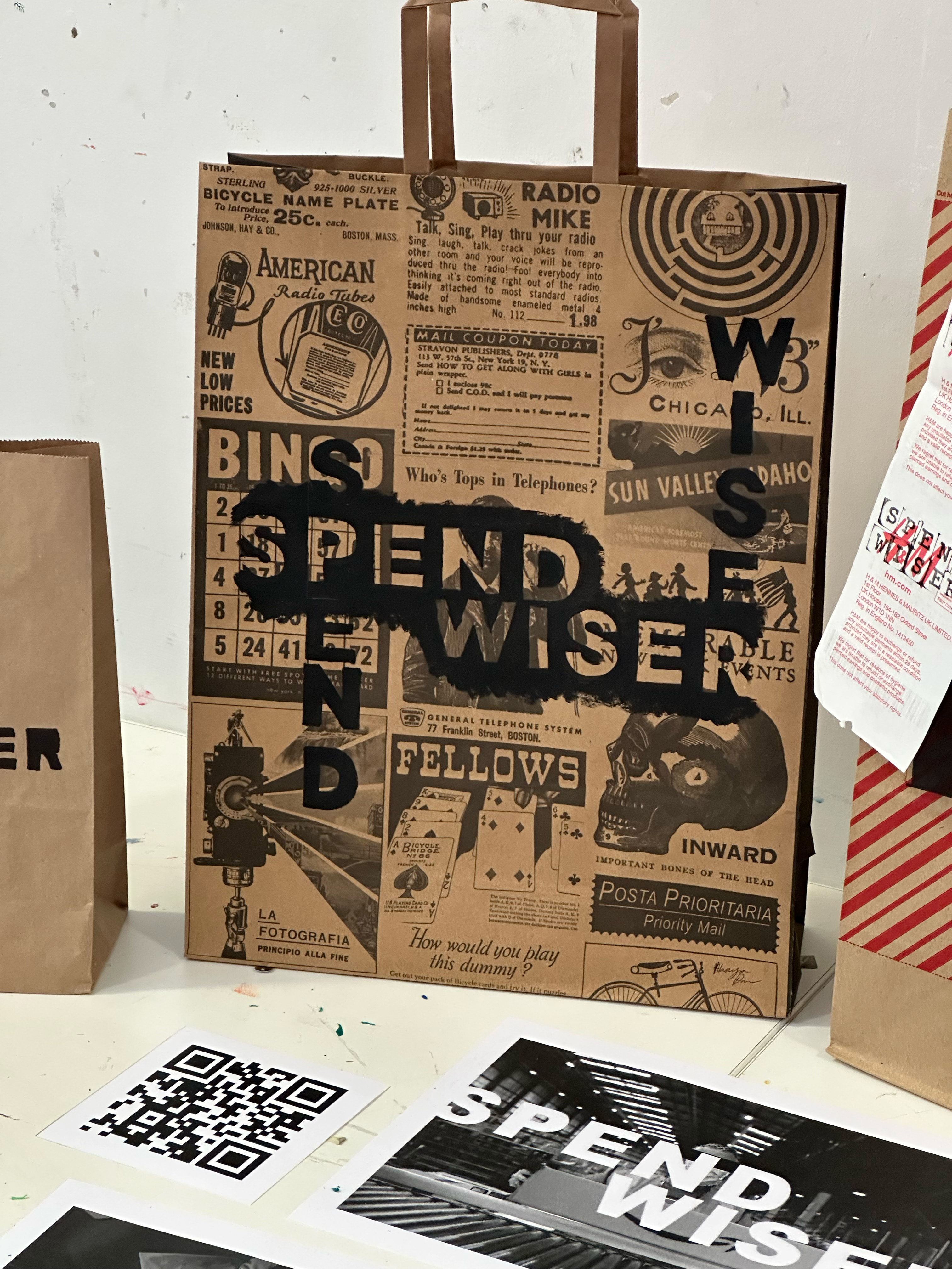
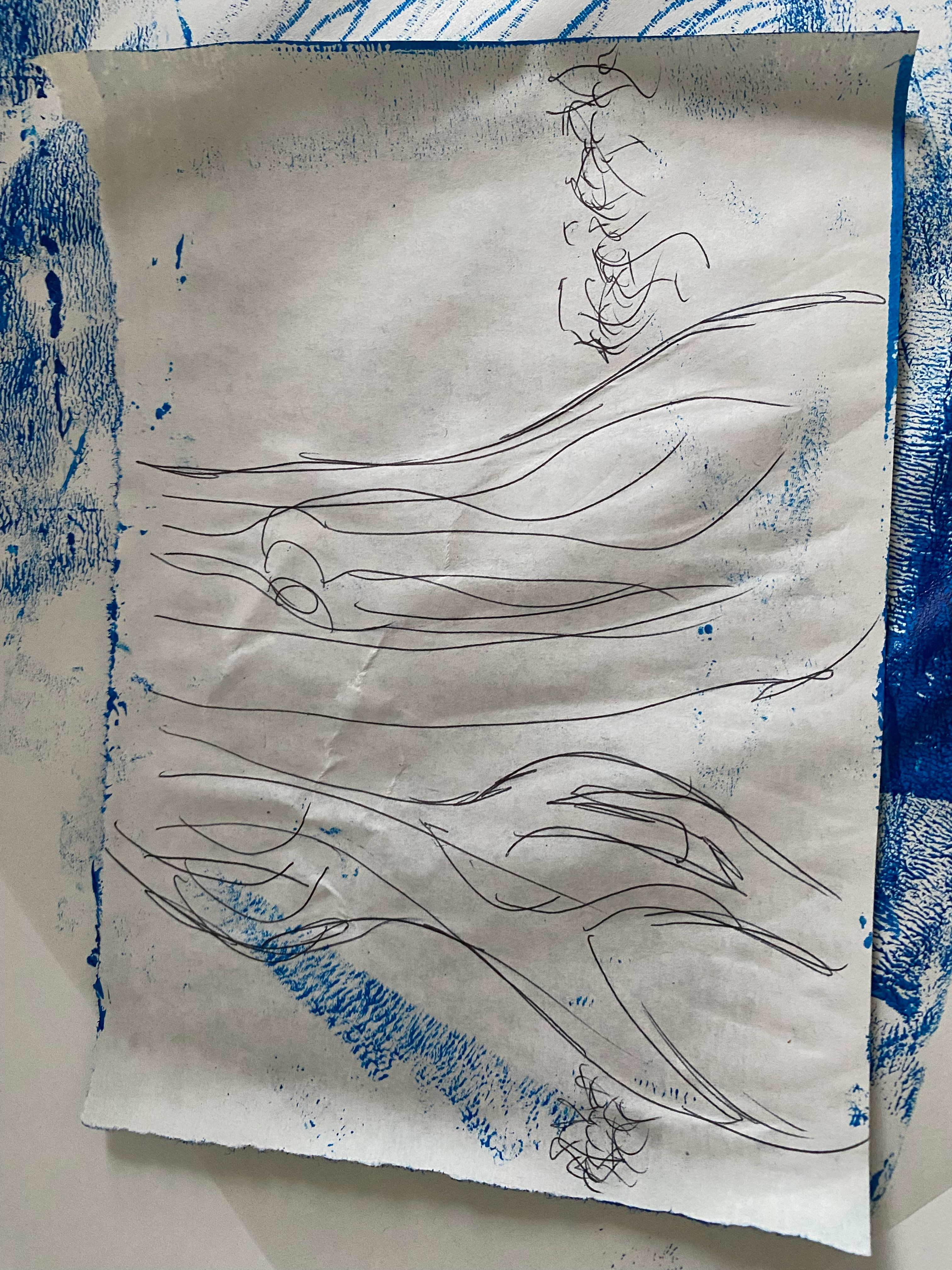
My first idea was a mug that breaks and then reassembles like magic. And my second thought was, “ok, calm down, it’s only two weeks”, but I want to continue this initial idea of a magical feeling, something fun and exciting.

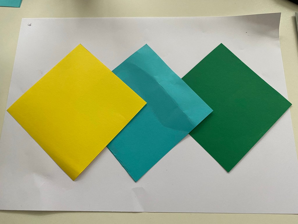
This was just a quick initial creative writing exercise to try and come up with ideas of household items with something else, somthing fun or something magical.
The term ‘enchanted objects’ keeps swimming around, making me think of magic and fantasy: The Monster Book of Monsters and the Shrieking Book in Harry Potter or, as Cat mentioned during the project launch, Sting from The Hobbit and The Lord of the Rings.
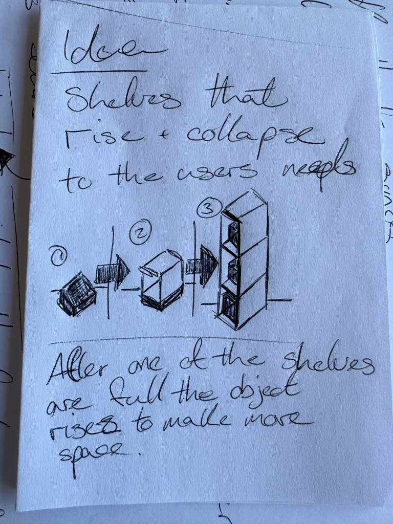
A book would be perfect; it could easily house the Arduino and an external battery with modifications so that if the book is opened, it’s triggered.
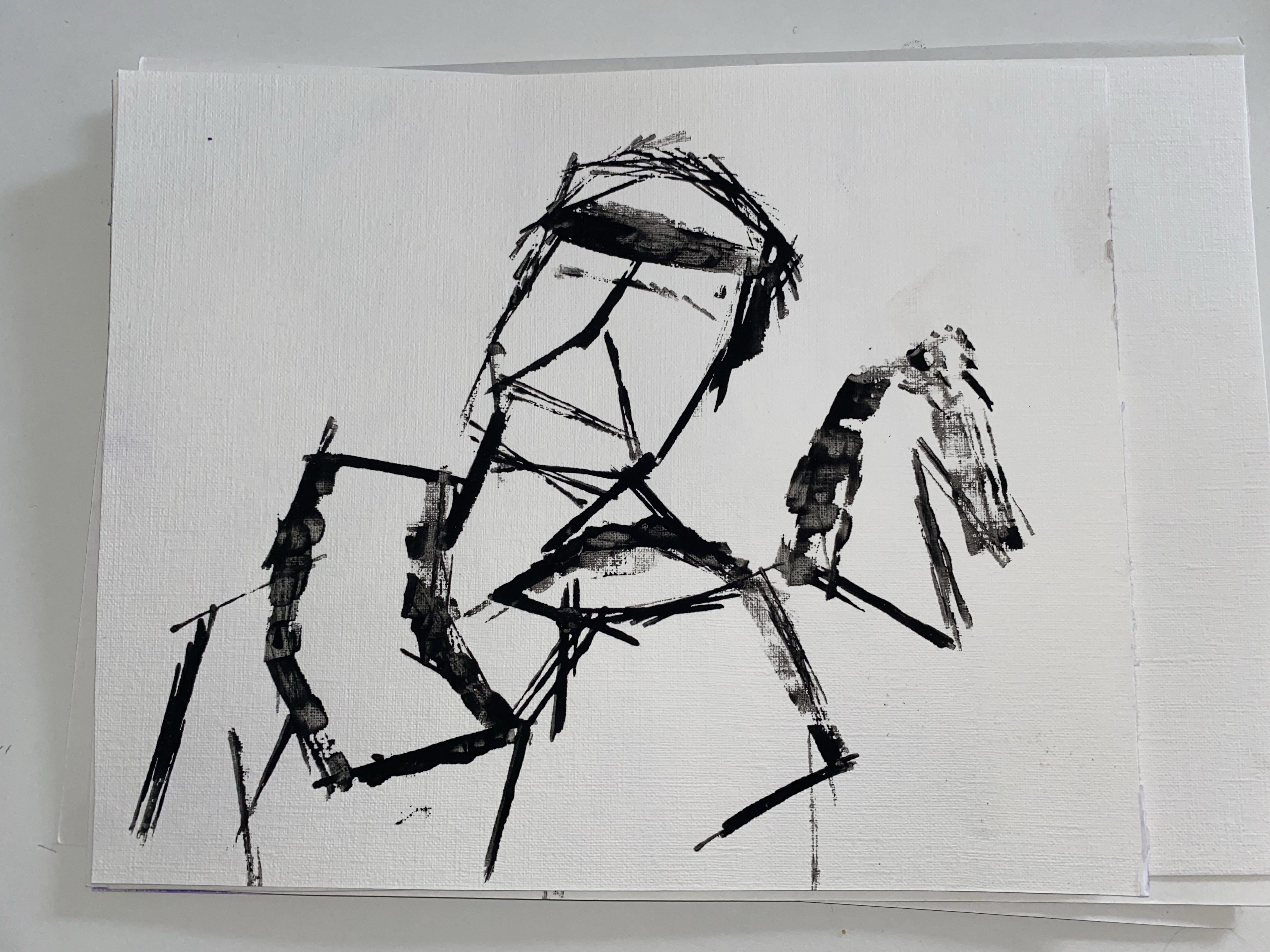
Workshop 01

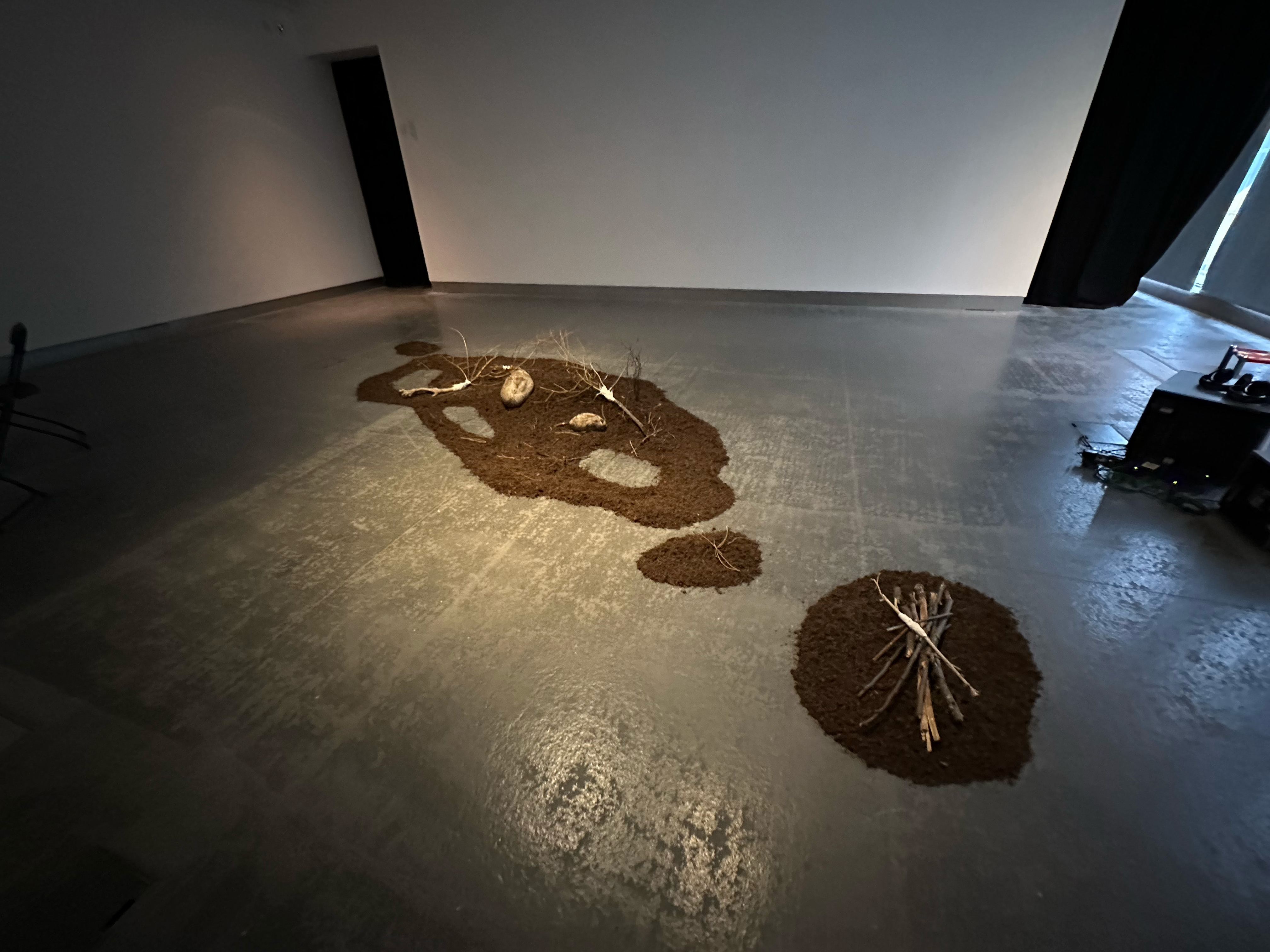
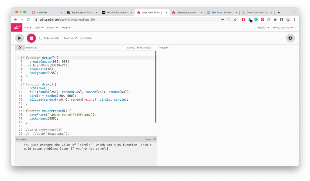
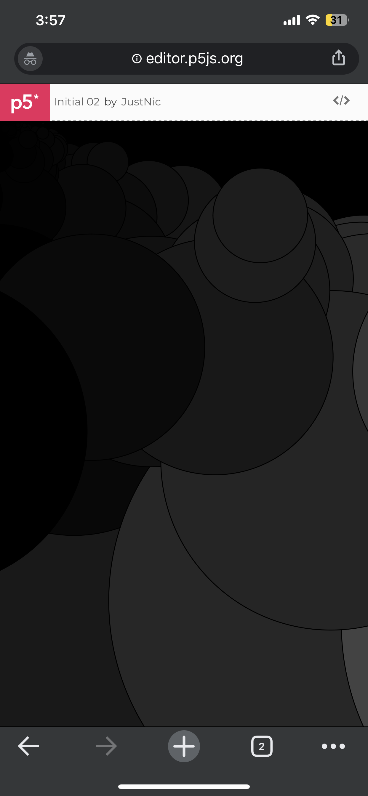
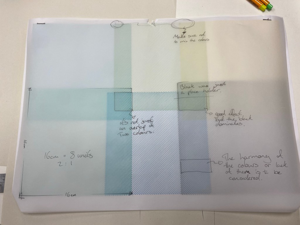
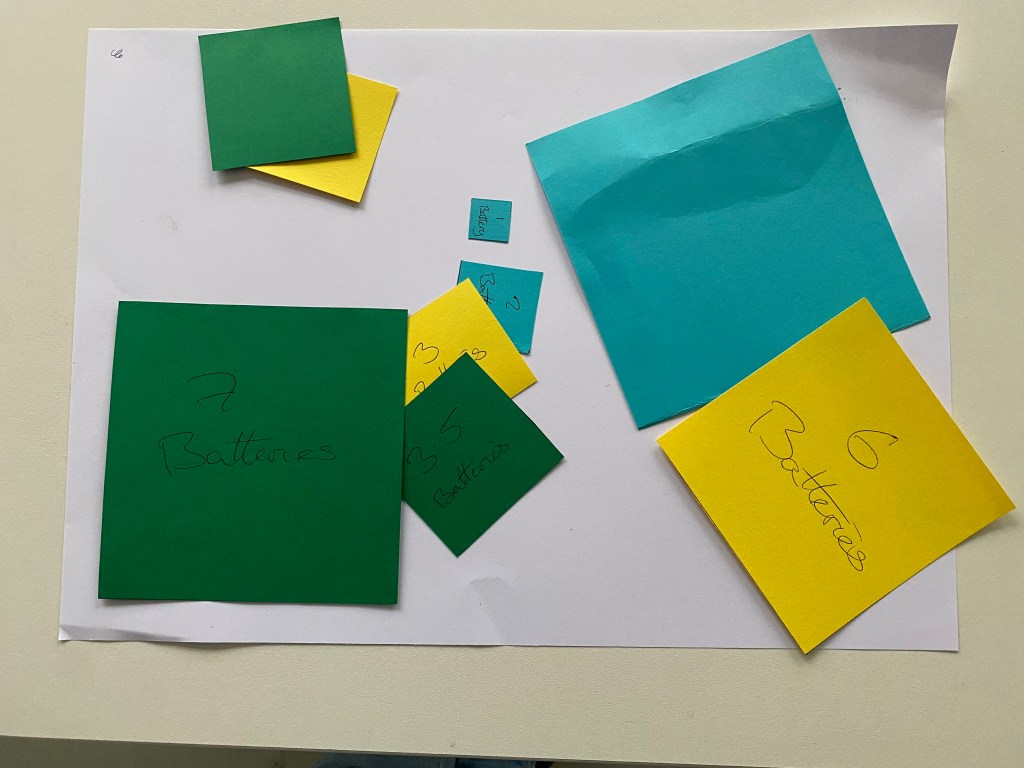
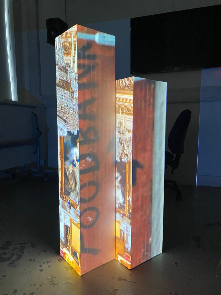
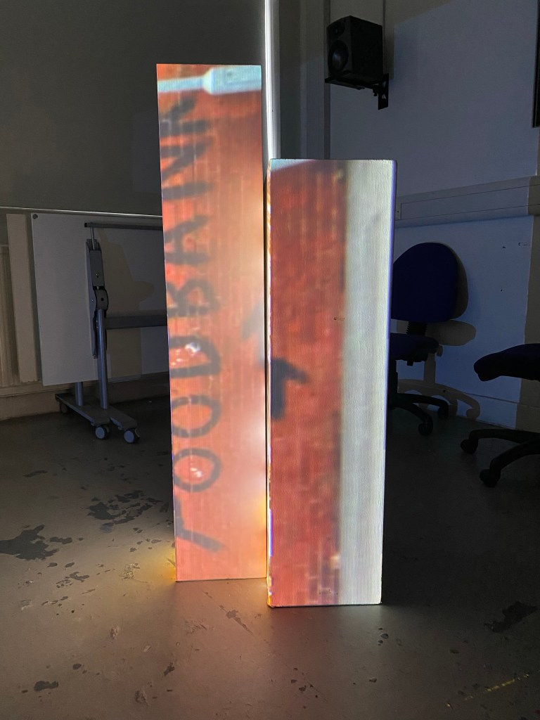
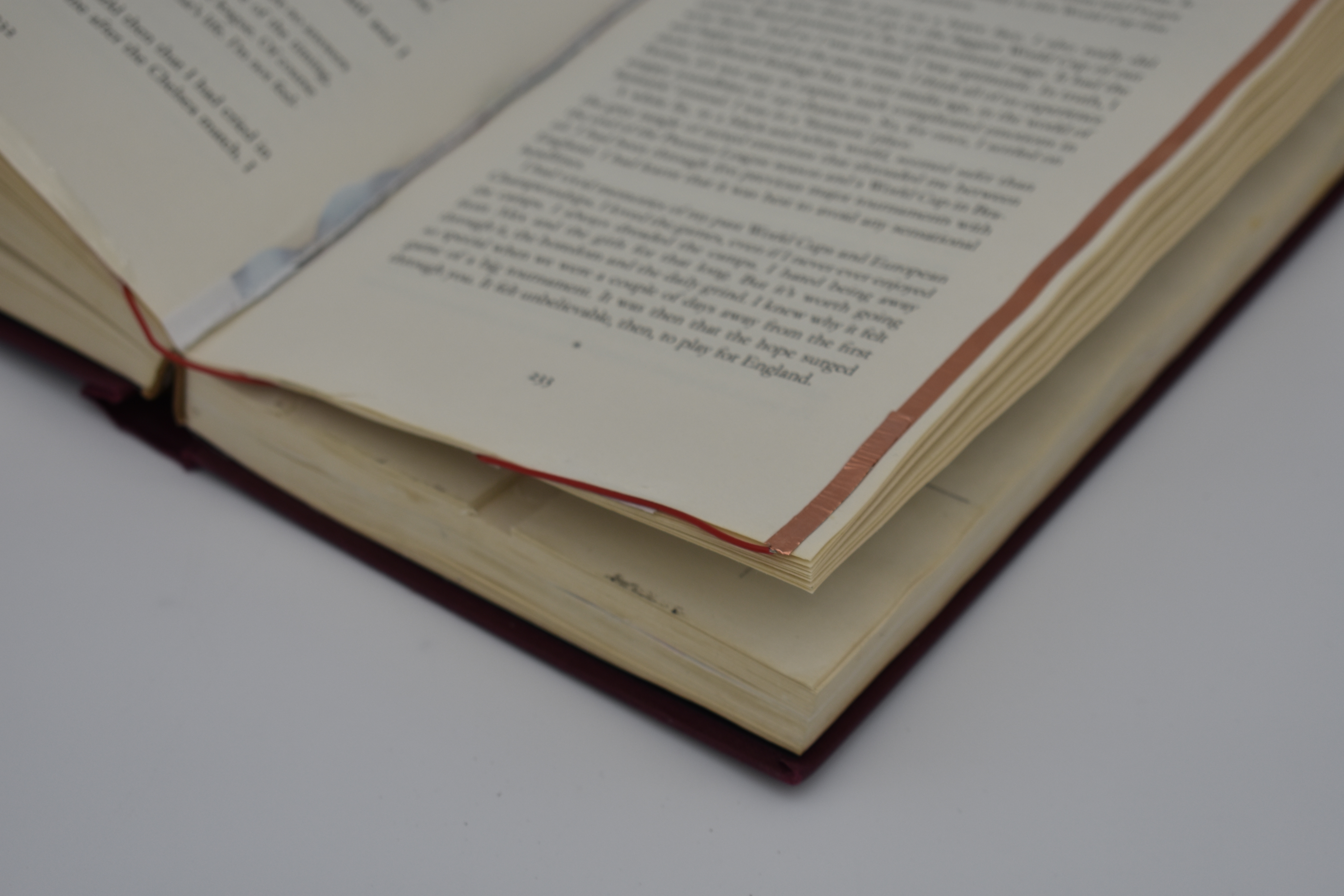
Above are just some examples of using the Arduino, considering the book idea, two strips of a conductive material could be used on the pages of the book so that when the book is open, and the circuit is broken, the output switches on.
Workshop 2
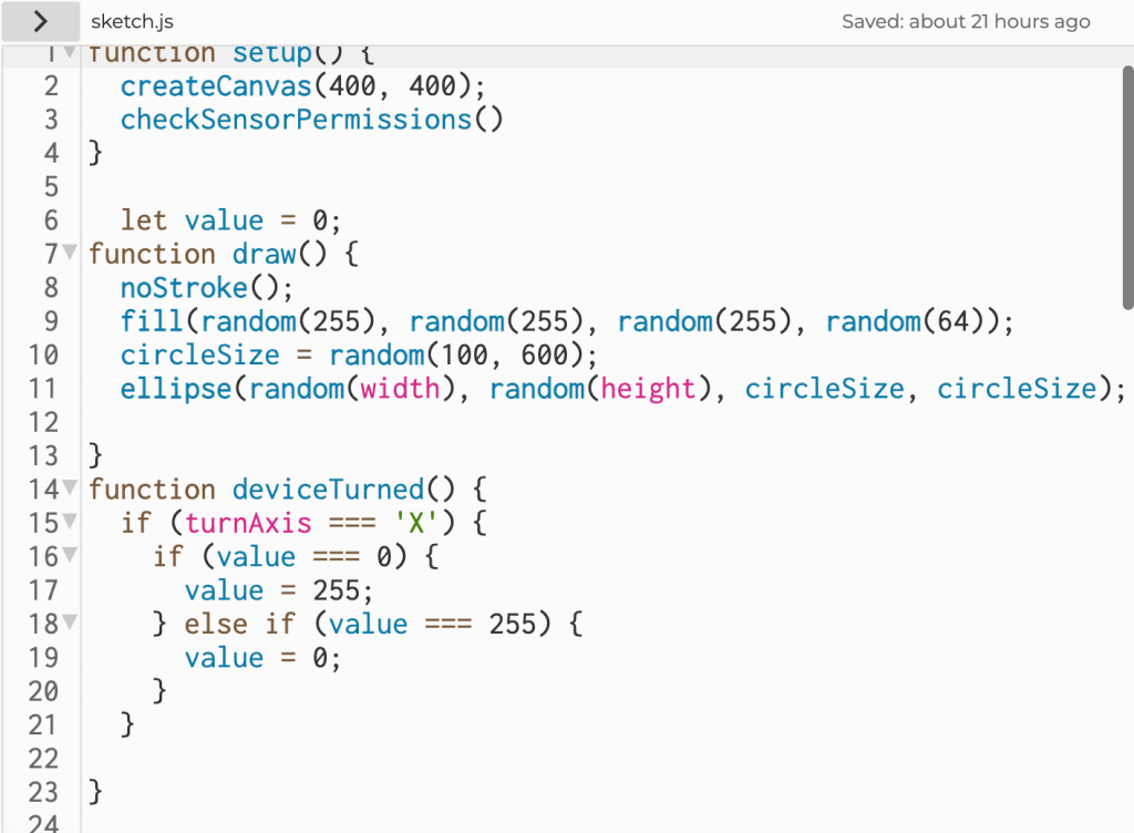
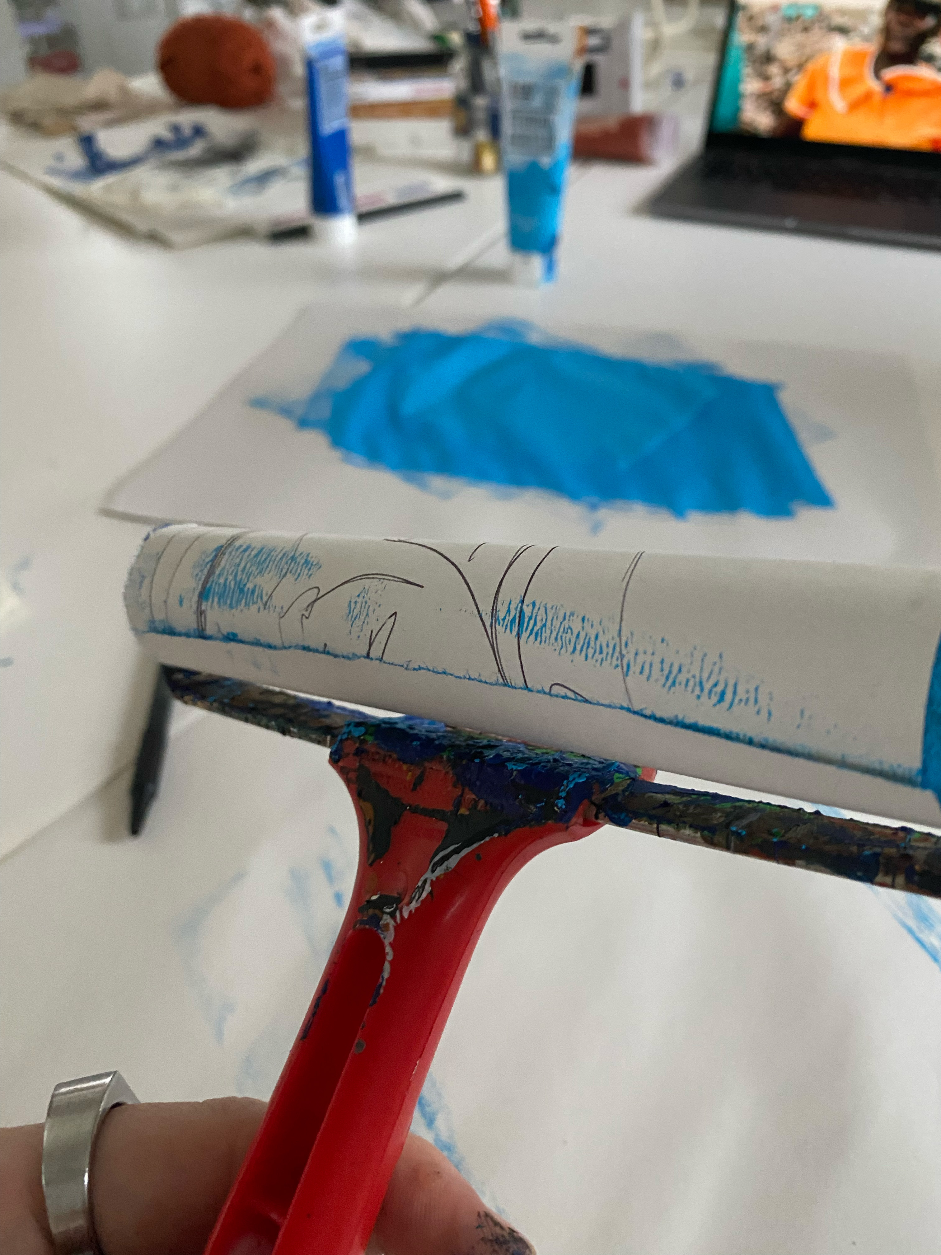
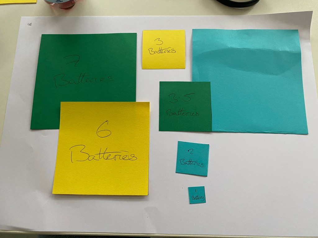
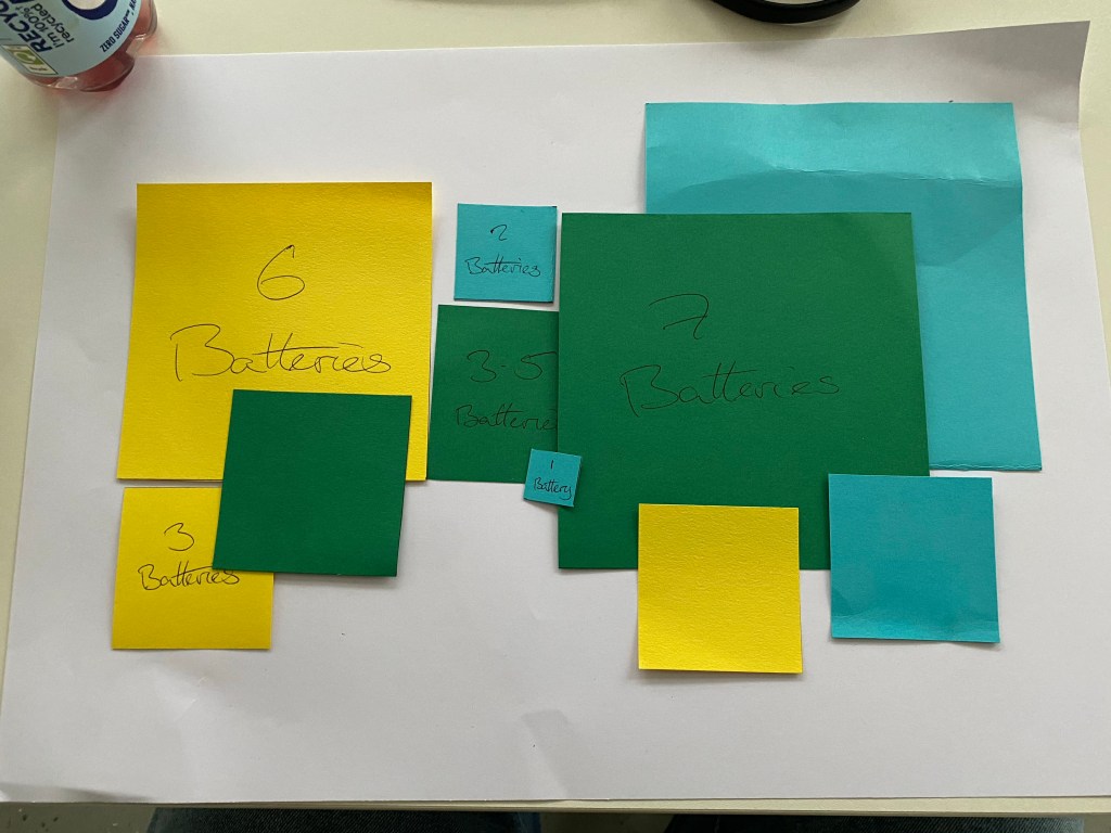
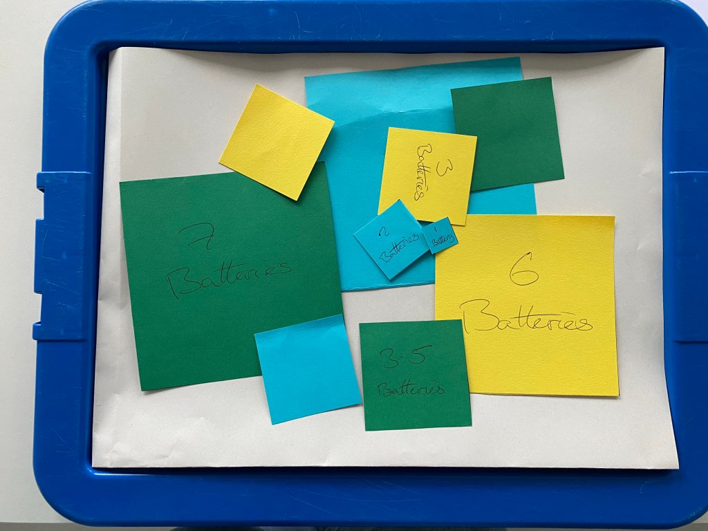
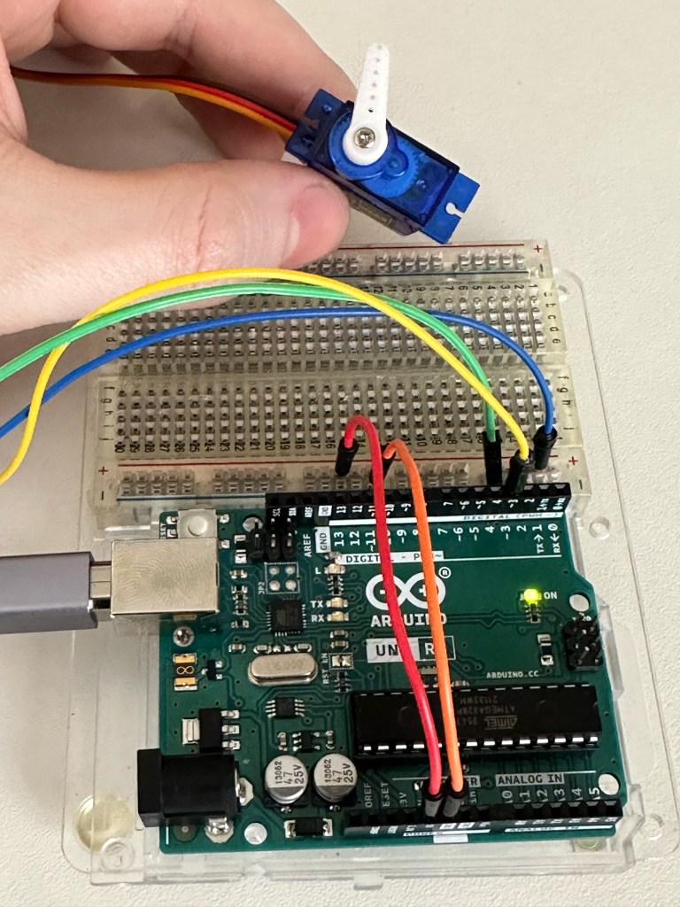
Workshop two was working on the components and the coding for the motor and the piezo buzzer and how even though these components are simple they can be used in a number of different ways.
I thought the piezo buzzer was just a one note drone that was either on or off but by changing the code it can play music.
Personally this has done a great job of opening my eyes to the possibilities of Arduino and building technology in general. I think I was hesitant to touch anything before hand and feel like it would be too complicated for me before this.
Support 01
A new direction. Initially, my idea of enchanted objects was very literal and limited. I wanted to avoid my usual way of working and designing a product like a product designer. Still, thankfully, Cat showed me that I was limiting myself in a different direction. But it can come together differently by using the logic of designing with UX in mind and having the creativity and fun of my initial idea.
The idea of my object is a book with a score or a soundtrack. As the book is read, the music changes as it would in a movie or tv show and with each page or chapter, a different track in the score is triggered with a new chapter.
Progress Report
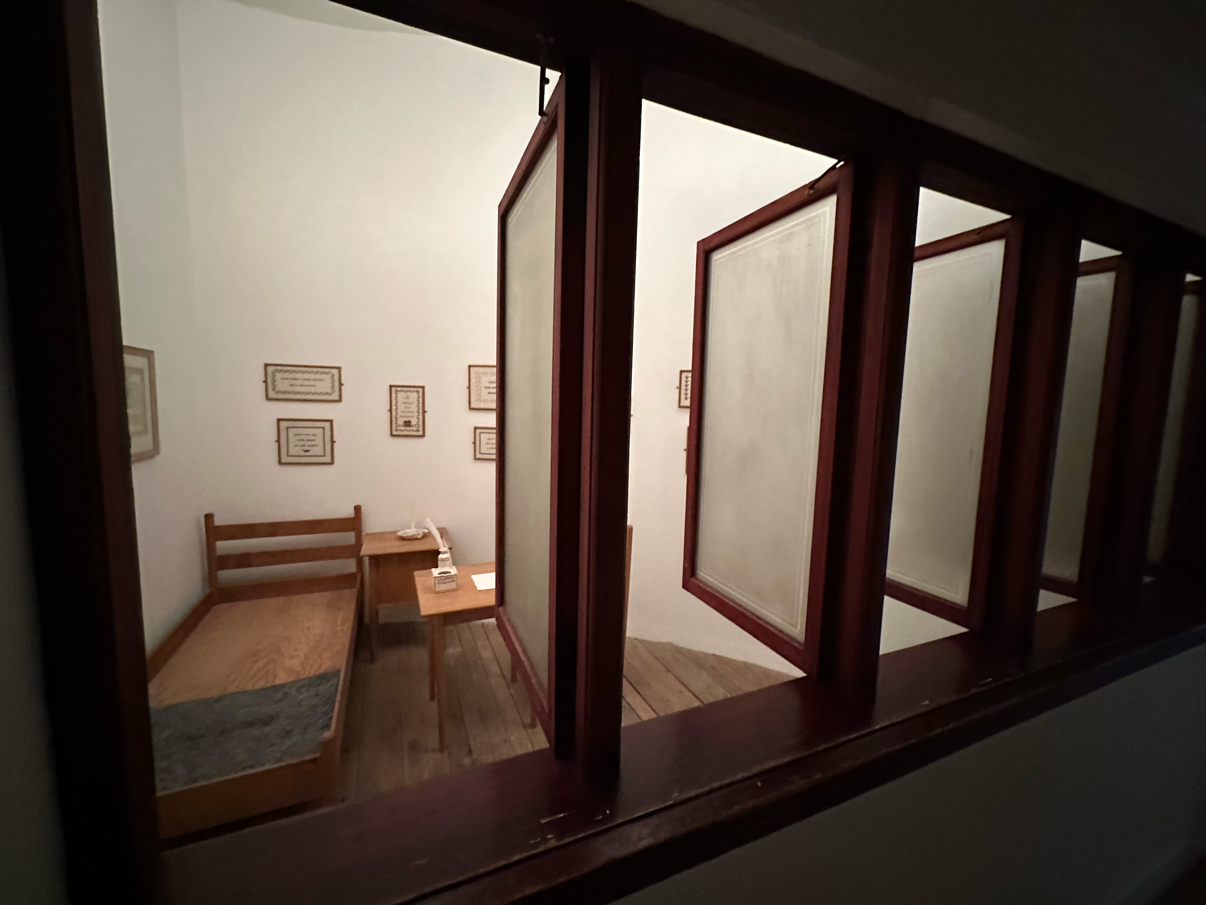
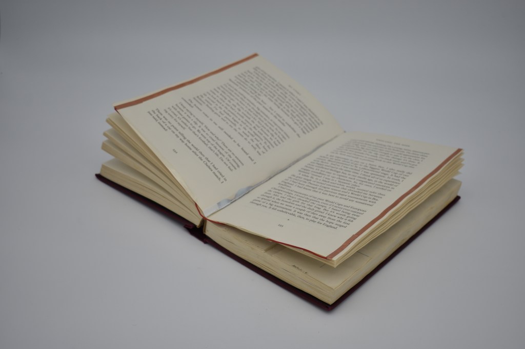
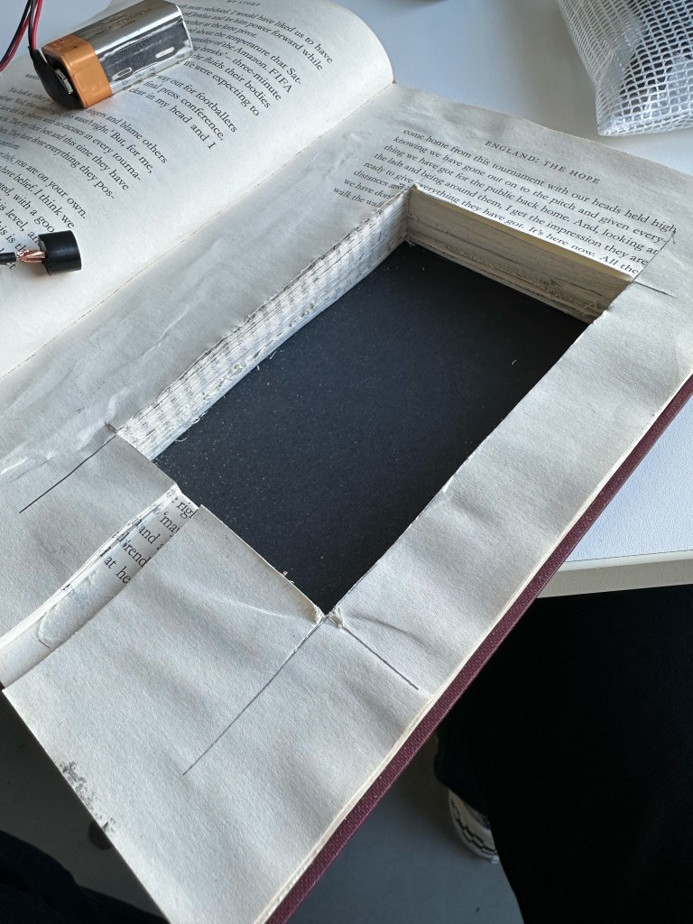
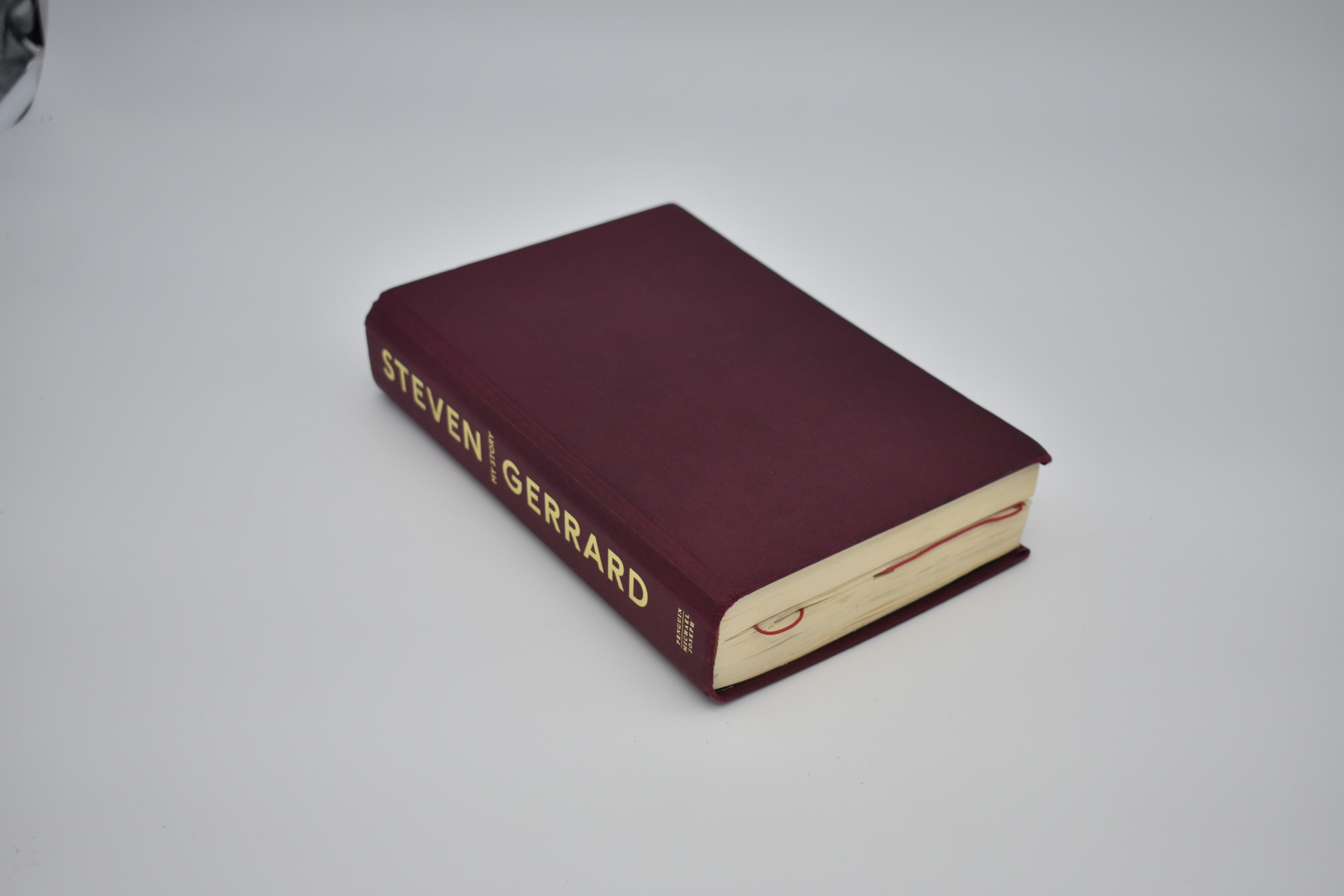
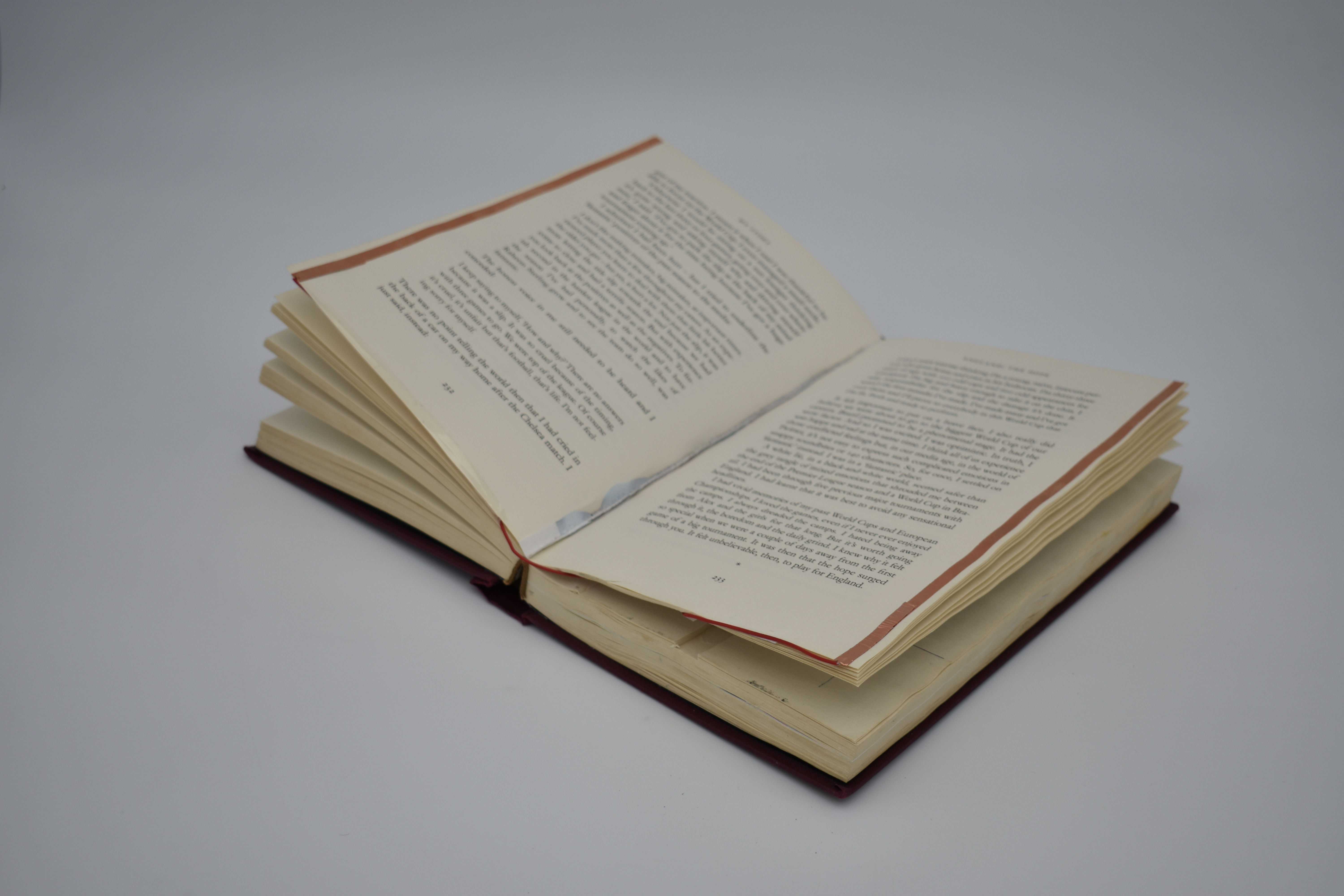
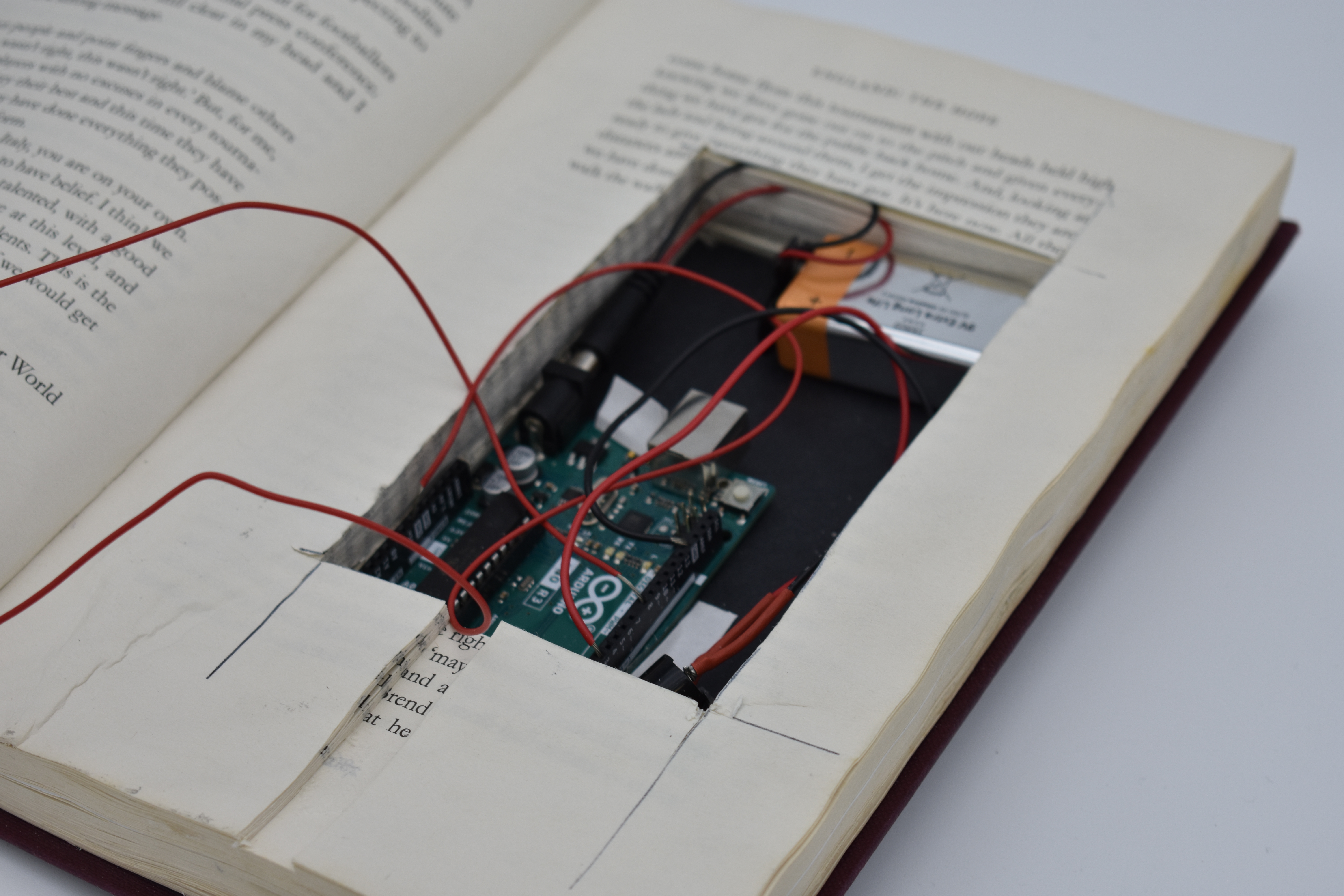
With the basic sizes of the Arduino and parts I need I went out on the hunt for a hardback with the correct sizes to hollow out.
What followed was a trip to the charity shop, getting a copy of Steven Gerrard’s autobiography, getting some Mod Podge and taking an age to glue half of the book together. My initial concept was to have the book’s two halves hollowed out, but Cat said the breadboard wasn’t necessary and saved so much space.
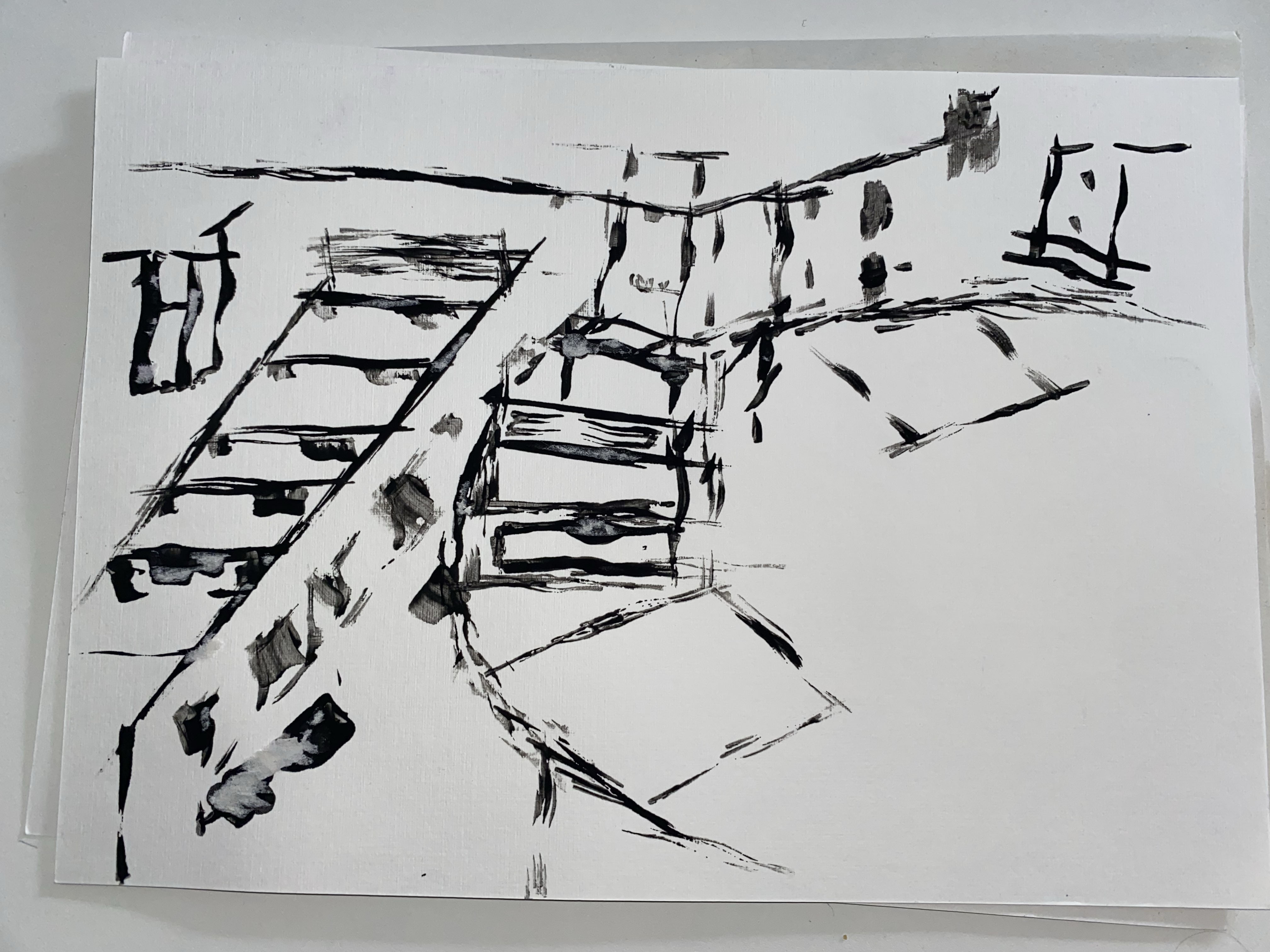
Support 02
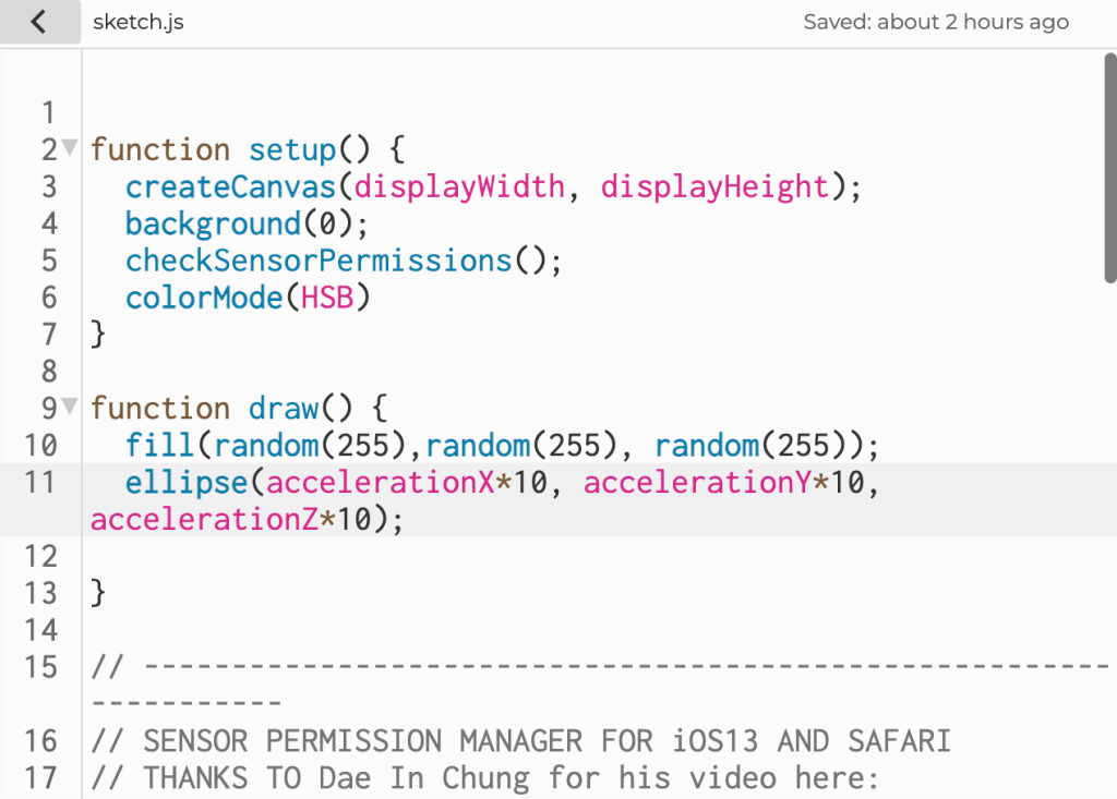
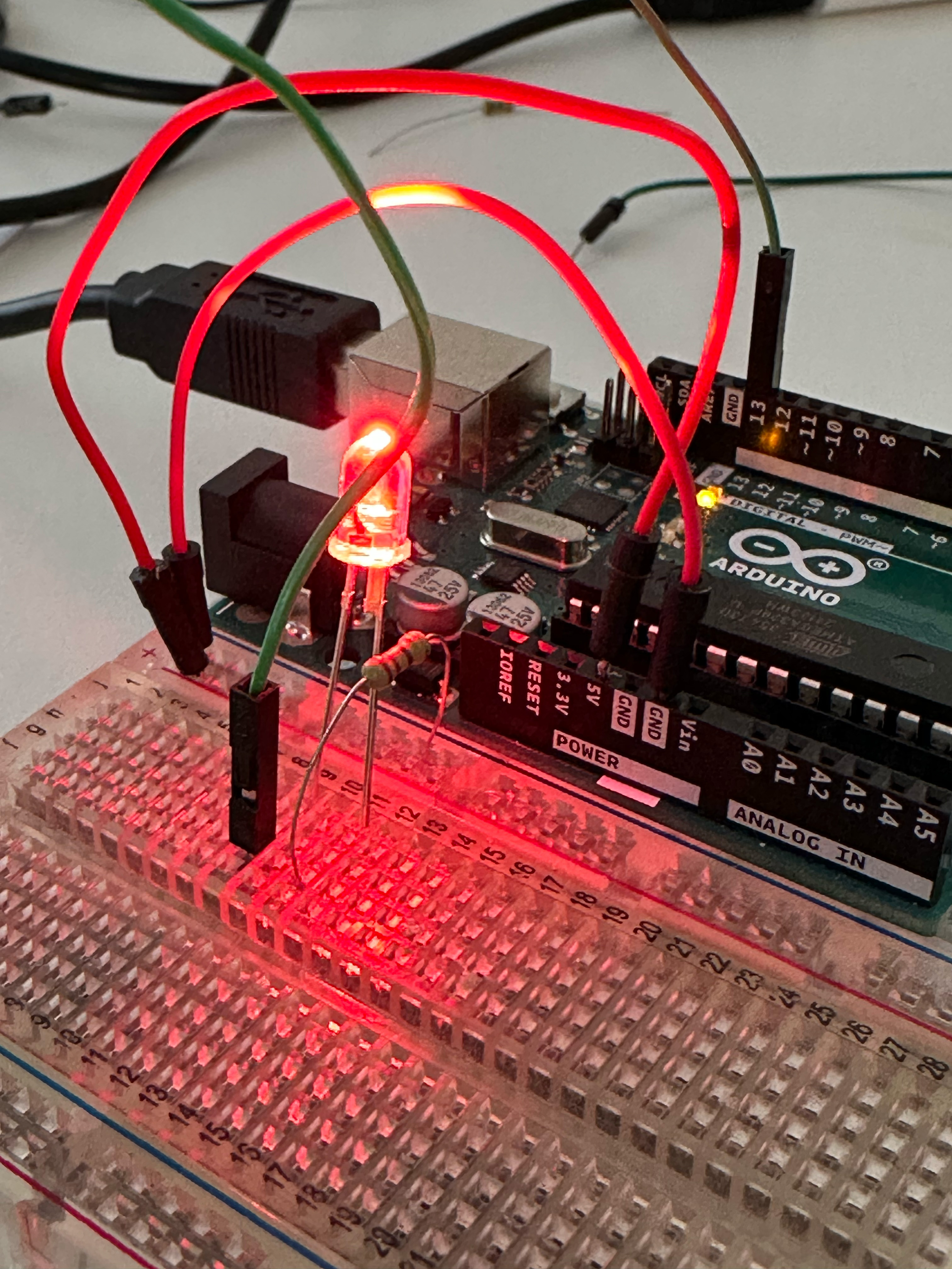
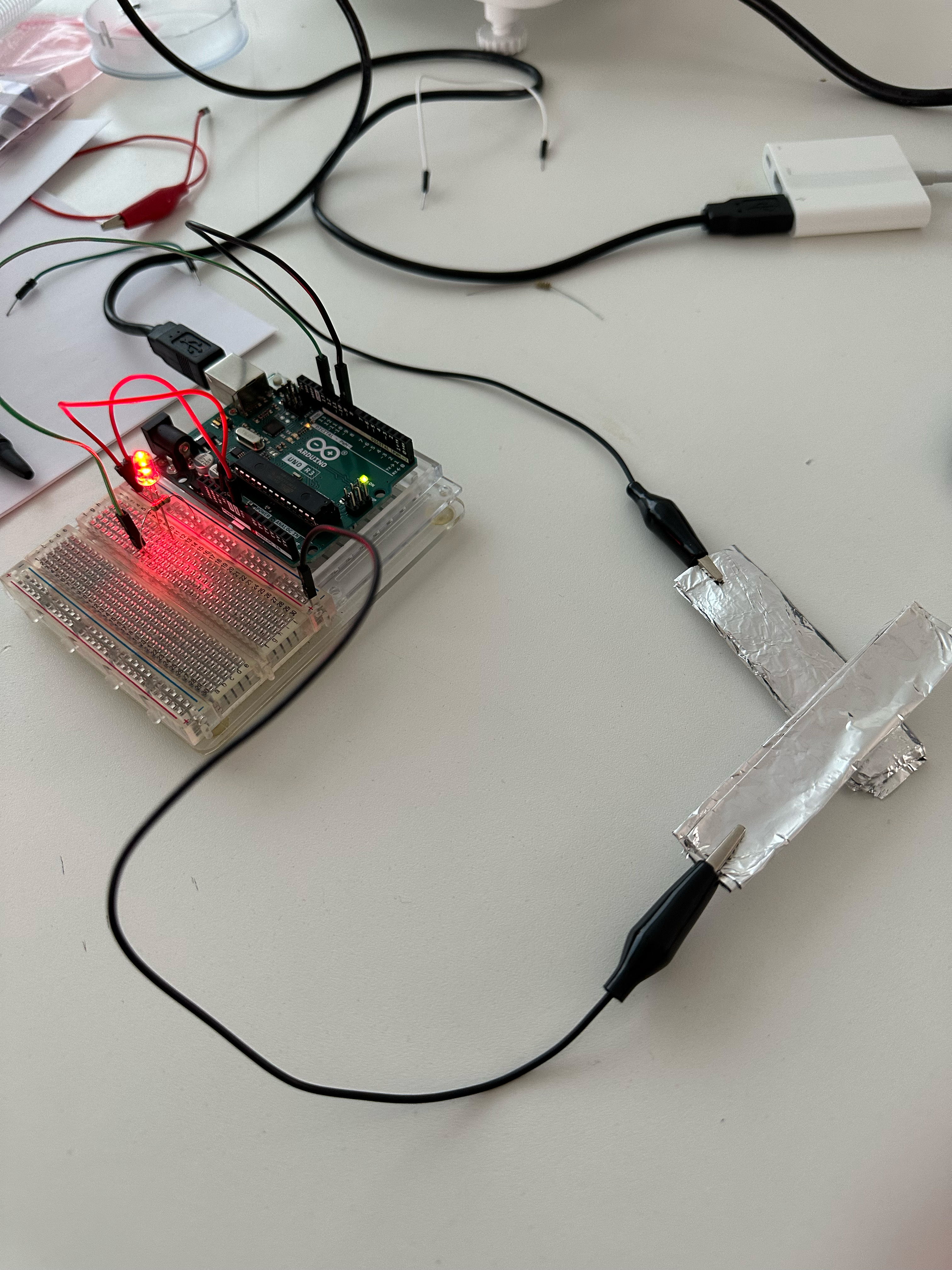
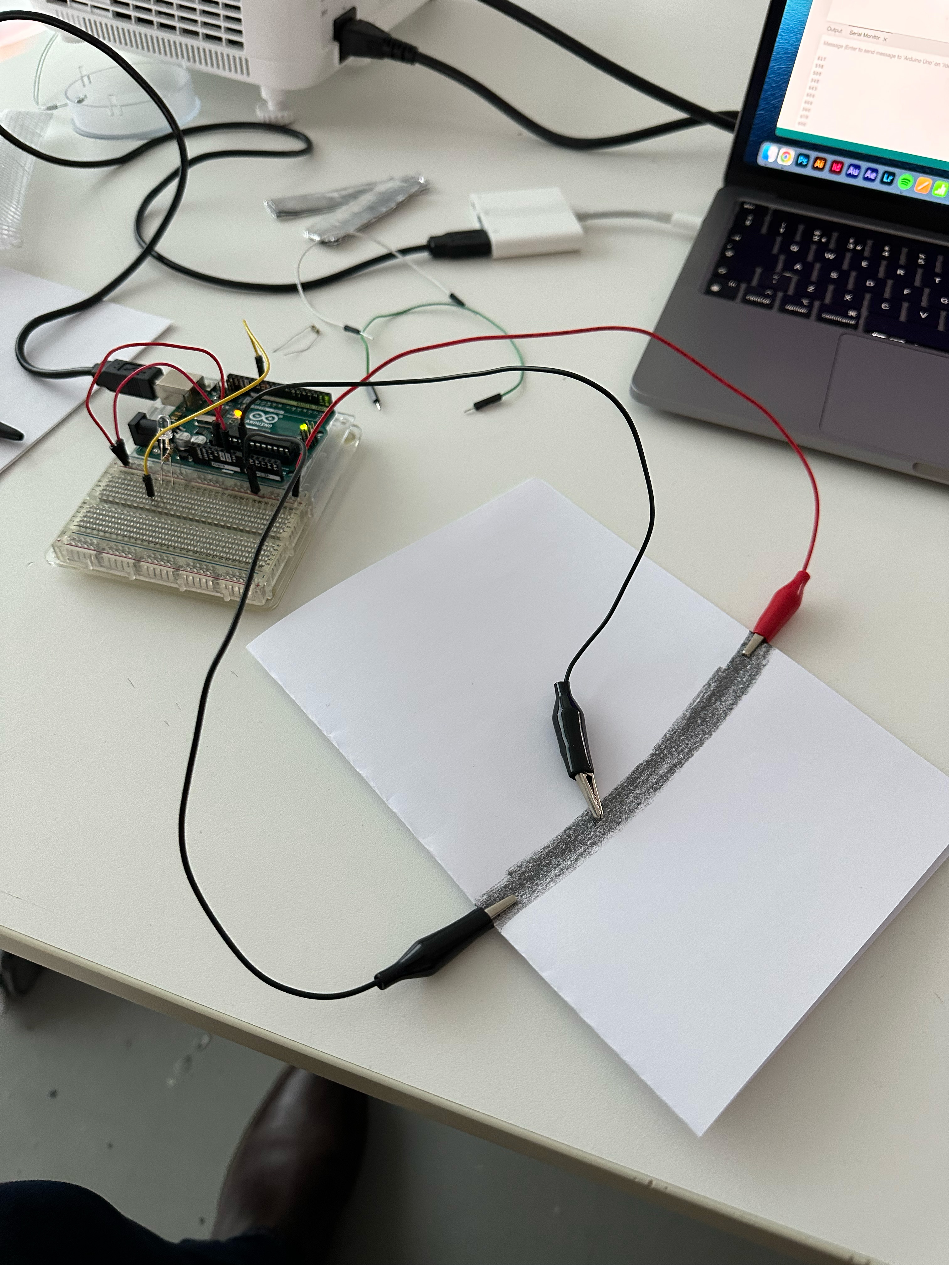
Working out the nitty gritty. The second support was working out how to get the code and Arduino working. Again I’ve noticed my thinking could be more flexible regarding certain things. For example, I was only trying to work with the components I had instead of getting wire and using that. But everything worked as it should with the wires and Cat soldering the piezo buzzer.
In my time, I need to focus more on my coding because it still doesn’t come as naturally to me as I’d like.

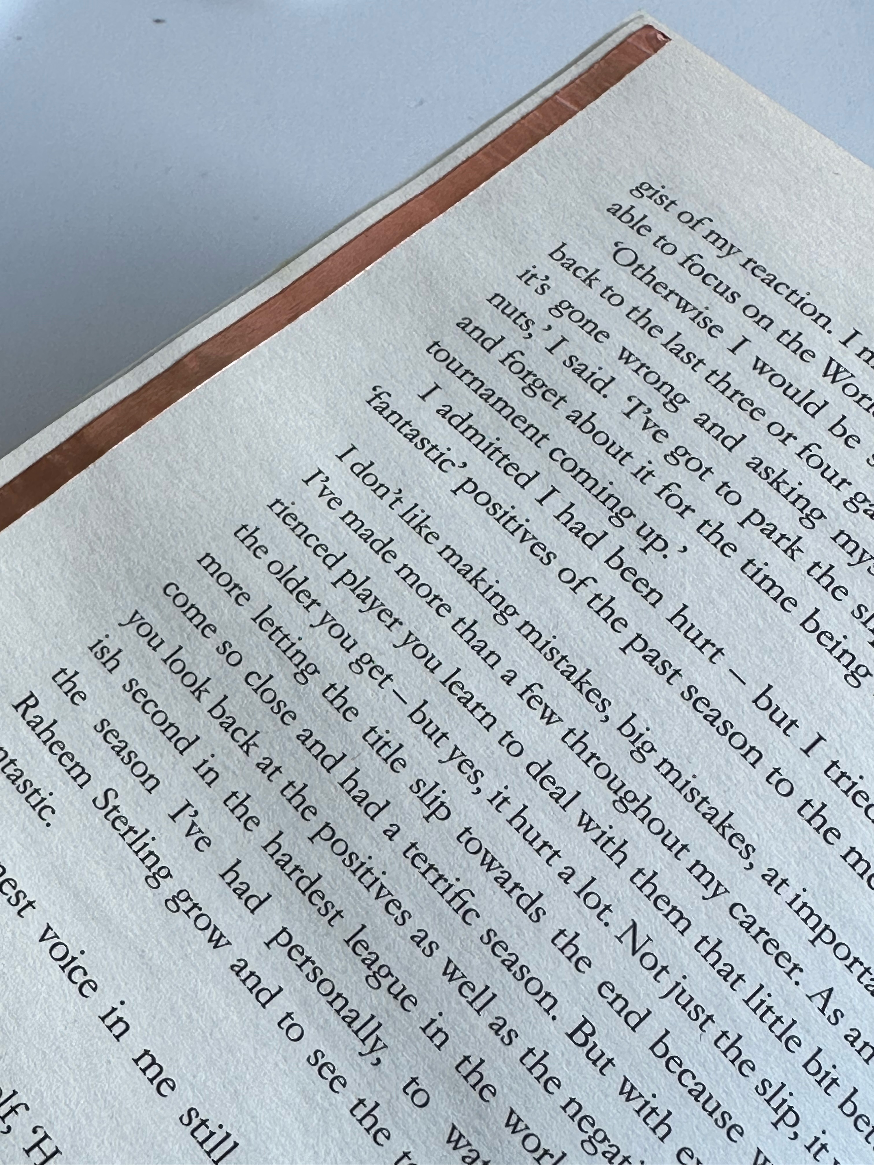
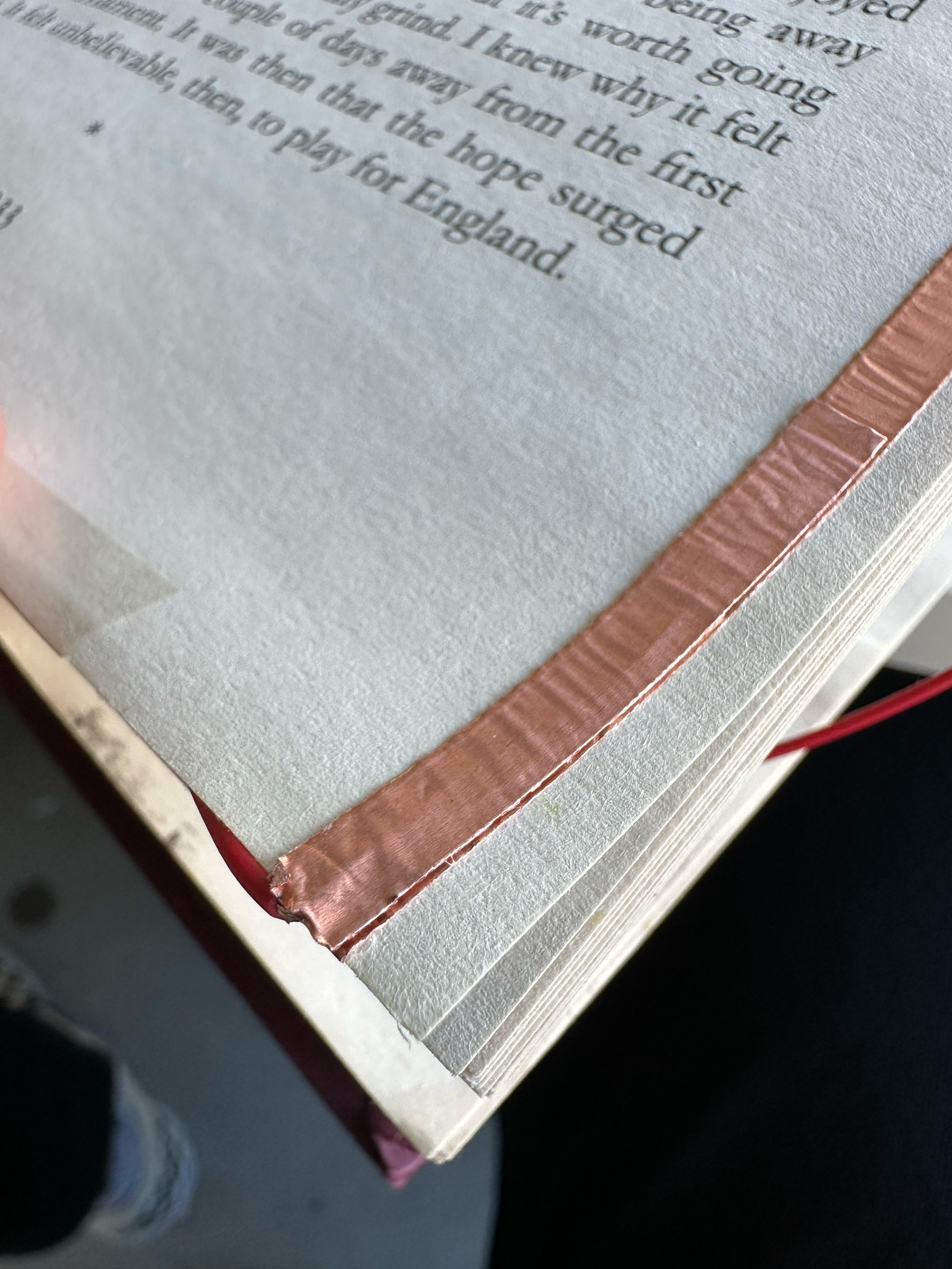
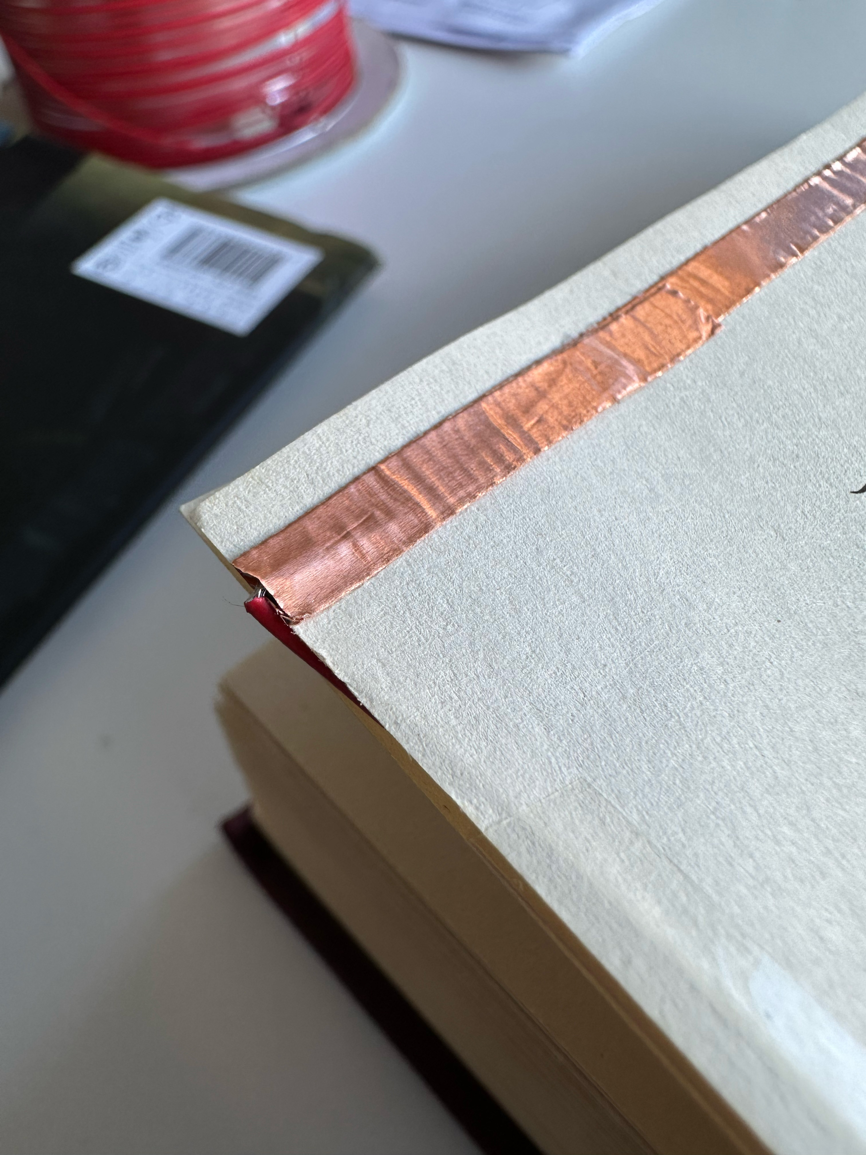
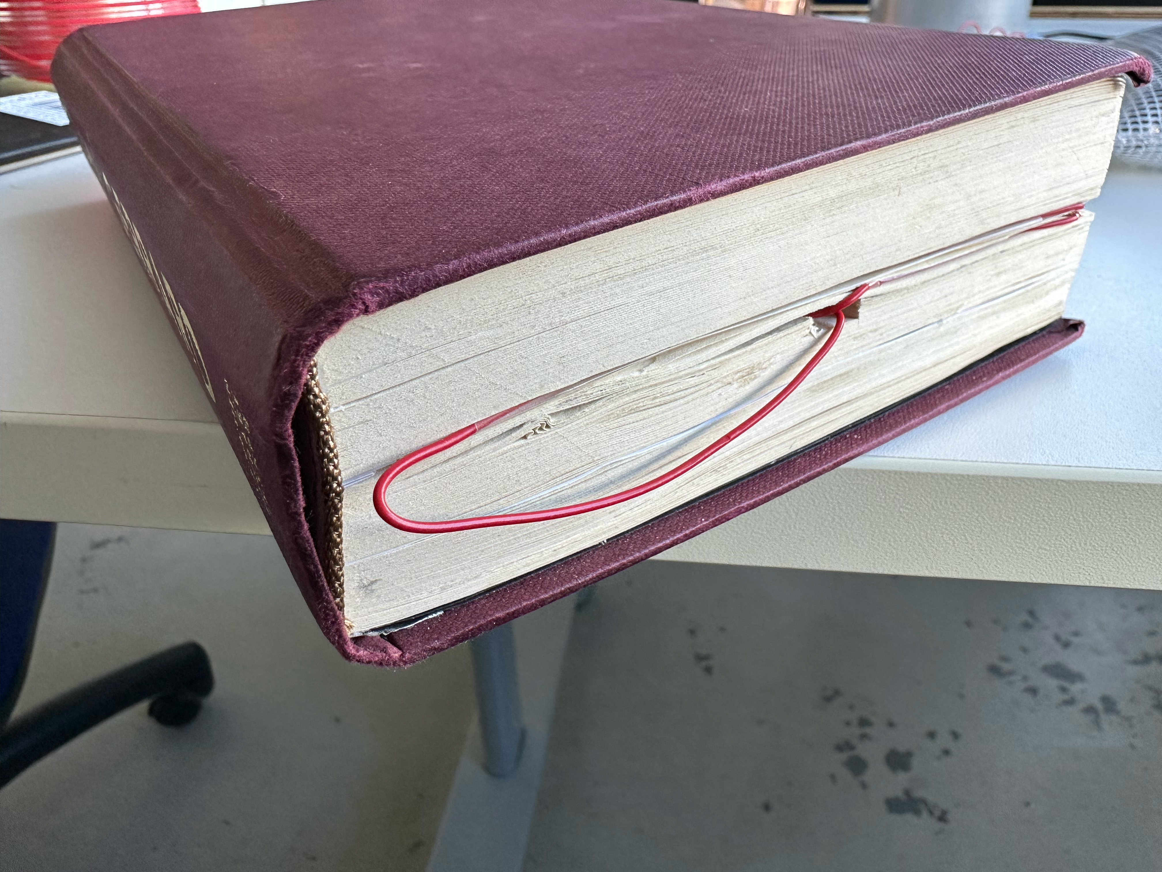
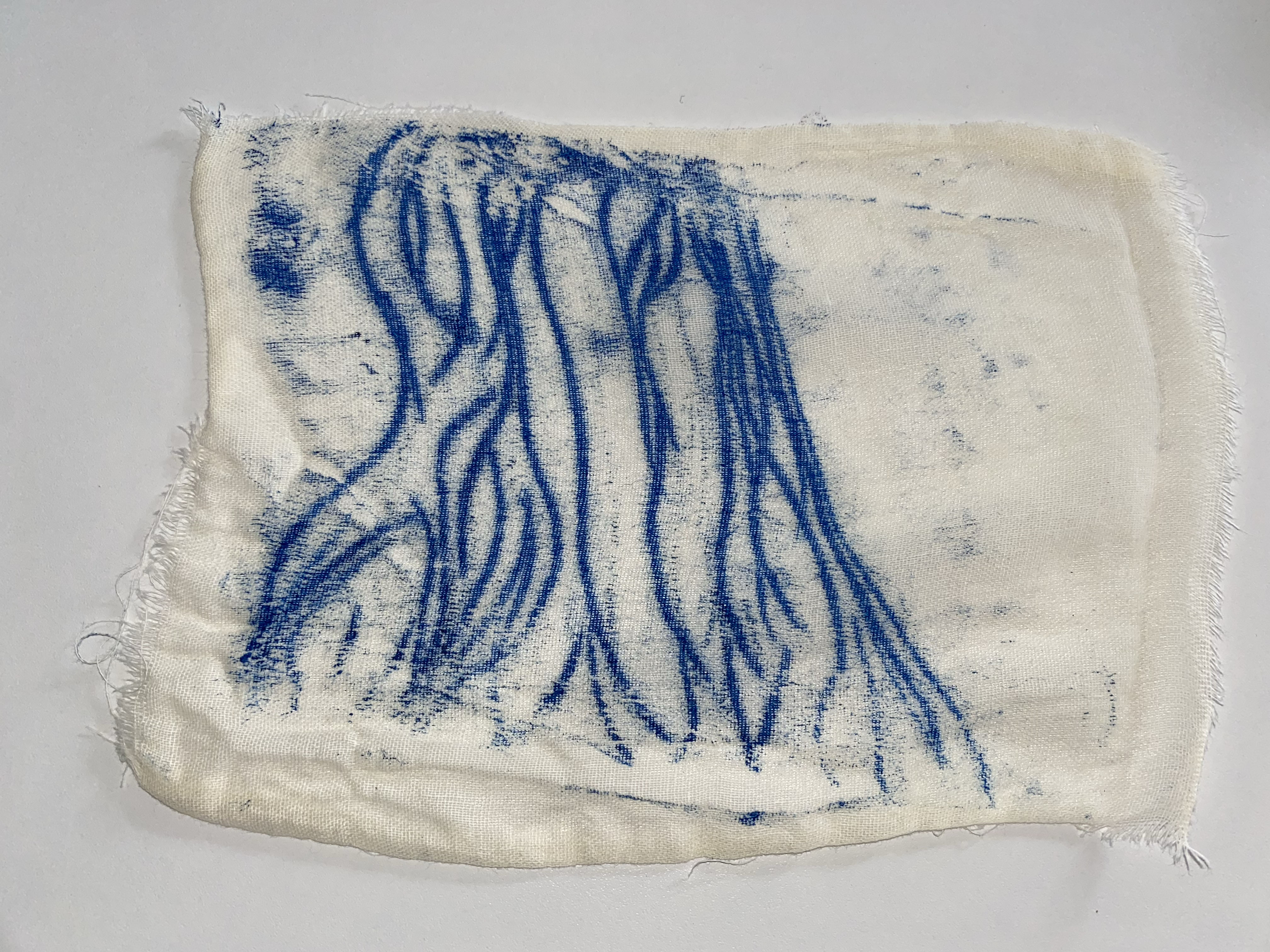
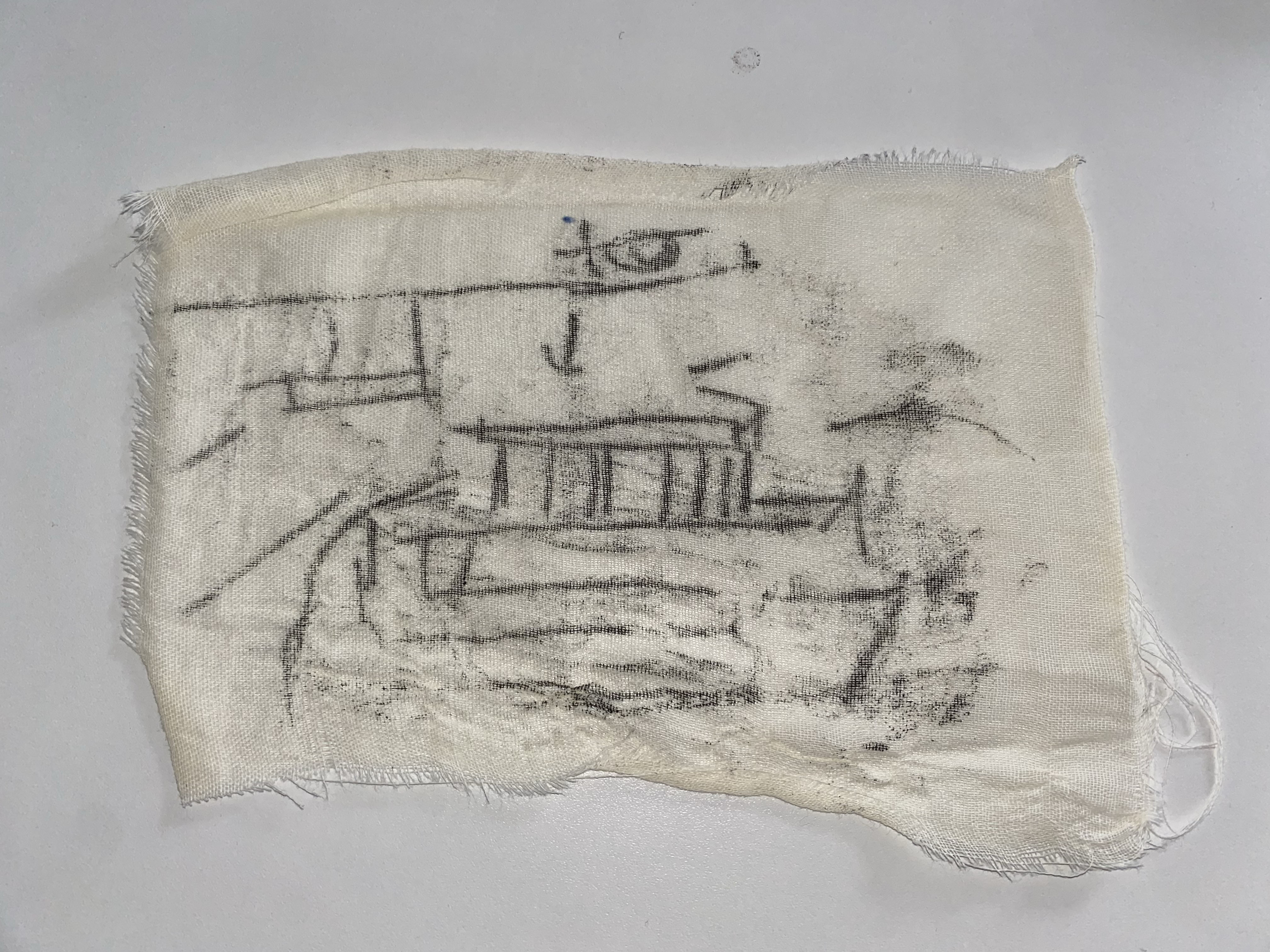
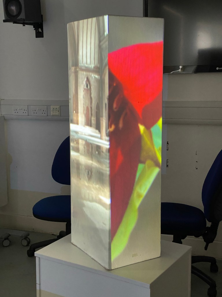
As seen above the hollowed out section of the book is housing the Arduino with a channel cut out to allow the wires to go to the pages that have conductive copper tape as to read when the boom is open or closed.
If I have more time, then I want to set up different pages to trigger different songs, relating it closer to the concept, as well as hide the conductive stripping.
The Video
At this point, I know how much time I have to make this video, so keeping it simple is the best idea. Someone goes into the library, picks up the book and enjoys it with the music playing. The ideal music will be added in post.
The Video
For the video, I roped Ally in to be my actress and went to the GSA library to film a number of shots and sell the idea that this book could be seen in a living, working library.
With consideration after the fact, this product might be more of a personal enjoyment or in a specific part of the library, so as not to disrupt other people within the library.
Or the book could have a way to connect headphones, such as a headphone jack or Bluetooth, so that it is not disruptive in quiet places.
The volume
‘The volume’ is the concept of an interactive book that will play the score of the book as the reader makes their way through it. Through each chapter triggering the track in the score, the music progresses at the same rate as the reader.
Reflection
On reflection, there is a number of issues to work out of the final piece:
- The housing within the book
- The options of audio output
- The triggering of each chapters score
But as this product is just a test of concept, I believe that the concept has legs either for personal use or for young adults as an incentive to return to reading.
If there was infinite time and infinite resources I would have subtler wiring within the book, smaller hardware housed within the book and a subtler user experience to give a deeper sense of immersion within the story and more of a magical experience when using the book.