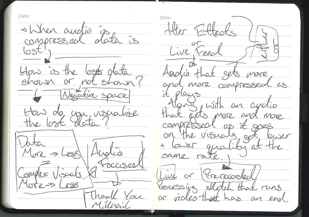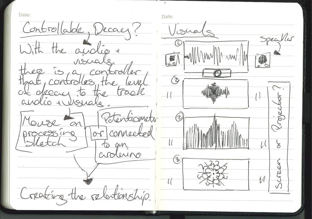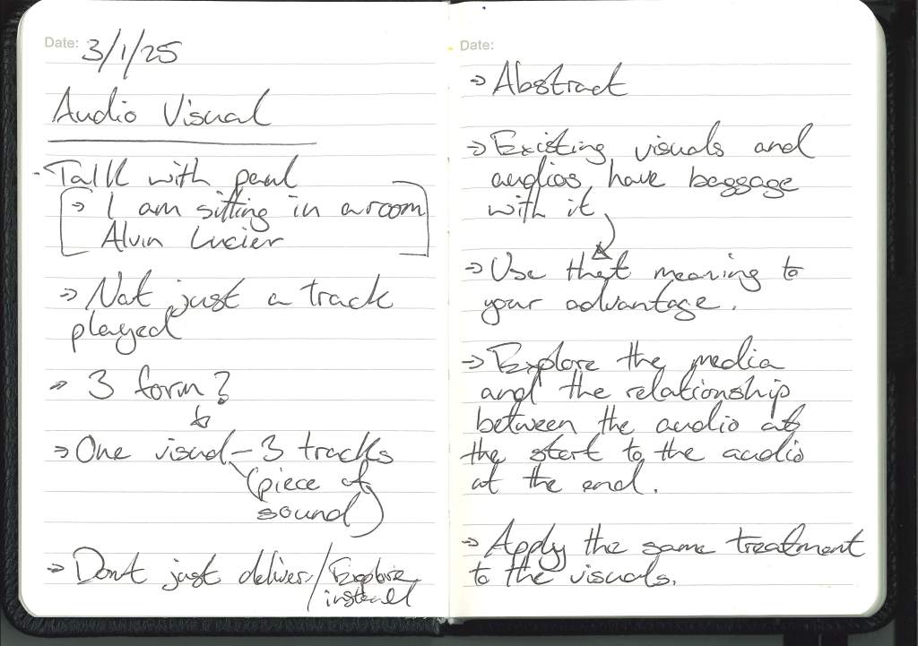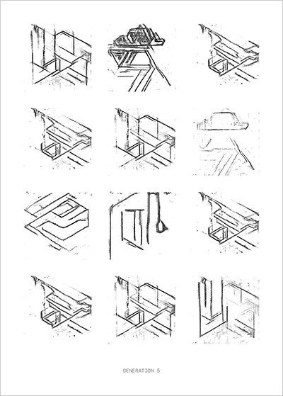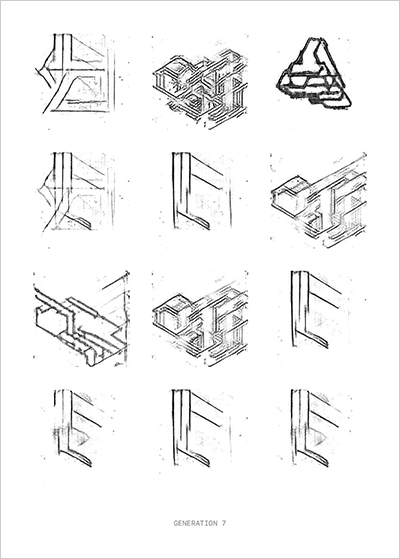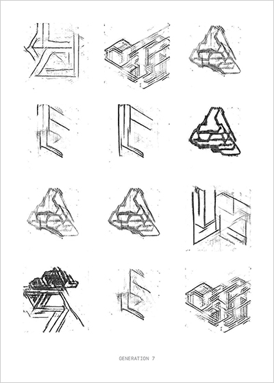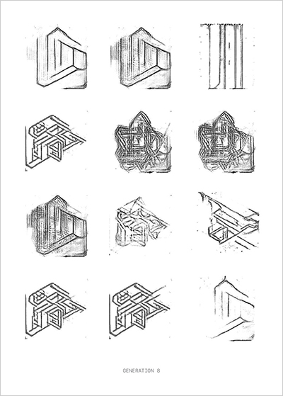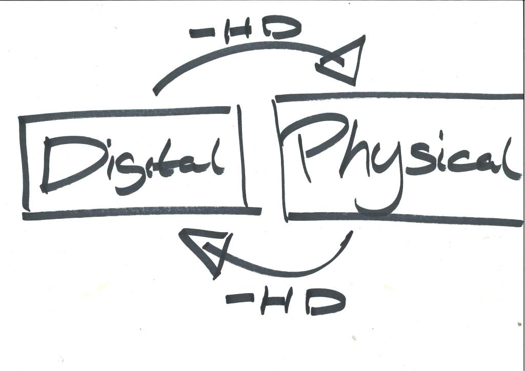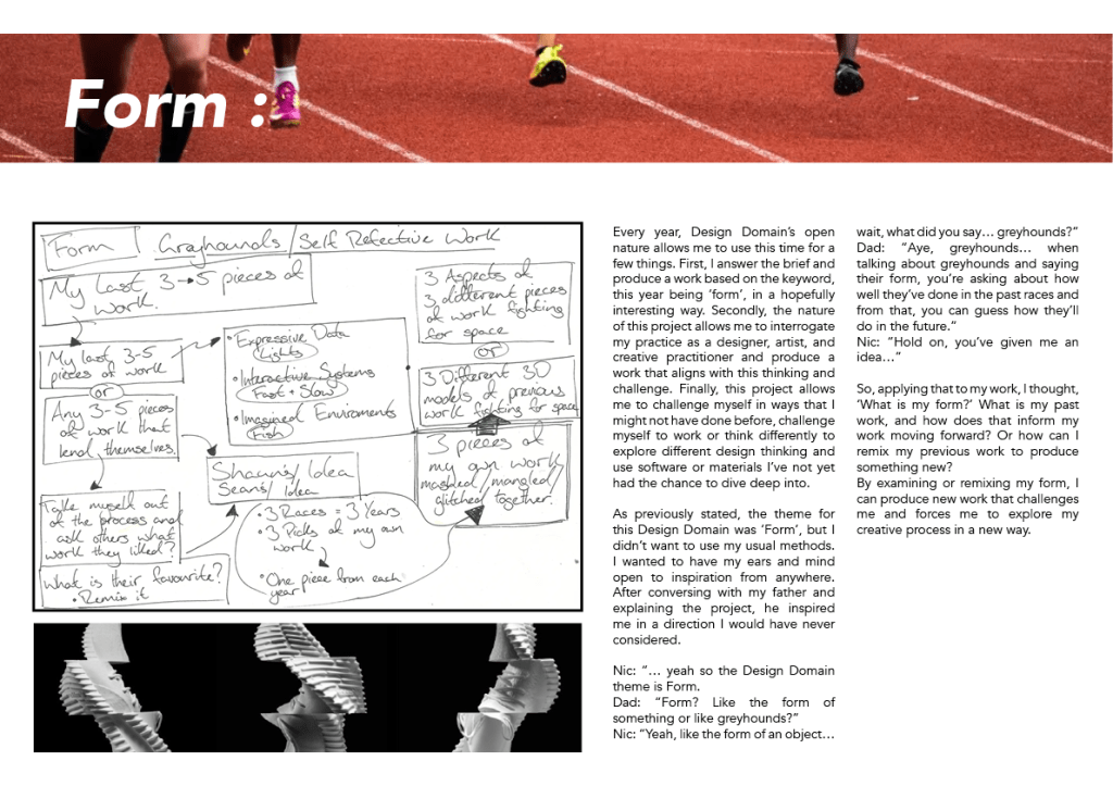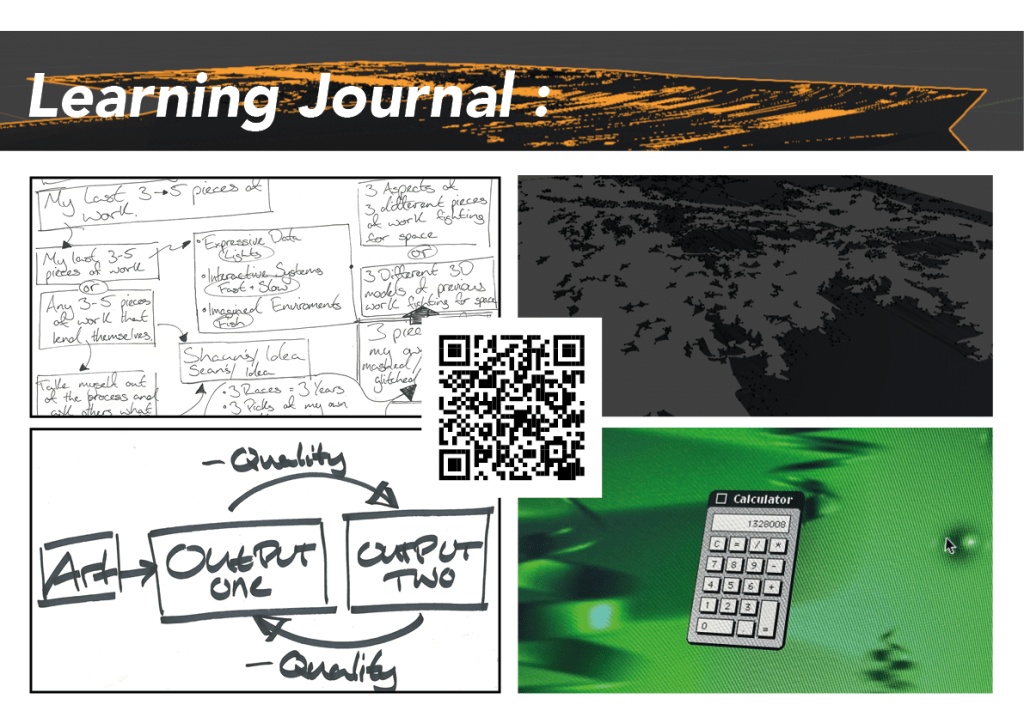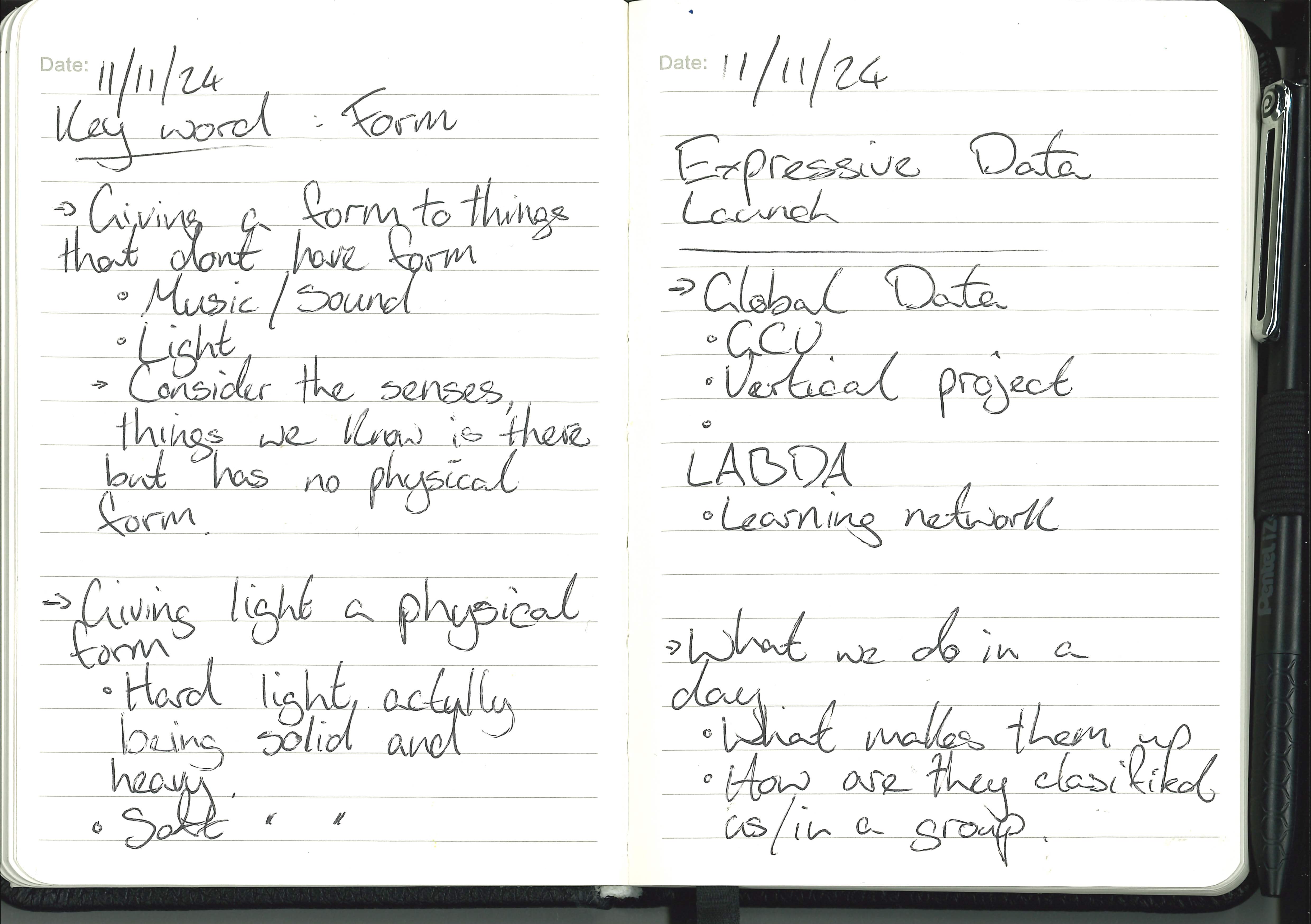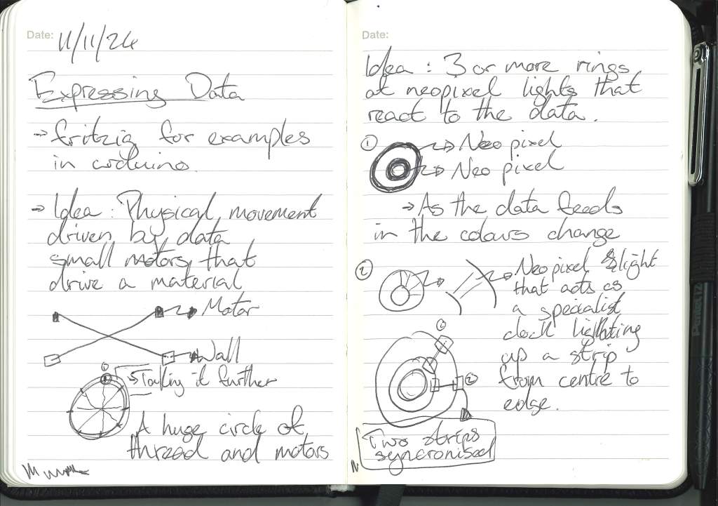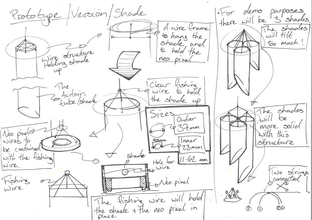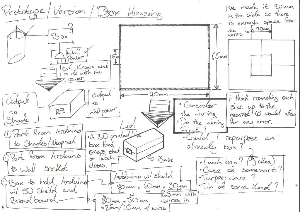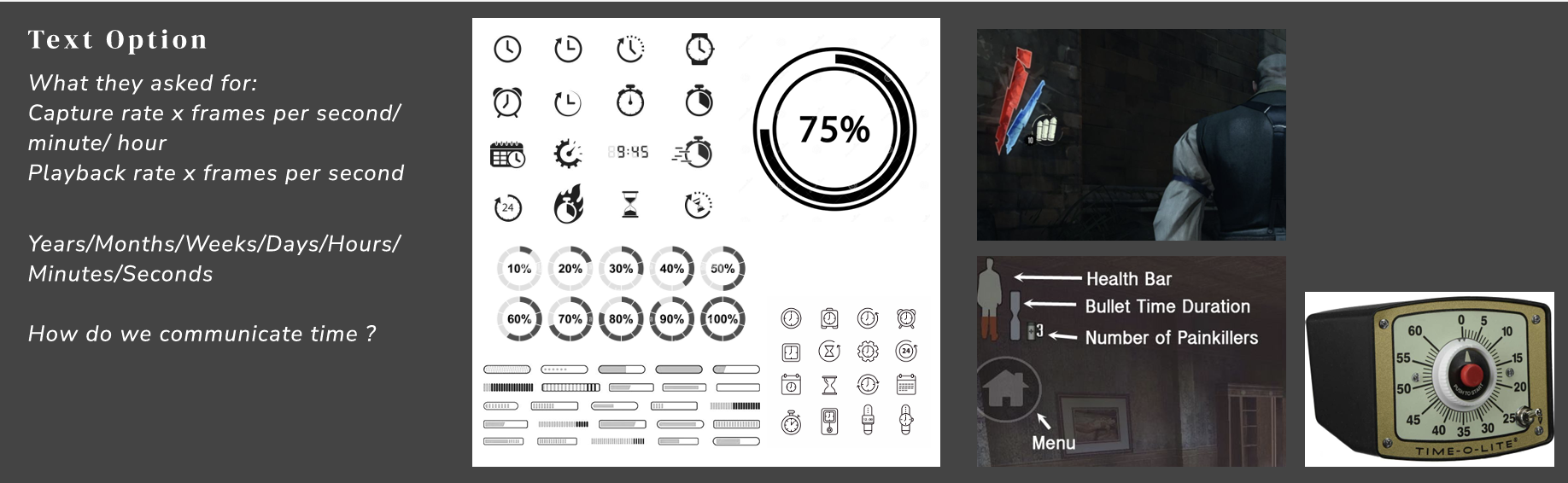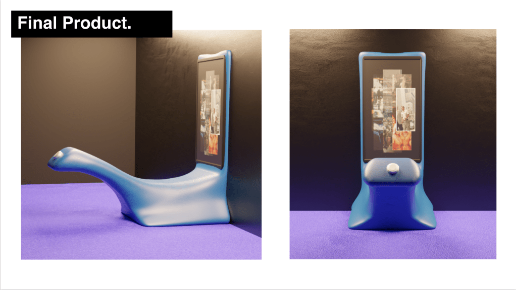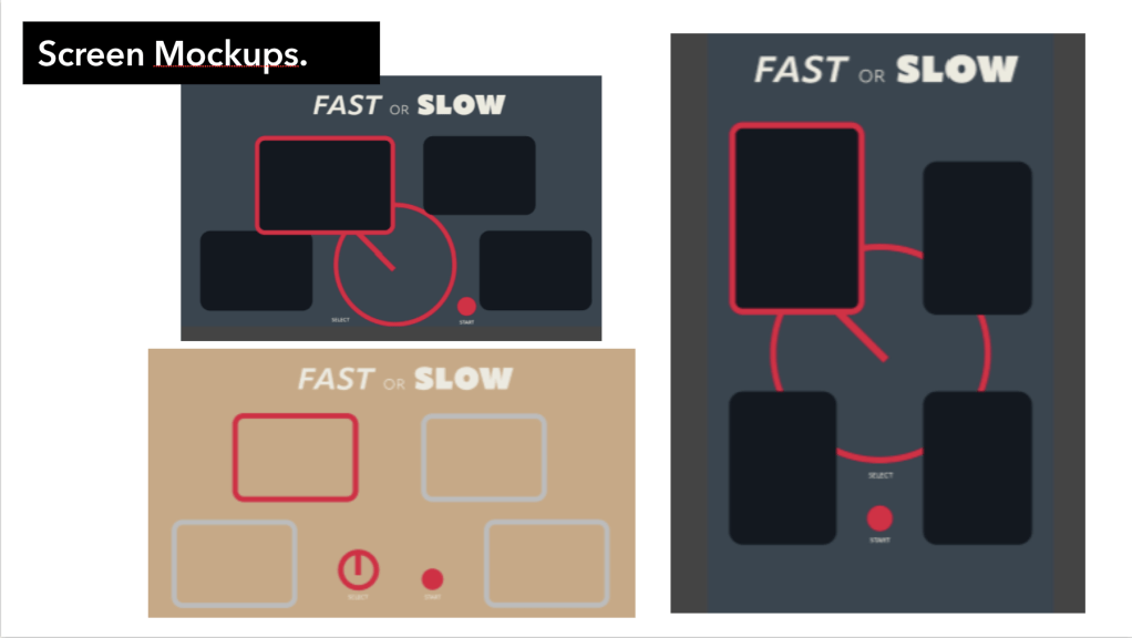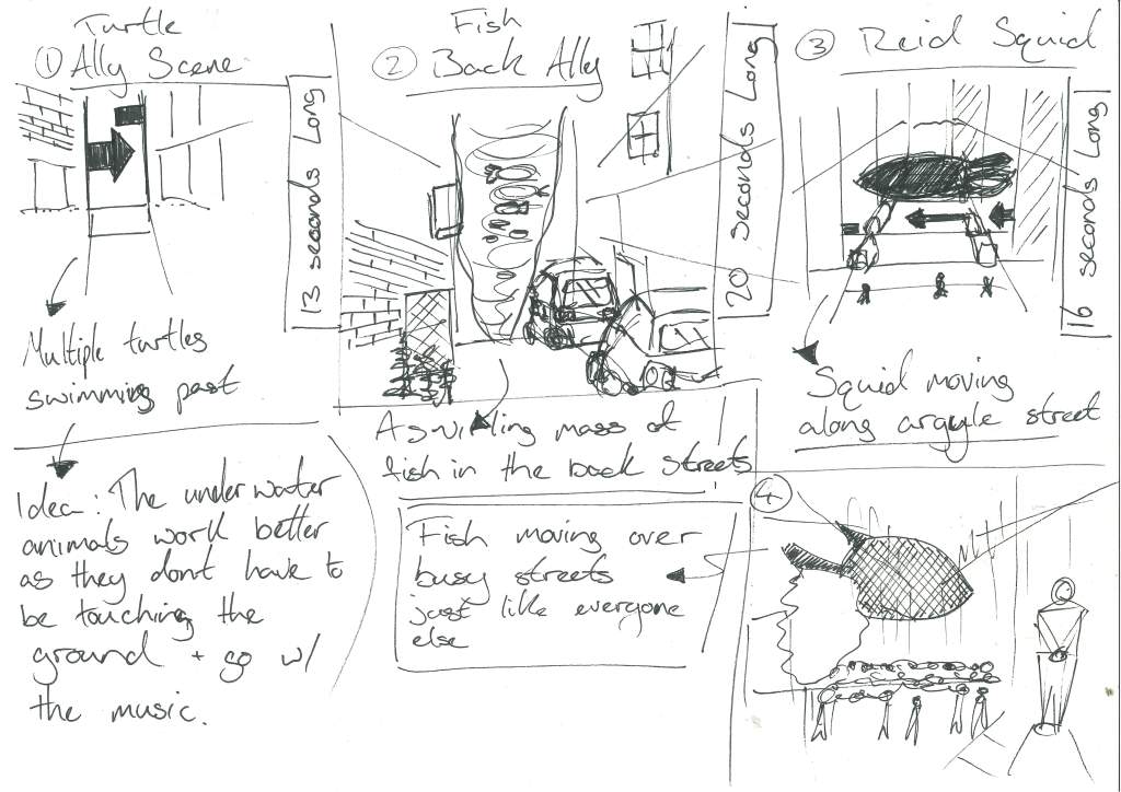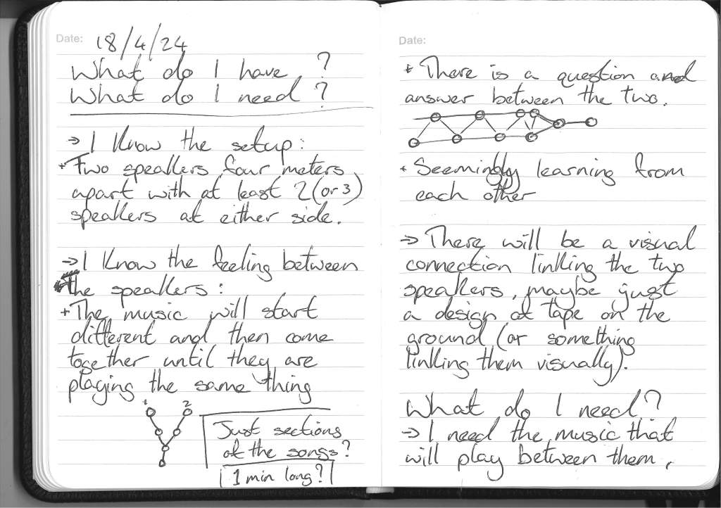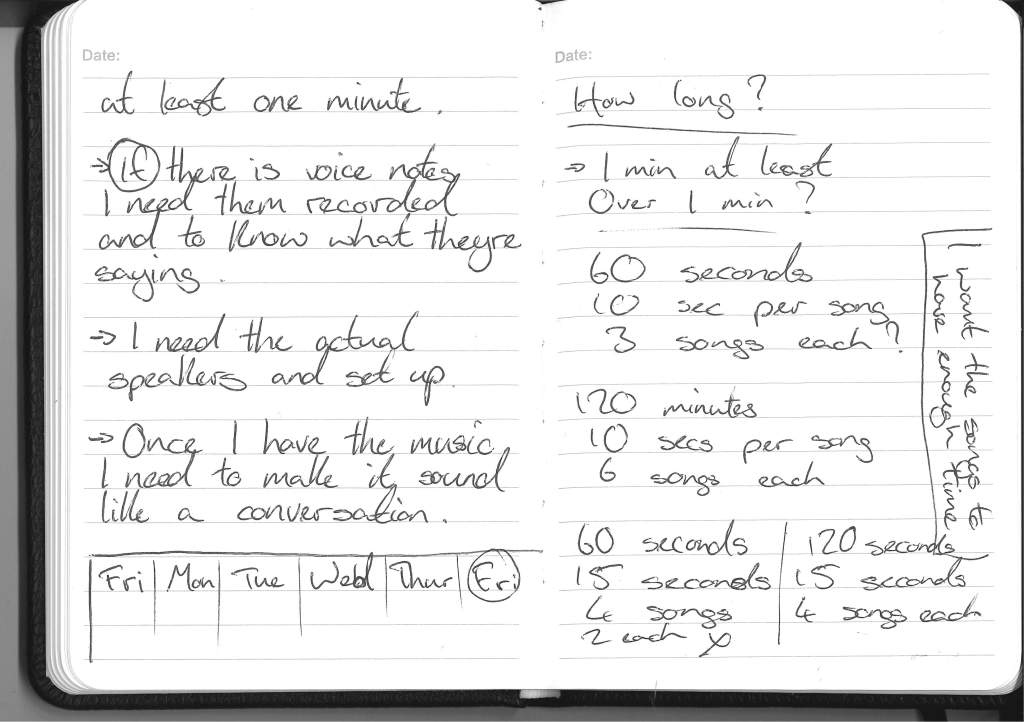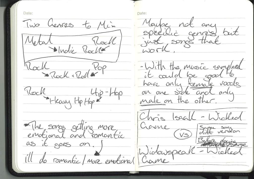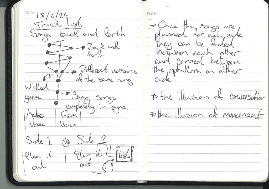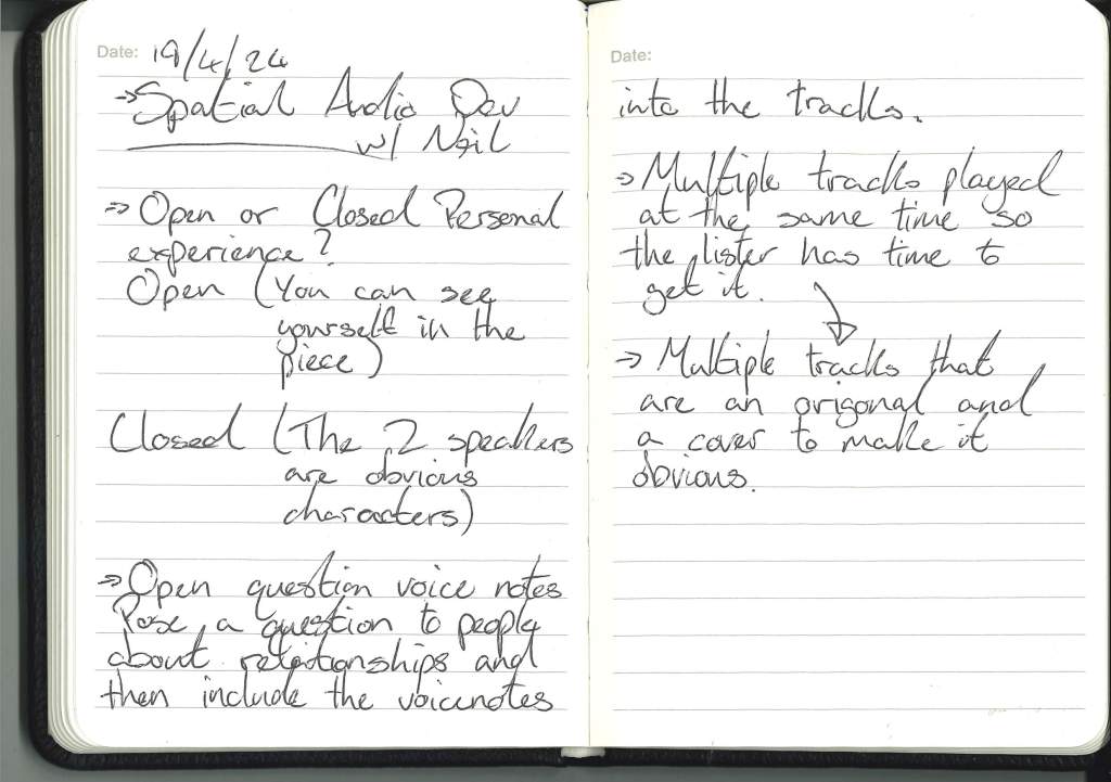

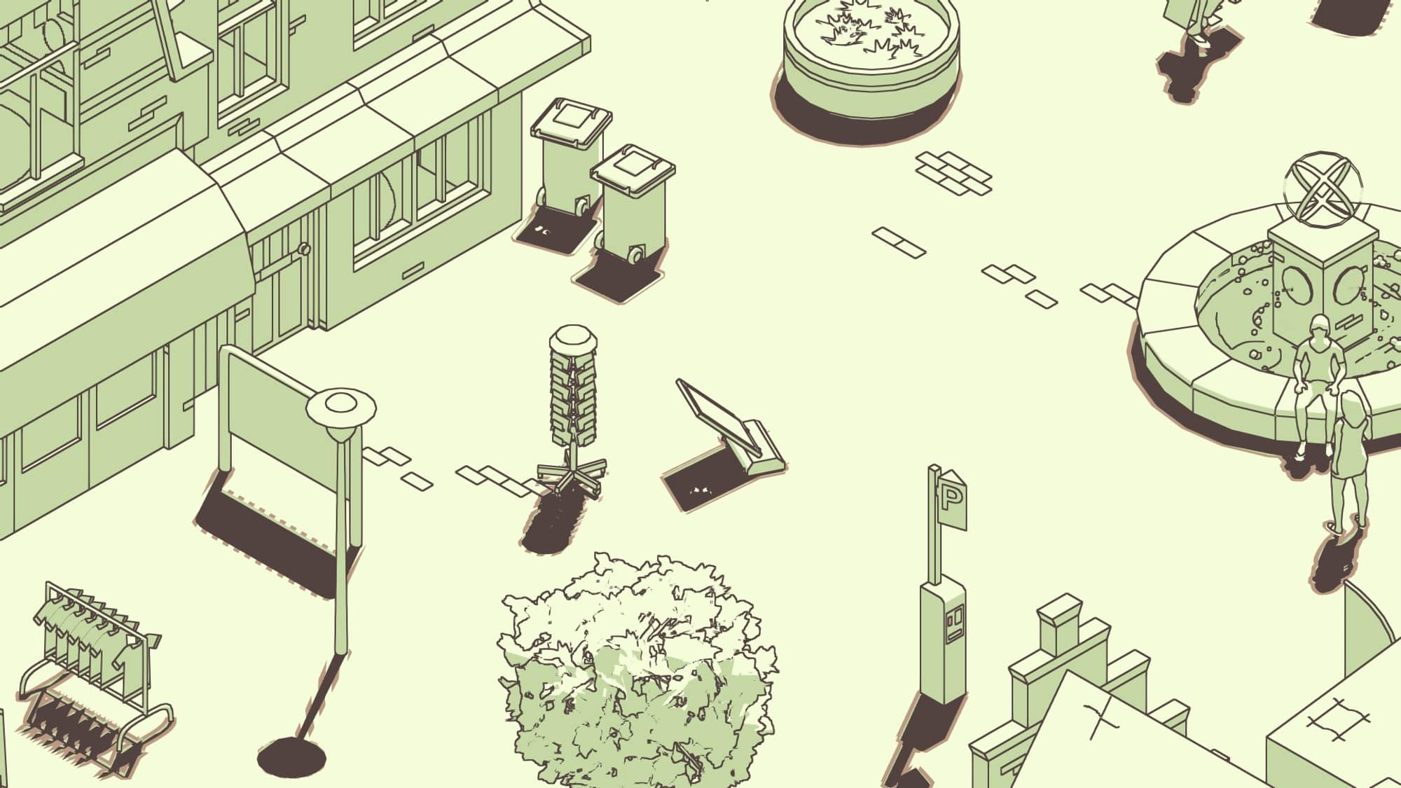
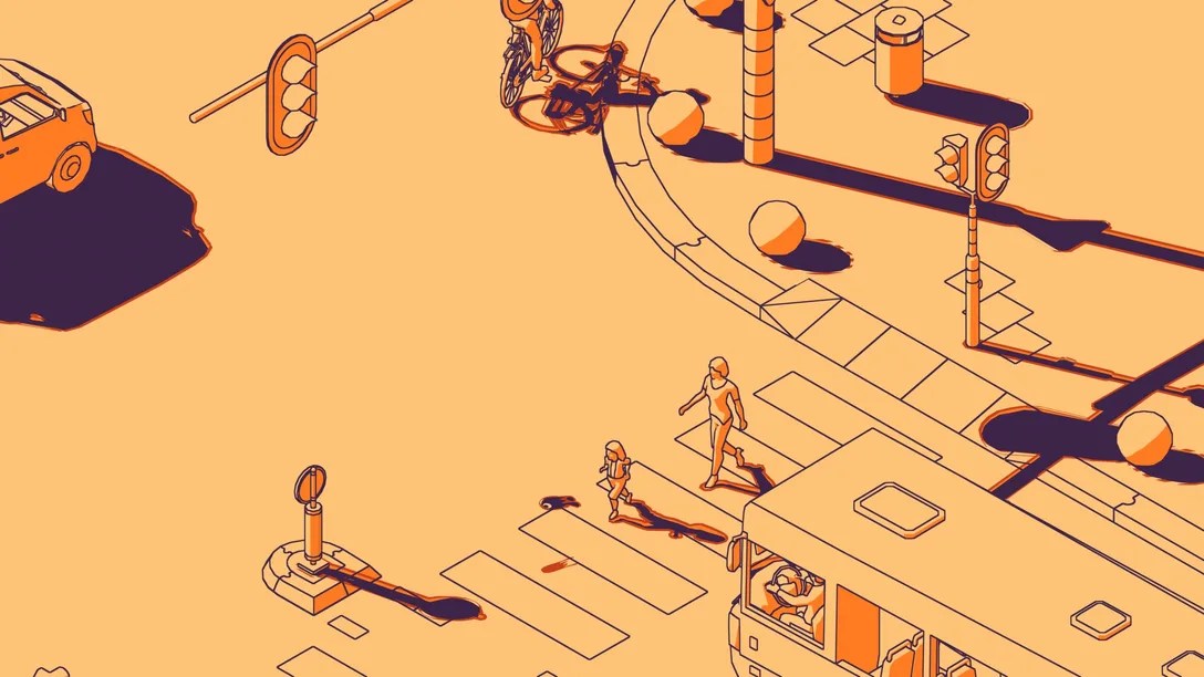
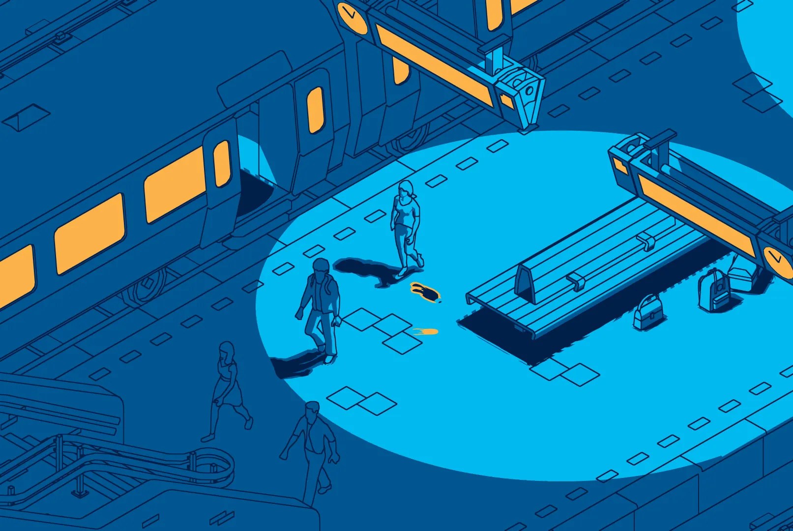
Initial Ideas :
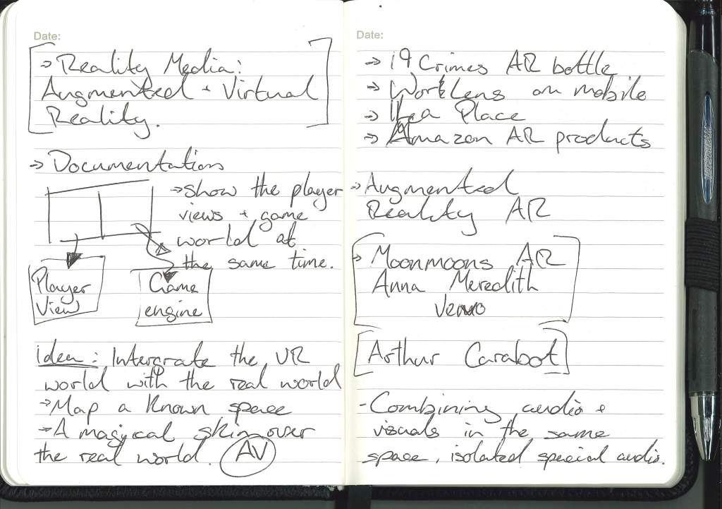
With the first idea shown on the bottom left of the page I had the idea to meld both the digital world with the real world but not through a frame or portal that is often done but more like the work done by MarshmallowLaserFeast – In the eyes of the animal.
https://marshmallowlaserfeast.com/project/in-the-eyes-of-the-animal/
In the work ‘In the eyes of the Animal’ the audience is sat in a forrest before even putting the HMD on and when put on their head they see the scene they’re already sitting in creating the relationship between the real world and the digital. I’d love to have this relationship in my work.


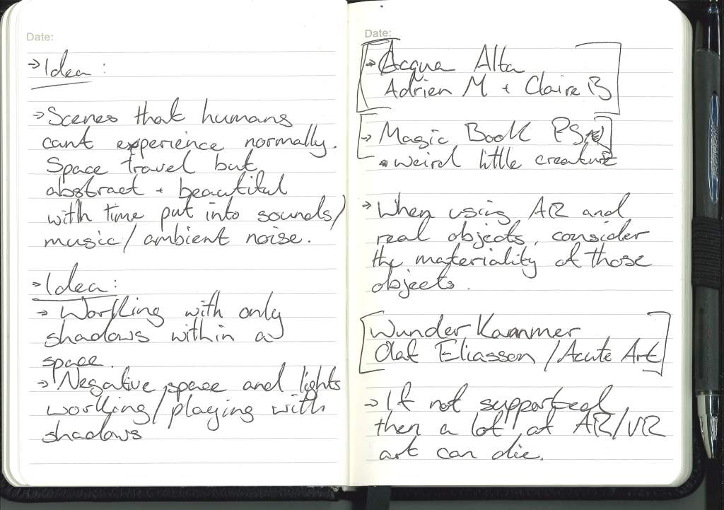
The second idea at the top of the left page is an exploration of the idea that VR can give people experiences that they would never be able experience and can bring a sense of wonder to the audience that they might have never experienced, for example, space travel. But as not to make this project just a tech demo and more emotionally engaging, the scene would maybe have an impressionist style, an exaggeration of the real thing.
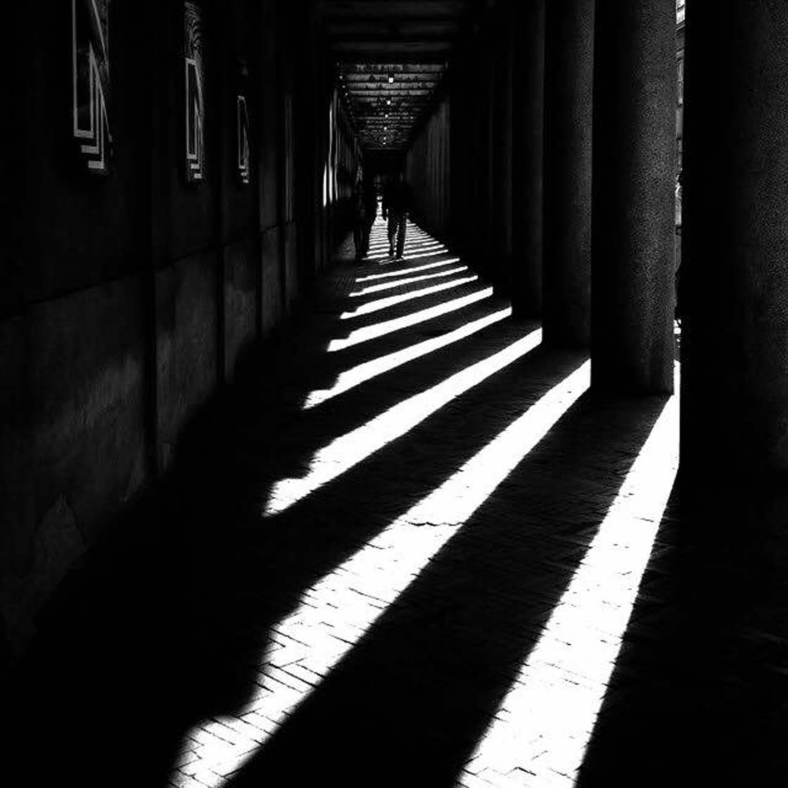
The third idea at the bottom of the same page is another interactive VR experience that uses light shadows and objects being implied by their shadows. Inspired by the feature of digitial objects in an AR space projecting AR shadows in the real world as well as the use of white space and black paint in the game The Unfinished Swan.


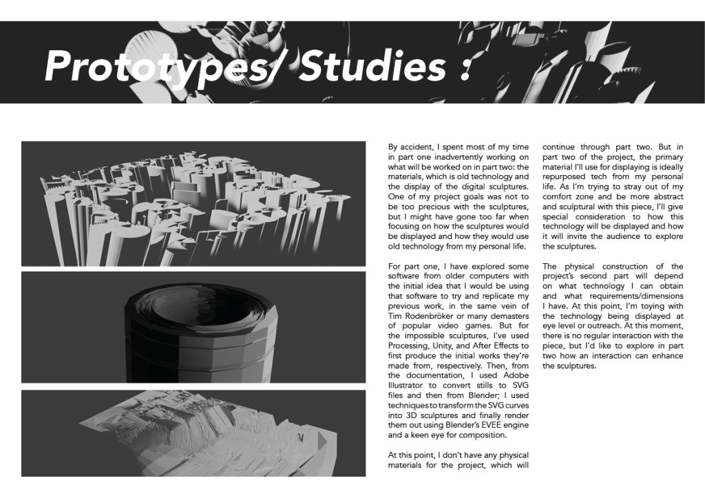
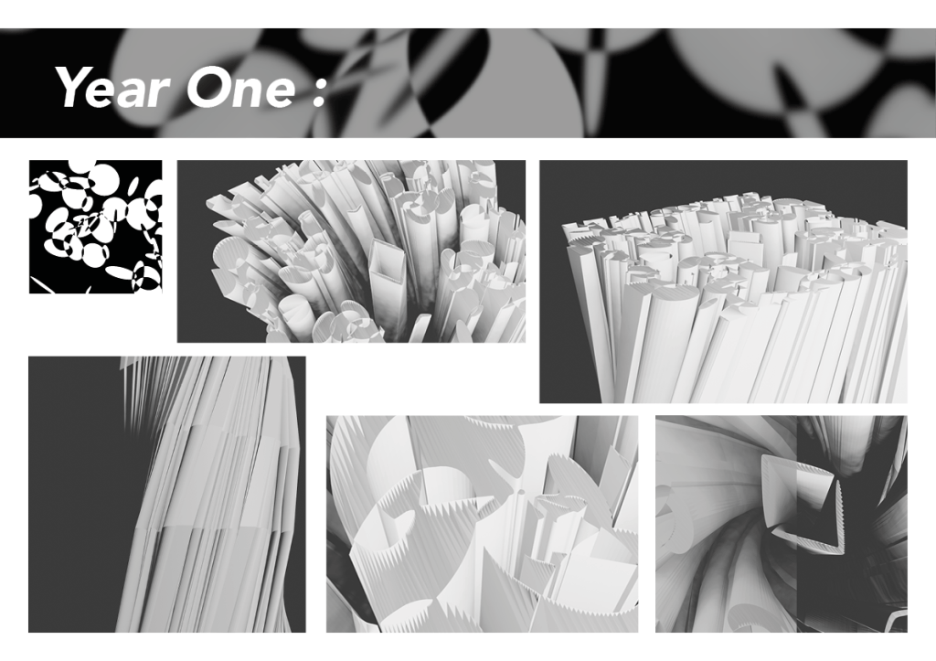
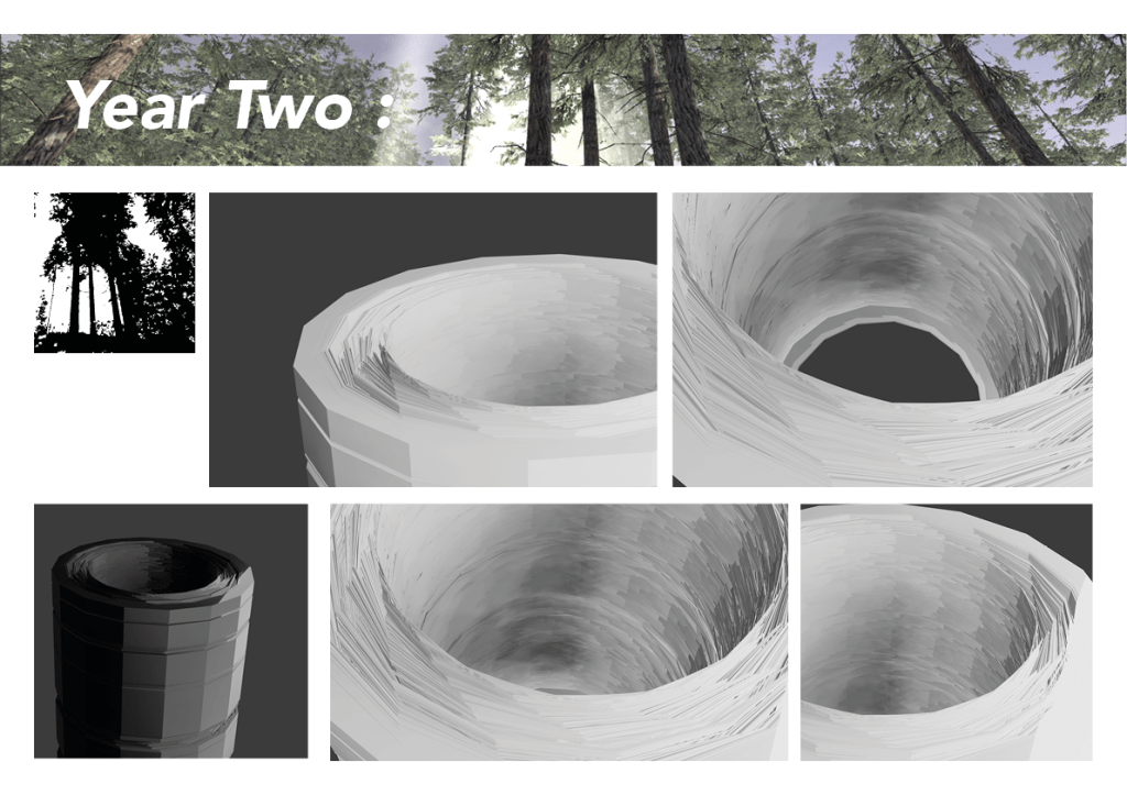
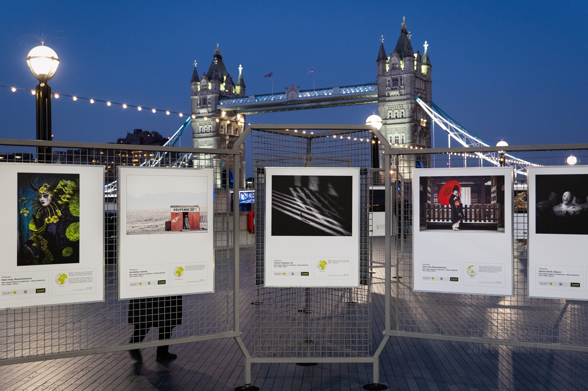
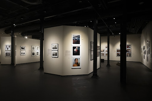
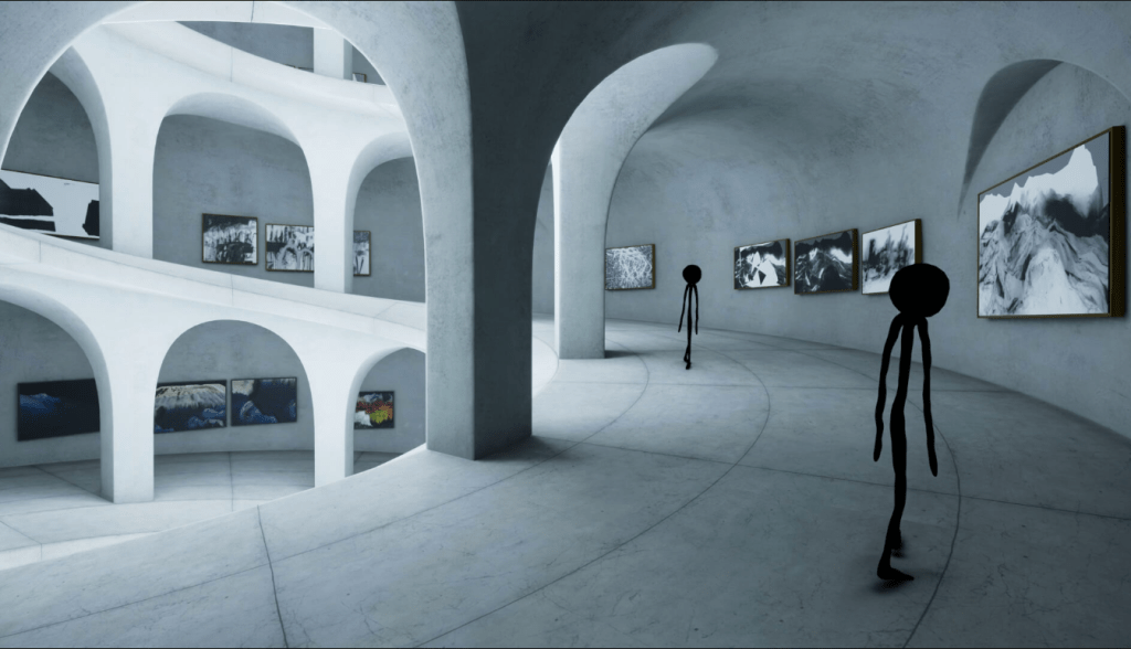
Idea four, noted on the left page is pretty much as it says there, a VR museum of dead technology and experiences that have either died due to technological advancements and a lack of support or an idea that was killed by those that had to pay for it, or even all of the above.
The museum would be a place for these 3D animation and effects to be shown in a virtual gallery.

This fifth idea is the concept of using materials that are not normally related to digital media to trigger a digital response such as a QR code made out of wood or moss or have a AR target made out of organic materials.
Testing AR :

Exploring Commercial AR :
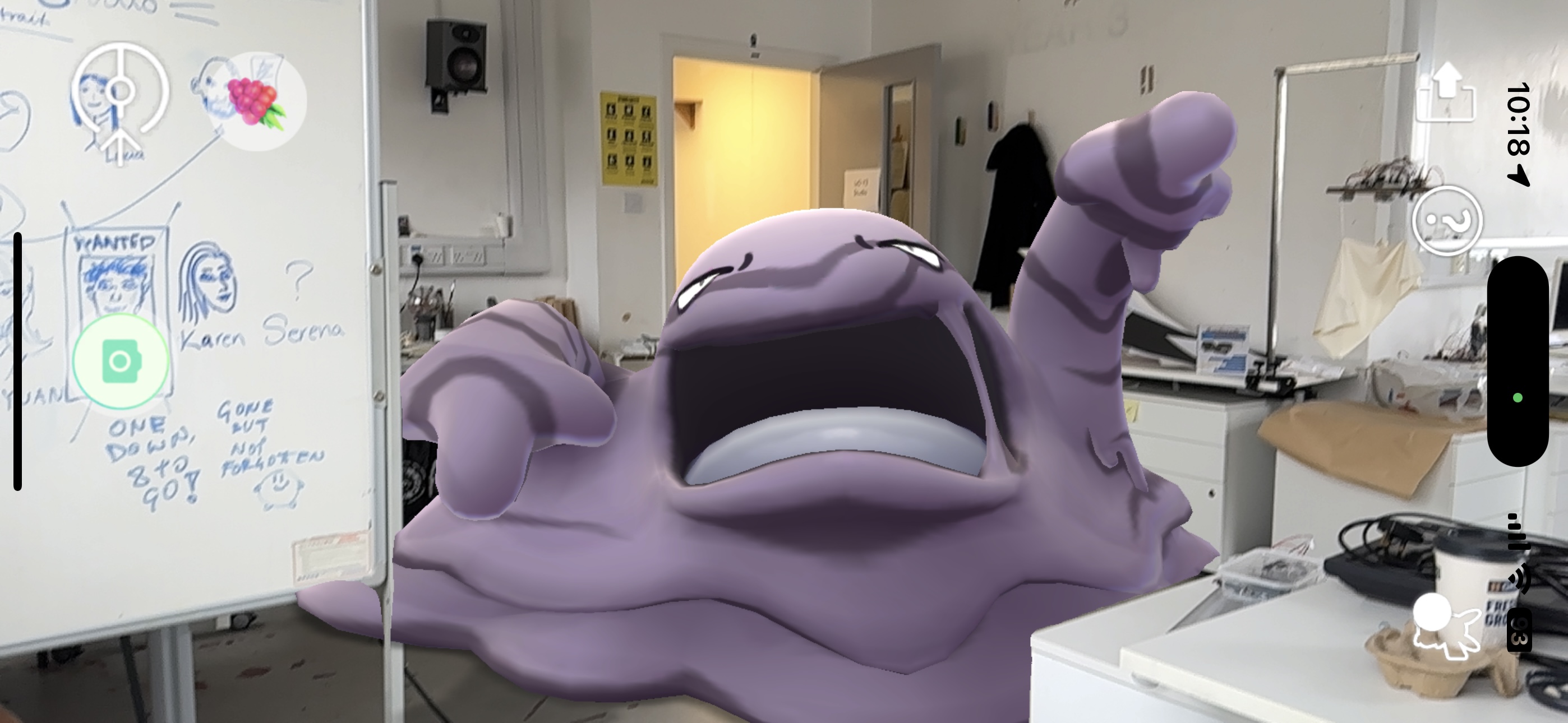
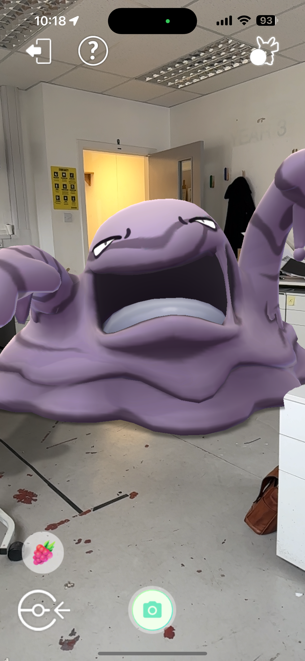
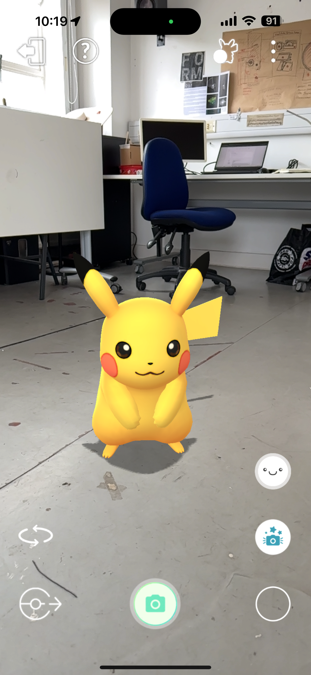
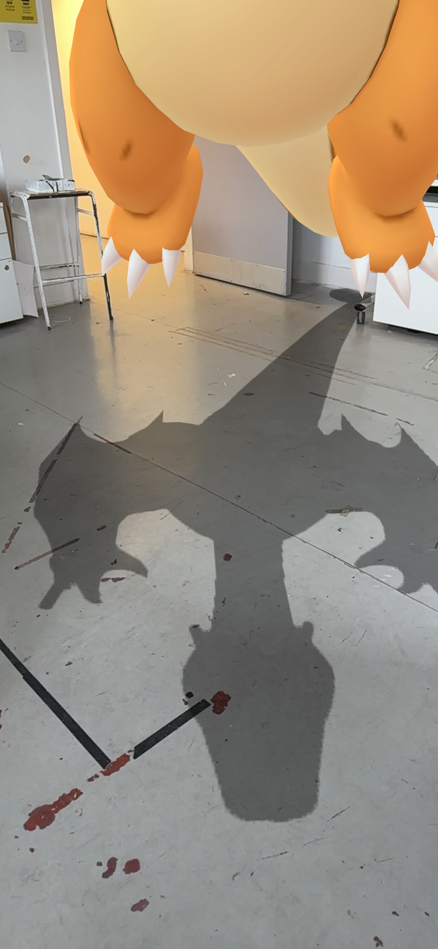
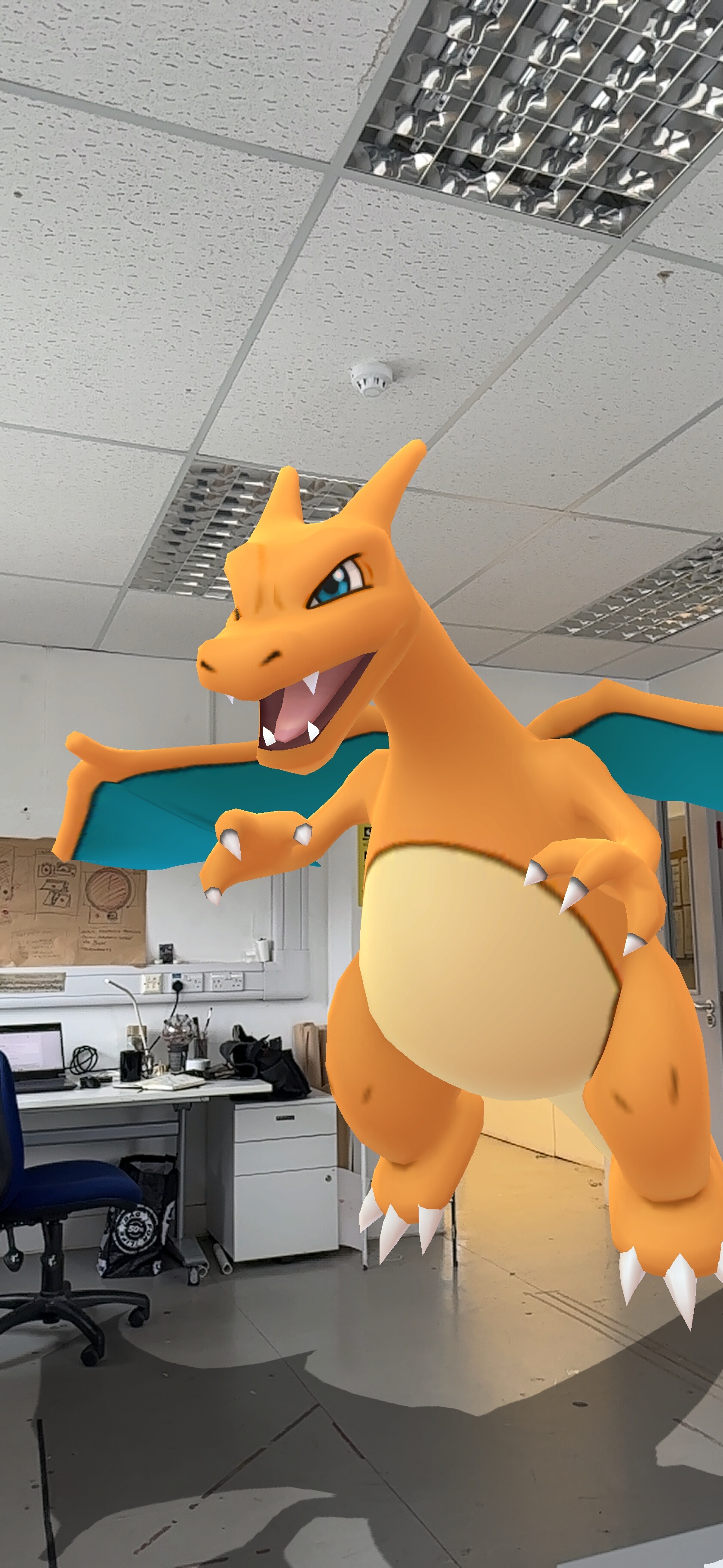
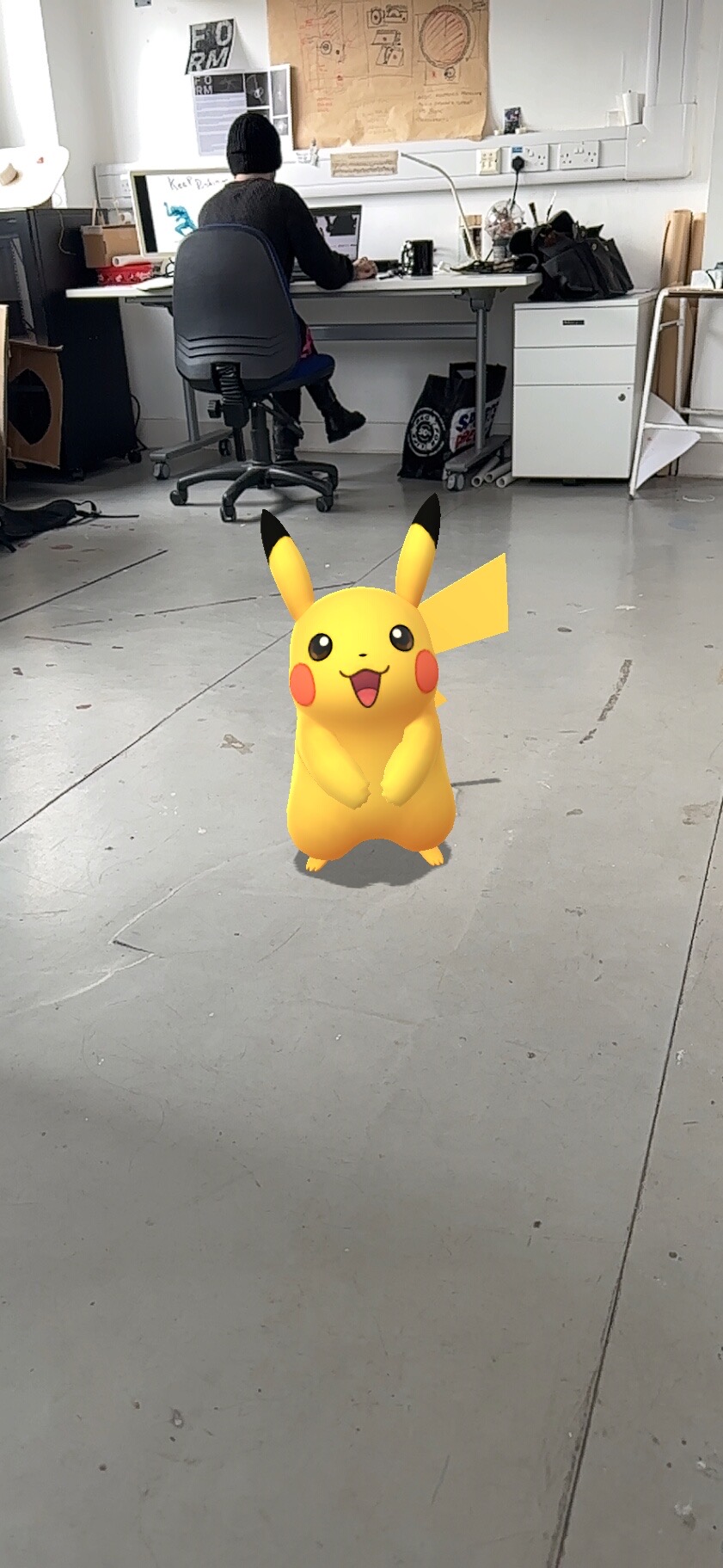
Pokemon GO in the studio:

Amazons products placement AR:
Acute Art VR app :
My thoughts at this time :
At this time in the project, I keep thinking about the fun that can be had with AR and VR, this idea of making the real world magical and lighthearted and beautiful. Using technology to make magic happen.
Light hearted, joyful, magical, fun.
Finding joy in artwork:
Bird (2008)
Natasha Light (b.1976)
Ceramic & fishing line
H 46 x W 20.5 x D 6 cm
Peace Museum
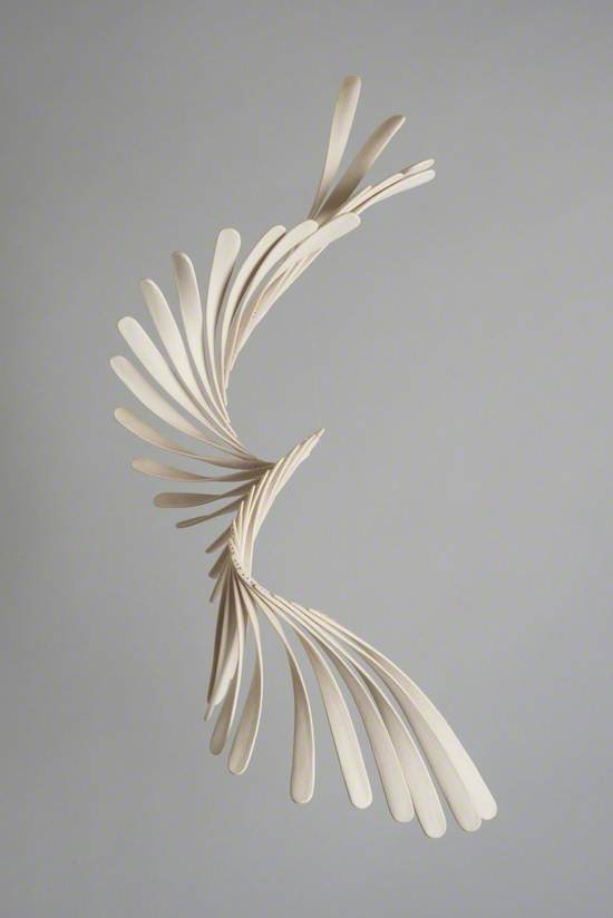
In lights ‘Bird’ the grace and beauty is something that draws me in, with such a simple visual style the grace of a birds flight is captured.
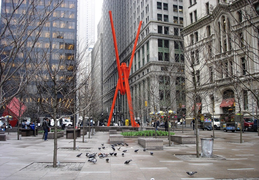
Joie de Vivre (1998)
Mark di Suervo
The joy I found in ‘Joie de Vivre’ (Joy of Living) was the essence of play, the colourful figure in stark contrast of the grey architecture and business people of New Yorks lower Manhattan financial district.
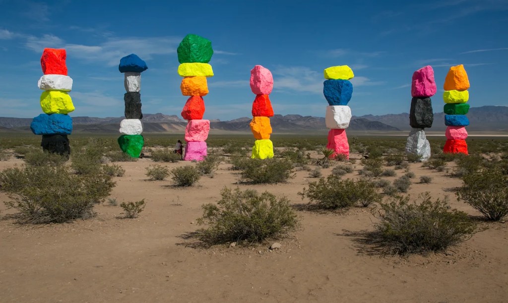
Seven Magic Mountains Land Art in the Nevada Desert 2016
Ugo Rondinone
Again as with ‘Joie de Vivre’ its the contrast between the work and the situation it sits, in ‘Seven Magic Mountains’ the outstretching harsh Nevada desert is harshly and unapologetically interrupted by these colourful standing stones.

La Joie de vivre [The Joy of Life]
Max Ernst
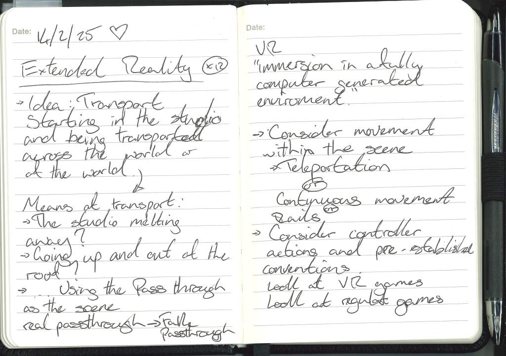
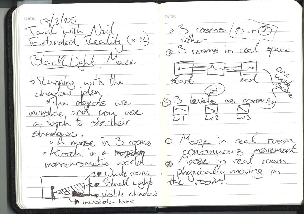
Talk with Neil:
BlackLight Idea
Inspiration:
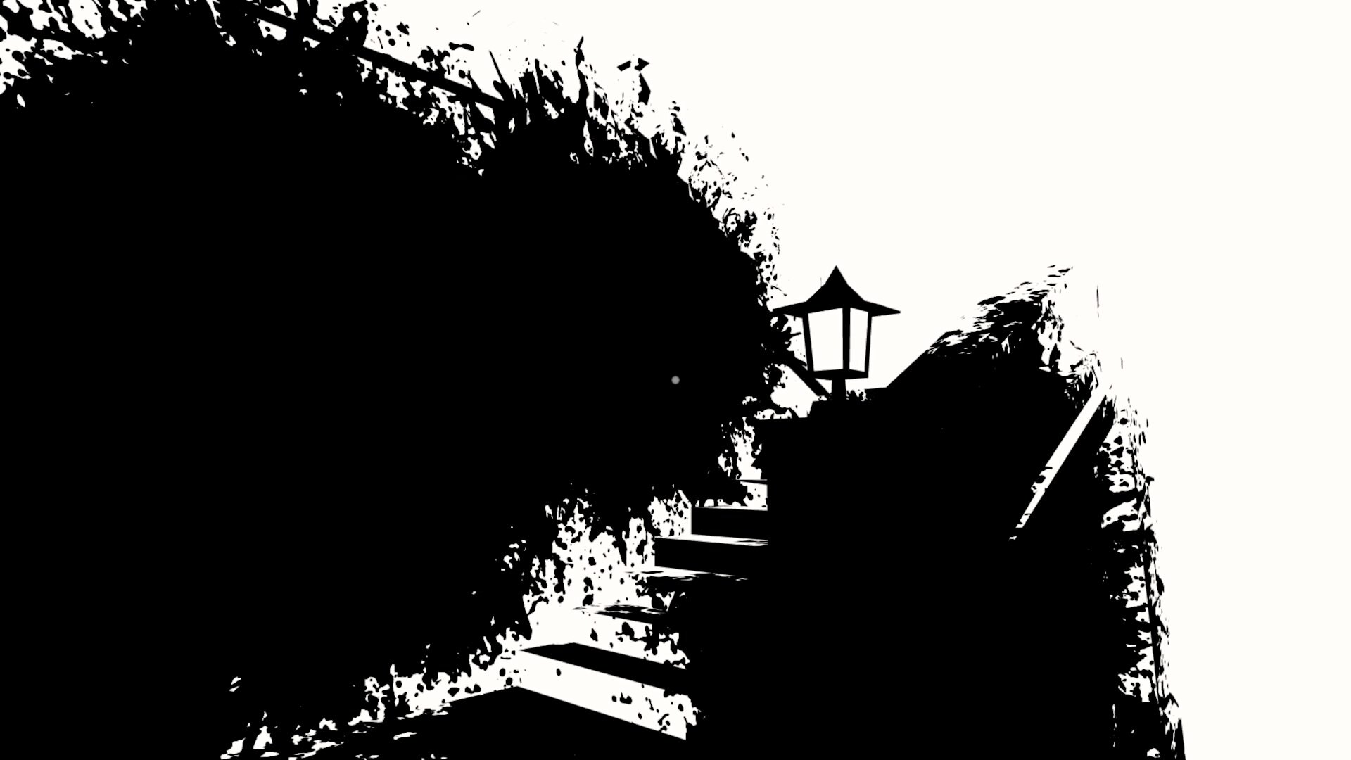
Unfinished Swan:

With Unfinished Swan the art style was a huge inspiration for me on this project, mainly for its visuals but also the way they introduce the main mechanic at the start of the game.
Shadowmatic:
I love the use of shadows to create different shapes, I’d love to work this into my project somewhere.
Schim:
With Schim I want to carry over its sense of warmth and joy in every situation, you work within the shadows in the game but at no point is it scary.
Superliminial:

With Superliminial, its the sense of joy and wonder in the majority of the game, using the one function of shifting and controlling perspective throughout.
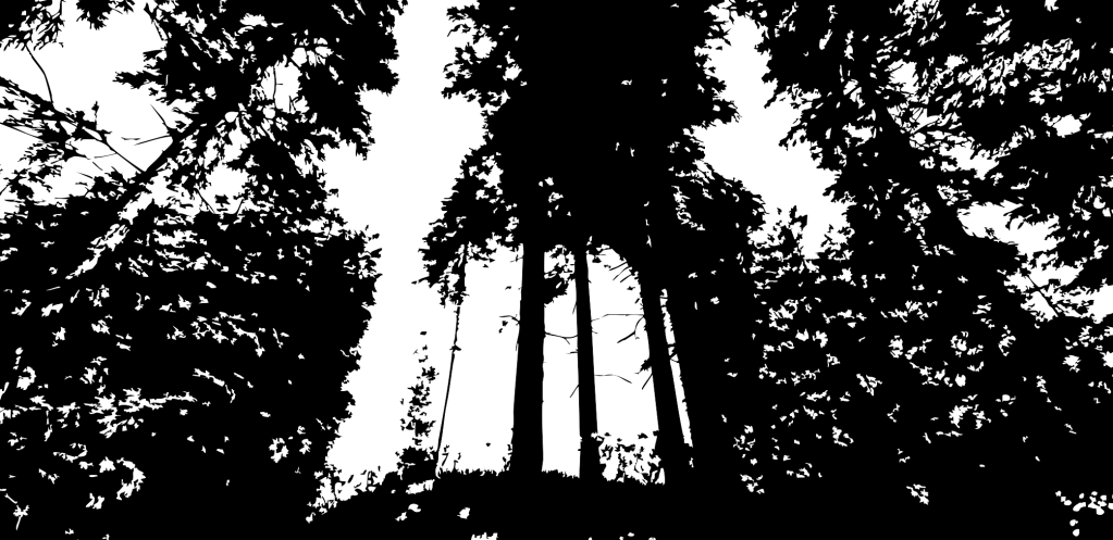
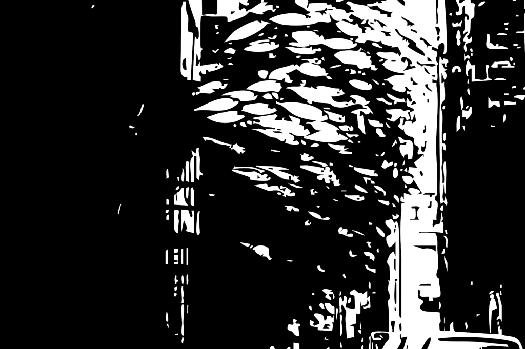
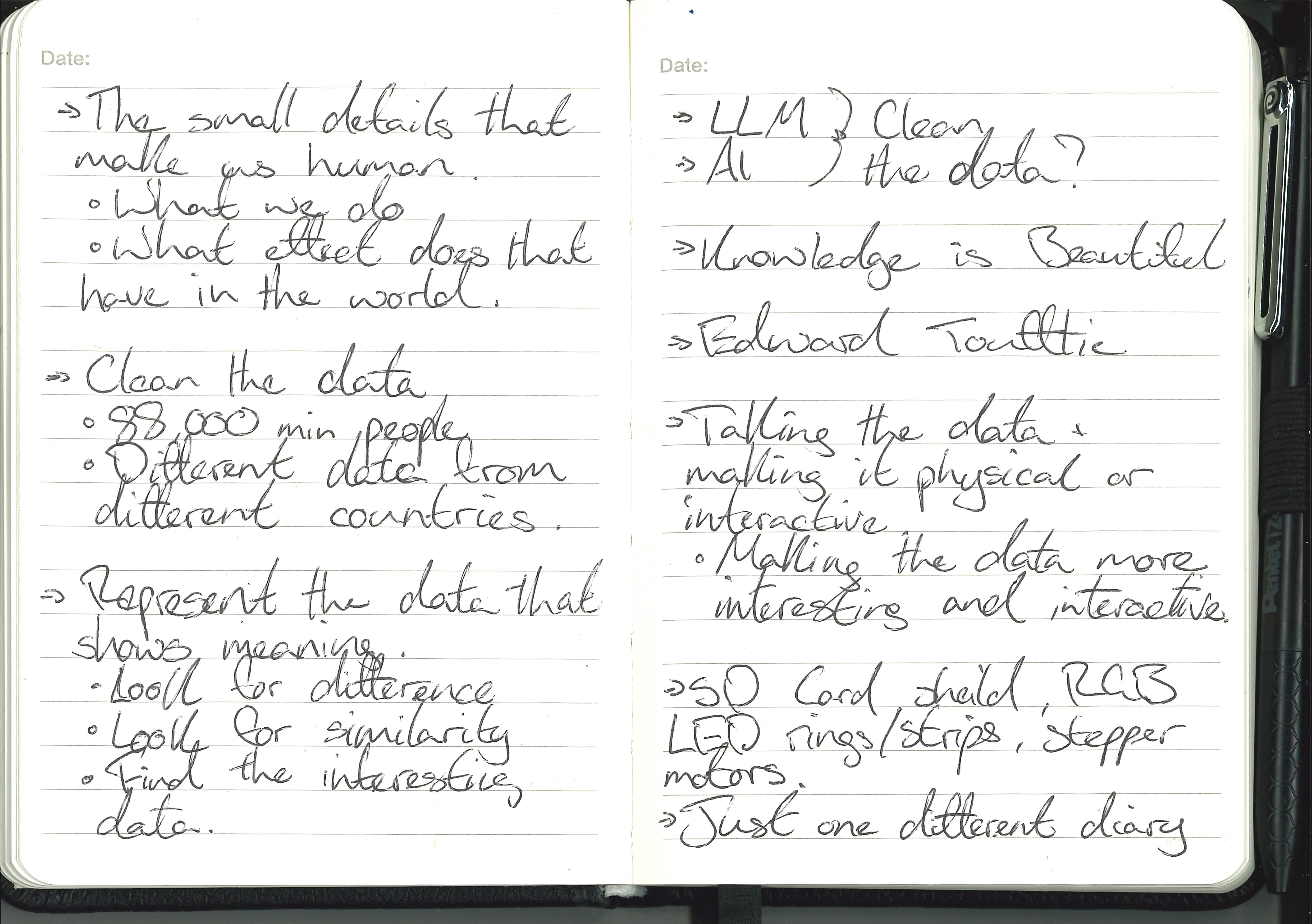
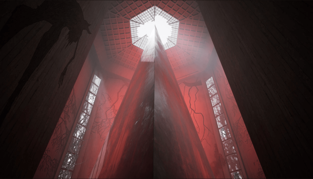
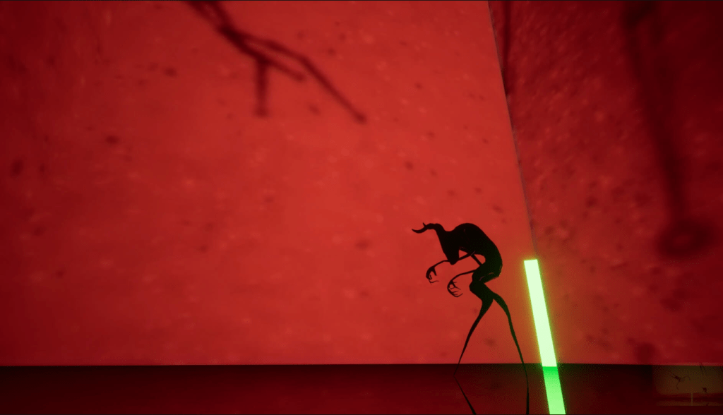
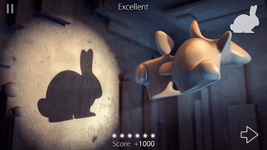
Understanding Shadows:


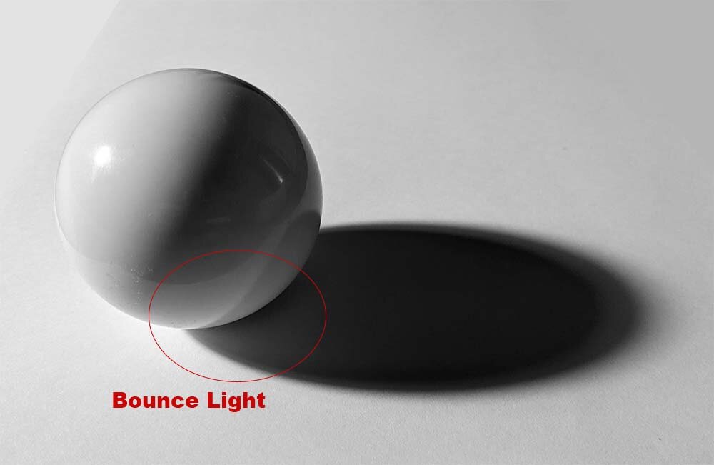
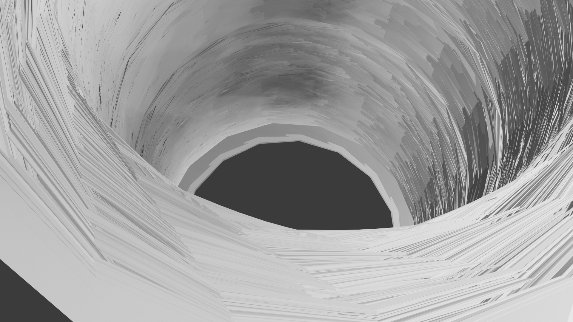
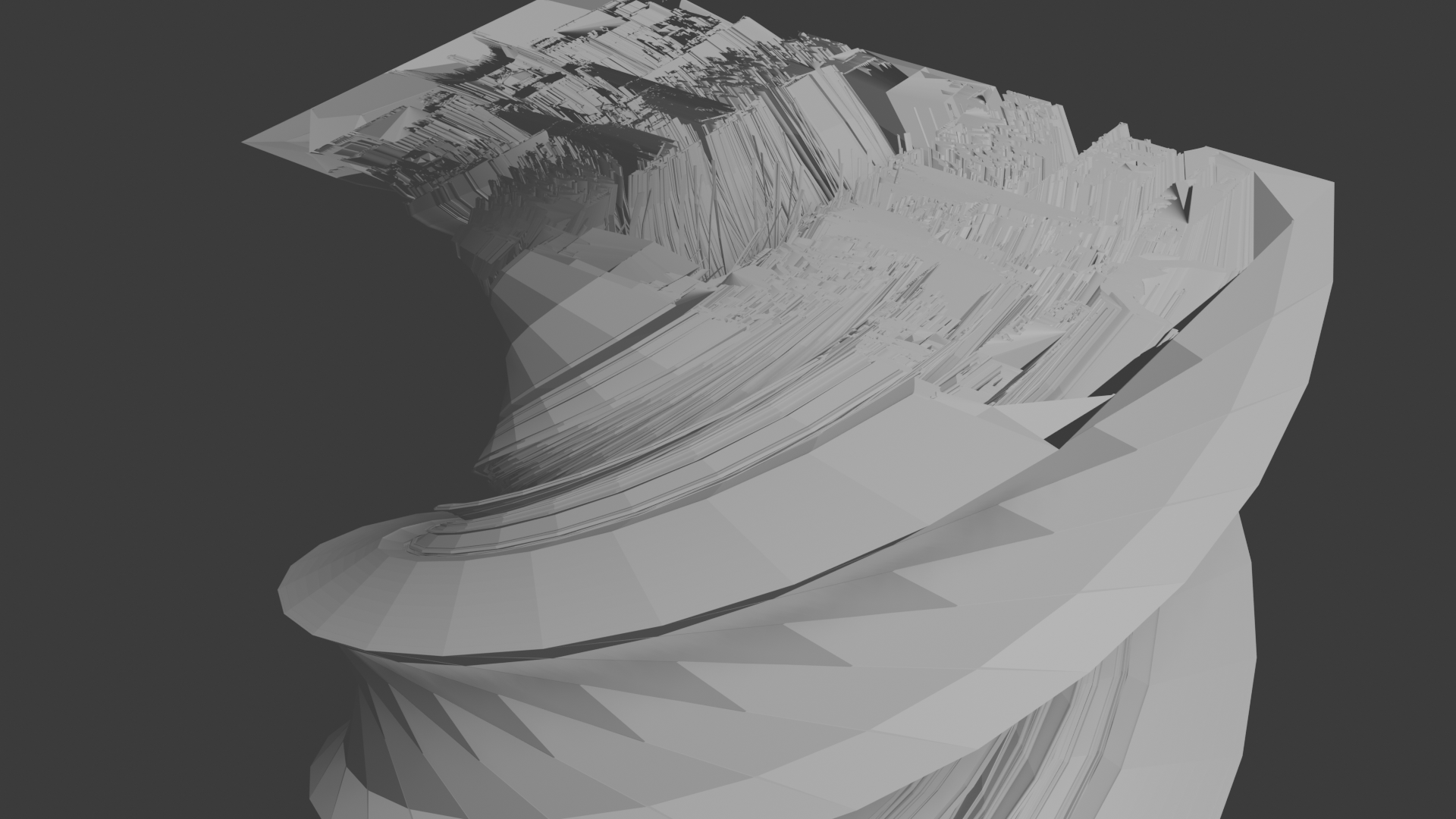
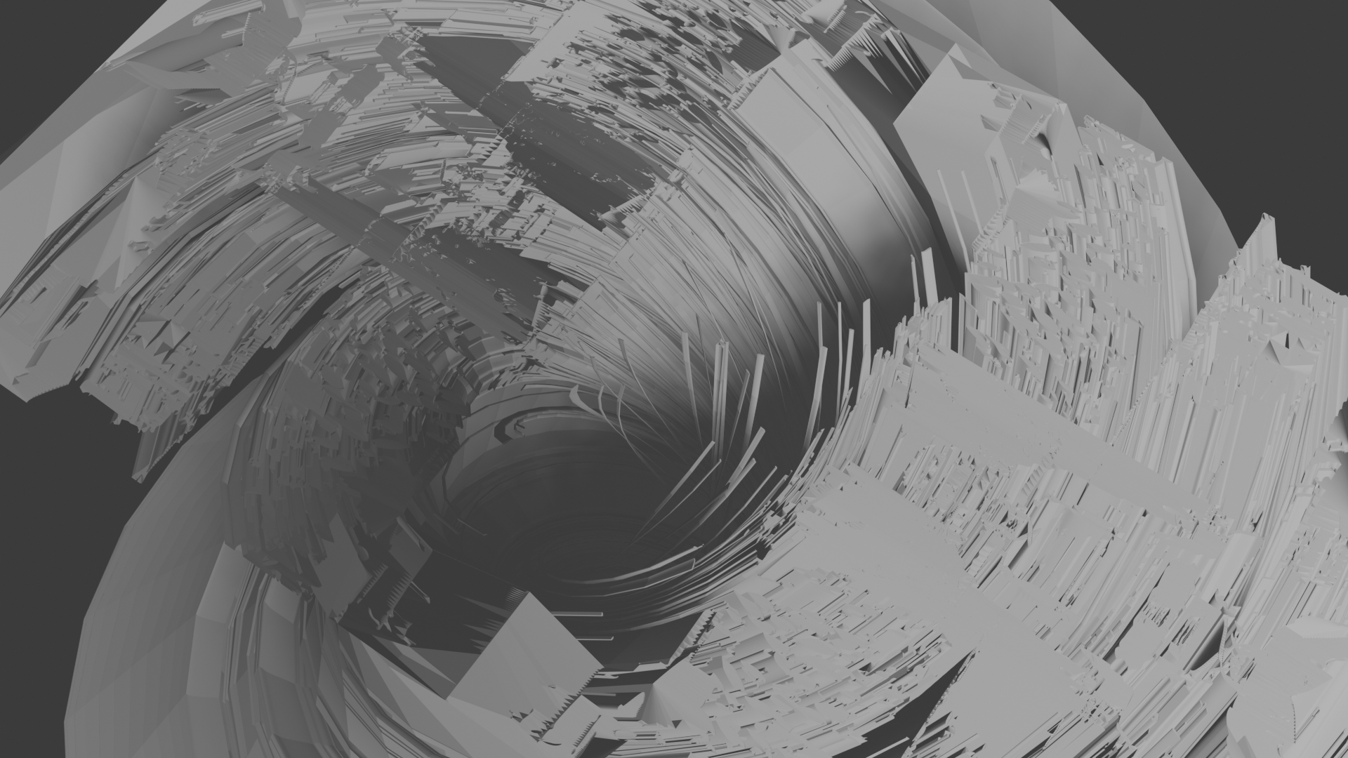
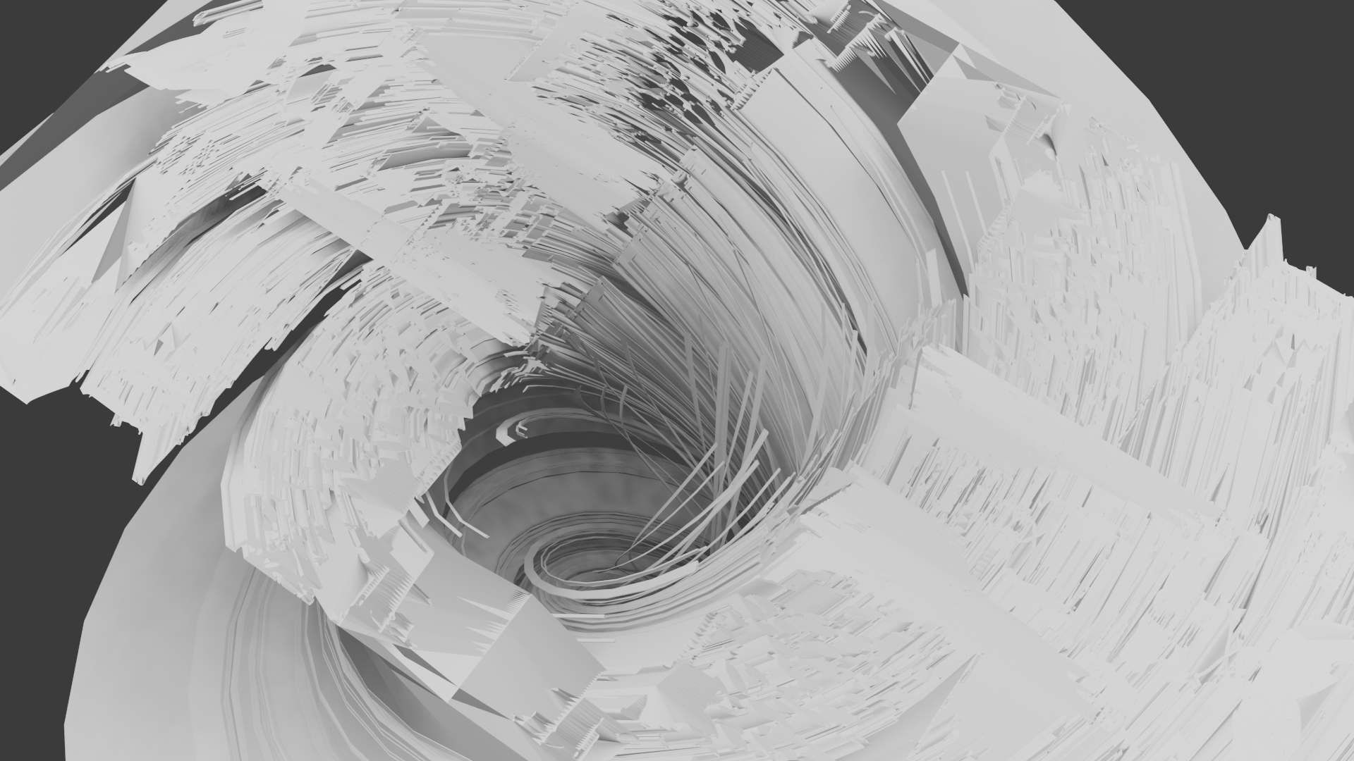
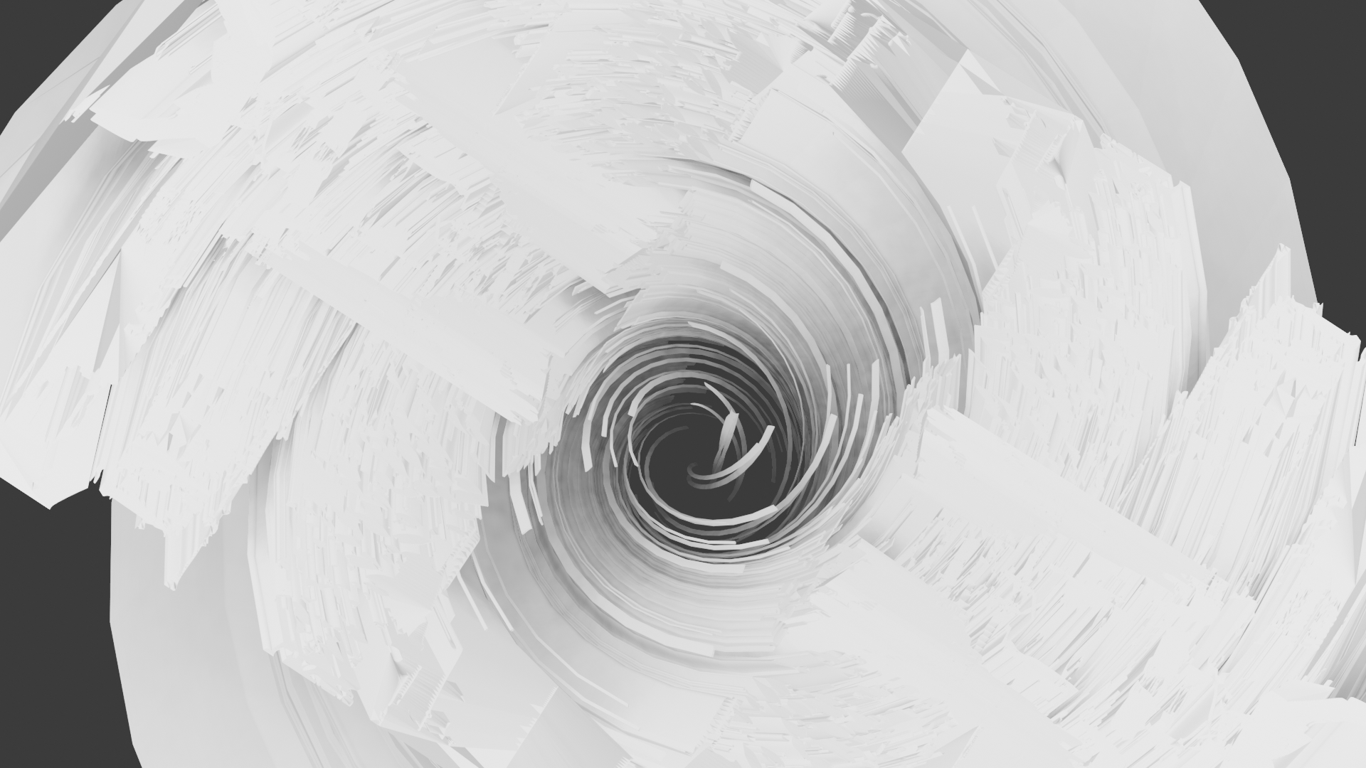
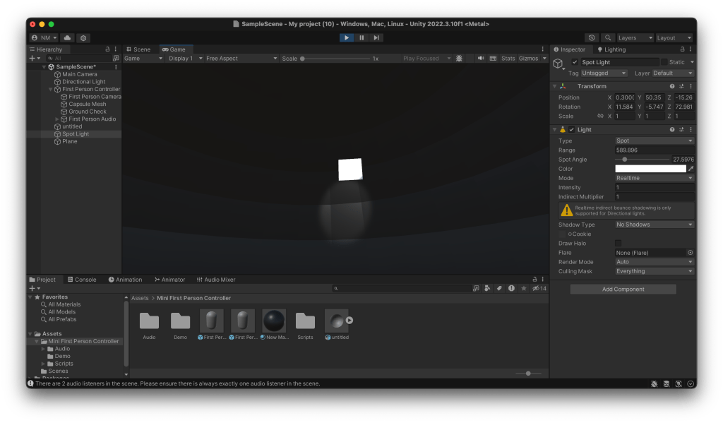
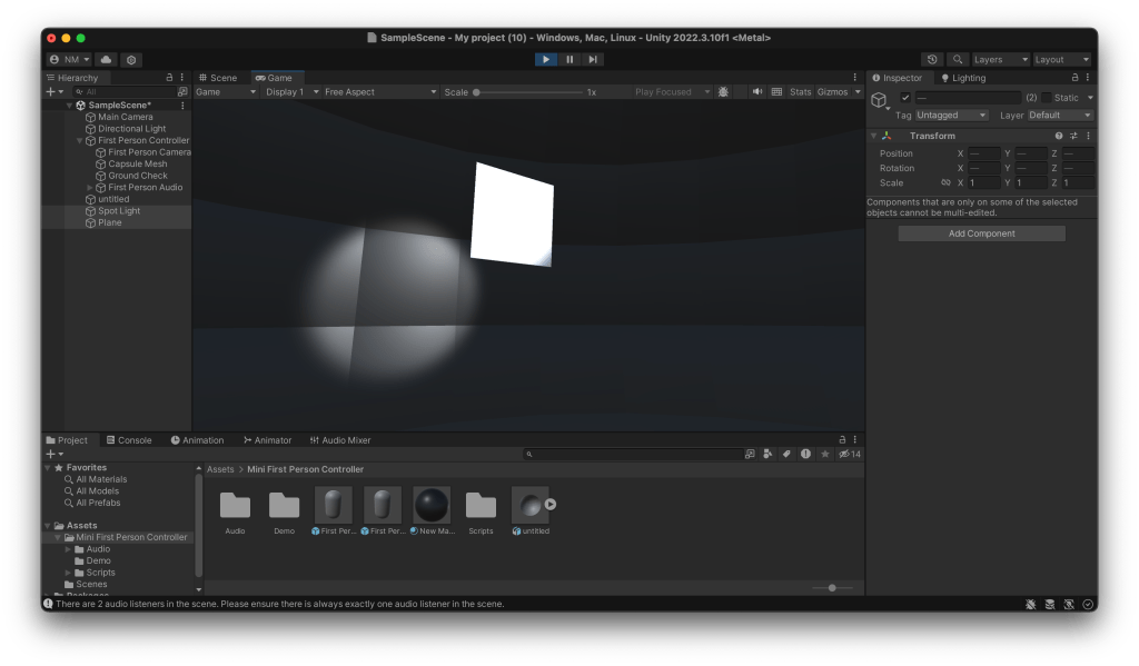
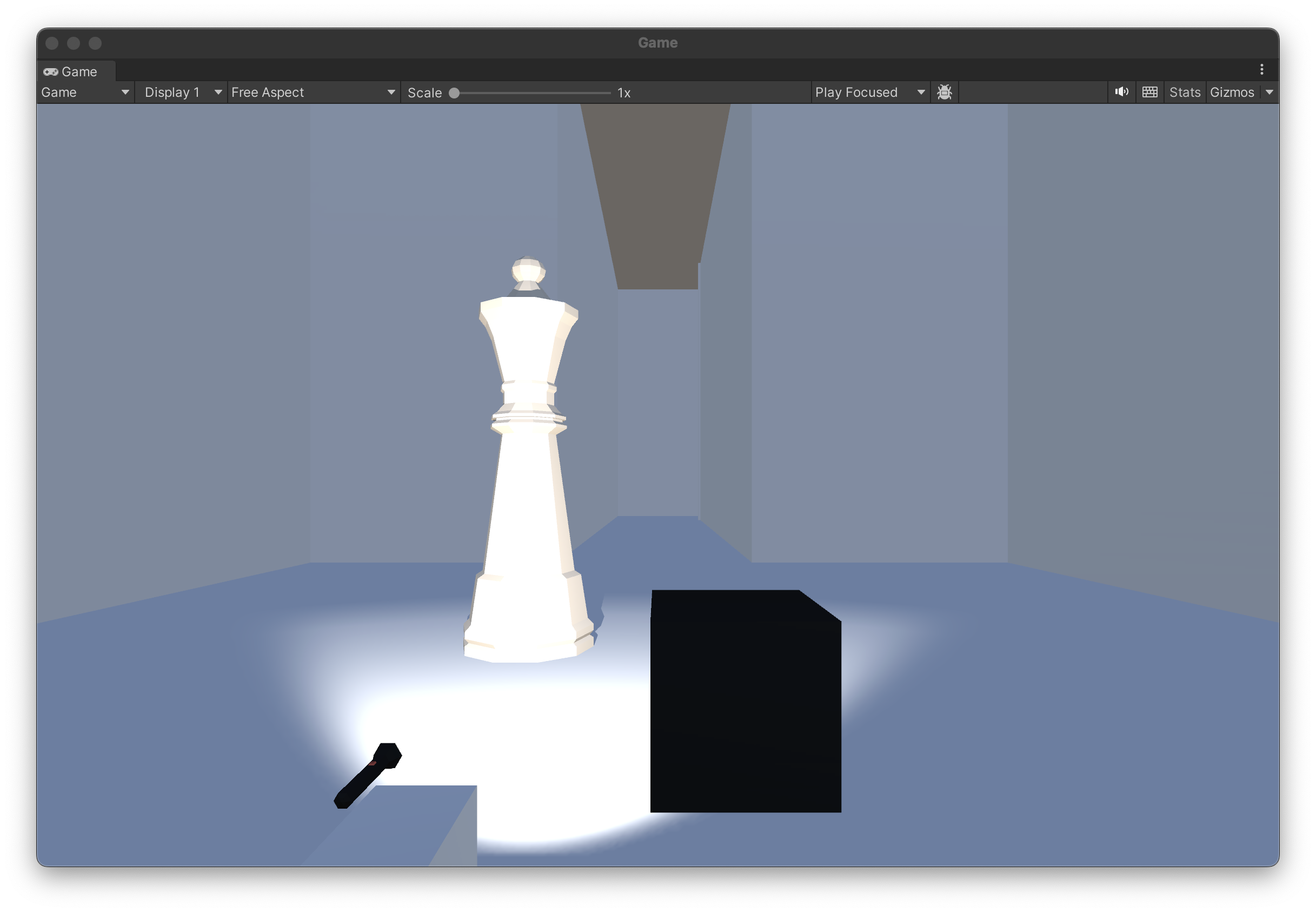
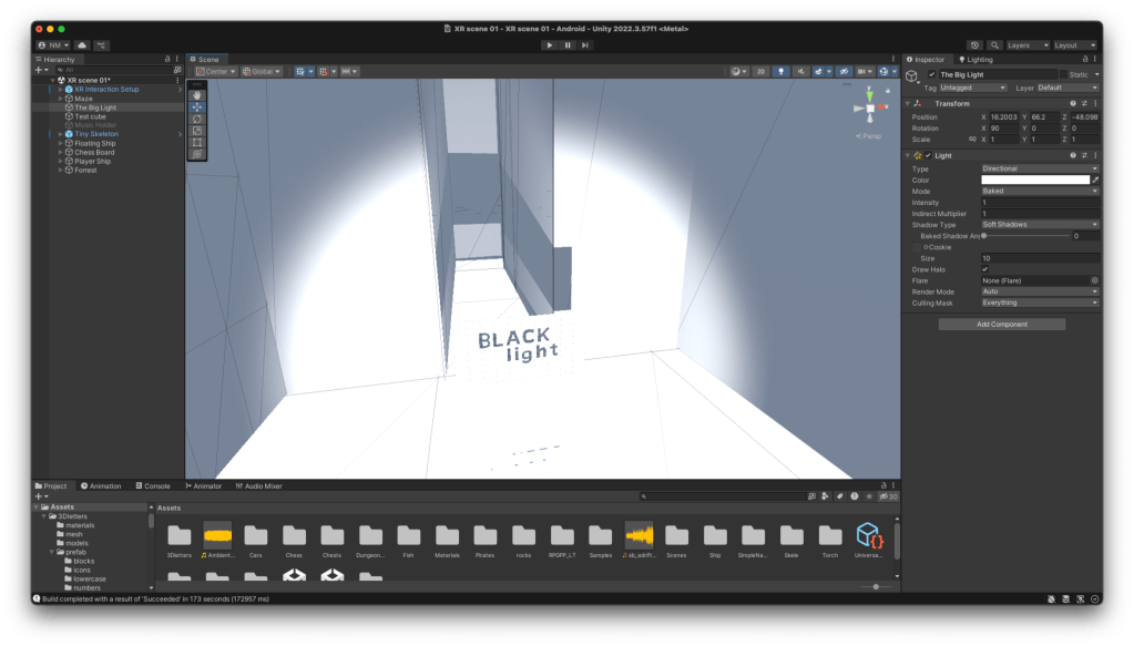
As the Unity scene will use shadows as its main interaction I think its good to look at them with a different focus, obviously we encounter shadows everyday but looking at them in a different lens or with a different context will give me a better of idea of how my scene should look.
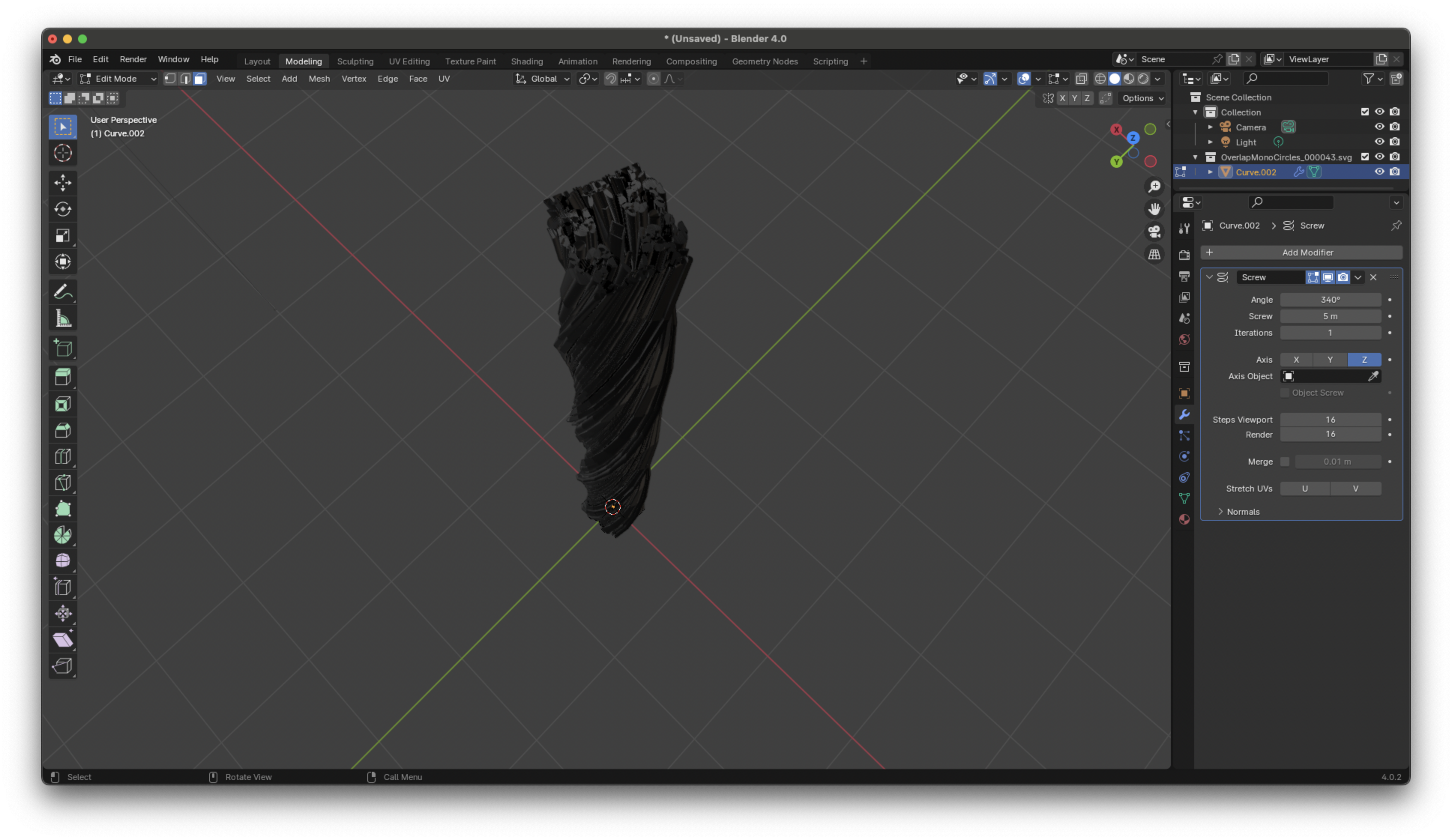
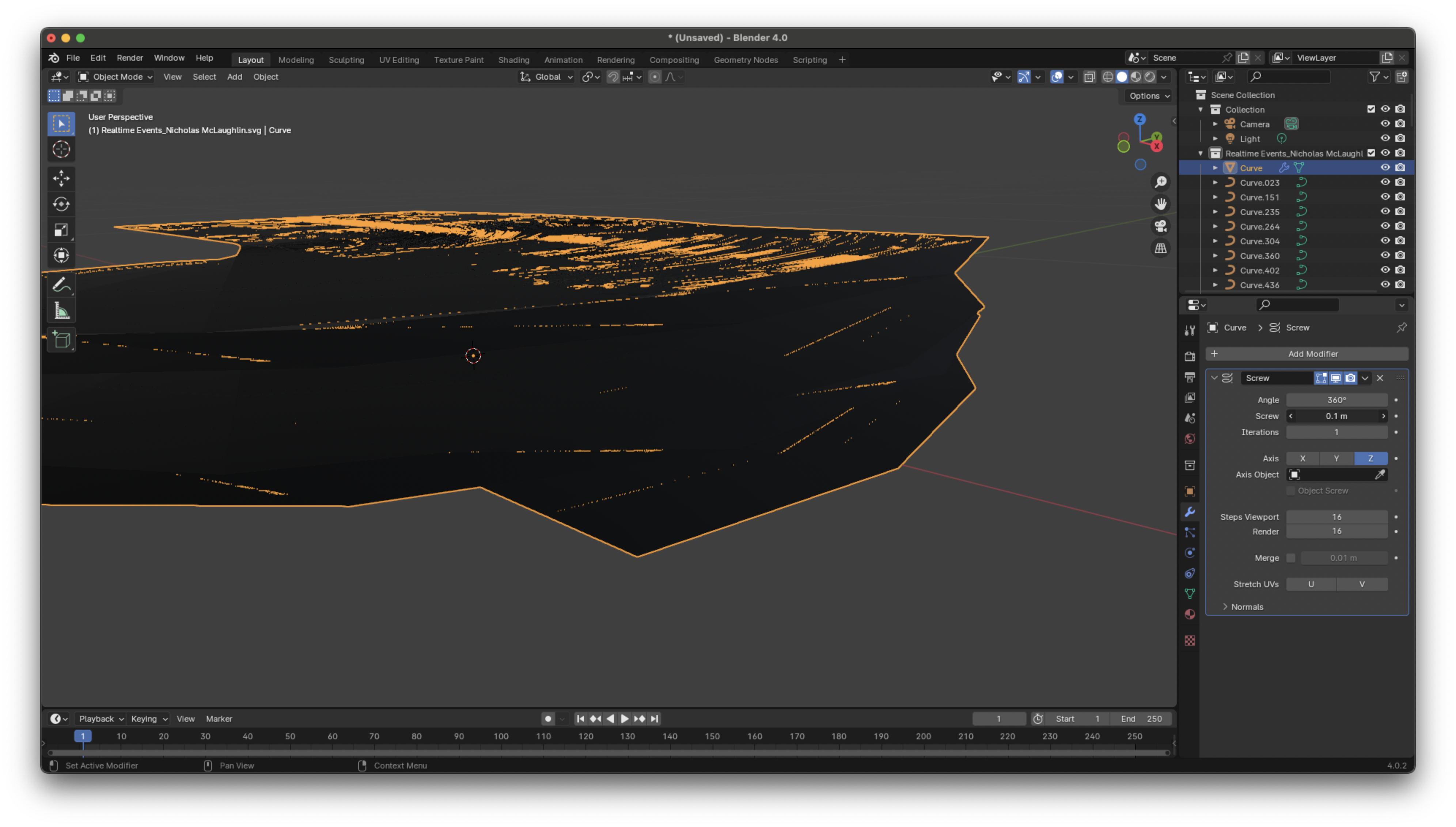
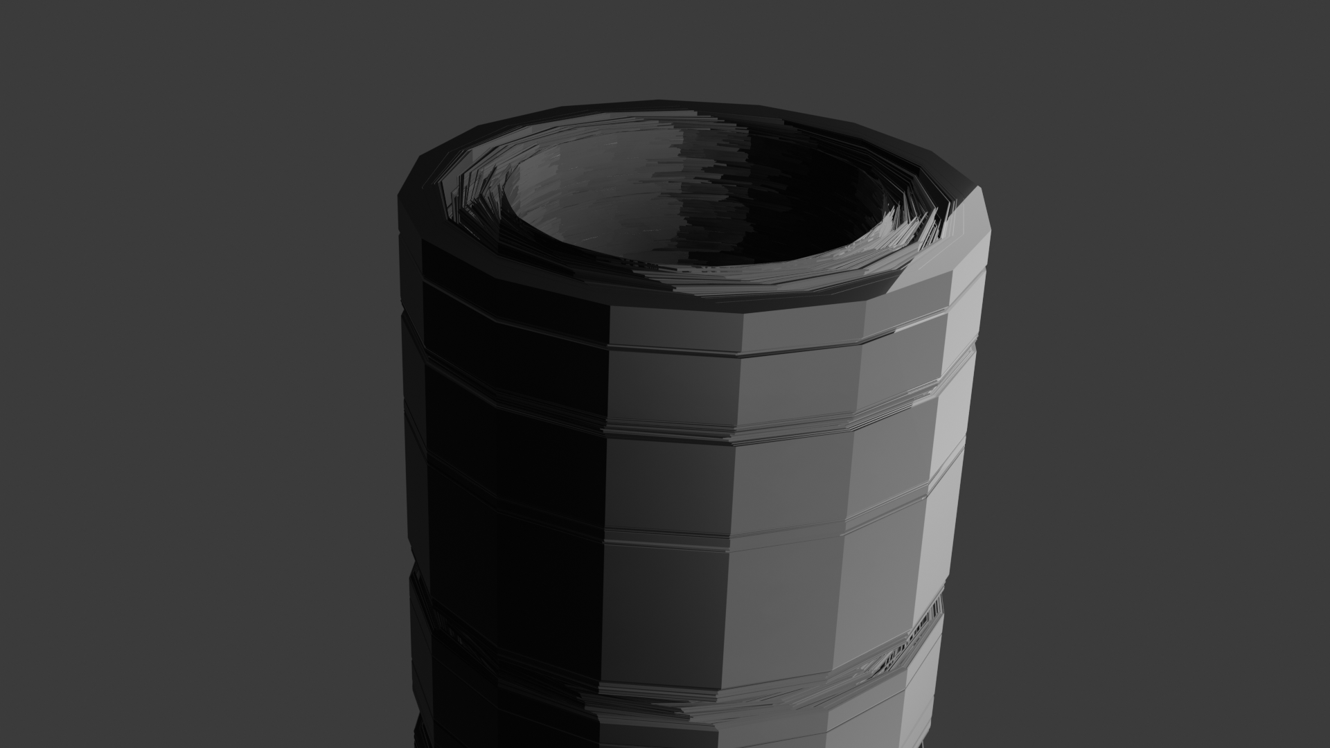
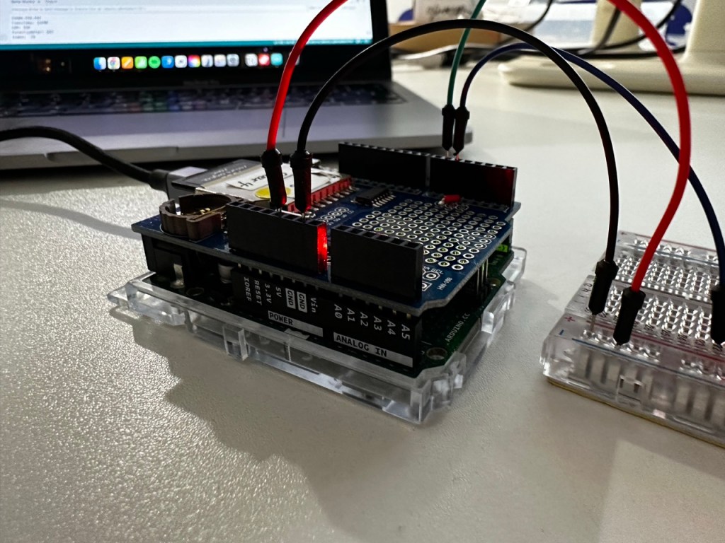
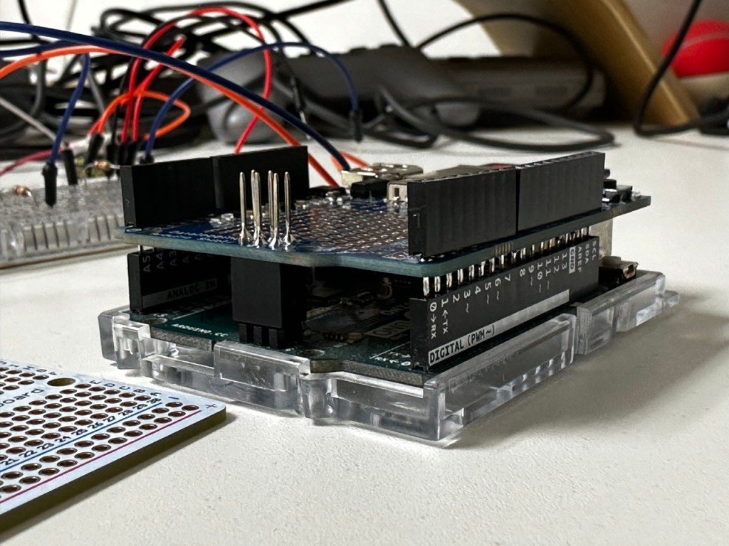
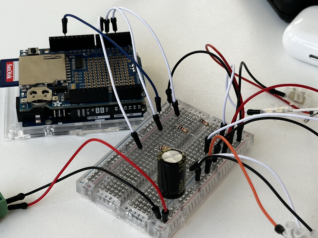
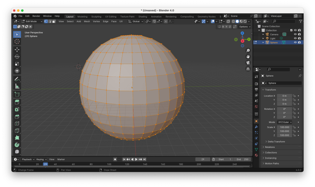
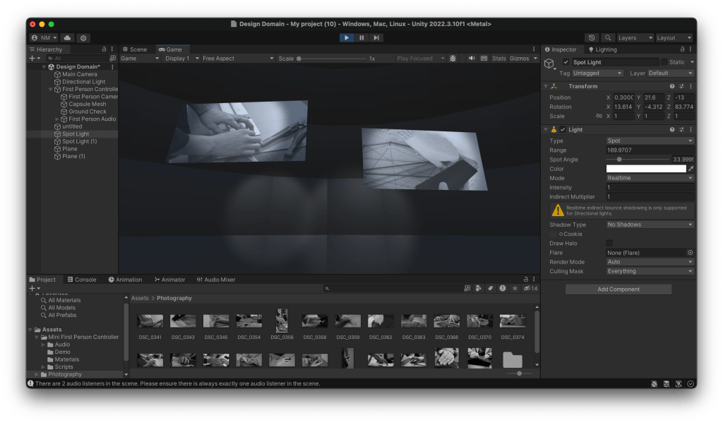
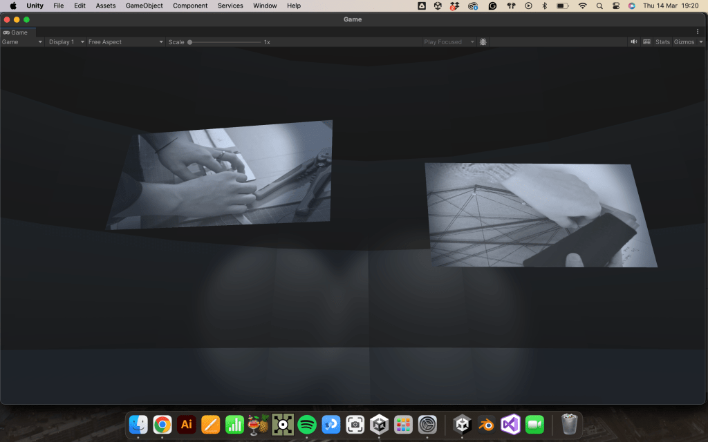
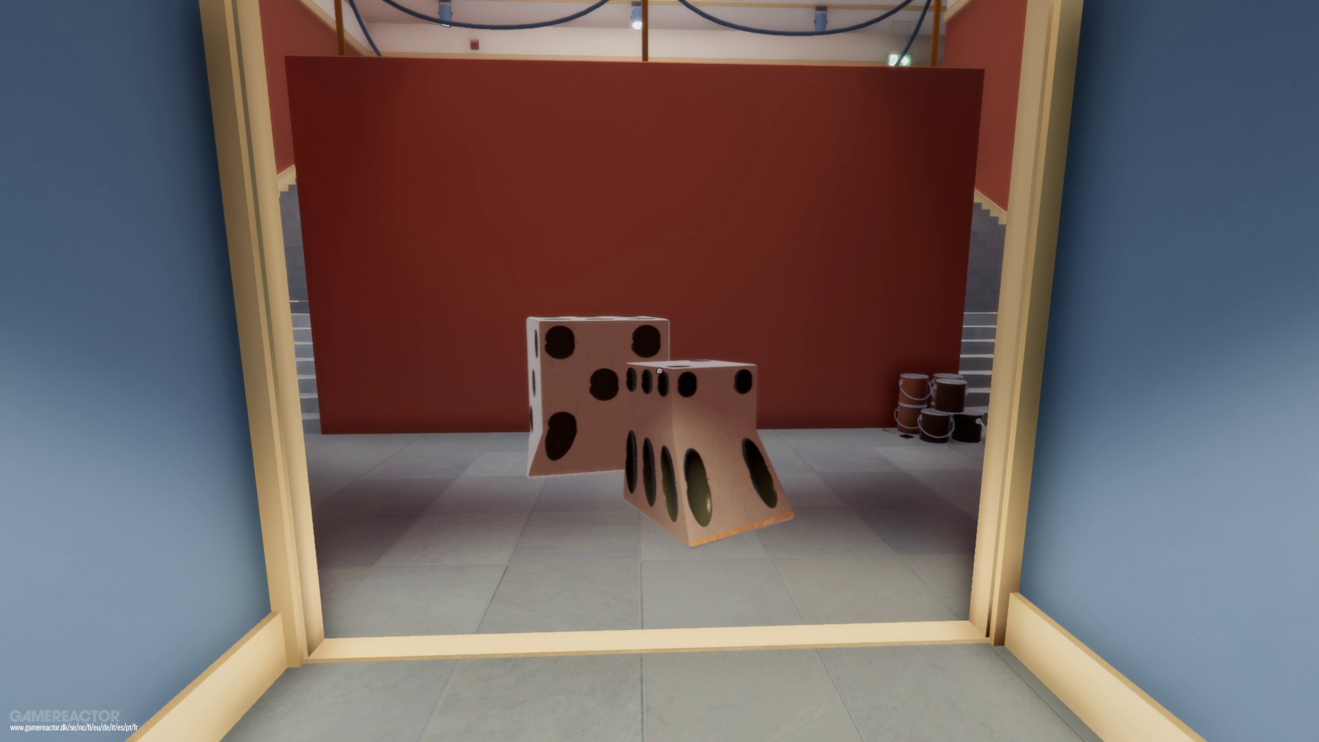
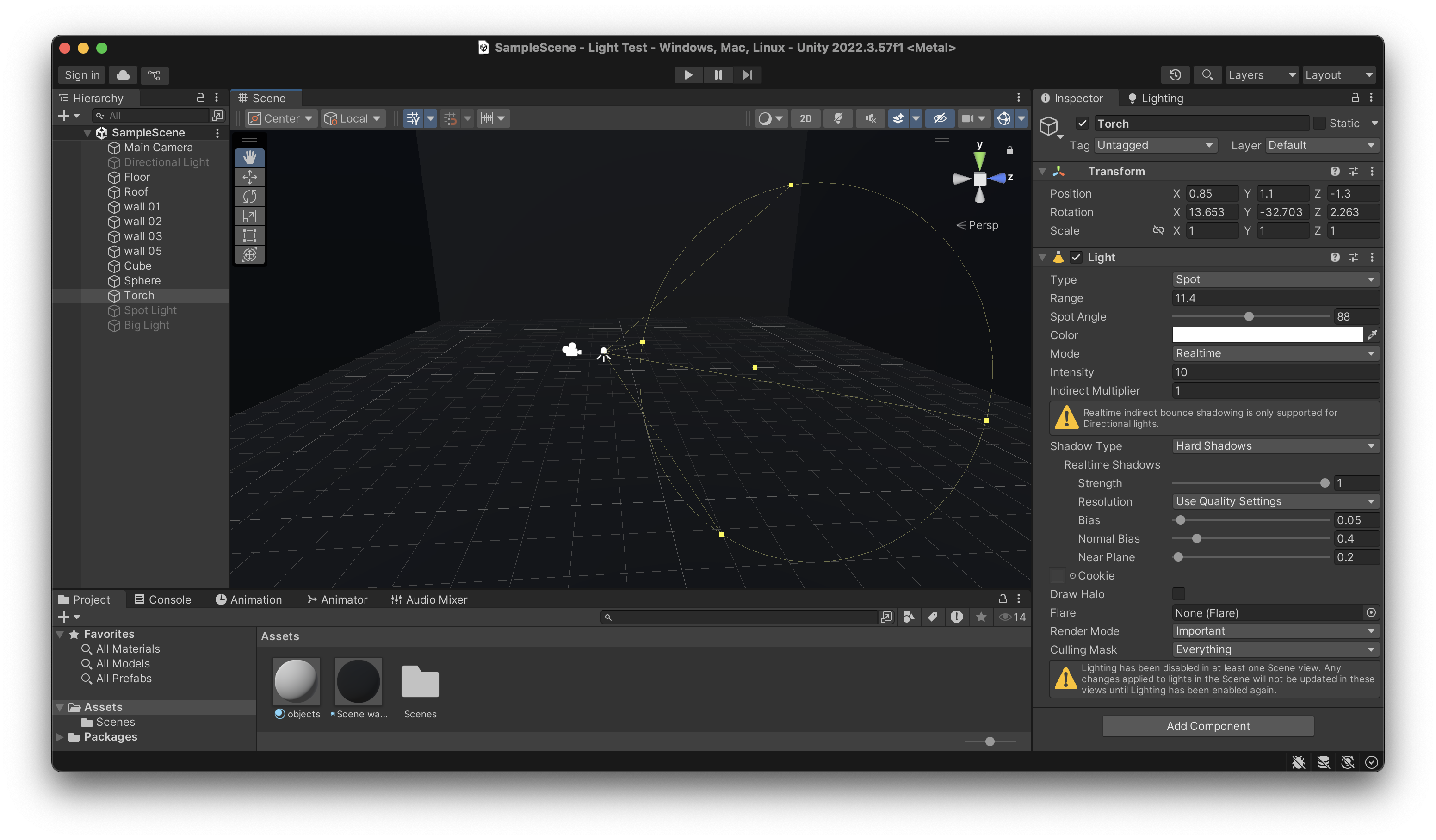
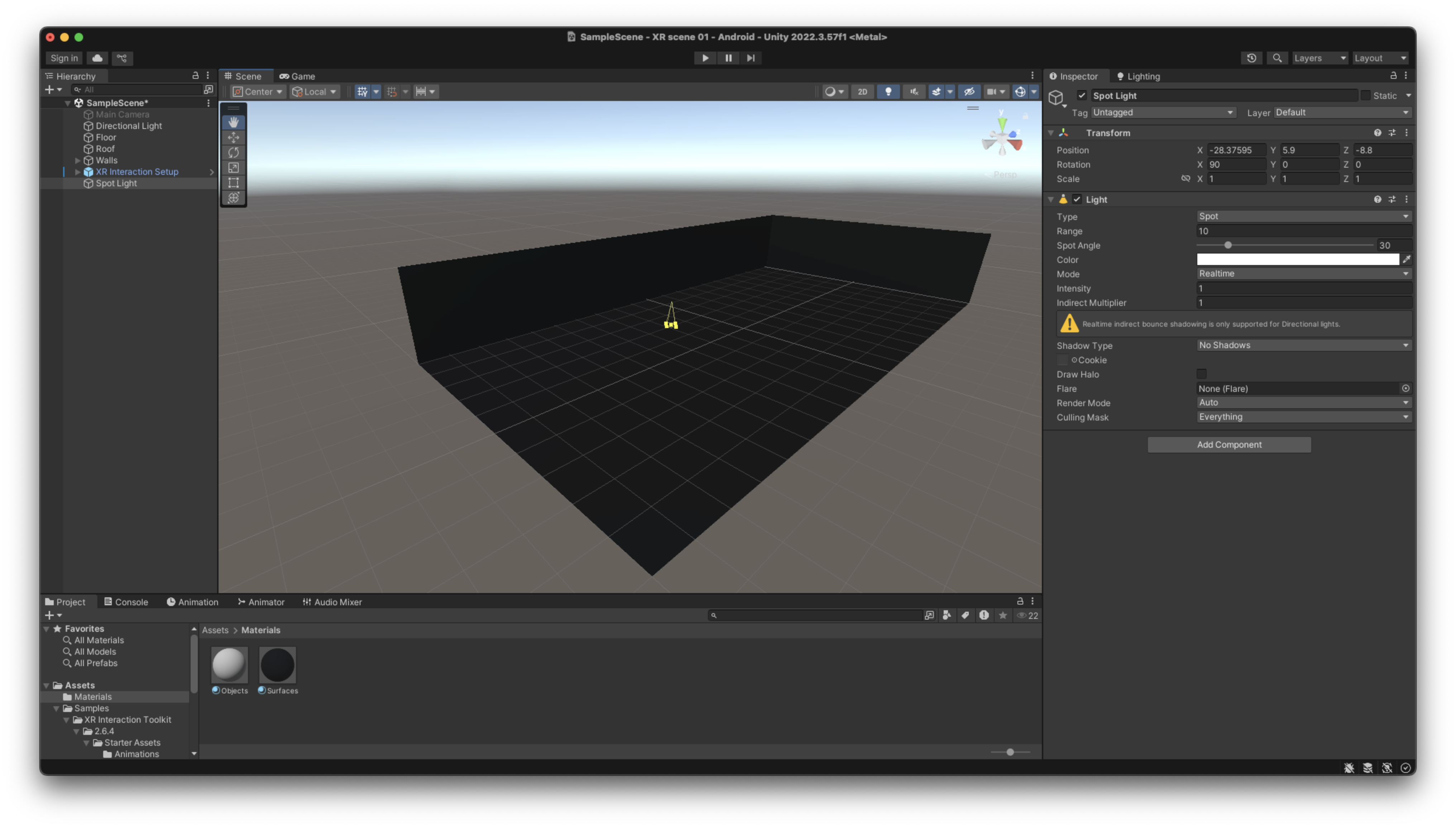
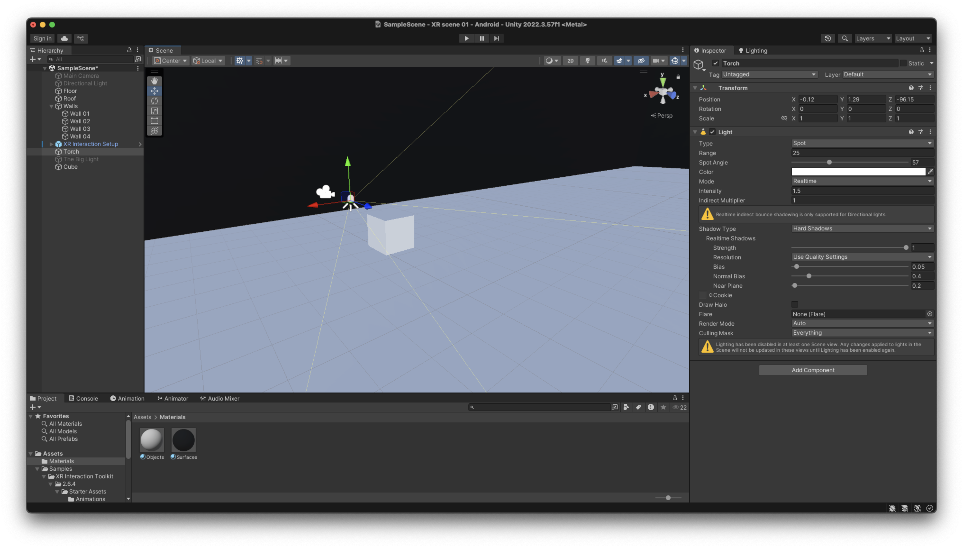
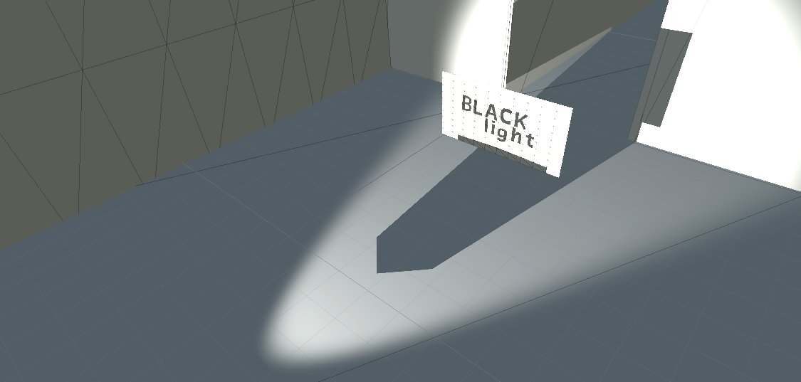
Testing Light in Unity :
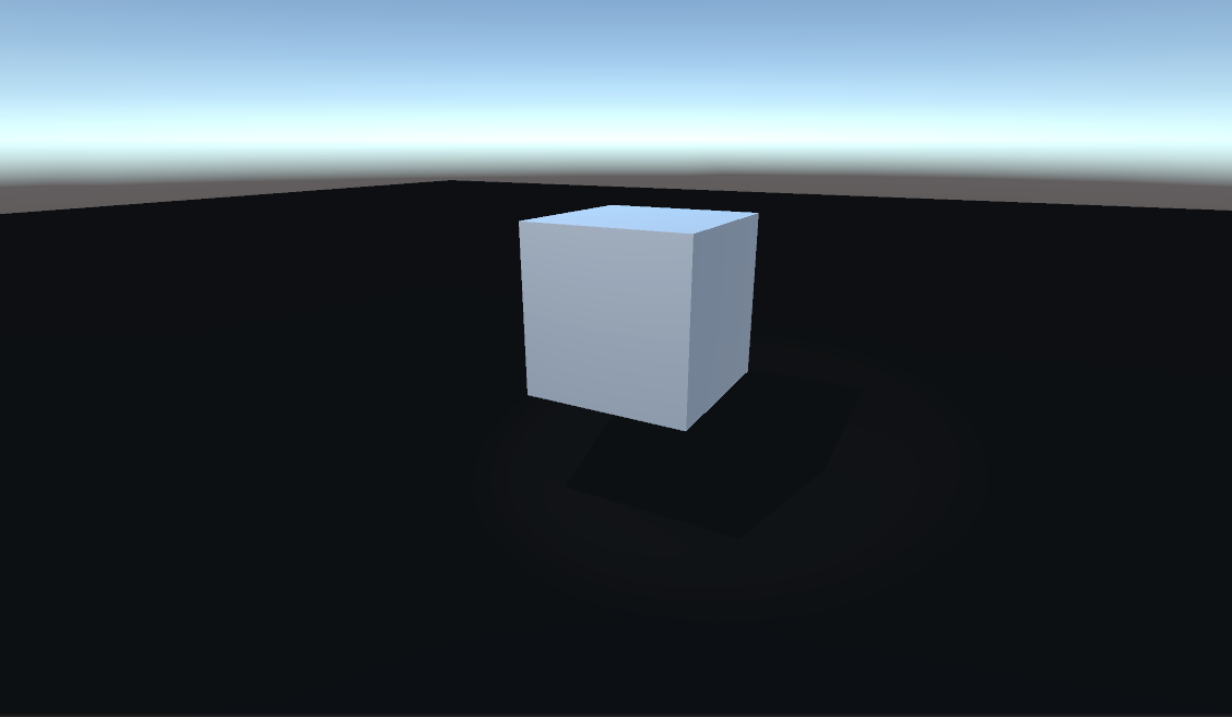

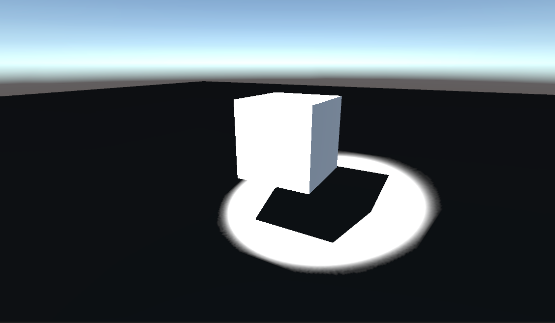
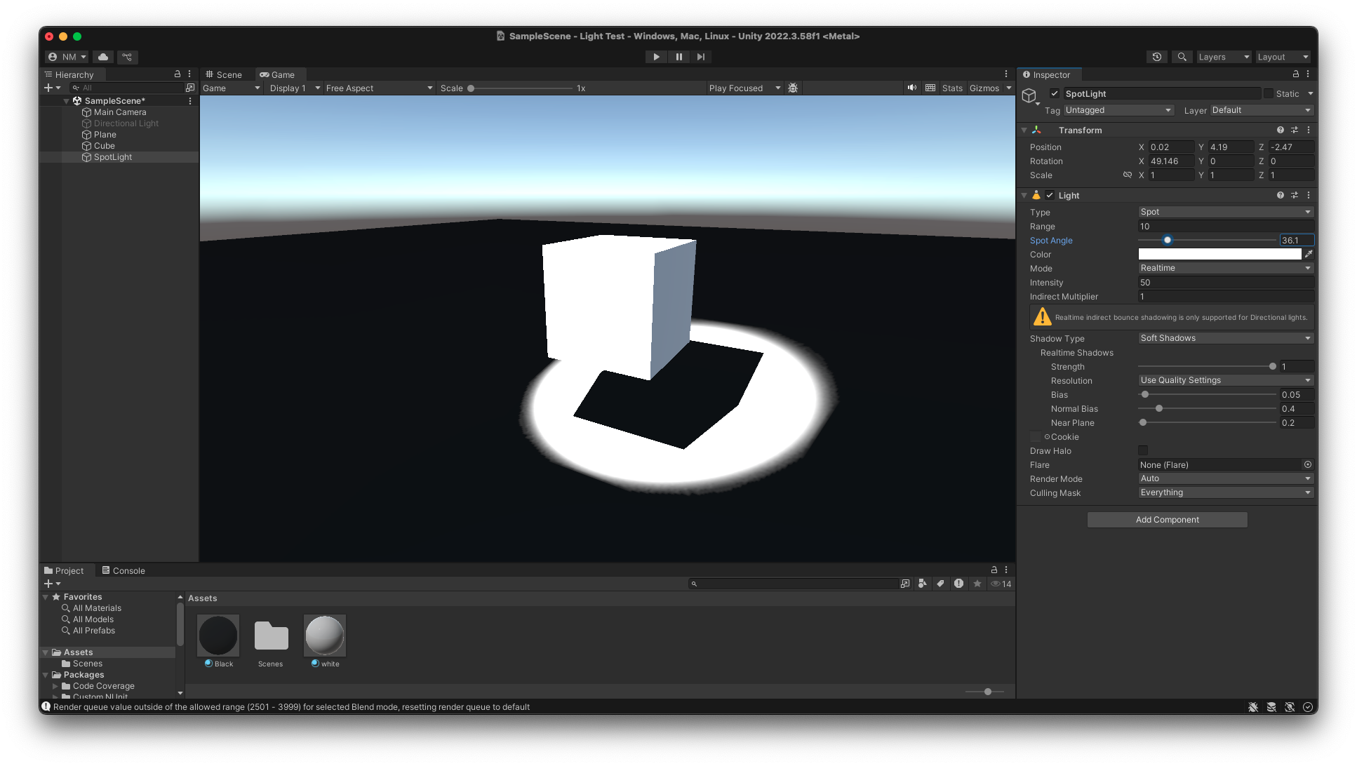
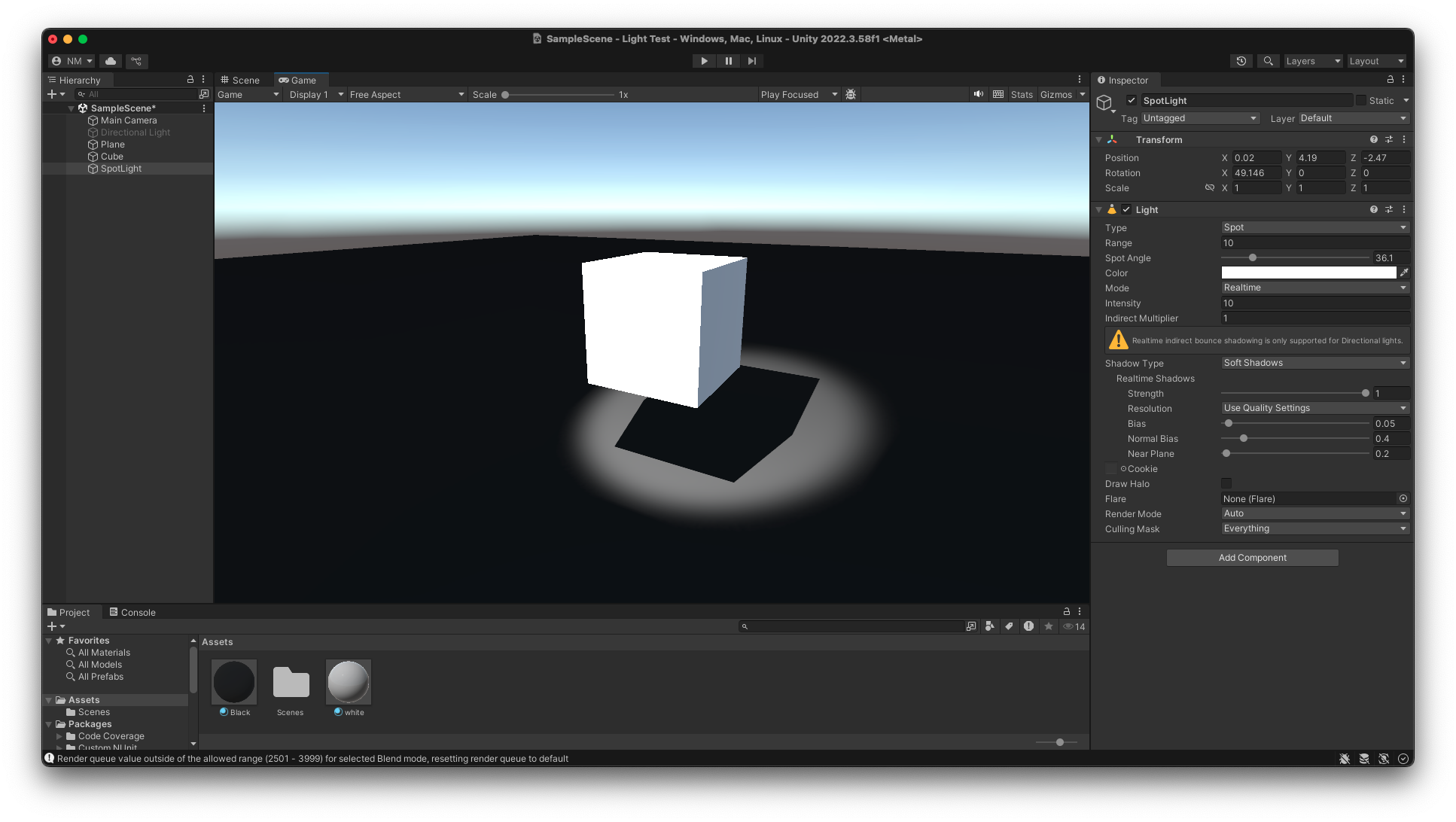
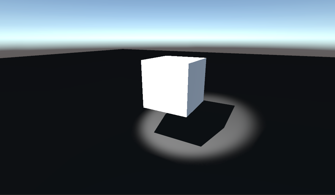
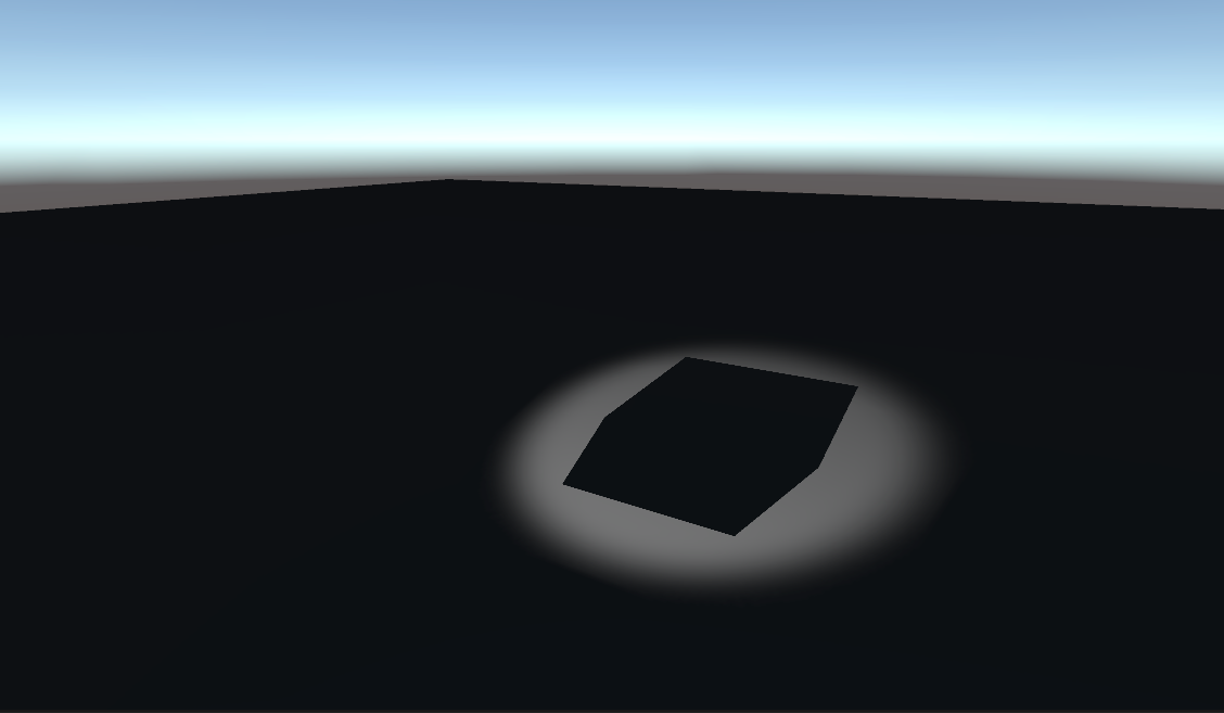
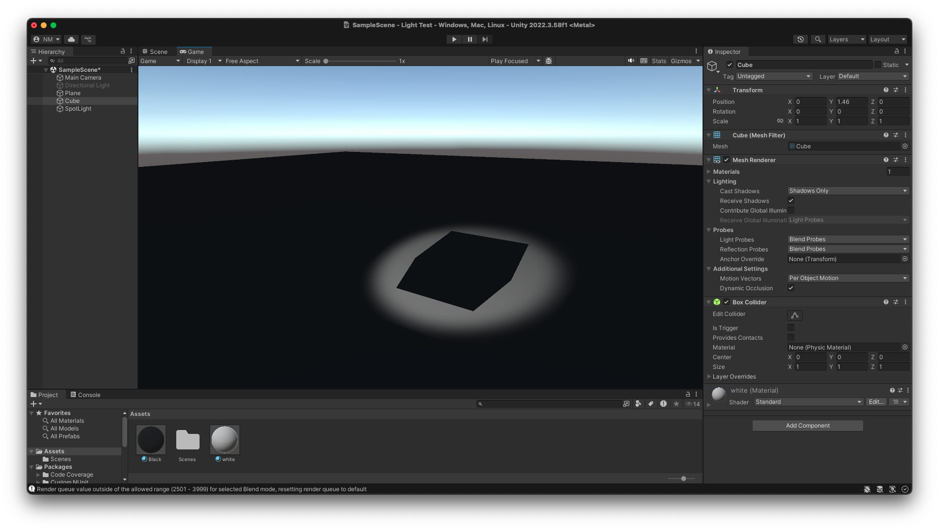


By turning off the mesh render but allowing the shadows still to be cast, it gave the effect that I wanted. And as it still has the mesh/ box collider then the player cant just walk through it.
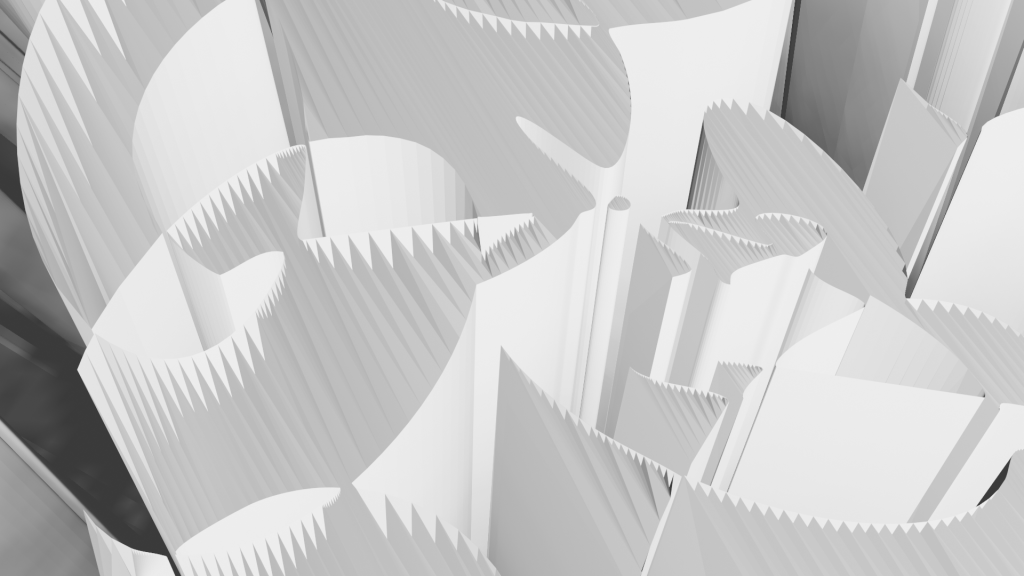
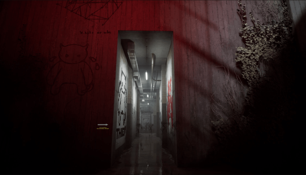
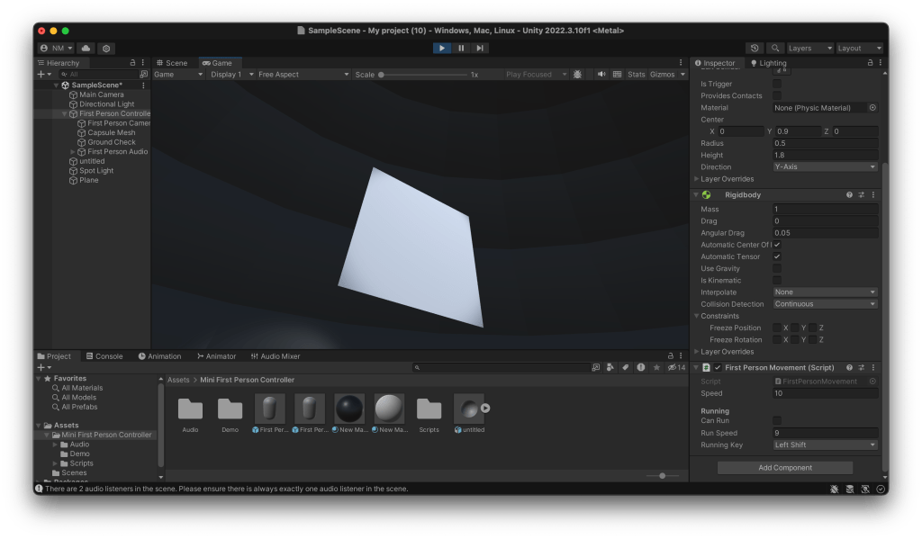
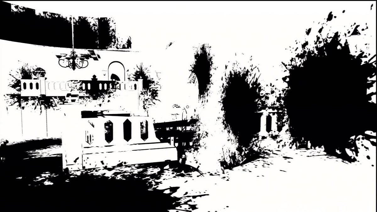
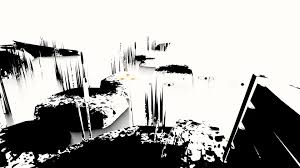
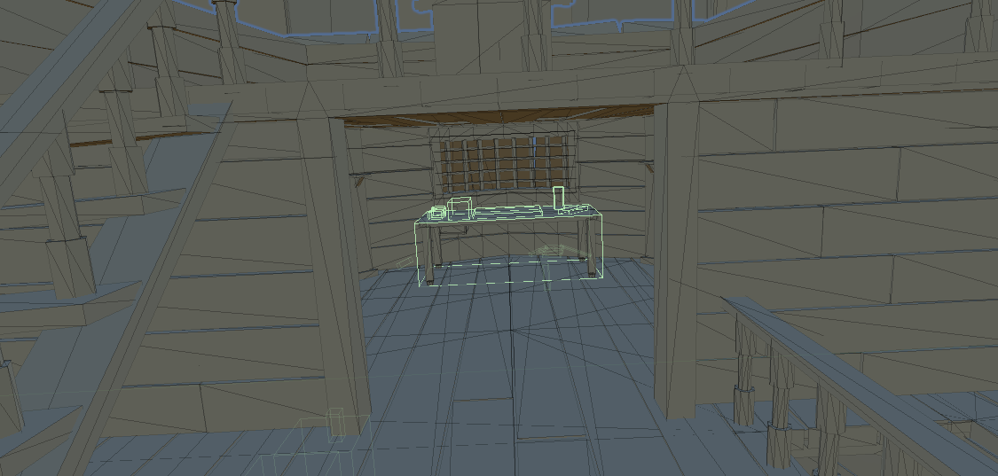
Building a Scene:
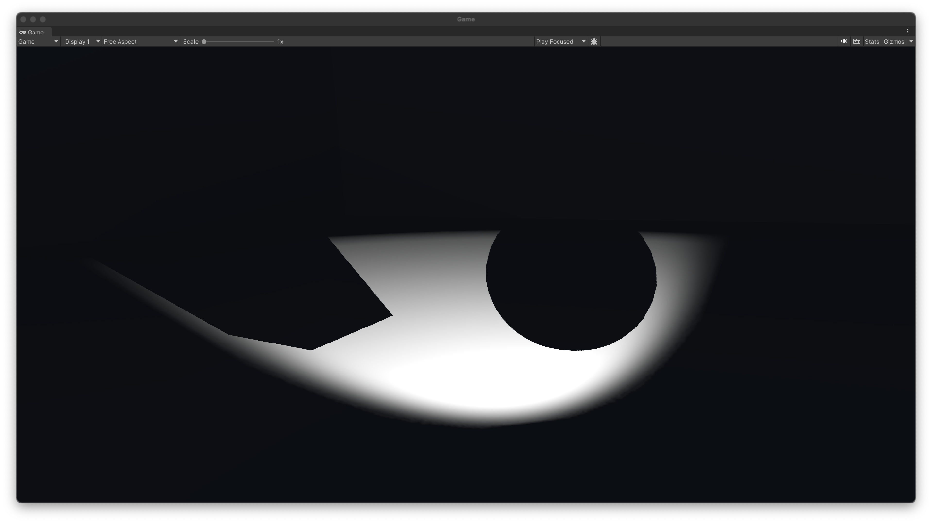
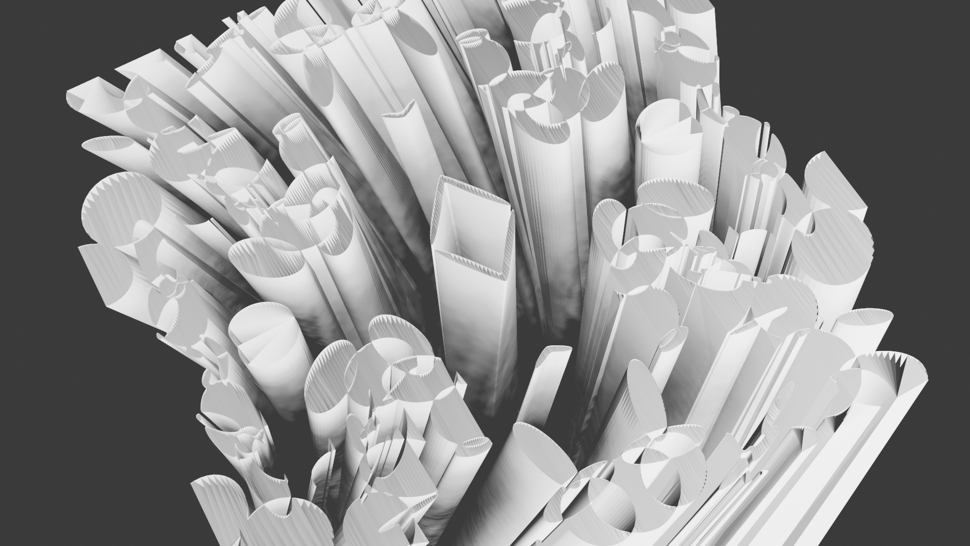
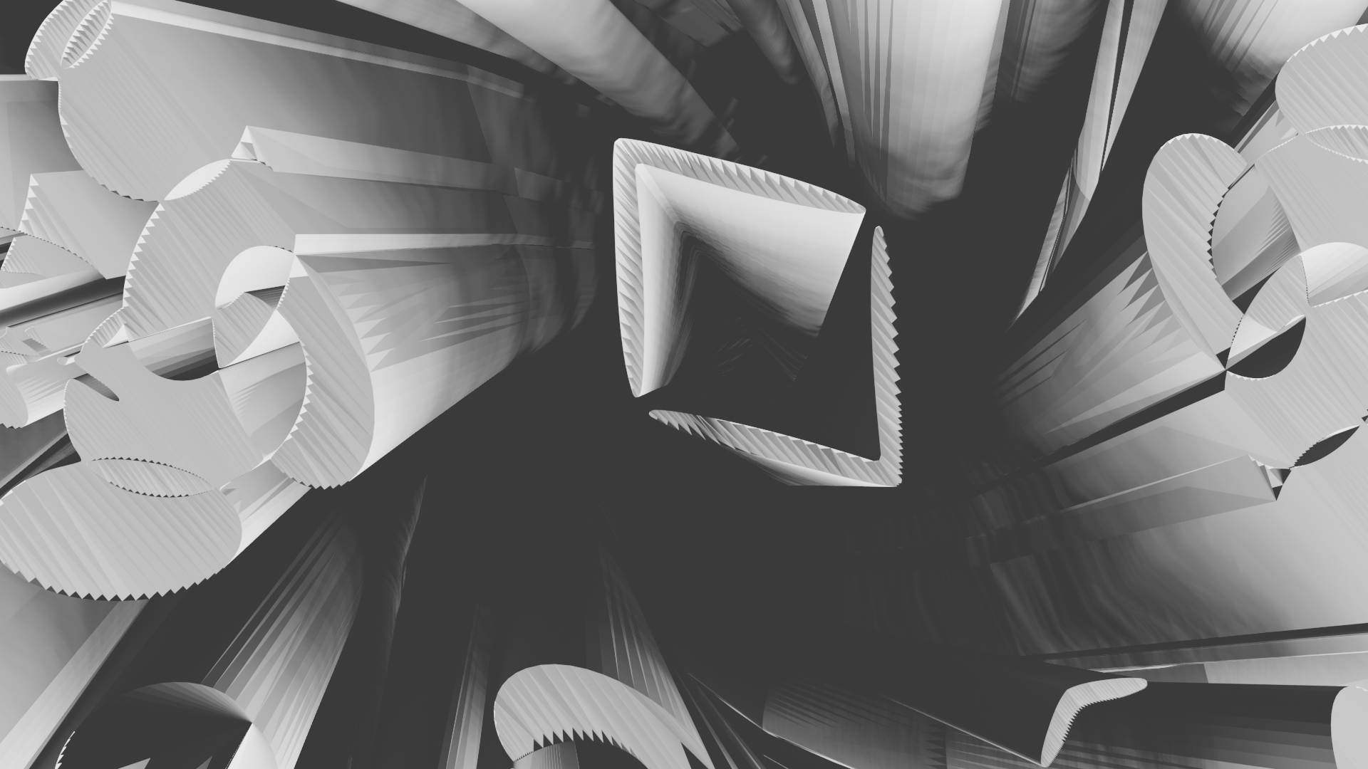
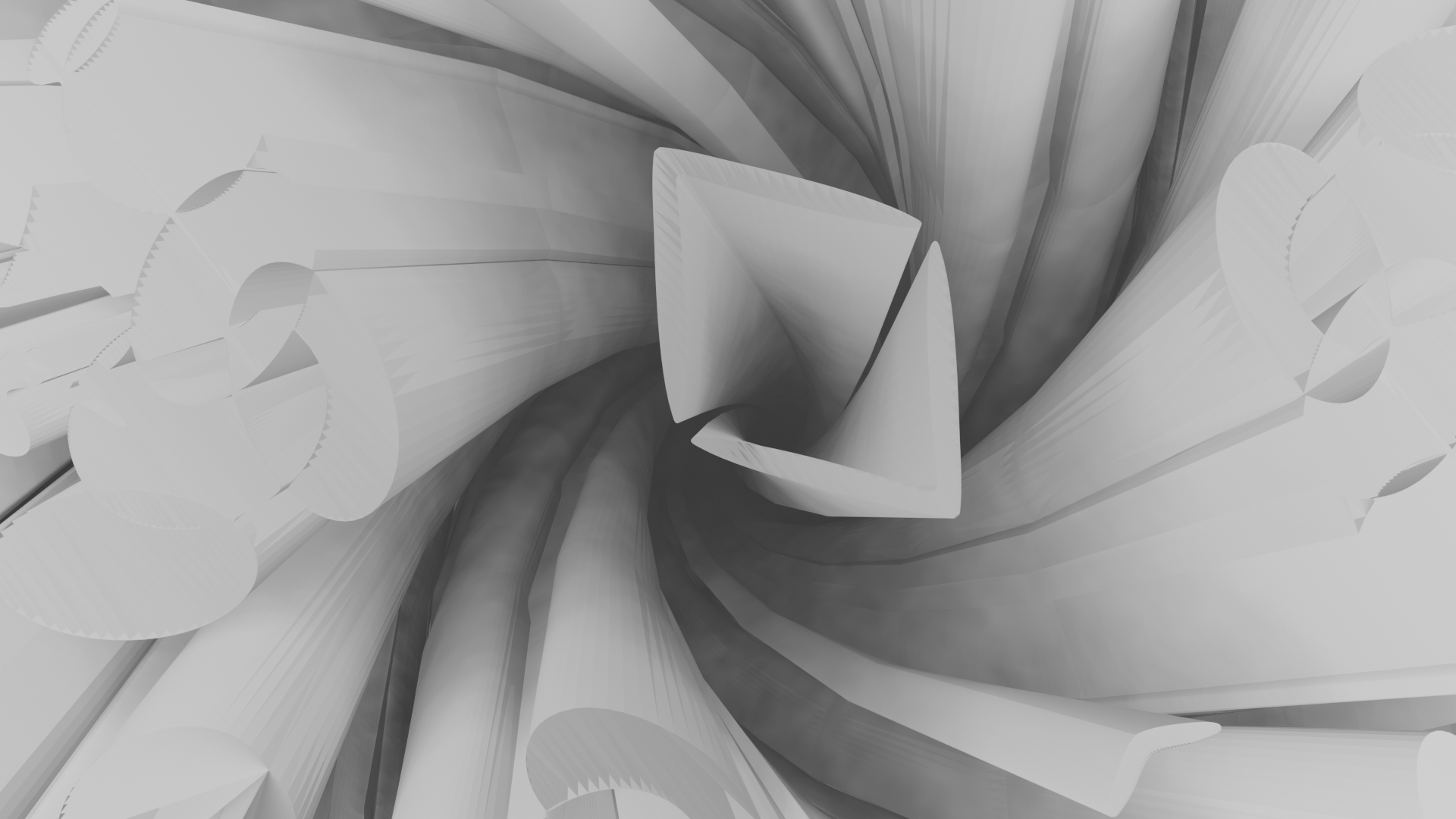
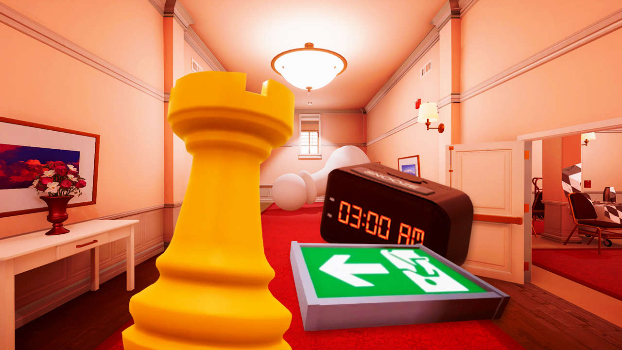
My initial thoughts were to have a maze that was completely shadows but as you need the shadows to be cast onto something the white walls of the maze were made.
Planning Scenes and Interactions:
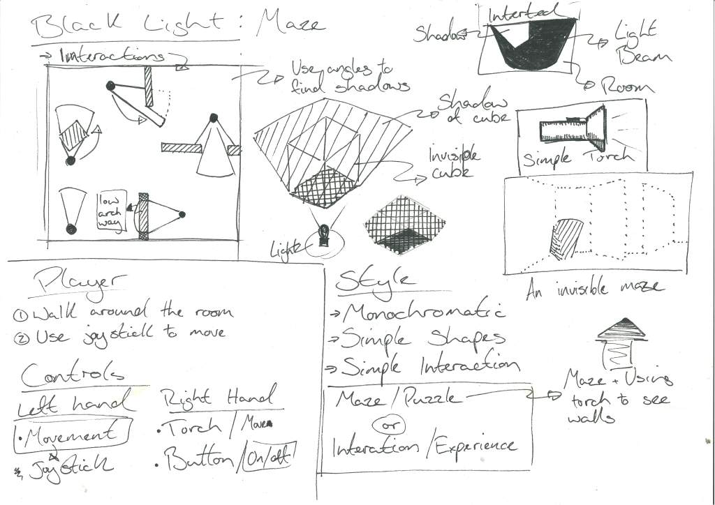
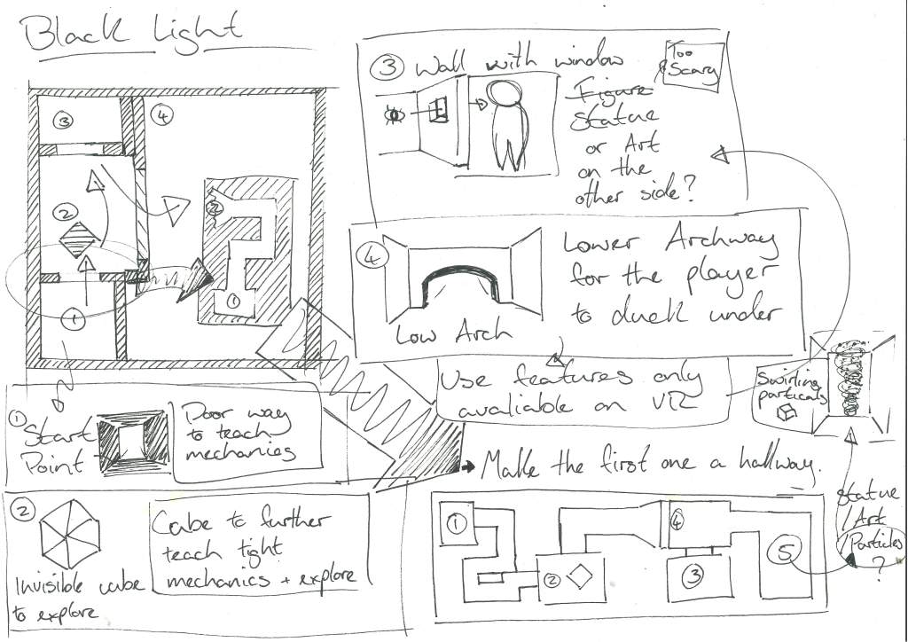
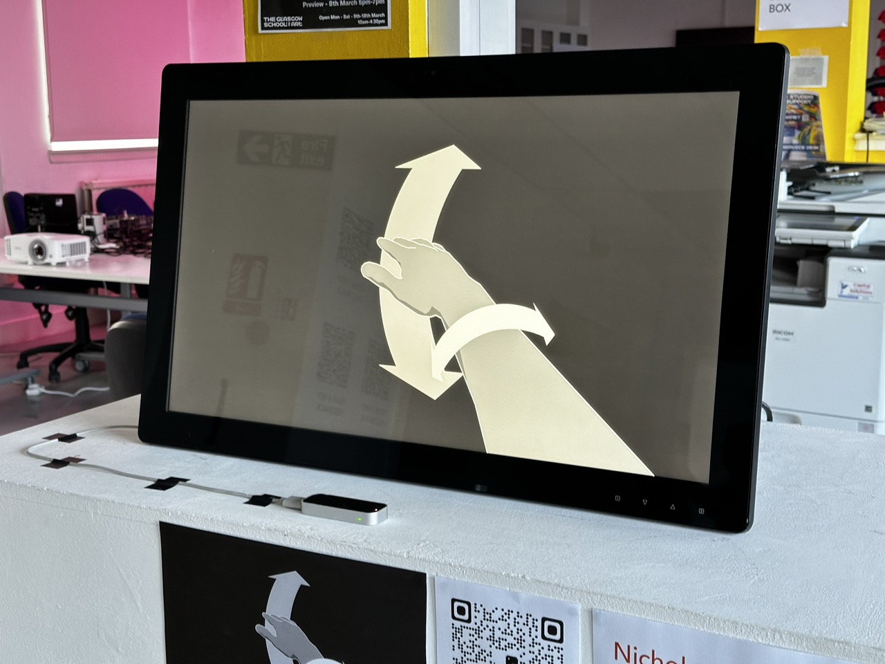
So with the basic concept of the torch sorted and the idea of a maze sorted I needed something for the player to do in the maze and with these interactions I wanted to use the functionality of VR and actions that were exclusive to VR.
Setting the Tone:
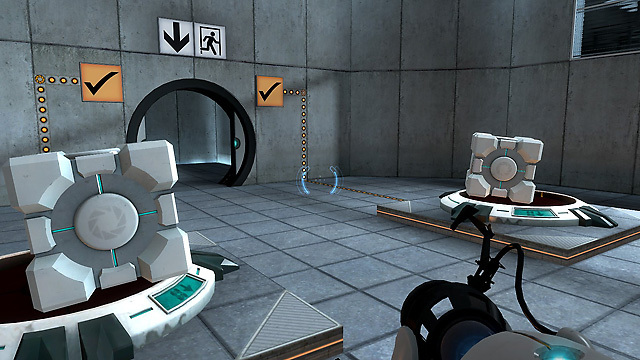
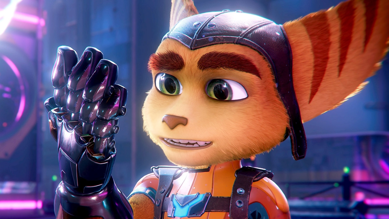
In the scene I want to spark joy through this unknown and adventure, that yes there is a little bit of fear but at no point are you in danger. Through not knowing what is around the corner but being called to find out I want to have a sense of adventure. Think Indiana Jones; the Mummy in movies or even the games Portal and Ratchet and Clank. All of these examples have fun, mystery and danger but at no point do they take it to horror.


More Primary Research – PowerWasher VR:
So with knowing my concept and my functionality I went back to some personal research to see how other studios have done it and with Power washer Simulator it had simple concept, simple movements and functionality that was only in VR so the footage above shows myself messing around and exploring the functionality of VR again through the lens of my own project.
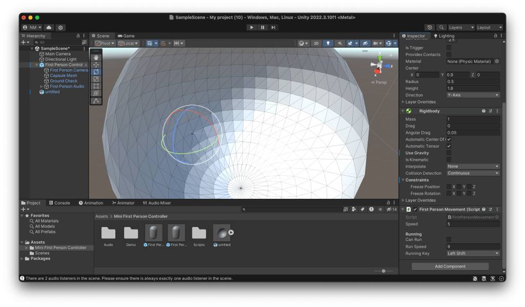
Building the initial scene and proof of concept:


At this point I was having trouble with the VR headset so to the best of my ability I began modelling my scene. During this process I had the idea that as the world would be using shadows then recognisability would be a big factor, if the player doesn’t have an idea of what the object is then there wont be any spark of joy or fun because they can not relate the object to anything in the real world.
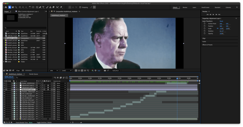
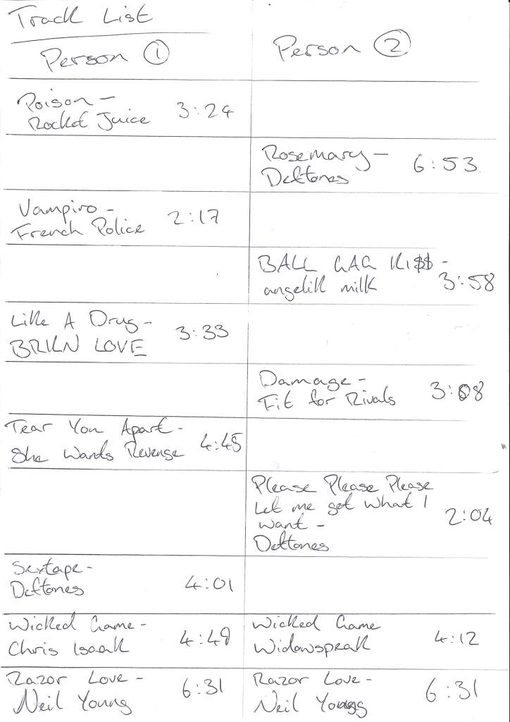
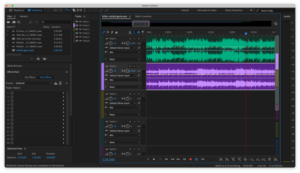
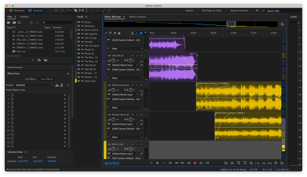
The soundtrack:
After the previous project when audio was the main focus, I didn’t again want it to fall by the wayside and not give it the time it deserved. So as I didn’t think that I would have enough time to do it justice but I had an idea of tone I asked a friend of mine if he would like to make the music for it and he thankfully accepted. I have lots of very musically talented friends but I knew Michael would be the man right for the job.
Below is his Soundcloud if you want more.
https://on.soundcloud.com/38jtdNRKCKnNvwds6
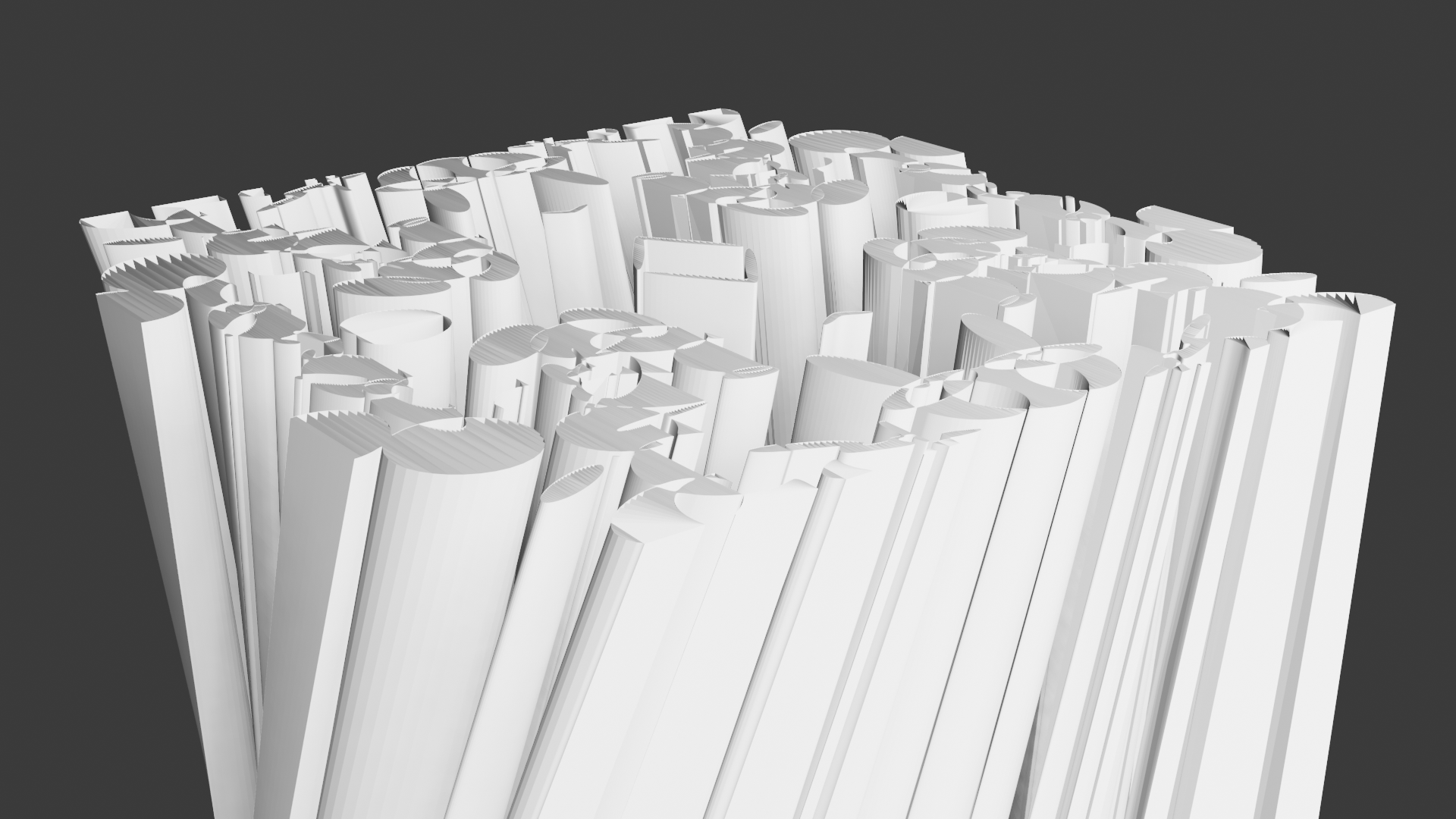
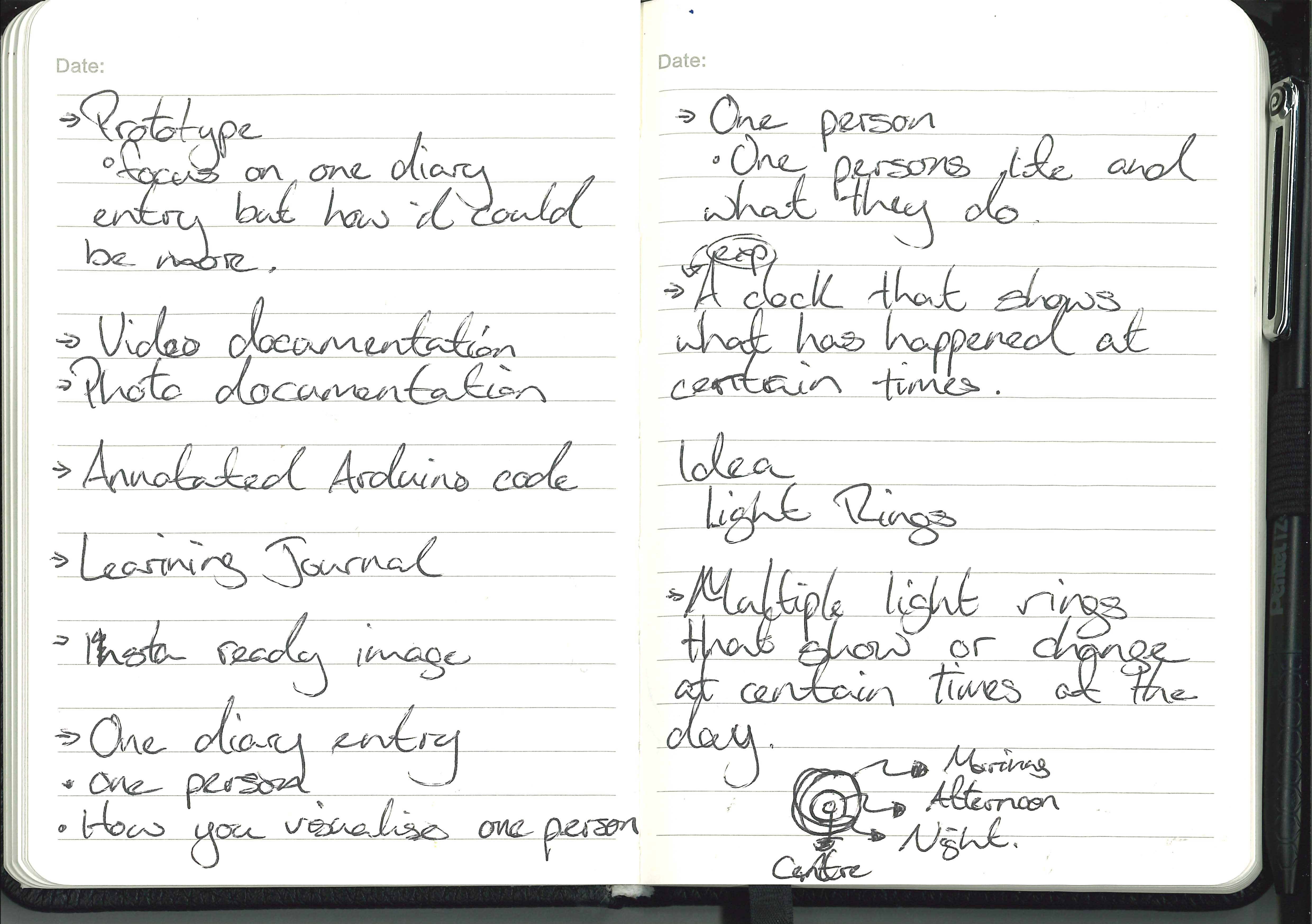
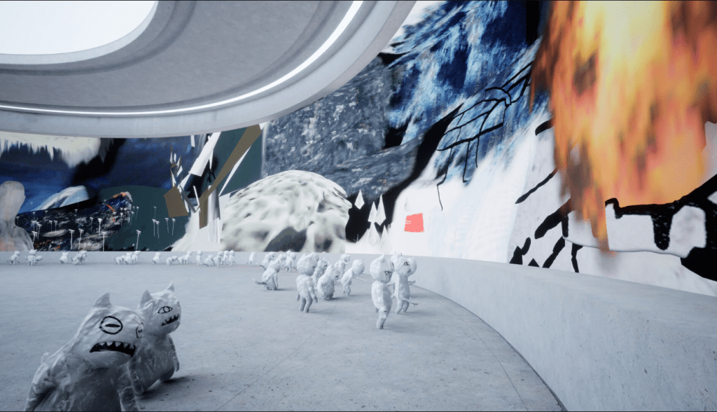
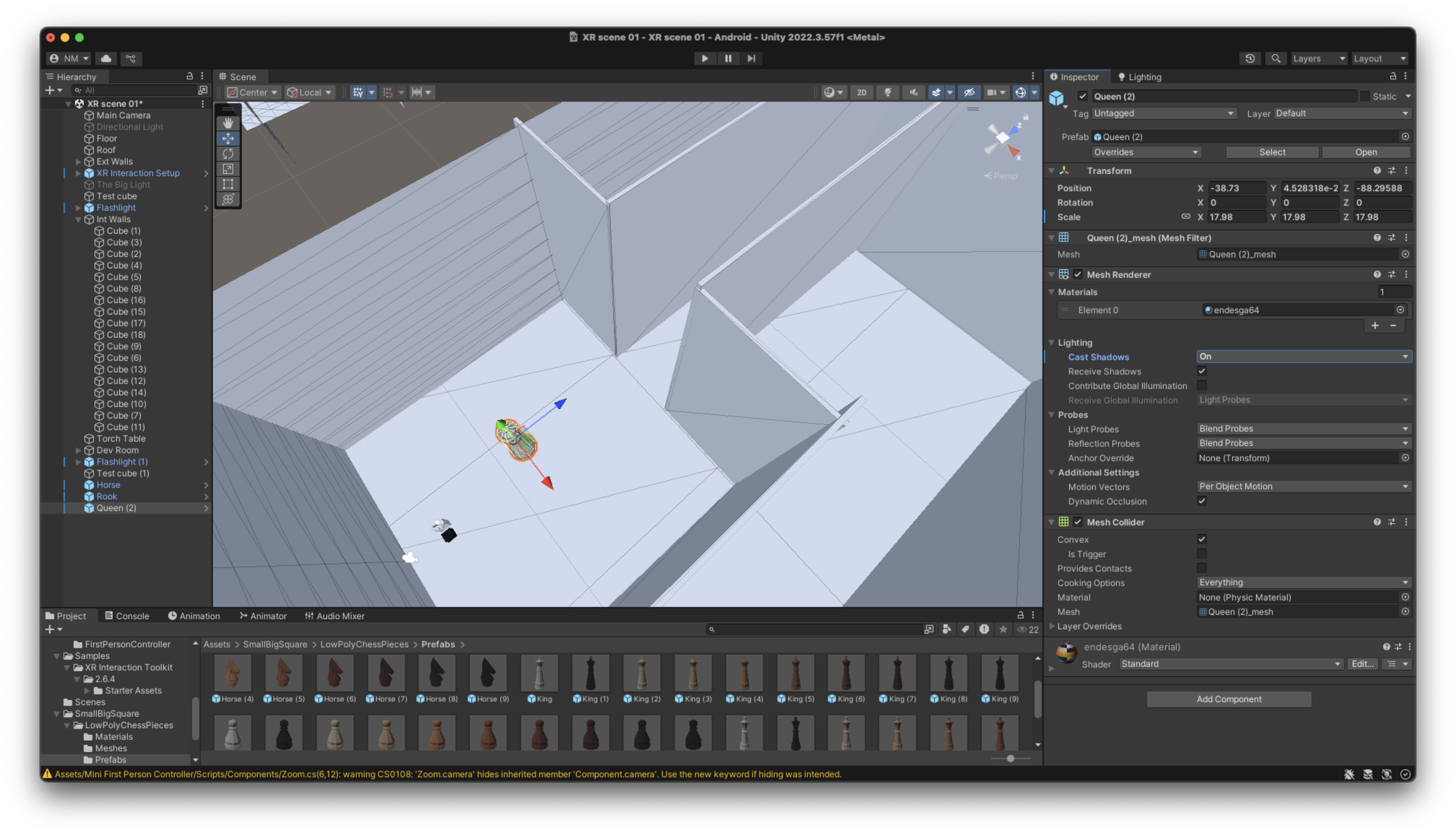
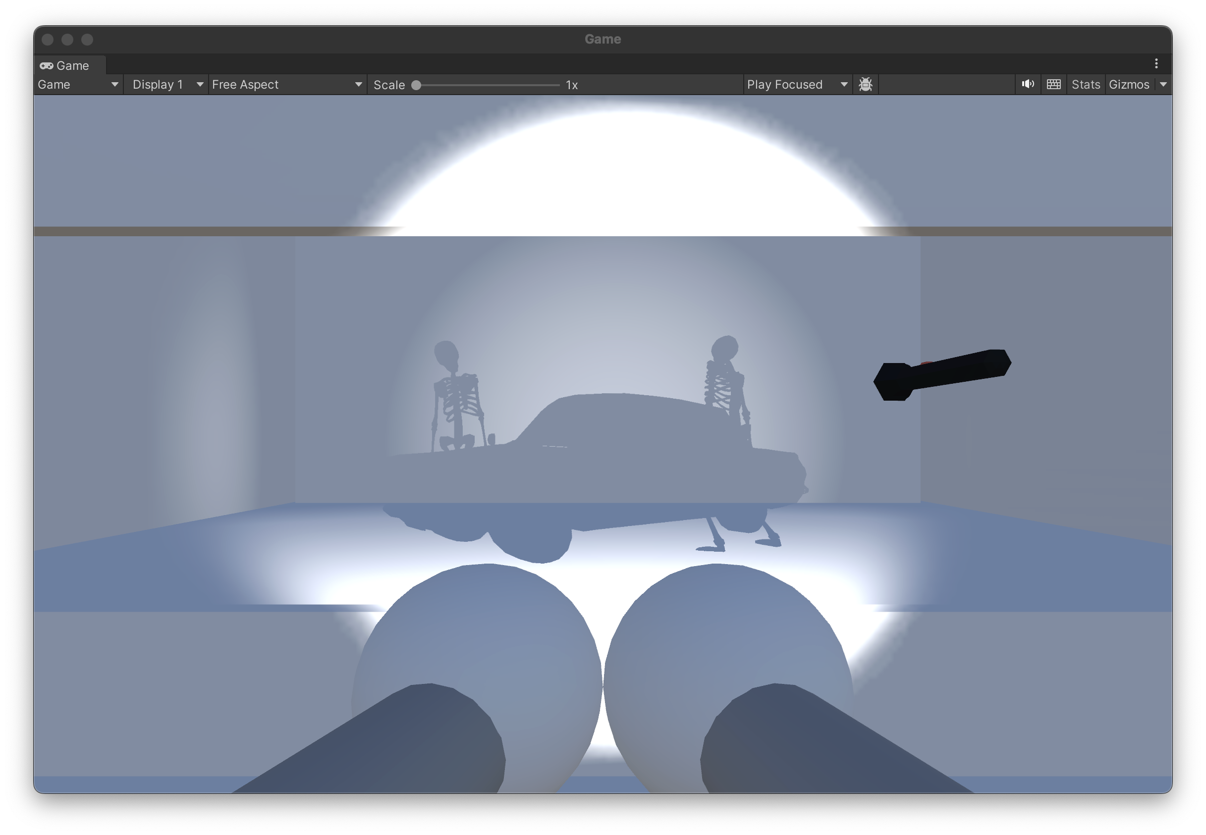
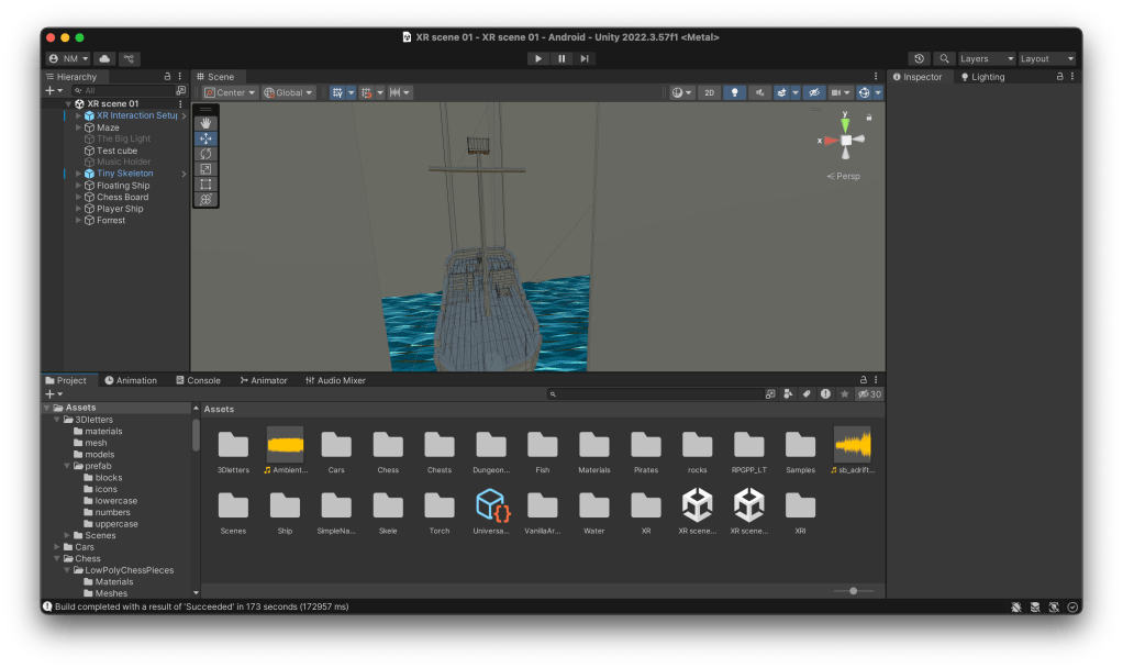
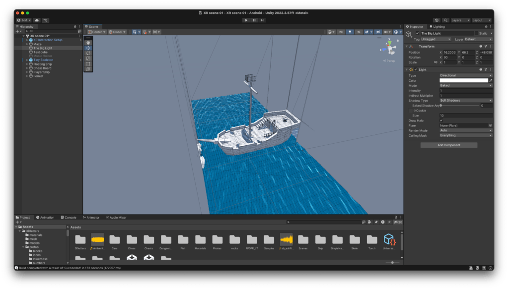
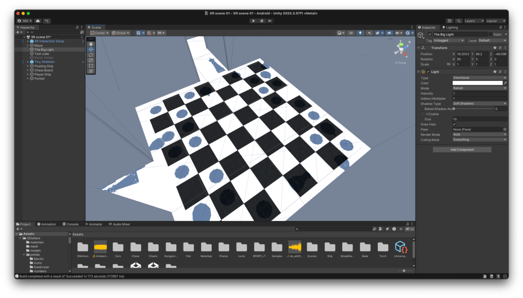
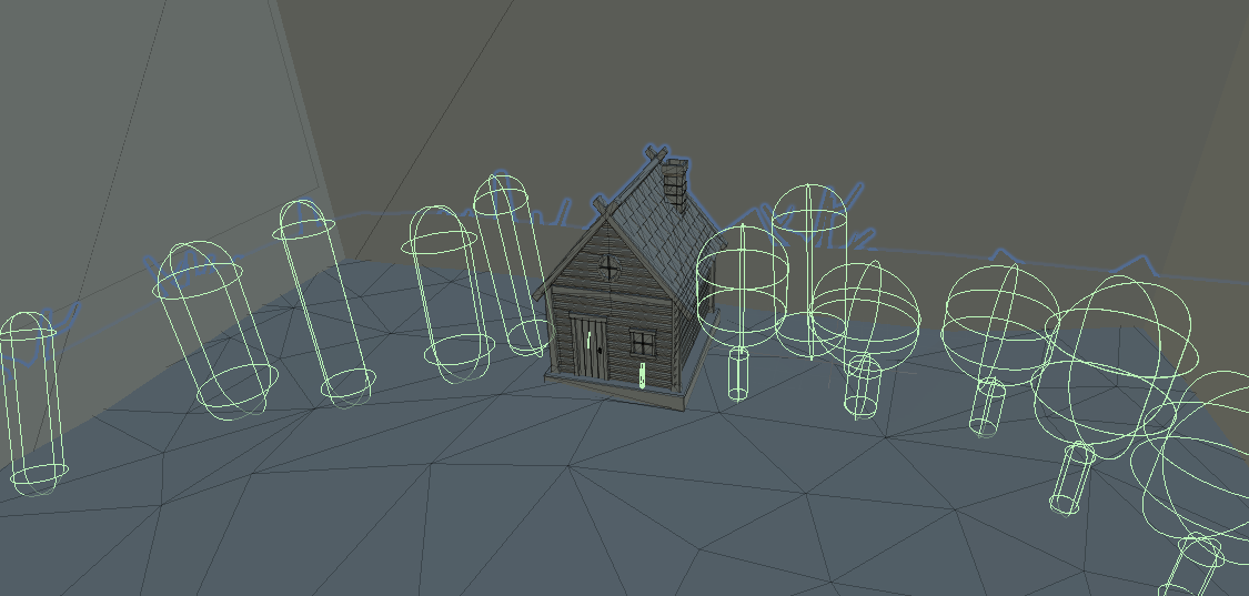
All the prefabs:
As the scene developed and got bigger and bigger I used more and more prefabs with recognisable silhouettes to fill the scene. This step had a lot of trial and error, I was very conscious that with such a simple concept and such a minimalist art style there wasn’t really anywhere to ‘hide’.
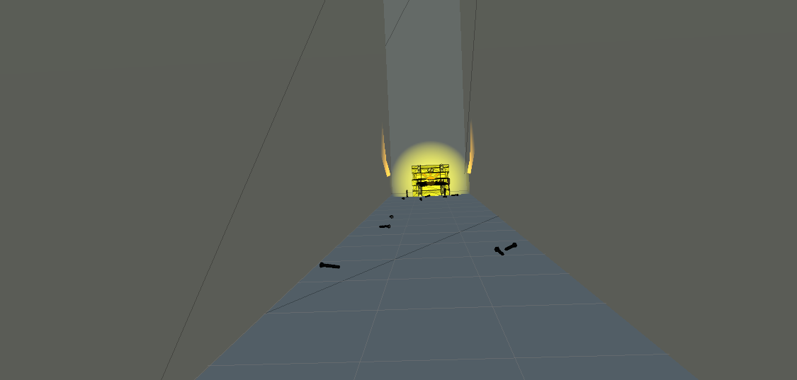
Building the scene:
I’ll be honest at this point my documentation was a bit poor as it was a lot of quick ideas, quick changes and quick implementation that didn’t really seem like much at the time but looking back now it was the scene becoming a basic interaction and maze to demo that it is now.
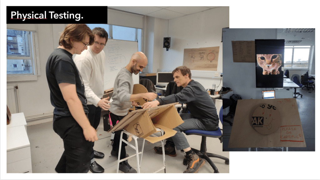
Play Testing:

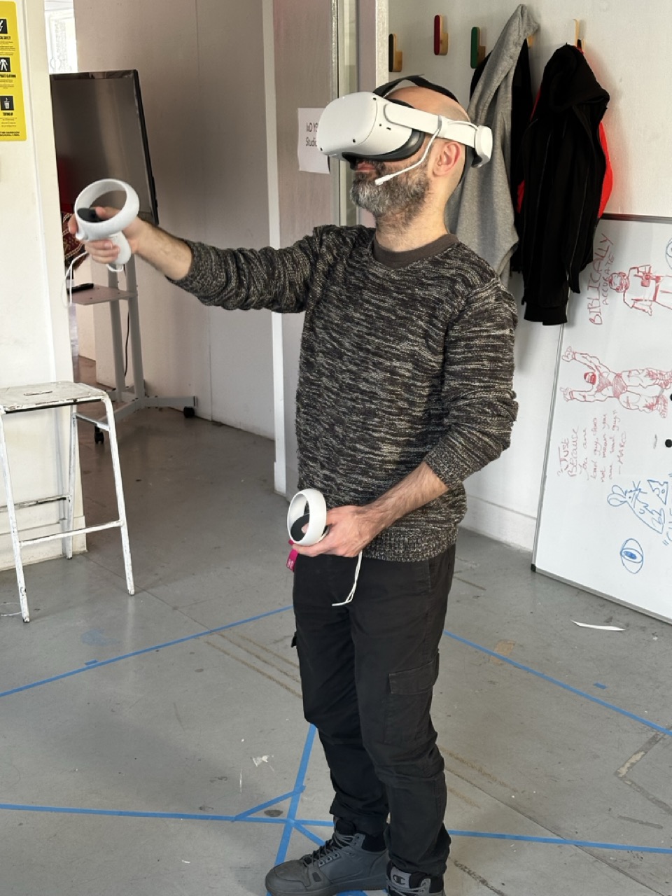
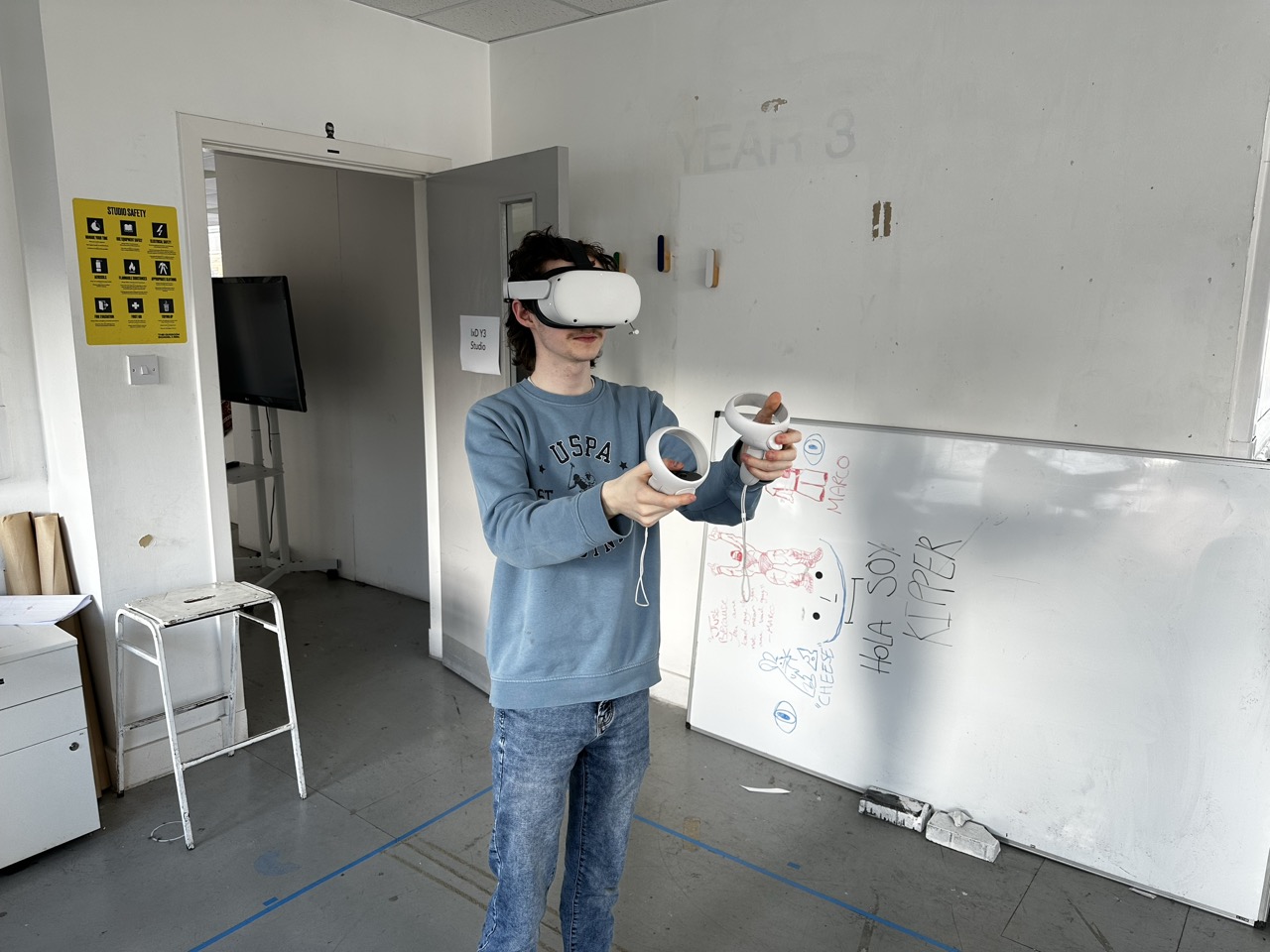
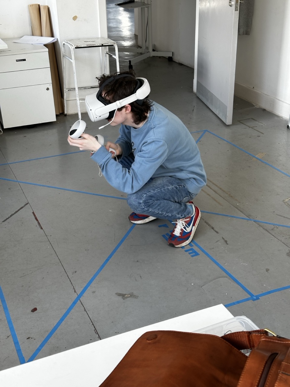
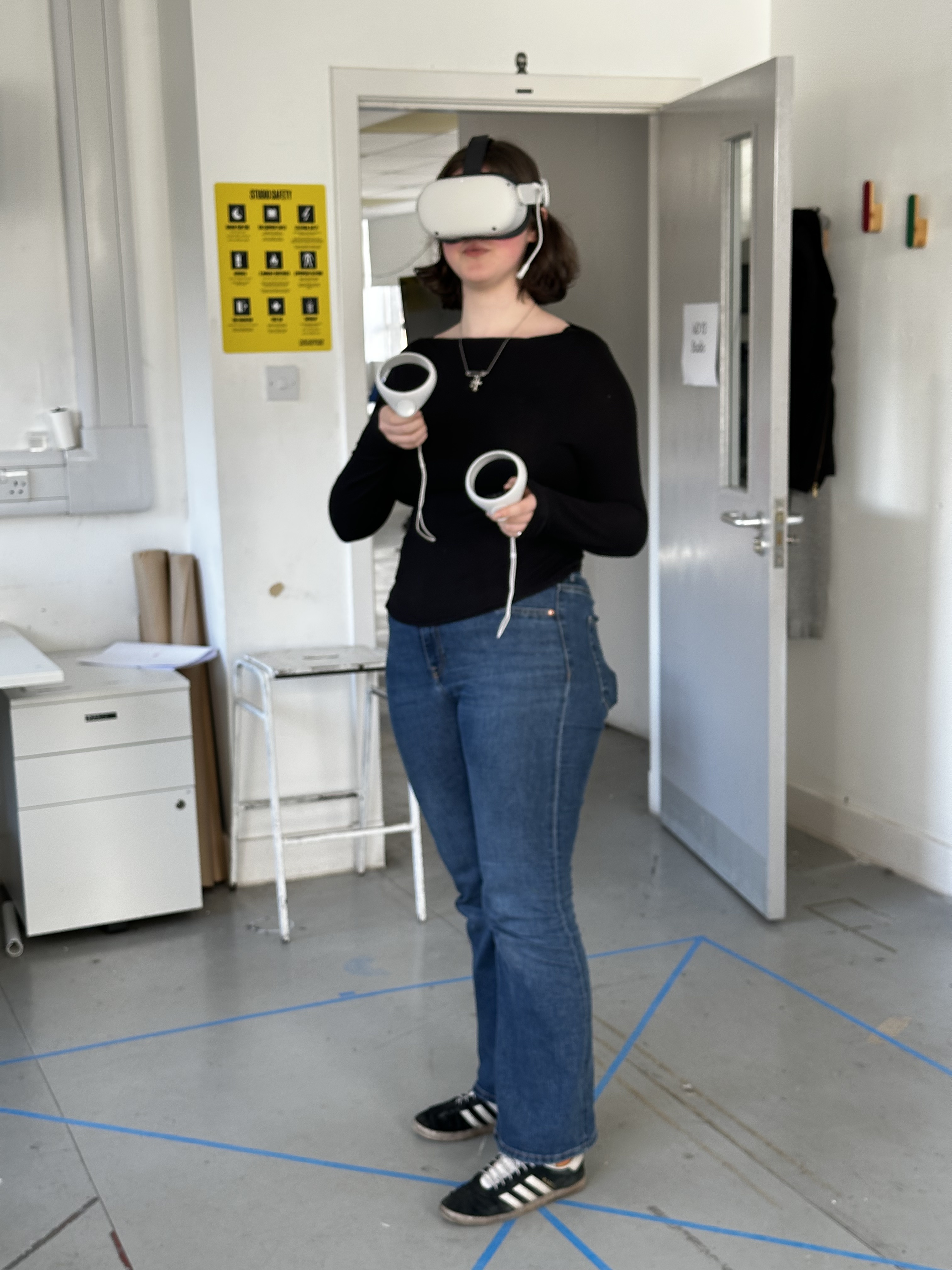
Above is footage of my class mate Lucia testing out the scene. After this session of play testing with both Lucia and Mikhail I finished the final scene and removed the snap turn on the controller.
| Note: | Fix: |
|---|---|
| Motion Sickness | Removing Snap turn |
| Reduce walk speed | |
| Removing Vignette | |
| Eye Strain | Increasing light temperature |
| Lower Light Intensity | |
| Lack of Ending | Adding in a final scene |
| Defining a narrative |
Planning the End :
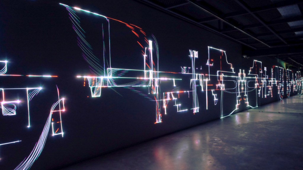
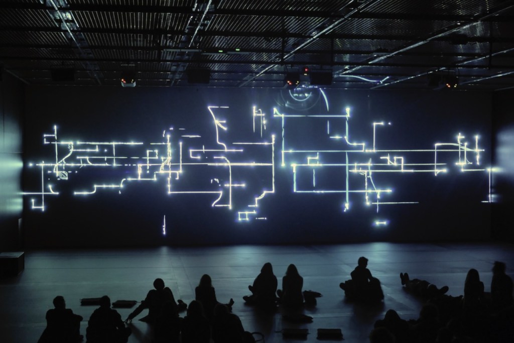
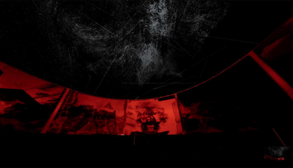
Behind the scene:
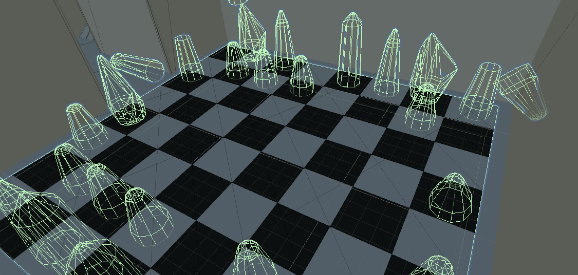
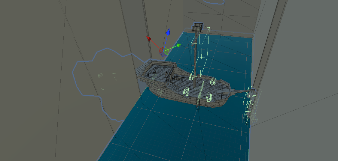
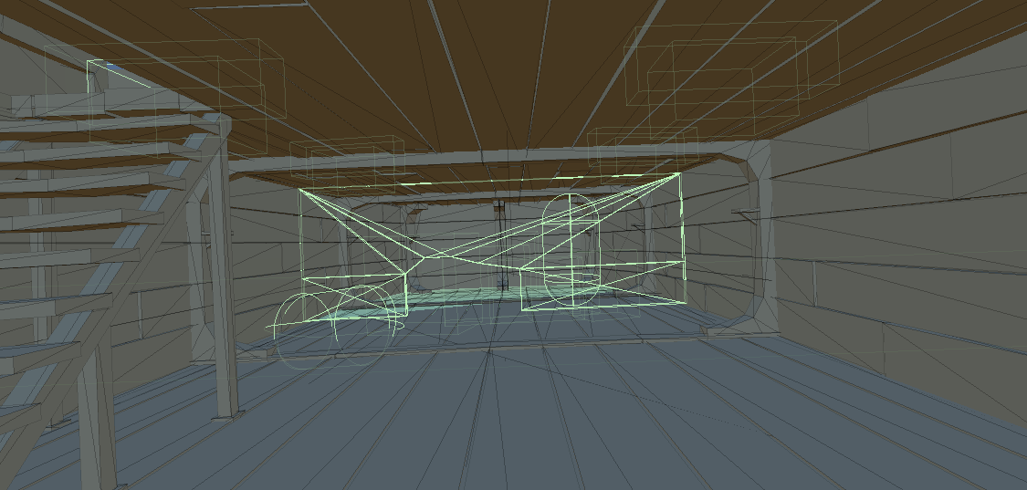

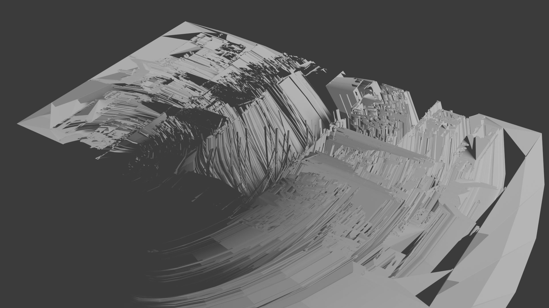
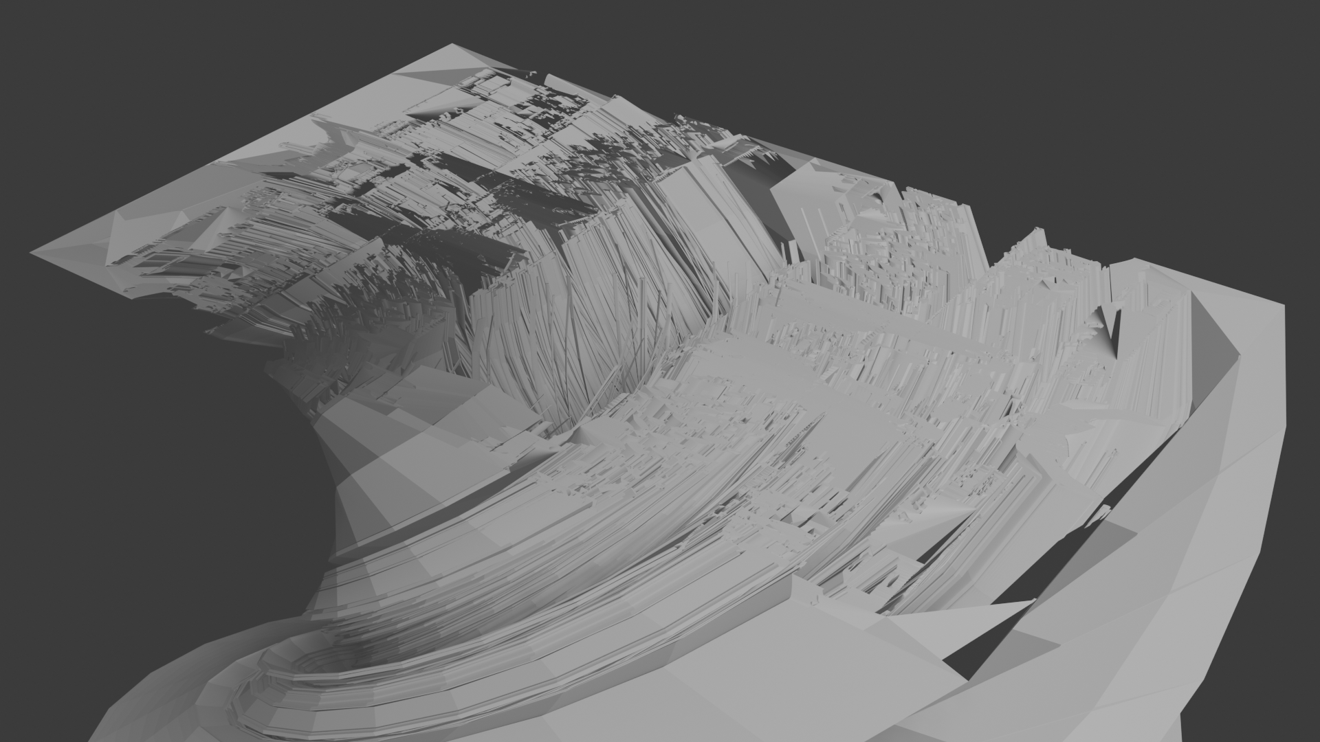
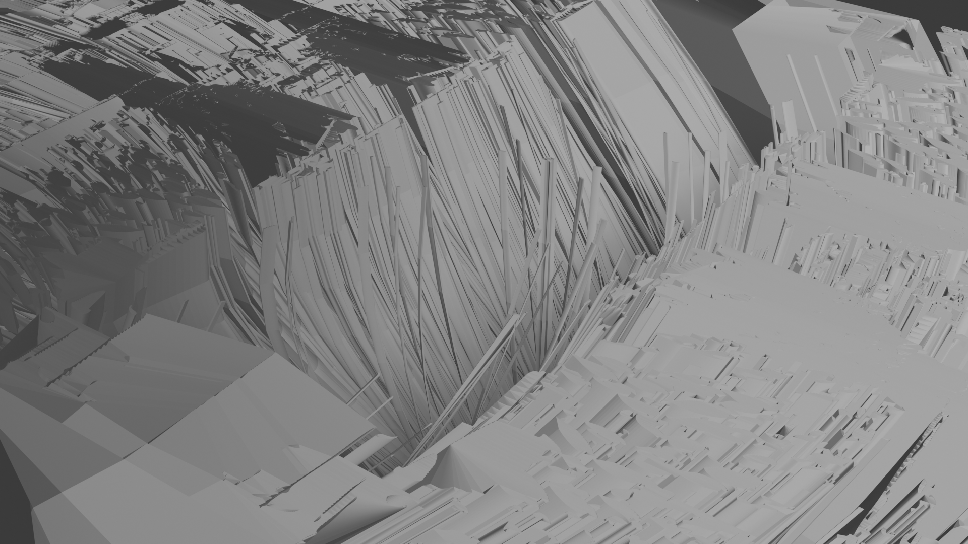
Above is stills of the scenes in unity using a green wire frame of the prefabs to show the invisible elements.
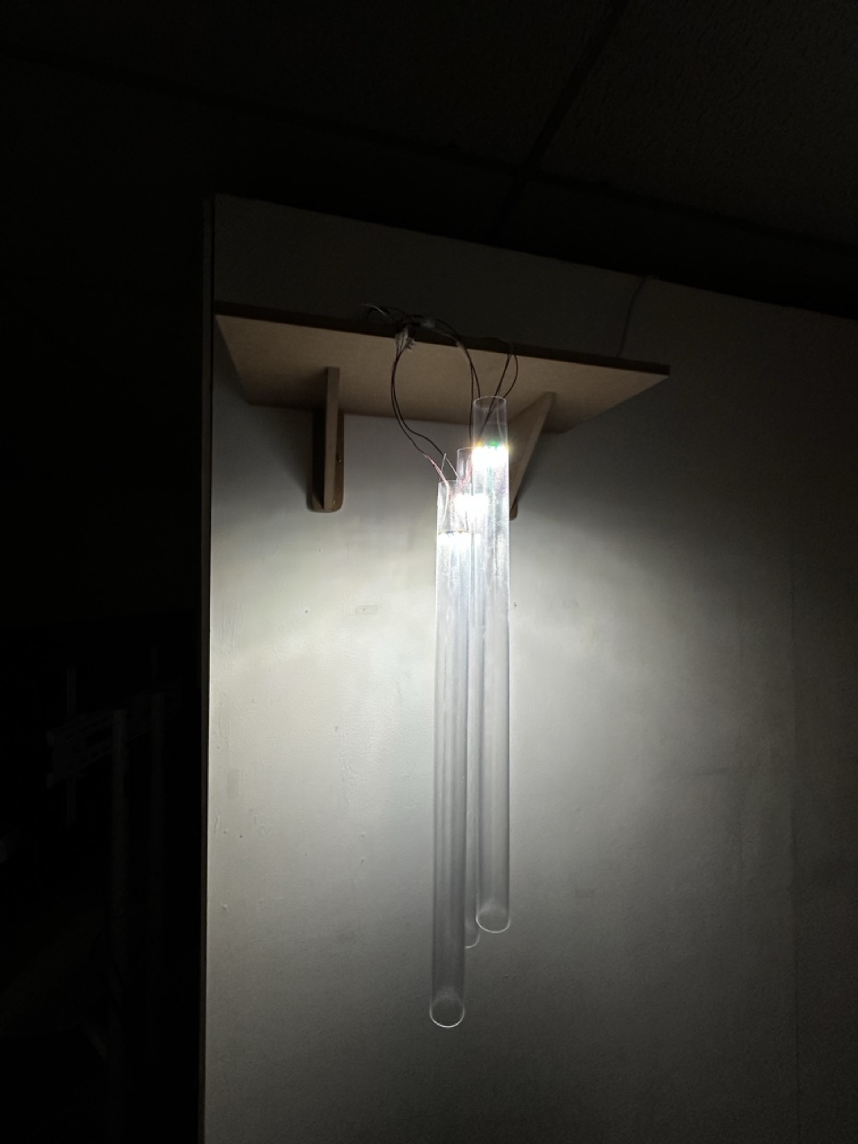
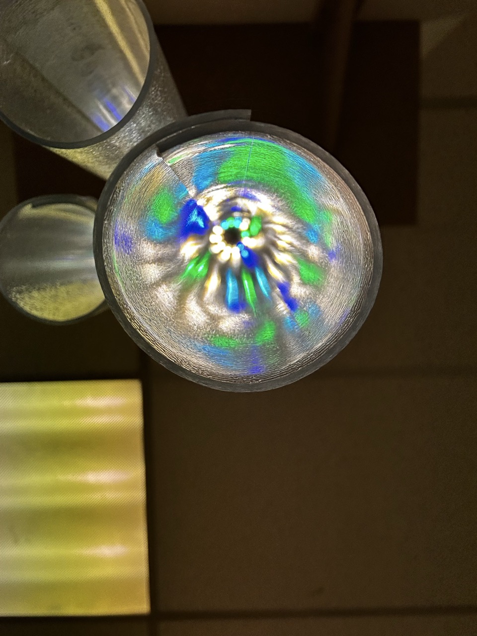
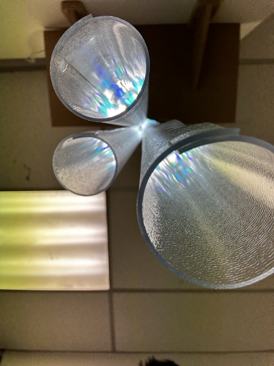
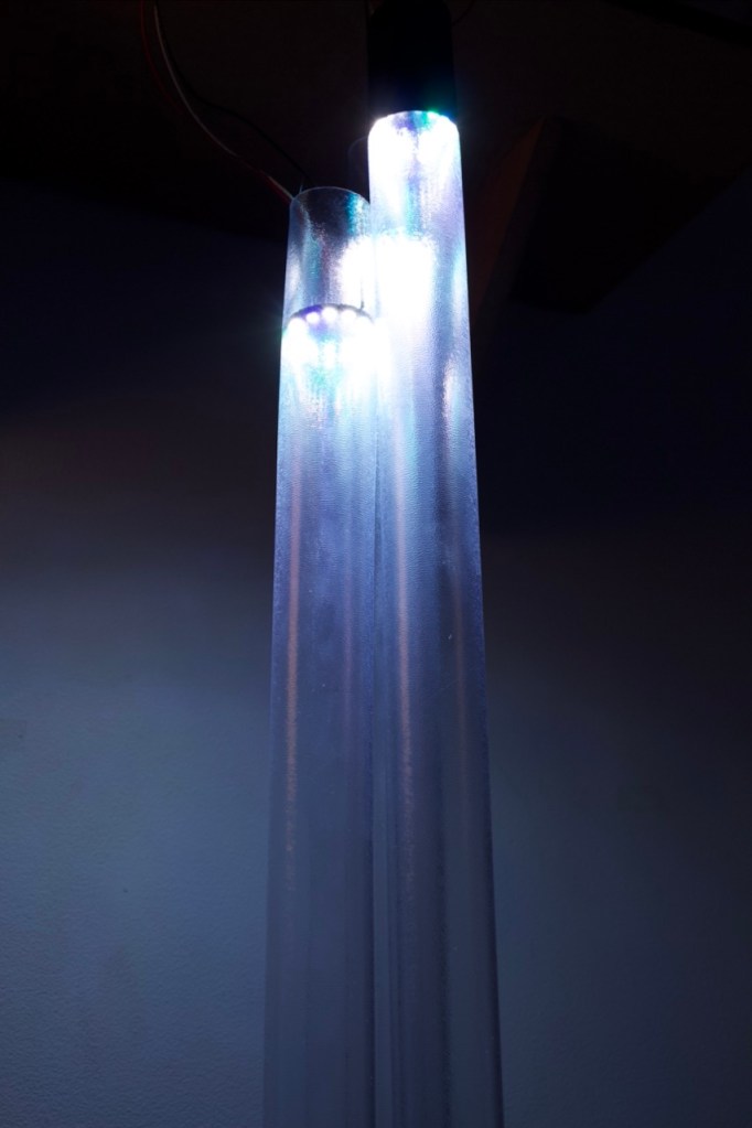
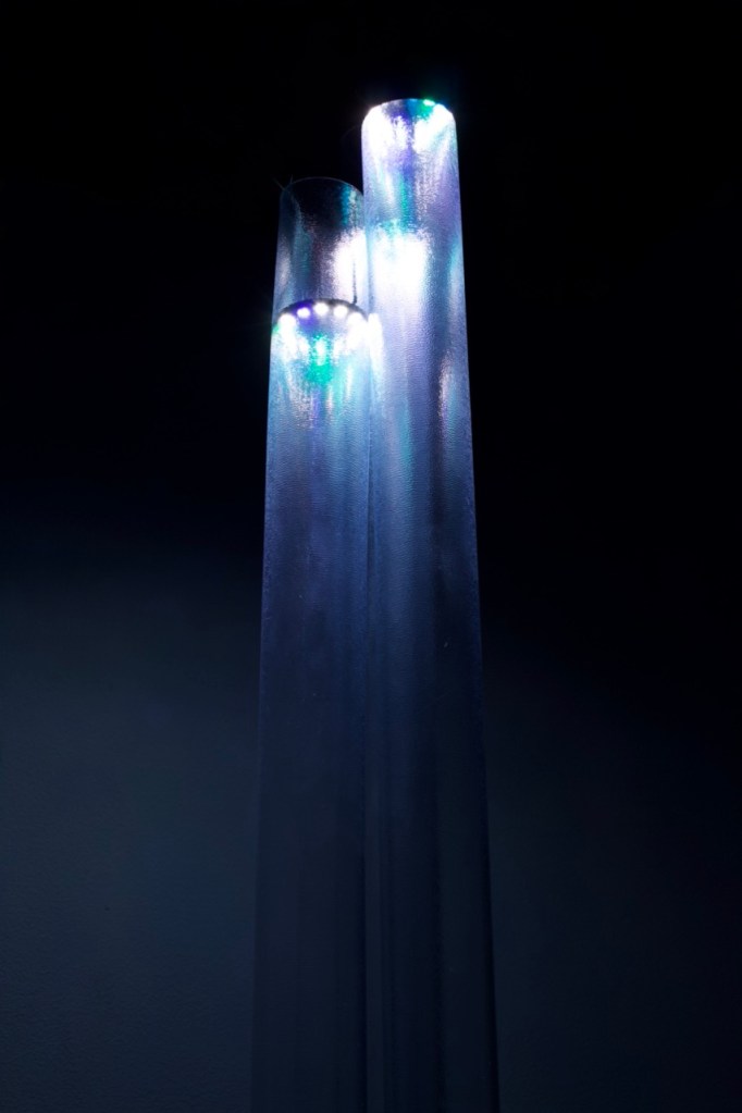
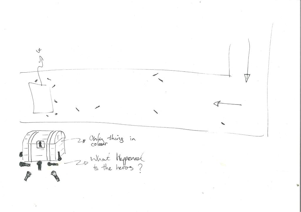
Black Light :
The Story of BlackLight –
In Black Light you find yourself in a odd space armed only with your wits and your torch.
Step into a world where time stands still, filled with intricate mazes and shadowy corners that feel strangely familiar. As you navigate through the labyrinth, you’ll encounter various structures and pathways that invite you to explore. Each area holds its own mysteries, waiting to be uncovered. Embrace the journey as you shine a light on
the stories hidden within the shadows.
Where are you ? What happened to the king ? What happened to the men on the ship ? And whats at the end of the maze ? What happened to the heros?
Reflection:
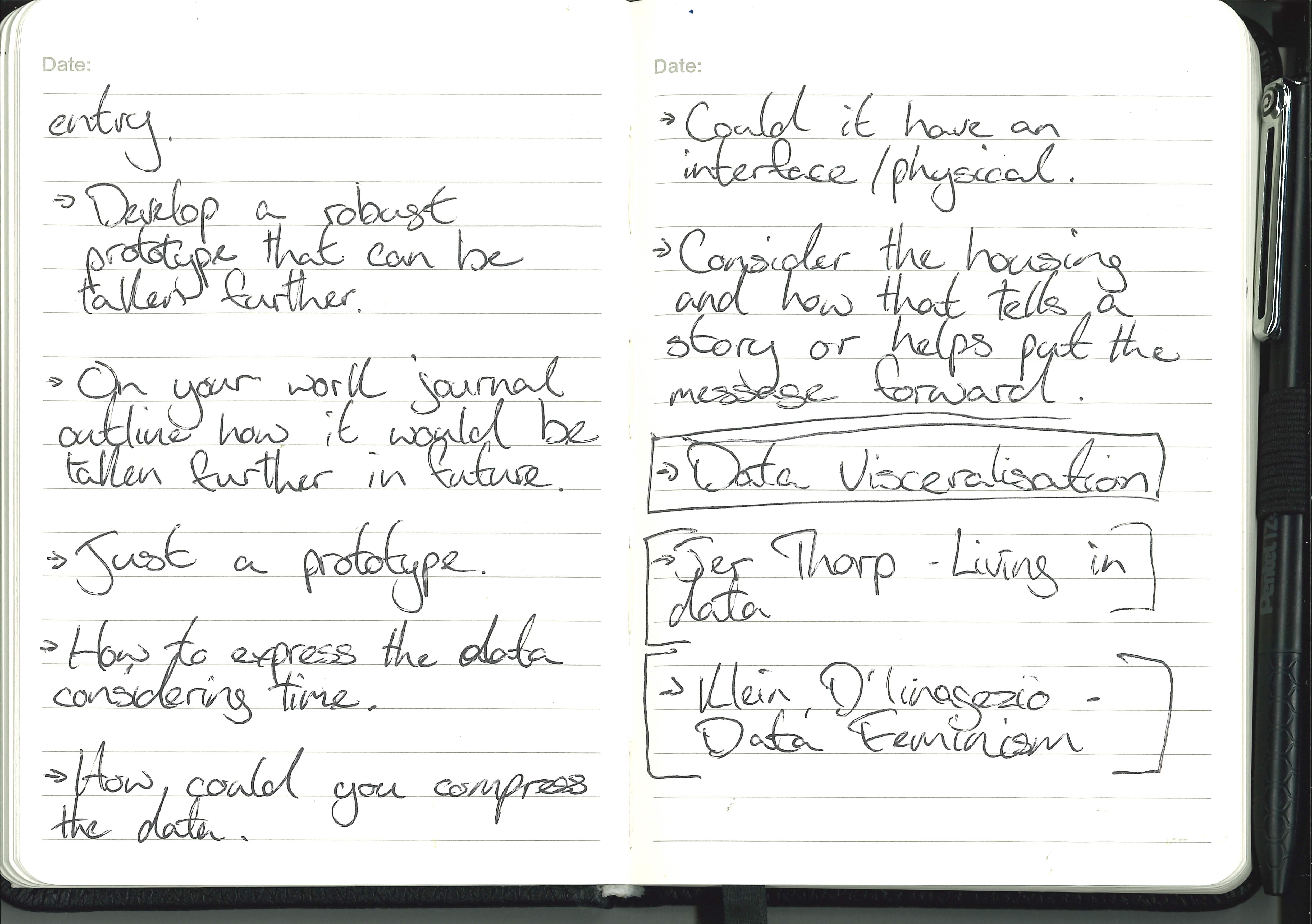
If i had more time and more resources I really feel like the concept has legs to stand on and could even be taken further to a full fledged game for VR, at this point it is a proof of concept or a demo.
If I was to do anything different or take it further, I would like to develop my own shader that gives the same effect as unfinished swan and lean into the reliance on the torch more.
Also one of the concepts that I didn’t implement was inverting the colours and making the white black but that would either need an after processing effect on the entire scene or another custom shader.