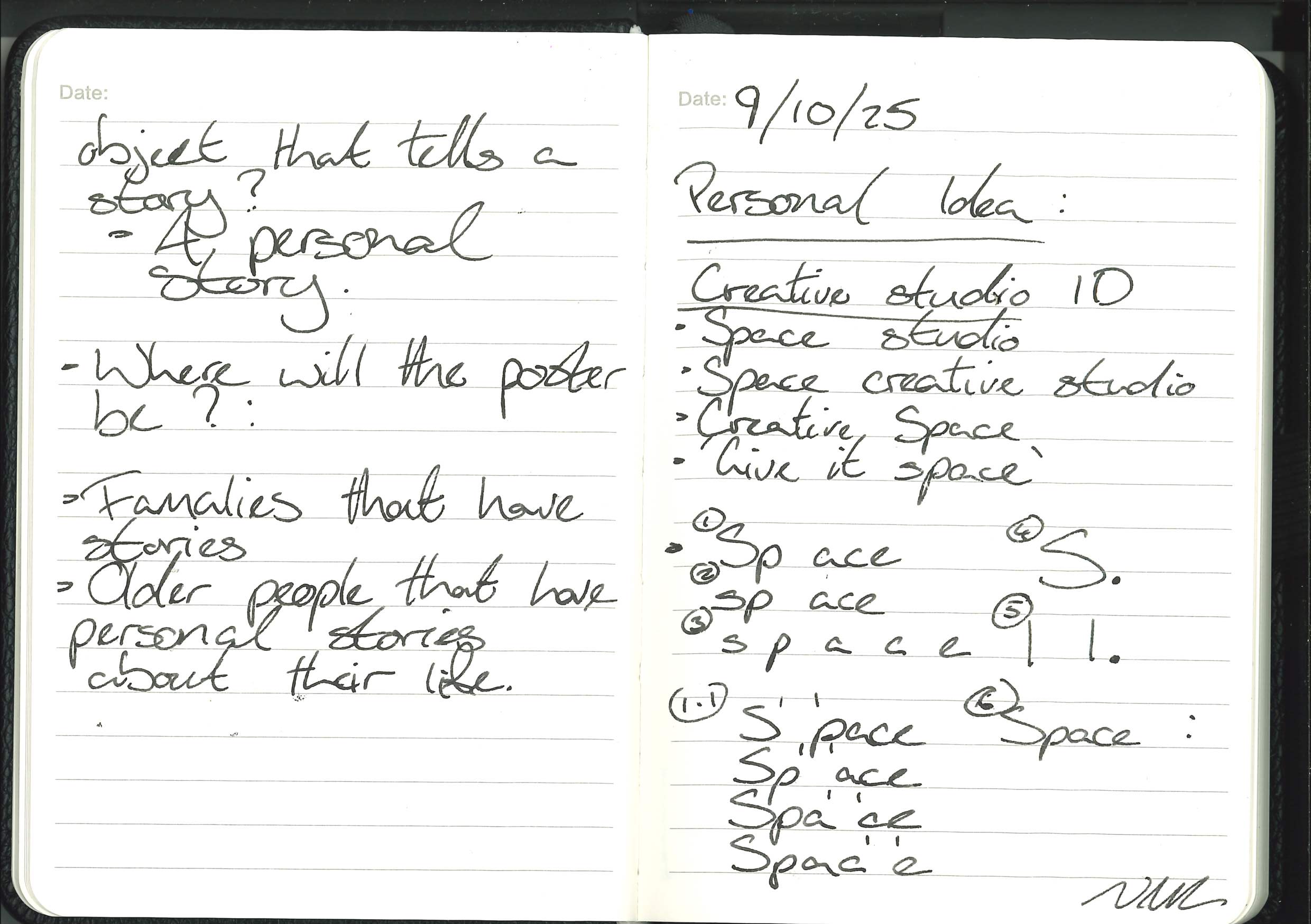
At this stage, I still want to focus on the fact that my first draft of my dissertation is due by the end of Week 9, but I am continuing my research and looking for stories and objects.
- Archived Industrial Images:
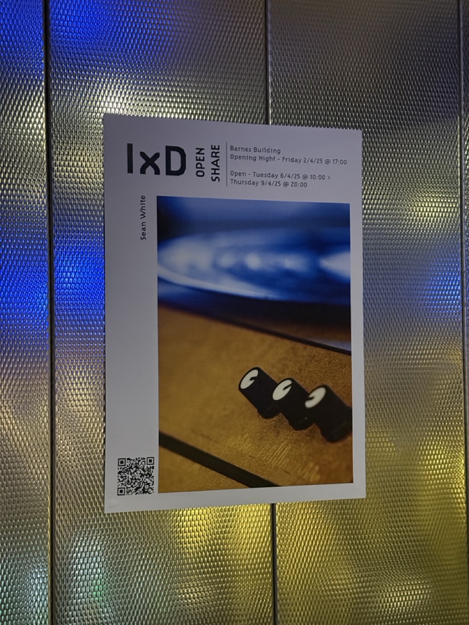
- Finally Seeing SEEP:
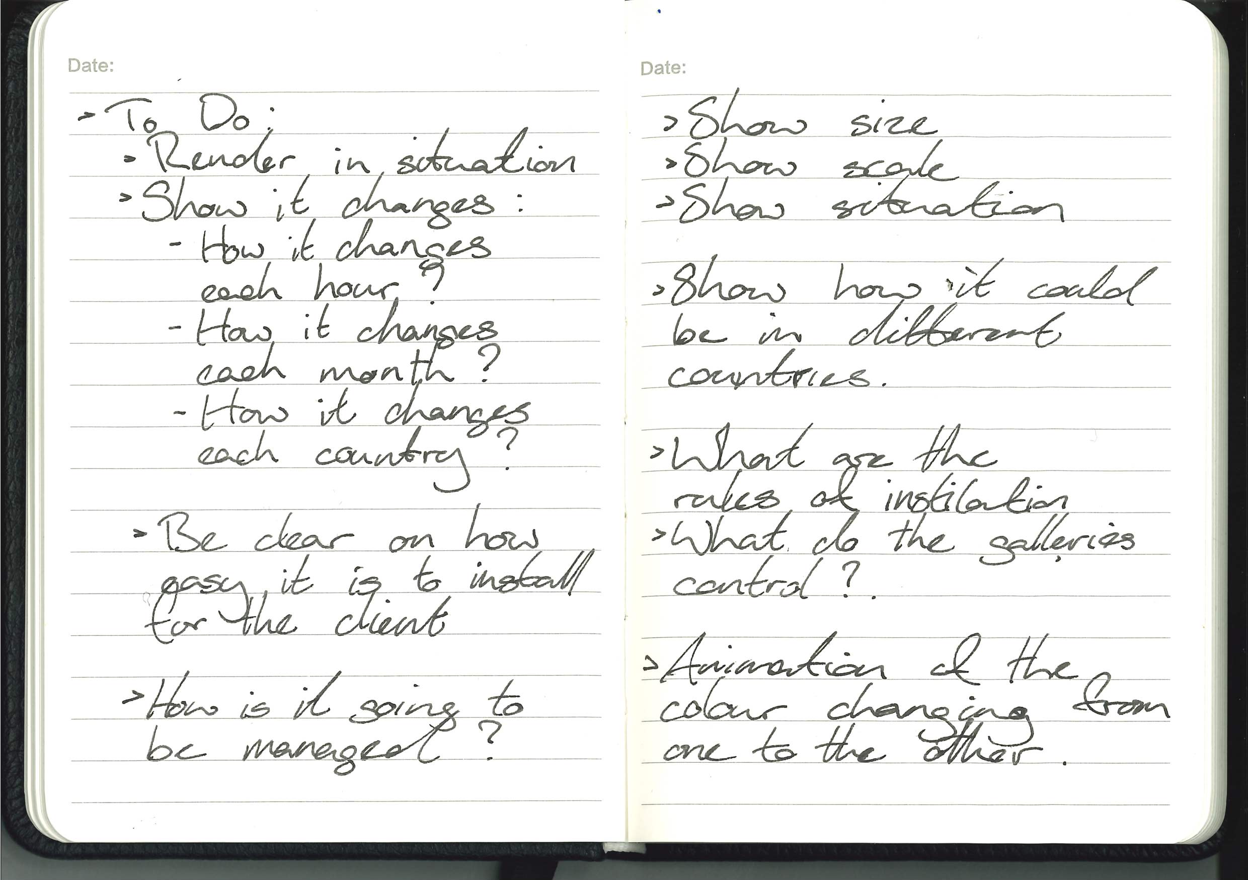
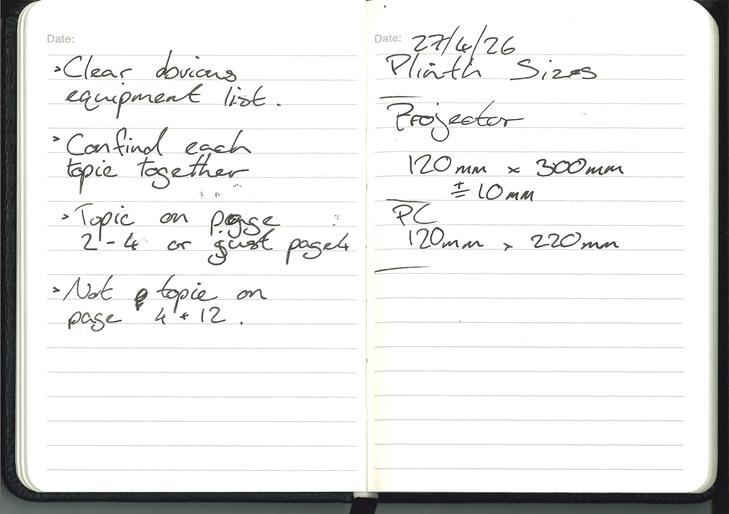
- To Do:
- Group Tutorial:
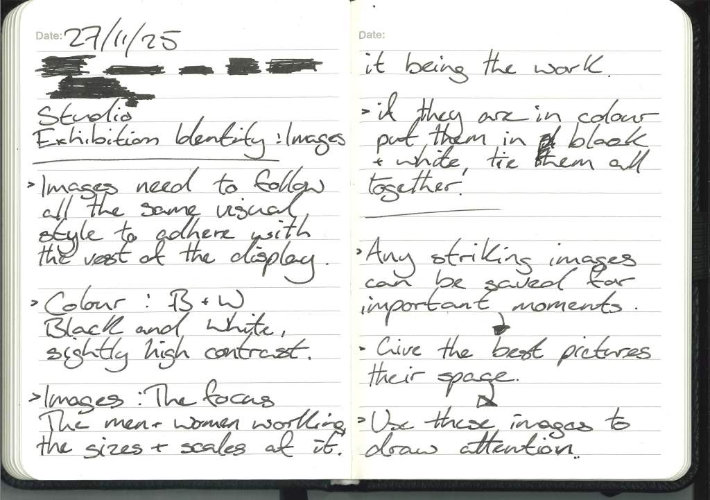
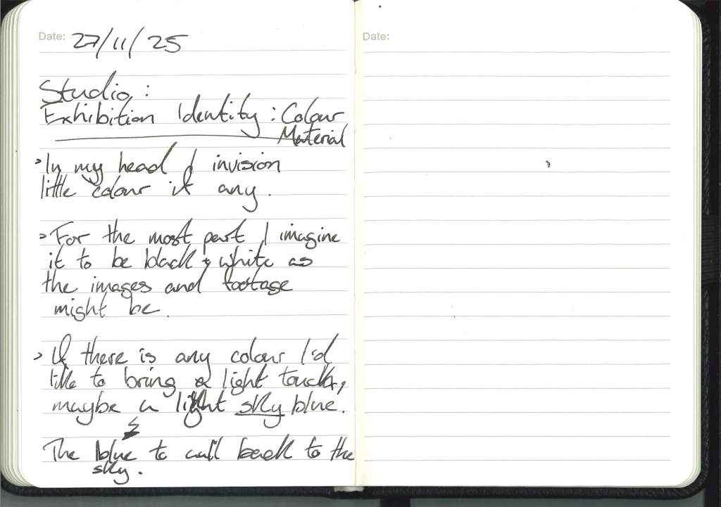
- Identity:
- Reflection – 8th May 2026:
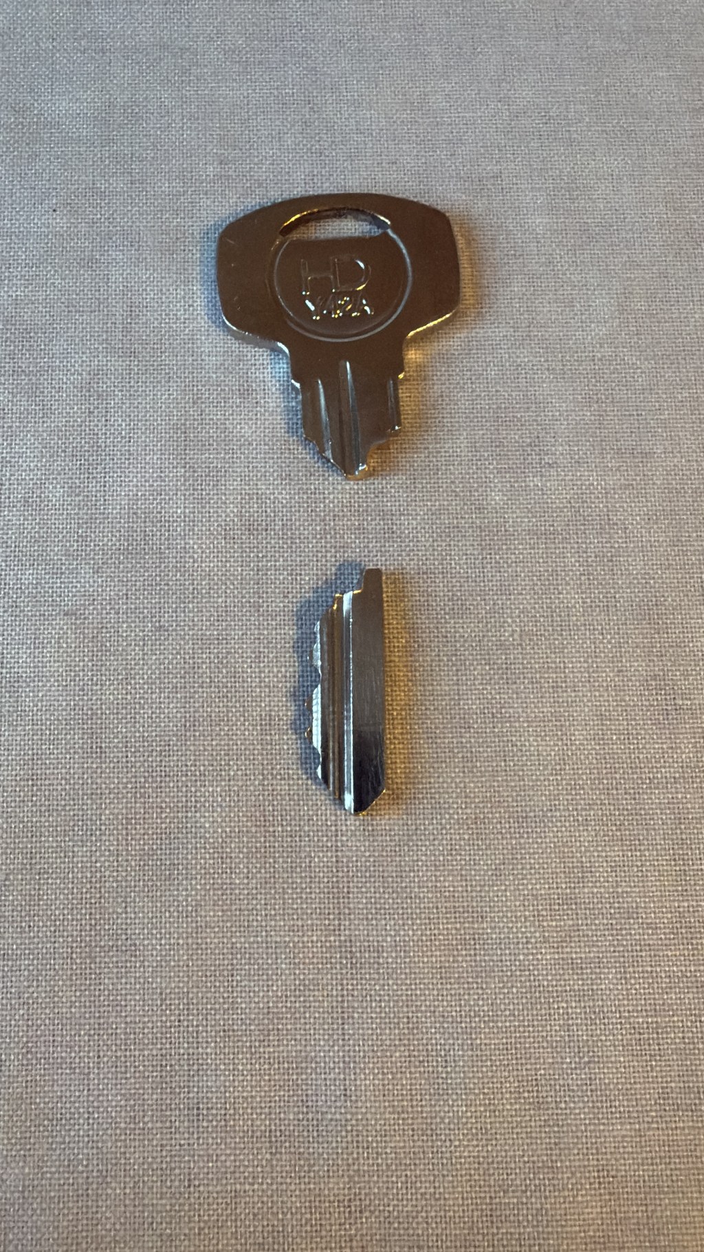
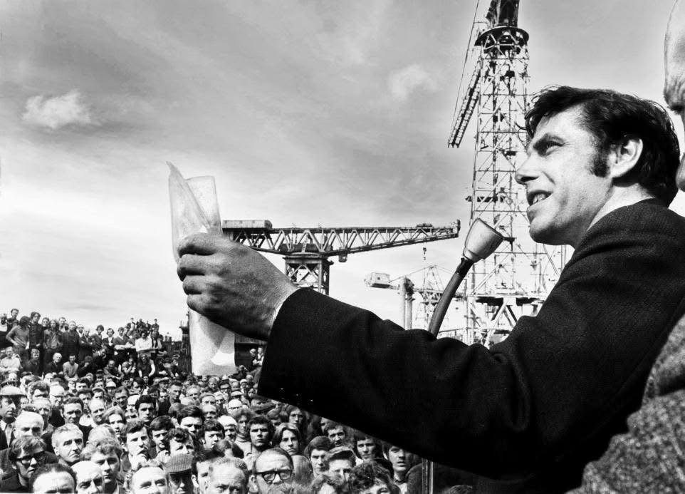
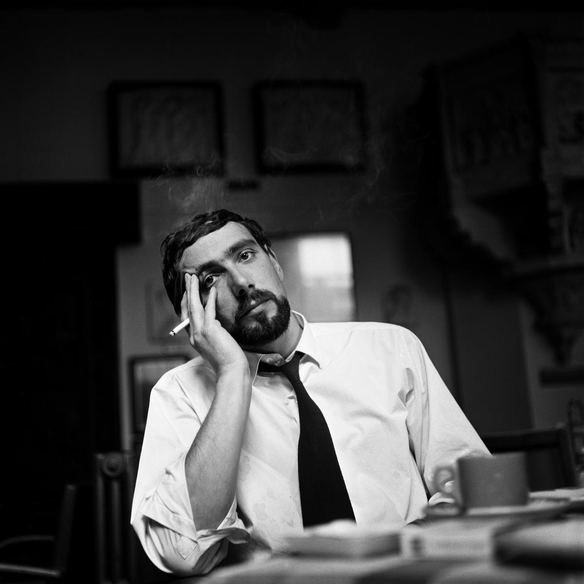
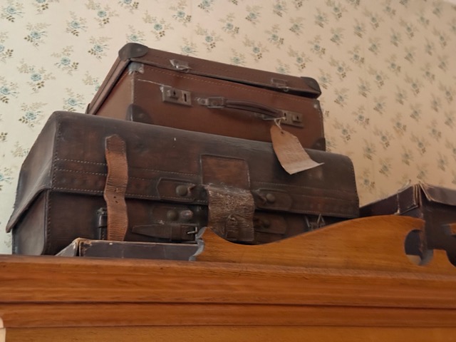
Over the weekend, on my way to Edinburgh for my friend Neil’s stag do, I had a conversation with another friend of mine, Keir, whose grandfather had worked on one of the bridges we passed, who then became the bridgemaster for that same bridge and who then stopped a man from jumping off the bridge, saving his life.
I’ve asked Keir to allow me to include this story and one of his grandfather’s belongings because this is exactly the sort of thing I’m looking for: a normal man who worked his life and, during that life, stepped up to save another man’s, without wanting or needing accolades.
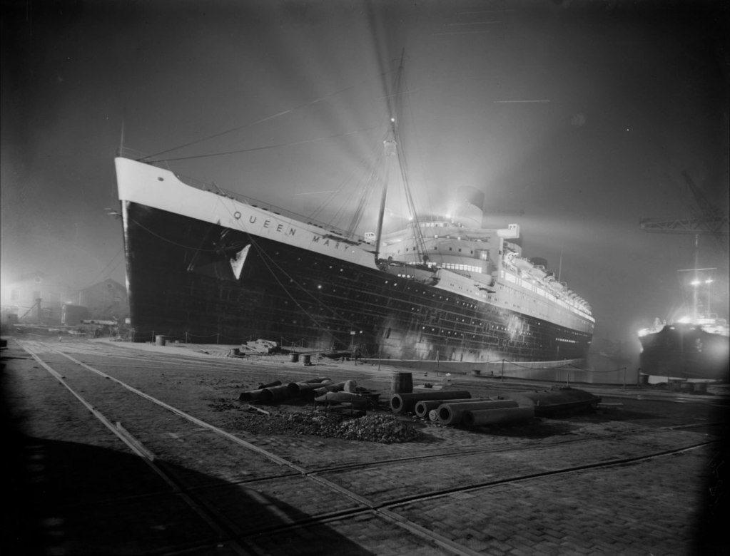
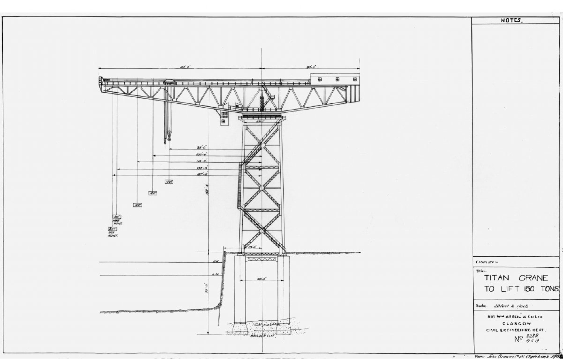
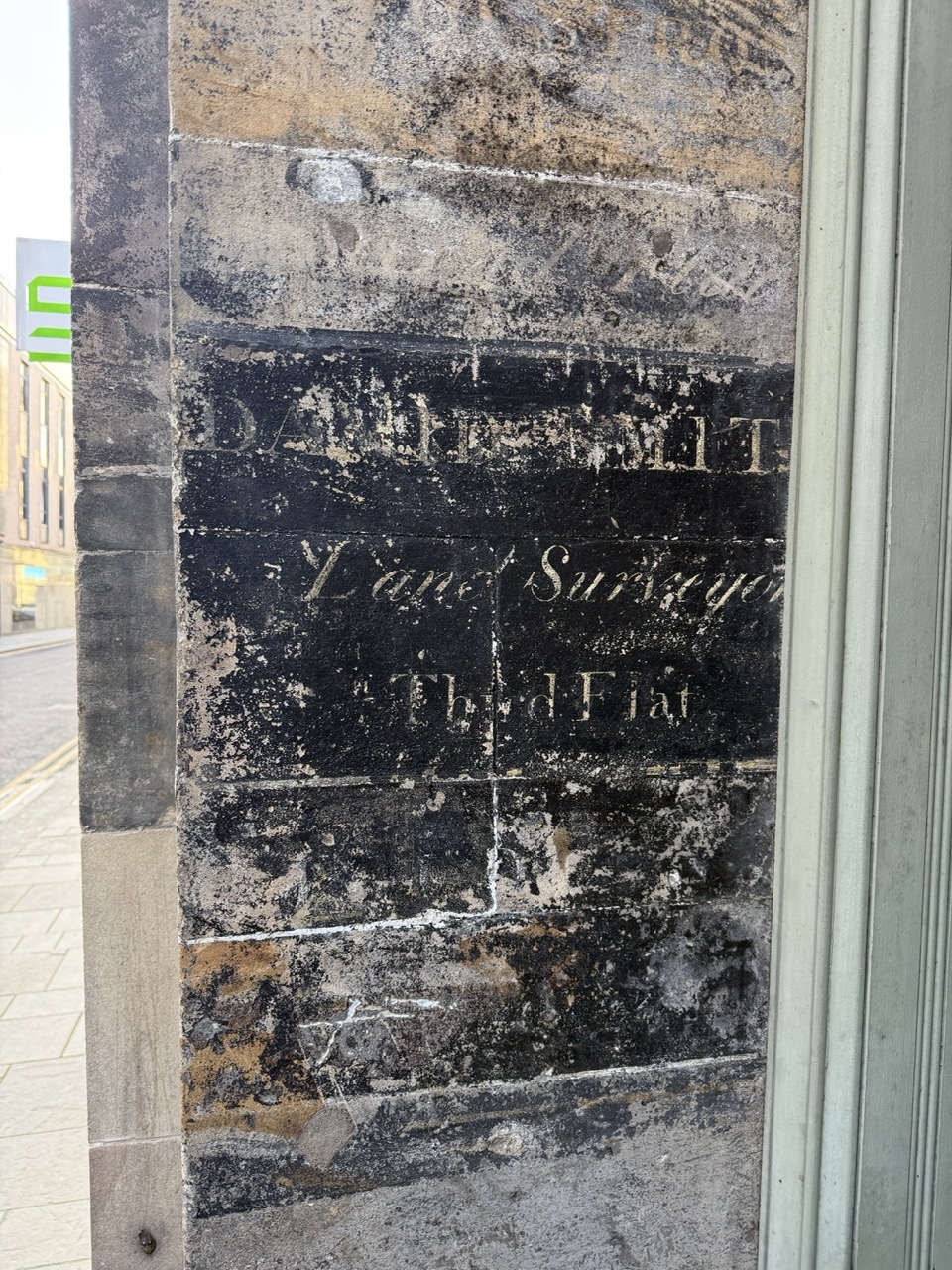
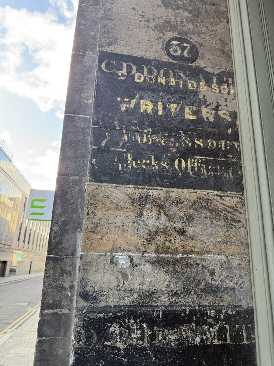
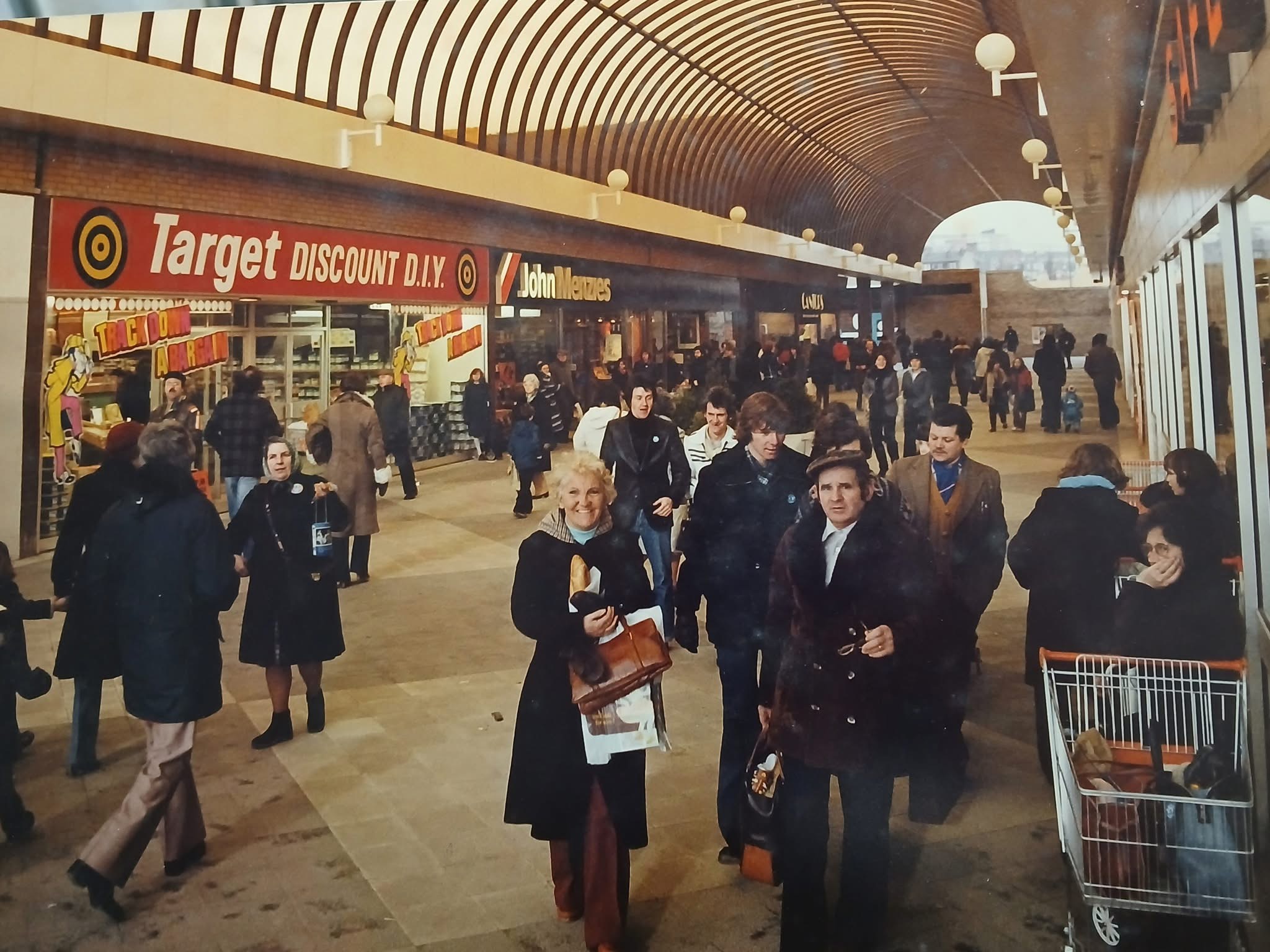
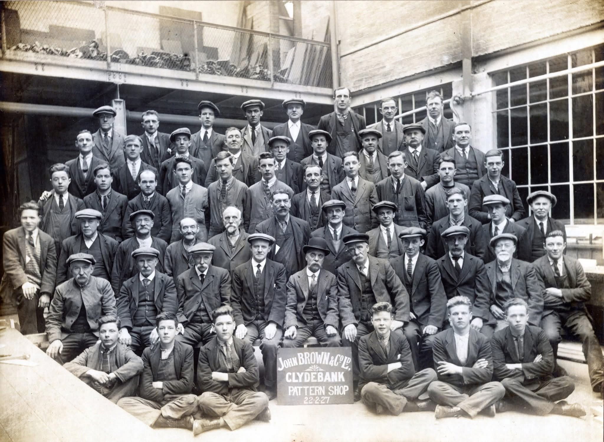
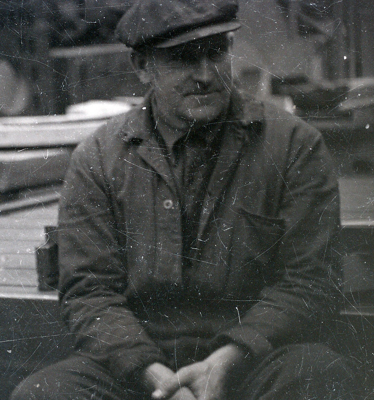
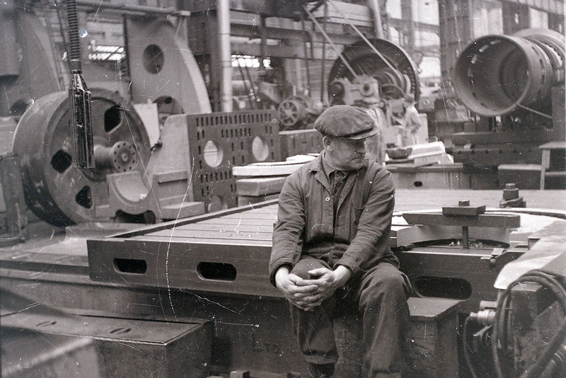
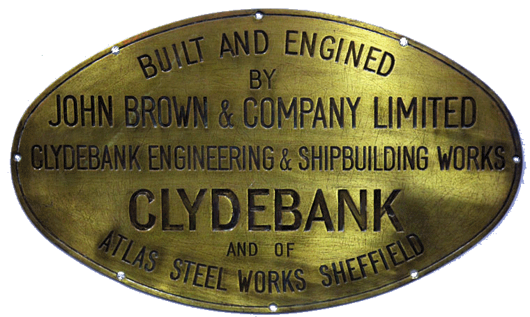
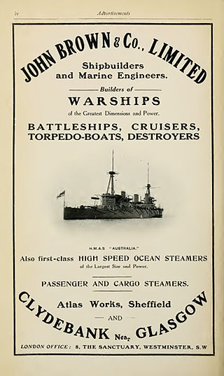
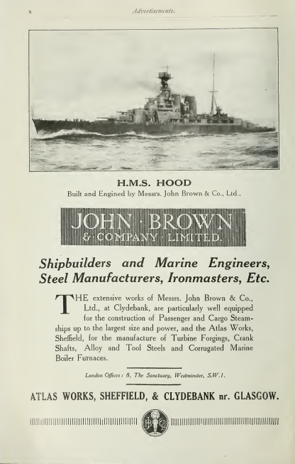
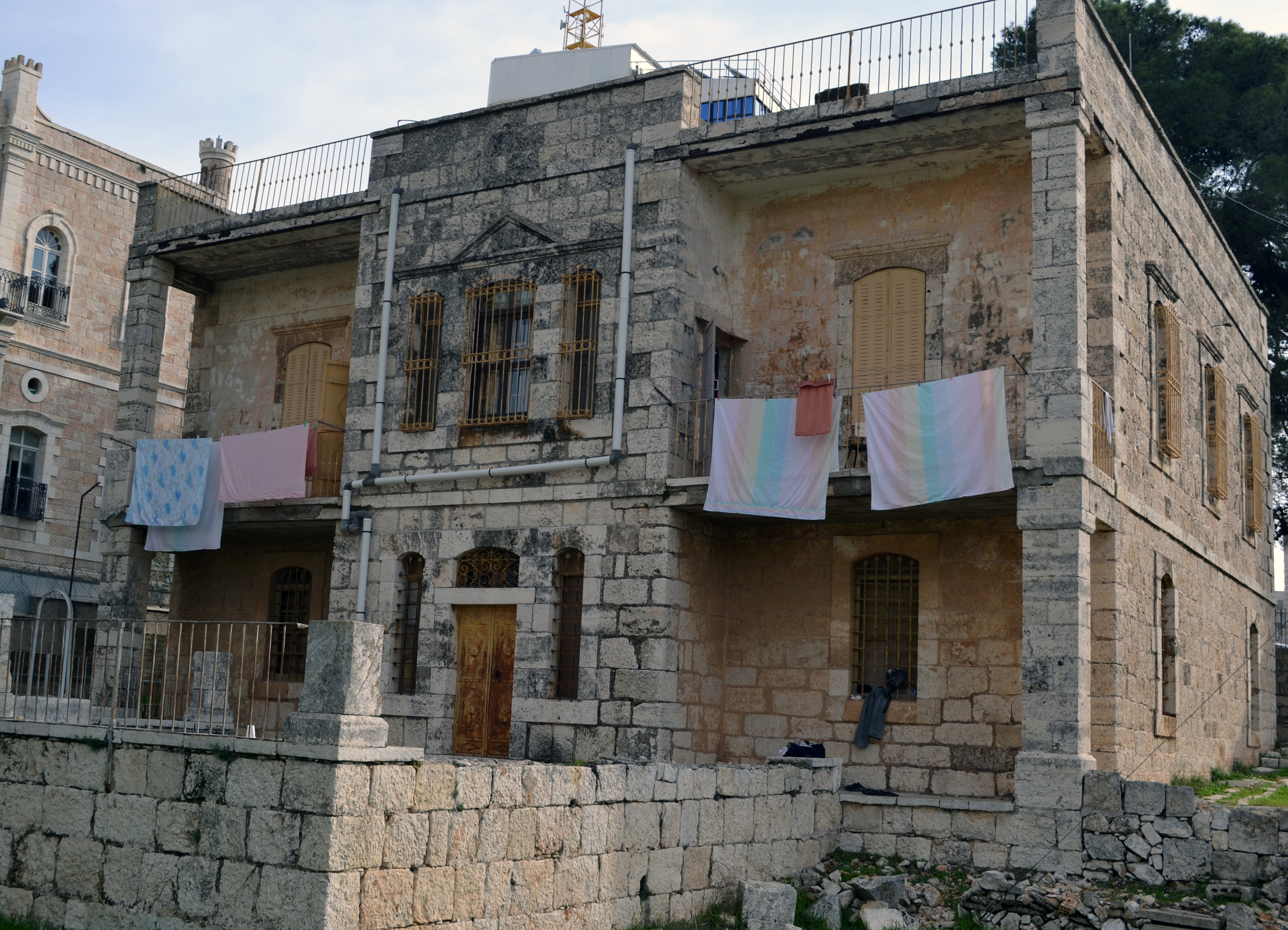
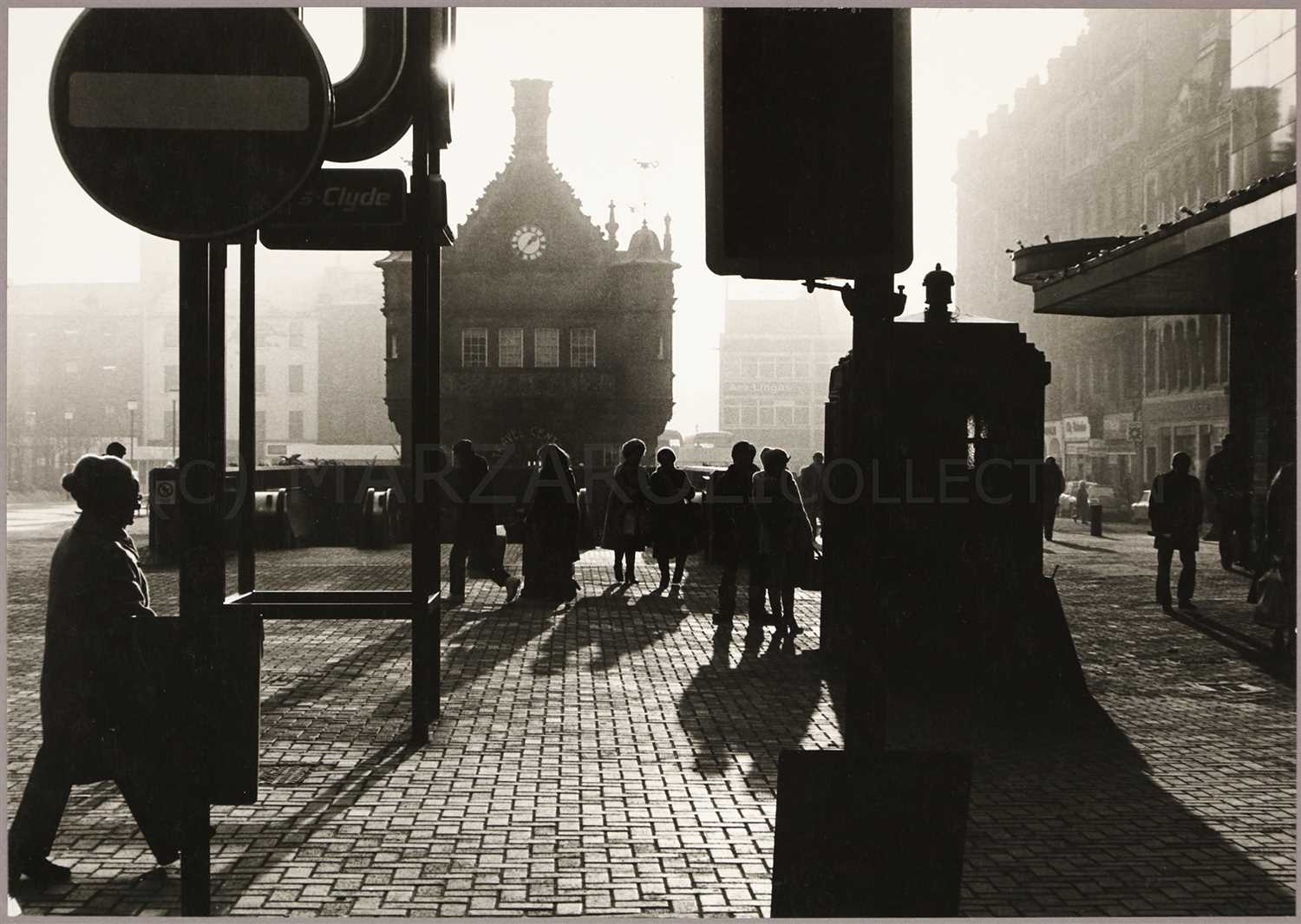
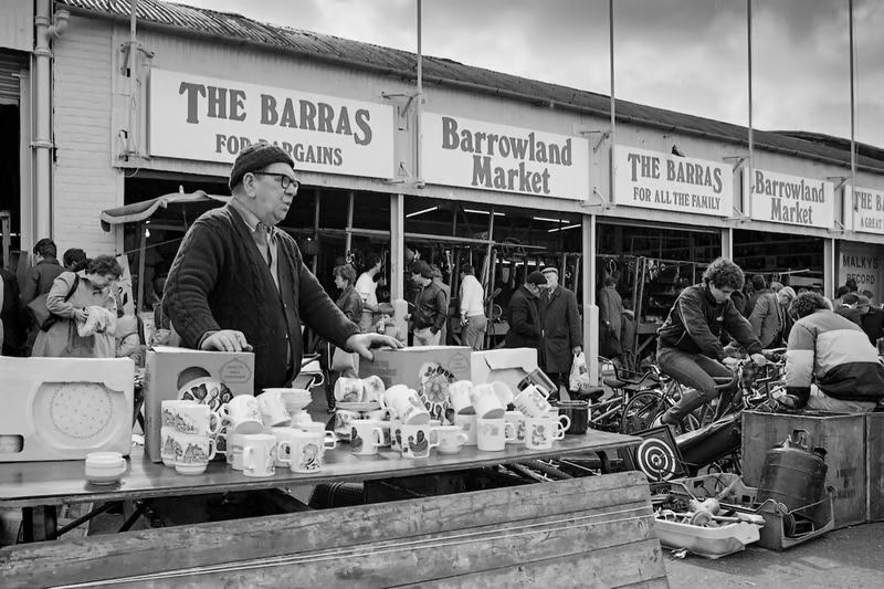
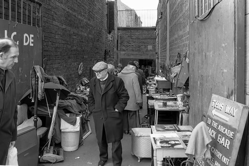
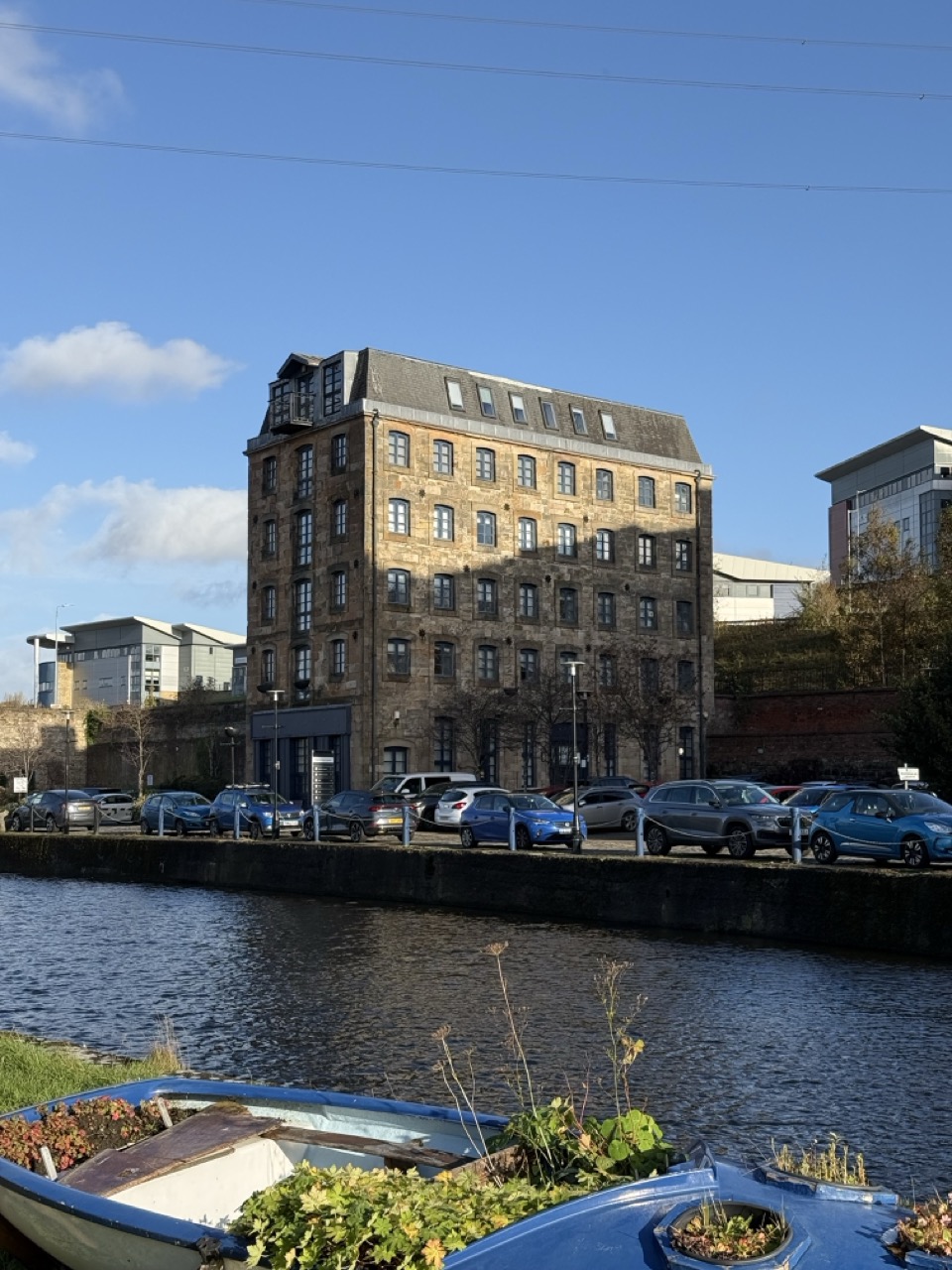
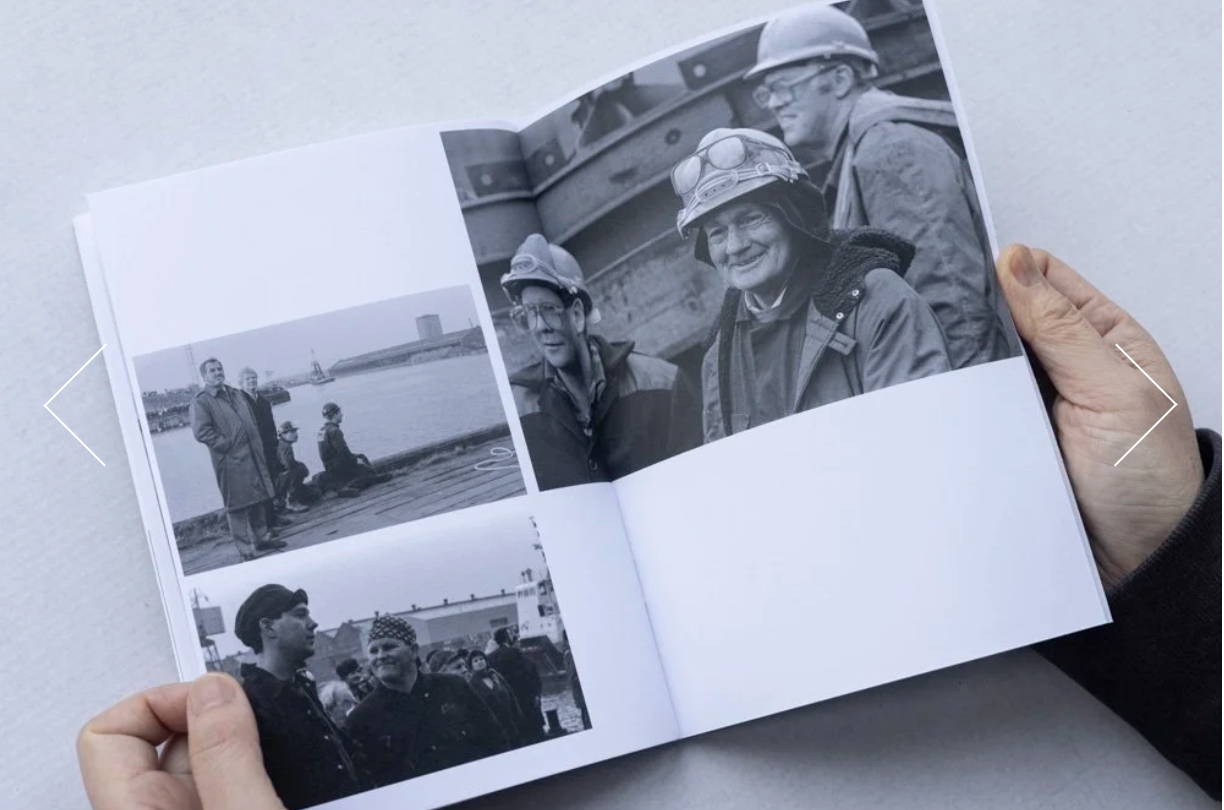
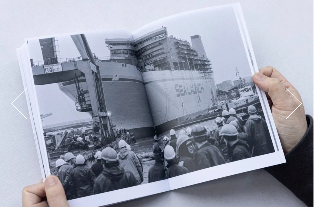
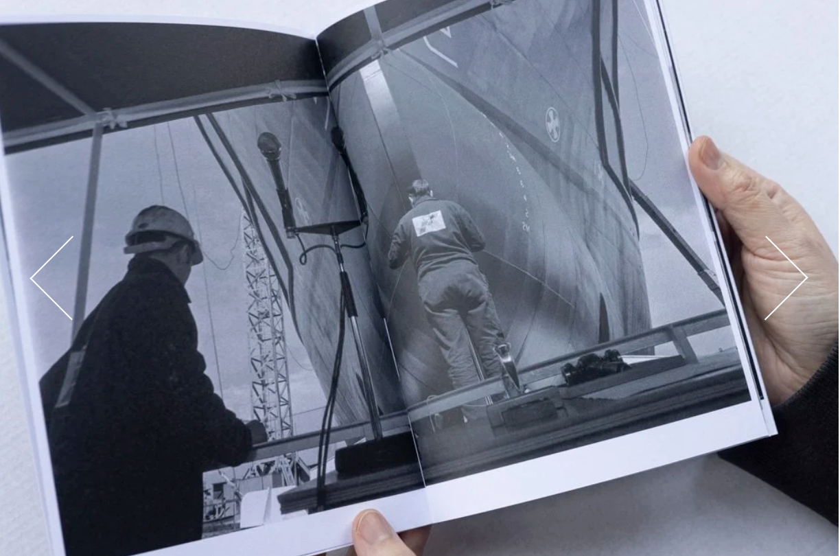
Through the early stages of these two stories I have so far, the photography of Robert G Taylor and now the story of Keir’s family, the throughline is one of Glasgow’s industrial past. This topic has been covered more than enough, but I want to focus on the people who made it happen.
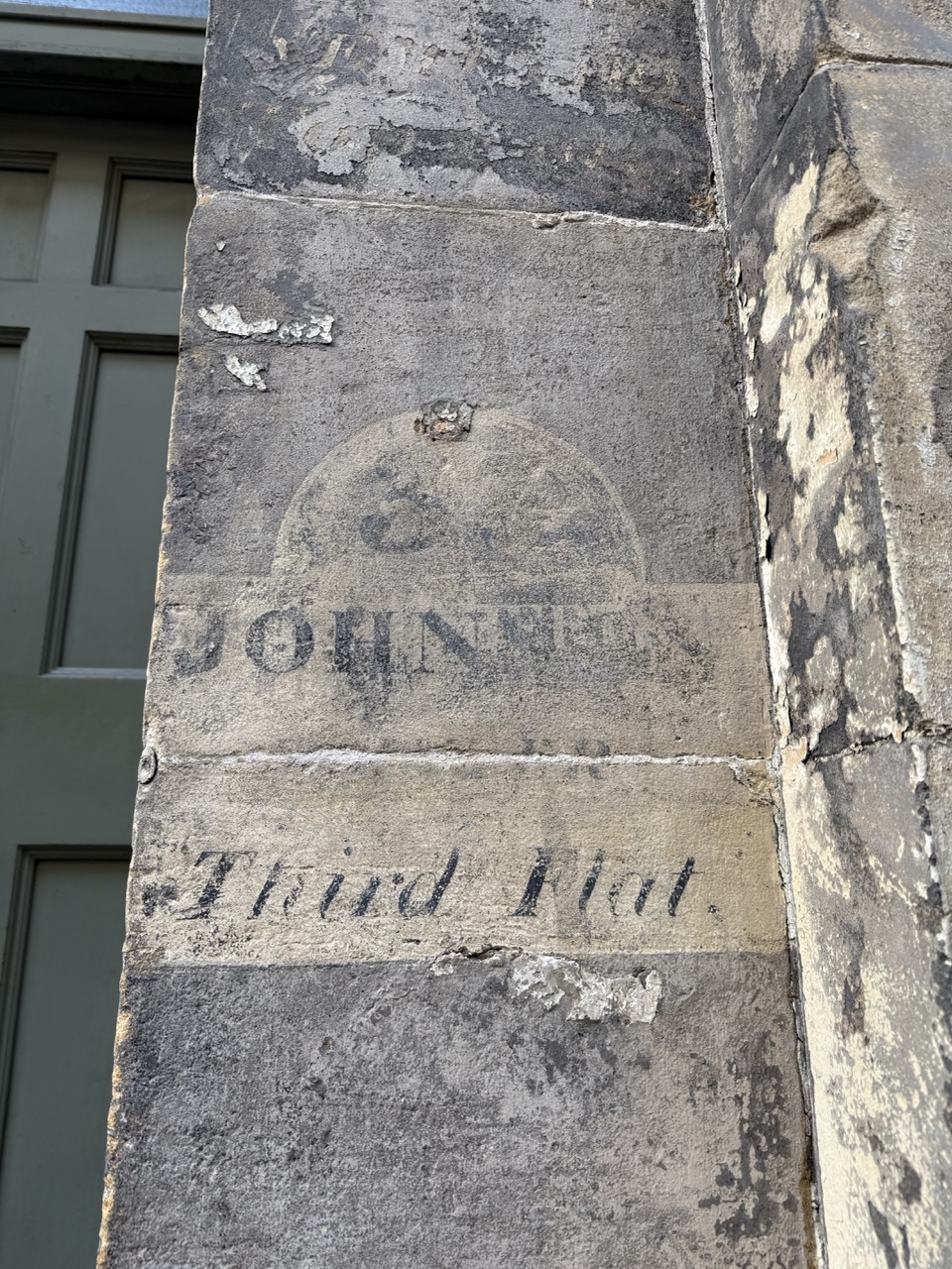
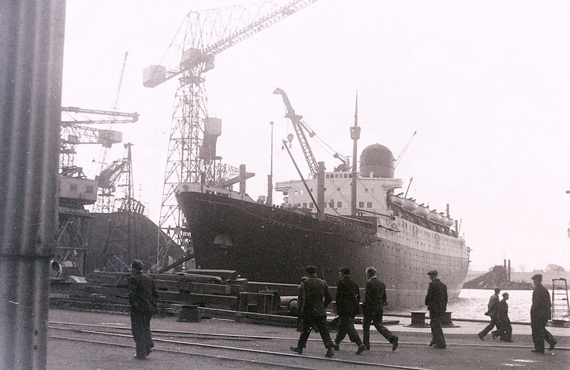
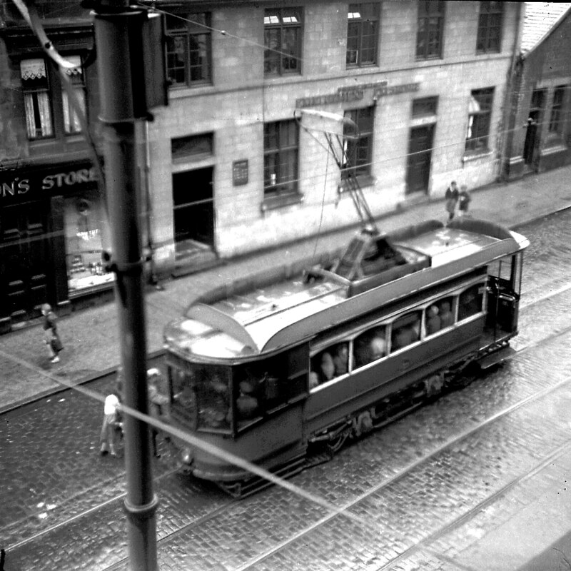
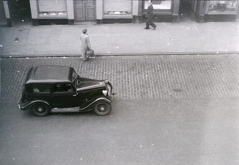
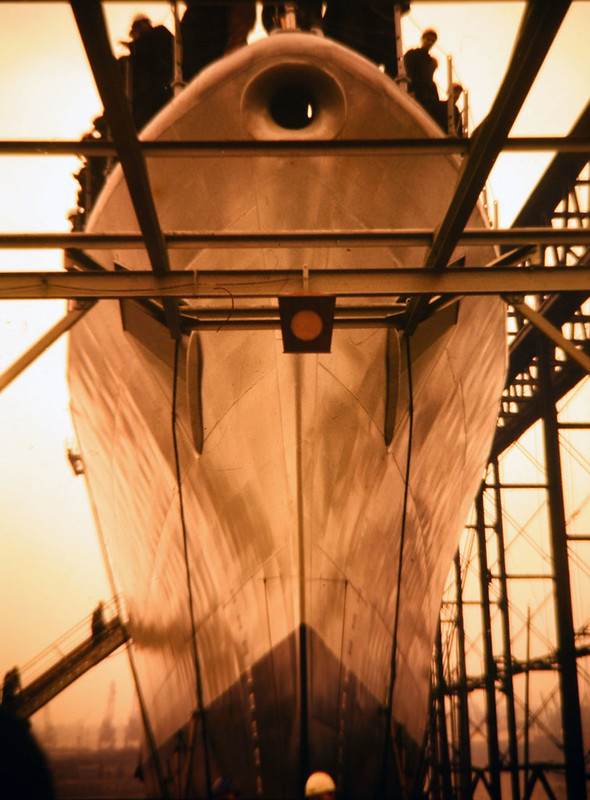
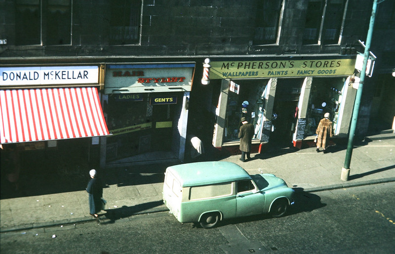
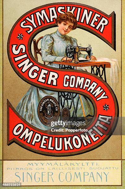
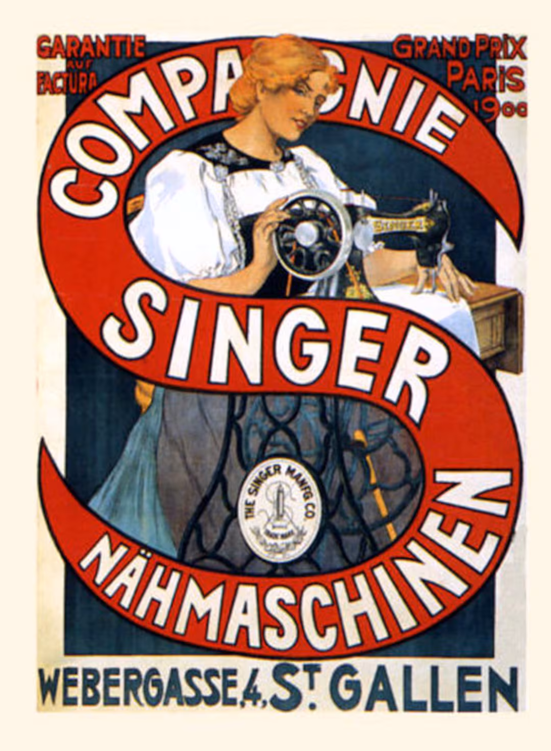
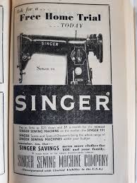
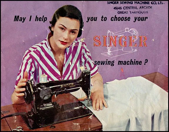
Archived Industrial Images:
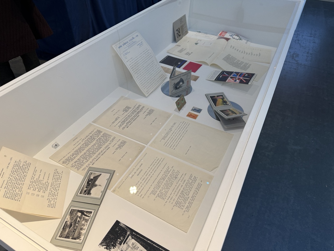
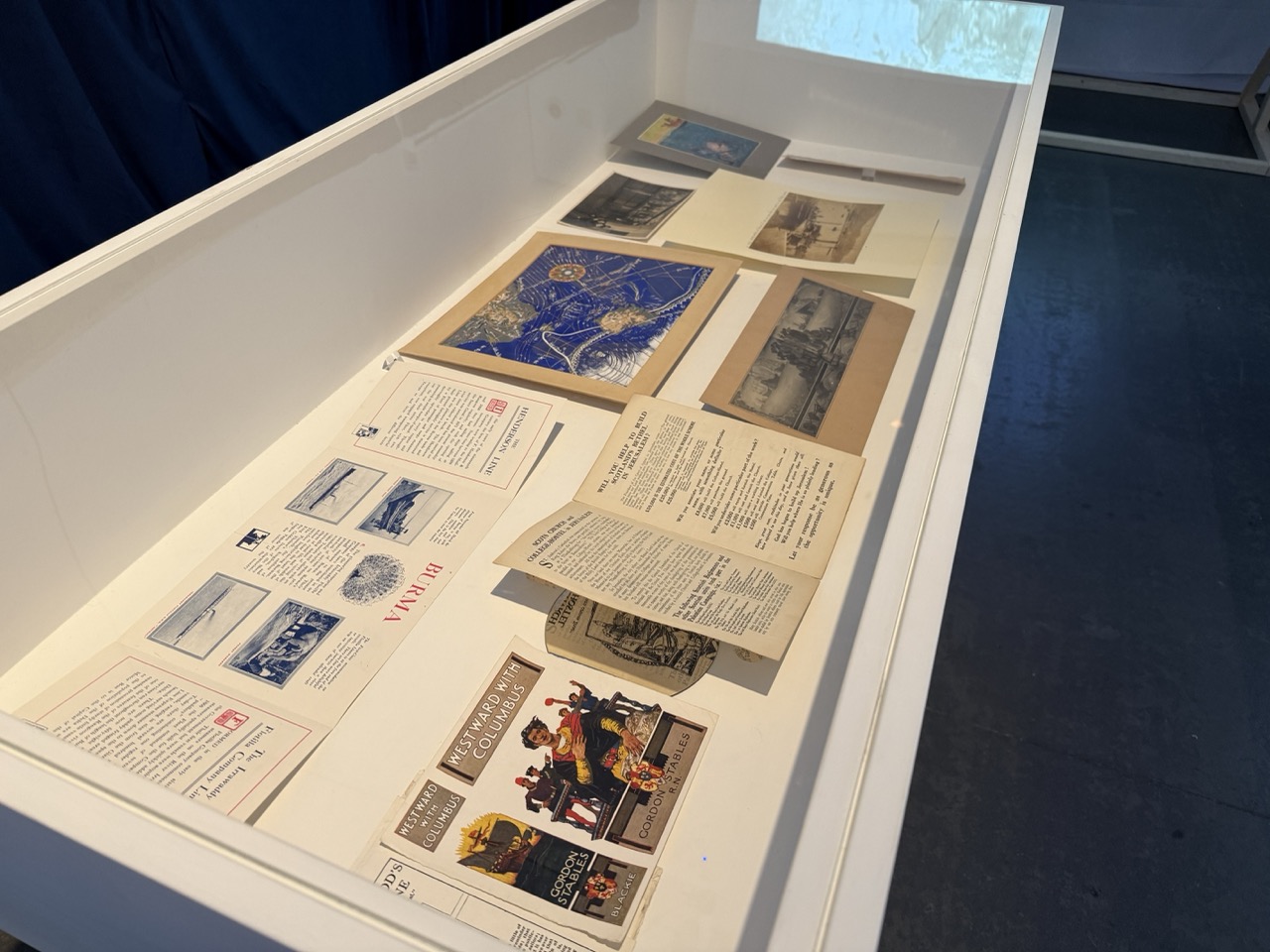
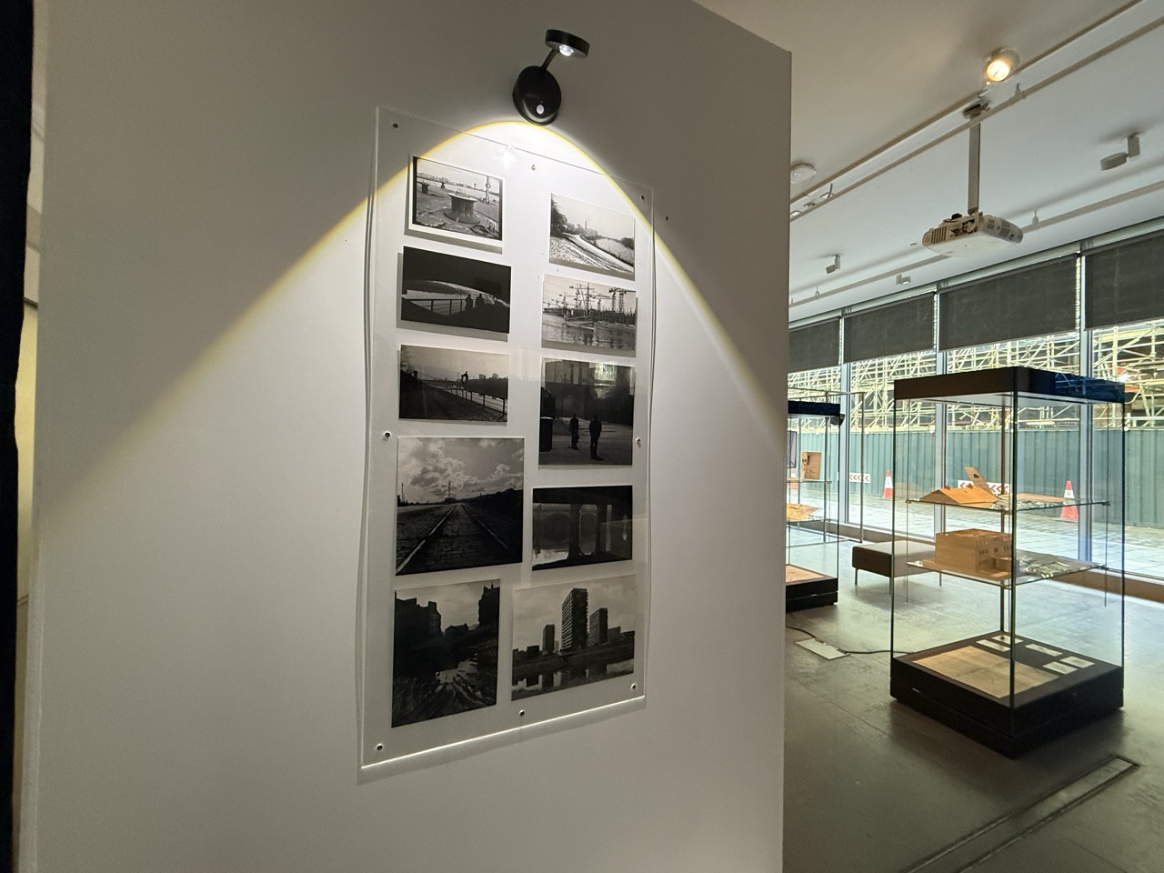
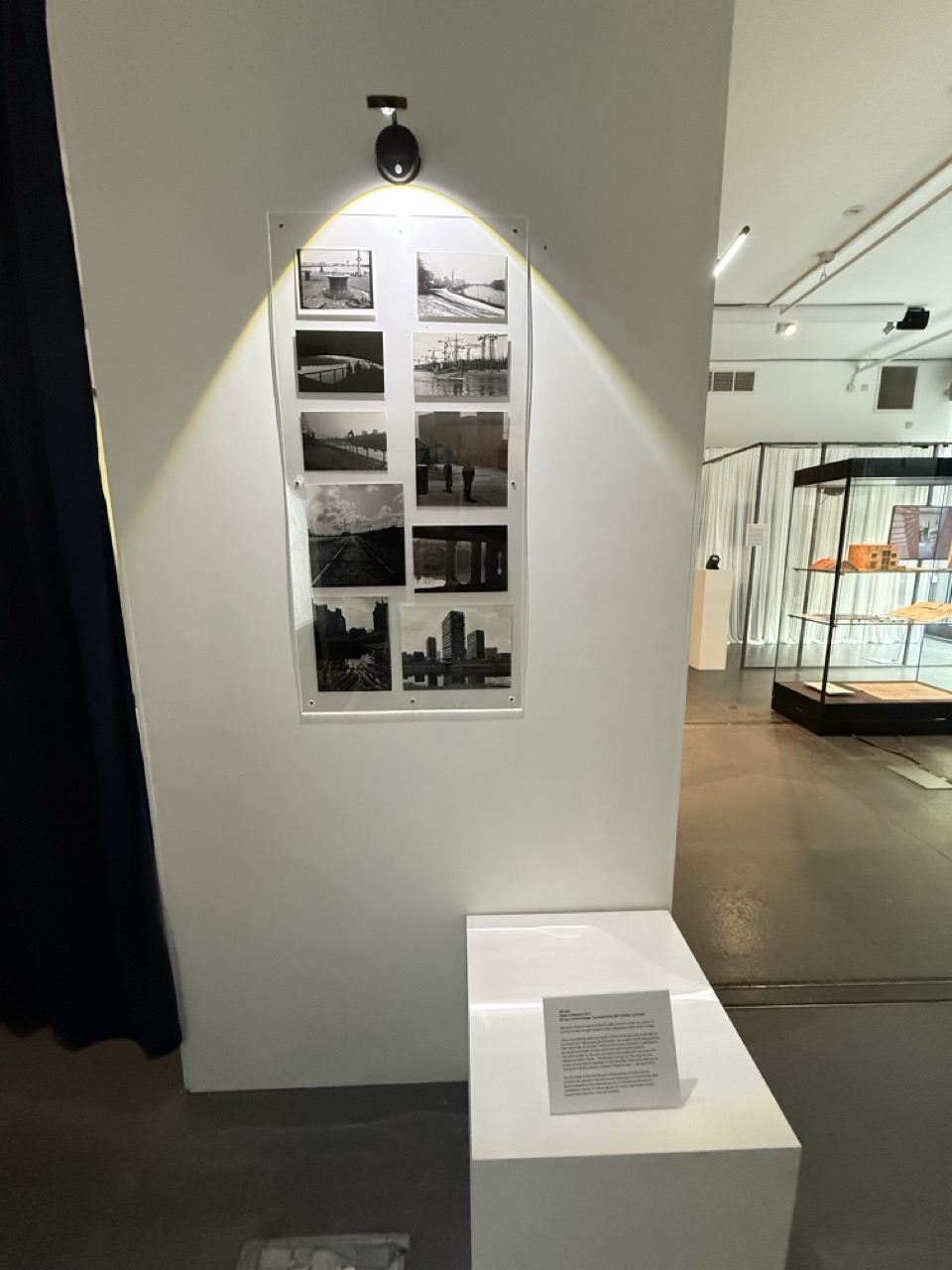
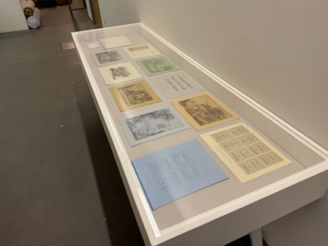
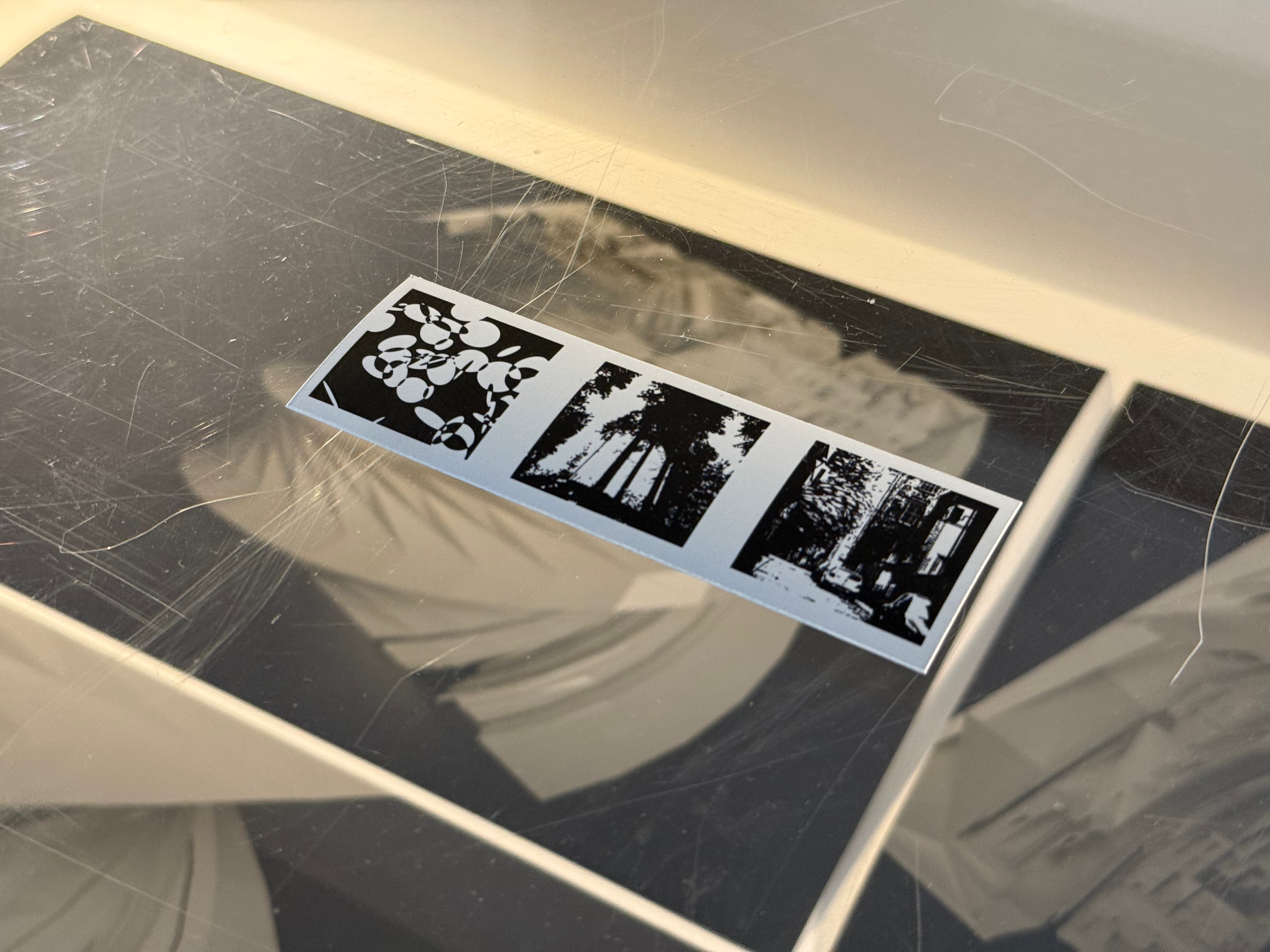
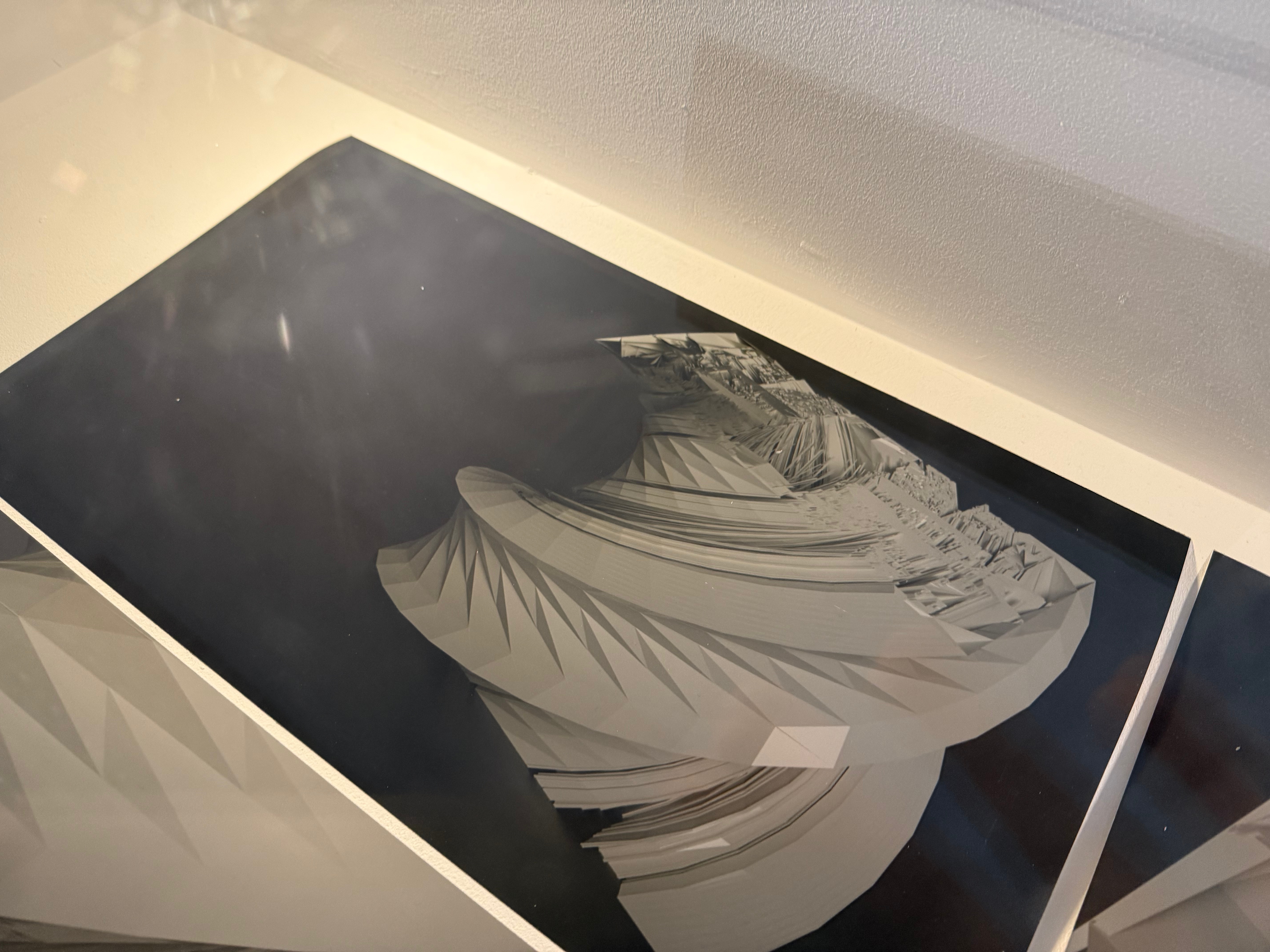
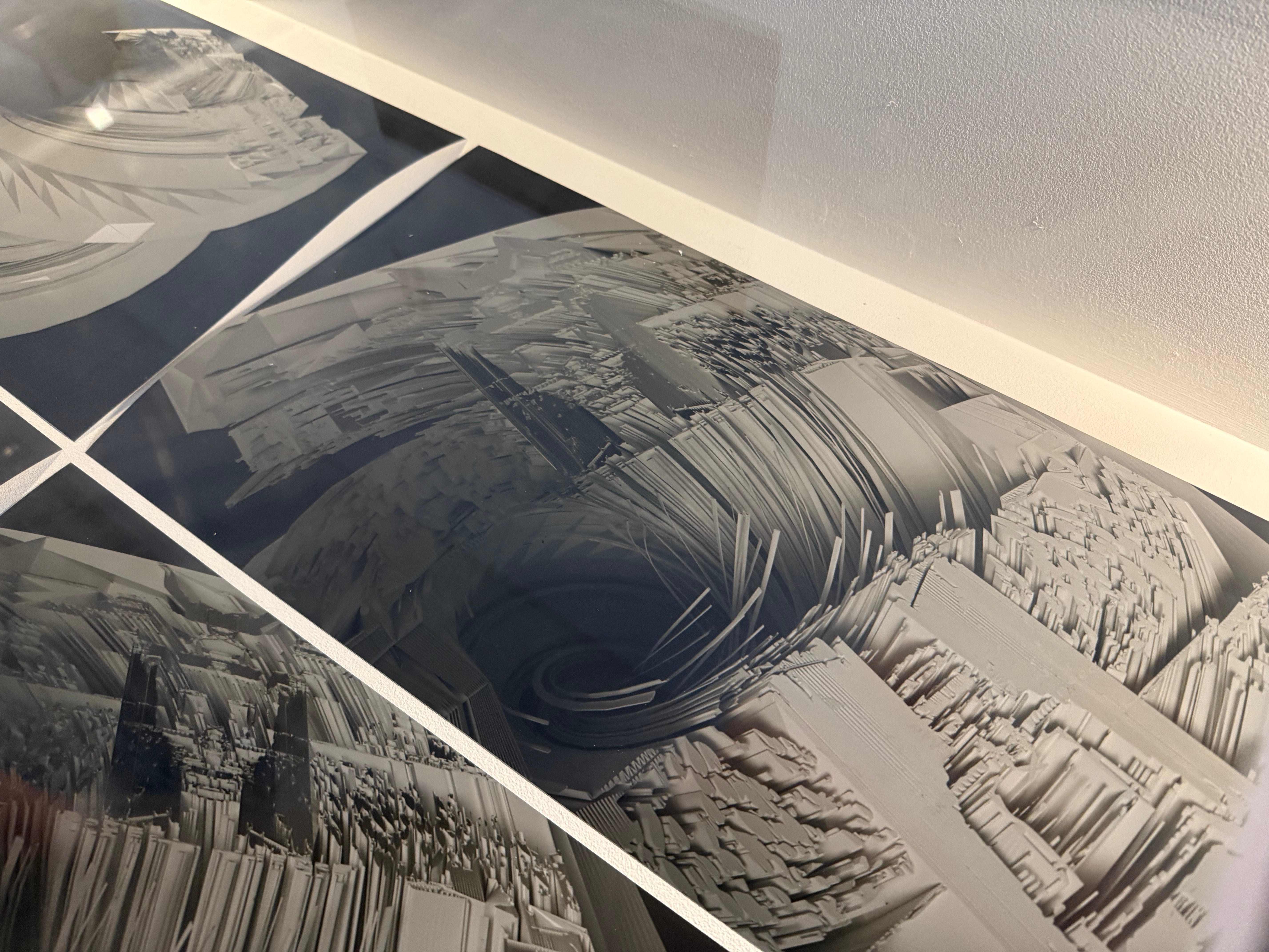
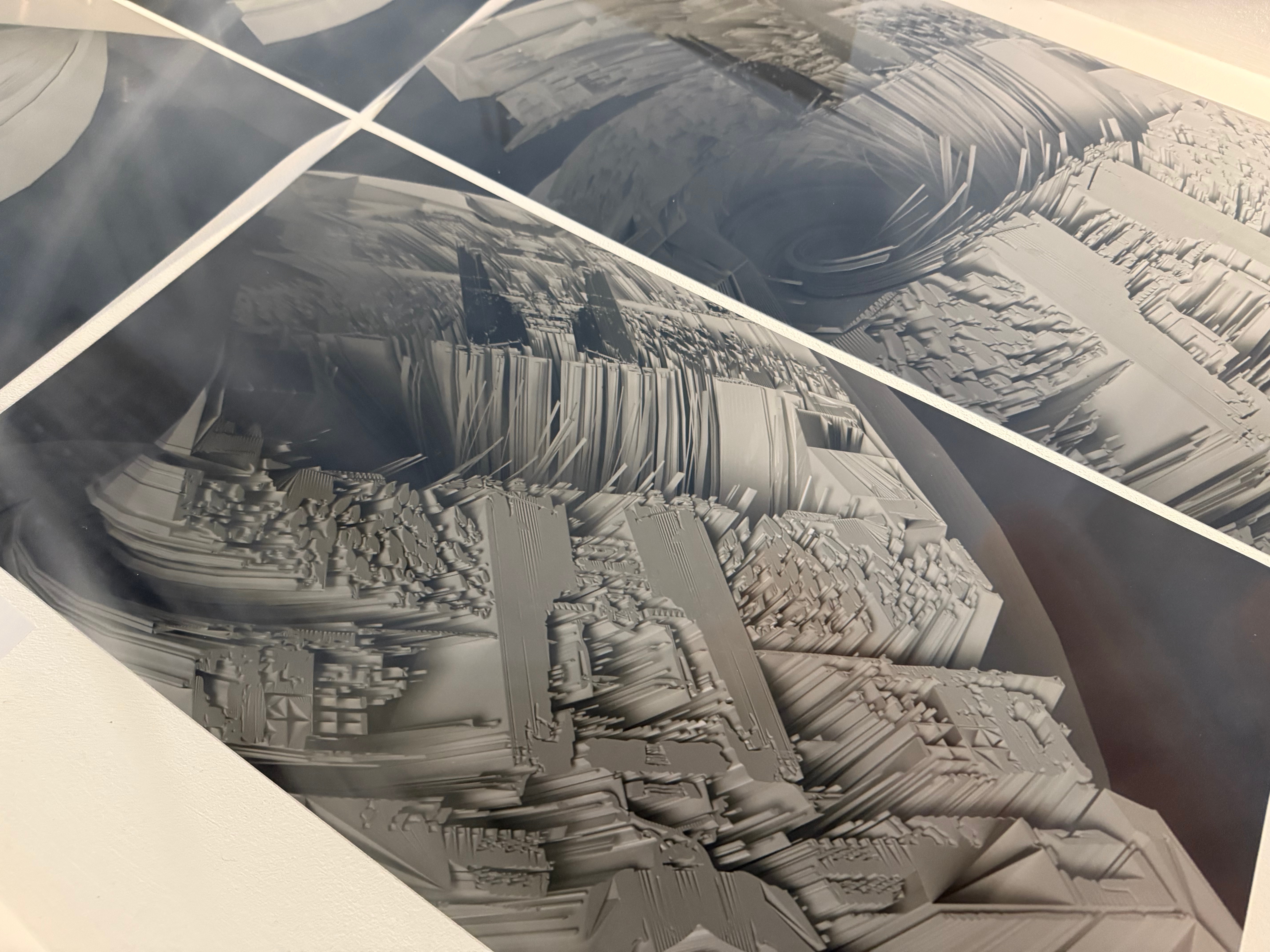
Looking through the Trove Digital Archive and searching for Clydebank now with this vision of people and Glasgows industrial past has narrowed my search, below is some images taken from the archive that caught my eye either for their artistic vision or the potential to use them within my work somewhere.

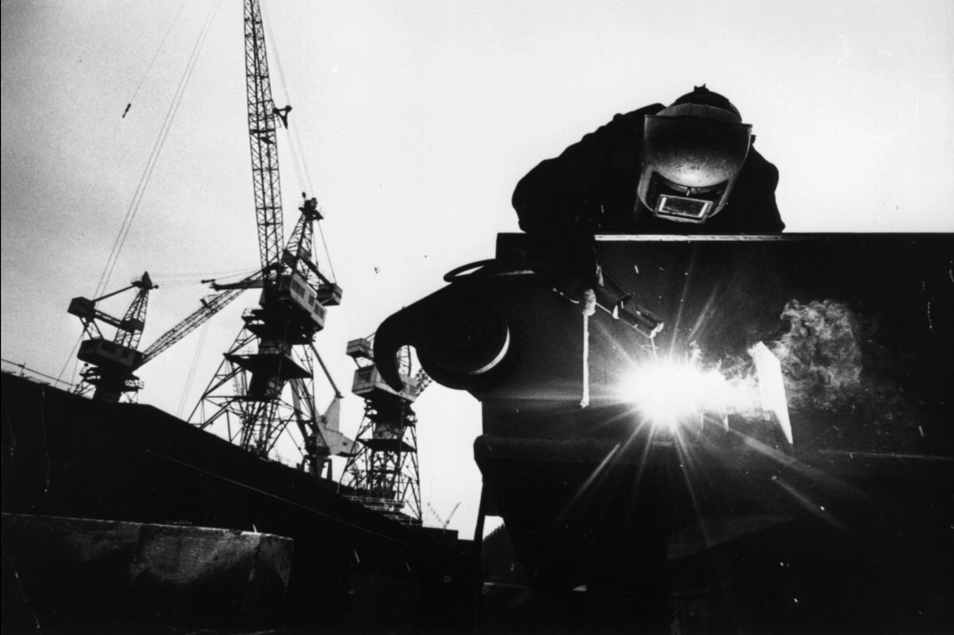
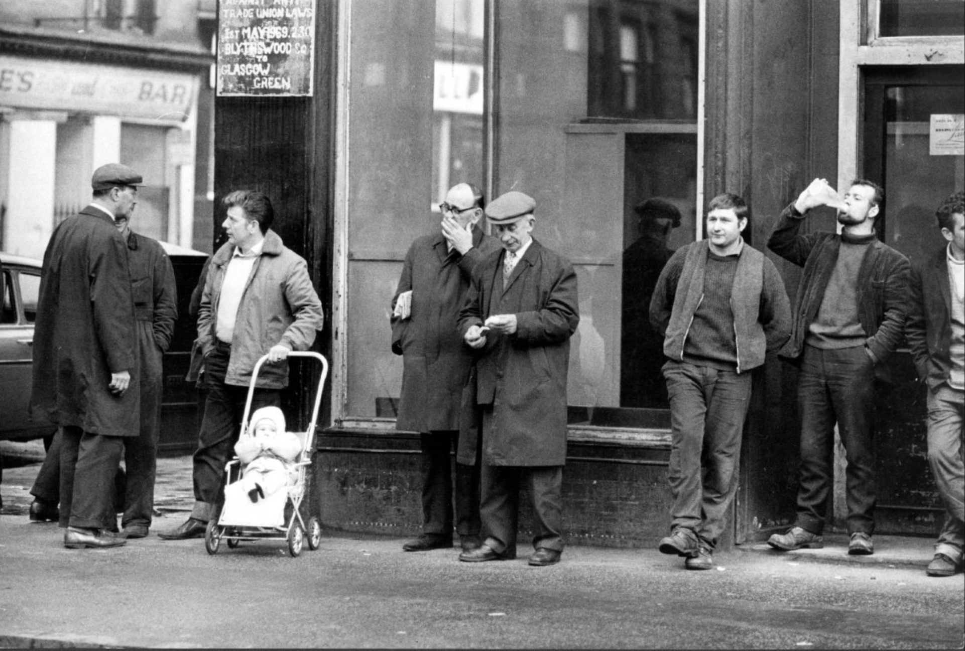
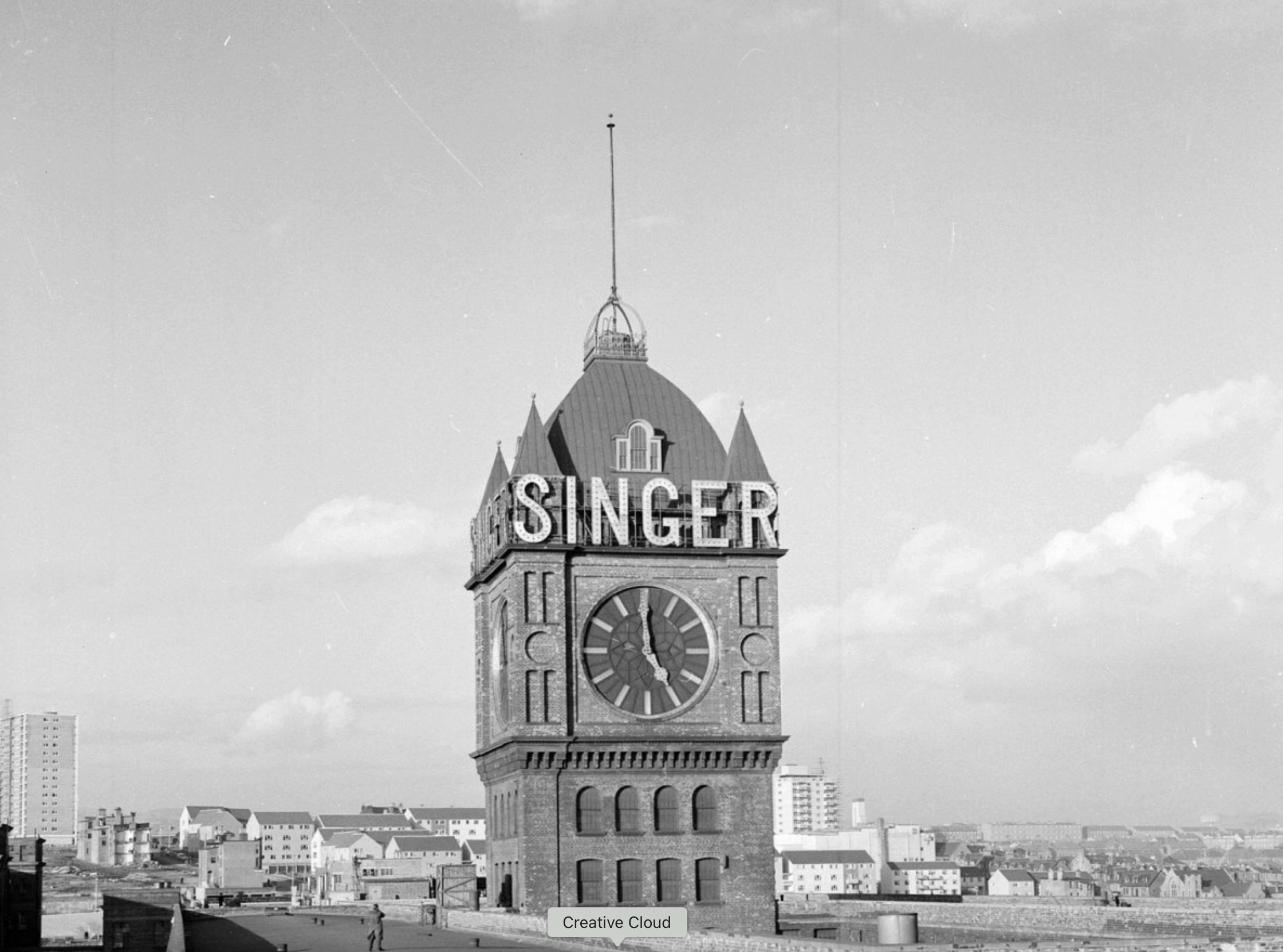
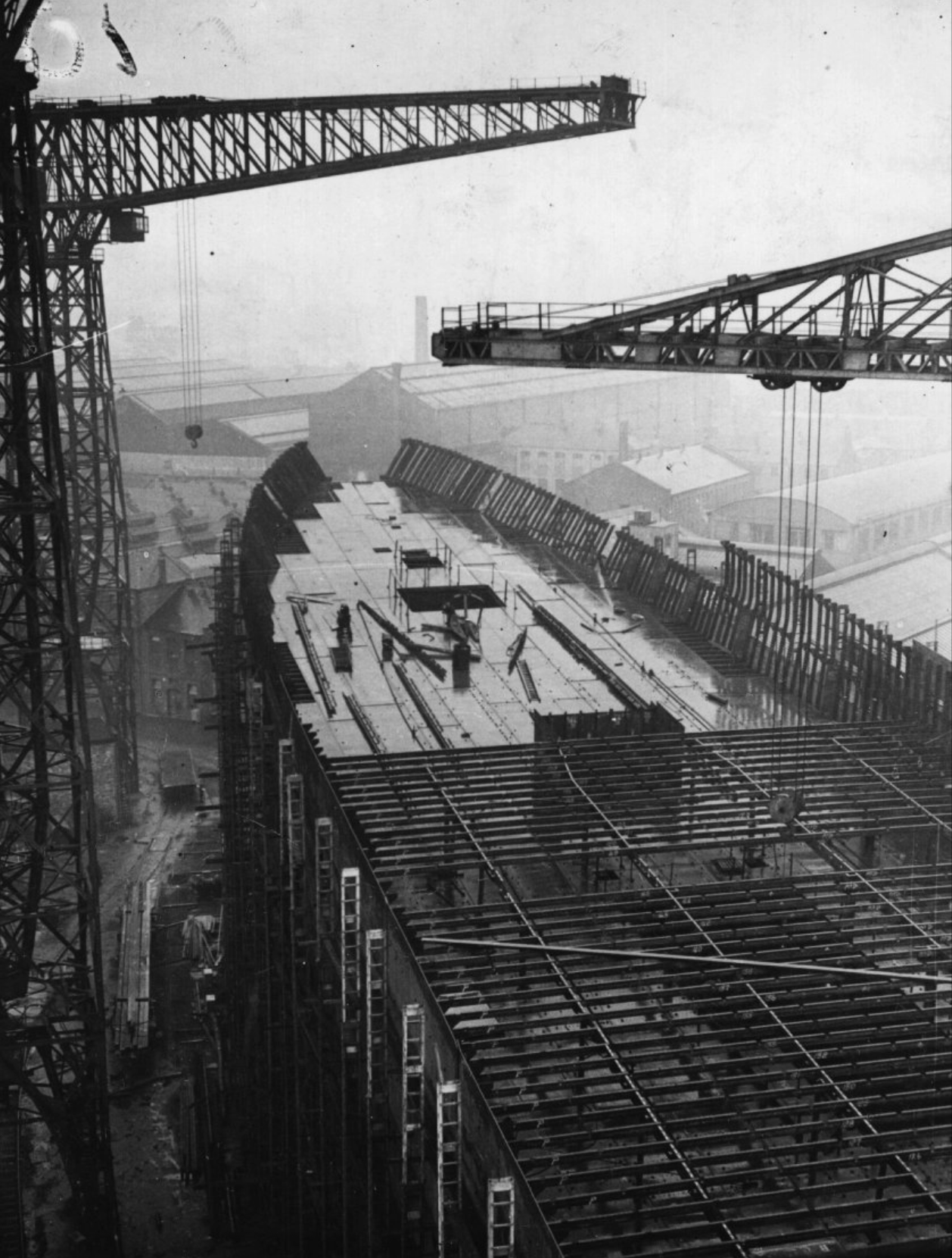
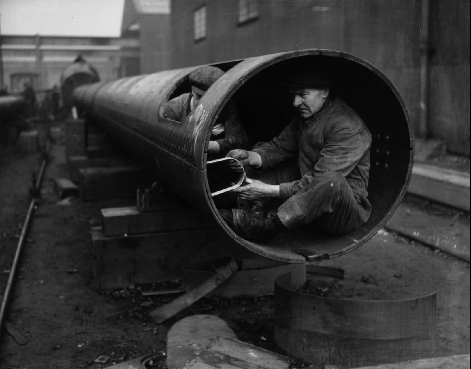
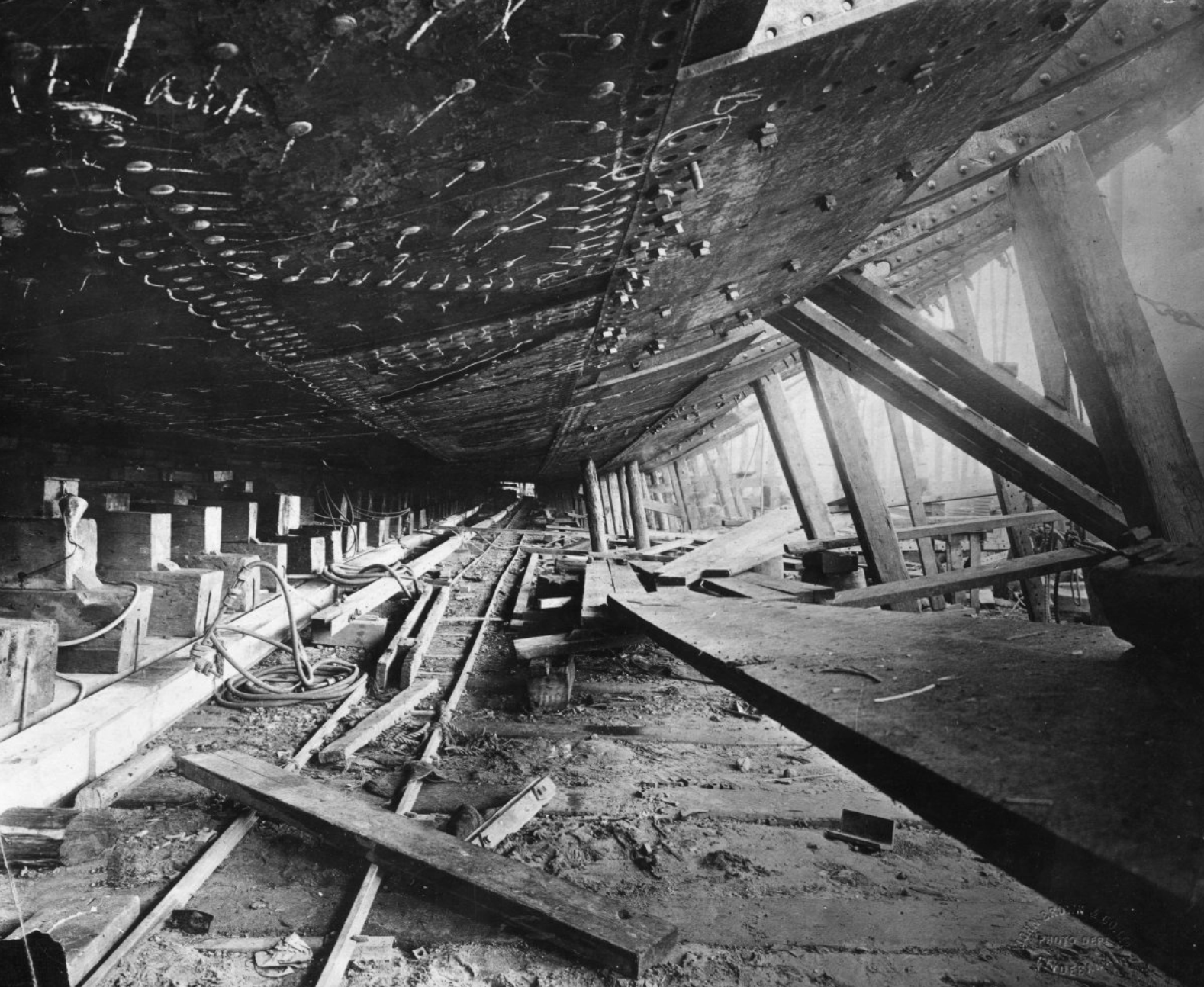
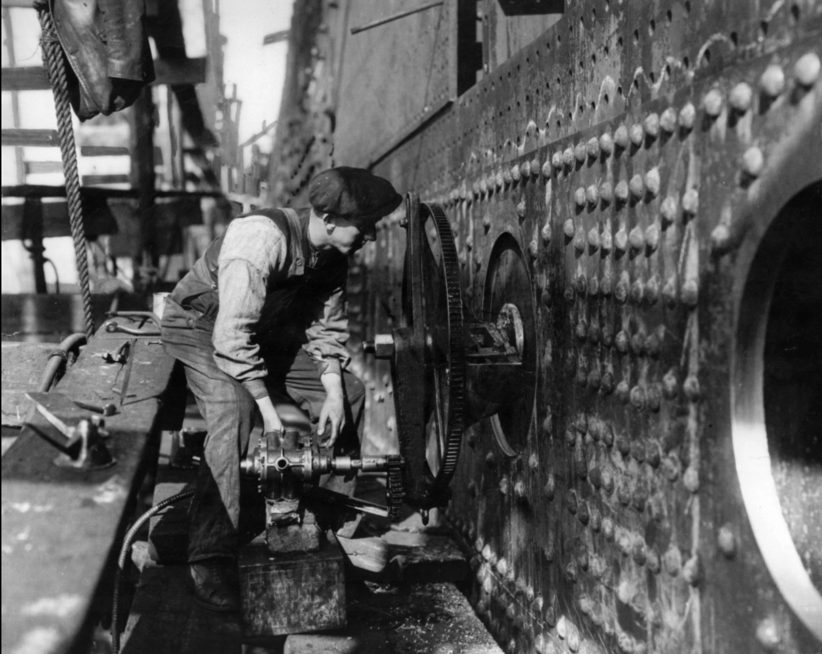
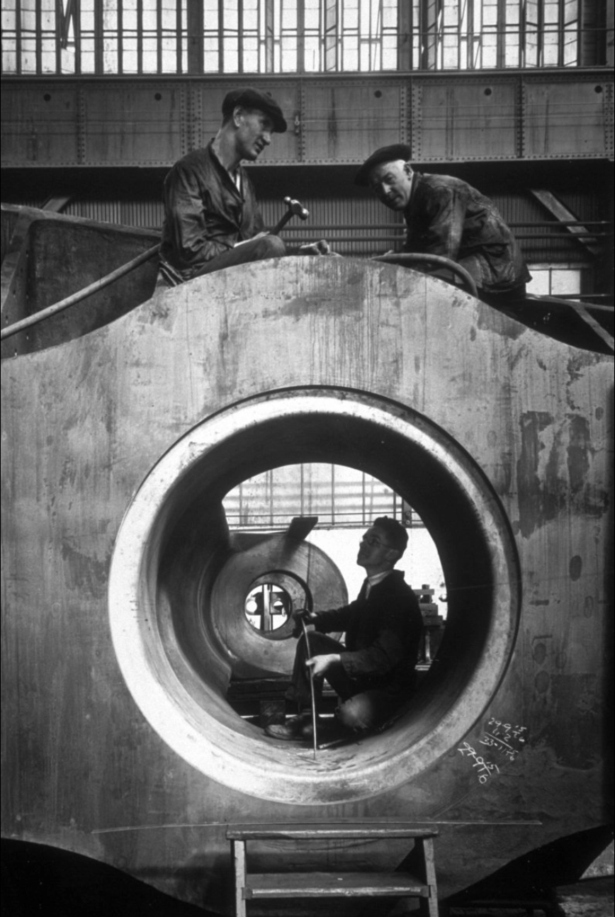
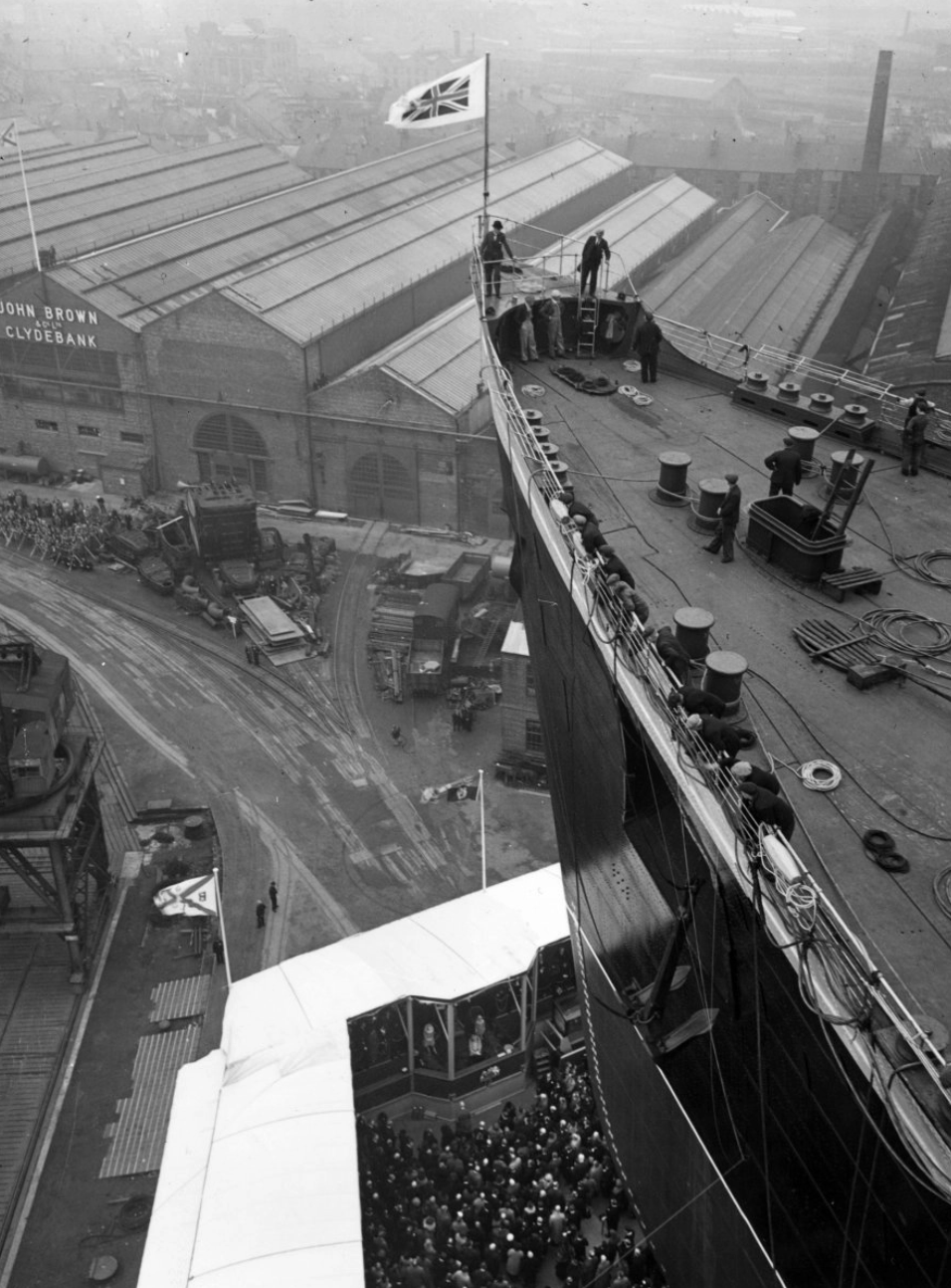

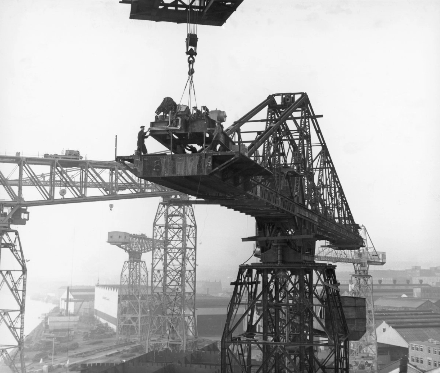
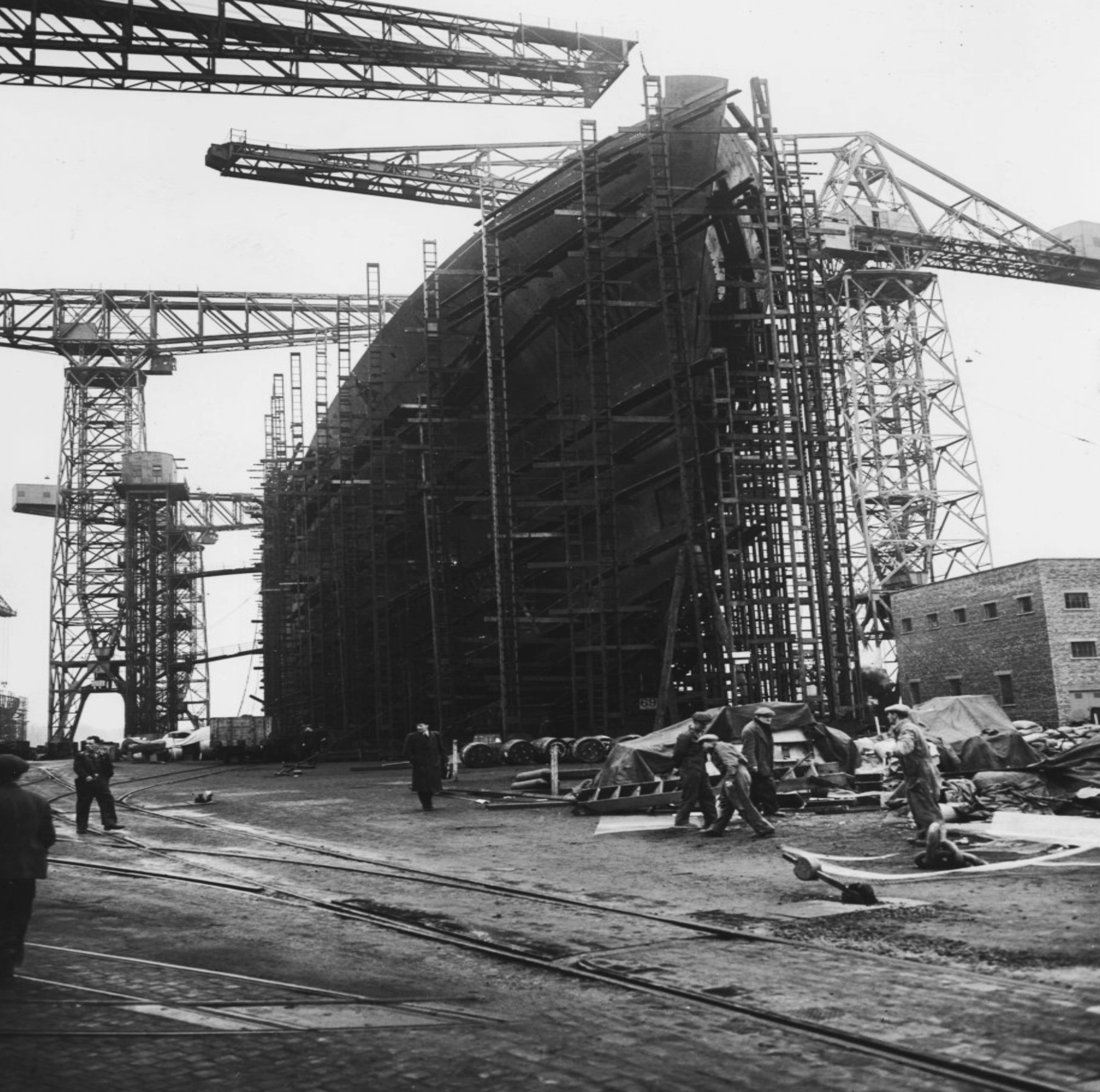
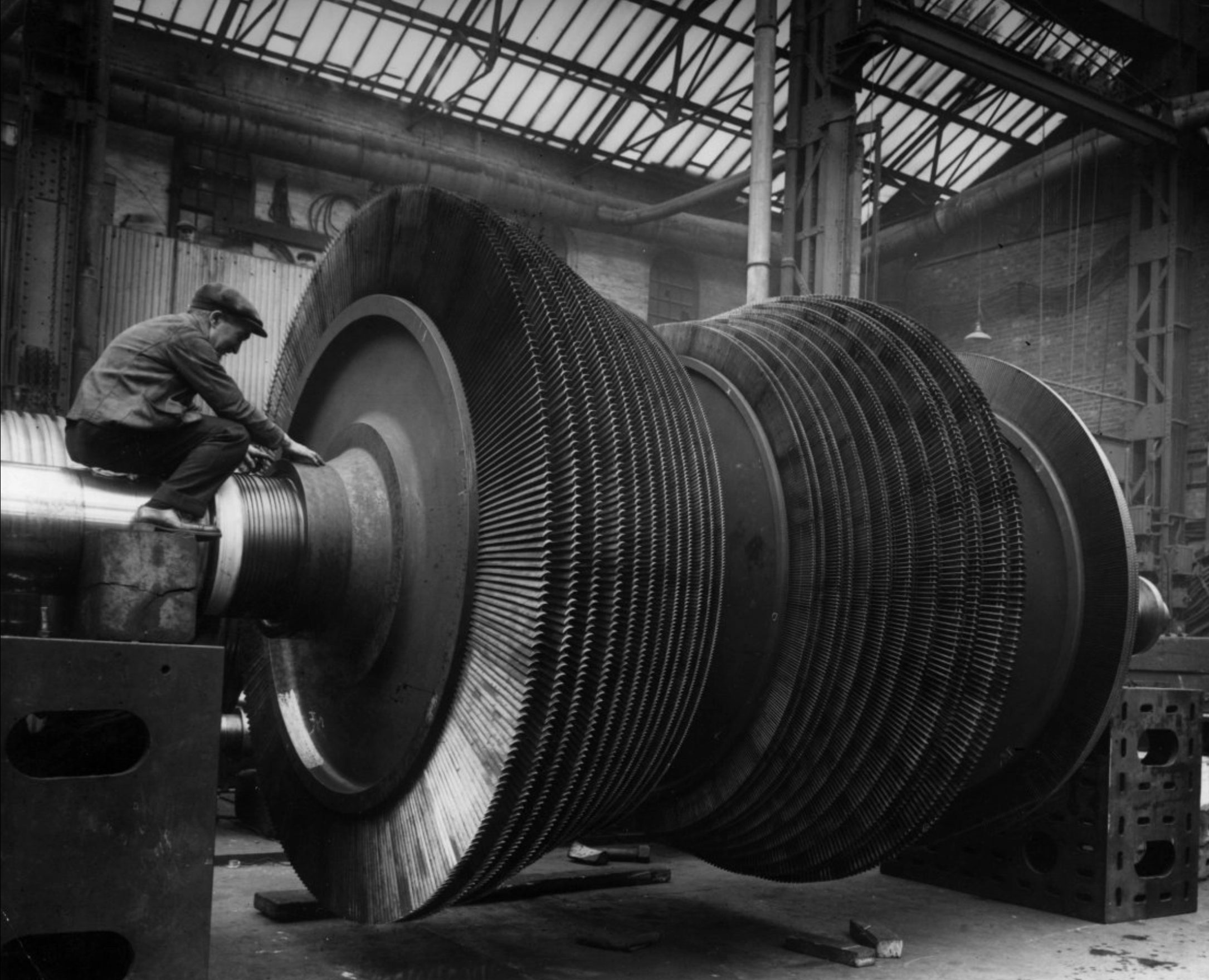
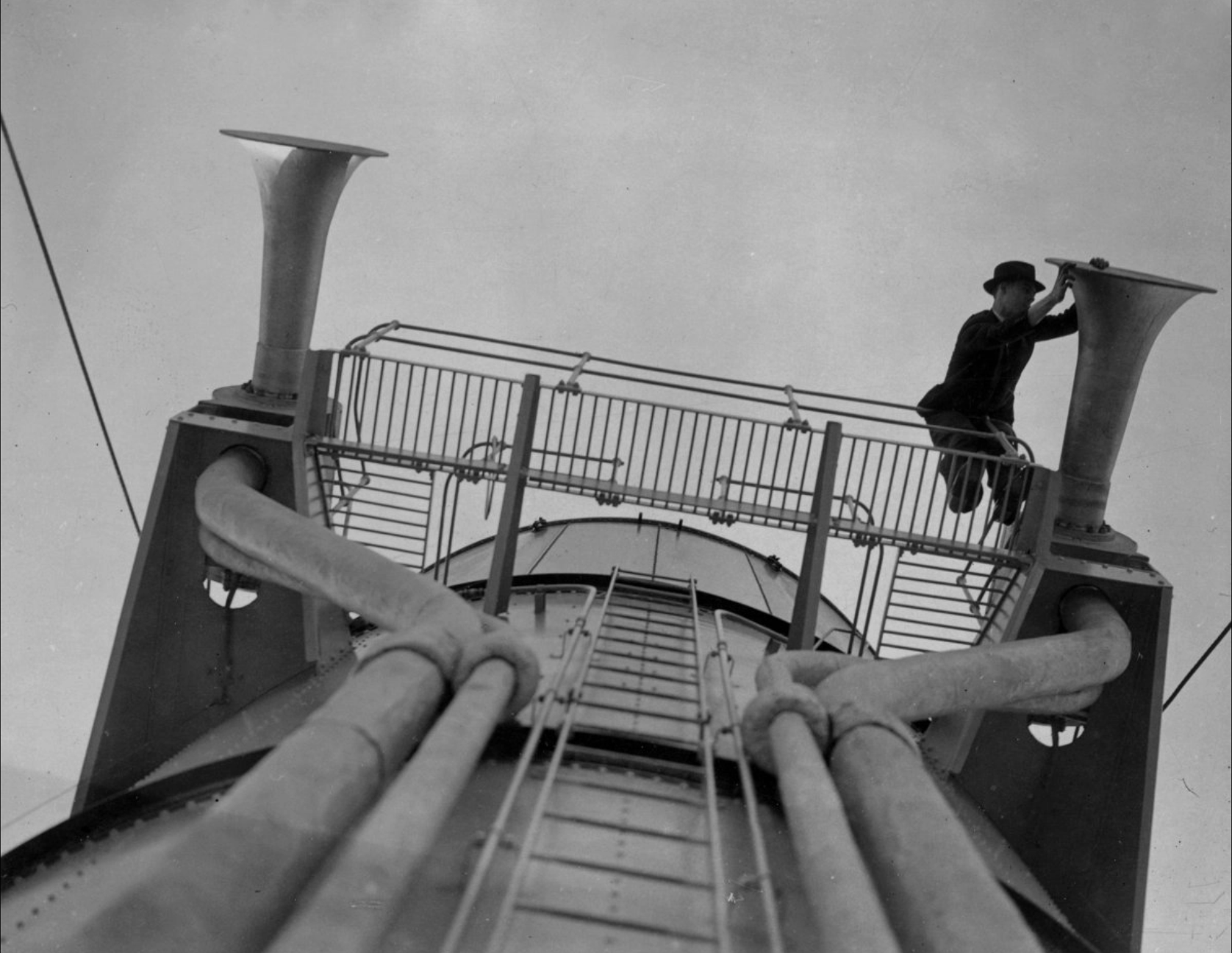
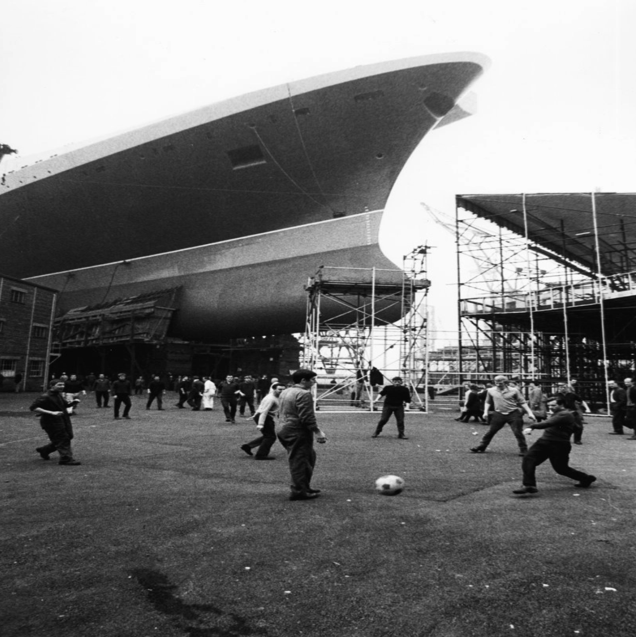
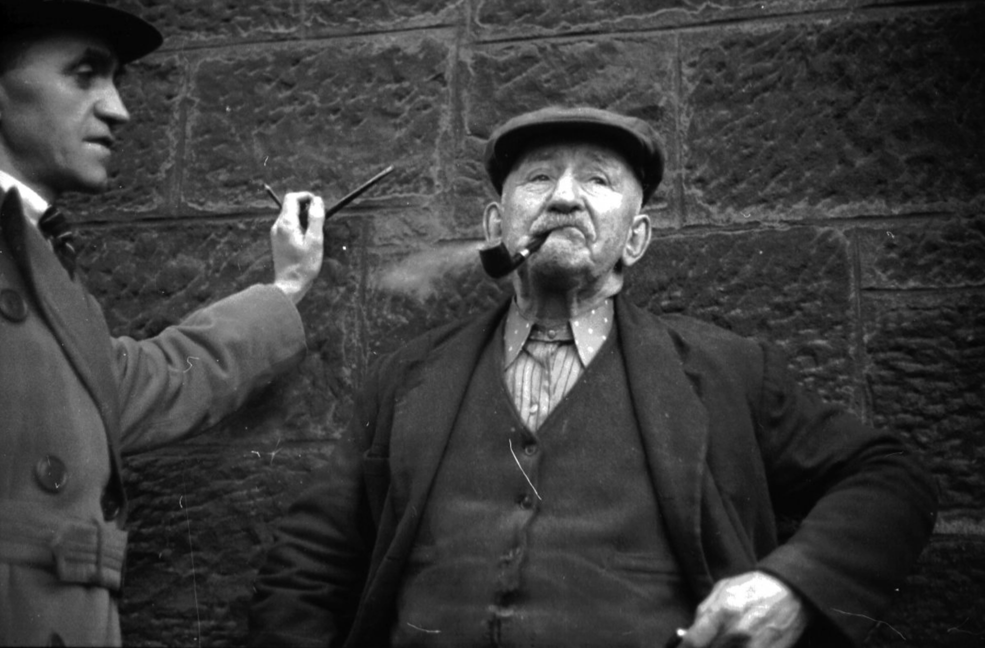
With this gallery of collected archival images, I wanted to paint the visual and linguistic image of the work. I think that black-and-white images with choice colours, or full-colour images with them, will draw more attention to them, highlighting certain aspects, people, or places.
Another detail I want to point out with some of these images is the difference in scale, the relationship between the structures and the people that build them.
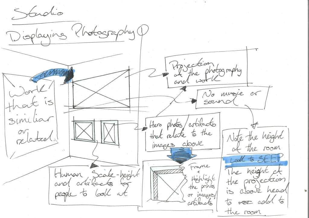
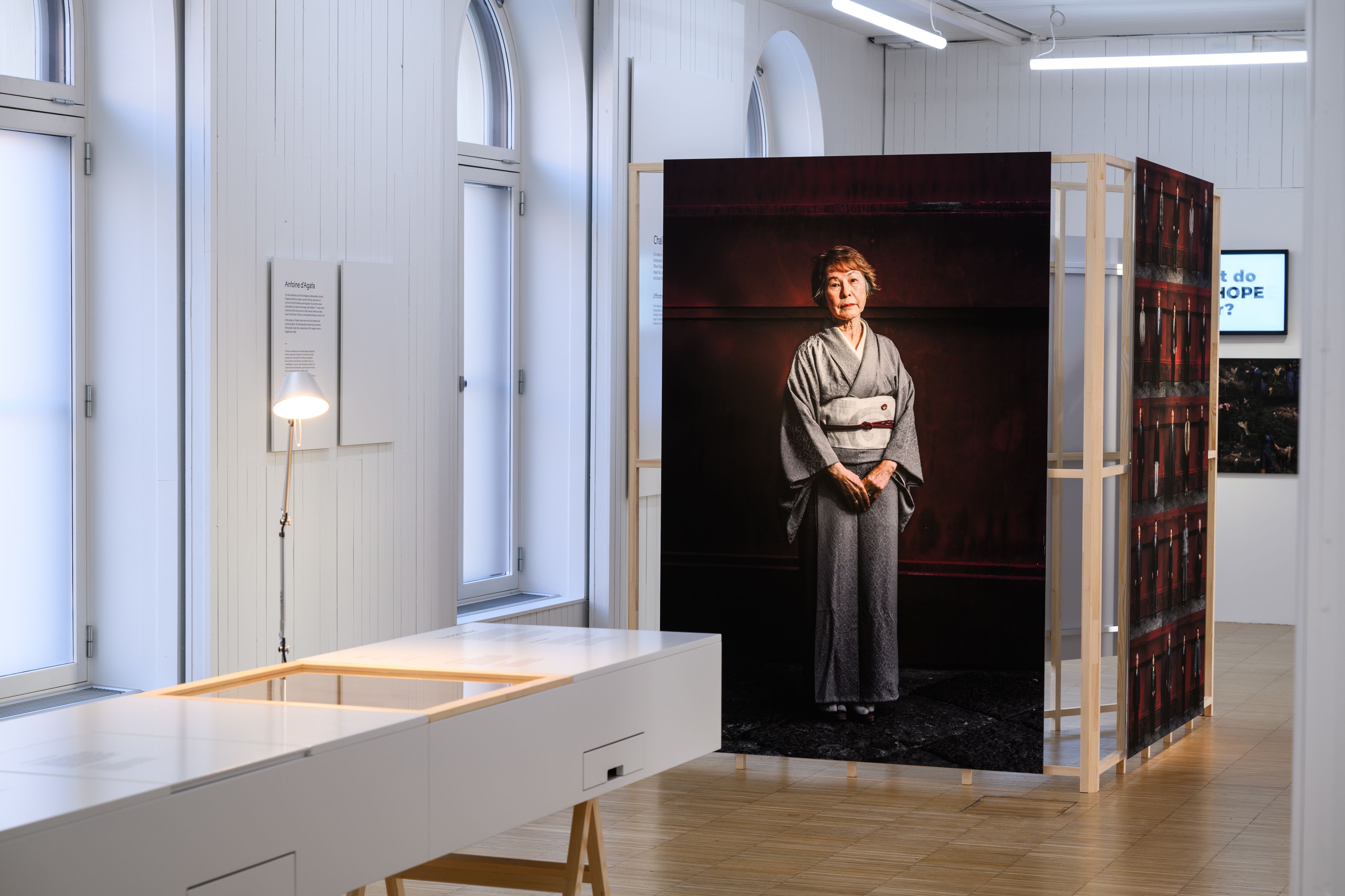
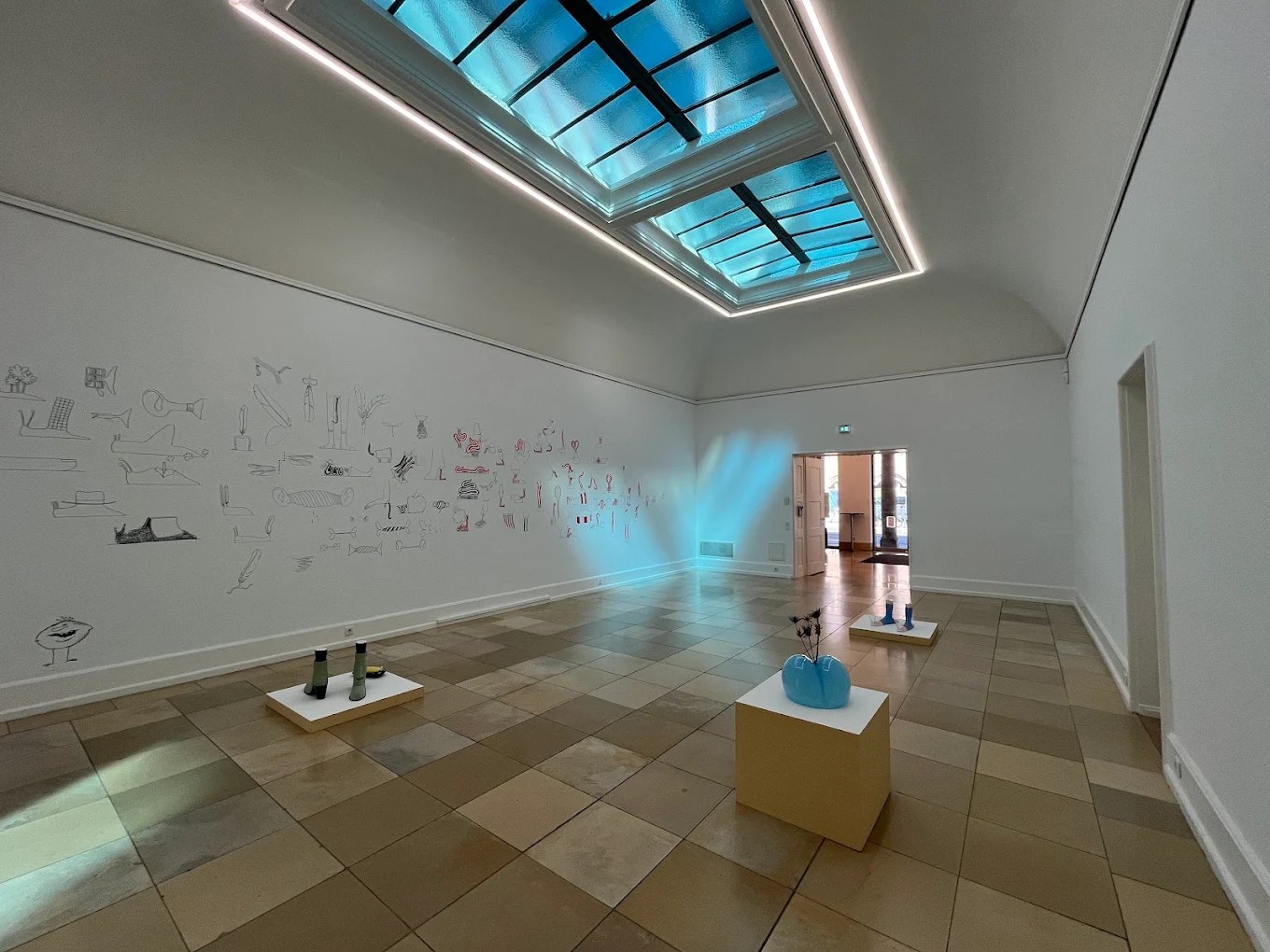
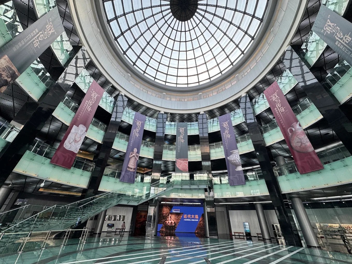
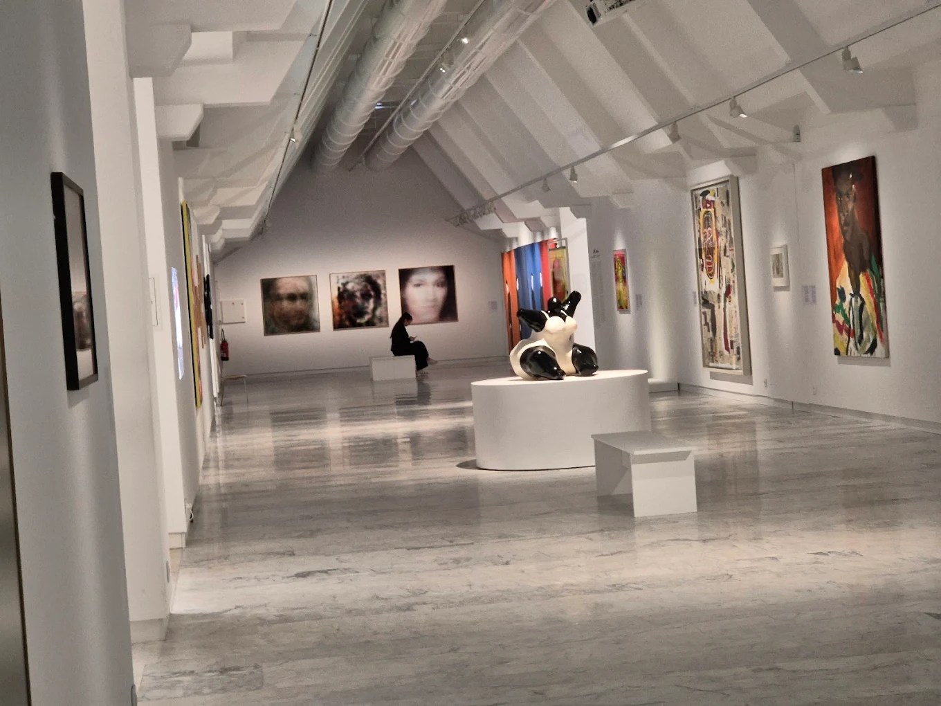
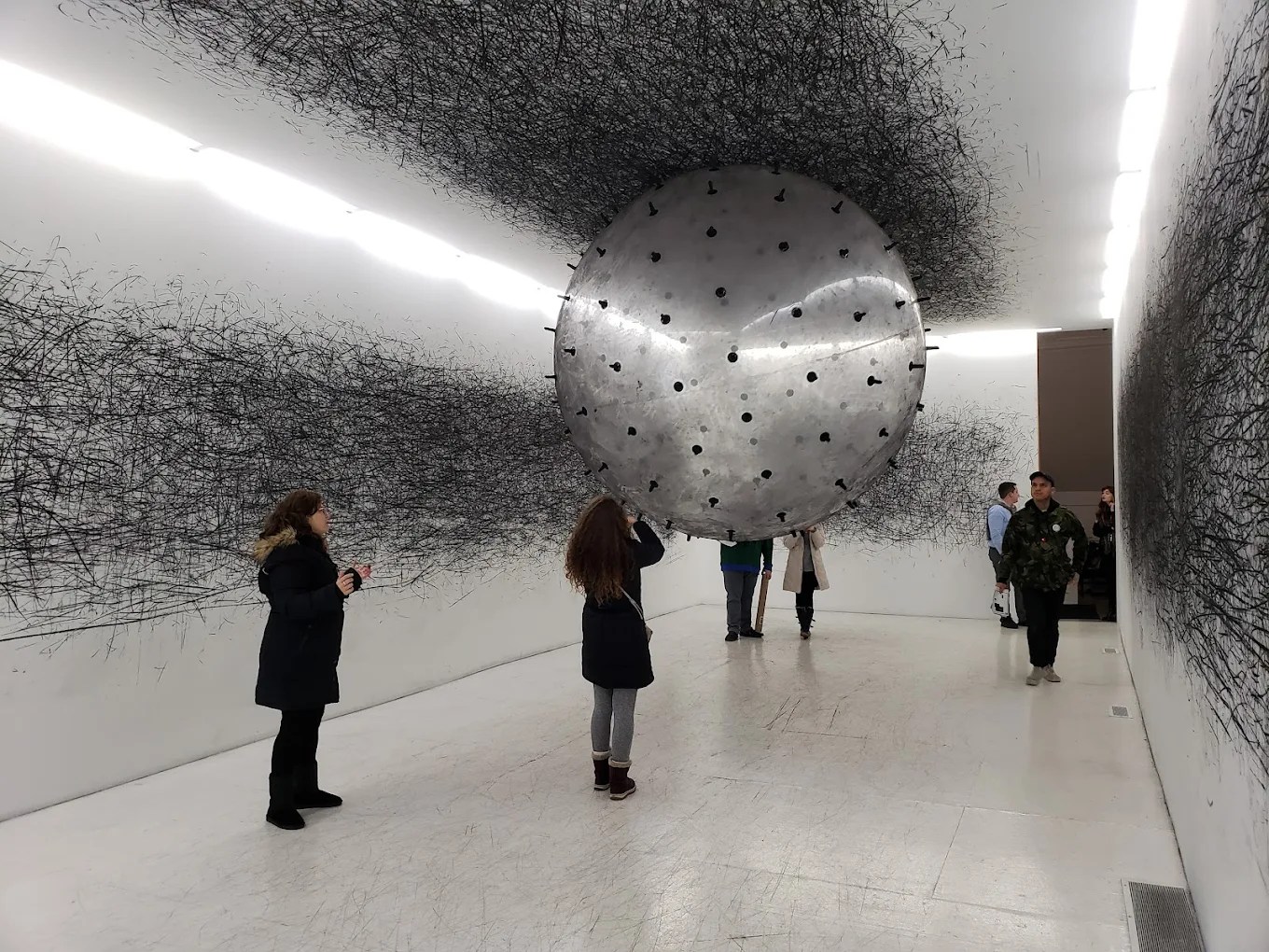
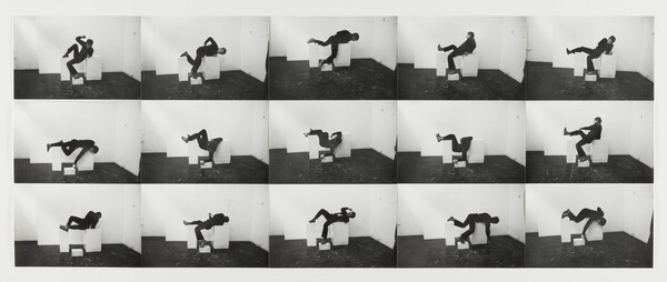
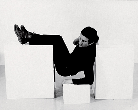
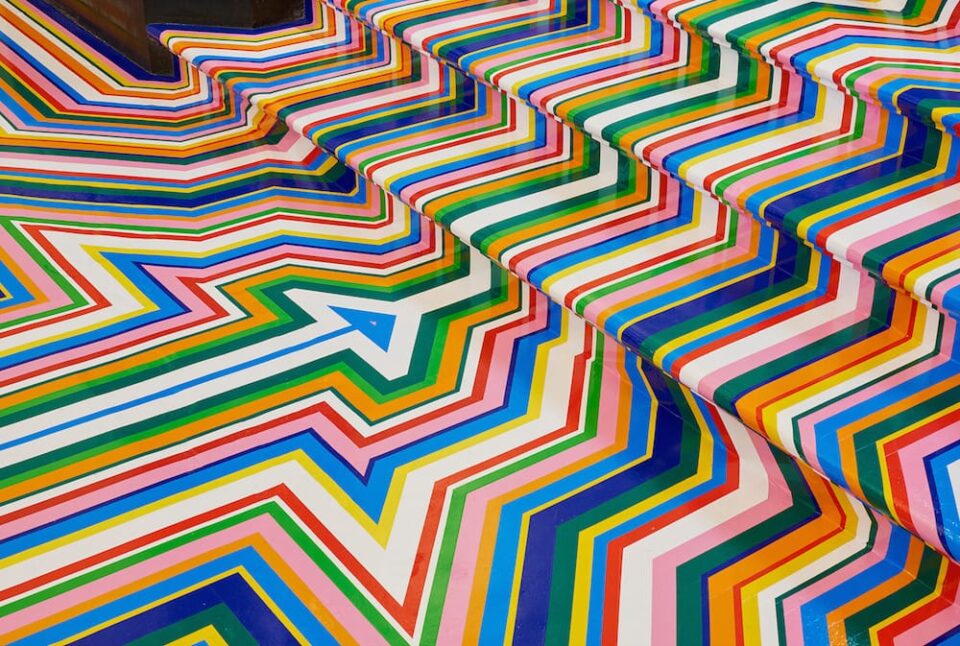
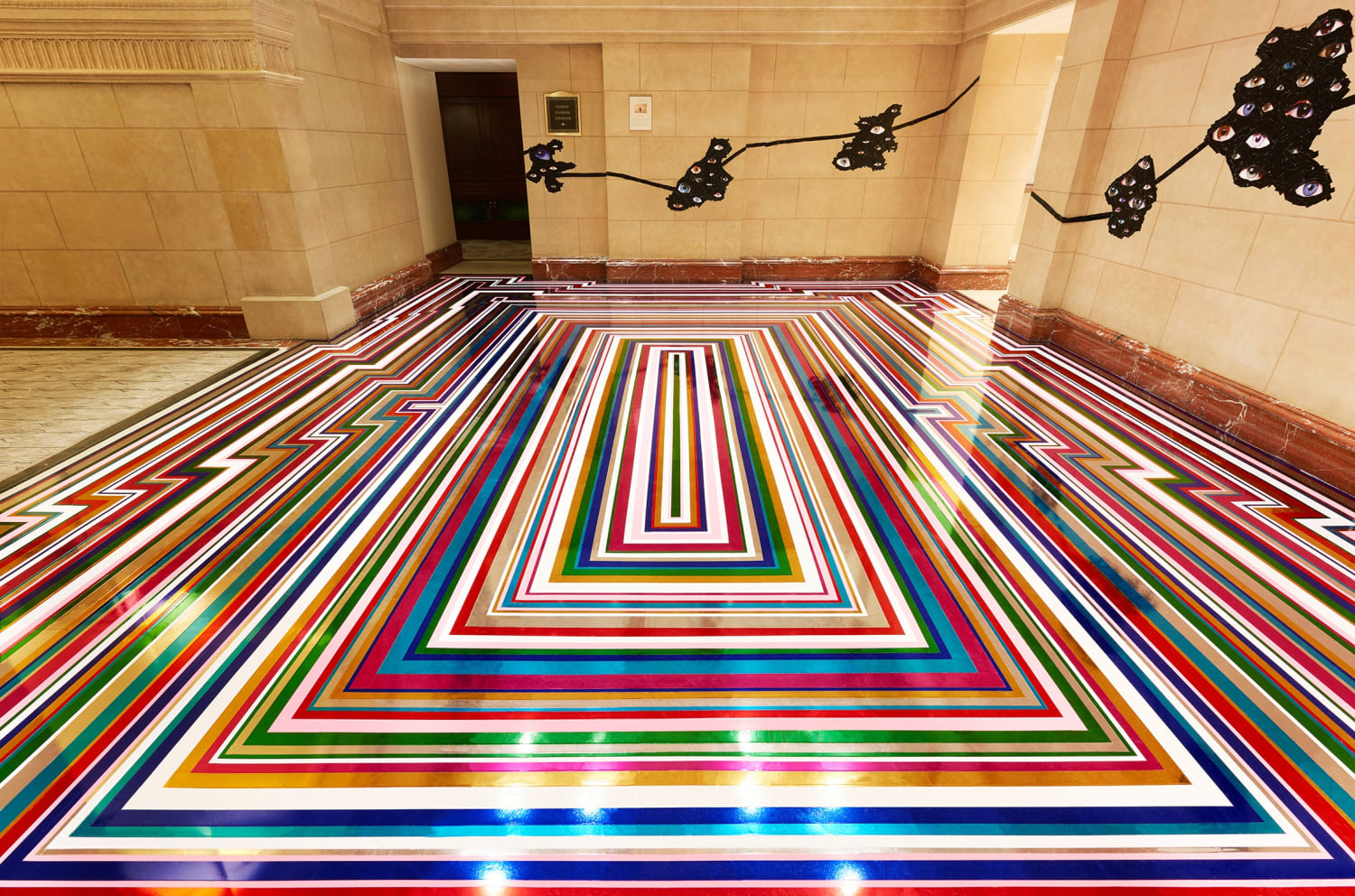
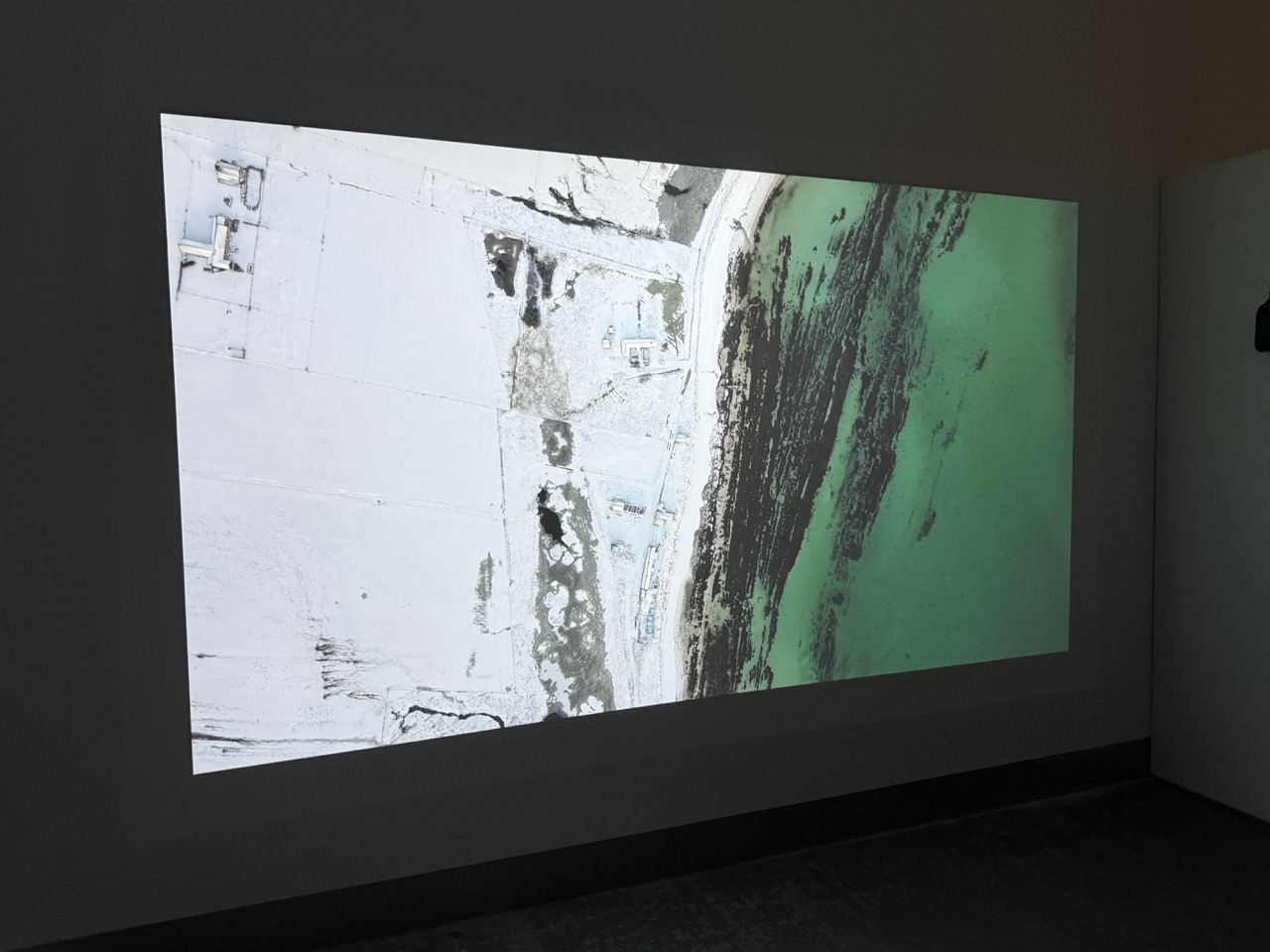
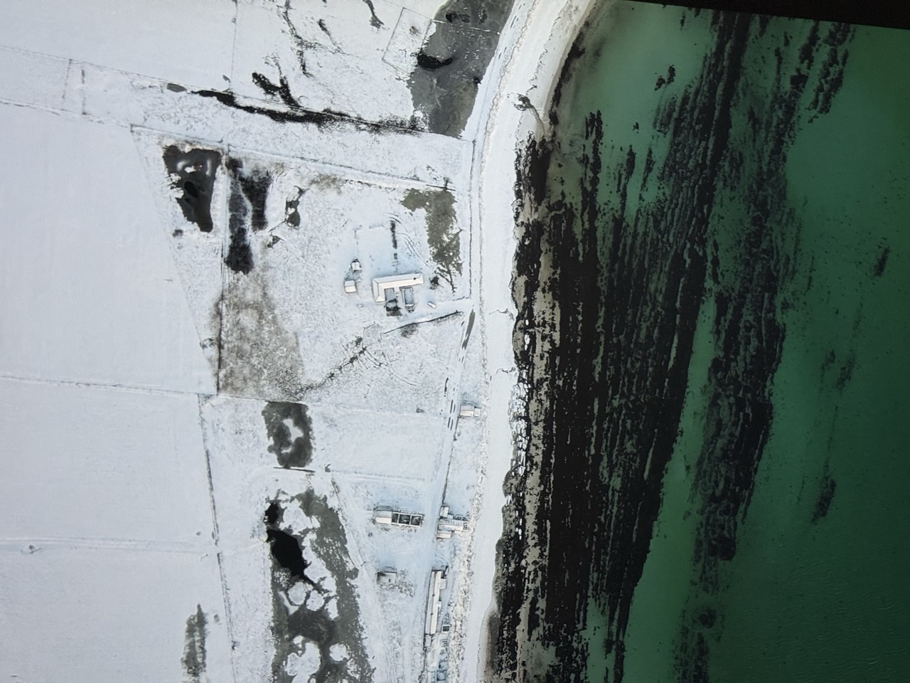
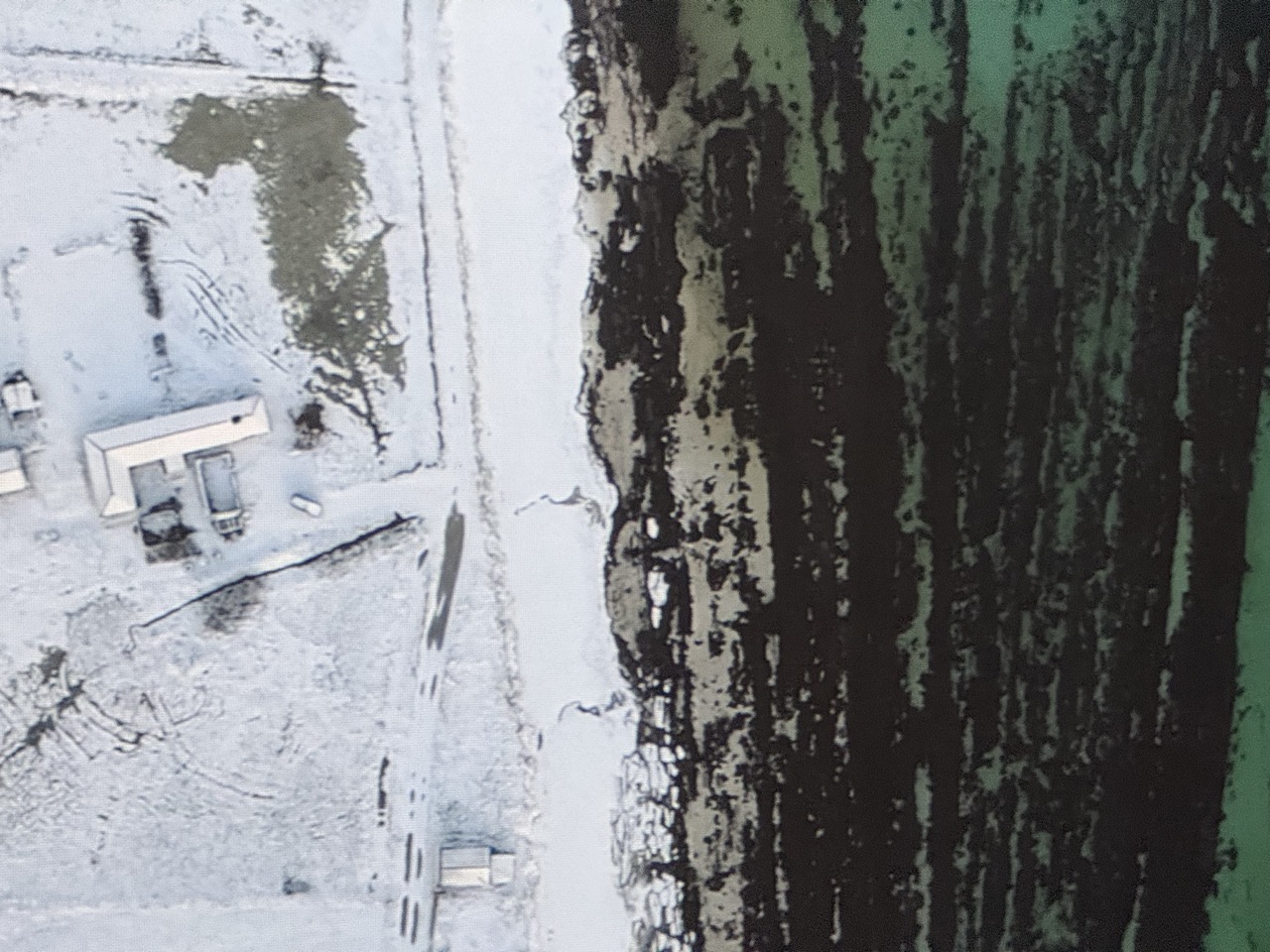
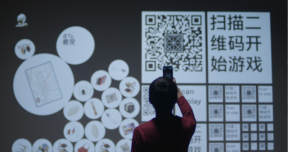
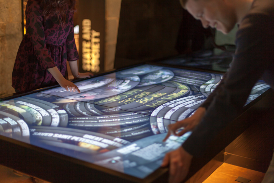
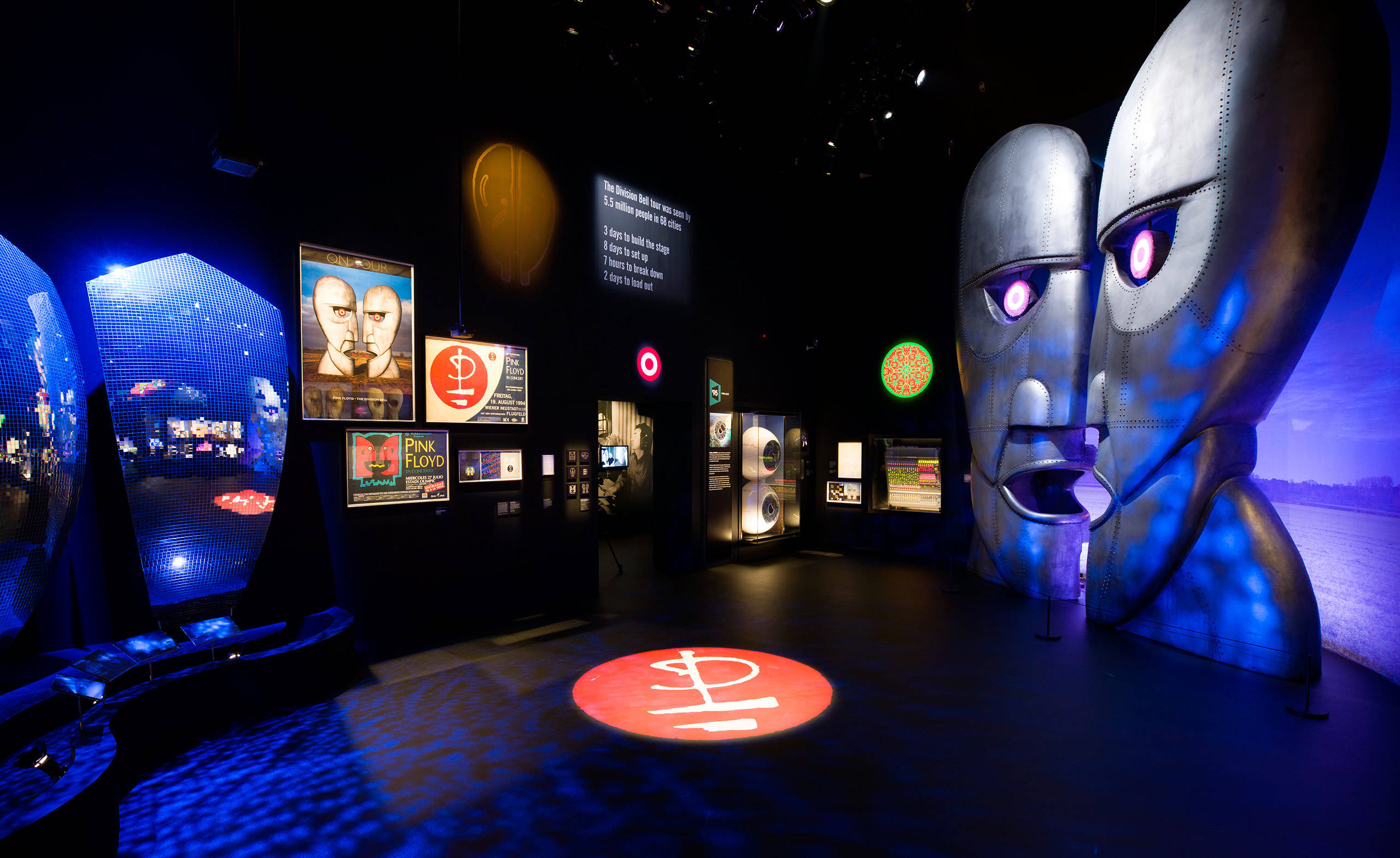
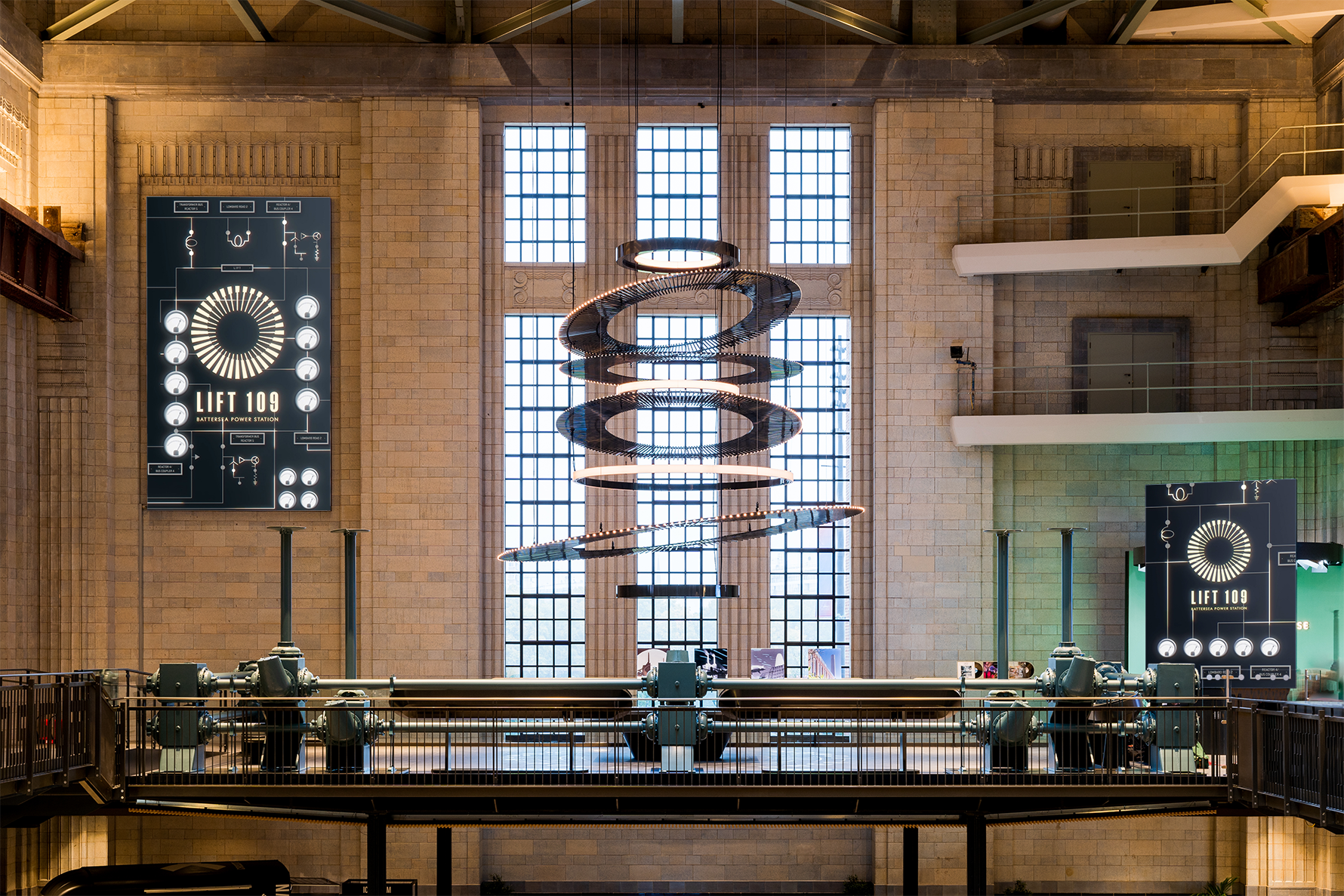
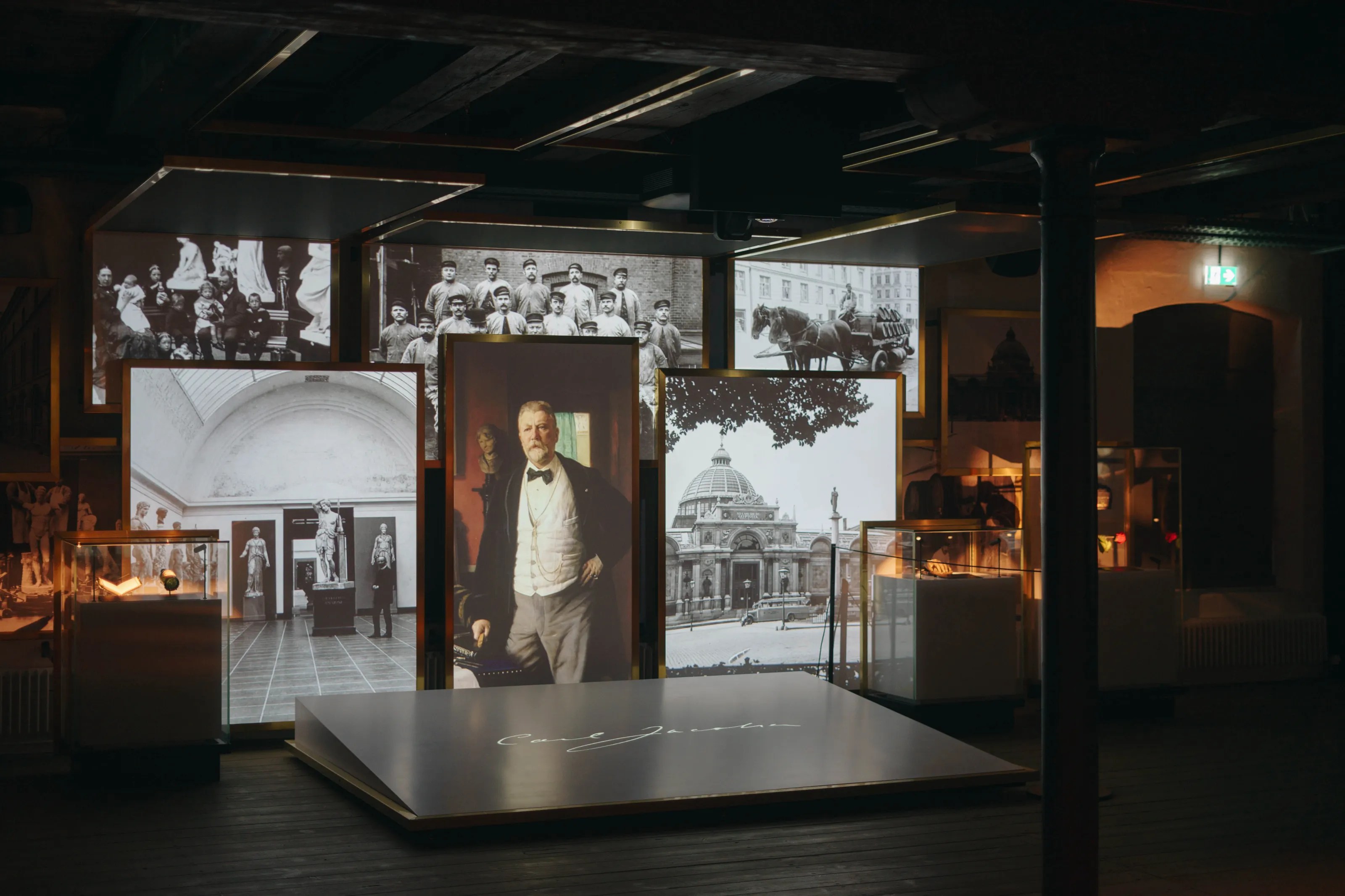
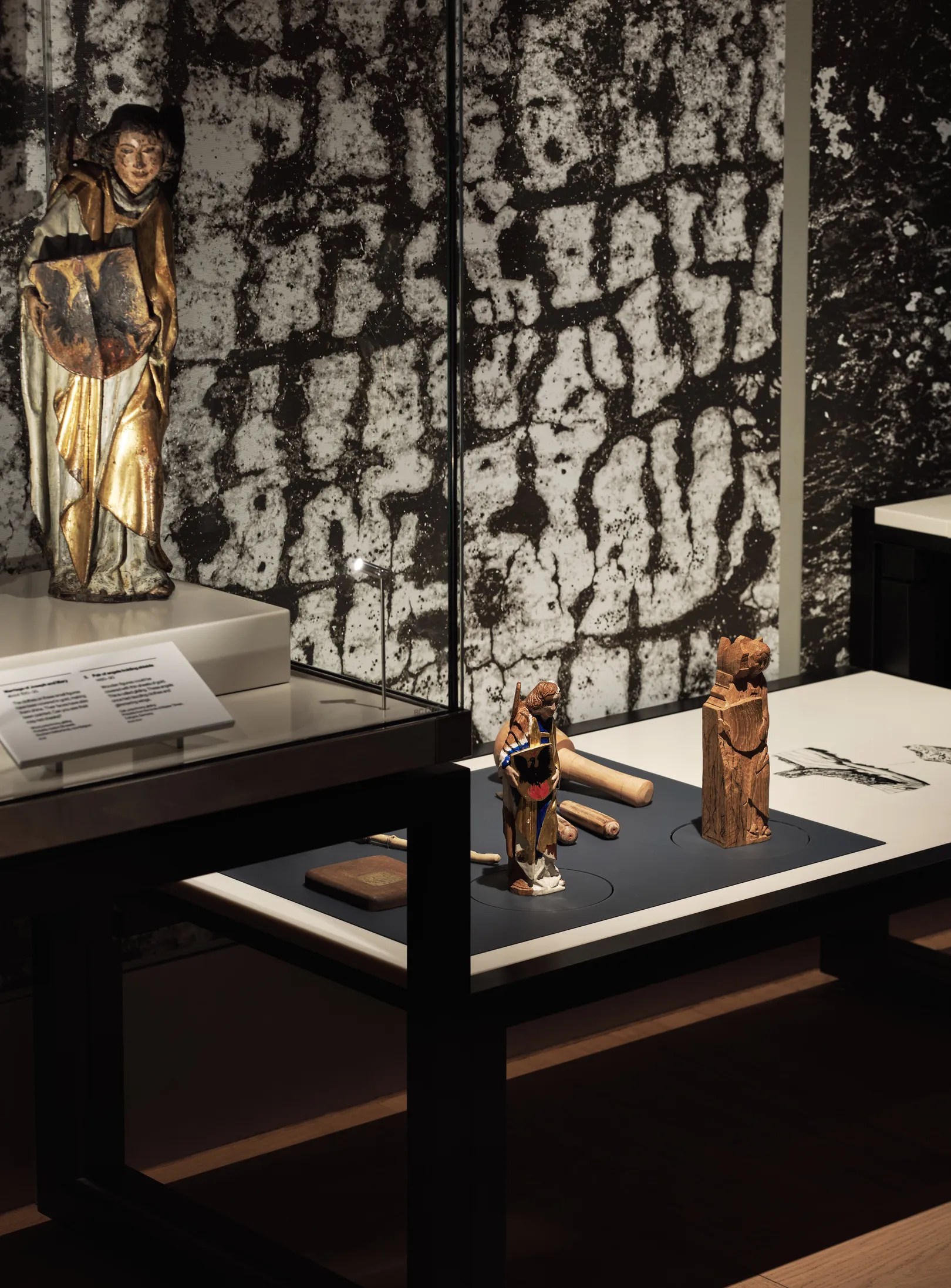
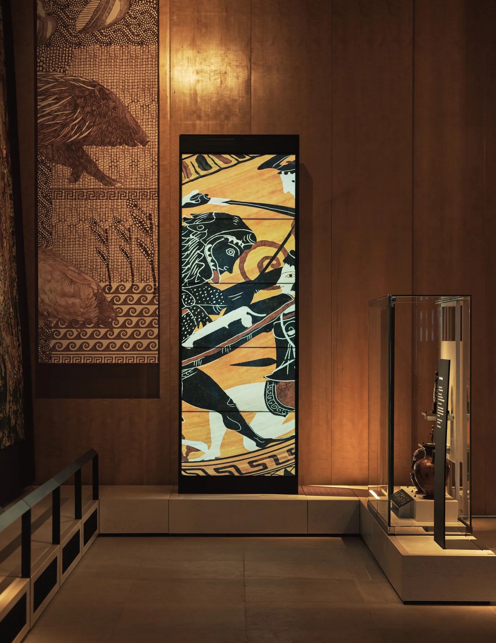
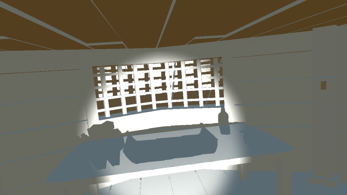
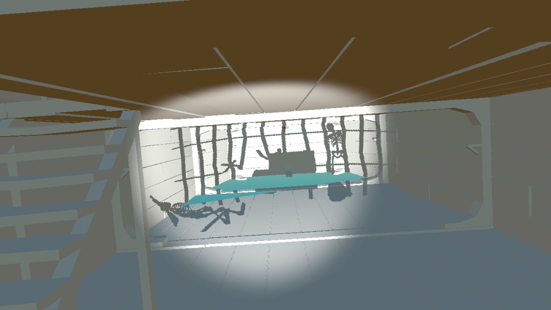
Finally Seeing SEEP:
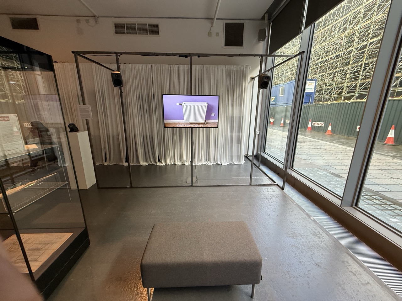

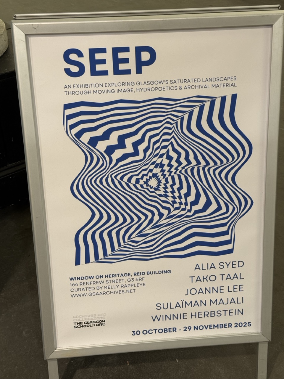
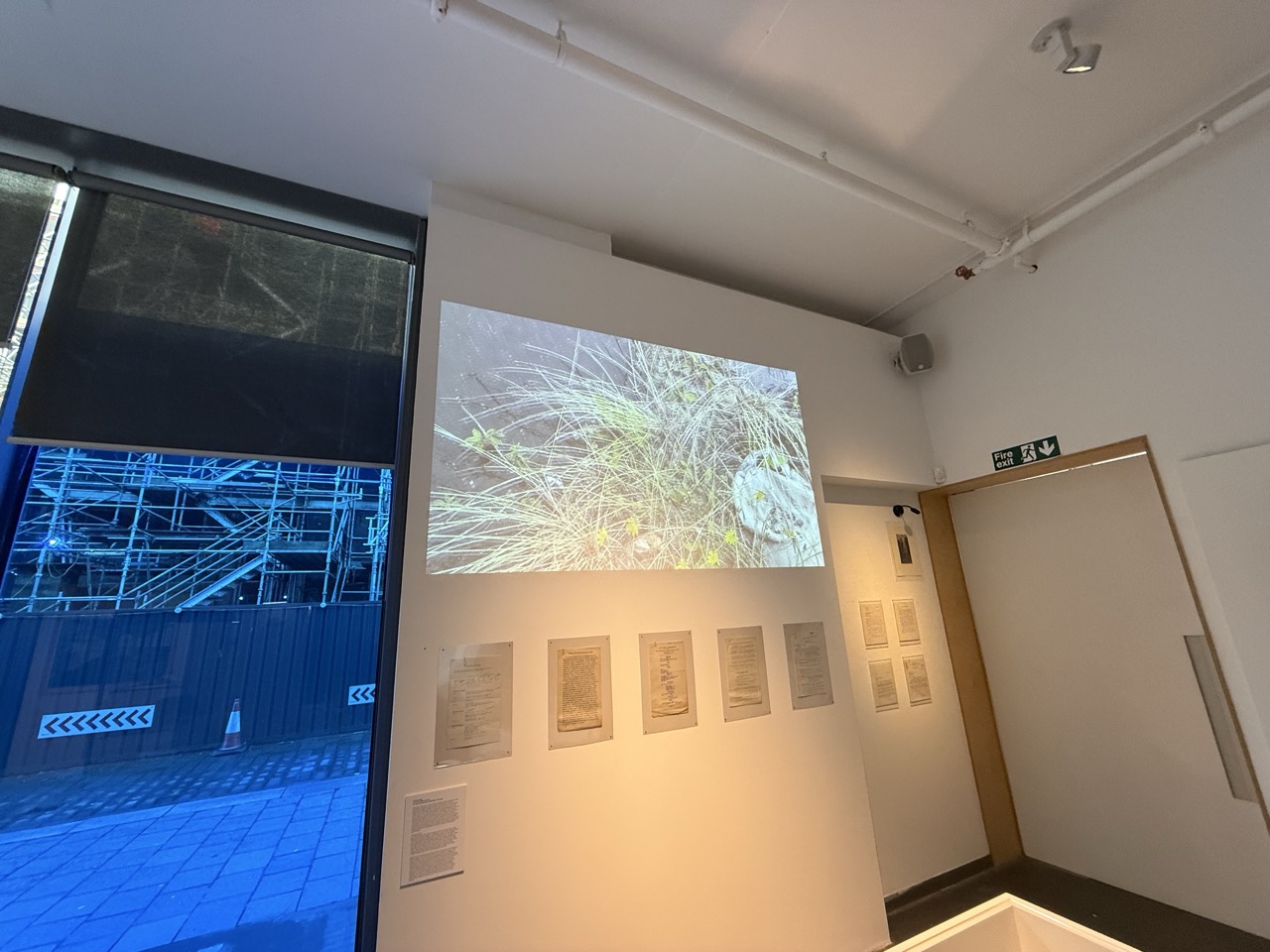
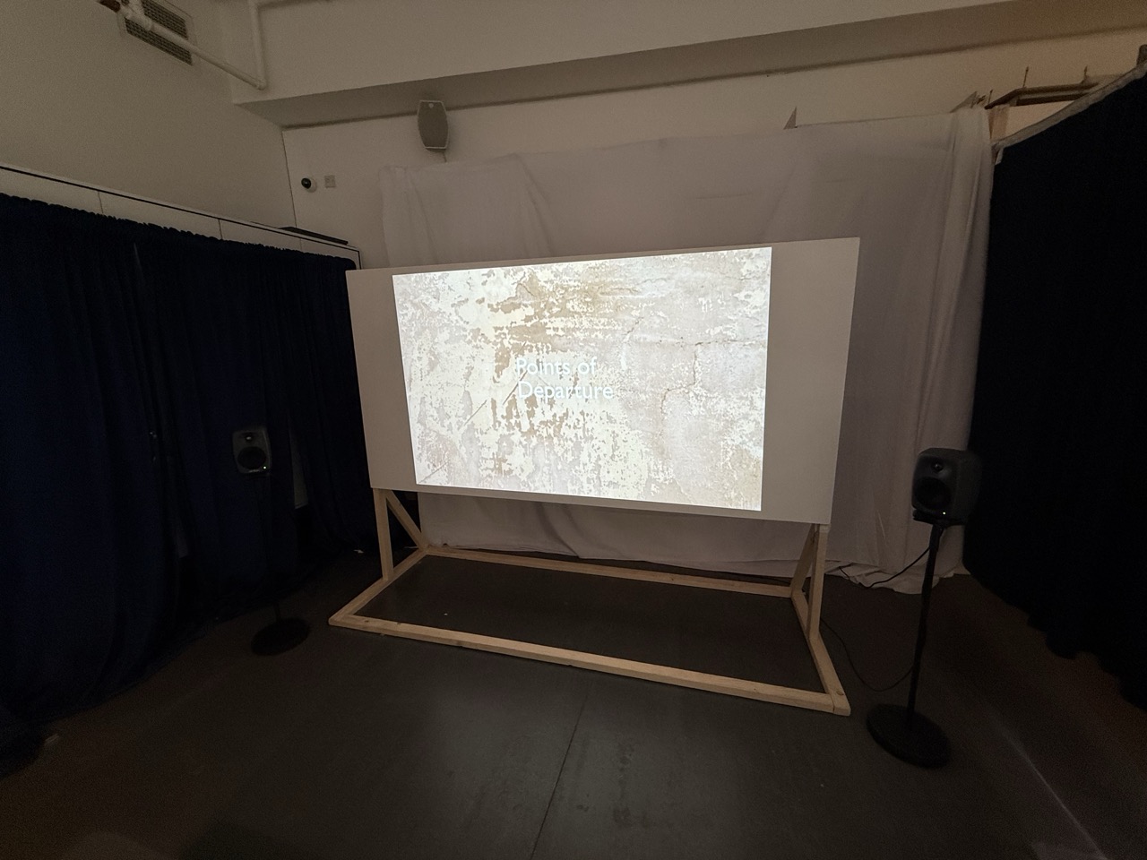
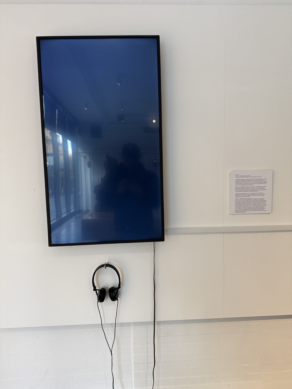

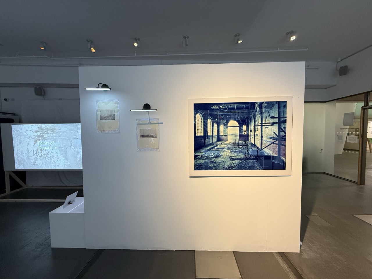
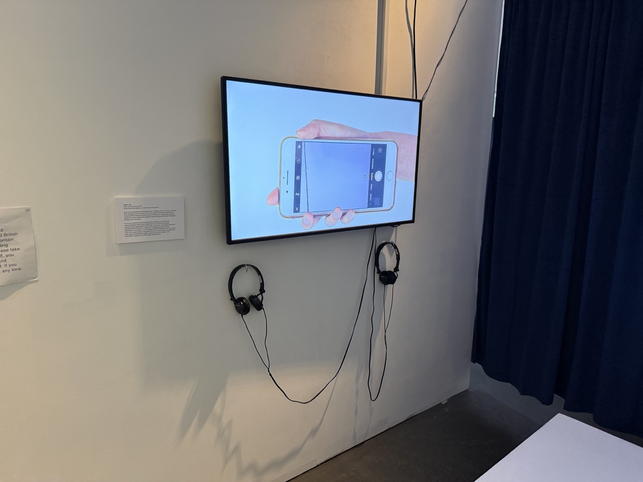
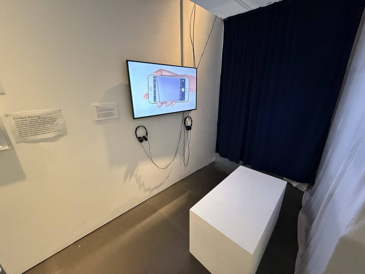


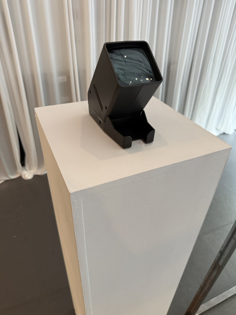
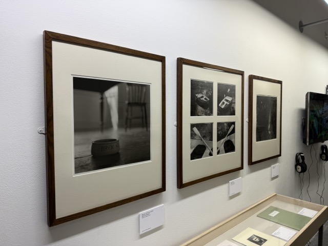
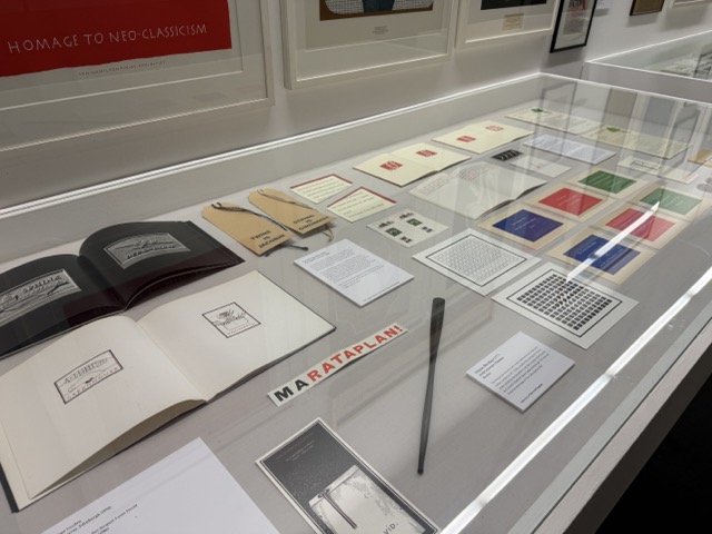
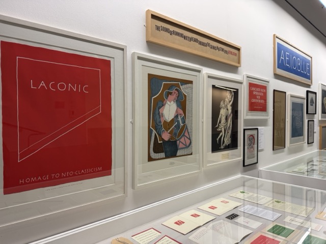
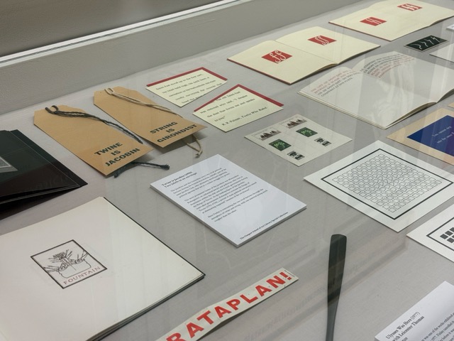
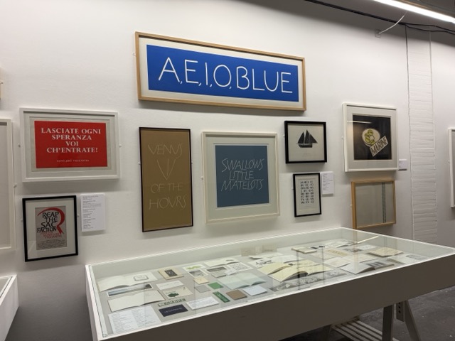
It was long-awaited, as the exhibition was either closed or I was busy, but I finally got in to see it and was not disappointed by the level of multimedia output, but still by the amount of consideration and attention that went into displaying these pieces in such a way.
In such a small space, they used the space efficiently, considering the room’s height as well as the audience and eye levels. Even something as simple as elevating the projection felt like a dynamic use of the space, the spaces created by walls that made them feel like almost different rooms.
The use of light, and even multiple light sources, to either highlight or provide dynamic lighting for the exhibition itself.
When looking at the videos shown the mix of speaker audio on the larger more focused custom built rig and the personal headphone output, the only problem that I personally had with it was that one custom rig was welded metal and the other was a wooden set up for the projection stand and I understand that both are the exposed material but personally I would have liked if they both were the same material.
To Do:
Getting myself back on track.
- Keep looking for the objects and stories of the people in Glasgow and Clydebank.
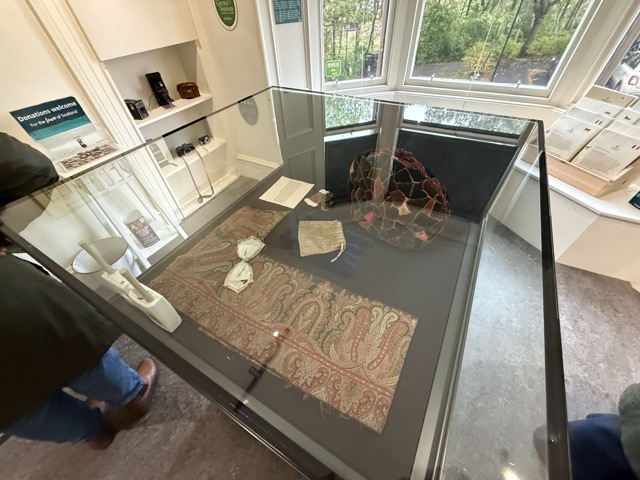
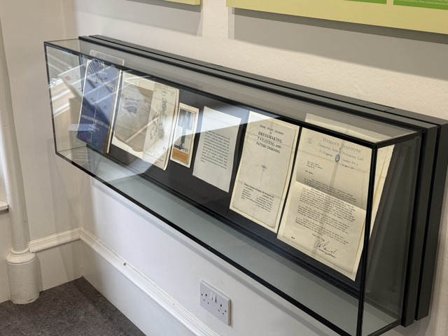
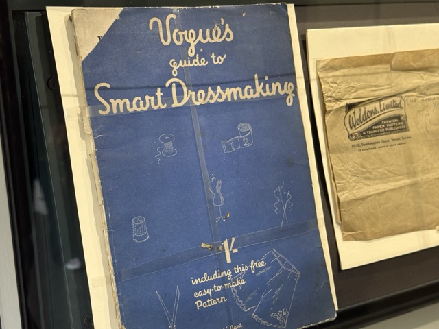
At the moment, I have contacted people about stories and turned to my family and friends to try and find them as well. I have now been in contact with Barbra at the Glasgow Archives in the Mitchell Library, though, so that’s another line to follow. I am worried that I won’t find the stories I’m looking for and that this might have been too big an ask.
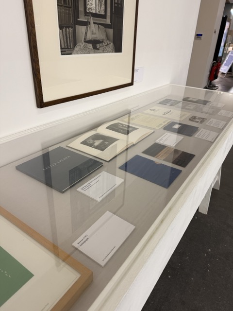
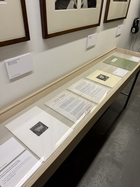
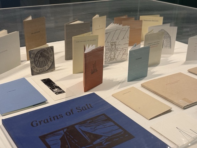
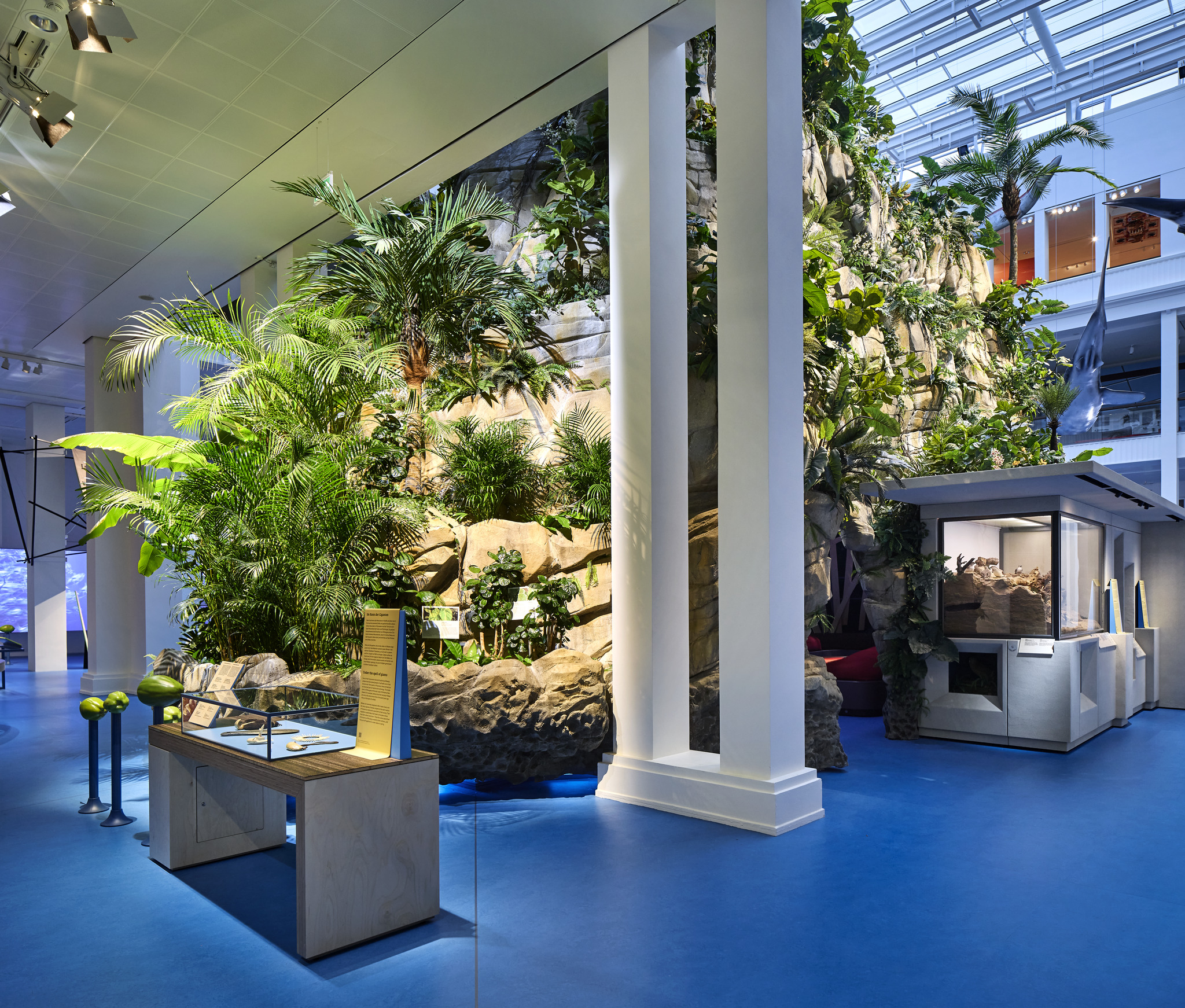
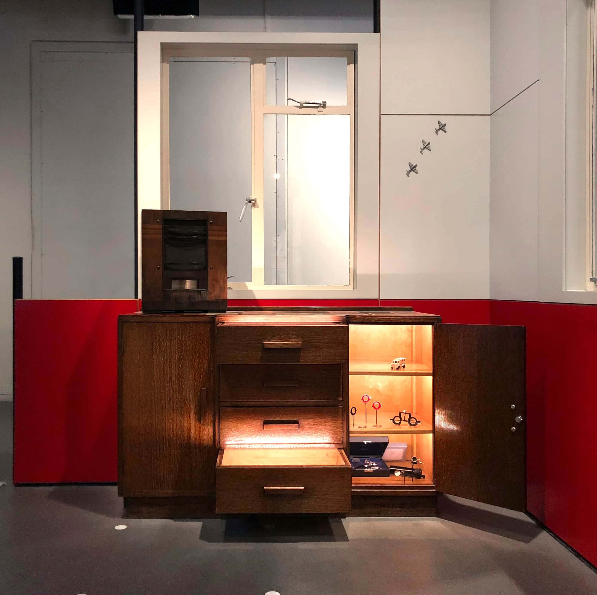
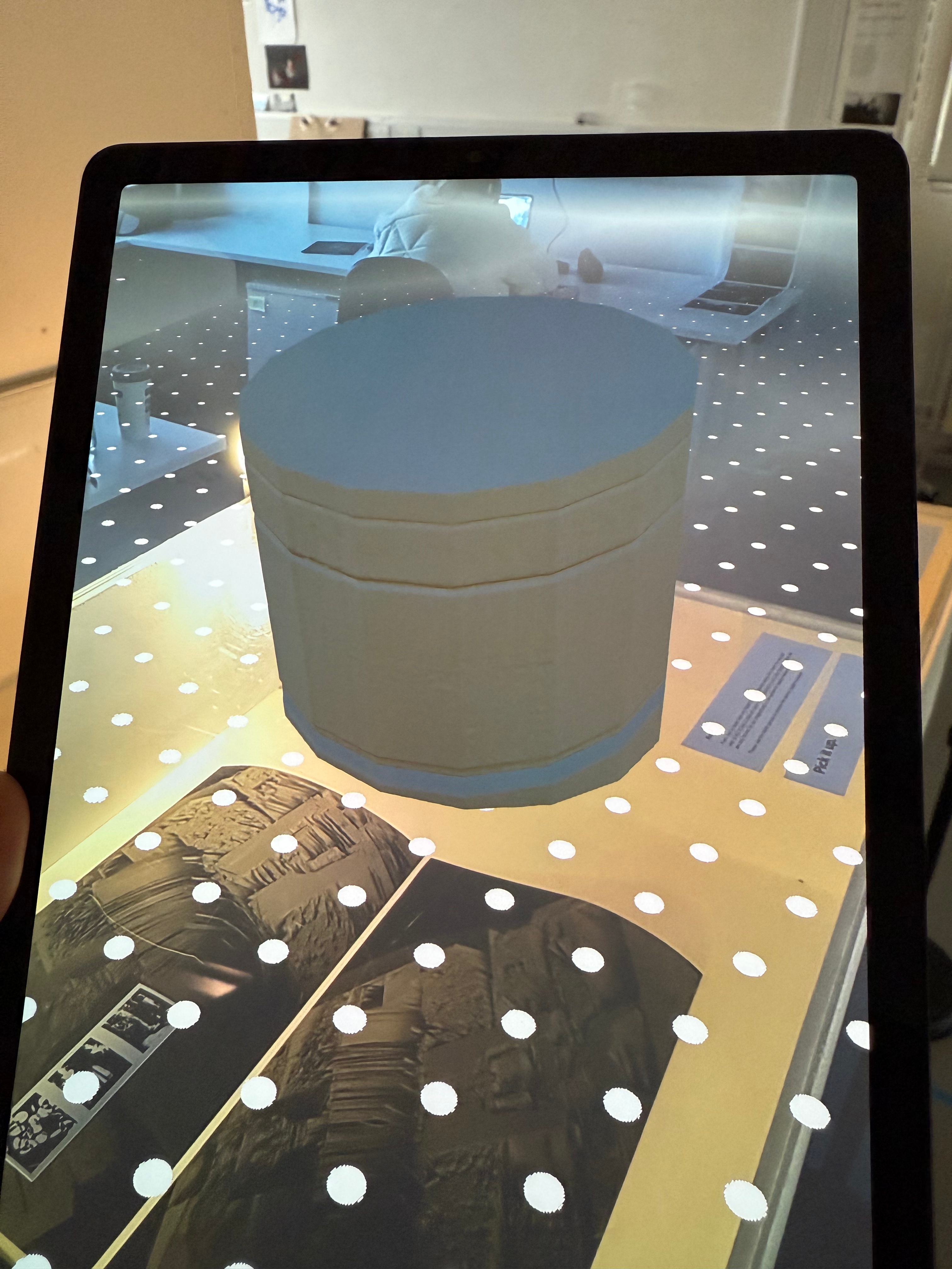
- Develop the exhibition that I will put on when I have these stories. How will I display the work? How will I realise the stories and objects that I have collected, with the same respect and consideration I have seen in SEEP?
I think it might be a good use of my time to get a stand in object or a collection of stand in objects that I can then start to develop with and realise so that when I do have the stories and objects I can insert them in and find out any issues or developments before I have peoples things and stories so that I might make them proud of the output and show the stories and objects respect.
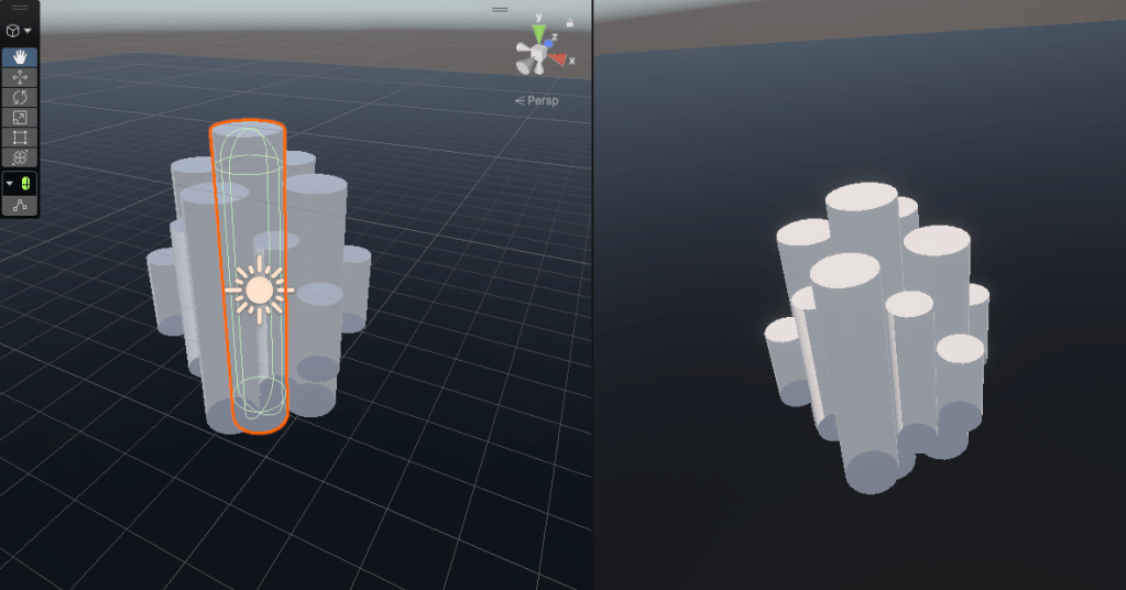
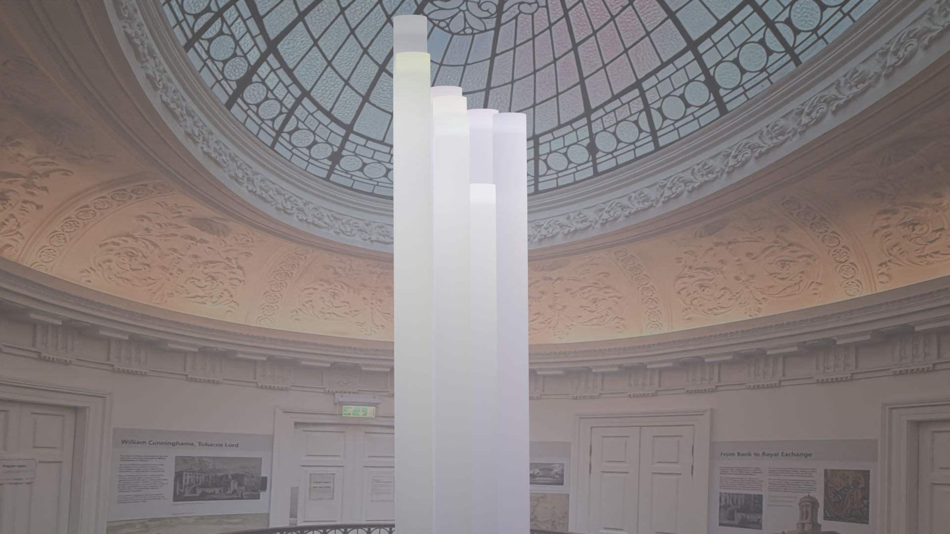
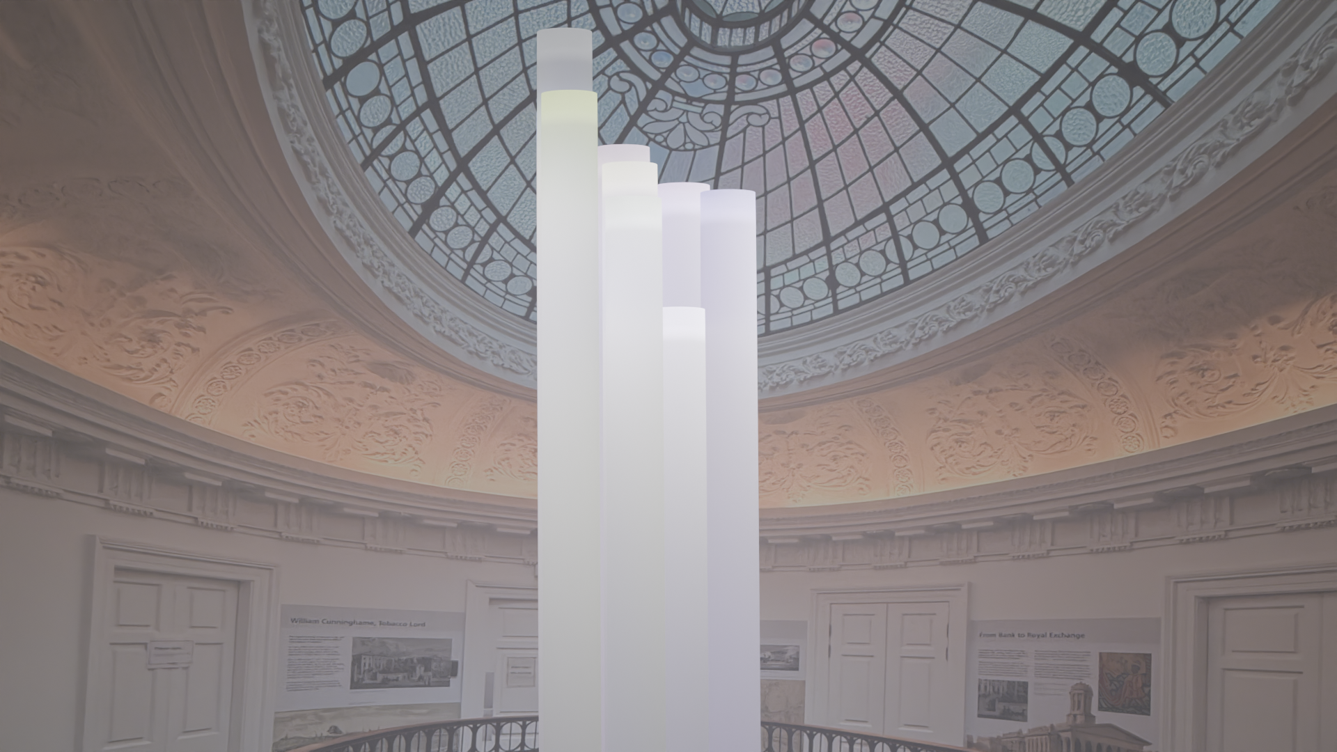
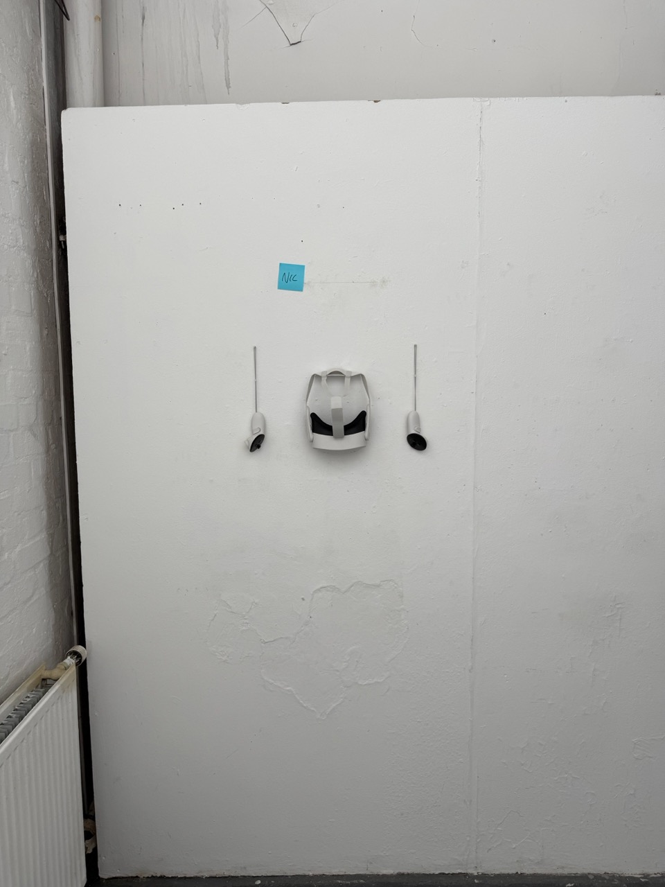
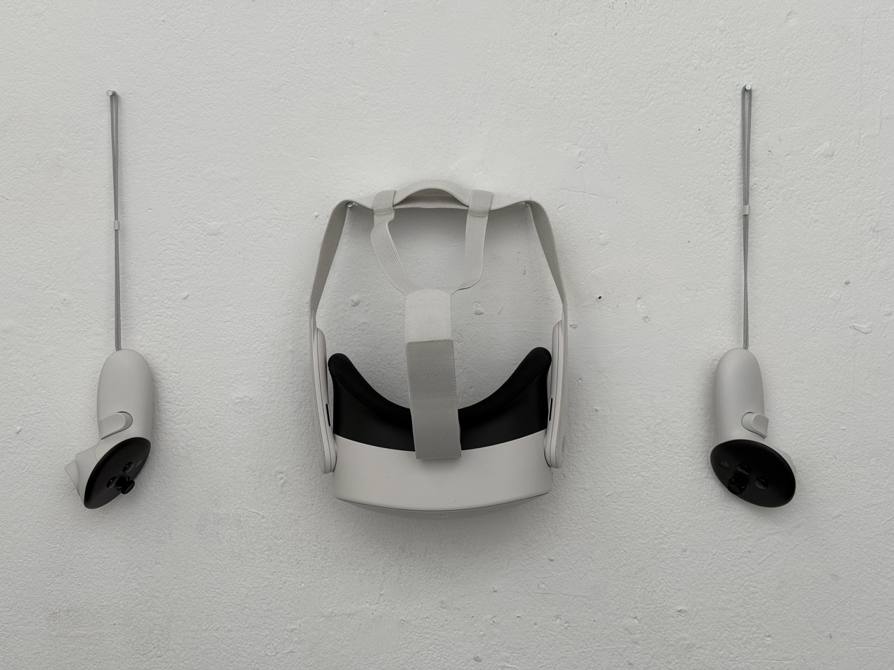
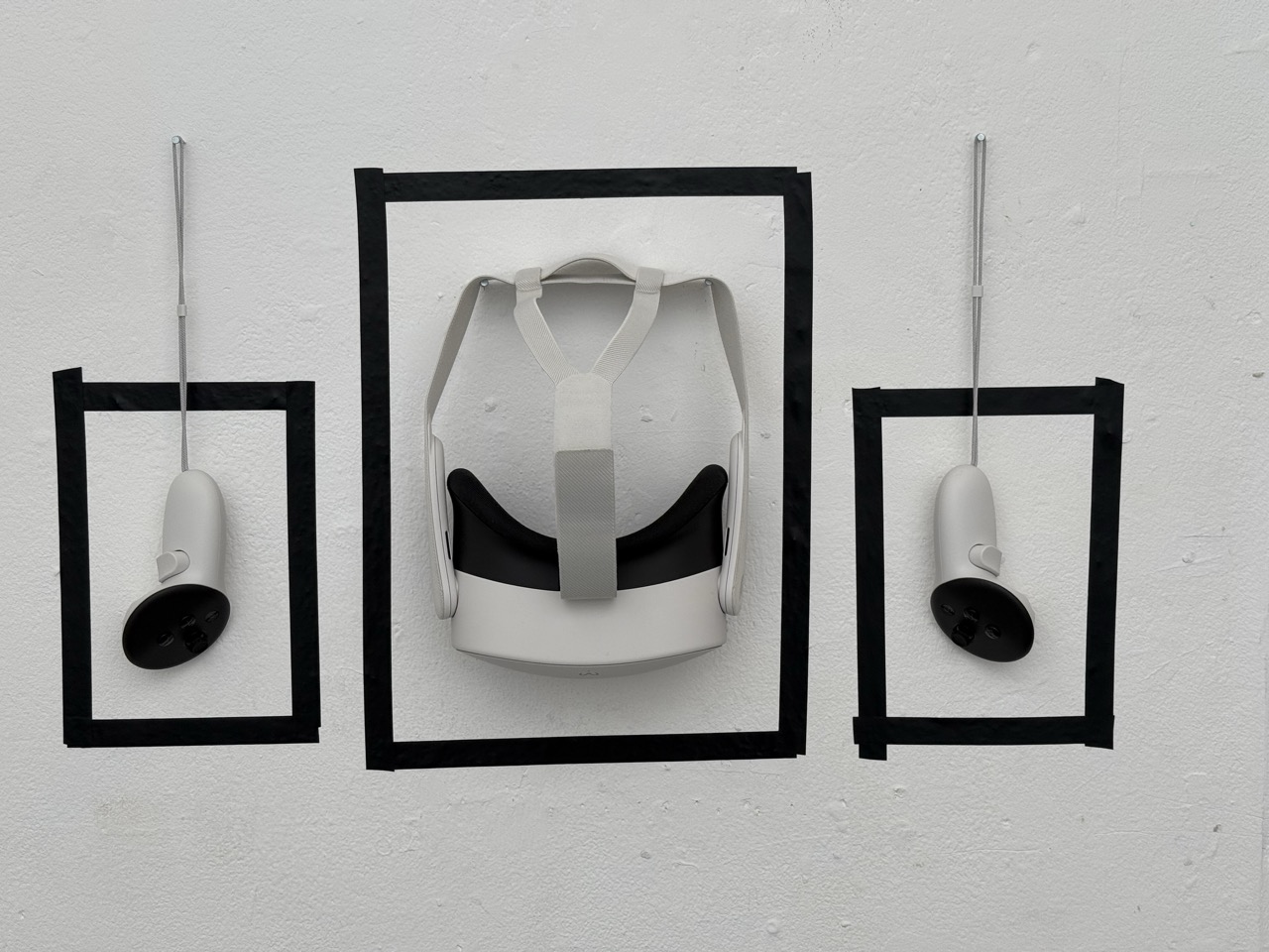
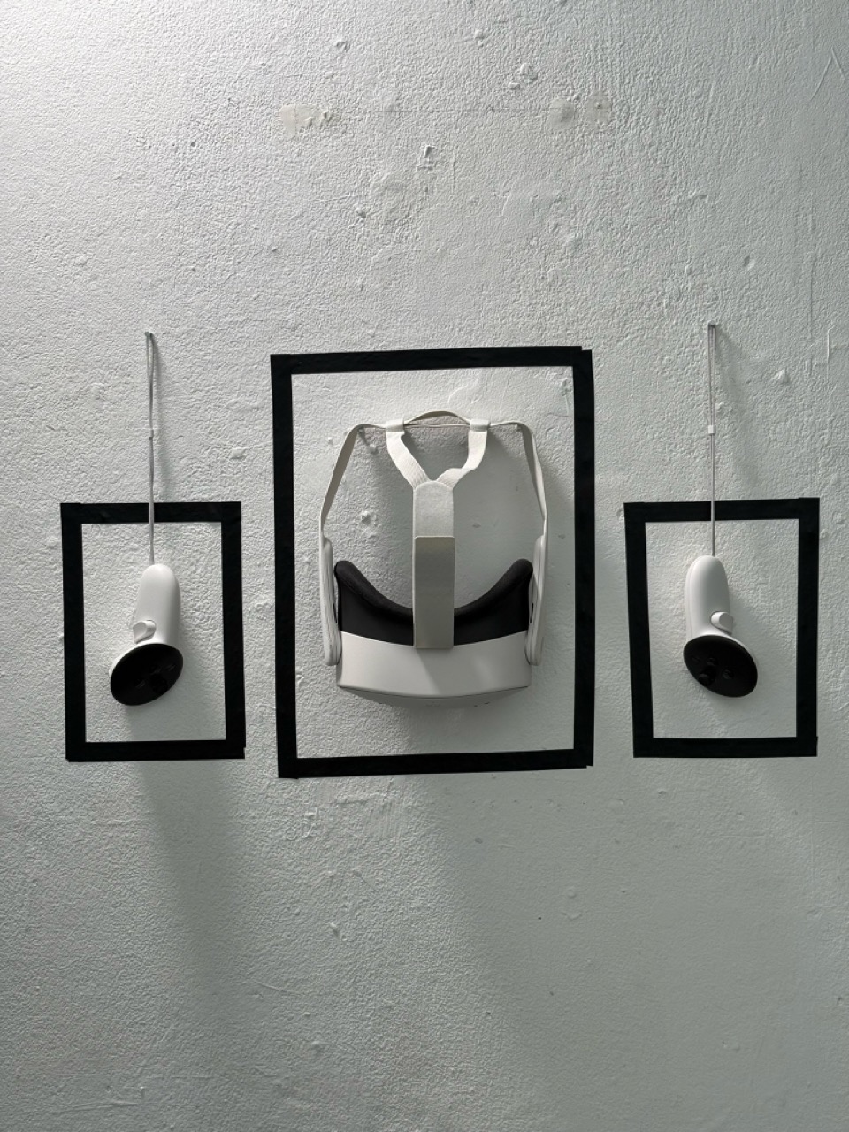
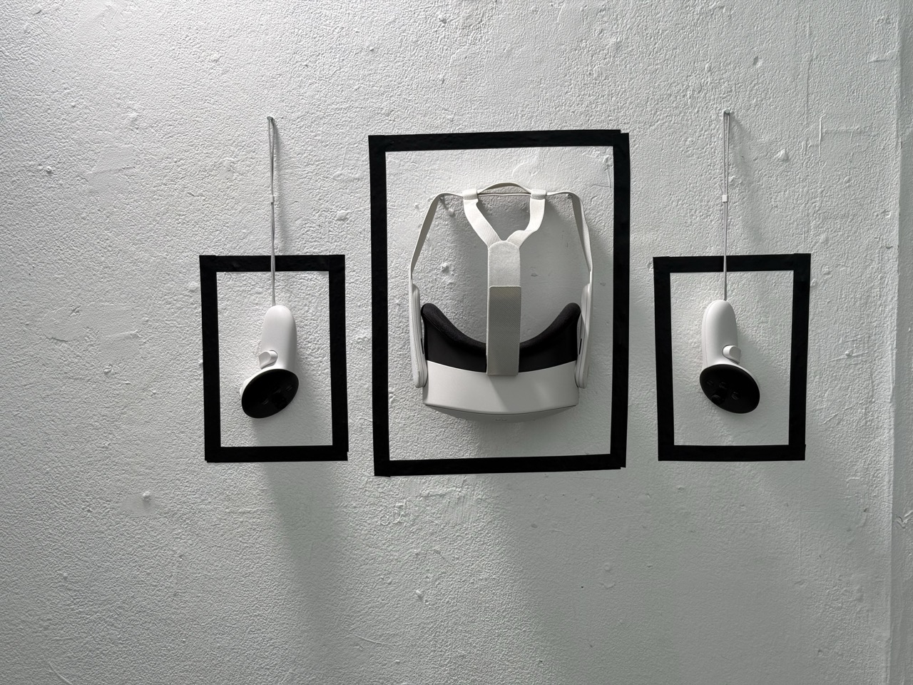
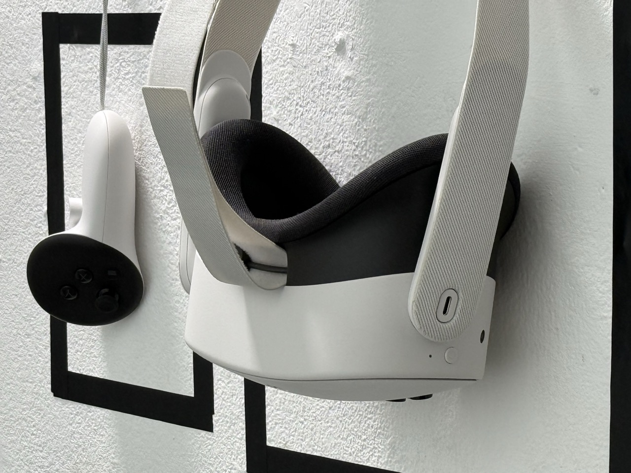
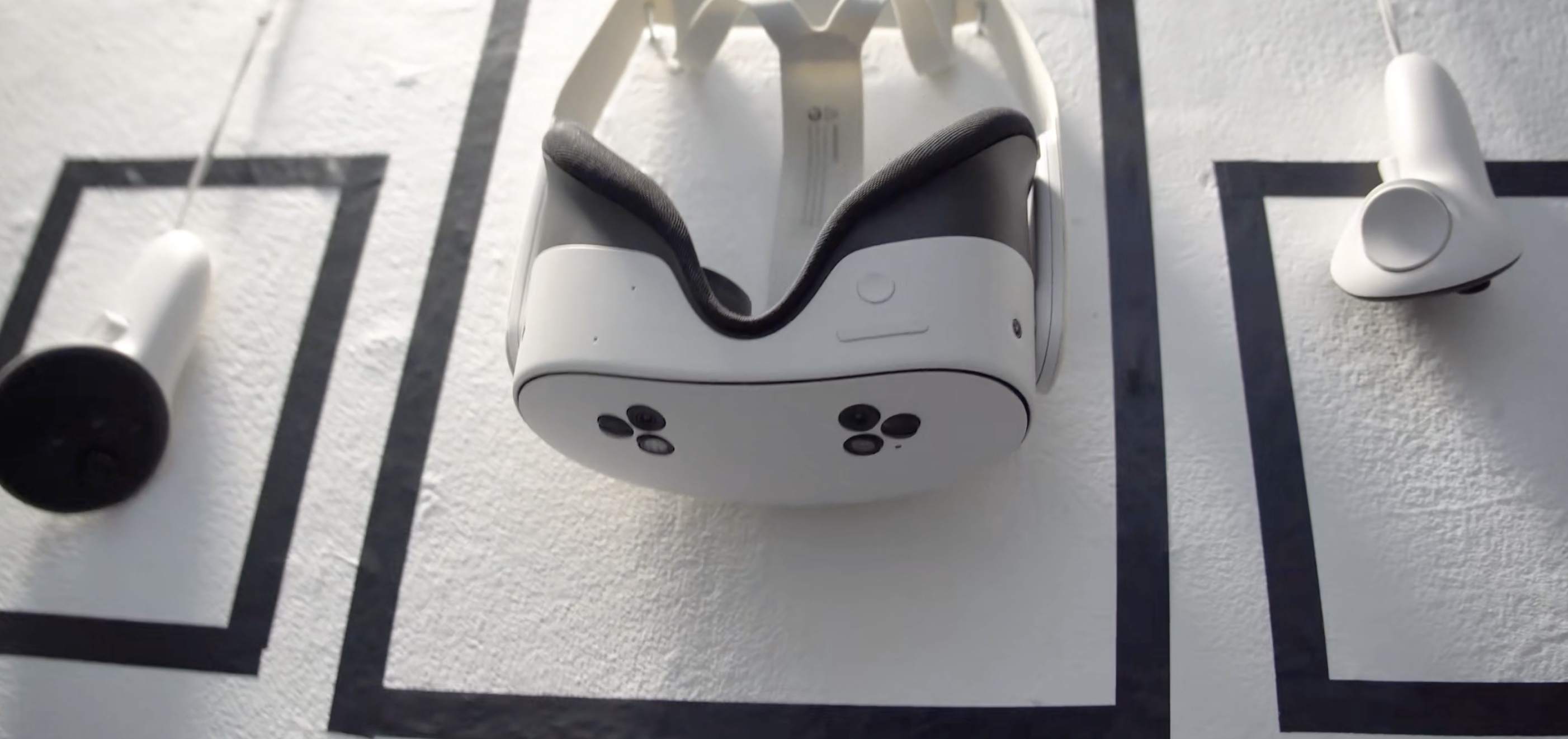
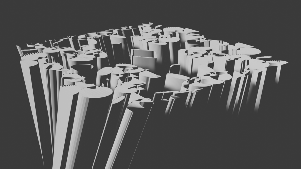
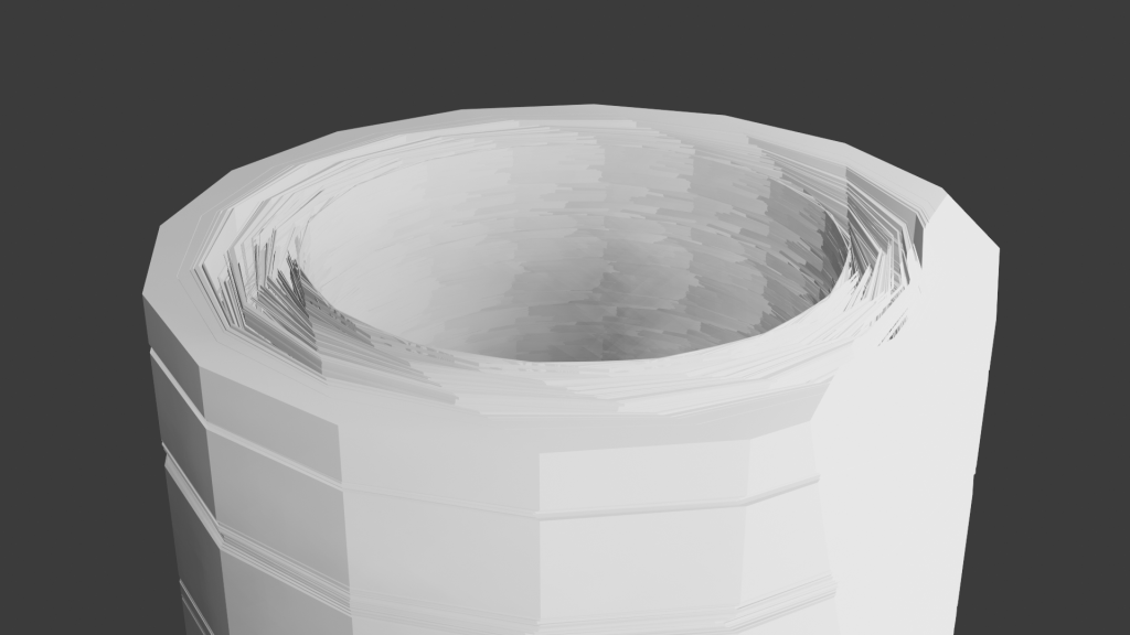
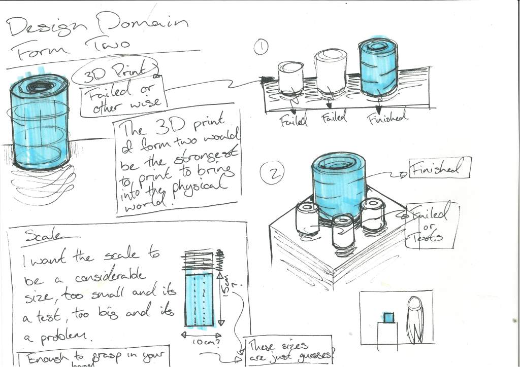
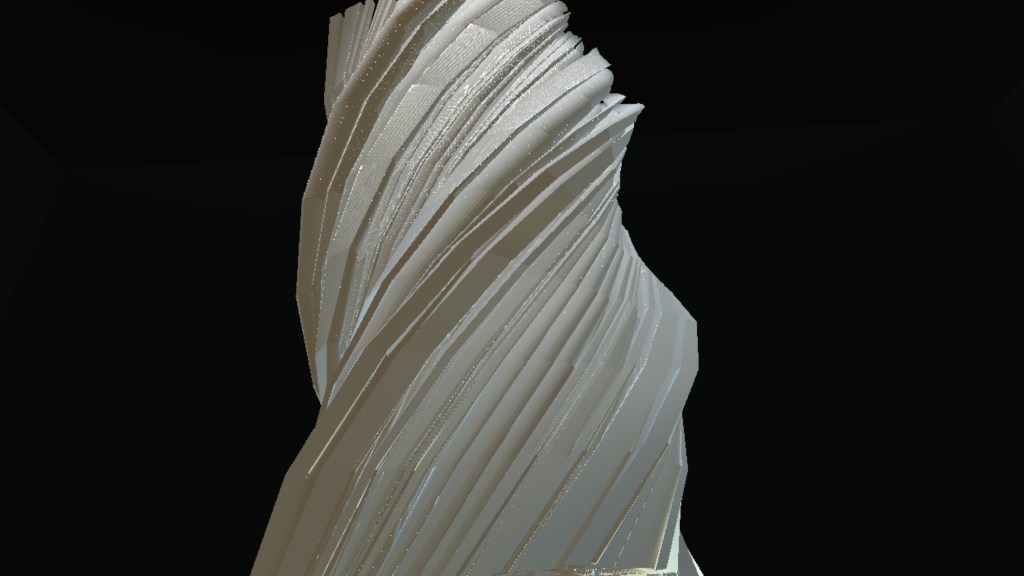
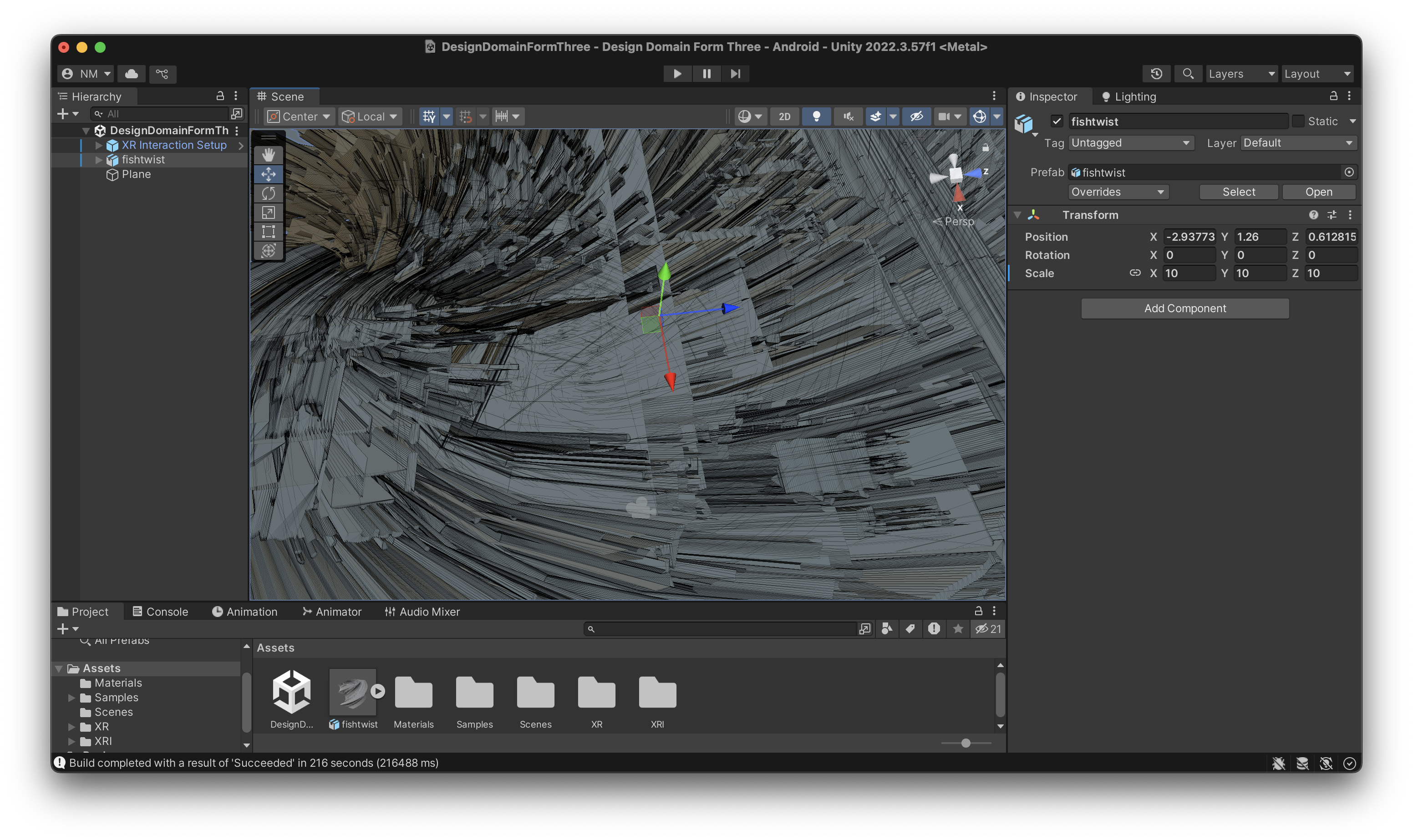
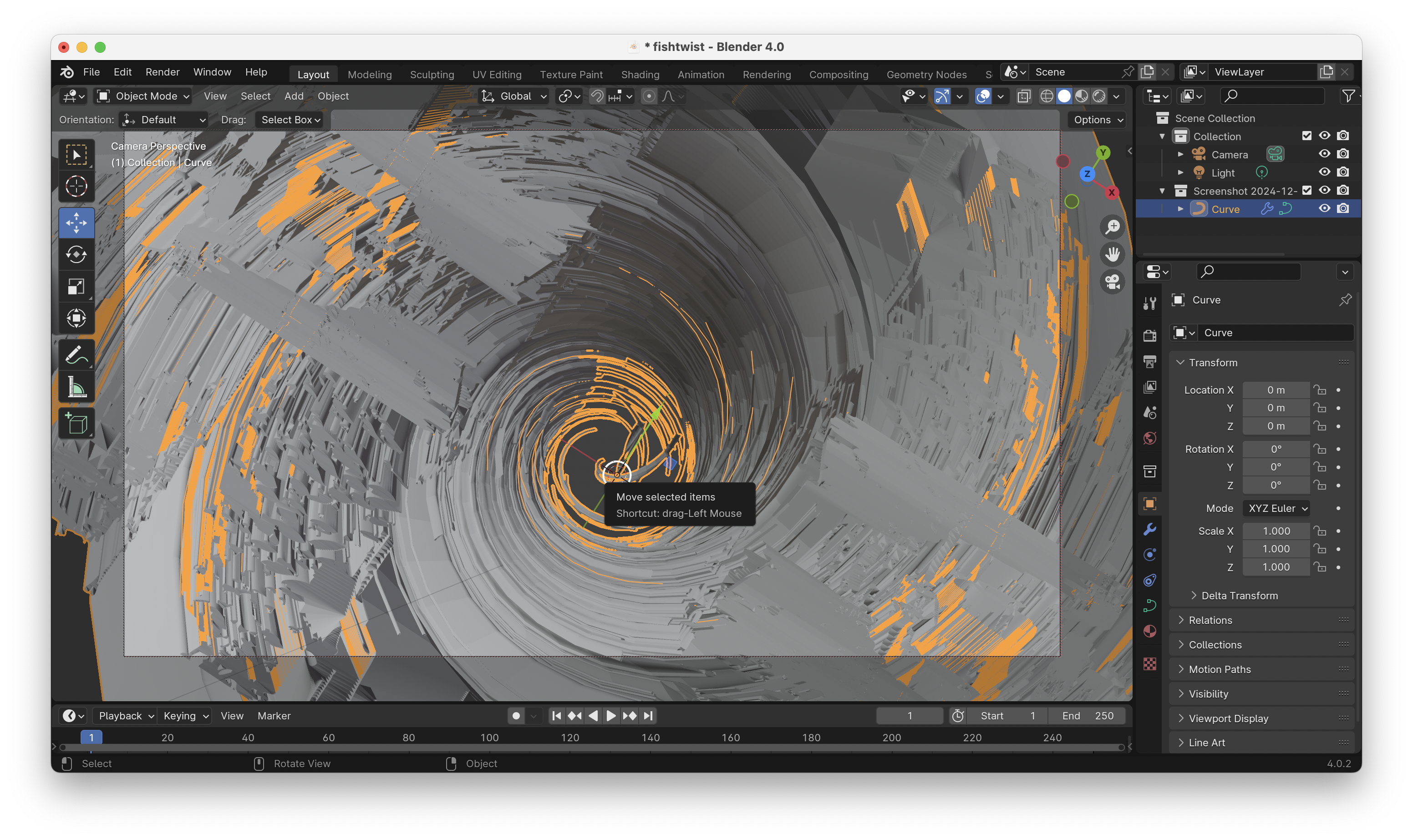
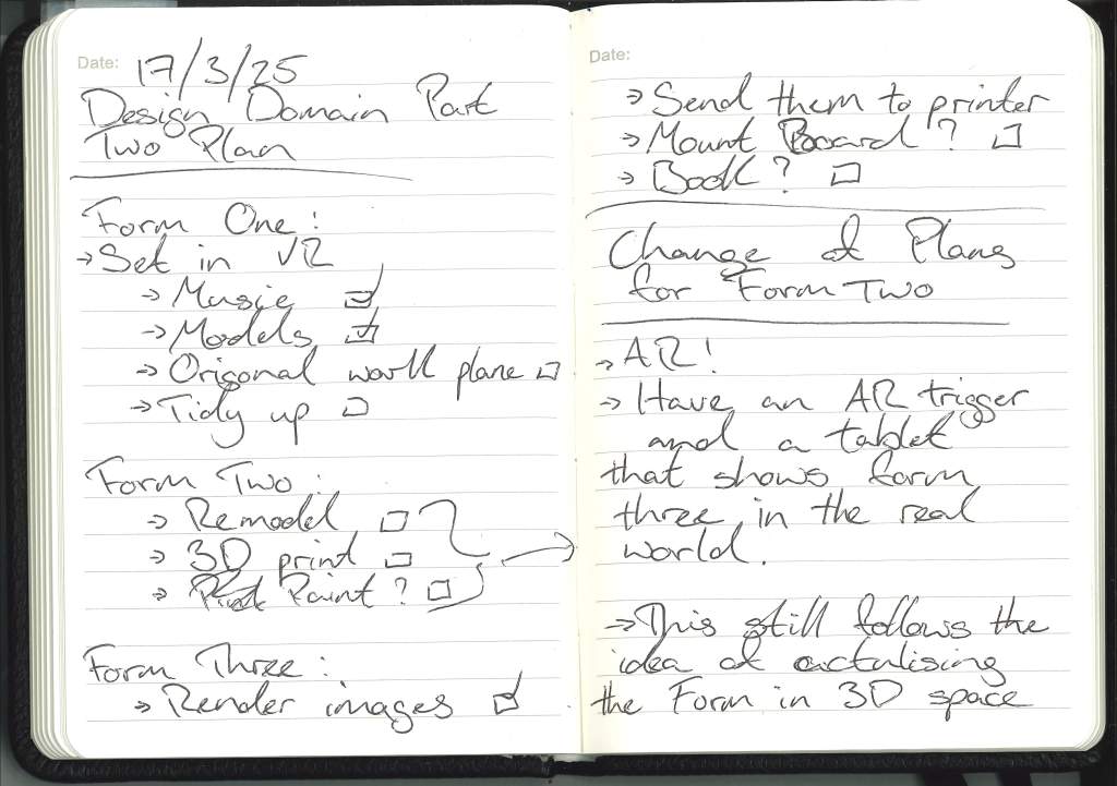
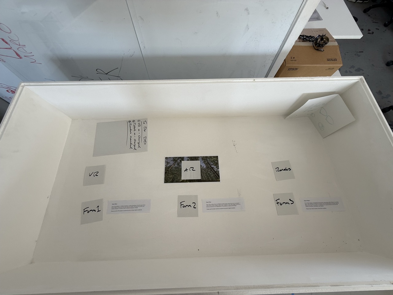
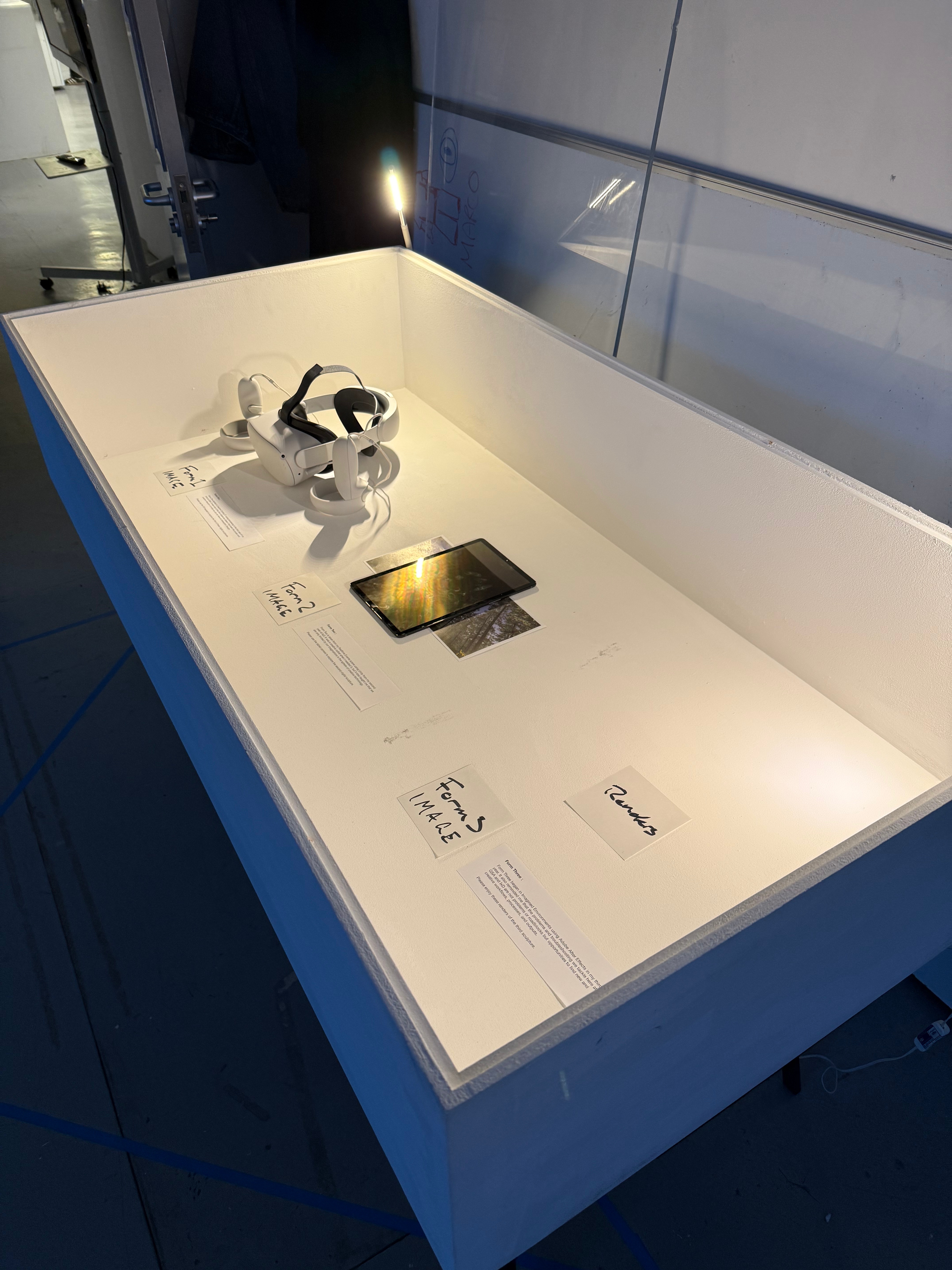
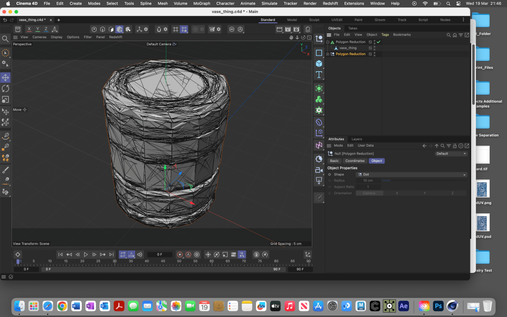
- Tidy up my Design Domain digital form sculpture for TechTonic.
I won’t let it get in my way, but I would like to allocate some time to the Design Domain VR sculpture so that I may display it confidently at the exhibition. I want to tidy it up and implement some things that make it impossible to break or wander.
- Continue developing the REDACTED night.
I want to continue dedicating my weekends to REDACTED at ISO with Pav and facilitate the guys on making a great show and showcasing their talents and abilities, as well as showcasing my capabilities to those in the field.
Continue researching and writing my essay
Even though I have sent away the draft, I still want to continue working on it, writing the second half to a passable level and then once I have the feedback, redraft the essay.
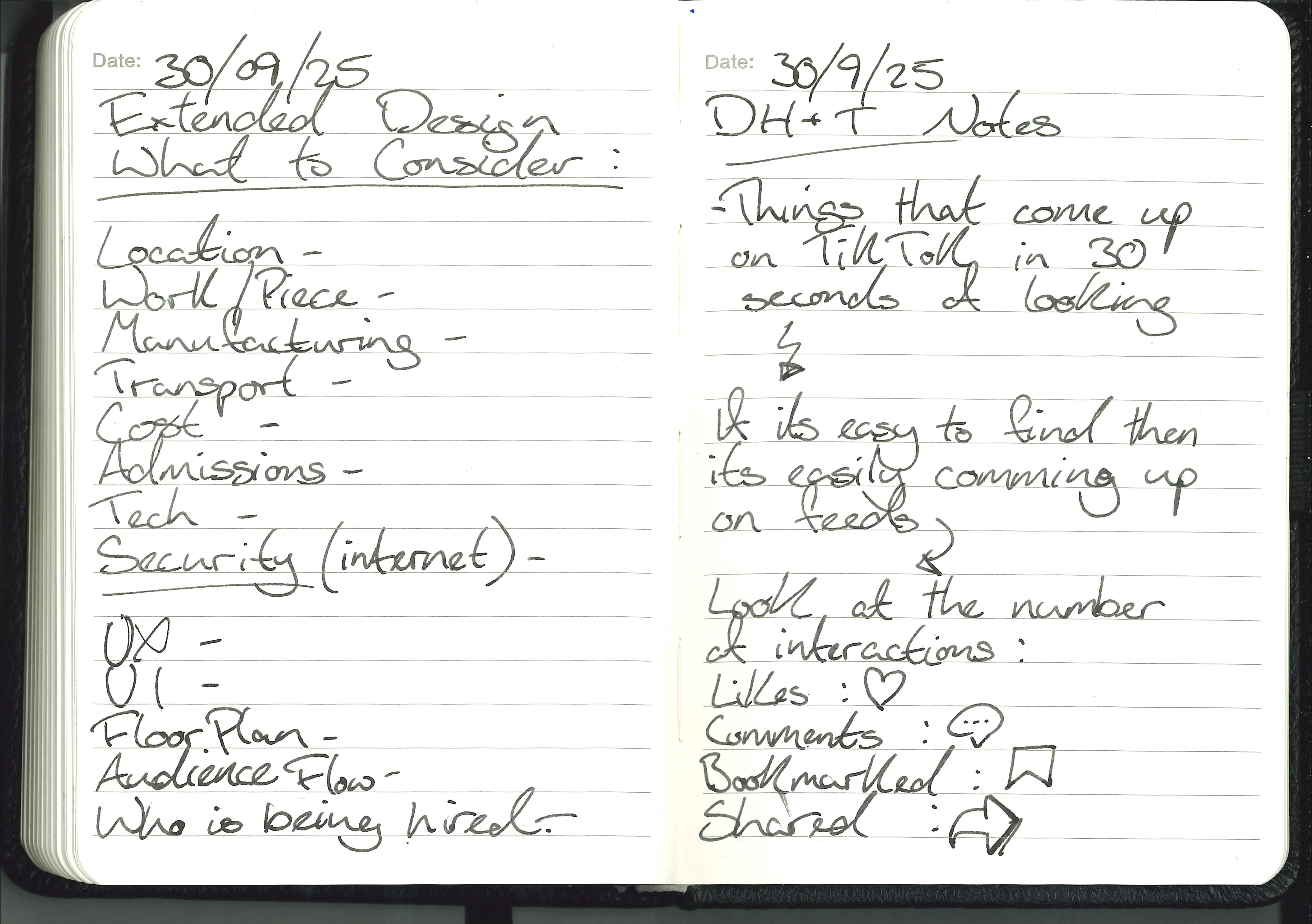
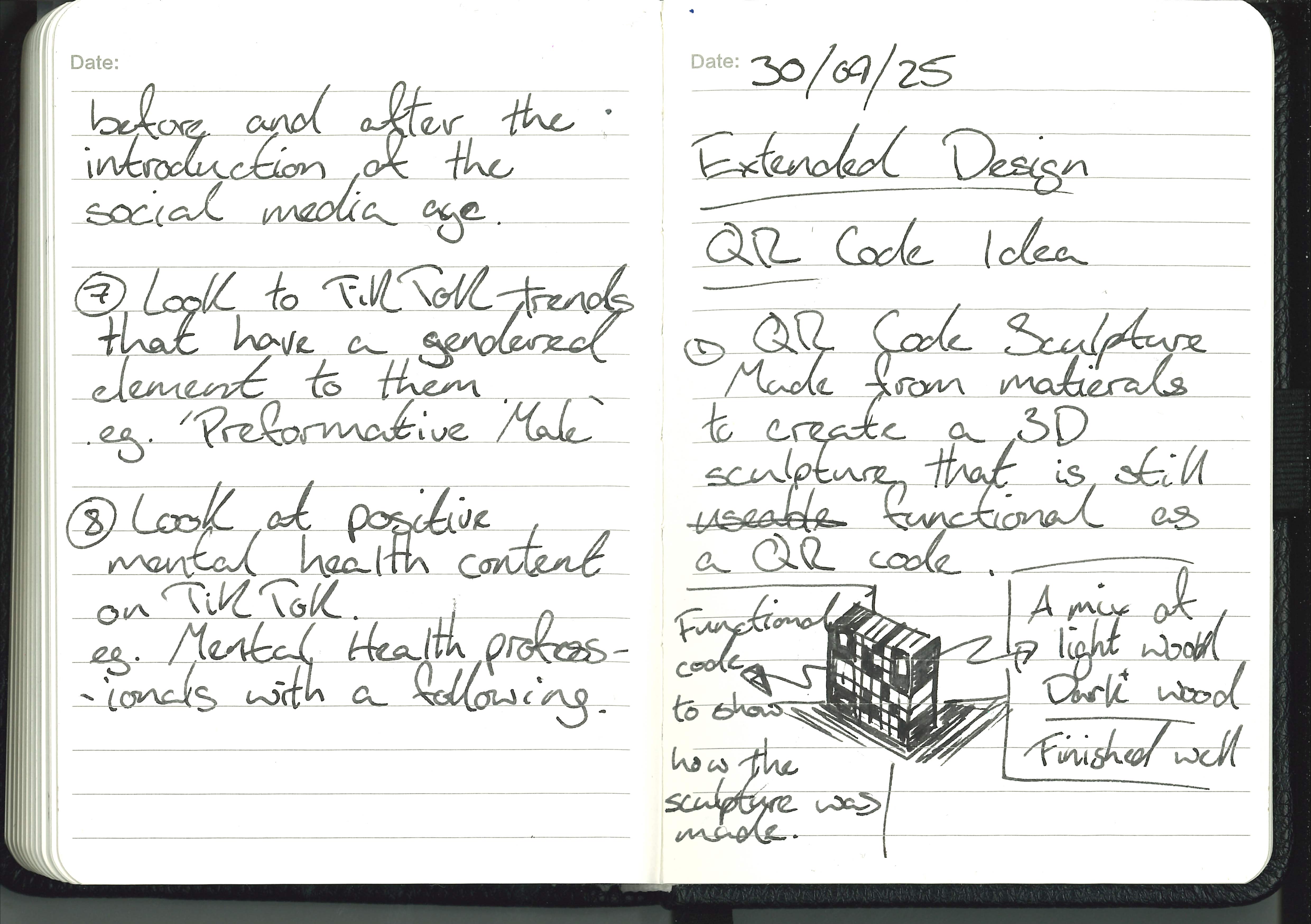
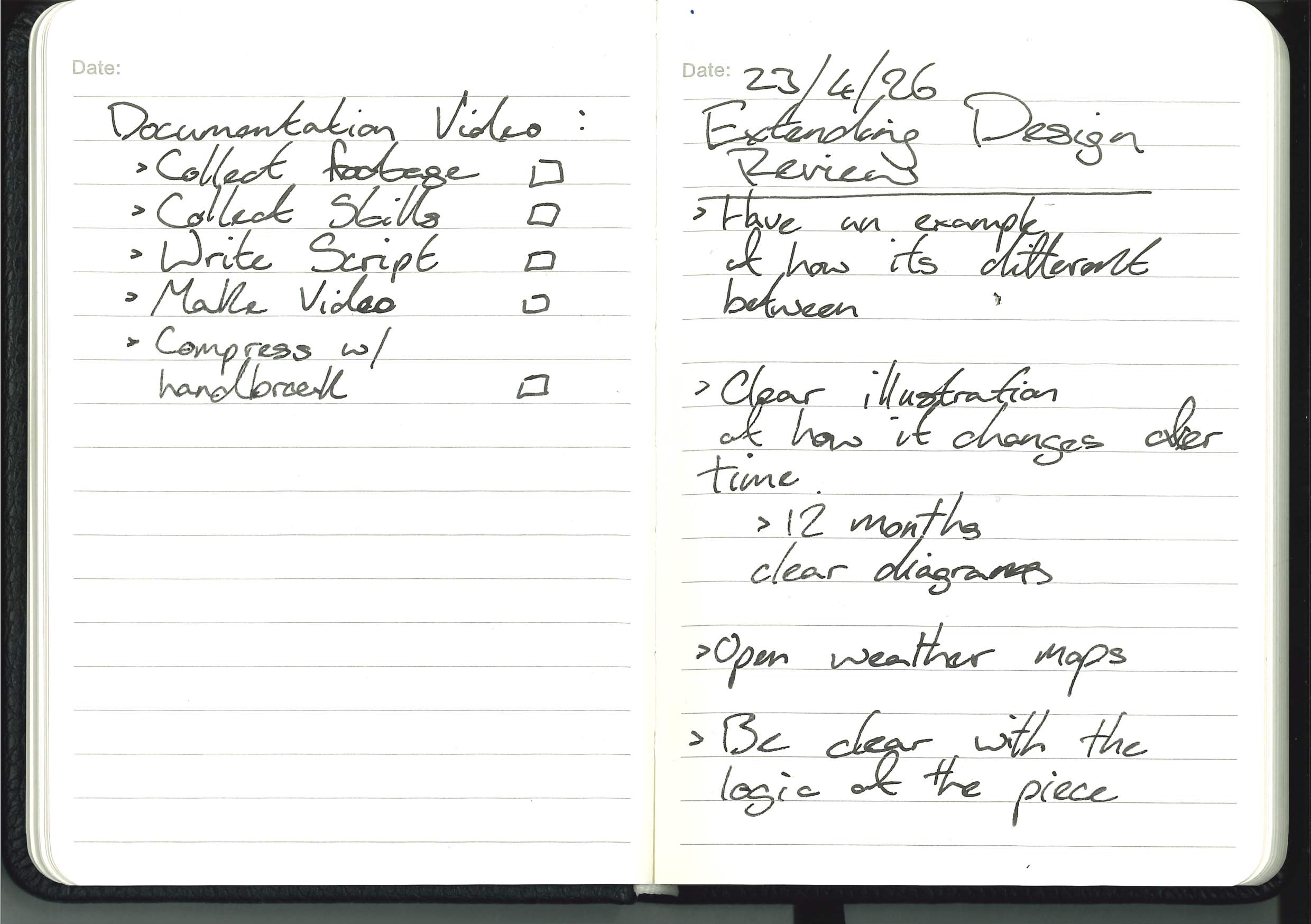
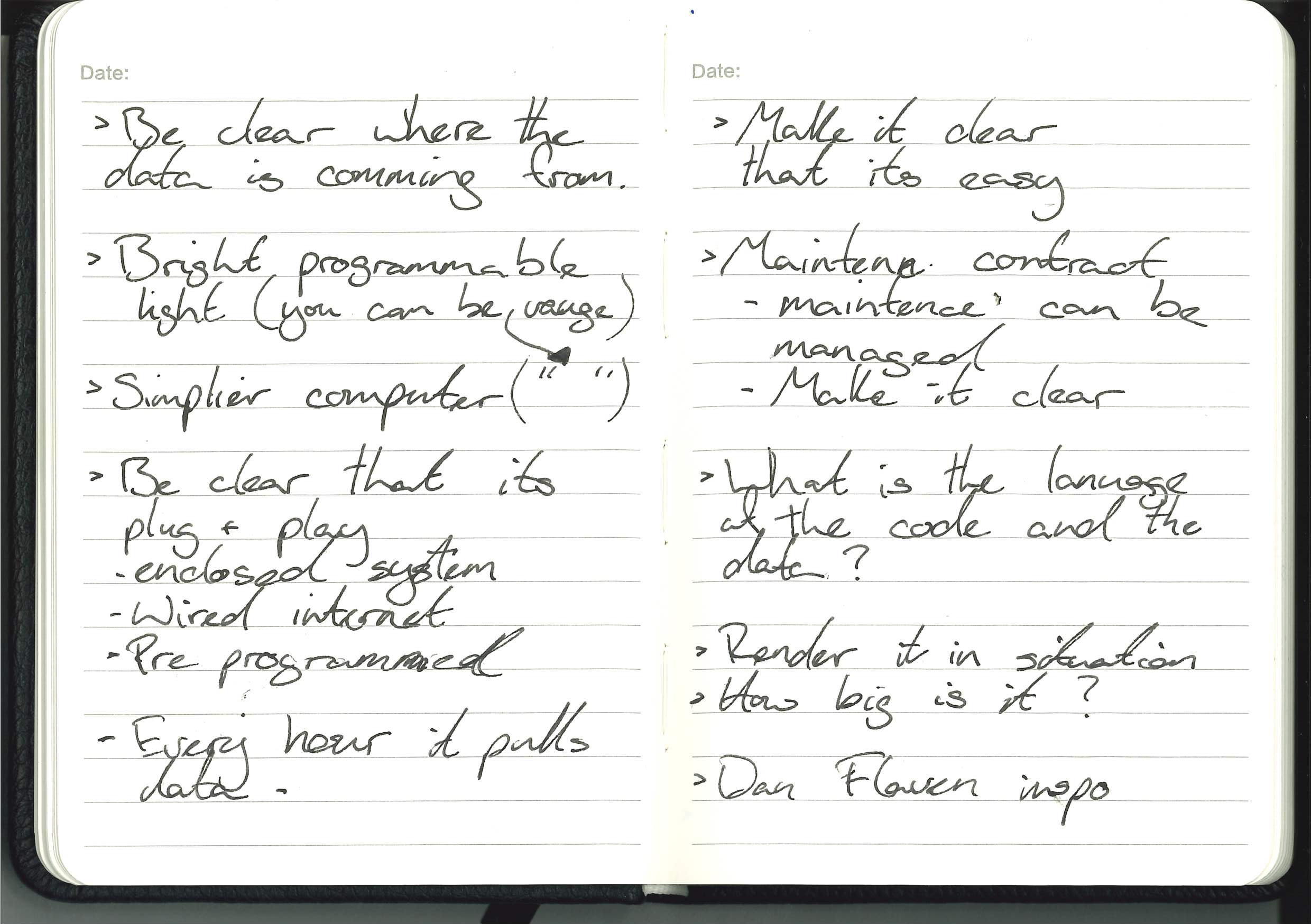
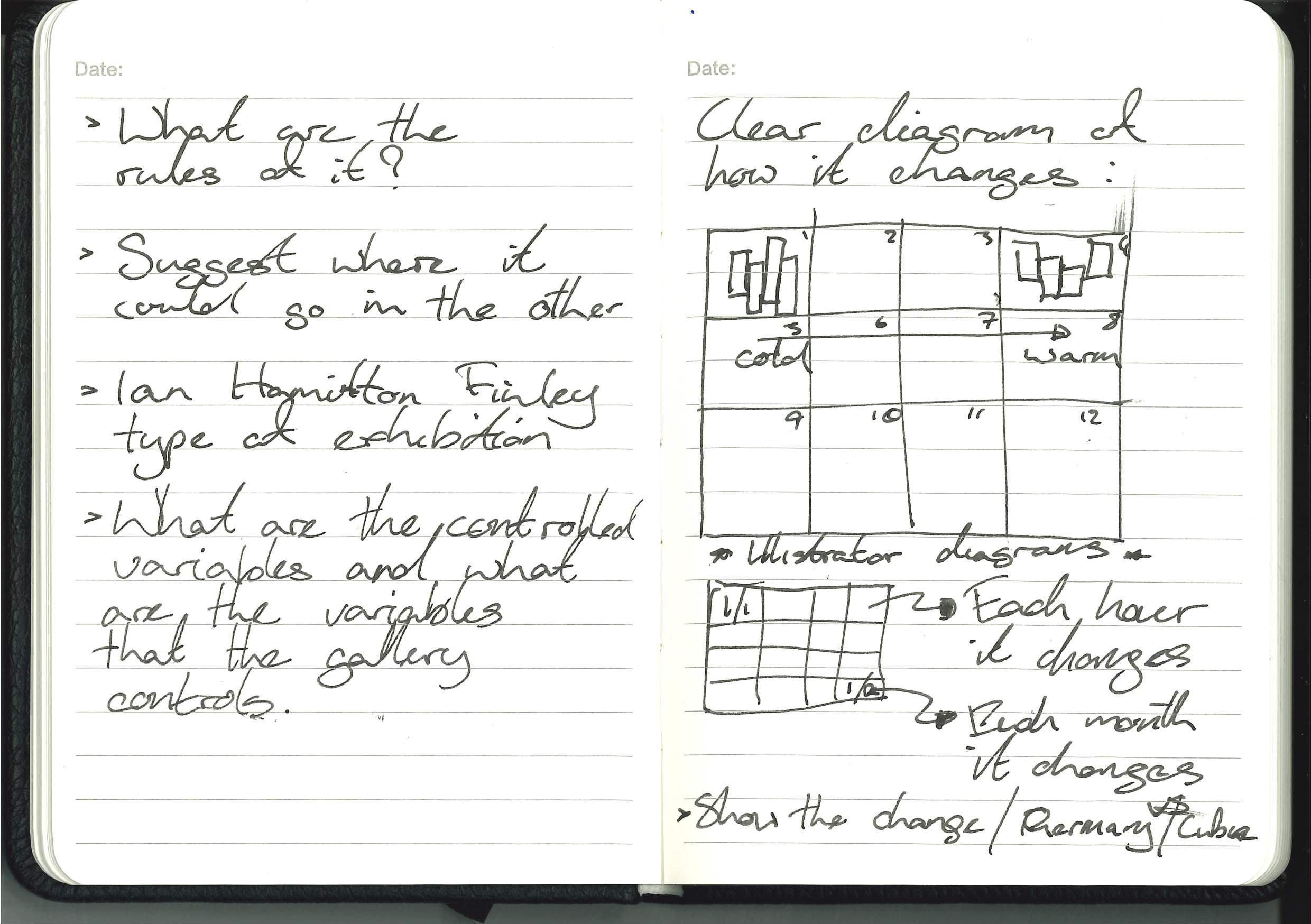
- Extended Design development
Extended Design will take a back seat until semester two, once everything else is sorted and the essay is submitted then I can focus on Extended Design and give it the time it requires.
Group Tutorial:
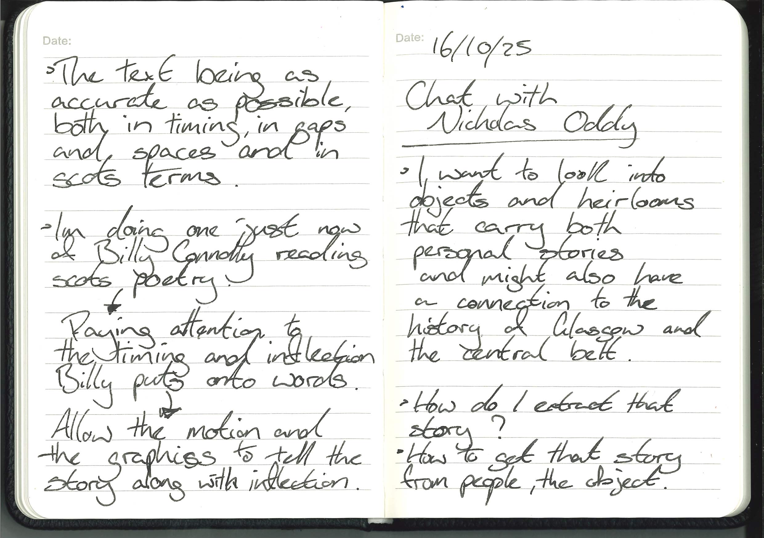
Initially, I was worried about the group tutorial and felt like I didn’t have enough to show because I’ve got bogged down in trying to find the story and the object, but after talking about my project with Paul and the guys, helping me think less about the story and the object and more about how it’s shown, it reminds me of what Nicholas Oddy said:
It’s less about the object and what the facts are and more about the story and how it’s told.

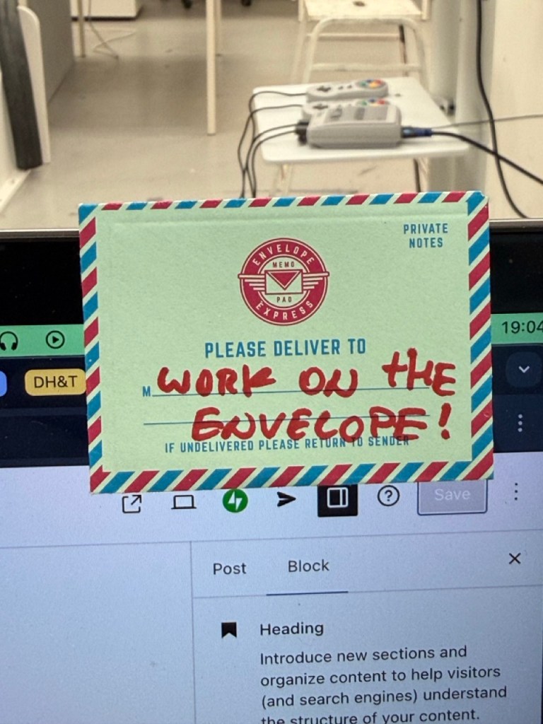
Also, after a conversation with Marco about how today went, he said something about my project that I liked: “You’re working on the envelope, not what’s inside… work on the envelope”
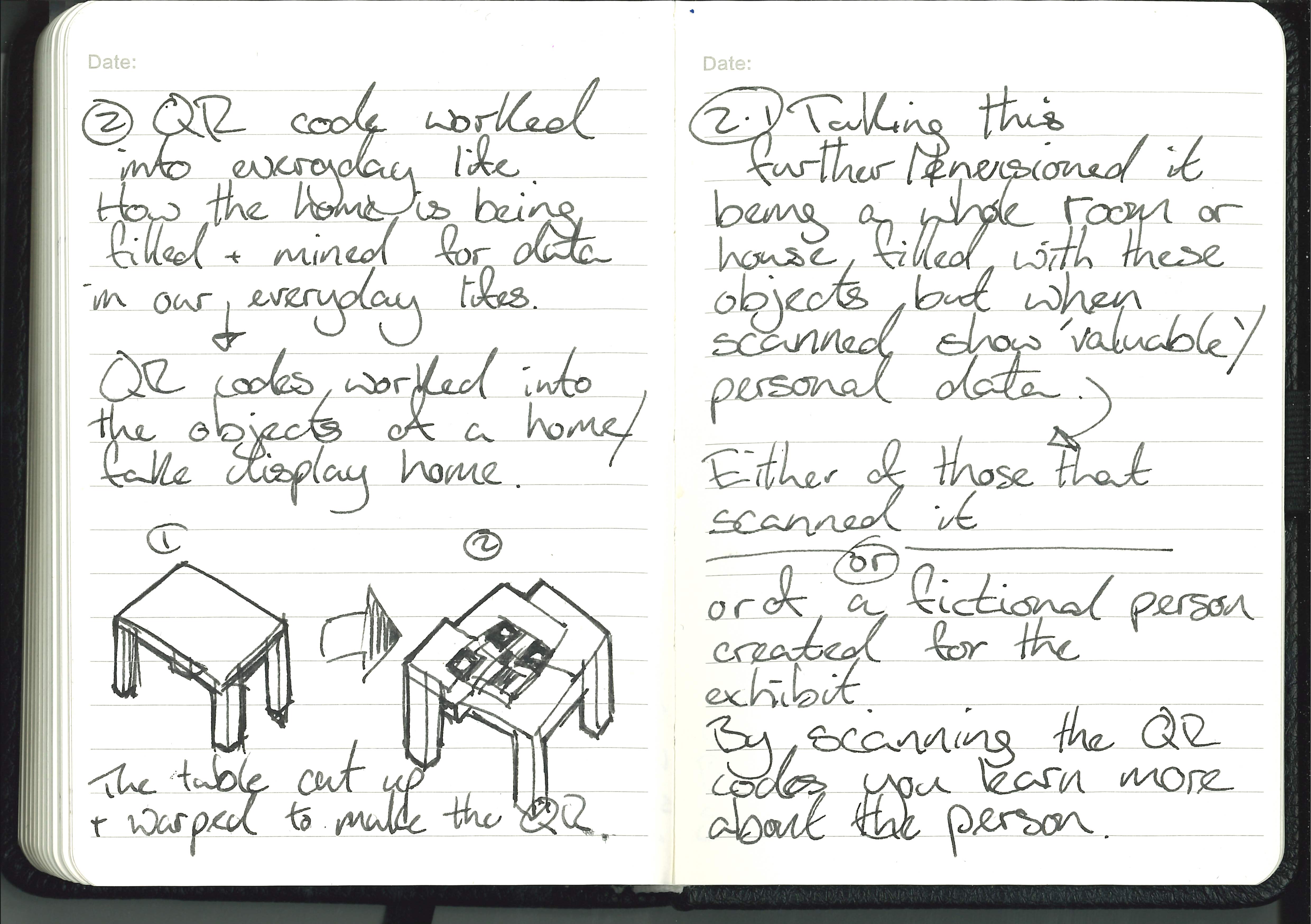
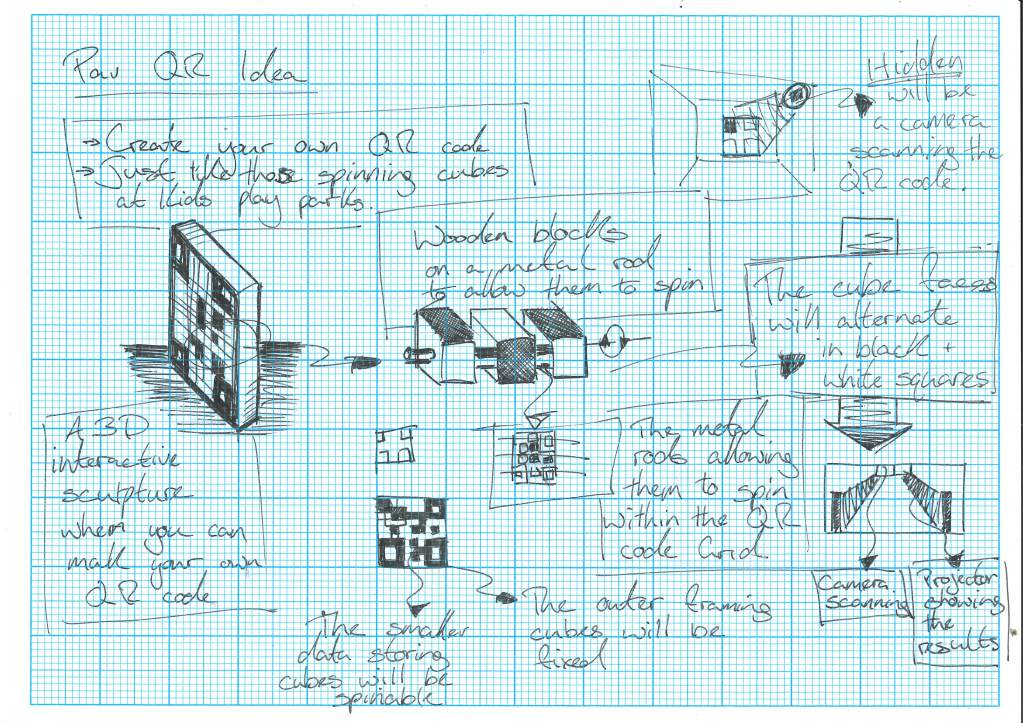
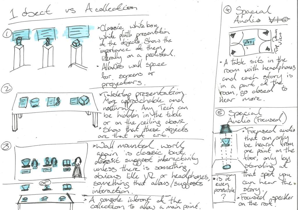
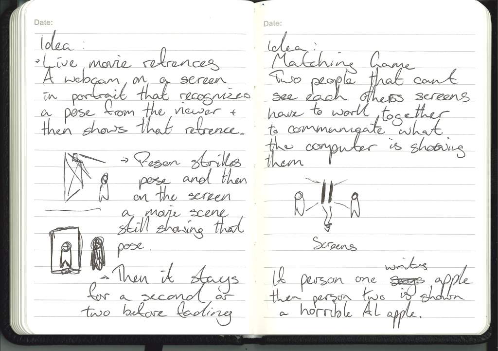
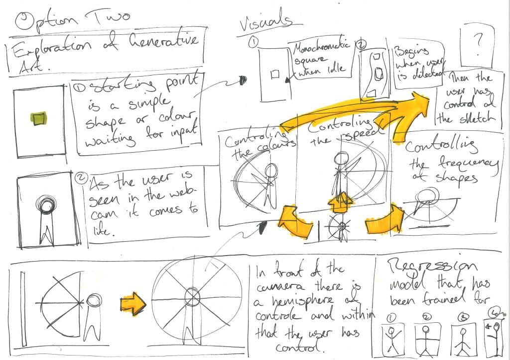
Development with the new direction:
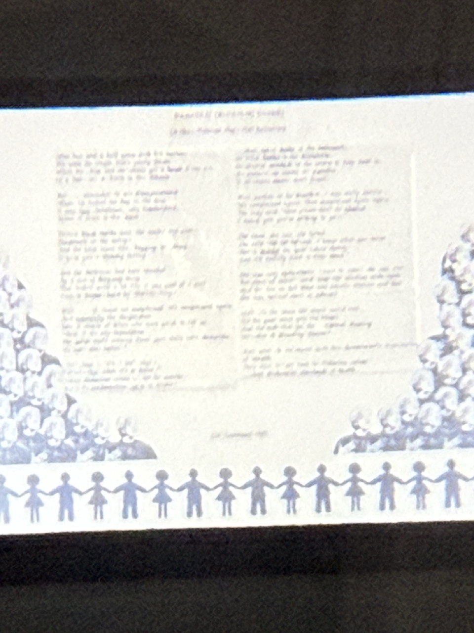
Below is an initial sketch and development considering the new direction for my project and how I will display the research and artefacts, with more of a focus on the soul of the story and the artistic expression of my final year, instead of being too literal, which I often struggle with when it comes to design work.
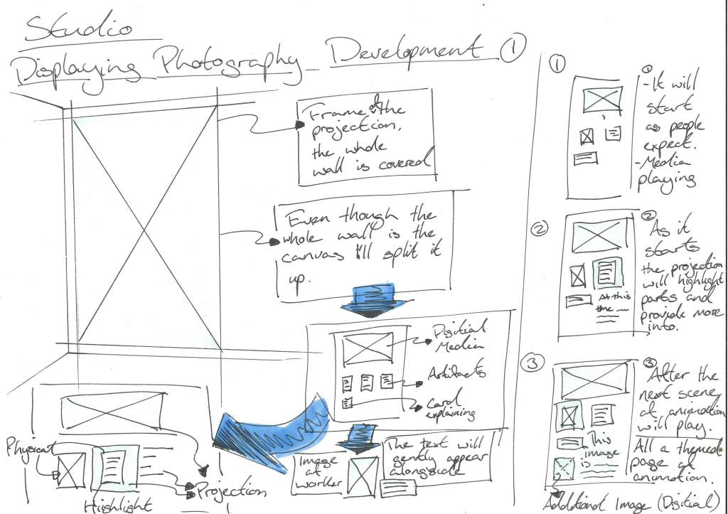
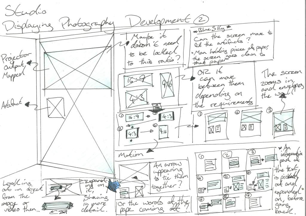
The three sketches above show the development and detachment from the usual work seen in exhibitions, and, building on that, I used exhibition displays that I felt communicated well as a starting point, and I believed that I could then.
Appointments:
Mitchell Library:
I have an appointment with the archivists at the Mitchell Library on Wednesday, the 3rd of December, to look through the most recent Glasgow Poor Relief records with a request for any stories that tie to Clydebank or industry. Under the Information Act, the records from 100 years ago are the only ones I can access, but they might still be informative.
GSA Archives:
I have also been in contact with the GSA archives and messaged them to ask them to contact Katie, whom I met when I tagged along to the year 3 scanning days at the archives, who asked me to contact her with any questions or requests for access to the archives. With the new direction I have now, I feel more confident about what to ask for, since it’s less specific or tied to the objects.
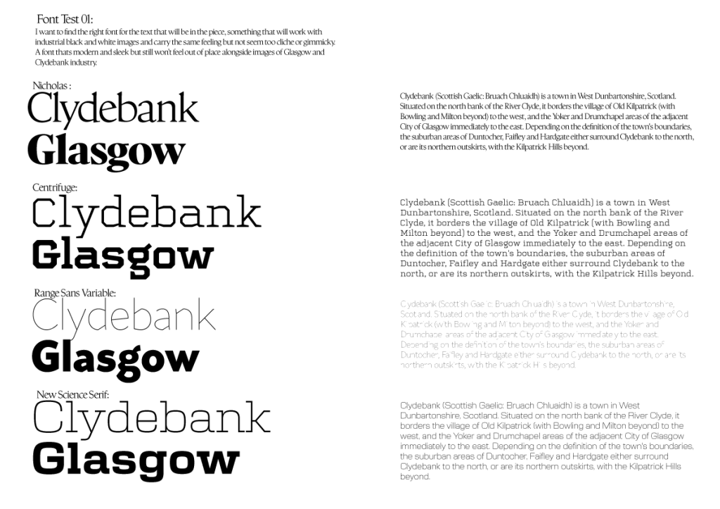
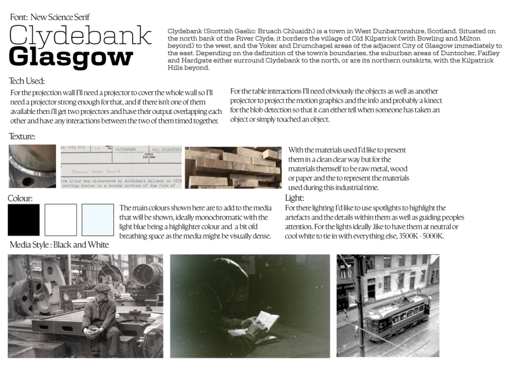
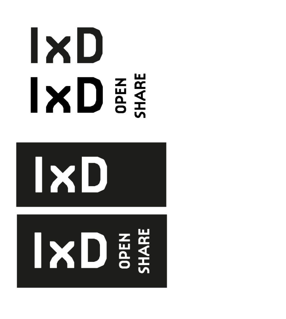
Identity:
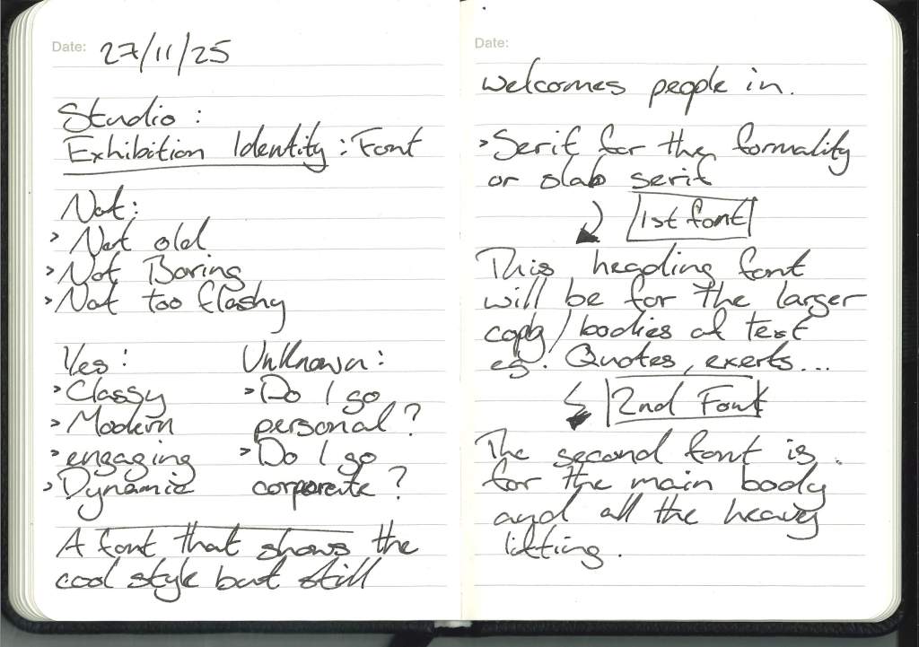
Font:
Initial selection:
Font Test 2: Process of elimination
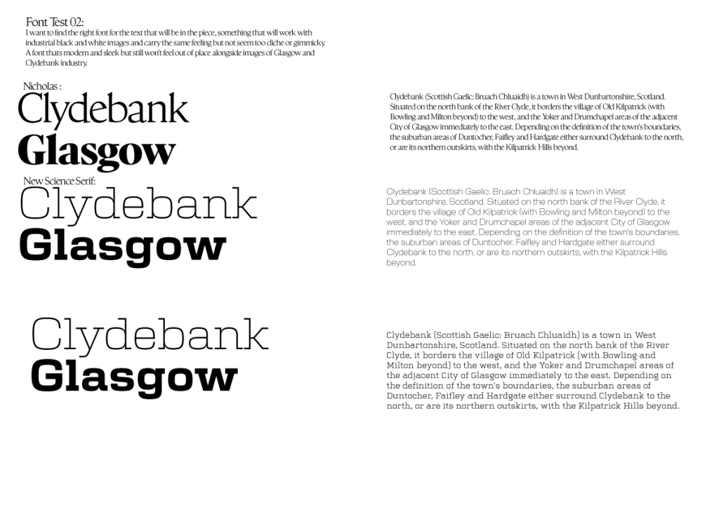
Final font selection:
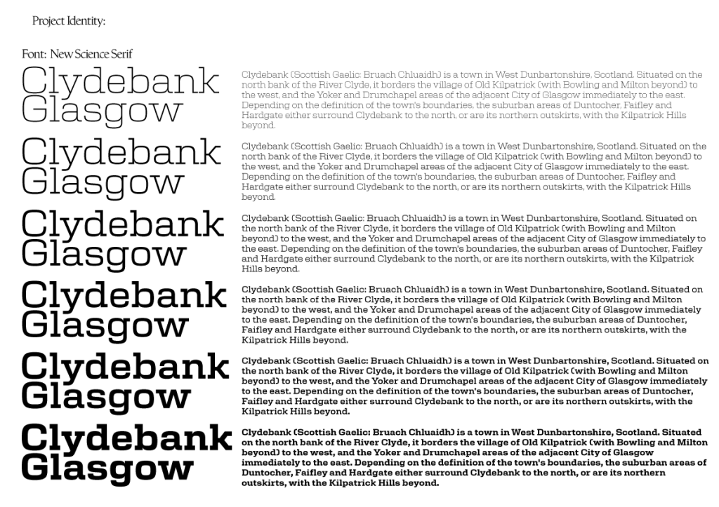
Through the process of elimination, I decided on the font New Science Serif, as it met the requirements I had set myself for the project identity: Clean, clear, impactful, versatile, and fitting with Glasgow and Clydebank’s industrial history.
As my plan is to lean into the industrial history within this project and have a textural aspect as well, the font should be harmonious with that texture and theme.
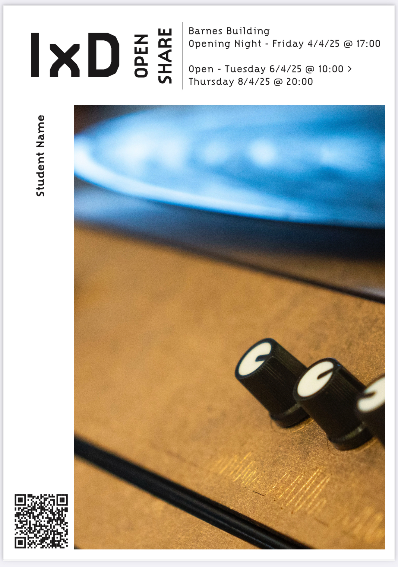
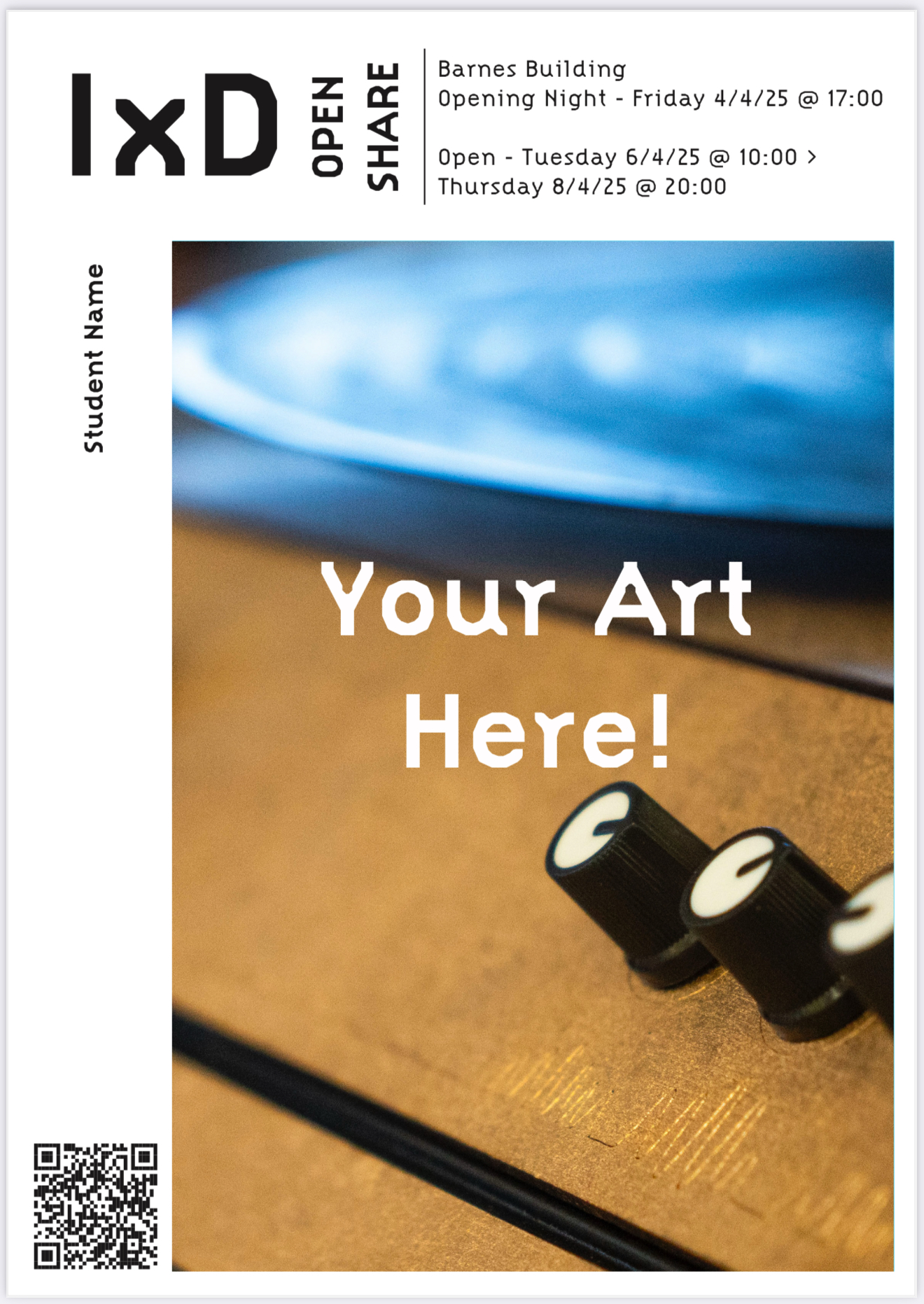
Project Visual Plan:
Reflection – 8th May 2026:
Before handing in, I want to look back at the whole project and reflect on each step of the process now with the hindsight that I have at the hand in date:
When revisiting weeks 9 & 10, I can start to see the beginnings of what my project is going to become, the style, the focus on the medium of photography, the focus of that photography being Glasgow and its people, as well as the idea that I would produce a museum-style display to excite and inform people of a subject that I’m interested in as well.


