Semester One:
Semester Two:
Creative Technologist/ Designer/ Student.

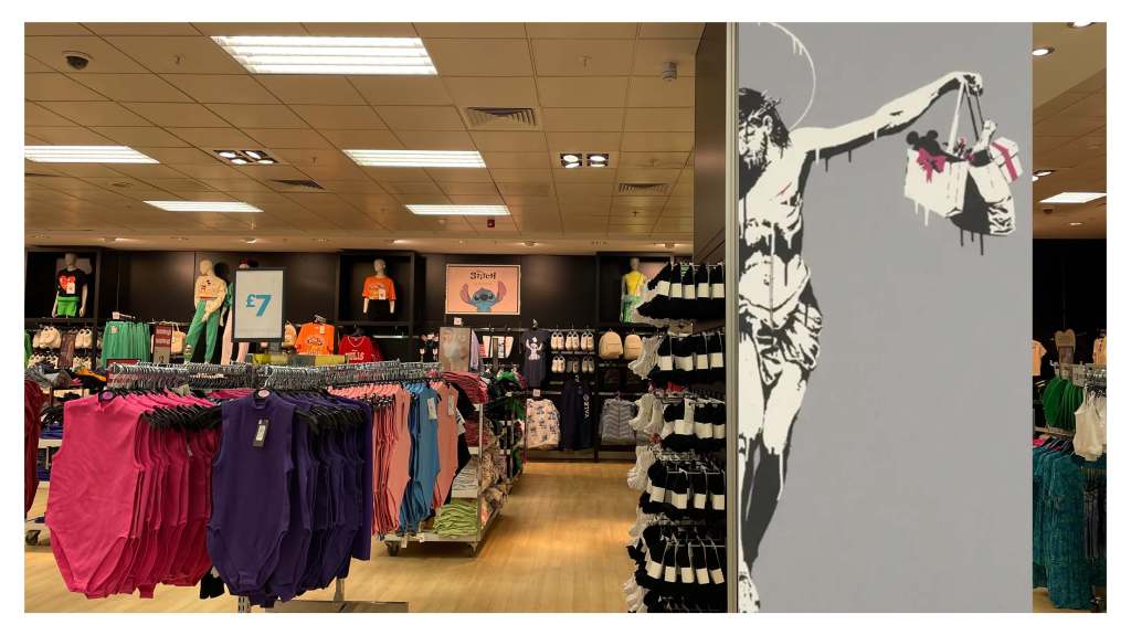
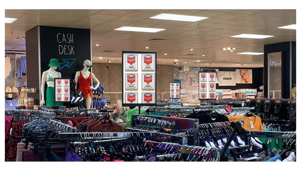
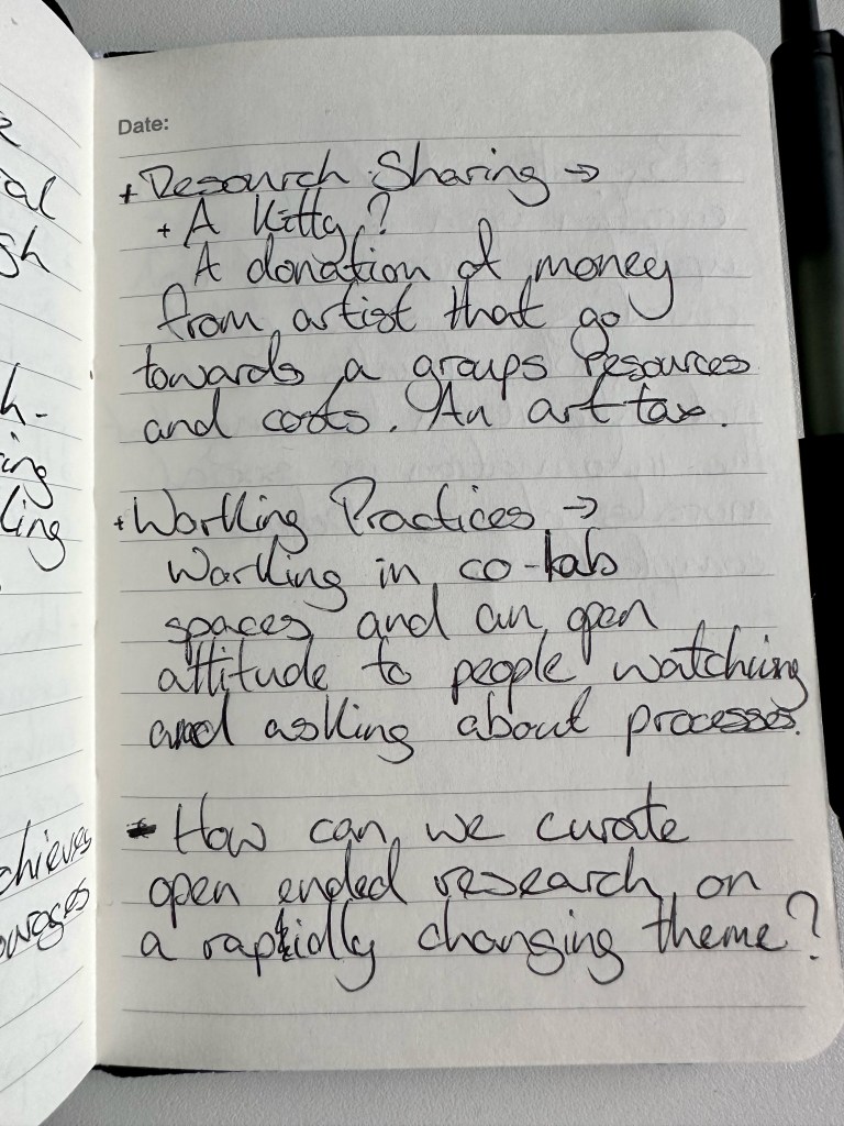
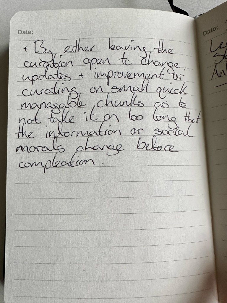
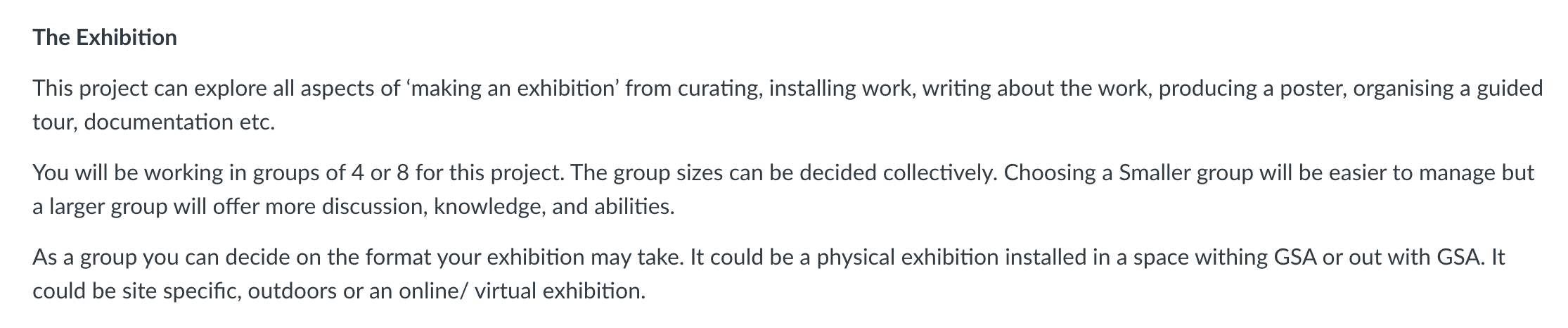
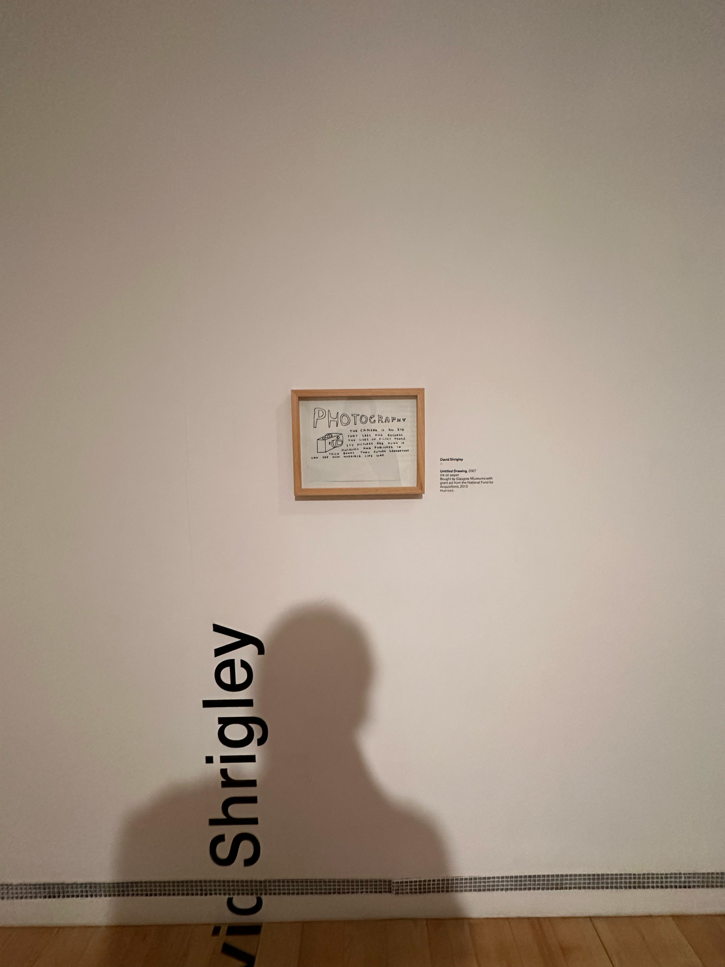
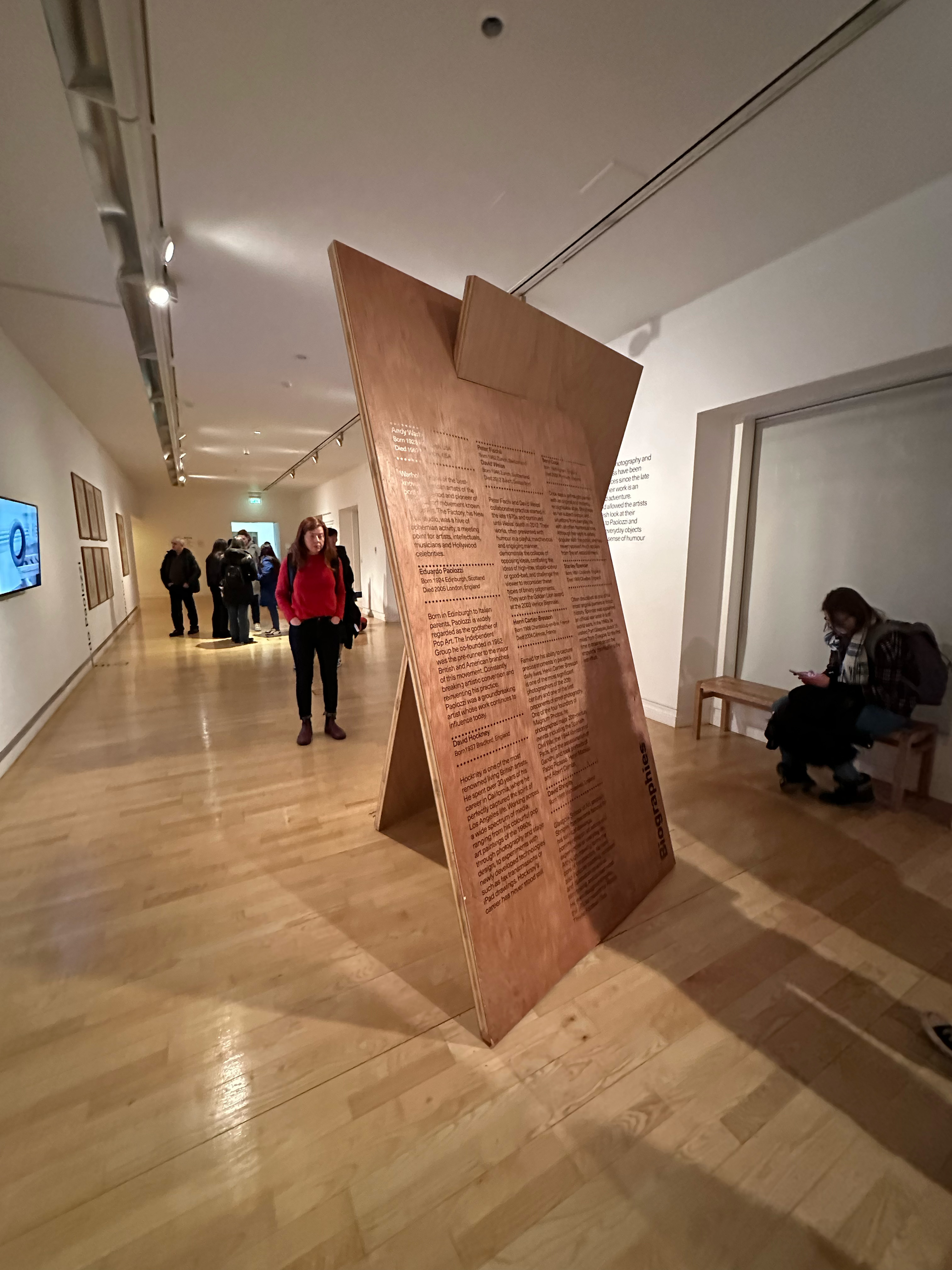
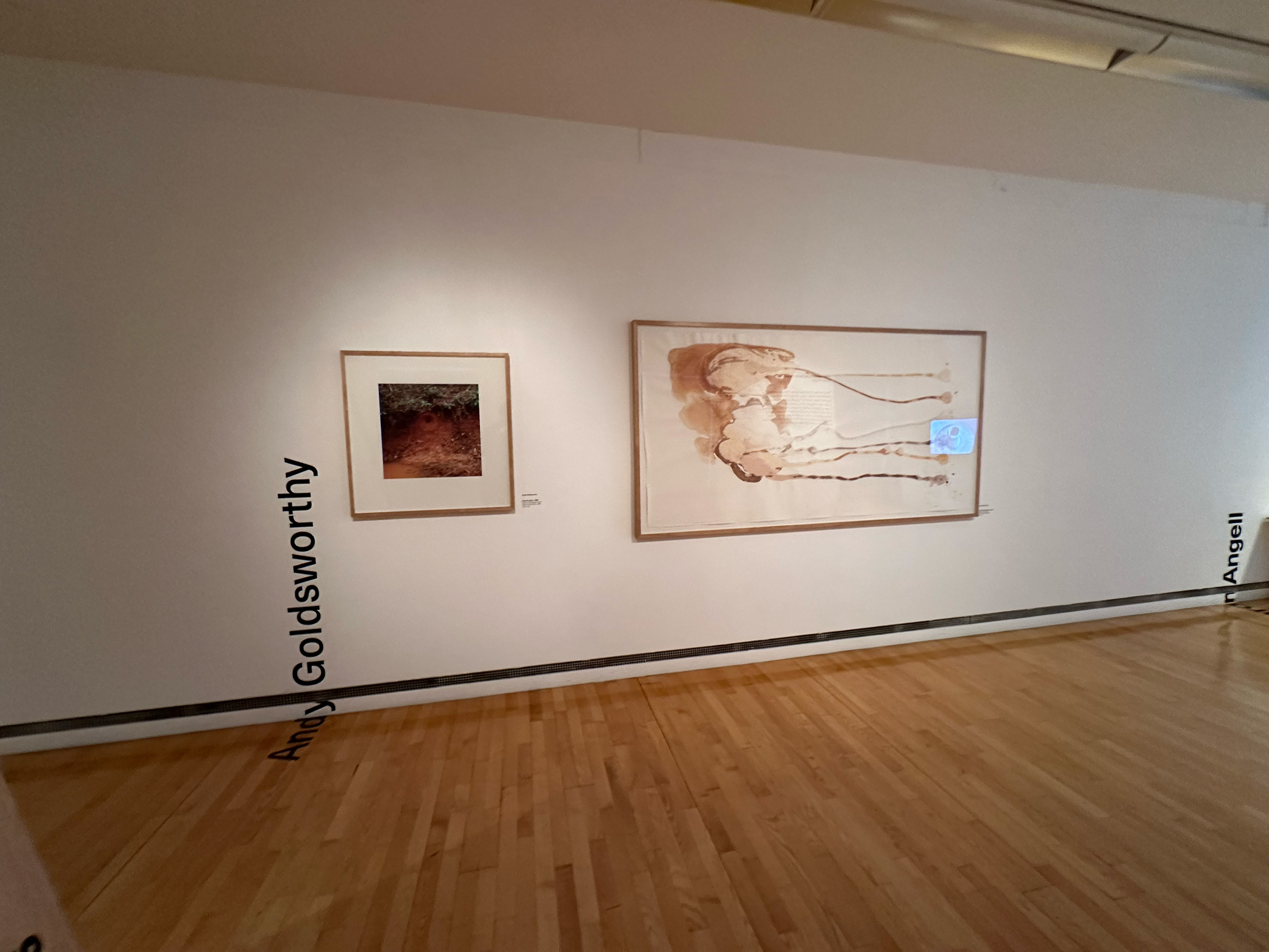
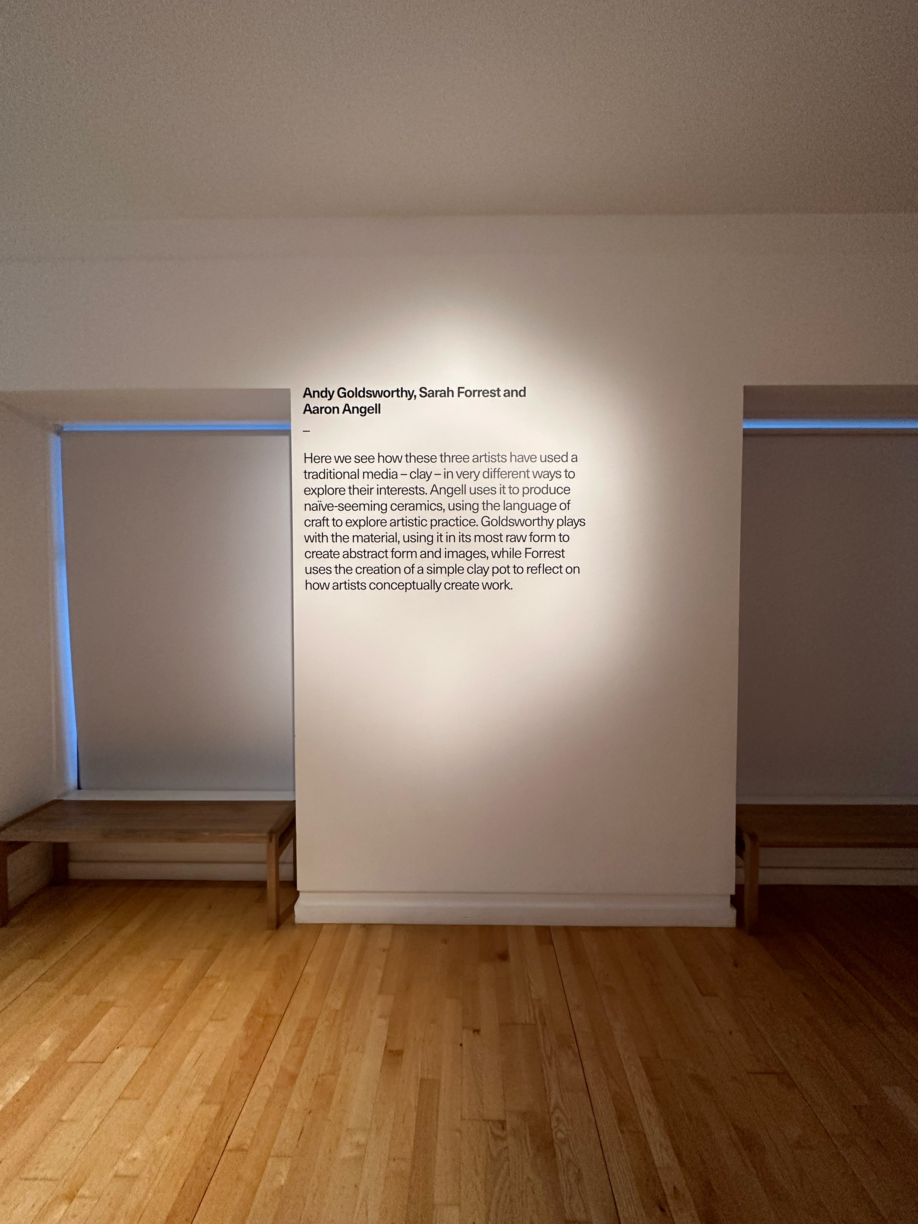
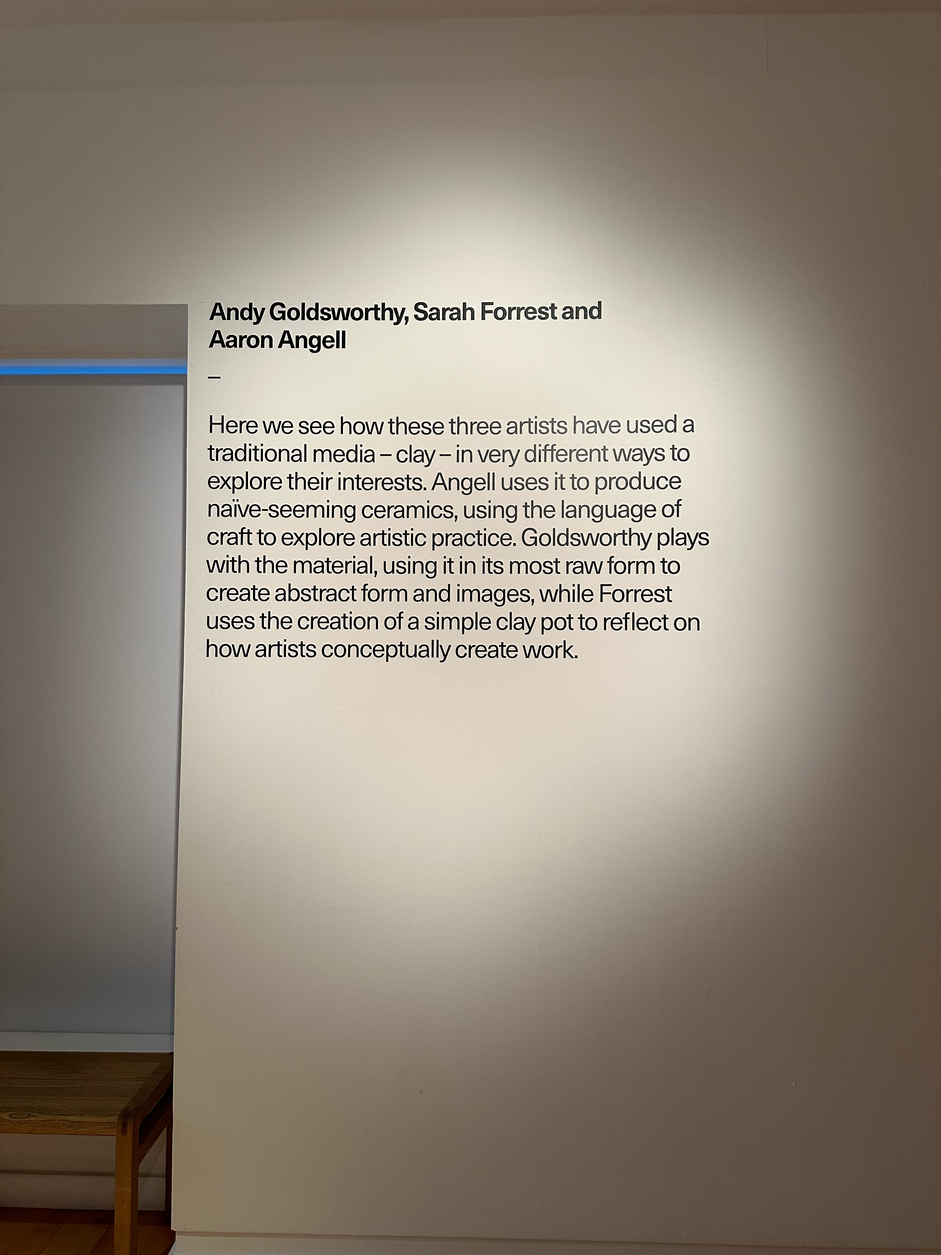
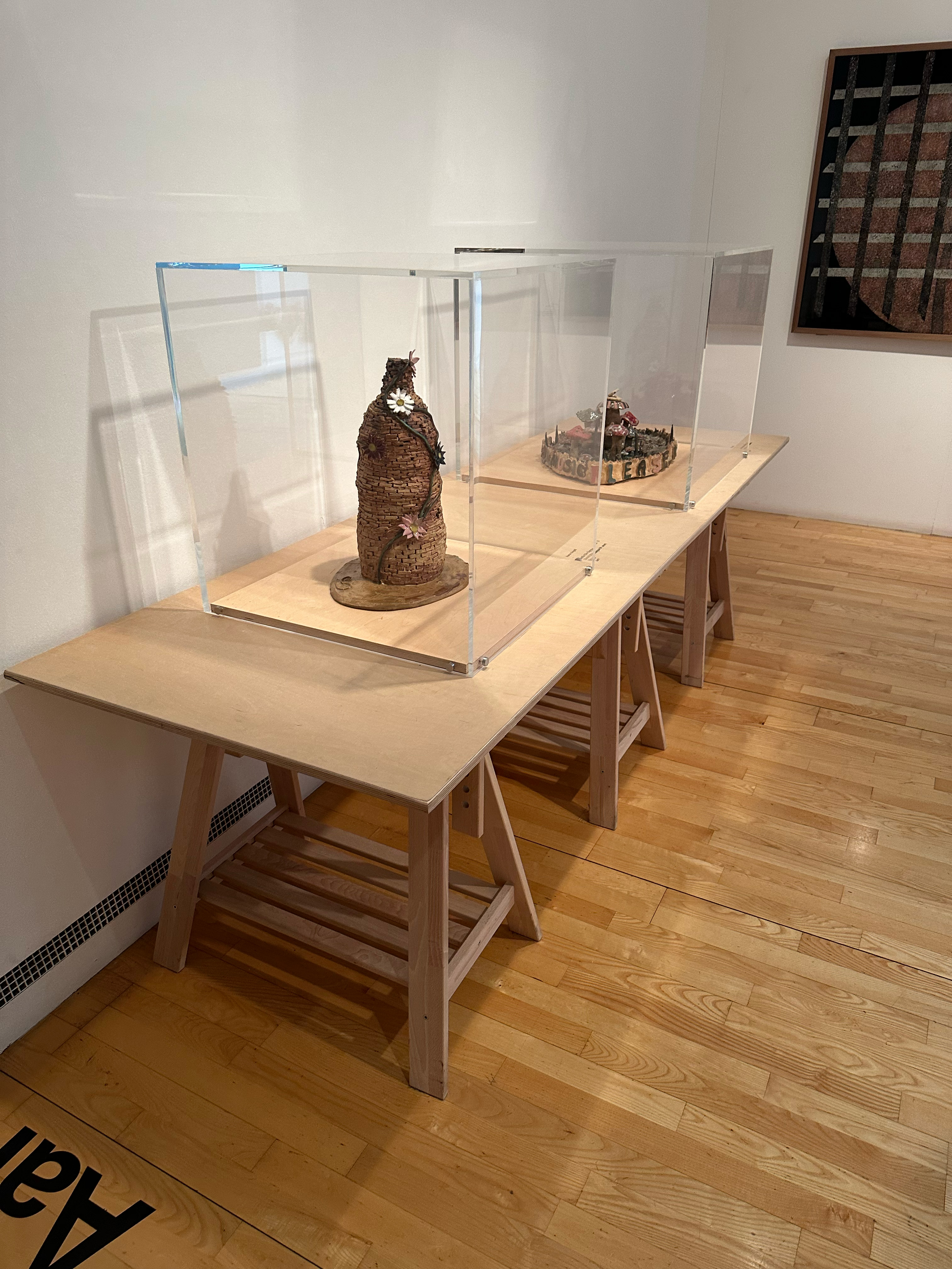
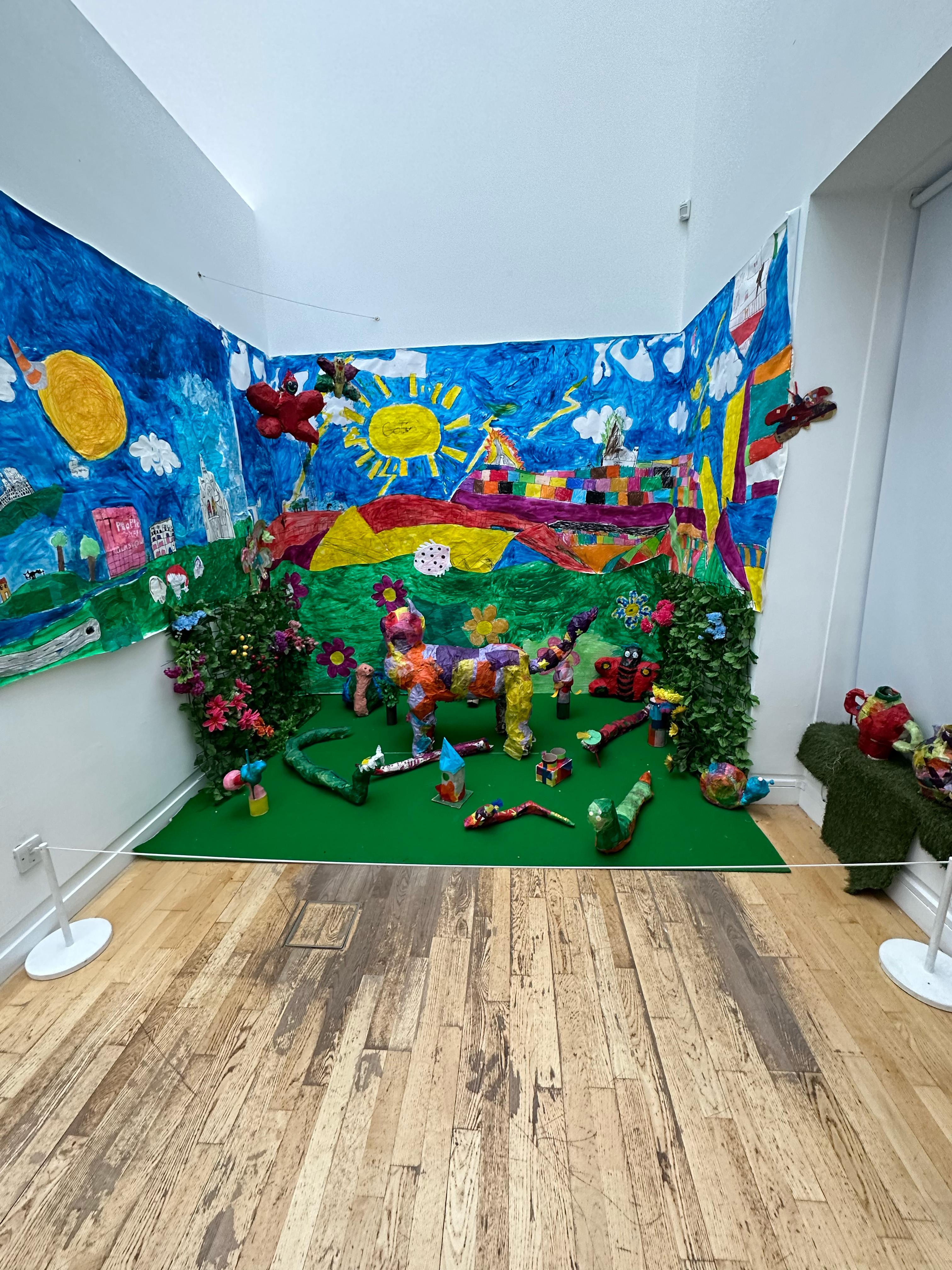
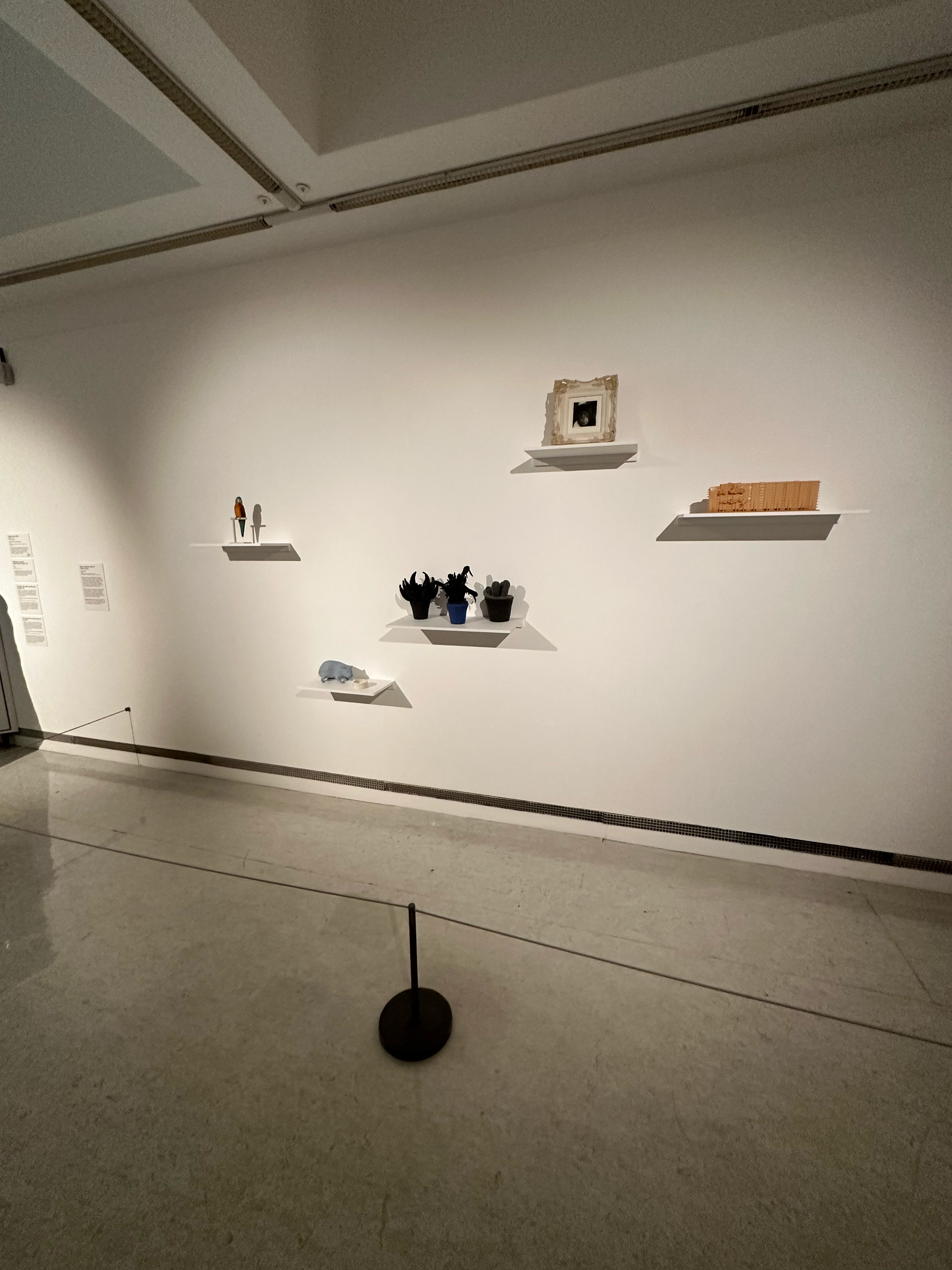
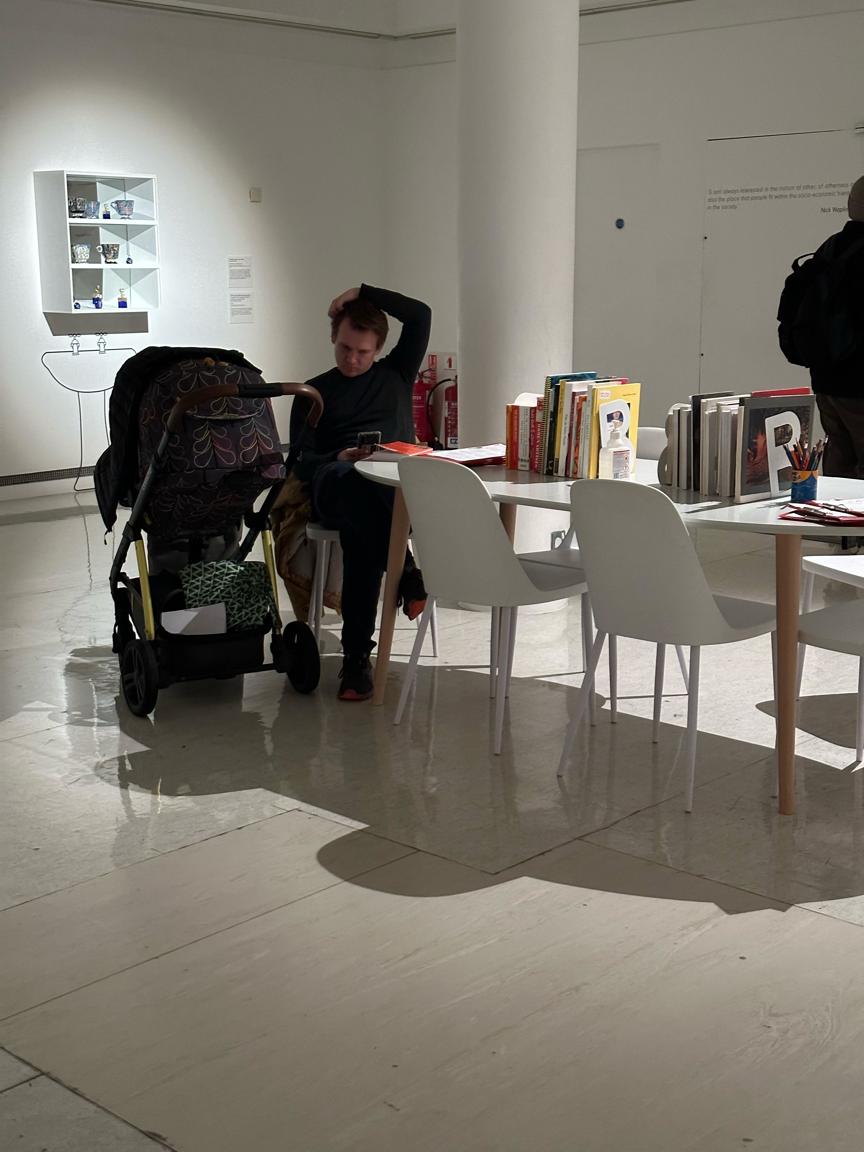
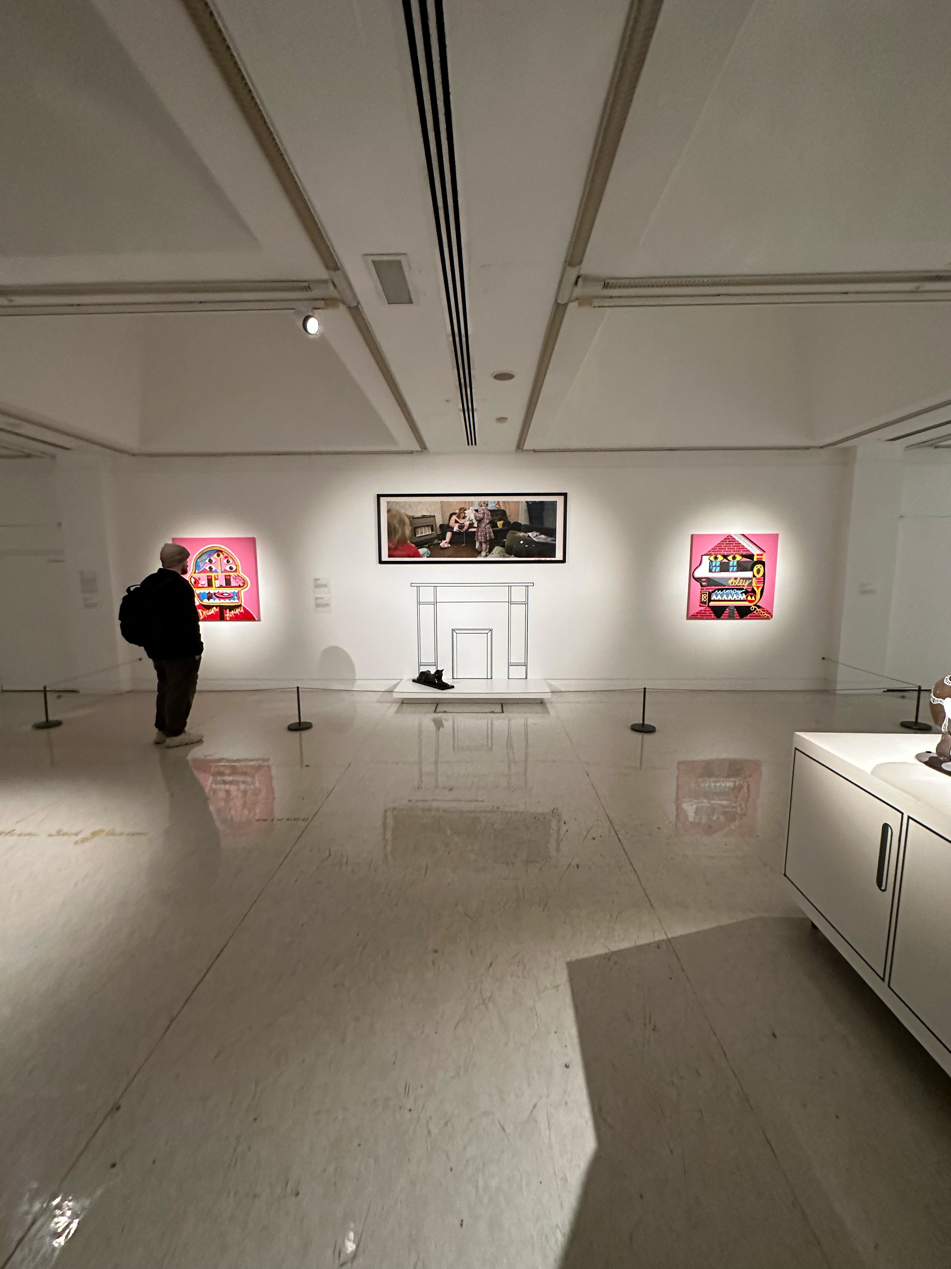
Open share is a chance to revisit a project at the end of the year and display it during an exhibition for years 1-3.
Day 01
Initially, I wanted to revisit my sensory objects project and refine the book with smaller components and conductive paint instead of the tape and just an overall design refining. But due to time constraints, I didn’t have enough time to order the components. I should have ordered them beforehand, but I was too focused on the previous project, Creative Coding 02.


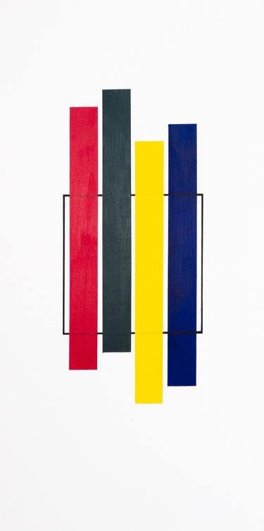
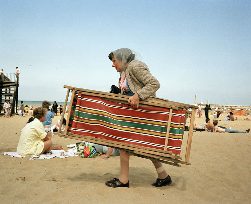
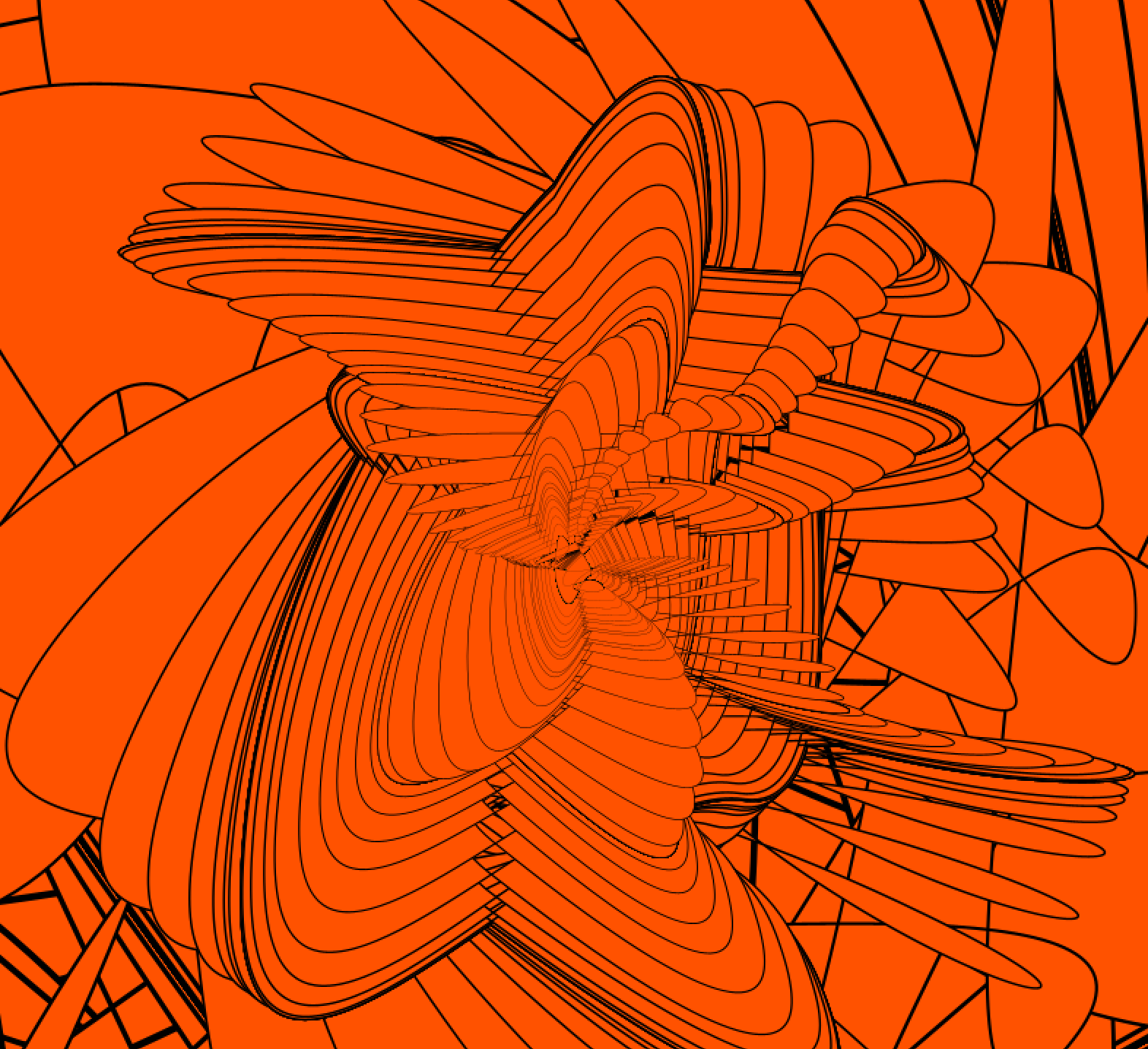
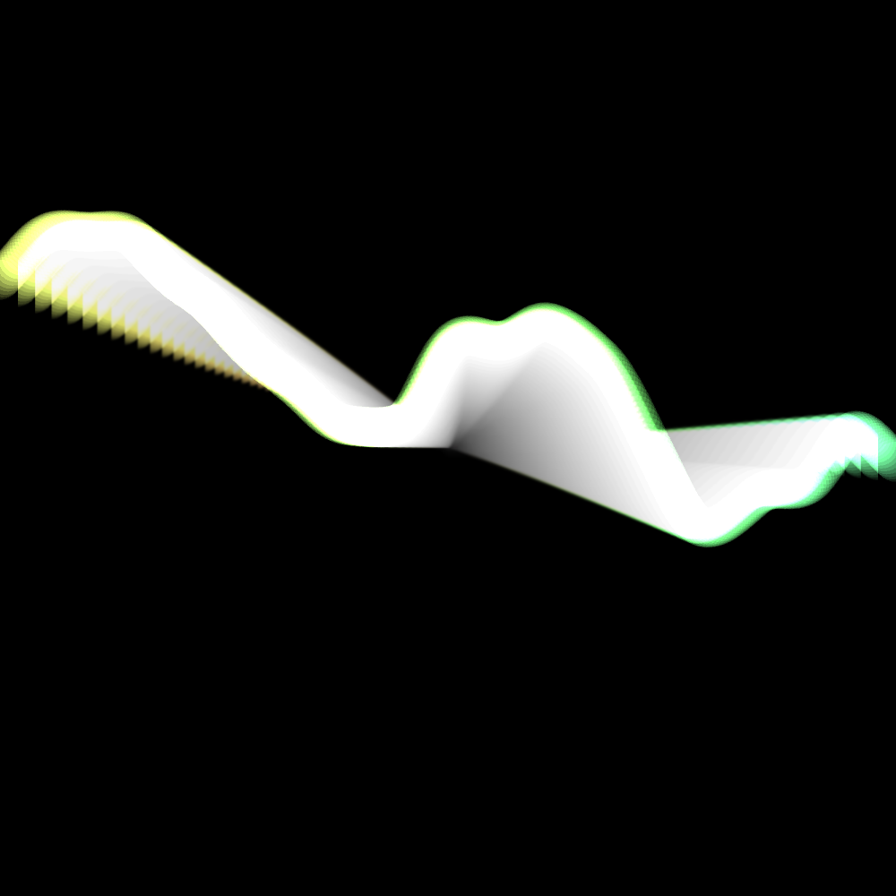
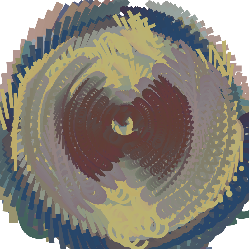
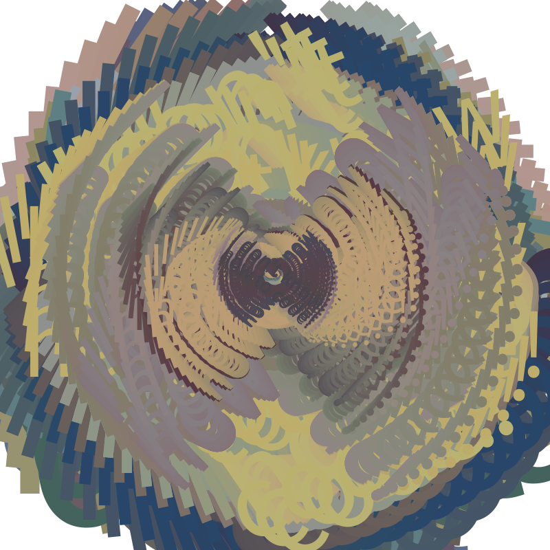
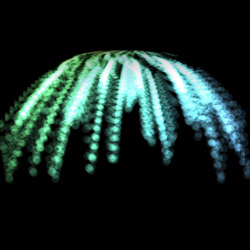
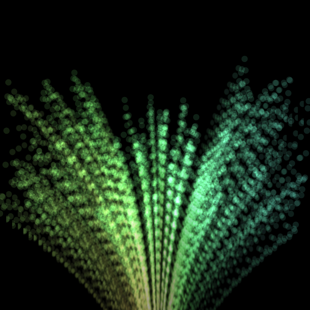
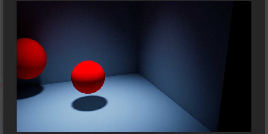
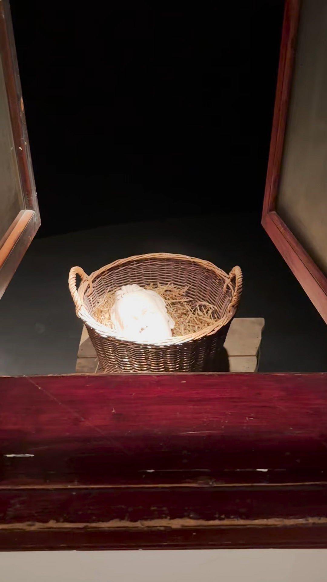
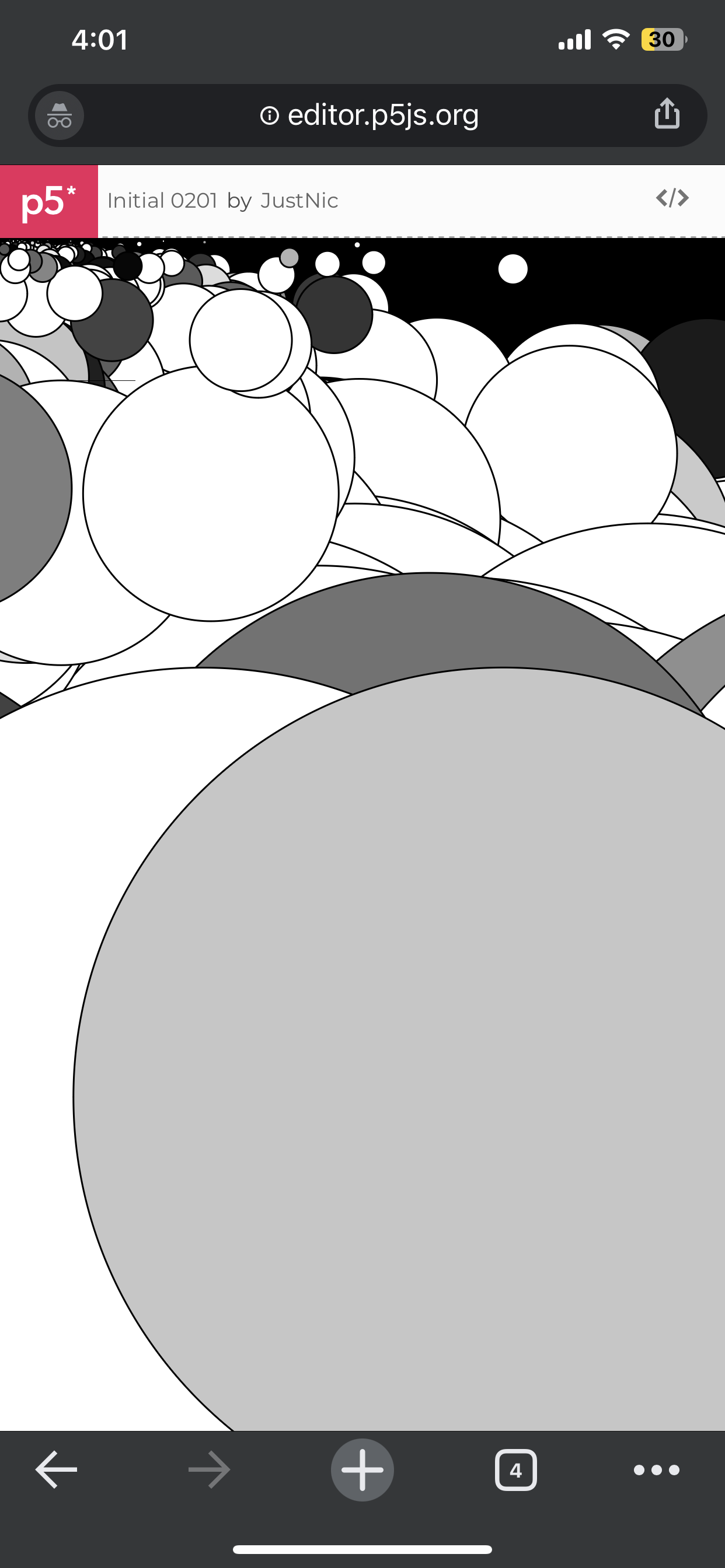
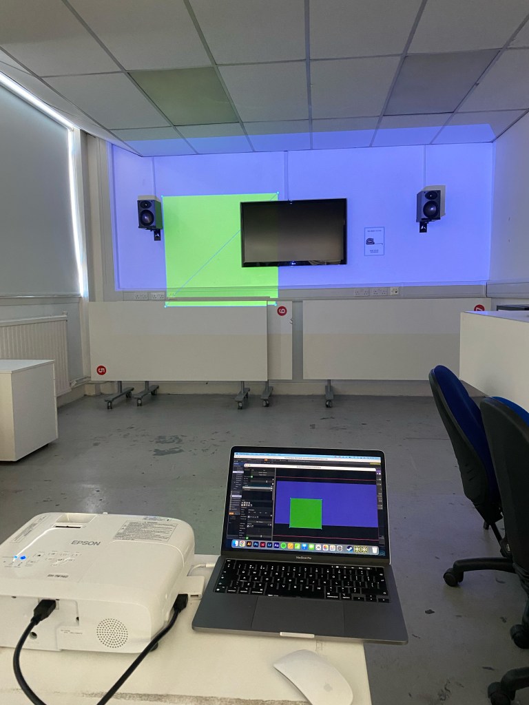
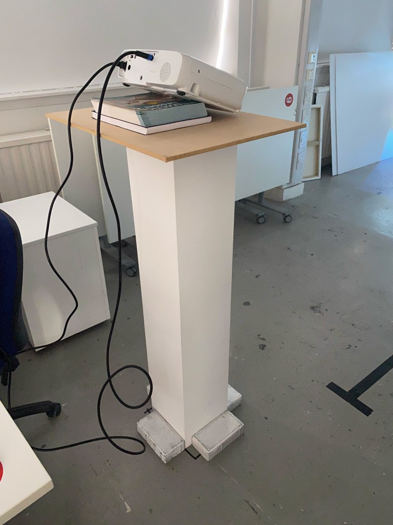
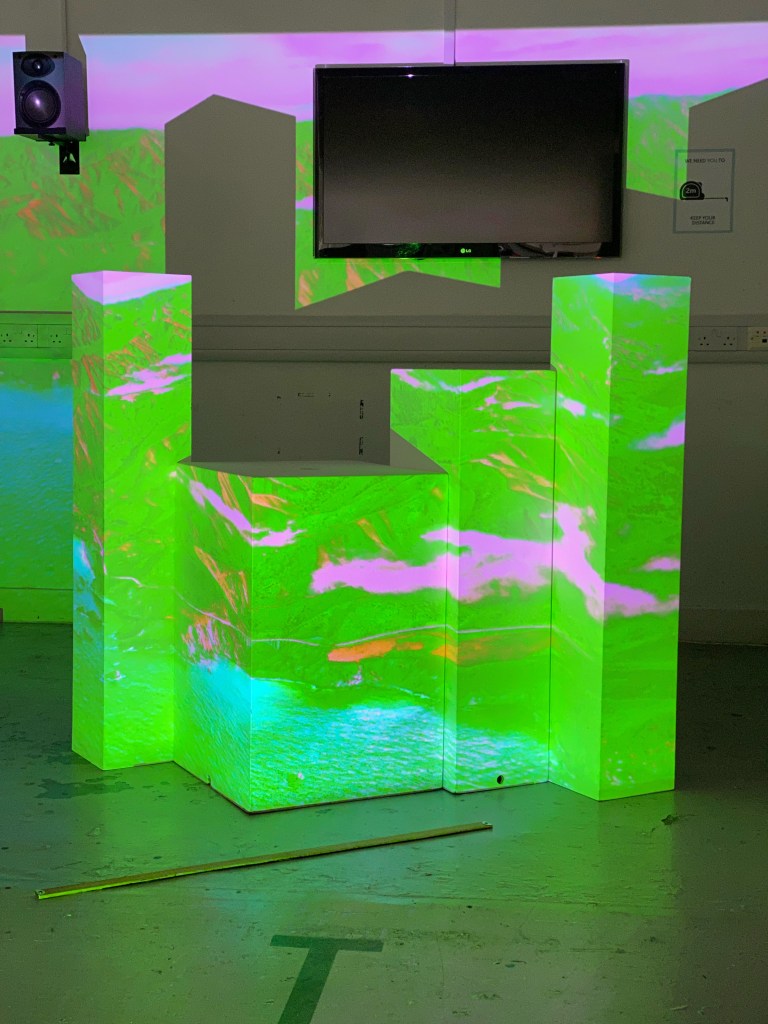
As this project is only three days long, I changed from my Sensory object redesign to my Projection Mapping project as it was something I enjoyed, and I felt that I already had some idea of where I wanted to take it.
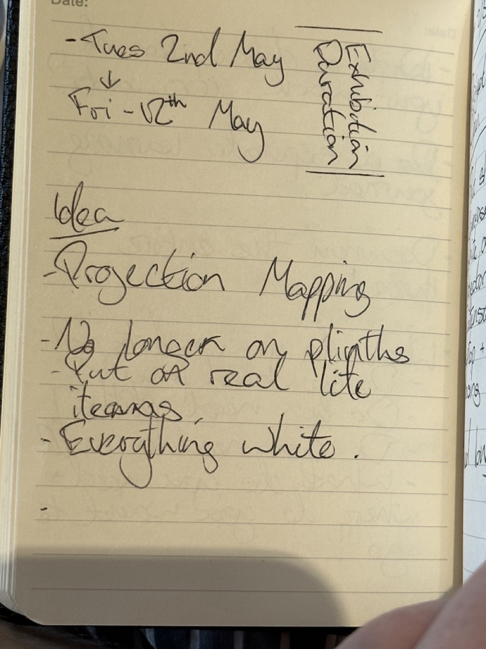
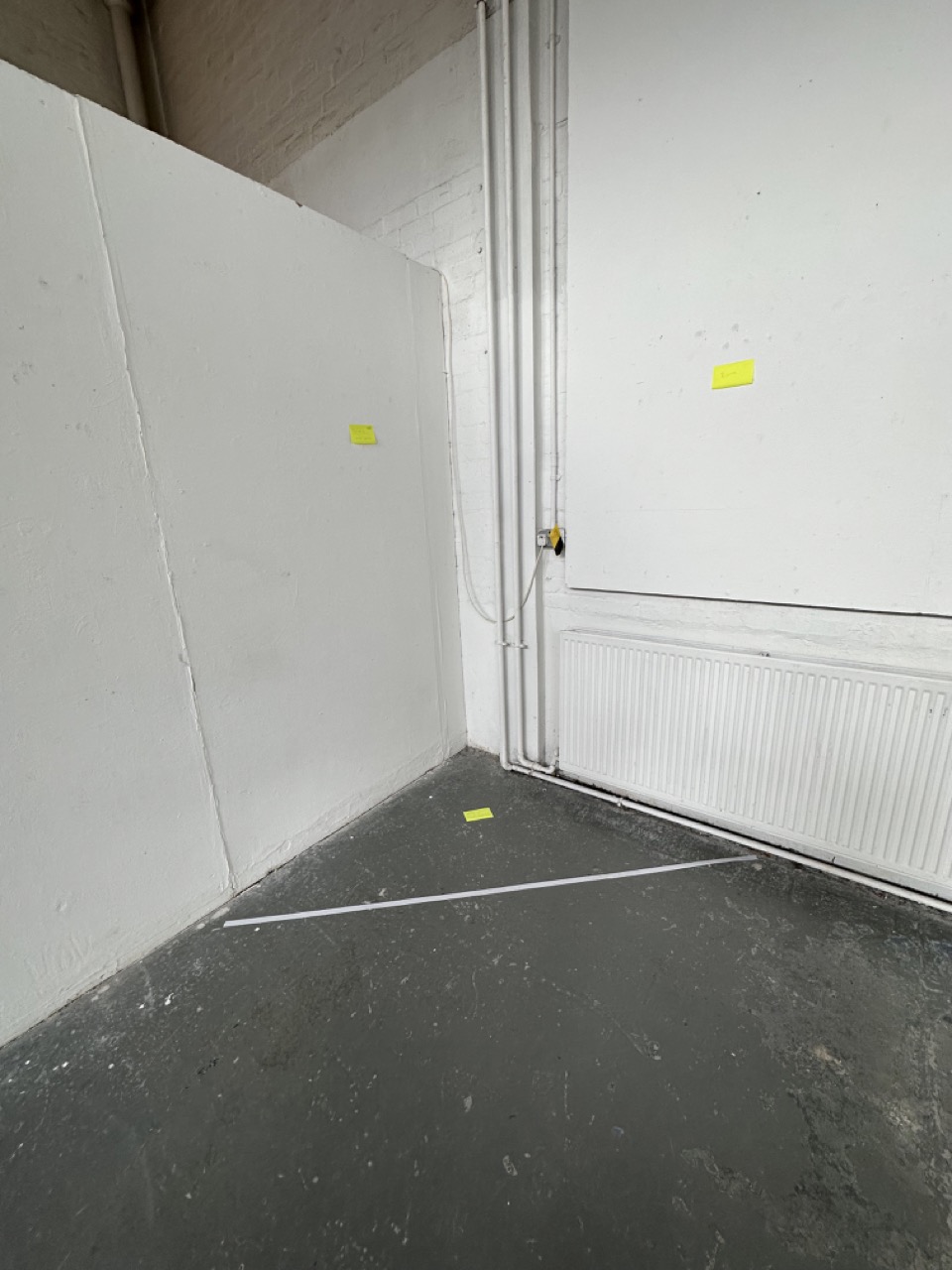
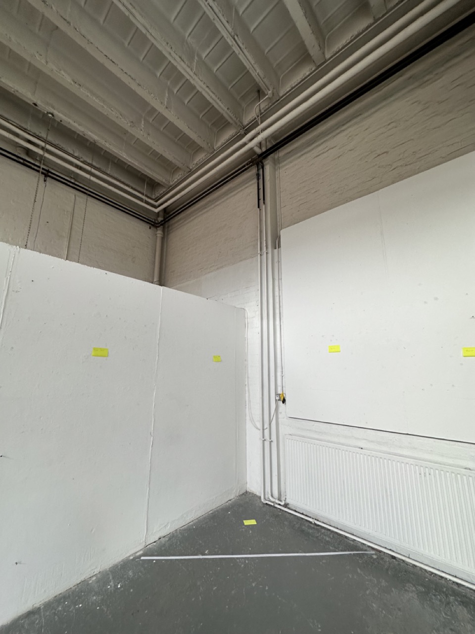
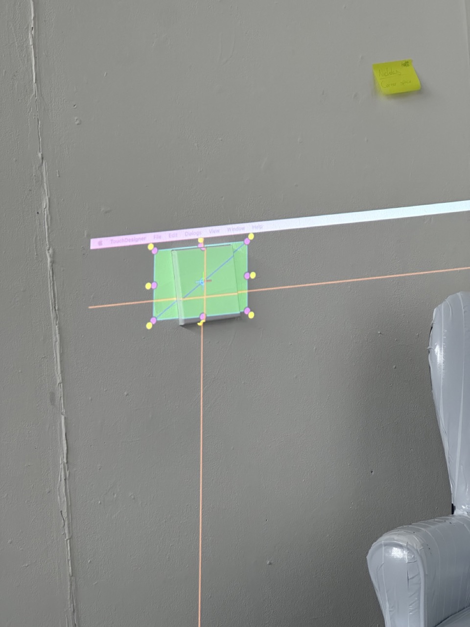
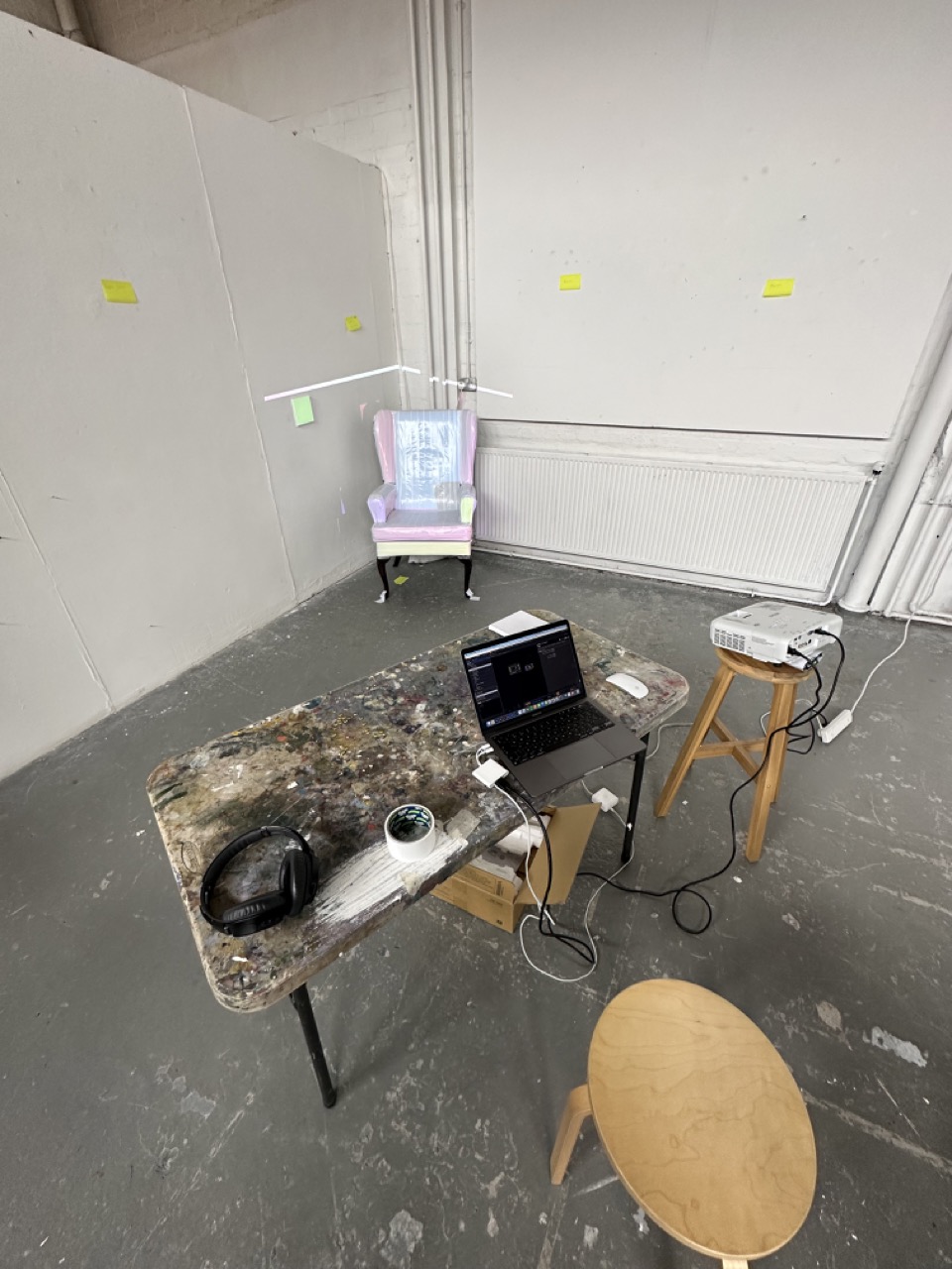
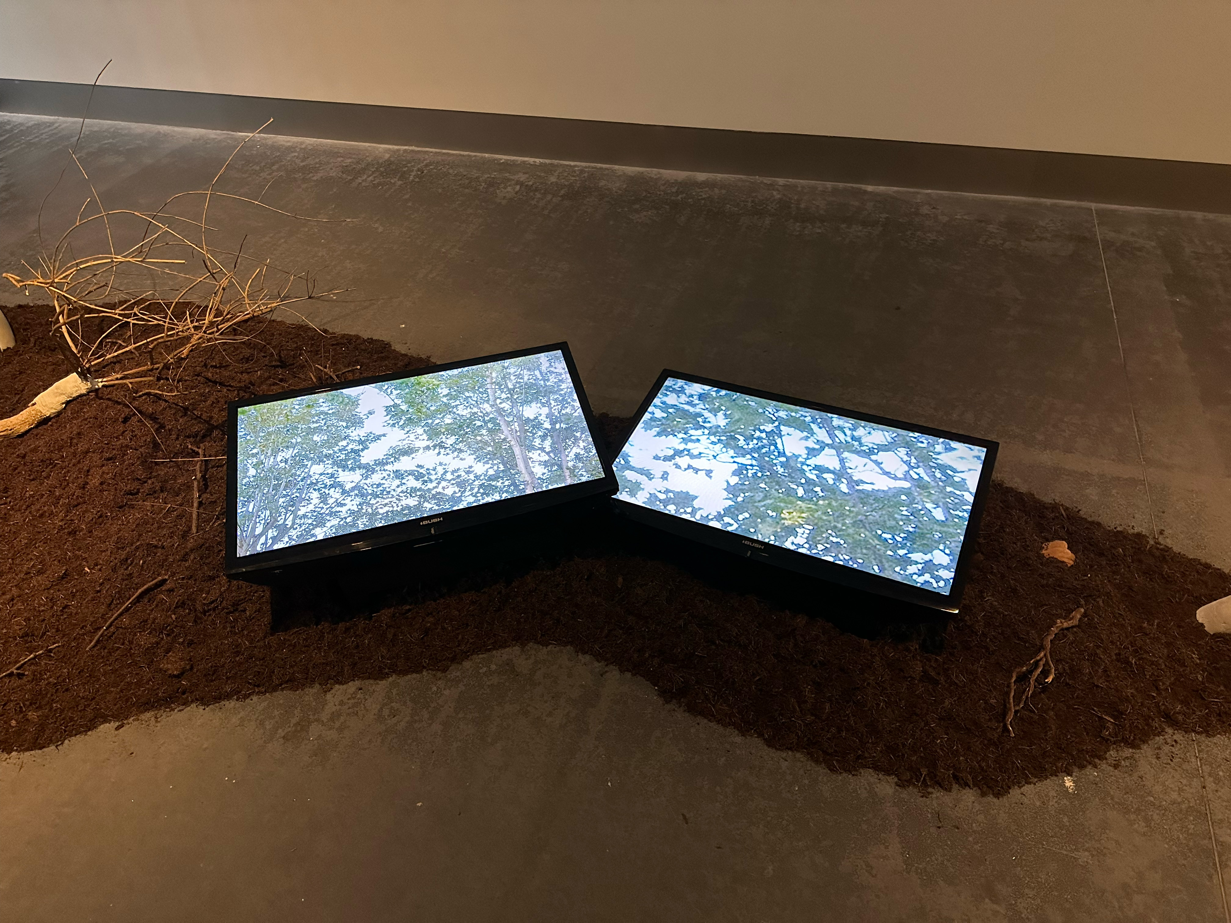
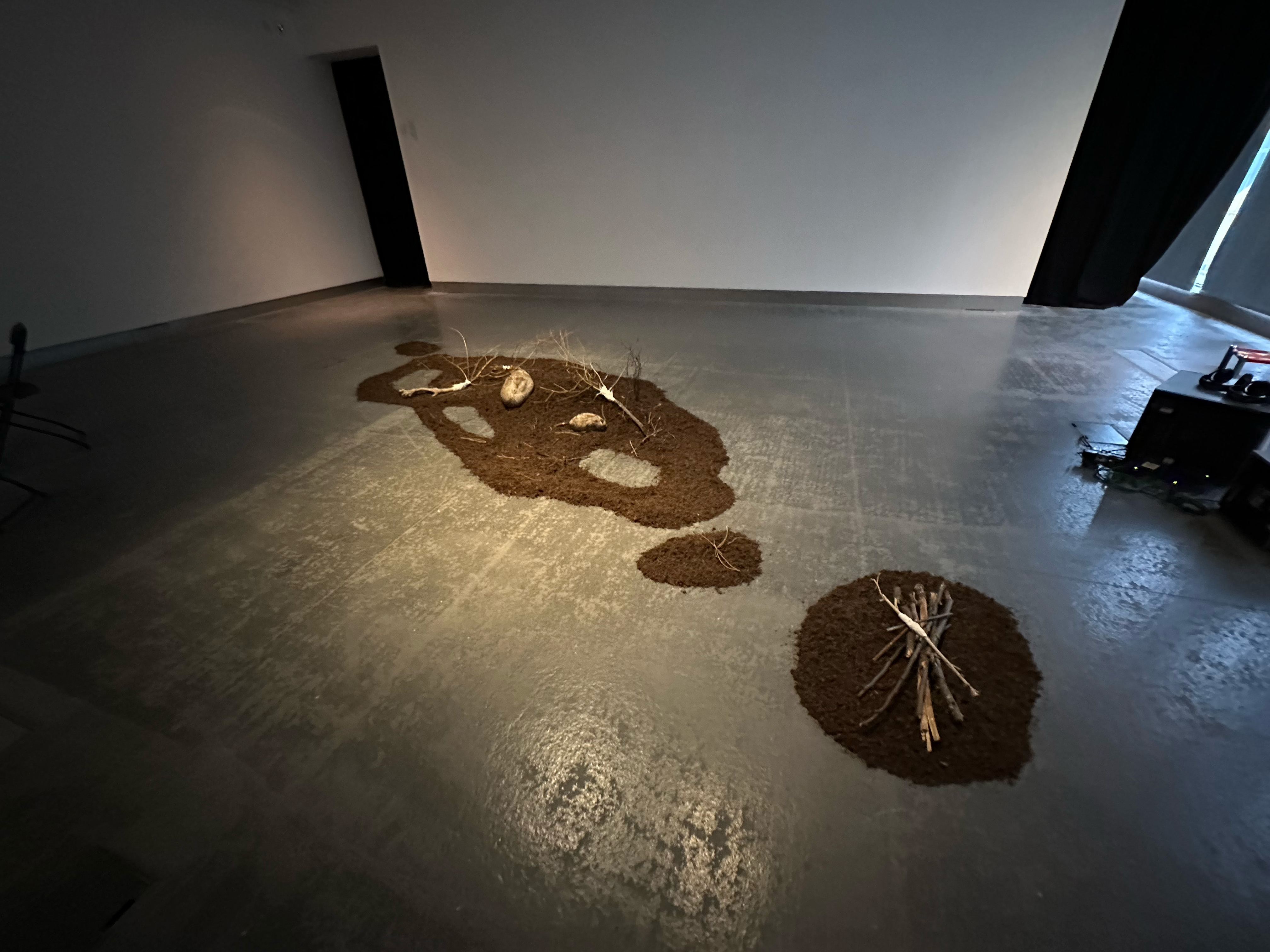
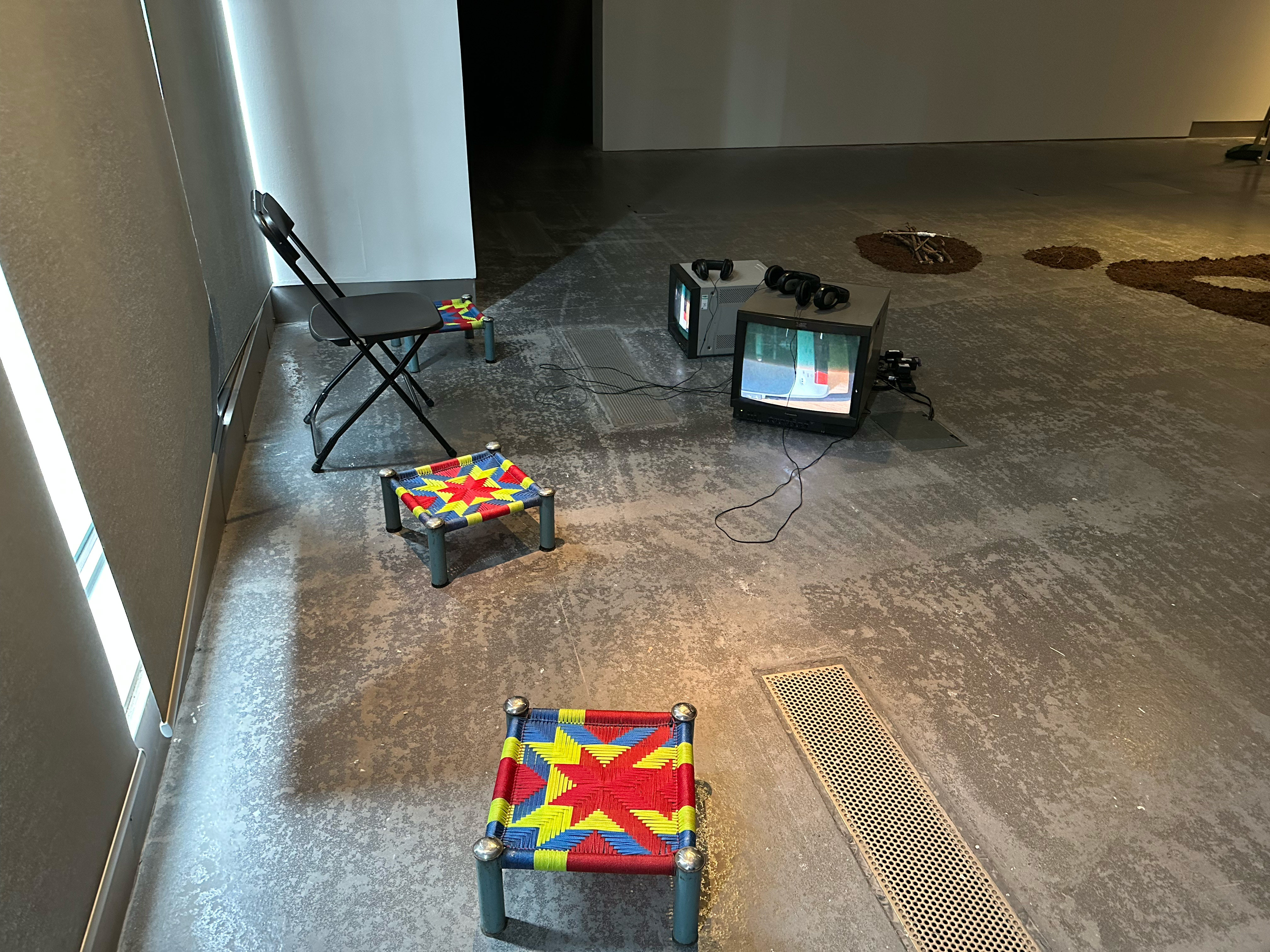
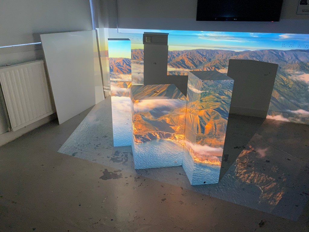
Initially my thoughts on the projection mapping second iteration where to bring back the plinths, get higher quality images or moving images and then present it in the garage space.
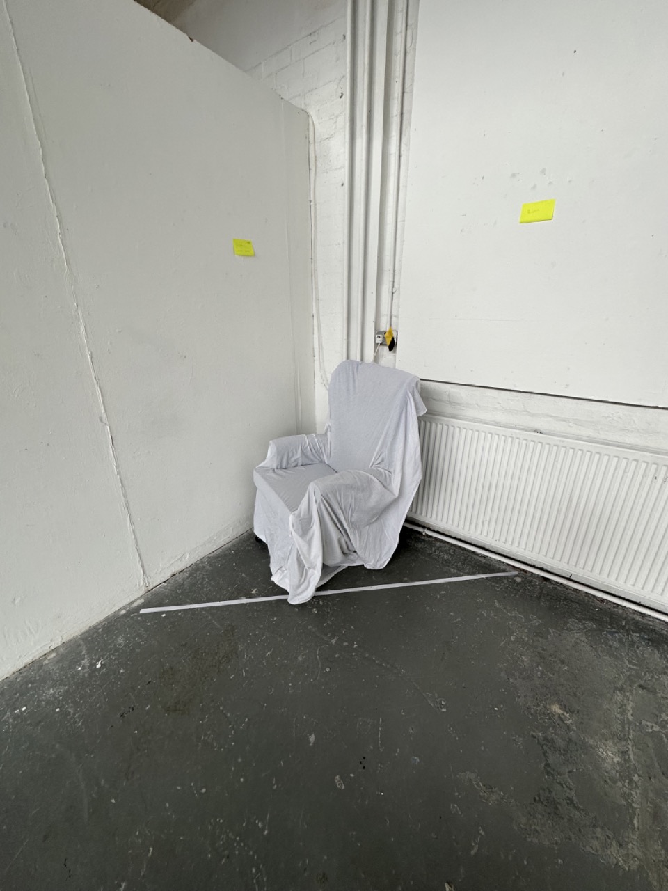
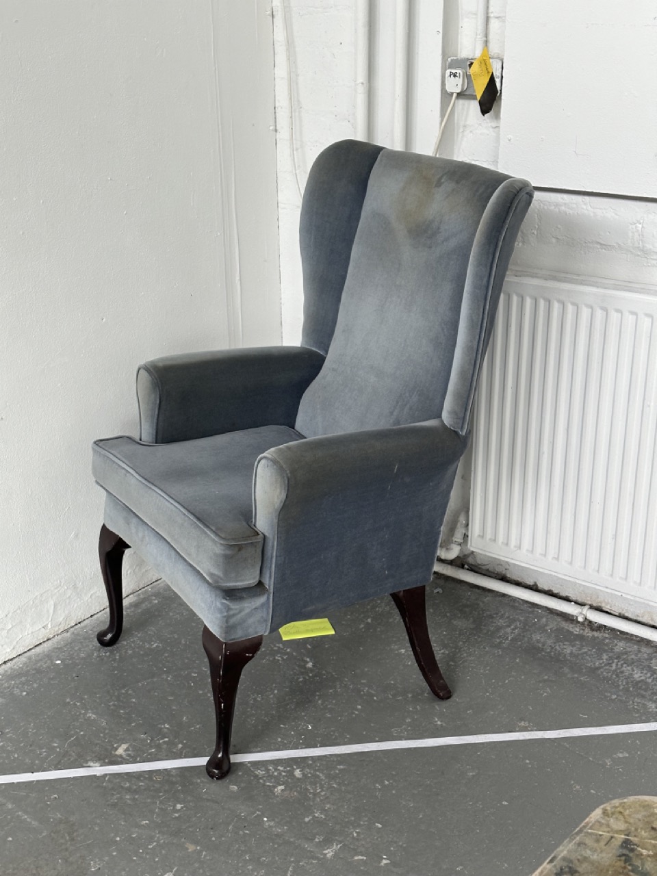
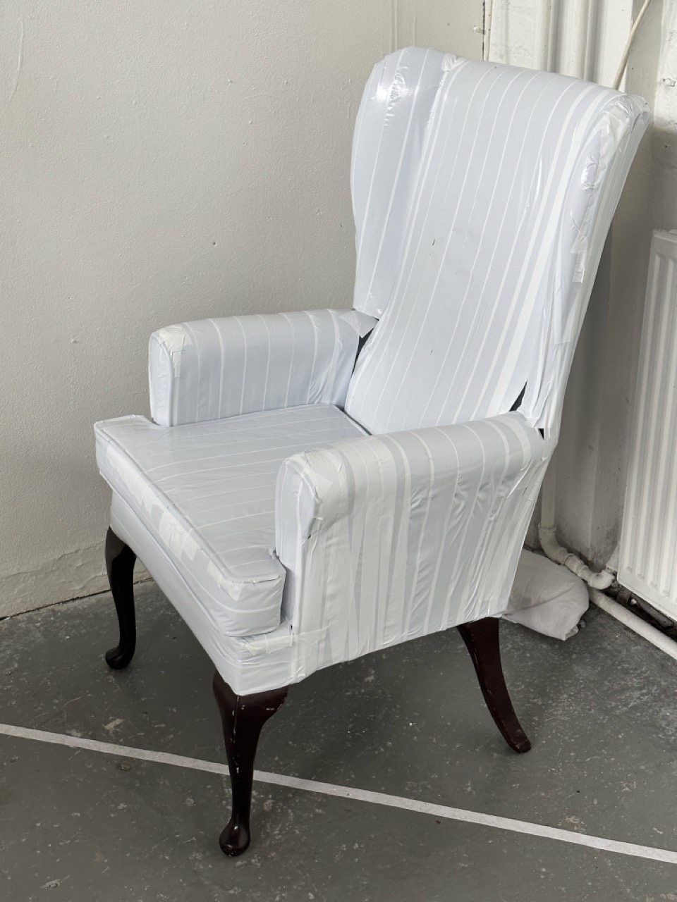
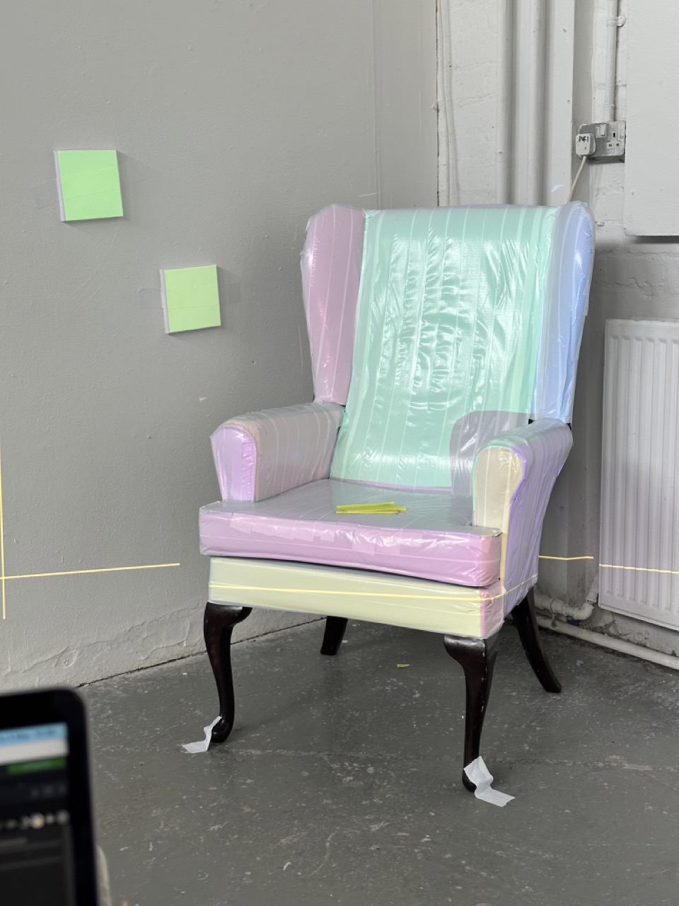
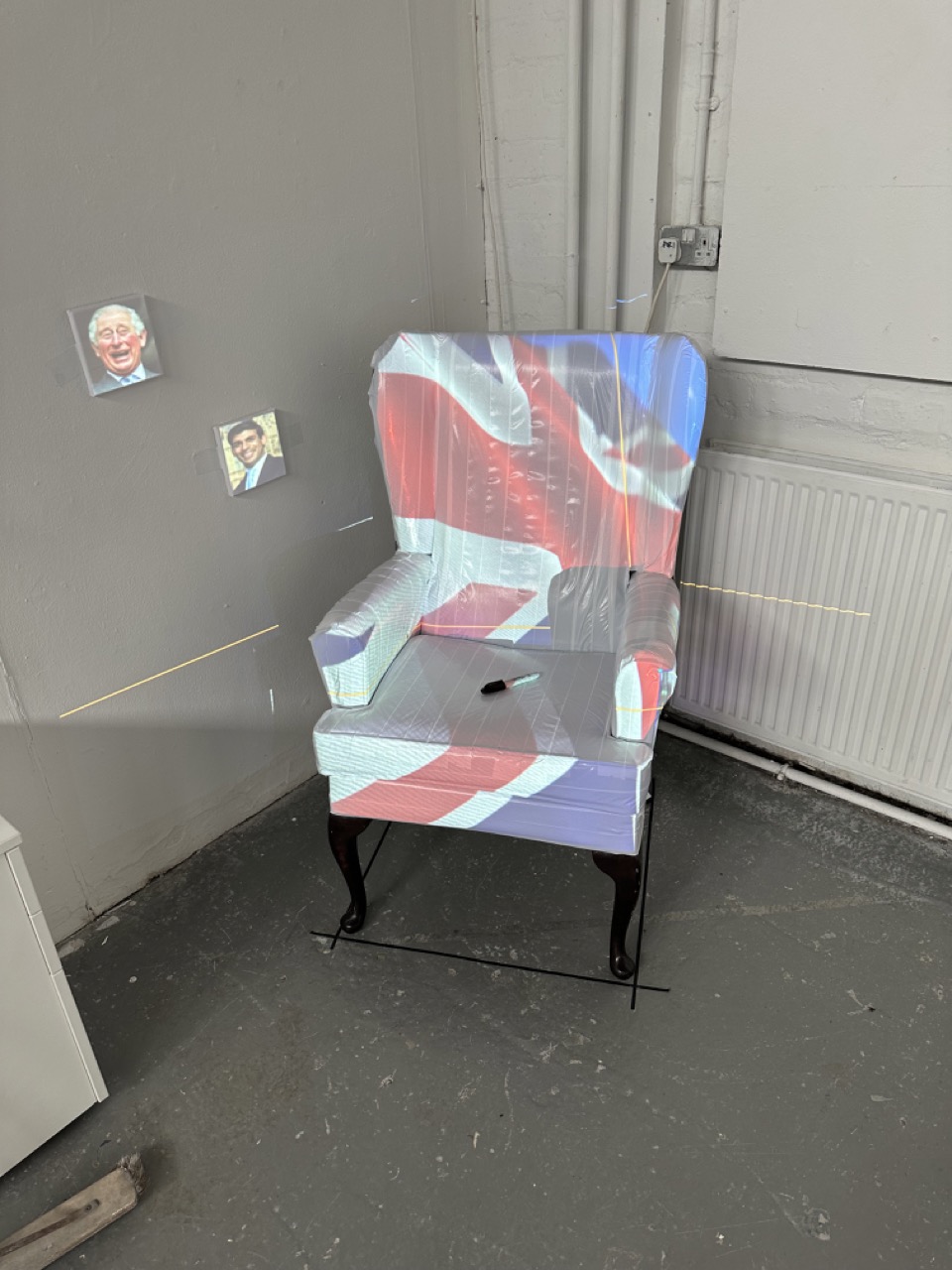
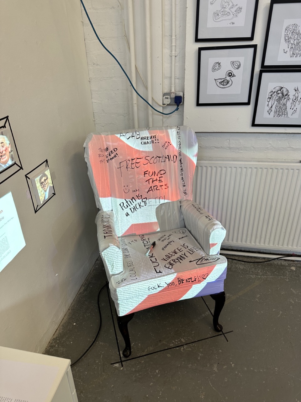
My first snag in that was the lack of plinths as they where already in use for the 3rd years projects and now still in use for the open share projects. So in my frantic mind as I walked into the studio I seen Saoirse’s old chair.
N – “Can I borrow this?
S – “Yeah sure”
N – “Can I paint it?”
S – “No”
N – “Sh*t”
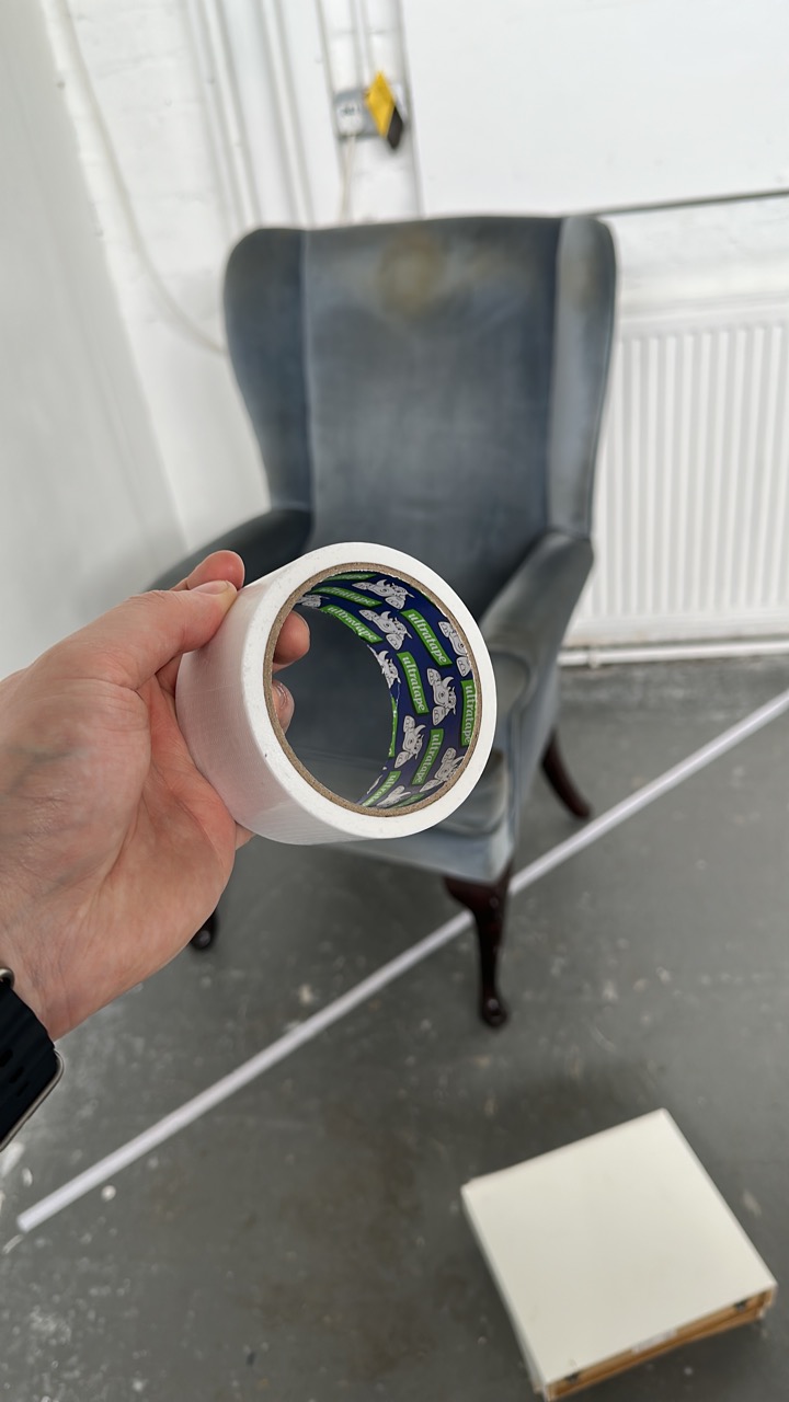
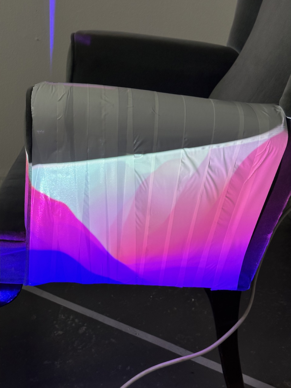
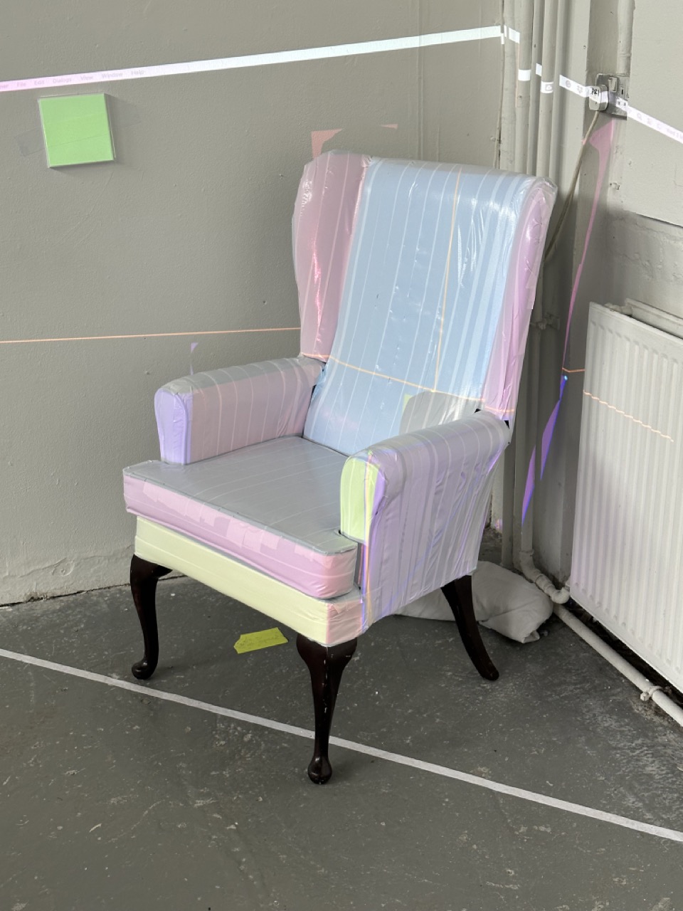
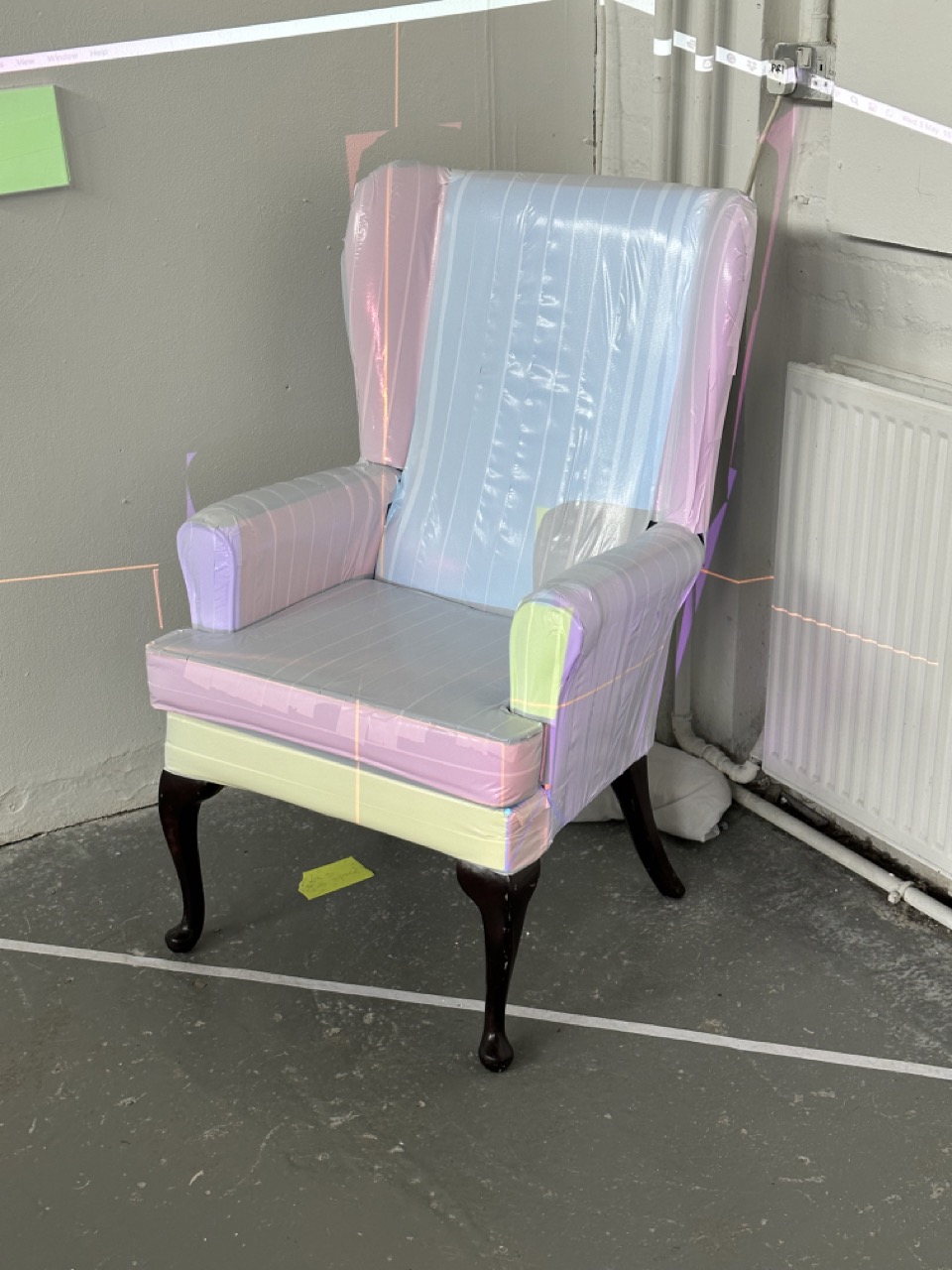
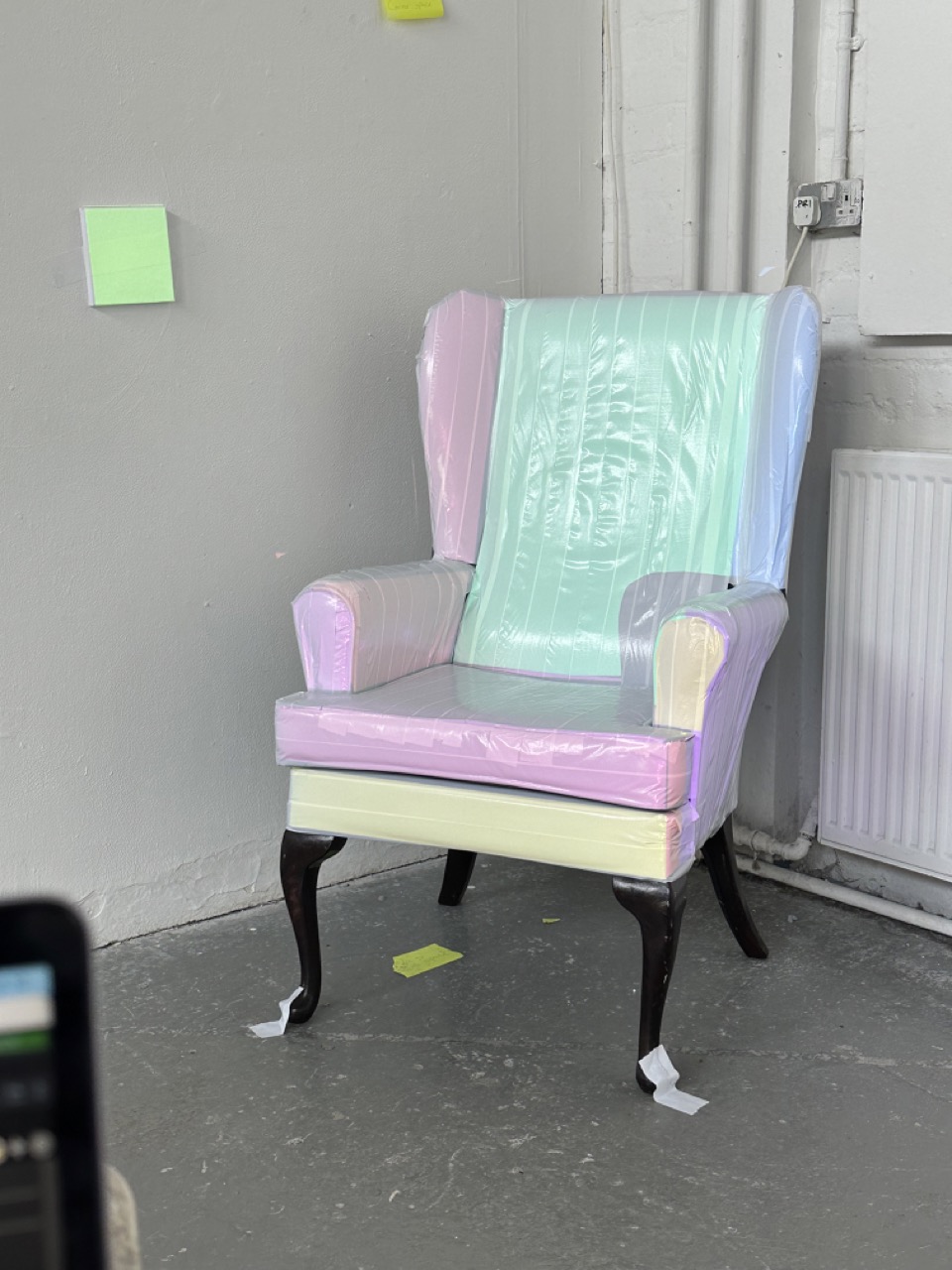
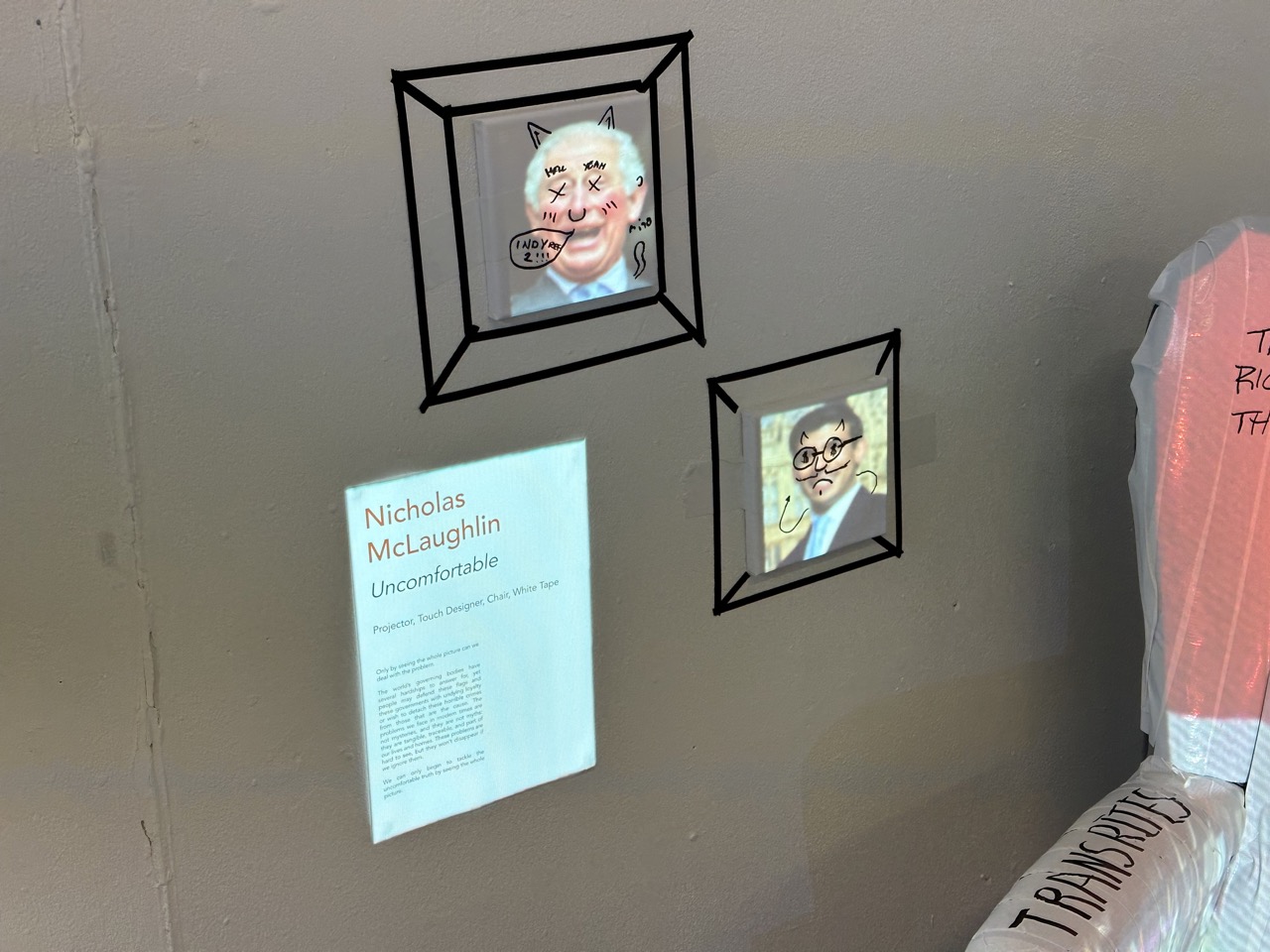
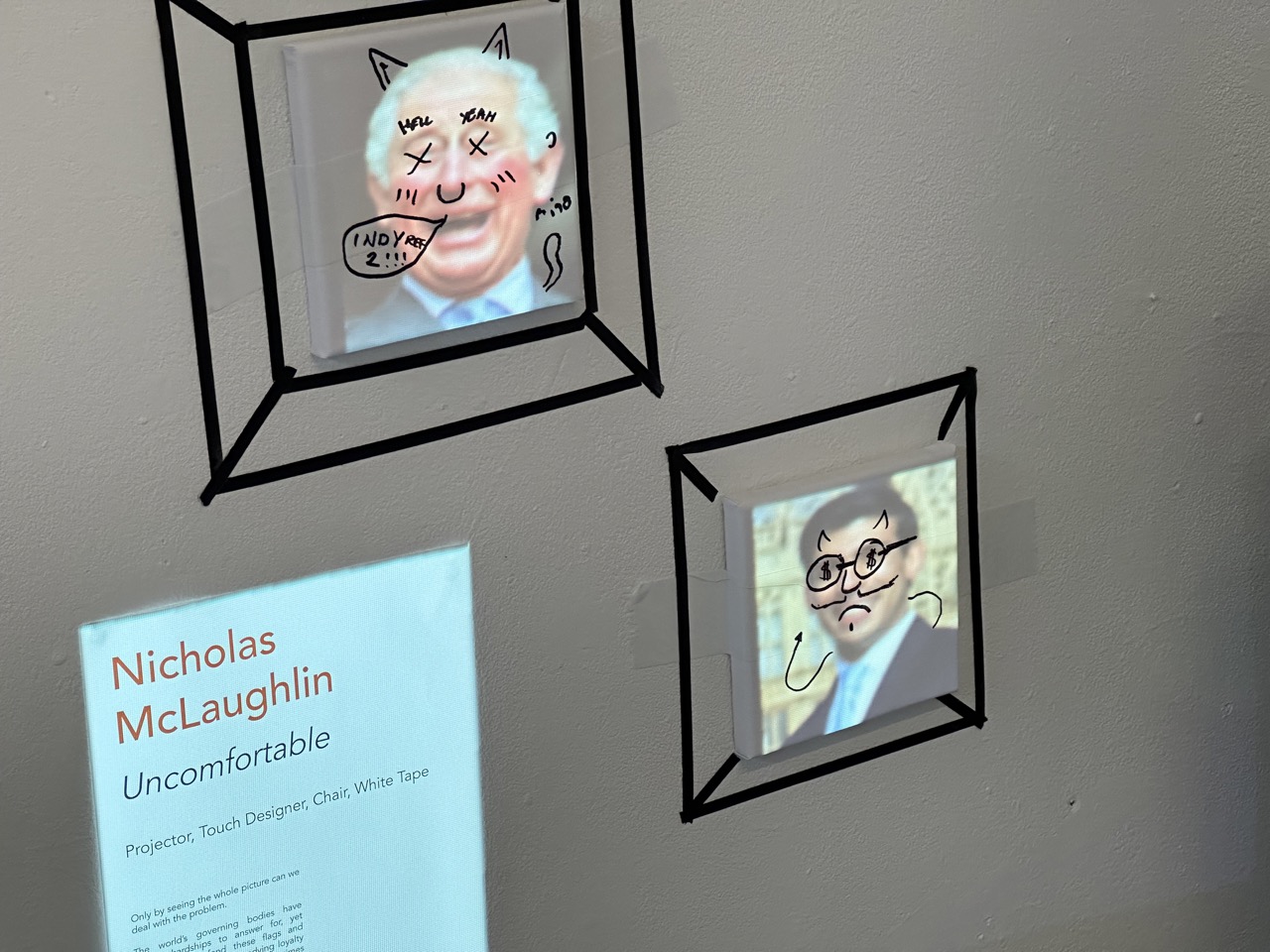
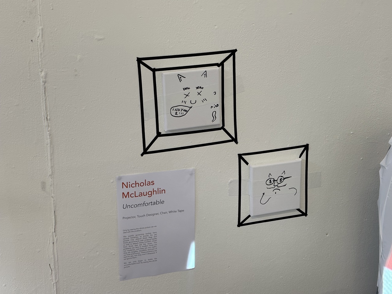
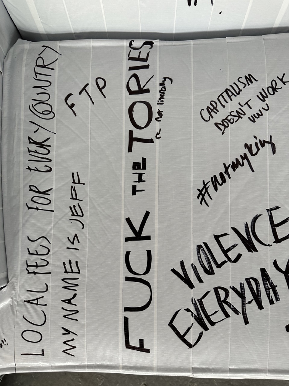
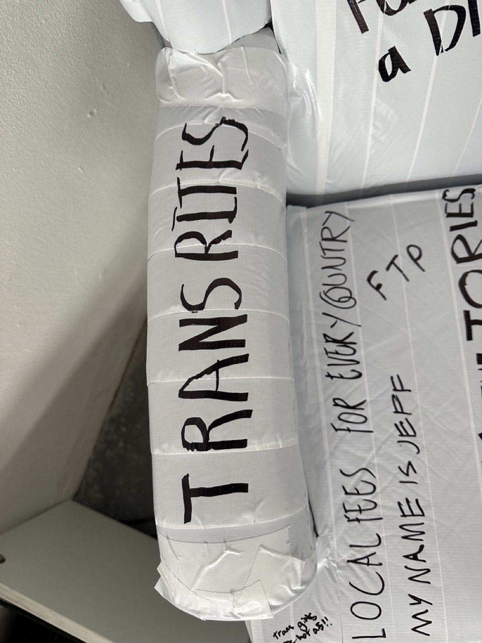
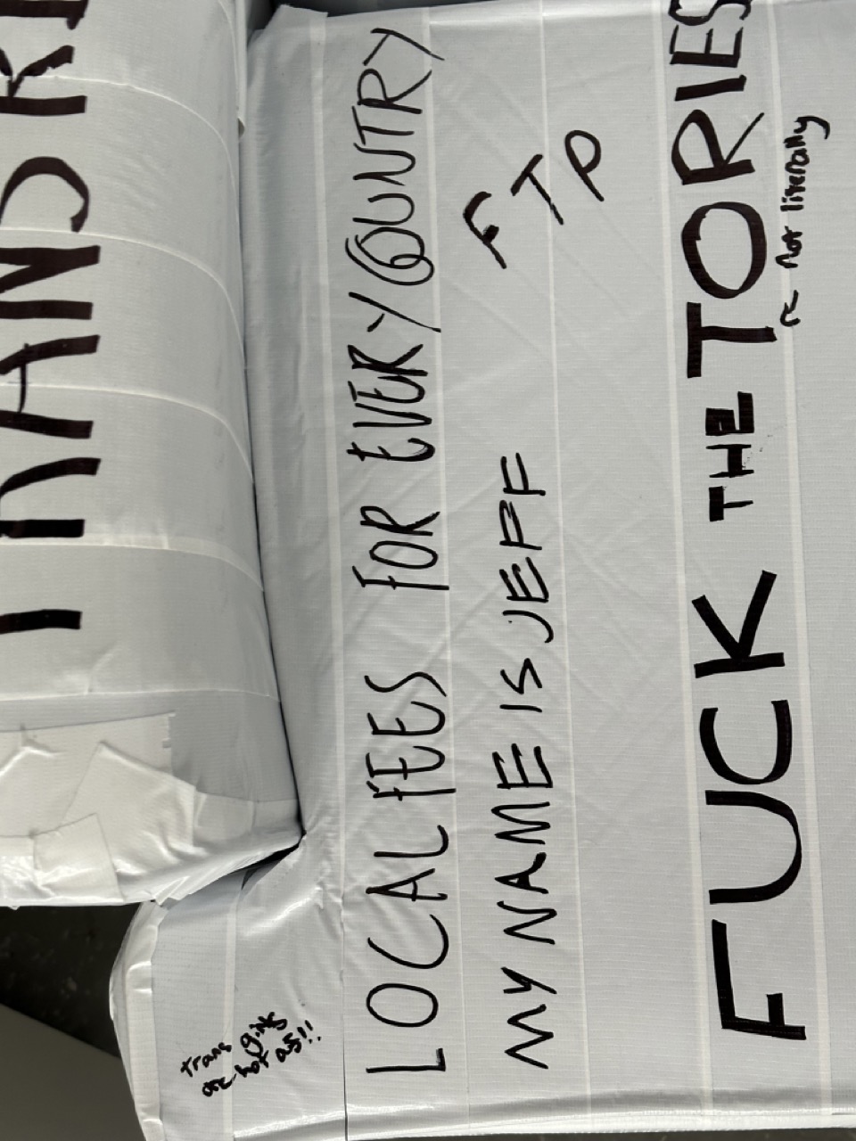
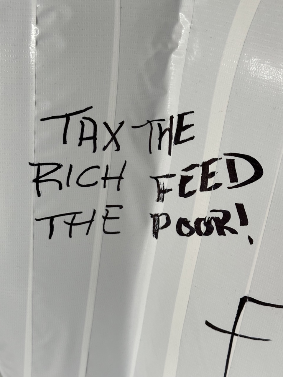
So with a chair and no way to paint it, I took Nikki’s suggestion and got some white tape; after a quick trip to the Savoy, I got a couple of roles of white tape and started to cover the parts of the chair I needed.
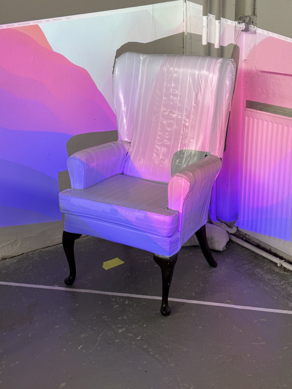
After a test and seeing that the projector’s colours were bright enough, I started taping the rest.
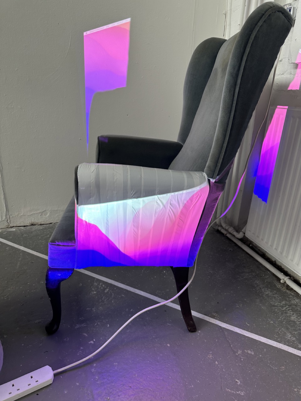
Day 02
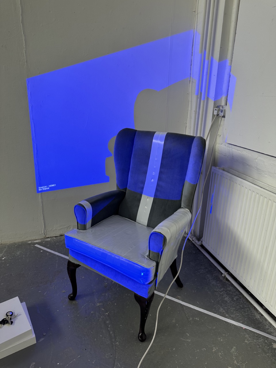
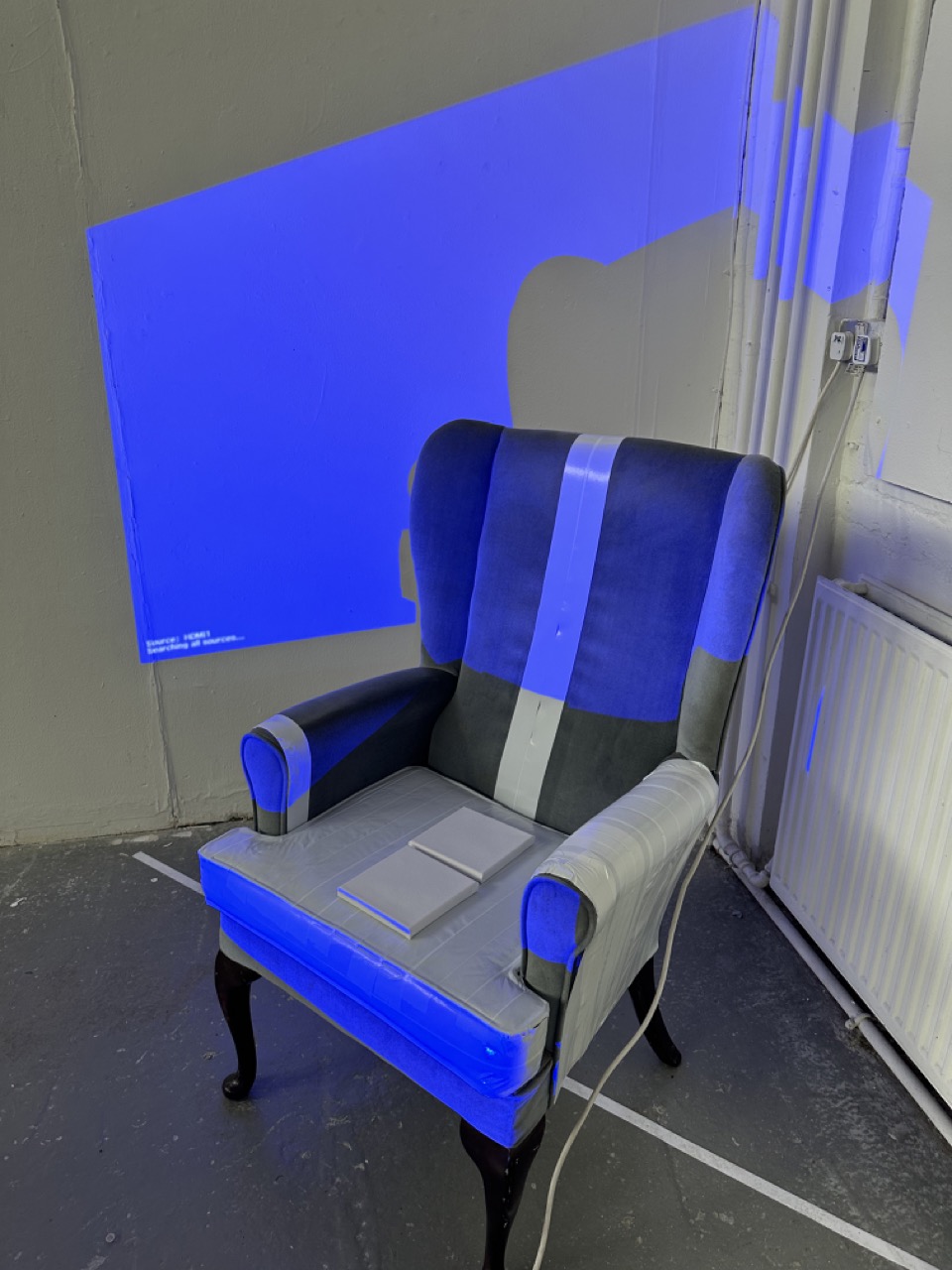
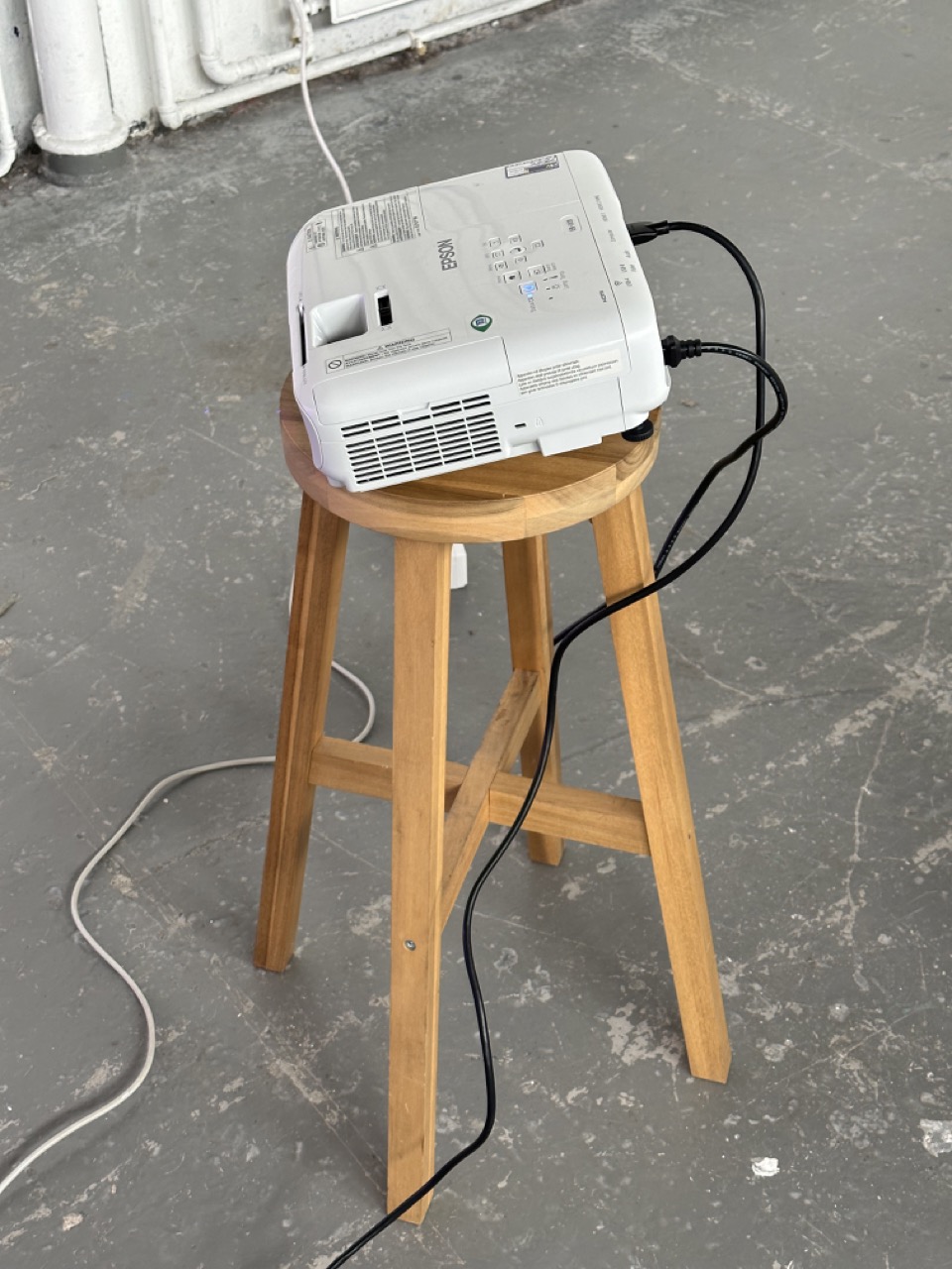
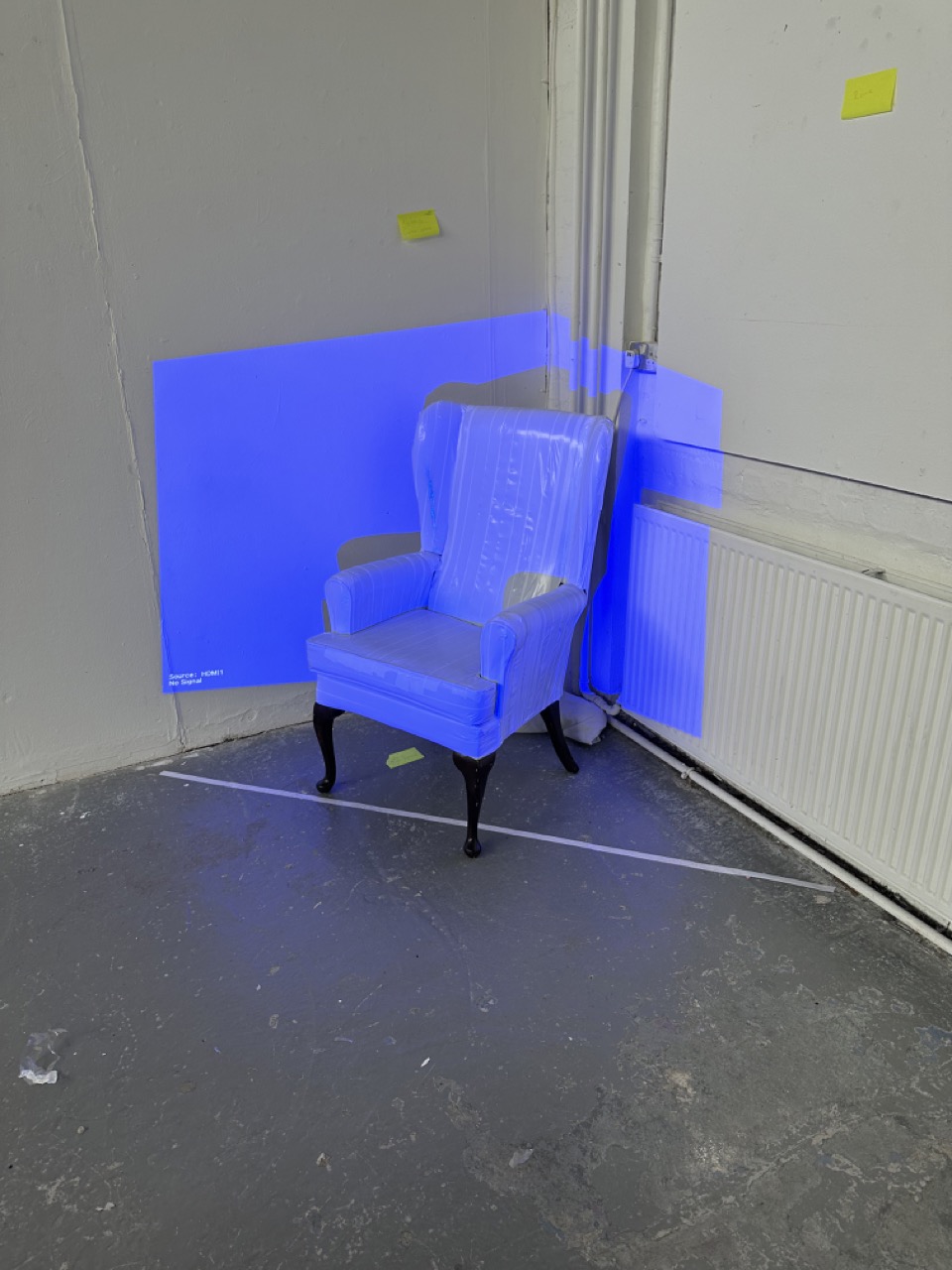
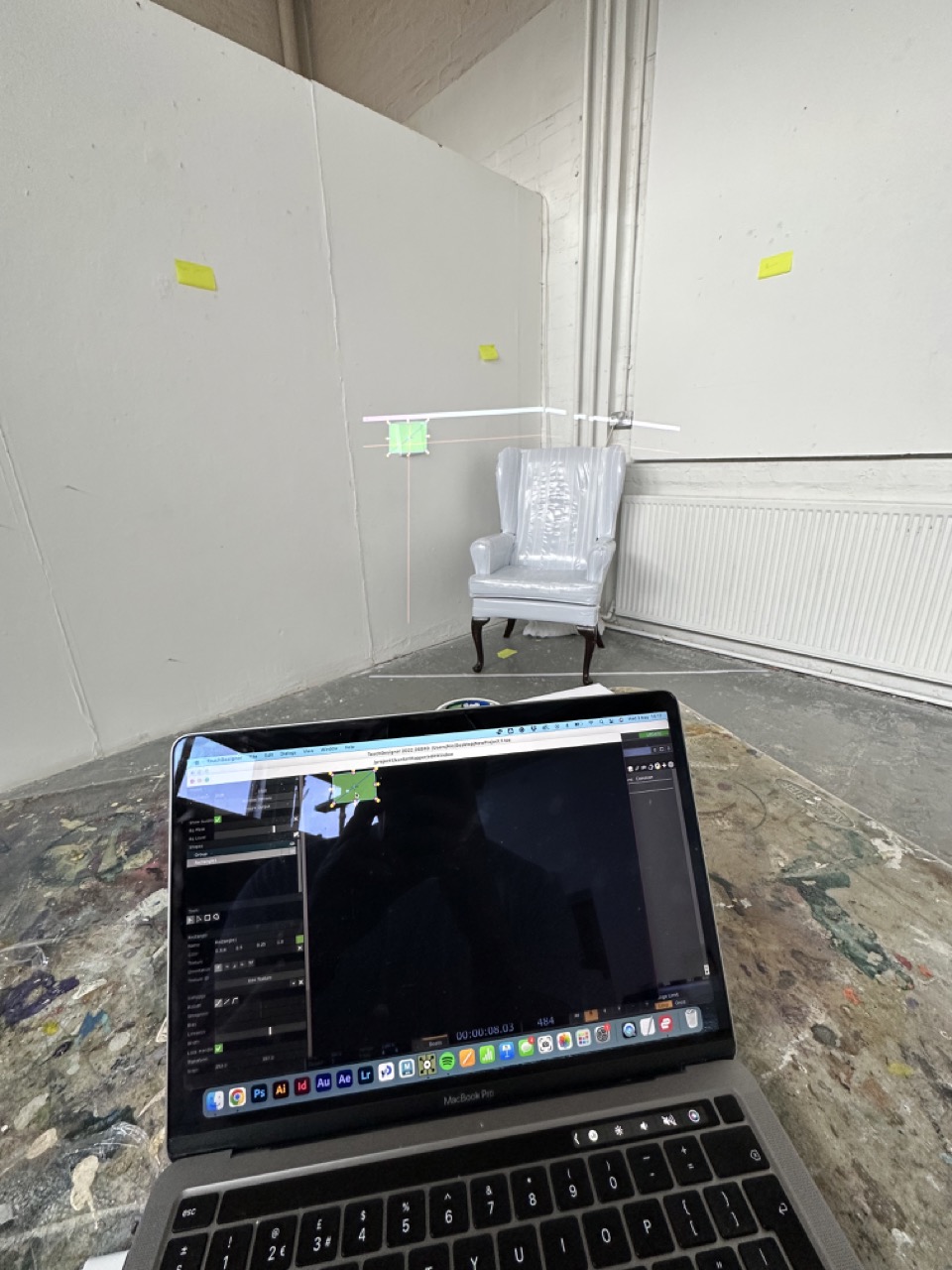
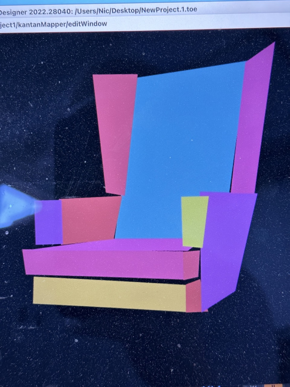
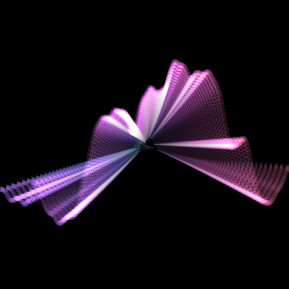
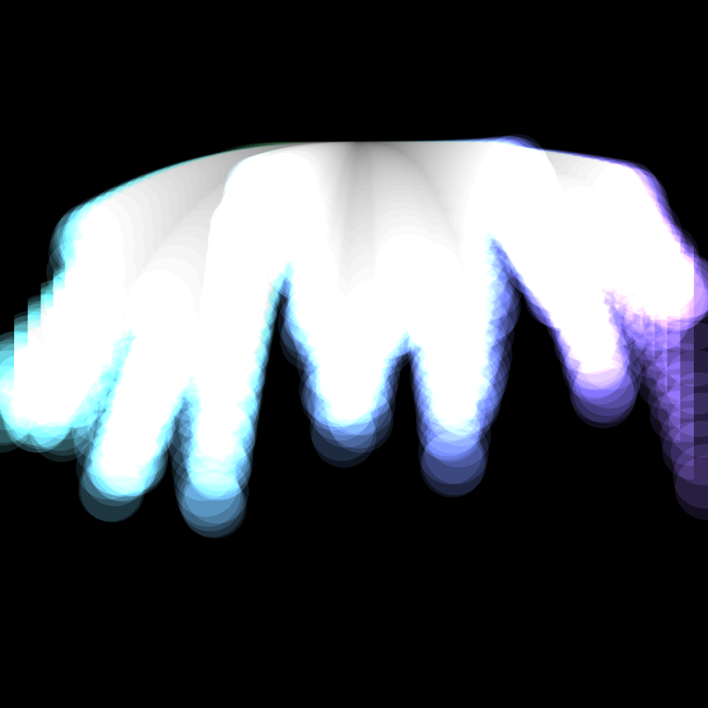
After more tape and with the chair now white, the next step was to sort out placement and mapping, which took longer than I had anticipated. And at this moment, I’ve realised that there’s a dead space from the position of the projector behind one of the armrests and for there not to be the projector has to be much higher and probably use one of the plinths I do not have or mounting the projector is some crazy location which seems a bit dramatic and a bit late in the game on day two of three.


For the end of day 03 I have to
Note: Do I want the mapping to be perfect? Should I lean into the imperfection… the tape isn’t perfect, and the walls and chair aren’t perfect; why should the mapping be?
The images must be perfect, though; they must be crisp, clean and clear.
Day 03
I had a weird feeling about my progress at this point today because I felt that I had done a lot and there was still a lot more to do but when I looked at any task list I set for myself it didn’t seem like a lot.
(Edit: This must have been my Spidey senses or something kicking in because it got too close to the wire. )
When remapping the chair today, I decided not to worry too much about the perfect lines of the mapper because it felt too different from the overall theme and style of the work. I feel that the rough and ready style communicates the main aim of what I’m trying to say.
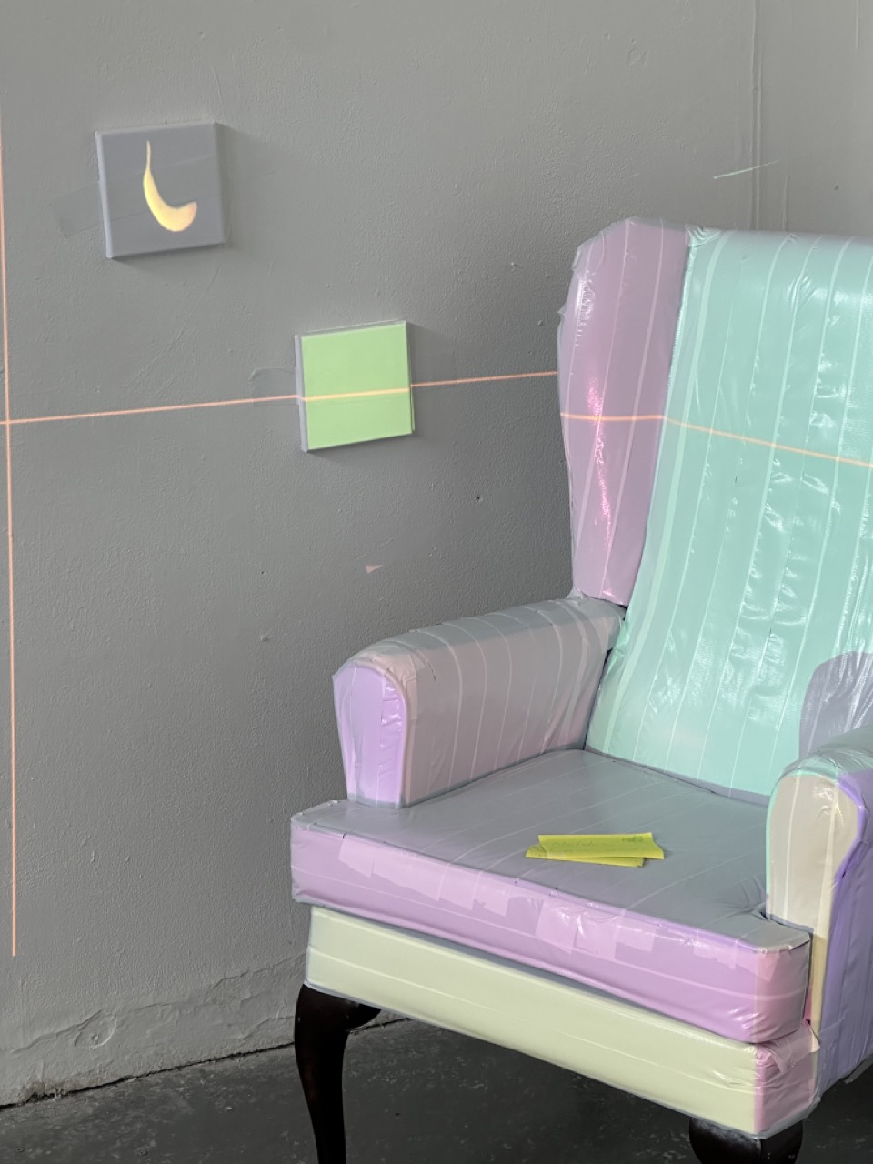
I did get a decent animation of a Union Jack for the projection but I had trouble getting decent images or footage of any negative images for the other side of the chair. (Thats probably an interesting subject to look into on a further date if its not just my poor Googling skills. Why is so difficult to find footage or images of certain topics.)
When thinking about the description of my work, I realised how much I was torn between describing it in a very logical, technical way or a very emotional, conceptual way. I found myself pulling away from talking about it more artistically, probably brought on by some doubt or some version of imposter syndrome, but thankfully, inspired by the theme of what I was writing about, I went for the uncomfortable option that was better suited.
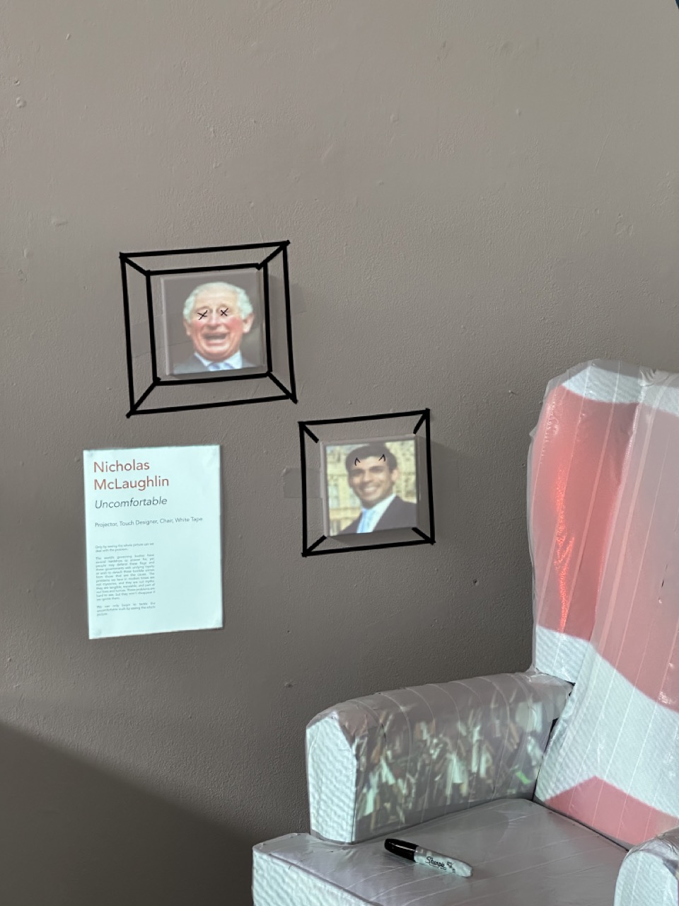
Uncomfortable
Only by seeing the whole picture can we deal with the problem.
The world’s governing bodies have several hardships to answer for, yet people may defend these flags and these governments with undying loyalty or wish to detach these horrible crimes from those that are the cause. The problems we face in modern times are not mysteries, and they are not myths; they are tangible, traceable, and part of our lives and homes. These problems are hard to see, but they won’t disappear if we ignore them.
We can only begin to tackle the uncomfortable truth by seeing the whole picture.
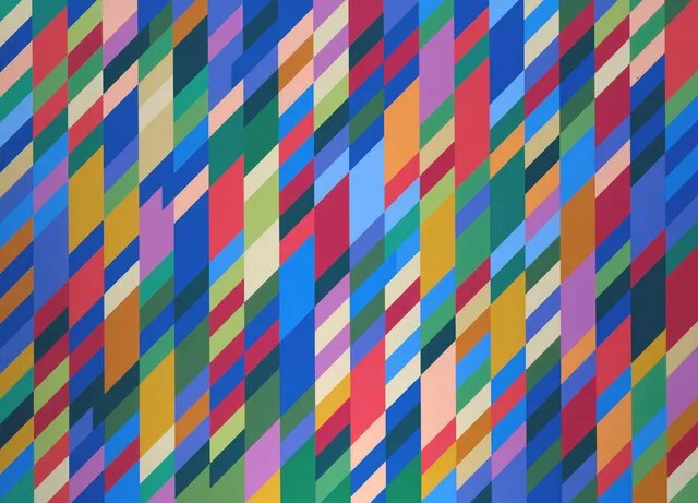
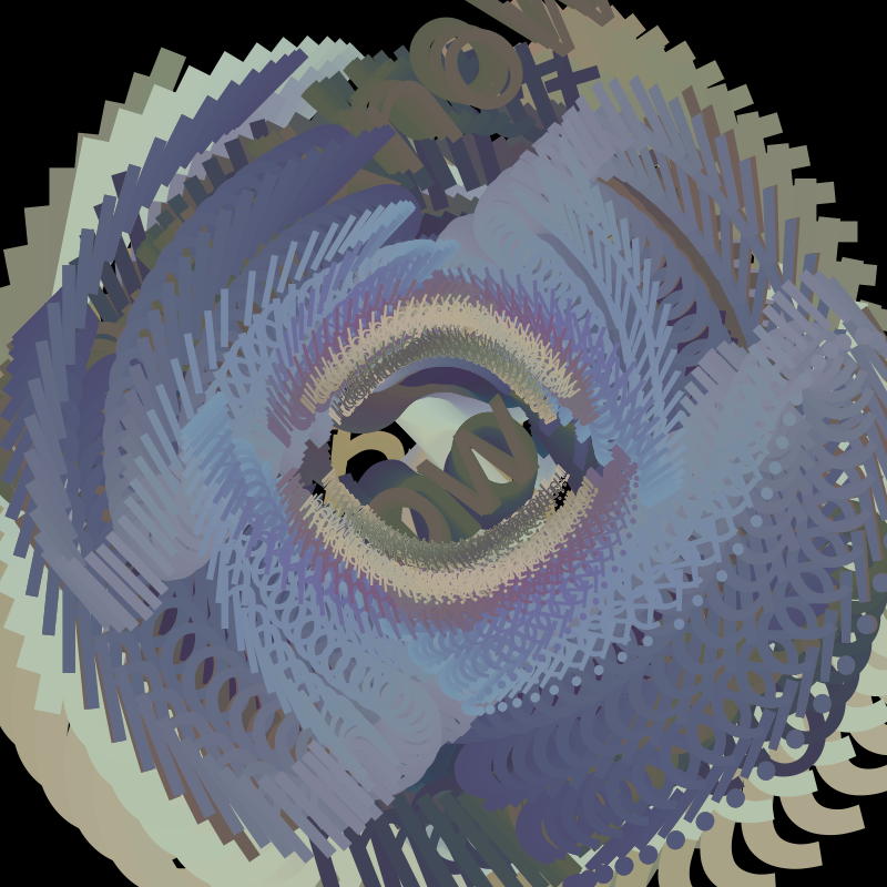
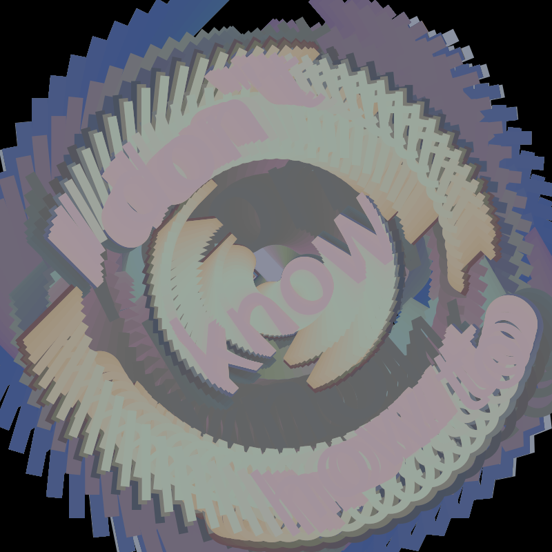
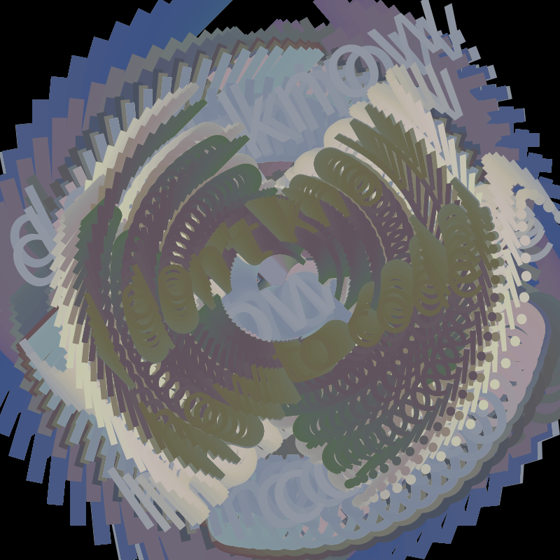
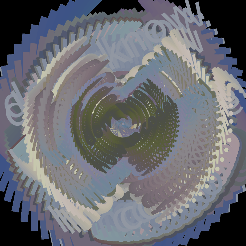
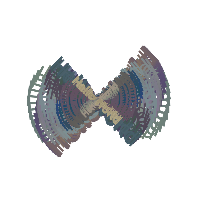
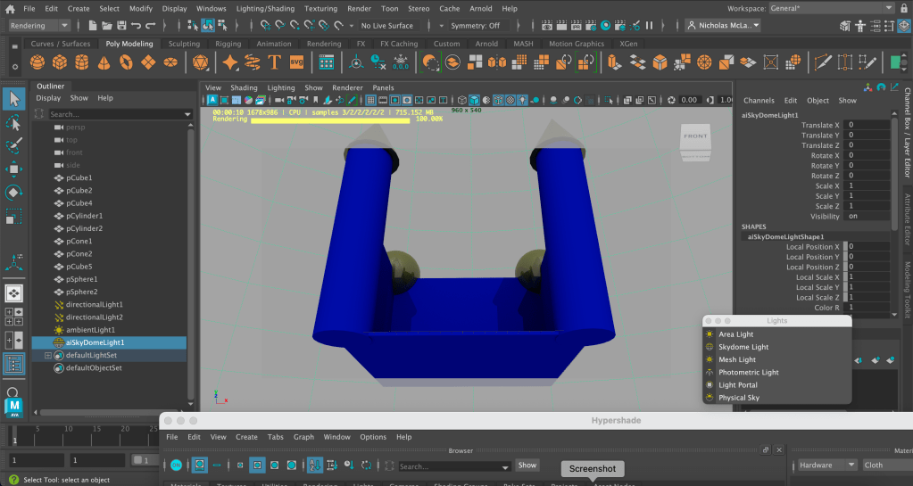
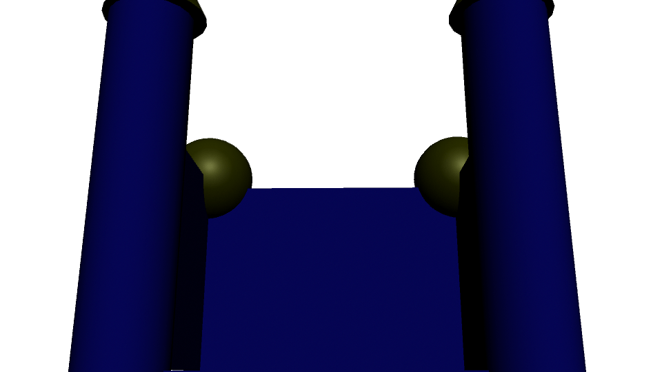
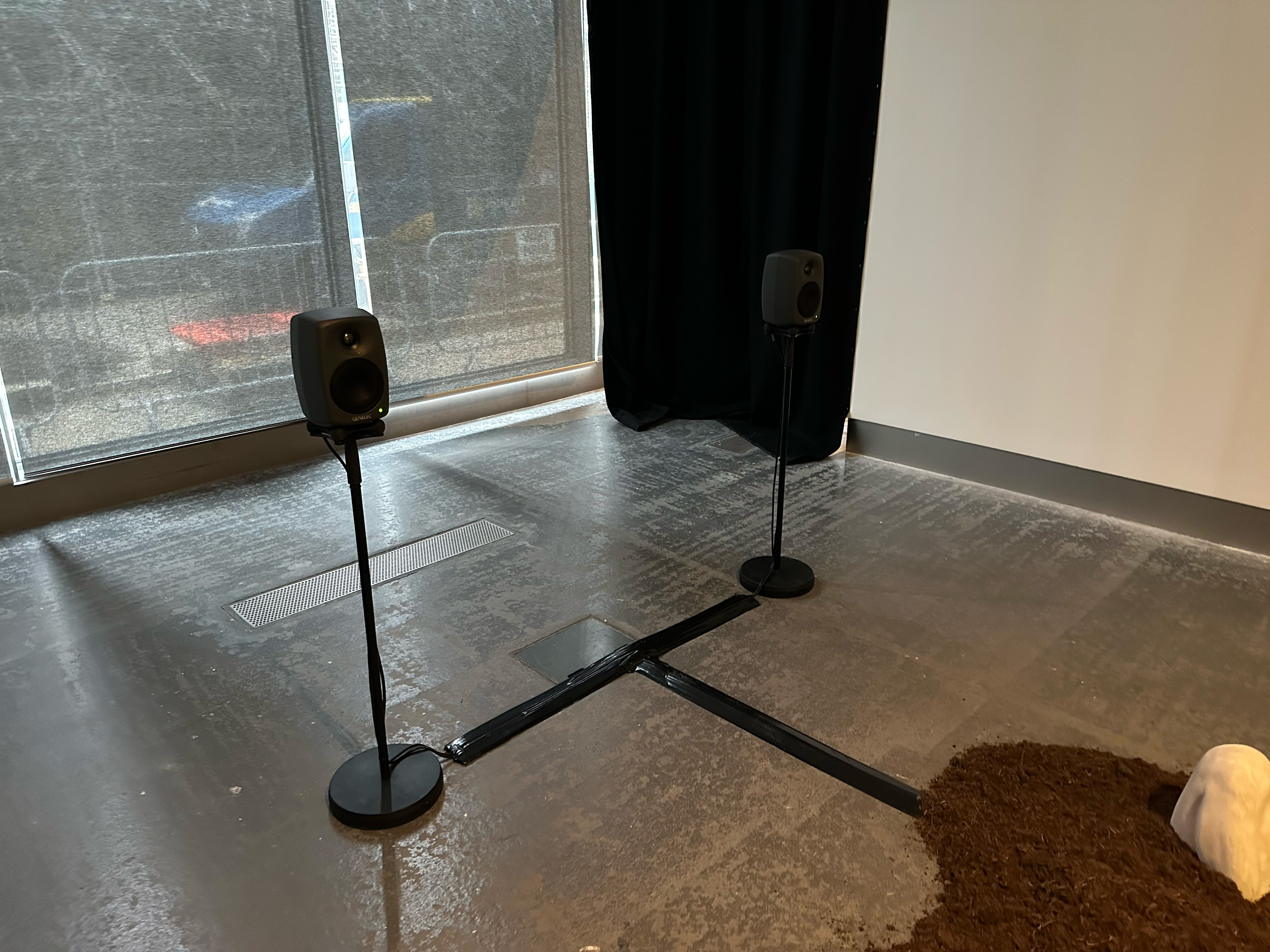
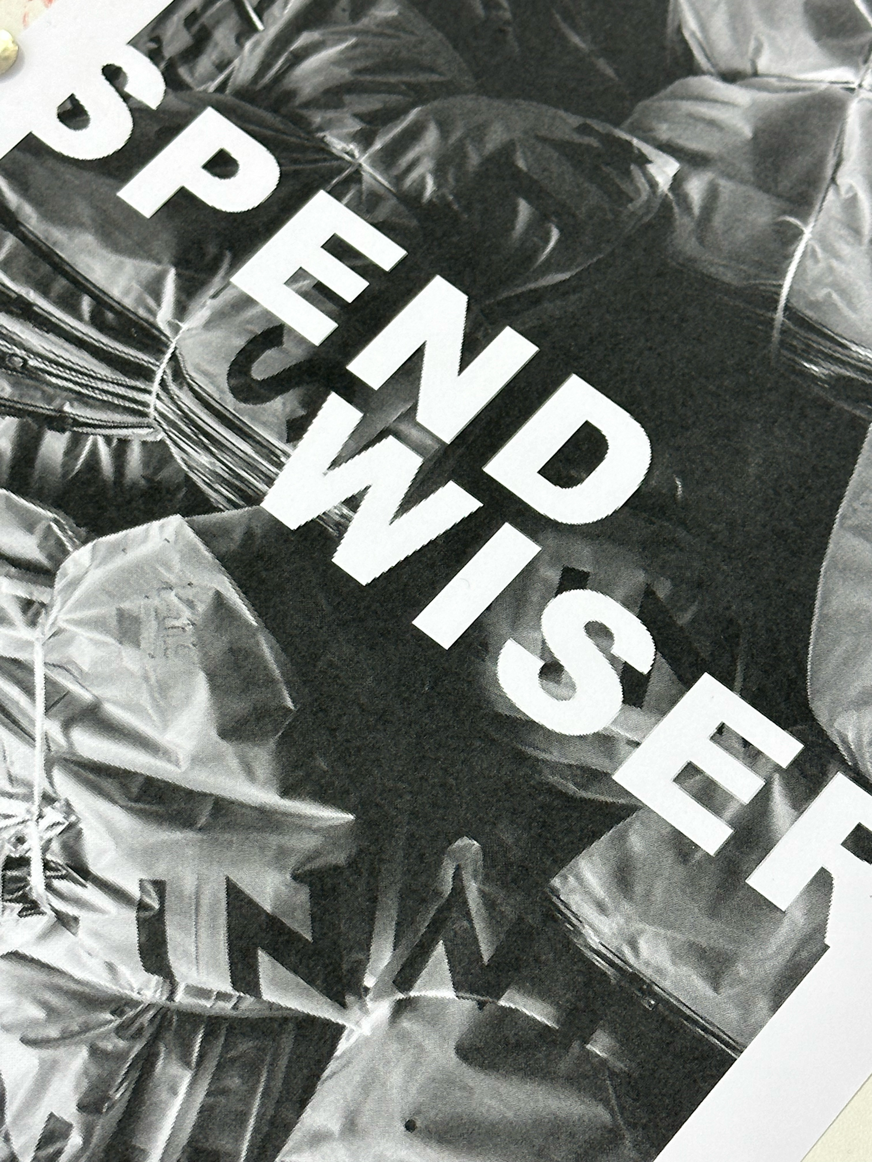
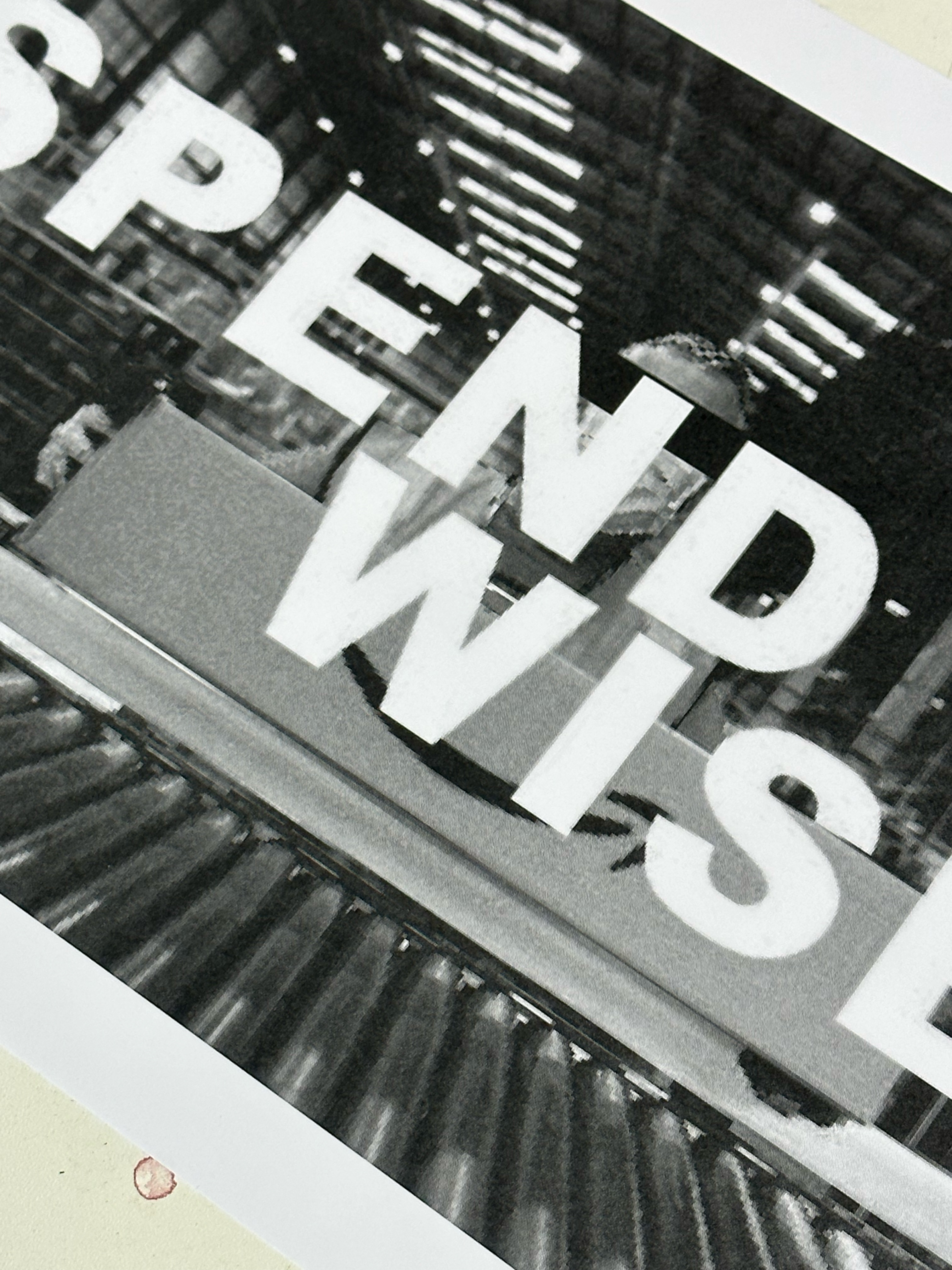
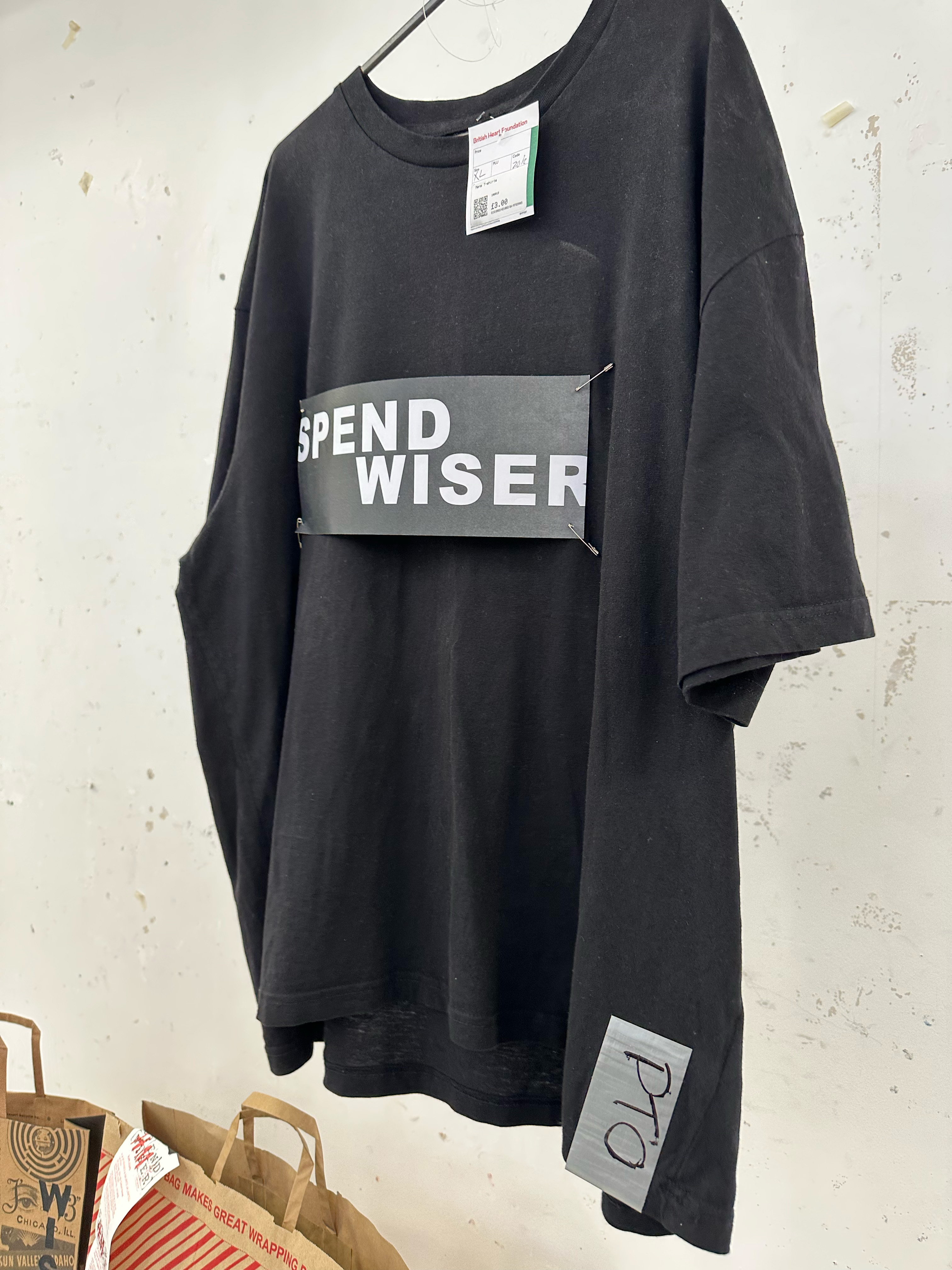
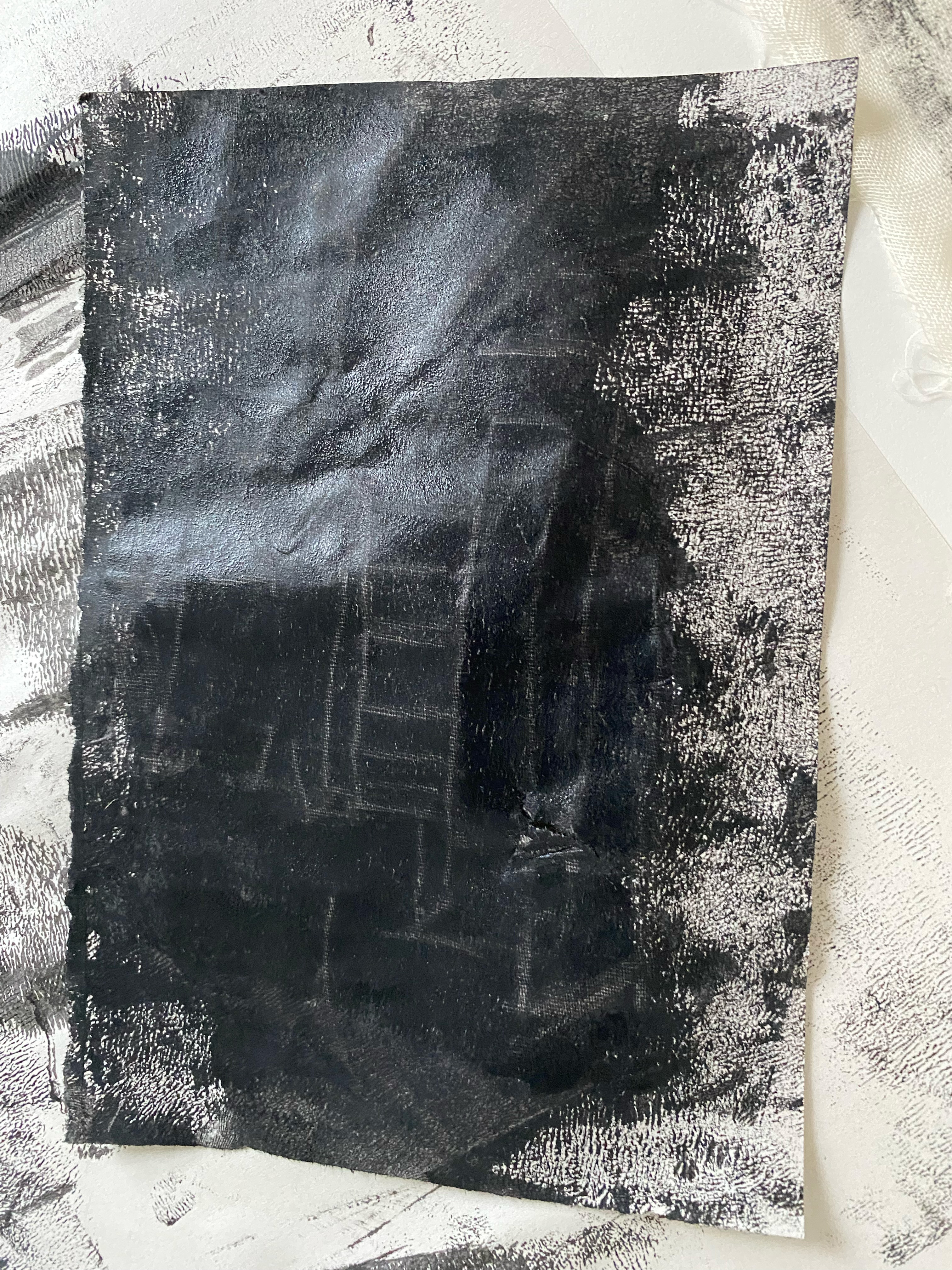
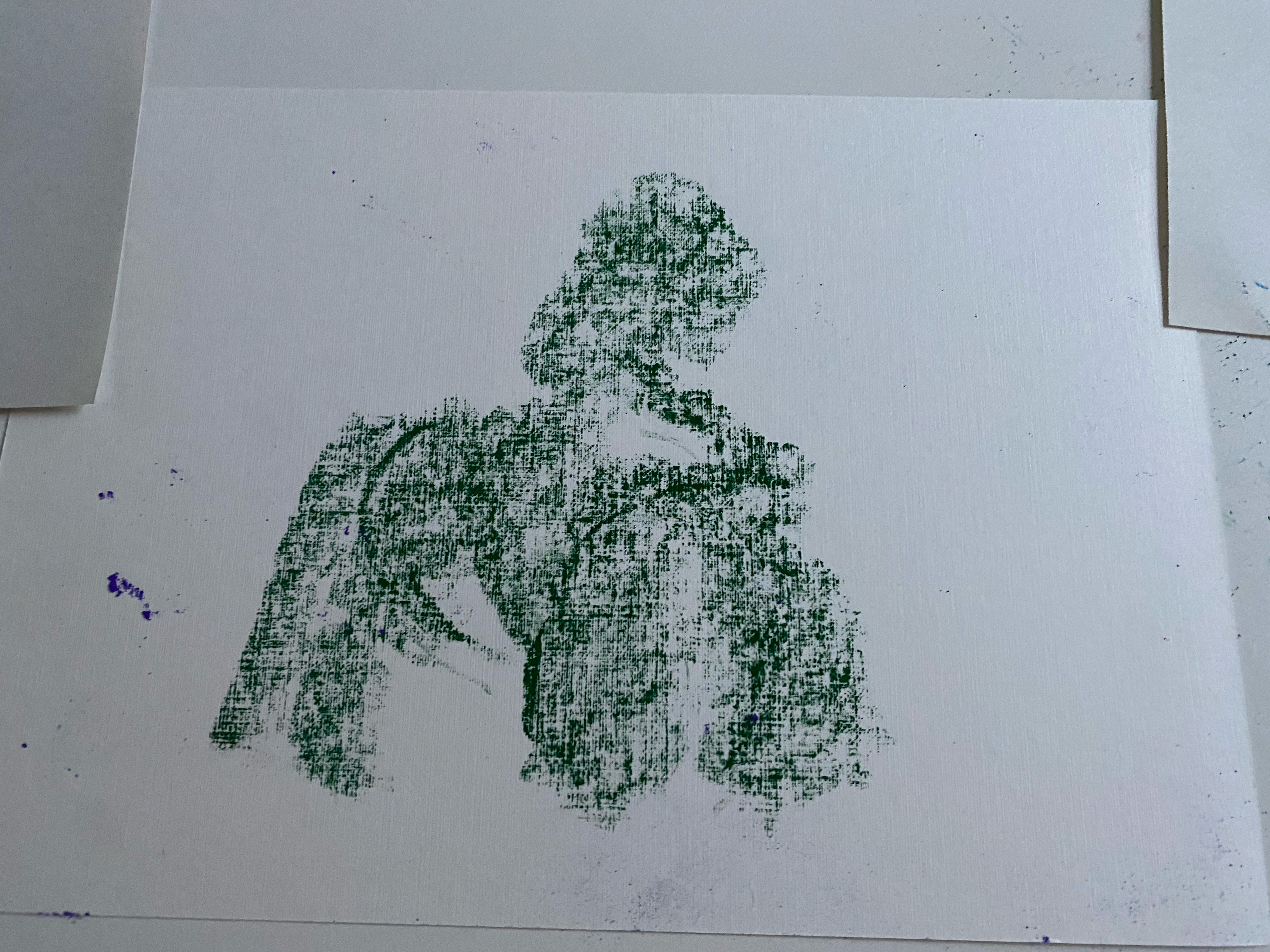
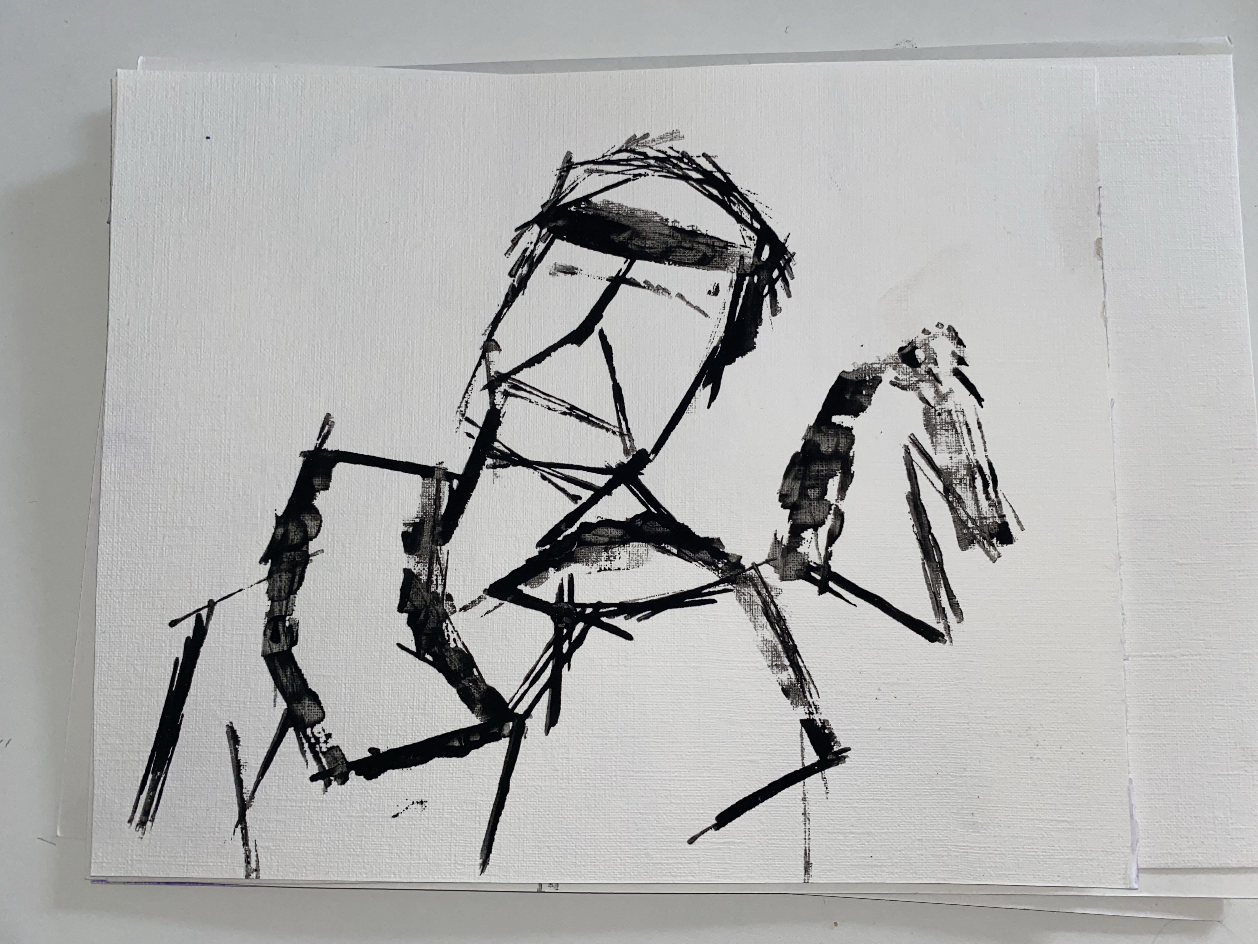
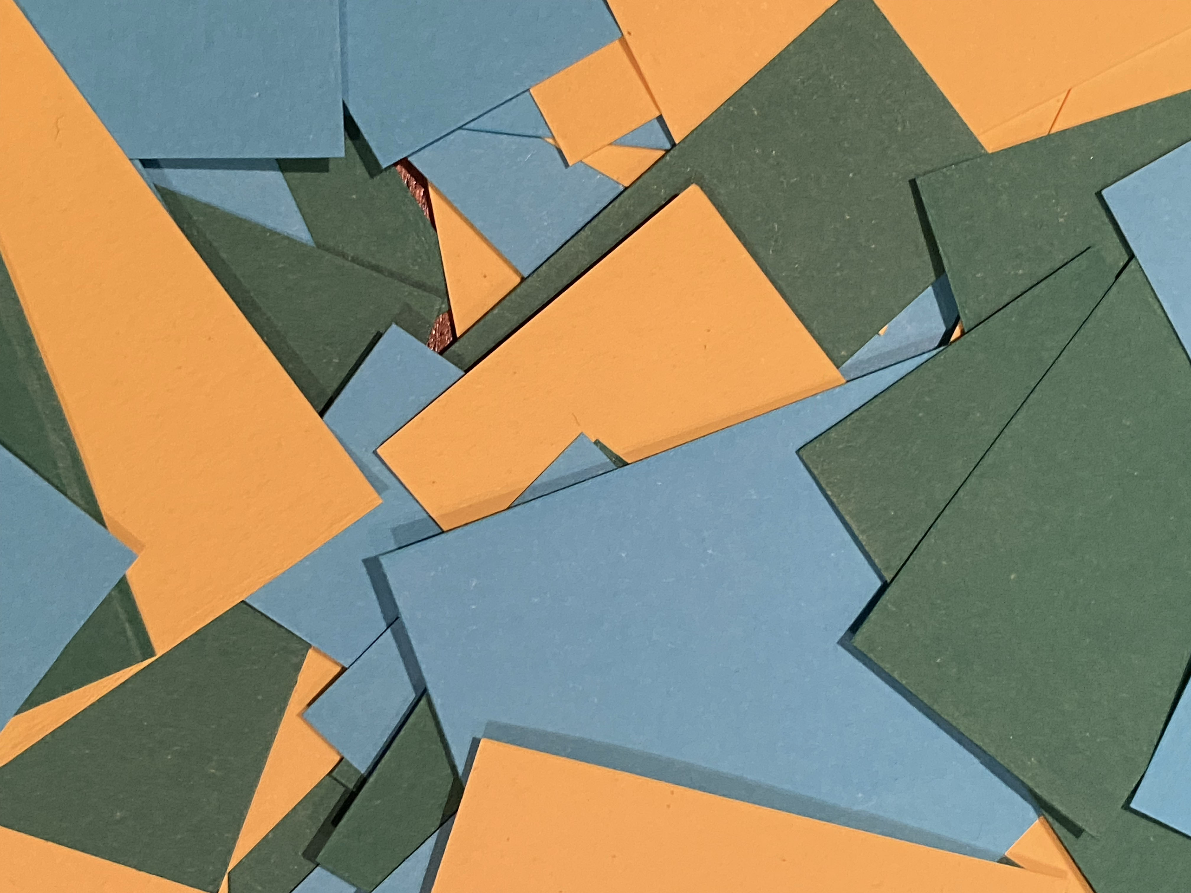
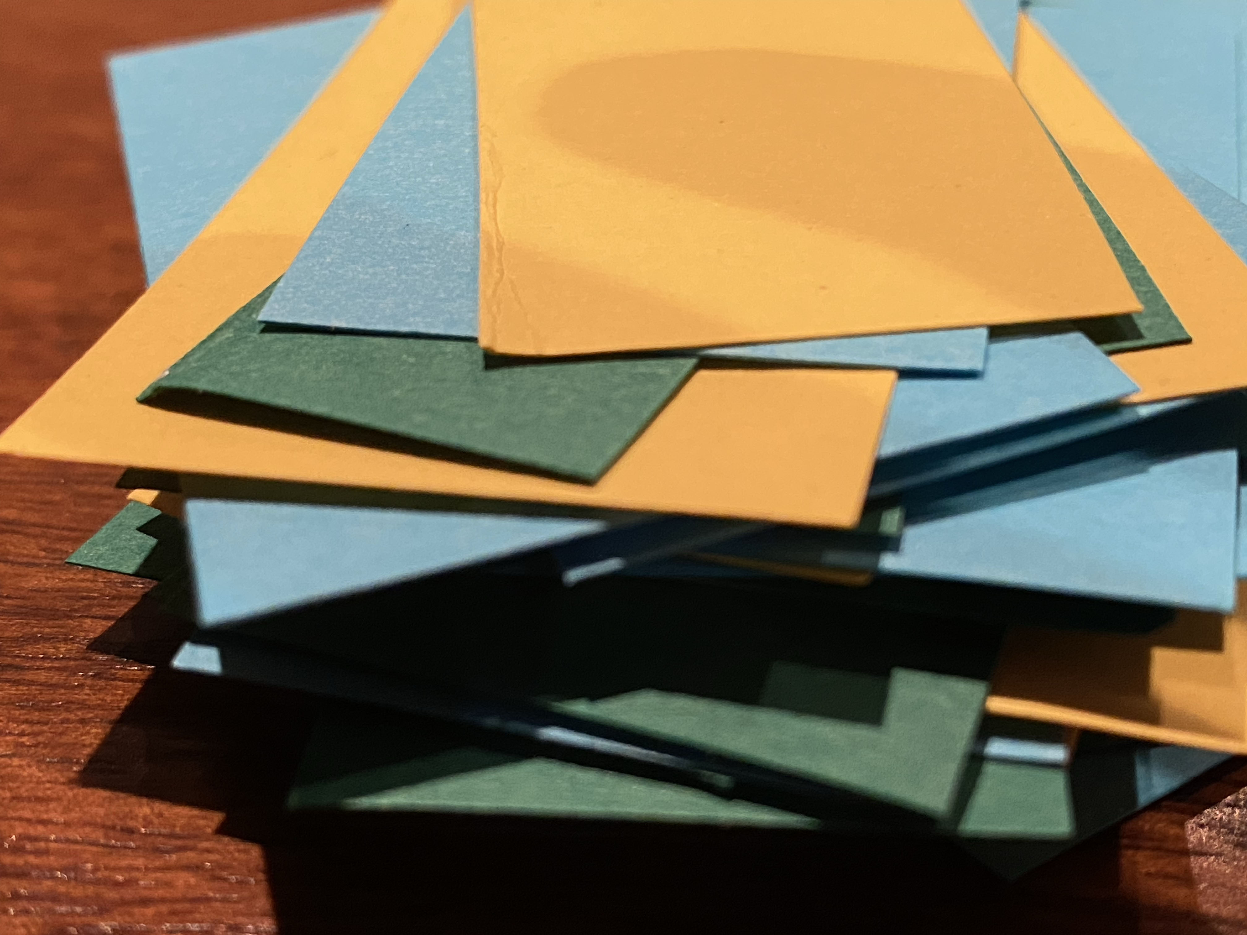
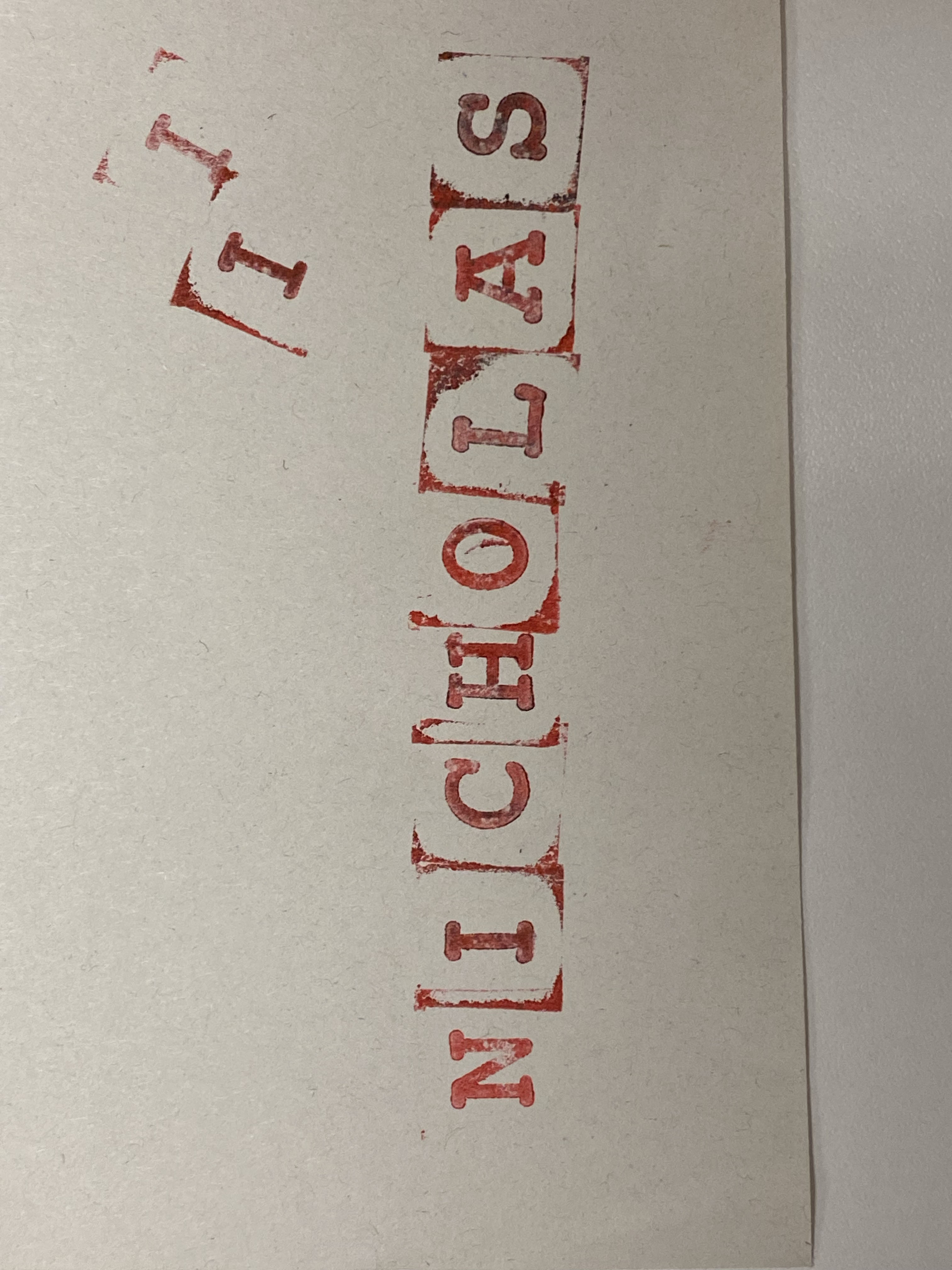
Projector, Touch Designer, chair, White Tape
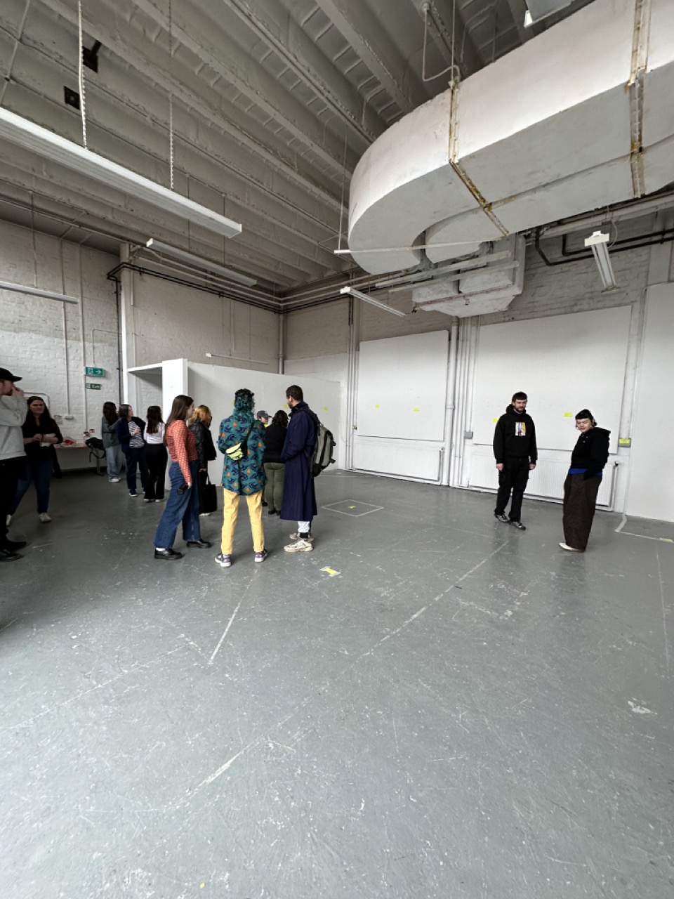
Day 04 – Exhibition Day
Exhibition day was very up and down on terms of stress levels and a lot of me wishing I had just simplified my submission and got out of my own head.
In first thing and setting everything up, when I look back it now a lot of the morning off was taken up by Touch Designer not playing along. And thankfully Gillian was there to help and put up with my growing stressing the closer and closer it got to the deadline.
Long repetitive story short, Touch Designer was working with the laptop open and in certain settings but didn’t want to work when the laptop was closed. But I had something to present and after remapping it a couple of times I got quite fast with it.
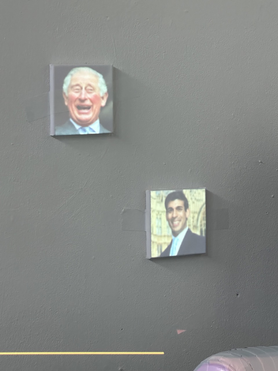
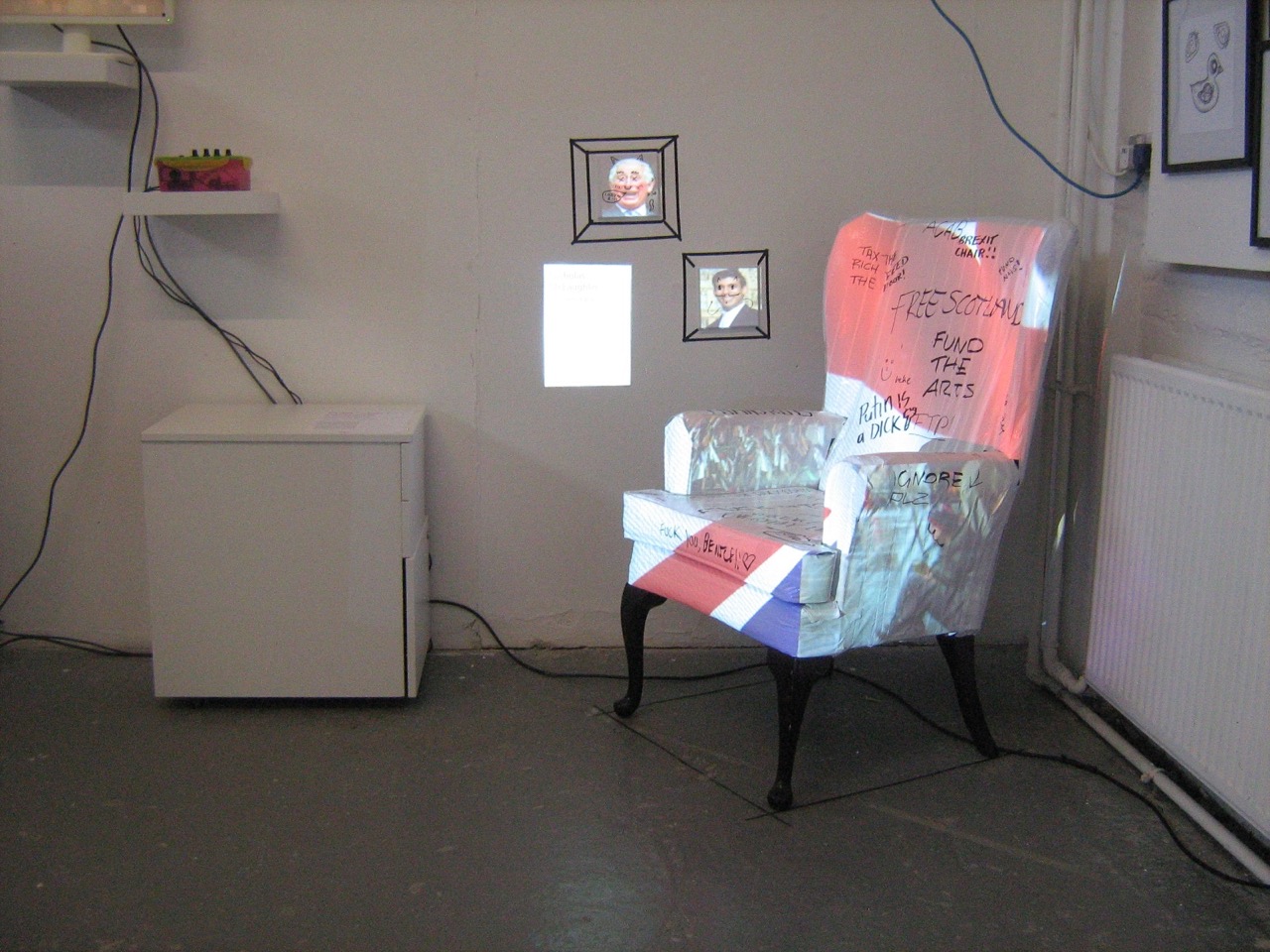
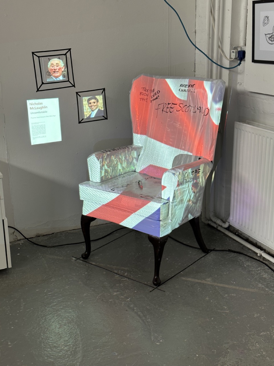
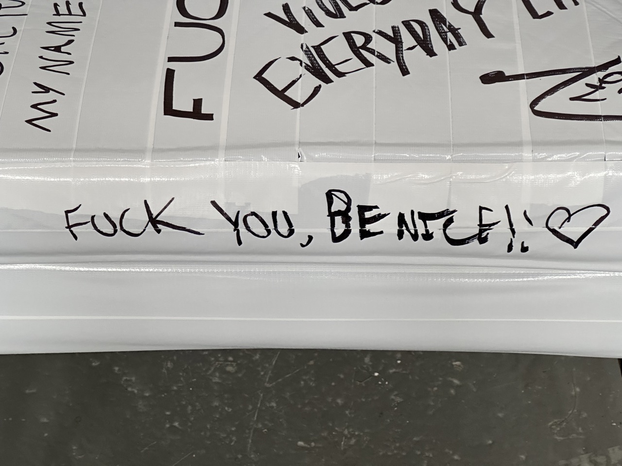
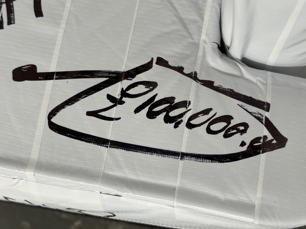
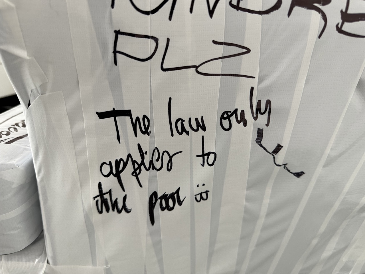
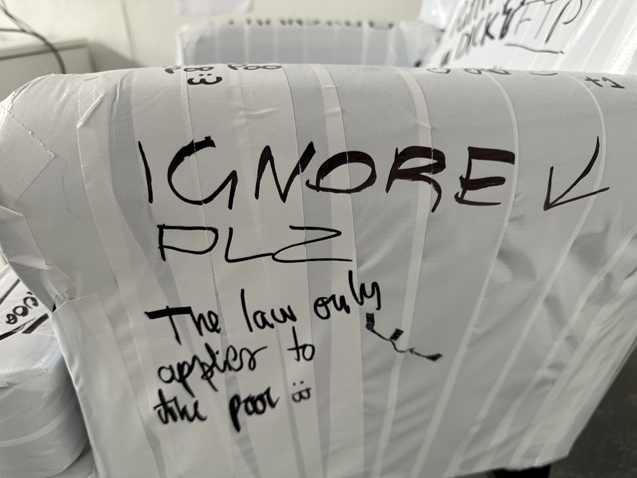
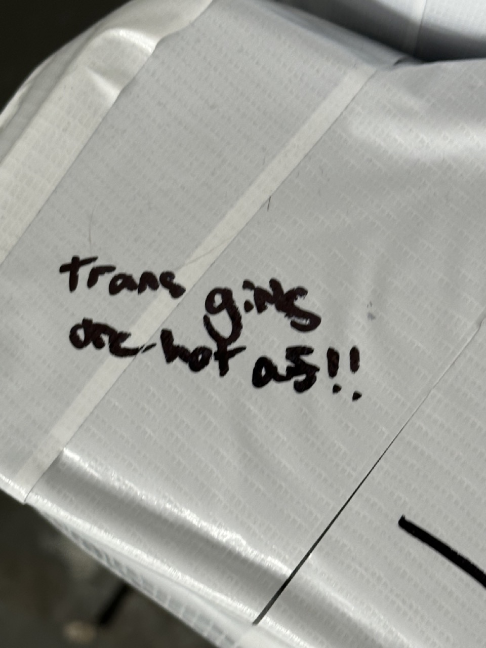
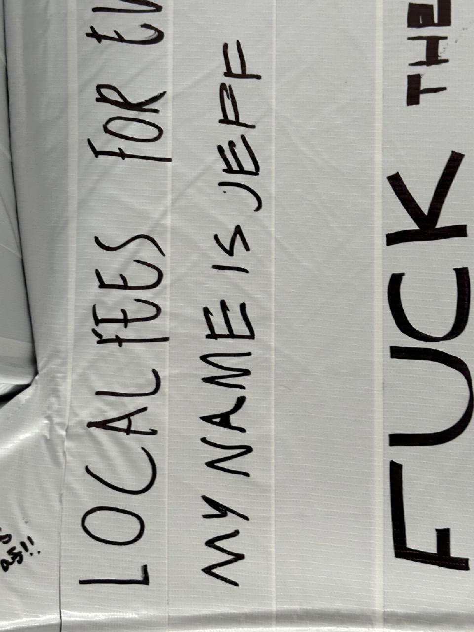
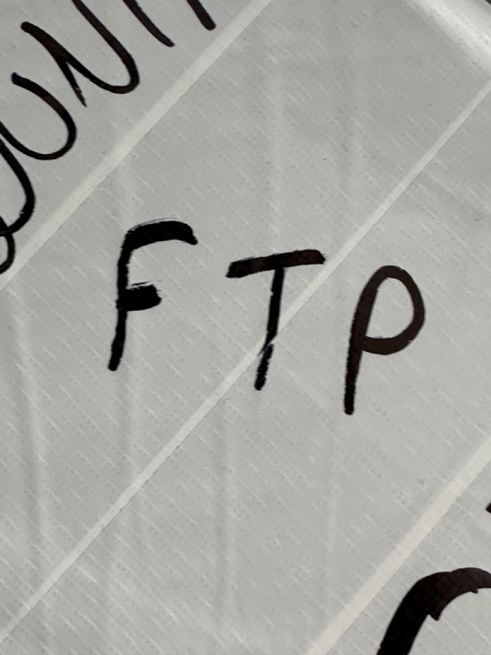
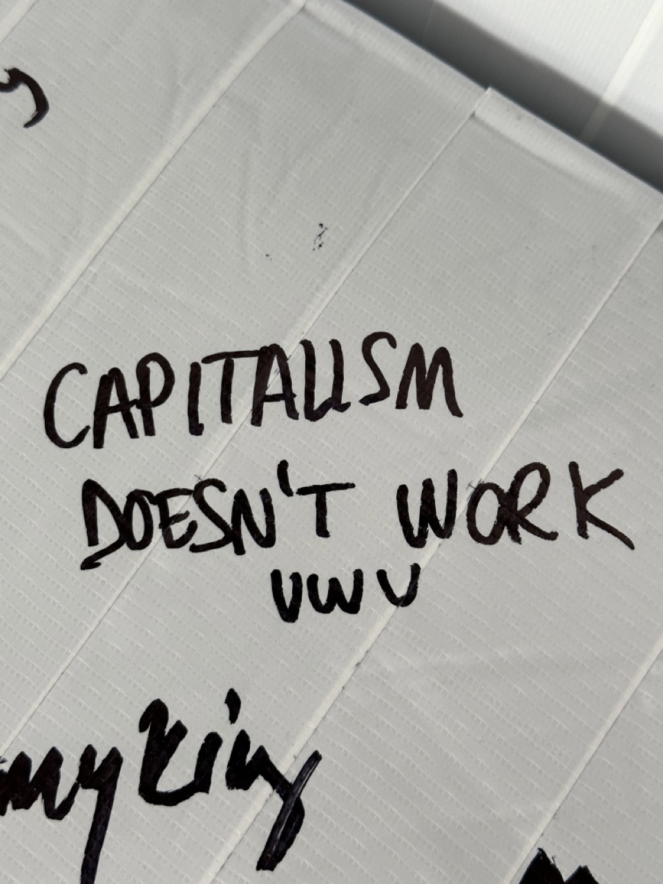
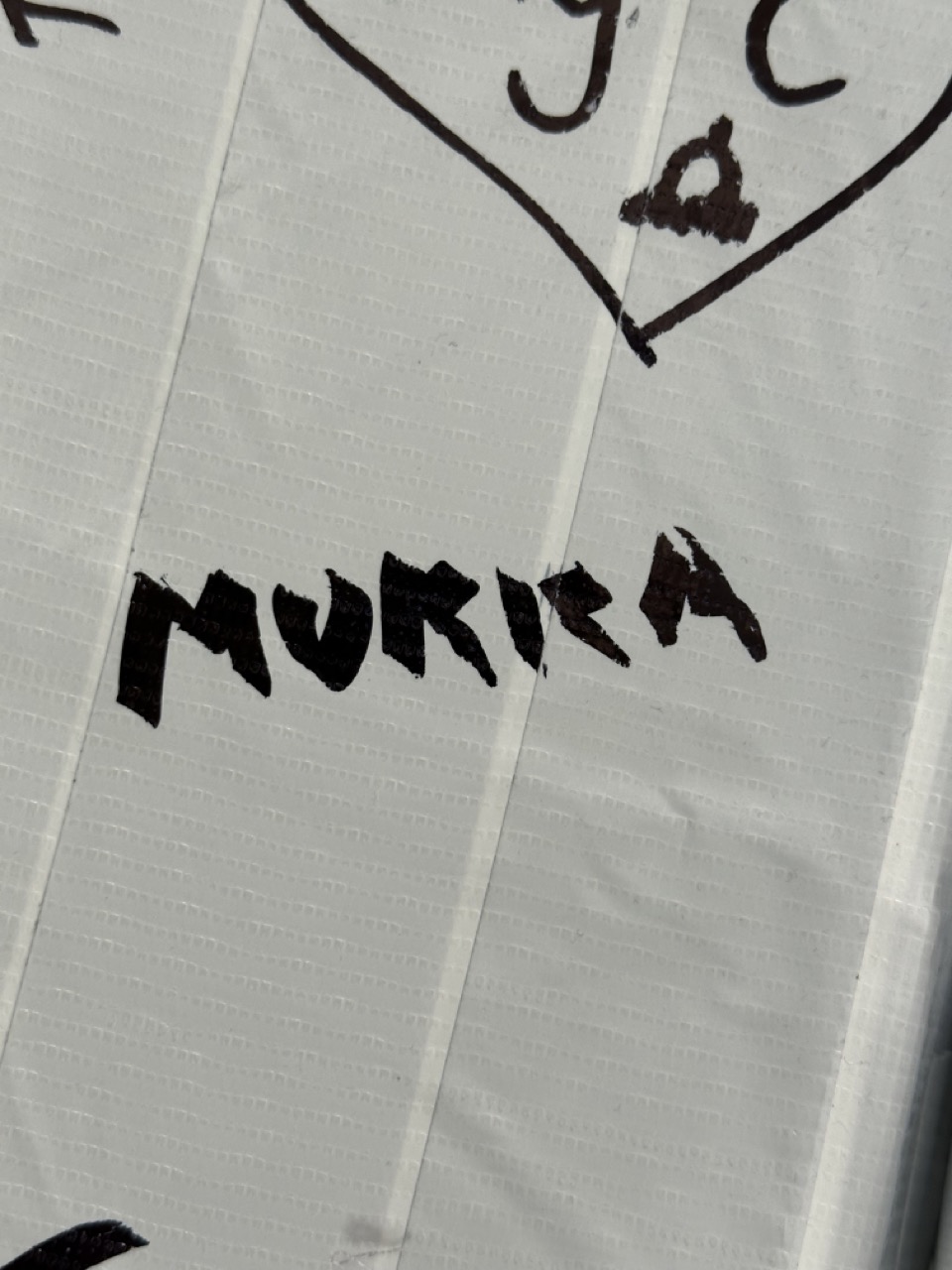
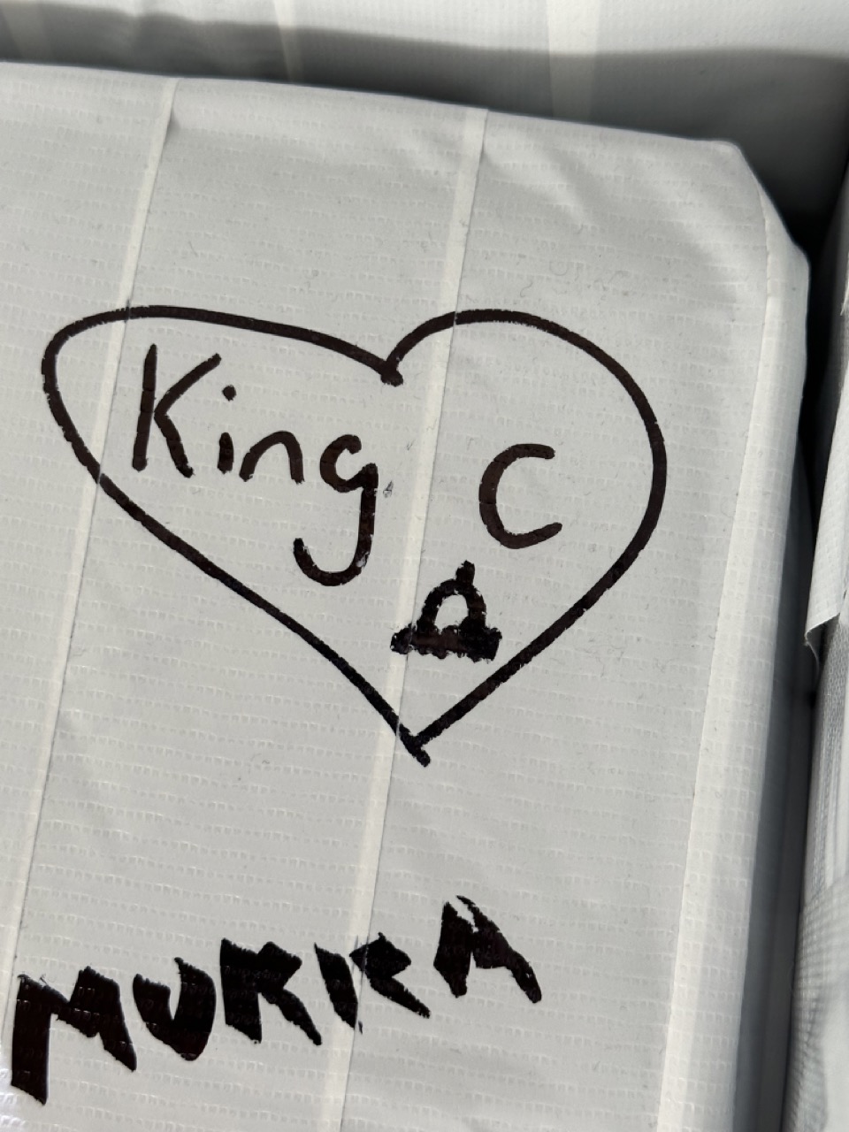
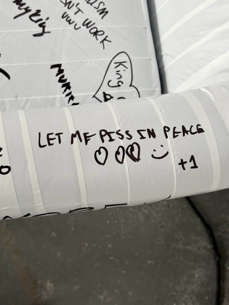
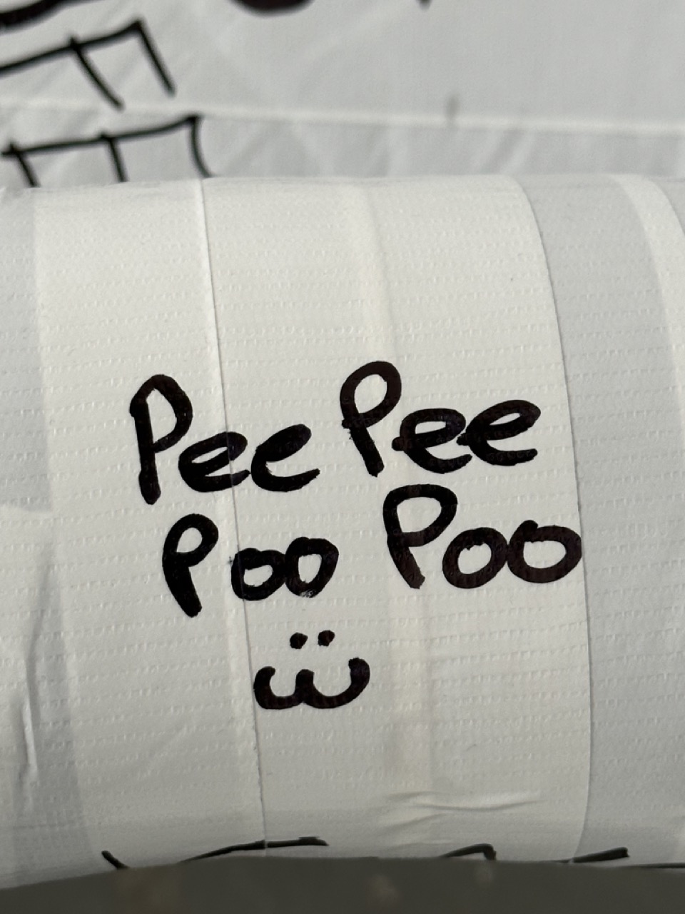
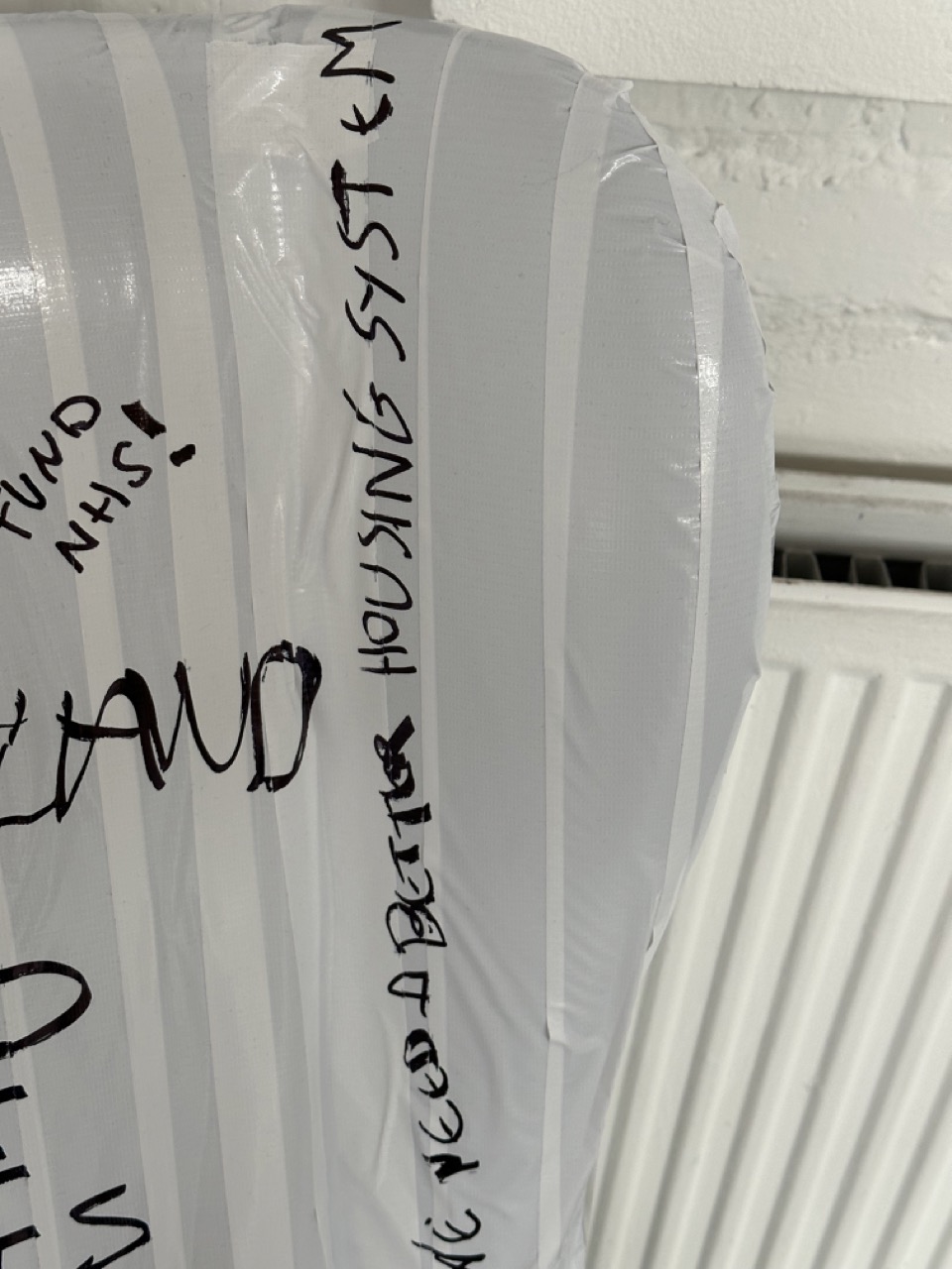
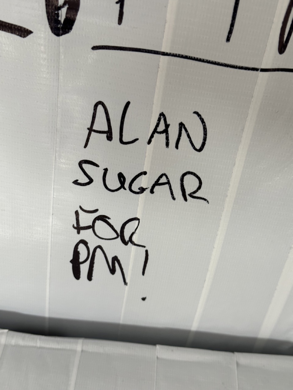
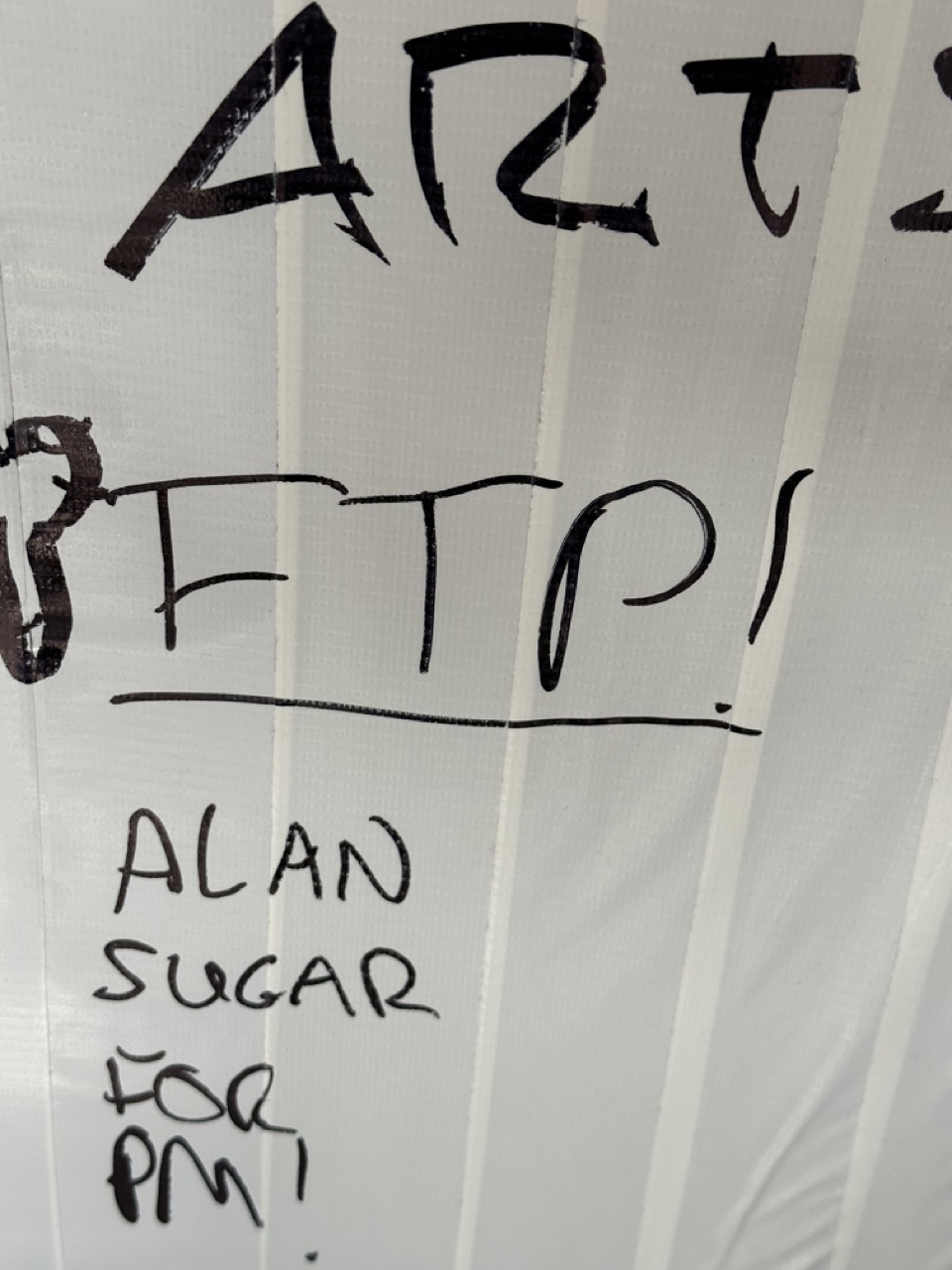
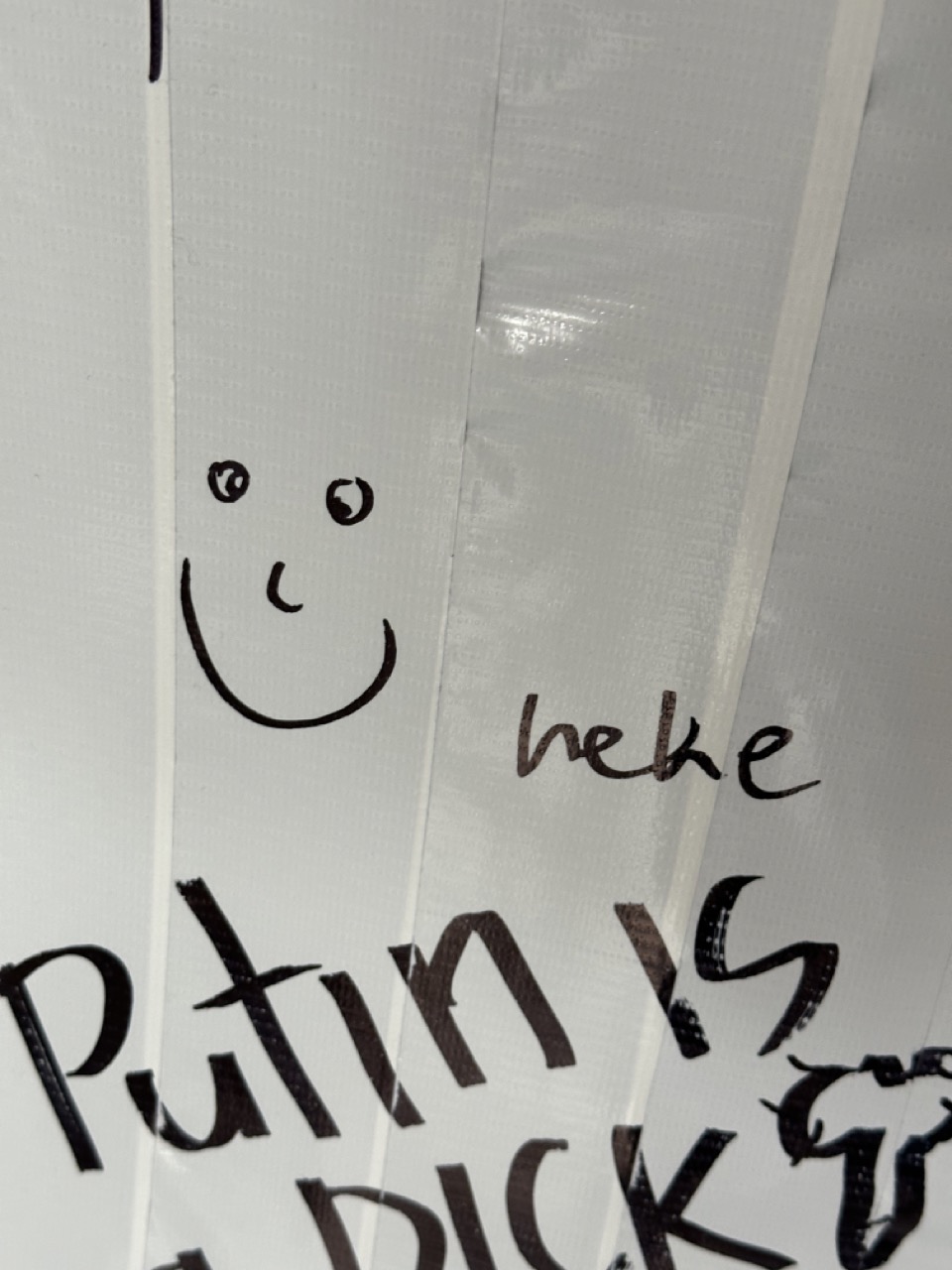
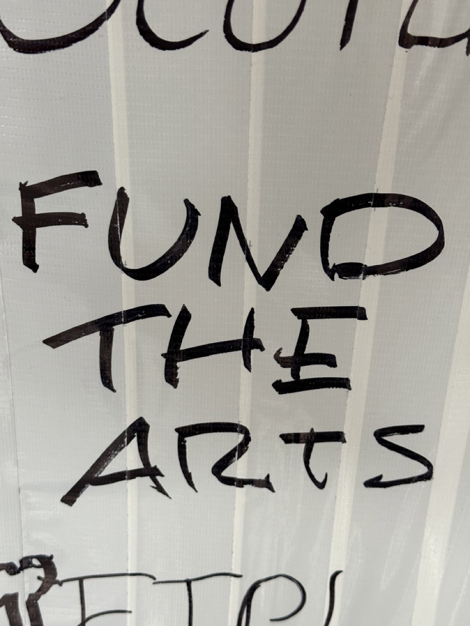
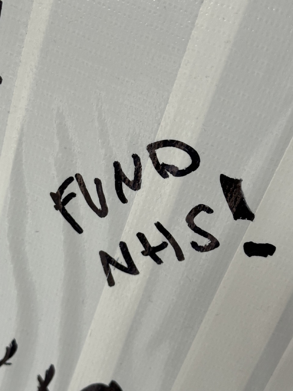
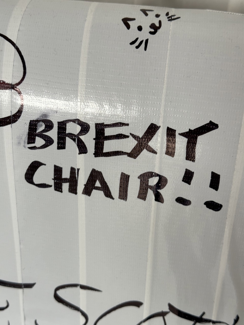
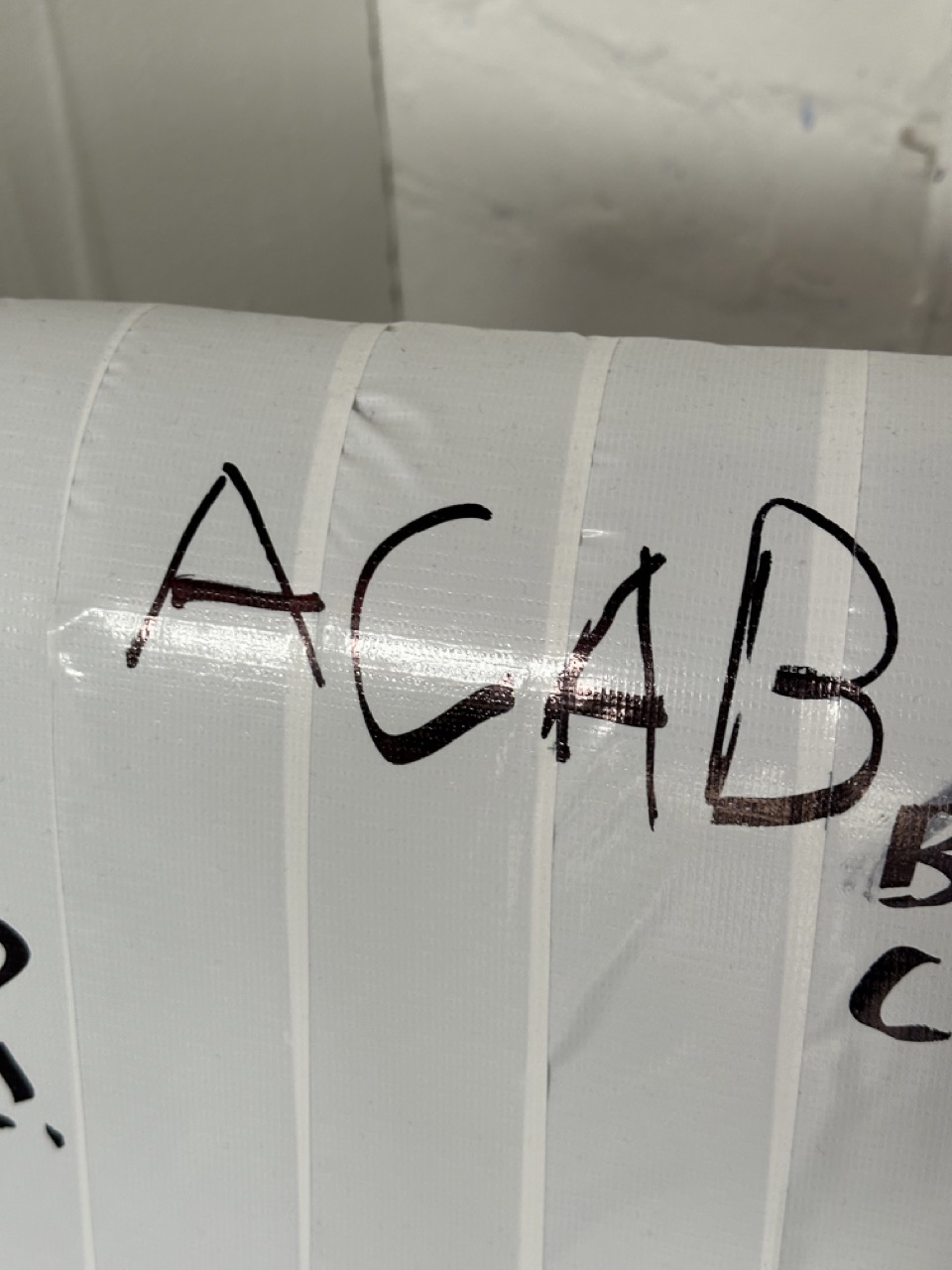
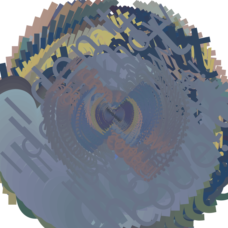
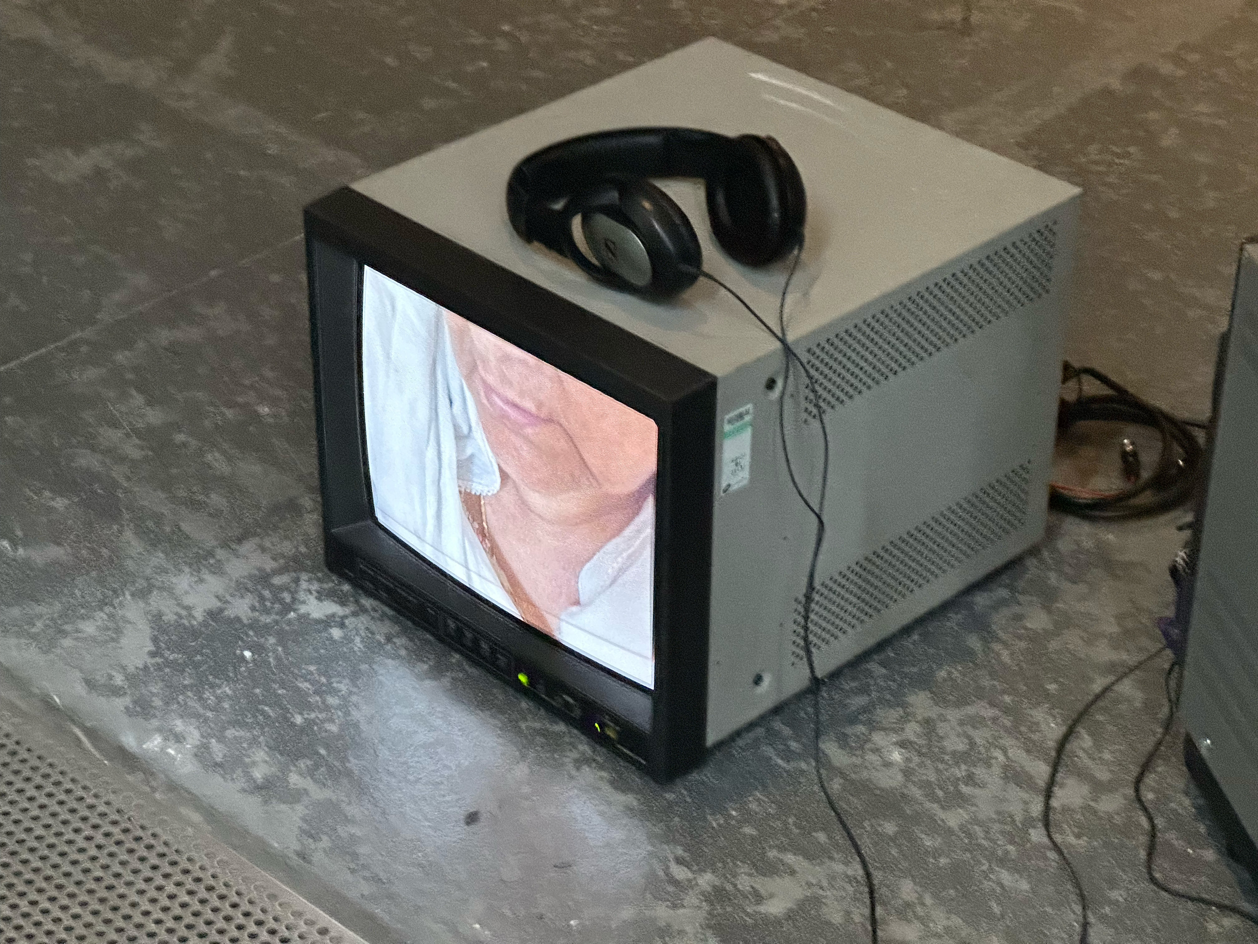
The key points of today were the little things that would come to me in jolts of panic and inspiration. Once the projection was set up and everything was how I wanted it to be, Stewart, in year 3, provided an idea by interacting with the pictures of the wall of King Charles and Rishi Sunak, and that gave me the idea for people to take it upon themselves and draw on the objects. Take a marker and draw on the chairs and the canvases however they wanted and say whatever they want.
Another last minute thing that people also commented on was the imitation of frames round the canvases using tape which again was a last minute thing that I added because I felt that it was missing something.
I would love to say that this entire exhibition was planned and well thought out but in all honesty it was me running down a path and making snap decisions when it came to a fork in the road and thankfully it paying off.
The change from projectors to chair was because everyone already had been using the plinths. The tape on the chair was because I could not paint on the chair. The interactive element was because Stewart felt moved to do something and I had a marker in my pocket. The frames round the canvases because I felt it was missing something and thankfully someone had left thin black tape in the Garage.


Evaluation
I was proud of my work and I didn’t think I would be. This experience was rushed, stressful, and manic and I loved it. I don’t know why but it felt more like what it should be. Working together with your colleges and lecturers; making decisions on your work and how the work changes and develops. And then displaying it for people to see and interact with it. The feedback and interaction from others was great.
I’d love to do more exhibitions, display my work proudly, and get that feedback, whether it’s positive or not.
A personal note for next time and for my work in general is not to forget my love photography and use that in my documentation. A decent camera, interesting shots and properly lit.
At the end
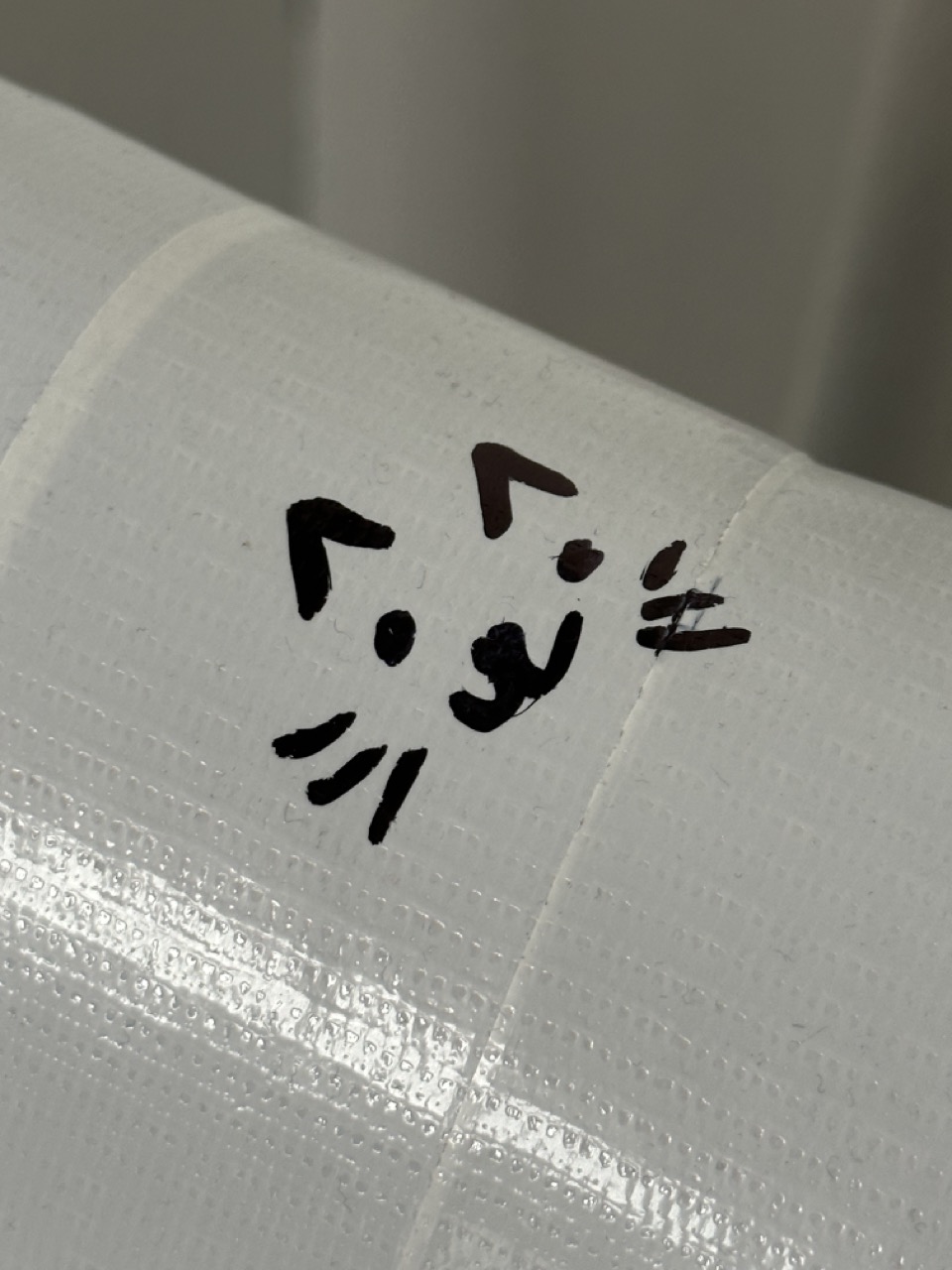
Below is the documentation of what people decided to write on the chair.


Back to Coding. My return to creative coding and brushing up on basic things again. From the workshop yesterday I still feel there is a lot to work on but with using code in Creative Coding 01, Mobile Web and Sensory Objects I feel a little more confident on using it.
Continuing my on going practice of being open to abstract art and practices instead of being too logical and rigid I want to look more into abstract artists and use their work as inspiration for my outcomes in Creative Coding 02.
One line that did stick in my head was (and I’m paraphrasing) “Organic is random with order”
Vera Molnar

Georg Ness


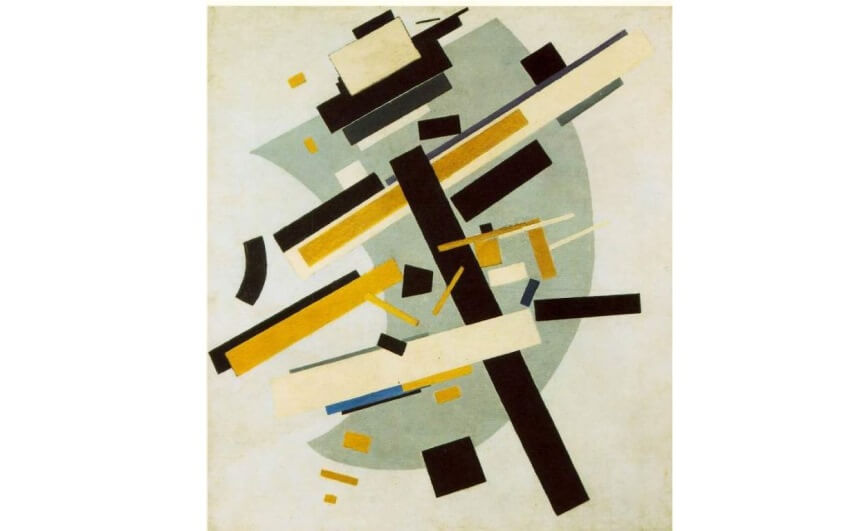
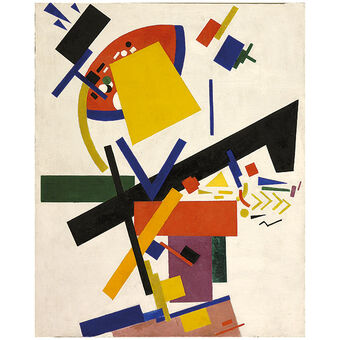
Kazmir Maelvich
Piet Mondrian
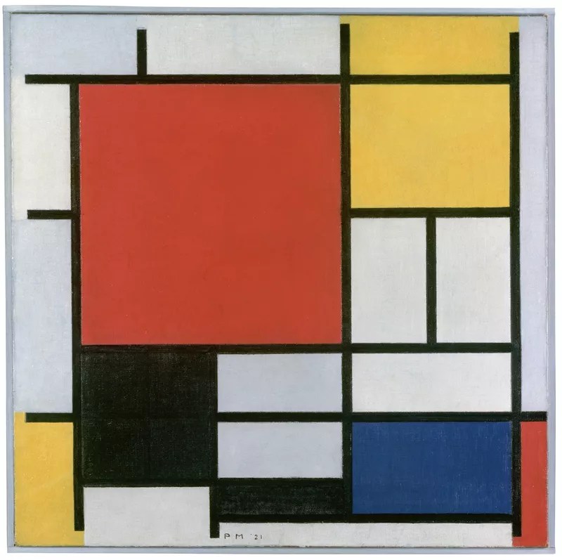
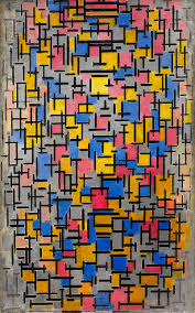
Liubov Popova
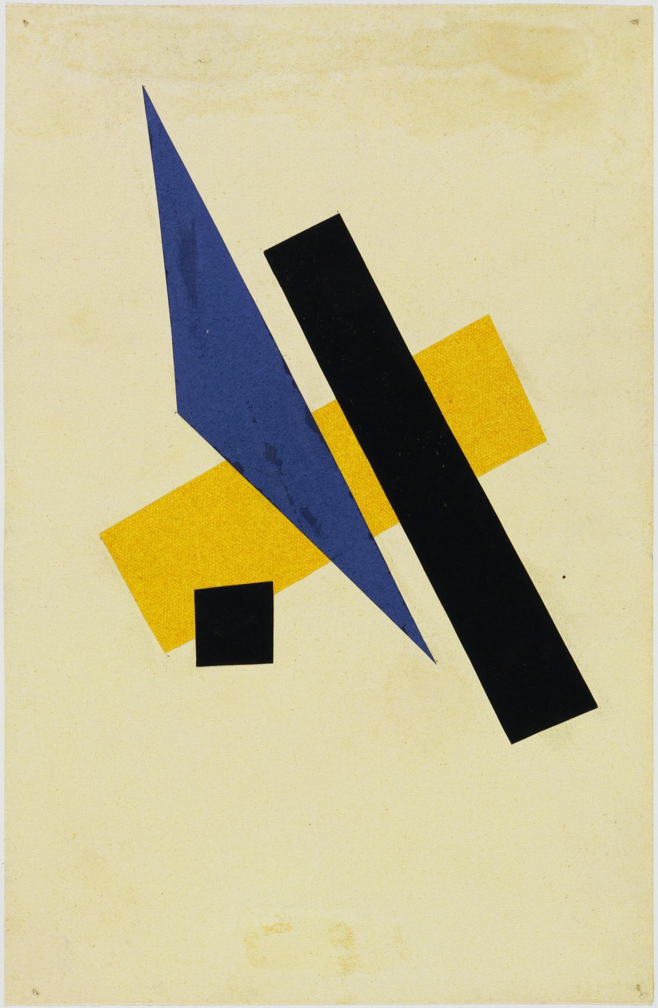
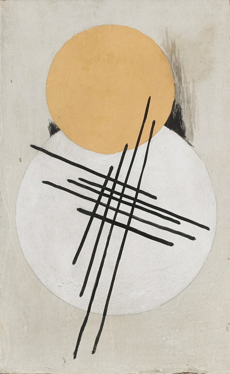


Bridget Riley
Work Shop 01
For workshop 01, it was a little refresher, and initially, it took me a second to get back into it, but as I said before, I didn’t realise how much I’ve come on from Creative Coding 01 after doing the other projects that used coding. So, for example, in workshop 01, we covered Translate, and as soon as I pictured it as framing on graph paper, it became easy to wrap my mind around it. And concerning the compounding orders of transforms and rotations and containing them within Push and Pop matrixes makes more sense to me if I imagine them as pieces of paper on top of one another or layers in a program like Photoshop or Illustrator.
Something to note that was touched upon is the use of P2D, other imported renderers and importing libraries. It seemed simple enough when Cat went over it in Sensory Objects but I will need to look into it further to really have a clue of what I’m doing.
Work Shop 02
Workshop 02 was bringing in images and modifying them with scaling, transforming, rotating and tinting. Images in Processing follows the same rules as Rect but with the added constraint of resolution. At this point I’d love to take some photographs into Processing and manipulate them into something else, something different.
Photography
After using images in processing, and even though the images were random, it still gave them a new quality so I thought that if I looked into some great photography then I could use them in my processing sketches.
Imogen Cunningham

Robert Frank

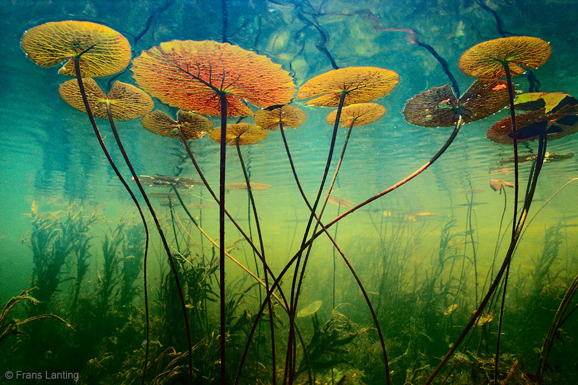
Frans Lanting


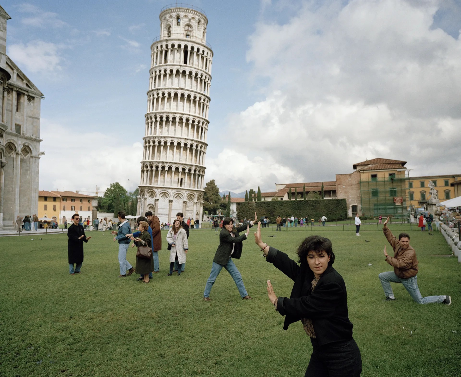
Martin Parr


Eliot Porter

Tim walker

Outcome Photography
Work Shop 03
Workshop 03 is using pre-made SVGs from adobe illustrator or Photoshop and putting them into processing. Besides some amazing visuals, it also opens up the workflow for bringing other things into processing and manipulating them that way.

Trigonometry. By using the functions of SIN, COS and TAN the animation and formations of processing sketches can follow the formation or comparative movement of these graphs in different ways. The outcomes of these processing sketches finally showing there was something to learning them in school.
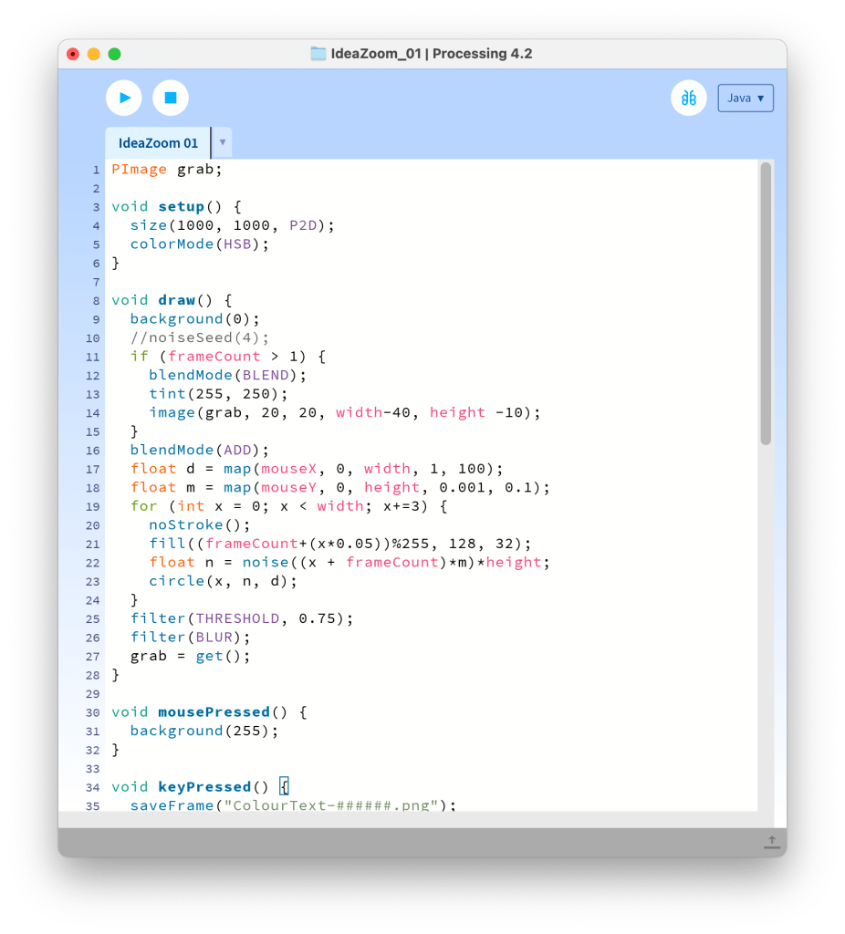
The noise function is something I found myself drawn to as it imitates autonomy. After trying to replicate that to an extent in the Dimensions project, it’s madness that it can be replicated with a couple of lines of code.
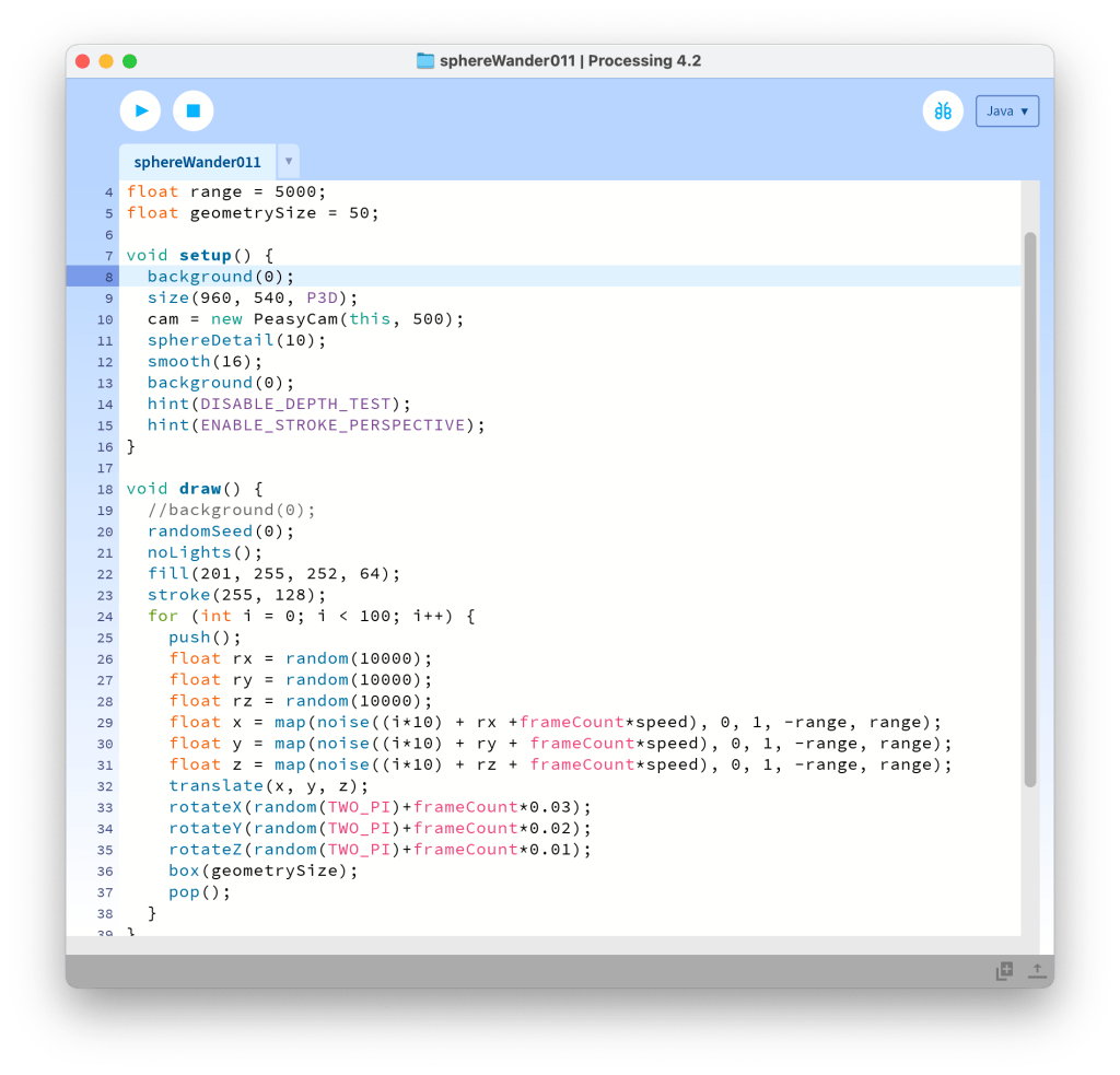
float n = noise(frameCount*0.01)*height;Workshop 04
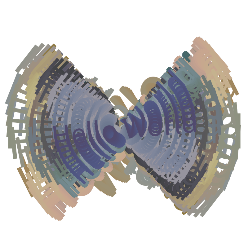
Opening processing to the world of 3D! It seems simple enough to add the Z axis to the X and Y axis as I use primitives, but I will need to work on it more to get to grips with more complex shapes and animation in a 3D space.
I did find myself drawn to playing with text in processing. Using words and languages to draw images felt odd, but the shapes and lines that came from it were something I enjoyed and helped me discover new shapes.
Support Session
Support session with Paul, again just mess around with it and plug some numbers into it
Noise is a known curve, and when the number is smaller it’s as if we’re zooming into the curve and taking information from a smaller collection of numbers.


Outputs
Outcome 01


Outcome 02.01


Outcome 02.02

Outcome 02.021


Outcome 03


Final Images
Final 01

Final 02

Final 03

Evaluation
My take away from this project is that even though I have made some progress there is still a lot for me to work on a learn. I do feel like I have made progress with understanding the logic of it coding and can understand it better than before and with practice and continuing to mess around with processing I’ll continue to get more and more confident with it and ideally better at it.

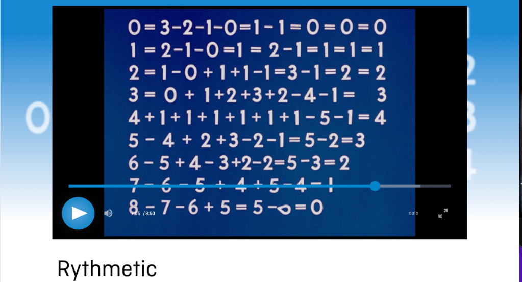
What initially caught my intertest was the animation of Norman McLaren and how he inbued personality, humour and motion with the simplest animations where others wouldnt have thought to put it, like his work in Rythmetic.

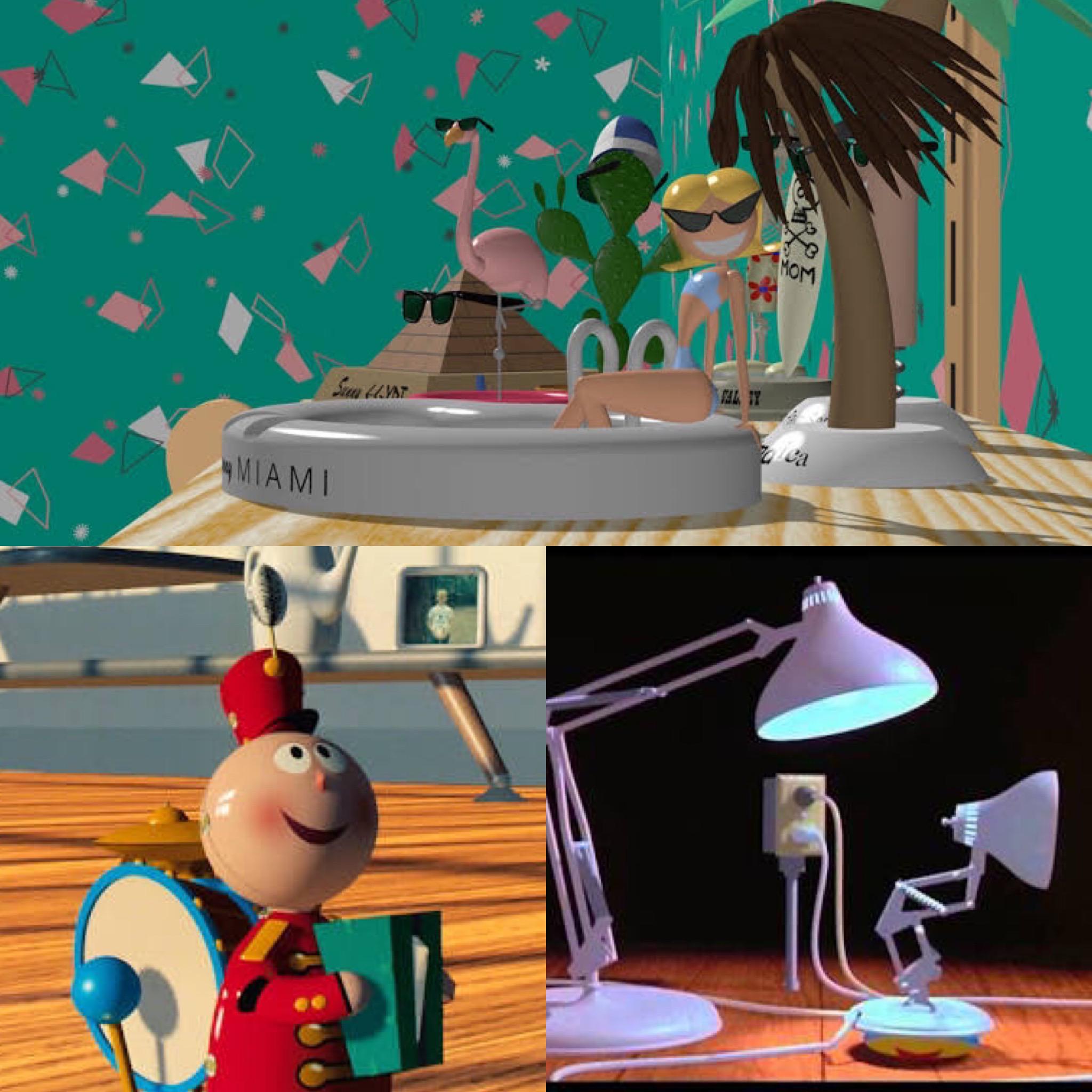
I have been a fan of Pixars work for as long as I can remember and their ability to bring warmth and love to computer graphics and even the simplest of objects and characters. I’d love to even hint at that sense of personality and joy the bring.

Going forward in this project, I want to better my skills at Autodesk Maya and begin learning some animation basics that I can call upon, maybe not purely in animation but in future projects I might use it on.
Workshop 01
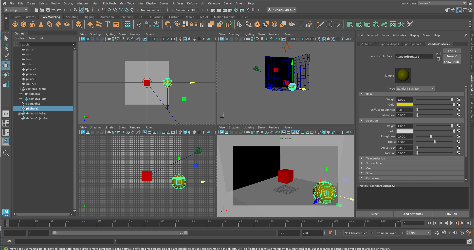
Introduction to 3D Modelling and Autodesk Maya.
I have used Autodesk Inventor in the past so hopefully my skills are transferable even if a little bit rusty.
They are not transferable and it does not come naturally but with some practice like everything I can learn them and get to a decent level for just picking them up. I’ll just need to practice.
Initial ideas for my diorama are maybe a little too adventurous. After the workshop I was thinking of castle interiors and long sweeping shots of structures that can be created using the basic shapes.
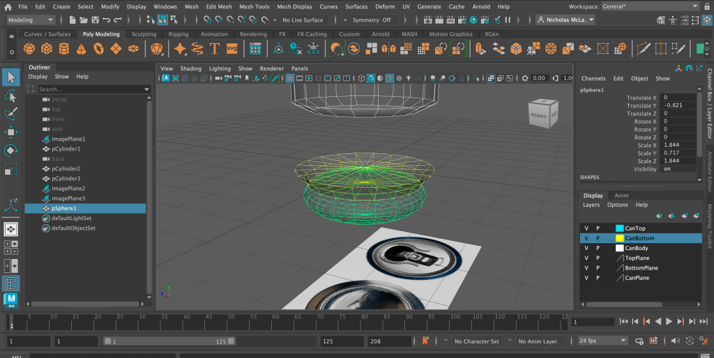
And another was to use inspiration from my creative coding 01 projects. The monochromatic transparent disks are in the air but now in motion because it’s simple enough shapes with simple animation. The rendering of the materials might take quite a long though, if reflective surfaces take longer than usual.
Workshop 02
After the workshop I was trying to get some extra practice in for 3D modeling like I have done in the past to get better at it. Im not sure what to do as my final idea but I think after the workshops I’ll have a better idea. Considering how I’m feeling in the workshops i’ll definitely need to reign in the ideas and keep it simple.
Workshop 03
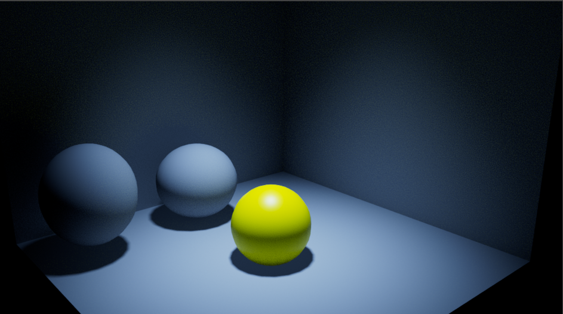
Camera and Lighting. What really captured my attention was how after the camera and the lighting the scene seemed to come to life and looked more tangable.
I would like to use the camera in exciting ways in my project. With the use of camera and lighting, you could really play with perspective and put the audience in situations that you wouldn’t be able to any other way.
Below is a message with a quick note on my initial ideas and where to take my scene.
Workshop 04
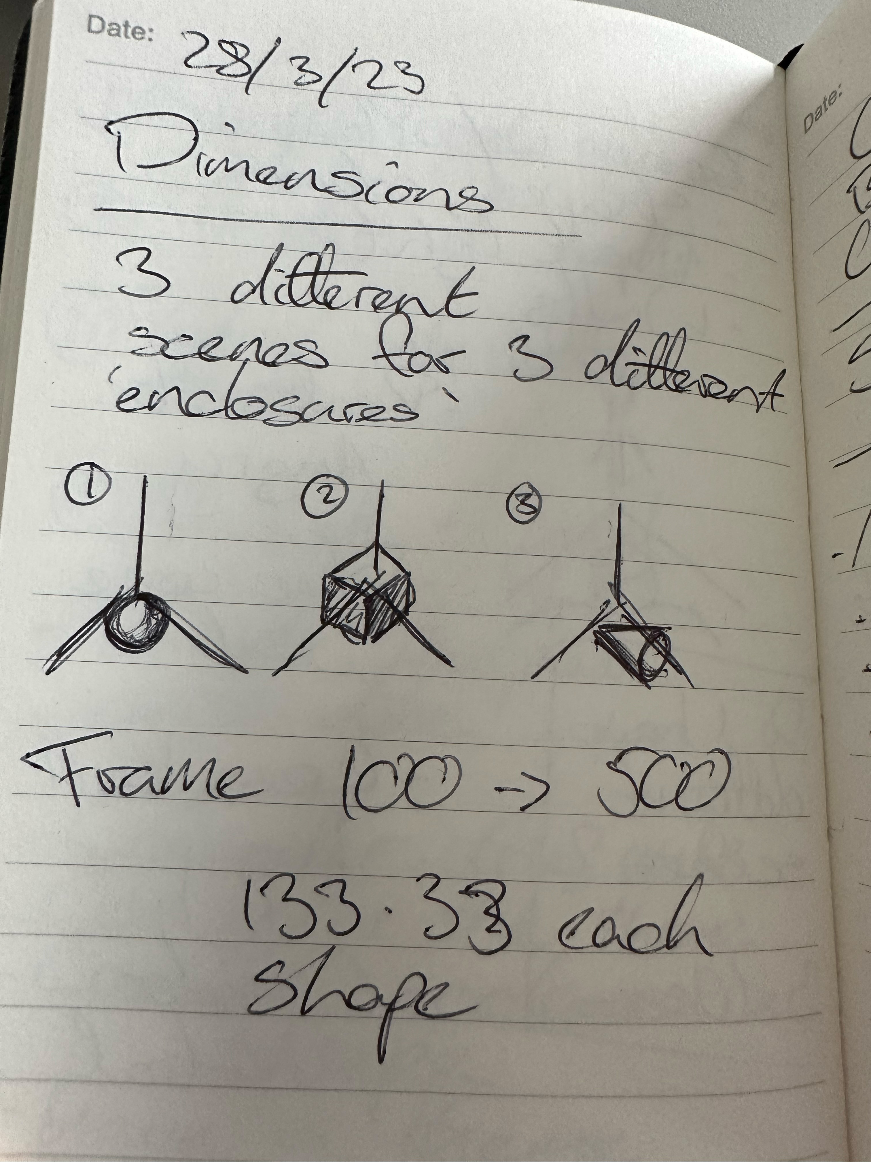
Rendering time will need to be a big consideration now, referring to the time I have left and the fact that I don’t have my final scene yet. I think the idea of the personality shapes will be simple enough but still convey what I want.
Below is a quick animation and render test.
Final
The final idea started as bringing a number of different personalities and emotions to basic primitives, but as I worked on it more and more, it became more and more apparent that with my current stills and the time remaining that bringing a Pixar-level of character and animation might be a little too adventurous.
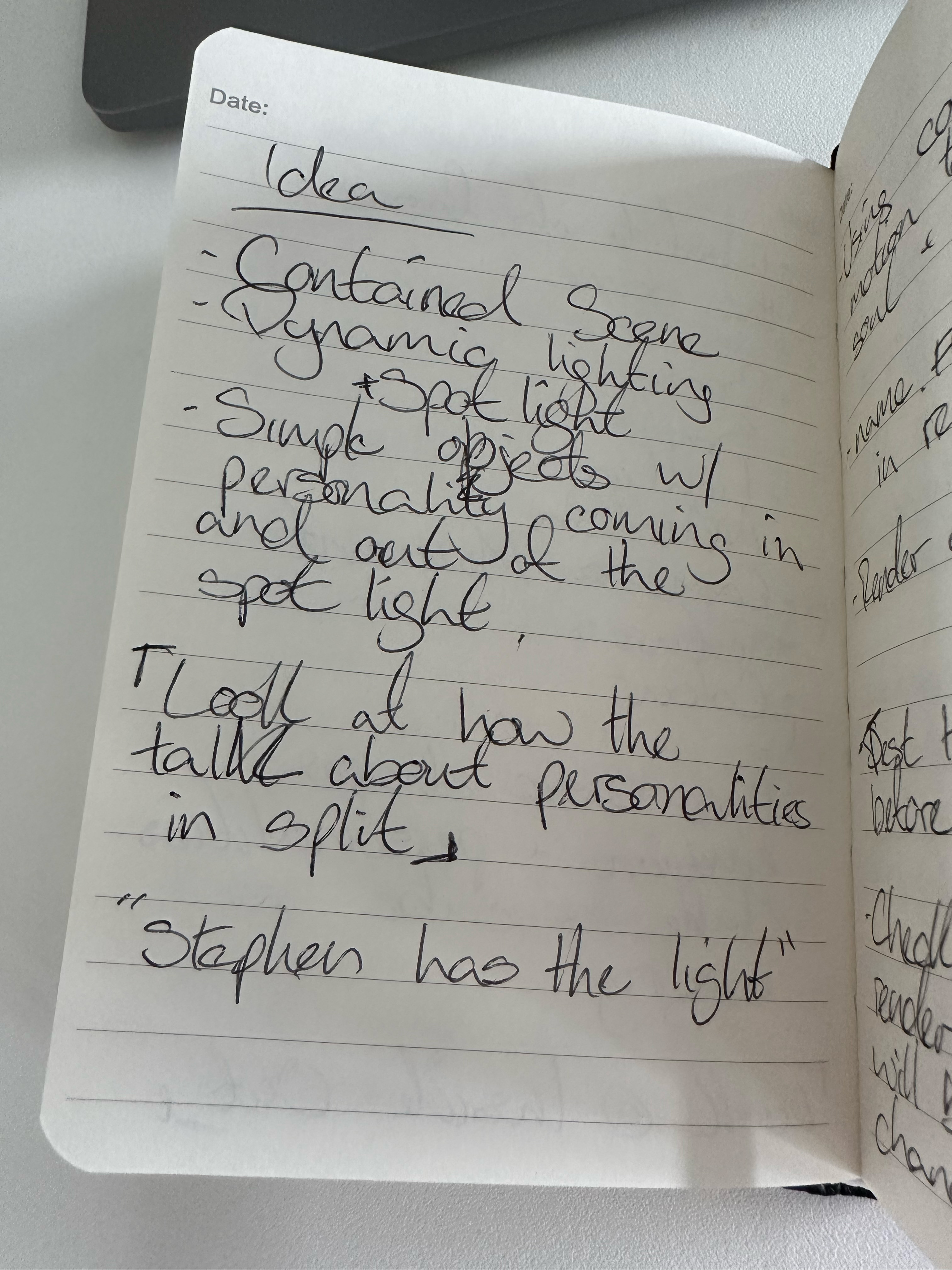
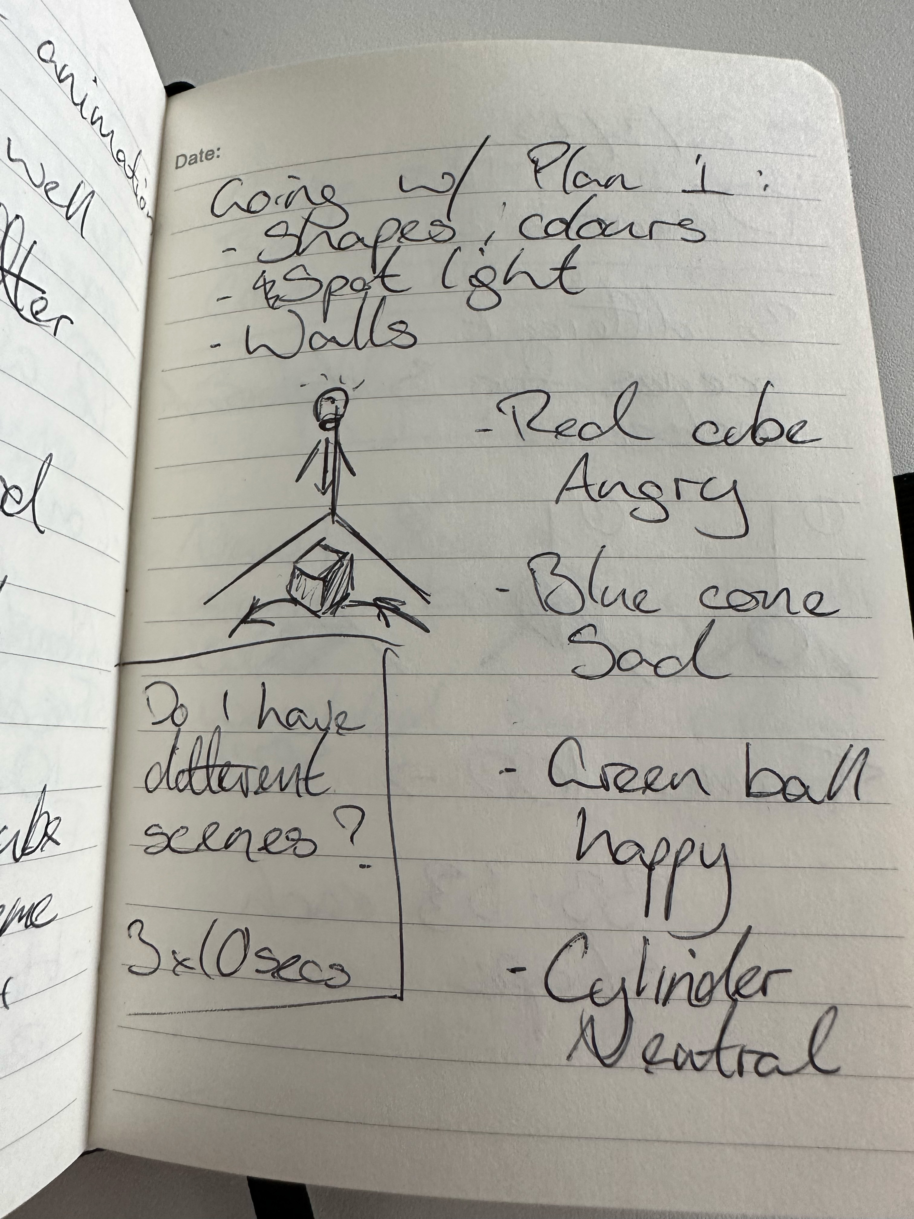
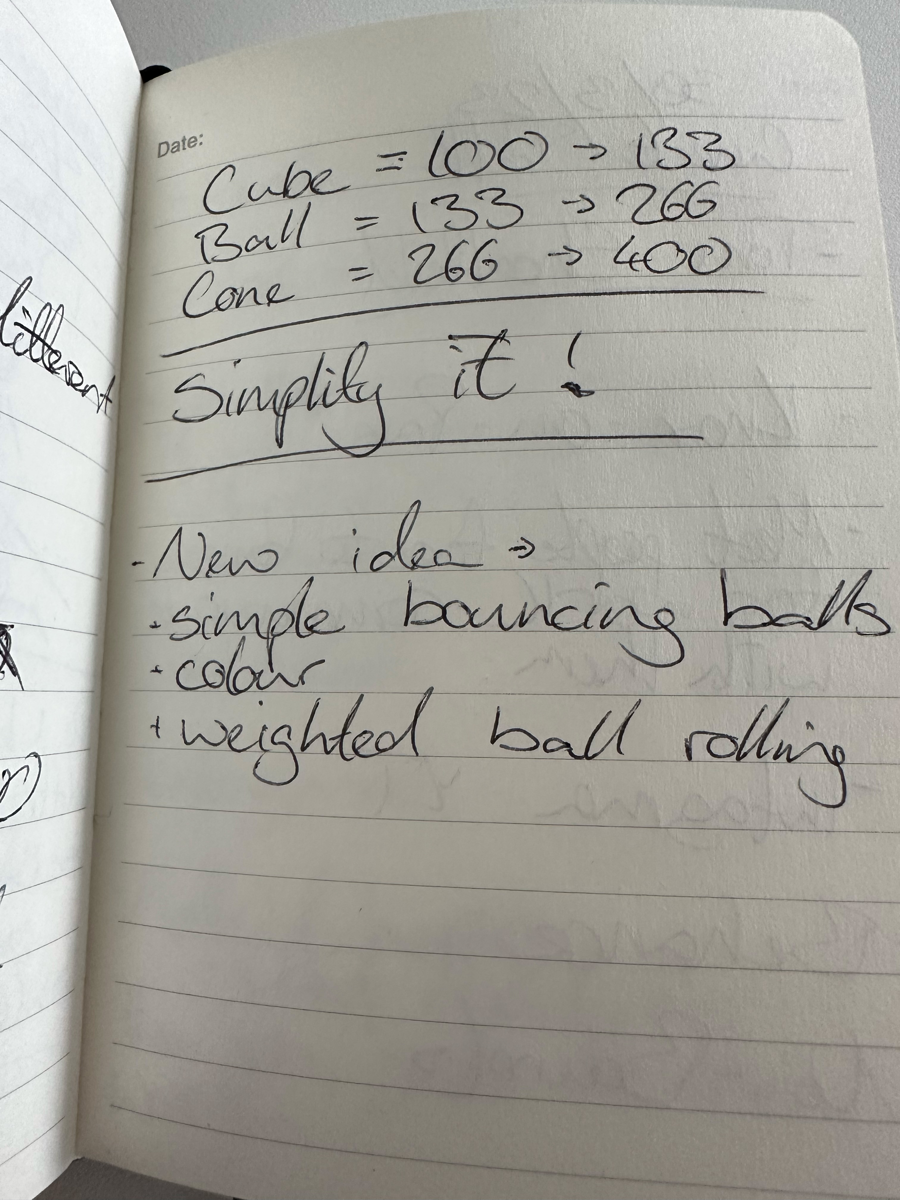
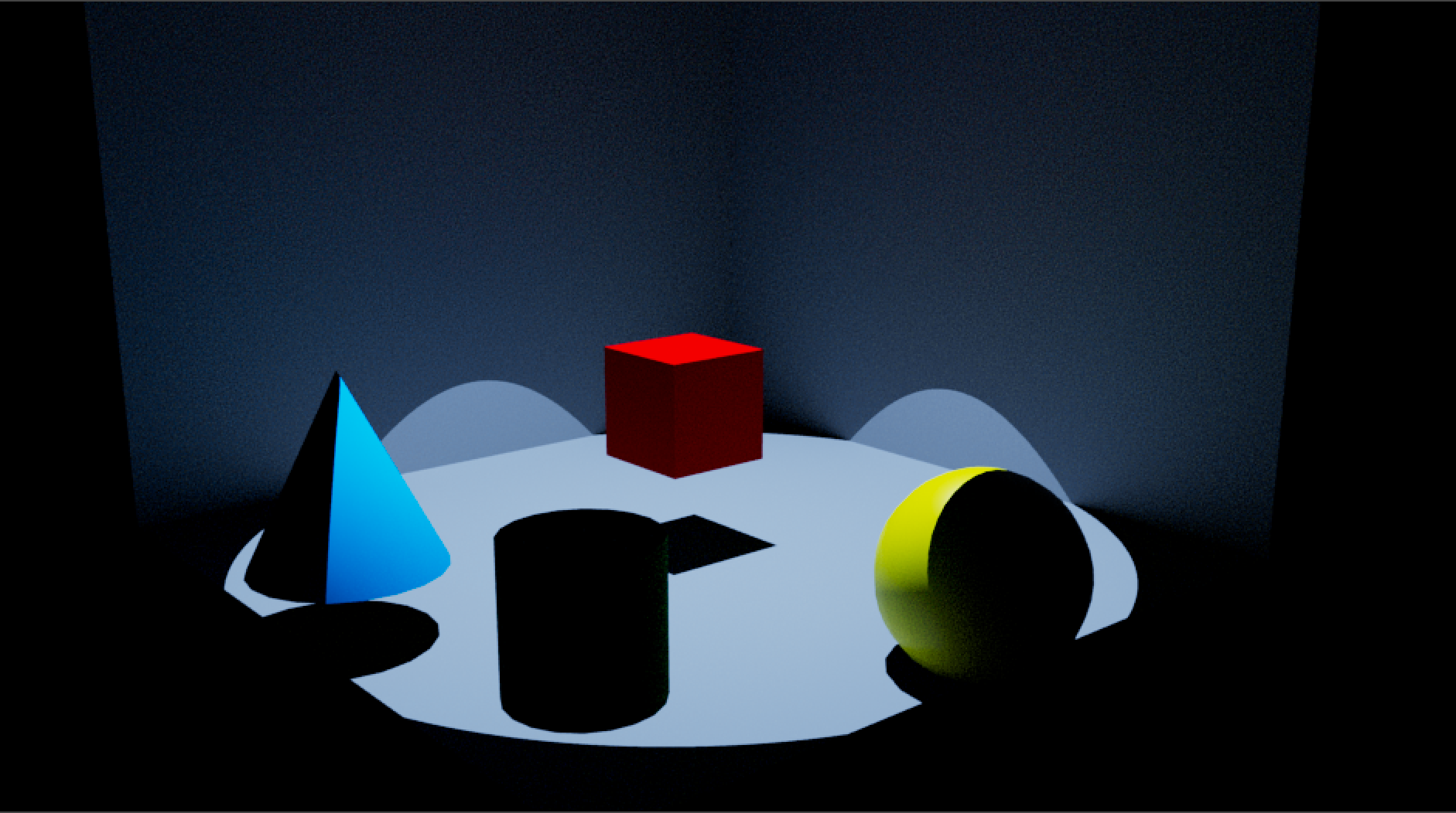

So after simplification and removing the character animation I still tried to keep a sense of motion and colour in each of the objects, and even if not as obvious as I would have liked, I still feel that some of the initial ideas for personality has sneaked through.
The weight of the yellow, the energy and speed of the red and the light, airy feeling of the blue.
Final: Shapes
After a number of iterations and a number of simplifications, my final rendering is a short animation of primitive shapes with motion, some realistic and some erratic.
I feel that the theme of emotion and autonomy I was aiming for has been diluted, but that was because my aim was a bit too high and my concept was too literal. Maybe the final outcome would have been more obtainable if I had gone with a more abstract concept.
Evaluation
If I had more time, I’d like to spend more time on each aspect of my scene and use them to relate to my theme. Looking at how the lighting angles, shadows and light temperature can convey emotions. How camera angles and perspective can make the audience feel a certain way… without making the audience feel sick.
And again, if I had more time, I’d love to spend more time giving each primitive a real personality, working on the animation and fine tweaking it.
I need to keep trying to be less logical and more conceptual. I’ll bring this through to future projects and future studies.

Class 01
Project launch. Using the Arduino Uno to change the sensory output of any household object.
My first idea was a mug that breaks and then reassembles like magic. And my second thought was, “ok, calm down, it’s only two weeks”, but I want to continue this initial idea of a magical feeling, something fun and exciting.

This was just a quick initial creative writing exercise to try and come up with ideas of household items with something else, somthing fun or something magical.
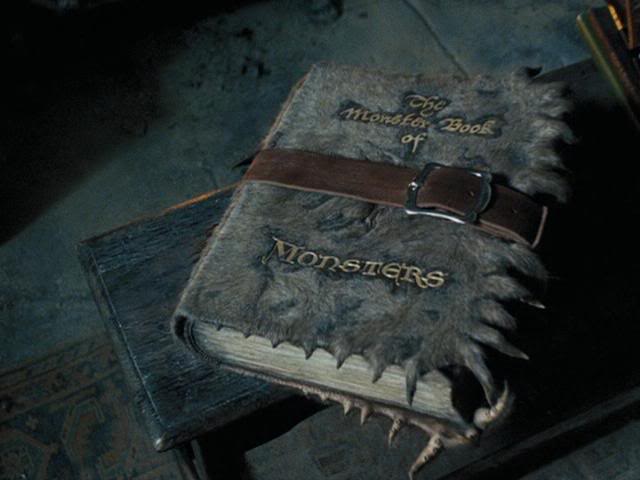
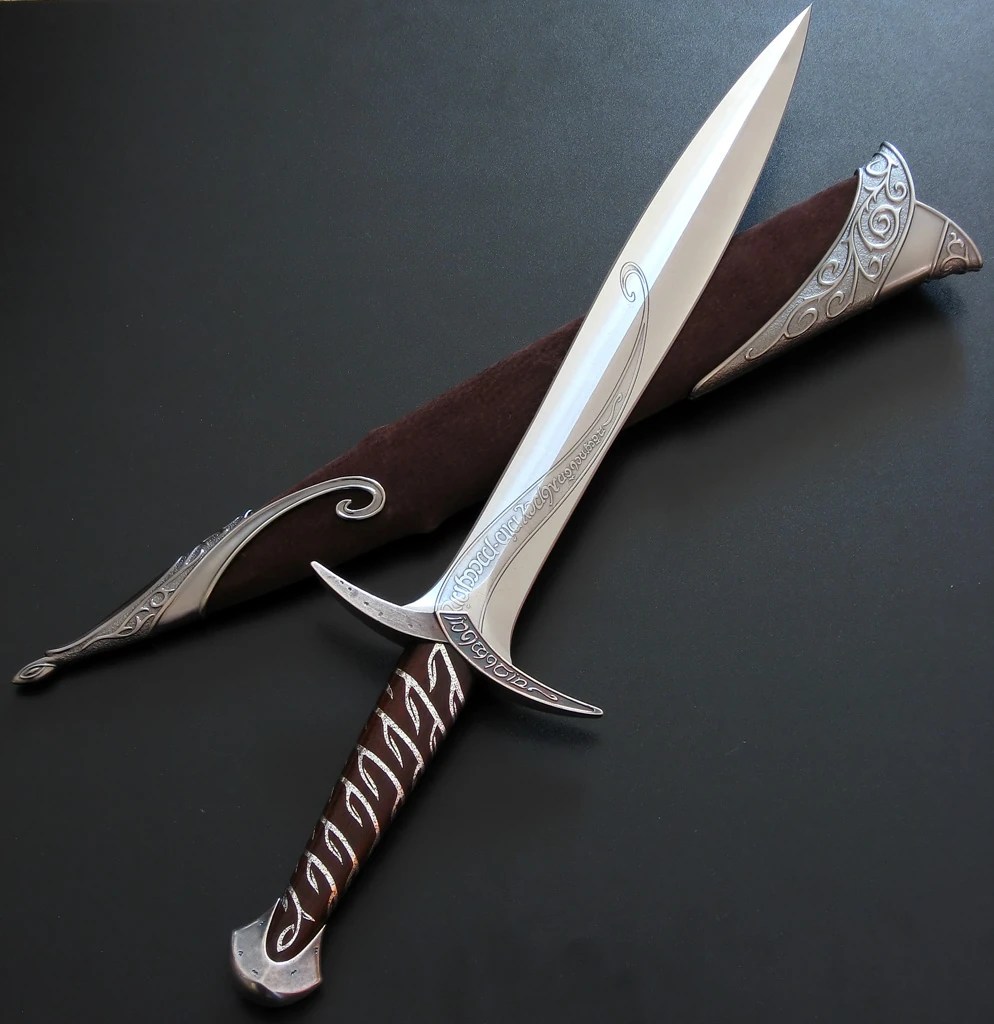
The term ‘enchanted objects’ keeps swimming around, making me think of magic and fantasy: The Monster Book of Monsters and the Shrieking Book in Harry Potter or, as Cat mentioned during the project launch, Sting from The Hobbit and The Lord of the Rings.

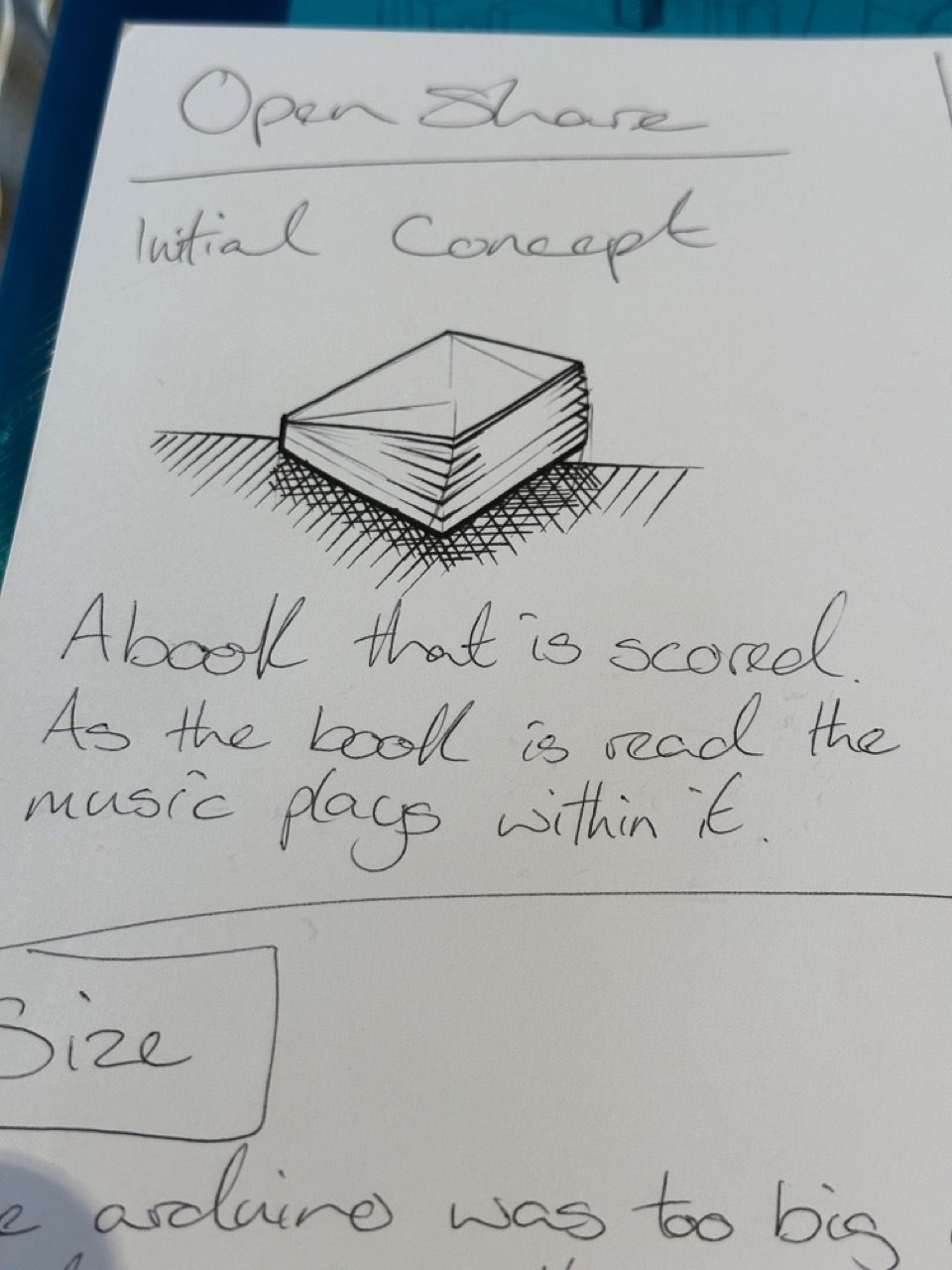
A book would be perfect; it could easily house the Arduino and an external battery with modifications so that if the book is opened, it’s triggered.


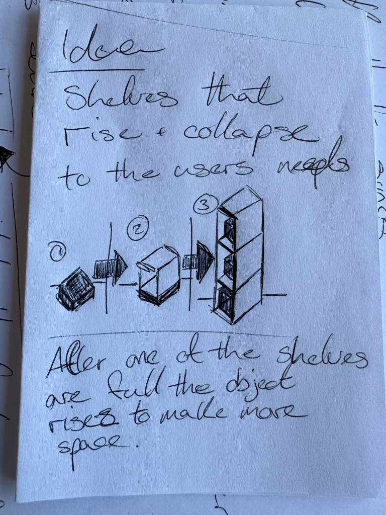
Workshop 01
Above are just some examples of using the Arduino, considering the book idea two strips of a conductive material could be used on the pages of the book so that when the book is open and the circuit is broken the output switches on.
Workshop 2
Workshop two was working on the components and the coding for the motor and the piezo buzzer and how even though these components are simple they can be used in a number of different ways.
I thought the piezo buzzer was just a one note drone that was either on or off but by changing the code it can play music.
Personally this has done a great job of opening my eyes to the possibilities of Arduino and building technology in general. I think I was hesitant to touch anything before hand and feel like it would be too complicated for me before this.
Support 01
A new direction. Initially, my idea of enchanted objects was very literal and limited. I wanted to avoid my usual way of working and designing a product like a product designer. Still, thankfully, Cat showed me that I was limiting myself in a different direction. But it can come together differently by using the logic of designing with UX in mind and having the creativity and fun of my initial idea.
The idea of my object is a book with a score or a soundtrack. As the book is read, the music changes as it would in a movie or tv show and with each page or chapter, a different track in the score is triggered with a new chapter.
Progress Report
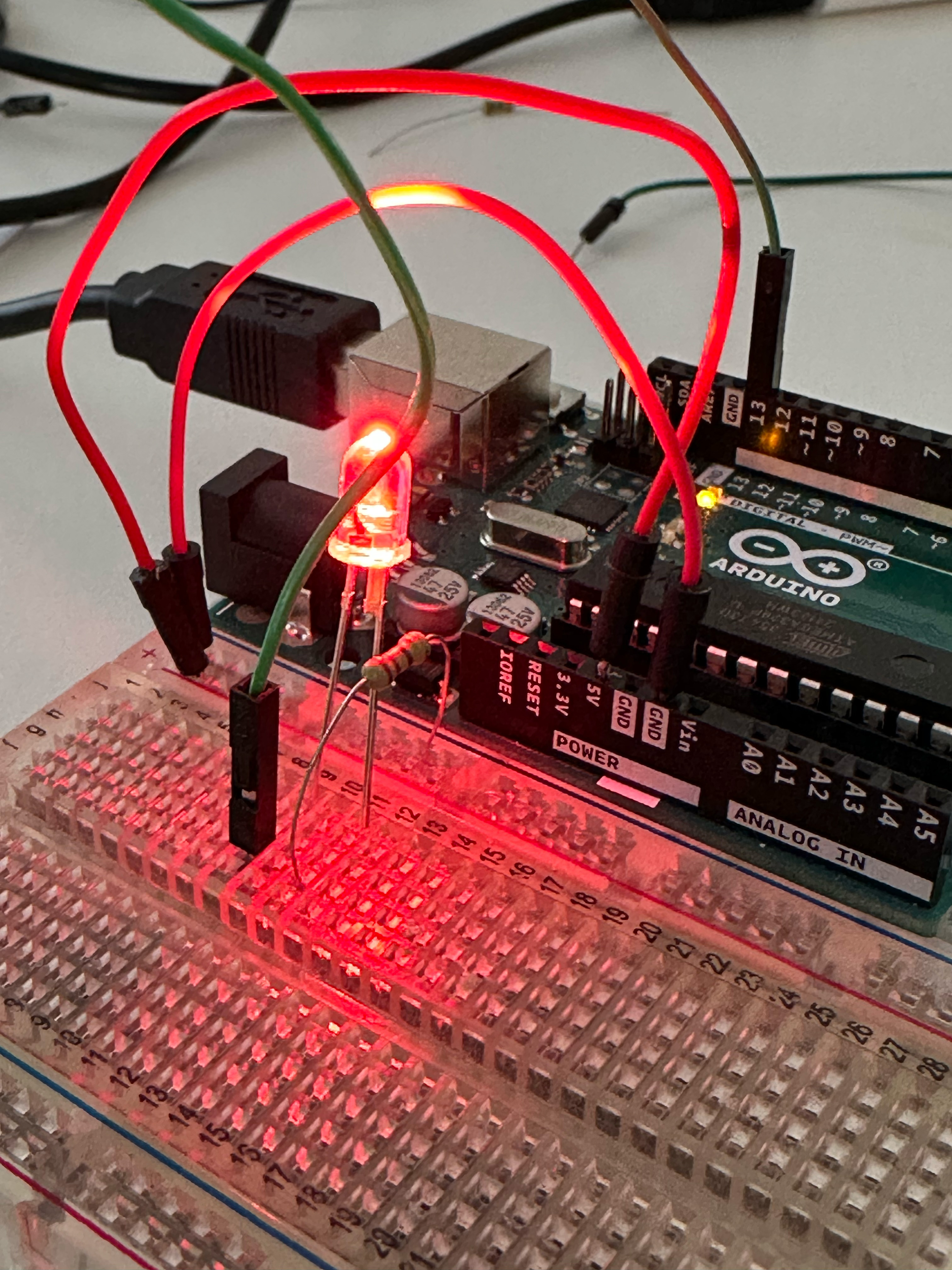
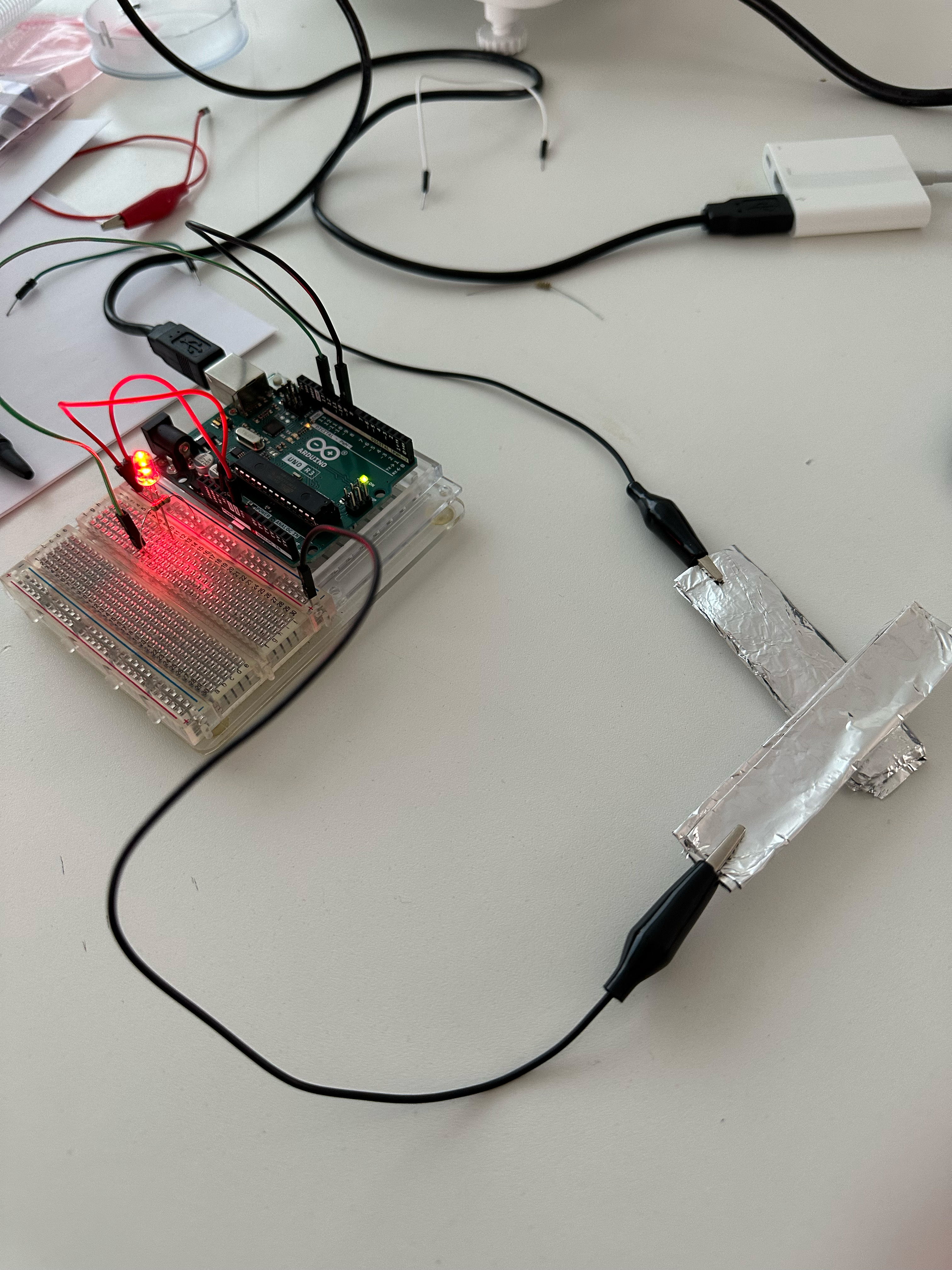
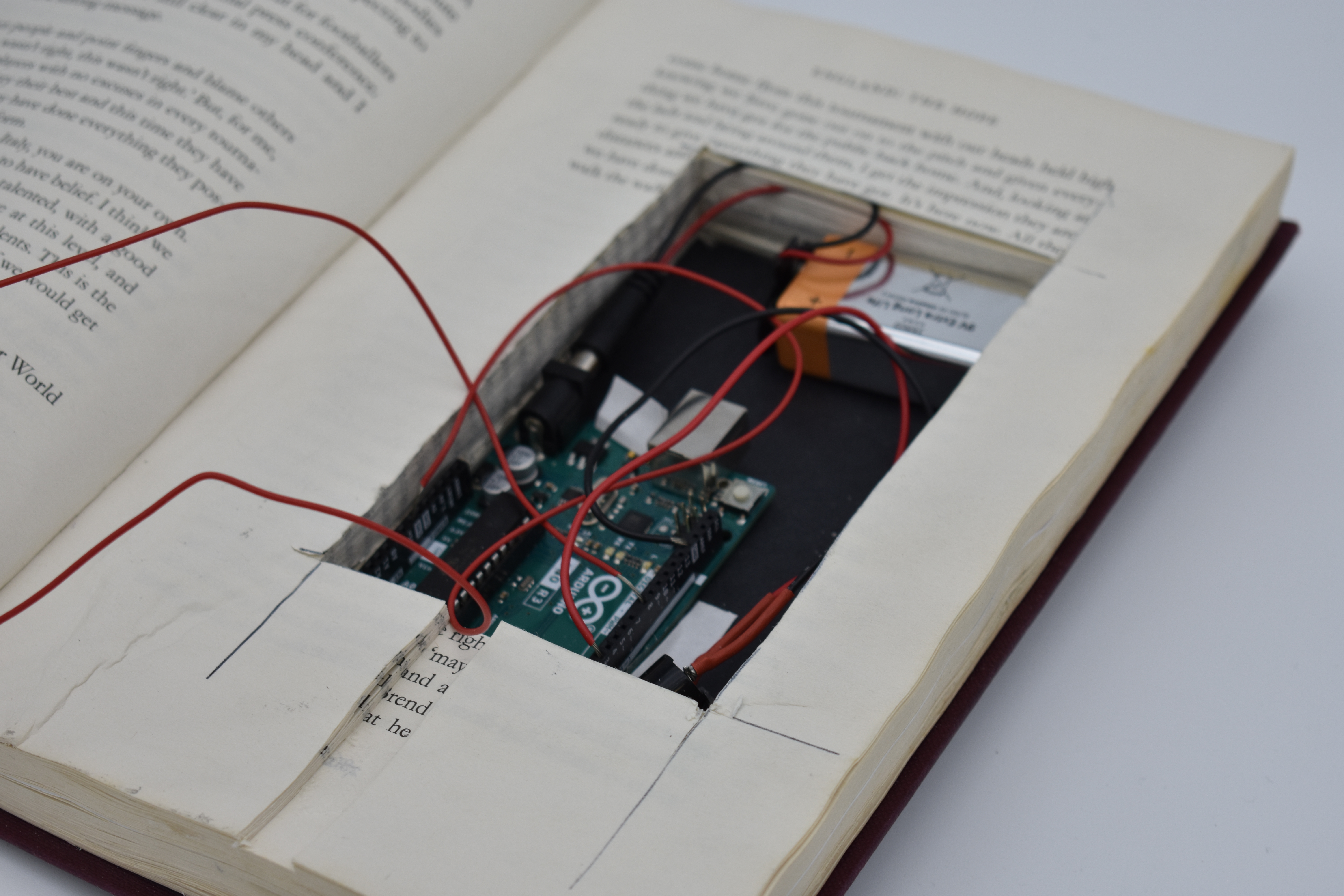
With the basic sizes of the Arduino and parts I need I went out on the hunt for a hardback with the correct sizes to hollow out.
What followed was a trip to the charity shop, getting a copy of Steven Gerrard’s autobiography, getting some Mod Podge and taking an age to glue half of the book together. My initial concept was to have the book’s two halves hollowed out, but Cat said the breadboard wasn’t necessary and saved so much space.
Support 02
Working out the nitty gritty. The second support was working out how to get the code and Arduino working. Again I’ve noticed my thinking could be more flexible regarding certain things. For example, I was only trying to work with the components I had instead of getting wire and using that. But everything worked as it should with the wires and Cat soldering the piezo buzzer.
In my time, I need to focus more on my coding because it still doesn’t come as naturally to me as I’d like.

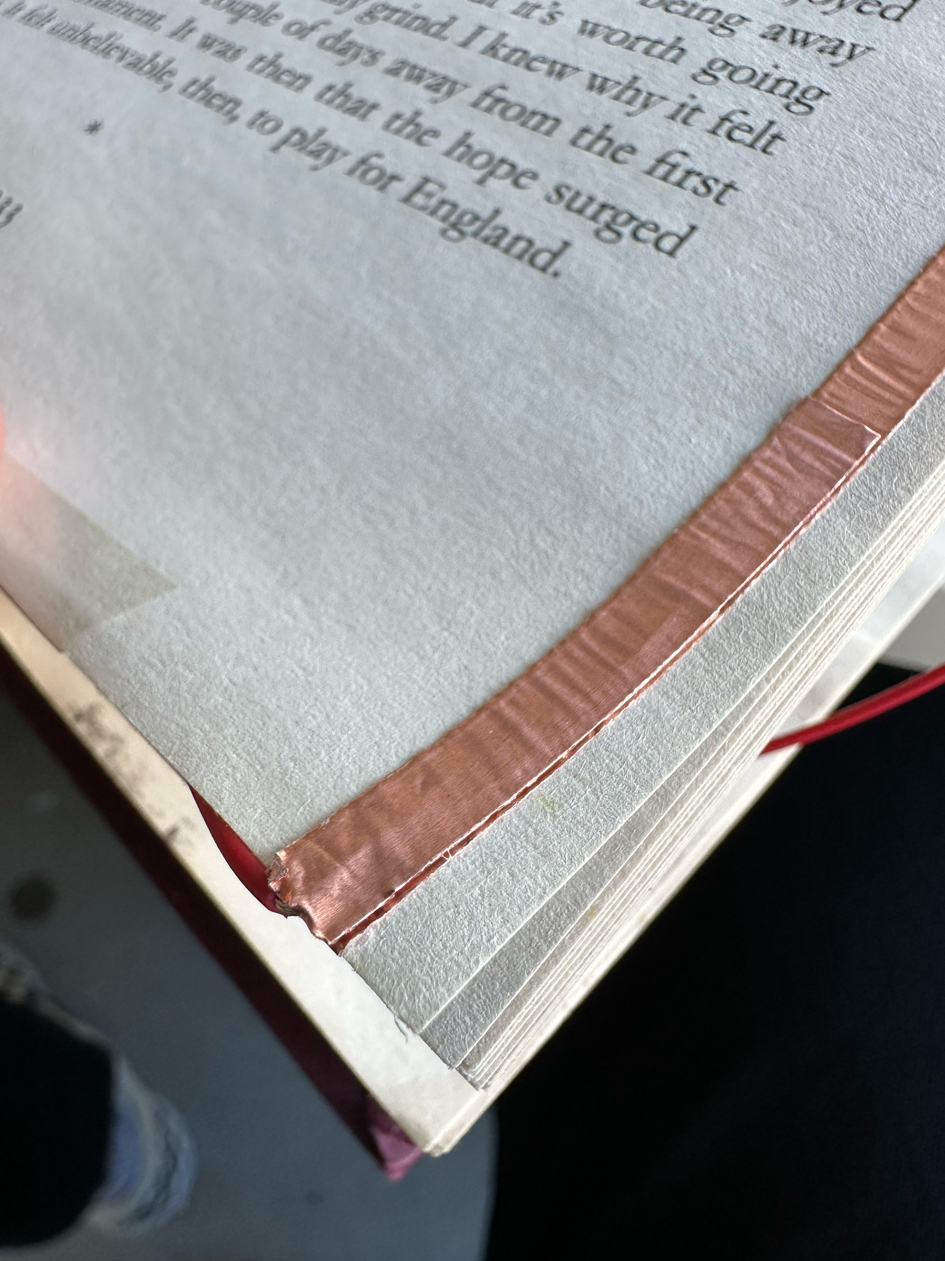

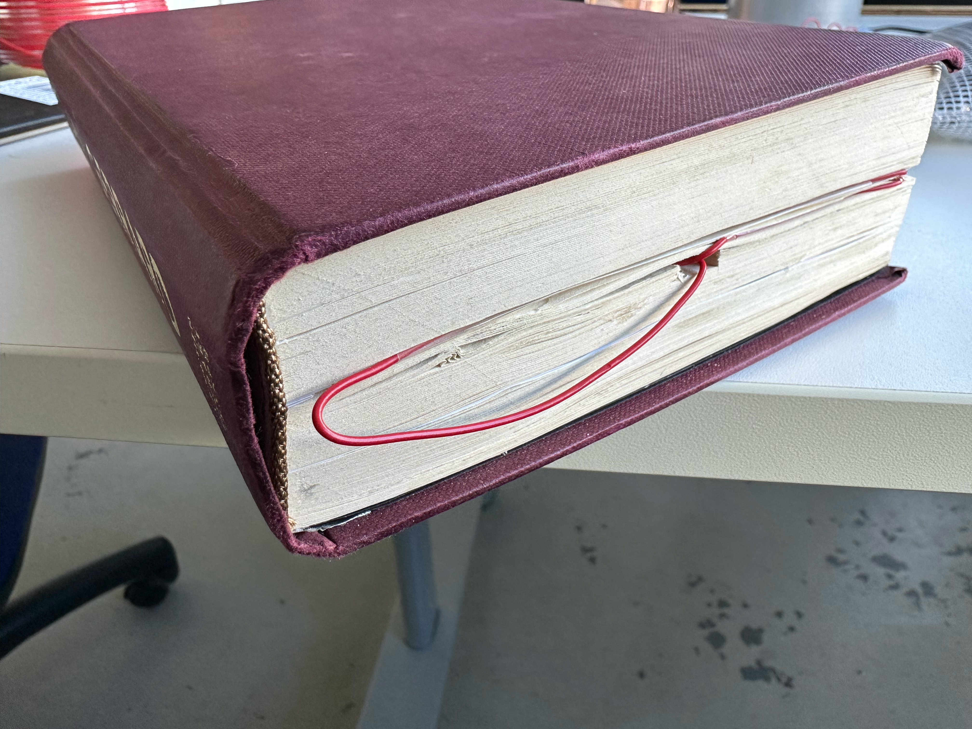
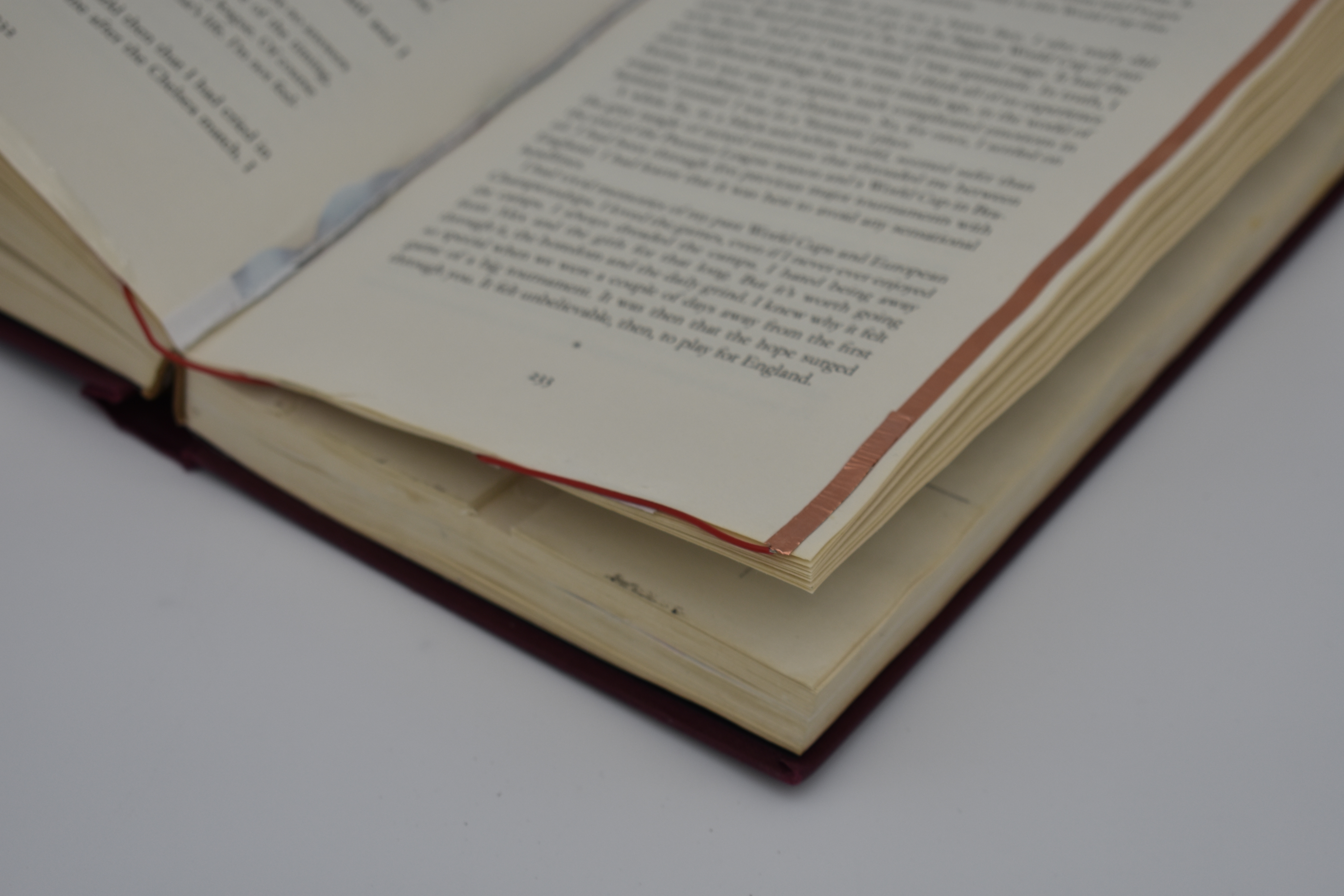
As seen above the hollowed out section of the book is housing the Arduino with a channel cut out to allow the wires to go to the pages that have conductive copper tape as to read when the boom is open or closed.
If I have more time then I want to set up different pages to trigger different songs relating it closer to the concept as well as hide the conductive stripping.
The Video

At this point, I know how much time I have to make this video, so keeping it simple is the best idea. Someone goes into the library, picks up the book and enjoys it with the music playing. The ideal music will be added in post.


The Video
For the video, I roped Ally in to be my actress and went to the GSA library to film a number of shots and sell the idea that this book could be seen in a living working library.
With consideration after the fact this product might be more of a personal enjoyment or in a specific part of the library as not the disrupt other people with in the library.
Or the book could have a way to connect headphones like a headphone jack or bluetooth component so that the book is not disruptive in quiet places.
The volume
‘The volume’ is the concept of an interactive book that will play the score of the book as the reader makes their way through it. Through each chapter triggering the track in the score, the music progresses at the same rate as the reader.
Reflection
On reflection, there is a number of issues to work out of the final piece:
But as this product is just a test of concept, I believe that the concept has legs either for personal use or for young adults as an incentive to return to reading.
If there was infinite time and infinite resources I would have subtler wiring within the book, smaller hardware housed within the book and a subtler user experience to give a deeper sense of immersion within the story and more of a magical experience when using the book.
Project launch & LIVING PROOF
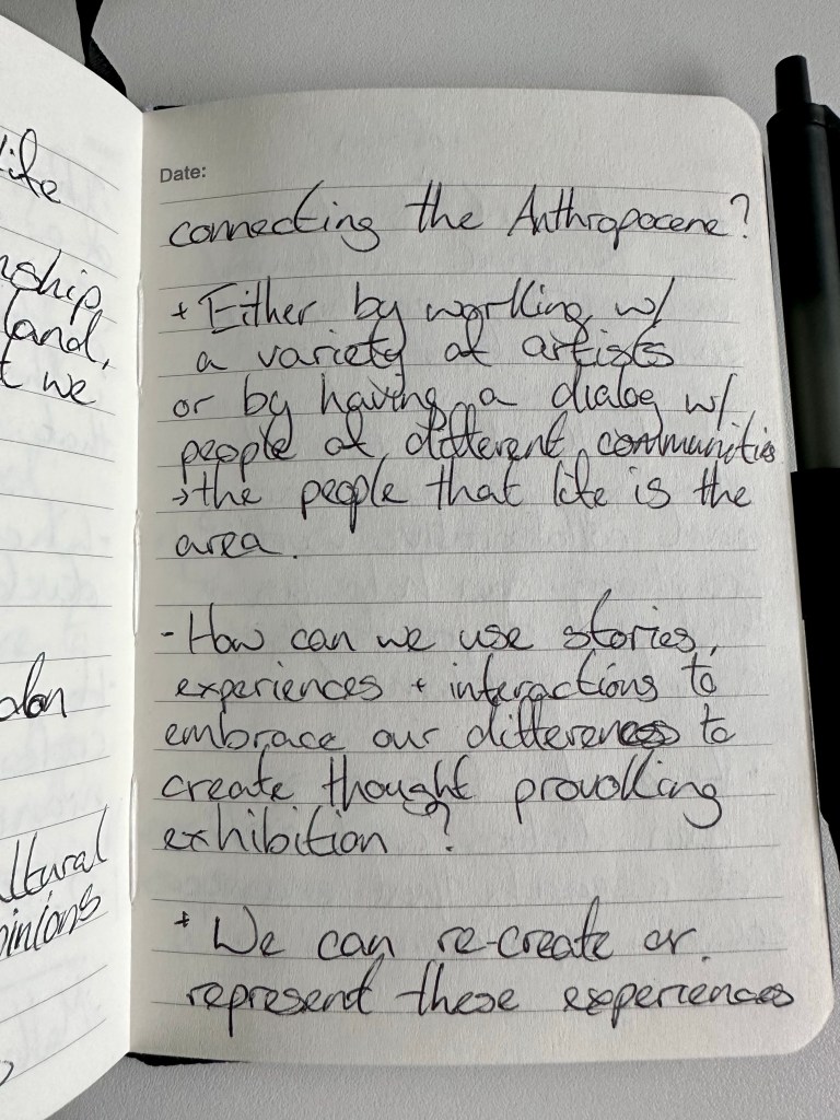
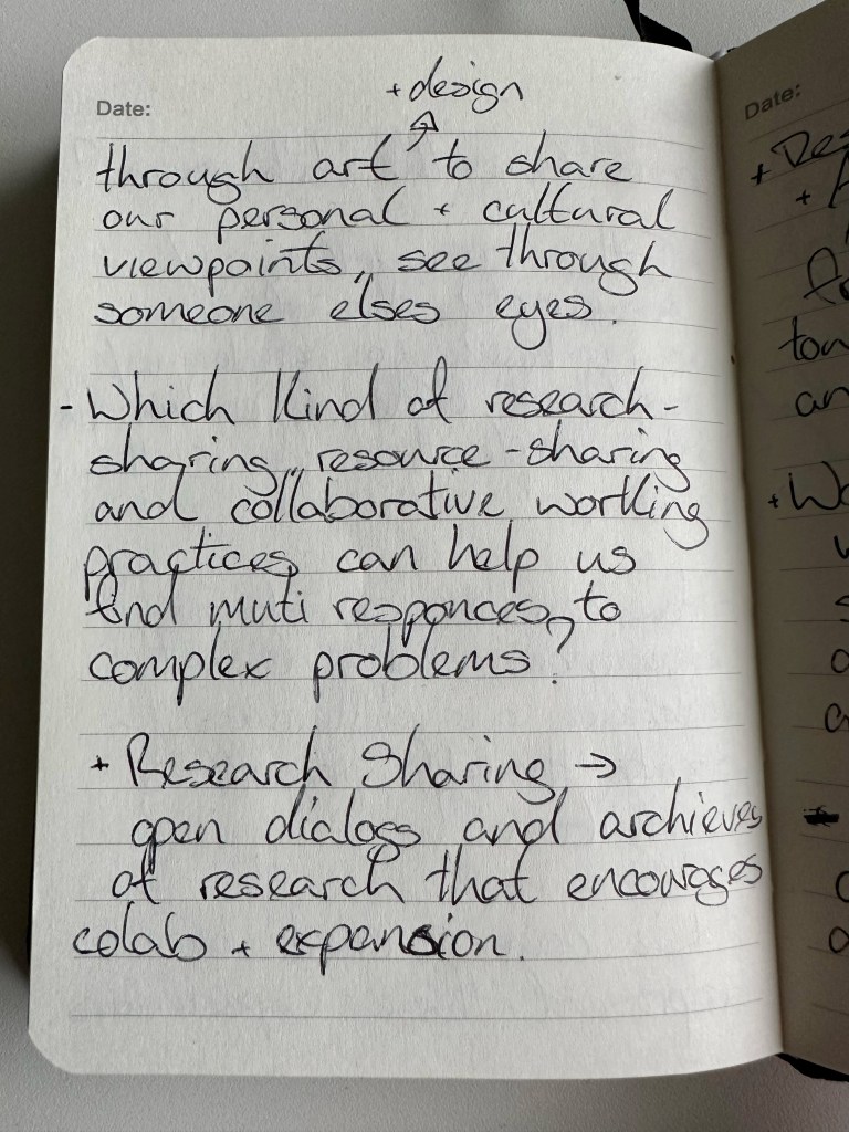
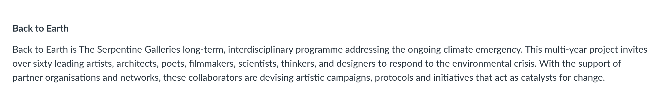
Returning to the Anthropocene. With the start of Co-Lab 2, I am returning to my studying and understanding of the Anthropocene. Again already trying to think of how we, as students, designers, artists, and technologists, can improve the world we live in and begin to reverse the effects humans as a species have had on the earth.
The film LIVING PROOF by Emily Munro was a collection of archival footage from the Moving Image Archive Catalogue curated together to paint the picture of Scotland’s history but also Scotland’s involvement and participation in our climate crisis.
After watching LIVING PROOF, I felt more connected and more responsible for the problem of the Anthropocene than I think I ever have.
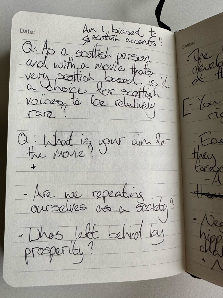
Living Proof: A Climate Story (d. Emily Munro, 2021) is a feature-length archive documentary that looks for the roots of the climate crisis in post-war history. Are we heading into new territory, or are we caught in a cycle of familiar promises?
Footage from the National Library of Scotland portrays a country shaped by demands for energy and economic growth, while an eclectic soundtrack amplifies the voices of the past in powerful, and sometimes unsettling, ways.
My takeaway from the film, on top of many other things, was how it’s too easy when studying a global issue to only think of it on a global scale rather than the small pieces throughout modern and very recent history that have led us to this point. At that point lies our solution. It is challenging for one person to tackle a global problem. Still, it is much more manageable for that person to change a situation in their community, city or even country.
“How do you eat an elephant?…”
Suppose we aim to change anything or improve anything. In that case, it has to be a collective effort from everyone, not just the students, designers, artists, and technologists but (in the context of Scotland) the Scottish people too.
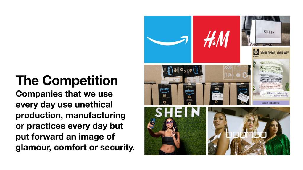
And at the risk of getting too high on my soap box, that is not done by exclusive galleries and loud protests. Instead, a better future can be achieved by using the same tactics that the successful companies of the world have used, by painting a picture of a better life for the people living in it. By making a greener, better future more enticing, attractive, more accessible.
By using our skills not to lambast anyone but to educate and help the people, we share streets with every day, we can make the mammoth task of the climate crisis more manageable.
We must learn their game and play it better than them.
Week 1
During the Q&A, Emily Munro jokingly mentioned Solar Punk, so I wanted to look into that a little bit, I’ve heard it thrown around over the past decade but wanted to consider this branch of utopian design.
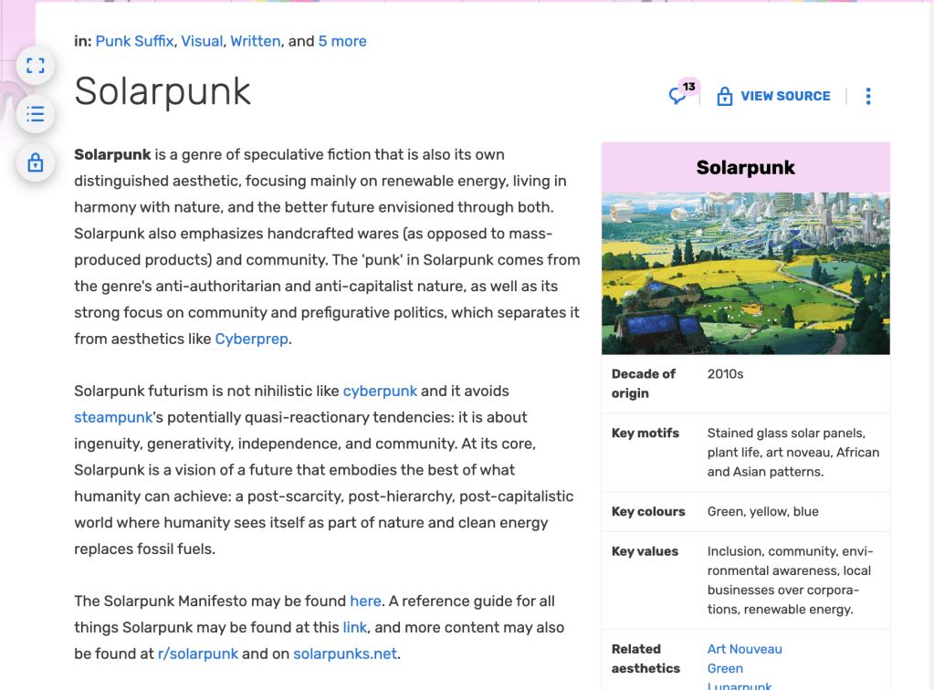

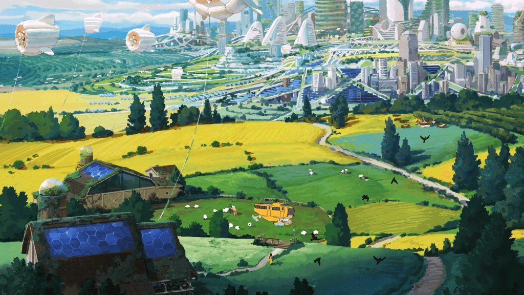


Even though it lives in the realm of Sci-Fi I think the utopian design of Solar Punk can serve as an inspiration of how humans can live in harmony with the earth.
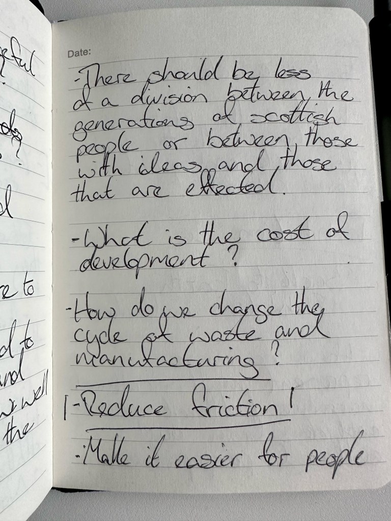
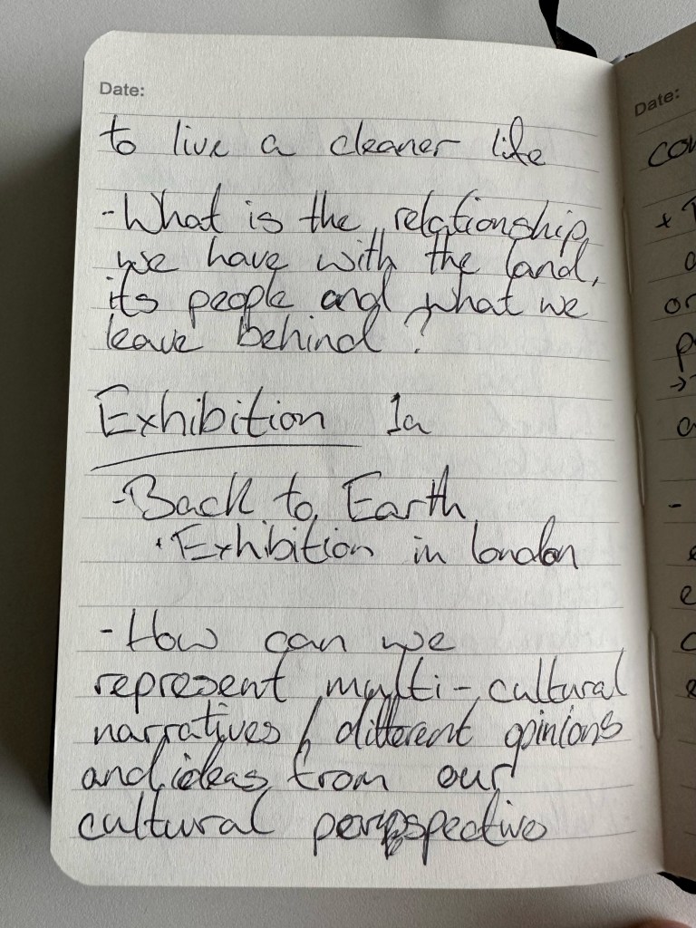
Picking an Output: Exhibition (Back to Earth GSA)
After going through each of the options, I went with Exhibition 1a (Back to Earth GSA) to push myself out of my comfort zone, I have never done an exhibition, but the idea of learning how to and then with my group putting on an exhibition is equally exciting as it is terrifying.


Lecture 1: Storytelling and the Anthropocene with Elizabeth Hodson
After watching Elizabeth Hodson’s lecture, my main takeaway was that even though we are human, and that is the perspective we have, we can use our minds as creative practitioners to view the world, the problems of the Anthropocene and our solutions to those problems with the natural world in mind. Not only to consider the human element but that of the natural world, nature and the animals within it.
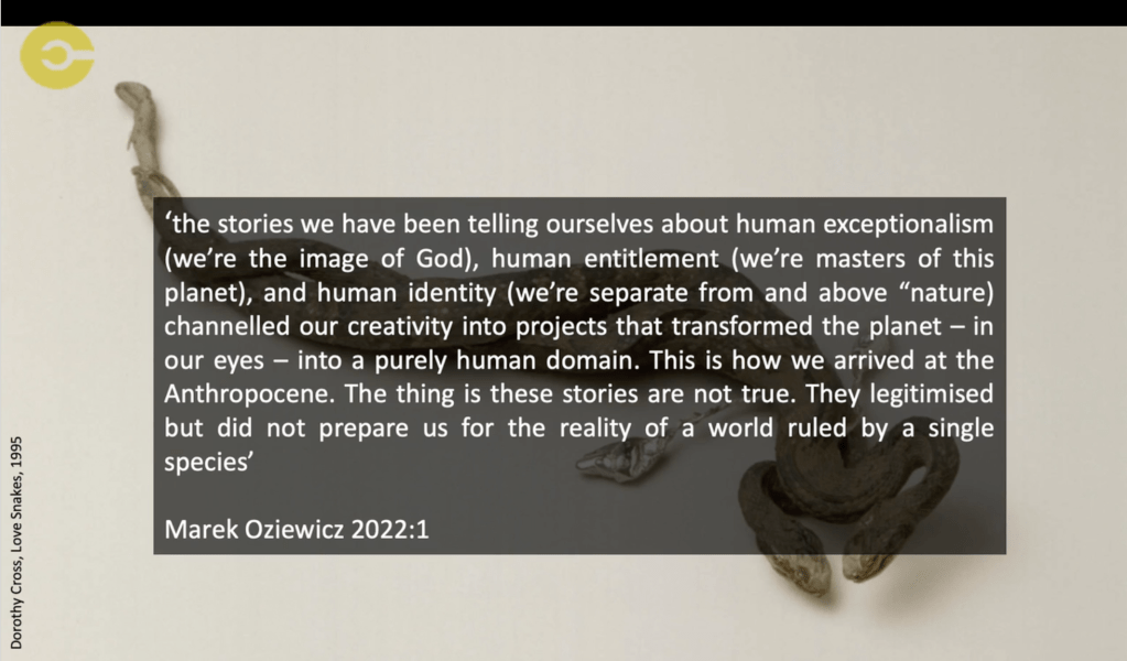

As I touched on slightly in my Co-Lab 1 work journal I think the human race should have more of a symbiotic relationship with nature and the earth. We have to be less selfish both in our usage of the earths resources but also in our perception of ourselves within the natural world, that being that we are part of the system not above it.
Exhibition Making
When initially considering the art of curation and exhibition, I went to the Gallery of Modern Art (GoMA) to see the exhibition that was on, Elizabeth Price’s SLOW DAN.
“SLOW DANS is a cycle of three 10-screen videos – KOHL, FELT TIP, and THE TEACHERS. These three works present a fictional past, parallel present, and imagined future, interweaving compact narratives that explore social and sexual histories and our changing relationship with the material and the digital.” – GlasgowLife
https://www.glasgowlife.org.uk/event/1/elizabeth-price-slow-dans
I didn’t take any photographic documentation of this exhibition because I was in almost complete darkness. I feel that mobile photography would not do the artist’s and curator’s vision justice but would also break other viewers’ immersion.
From my observation as both a participant and as someone looking at the exhibition choices made, it was a fascinating, immersive and exciting experience.
Initially, you are guided in and given time for your eyes to adjust to the darkness, walking into a vast open space with giant hanging screens and loud announcing coming from an almost unknown location and the hypnotic visuals using imagery as well as typography to tell Price’s crafted story.
After taking more of an analytical approach to how the exhibition made me feel, I felt the complete change in the environment from the life and noise of Glasgow outside the GoMA to the alien location within the hall was almost sci-fi. It was too dark to grasp the depth of the hall, and the height of the screens was almost monolithic and reminded me of Michael Radford’s movie adaptation of 1984.
The lowered seating added to this adult/ child sensation or teacher/ classroom dynamic, forcing your neck to crane even more.
The suspended speakers surrounding the seating area created the sensation of voices coming from anywhere.
At its core, the concept seems simple, but the execution, choices, and commitment to those choices transported the viewer to an entirely new unknown space.
GoMA


Glasgow Photography Gallery

Reid Studio


Week 2
Introductions
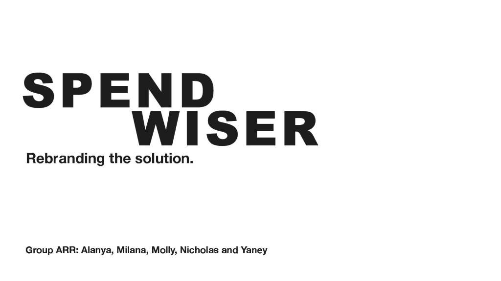
We’re now in our smaller project group, (group ARR: Milana, Alanya, Molly and Yaney). We seem to work well together and all give input for our mind map/ initial concepts.
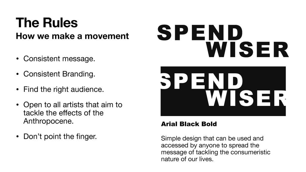
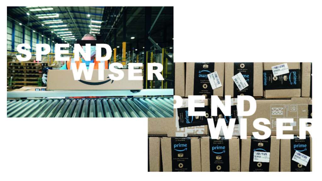
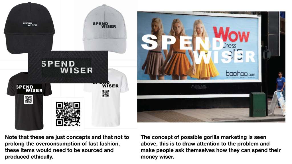
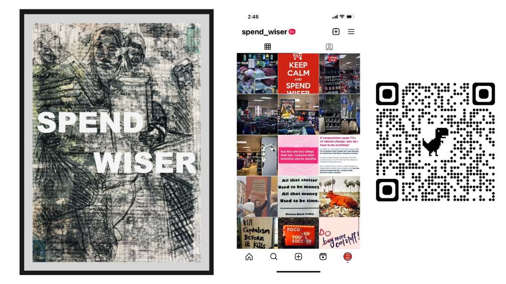
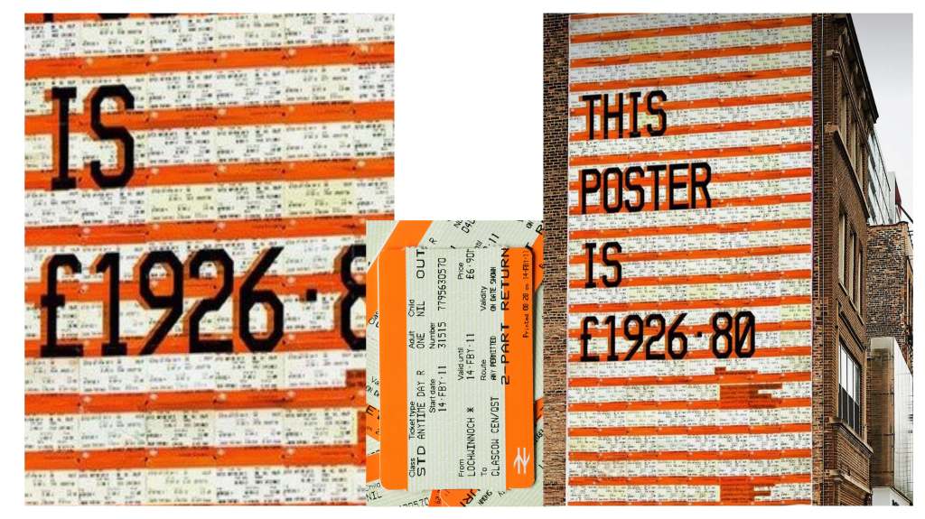
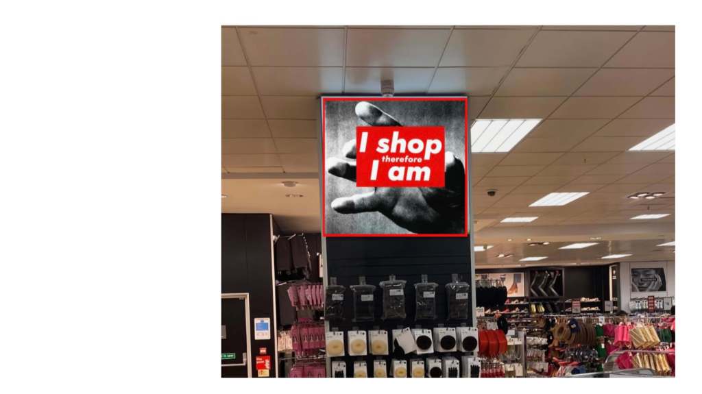
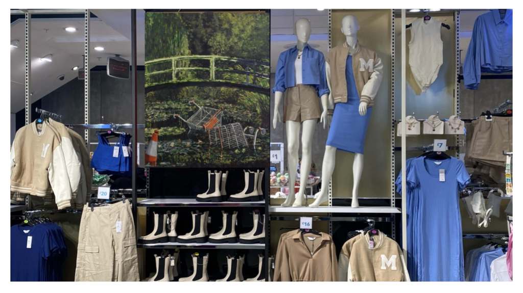
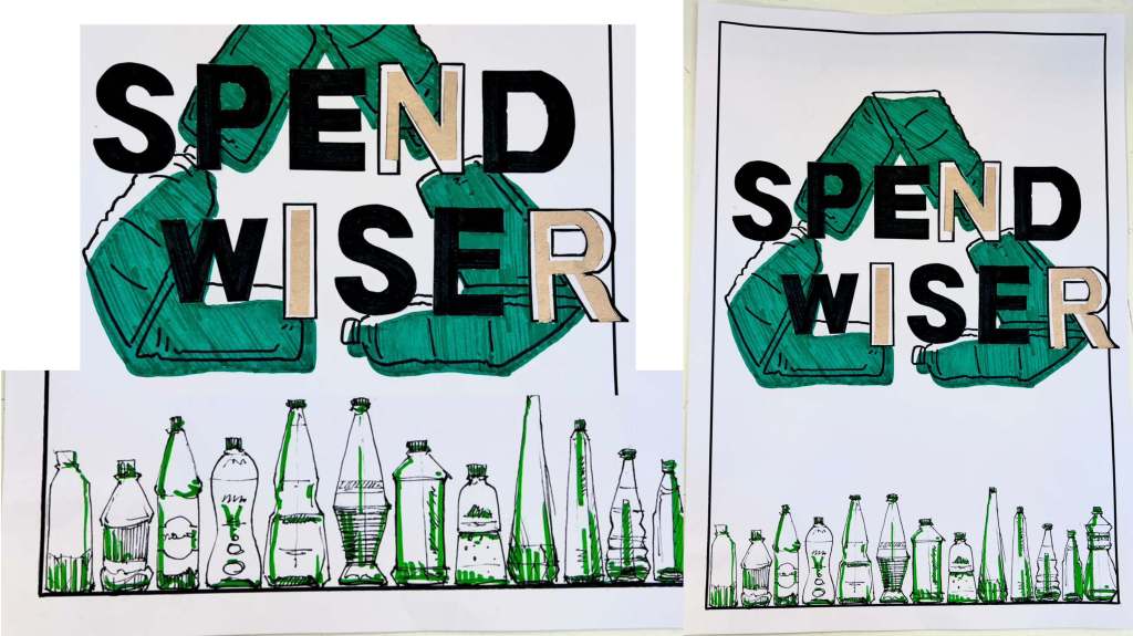
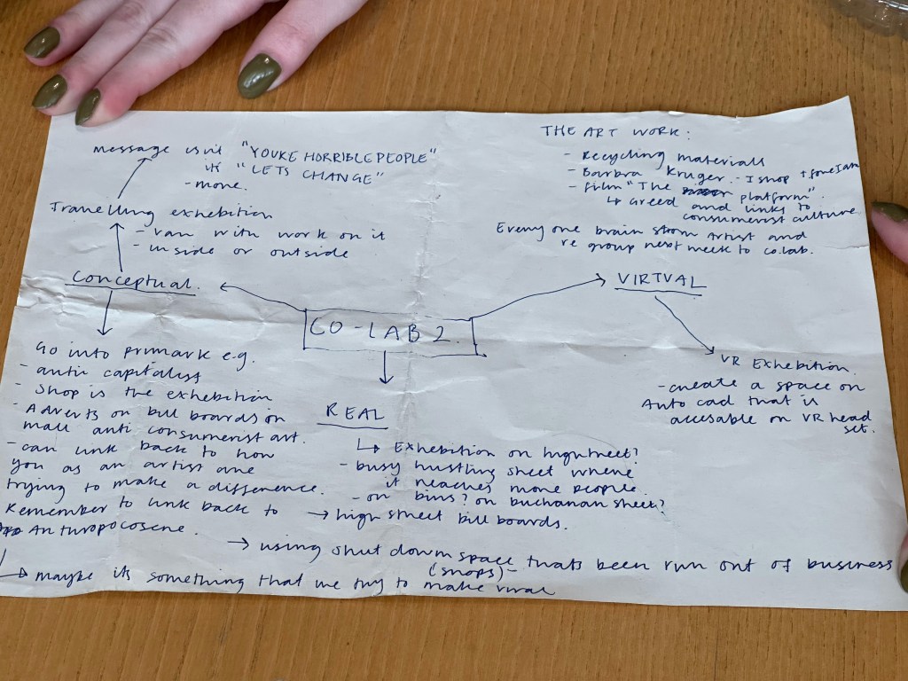
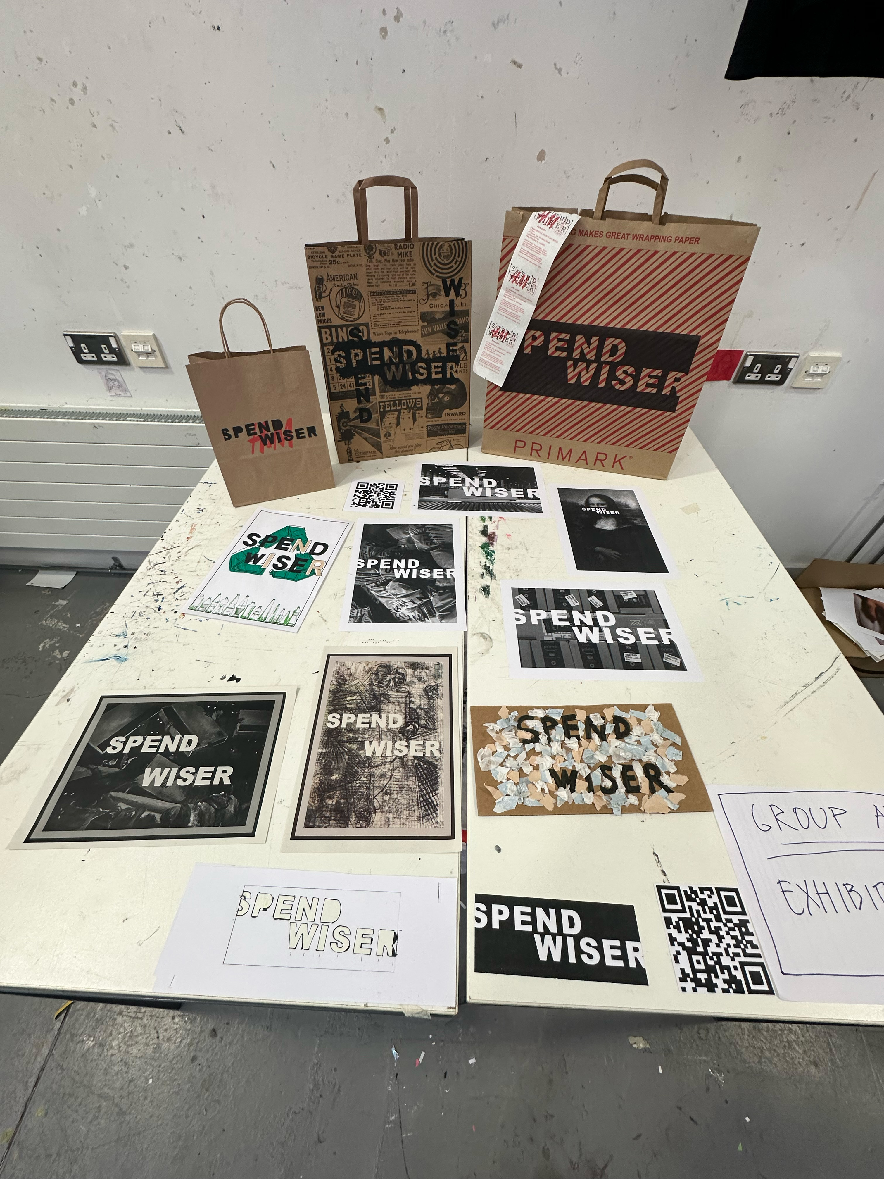
After our discussion, it became apparent through the mind map and having a chat that we wanted to take the exhibition out of the traditional space as much as possible. So the idea of a ‘travelling’ exhibition was decided on, with the concept in our mind of using gorilla marketing tactics, putting anti-consumerism art in shops like Primark so that we would reach the correct audience. If we get into trouble then plausible deniability.
Padlet made for the project
Week 3
This week I have been horrible at the documentation. Personally, I feel like I have lost a bit of steam and momentum; I feel like I’m the only driving force doing research and coming up with ideas for the direction of this project.
Group ARR Presentation and feedback
Above are the slides used in the progress report/feedback.
There was some helpful feedback from Michael and John on the project and on other things to look into, but with the essay still to write and the last week already allocated to finalising the exhibition this feedback will most likely inform my reflection, ideas and further research if this project was to go further after the Co-Lab 2 deadline.
Week 4
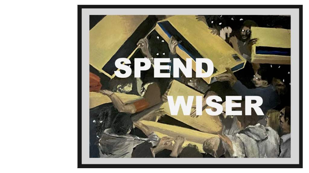
Exhibition iteration one
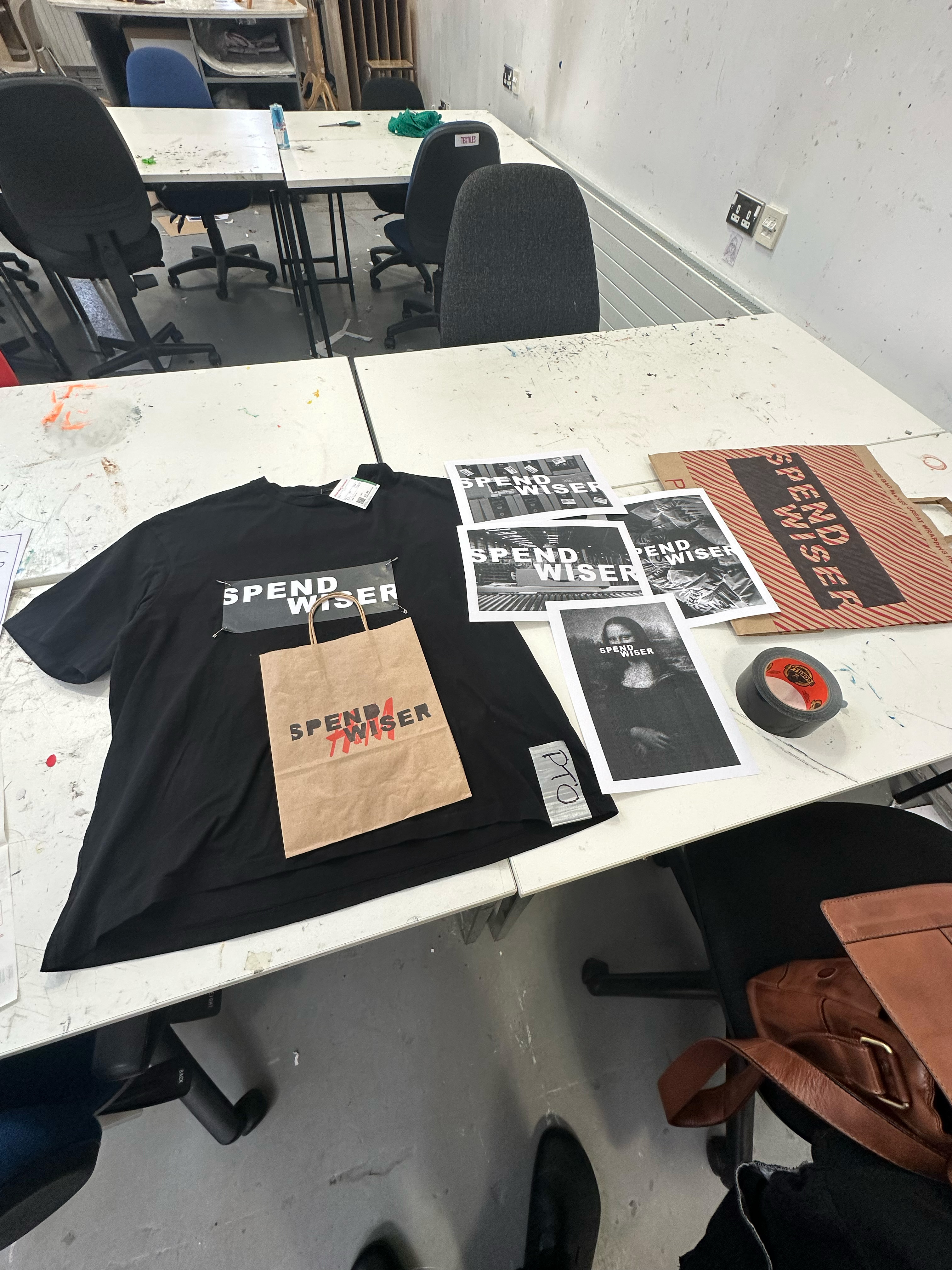

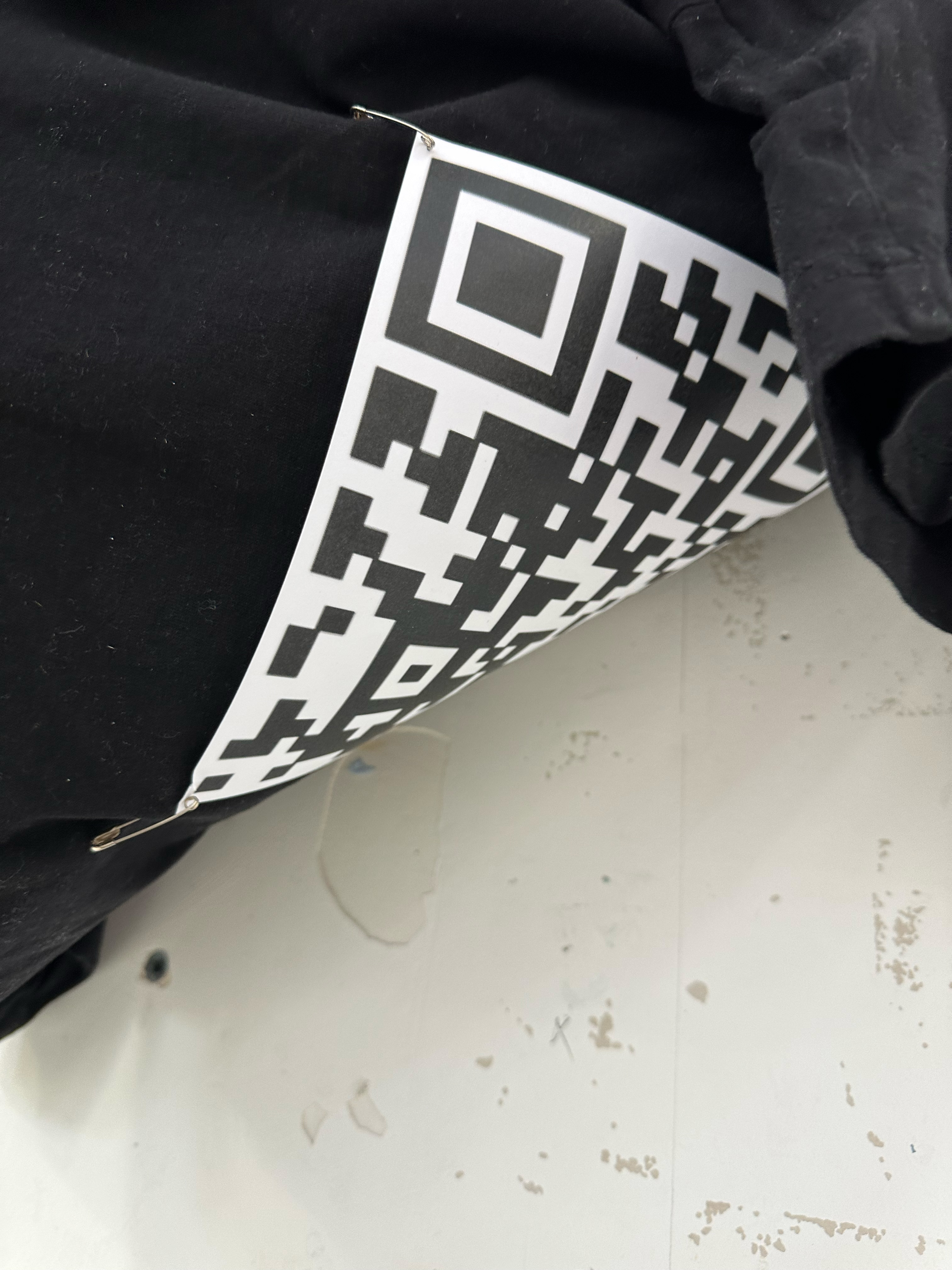
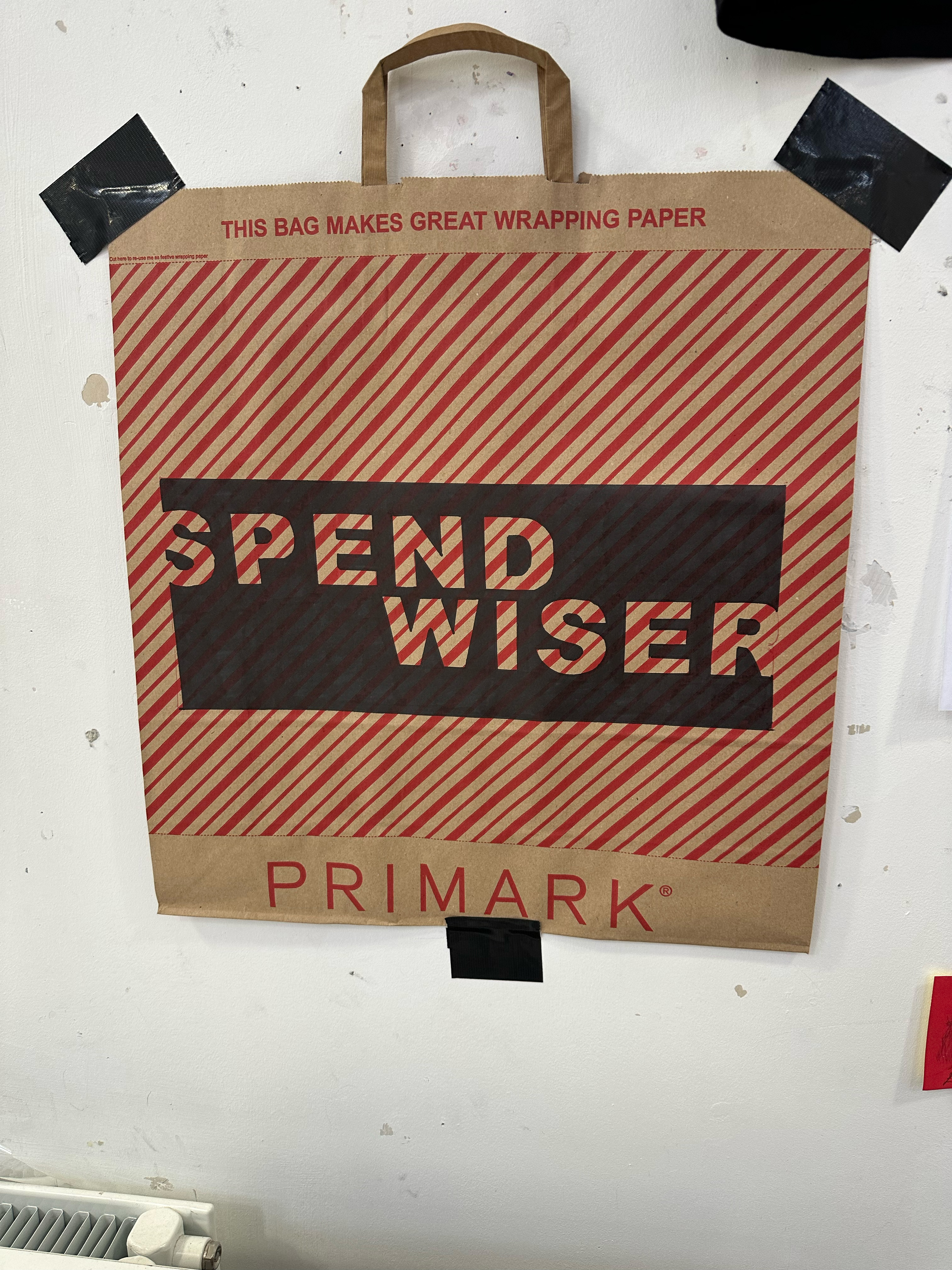
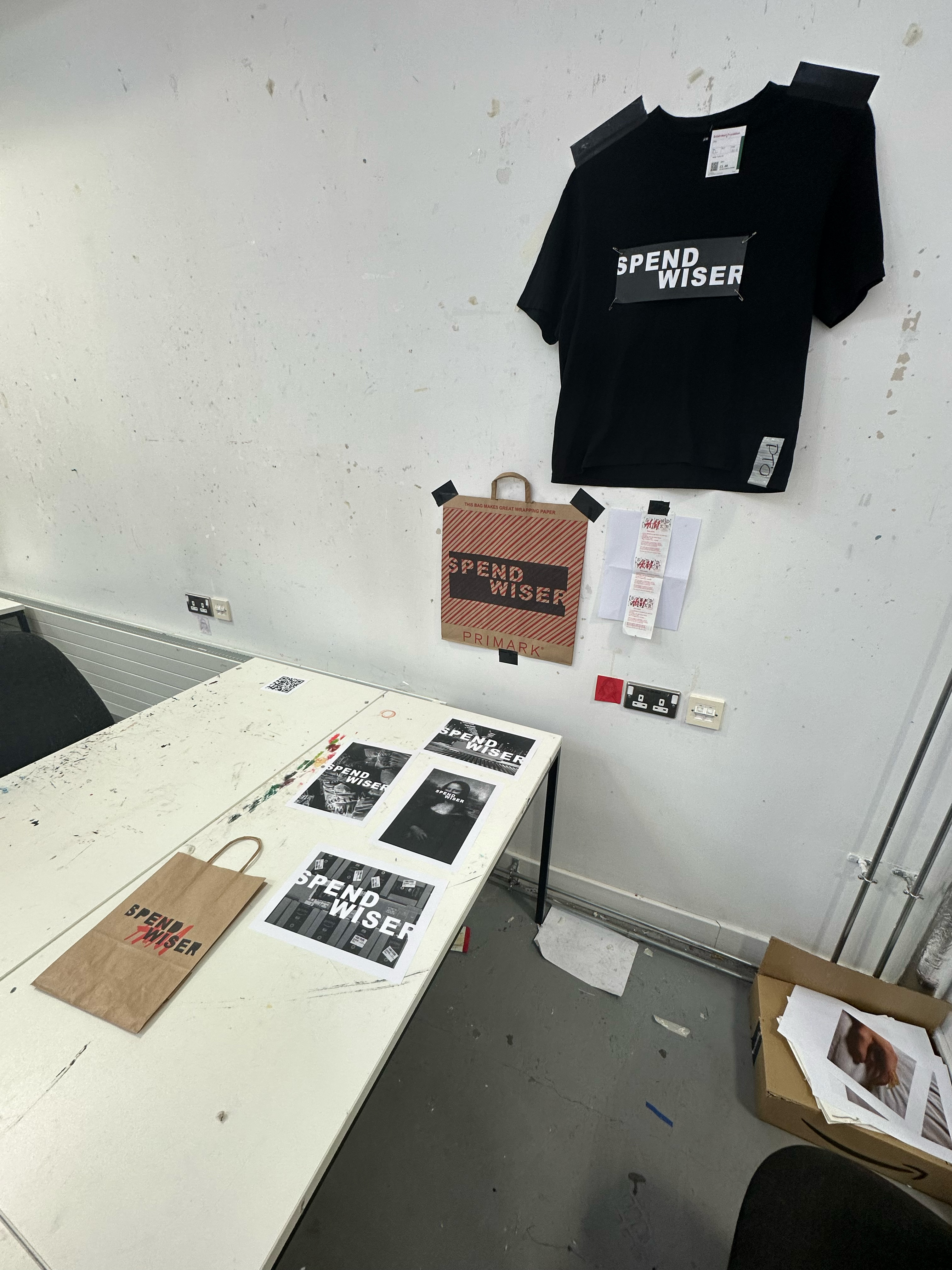
This was just the first iteration of the exhibition I had set up in the Haldane studio before some helpful feedback from Alanya to really make it more appealing, as seen below in the final.
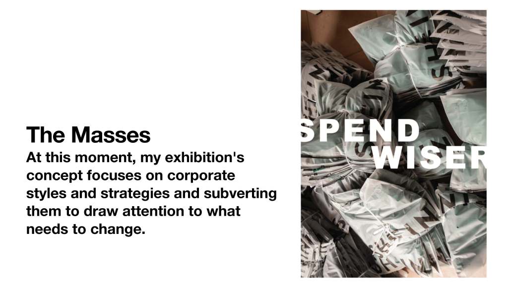
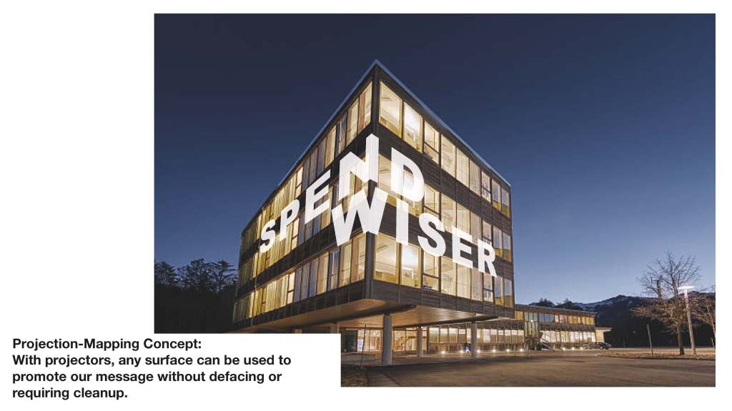
I initially intended to have a projection at the space’s back wall with a live feed of the Instagram page so that people attending can see the numbers and interaction with the page go up as they like, share and follow it. But as there was not much foot traffic in the space I decided against having the projector.
Final Exhibition

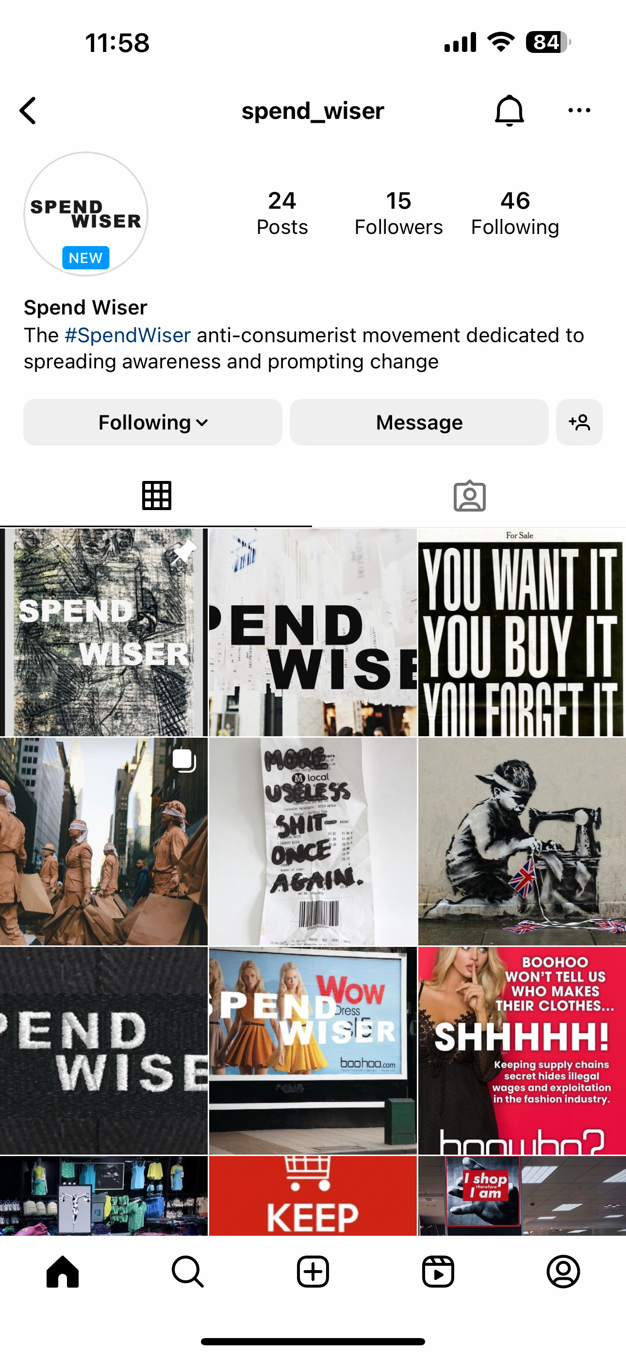
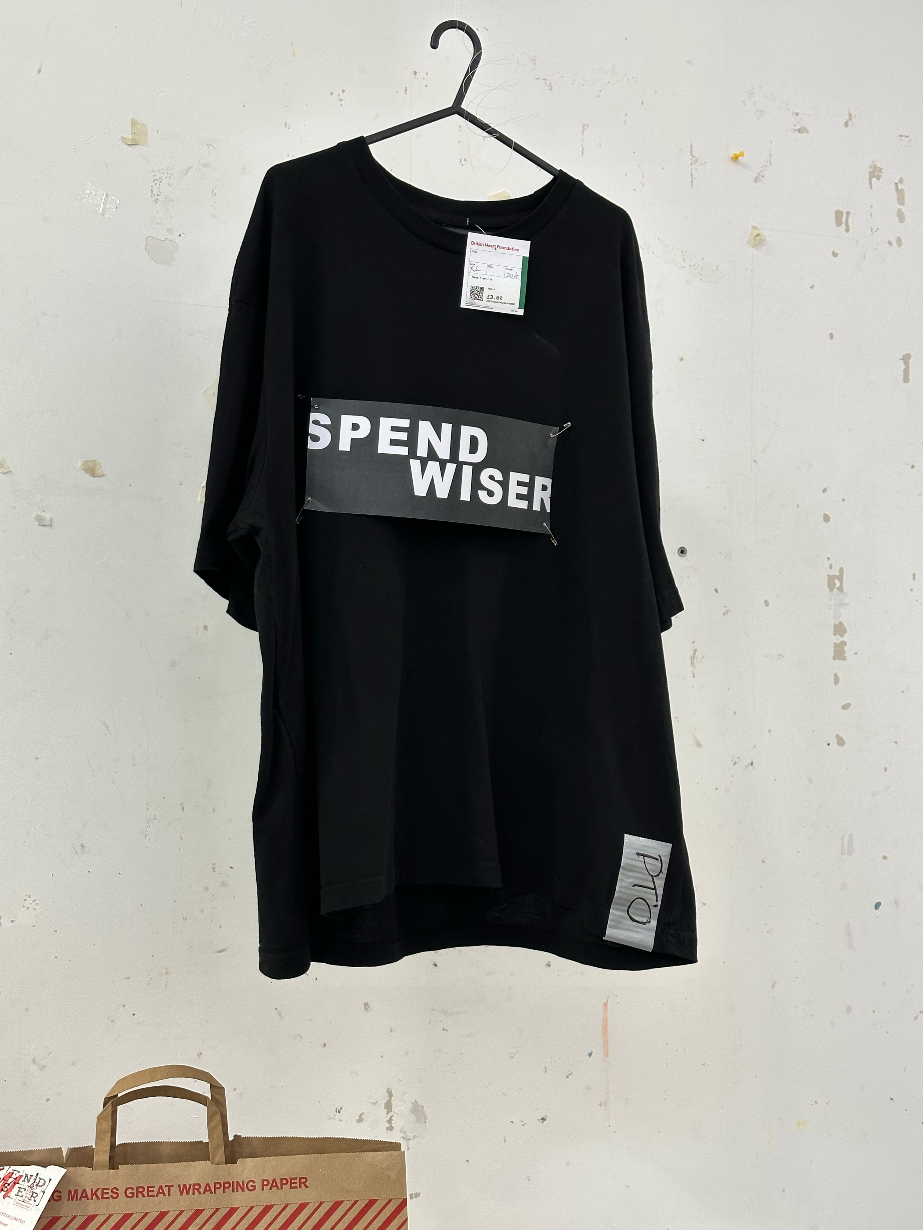
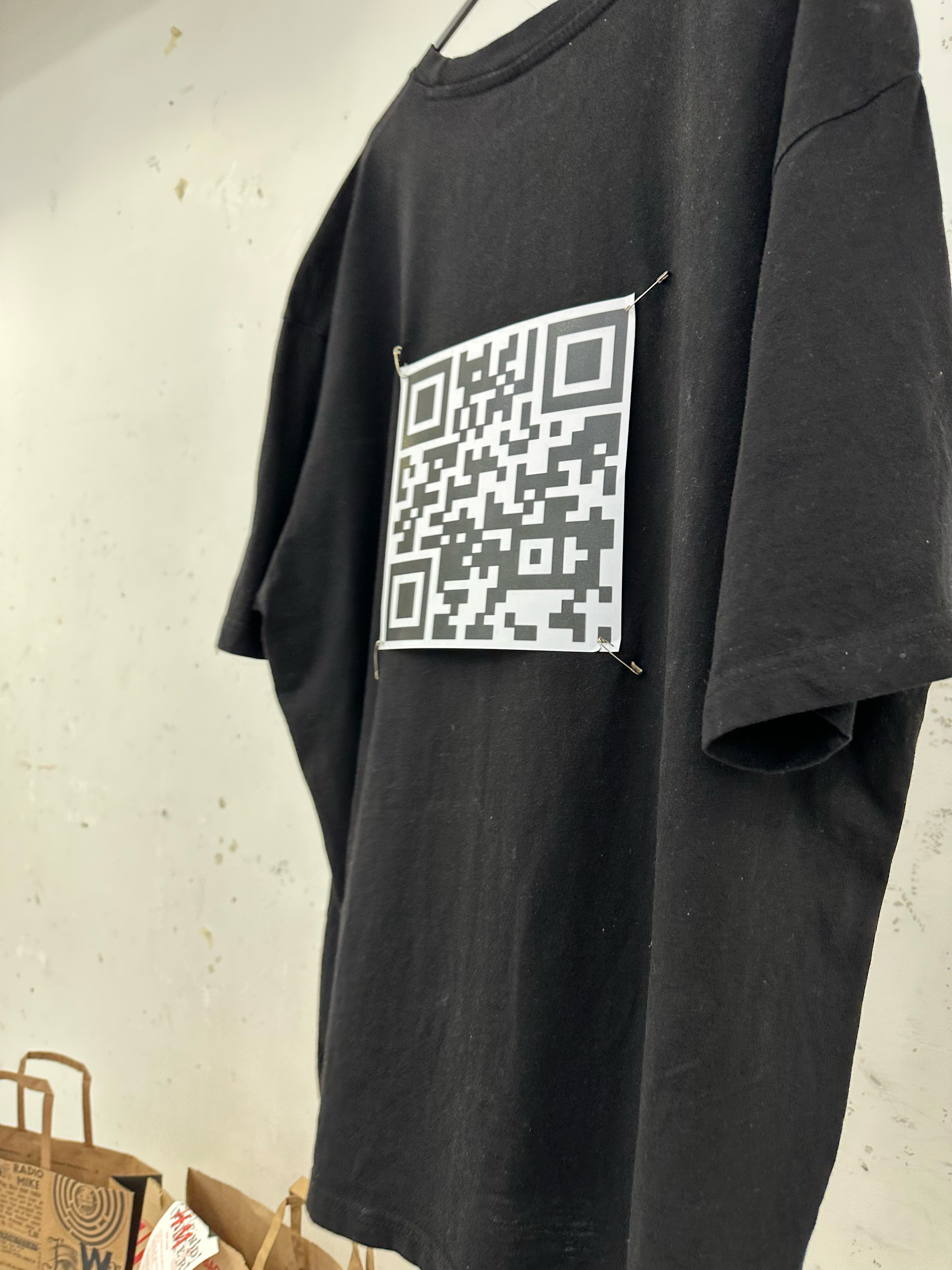

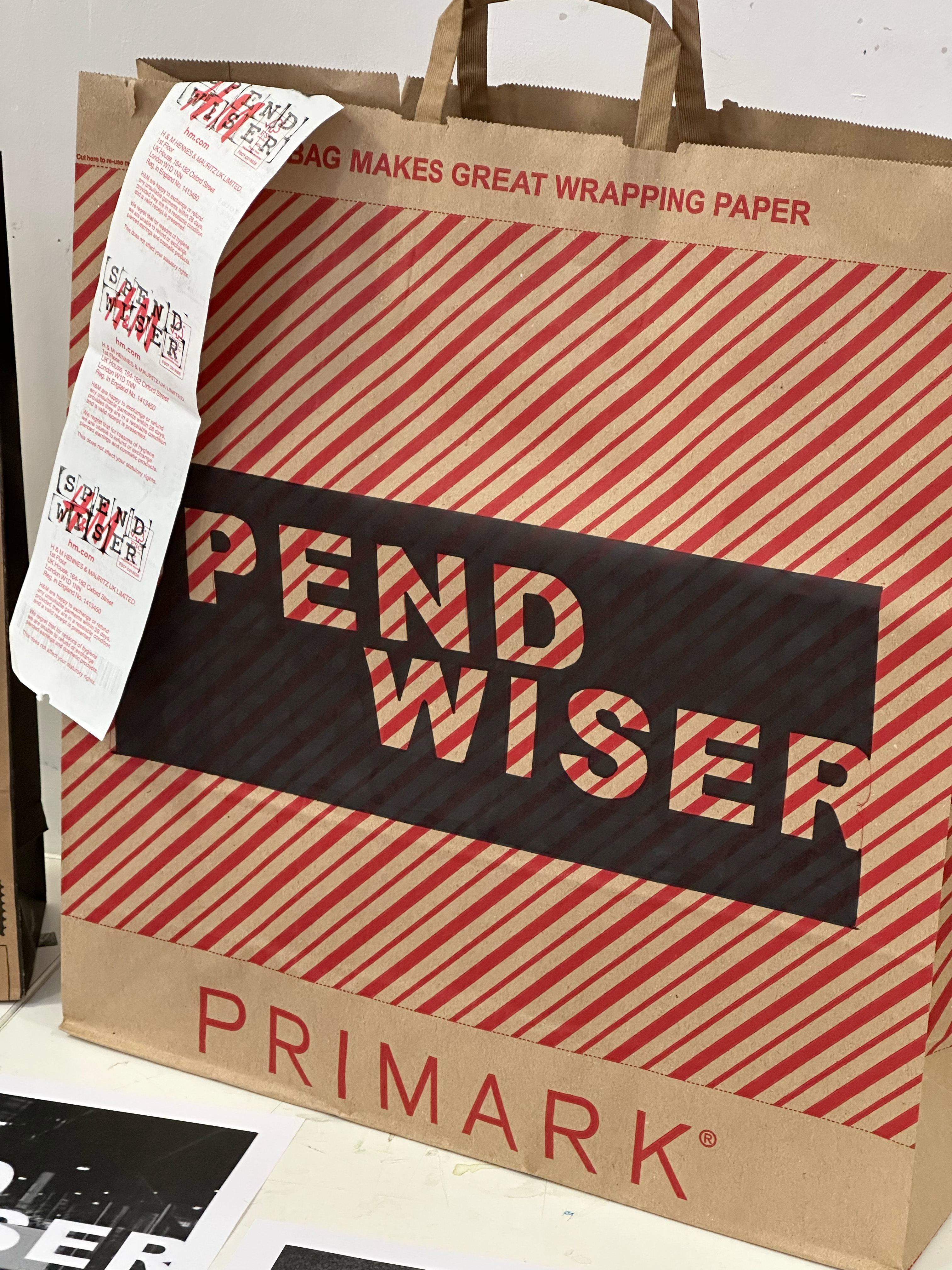
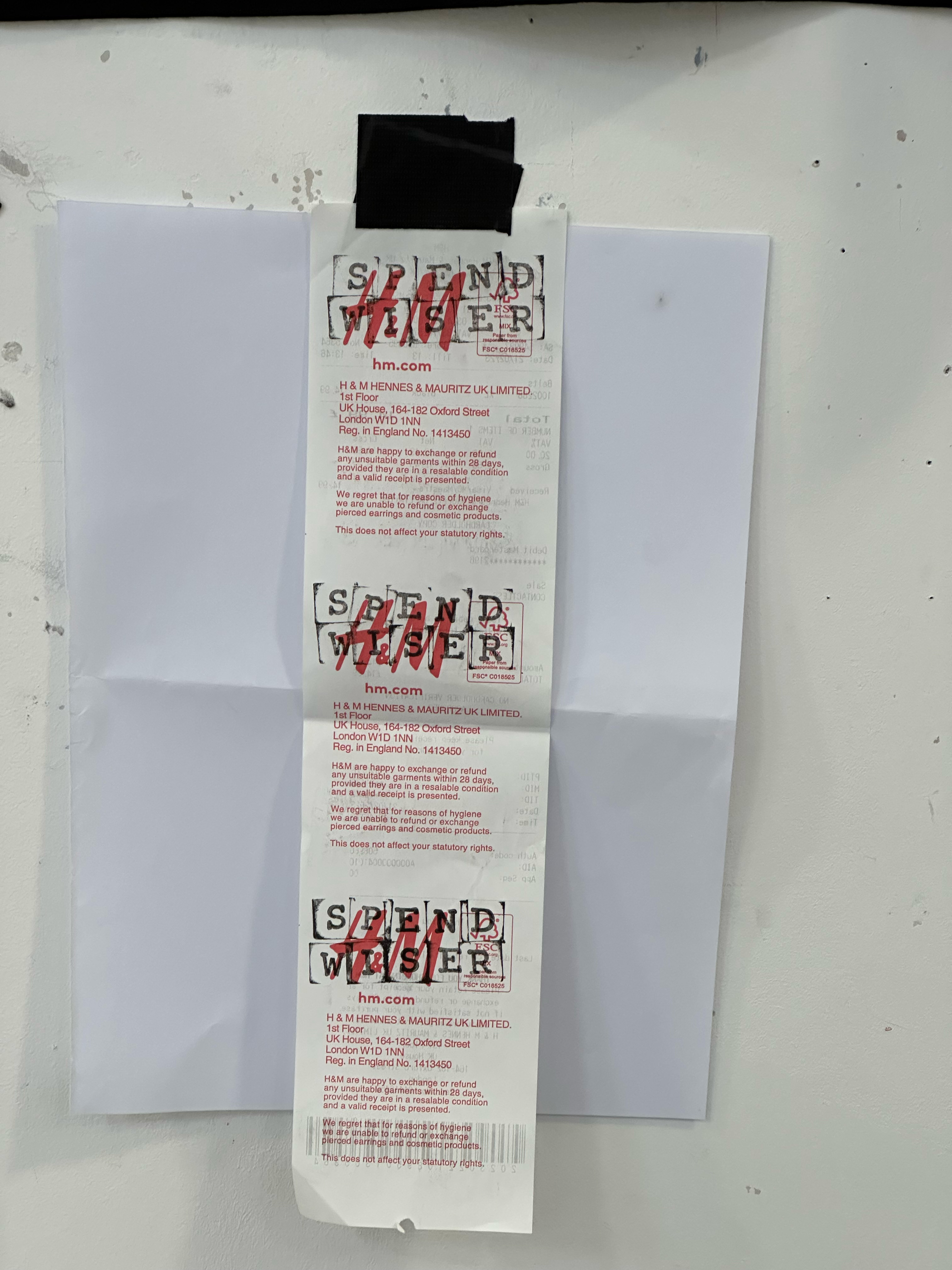
https://www.instagram.com/spend_wiser/

Reflection
If I had more time then I’d like to take the exhibition out into the real world for its intended audience and get feedback from those who were intended to see it. As I aimed for this to be an ongoing exhibition/movement then that feedback or interaction would then inform the project going forward. And with each iteration the exhibition would change accordingly and develop to best meet the requirements of the audience.
If I had more resources, then I’d believe that the scale and effectiveness of the project would be shifted into the next gear. If the project could reach more people and imitate the larger corporations more then it might be more effective and shift from this small plucky punk movement into this collection of artists against the issues of the consumerism by showing art and posing the questions to the masses that often go unasked.
Next steps for this project. At its current iteration, this is a very one-dimensional challenge to consumerism and a very head-on way of tackling the problem of the Anthropocene, but if I was to take this further, I would want to make it multi-dimensional platform tackling the Anthropocene through giving artists a platform for tackling their specific corner of the Anthropocene. For example an event like a musical event that may charge for tickets but those profits would then go back into the exhibitions and events to allow aspiring artists to fund their vision. Spend Wiser would become a self funding movement that would use exhibitions, concerts, fundraisers… etc to then fund and support other exhibitions, concerts and fundraisers with the specific goal of making everyday people ask the questions of how they can live a “greener” life without berating them.
Day 01
An introduction to designing for the mobile web. Showing the potential and what can be achieved using the web and running P5js.
Such examples of these mobile web apps are:
https://www.exhaustingacrowd.com/london
In this example, exhausting a crowd takes inspiration from Georges Perec’s ‘An Attempt at Exhausting a Place in Paris’ to then let people from all over the world tag who they see the footage.
https://rhizome.org/editorial/2017/sep/06/the-good-life/
After using Processing in my Creative Coding project, I don’t feel that I am going in completely blind, but to borrow my analogy from my creative coding work journal. If that was learning a new language, this is like learning a new dialect.
The next step was testing out the older code I had taken from Processing into P5js and then sharing it with my phone to see how it worked on other devices.
I then went on to mess around with the accelerometer on an android tablet to both have a chance at messing around with that function as well as gaining experience with an OS that I have no idea about.
As well as a bonus of troubleshooting and highlighting the question of access to the accelerometer on the Apple OS.

Day 02
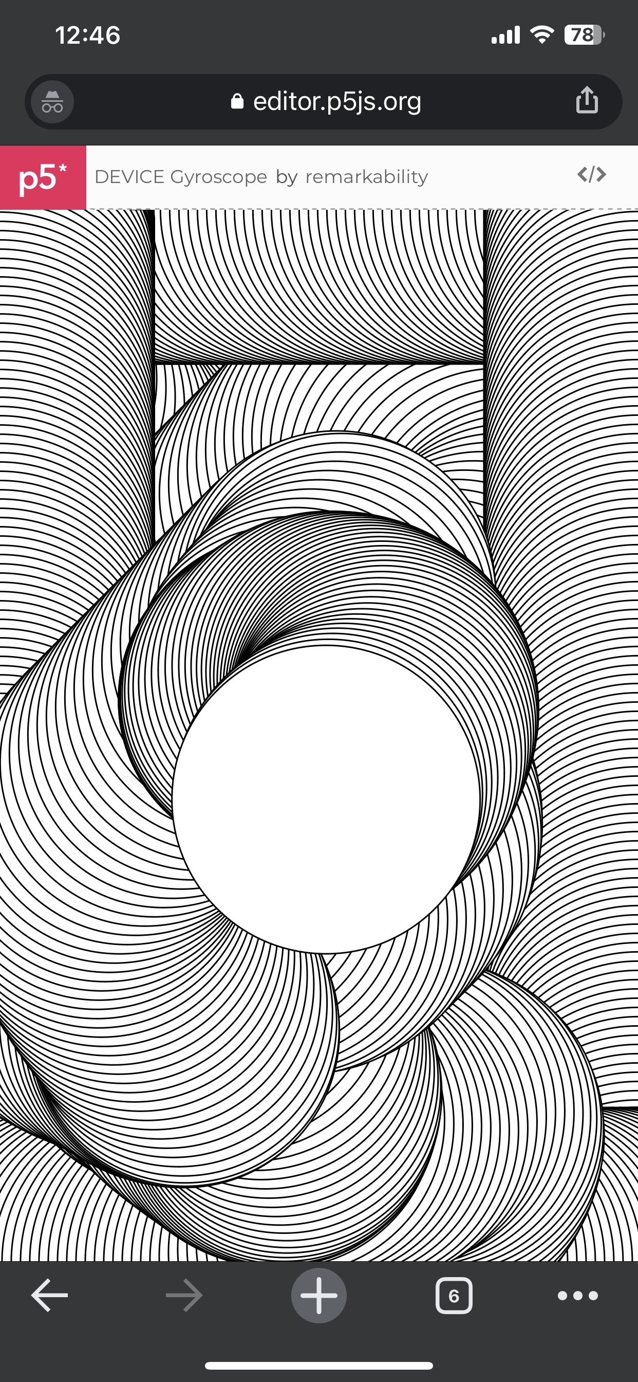
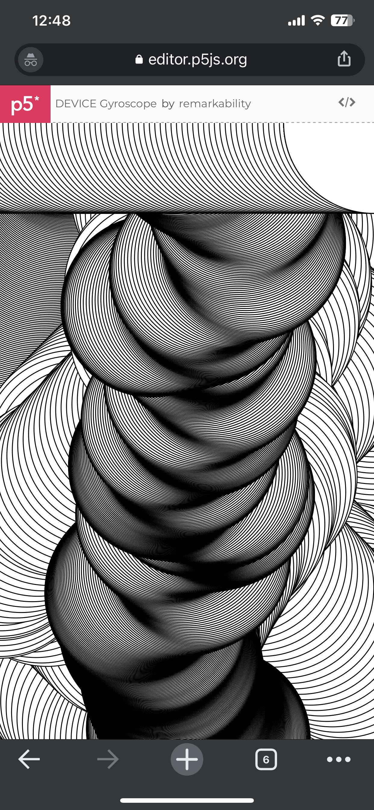
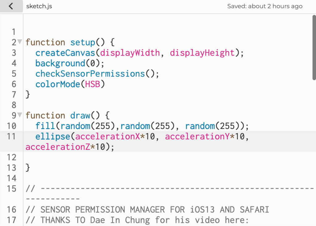
The second class was using code to gain access to certain functions like the motions of the phone and specific access. I’m still trying to figure out what I want to do for my mobile web project, but I know I want to integrate physical motion into my art. Either through the code affecting the phone, such as vibration or noise, or the phone affecting the code using the distance sensor or accelerometer.
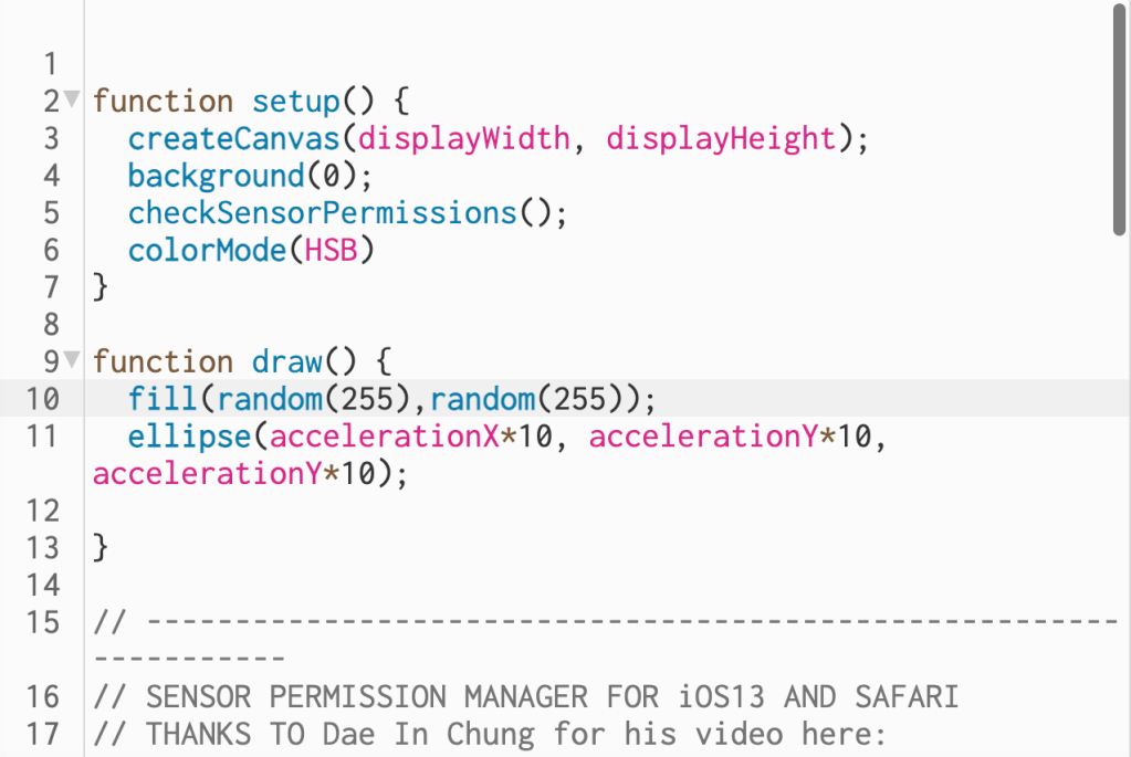


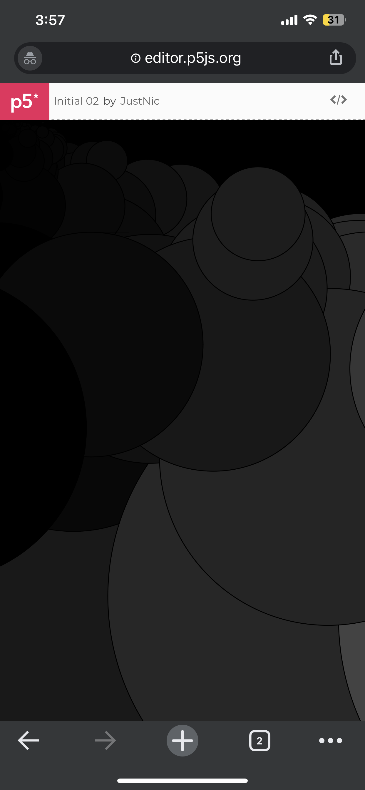
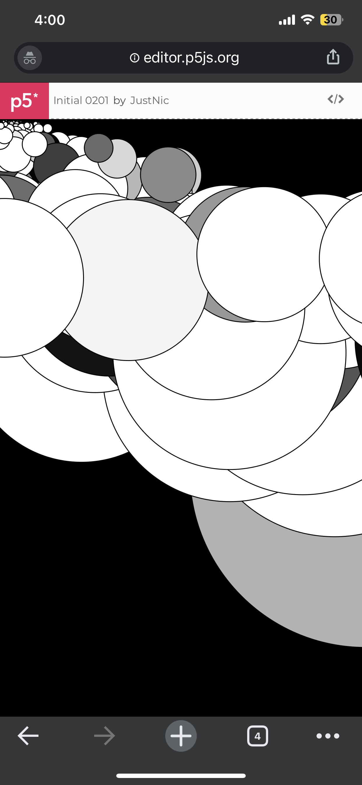
The images above show tests I did with the accelerometer I did in my phone (IOS), I also tested it on an android device so that I know that its not one operating system.
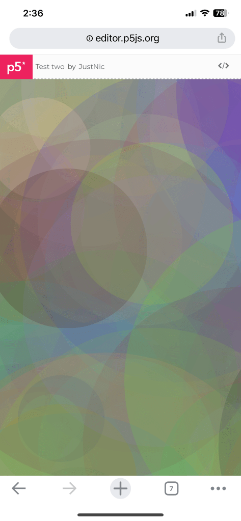
As shown in the video above, the force and direction of the phone as it is shaken determines where the circles are drawn and how big they are.
Day 03
I started by looking at different examples of how coding has been used in P5js to possibly inspire my project further.
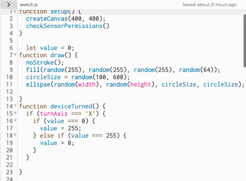
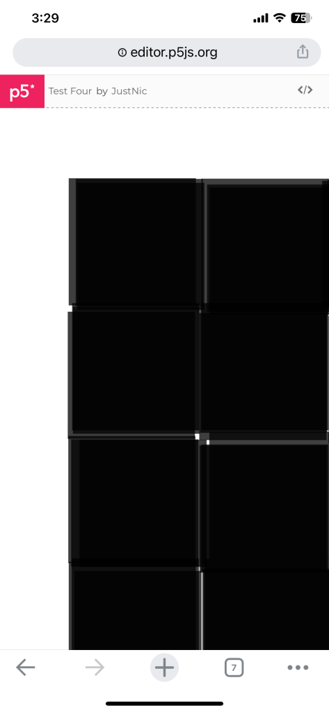
The video shown above tests the device turned command, so the phone is faced down when the square changes colour.
Ally broke a Nintendo switch to get to google and test my code; sadly, the accelerometer of the switch wasn’t accessed.
Final
https://editor.p5js.org/JustNic/sketches/xM955ChnG
This is footage of the final idea being run on Chrome through an iPhone. The accelerometer is still the driving force of this test. Still, in this iteration, I have also lowered the effect of the accelerometer on the drawing, as I added the random colour aspect to it.
Above is the same code running on an Android device and also on chrome. As well a demonstration of how the user interacts with it.

Try it for yourself and see what images you can make!

An introduction to the Anthropocene. The Anthropocene was a brand new concept to me. Going to the Glasgow Film Theatre (GFT) was an informative experience. It opened my eyes to more effects the human race is having on the planet and how much damage is being done without the majority of the world knowing. However, the film did have some weaknesses that I felt when watching it, such as how it almost vilifies small local communities for how they live and doesn’t consider that the jobs they have might be the only ones available to them. Of course, these jobs are damaging to the environment, but it’s not constructive to highlight a problem without suggesting a solution.
The movie also felt very detached from the human aspect of Anthropecy. The human race causes damage to the earth and the environment, so it only seems logical that the answer will come from humanity.
The earth and the human race can only continue to coexist in a symbiotic relationship. And it might be too big of a task for any one person, but I’d like to take a step in the right direction.
Week 01
Initial Ideas & Rumination
The first week of Co-Lab has been a lot of knowledge and information in one wave. So The main task was taking this giant subject and personalising it, both to me as a human being as well as to my discipline and what my project will mean to my field and those in my domain.
At the point of this note, I was still determining how to explore the relationship between the Anthropocene and my discipline and how I could personalise the tech we use and educate people on the process those materials go through before they get to us.
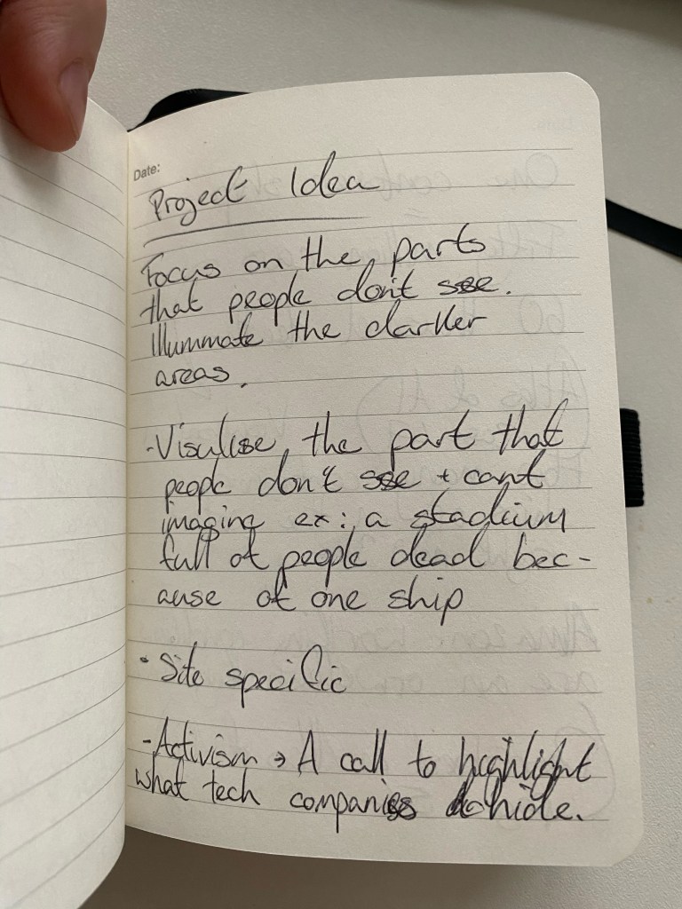
Here again, is another idea of trying to personalise and qualify the effects of the Anthropocene and make it more tangible to people and, in turn, harder to ignore or turn a blind eye to. Again, I will put my hands up and admit that I don’t do enough when it comes to the climate crisis. One of those reasons is because it’s easy for me to cast it out of my mind, it is easy for me to distance myself from it, and that’s something I want to tackle, and if the climate crisis is looking the people of Glasgow in the face, then it’s more challenging to ignore.
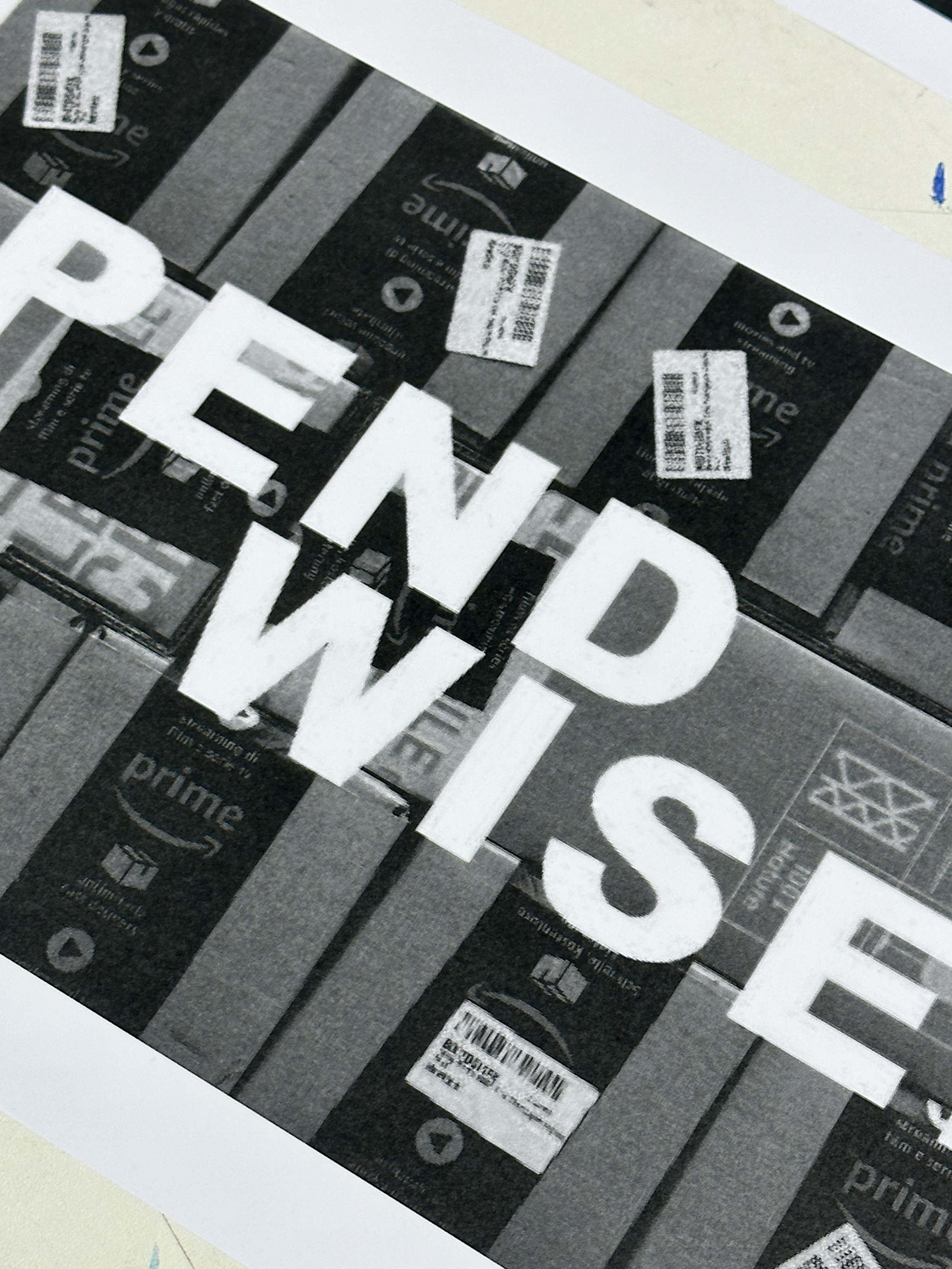
Here noted is one half-baked concept I had to highlight or embody the relationship between the tech we use every day, who we are with this tech and the cost that tech has on the planet. This concept might be realised in a series of street photography images that show how many people have multiple devices at any one time in the heart of Glasgow.
Research
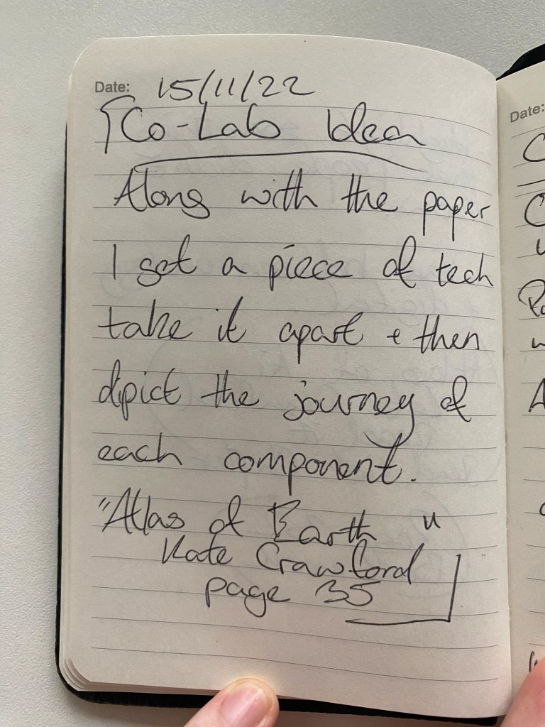
After reading the first chapter of ‘Atlas of AI’ by Kate Crawford, the Anthropocene felt more localised to IxD and how I contribute to its problems and how I can negate those problems.
One idea that came to me when reading was how unfathomable some of the statistics are and how their weight is lost on me because I have no reference and no comparison.


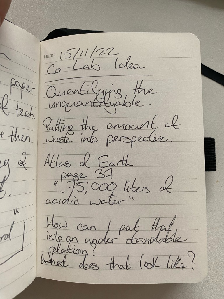
Within my research, one aspect that jumped out at me was Lithium batteries within the context of the Anthropocene. Huge landscapes are being mined and converted to power our devices and technology. The lithium battery is marketed to the public as the green step forward as the alternative to foil fuels. However, the same battery that powers electric cars is not recyclable; they are used and then disposed of like general waste into another technological landfill.
Lithium battery production is initially thousands of feet of caves through the earth to harvest the raw materials. After that, acres of land have been covered to farms of vibrant pools that starkly contrast with the desert landscape sacrificed for it.
I need to research more on Lithium batteries and their consumption on a personal level within my life and those around me.
Week 02
Mark Making Workshop


As someone that’s alien to mark-making, I was out of my comfort zone but with guidance, I was exploring mediums that would have, in all honesty, steered clear of.
Axi Draw Mark Making

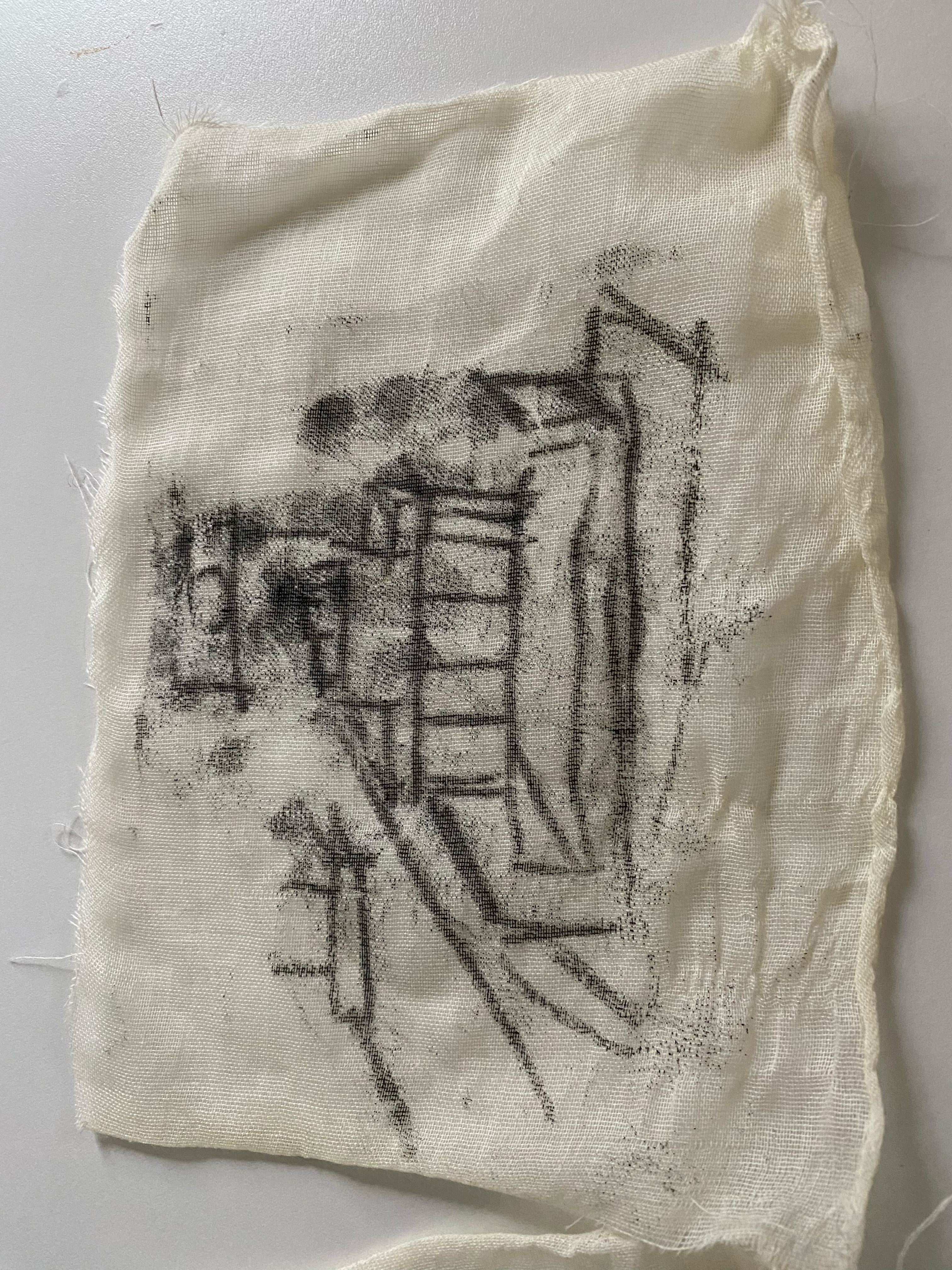
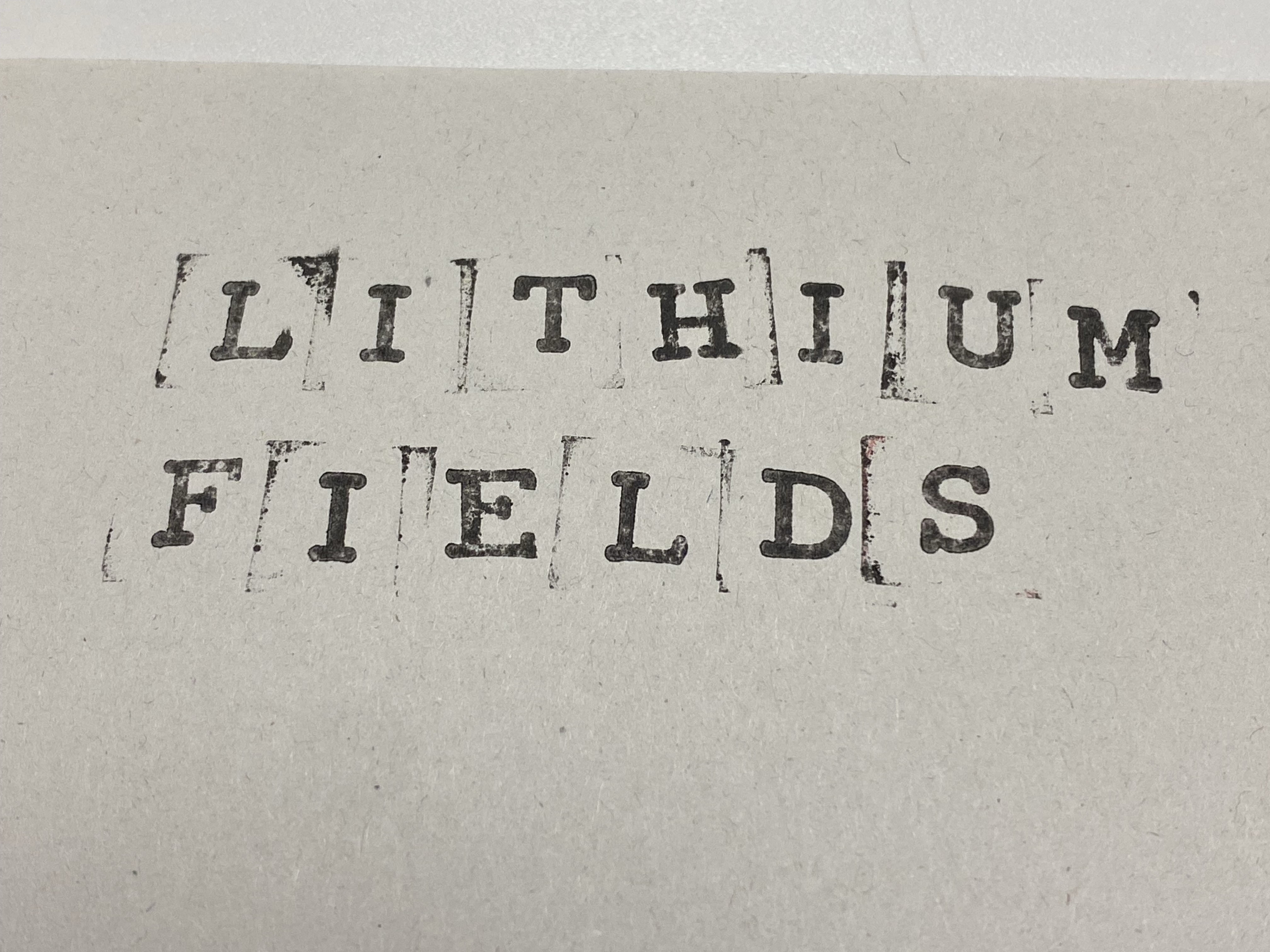
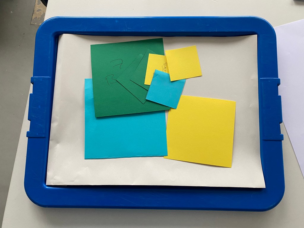
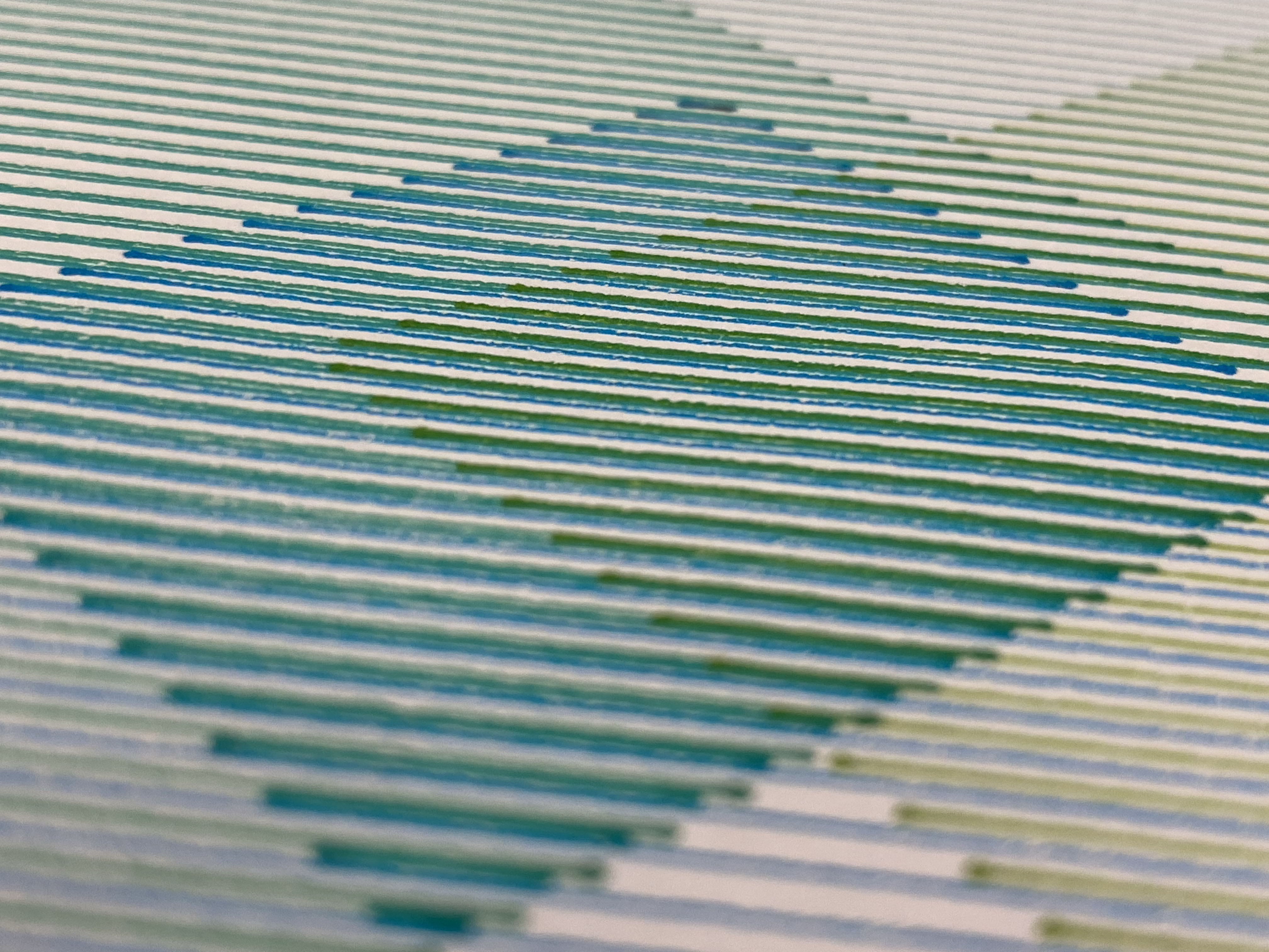
One experiment shown here was mainly for me to get familiar with the Axi Draw and explore one avenue of mark-making; the idea was to isolate the artificial grid structure of the lithium fields that are rechargeable come from.


Inspiration for Axi Draw Mark Making

Damien Borowik was an artist that caught my eye with his use of tight squared spirals and his use of colours that don’t meld in a traditional sense but trick the eye into finding new colours within those combinations. I enjoyed the relationship between spirals that work between the lines of one another, so they don’t cross at parts but run within one another.
Lithium Fields on the Axi draw

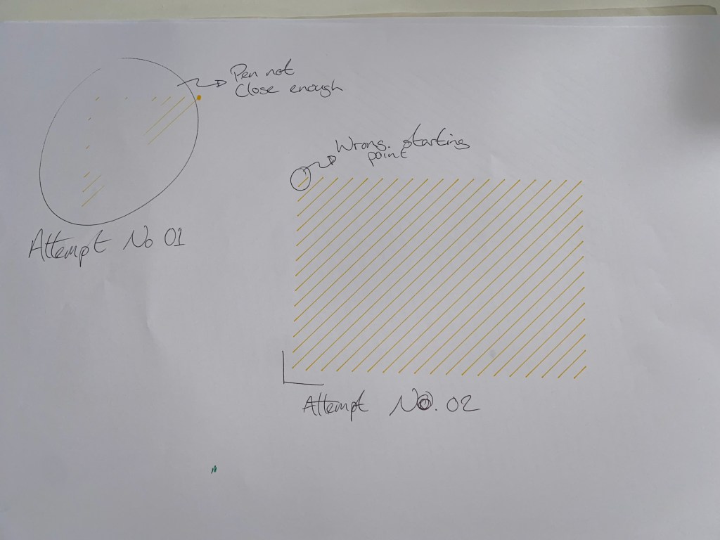
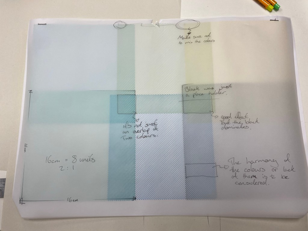
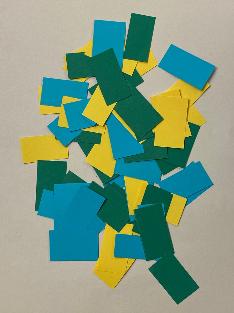
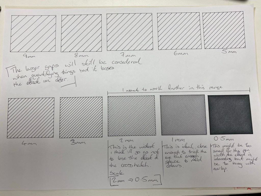
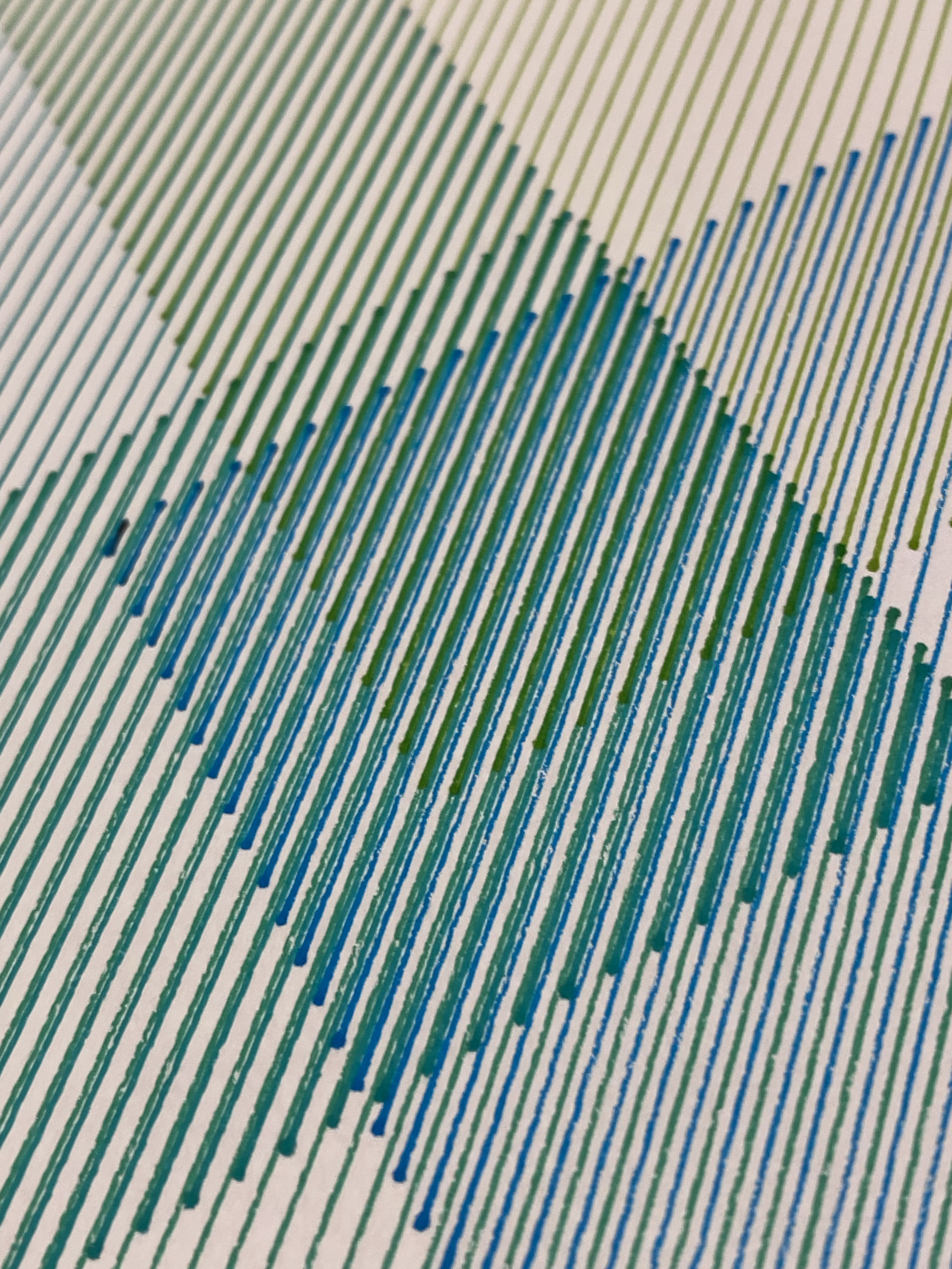
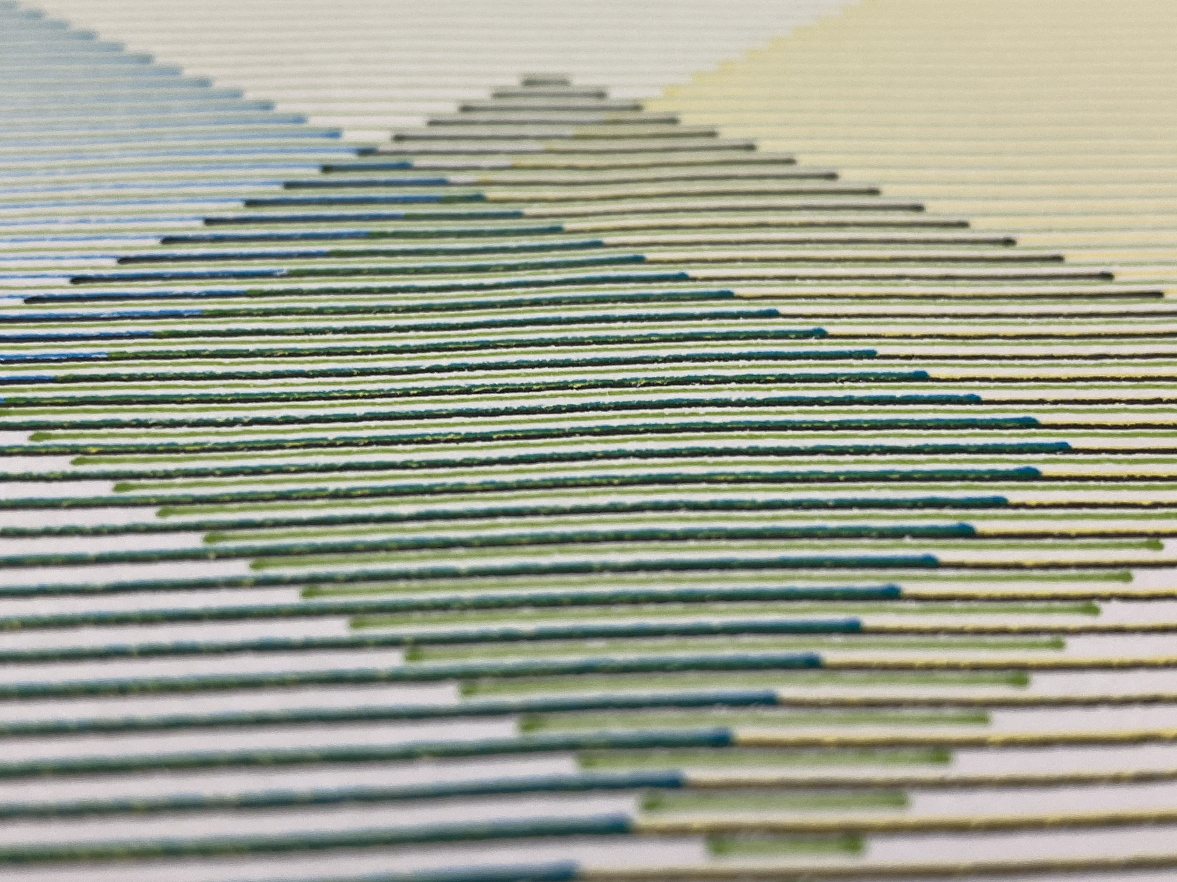
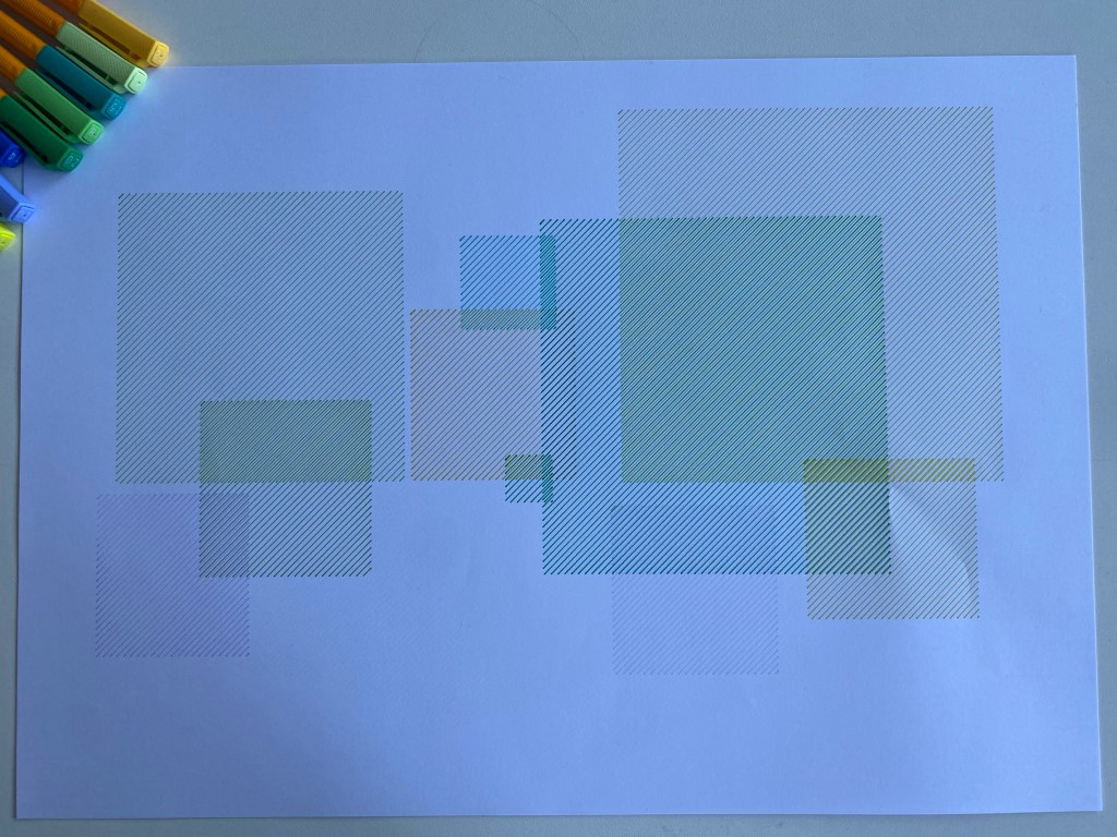
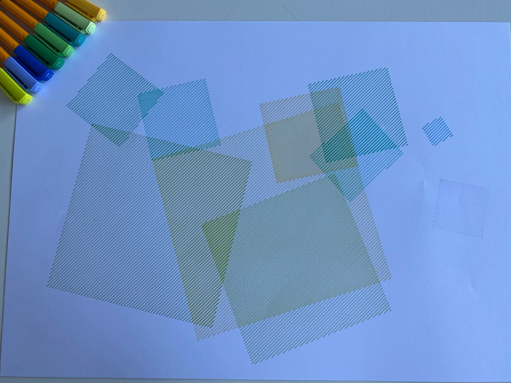
Experiment One of using the colours and shapes on the lithium fields on the Axi Draw.
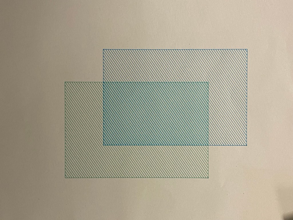
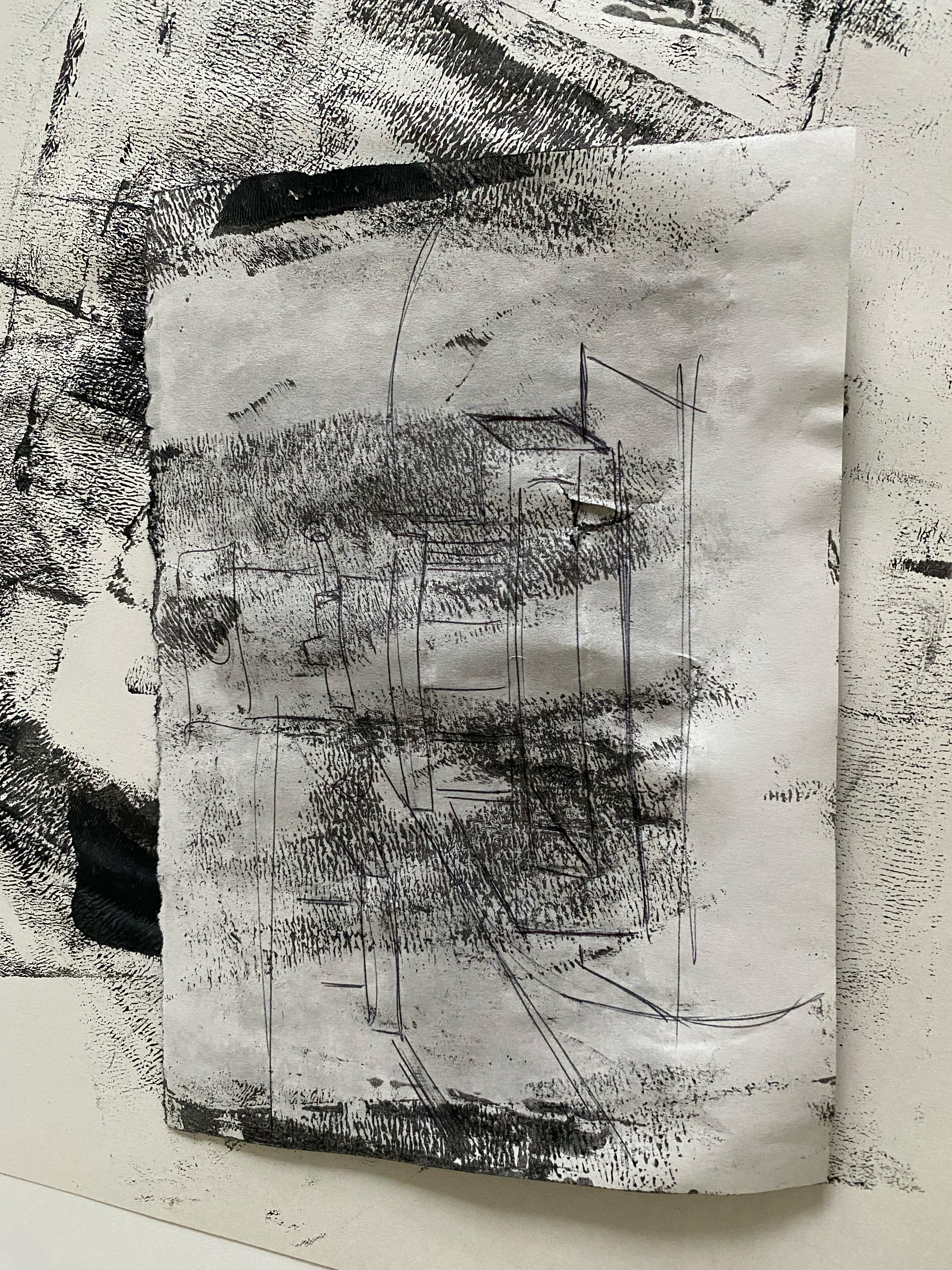
The first experiment didn’t have the right effect when the lines overlapped, so this is the test of more lines that was suggested by Gillian.

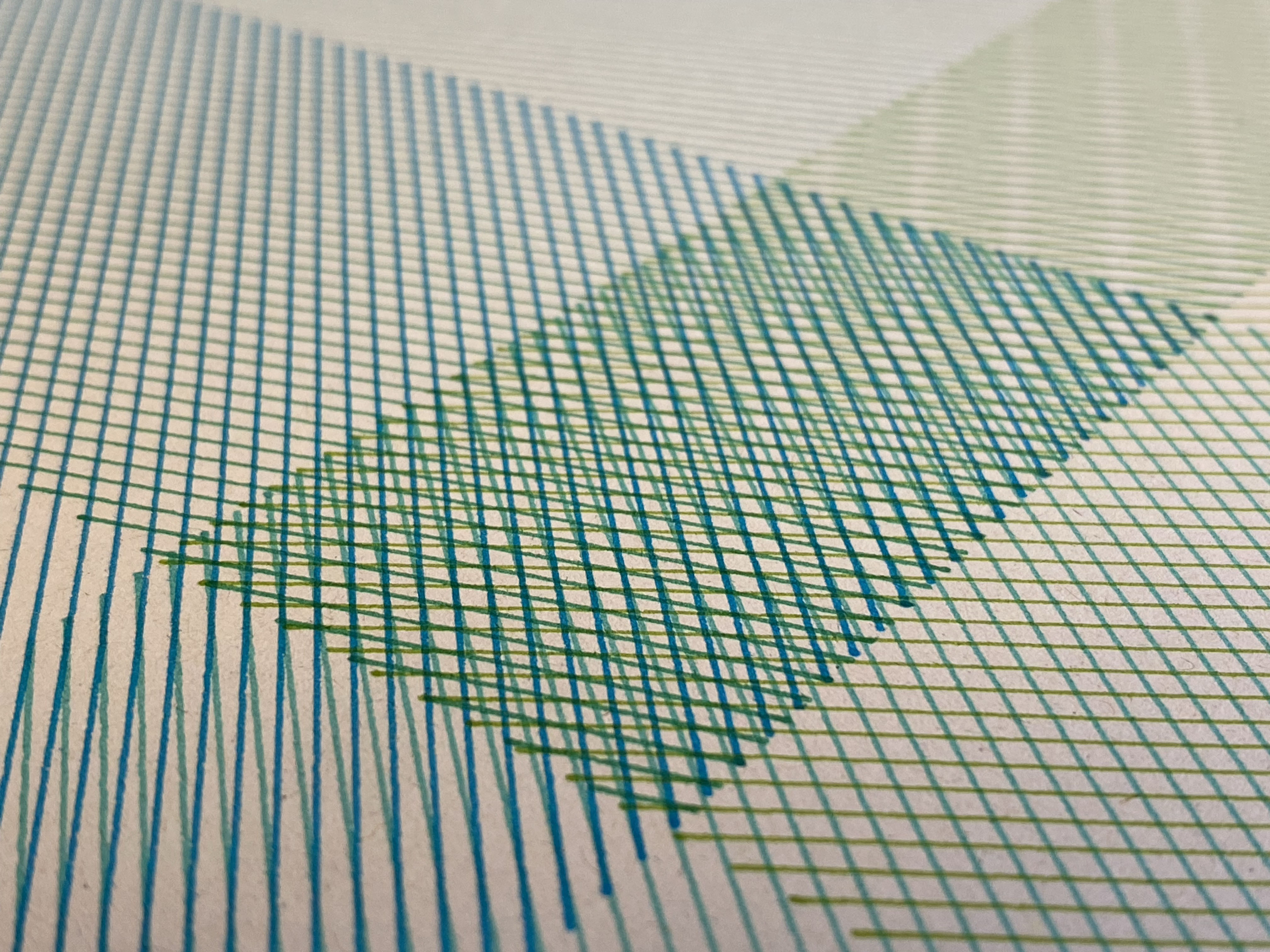
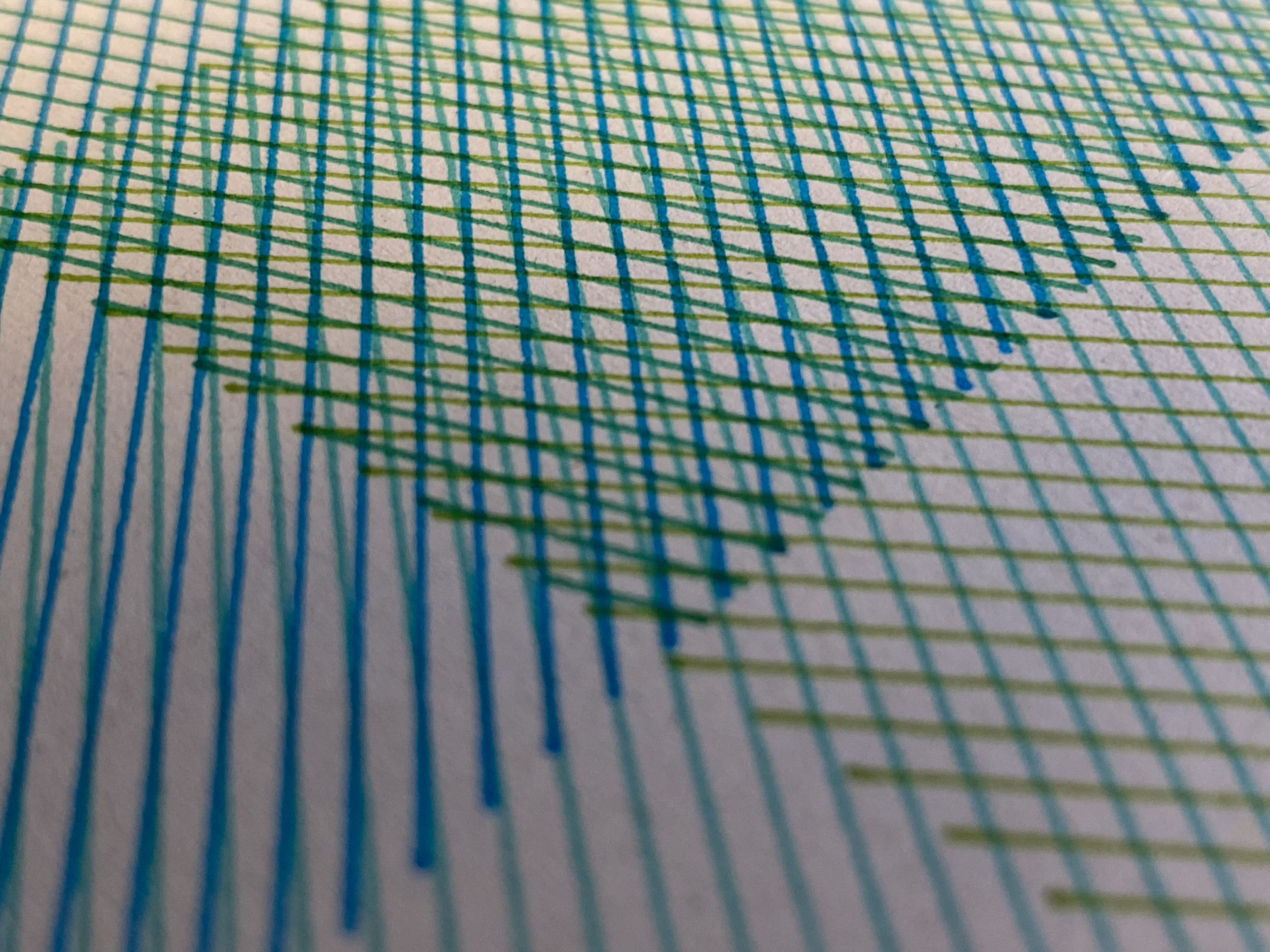
This is the second experiment using the Axi draw. Again, I isolated the core elements from what I have seen within images of lithium fields, the vibrant yet unnatural greens and the artificial grid structure of the landscape and interpreted them in another way.
After Review
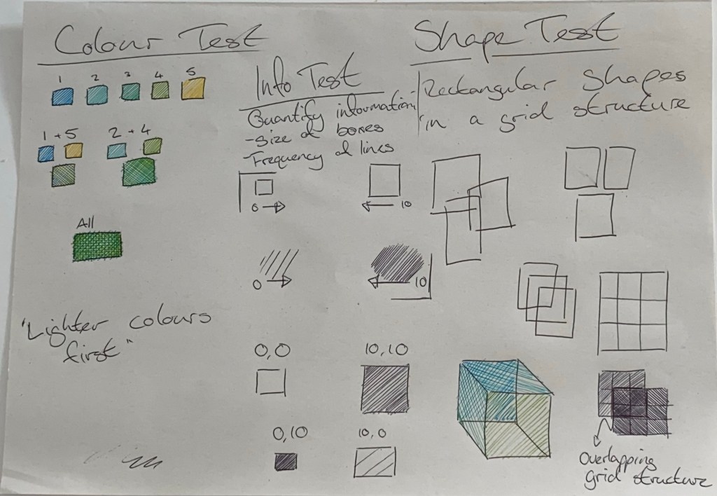
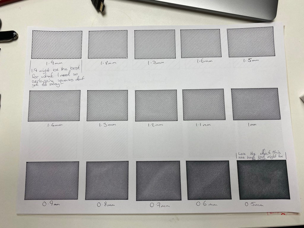
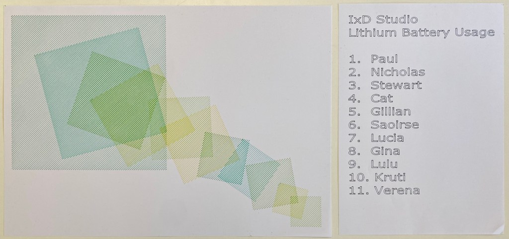
In the review, Cat suggested using the hatched rectangles as the quantifiers. The bigger the square, the more lithium is present. Taking this further, I would like to explore the frequency of the lines being an indicator of quantity. The size of the square indicates one factor, and the frequency of the lines indicates another.
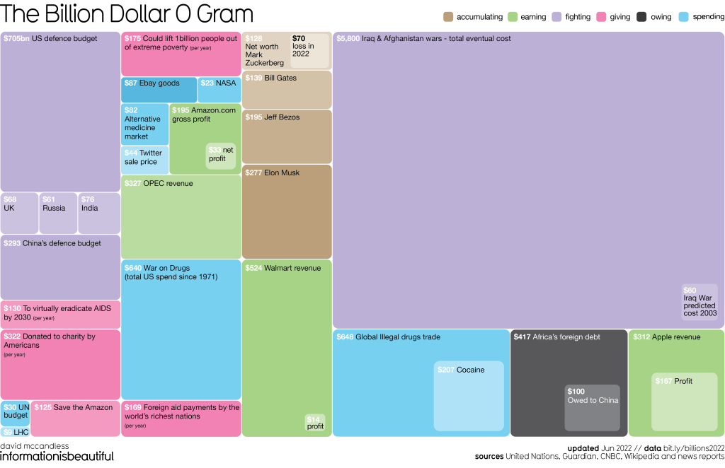
https://www.informationisbeautiful.net/visualizations/the-billion-dollar-gram/
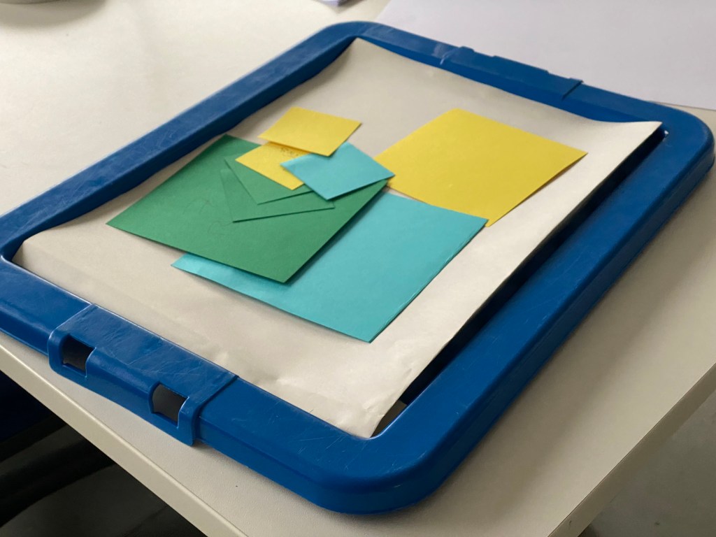
Cards

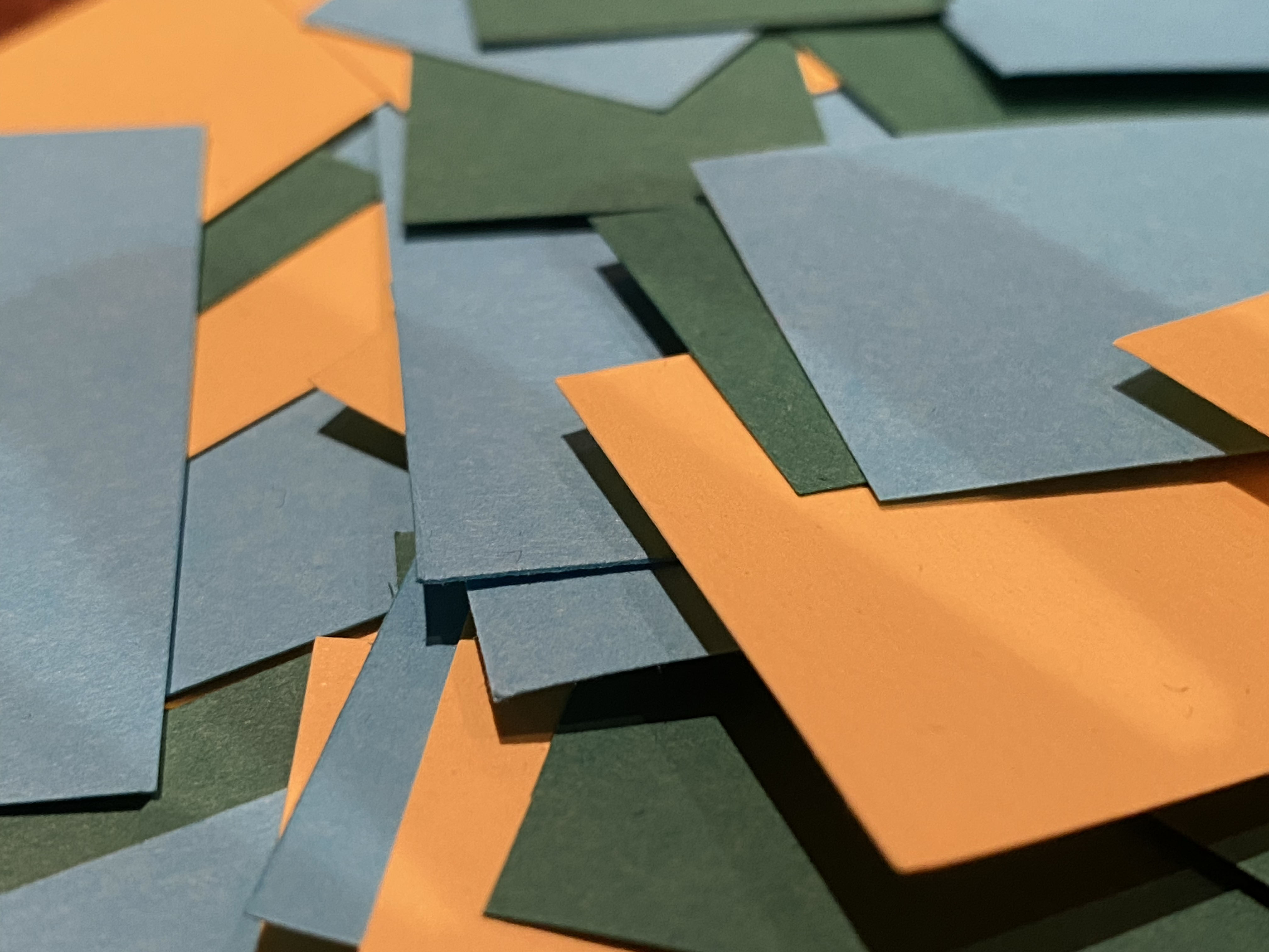


This experiment forced me to step away from the Axi Draw and try something else; I took what I had already identified as the core elements of the lithium fields, the colours and the shape and applied it to something else.

Self-Review
As I review the work I’ve done so far, a throughline I’ve noticed is the Data Visualisation and illuminating aspects of the Anthropocene to the viewer. This now has been focused on the journey of Lithium from manufacturing to the devices we use daily and how the lithium-ion batteries that are marketed as a green alternative end their life in the same tech dump that the “worse” tech ends up in any way.
Note to self: Remember always to bring it back to a personal level. If the final piece is too abstract, that might take away from the message, what you’re trying to say, and what you’re trying to highlight. To show people how much lithium they use and how that is damaging.
Embracing Mess (Kind of)

Exploring the Axi-Draw
Stamps
This was just a test after these lettering stamps caught my eye when shopping, the idea being that I continue to open myself up to using different mediums and techniques.
Upclose and Personal


Layout Creation
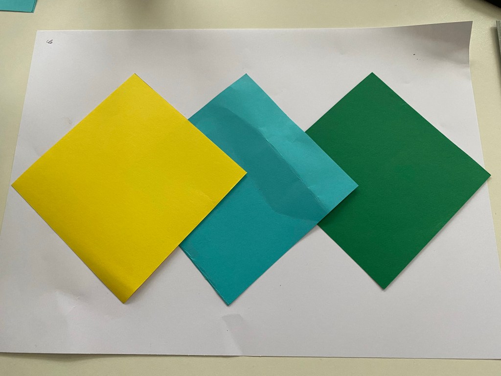
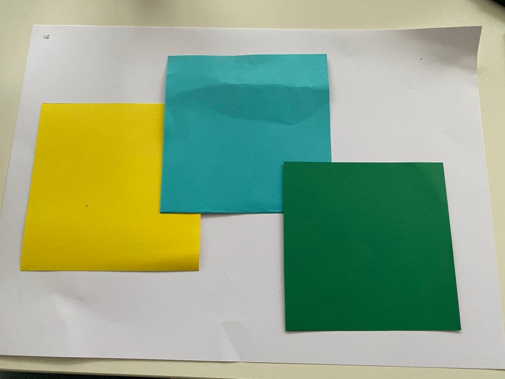
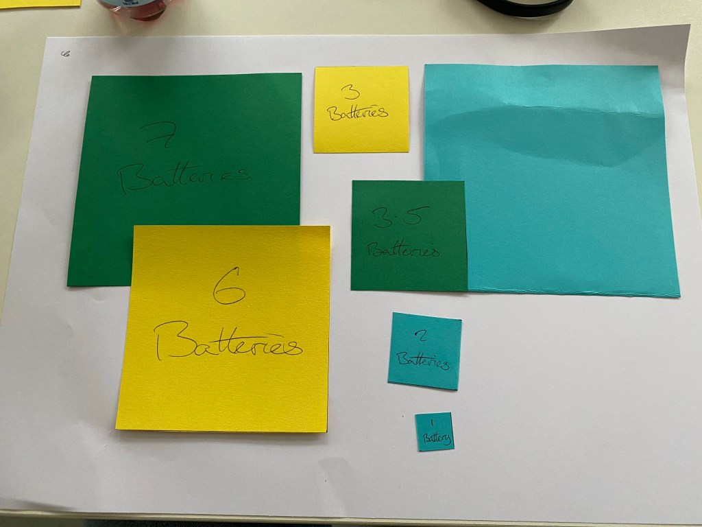
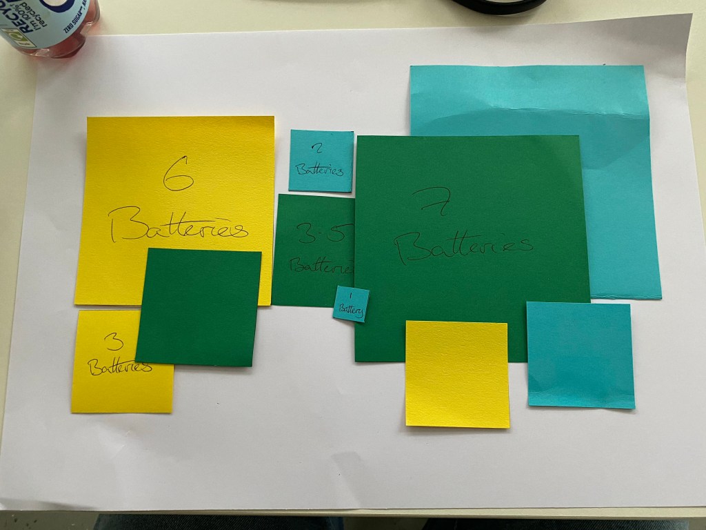
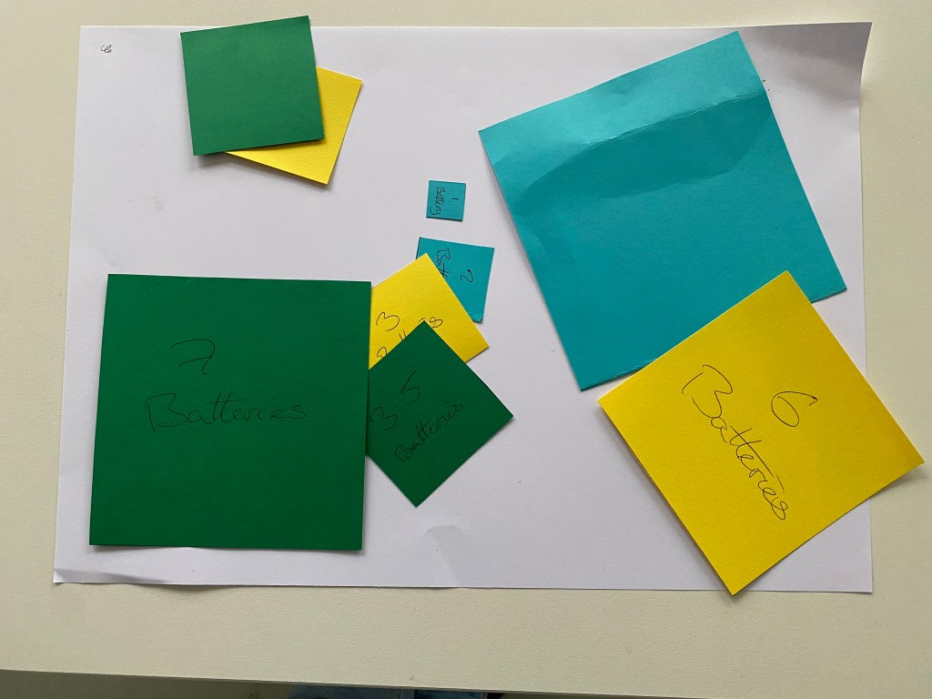

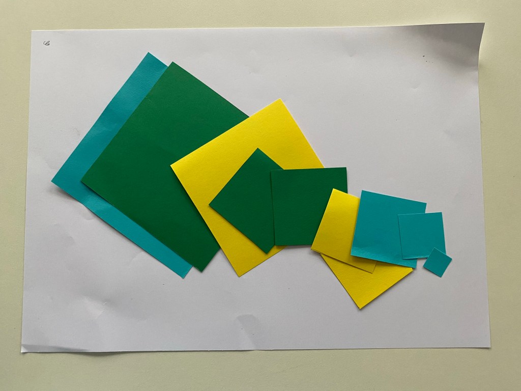

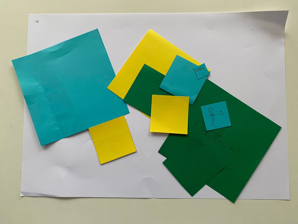
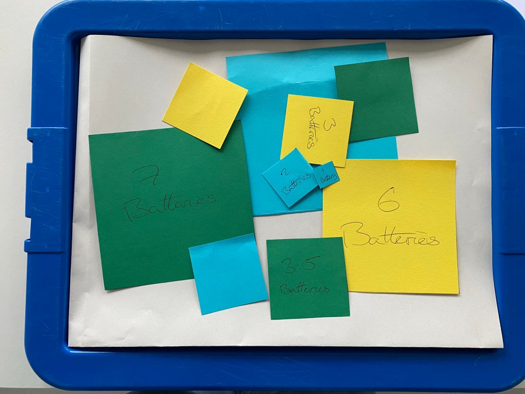
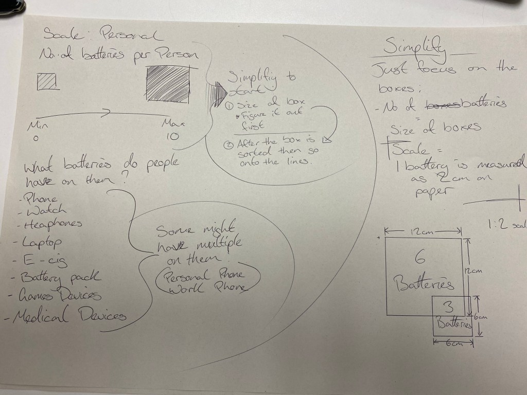
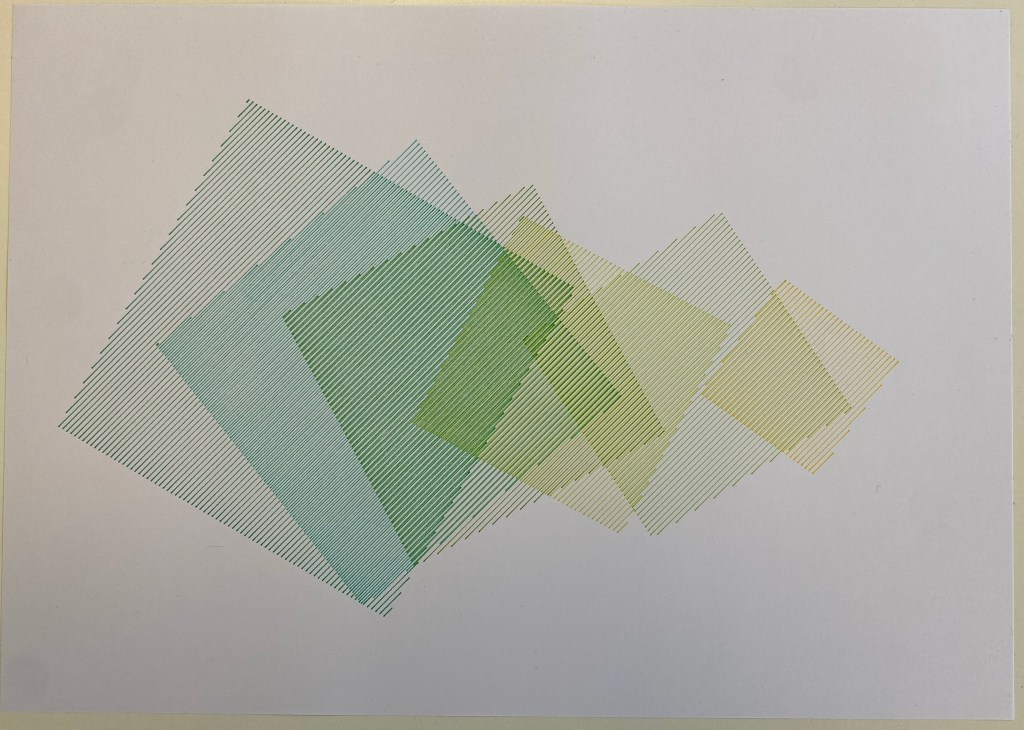
The next stage I wanted to tackle was the layout of the squares. (These sizes and quantities of squares might not be the same as the final outcome, but I wanted to create a general shape for each size of the battery)
I used several methods to make/discover the layout, mainly to remove my OCPD from the process and discover more random and potentially engaging layouts.
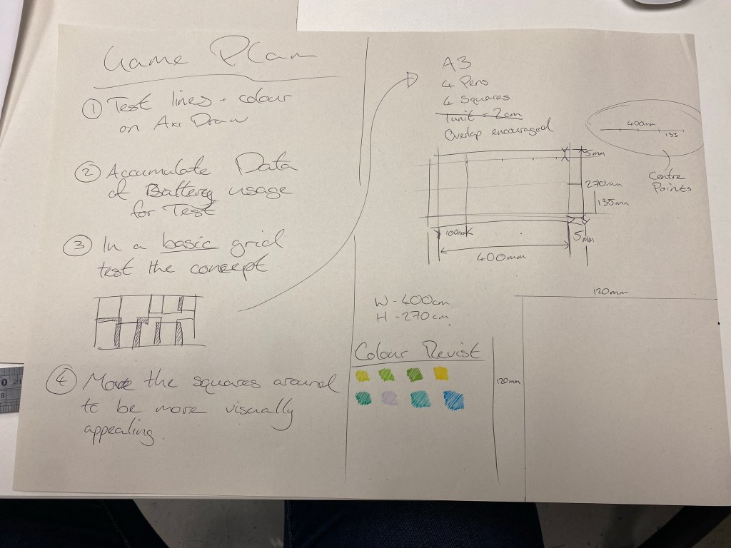
Layout Tests
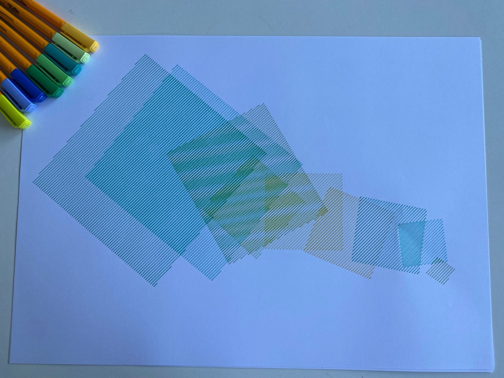
These are the selected layouts taken forwards from the card test to see how they work with the colours selected and on the axi draw.
Collecting Info
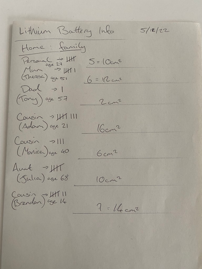
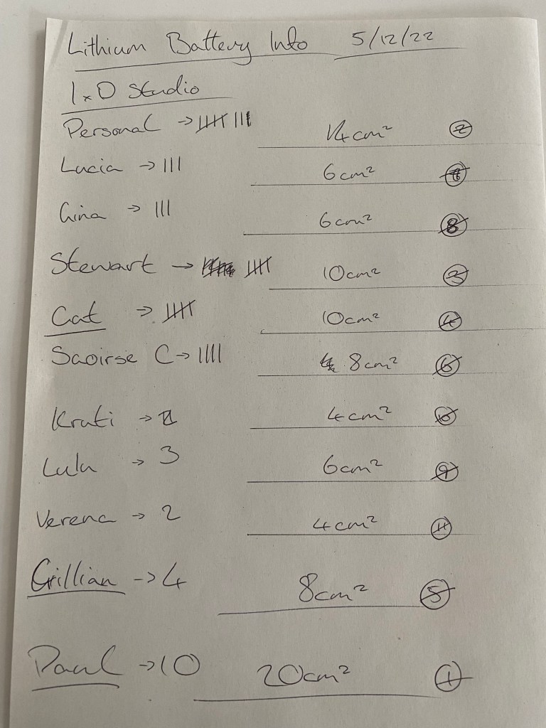
These notes are the drafts of data collection that are then used on the final pieces.
The Lithium Closest to Us

Hows its made
Class 01
My introduction to soundscapes. Music and sound have always been a big part of my life, but I’ve never given the everyday sounds the focus I should have. I play video games and watch movies and always direct my focus on the score. I am aware of ambient sound but have yet to truly understand its power to paint the environment or convey information about that environment.
Or how specific isolated sounds could be used in a creative space or medium, that sound itself is the art and can stand alone to convey the artists’ intentions.
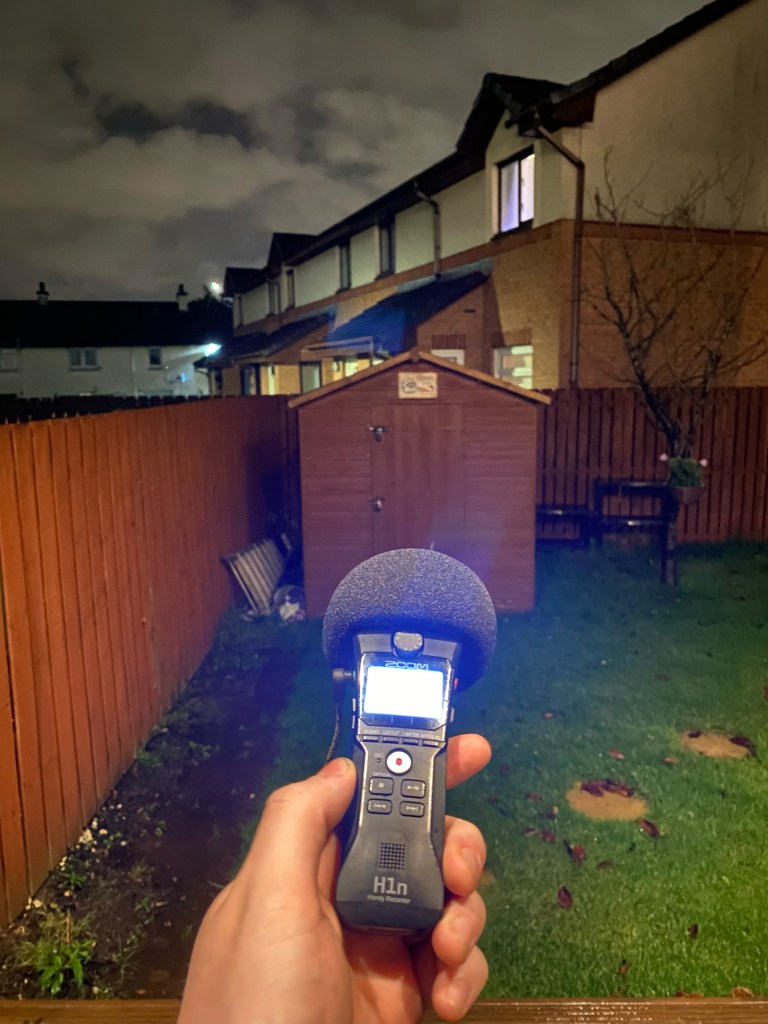
Going out on the streets of Glasgow with the H1n tuned me into the everyday sounds I have tuned out and how much information or emotion they convey. I’m guilty of always using my headphones at a loud volume because I love the music or the noise, so I’ve either missed this sound or forgotten about it. So even when I wasn’t using the directional listening of the H1n, I decided to keep my headphones off and keep listening and to focus on the sounds; people talking, the wind in the trees, the different soles of shoes on other surfaces and people living their lives around the city.
Self Learning 01
Even at home this evening, I listened to the different sounds more intently and heard things I had never noticed before with the H1n, like the mechanism inside my door that I’d been opening and closing for years.
Or enjoying the sound of the planes I’ve learned to tune out after years.
Class 02
Audio Editing. Previously I’ve used Adobe Audition for the bare minimum, but after spending a couple of hours with it, I can see how complex it could be.
I have focused on how some audio can sound empty and clinical without ambient noise and how the world around us is never really silent. So I want to make sure my project has that reality of the natural world if that’s what it’s trying to replicate.
Self Study 02
I’ve gone out to capture the noises that most people ignore or tune out daily to tell the story of my daily journey and how even a short sound or snippet of a giant sound can communicate a location or situation.
The direction of the audio in speakers or headphones is something I want to focus on because it’s something I’ve always enjoyed since hearing it in Space Oddity, giving the illusion of being surrounded by music.
Self Study 03 (Kind of)
Well, I tried to do work on Wednesday, but that didn’t go to plan.
The H1n micro SD was corrupted, and I lost a lot of audio, so I couldn’t record any of the audio I wanted to in my house for the beginning of the soundscape.
I then decided that if I couldn’t work with the recorder, I would work on what I could using my laptop, but in another stroke of genius, I had left my charger in the AV room, so my laptop was dead, and I lost a day of productiveness. Lovely.
Self Study 04
The first thing in the studio was to get the recorder fixed and the laptop charged. Done.
With the limited time I had left, I decided to change my soundscape; because I already had the audio of the planes over my house; I used that as a starting point to build the soundscape of an airport runway around it. The soundscape differs from my initial choice, but I still wanted to carry through aspects I liked and could with the time constraints, such as communicating a journey, even if it is a bit smaller—the journey from inside the airport, out onto the tarmac and then into the plane.
My initial idea was intended to exaggerate reality to make it more engaging and expressive instead of listening to a train ride for 20 minutes and steady walking for 10 minutes.
I’ve applied that thinking here by making the runway overly busy and dynamic whilst still based on reality.
Final
With the runway, we start inside the airport coming out to the wave of noise and activity with trucks, engines, runway workers and planes flying overhead to populate this busy runway before heading upstairs to the cabin ready to board the plane. In theory, it seems like a quick small journey that nearly everyone has done but by drawing attention to the sounds big and small I wanted to capture the whole experience and maybe excitement.
Class 01
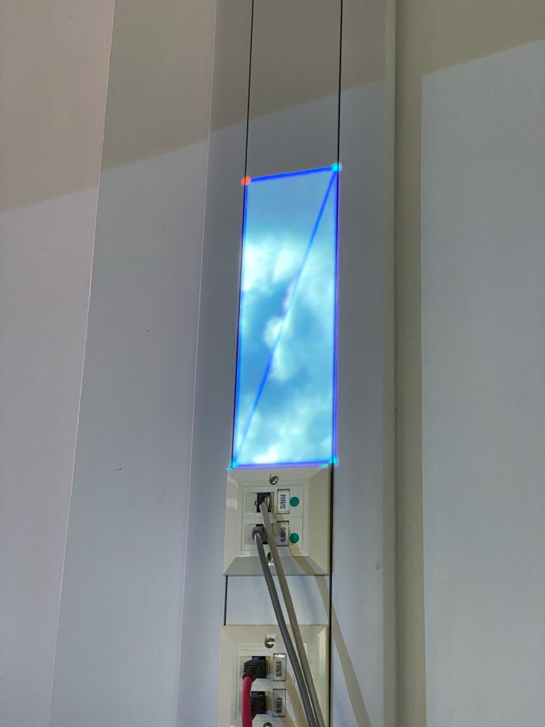
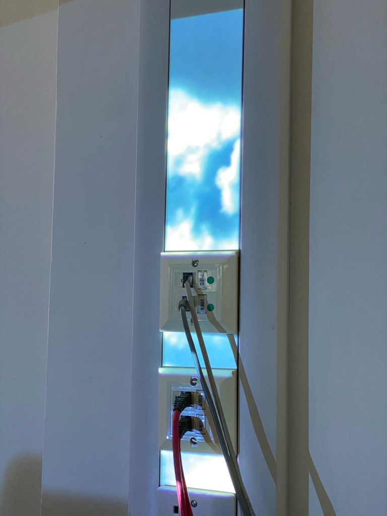
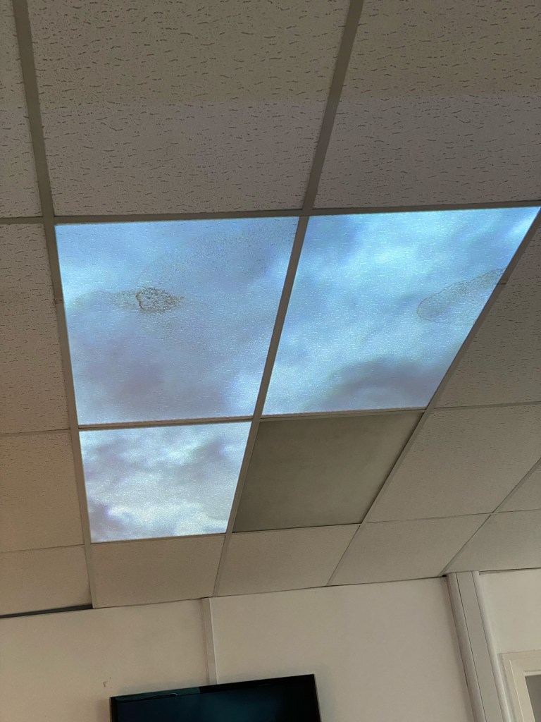
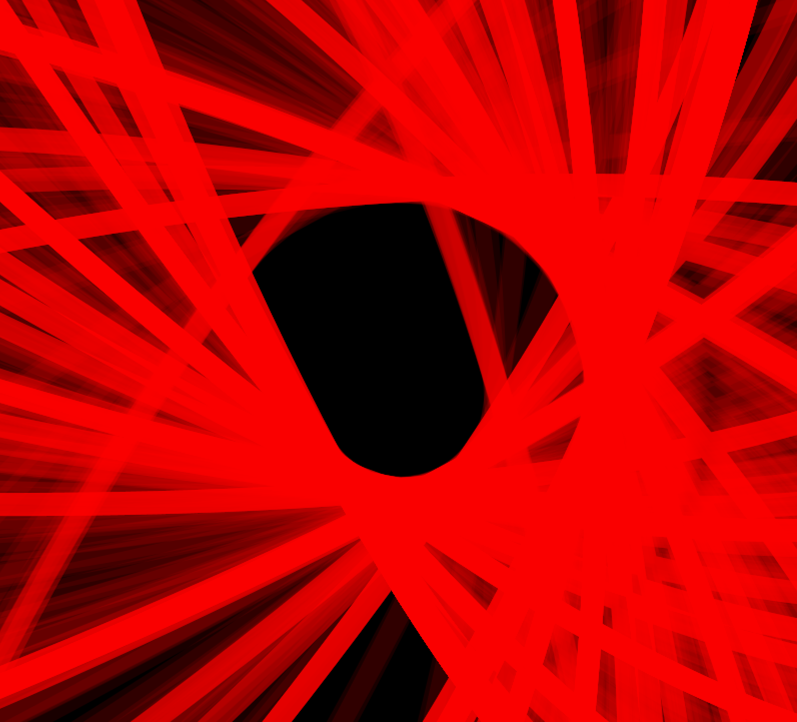
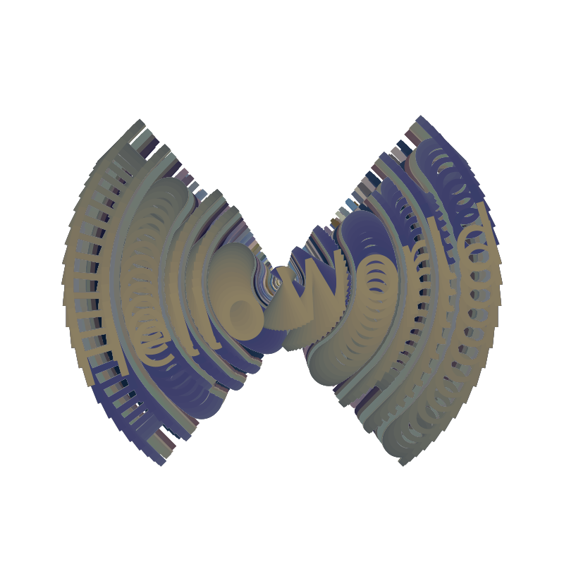
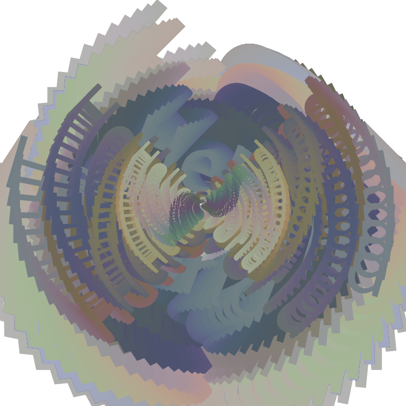
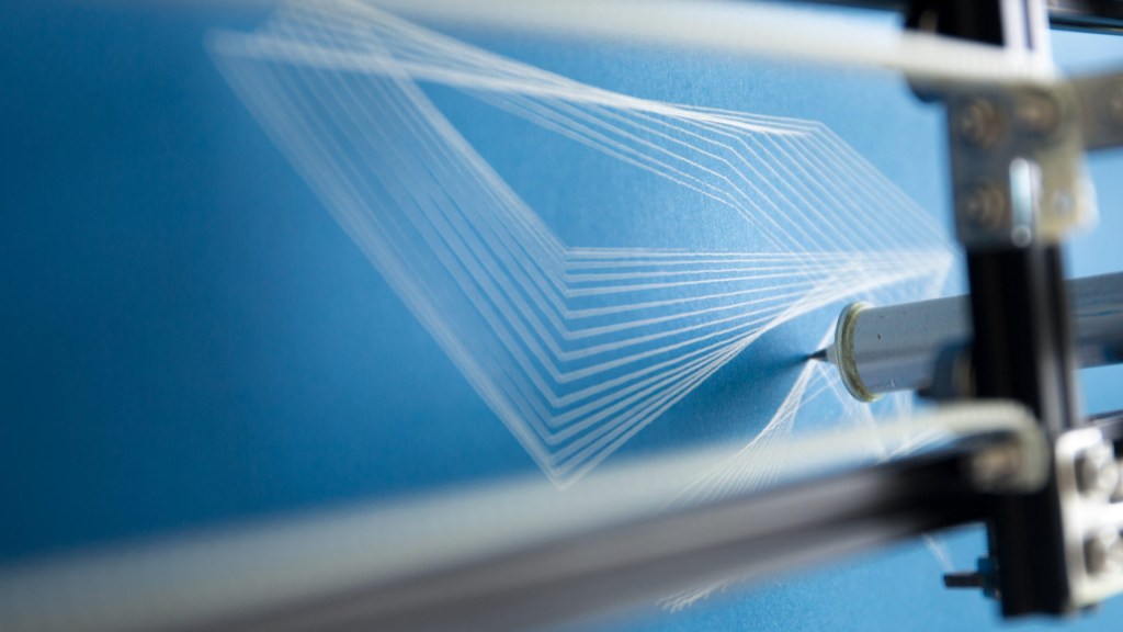
Introduction to Projection Mapping. My first hands-on experience with projection mapping showed me that using projections for art is a lot more accessible than I thought and they’re not just used for heartless power points.
Self Study 01

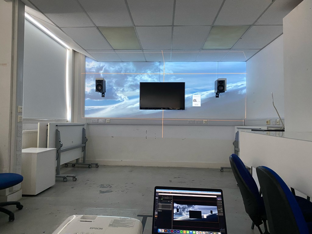
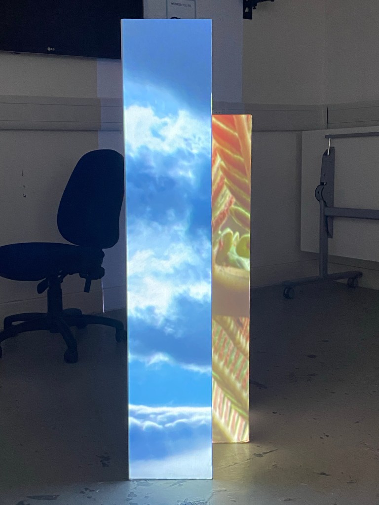
I wanted to create the illusion that I accidentally touched on in class 01, bringing the outside, inside. As Touch Designer is not the most stable software I had some teething problems with trying to expand on the cloudy sky window idea I did in class01.
Class 02
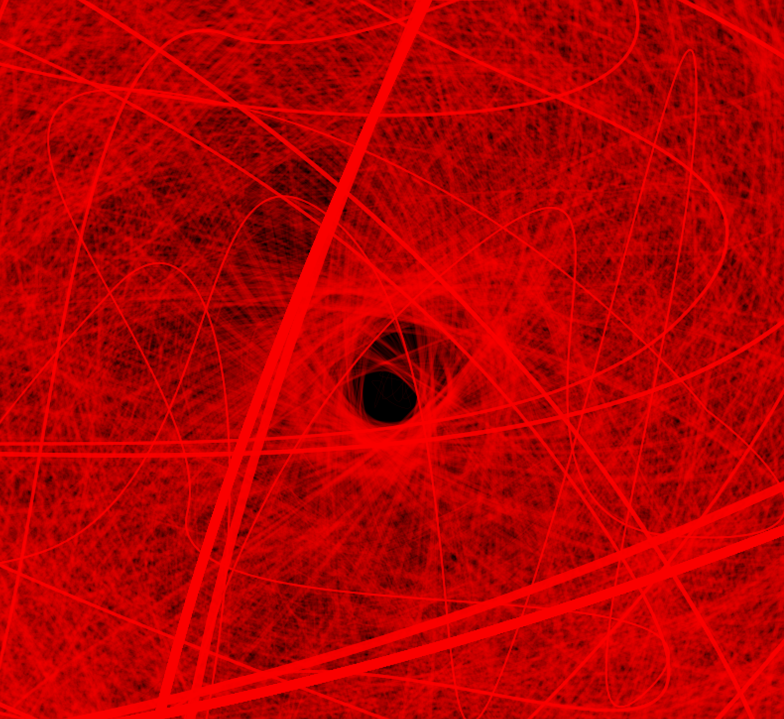
Boxes and noodles and how I can generate images within ToughDesign to use in projection mapping. The first level of Touch Designs UI makes more sense to me and how programs are visually represented as self-contained boxes with webs or noodles connecting them.
I need to shake my basic thinking regarding projection mapping and focus more on dynamic planes and 3D images or visuals, or at least their illusion. The window idea I got a little lost in feels too simple and one-dimensional.
One idea I have is to replicate a plinth surface and use an effect to make it seem that it changes the density or is moving from the inside.
Self Study 02

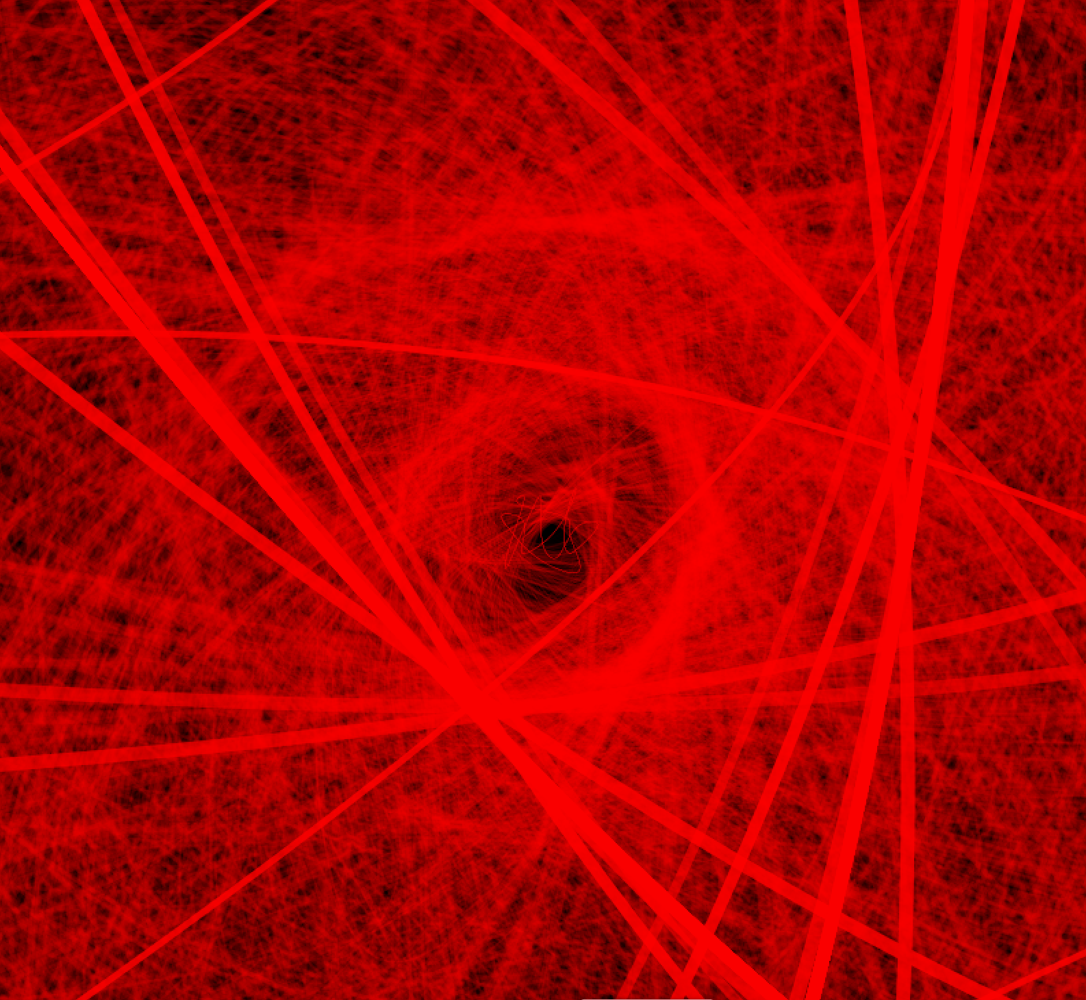
At this time in the studio, I started by experimenting with different boxes and setups, the images used are test images to see how well the perspective worked with different images.
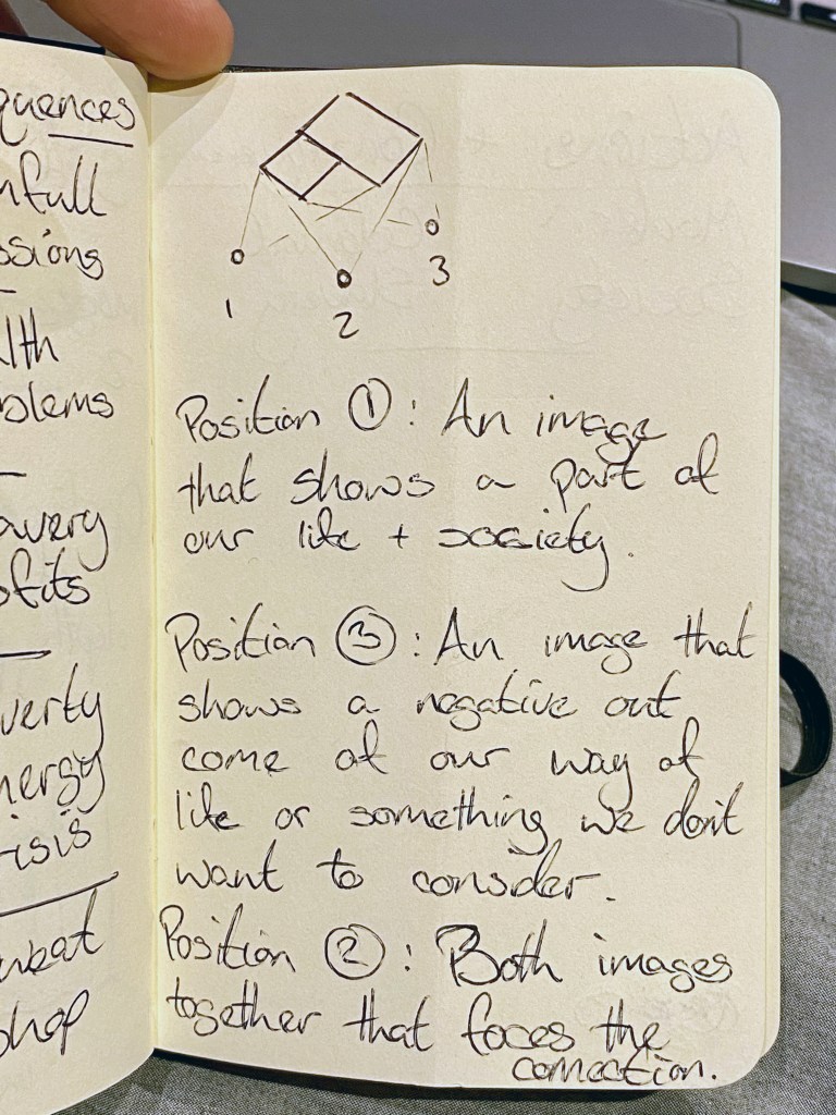

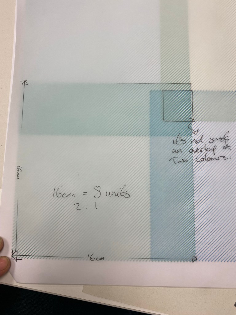
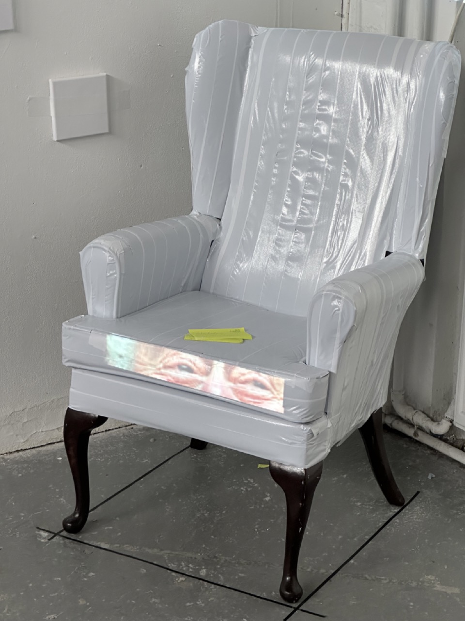
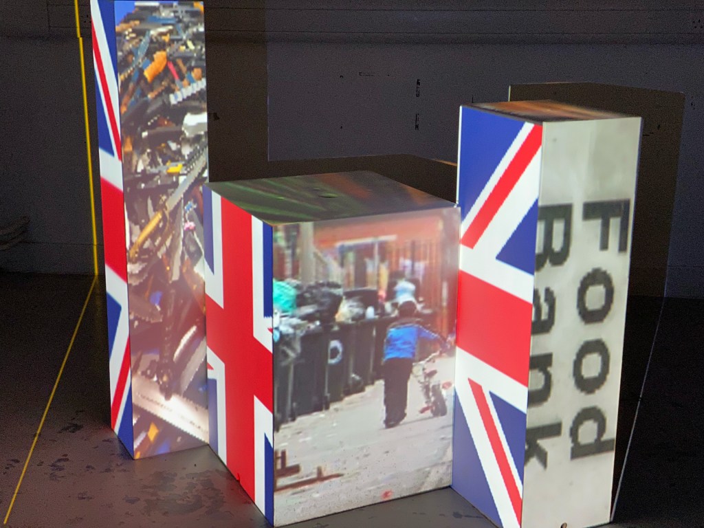
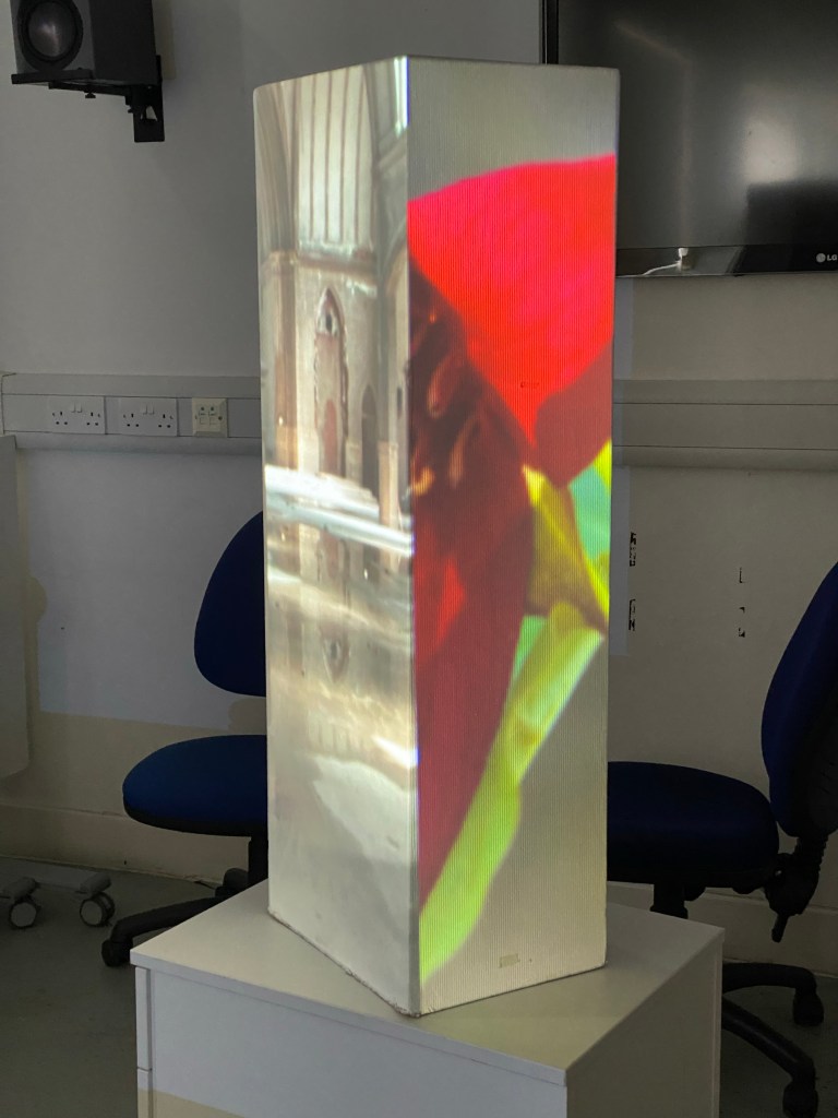
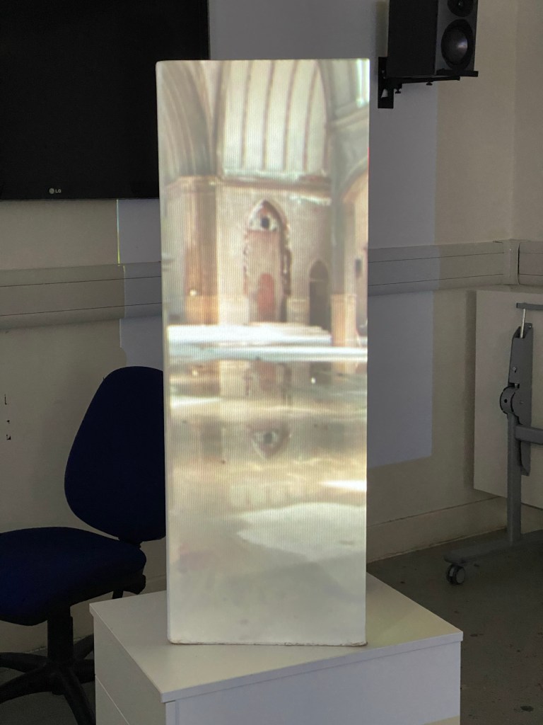
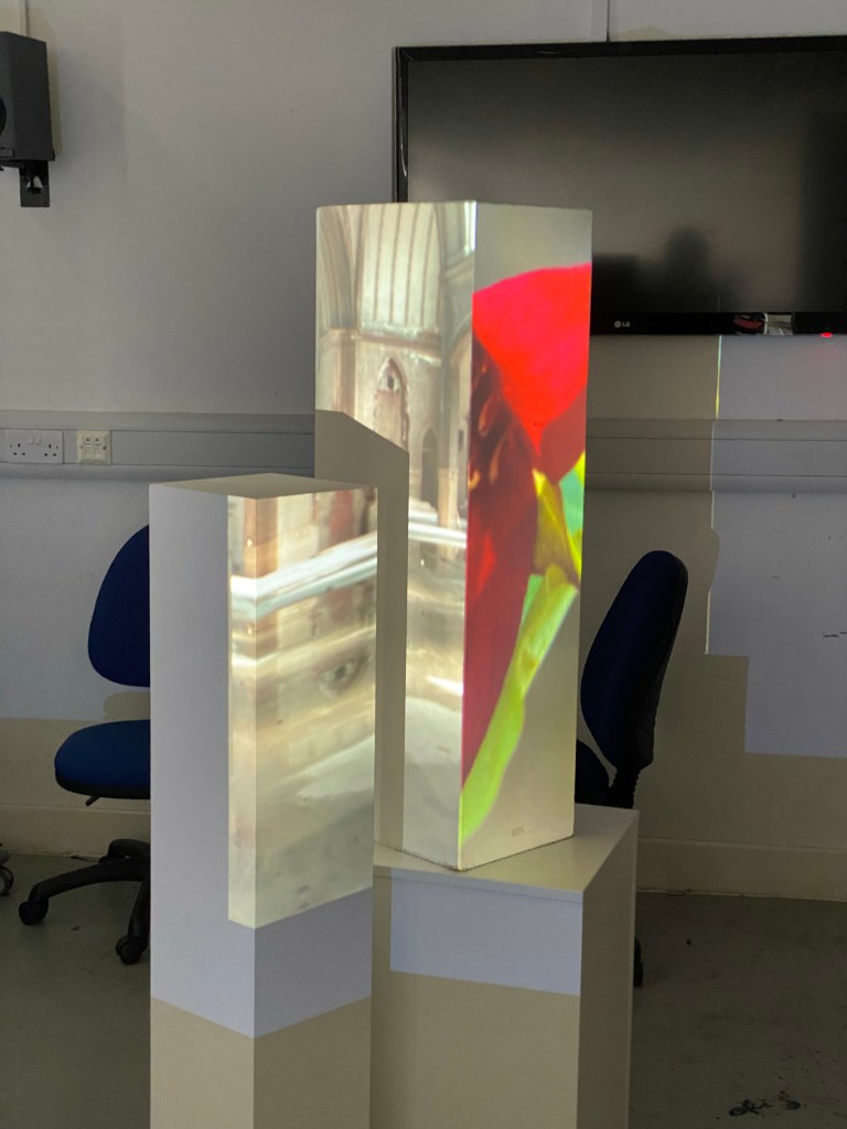
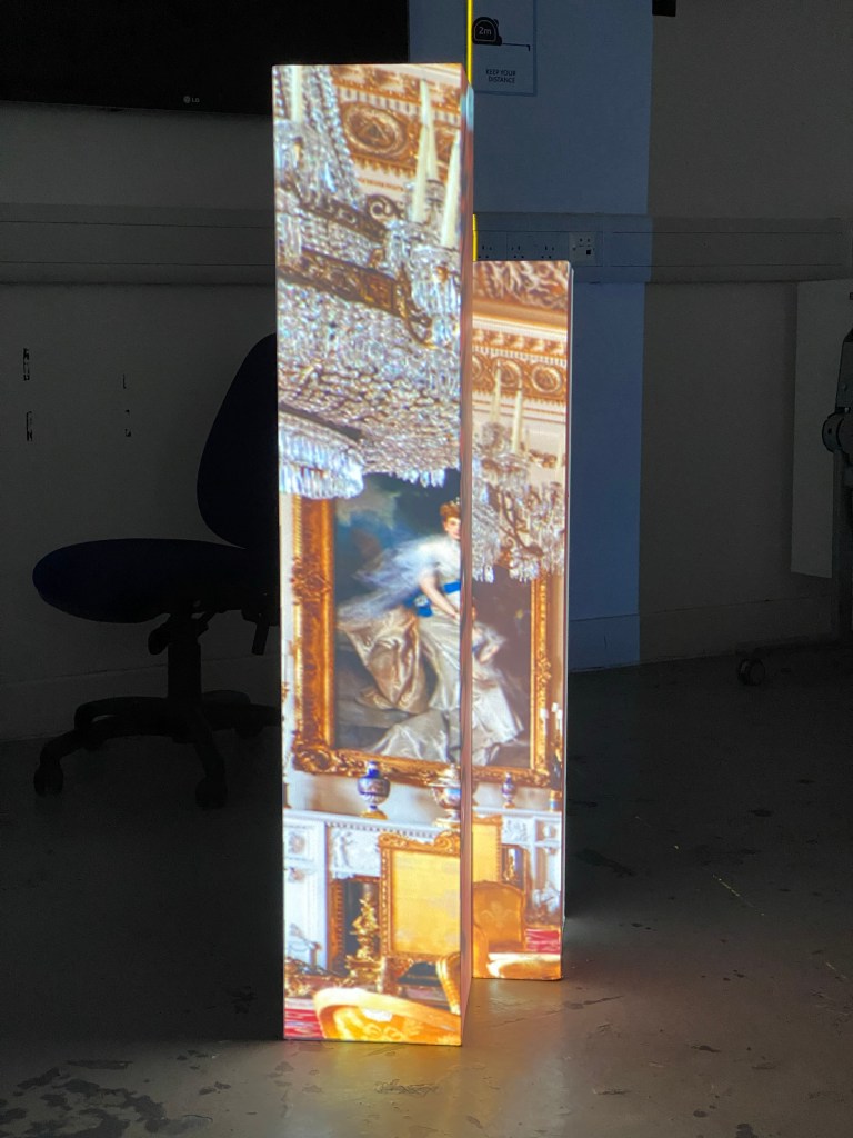
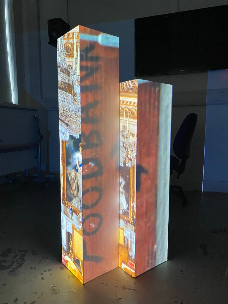
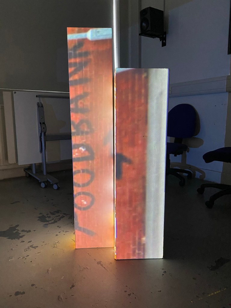
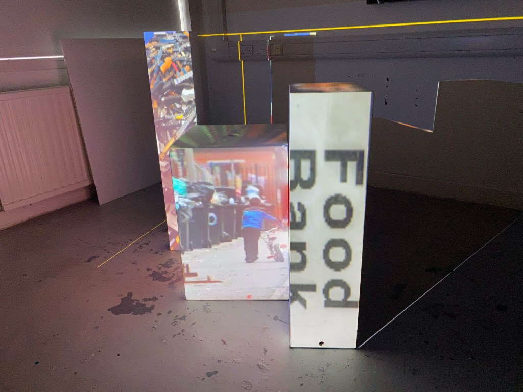
At this point, I was reminded of holographic prints that would change the image depending on what angle you viewed it from. So running with that idea I wanted the images to have a connection so that when viewed at position 2 the correlation was obvious.
Lifting from recent personal experiences the stark difference between the opulence of royalty and the demand for foodbanks up and down the country came into my head. From position 1 you see the wealth and decadence from the interior of Buckingham Palace and from position 3 you see directions to a foodbank taken from a picture of a neighbourhood wall.
Edit: Since I’m taking this concept further I want to expand upon it, look at other societal Cause & Effect situations as well as trying a different arrangement of boxes and exploring the top of the boxes as well.
Self Study 03
Today I think I was in the studio to experiment (mainly the support session) to see what happened, what would come to me and what I could discover/produce. The positive outcome is that after the support session I now have my heading.
The Actions & Consequences display I had in Self Study 02 is something I’m going to take forward. I was hesitant at first because I got some pushback from people I asked outside of the course but I shouldn’t let that deter me.
I believe in the concept, the medium and the message I’m trying to convey.
Self Study 04
When I go in with a game plan, it speeds up the process. That sounds obvious, but for some reason, I hadn’t planned what I would do in the studio to this point. So let me clarify: I had ideas and suggestions of what I wanted to do but just neglected the logistical stuff until I had to deal with it; the obvious, simple fact of planning my setup left me more time to focus on my project.
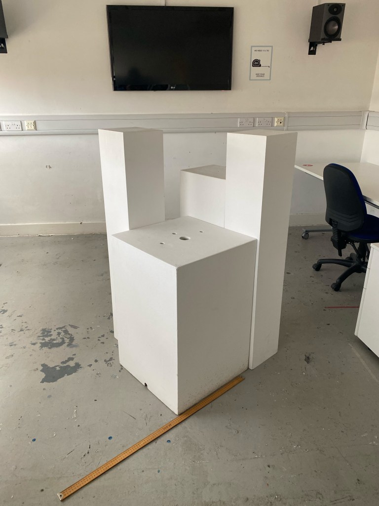
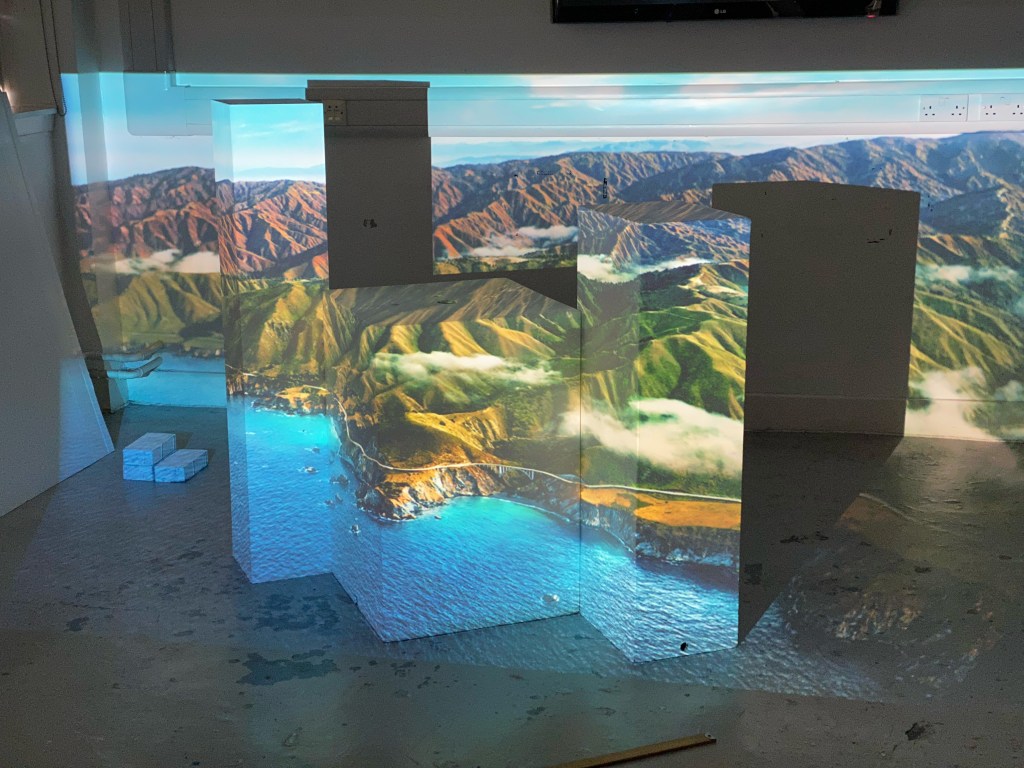
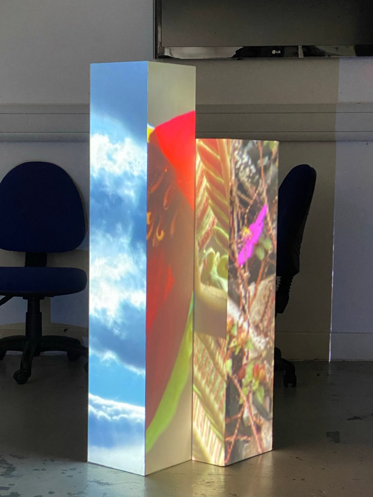
Initially, with my final design, the first step was the setup. I needed to have the correct box set up so that the viewer could easily move between positions 1,2, and 3 to get the full effect of the projection. As well as considering the viewer’s position, I also had to consider the faces of the boxes I was using and give them enough breathing room.
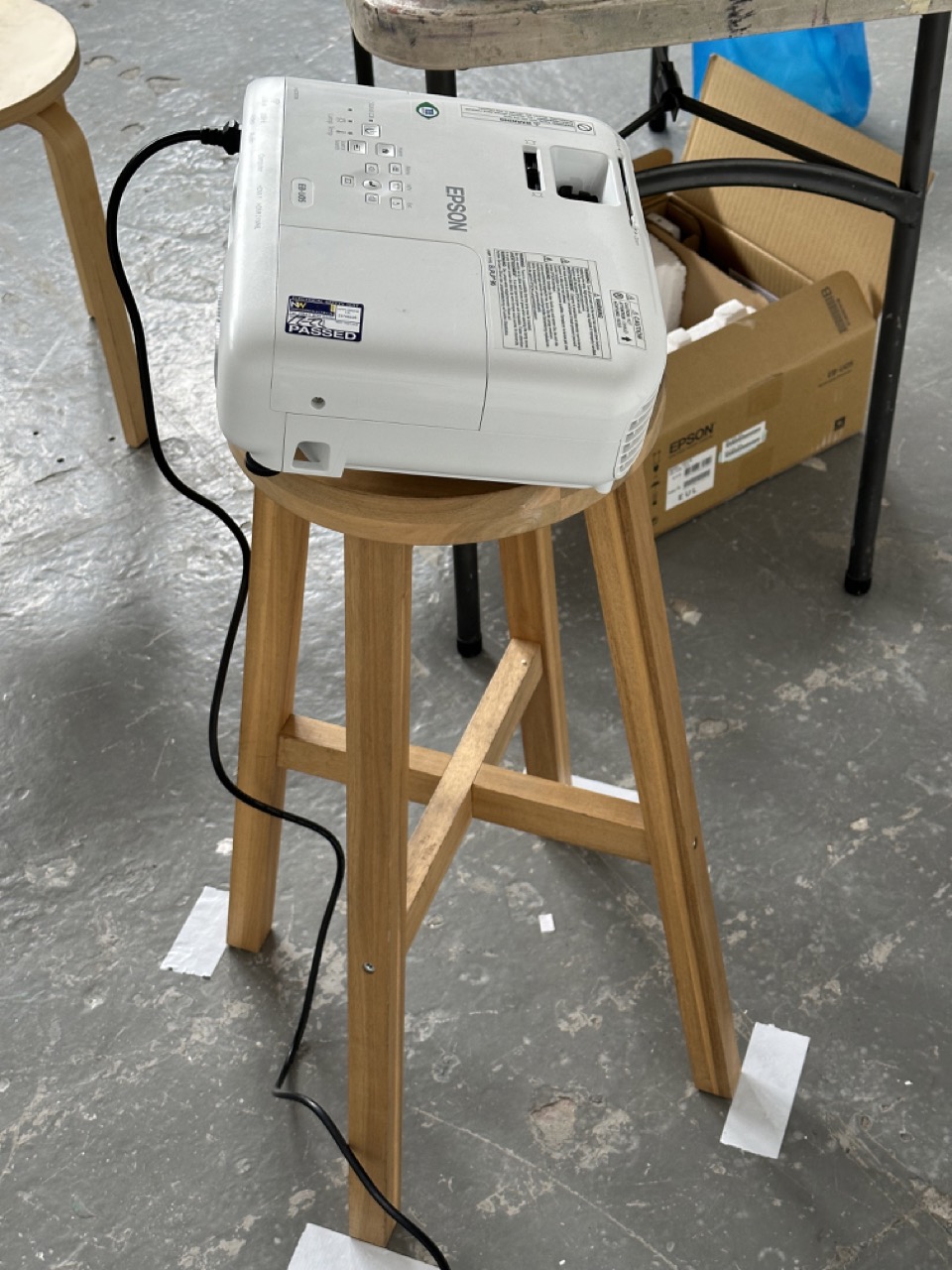
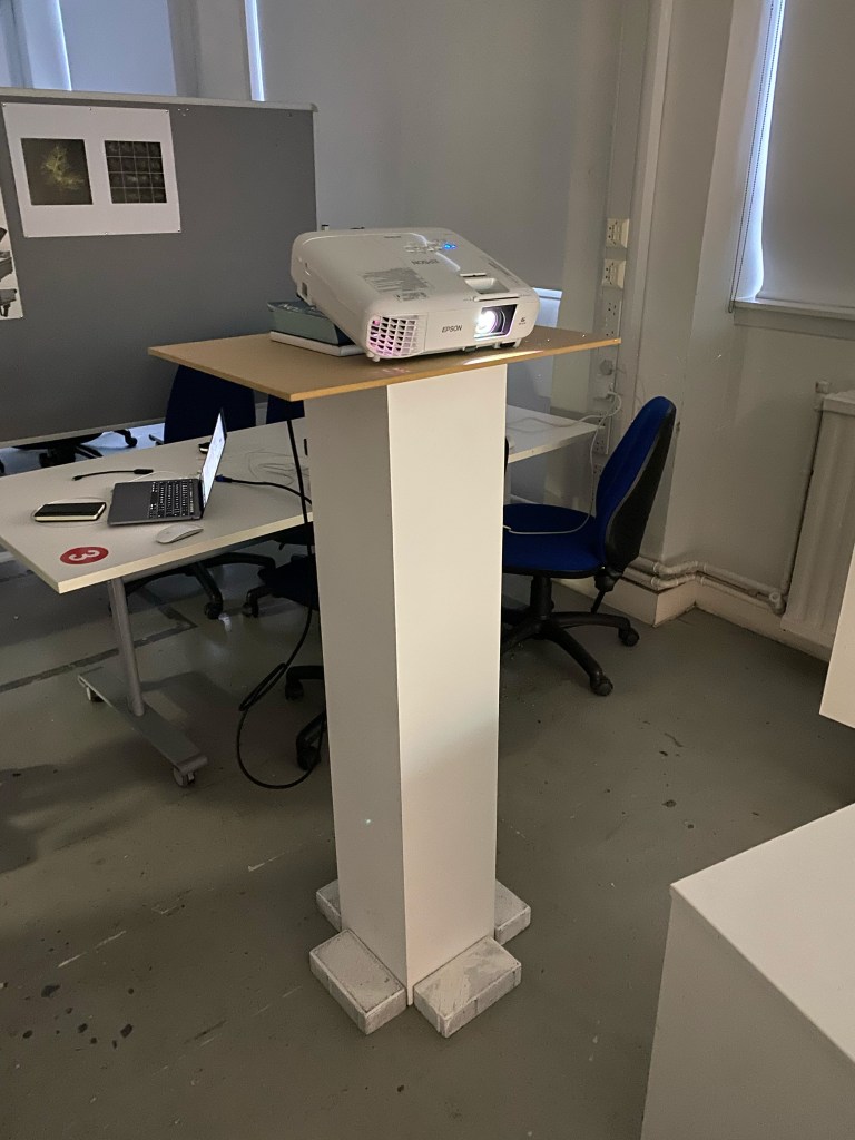
The projector was on the plinth contraption to get as much height as possible. If I had the chance to improve this, I would mouth the projector on the ceiling to allow for a more diverse placement of the boxes and utilise the top of the boxes.
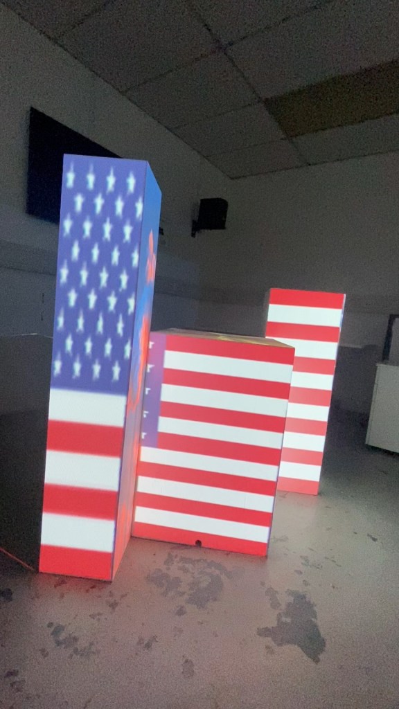
The United Kingdom
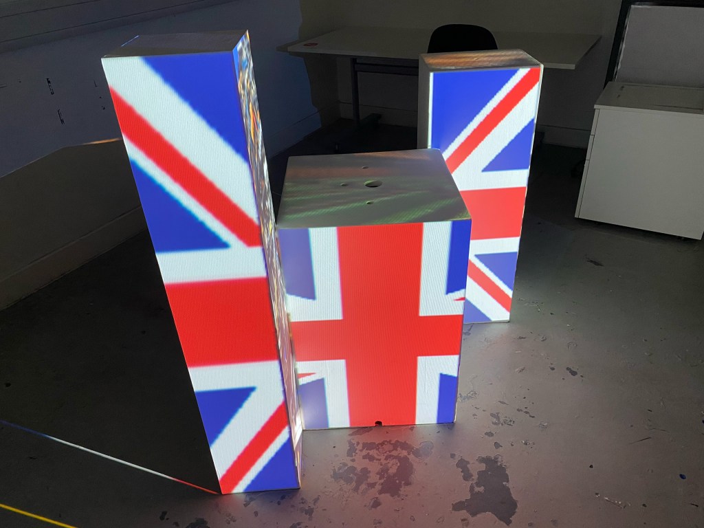
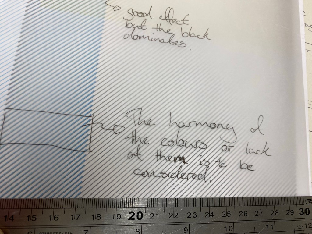
I didn’t set out to make my project political, but it fit when I stumbled into it. The different perspectives of the project mirrored the different perspectives people take when looking at issues of viewing a country. Some people might focus on the flag instead of what the flag hides or condones.
My first take was on the UK because its closest to home and how I can personally see an abundance of wealth in our royalty and our houses of government on any TV or media, but anyone can walk 5 mins from their homes or places of education and see violent crimes, poverty or growing lines for foodbanks.
From even the perfect angle, each flag is disjointed and imperfect. I initially spent a bit of time trying to get the UK flag perfect, but after showing my project to people, I found that the viewer spent more time trying to line up the lines of the flag, trying to solve the puzzle. So I decided against this as a possibility because it distracts from the point and makes the viewer spend more time on the flag, not what the flag is hiding. I should have documented this, but honestly, it was a change done quickly and out of dissatisfaction that the main subject of my project was getting overshadowed.
The United States of America
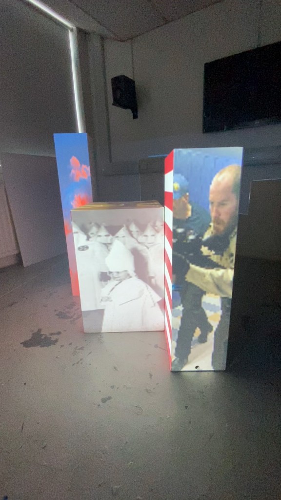
Secondly was the US because they’re always bigger and better than everyone else, even when it comes to horrifying societal norms. Similar to what I did with the UK, I wanted to look at images that would be harder to see, pollution on a massive scale, trained gun-wielding police officers in a school hallway and an innocent young child being indoctrinated into a group of evil and hate.
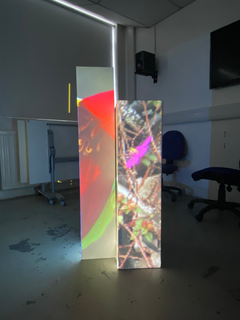
The Russian Federation
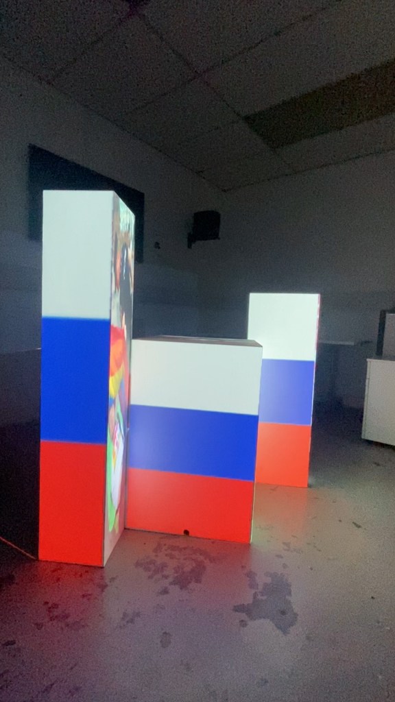

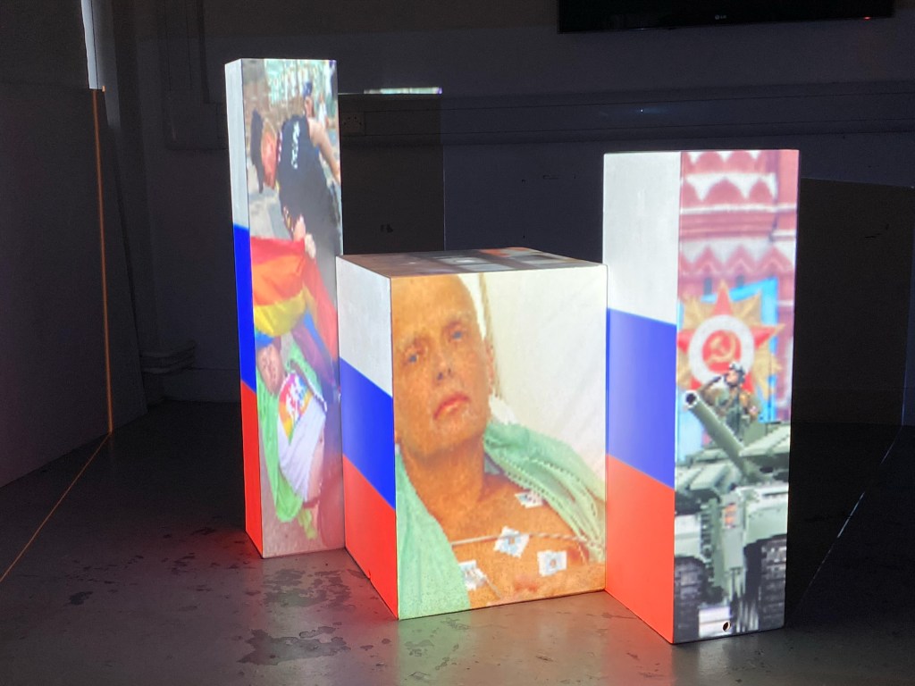
Finally was Russia, which came as a request from a fourth-year IxD student, and once they asked, it seemed apparent. Russia has become synonymous with oppression, corruption, espionage and political grandstanding in recent years. The images I chose reflect the denial of someone’s fundamental right to love who they want, the silencing of Russia’s enemies and the facade of unity and power.
After completing my three projects / unsubtle political statements, I was struck that almost every one of these images are not exclusive to the flag I have assigned them to. Each country varies in their subtlety to the highlighted issues, but they overlap in one way or another. There are still those in the UK that have homophobic views, there is poverty and food banks across Russia and the US, and racism and xenophobia across all three.
Looking at what’s wrong with the world all day puts you in a downer, I’ll be honest. But the thing that it made me think about was the positive similarities between people. The resilience and passion for going against what’s wrong no matter how scary, massive or faceless the opposition might seem. So my project focuses on the negative to inspire the positive.