• Imagined Environments

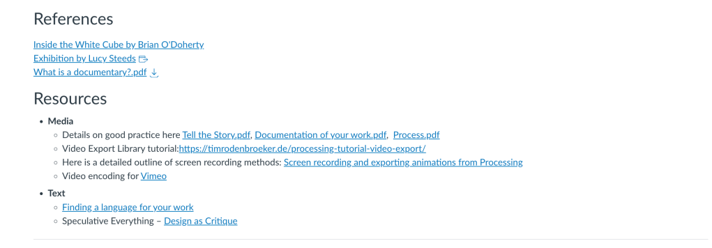
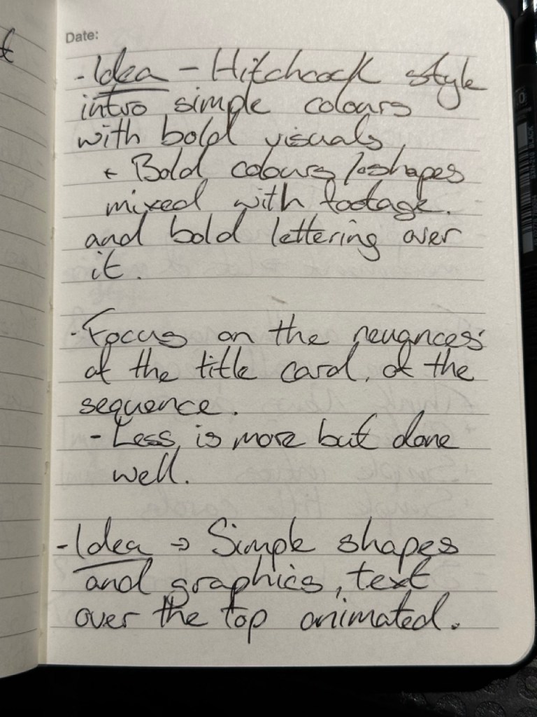
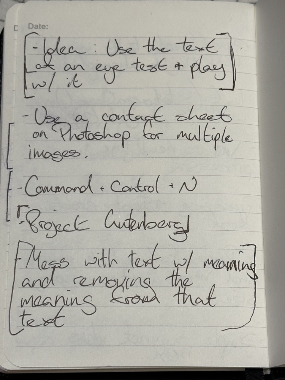
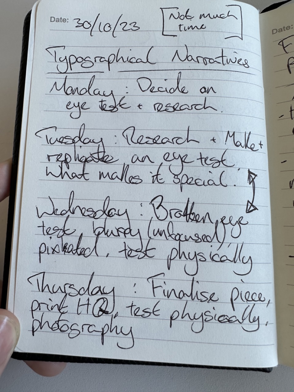
    Initial Ideas / Notes :

    Initial idea one is the story of two people making a journey to each other throughout Glasgow, with footage of both journeys overlapping or intertwining.

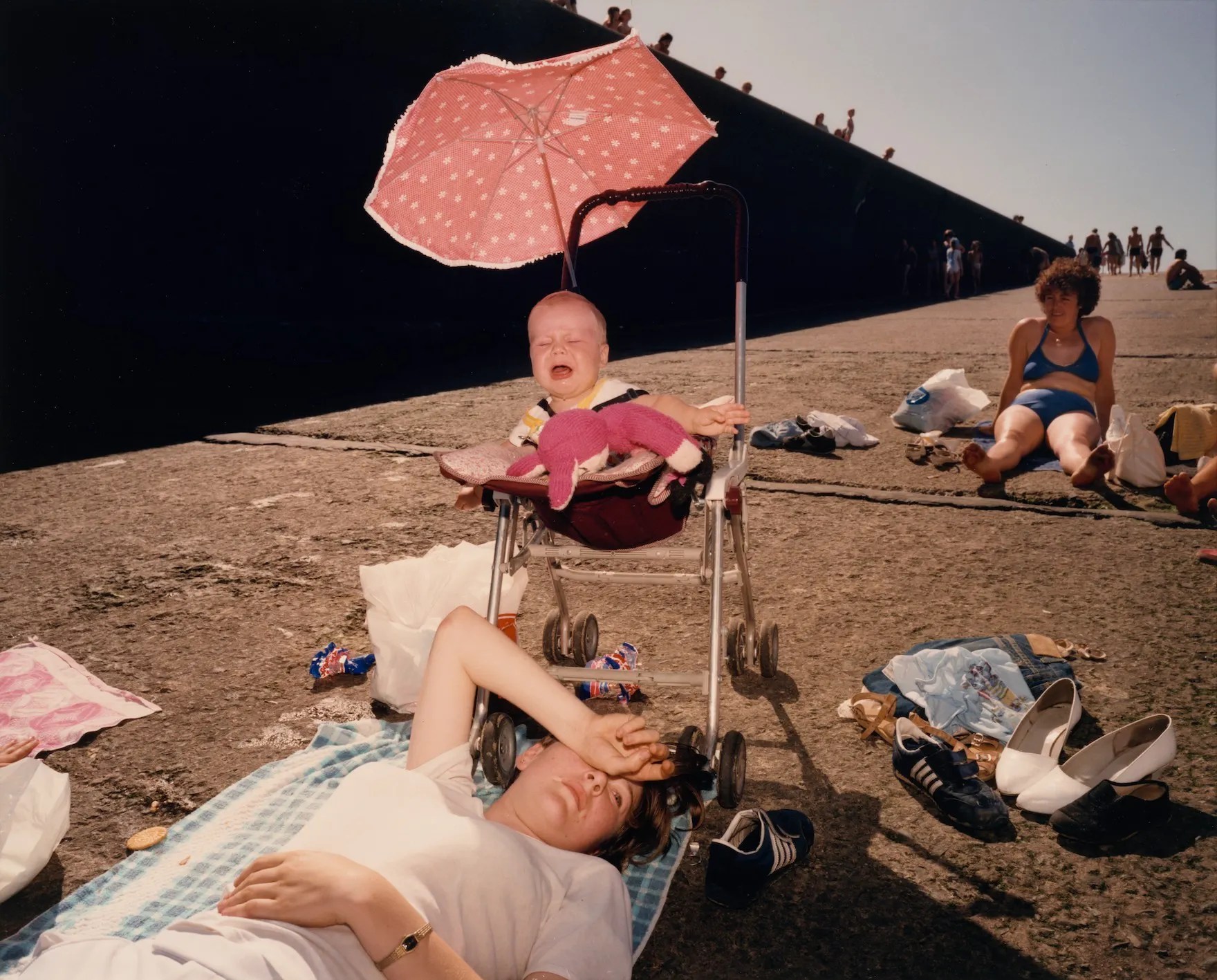
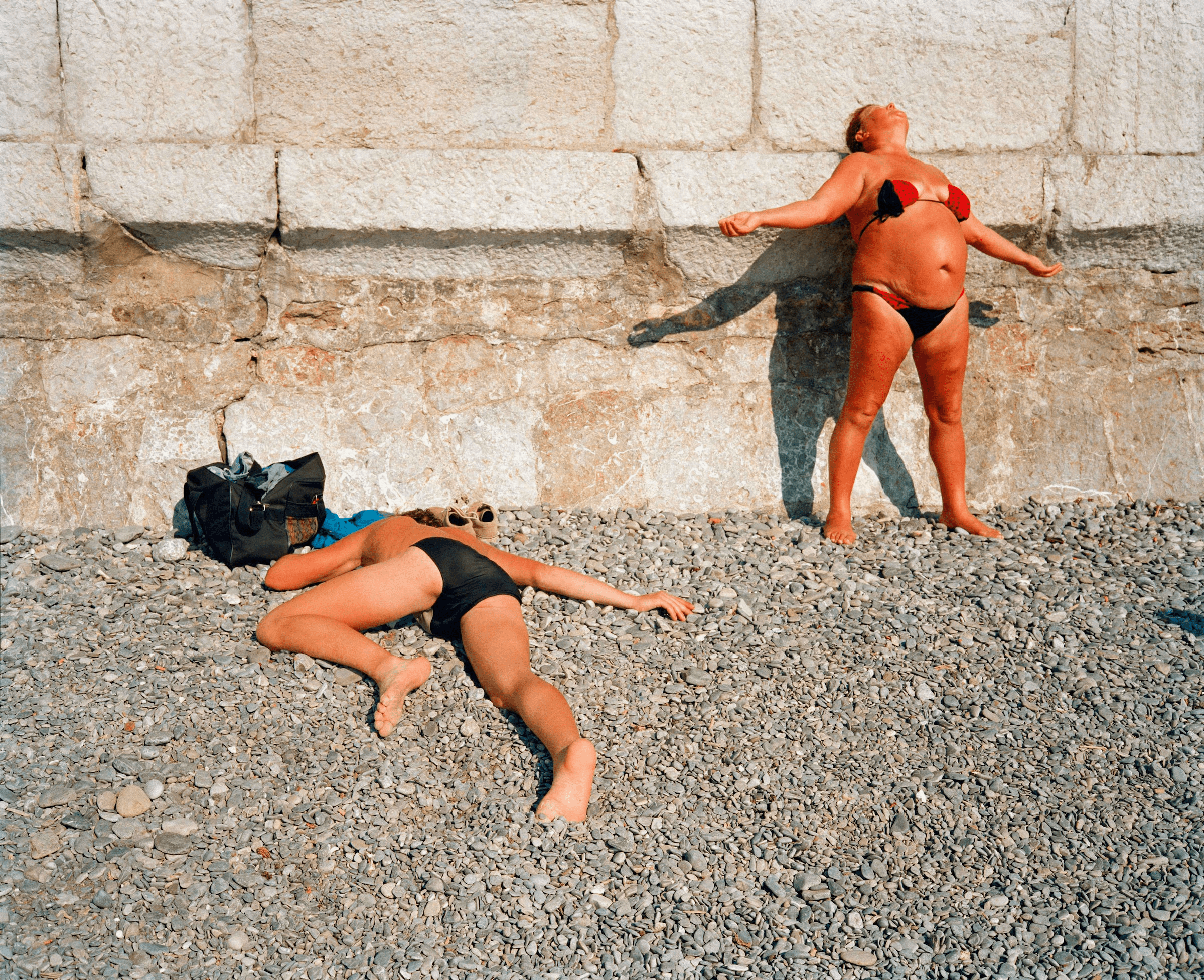
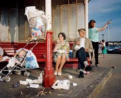
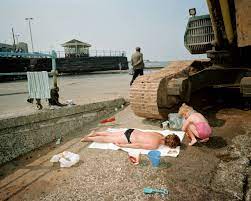
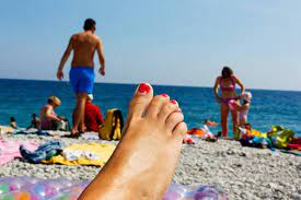
    Idea two is normal footage of people around Glasgow walking around but different sizes, colours, speeds. The normal sights of Glasgow made weird and wonderful.

    Idea Three is playing with the idea of different aspect ratios within one video/screen. One story told from behind multiple different screens.

    Conscious of Time :

    As the project is only two weeks, and it’s already Wednesday, I want to nail down the concept as quickly as possible so that I have plenty of time to get the footage I’m happy with and then have time to make sure the video has polish to it.

    Effects with a good level of polish obviously add to their credibility and believability. And when doing something odd based on the real world, a certain degree of believability is vital.

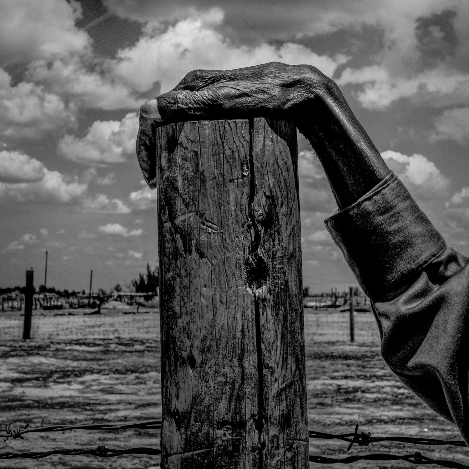
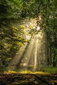
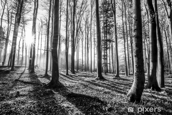
    Normal made magical :

    I’ve decided to go with the change in size idea for my project as it can be the most effective. It is a pretty simple idea, but I think if done well, it can be the most effective of the ideas I had.
    With personal evaluation, the changing size idea excites me the most about the project, and I think that’s an important consideration.
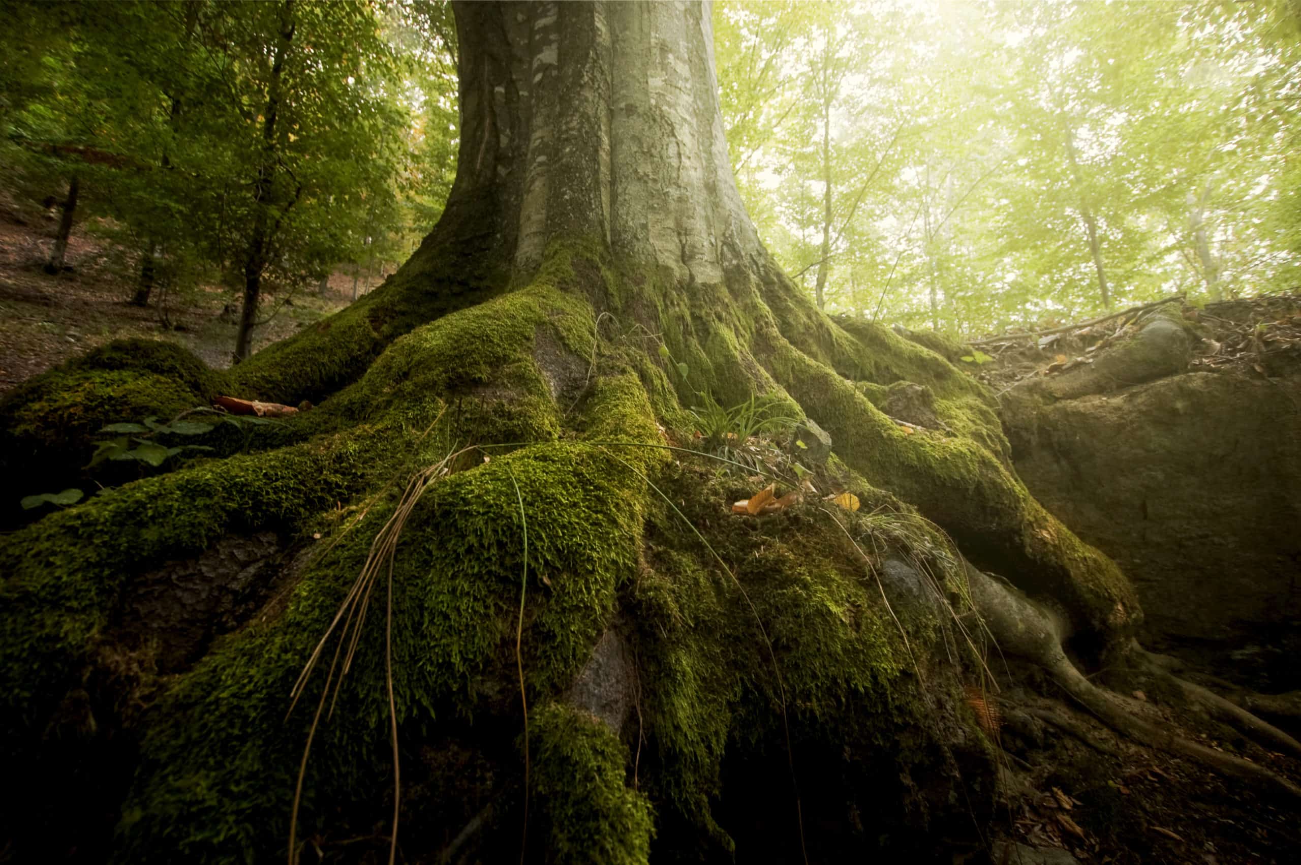
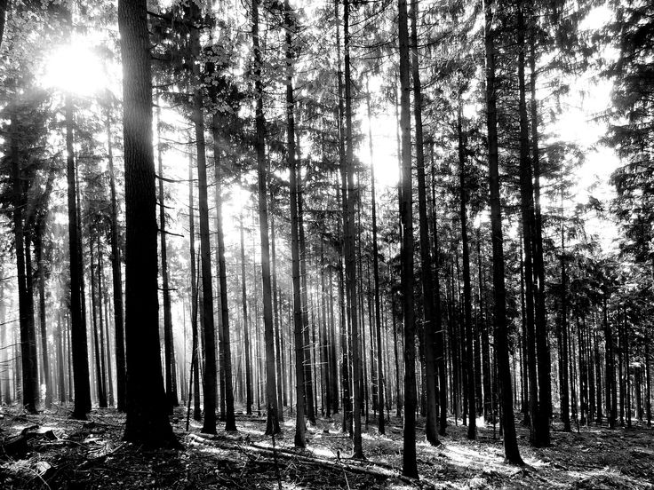
    Inspiration :

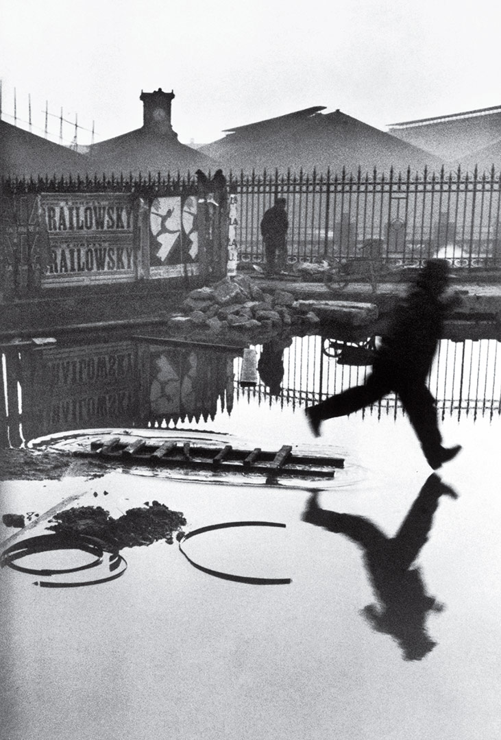
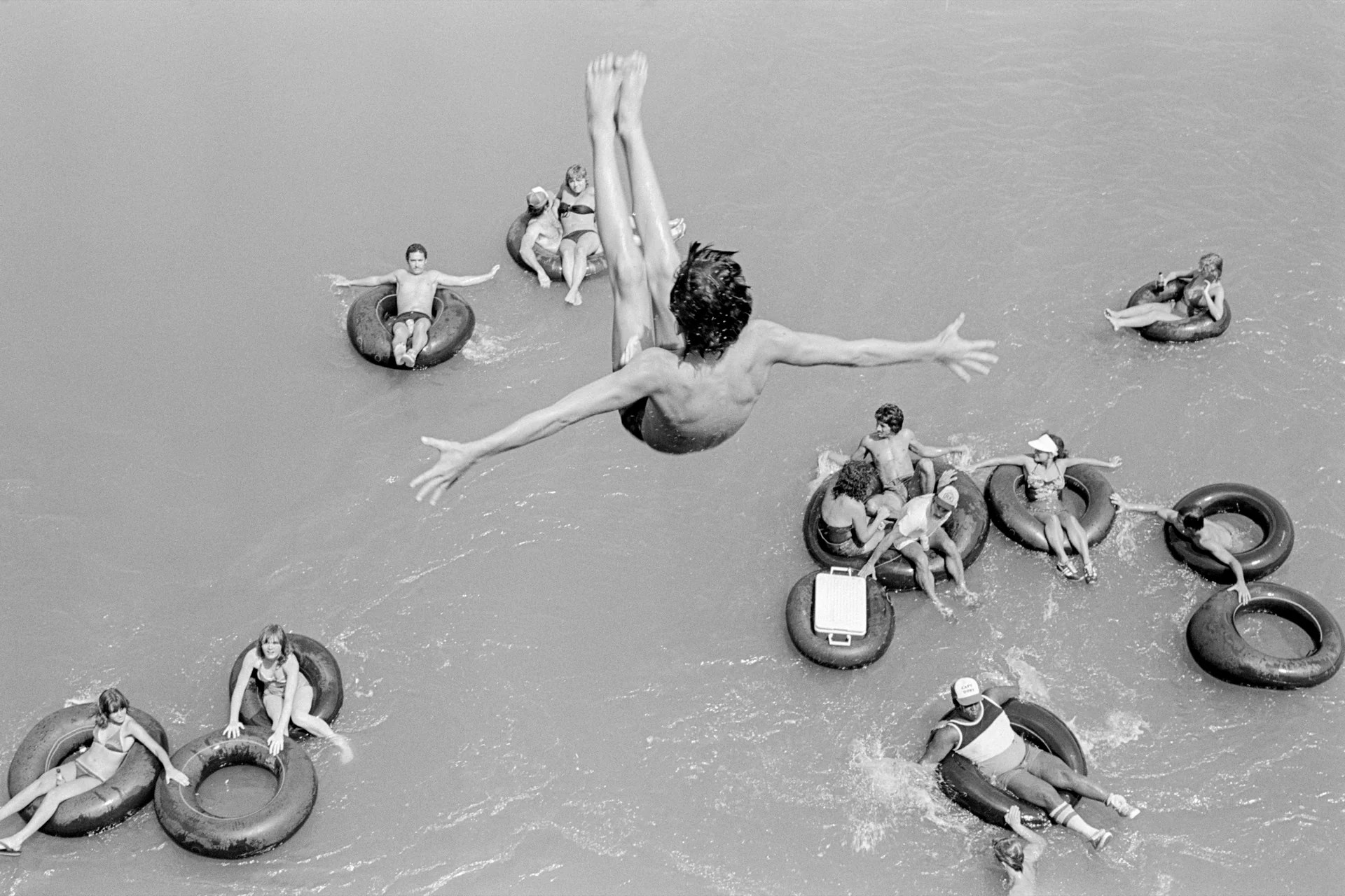
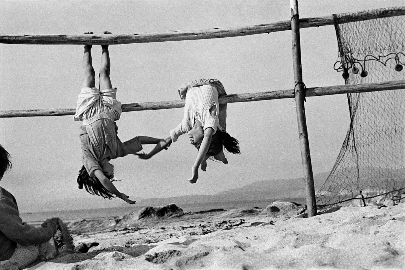
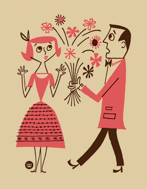
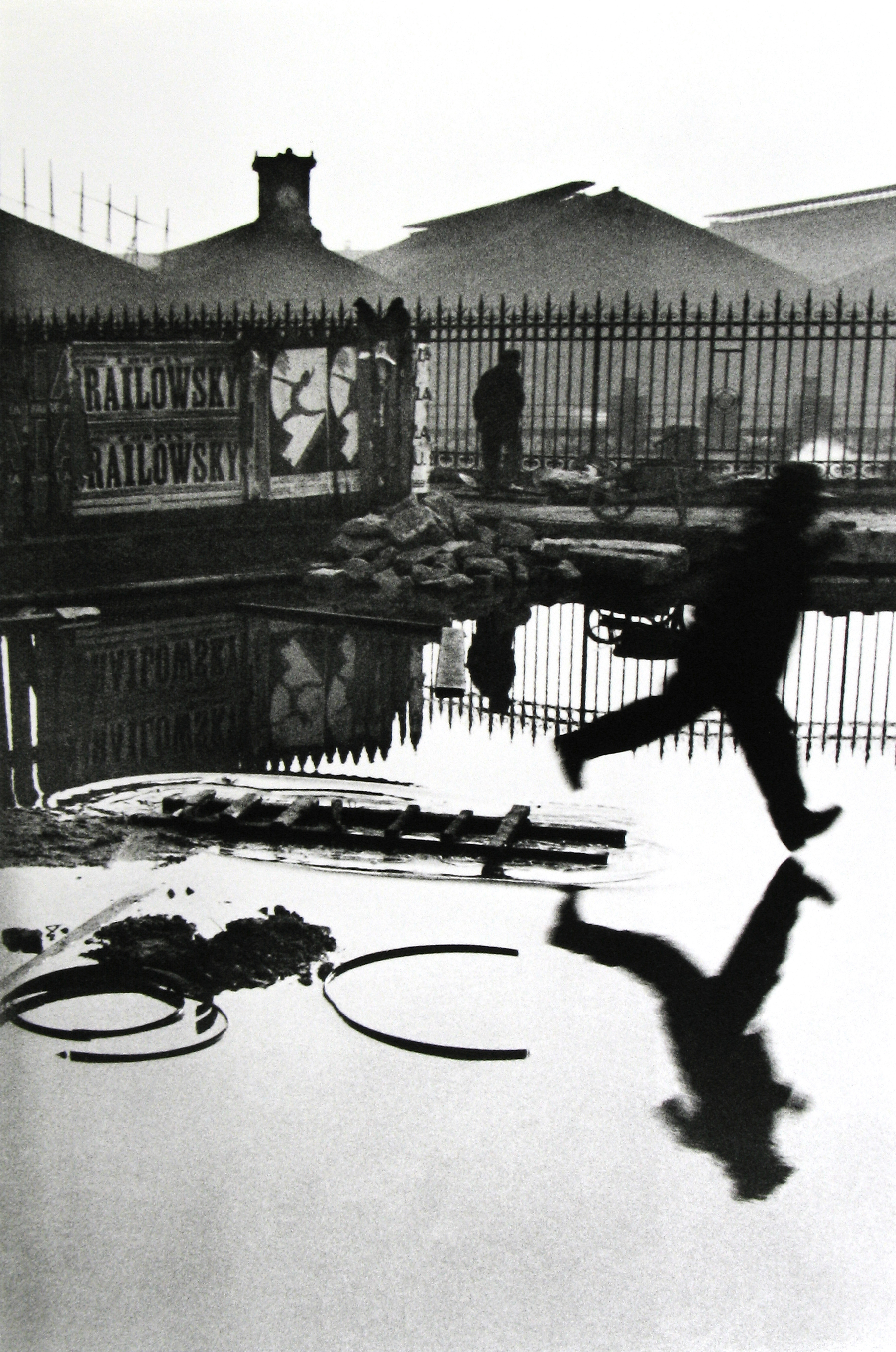
    The BBC Sounds trailer, shown at the project launch, shows how effects can be used to make the real world more amazing and magical. I really like that aspect of it—subverting expectations or the natural world while still telling a story or message.

    The music video for ‘Why’s this dealer?’ by Niko B also shows this aesthetic of weird or magical things happening in the real world, again with a story or narrative that would only be as clear with the effects.

    Again, I am looking at music videos that have used special effects to create something magical out of the routine mundane.
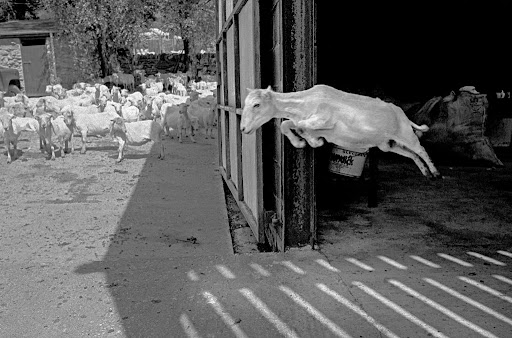
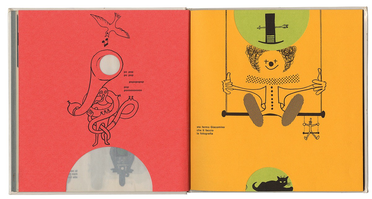
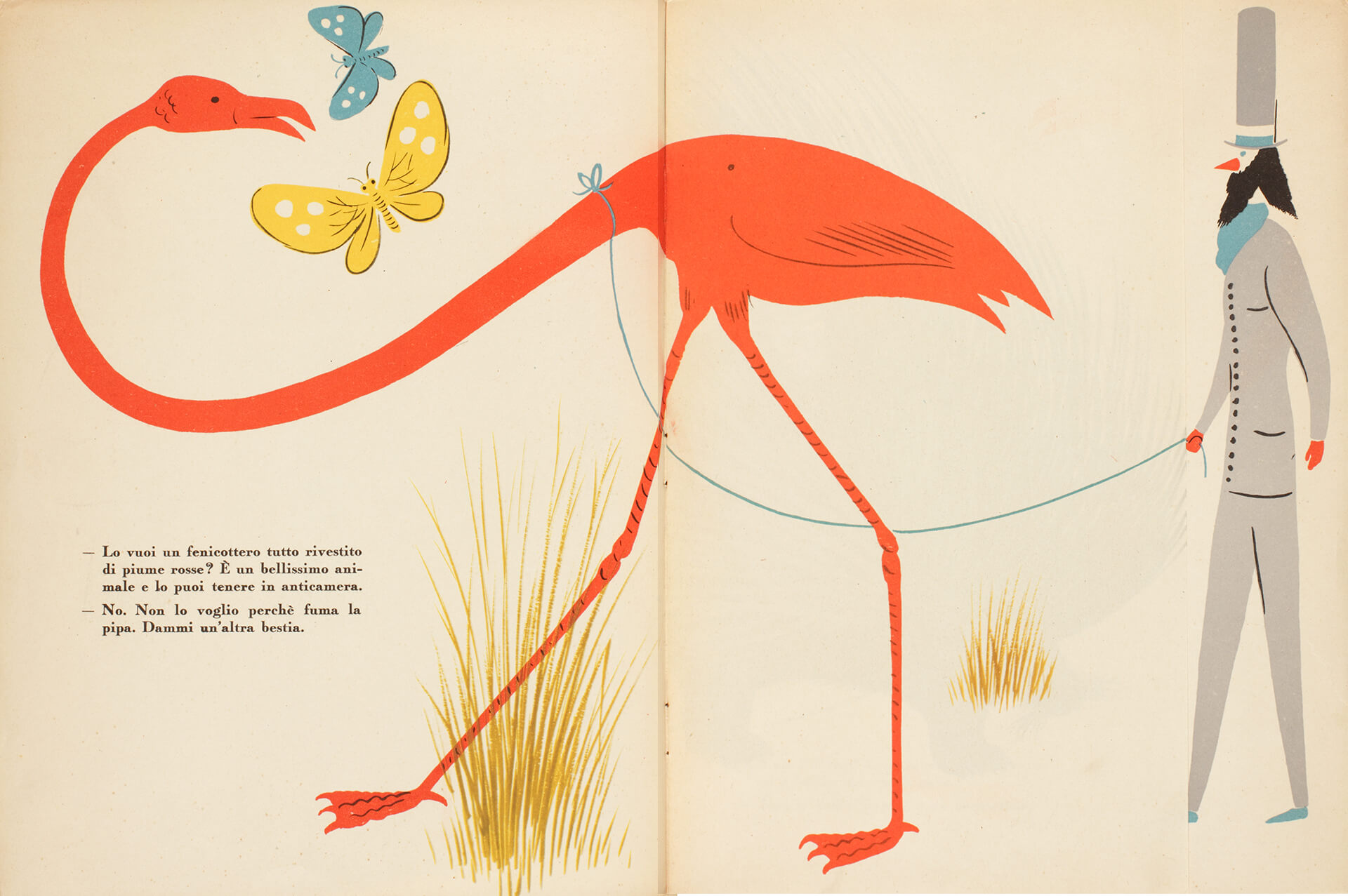
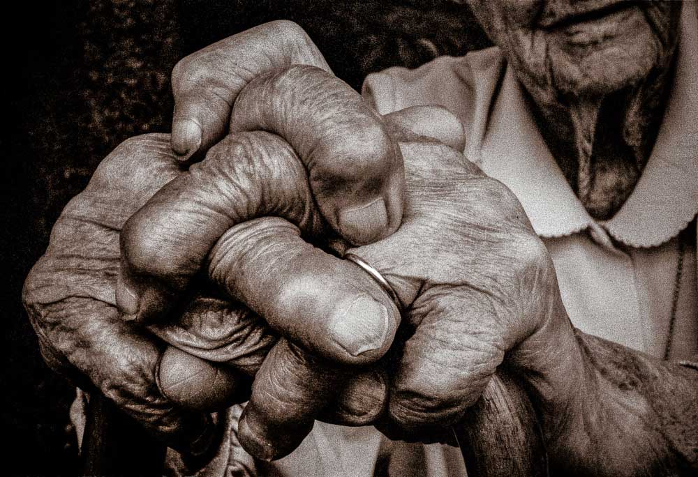
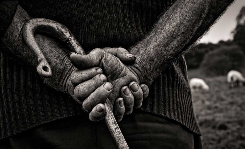
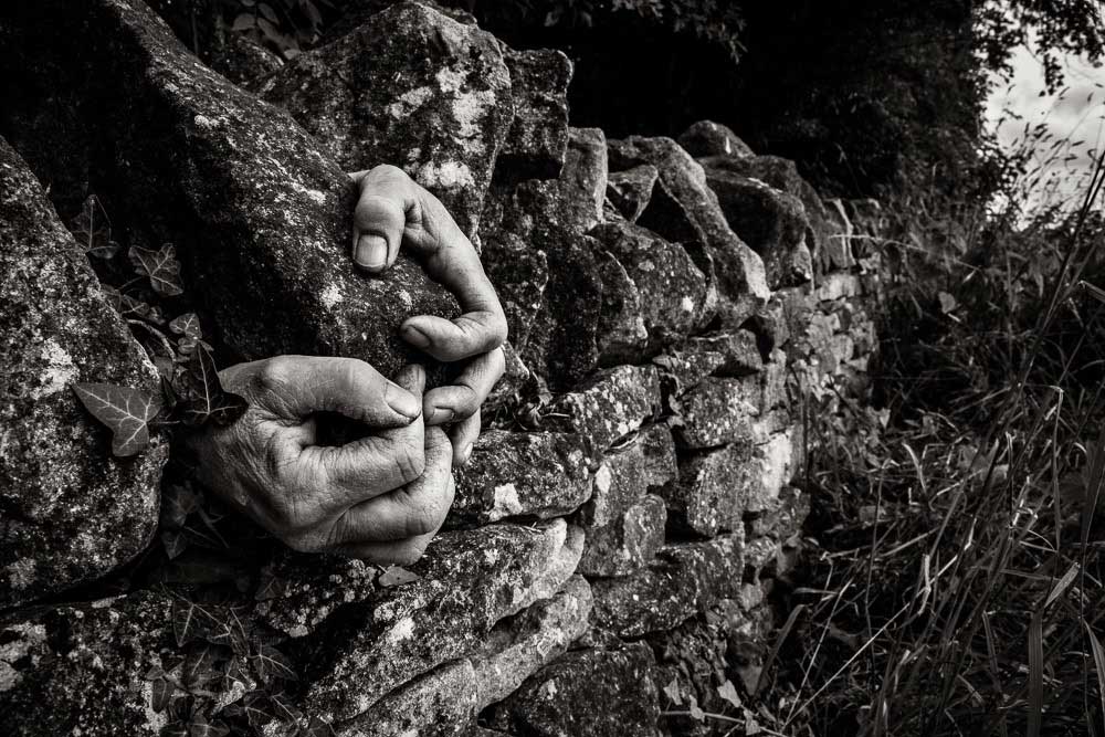
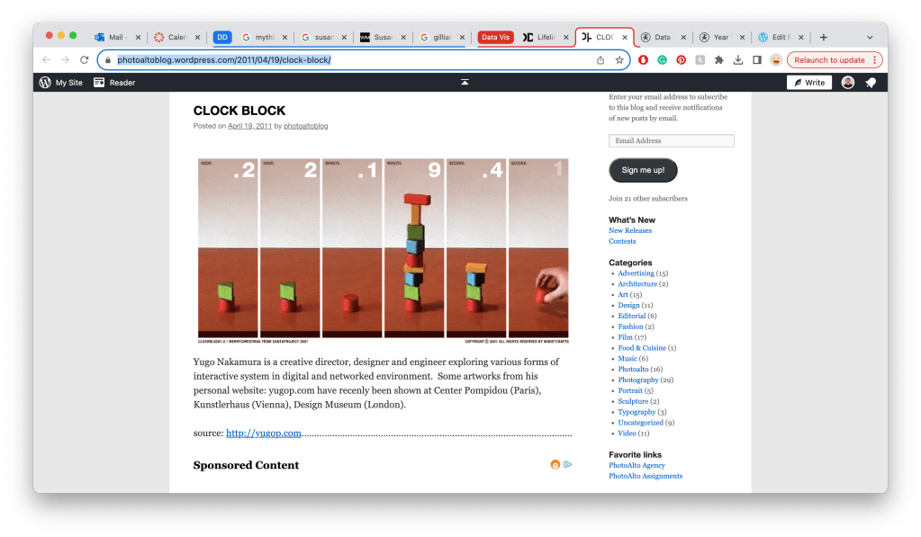
    Rómulo Celdrán

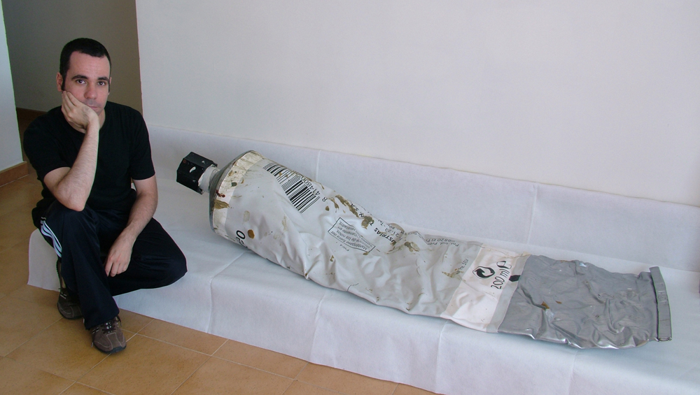
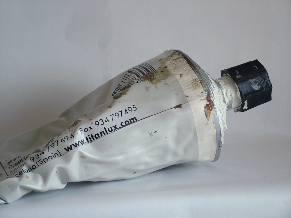
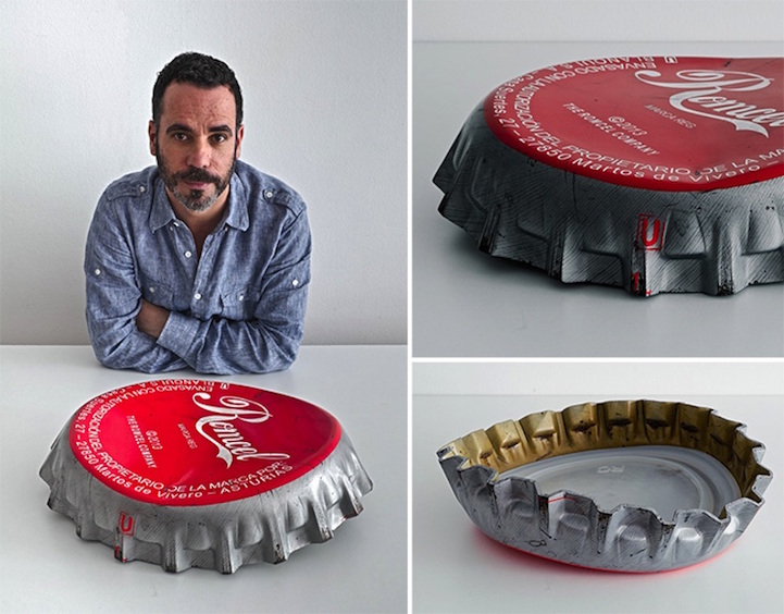
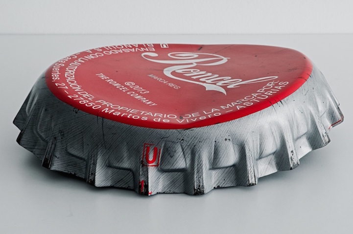
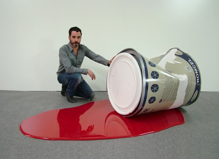
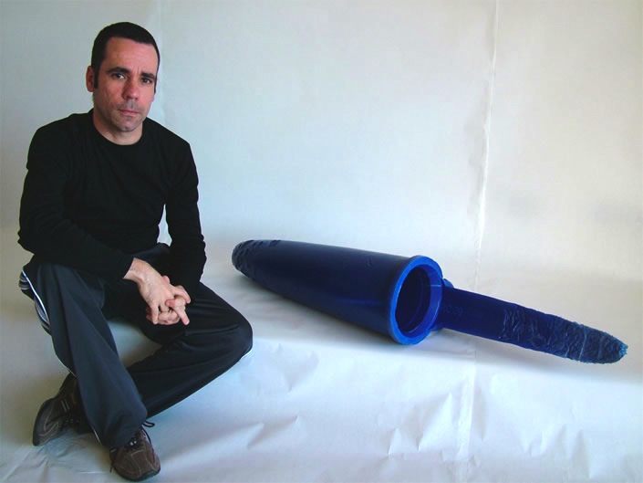
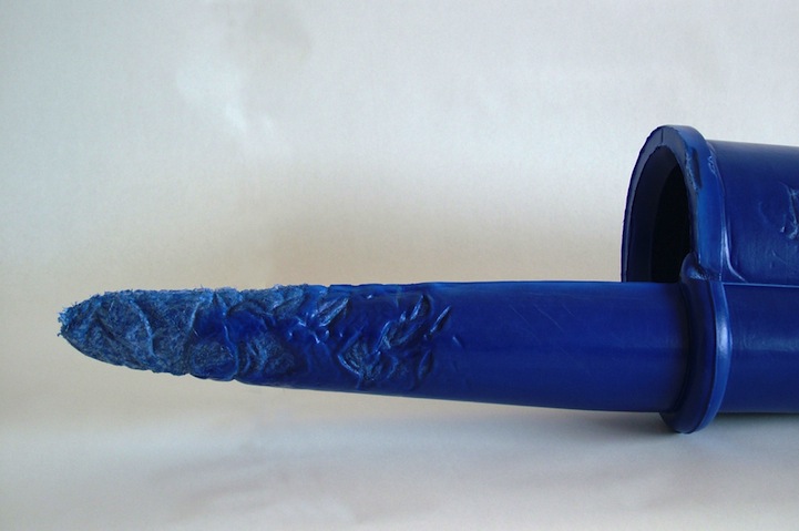
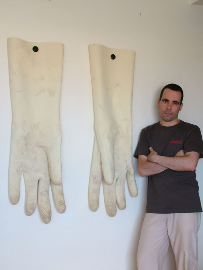
    Looking at the work of Rómulo Celdrán, who makes replicas of everyday objects he interacts with and blows them up. When these everyday objects get to this size, they almost take on a sculptural nature even though they are nearly exact replicas of ordinary objects.
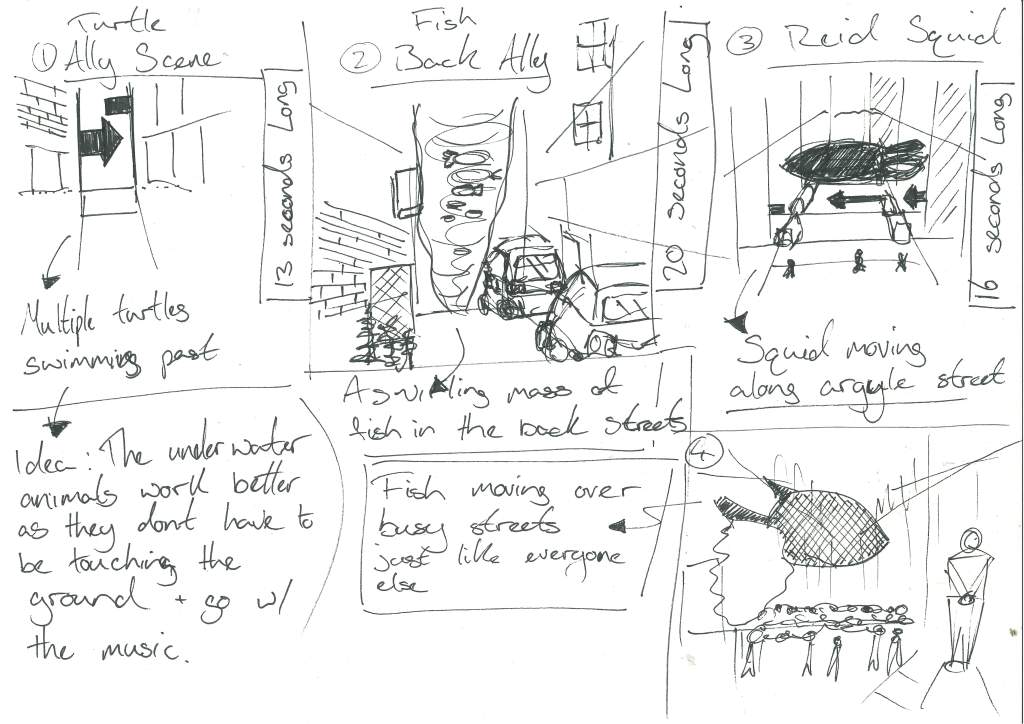
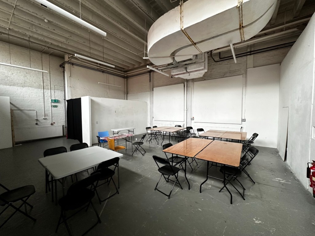
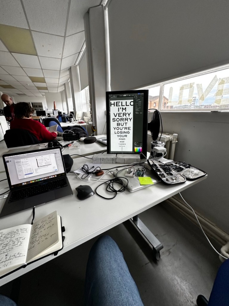
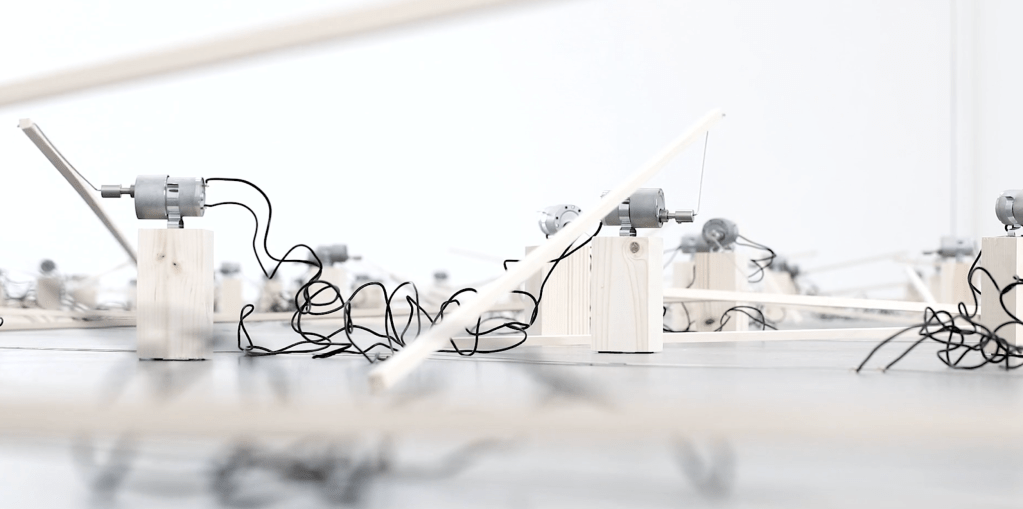
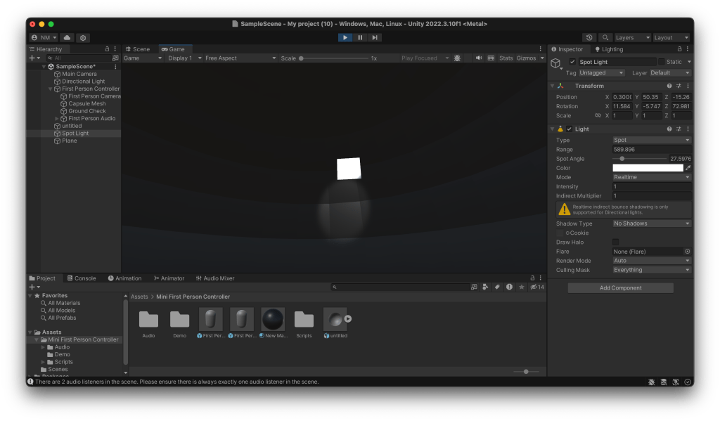
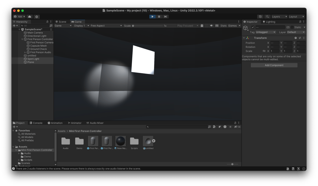
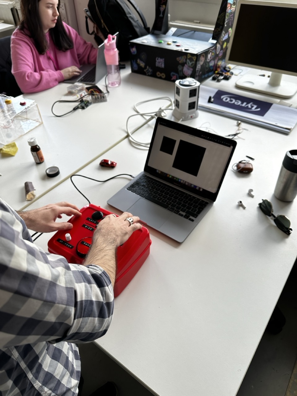
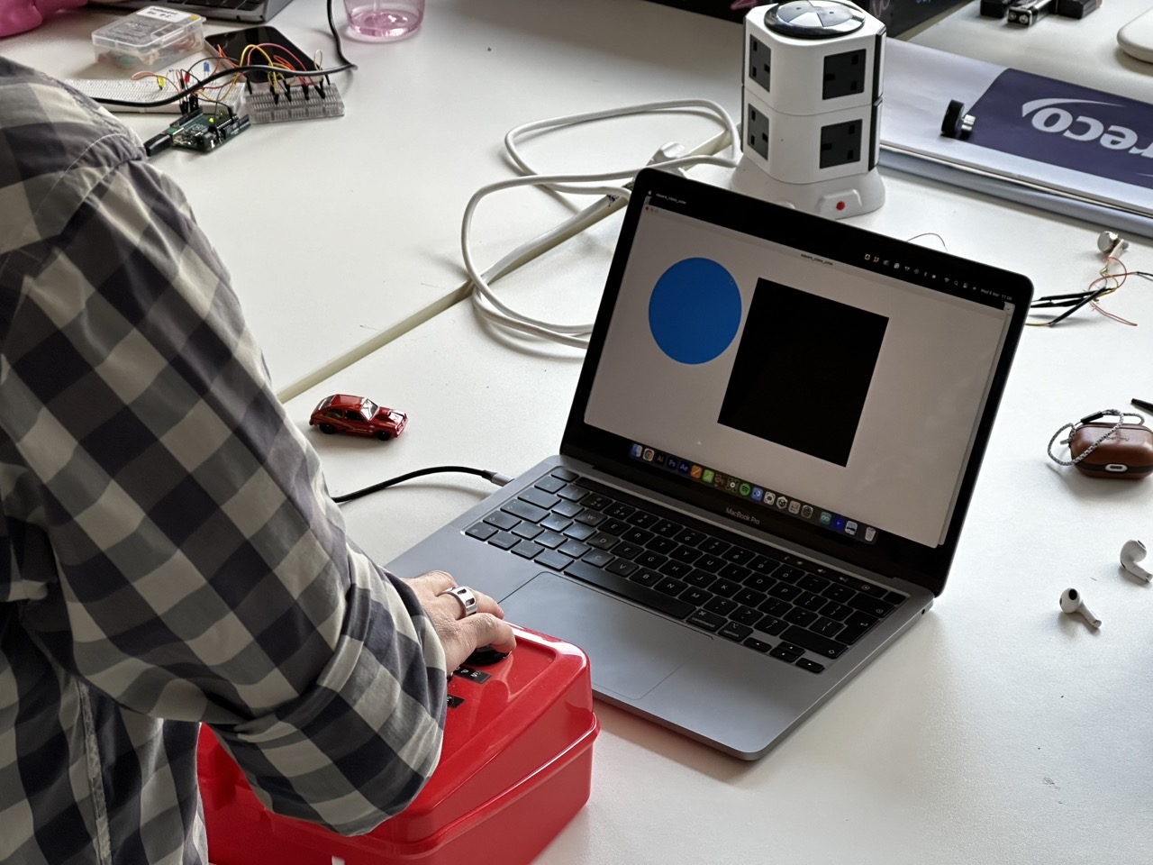
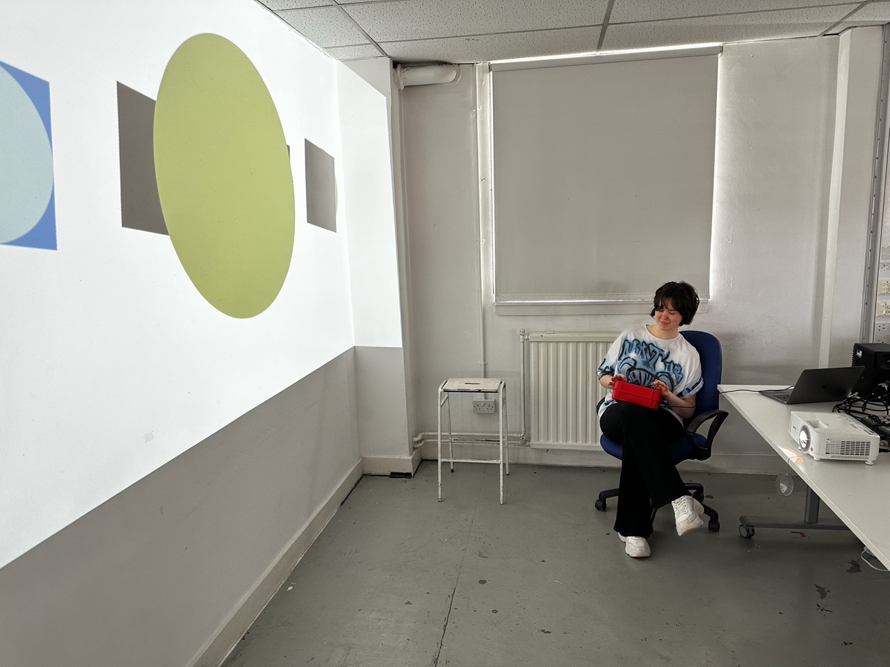
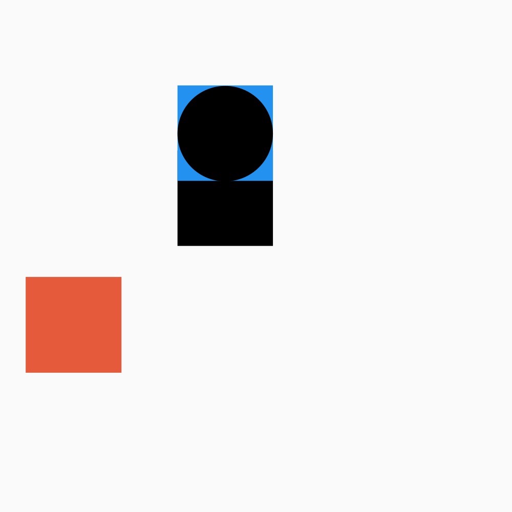
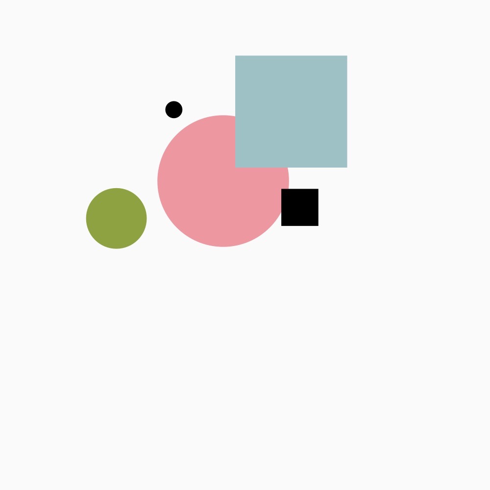
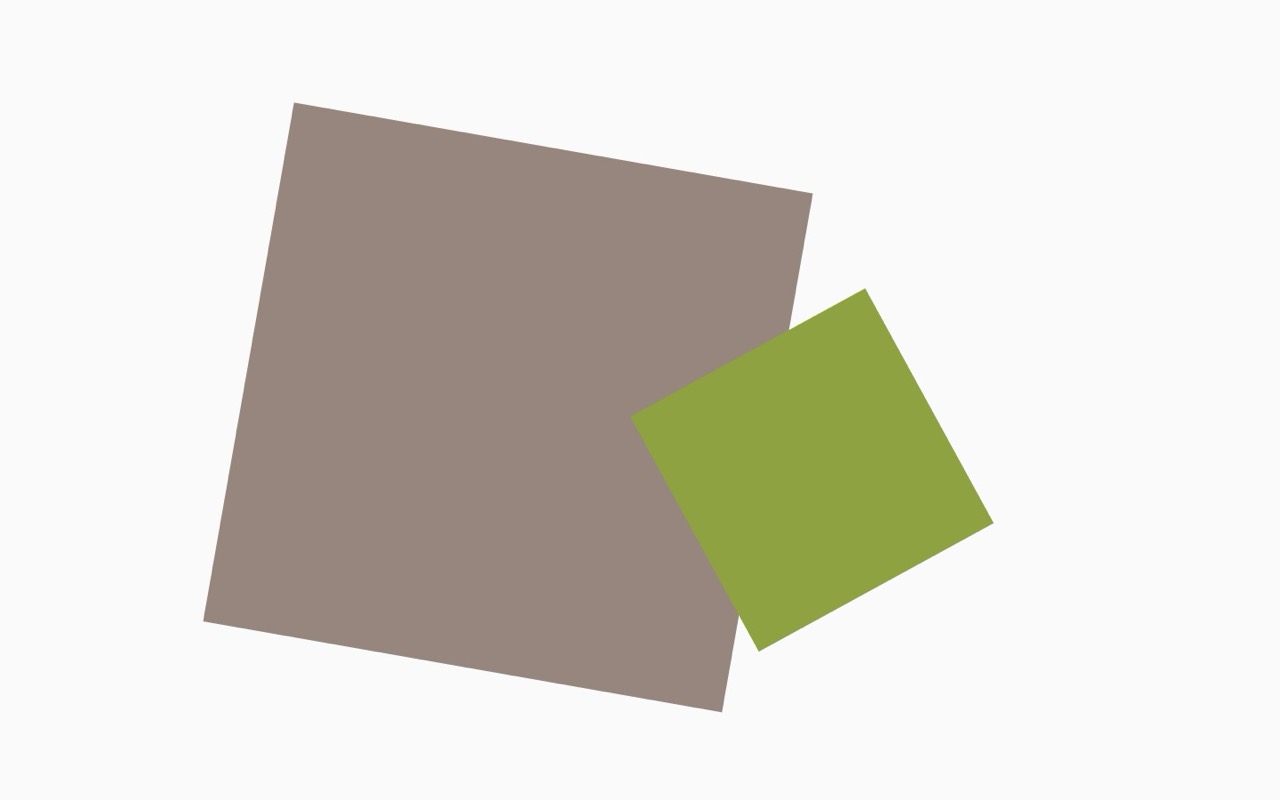
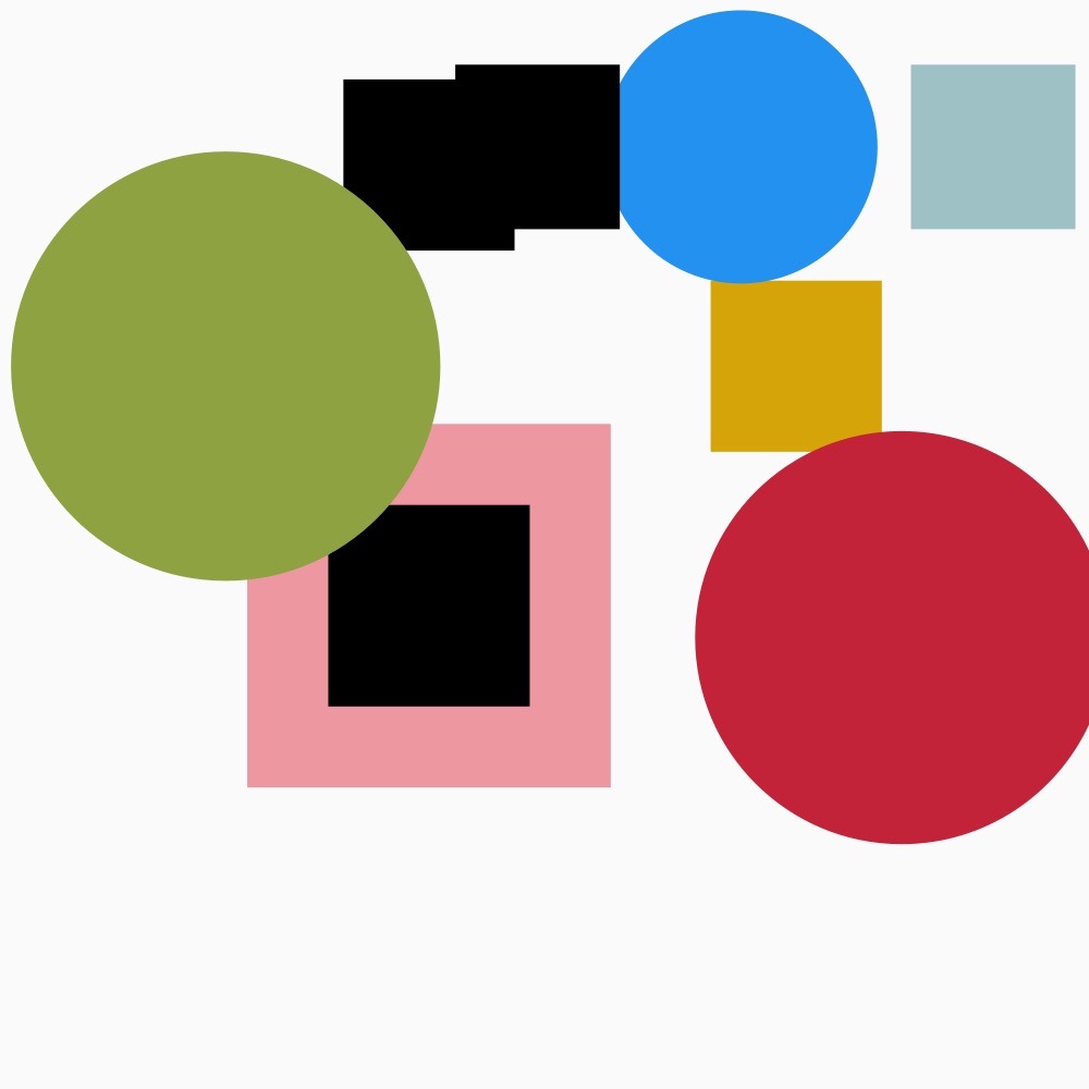
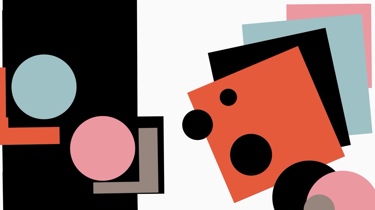
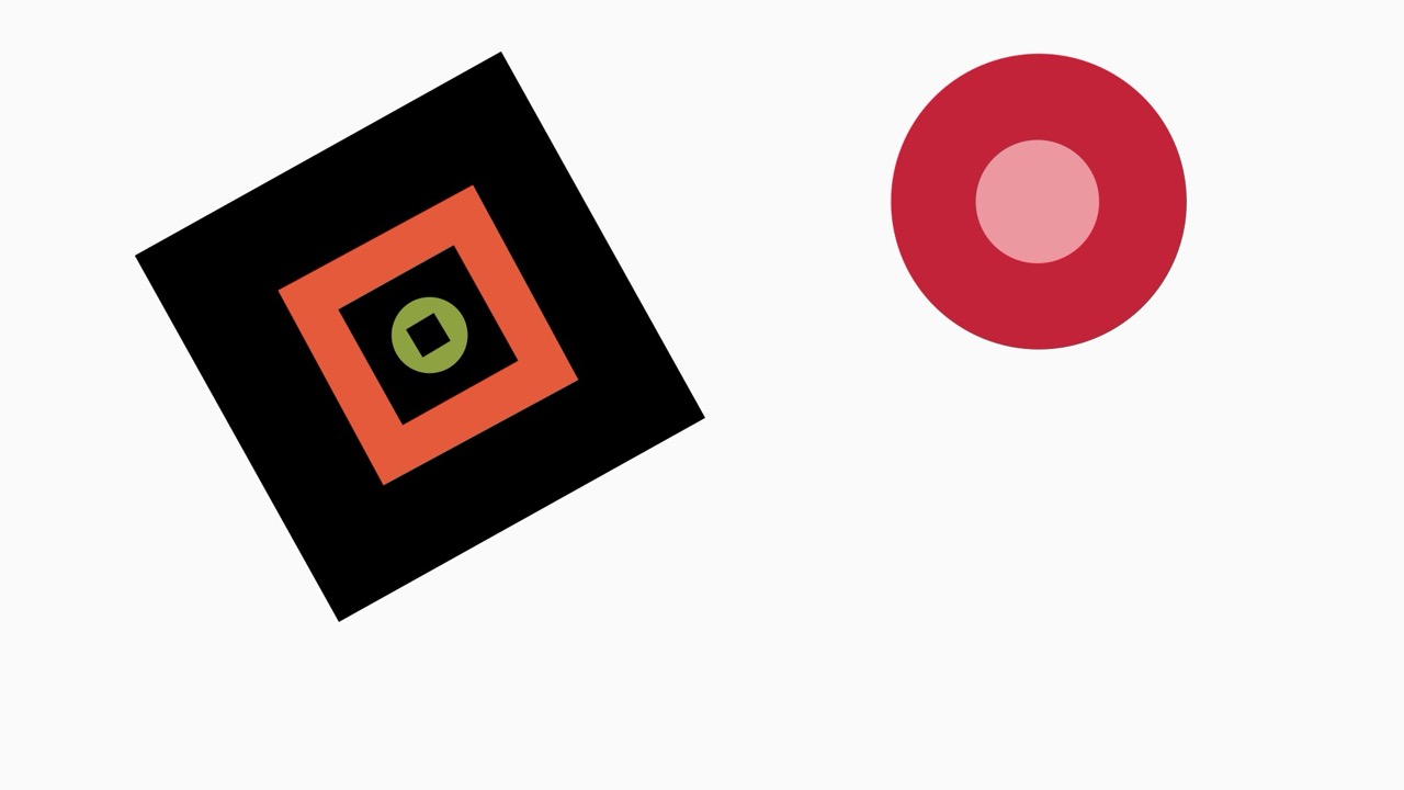
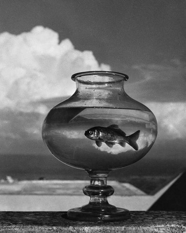
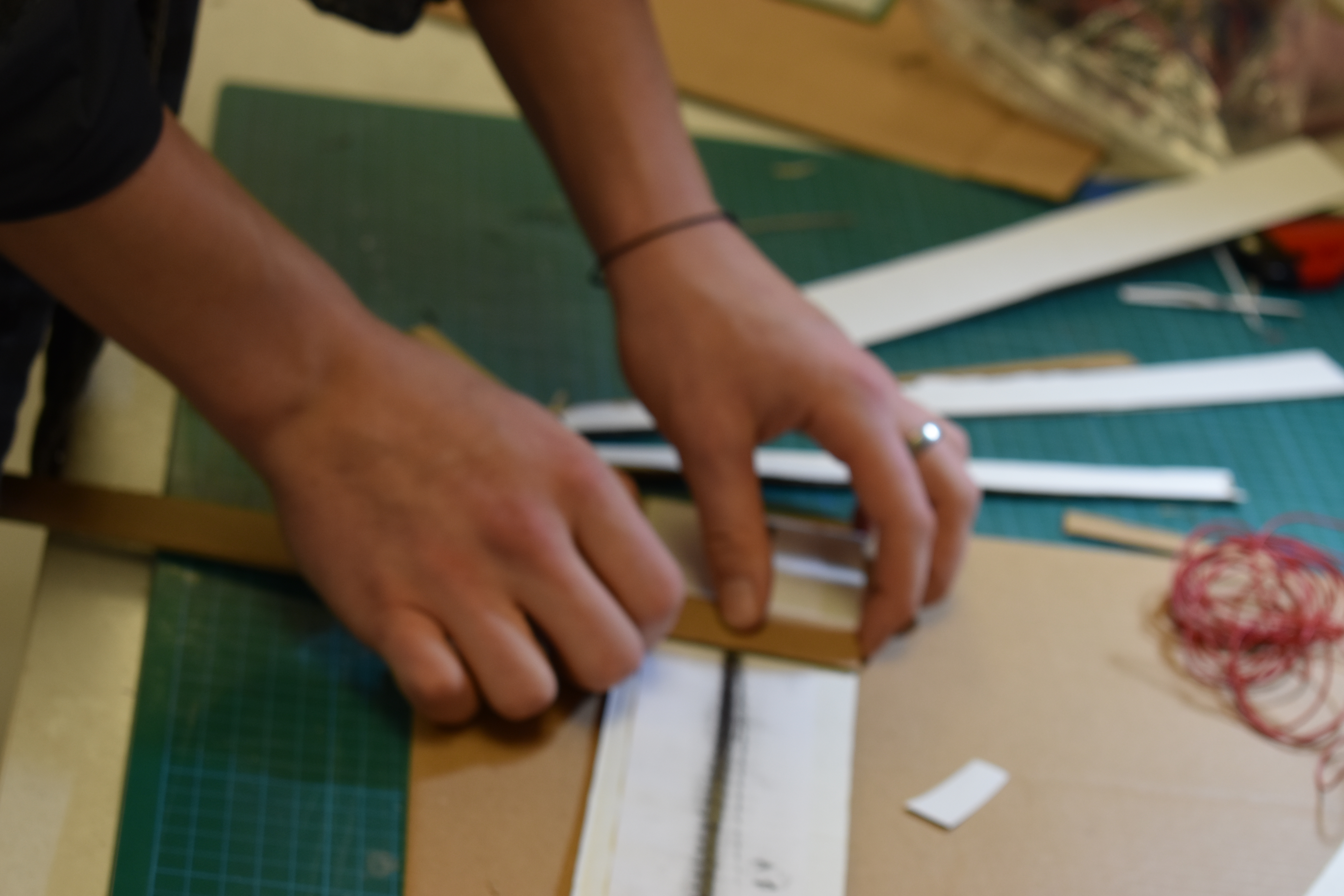
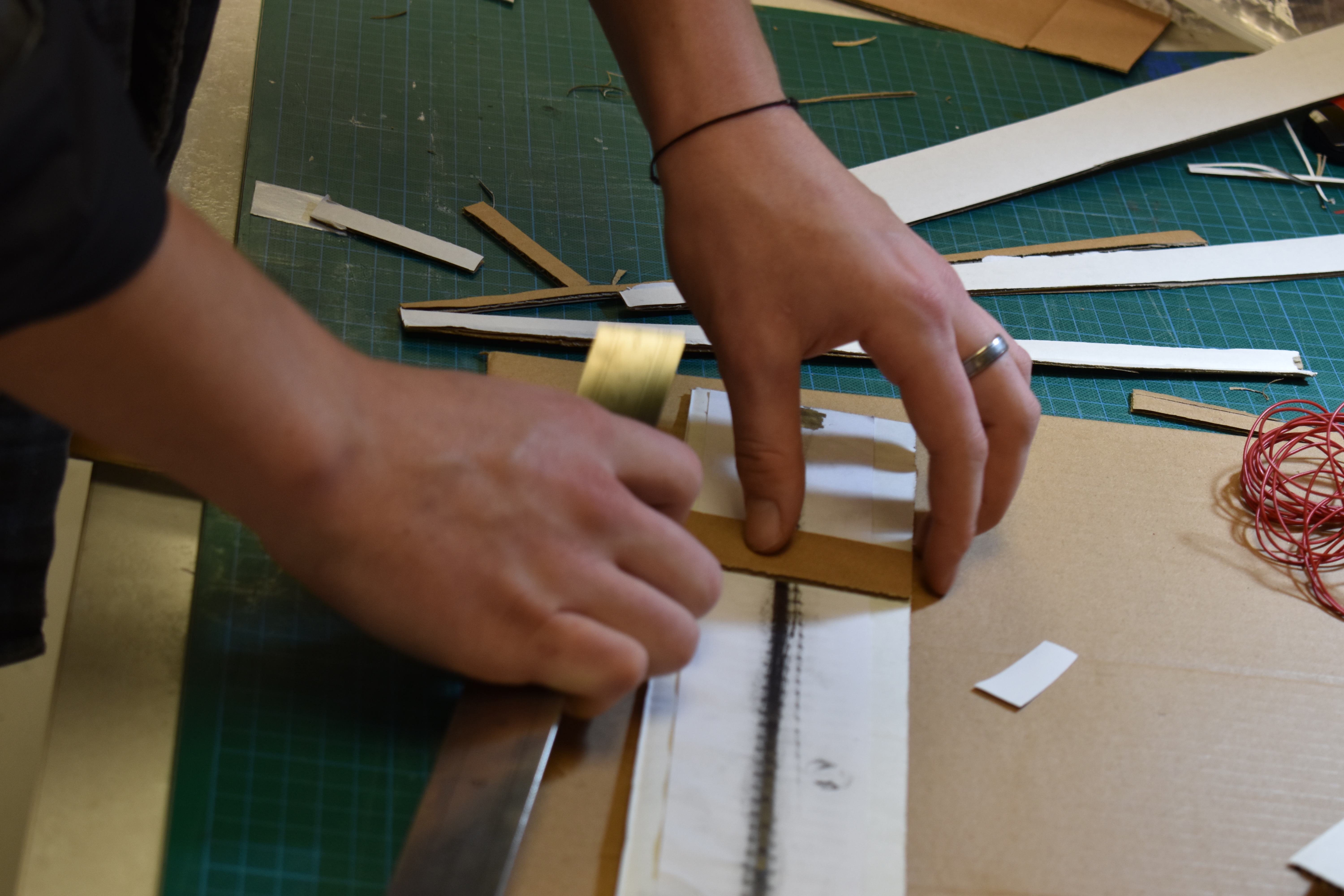
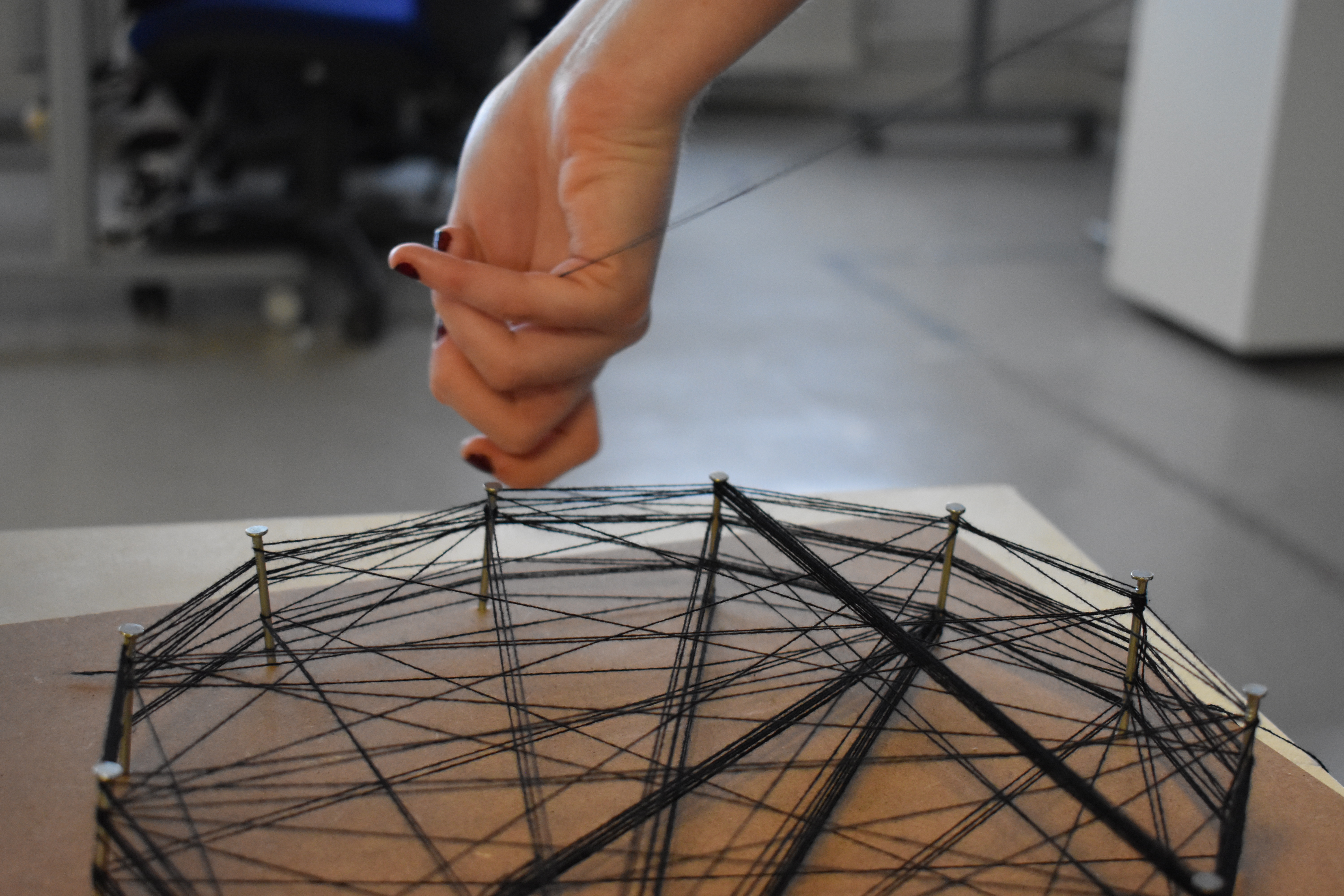
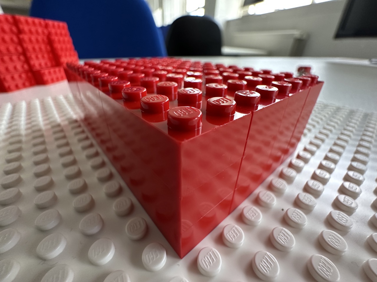
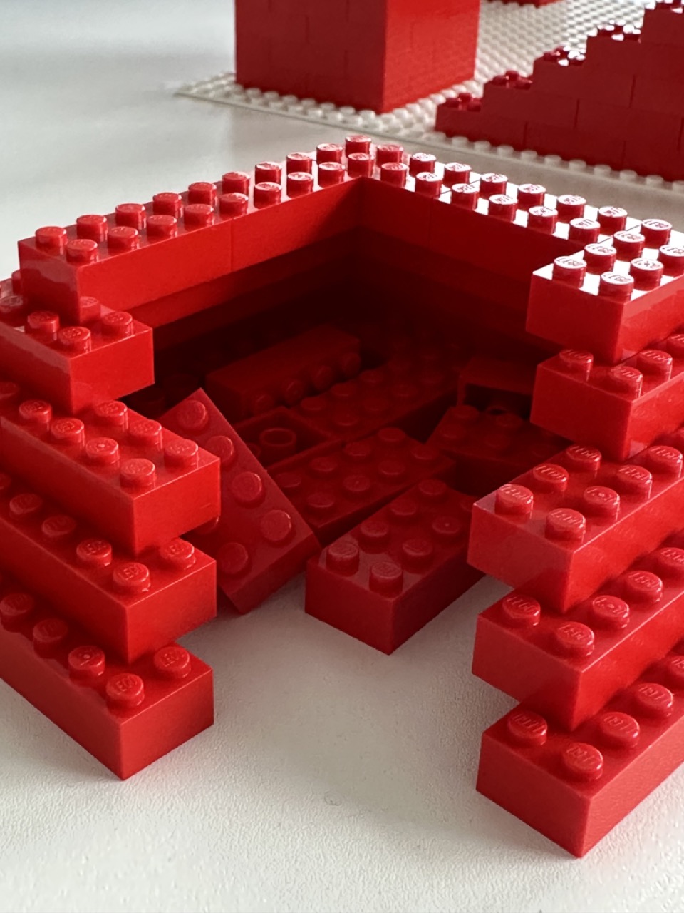
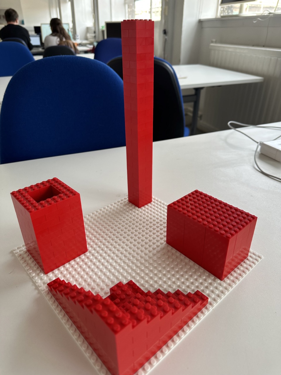
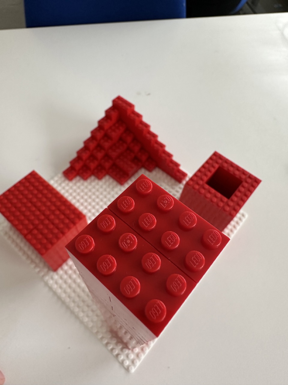
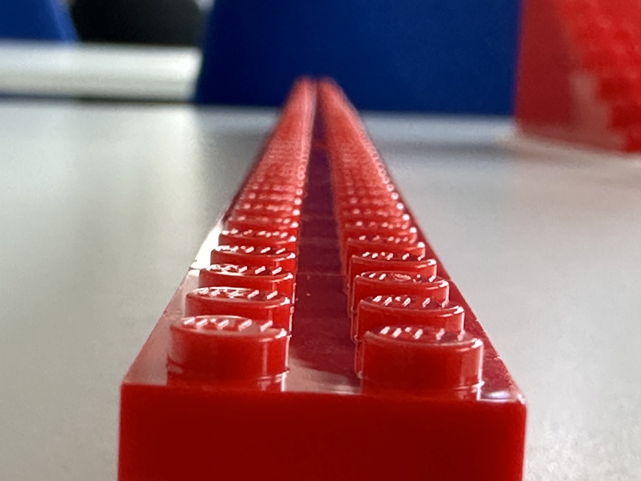
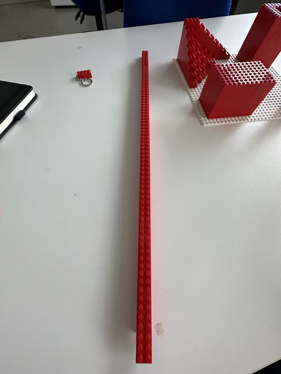
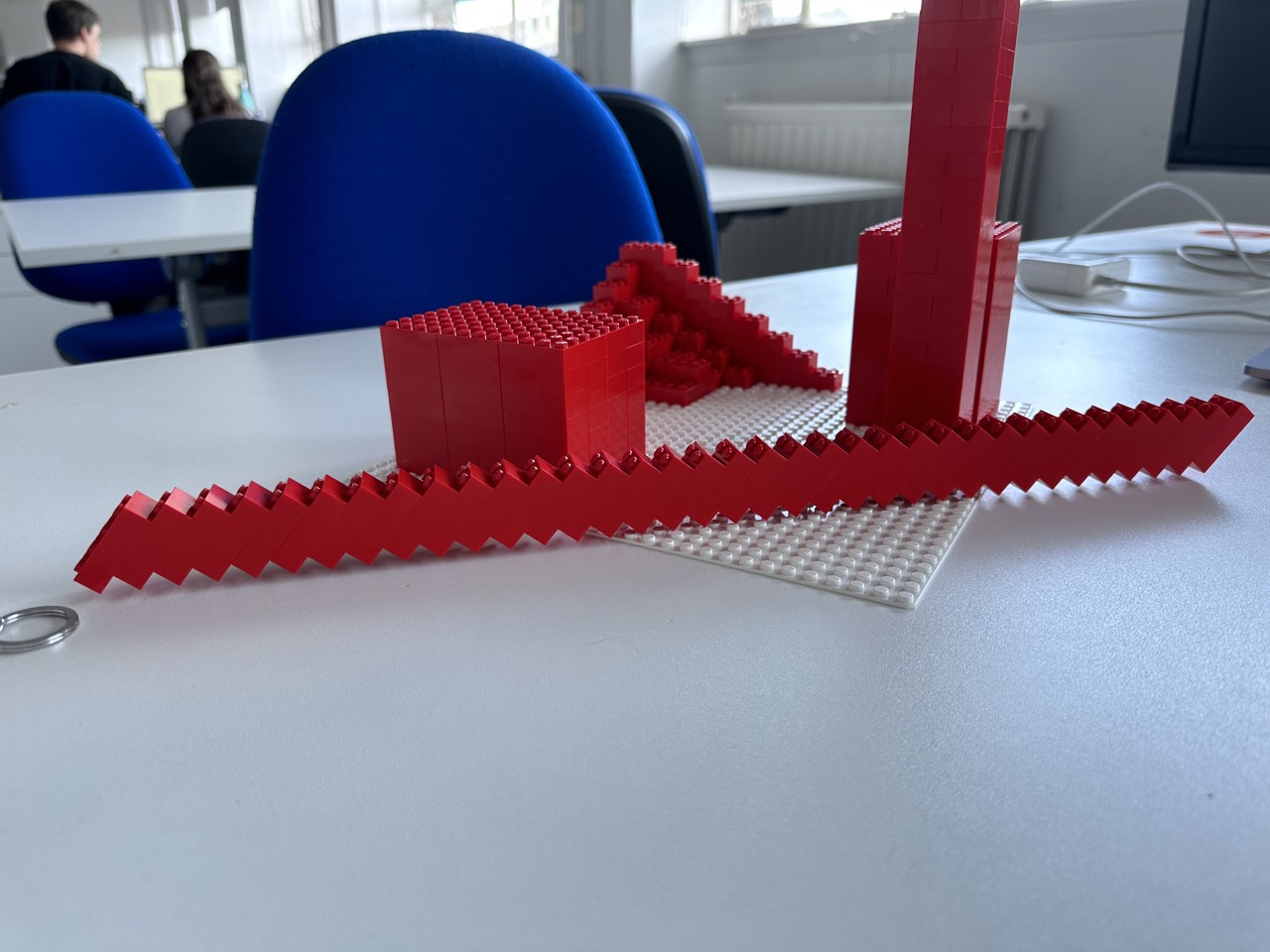
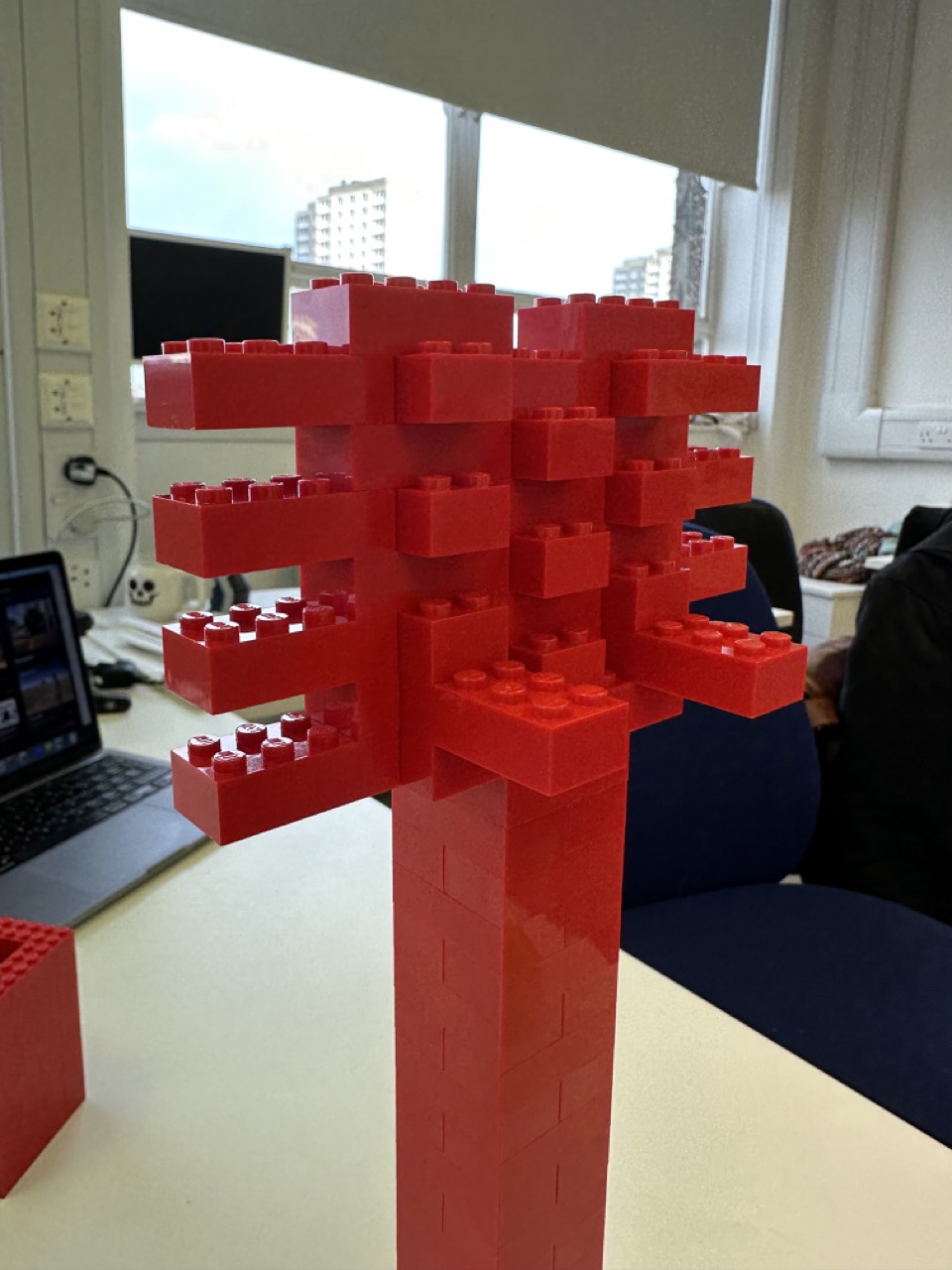
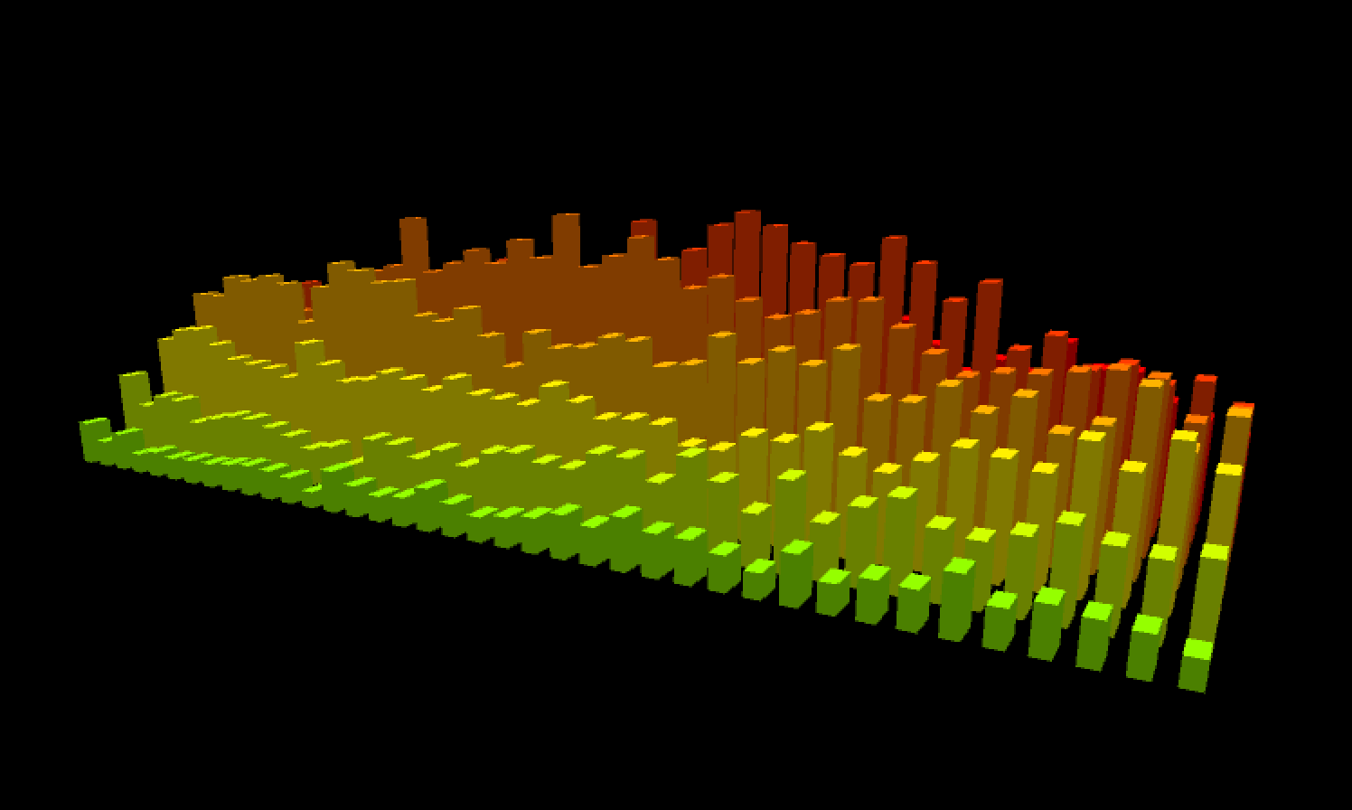
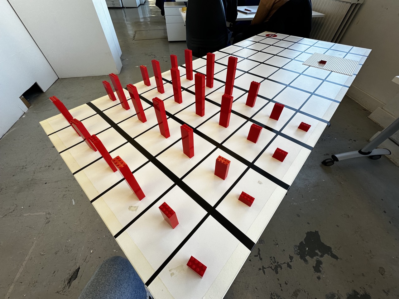
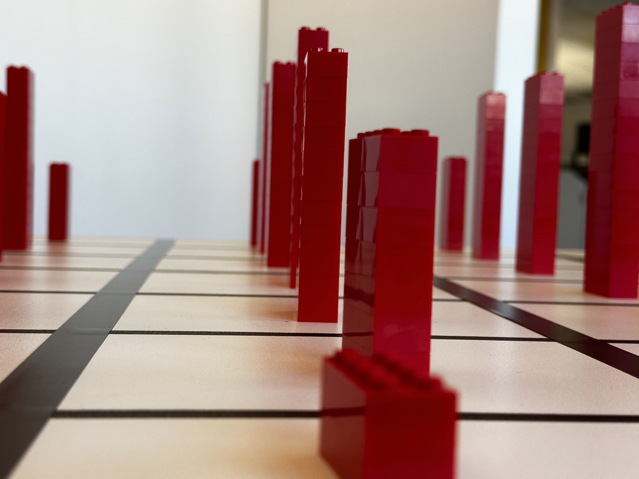
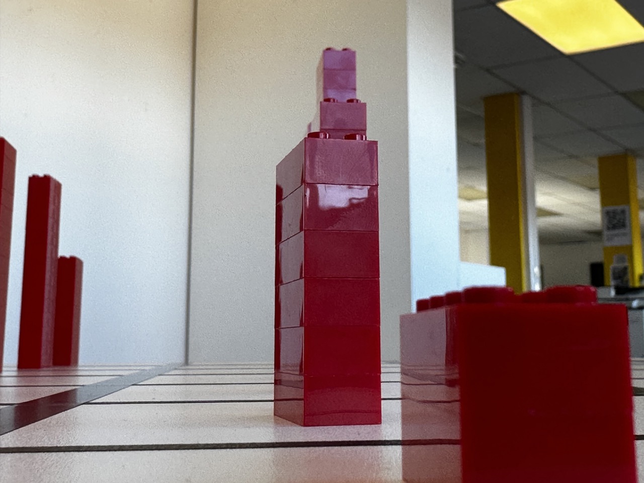
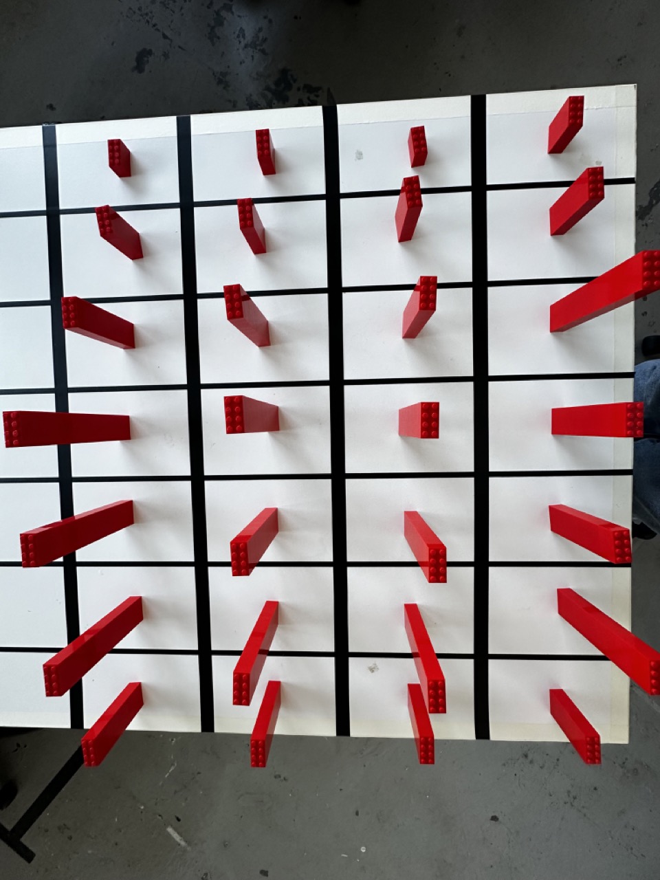
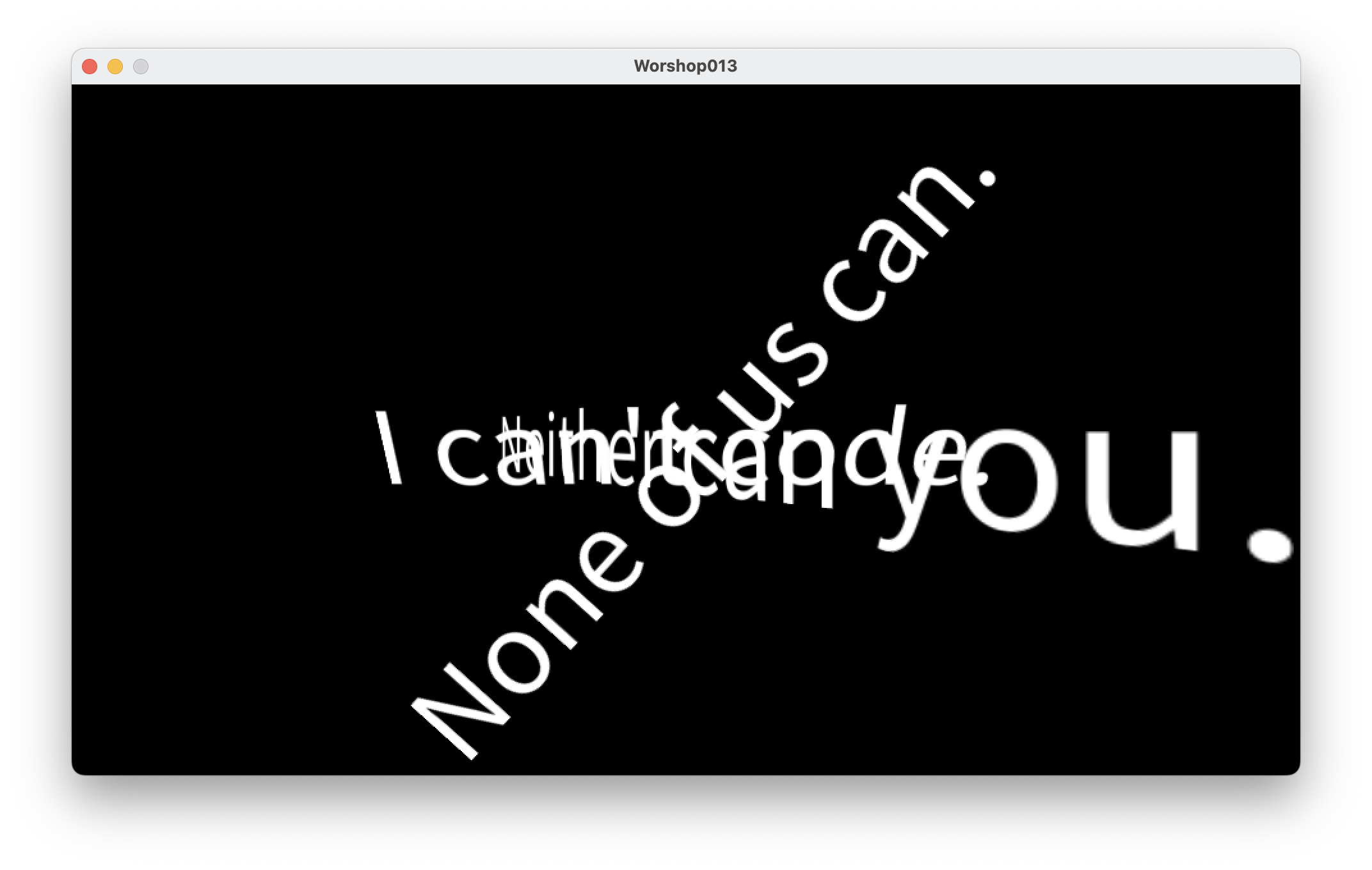
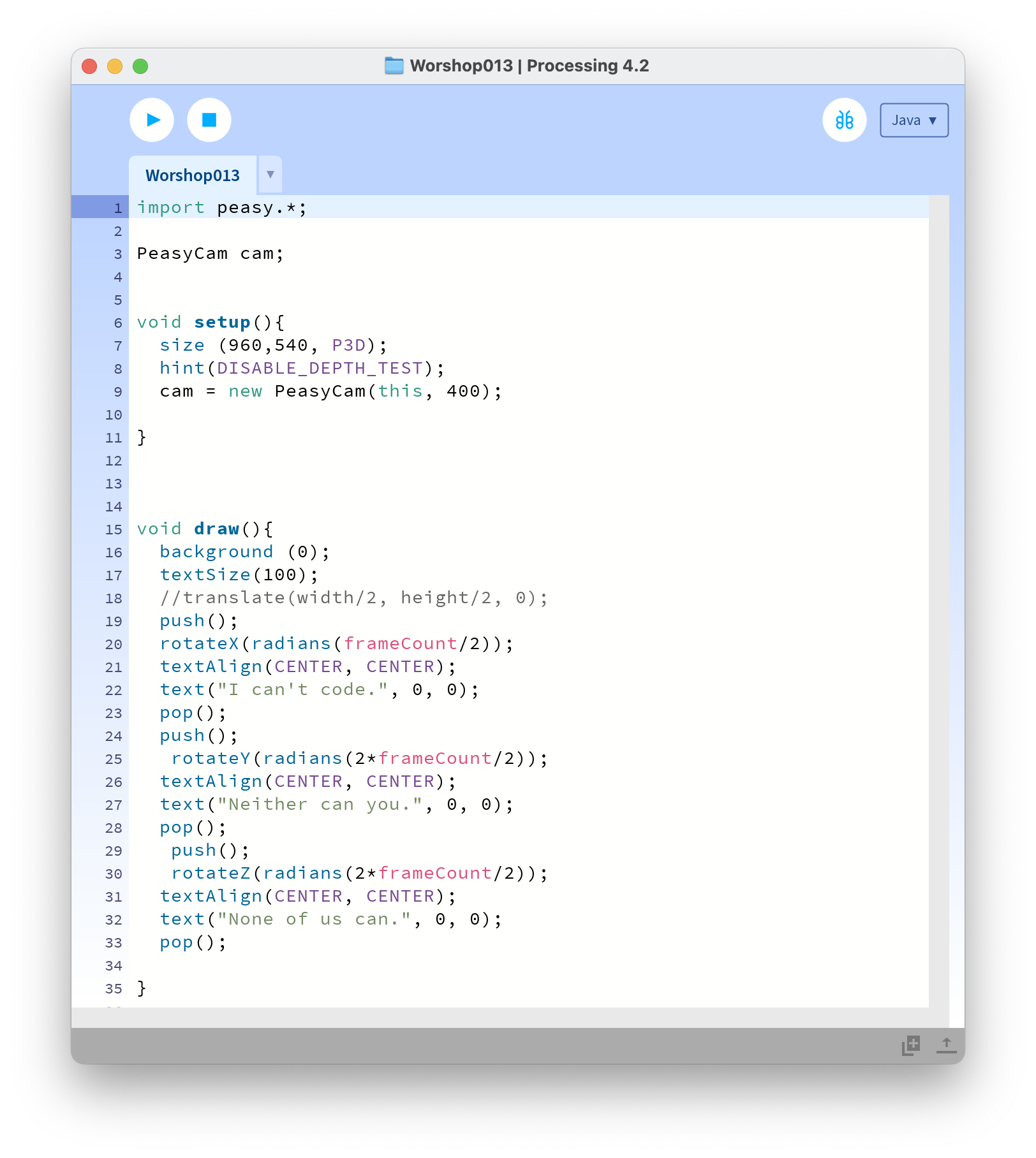
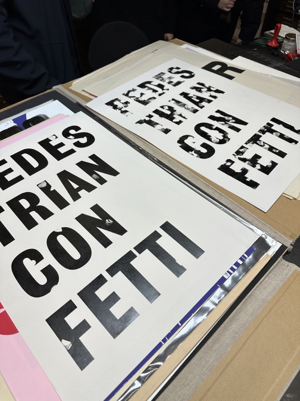
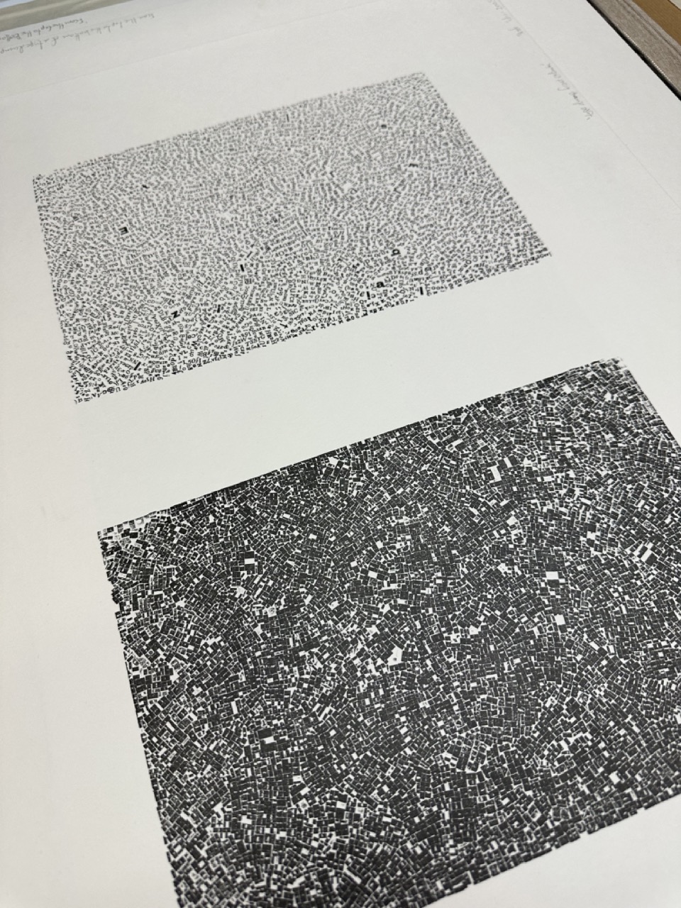
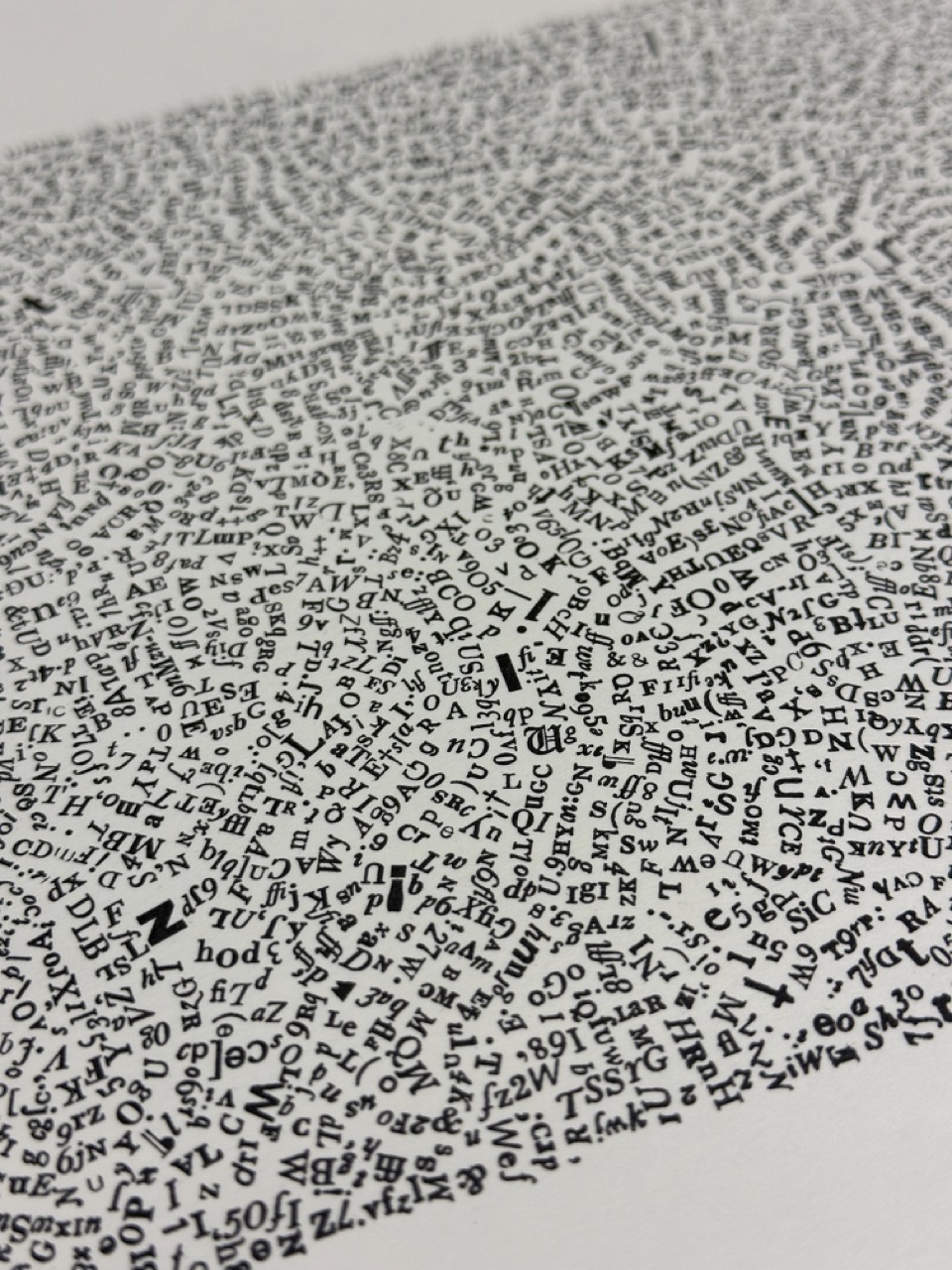
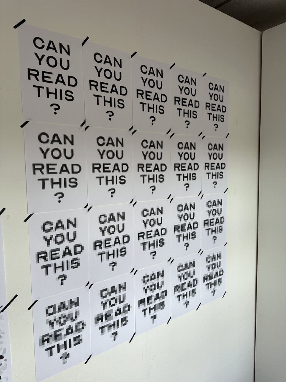
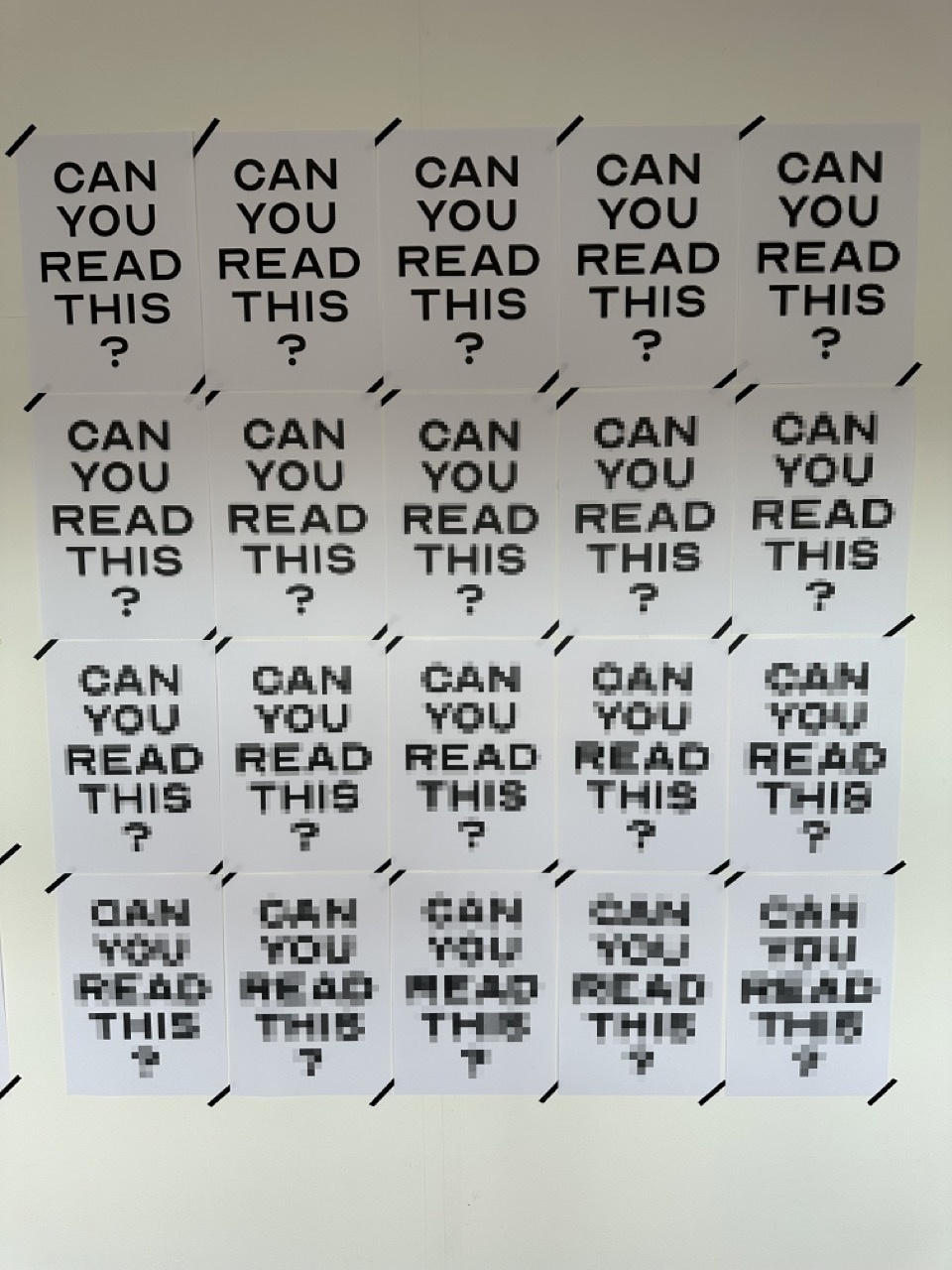
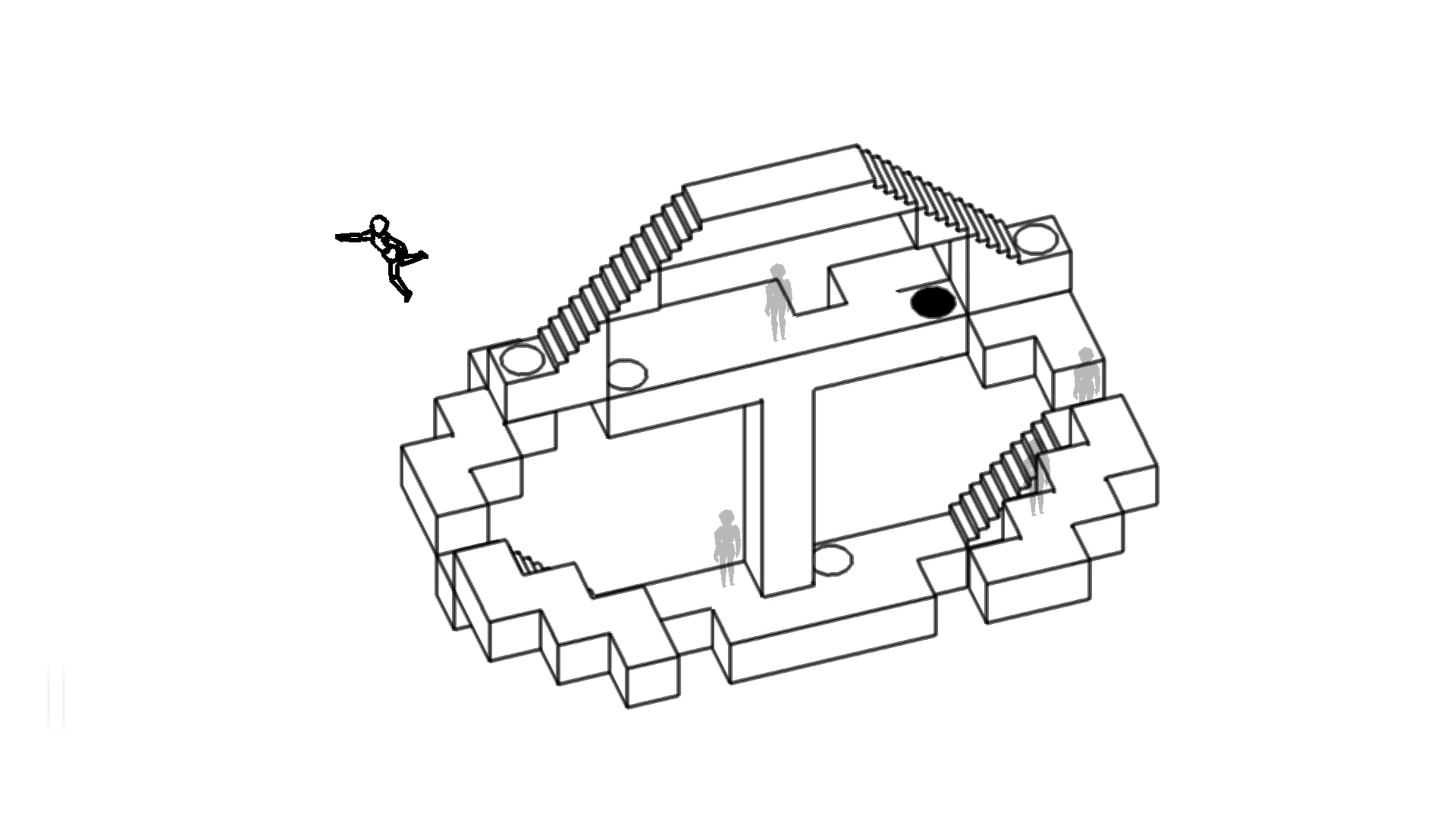
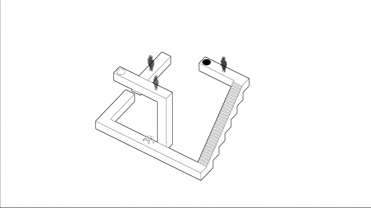
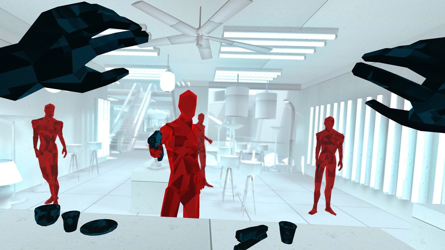
    Proof of Concept :

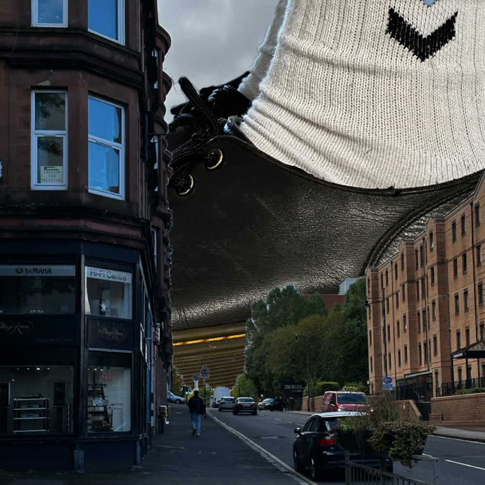
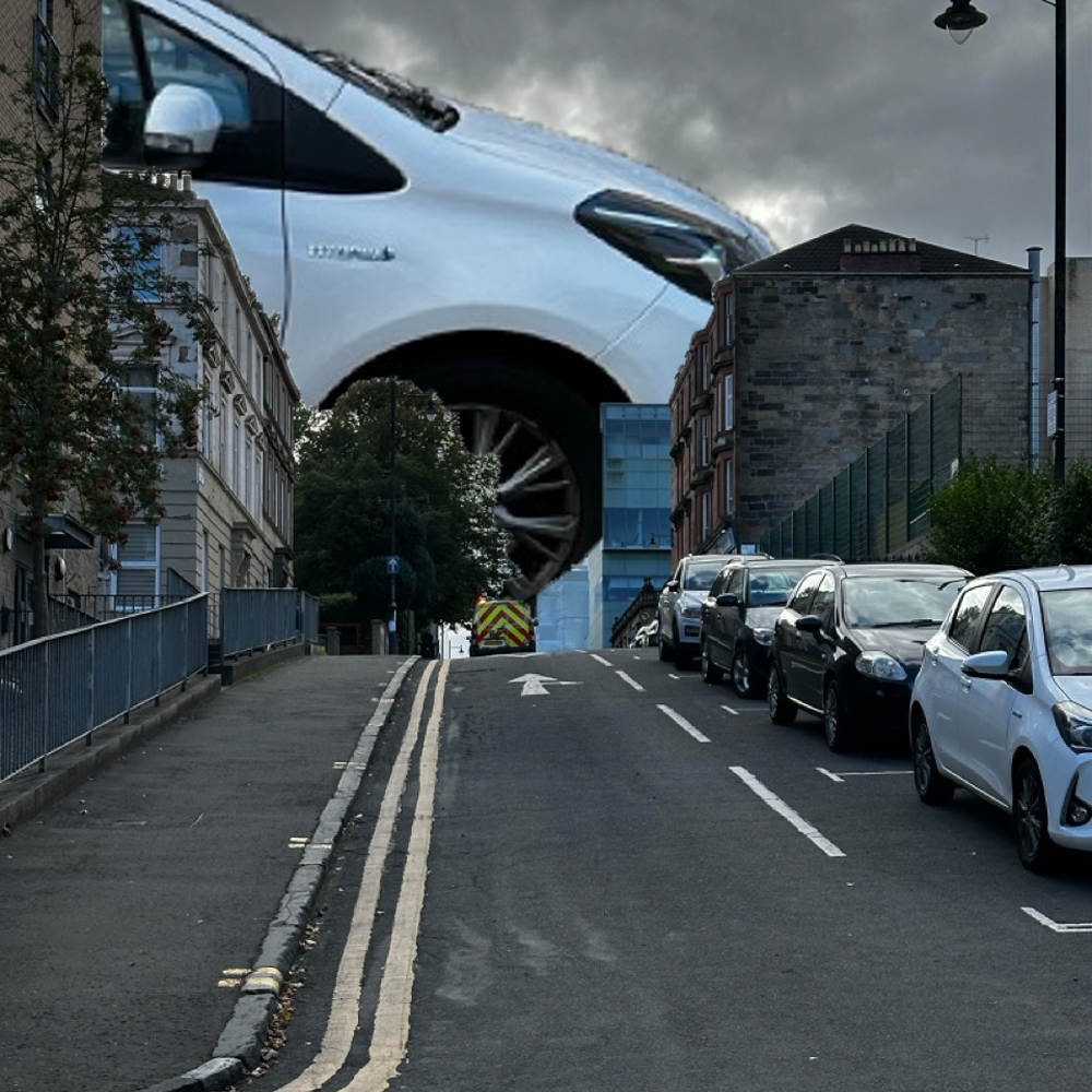
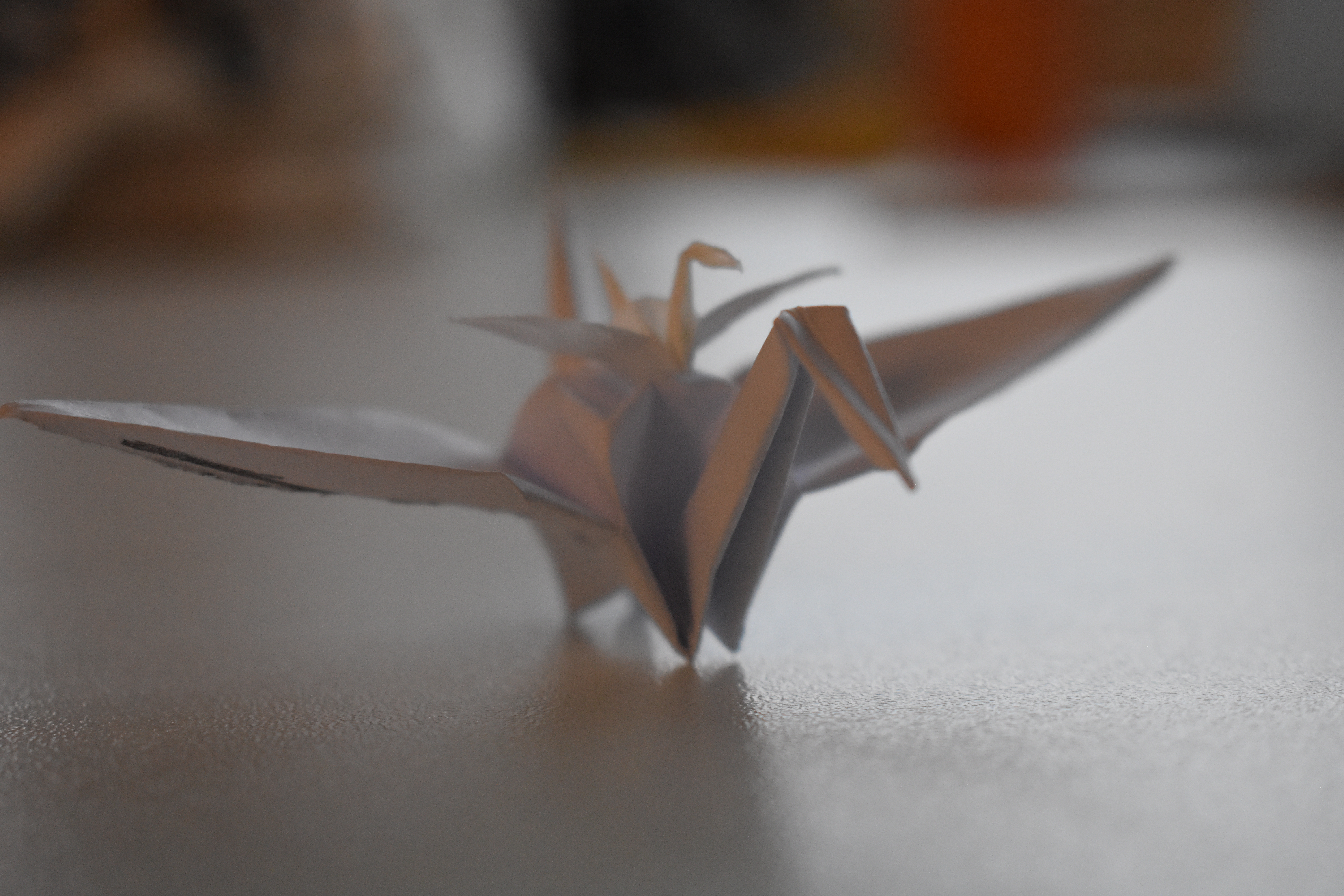
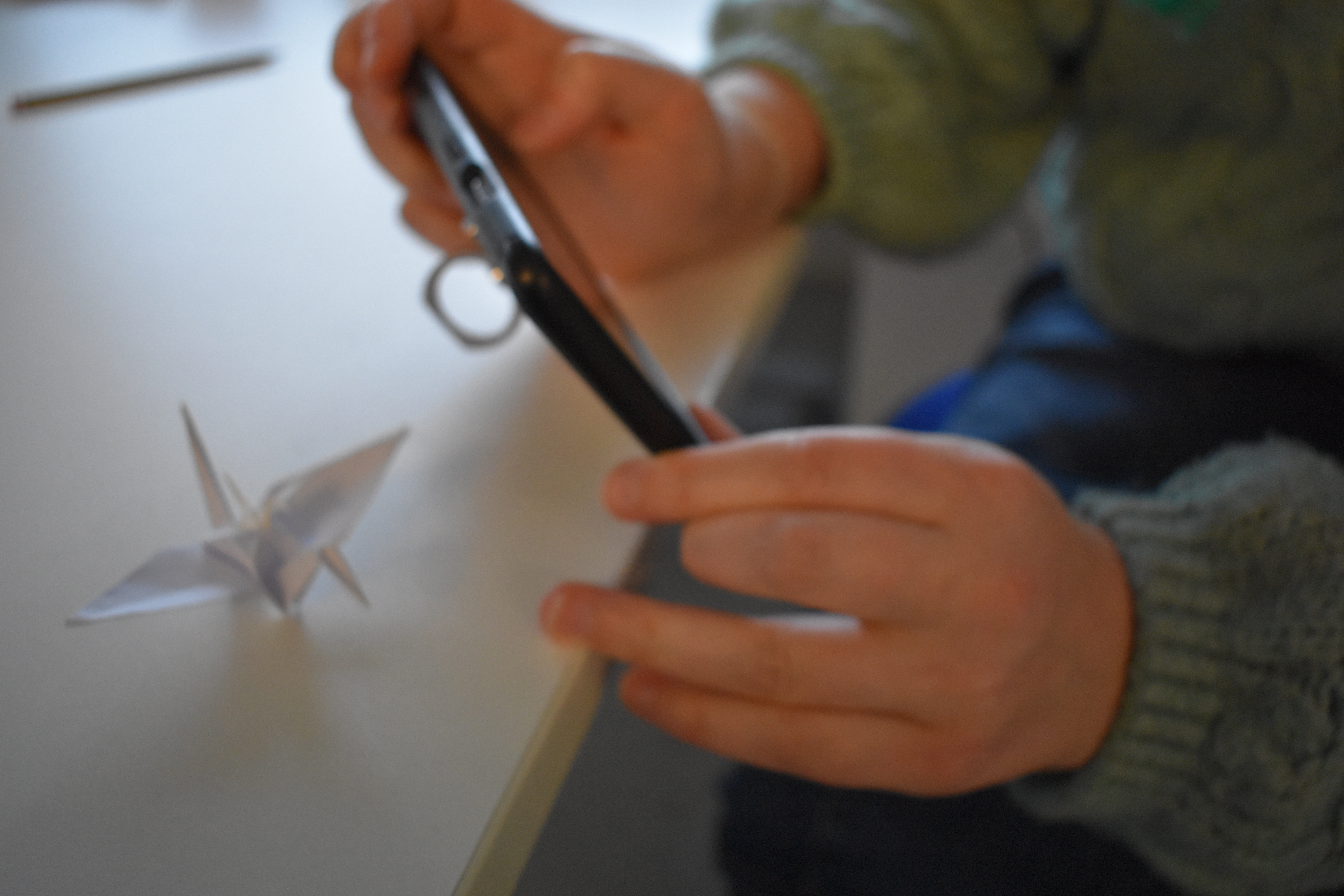
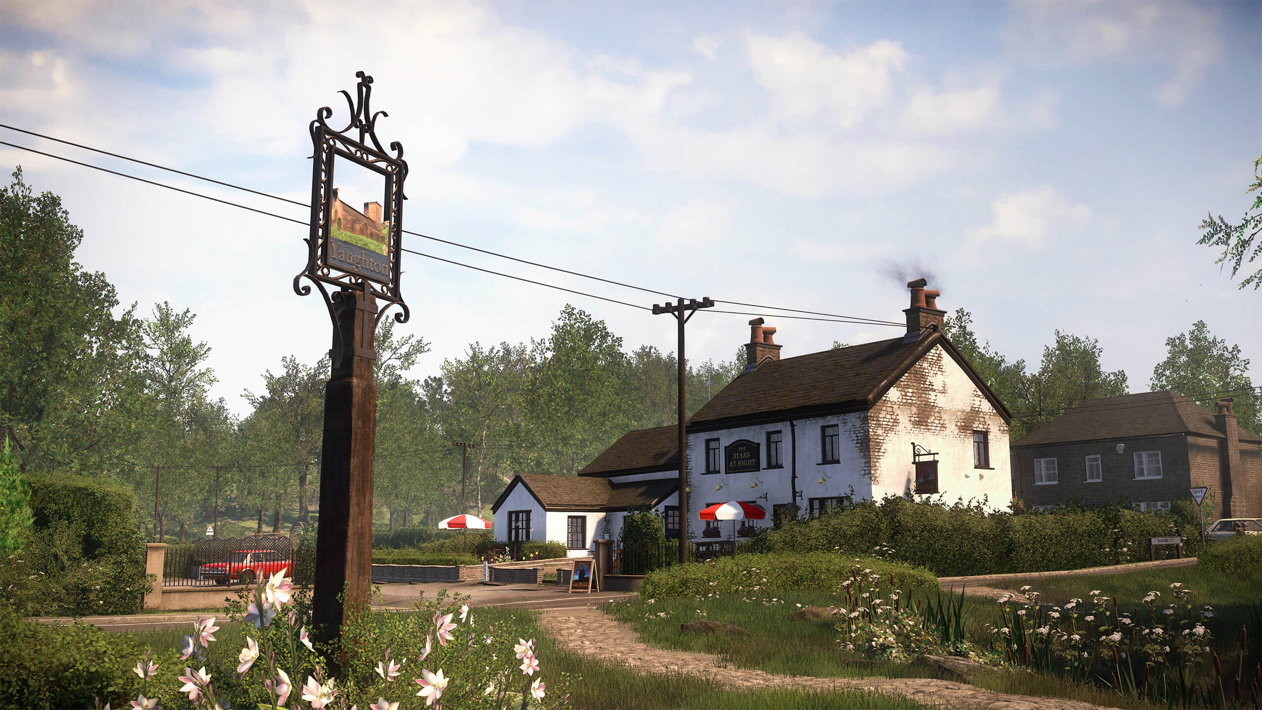
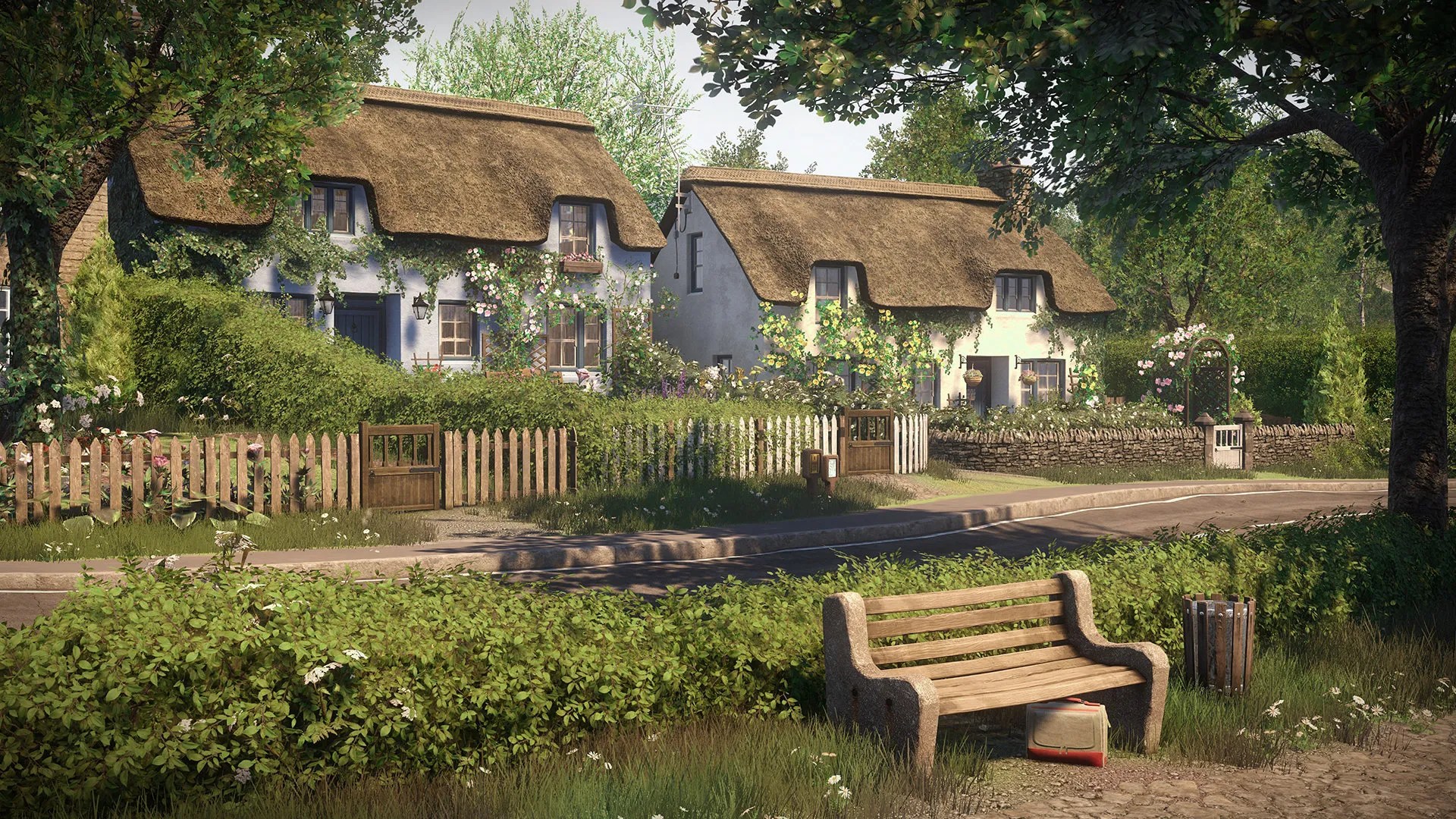
    Above are two quick mock-ups of the concept for the video. I’m just testing out the visuals of how ordinary everyday people and vehicles will look moving around Glasgow.

    From my iPhone :

    Even as I mindlessly scroll through my phone, the algorithm helps me return to work on this project between the reposted TikToks and the Family Guy clips.


    Even in this clip, I can see the joy and wonder these oversized items bring to this creator. I’m sure other attendees at the con share this excitement.

    Points to focus on :

    After the proof of concept tests there is a number of things that I’ve noticed :

    The size might need to be smaller to create a meaningful space for the larger object to work within. If they are too big, they’ll be in and out of frame in a second, so if they are smaller, the viewer will have more of a chance to see them and enjoy the juxtaposition of small to big.

    Does there have to be a narrative of the minute video? If so, what is the narrative of that video? An insert character for the audience to relate to that is the only person in Glasgow noticing all the weird stuff happening along with them?
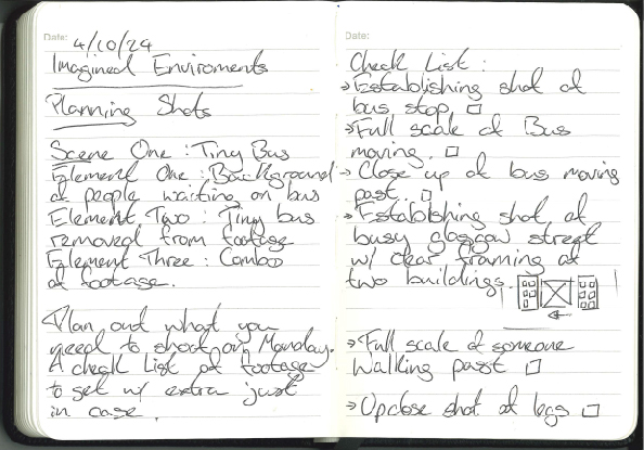
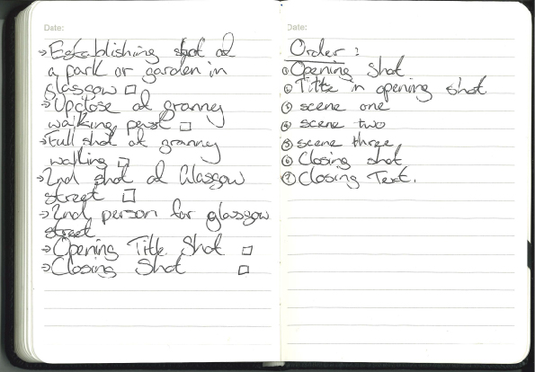
    If I plan to shoot correctly, I can complete all the shooting in one day and then use the rest of the time to work on my After Effects skills and make the footage believable.

    To Do List :

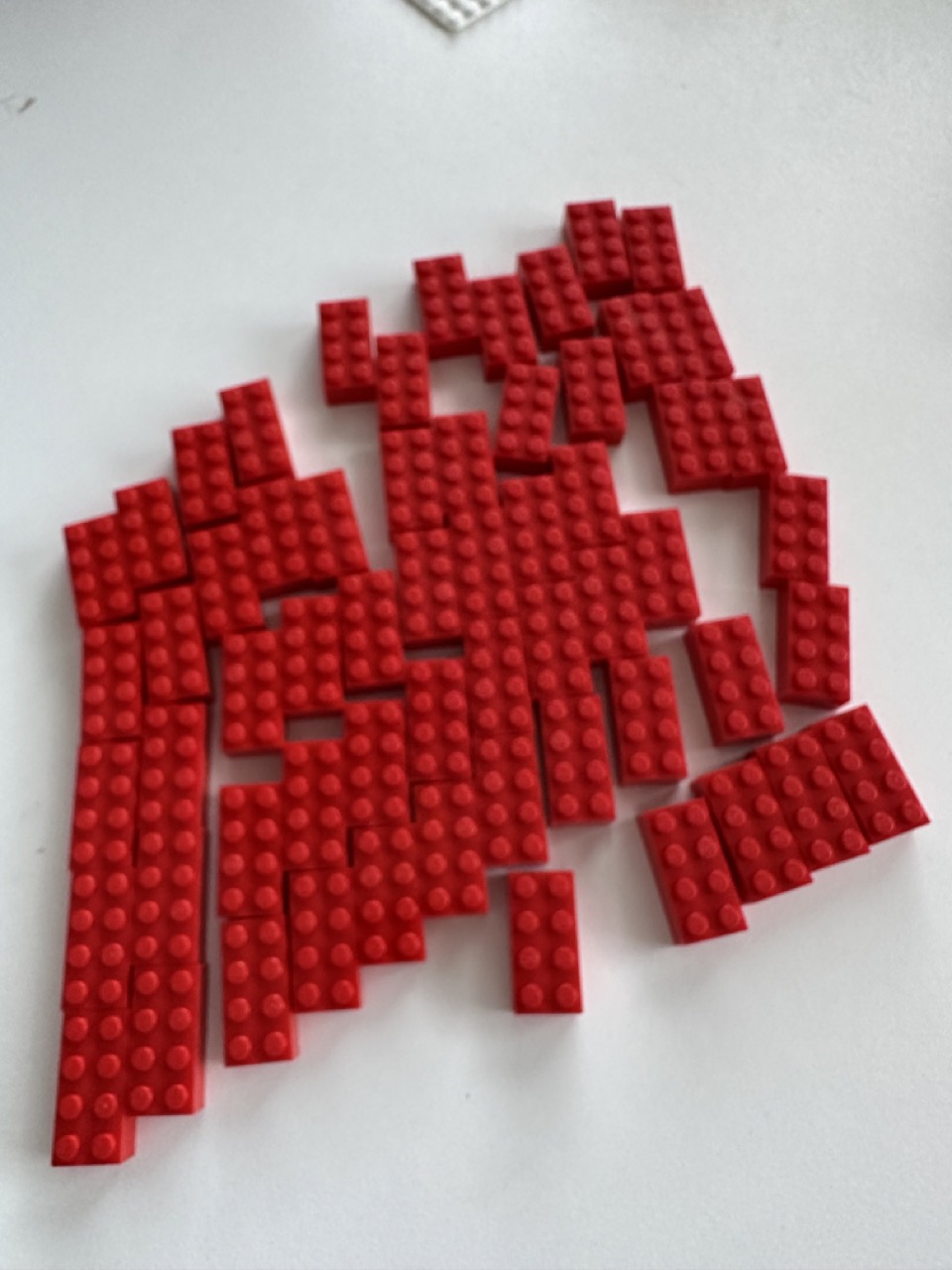
    Select 3 different elements from 3 different sources and combine to make a new composite, i.e. a background, a moving object (realistic or 3d model) and a human element.

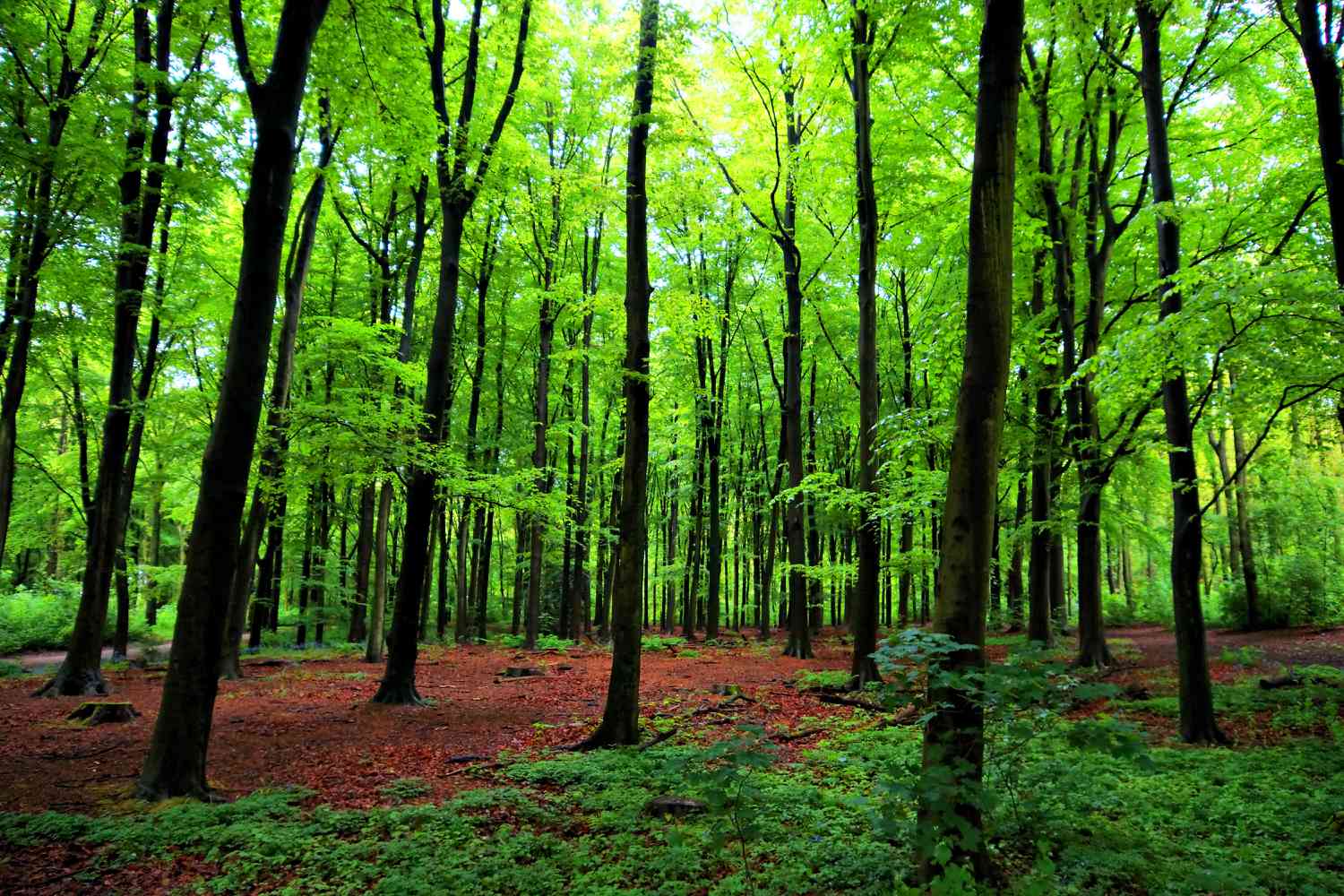
    • background of Glasgow
    • moving objects (realistic) being the people and vehicles of Glasgow
    • the human element of the people of Glasgow shown in the video

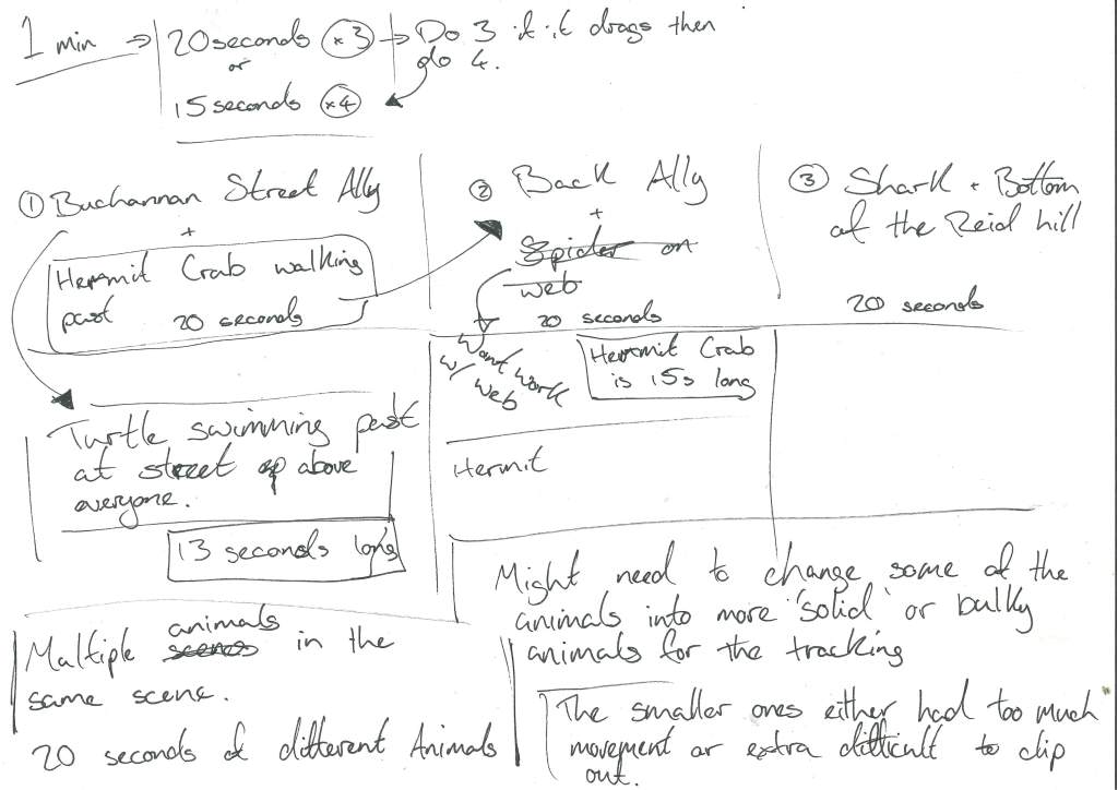
    1 minute long duration minimum. For the duration of 1 minute, I can break it up into 2 ways :

    • I can have 3 scenes of the city and a different element is changed in each scene which gives me 20 seconds each scene
    • Or I have have 4 different locations from around of Glasgow that will break it down to 15 seconds per scene.

    Allowing a couple of seconds at the start and end of the video for a fade in and fade out with a title.

    What do I need to shoot ? :

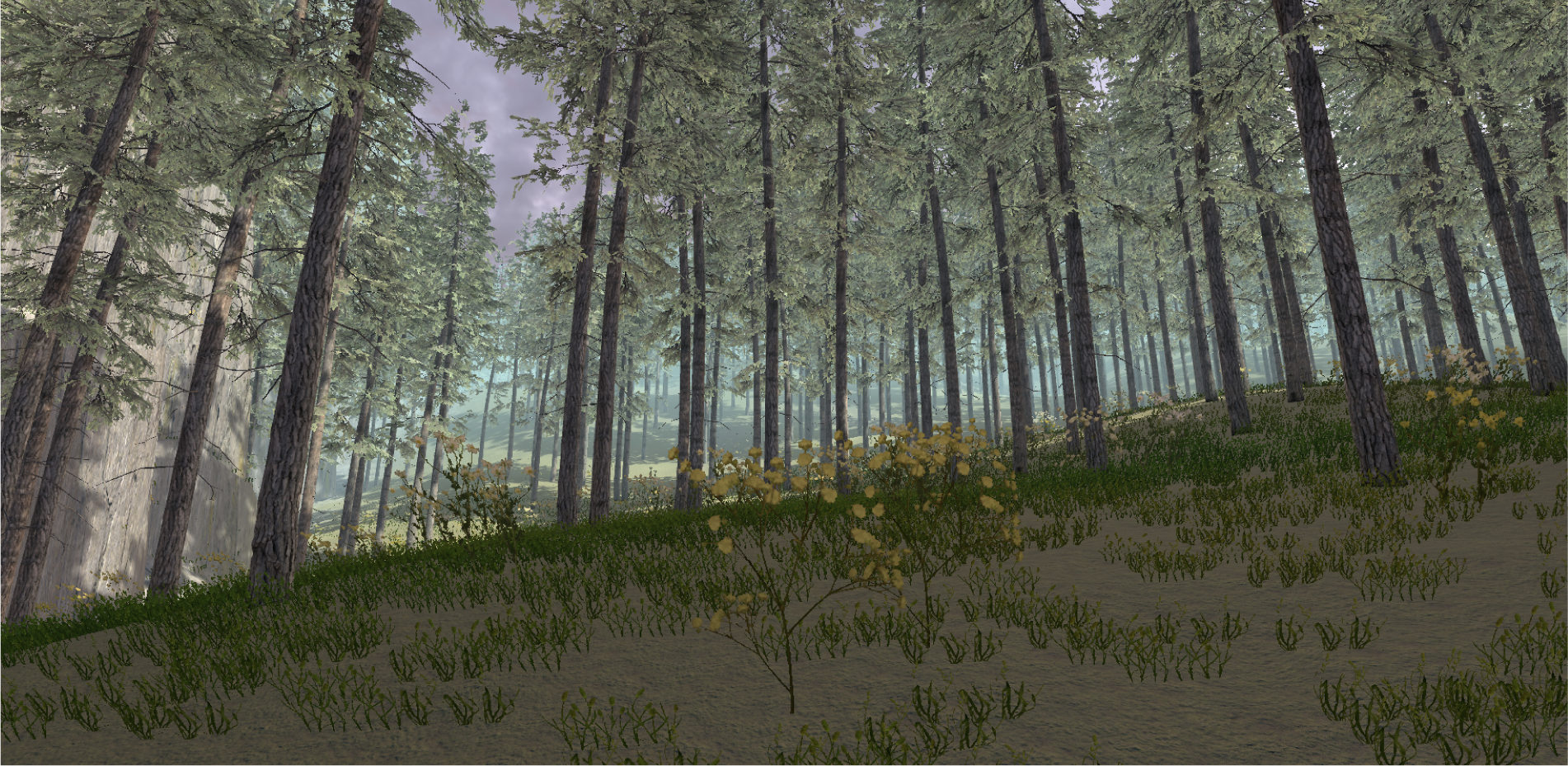
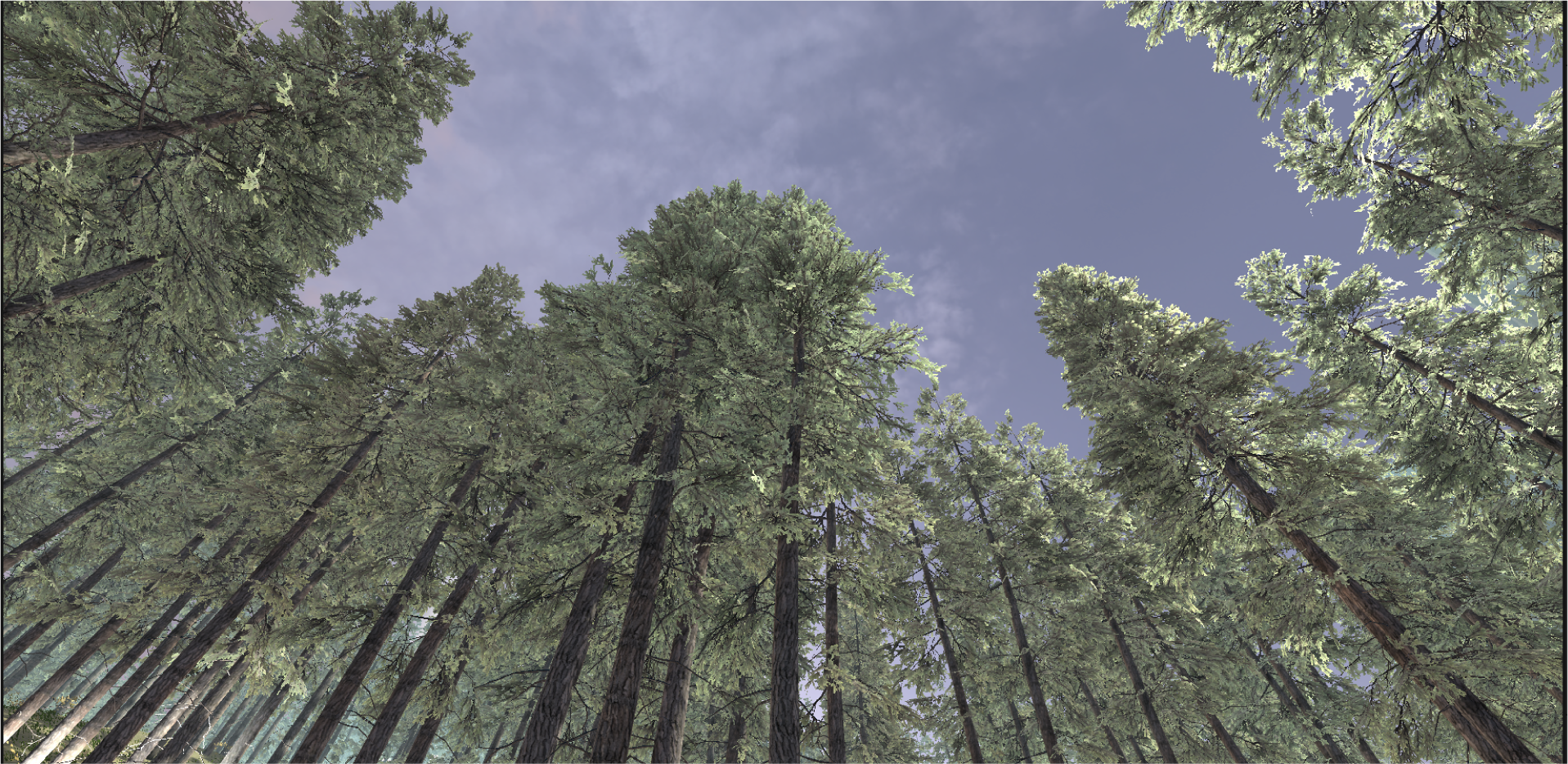
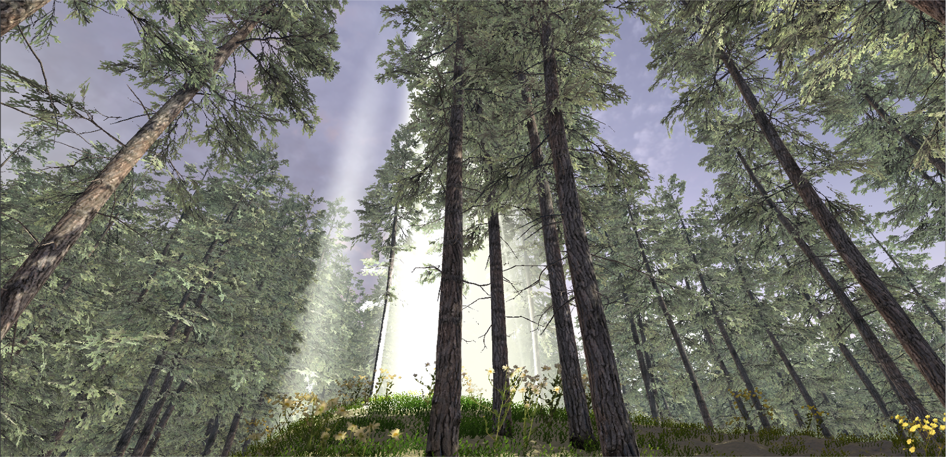
    • 4 or 5 scenes of Glasgows Cityscapes that show clear movement and busy life 30 seconds to allow for editing.
    • 4 or 5 upclose scenes of people, vehicles or animals that can be blown up to scale with a clear left to right movement ( or diagonal left to diagonal right).
    • Possibly 1 or 2 etablishing shots of identifiable Glasgow scenes or Landmarks for title and end.

    All HQ to survive the upscaling or down scaling, all on the same day, around the same time as to keep lighting similiar.

    Future Ideas :

    I think these ideas are good but maybe a bit late in the game for this project.

    Idea : fistfull of dollers/ block blur effect/tarentino esque copy of wester effects, snap zooms close up and hard line blurs.

    Instead of the standard close up used in cinema or the focus blur with a soft feathering on the edges, I want to do a hard seperation between clear and blury.

    Idea : Tekken 3 fighters in the real world.

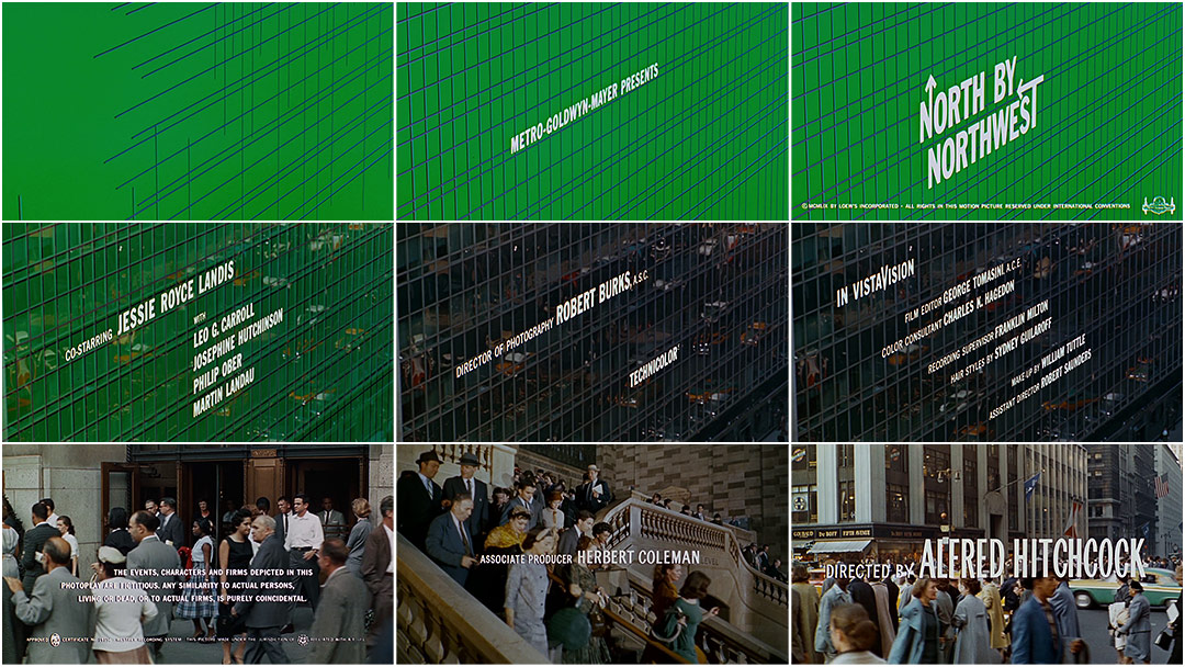
    Idea : james bond title sequence effect

    Idea : mirroring image of city and nature double exposure together on the one footage. but both camera movements are the same essentially tying them both together.

    Having an element of the city blocked out with mirrored footage of nature but mirrored camera movement so that as if they are occupying the same space but just at different times.

    To Remember :

    note : adjustment layer over all footage at the end to tie it together

    At the end of production when all the effects are finished and the footage is as close as possibke in it raw output, tie it together visually with a adjustment layer over the finished product

    note : jigsaw effect to immitate a lower qualioty image that then ties the two levels of the footage together. (mosaic mask)

    If the footage is two different qualities and the difference is obvious, tie the footage together by using the jigsaw effect on the lower quality footage immitating a low res look.

    note : consider the movement of the footage and how that effects the footage

    When recording footage, imagine how that footage will be used or how the effects applied to it might follow a direction, or may benefit from a direction.

    Trying to Plan :

    If I have a plan of what I need to shoot then I won’t just be wondering around aimlessly and the footage will all be pretty similiar in lighting and conditions… weather permitting.

    I have an idea of what I was wanting to shoot on that day but the weather didnt hold up for too long, the busy streets got considerably less busy when the rain started. Its almost as if people dont want to be out in the rain.

    In all honesty the plan went quickly out the window for some reason but with that I decided that I would keep an eye out for shots that would have the framing I was looking for or the enviroment I was thinking.
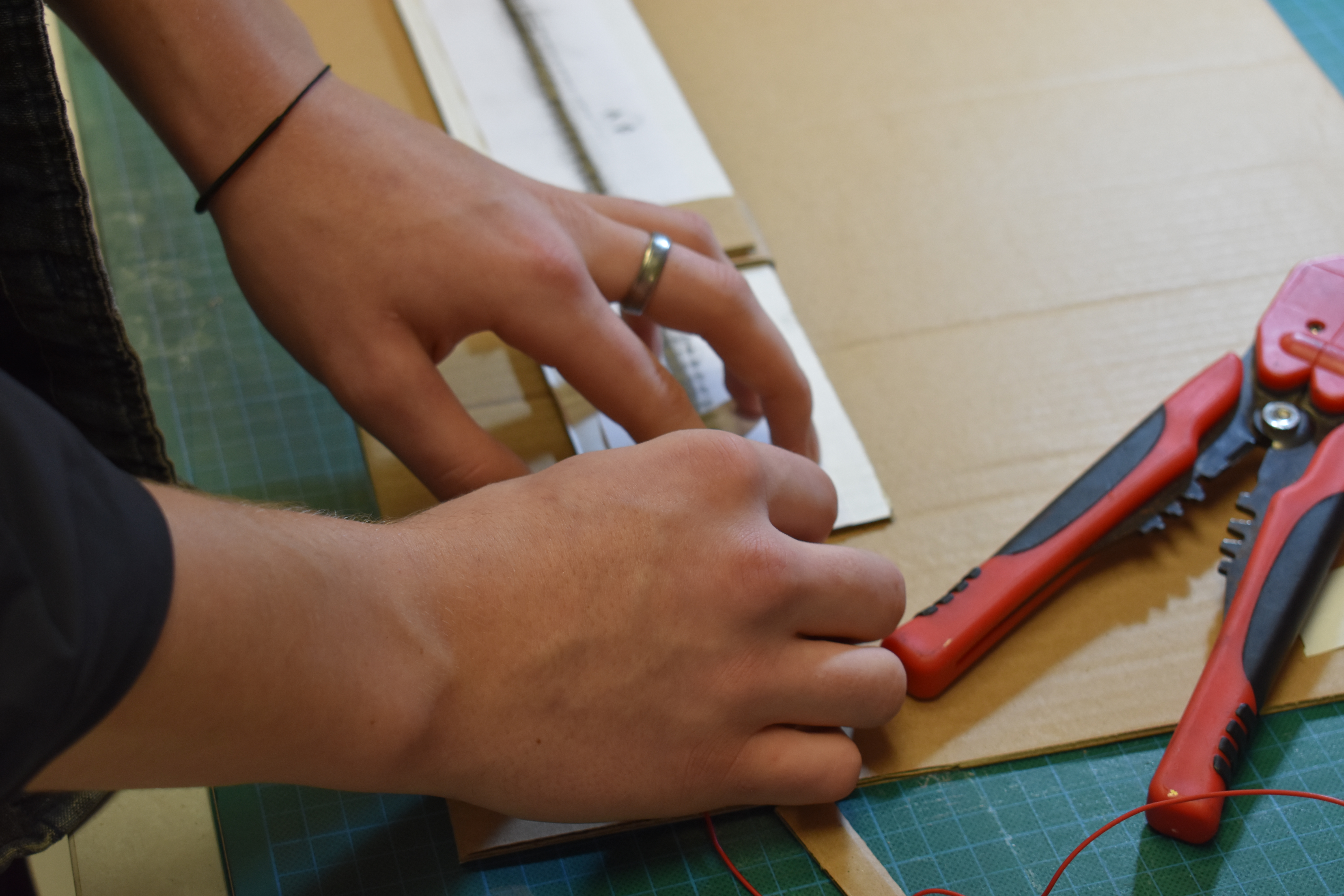
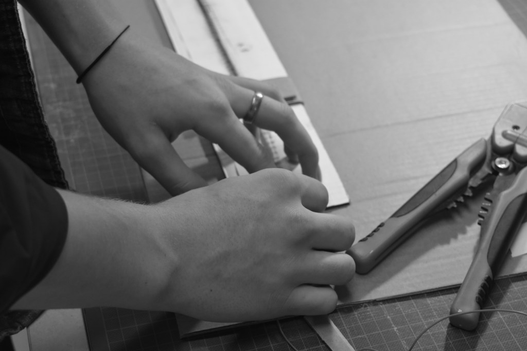
    Out Filming :

    Camera in hand, tripod under the arm, jack white album on in my ears, I set out in Glasgow to get the footage I needed; I had some of it planned, but I thought it would be better if I just tried and discover shots when I’m out and about.

    When I was out I got some shots I wouldnt have thought of but also discovered that with the time contraints and equipment I have, the upclose shots I was wanting to get will either need to be done with my phone or I change my idea slightly.

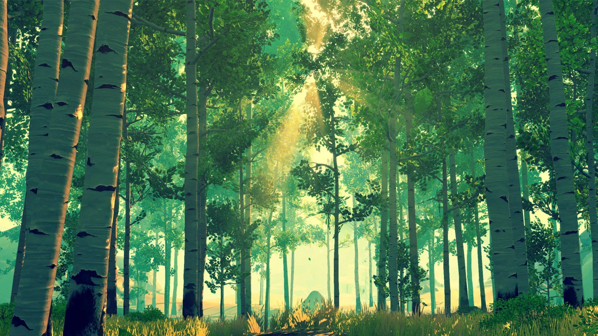
    After thinking that getting the footage I want wont be possible I started to consider other methods and other footage I could use to in its place and with listening to the Jack White album ‘No Name’ on it was making me think primal or of animals , so then the image of these normal city with the image of animals or fish moving through the city appeals to me and the footage can be found easier in the scale I’m looking for.

    Change of Plans :

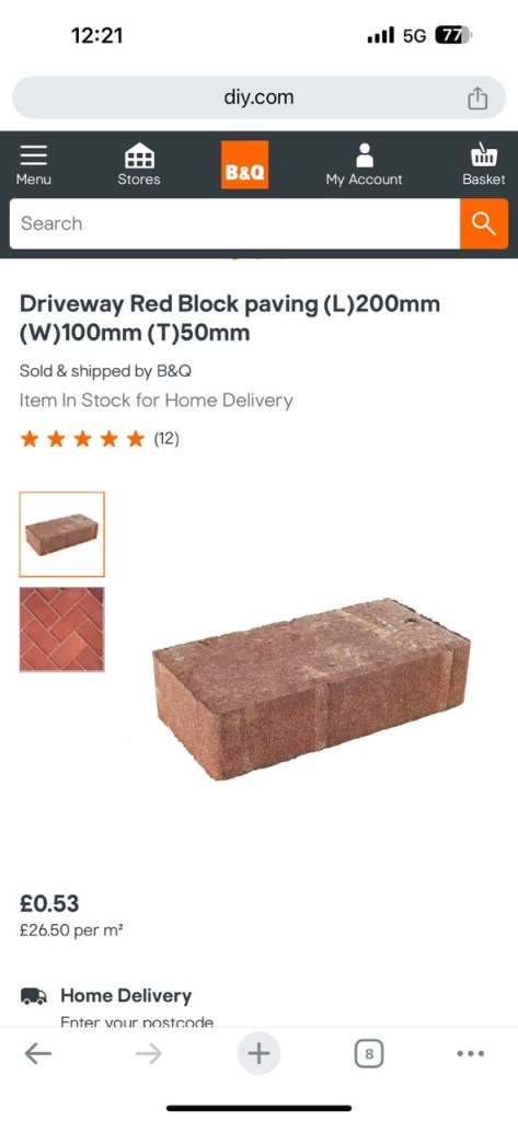
    So as I couldn’t get the up close footage of Glasgow that I was looking for. I went with Gillians suggestion and looked at Adobe Stock footage, downloading a variation of animals to then bring them into the footage ive filmed in the city.

    Example of stock footage fish that I was trying to find an excuse to use but the transparent fins where too much.

    Below is some notes of my process when I wasnt having the most luck and then expanding on those notes after the fact when I can take a better look at them :

    its crashed and i lost a good chunck after trying to brute force it

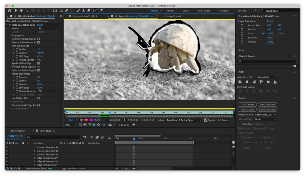
    At the start of the tracking I had done a few of the animals but as I hadnt yet went through the setting troubles and figured out how to make After Effects less distructive it crashed and I had lost a good chunk of my work meaning I had to do the roto brush again.

    I tried to force it to preview one HD rotobrushed preview at a time and it crashed on the last couple of frames.

    I learned that solid contained shapes are best to roto brush

    Also as I did more of the roto brushing I learned that the smaller difficult areas on this footage will obviously be more difficult. I then changed the footage to more solid animals with clearly defined shapes and movements.

    I learned that land animals are worse to roto brush onto existing footage because they actully have to stand on something

    After changing my animals footage I learned that any animal that was making contact with the floor would be another layer of difficulty, where they are making contact with the ground looks too fake and amateur.

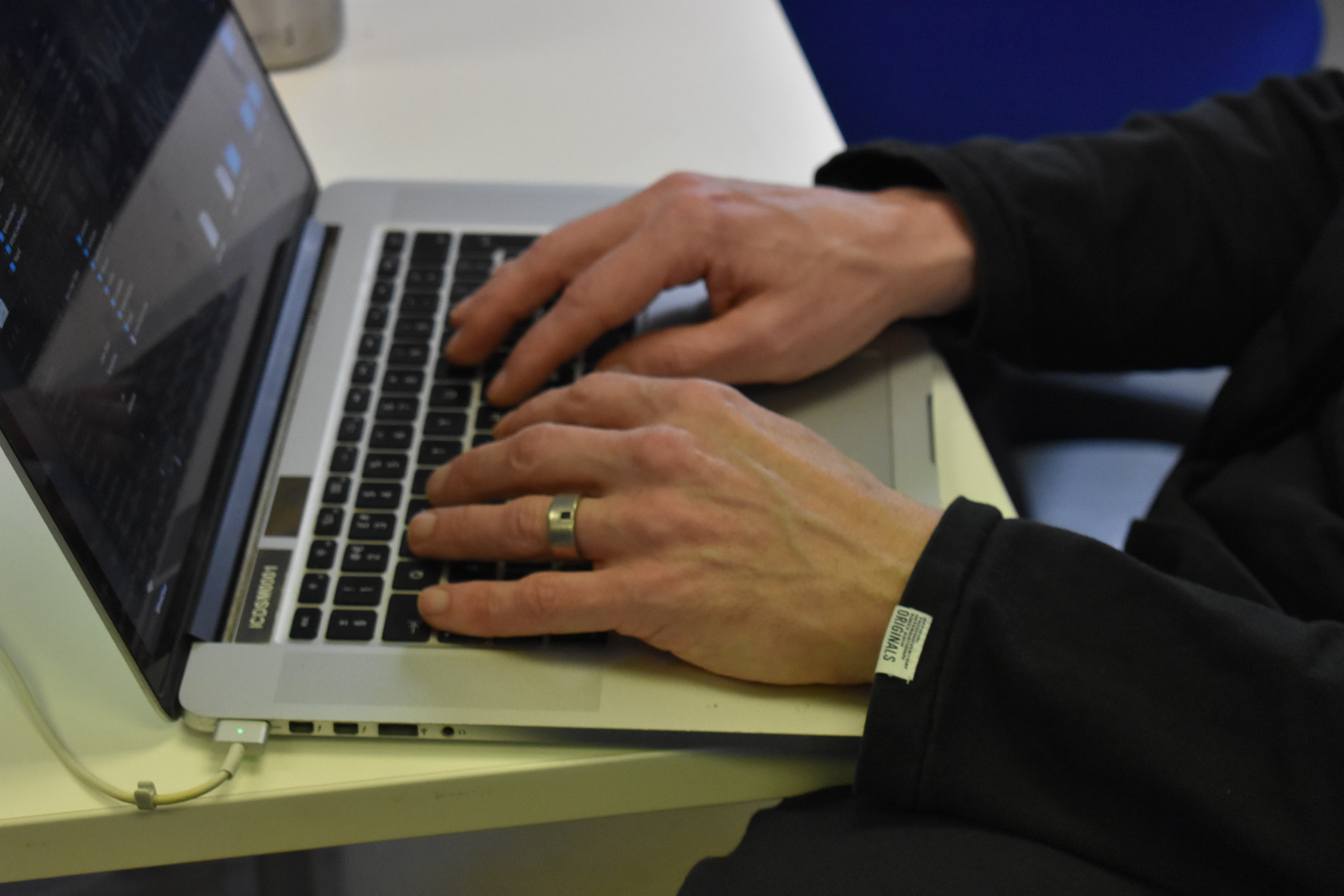
    my laptop was struggling during the entire thing

    During this entire process of rotobrushing and assembling my footage I learned that to save some processing power, and in turn my laptop, I had to change the perview settings to as low as it could go (quarter), to assign more ram to After Effects (7.5 gigs of RAM of my total 8 gigs of RAM) and to break it apart into managable chunks of my laptop and then assemble it again in After Effects before rendering it out.

    i have became a master at the roto brush tool / fine detail brush tool in after effects because ive done the same thing over and over again

    As you can probably tell from this lack of modesty I was going a bit mad after doing the roto brushing/ fine detail brushing a number of times and having to the same footage a number of times but because of this I found an efficent workflow and key shortcuts when doing roto scoping.

    Id actully like to use it again when doing more work on the school of fish potential project.
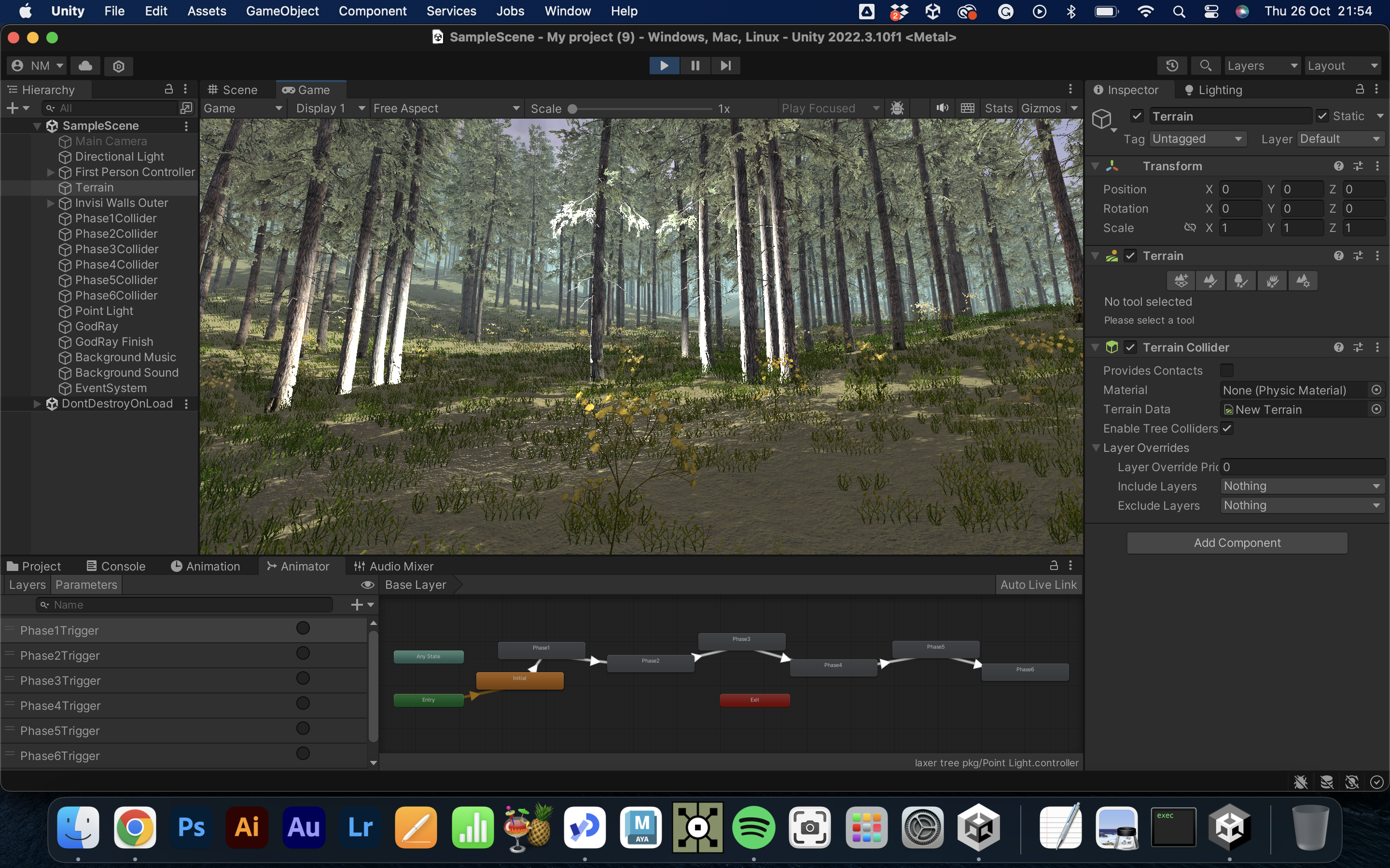
    Comp in a Comp :

    To save my laptop I’m separating the footage into separate scenes, rendering them out with the Media Encoder and then putting them back into After Effects to edit them together and to add a fitting soundtrack.

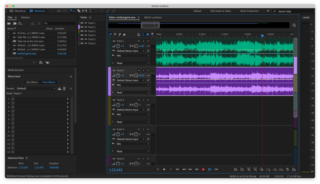
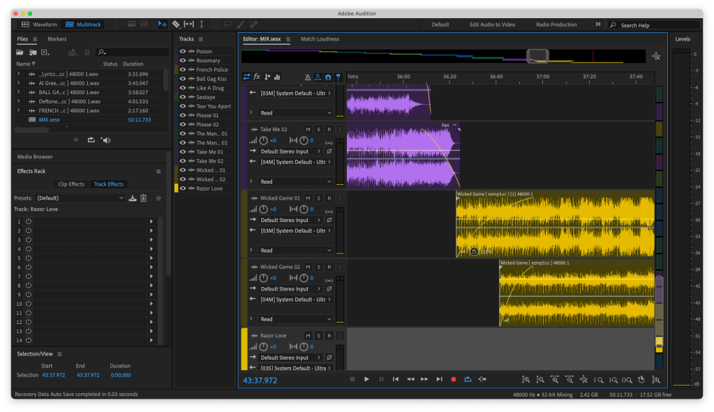
    The Music can Change it :

    Porcelain was in my head for it because of the two main elements of the track, the steady drums being the street and the normal life and the strings and vocals being the sea life floating above.

    Nude has always gave me this feeling of being underwater so the connection again being a sealife with this one.

    Feel it all around initially gave me that same ocean feel as the others did but in a lighter tone. But as I was looking for the video on Youtube to put here I found another version.

    Excuse the visuals of this video sorry.

    The same song, Feel it all around by Washed Out but slowed down with added reverb give it an even dreamier spaced out feel which i think might work well with the underwater visuals.

    After going down the rabbit hole of slow and reverb songs I found veridis Quo (slow and reverb) that has that feeling I’m looking for, a magical wonder that still fits within the city scape.

    The song has a solid minute at the very start that I’m going to use, it does start to ramp up at the end of that minute though and it makes me want to make a longer video but I’m just capping it at a minute.

    Trust the Process :

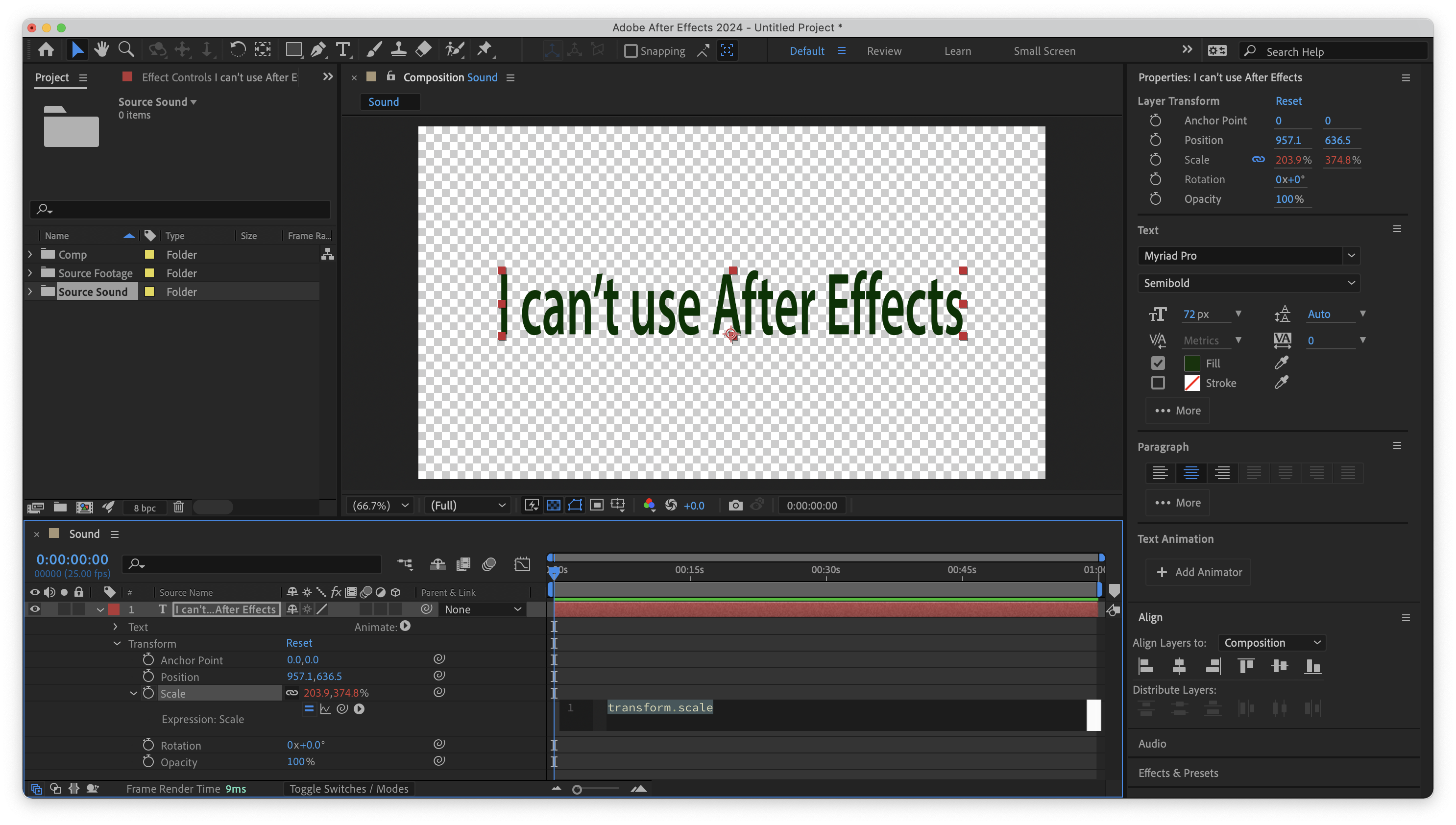
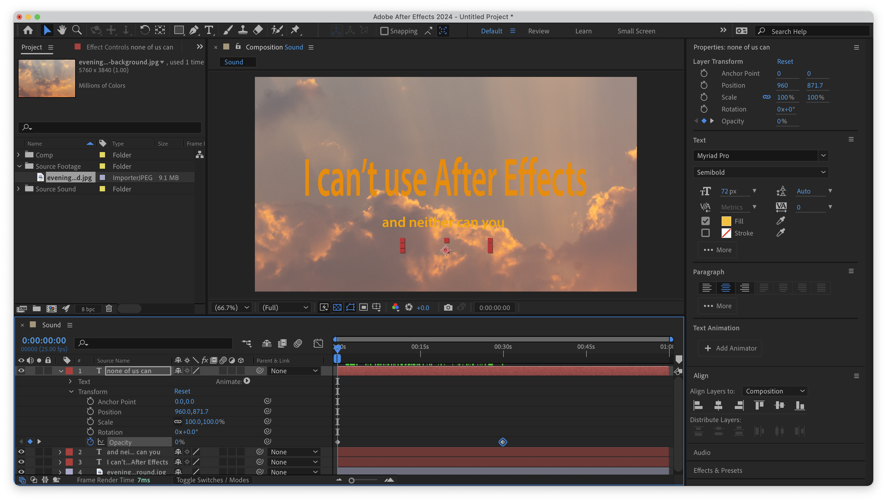
    With all the footage rendered out, I now want to bring it back into After Effects to bring it together for a final composition and to add some effects:

    • To start and end the video I’ve put a fade in and out of black at either end as so not start and end so abruptly and fading the music at the same time as the black to gently lead into the video as well to set and maintain the light relaxed tone.
    • Using the camera lens blur effect on an adjustment layer I made the transition between each scene, I felt that the adjustment of focus will again be easier on the eyes and tone as not to just cut to the next shot.
    • And over each scene in an auto colour correction, auto levels and auto contrast just to tie the scene and the imported fish a little bit more together. I could have went deeper into it but I enjoyed some contrast between the normal streets and the vibrant sealife.

    With the visual elements i wanted to really soften them and continue the feel of the entire thing (as ive probably said too many times at this point).

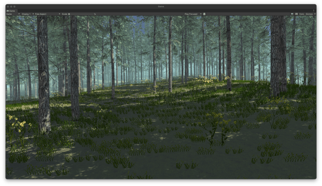
    Final : Magic in the Mundane

    Taking it further:

    I really love the visuals of the school of fish and would love to do another video with only images of schools of fish moving throughout a city scape.

    I really like the combo of the school of fish, the solid rigidity of the city and the music that has elements that mirror both the rigidity and the flowing natural patterns of the fish.

    Evaluation :

    During this project I did have to be adaptable, be that becuase I couldnt get the exact footage I was looking for or hardware restriction of my laptop. I had to exhibit my ability to take it on the chin and keep going.

    My main technical take away from this project is my confidence with the rotobrush, after having to do it a few times I’m quite happy to use it and would like to take my skills further, even footage in my final piece could be better and if given the opportunity I would do it more.

    I could have been more open to other ideas, i was so bogged down with the one concept and might have made my life easier if i did a simpler idea

    A personal criticism I have is that I might have locked in my concept too soon, yes the project is only two weeks but maybe given another day or a wider scope I could have came up with something more abstract or inspired. I am happy with the final visuals but think there is more potential for it either to be more abstract and stylised or more honed in and focused.

    In future i could first look into the software to see what can be done and then maybe let that infrom my decisions/ process/ workflow.

    In this project I was driven by my concept and then had to work around/against the software to make it work. This process did have its own interesting workflow and outputs but I wonder what I would have come up with if I had looked more into After Effects and let that inform my creative process.

  • Open Share Year Two

    Building

    What do I want to do ?:

    Narrowed down to 3 options all with their own draws and aspects I want to focus on.

    Looking at the space again:

    Just familiarising myself with the garage space again, considering where I could present one of my pieces.

    Deciding what to do: Process of elimination

    Data Visualisation:

    So for the data visulisation I wanted to make it human scale and for that an idea was to use real bricks to replace the Lego bricks.

    But when I was looking into the cost of buying 297 bricks it would have cost me £157.41 and I dont really want to pay that and there is cheaper alternatives but the problem with that would be transportation.

    Control:

    For control I could do it, if I was I would want to do a better job with the soldering and have it more secure as well as having a more performative output like the printer idea i had or have the final piece output to a projector or second screen.

    But between the three options I personally feel that Control was the most realised of the projects and couldn’t have gained too much during Open Share.

    Typographical Narratives:

    For Typographical Narratives I initially aimed to have an interactive display that would react with the proximity of the viewer making it more difficult to read the closer they got.

    Graphics

    As the main code and sensor is working for the piece I want to use today to redesign the actual graphics of the piece as well as thinking about how to elevate the piece to gallery level.

    The main task of today was to test the legibility of the font at certain lengths and by asking others, decide on a font type for the smaller text so its not too easy for people to read before the blur effect begins.

    Final Graphic:

    With the final graphic I wanted to try and get something that would draw people in and make them want to read on. I wanted the writing to have the same feel as Hitchhickers Guide to the Galaxy, that sort of horrible news delivered as if it was nothing important or just a fact of life that everyone has accepted.

    “Time is an illusion. Lunchtime doubly so.”

    Installation

    Putting it in the space:

    Ready to present:

    Reflection:

    Last year for Open Share year one I did too much, I stressed myself out and maybe took too much on or just got too wrapped up in it.

    This year I feel I made an overcorrection, my goal for this year was to do something simple, continuing on from a practice I’ve been trying to have throughout the year, something that wasnt too adventurous for a one week project.

    For open share this year I wanted to realise my installation concept from typographiocal narratives, that I had explored in a number of prints and turn these prints into reactive posters.

    In reflection I believe I could have done more, more examples of text on the screen, more effects that warp and shape the text.

    • Pixelisation effect on the test
    • Depth of the text (moving further away from you)
    • Warp and melt

    I do believe this concept has potential and the relationship between the audience and a piece that doesn’t play fair is something I’d like to explore.

  • Spatial Audio

    Initial Idea:

    One + Two

    One: An Initial idea that uses sonic vibrations to reseonate at certain frequencies to create a feeling within the viewers body or a low resonating sound that feels a certain way.

    Two: Two audio sources that seems to be conversing with one another, non verbal,

    Three

    A large exhibition that has arms connected to motors and spaces for keys so that users to connect their keys, everyones keys will sound differently so when there is a large collection of them there will be a similiar effect to the work of Zimoun.

    Inspiration:

    Zimoun

    https://zimoun.net

    From Zimouns work, I love the physicality and tacktile nature of the work. I would love to impliment the same tackle nature of sound into my project.

    Bernhard Leitner

    Conversation with Neil:

    After the break, I had two ideas, one that was more out there and on a larger scale and one more personal and person-focused. Looking inward as I have this year, I realise that my work is mainly people/ humanity based, and both ideas focused on that but in two different ways. After a discussion with Neil, the second felt more meaningful and manageable.

    Idea Development:

    Audio with Spoken word:

    Black Wing – Death Sentences

    Gorillaz – Fire Coming Out

    Loaded – Primal Scream

    During my conversation with Neil, we discussed the popular trope in music of having a voice note or recording of spoken word or movie dialogue in the track. We discussed how that could be used in my project to make the meaning of the songs more apparent and how voice notes that hint at the story of the relationship can make the connection between the speakers more apparent.

    How I aim to implement this in my project is either:

    • Starting and ending the project with some voice notes that give context.
    • Having the voice notes in between the tracks.
    • Having it more naturally sprinkled throughout the tracks as real voice notes.
    • The frequency of the voice notes increase as the two people get to know each other.

    Development:

    Text

    What do I have and what do I need? :

    Correction:

    I have a slight change of plans for these notes. As I was working on the assumption that it has to be approximately 1 minute, and that’s not the case, I can take longer to explore the relationship between the two people.
    I don’t think I’ll have the full songs in the piece so as not to feel too drawn out. Maybe I’ll just have the song play until the listener has heard enough or when the song feels natural enough that the listener would think of the answering song.

    After my conversation with Neil, I have a better idea of the trajectory for the project and that I want to focus more on the audio and stop getting distracted by the visuals.

    Track List:

    The TrackList Playlist:

    Set Up: Test

    Initial set up, I was just going to use the tall white plinths but with the stands allow for the speakers to be at the optimal level for average ear height.

    Set Up:

    The set up is very minimal as to not distract from the audio and for the sound to be the main attractor.

    The Music:

    Harmonies:

    One:

    Two:

    Three:

    Four:

    Final:

    The Combos:

    Trying to get the two songs to work together was harder than I thought. But when the songs overlap at parts I love the harmonry effects it has or through a couple of the songs there was a question and answer effect between them.

    Main Track:

    Here I’m just building the mixtape, putting the music together and trying to put together the story of two people through music.

    To Do:

    Just a list of things I’ve still to do, keeping me right. There was another stage of this project that I didn’t get to reach in the time available. If I was to revisit this project then I’d give more time these extra features and ideally elevate the work.

    Working on the Timing:

    Shown above is just the files of the songs that I was timing together. Trying to find the right level of two songs working together.

    Final:

    A conversation between two people through music.

    Two people that find a common line through music and develop a relationship, sharing and learning from each other, finding a common ground by becoming closer.

    As the music plays back and forth the speakers get closer in taste until they’re playing different versions of the same song.

    These songs, just as people do, don’t line up perfectly but sometimes line up perfectly creating harmonies and special moments of choruses or question and answer sections between the music.

    The music is in three sections:

    • The Disconnect
    • The Imperfect Harmony
    • The Connection

    Reflection:

    Good idea, nice concept, could be better.

    Focus more on the BPM and less on the vocals syncing up

    I think for this project I got too bogged down in the imperfect harmony stage of the piece and trying to make it work. But in the review it was made clear to me that the concept is solid but maybe there is another way to make the concept/ story clearer.

    If I revisit this project :

    • I’ll change the overall set up of the music as to make it less chaotic and more harmonious.
    • I’ll add more speakers to the set up as to achieve the panning and more natural movement at either side if the listener.
    • I’ll collect and add in the voice notes from others after I ask them the question “What is special about them?”

  • Design Domain Part Two : Process

    Proposal from Part One :

    Reminding myself :

    Feedback :

    • Q : What worked well about these photographs?
    • A : They did a good job of showing the identifying factors of peoples hands as they work or go about their lifes
    • Q : What didn’t work so well?
    • A: I felt that the images weren’t dynamic enough, when displayed they almost melded together. I want them to be similiar enought but not enough that they get lost within each other.
    • Q : Why did you choose to move to black and white rather than colour?
    • A : I decided on black and white photography as to focus on the detail of the hands and finding a way to link the photographs together.
    • Q : Looking to Part 2, you need to bring your attention to how you curate and display these images.
    • A : I want people to be able to interact with the images using their hands, a tactile method of going through the images. Using their hands to explore.
    • Q : Do you intend to stage some of your photographs (similar to some of the photographs of hands in your Learning Journal), or are you planning to pursue a more documentary approach?
    • A : At this moment I’m not sure to go for staged photographs as to have more control or go for a documentary approach and for the outcome to be more ‘athentic’.
    • Q : With regards to display, we discussed various options, such as using the Magic Leap to create a gestural interface or projecting the images as a slide show, but you need to make a decision as to how to develop this. You also need start thinking about developing an interactive digital prototype, e.g. in Processing.
    • A : At this moment I’m not sure how I want to display the photography other than wanting it to be a interactive hand focused interface.

    Talking this further :

    Key points :

    • The process of aging shown through your hands and what we do with them.
    • Photography as the medium in tandem with visual regocnition software to embody the relationship.
    • How can the technology be used in a tactile way to interact with the photography and create a relationship between the art and the viewer.
    • Using Magic Leap to create a hand interface that will then relate to the images of the other hands building a relationship within the artwork.

    Refined focus on photography :

    Henri Cartier Bresson

    With a more focused attention to the photography I want to use, I’m looking at the work of Henri Cartier Bresson and how, in his black-and-white photography, he brings light and levity to his work. I aim to bring that same warmth and levity to my work.

    Physical Idea :

    I want to make hand identification a very tactile experience.
    The throughline of the project is that our hands are moulded by the process of our lives, and how we use them as creators is how we mould our lives.

    Key elements:

    • Tacktile.
    • The processes of aging.
    • The processes of wear and tear.
    • Hands and their identifiers.
    • Photography.

    Conversation with Gillian :

    Simplify: Instead of overcomplicating the issue, just create a hand-focused interface that lets the user traverse the images and the stories.

    Leap Motion :

    Idea using Leap Motion :

    If a leap motion is available, create a 3D virtual space in unity or something similar to the photography held within, and then use hand gestures to traverse this space and the photography within.

    Looking at existing photography exhibitions :

    A key point I took away from looking at existing photography exhibitions was the use of location and lighting and how these are used to focus or inform the photography.
    I wanted to look at existing exhibitions of what is to be considered nonconventional examples of photography exhibitions, remembering my research I did for exhibitions in CoLab2 in first year and how that informed me then.
    A digital photography exhibition is informed by exhibitions of the physical world but not constrained by space limitations.

    Testing Hand Tracker :

    Digital Exhibitions :

    Radioheads KID A MNESIA Exhibition :

    https://kida-mnesia.com

    https://store.epicgames.com/en-US/p/kid-a-mnesia-exhibition

    After a conversation with my father about music, Radiohead and my idea for this project, he reminded me of the KID A MNESIA Exhibition I showed him a couple of years ago and how they used a digital space to transport the viewer to space and display their multiple different works as well as their music.

    Game Plan :

    What I want to do for Design Domian submission:

    • I want to create a 3D virtual exhibition in unity that will house the photography of different people and practitioners and highlight the process of aging and stories that we carry with us on our hands.
    • Possible name for the exhibition : Tools of creation.
    • I want the user to traverse the virtual exhibition using their hands and the Leap Motion to continue the theme of using our hands to move; create and process our lifes and surroundings.
    • I want to collect more photography of peoples hands from a number of different people.
    • Within time constraints I dont think its possible but I’d like to take this concept forward and develop a VR experience.

    How I’m going to do it :

    • Create a 3D space in Unity that will hold the photography of the hands.
    • Name the exhibition
    • Use the Leap Motion to Control the Unity Scene and allow the user to move through the space
    • Continue to collect photos from throughout the Art school and throughout my life and the people I encounter

    Design Domain Part Two : Brief

    Building the Exhibition :

    Using Blender for the first time, I created the sphere to hold the exhibition. The goal is to create a space for the exhibition that couldn’t be replicated or would be very hard to replicate in real life without being too much to take away from the photography.

    With floating massless planes holding the photography, again adding to the wonder of the environment but not drawing from the photography.

    And just now I’m realising that I’ve created Cerebro from the X-Men comics.

    In building this exhibition for my photography I want to create a space with a relationship to the physical world of photography and the digital world.

    What I’d like to explore further if I have time is :

    • Better photography, really taking time to get shots I’m proud of, the subjects being a range of different creators and their hands
    • Develop this exhibition for VR to make the experience more encapsulating.
    • I still aim to implement the hand movement for the traversal.

    Conversation with Neil :

    Neil – “Hand based interaction in Leap Motion has a nice parallel with the photographs themselves but again, I’m not sure first-person movement controlled that way would be the most effective use of it… virtual galleries are interesting but maybe it’s not the right approach (just a thought)… wouldn’t a transition between the photographs triggered by hand movement be a bit more elegant? The simplest outcomes are often the most impactful! Have a think yourself and we can talk it over during the week.”

    Me – “Yeah well to be honest I had that idea initially but was worried it wouldn’t be enough, but yeah you’re probably right, just a simple slideshow that is triggered by the hands would be elegant, what would I be using that in though ? Still Unity or use the leap motion in processing ?”

    Neil – “Yes processing might be simpler / lower overhead if you were only working in 2D and without undergoing lighting effects etc. that might colour the original photographs.

    That would definitely be enough so don’t worry about that – there’s power in the minimal!”

    Something to remember :

    “there is power in the minimal!”

    After starting part two of this project, I want to complicate my work and make it bigger and better rather than simplify and work on its nuances.
    This is because I can do better with my photography.

    After the reading week :

    Honestly, during the reading week, I wasn’t as productive as I would have liked, and if I had come into the studio, I would have gotten more done. However, I’d also like to note in this part of the process that I did enjoy spending time with my family and gained some valuable ideas and insight just by spending time with them and allowing the balance of work and personal life.

    Building Something Simpler :

    Trouble with the Leap Motion, I’ve stumbled into using the touch display for my work because the Leap Motion seems to be having some trouble; I could use the touch screen or something like a trackball, as Paul suggested.

    Paul and his technical wizardry have got the leap motion to work. It seems to draw people to it when they see it working, and I’m getting positive feedback from its responsiveness. However, it will need some tweaking for the feel to be a pleasant experience.
    Also, the image sizes are hilariously massive (6000 x 3500 px) for what I’m using them for. The sketch will run a lot smoother and load a lot quicker once I’ve made them a more reasonable file size and resolution.

    The Code :


    PImage attractorImg;
    PImage[] images1, images2, images3;
    float mx, my, lmx, lmy;
    float ease = 0.01;

    boolean debug = false;
    int state = 0;
    float alpha = 0;

    void setup() {
    //size(960, 540, P3D);
    fullScreen(P3D);
    noCursor();
    setupLeap();
    attractorImg = loadImage("AttImage.png");
    images1 = new PImage[8];
    for (int i = 0; i < 8; i++) {
    String f = "DSC_"+nf(341+i,4)+".jpg";
    images1[i] = loadImage(f);
    images1[i].resize(1920, 0);
    }
    println("LOADED SET 1!");
    if (!debug) {
    images2 = new PImage[8];
    for (int i = 0; i < 8; i++) {
    String f = "DSC_"+nf(349+i,4)+".jpg";
    images2[i] = loadImage(f);
    images2[i].resize(1920, 0);
    }
    println("LOADED SET 2!");
    images3 = new PImage[8];
    for (int i = 0; i < 8; i++) {
    String f = "DSC_"+nf(357+i,4)+".jpg";
    //println(f);
    images3[i] = loadImage(f);
    images3[i].resize(1920, 0);
    }
    println("LOADED SET 3!");
    }
    }

    void draw() {
    switch (state) {
    case 0:
    doAttractor();
    break;
    case 1:
    doMain();
    break;
    }
    }

    void doAttractor() {
    background(0);
    noLights();
    updateLeap();
    alpha = min(alpha+4, 255);
    tint(255, alpha);
    imageMode(CORNER);
    image(attractorImg, 0, 0, width, height);
    }

    void doMain() {
    background(0);
    noLights(); updateLeap();
    pushMatrix();
    translate(width/2, height/2, 0);
    lmx = lerp(lmx, mx, ease);
    rotateX(radians(lmx));
    lmy = lerp(lmy, my, ease*2);
    rotateY(radians(lmy));
    drawImages(images1);
    if (!debug) {
    float q = 1200;
    pushMatrix();
    translate(0, -q, 0);
    drawImages(images2);
    popMatrix();
    pushMatrix();
    translate(0, q, 0);
    drawImages(images3);
    popMatrix();
    }
    popMatrix();
    alpha = max(alpha-8, 0);
    if (alpha > 0) {
    tint(255, alpha);
    imageMode(CORNER);
    image(attractorImg, 0, 0,width,height);
    }
    }

    void drawImages(PImage[] _images) {
    noTint();
    float m = -2500;
    //println(int(m));
    for (int i = 0; i < _images.length; i++) {
    pushMatrix();
    imageMode(CENTER);
    rotateY(radians(45*i));
    translate(0, 0, m);
    image(_images[i], 0, 0);
    popMatrix();
    }
    }

    Attractor Image :

    Something I honestly hadn’t considered until my conversation with Paul was an attractor image and how you might need to invite people to interact with your piece or inform them about it in an exhibition with a screen-based output.

    After a conversation with a 4th-year student, he informed me of the brutal fact that the majority of people who will interact with your piece won’t actually read any description or prompts.

    “People don’t read sh*t.”

    Stewart Marshall (2024)

    So with Paul’s suggestion and Stewart’s experience as a student of IxD I made an two possible attractor images :

    Personally I preferred the look of the first attractor image I made but after asking others in the studio and considering how people would read this when first interacting with the piece, myself and others agreed that the second image was more informative and true to how the piece would actully be interacted with.

    Displaying:

    After some suggestions from my peers in the studio that it deserves to be elevated onto a plinth and more open to people rather than on a desk or hidden away somewhere in Open Studio, I displayed it somewhere so as not to obstruct the flow of traffic in the studio but very upfront and obvious.

    Tools of the Trade :

    Black & White Digital Photography, Processing, Leap Motion, Monitor 

    1920 x 1080 pixels / 670mm x 410mm

    In Tools of the Trade, I wanted to bring attention to the tools we are equipped with, how they shape our lives, and how our lives have left their mark on us. And through the process of making our art, making mistakes, and making decisions in our lives, we wear it all on the very hands used to shape those lives and the lives of those around us.

    Exploring the collection of digital photography, I ask that you use your hand to navigate the collection and try to imagine who you’re looking at, the life they’ve lived and the art they’ve created.

    Reflection :

    On reflection, if I had time to revisit this work, I’d want to redo the photography to a standard I’m happy with. I think more could have been said/ achieved if I maybe did physical photography over digital or spent more time coming to a more purposeful direction with the photography.
    To take this further, I’d like to continue collecting photography and implement them into the same processing sketch so that it’s a large tunnel of photography with the ability to ladder between the levels and use a gesture such as a pinch to highlight and focus on a specific photograph within the collection.

  • Control

    Project Plan:

    • Week One

      Research to solidify a game plan and direction for the project and Initial concepts informed by initial research personal artistic choices of where to take this project. Constant documentation.

    • Week Two

      Further Research now with more focus into specific fields or aspects concerning the initial ideas as well as concept development driven by the research. And if I have enough to go on then starting to build. Constant documentation.

    • Week Three

      Building the product all of this week in tandem with concept development if its required through the building process, as there might be problems I didn’t consider. Constant documentation.

    • Week Four

      Finalising the building process along with time put aside to consider the exhibition of the build and ideally finalising the documentation, I am aware of the extra week for documentation but would rather have that finished before hand as to not bleed into the second half of Design Domain.

    Concept :

    I want my Control project to bring joy/satisfaction.

    me (2024)

    Inspiration :

    I know that I want to elicit joy from my build, and now, looking into different media, I think of eliciting pleasure in several ways and media.

    Martin Parr :

    For inspiration, I’ve looked at the work of Martin Parr because, in my initial concepts, I want a sense of fun, joy and accessibility in the sense of classless art.

    David Hurn :

    Looking at the work of David Hurn, the humour and joy of Hurn again inspires me, but within his work, there is both style and conventional class as well as spirit and joy.

    Bruno Munari :

    Dieter Rams :

    Teenage Engineering :

    Sound Play Projects:

    https://www.housemusic.app

    Pushing your buttons:

    What buttons do we want to press? What will entice an interaction from the viewer from initial sight of the button and then after the interaction, what will be the most satisfying.

    What we have in the studio:

    What I might need to order:

    Controllers:

    Switches:

    Initially I have no idea on what form my project will take but I think if I follow the direction of my thought process and research then I’ll find a fitting housing and inputs that has a tactile satisfying feeling.

    Concept :

    What art will the build produce ?

    What art can I look at to inspire the controls or outcome of the build. Simple in elements but complex in beauty and concept.

    Hard Edge Painting :

    John McLaughlin :

    Ellsworth Kelly :

    Kazimir Malevich :

    Concept :

    The design is too complicated and with my current ability and time frame the initial design will either be too difficult or too time consuming. It has to be simplified.

    Simplify the concept :

    To save time cost and manufacturing I’ll be using a simple lunch box for the body, it can be opened and closed in ease and thew hard plastic body will be secure enough to work with/on.

    For the shape position on the controller I’ve removed the the joystick and went for a simpler two knob control system like an etch a sketch.

    Button Layout Test :

    For the XY of placing the square I

    Components :

    The components have been ordered and hopefully all sorted so that they can be soldered and all i have to do is put them into the lunch box.

    Housing :

    The classic red hard plastic lunchbox is the housing for this build.

    What do I actually want the code to do :

    Making the code more manageable :

    Developing the concept :

    Button Layout Test :

    Drilling the holes :

    Seeing it everywhere :

    Revisiting the etch a sketch :

    I would like the knobs for the directional potentiometers to be different, bigger or more attention-grabbing.

    Labels:

    The Code :

    //defining the buttons, potentiometers and leds coming in from the Arduino

    void setupArduino() {

    myArduino.pinMode(pot1, Arduino.INPUT);
    myArduino.pinMode(pot2, Arduino.INPUT);
    myArduino.pinMode(pot3, Arduino.INPUT);
    myArduino.pinMode(pot4, Arduino.INPUT);

    myArduino.pinMode(BigButton, Arduino.INPUT_PULLUP);
    myArduino.pinMode(button1, Arduino.INPUT_PULLUP);
    myArduino.pinMode(button2, Arduino.INPUT_PULLUP);
    myArduino.pinMode(button3, Arduino.INPUT_PULLUP);
    myArduino.pinMode(button4, Arduino.INPUT_PULLUP);

    myArduino.pinMode(BigButtonLed, Arduino.OUTPUT);
    }
    //a square class to draw the shape with a if/else loop to change the square to a circle

    class Square {

    float x;
    float y;
    float size = 20;
    color col;
    float rot;

    int s = 0;

    Square(float _x, float _y) {
    x = _x;
    y = _y;
    }

    void display() {

    fill(col);
    noStroke();

    pushMatrix();
    translate(x, y);
    float r = radians(rot);
    rotate(r);

    if (s == 0) {
    square(0, 0, size);
    } else if (s == 1) {
    circle(0, 0, size);
    }
    popMatrix();
    }
    }

    // note of serial port coming from arduino ide

    //serial point 02
    ///dev/cu.usbmodem1101

    //using formata to talk to processing
    import processing.serial.*;
    import cc.arduino.*;

    Arduino myArduino;

    //set up which button, potentiometer and led is in which port
    final int pot1 = 0;
    final int pot2 = 1;
    final int pot3 = 2;
    final int pot4 = 3;

    final int BigButton = 6;
    final int button1 = 10;
    final int button2 = 9;
    final int button3 = 8;
    final int button4 = 7;

    final int BigButtonLed = 12;

    //putting each button and potentiometer into an array, a tidier solution that writing out each function for each input
    final int [] allButtons = {BigButton, button1, button2, button3, button4};
    int [] lastButtonStates;

    //final int [] allPot = {pot1, pot2, pot3, pot4};

    Square [] squares;

    // a selected colour palette to replicate the colours used by Mclaughlin and Malevich from the 1960's hard edge paint movement and putting them into an array
    color CGrey = color(151, 134, 126);
    color CRed = color(194, 35, 56);
    color CGreen = color(142, 162, 65);
    color CBlue = color(34, 145, 240);
    color CLBlue = color(158, 193, 197);
    color CYellow = color(213, 164, 9);
    color COrange = color(229, 90, 59);
    color CPink = color(237, 152, 161);

    color [] colours = {CGrey, CRed, CGreen, CBlue, CLBlue, CYellow, COrange, CPink};

    int squareNum = 0;
    int shape = 0;

    void setup() {

    fullScreen();
    //fullScreen(2);
    //size(1900, 900);
    background(250);
    rectMode(CENTER);


    //printArray(Arduino.list());

    myArduino = new Arduino(this, Arduino.list()[2], 57600);

    setupArduino();

    //drawing the square and taking the reading from the X and Y potentiometers
    squares = new Square[1];
    float x = xPotRead();
    float y = yPotRead();
    Square s = new Square(x, y);
    // Square s = new Square(width/2, height/2);
    squares[squareNum] = s;

    lastButtonStates = new int[allButtons.length];

    for (int i = 0; i < lastButtonStates.length; i ++) {
    lastButtonStates[i] = Arduino.HIGH;
    }

    myArduino.pinMode(BigButtonLed, Arduino.OUTPUT);
    }


    void draw() {

    background(250);
    myArduino.digitalWrite(BigButtonLed, Arduino.HIGH);

    for (int i = 0; i < squares.length; i ++) {
    squares[i].display();
    }


    float s = adjustSize();
    squares[squareNum].size = s;

    float r = adjustRotation();
    squares[squareNum].rot = r;

    float x = xPotRead();
    squares[squareNum].x = x;

    float y = yPotRead();
    squares[squareNum].y = y;

    // a for loop to check each button state if they are pushed or not
    for (int b = 0; b < allButtons.length; b ++) {
    int buttonState = myArduino.digitalRead(allButtons[b]);
    if (lastButtonStates[b] != buttonState) {
    lastButtonStates[b] = buttonState;
    if (buttonState == Arduino.LOW) {
    switch(b) {

    // each button has a case that defines which each button does
    case 0:
    saveSquare();
    break;

    case 1:
    createSquare();
    break;

    case 2:
    selectColor();
    break;

    case 3:
    if (shape == 0) {
    shape = 1;
    } else {
    shape = 0;
    }
    squares[squareNum].s = shape;
    break;

    case 4:
    resetSquares();
    break;
    }
    }
    }
    }
    }


    // reading the the potentiometer and adjusting the size of the shape
    float adjustSize() {
    int potRead = myArduino.analogRead(1);
    float s = map(potRead, 0, 1023, 5, 700);
    return s;
    }


    // reading the the potentiometer and adjusting the rotation of the shape
    float adjustRotation() {
    int potRead = myArduino.analogRead(4);
    float r = map(potRead, 0, 1023, 0, 360);
    return r;
    }

    // a save frame function that
    void saveSquare() {
    saveFrame();
    shape = 0;
    squares = new Square[1];
    float x = xPotRead();
    float y = yPotRead();
    Square s = new Square(x, y);
    // Square s = new Square(width/2, height/2);
    squares[0] = s;
    squareNum = 0;
    }

    void createSquare() {
    shape = 0;
    float x = xPotRead();
    float y = yPotRead();
    Square s = new Square(x, y);
    squares = (Square[])append(squares, s);
    println(squares.length);
    squareNum ++;
    }

    //cycling through a random colour from the colour array
    void selectColor() {

    int r = (int)random(colours.length);
    squares[squareNum].col = colours[r];
    }

    // clearing and resetting the square array
    void resetSquares() {
    shape = 0;
    squares = new Square[1];
    float x = xPotRead();
    float y = yPotRead();
    Square s = new Square(x, y);
    //Square s = new Square(width/2, height/2);
    squares[0] = s;
    squareNum = 0;
    }

    //reading and mapping the x coordinates from the potentiometer
    float xPotRead() {

    int potRead = myArduino.analogRead(2);
    float x = map(potRead, 0, 1023, 0, width);
    return x;
    }

    //reading and mapping the y coordinates from the potentiometer
    float yPotRead() {

    int potRead = myArduino.analogRead(0);
    float y = map(potRead, 0, 1023, 0, height);
    return y;
    }

    The Jungle :

    Final Build :

    Box in use :

    Reflection:

    I enjoyed the reaction people had to my control project, the joy and excitement they had towards it was great.

    I would love to develop this piece even further; as well as having the electronics of it to a solid professional standard, I would love to bring an extra level of polish to the interface and the interactions people have with the box.

    If I was to take it further I would want to work on having the ideal buttons for the box, more chunky and durable, really focusing on the satisfaction or interacting with each component as well as the iconography on the face of the box, replacing the english labels with universal symbols.

  • Motion Graphics

    The Brief:

    Initial Ideas:

    As I have a week for this project I can’t spend as much time as I’d like researching the topic and influences and will just have to trust my gut on it. Initial thoughts is to do something very simple but still effective and as Gillian instructed focus more on the nuances.

    Inspiration:

    Lora Lamm

    I’ve looked at the work of Lora Lamm, specifically her use of straightforward yet descriptive visuals. Her use of shape and colour creates a sense of fun and brightness around her work, which is shown below, and even though my goal is to be more severe and direct, what I am to take away from this is how Lamm does so much with so little and that less can be more than enough.

    Saul Bass

    In a number of Saul Bass’s work When looking at Saul Bass’s work, I was drawn to the apparent simplicity of shapes, colour, and movement and how he uses such simple elements to elicit the overarching emotional reaction the movie is about to achieve. He sets the film’s tone with simple components and speaks with attention given to the movement or relationship between these components.In a number of Saul Bass’s work

    North by Northwest (1959) :

    The Man With The Golden Arm (1955) :

    Psycho (1960):

    Anatomy of a Murder (1959) :

    Maurice Binder

    With Maurice Binder’s title sequence in the 1958 movie ‘Damn Yankees, ‘ it was less the tone and emotion achieved but the use of movement, paying particular attention to the method used at 1:59 when the baseball is followed flying past the stand.

    Damn Yankees (1958) :

    Inspiration:

    The News

    As the brief states, the piece has to be for a news brodcast ‘Tonight’, so after establishing the style and time frame I wish to imitate, inspired mainly by the work of Saul Bass I took a look into the news broadcasts of the time.

    The main iconography that stands out to me is that of the globe and the signals emitters. Another key element that I want to imitate from the original news broadcasts is the music, the large triumphant brass section to announce its presence.

    From Early 60’s to Late 60’s:

    At some point of actually creating my title sequence I realised that even though I was creating it with a style based of the early 1960’s, it was inspired from films and artistic pioneers of the early 60’s which didn’t trickle down to television and mainstream television until the mid to late 60’s/ early 70’s.

    As this is a very quick project I wont have time to correct or delve deeper into my research but I think it’s important to note that with more time I’d love to look more into television from that era and nail the specific feel and nuances of television from that time.

    The visuals I have in mind at this point makes me think of the energetic instrumentals by Werner Tautz.

    So with the style of Saul Bass and the images of the globe and/or radio emitters and the music Werner Tautz, my final piece should be something inspired by the 1960’s but almost an exaggeration of it, the 1960’s news broadcast through the rose tinted glasses of nostalgia.

    Inspiration:

    Story Board :

    Music Change:

    David Rose & His Orchestra – Holiday For Strings (1955 Version)

    In all honesty I can not remember why I went for David Rose – Holiday For Strings in stead of Werner Tautz – Derby Day they both seem to do the same job, Derby Day being a bit more energetic than Holiday for Strings. What I do know is that I removed Grand Central by Tautz because the the reason I loved it initially now doesn’t align with the pacing and steady feel of the final outcome. Again if revisiting this project then I might want to explore Derby Day further and create a title sequence closely tied to its tempo.

    Final – Tonight1970:

    With my final outcome I aimed to create a modern recreation of a 1970’s title sequence, the key elements of the design, tempo and nuances driven by our nostalgic recollection of that time period and the media that went along with it.

    Reflection:

    This was a quick project but looking back I appreciate that sometimes, the short sporadic nature of it means that you have to trust your gut and run with it and don’t have time to second guess yourself, some elements might have been improved with some rumination or delving deeper though.

    If I was to spend longer in this project then I would have spent more time planning and narrowing down exactly what I wanted to achieve and exactly how I was going to do it, as well as perfecting some elements like movments and pacing and fixing others completely like the font.

  • Design Domain Part One:

    Process

    PRE RECORDED TALKS:

    PANEL DISCUSSION:

    INITIAL IDEAS:

    When starting my initial ideas and creative process, I kept the theme of process in mind. Honestly, I read and wrote it so much that it was beginning to lose meaning.
    When I considered the theme process, two things kept coming back to me: the process of ageing and the number of processes used in photography.
    But as I was trying to not do what I always do, I didn’t want to lock in the first idea I had.

    MY CREATIVE PROCESS:

    ACCIDENTAL BEGINNING:

    When discussing the idea of documenting progress in peoples hands I remembered that during a drunk train ride home I took the picture of the stranger sitting opposite me.

    I could tell so much from one picture of his hand and the situation it was in.

    HAND TEST ONE:

    RESEARCH:

    Below are works from Sally Mann, Henri Cartier Bresson, Herbert List, Elliott Erwitt, matt black, Fan Ho, Dorothea Lange, Mary Ellen Mark, and Ansel Adams.

    I’ve grouped the works of all of these photographers together to try and inspire myself to do something as half as good as any of them. Like an inspiration board of good photography.

    John Hilliard

    Camera Recording its Own Condition (7 Apertures, 10 Speeds, 2 Mirrors) 1971

    Camera Recording its Own Condition (7 Apertures, 10 Speeds, 2 Mirrors) 1971 John Hilliard born 1945 Presented by Colin St John Wilson 1980 http://www.tate.org.uk/art/work/T03116

    Susan Hiller, Monument, 1980-1 (Tate Britain installation shot)
    Tate; Copyright Susan Hiller; Image: Tate Photography/Sam Drake

    HAND TEST TWO:

    Familiarising myself again with my camera in the studio.

    HAND TEST THREE:

    DESIGN DOMAIN WRITING:

    When considering the theme of the process, two interpretations kept coming back to me: that of ageing and that of photography. The process of getting older, changing and learning is something we all have in common, and our experiences in life are a big part of that. What we do and what happens to us is a big part of who we are, and through life and those experiences, we use our hands to communicate, create, move or connect with others; our lives are on our hands one way or another and after realising most of my projects have a focus on people and humanity I knew I wanted to focus on the humanity we present with our hands. And the multiple processes of photography, from the simple processes of lining up and taking a shot to the development of physical film to the editing processes after initial photography. So, using photography and the ageing process, I decided to focus on the process people go through with their hands and document that as best as I could.

    Everyone’s hands tell a story of their life and what they have used those hands for.

    My primary research and creative process were interlinked; I had to get my hands on the camera and start taking pictures again, which informed my process and interactions with the people I was photographing. There is no clear line between the research part of my proposal and the making part. As I was researching, I was making, and as I was making, I was researching and learning more as I did more in an almost symbiotic system between the two. I wouldn’t have gained as much if I had studied the camera without any subjects or gone out and discussed the projects with those I was photographing without the camera.

    To learn about people, we need to know them, and photography gains something through conversation. So going out and actually having a conversation with people as you take pictures adds another level to the understanding of the photo, which is already quite a personal thing; someone’s hands are how to interact with the world and can tell us so much about that person when we focus and pay attention to them. If I don’t go out and research or take pictures with a telescopic lens, I may save myself an awkward conversation, but I rob myself of interacting with that person personally and learning about who they are.

    Taking this further will be done in two ways; firstly, I want to photograph a wide range of people and show the diversity and differences in people’s hands and lives, developing an extensive collection of people and their stories. Secondly, I want to develop a very tactile and satisfying way for people to view the photographs in a way that they can use their hands to view them. Another possibility is to show them in an exhibition or gallery space as one extensive collection to show their relationship, as through this process, I’ve learned that on their own, they make less of an impact than they would as a collection. A wall full of people and their stories.

    DESIGN DOMAIN PROPOSAL:

    DESIGN DOMAIN: OPEN STUDIO DISPLAY

    GOING FORWARD:

  • Data Visualisation

    Going into this project, I’m already thinking about what I’ve done in the realms of data visualisation and how I can do something different from before.

    I initially did data visualisation before I even really knew what it was in the year one Hello World project with the amount of music I listened to.

    And then again during Colab 1 in year one in the visualisation of lithium battery usage within the studio and my family.

    BRIEF :

    One of the critical things I have in mind for this project is to make the data personal and relatable. To have a data visualisation that means something to someone as well as informs and educates.

    INSPIRATION : David McCandless

    INSPIRATION : Photoviz by Nicholas Felton

    INSPIRATION : David McCandless (again)

    INSPIRATION : Mitsuo Katsui

    The critical factor I want to take away from Katsui’s work is his openness to colour and how vibrant and almost dreamlike it is. The bursts of colour and blurring and mixing of those vibrant colours

    THE LEGO IDEA:

    The Lego idea is visualising the data I have in my room daily. I keep looking at how to make it more personal to the viewer and how to make the data relatable. But, I’ve forgotten a lesson I learned during my first year: I’m not yet the exact precise scalpel of a trained artist/designer, but I am still learning, the blunt sledgehammer.


    Using the old saying, write what you know; if I want it to be relatable and personal, it should be something unique to me and I can relate to.


    I build Lego to relax and almost meditate while doing something I enjoy and having an outcome at the end of it.
    So even with the added layer of my personal experiences with these sets, there’s already quantifiable physical data there as well as a quantifiable emotional aspect within the data such as the level of joy I’ve got from it, the relaxation I feel before and after it on top of the number of pieces, the colours used, the themes that inspire the sets.

    WORKSHOP 02:

    DATA VIS BELT : Test

    The belt was a concept I had for Data Visualisation that initially was just an idea on how to show data physically, something personal by proximity. Data that can be worn. But through my life and the discussion of men’s mental health that has been happening more and more in society, I thought it would be an excellent opportunity to use my data to bring more attention to it, but as I’ve been working through the concept, I feel that at this point I can’t do it justice as well as the fact as that I am not finding the data and designing around it but starting with a concept and trying to cram the data in to fix it and the outcome won’t be good enough for myself or the cause I’m trying to help.

    I need to find the data, collect it, let it guide the design of the visualisation, and find a way to show that in an exciting and informative way.

    THE LEGO IDEA:

    LEGO PROPAGANDA:

    INSPIRATION: Jean Widmer

    INSPIRATION: Rosemarie Tissi

    A CLEAR PATH :

    Mens mental health:

    https://www.menmatterscotland.org/team

    https://www.brothersinarmsscotland.co.uk/about/

    https://www.gov.scot/publications/scottish-health-survey-2021-volume-1-main-report/pages/7/

    https://www.gcu.ac.uk/currentstudents/support/wellbeing/spotlightonmentalhealth/spotlight-on…mens-mental-health

    https://publichealthscotland.scot/publications/suicide-statistics-for-scotland/suicide-statistics-for-scotland-update-of-trends-for-the-year-2021/

    https://www.scotpho.org.uk/health-conditions/mental-health/data/adult-mental-health/

    LEGO AS A MEDIUM:

    WHICH FORM ?:

    SUPPORT SESSION:

    After the support session with Paul, I have a clearer thought process. Before, I felt I had all the puzzle pieces but no connective path; I had the data/ starting point, the medium and reasoning, and a general idea of the outcome. But with no clear way to get there, I couldn’t have said for sure.

    My plan was Initially to look at each Lego piece as a singular unit. Still, again, when discussing with Paul, there might be too many Lego pieces or something that will not fit into my time frame, so with the eight Lego studs on each block, that will represent eight men.

    https://domesticstreamers.com/projects/lifeline

    Exploring Forms:

    Above is further exploration if form and how I can show each brick but still within a stable structure.

    297 bricks are in the main structure shown.

    THE DATA:

    THE CODE:

    THE PHYSICAL:

    8 MEN : Grid

    8 MEN: Sculpture

    Reflection:

    While reflecting on this project I’ve realised I really do believe in it.

    Each aspect separately is something I stand by and the concept of using a non-threatening medium to tackle harder issues in a non invasive sculptural piece is something I’d like to try again or develop further.

    Taking this further, I would like to upscale it to a human level while still considering the importance of keeping the material informal, relatable and personal.

  • Typographical Narratives

    Project Launch

    Workshop 01

    Visiting the Case Room

    I was drawn to the EVERY OTHER THING print, and I’m not entirely sure why. I instantly saw and loved the bold Font, colour choice, and spacing of the lettering. I’m still determining if I want to bring anything of it into my project. Still, I thought it essential to document how much it affected me.

    Research

    Space Type Generator

    Above are just messing about with the Space Type Generator, seeing what I could make with it, pushing it to the maximum and minimum settings.

    Thinking with Type by Ellen Lupton.

    The book does a fantastic job of telling you what and what not to do how to use type well and effectively, and what not to do, but I thought about what happens if you do what Lupton is asking you not to.

    Mark Making

    An idea I initially had last year when talking with the then 2nd year students was to use some sort of liquid or gel to write the text like shower gel (shown here) or washing up liquid. Essentially using the same techniques as piping bags and icing but with its own distinct properties due to its nature.

    Above is an ad for a Scotto Overcoat I picked from an antique shop years ago. I’d like to use this in my mark-making process to see what it will look like when printed.

    Workshop 02

    Support Session

    Legibility and running with the Eye Test

    After my talk with Paul, I had a direction to go on. I knew I wanted to do something with legibility and not be able to see what you are supposed to or needed to do. Still, then, pulling from personal experiences, the idea of eye tests and out-of-focus text was something I wanted to follow or the over compression of text and pixelisation of it.

    Print Research

    Workshop 03

    Game Plan

    With one week left, I needed a game plan; the first week, I was honestly half distracted with finishing the Realtime Events project, so I did get research done and had ideas but might have been more informed or had time for exploration, but we can’t go back in time only forward. With my game plan, I looked into eye tests and creating one.

    Eye Test Chart

    Research into traditional recognisable eye tests and how I can make mine as close to the original as possible. I don’t want it to be evident that mine does or says something different.

    Important Signage

    When thinking about the mock eye test, I kept thinking about the importance of being able to see. Words, signs, warnings. How important is it to see what we’re being warned about and what would happen if we couldn’t?

    Testing the Blur

    Snellen Chart vs LogMAR Chart

    LogMAR Font : Optician Sans

    LogMAR Blur Test 01

    CAN YOU READ THIS ?

    CAN YOU READ THIS? : PIXEL

    The poster(s) you can never read.

    Below is an initial concept for an installation with the poster collection. The concept show would be the blurring effect. When the viewer gets closer, the poster gets harder and harder to read.

    Taking this concept further, each poster effect can be animated and triggered by proximity, devolving or warping in different ways.

    Reflection

    Reflecting on this project, I got so caught up in one aspect and didn’t keep my mind open to different avenues and methods. As well as neglecting the Processing/After Effects aspect and the projects and just focusing on the print.
    A point I had lost was the importance of the actual words and what I was reminded of in the review. Making the poster something people want to read, the words having importance to the viewer and making it more critical when they can’t read it.

    Further Development:

  • Realtime Events

    Workshop 01/ Launch

    Video Game Art Styles

    Initially, looking at art styles will help with where I want to take my Unity project. Now, I think it to say that I don’t know if I can research, learn the basics of Unity and create a gripping hyper-realistic scene in 3 weeks, so the Unity scene might need to be heavily stylised as I want to do this project justice and not just focus on the aesthetics of the game but the user experience as well as the sound design of the scene.

    The skills I’ve gained in year one on programs like maya helped a lot with the workflow and interface of Unity and I’m sure that when I start moving deeper into Unity the differences will become more obvious but it seemed to help with the basics.

    Below is a screen grab of a test scene done in workshop 01. I might change but initially I do like the visuals of a city lost at sea and the mystery that can surround that.

    When thinking about user experience, I aim to draw them in. A possible way of simplifying each aspect of the scene but not reflecting on quality. An inviting art style, intuitive controls, compelling audio and a clear vision for the story/theme/mystery.

    Low Polygonal (Low – Poly)

    Shown here is the hyper styled Low-Poly action shot of SuperHot. A unforgettable game with visuals to match, from its interesting yet intuitive mechanics, striking visuals and effective sound landscape. I don’t intent to imitate SuperHot but take inspiration from how it does so much with so little.

    Realism

    Realism, is shown here in The Last of Us 2, to the right level between artistic style and realism. Sometimes with a realistic style it can go too far in to the ucanny valley and distract from the intended purpose. Realism when done well can really immerse the player in the experience of the game.

    Fantasy Realism

    It is closely tied with the goals of the realism aesthetic; the fantasy aesthetic aims to make the fantasy world the game is set in as believable as possible to help immerse the player.

    Cartoon

    Cartoon can incompass a number of styles from 3D to 2D and as cartoon styles change these game aestheics can change as well. Shown above are two examples of both cartoon that are widley different firstly is the 1930’s rubber hose style of Cuphead and then the almost Pixar inspired style of Overwatch.

    Flat

    An example of flat pixel art I’ve used is Nidhogg. Now, it is imitating the flat pixel art of the 1980s but with a vibrant colour pallet that wouldn’t have been available in that era.

    Pixel

    An example of pixel art I’ve chosen to look at is Fez because it was published in 2012, and this specific style was selected without the limitations of the decade and era the style comes from. Fez then subverts these traditional 2D aesthetics by allowing the player to switch between the four planes of this 2D/3D pixel world while style maintaining its aesthetic.

    Cell Shaded

    I was first introduced to cell shaded animation with the 2003 classic the Legend of Zelda: The Wind Waker, that has contuined to show that a cell shaded can still look good years later.

    Monochromatic

    An example of monochromatic style that first came to mind in video games is the Return of the Obra Dinn, that even though it is a 3D game it uses this monochromatic rendering to imitate an almost printed look.

    Scene Idea

    My initial idea for the scene was to follow the same idea I had in Workshop 01, the city lost at sea. The scene would take inspiration from games like Journey or Flower, a semi-peaceful world that beckons the player forward through curiosity and discovery.

    Workshop 02

    Workshop 02 focused on several things, one being building prefabs and streamlining populating a level or scene and animating those prefabs within the scene. Also covered was the animation within Unity, which had a lot of similarities to how animation was done in Maya, and again, I’m sure on a deeper dive, the differences will become more apparent. Still, the basics are the same, and the same animation foundations and techniques can be used.

    Styles by Decade

    • 1970s

      https://elgoog.im/space-invaders/

      The video game style of the 70’s was rudimental shapes and simple interactions that paved the way for the rest of gaming to follow. For my project, I think the simple interactions and style can inform the simplicity of my scene.

    • 1980s

      https://supermarioplay.com/

      The classic that is Super Mario Bros brought level design that guided and taught the player almost instantly to the masses and again should be a primary consideration when a player is interacting with my scene. How do they learn how to interact with the world and what objects are in the world, along with functionality to teach them?

    • 1990s

      With the 1990s and the introduction of fully realised 3D environments, games developed again to allow players to interact and move characters around those environments. There was no universal or commonly understood button layout at this time as it was still being carved out. Ocarina of Time and its odd controller from the N64 did a lot to find ways of moving within that space. My main takeaway from this game is its sense of adventure and story.

    • 2000s

      With the 2000s (and 2010s), there came a sense of storytelling maturity in gaming, with some leaning more toward movies and QTEs and others taking this maturity into the realms of more complex and compelling stories to rival that of film and TV whilst still being fun and exciting games as shown in Bioshock above. Now, some, in hindsight, missed the mark, but the takeaway from this is that a real story can be told. It doesn’t have to be simplified or catered to a younger audience.

    • 2010s

      In the 2010s, maturity and storytelling started in the 2000s were refined. The stylistic choices of some games became more deliberate, and realistic games, such as Uncharted 3 (shown above), became more beautiful and polished with each game throughout the decade. In the way of visuals, though, the differences between the 00s and the 2010s became slight and then slight again when comparing the 2010s to our current decades’ visual quality.


      Tieing back to my scene, there is no way of producing a AAA title, but the scene could be compelling by taking thematic inspiration from games of the 2010s.

    • 2020s

      Most recently, with Spider-Man 2 on PS5 and looking back at the past ten or even twenty years of gaming, there has been a steady rise in graphical style and high-quality graphics of video games. Still, in the ways of innovation and change, it has been stagnant; a similar button mapping is being adopted by most game devs and the spaces for radical ideas, or strange new game mechanics have been left to the indie devs and smaller studios for the most part. So Far…


      With a small scene to create, there is an opportunity to try something odd and different.

    Gao Hang

    Gao Hang uses oil painting to imitate the low-poly style of early ps2 graphics and characters models. An intereresting thing to takew from Hangs art is that he was born in 1991 and that this style of vidoe games are from his formative years.

    Sequelitis with Arin Hanson

    Now, there are a lot of jokes and swearing in this, but the main thought about game design stands and how video games are a unique medium that can be communicated without a manual or hand-holding and by simply interacting with the game or scene, the player can discover what they want to know for themselves and that the feeling of accomplishment after figuring it out is a reward.

    Scene Idea

    Unlike the other idea, this one is more focused, and even though I don’t have a style or theme for it, it’s driven by simplifying aspects of the scene so that more effort and focus can be put into other aspects of the experience. Like making it smaller scale so I can put more time into the sound or user experience.
    I know what I want to do with this logically, but I am still trying to figure out what to do in aesthetic stories or triggers of the scene.

    Support Session : The Fork in the road

    After the support sessions, I felt like I had more of a focus on what to do. I did not have a direction, or my efforts were halved between two ideas and too focused, but after the support session, I have a concentrated direction.

    For my scene, I will be doing a linear narrative walking sim with a monochromatic colour scheme; what I now need to figure out is the art style of the scene, the story of the scene and everything that comes along with that.

    Inspiration:

    Monochromatic art style in use

    Limbo

    Return of the Obra Dinn

    Echochrome

    Colour with a direction

    Mirrors Edge

    SuperHot

    Unfinished Swan

    Walking Sims

    What Remains of Edith Finch

    Firewatch

    Everbody’s Gone to the Rapture

    Monochromatic Art

    Workshop 03

    Support Session : Overhaul

    I’m keeping the basic ideas of the scene but changing the setting and feel of it. Before, there was a lack of warmth, and that sense of wonder kept becoming. one of fear or uncertainty. The scene will be in a forest in the morning, with the warm summer sun peaking through the trees, guiding the player forward.


    This week has been quite tumultuous in my personal life, and I have had to spend too much of it inside. When I needed a break, I went outside whenever I could to get some fresh air and to calm myself, listening to the wind through the trees. I want to bring as much of that as I can into my scene.

    Tree Test

    This is my initial test on what trees I should use, how dense they need to be, and how the light reacts through the leaves. After this test, I’ve learned that the trees need to be much denser to achieve the effect I’m after and taller to give the impression of the far-reaching top of the forest.

    Terrain Test

    Above is my first attempt at experimenting with the terrain in Unity and how the player interacts with and traverses the terrain. In my scene, the terrain will be more subtle, but I will use the terrain so conceal the limitations of the scene.

    Tree/Terrain Test

    In this attempt, I wanted to ramp up the density of the trees to the extreme just to see how many trees there has to be to imitate the look of a forest. What still needs to be changed is the trees’ height and thickness to bring the forest’s stability to life.

    Finding the sounds of the forrest

    The sounds I wanted to find for the forest focused on subtlety. Nothing too dramatic but just the wind moving through the trees and animals in the distance with more active sounds that can be used in triggers such as a bird chirping or a branch breaking.

    Support Session

    Building the Scene

    Between the images above and below, I have imported a different tree prefab and adjusted the height as much as I could, used terrain and tree density to hide the limitations of the landscape, paid more attention to the ground of the forest that colour and texture or the grass and foliage.

    I am happy with the terrain on this iteration, though; the soft hill doesn’t feel out of place and creates a natural horizon break to hide some limitations and creates a natural path or endpoint for the player to climb.

    At this point, I dropped the monochromatic filter idea for two reasons. Firstly, time management because I wasn’t sure how to actually do it and do it well, and secondly, I didn’t want to take away the natural colours of the forest because, without it, it loses some of its comfort and warmth.

    At this stage, I am fine-tuning the look of the forest with the correct tree prefabs, ground textures and grass billboards. At this point, I’m trying to balance the computational power, the almost realistic style and the player immersion simultaneously so that the feeling of a forest or at least the calm of one is apparent.

    The fold-out pages in my notebook that seem like the scribbles of a madman were actually the XYZ of the sphere triggers and light locations on the terrane.

    Music for the scene

    Music I’ve been considering for the scene in Neil Young’s Harvest Moon. I was reminded of it by my younger cousin, who was playing it on guitar and had asked for me to sing along to it. The softness and warmth but still with the rugged strength of the song is something that I want to bring to the scene to bring this feeling of wilderness and ruggedness but still comfortable and safe.

    The Soundscape

    I was considering using Harvest Moon as the scene’s music, but it was pointed out that it has a definitive start and end and that if the scene is to last longer than the song or if the player wanders, then the music will need to loop. As well as the length of the song, the complexity of it might be an issue if I want to put music triggers or sounds over the top of it, then the soundscape can become messy or cluttered.


    So, instead, I’ve opted for keeping the quiet sounds of the forest with a looping 1-minute guitar piece that is subtle so as not to distract or overpower but still brings warmth and comfort to the scene.

    Final Scene : The Walk

    Below are some stills from the final scene showing the final look I went within the time I had. It’s based on a realistic style but leans into the limitations of time, computational power and available textures to find a look similar to the late stages of the PS2 era and early stages of PS3.

    Play Testing

    After finishing the scene and building it, I sent it to some of my colleagues and family to get feedback and see if they could find any game-breaking situations or areas.
    Below is feedback from my course colleague, Stewart.

    Reflection

    At the start of this project, I was understandably distracted and didn’t have a clear path, but I think my personal experiences informed this project in the positive; I don’t know if I would have changed it to the forest and the calming nature of the trees if they didn’t also bring me calm in a difficult time.

    If I had more time with this project or had things happened differently, I would have liked to have a definitive ending to the game along with a more polished feel.
    I was happy with the final look of the scene. Still, I had limitations from the machine I was using and the available space. In a stronger machine or one with more internal memory, I could have ranked up the overall quality of the project, upping its visual quality and scale.