My Aim:
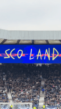
Last week, I was unsure of what I was doing and found myself getting into a bit of a funk. I wasn’t sure why until I took some much-needed time away to spend with my family and watch Scotland beat Belarus 2-1 at Hampden. But as I was sitting there getting a bit too swept up in a game of football, I don’t usually follow, I realised a few things, firstly, how much I loved the motion graphics of the Scottish Football team and how I couldn’t take my eyes off it and that I wanted to do something like that, I wanted to work for somewhere that did something like that.

And secondly, when I was enjoying the shared experience with my family and 50,000 other people, it hit me why I initially wanted to do the stories of people, because we are who we are by the lives we have, the stories we experience and tell, and the stories we share with others are essential. Today, we are more technologically advanced than ever before, but the art of communication, of spoken word and of telling stories in informal, spontaneous settings is dying out.
Chat with Gillian:
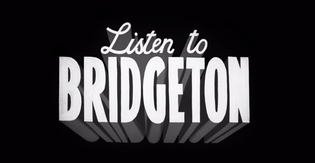
Listen to Bridgeton:
https://player.bfi.org.uk/free/film/watch-listen-to-bridgeton-2017-online
With ‘Listen to Bridgeton’, the story being told is such a personal one, of one man helping another through the language and structure of vintage bus restoration. This documentary has the exact same elements I would love to create: the personal, touching story, the honesty, and even the beauty of the spoken testimonies and the footage of the warehouse.
Lights Out:

https://www.chrisleslie.com/portfolio/lights-out/
It was once again the spoken testimony of people who actually lived in the flats, sharing their stories and describing it as a palace when it was new, with the beautiful footage of the flats themselves before their demolition. We often look at things, perceive them as we initially do, and don’t change our opinion until shown otherwise or given a look at the same place, object or time through someone else’s lens.
Intl Conference:
If I do love graphic design, motion graphics, and creative direction, then it would make the most sense to go to a conference for it, to see the front-runners in the field and look to them for a goal and inspiration.
Looking at more studios:
Initially, I was looking at Interaction Design studios last week, but as I mentioned earlier, I think motion graphics will likely be a significant part of it. No matter what the outcome is, I want to give consideration to the typography, the identity and the graphics of the piece.
Pentagram:


As with the previous studios, I want to look deeper and think of what works and what doesn’t, in an ploy to improve myself and with Pentagram, that is obviously a legacy brand, their work is obviously great and feels like the front runners in a modern yet feasible motion graphics and graphic design work, but the product design work follows that same methods but I believe that when in a different creative practice like product design, that must have its own style and more of a focus on form instead of flat aethetics.
D8:
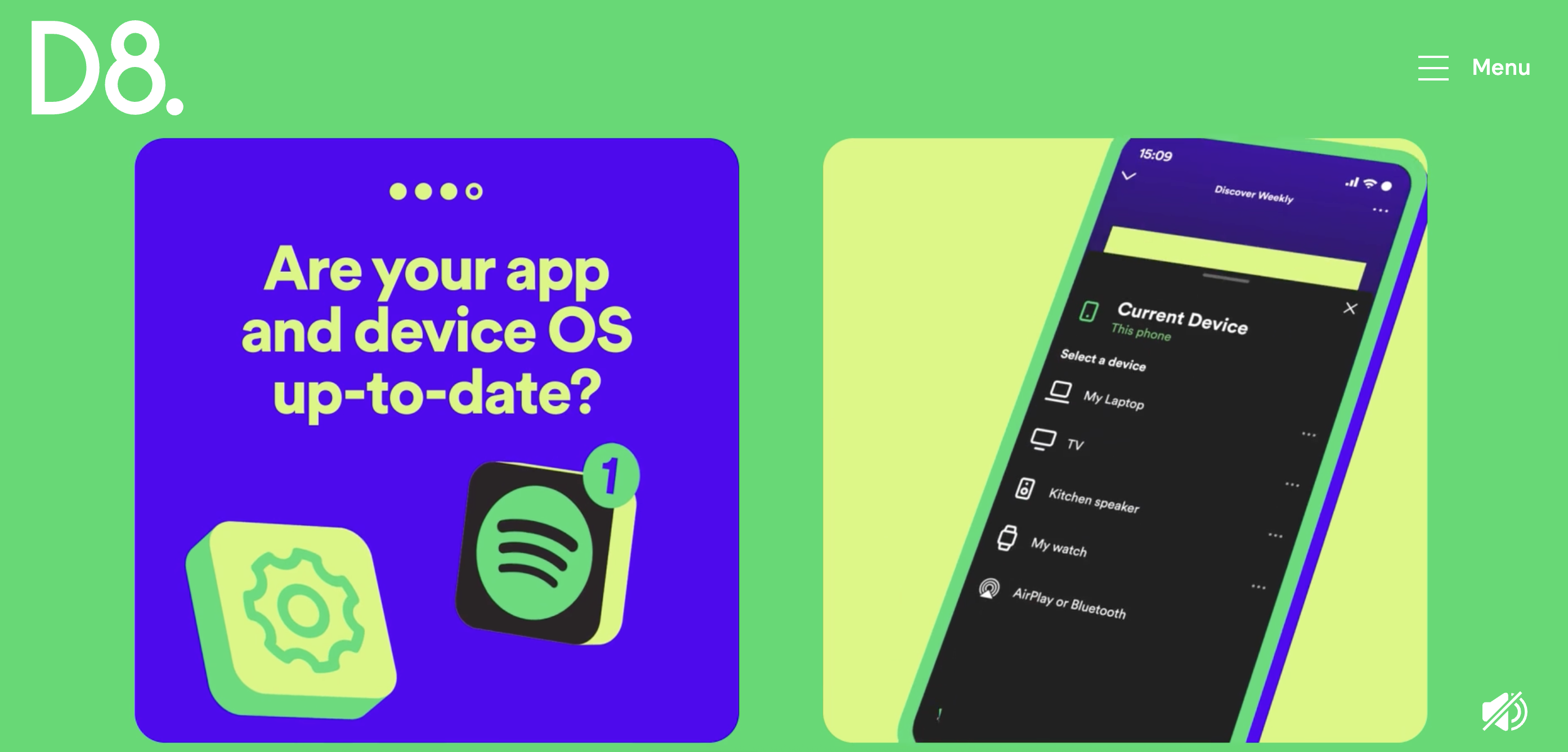

D8 is a studio that I have recently enjoyed without even knowing it. After reviewing their projects, I was surprised to discover numerous design campaigns I was familiar with and enjoyed, all originating from a single studio. They consistently delivered a modern, vibrant style that has recently caught my attention and held it. My only concern is the longevity of this style, and I’m sure they will adapt with the times as they have in the past but their most recent work already feels very “of its time”.
Applying that to my own work:
I see the style of these studios as two sides of the same coin: a new, modern style that’s cool and controlled, and another that’s more vibrant and punchy. My initial takeaway is that locking myself into one style is a quick way to go stale. I should be constantly developing and changing, both in my style and in my life, rather than being locked into one thing and turning away from everything else and secondly is that wether its cool and sleek or loud and punchy the presence of soul put into the project can be seen.
Typographical Motion Graphics:
After my chat with Gillian and enjoying the typographical motion graphics of the Scotland game, I thought this might be an interesting avenue to explore. Given how moving and engaging the documentaries were, I realised I could create something equally moving with simple imagery and audio.
Foggie Bummer:
With the foggie bummer video, it packs so much character and soul into such a short time. The energy and speed of the text on the screen carry through that same energy.
Looking to Clydebank:
In Clydebank, a local Facebook page is where locals share updates about the area, its current events, and its history. While it’s mostly filled with traffic updates and lost keys looking for owners, it occasionally offers hints at the town’s rich history.
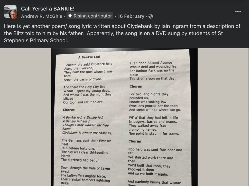
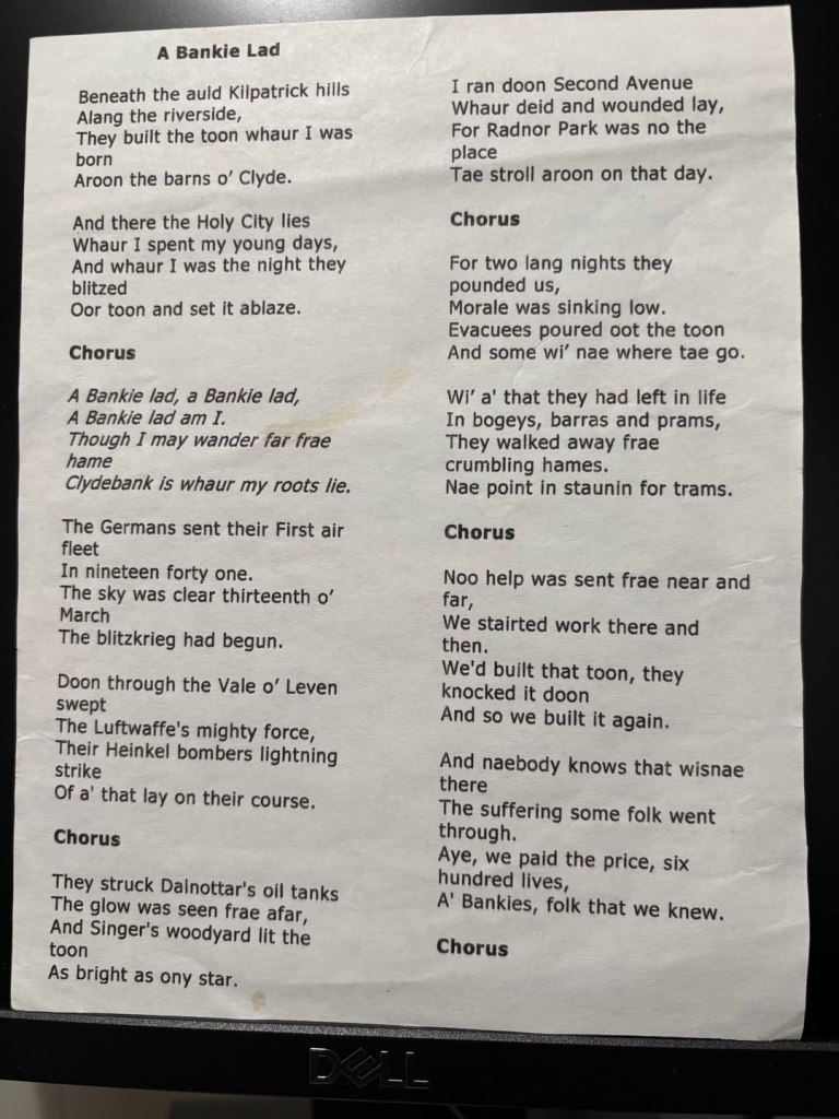
A Bankie Lad by Iain Ingram:
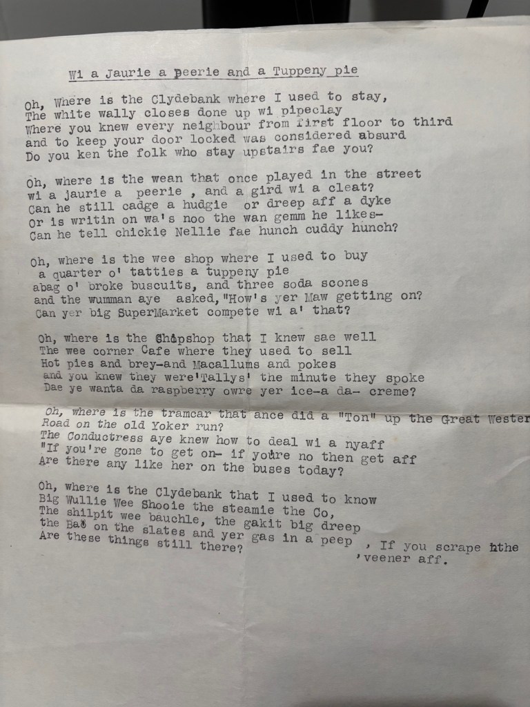
Wi a Jaurie a Peerie and a Tuppeny pie by Adam McNaughton:
Billy Connolly reads Norman MacCaig:
The extracted audio:
Typographic Output:

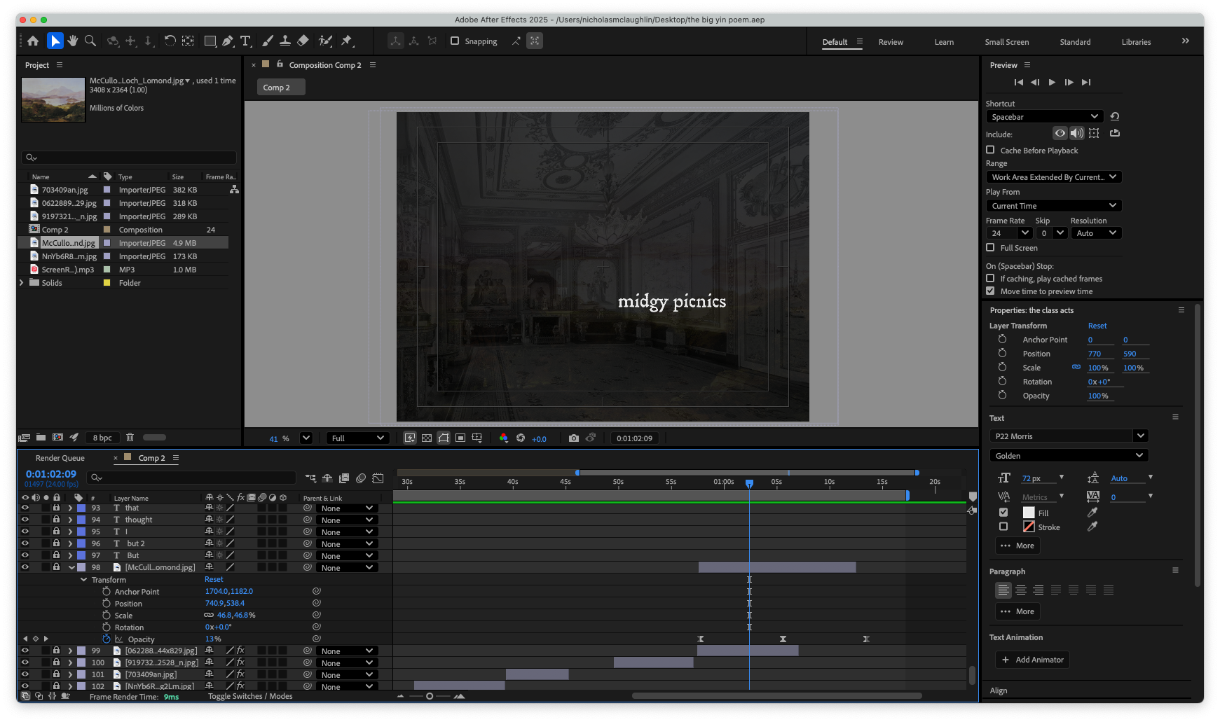
Giving time and consideration to the timing, the inflection, their voices, the relationship between the two men and the imagery that these poems describe and trigger in your mind, while still not taking away from the writing. Less is more.

Leave a comment