Project Launch
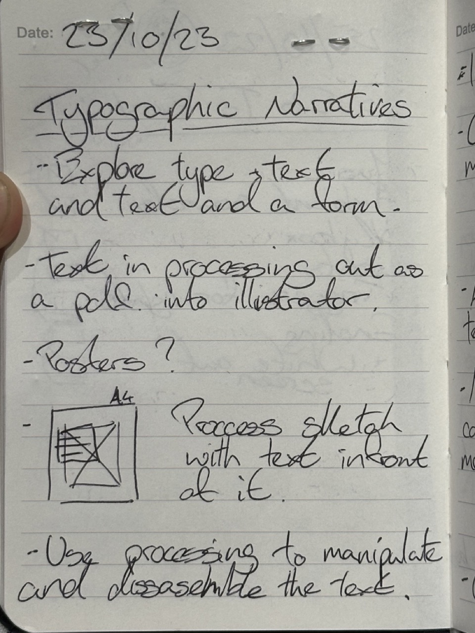
Workshop 01
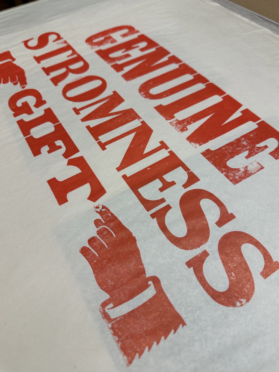
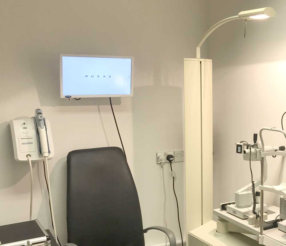
Visiting the Case Room

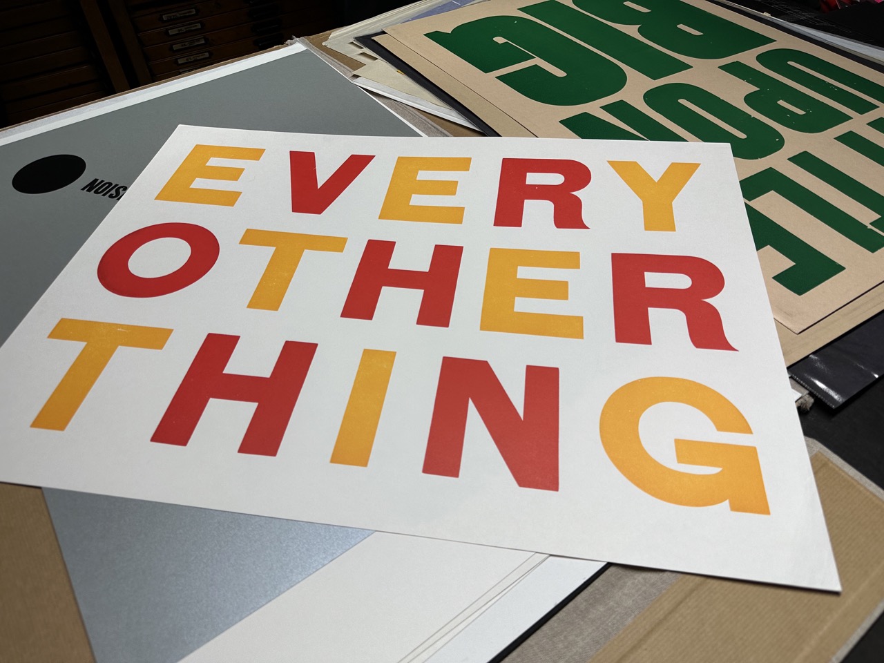
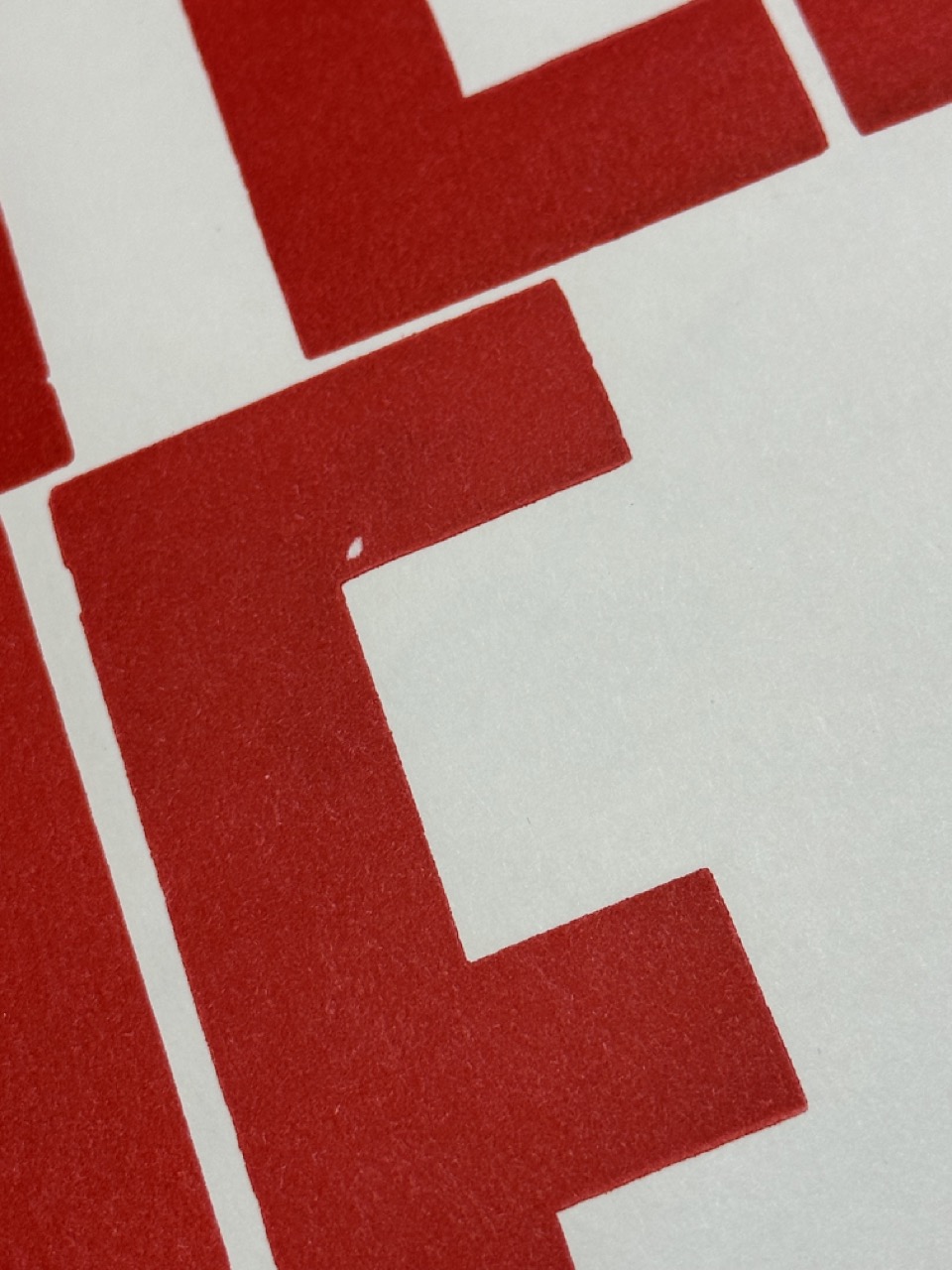


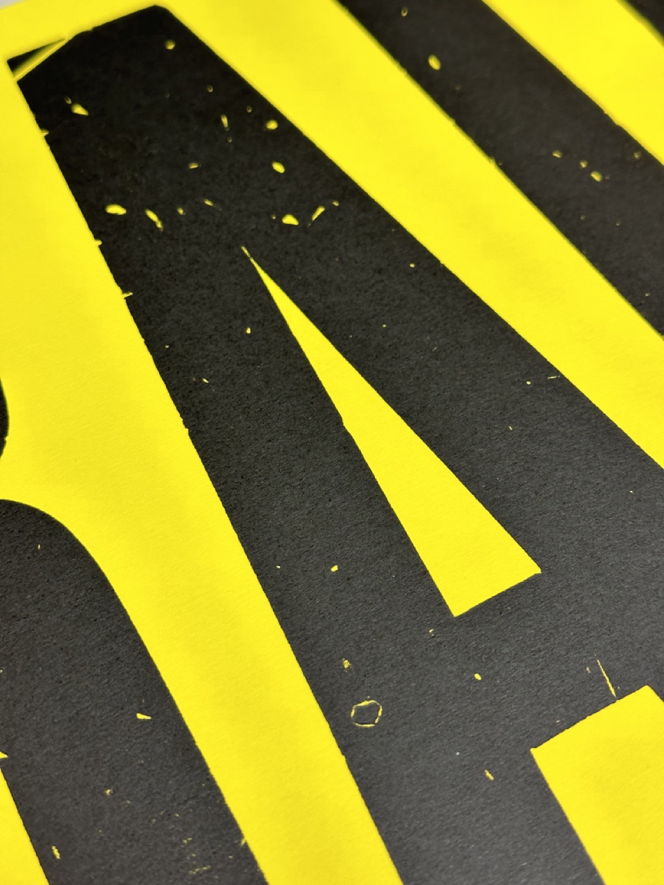
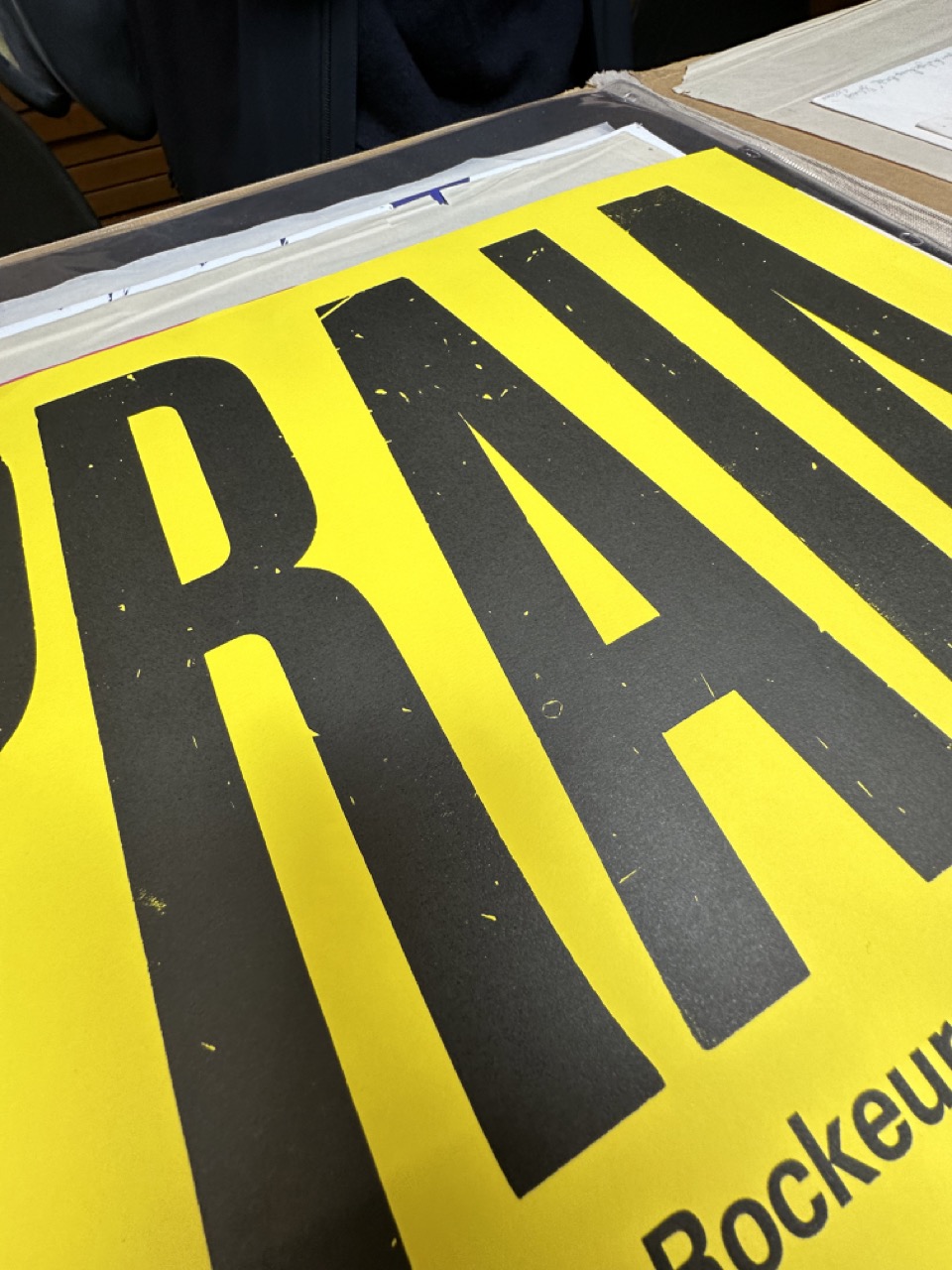


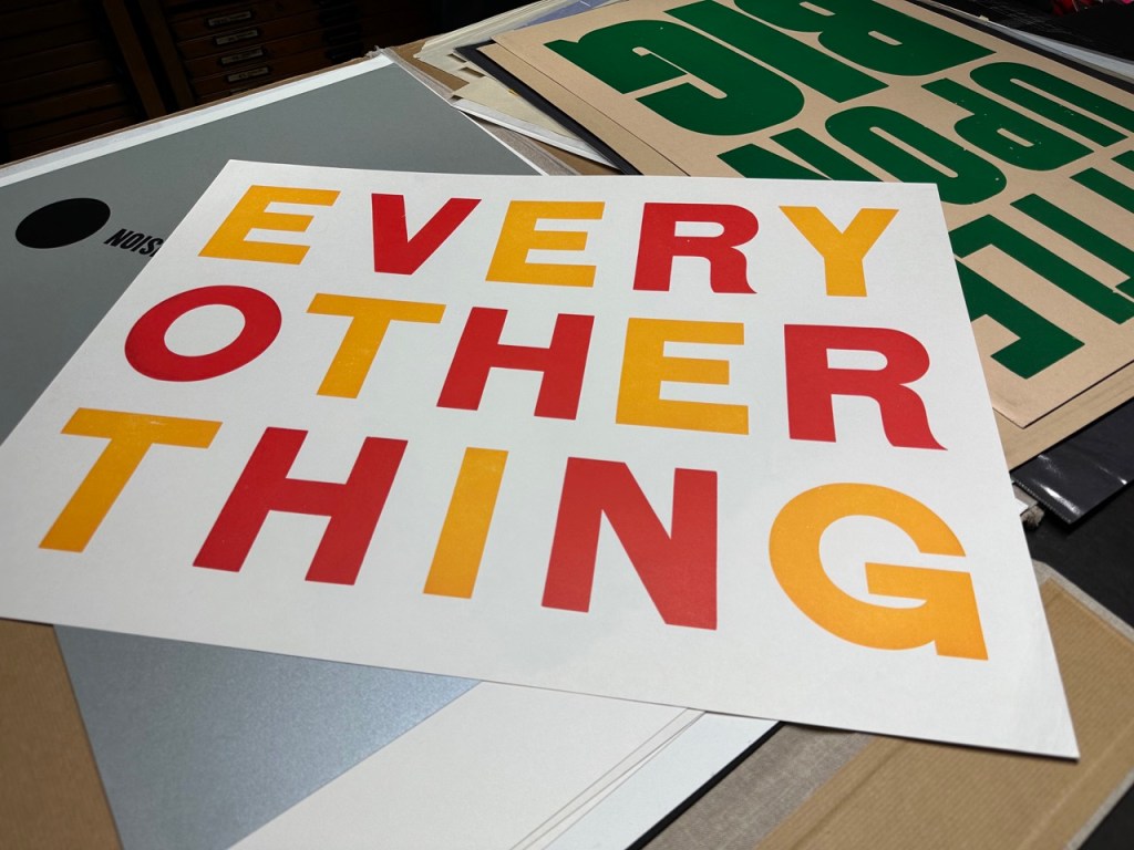
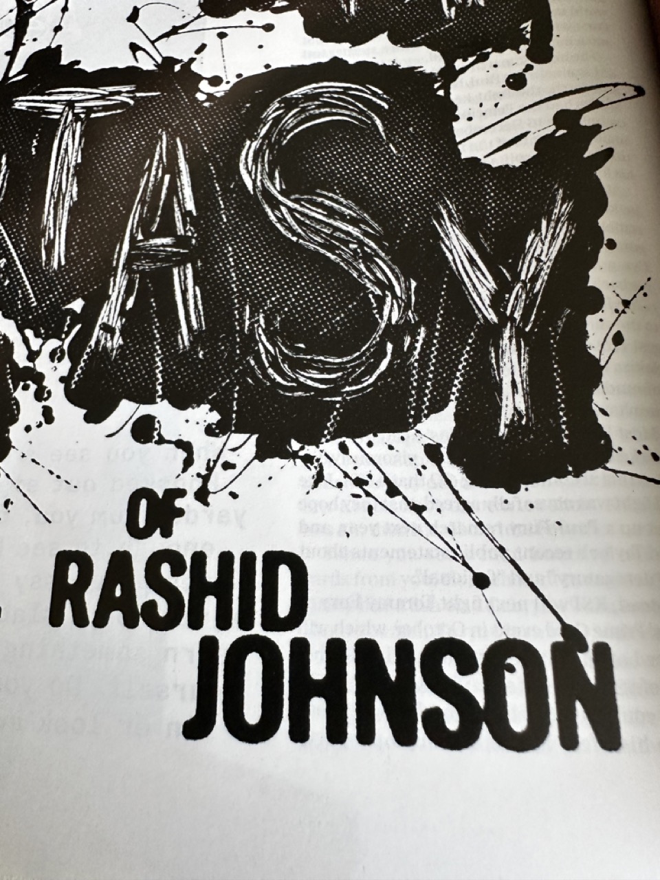
I was drawn to the EVERY OTHER THING print, and I’m not entirely sure why. I instantly saw and loved the bold Font, colour choice, and spacing of the lettering. I’m still determining if I want to bring anything of it into my project. Still, I thought it essential to document how much it affected me.
Research
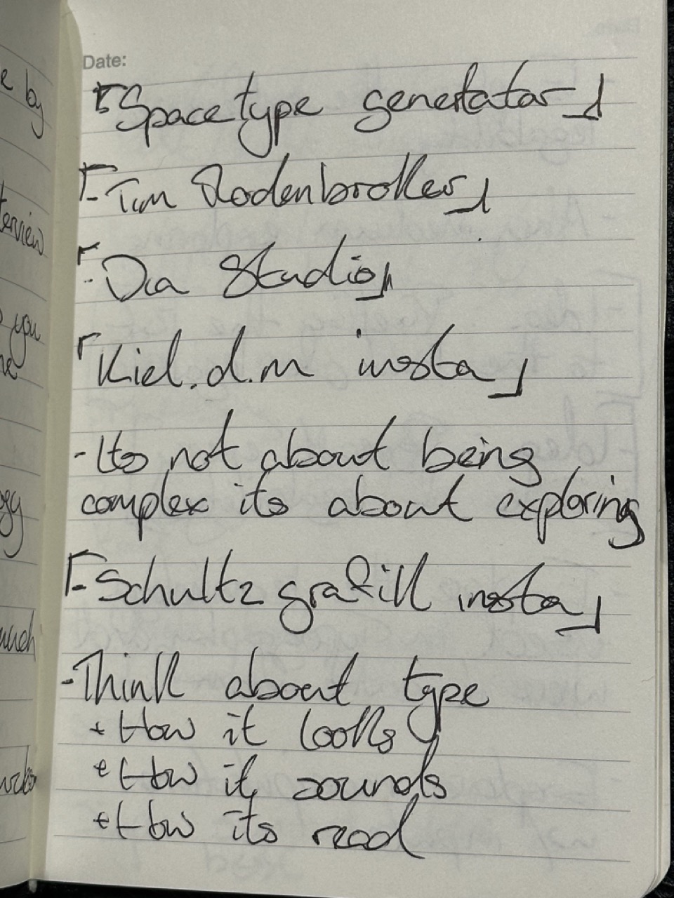
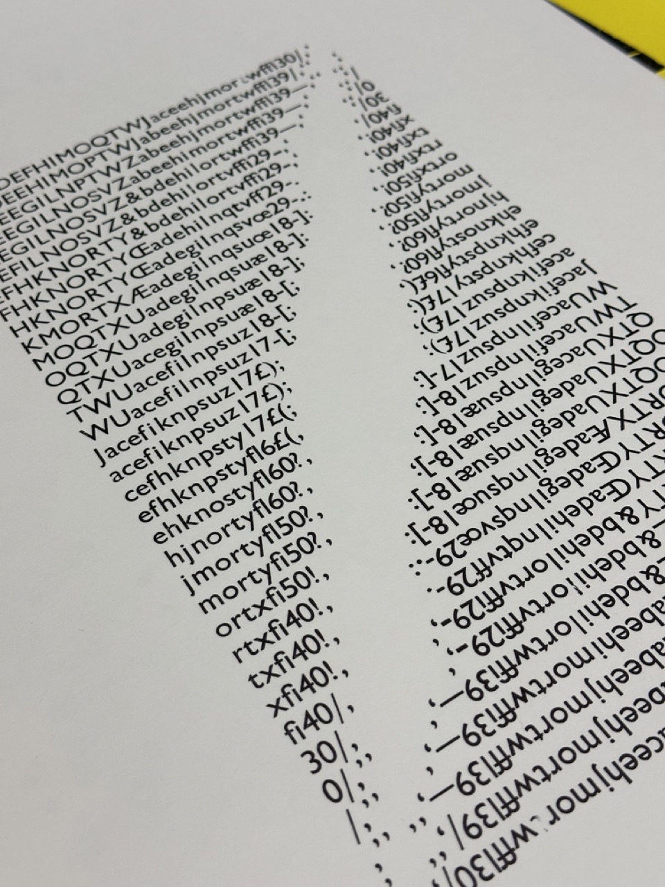
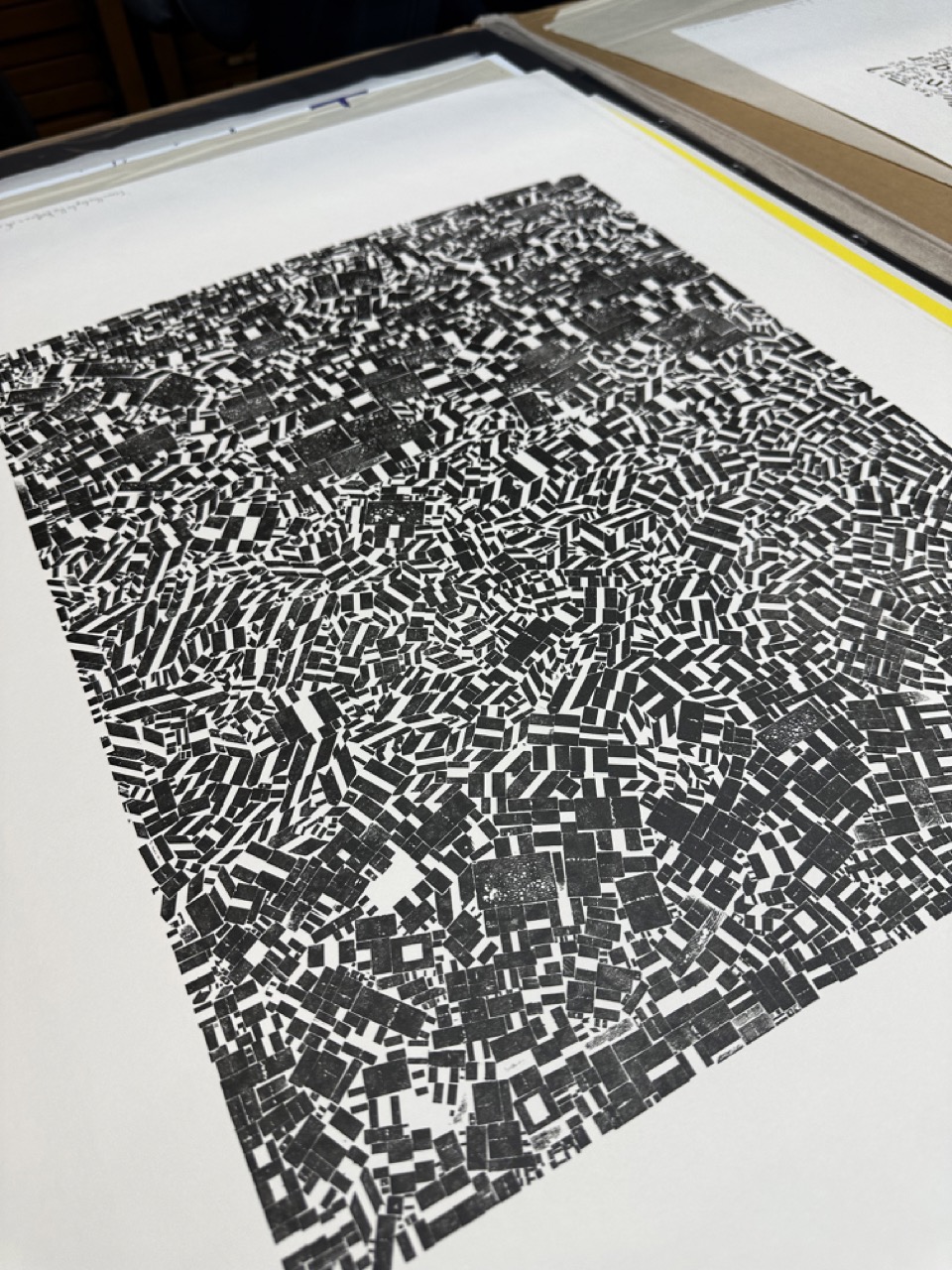
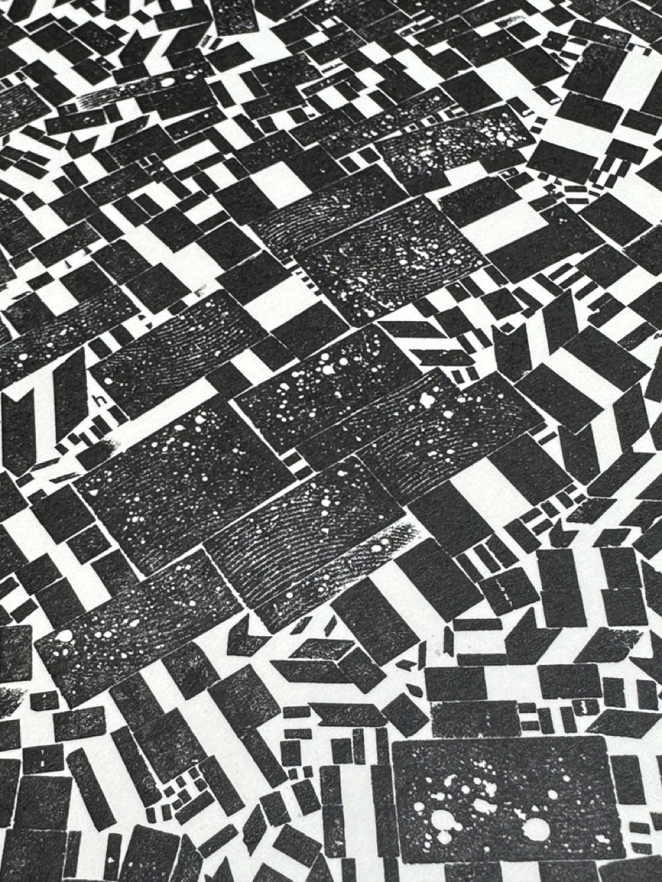
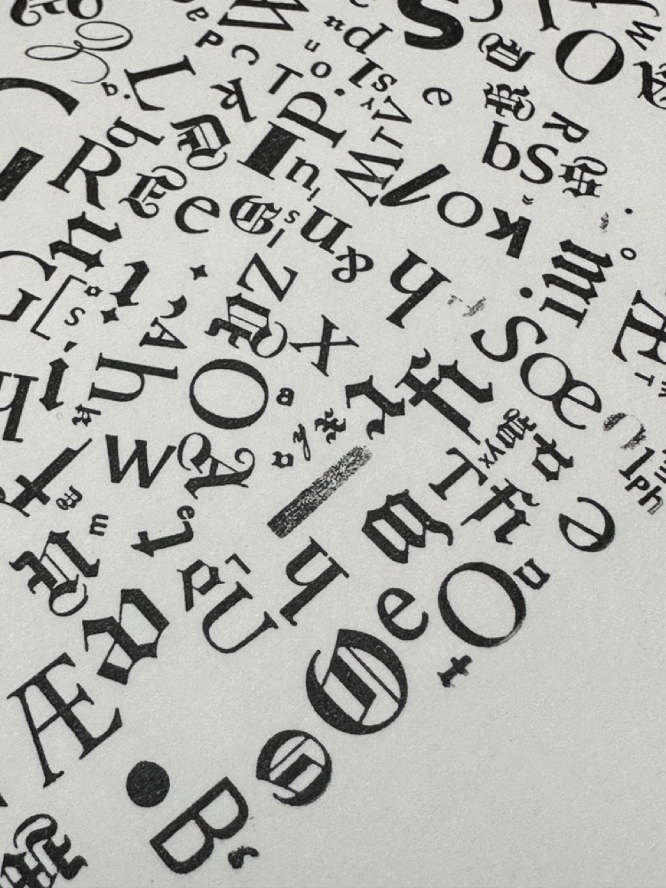
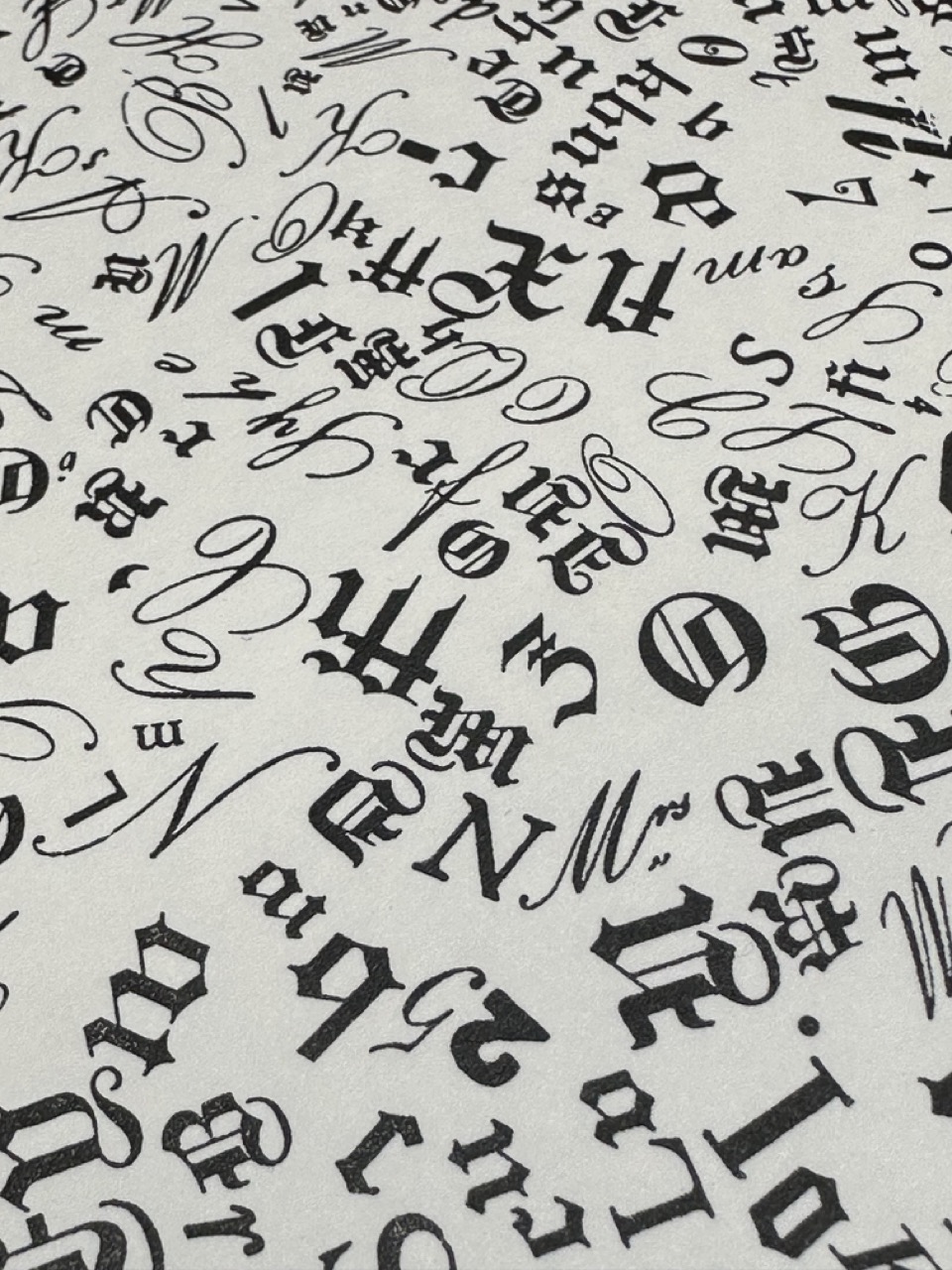
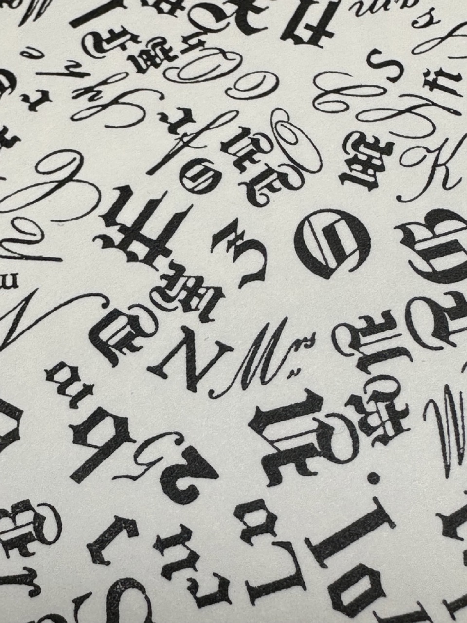
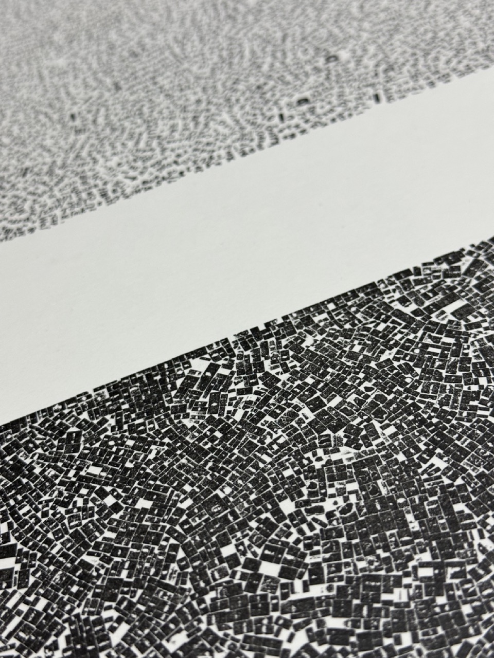
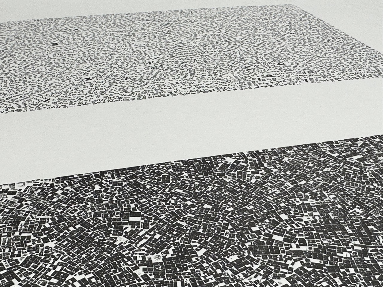
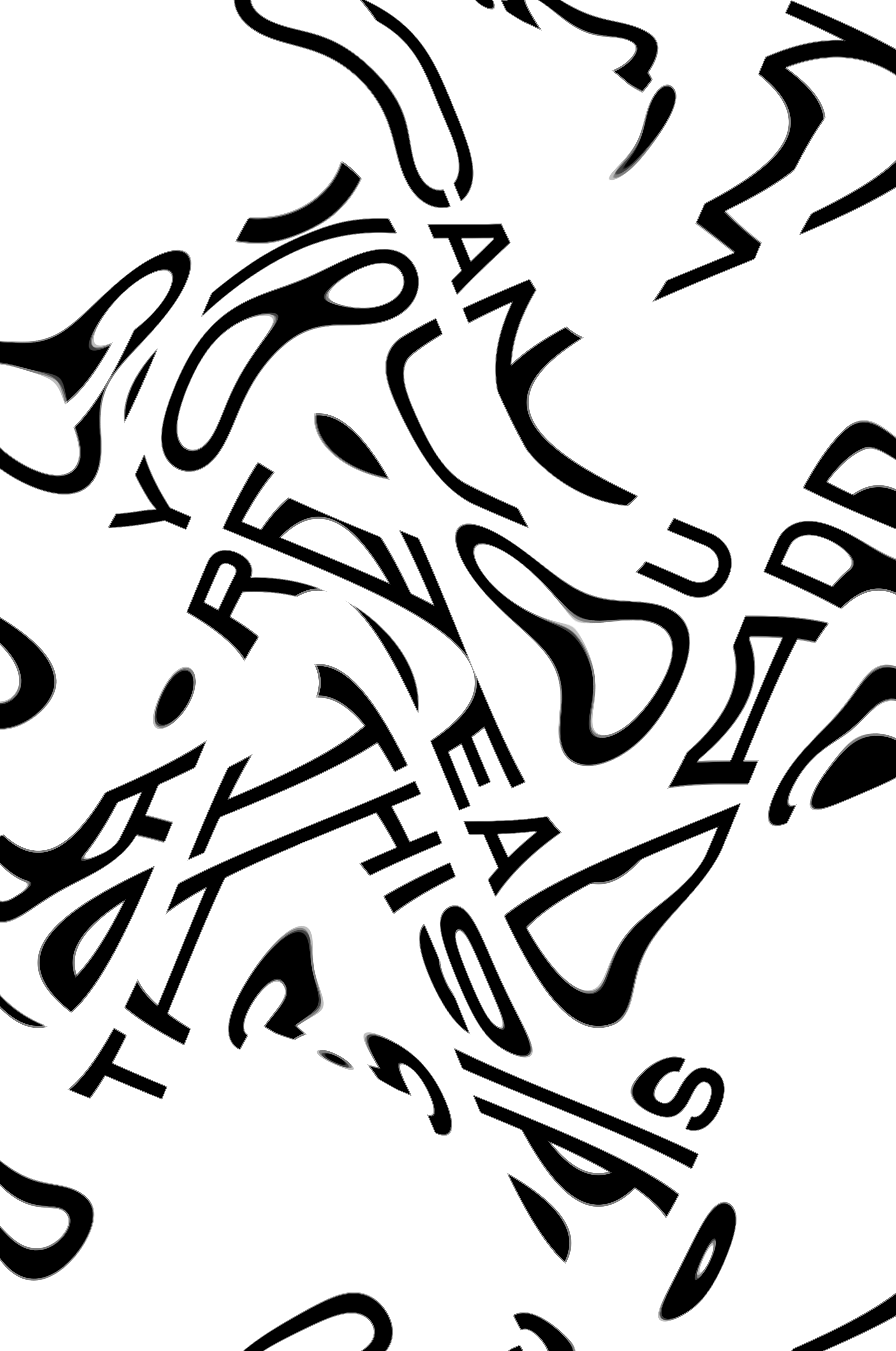
Space Type Generator
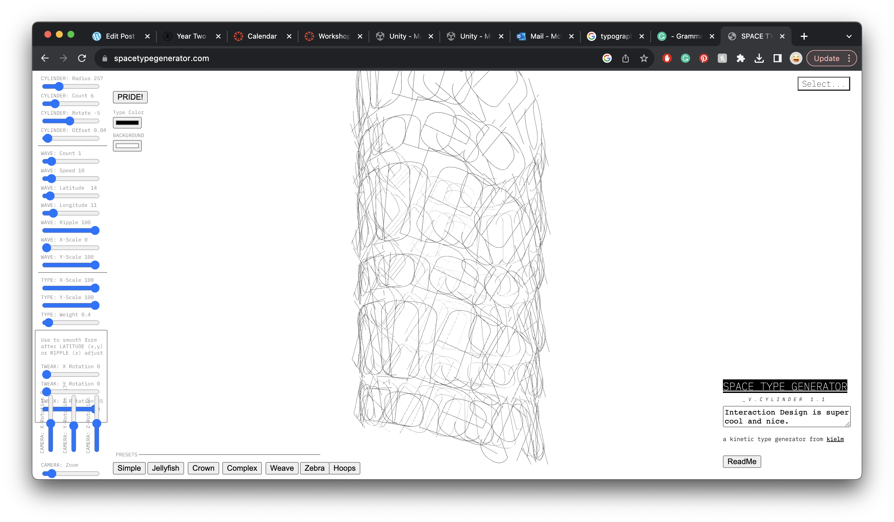
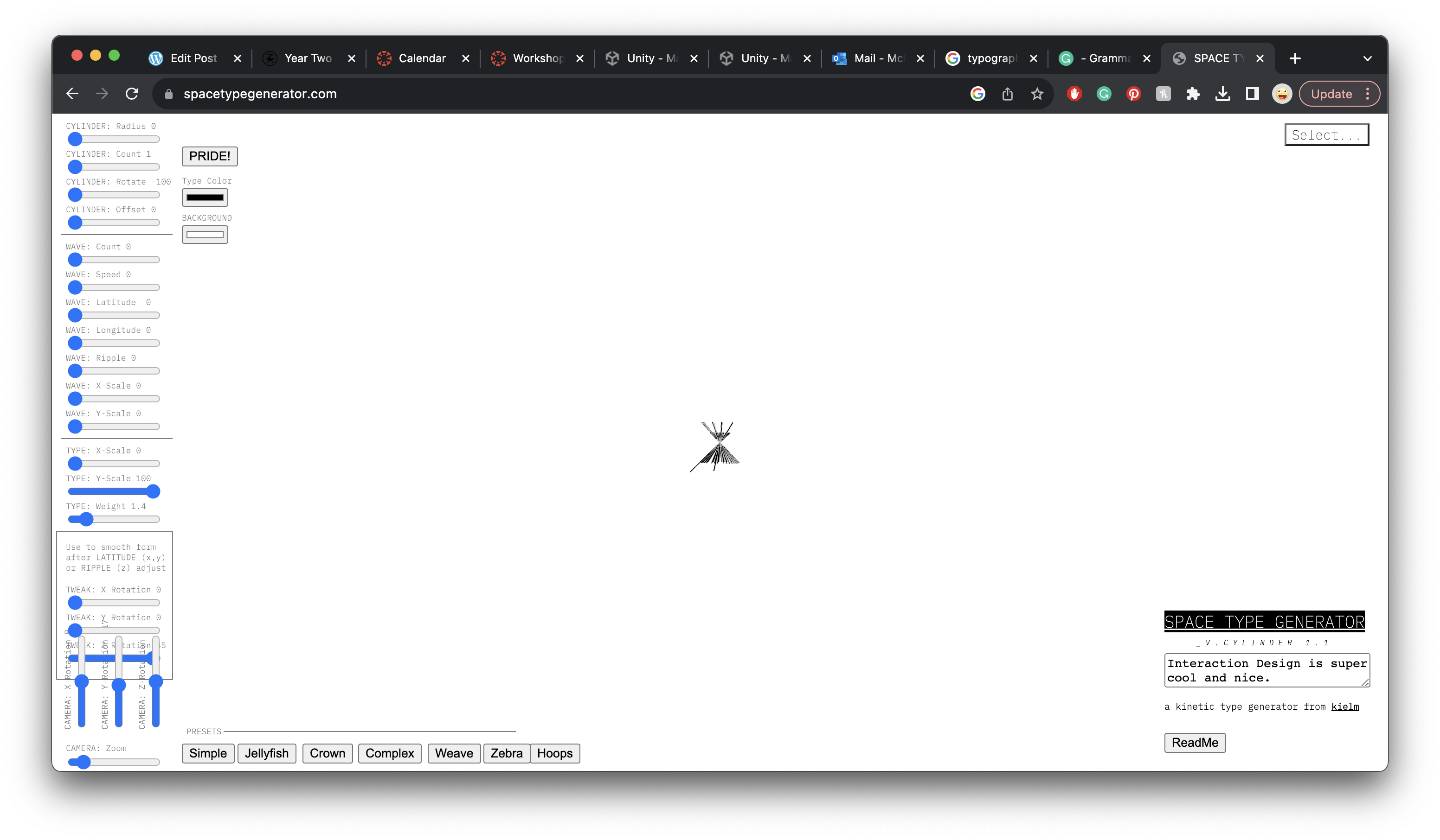
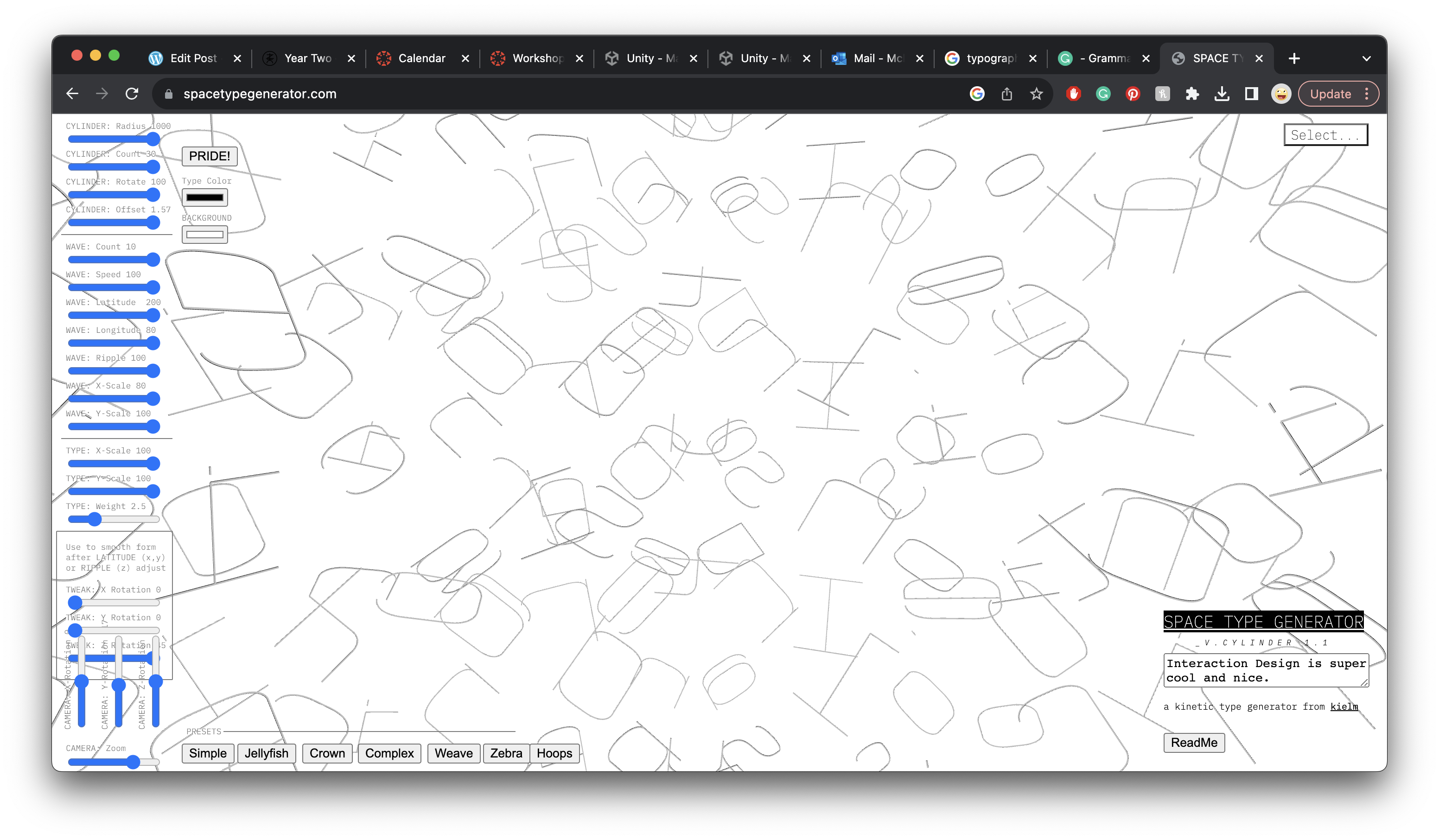
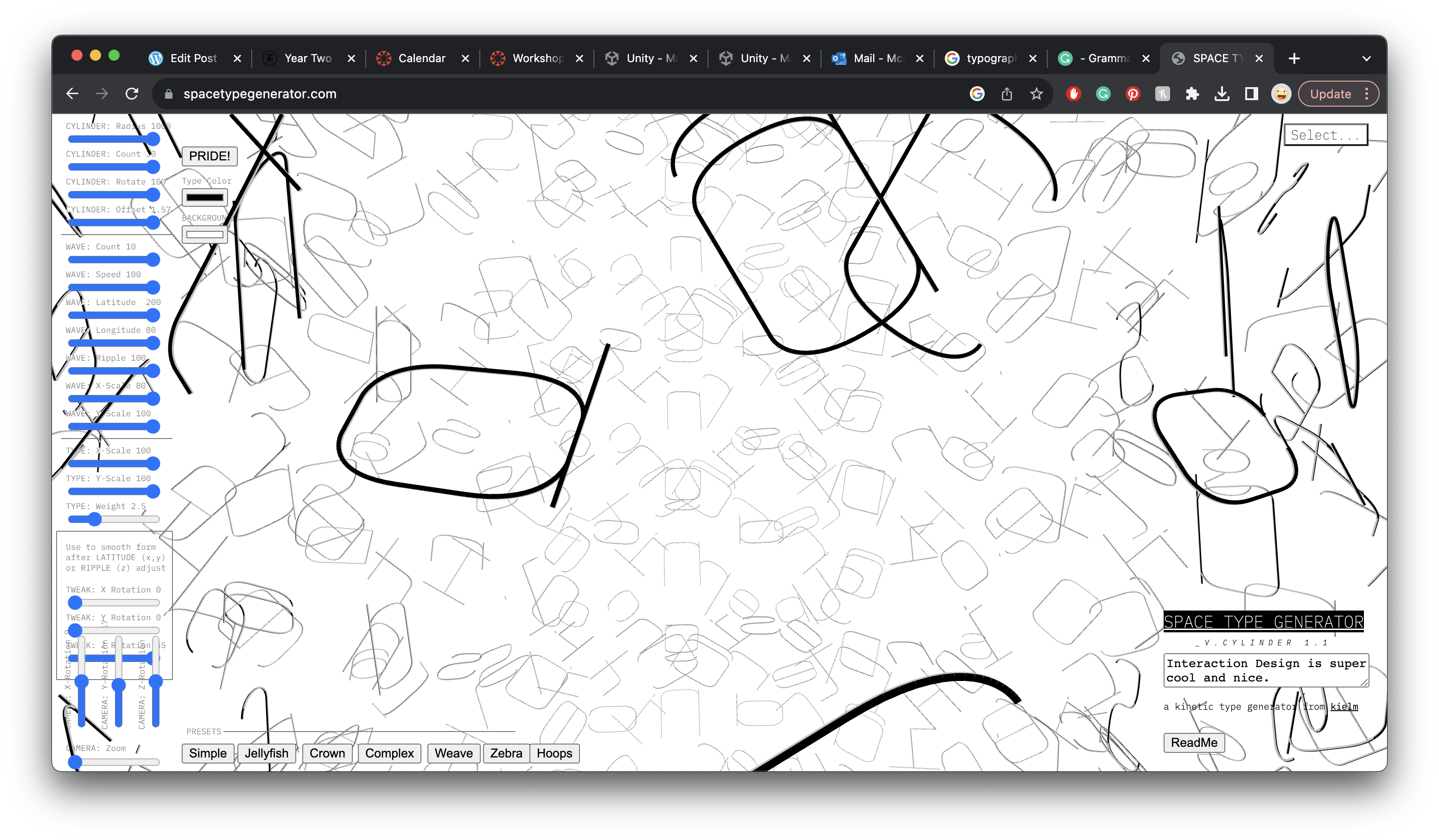

Above are just messing about with the Space Type Generator, seeing what I could make with it, pushing it to the maximum and minimum settings.
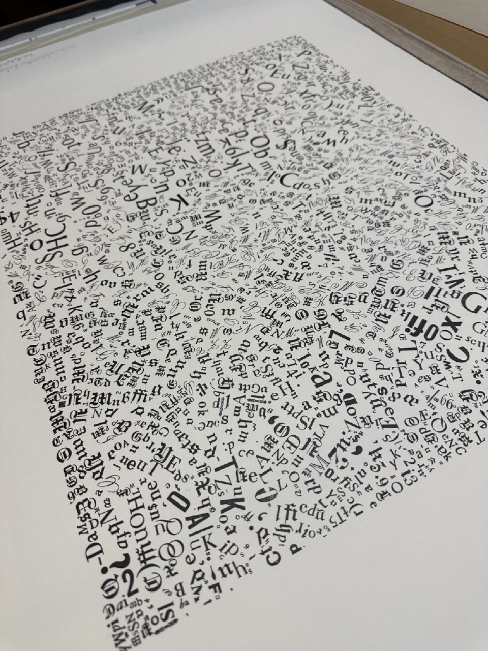
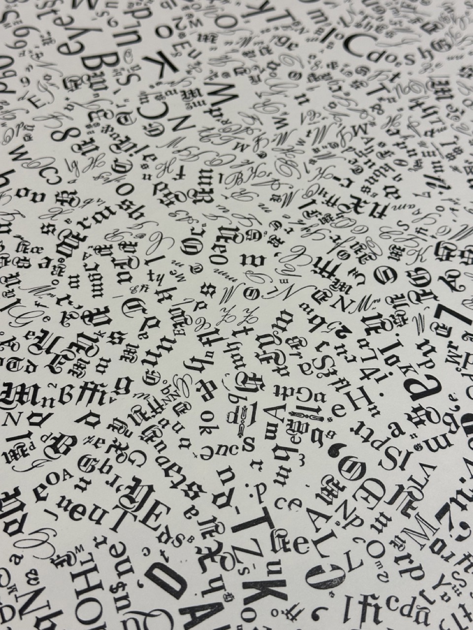
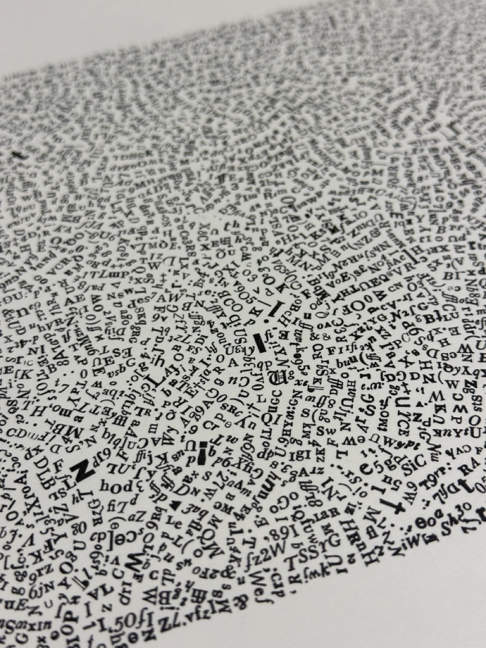
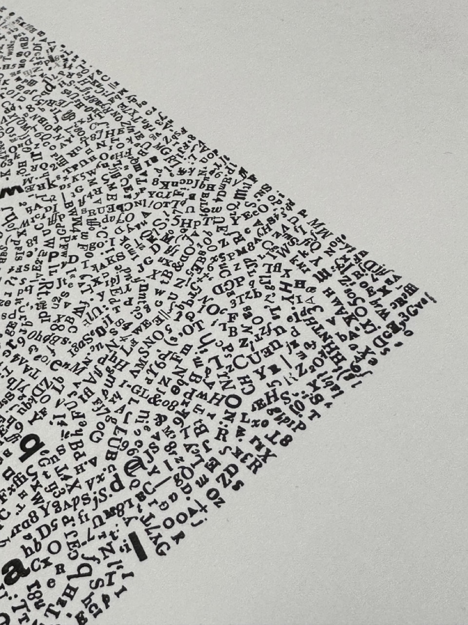
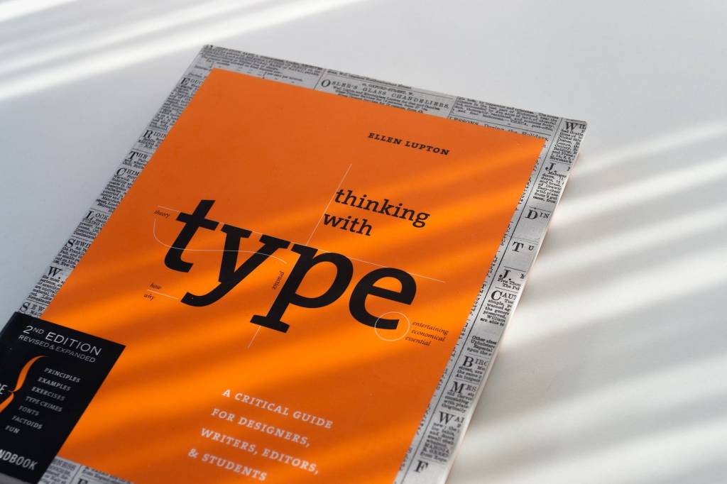
Thinking with Type by Ellen Lupton.
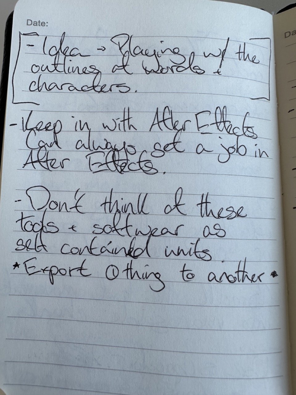
The book does a fantastic job of telling you what and what not to do how to use type well and effectively, and what not to do, but I thought about what happens if you do what Lupton is asking you not to.
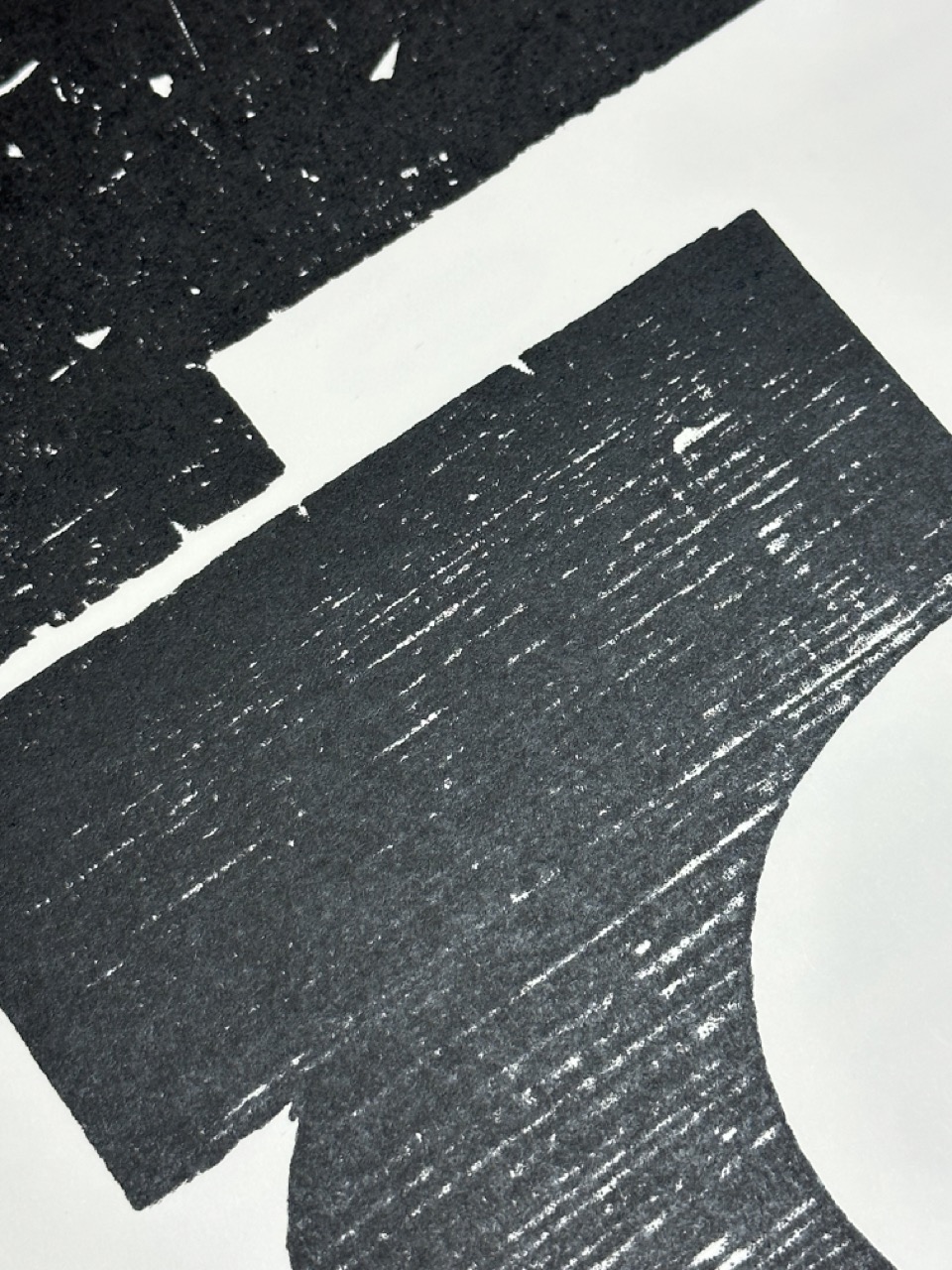
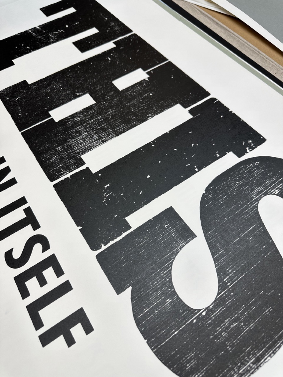
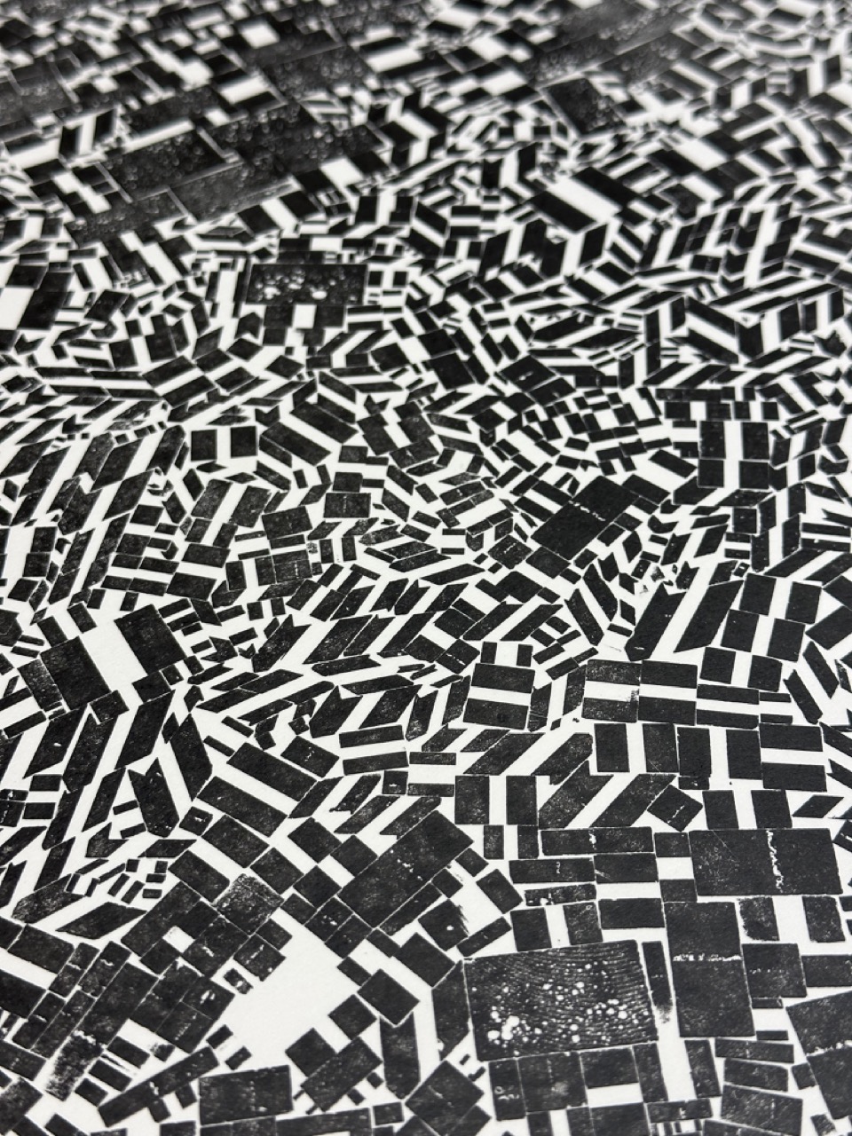
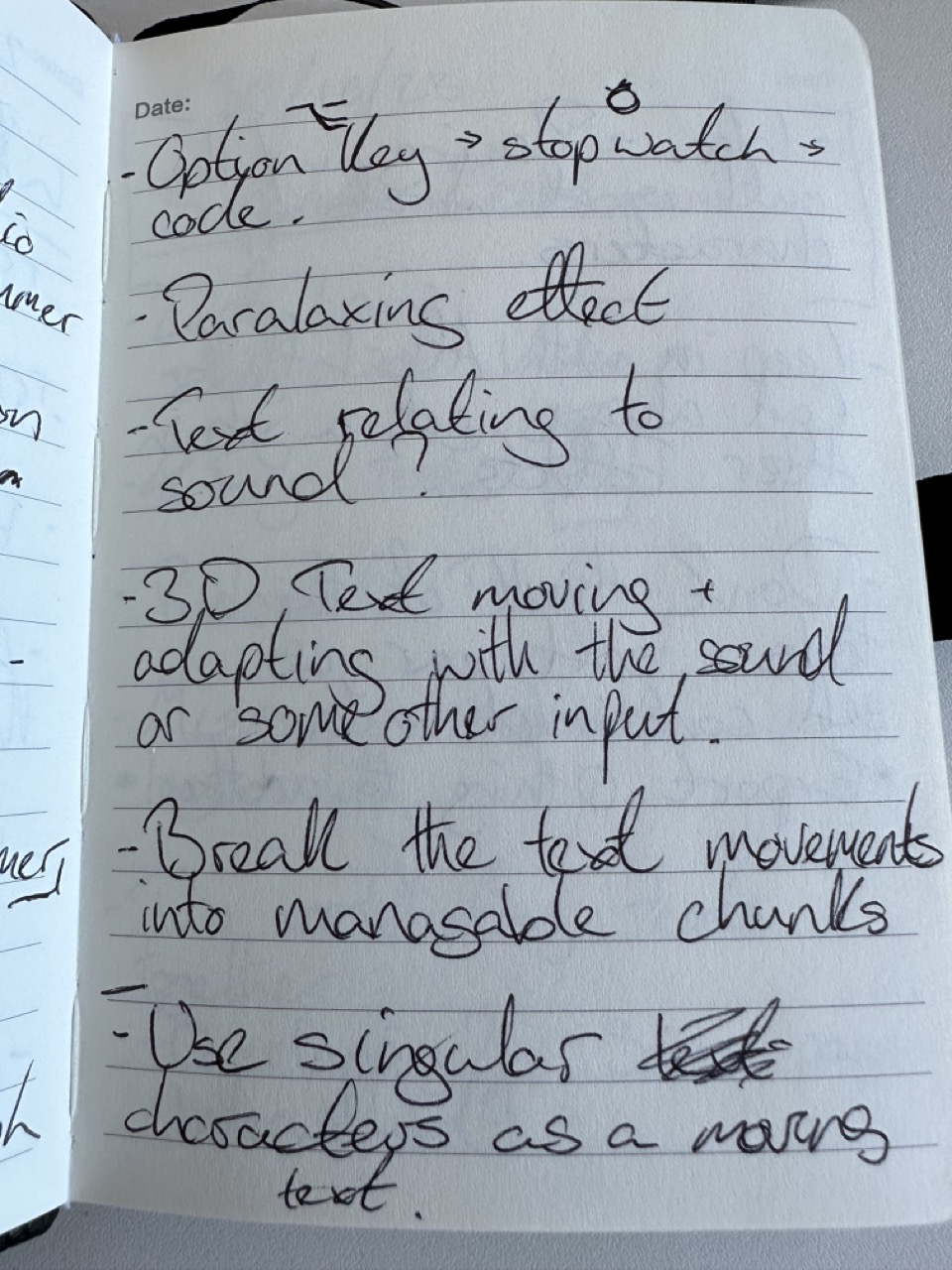
Mark Making
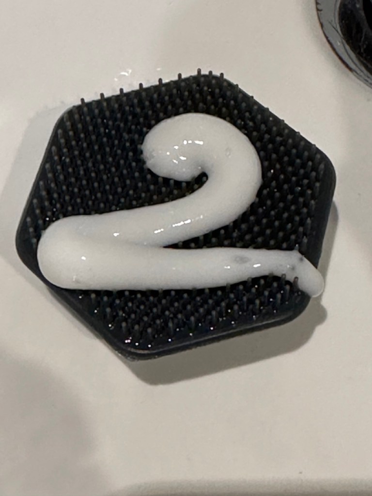
An idea I initially had last year when talking with the then 2nd year students was to use some sort of liquid or gel to write the text like shower gel (shown here) or washing up liquid. Essentially using the same techniques as piping bags and icing but with its own distinct properties due to its nature.

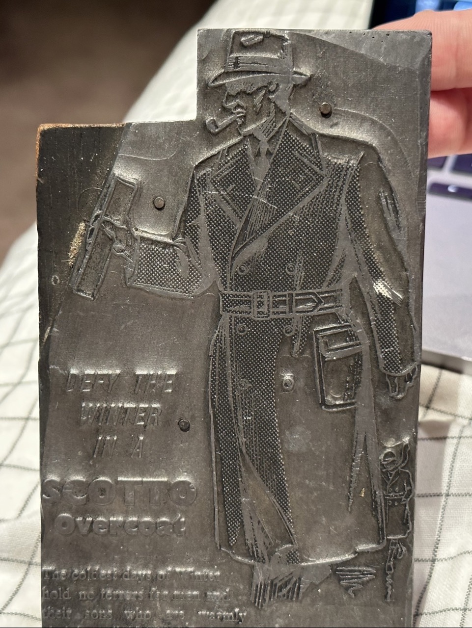
Above is an ad for a Scotto Overcoat I picked from an antique shop years ago. I’d like to use this in my mark-making process to see what it will look like when printed.
Workshop 02


Support Session

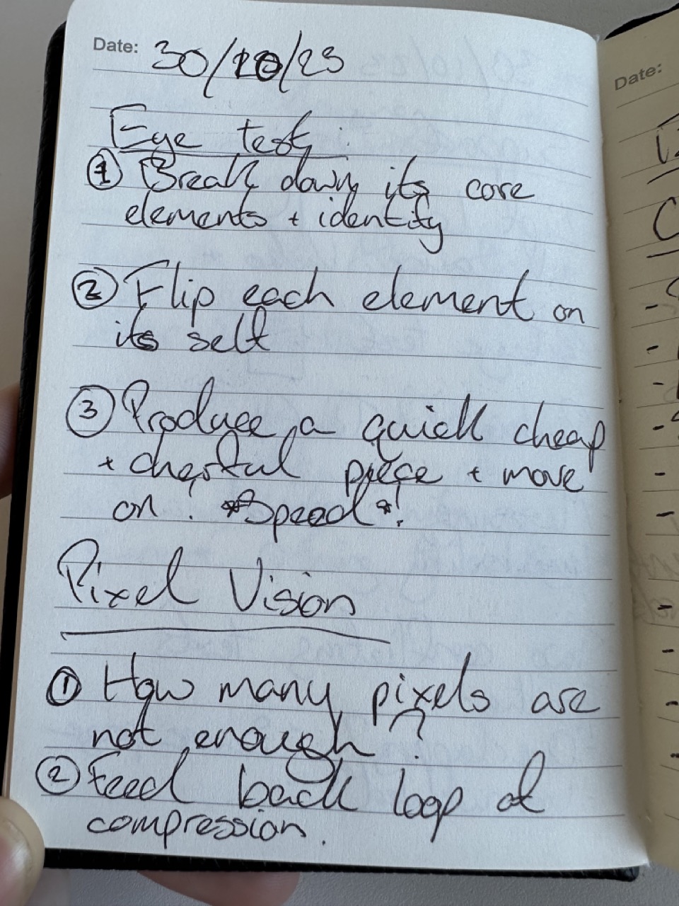

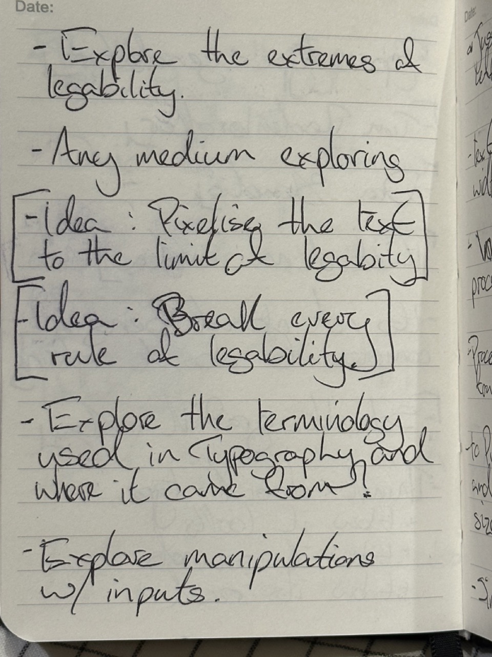
Legibility and running with the Eye Test
After my talk with Paul, I had a direction to go on. I knew I wanted to do something with legibility and not be able to see what you are supposed to or needed to do. Still, then, pulling from personal experiences, the idea of eye tests and out-of-focus text was something I wanted to follow or the over compression of text and pixelisation of it.
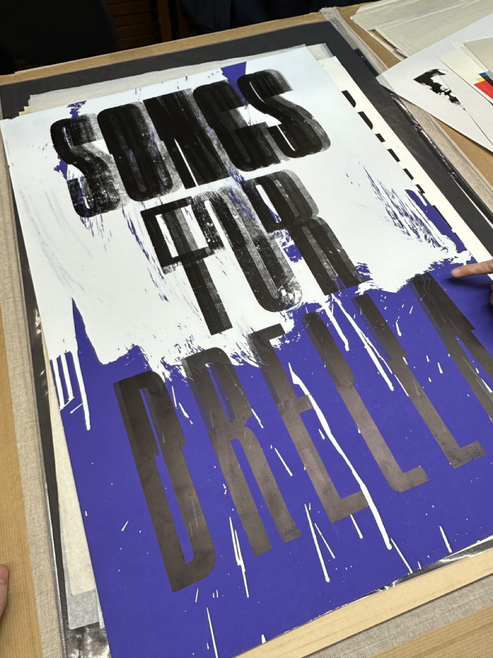
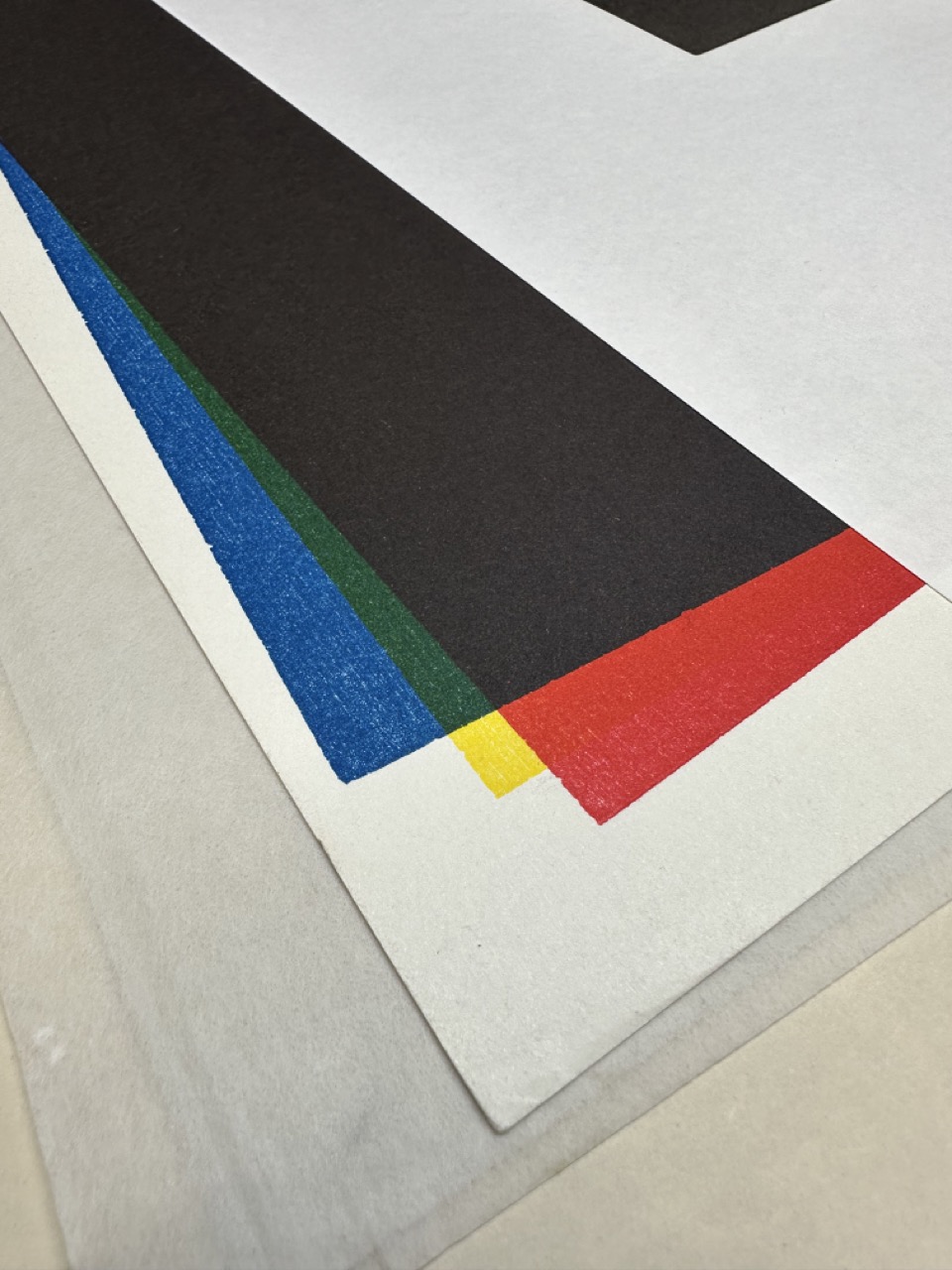
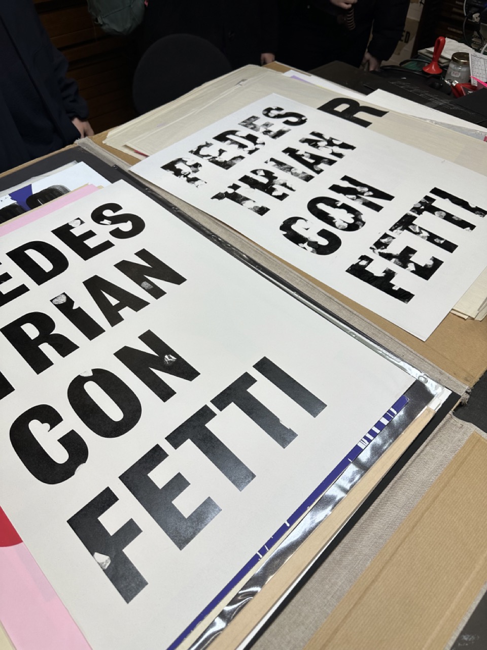
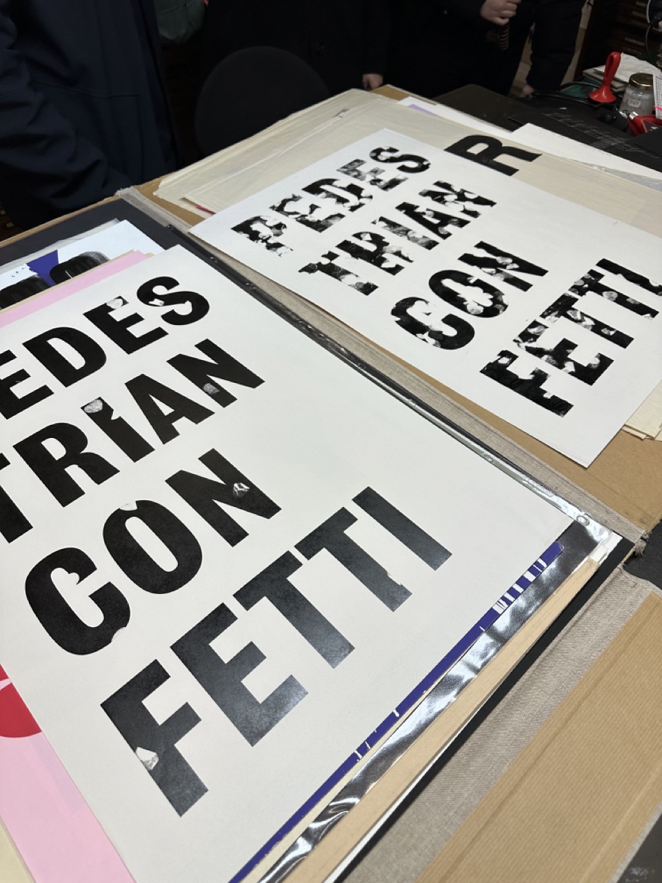
Print Research


Workshop 03
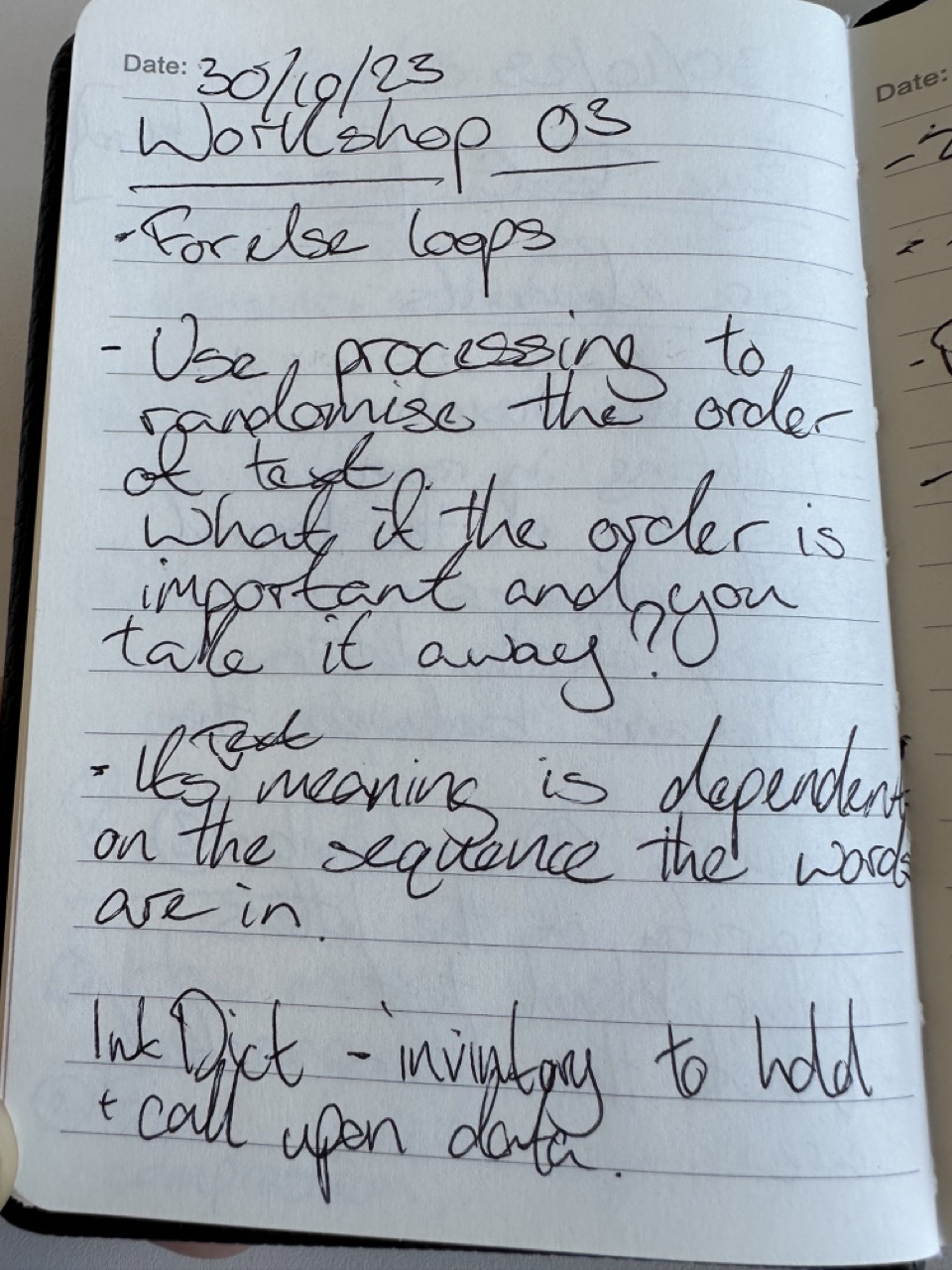
Game Plan
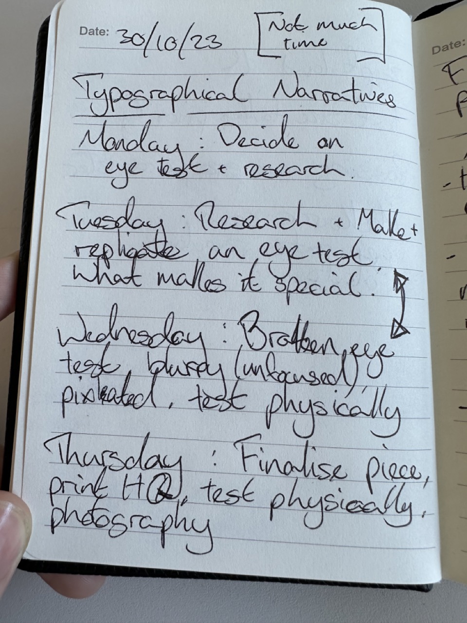

With one week left, I needed a game plan; the first week, I was honestly half distracted with finishing the Realtime Events project, so I did get research done and had ideas but might have been more informed or had time for exploration, but we can’t go back in time only forward. With my game plan, I looked into eye tests and creating one.
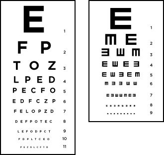
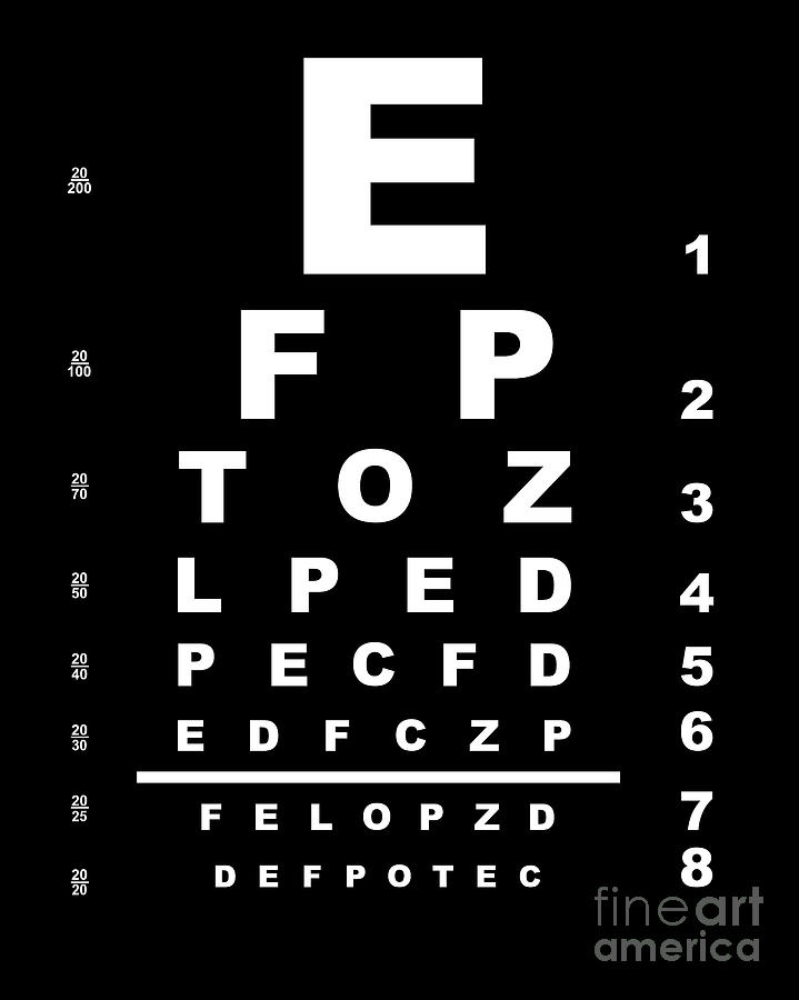
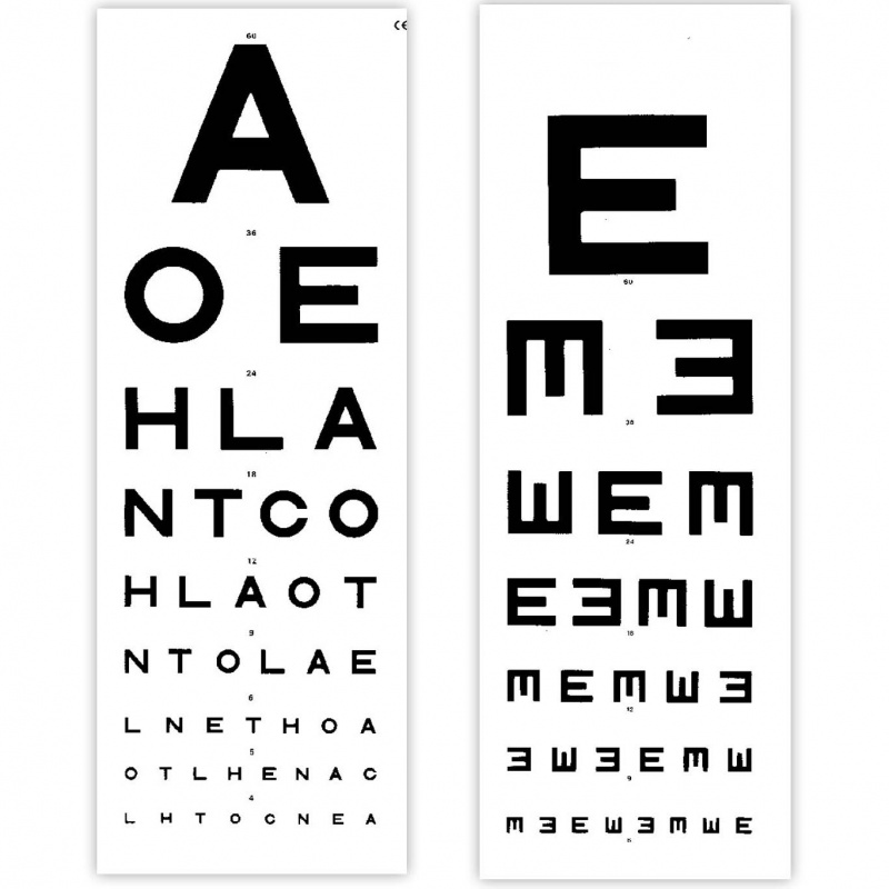
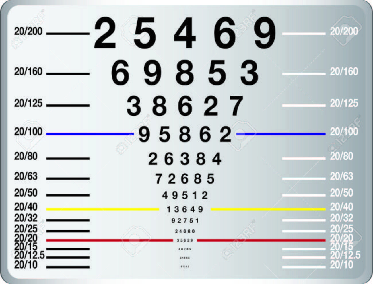
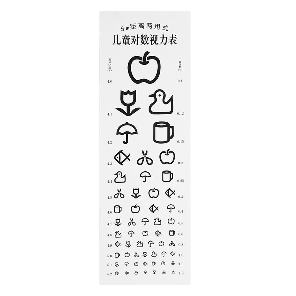
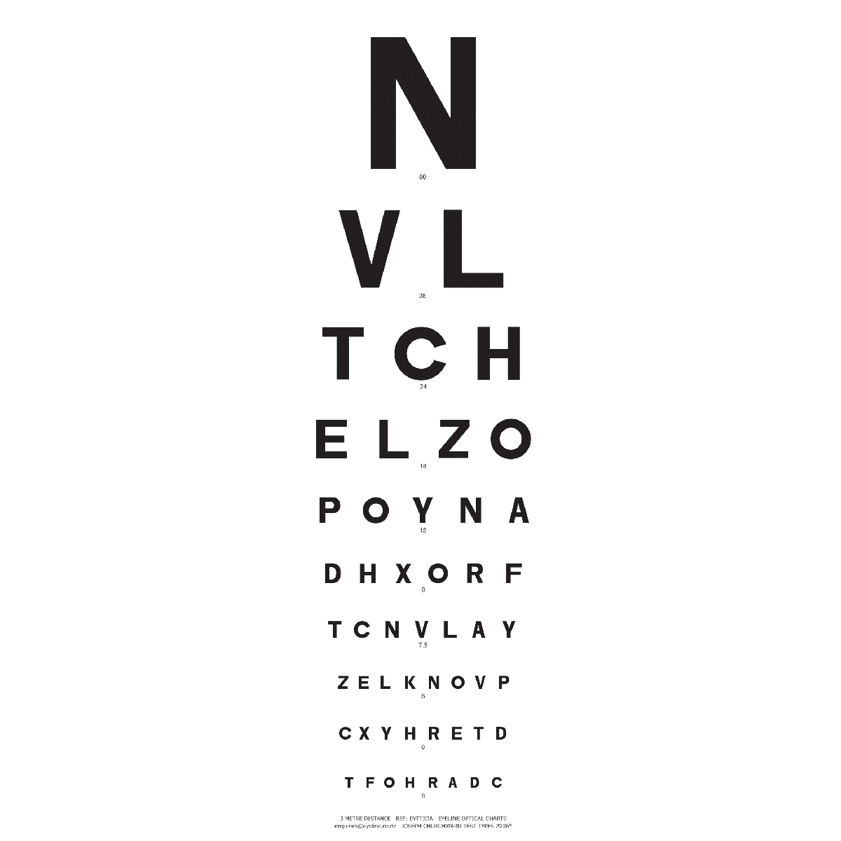
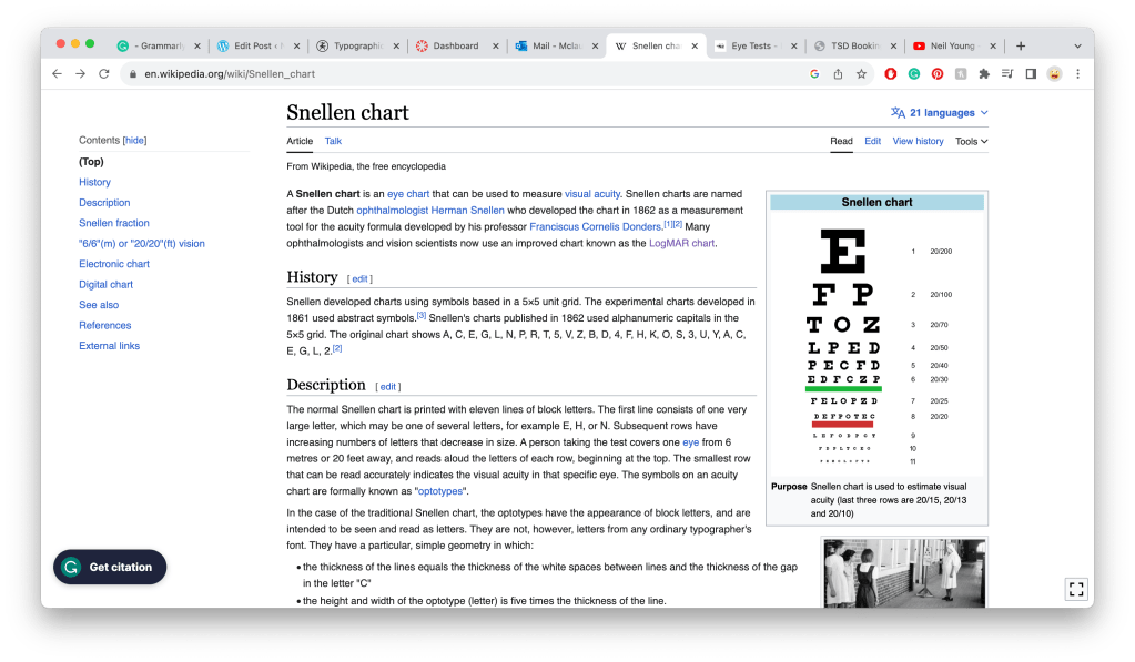
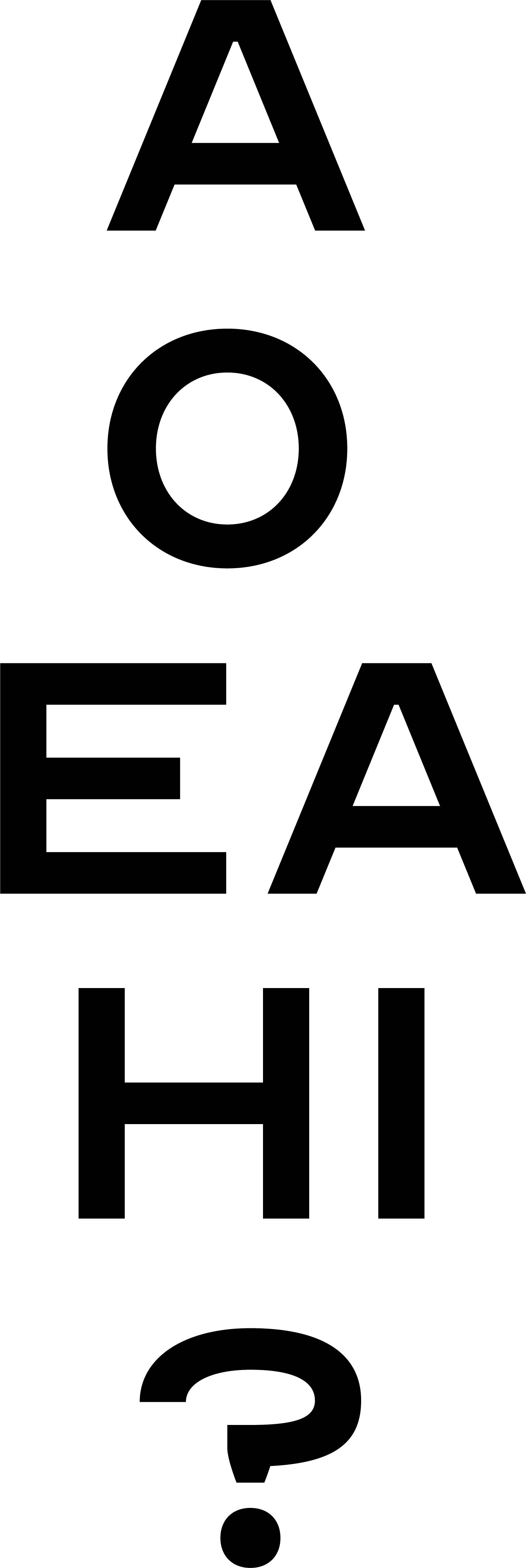
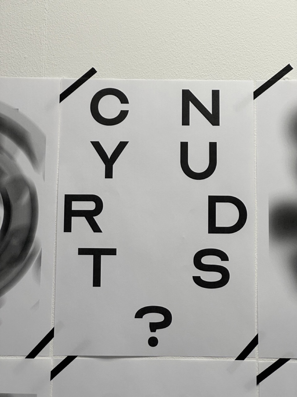
Eye Test Chart
Research into traditional recognisable eye tests and how I can make mine as close to the original as possible. I don’t want it to be evident that mine does or says something different.

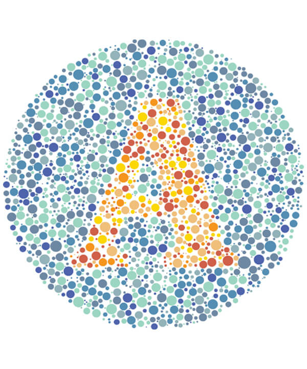
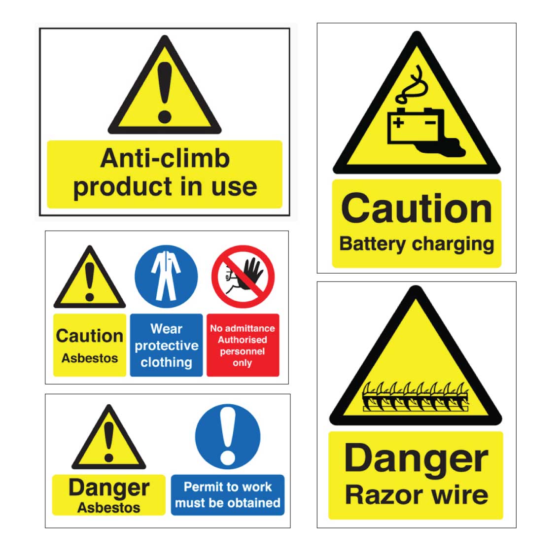
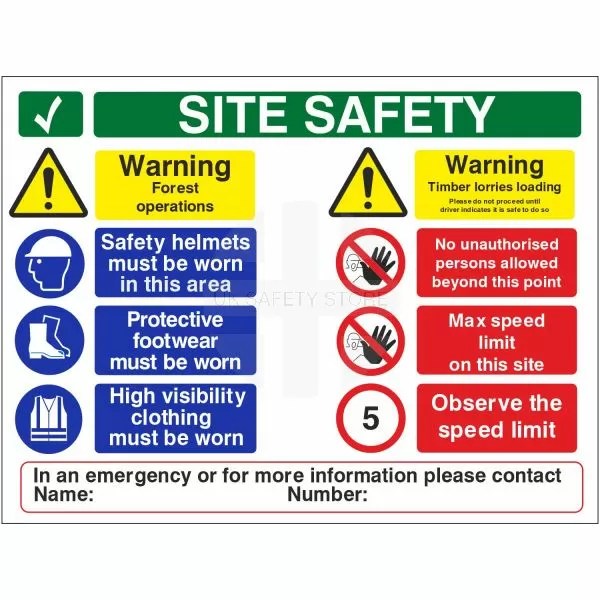
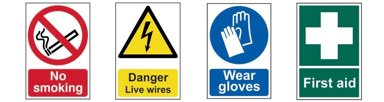
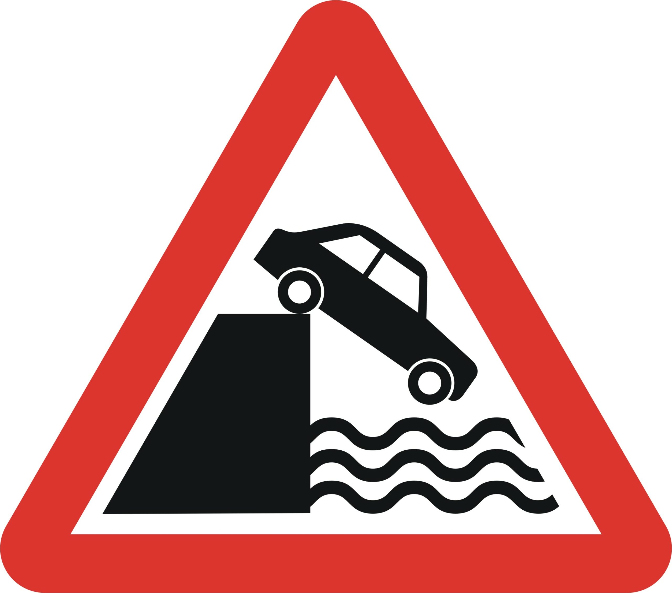
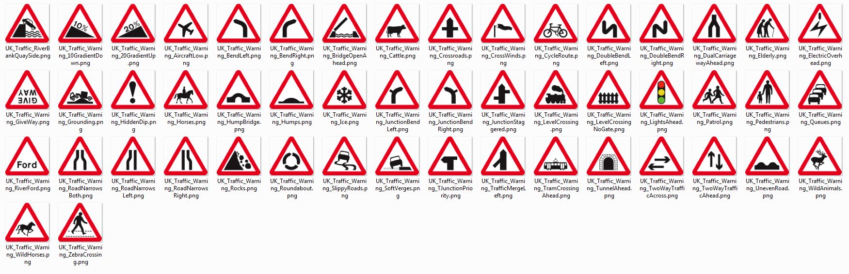
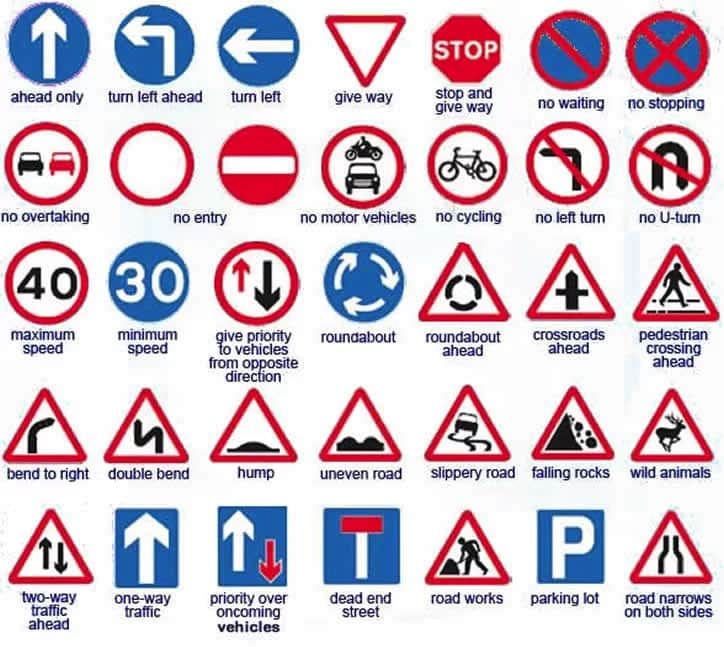
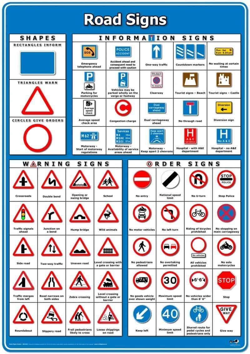
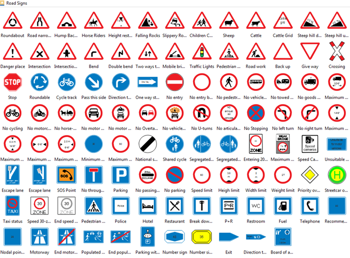
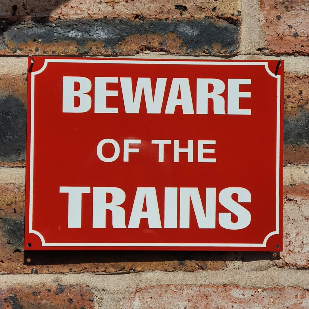
Important Signage
When thinking about the mock eye test, I kept thinking about the importance of being able to see. Words, signs, warnings. How important is it to see what we’re being warned about and what would happen if we couldn’t?


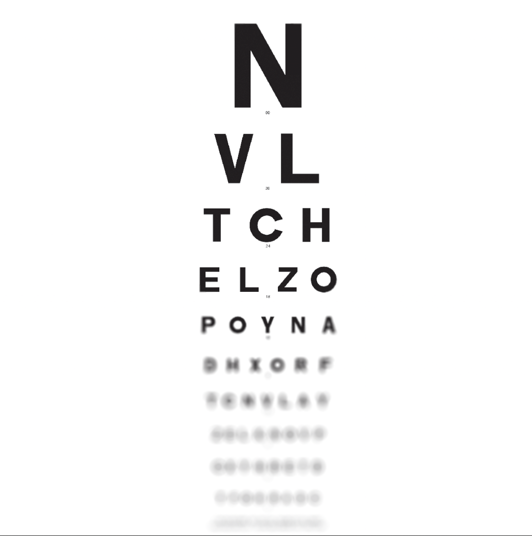
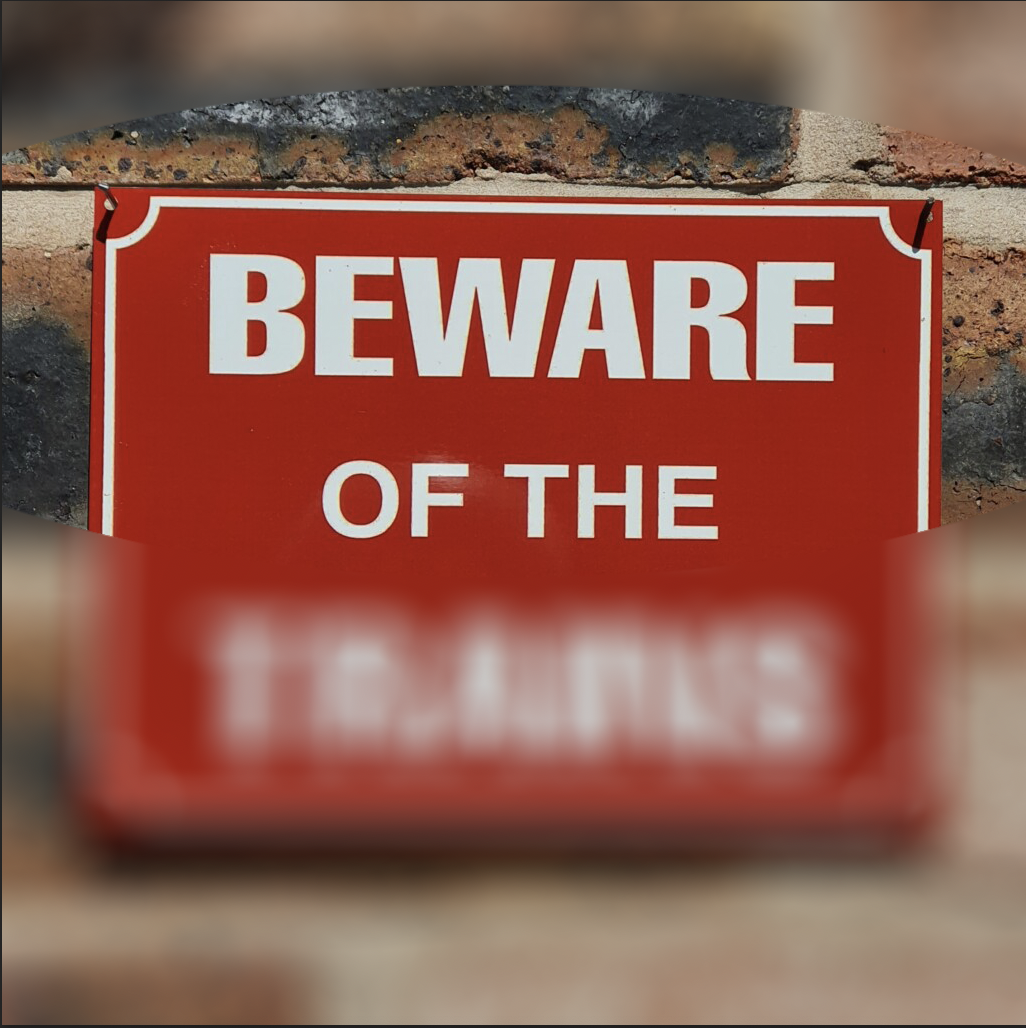
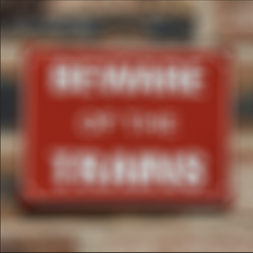
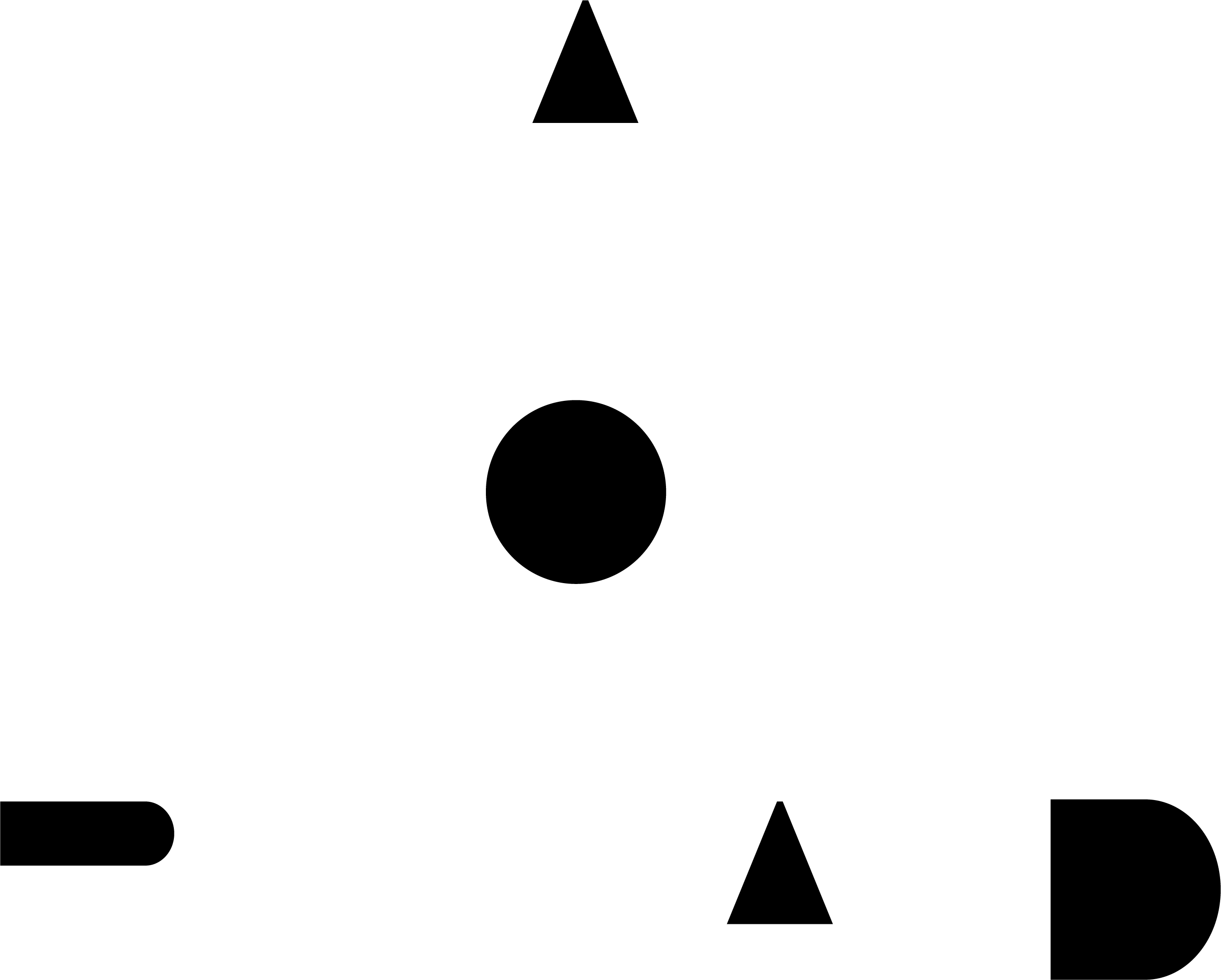
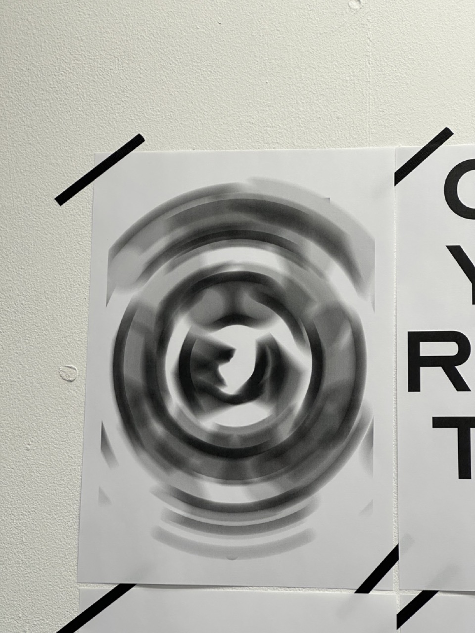
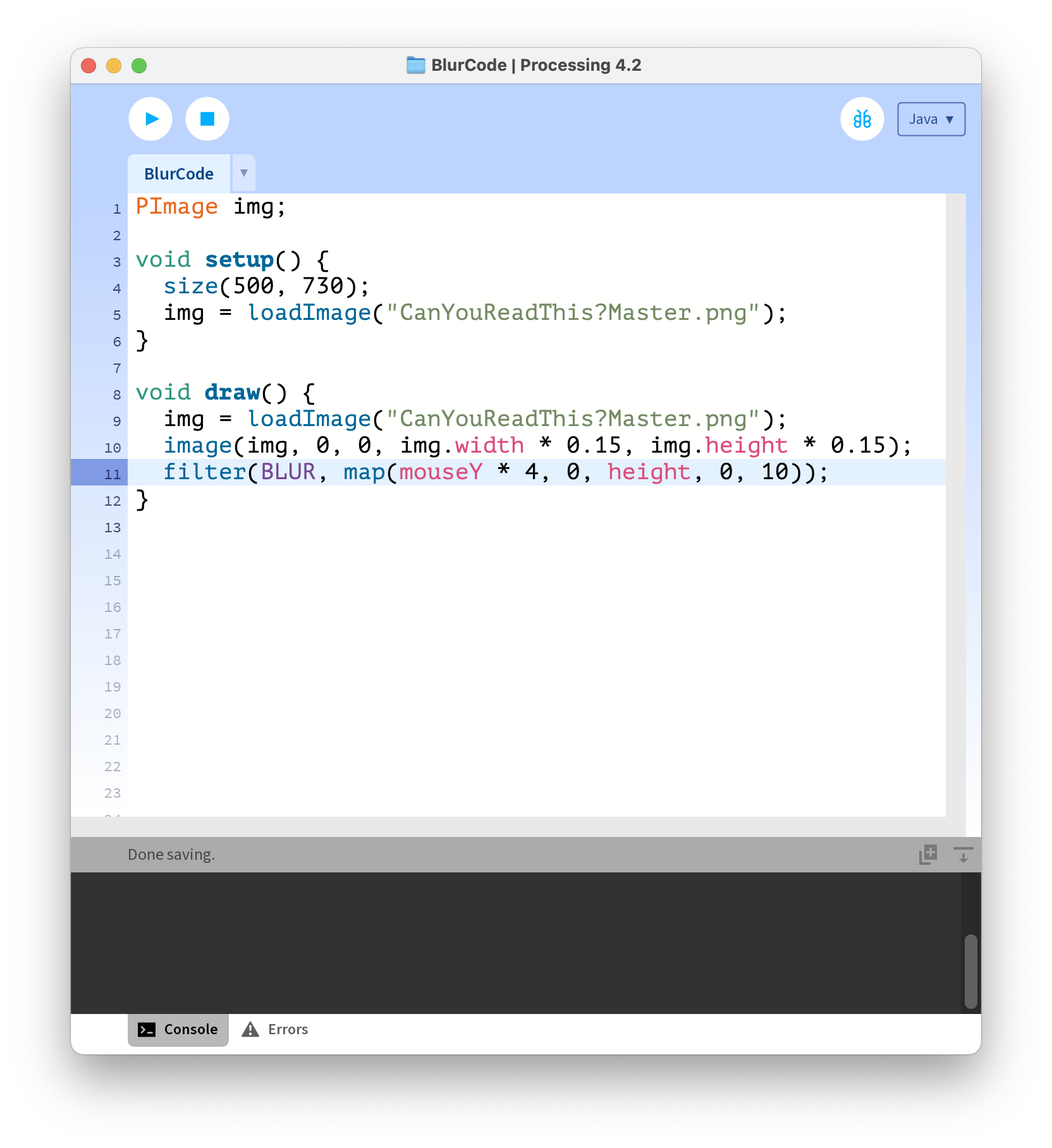
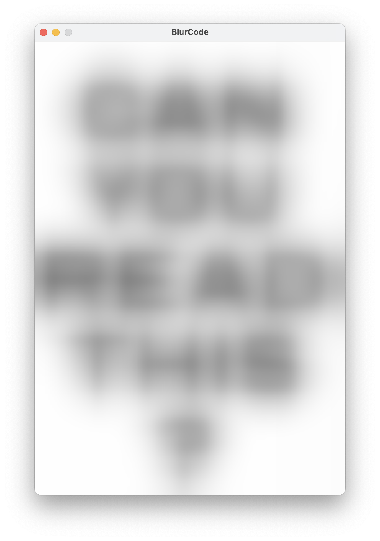
Testing the Blur


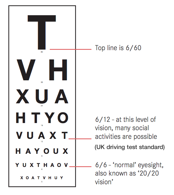
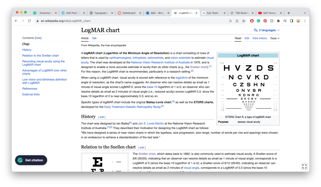
Snellen Chart vs LogMAR Chart

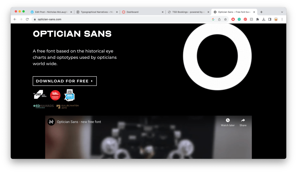
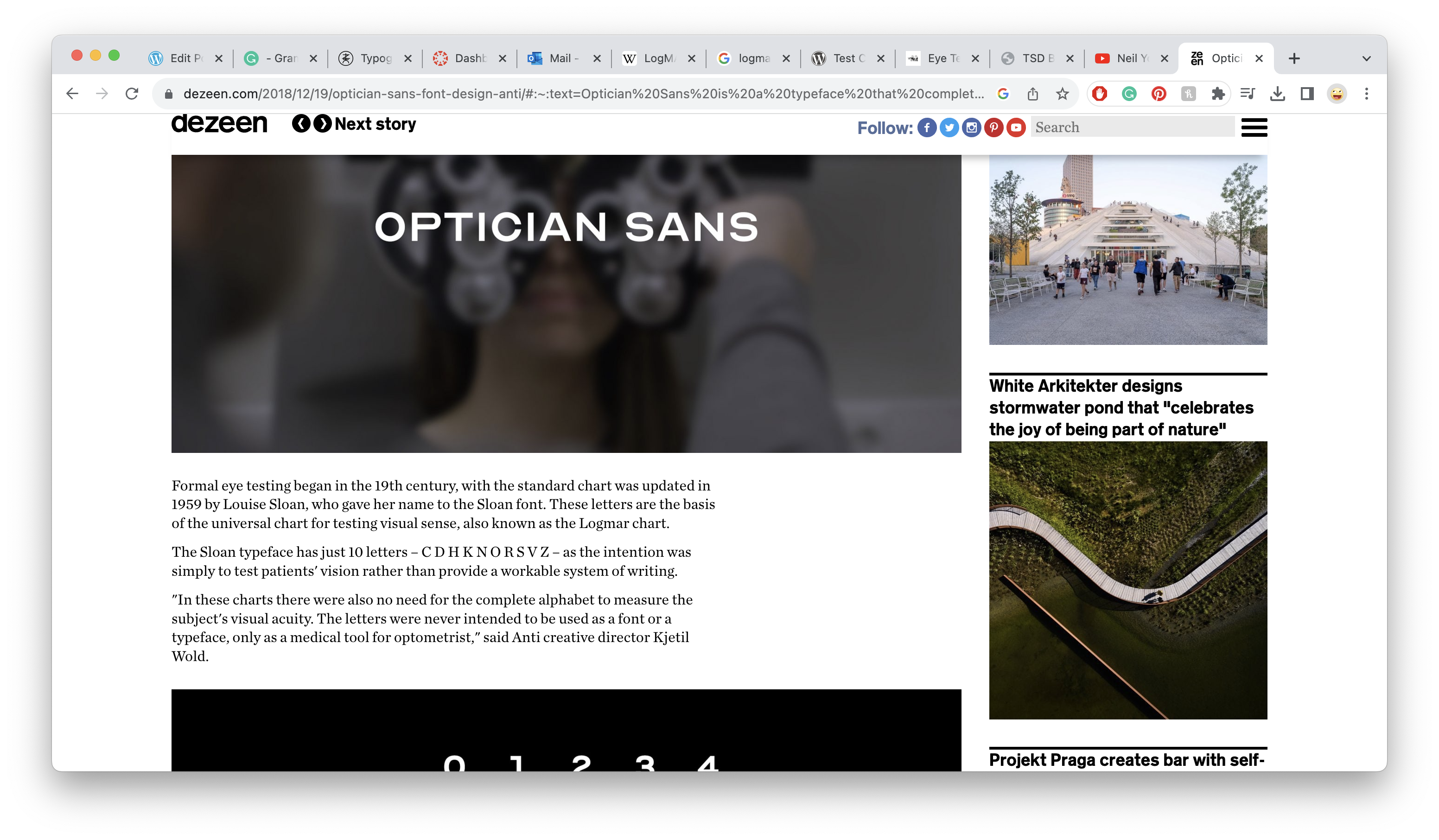
LogMAR Font : Optician Sans

LogMAR Blur Test 01

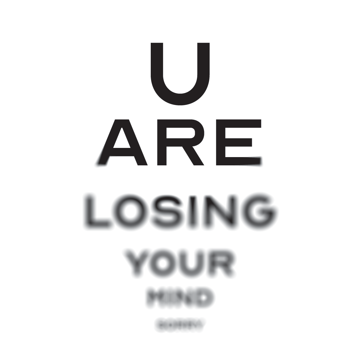
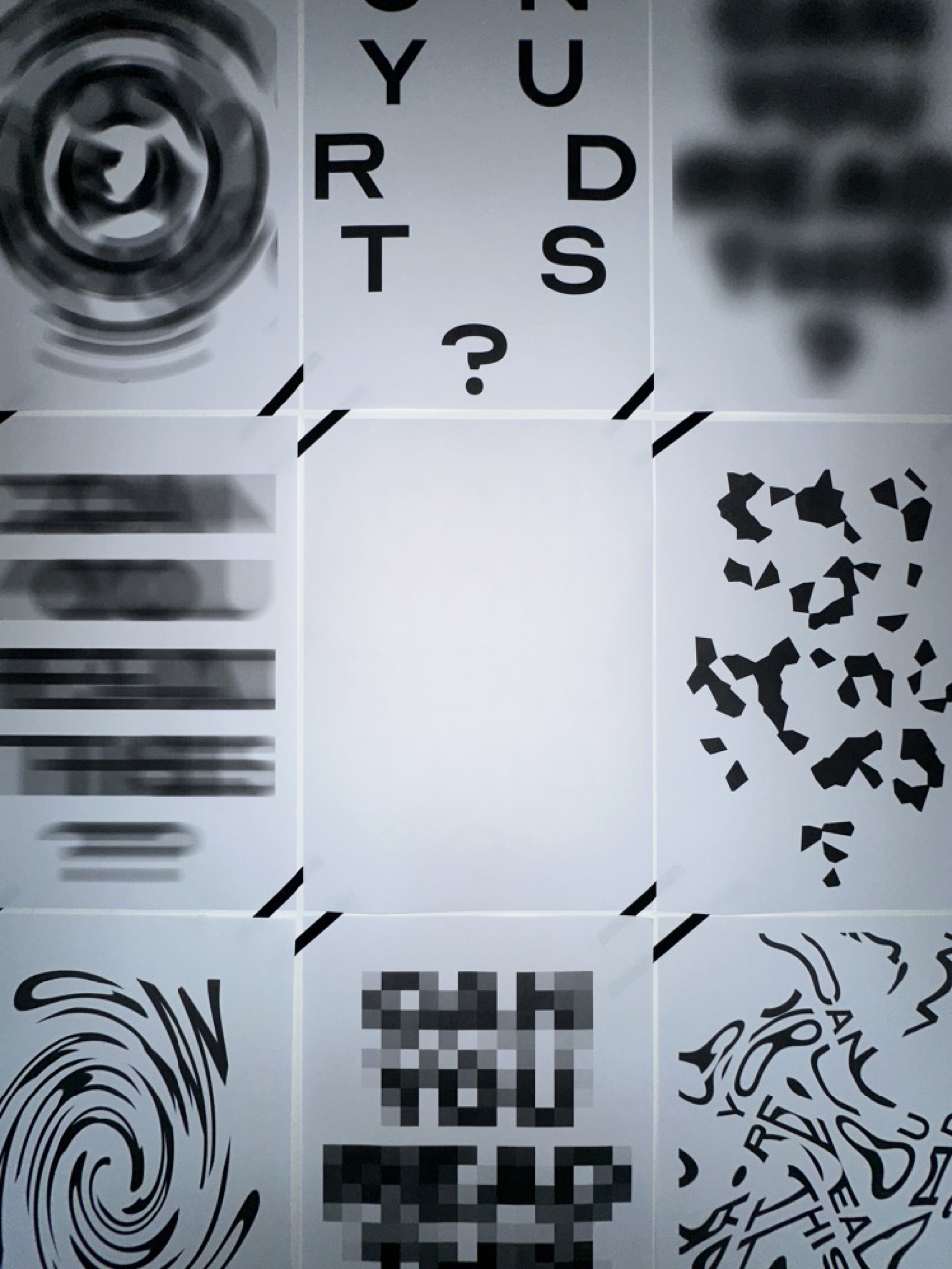
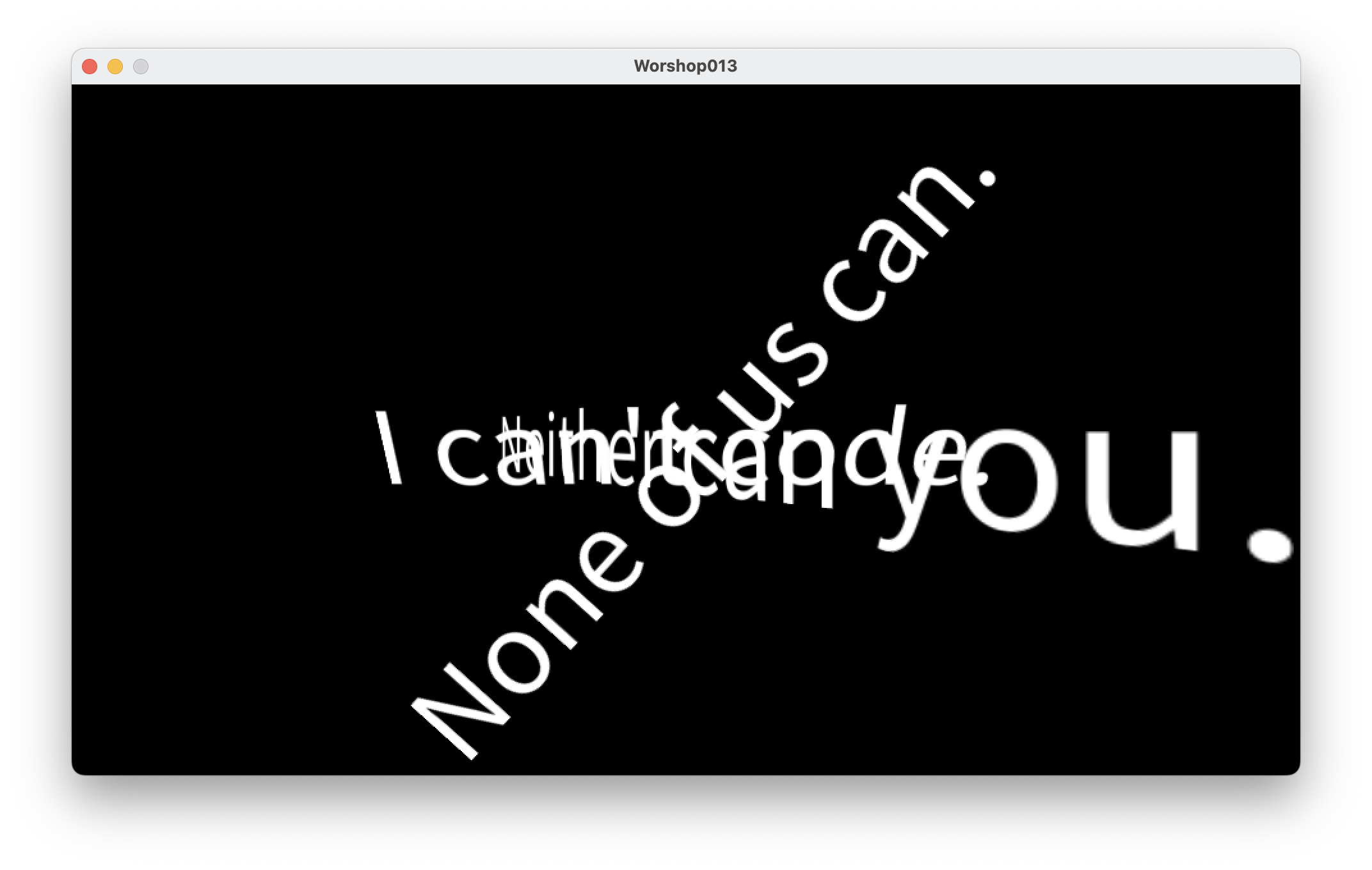
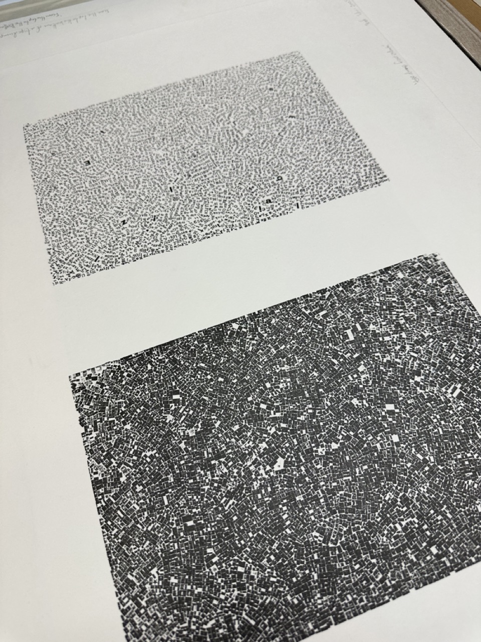
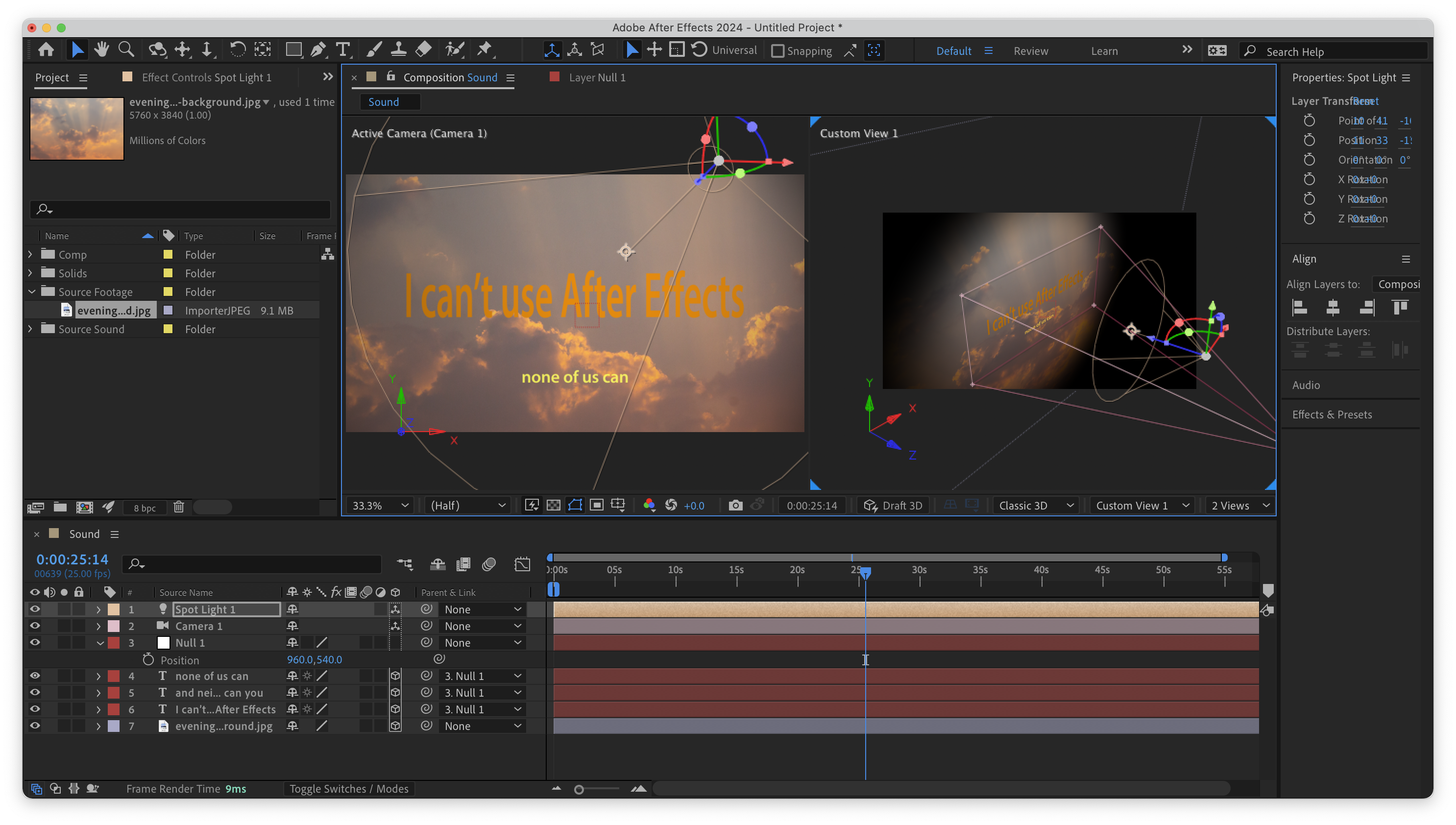
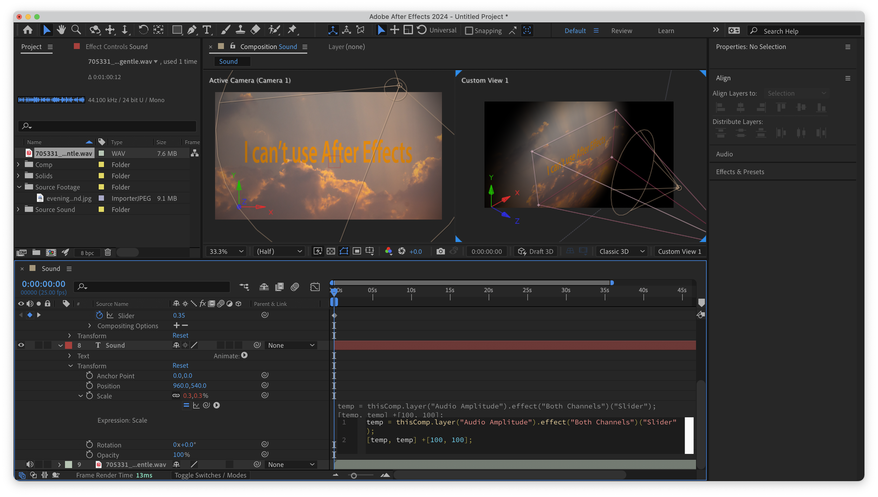
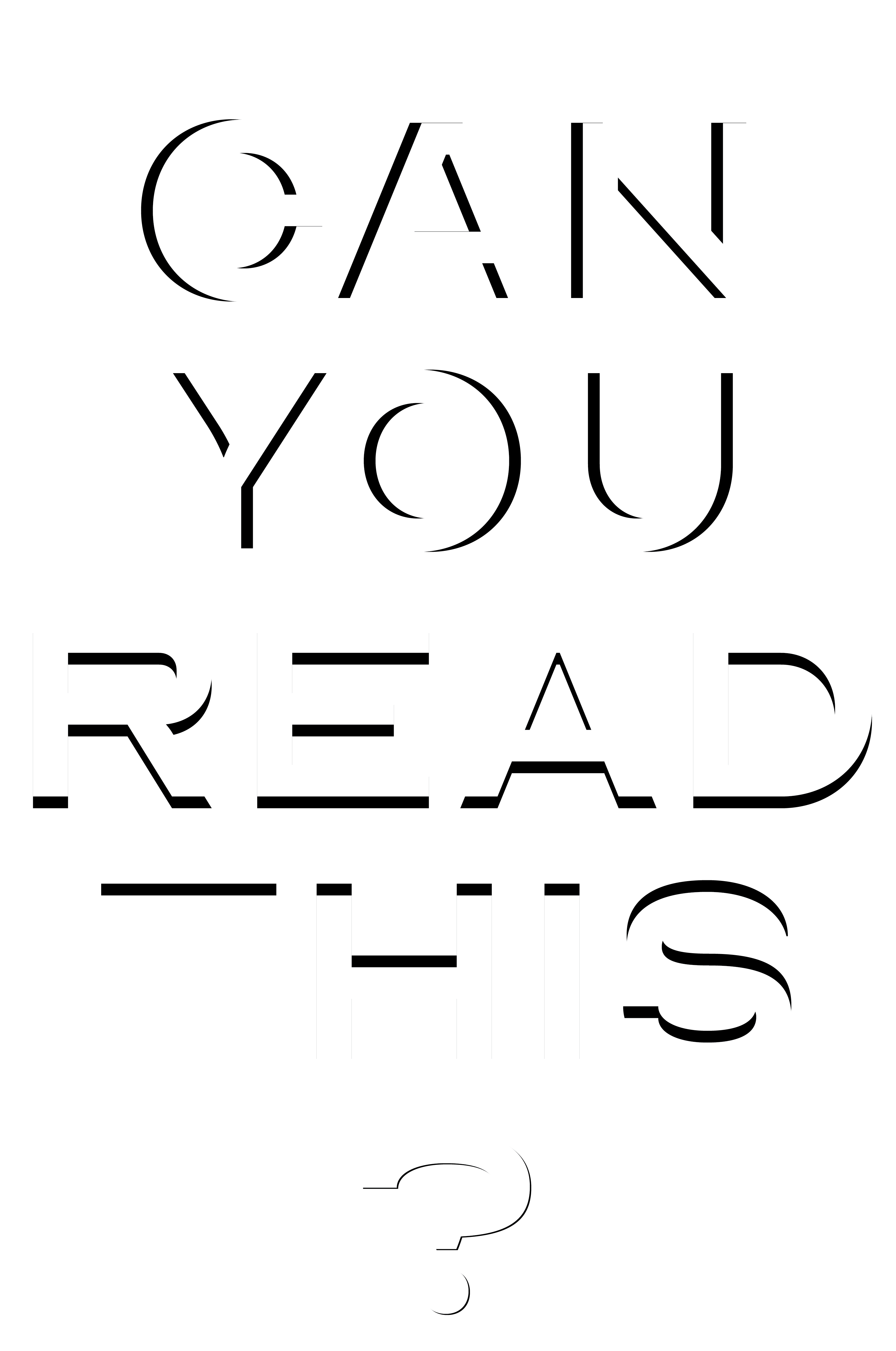
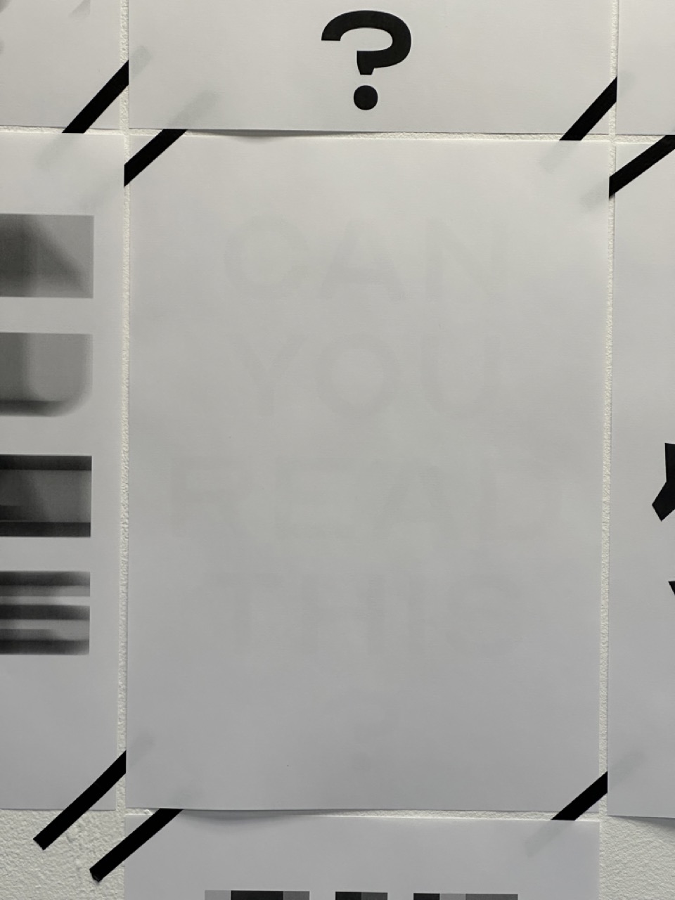
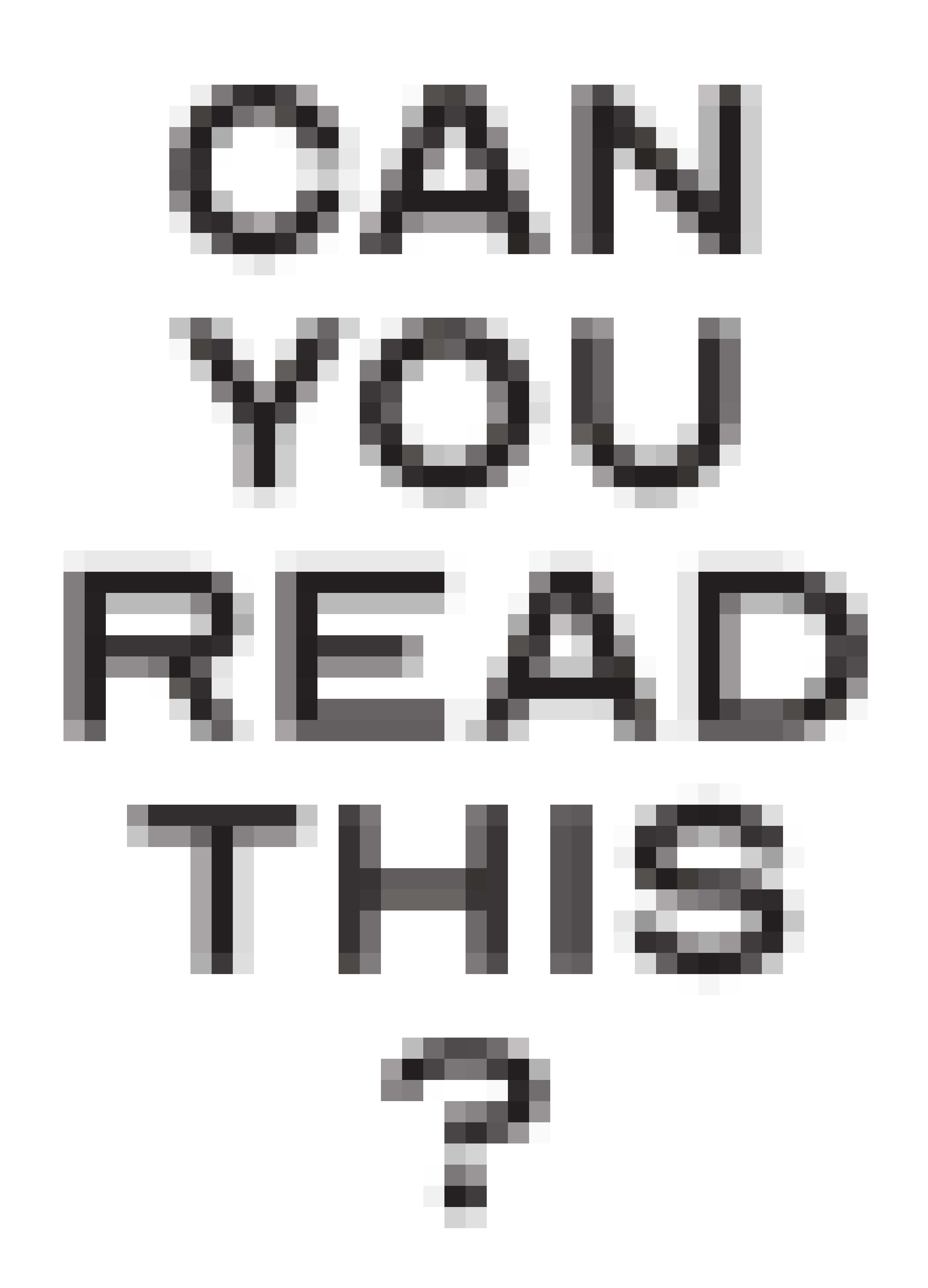
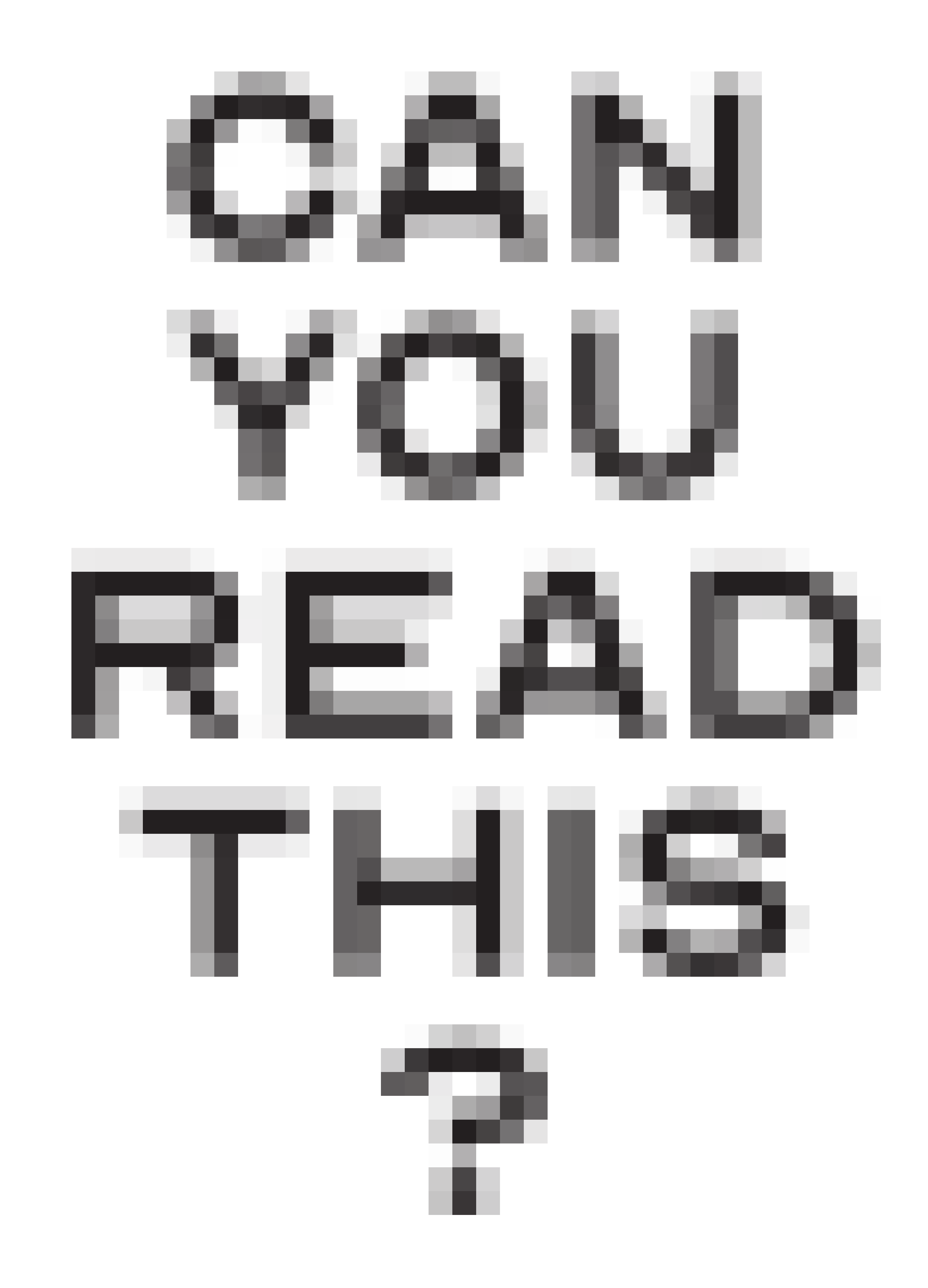
CAN YOU READ THIS ?


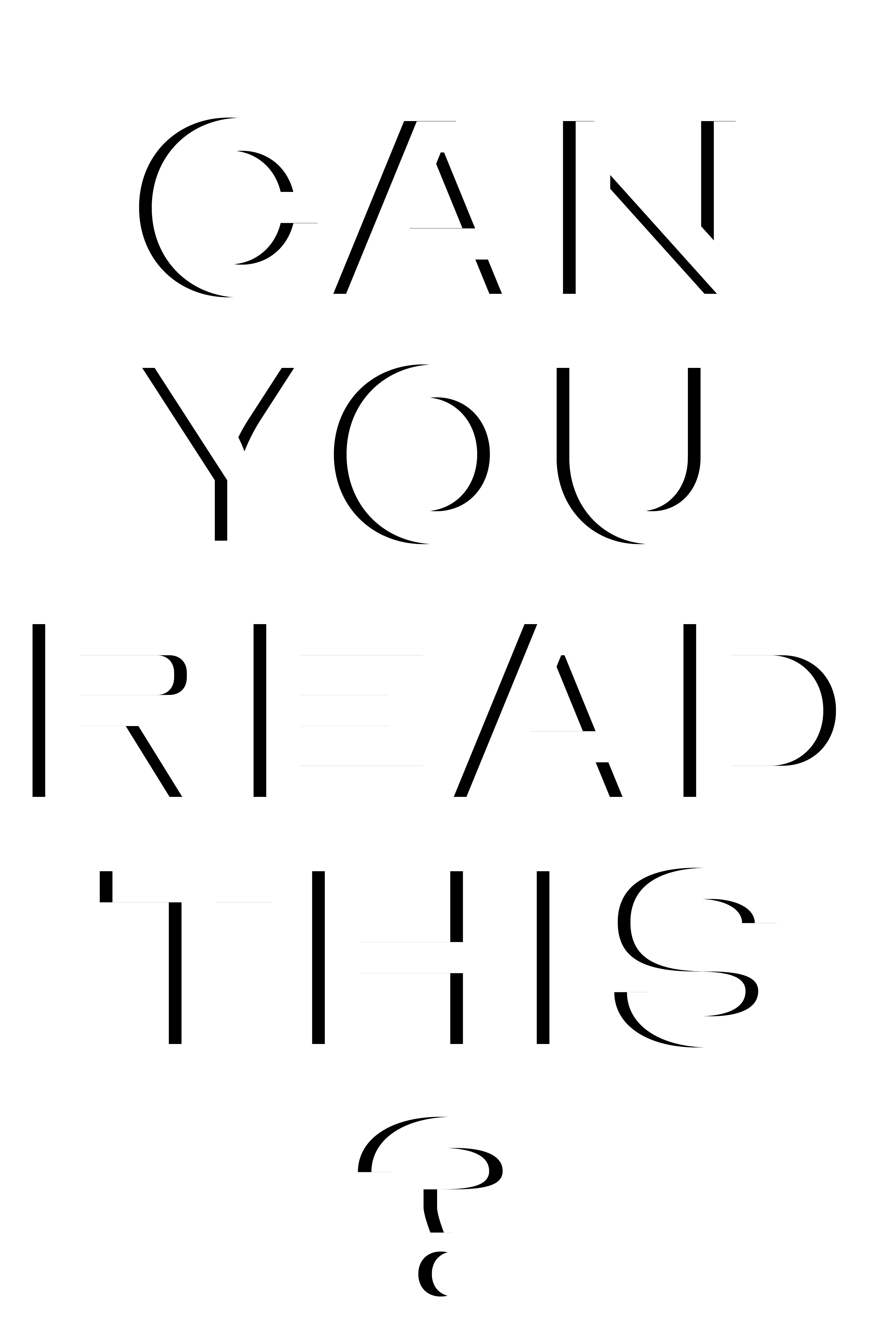


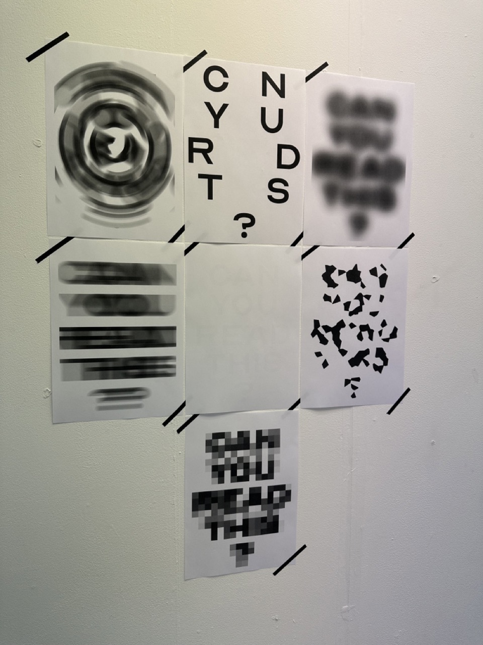

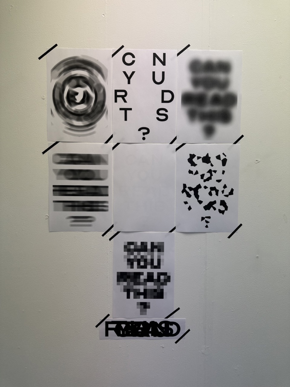
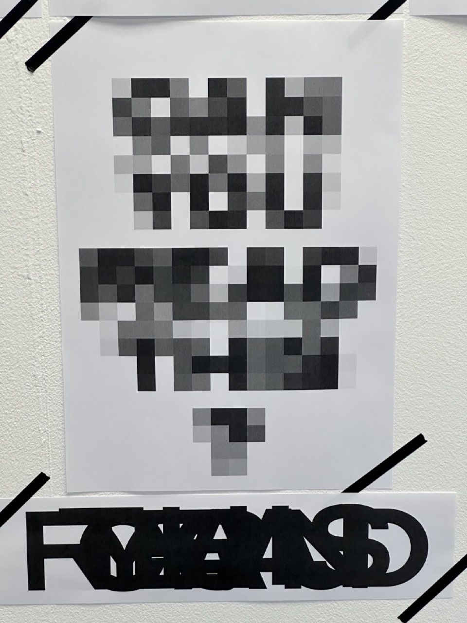
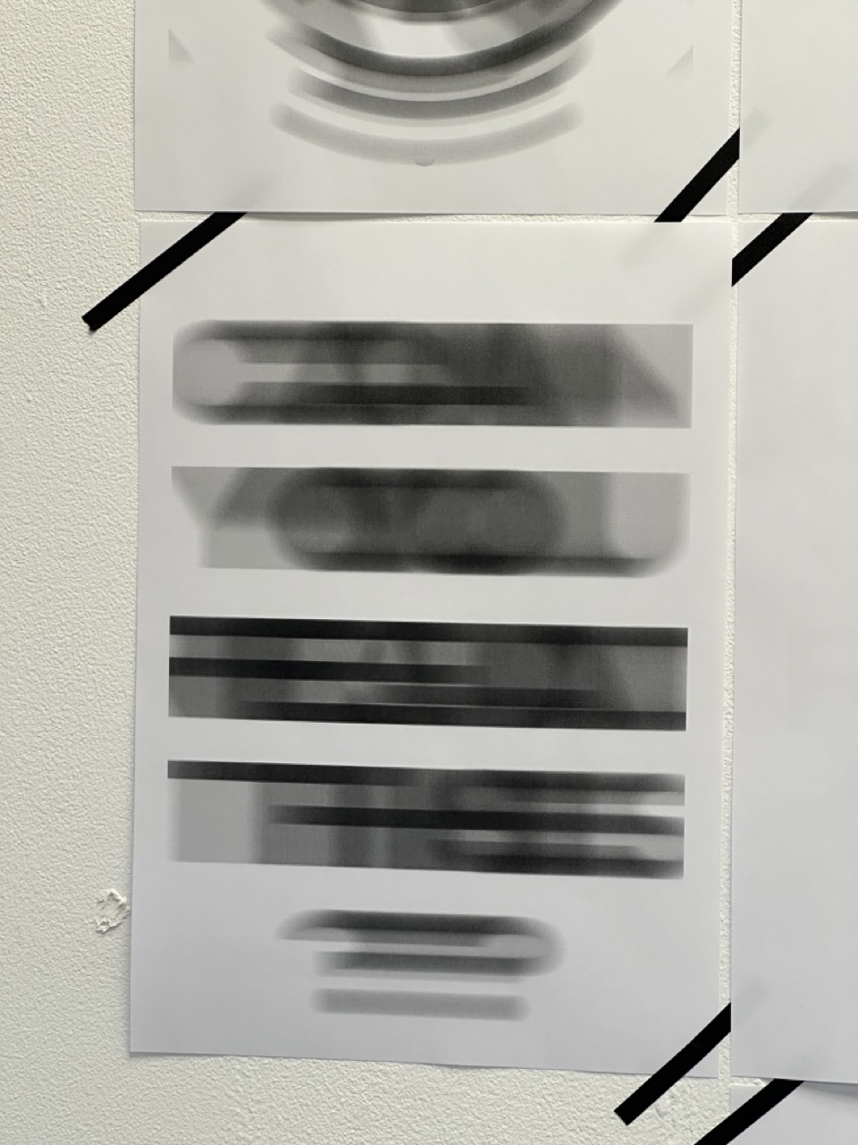

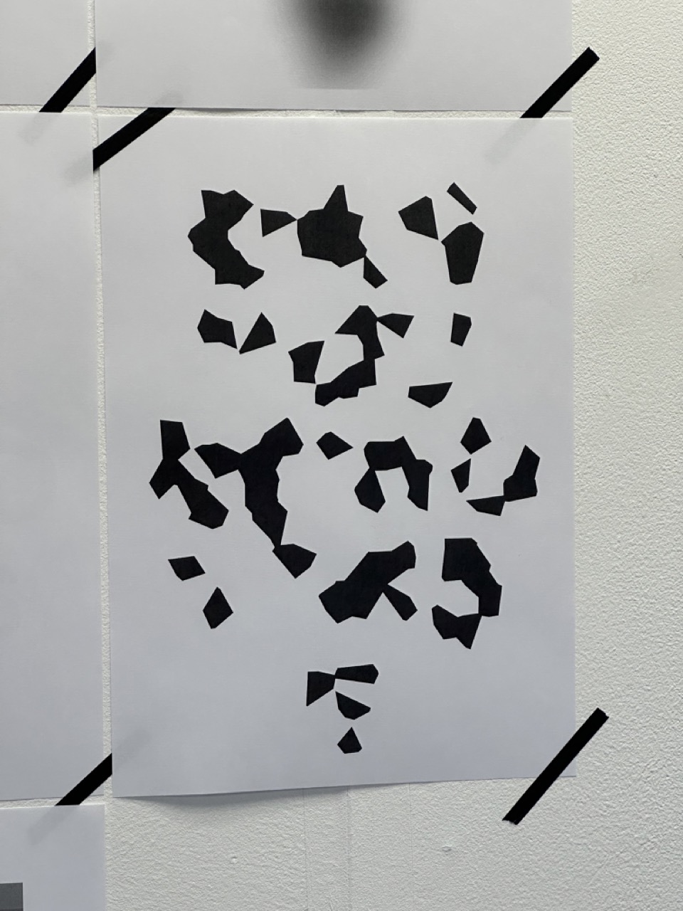

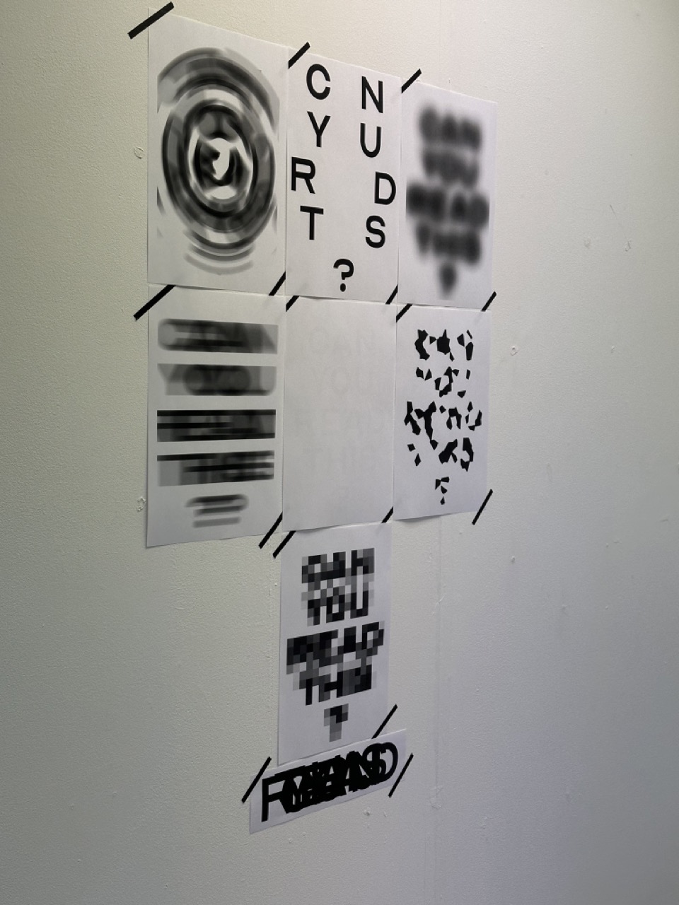
CAN YOU READ THIS? : PIXEL


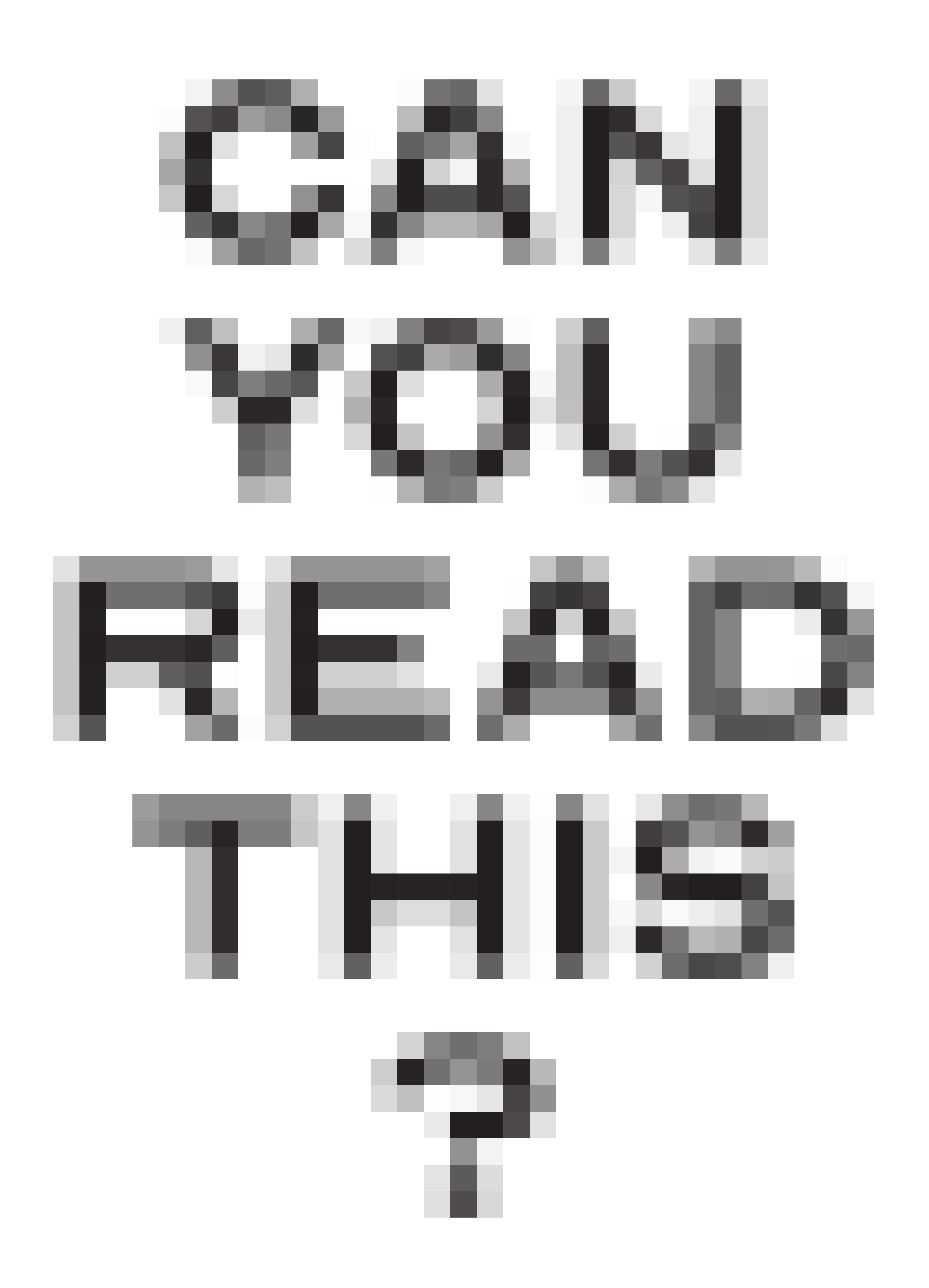


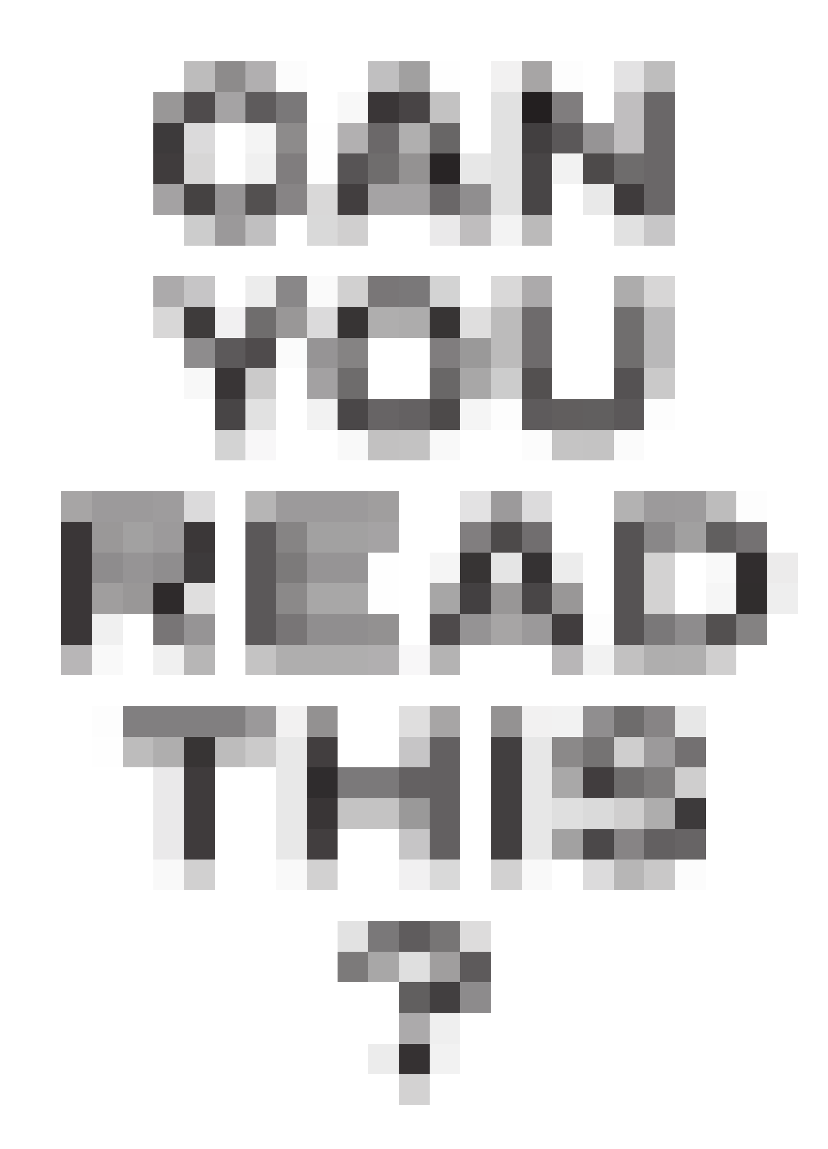
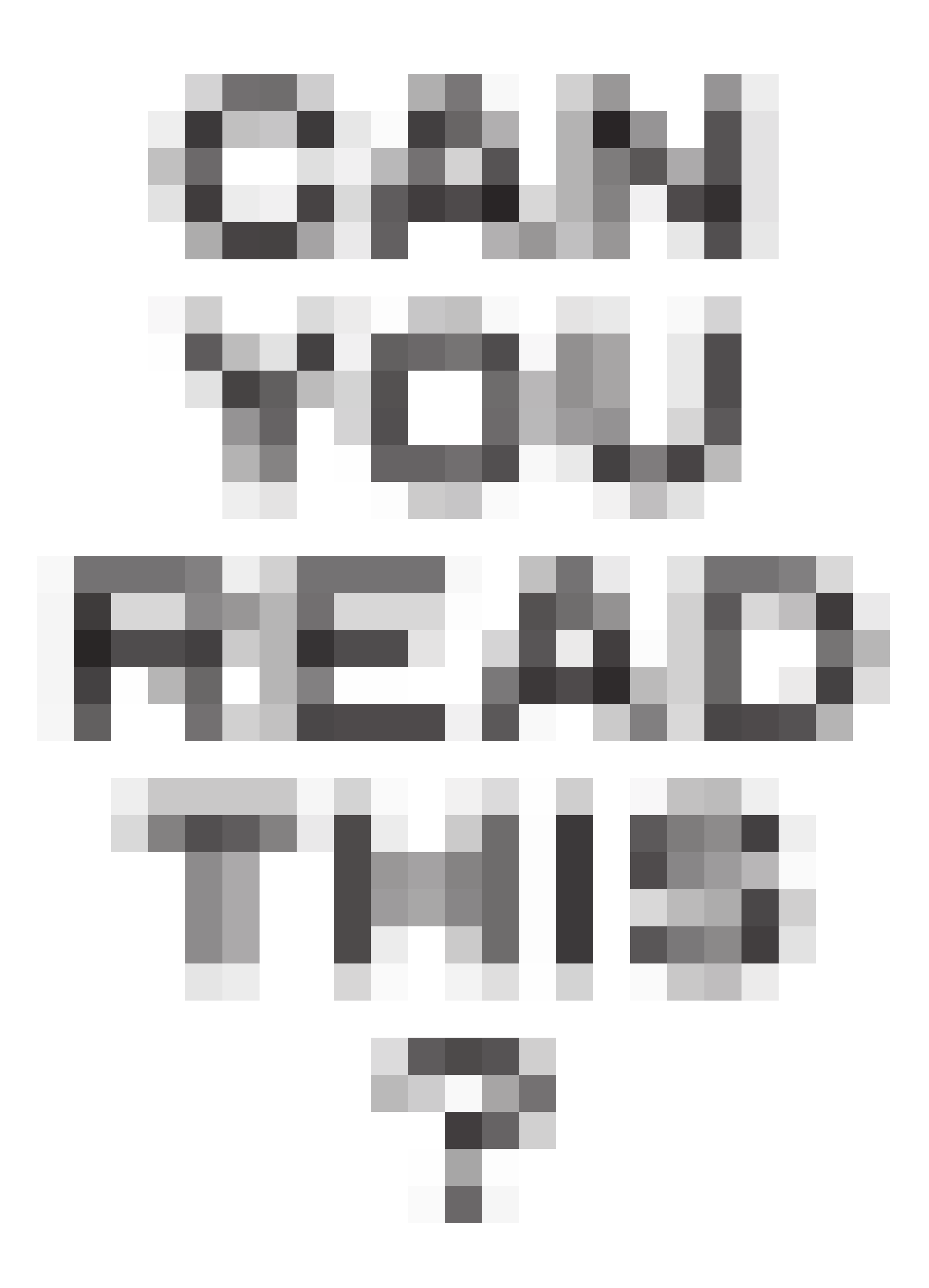
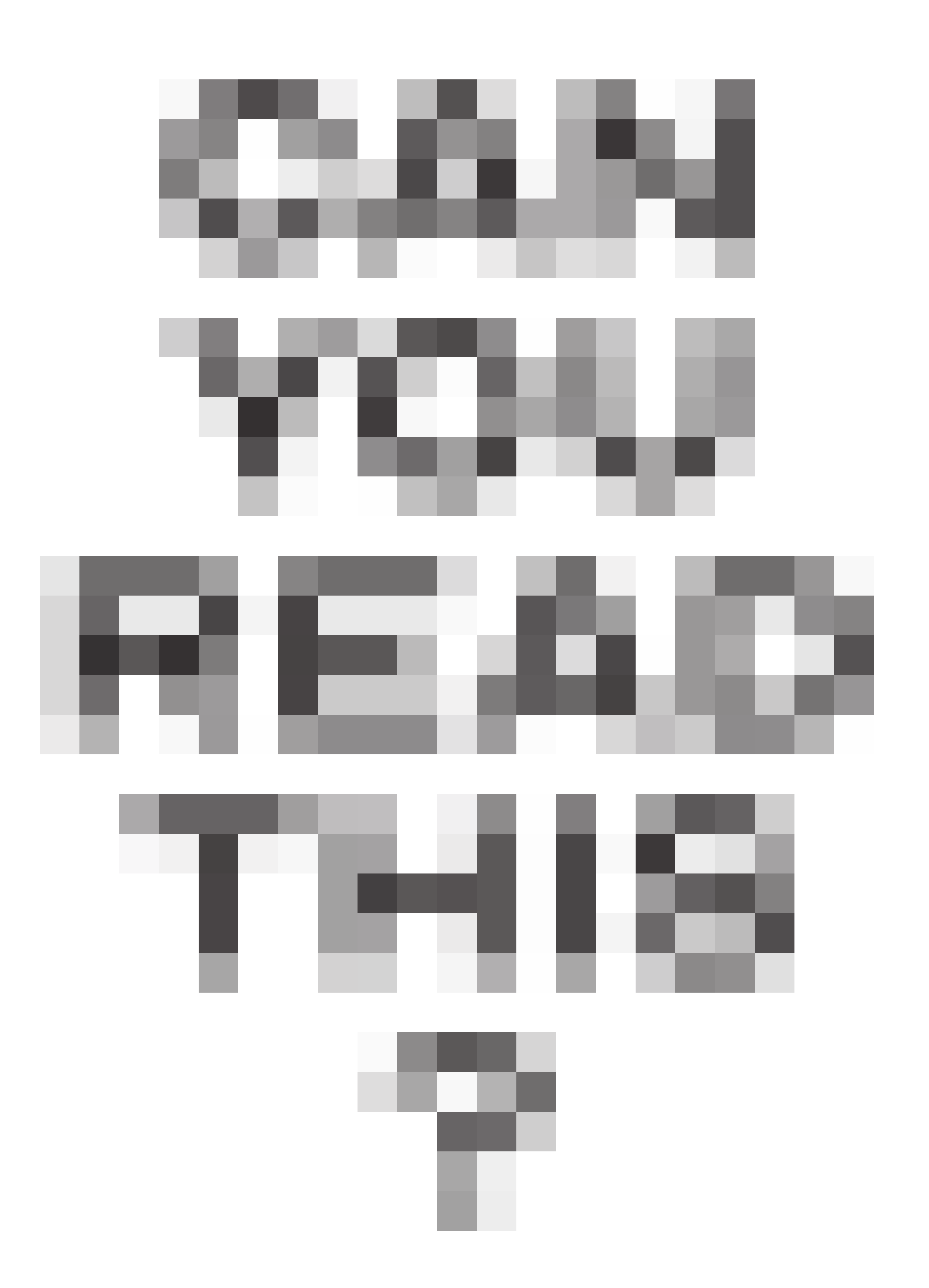


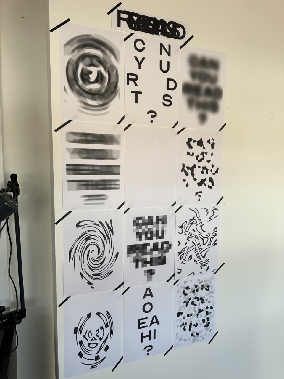
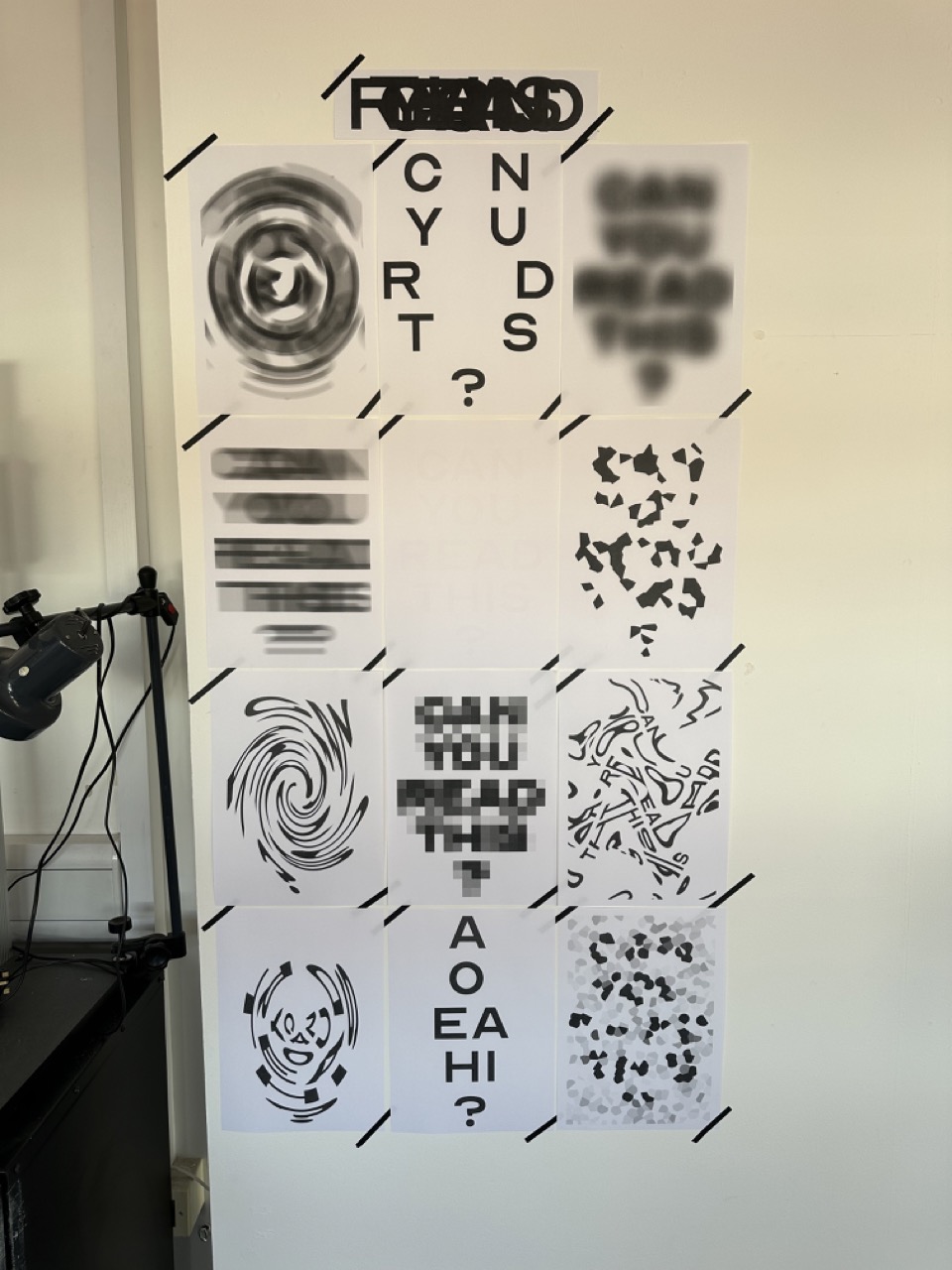
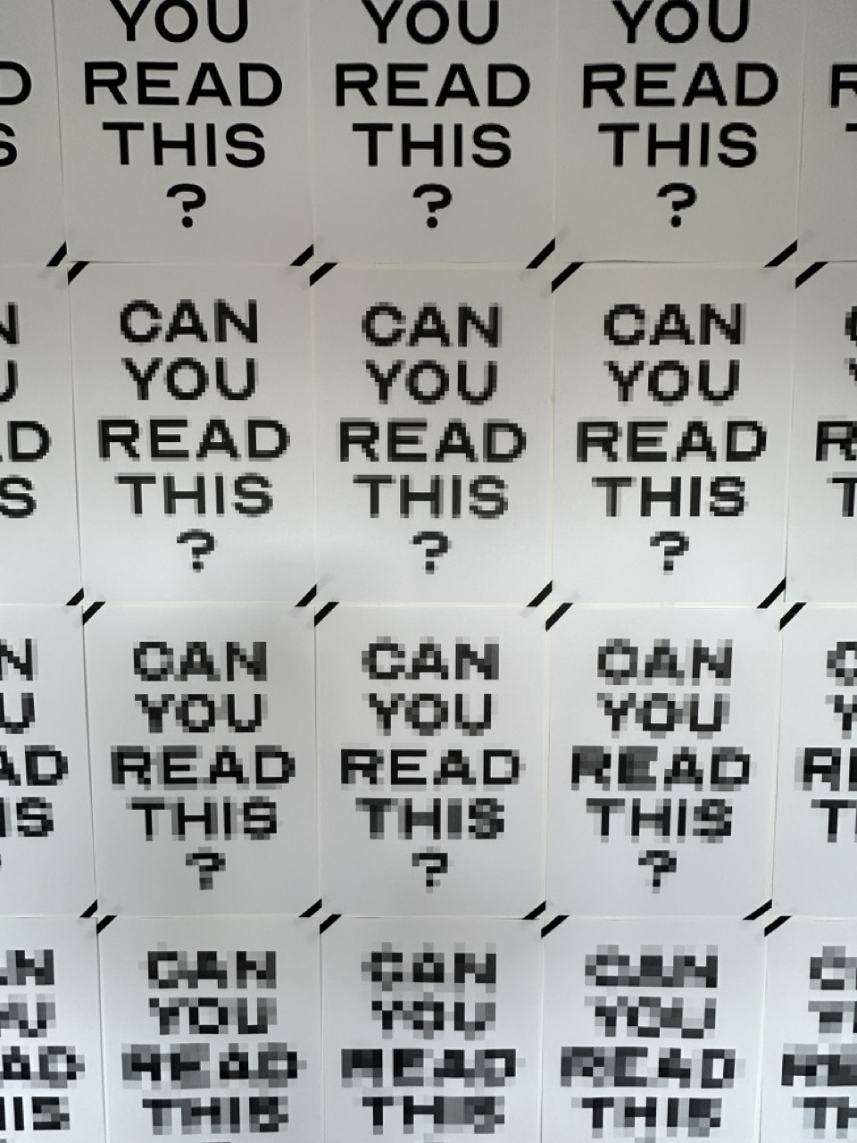

The poster(s) you can never read.
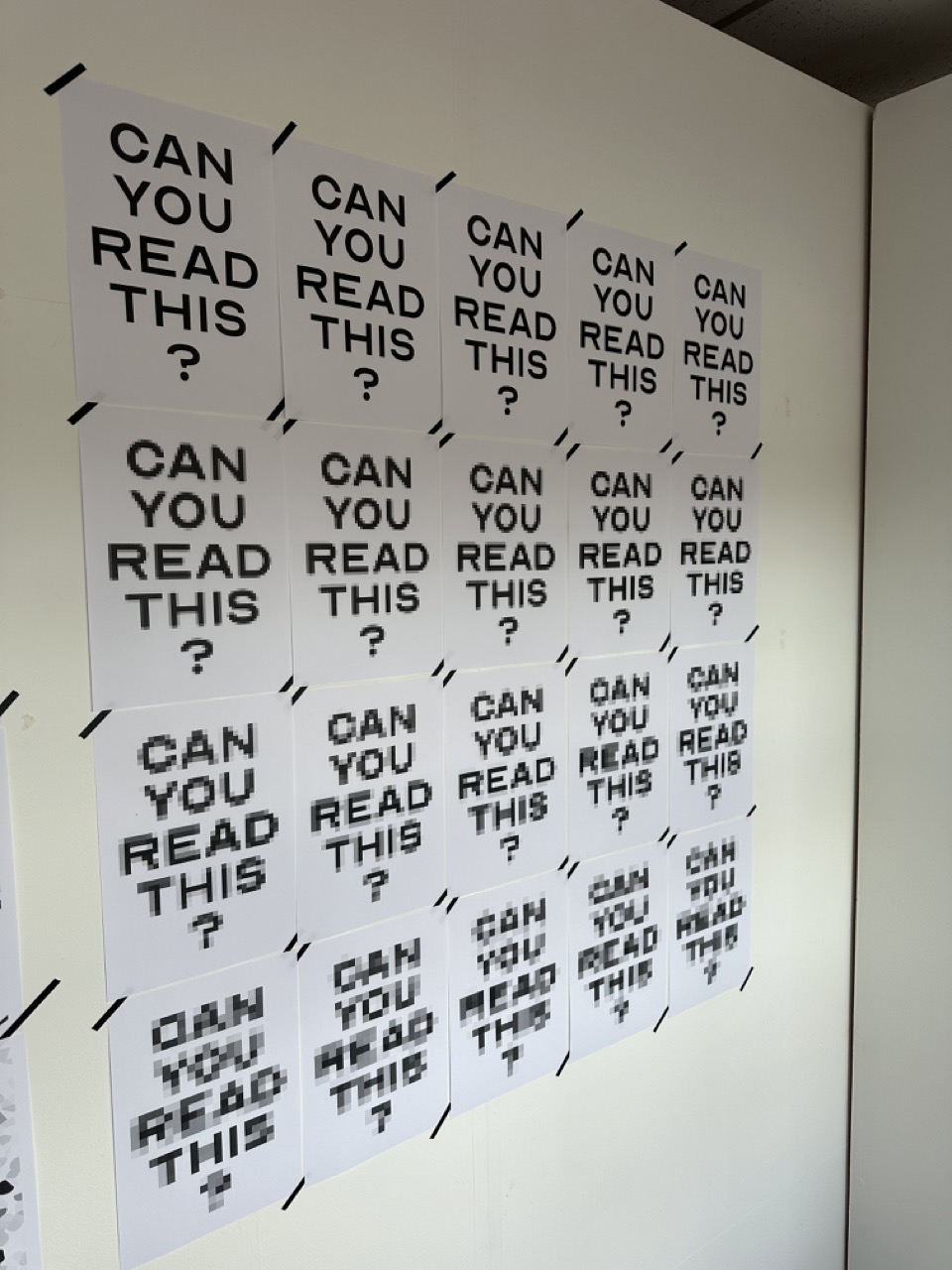
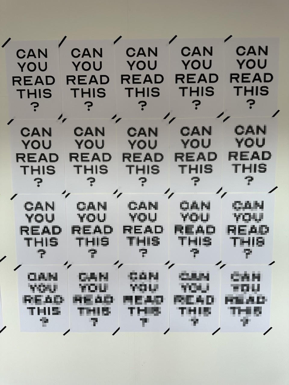
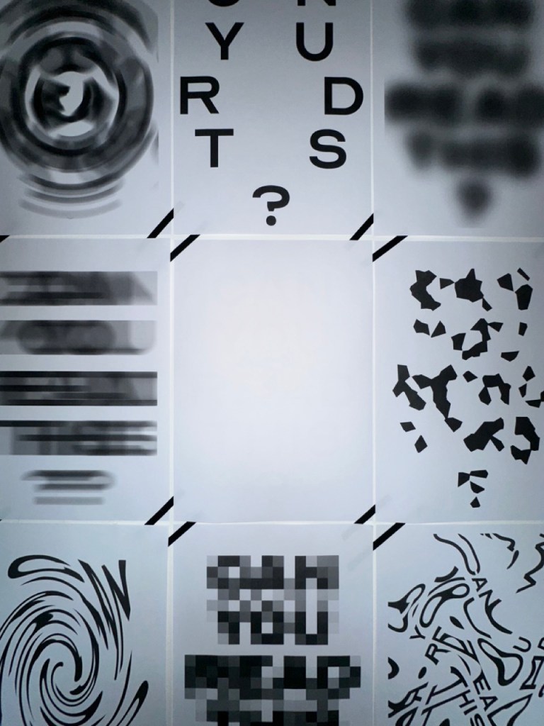
Below is an initial concept for an installation with the poster collection. The concept show would be the blurring effect. When the viewer gets closer, the poster gets harder and harder to read.
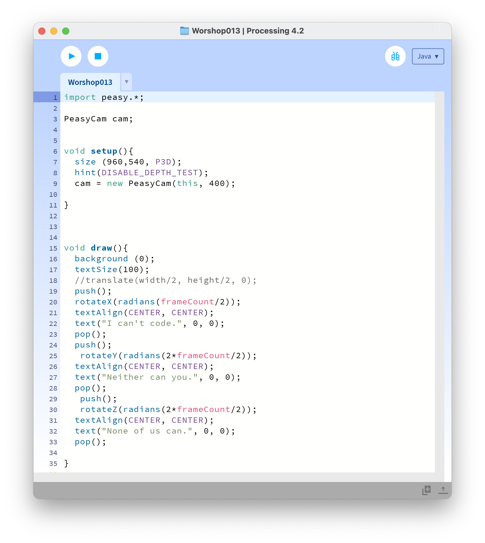
Taking this concept further, each poster effect can be animated and triggered by proximity, devolving or warping in different ways.
Reflection
Reflecting on this project, I got so caught up in one aspect and didn’t keep my mind open to different avenues and methods. As well as neglecting the Processing/After Effects aspect and the projects and just focusing on the print.
A point I had lost was the importance of the actual words and what I was reminded of in the review. Making the poster something people want to read, the words having importance to the viewer and making it more critical when they can’t read it.
Further Development:

Leave a reply to Open Share Year Two – Nicholas McLaughlin Blog Cancel reply