
WIP Set Up:
As this week has been a whirlwind I’m updating this learning journal after the fact, there might not be as much to write as I’d like as most of this week is implementation and problem solving.
Monday:
After designing and sorting out the file for the laser cutter on Friday I was booked and read to get everything cut in the morning and then ready for the walk around of the Reid basement that morning. But as it was a bit later I had time to assemble and glue the box for the top of the plinth.
At this point I noticed a disservice I did myself in previous years, I hadn’t laser cut and glued a box before, I had either repurposed an existing box (control lunchbox) or had the wiring and components hidden away in a tupperwear container (expressive data chandelier).
We had the walk around the Reid basement when I was able to visualise my piece in the space and start to visualise how it would be in the space and how people use it, as well as how my piece might work with other pieces in the space.
Tuesday:
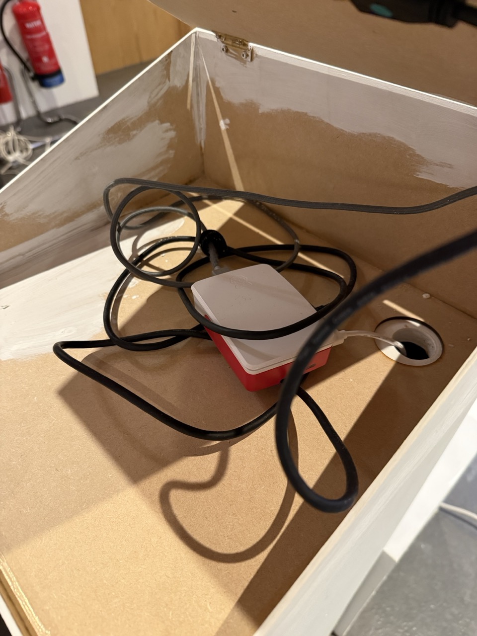
With a game plan with the space and the technical requirements of the the piece I knew that the wiring would need channels to move through and between the plinths and then out to the wall power.
With the box glue dry and the sanding sorted the box was ready for the first coat of paint along with the same paint to freshen up the podium so that both the box and the podium had the same colour and a similar texture to each other, the idea was for both of them to be indistinguishable from one another, now looking at it, that didn’t really work because I measured the plinth incorrectly so there was a slight overhang, but this will be sorted in the final piece because I want to get a plinth made for it.
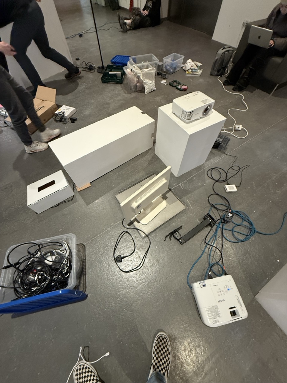
Tuesday was a labour-intensive day as it was mainly transporting everything from the Barnes to the Reid.
Wednesday:
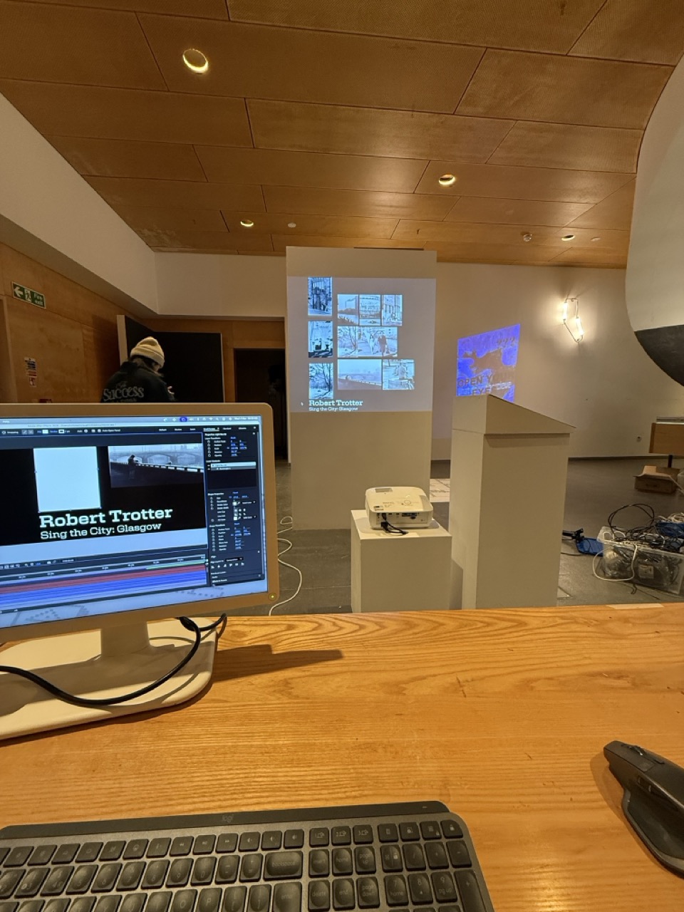
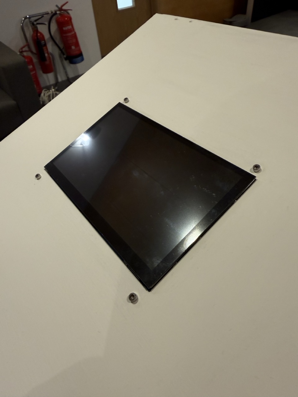
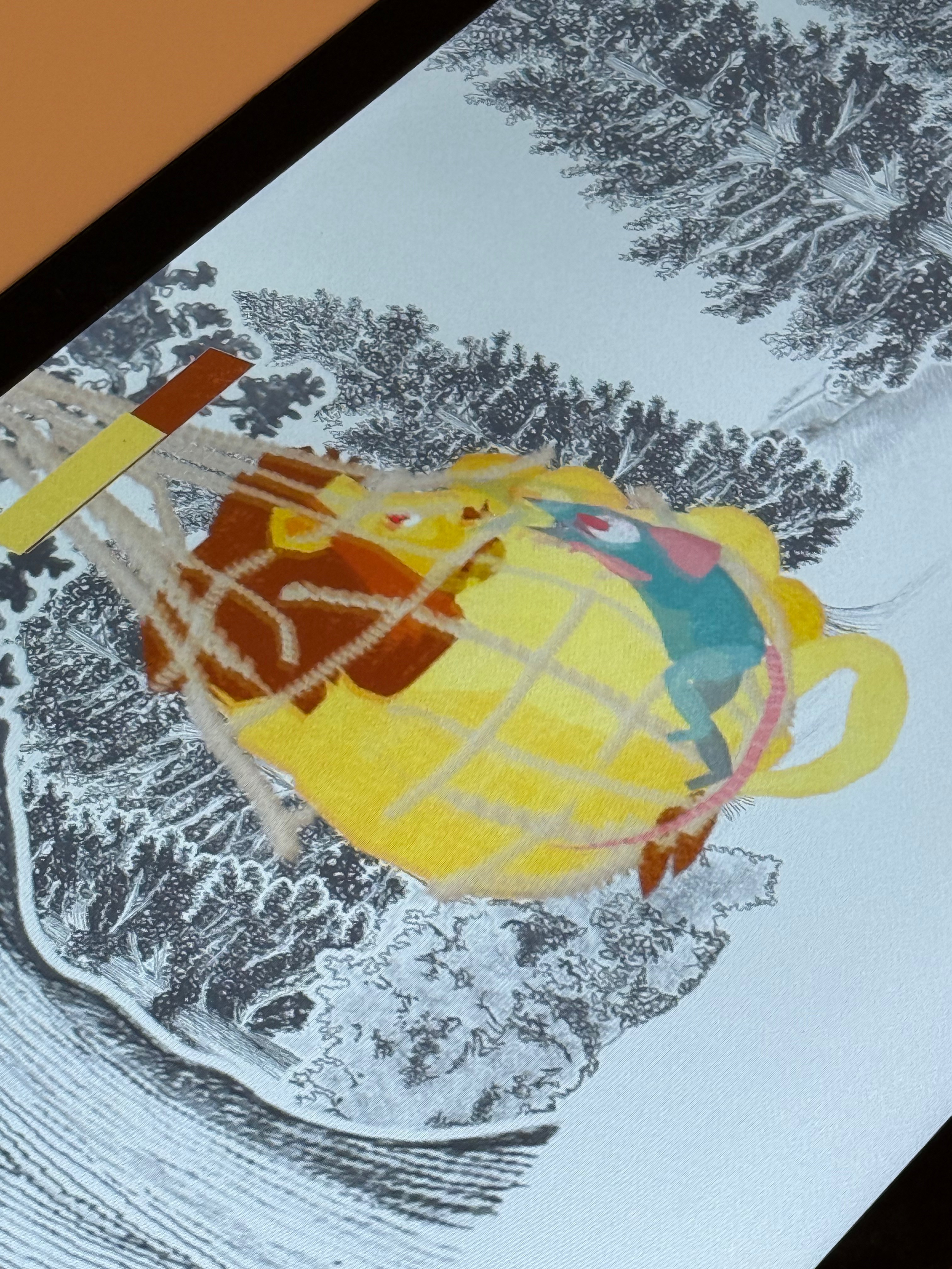
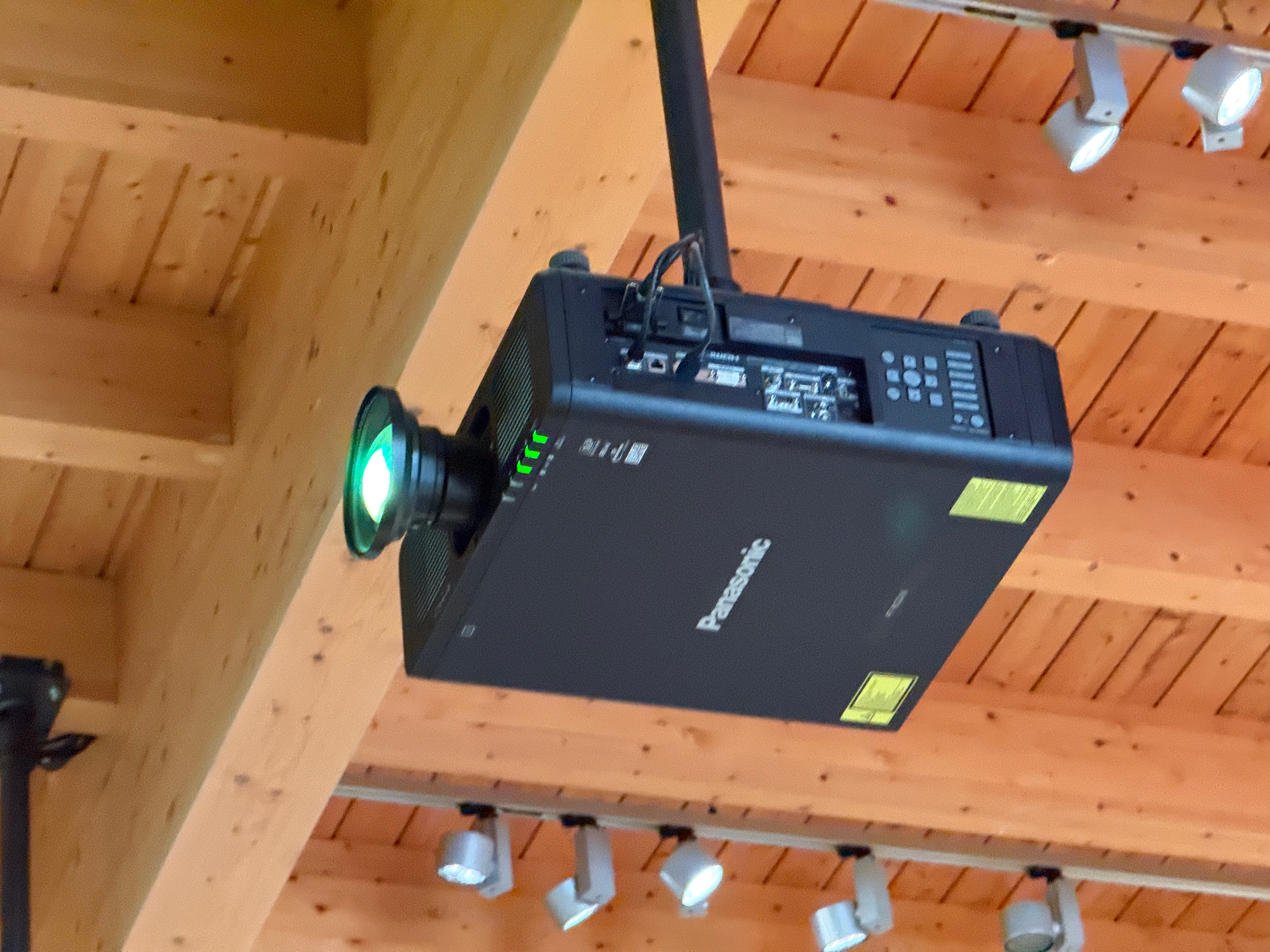
With the projection set up and a clear idea of the space and what I want to do, I was able to set up a screen, desk and my projector. I was able to map the images to the wall and work on remapping the motion graphics on the printed photography.
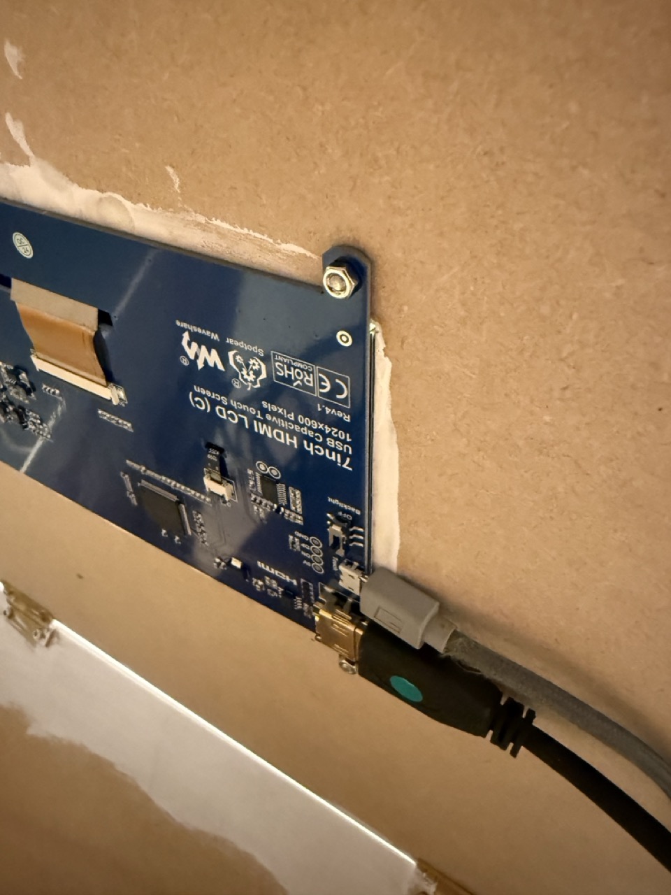
At this point, there was only a temporary wiring from the projector, the screen I was using for remapping the motion graphics, the Mac mini that I was working on, the touch screen, the media player Raspberry Pi that was running the touch screen sketch and the Ethernet switch that was connecting the mac mini to the Pi.
Thursday:
With the scenes mapped, exporting them was the next step and getting them plugged into the code that Paul had done for the projector and the Mac mini and the code that Cat had done for the Pi, plugging my media into the framework of that code was easy, but Paul and Cat were trying to get everything to work together seemed to be a bit annoying. The next iteration of the piece will need to be as easy as possible for both myself and my lecturers to implement.
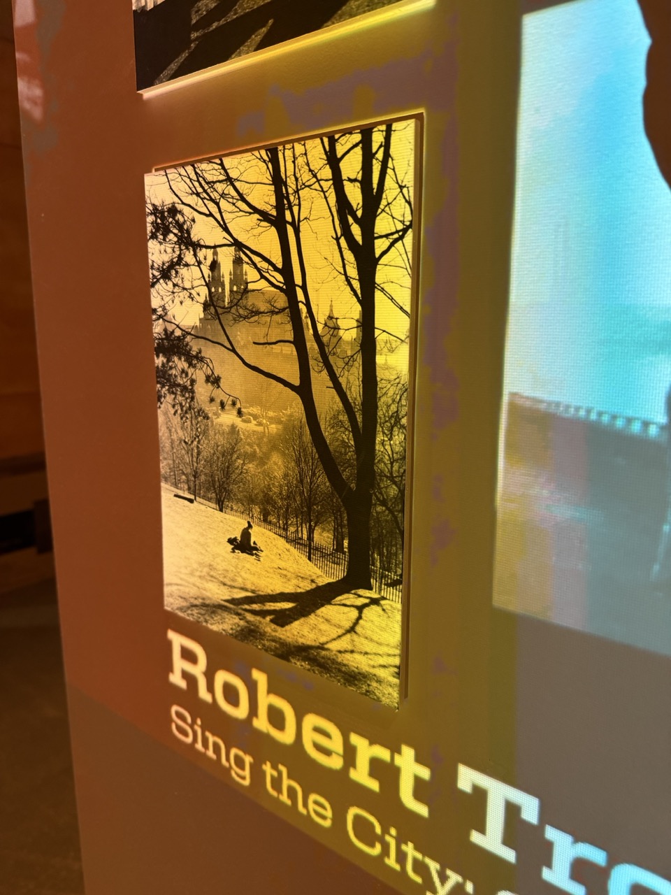
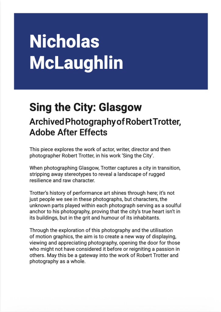
Late night on Thursday, after a day of trying to get everything working, I was writing the description in the middle of the night, looking at Trotter’s photography with fresh eyes, trying to communicate the passion I had for the photography and how I wanted the piece to make people feel.
This piece explores the work of actor, writer, director and then photographer Robert Trotter, in his work ‘Sing the City’.

When photographing Glasgow, Trotter captures a city in transition, stripping away stereotypes to reveal a landscape of rugged resilience and raw character.
Trotter’s history of performance art shines through here; it’s not just people we see in these photographs, but characters, the unknown parts played within each photograph serving as a soulful anchor to his photography, proving that the city's true heart isn't in its buildings, but in the grit and humour of its inhabitants.

Through the exploration of this photography and the utilisation of motion graphics, the aim is to create a new way of displaying, viewing and appreciating photography, opening the door for those who might not have considered it before or reigniting a passion in others. May this be a gateway into the work of Robert Trotter and photography as a whole.
Friday:
As was the plan, Friday was for nothing else but finishing up and tidying, so that’s what we did, I still had to finalise the wiring when I knew there was nothing else to be done with my piece.
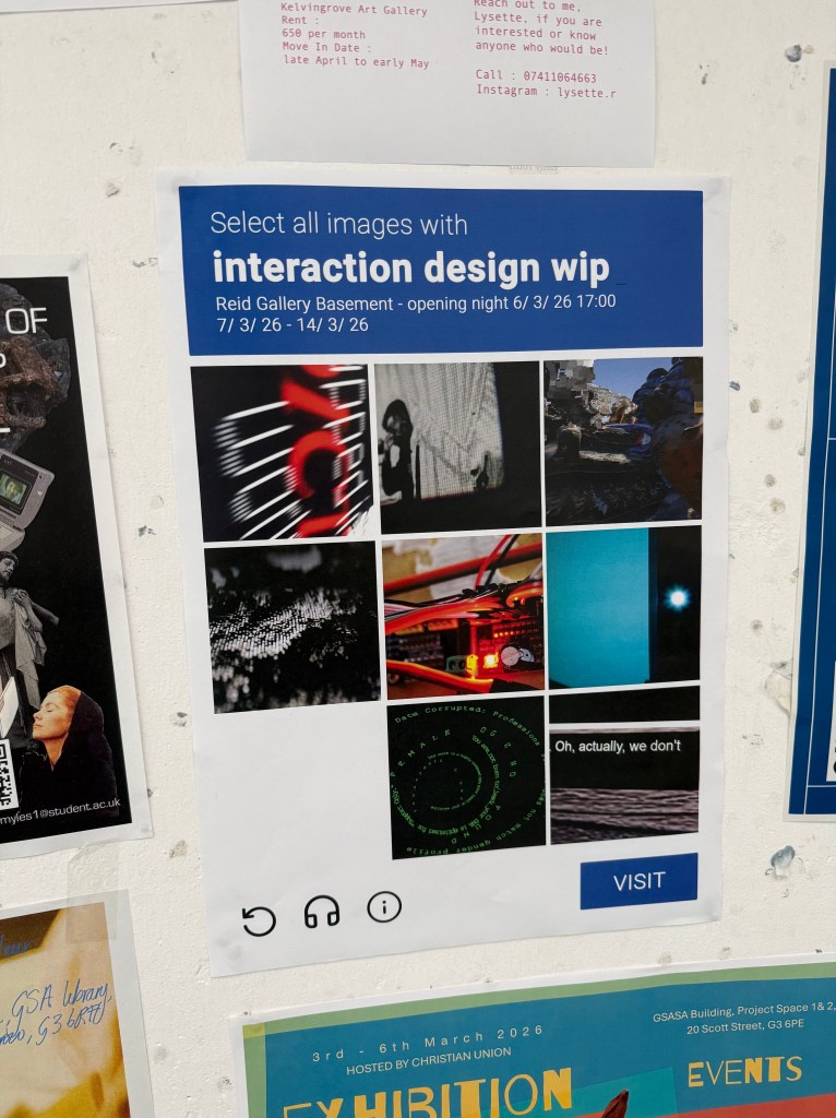
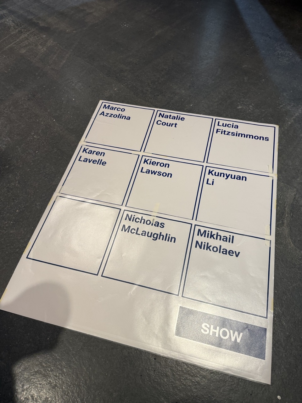
With the extra time I had, Cat asked me to create the name card designs for the exhibition. I just followed the direction of the Captcha idea we were working from with the same font, shade of blue and formatting as seen below.
Independent Study Week:
As this is an independent study week, the only thing to do is man the exhibition opening and catch up on some documentation. It seems that as soon as I started actually focusing on and making my piece with the WIP in mind, my learning journal lost a bit of focus.
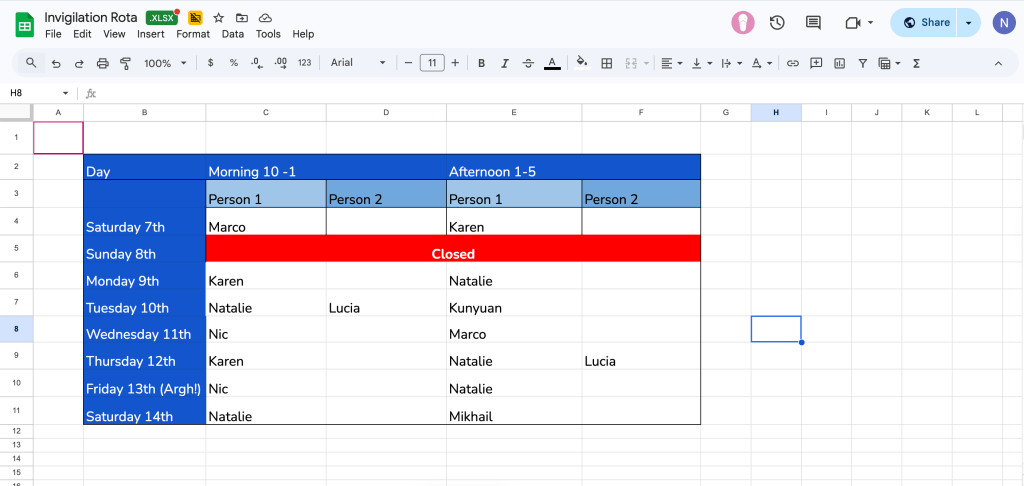
Since everyone got the WIP running and sorted in time with great help from Paul and Cat we were free to sort out the invidulation ahead of this week.
Thanks to Paul showing me that Mac computers can be set to run programs, boot up or even turn on themselves, for the most part, my work doesn’t need much fixing, other than having to reset the sketch on the touchscreen controller, but Cat has let me know that that can also be automated and boot up itself. I imagine with the Raspberry Pi’s internal clock and code to talk to it. If I don’t implement this feature in the WIP prototype, then I’ll definitely get it working in the final piece for the degree show.
Autopsy
Pav also told me that in ISO, they conduct a project autopsy when they review the project to determine what worked, what didn’t, and how it could be improved next time, so wile its still fresh, I should do mine, and then I’ll have a list of improvements for the degree show version of my piece.
What worked:
- Users of the piece liked the simple touchscreen interaction.
- The overall concept of the work grabbed attention and engaged people in the photography.
- The scenes were not too long.
- The soft transitions allowed the eye to follow everything.
- The photography chosen was engaging.
- It was obvious to use.
- The slant of the box on the plinth gave clear direction on where to stand and how to use.
What didn’t:
- It was too slow
- The quality of the After Effects got messed up when having to remap in the Reid basement.
- People wanted to know more about Robert Trotter.
- People wanted more options for photography.
- The podium could be more solid.
- The transitions of the scenes could be smoother and quicker
- The user interaction could be more obvious; most people knew exactly what to do, but there were one or two who had some hesitation
- The highlight square on the printed photography wasn’t obvious enough; some didn’t notice it until their second turn or exploring a second scene.
- More obvious feedback
Ideas:
- Subtle Audio in the piece to add to the stories of each shot.
- Subtle Audio feedback in the piece
- There could be a more tactile way of exploring the photography
- Bring more depth to the projected photography to tie it in to the printed photography (more foam board).
- Custom Plinth:
- Specifically designed for this project
- To hide the projector
- To hold the wiring neatly
- To highlight the touchscreen more – Same Touchscreen? Bigger?
- Custom Vinyl cut for the plinth?
- Paint the wall to frame the projection and the piece more.
How do the experts do it?:
With a clear idea of what I’m looking to go into in the future concerning my career I’m now going into museums and interacting with displays to give myself ideas and to inspire myself of what I’m aiming towards.
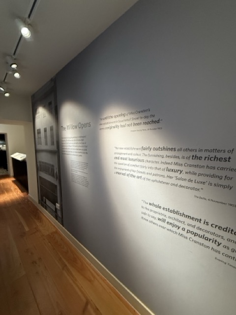
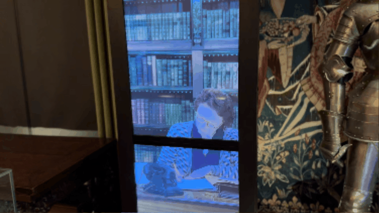
Mackintosh Tea Room:
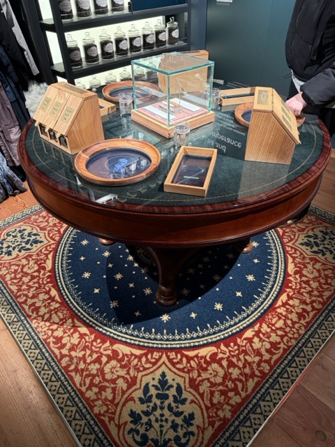
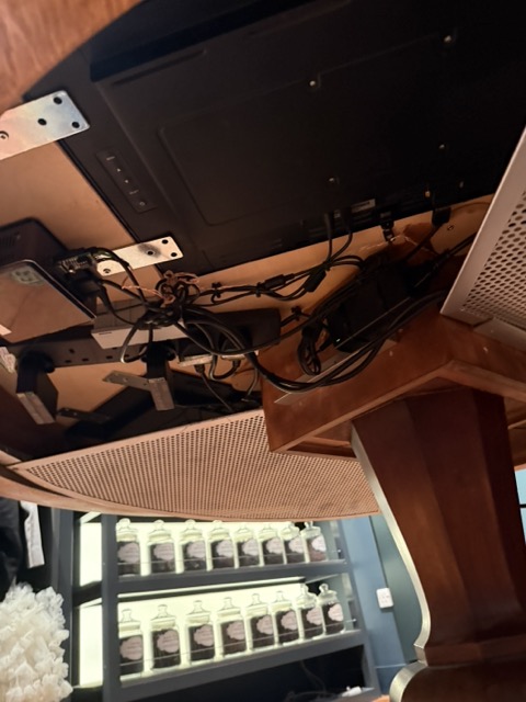
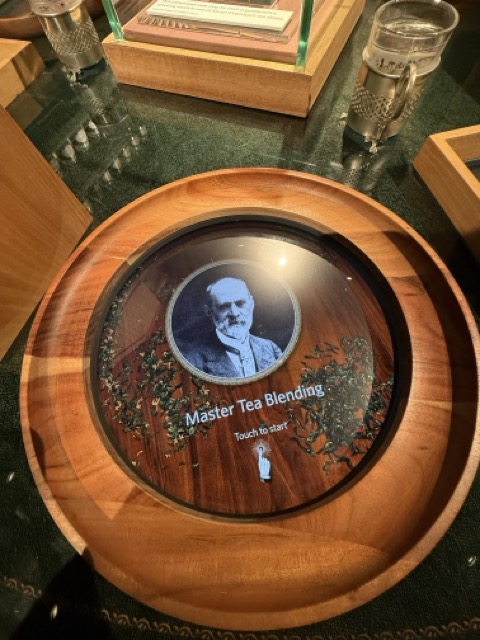
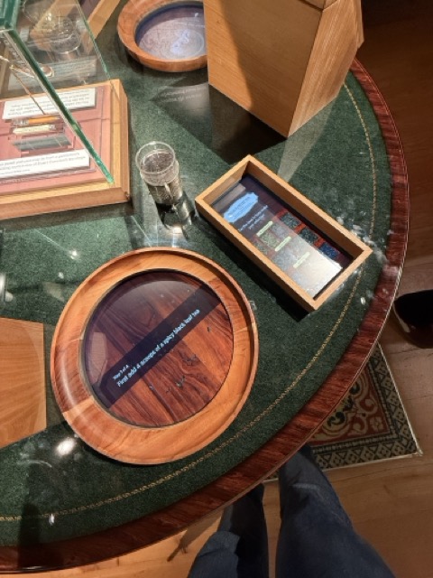
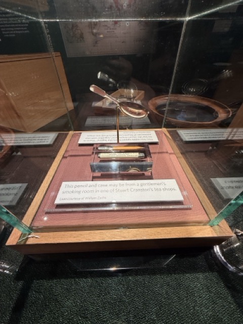
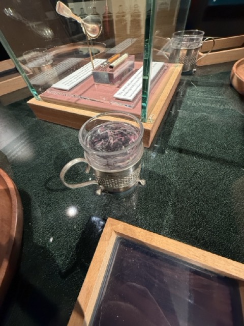
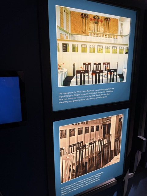
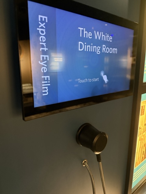
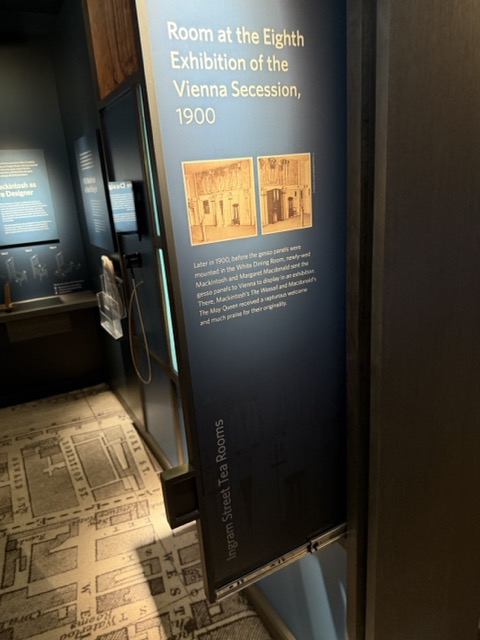
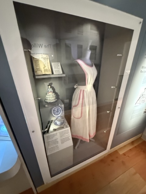
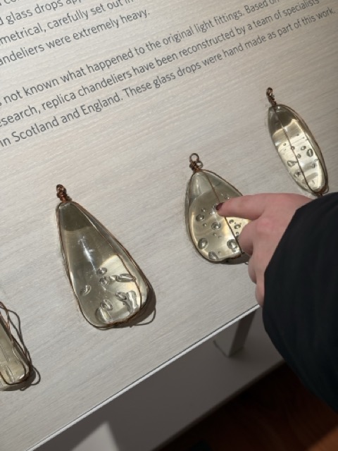
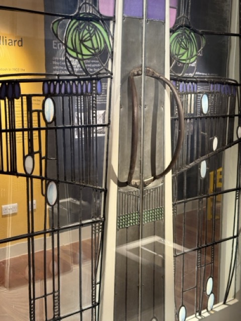
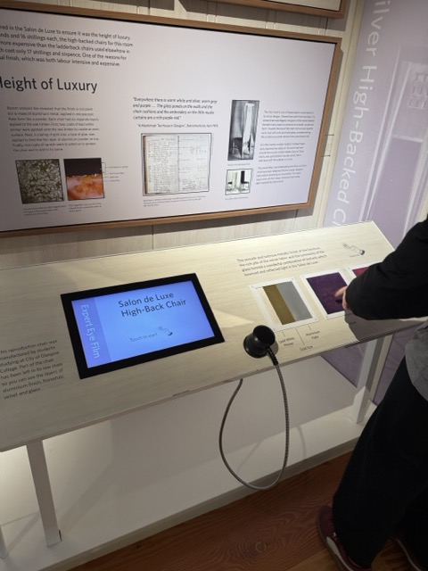
I enjoyed the storytelling of the Tea Room exhibition. What the teams involved did well was the attention to detail, and the set design of the exhibition; the only problem with it was that some of the pieces weren’t robust enough, they would either lag, stop working or not be working at all and just have a sign up saying that.
There was also one or two signs up for broken interactions in the Burrell Collection, but there was so much to see in that, and I didn’t have to pay to get in, but did with the tea rooms.
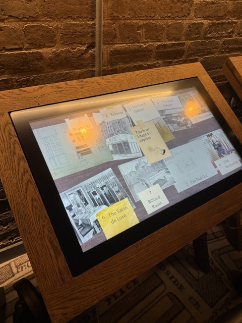
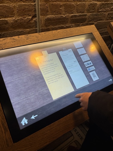
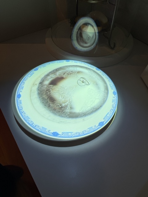
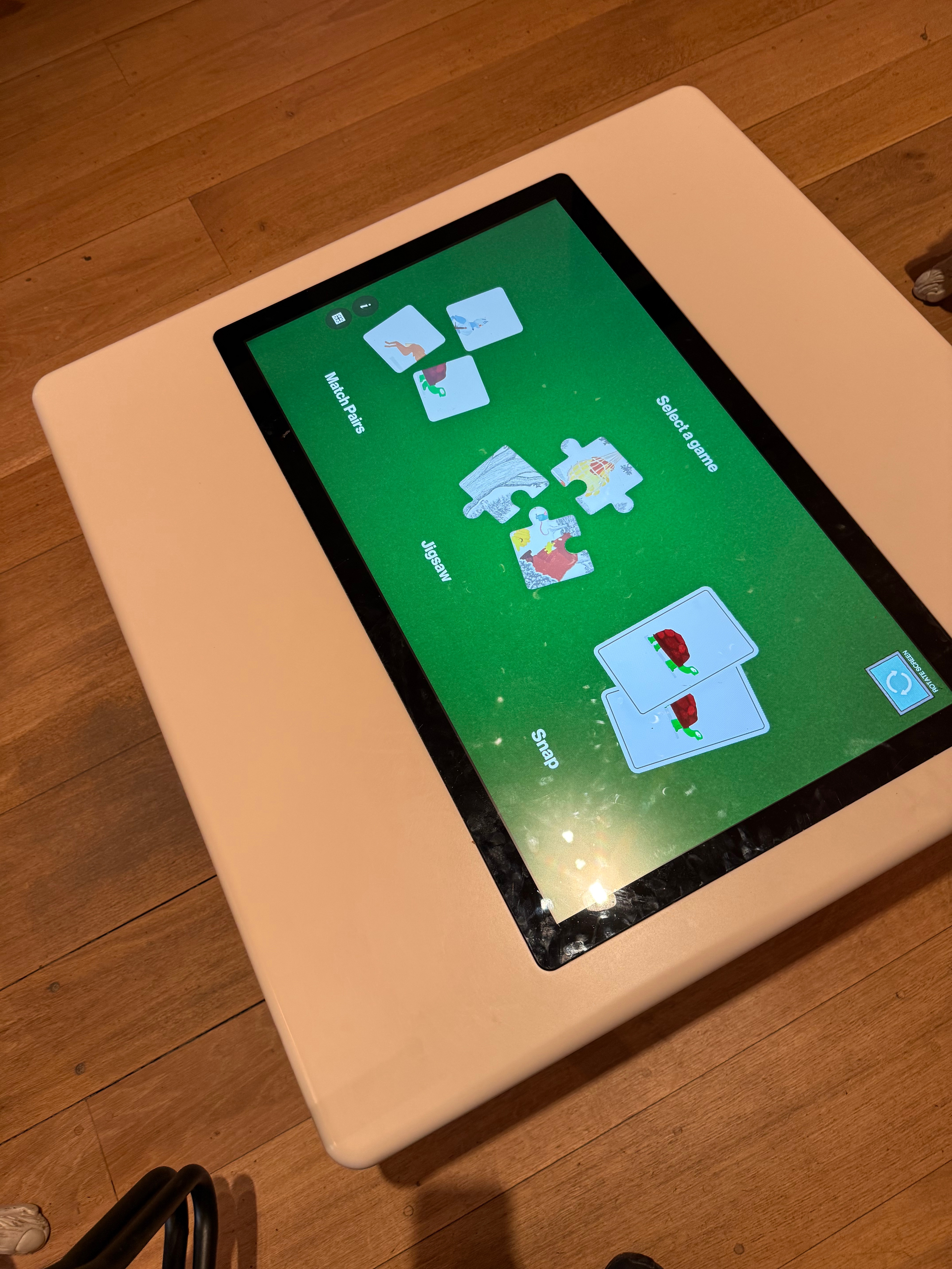
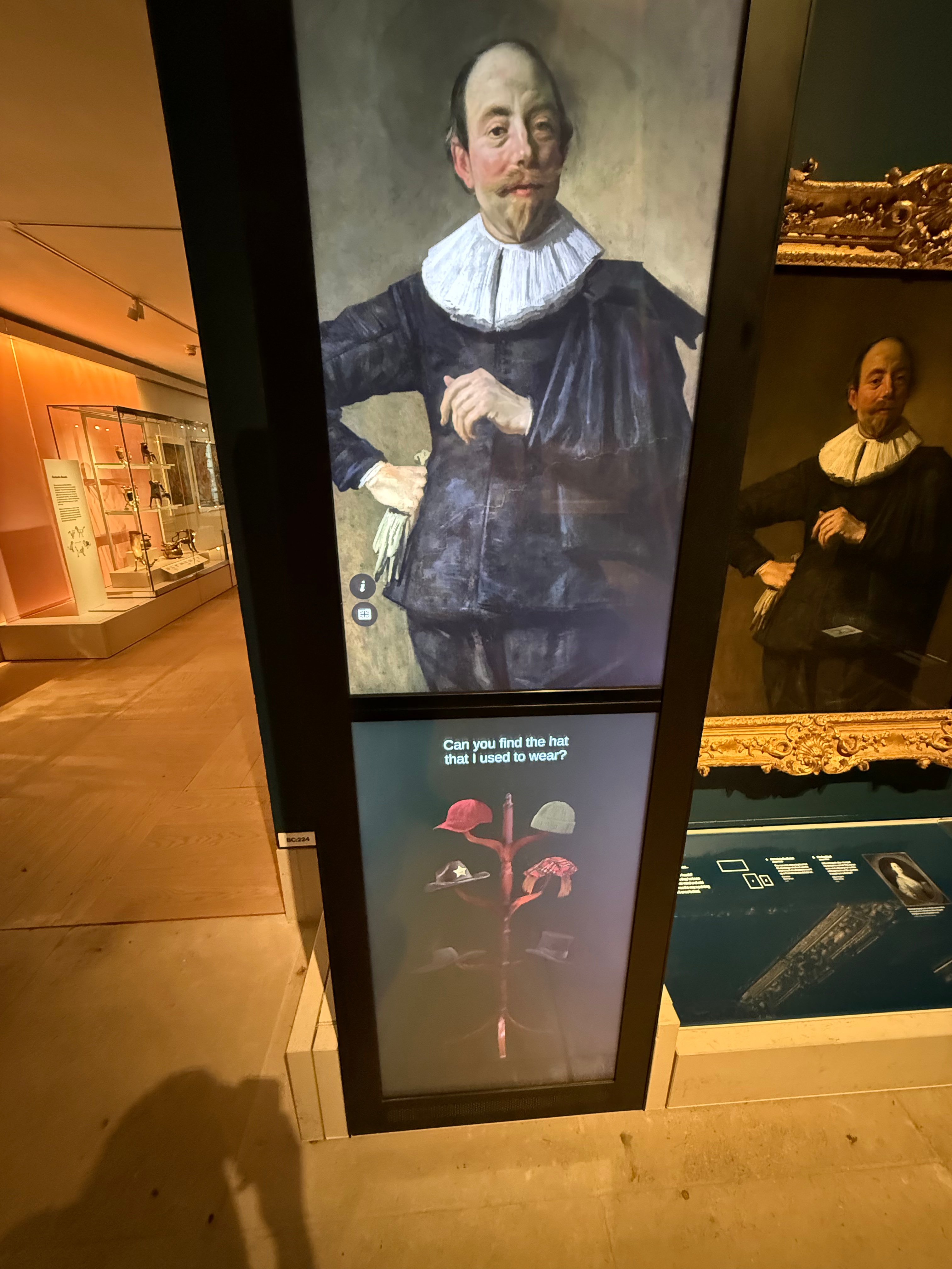
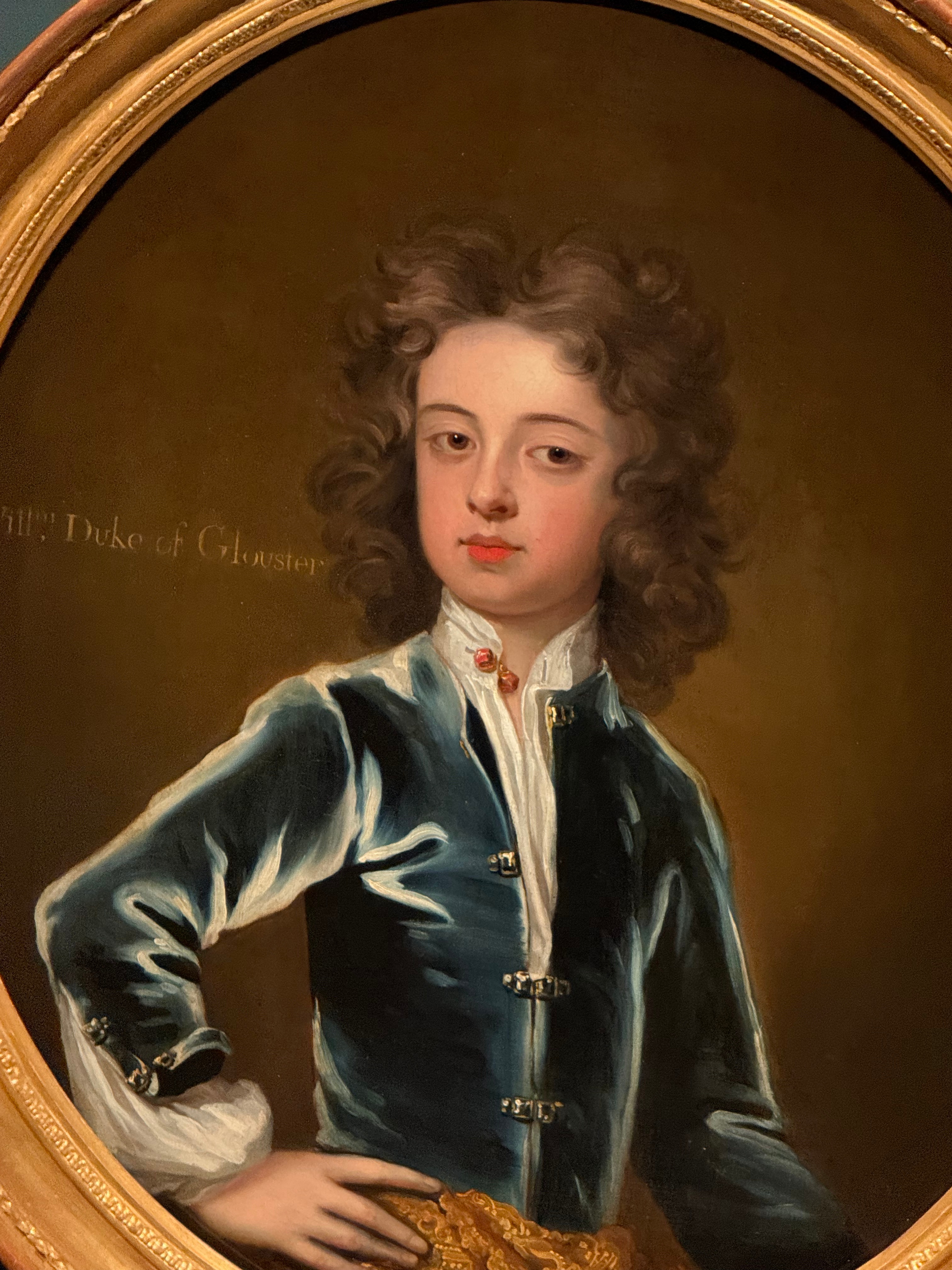
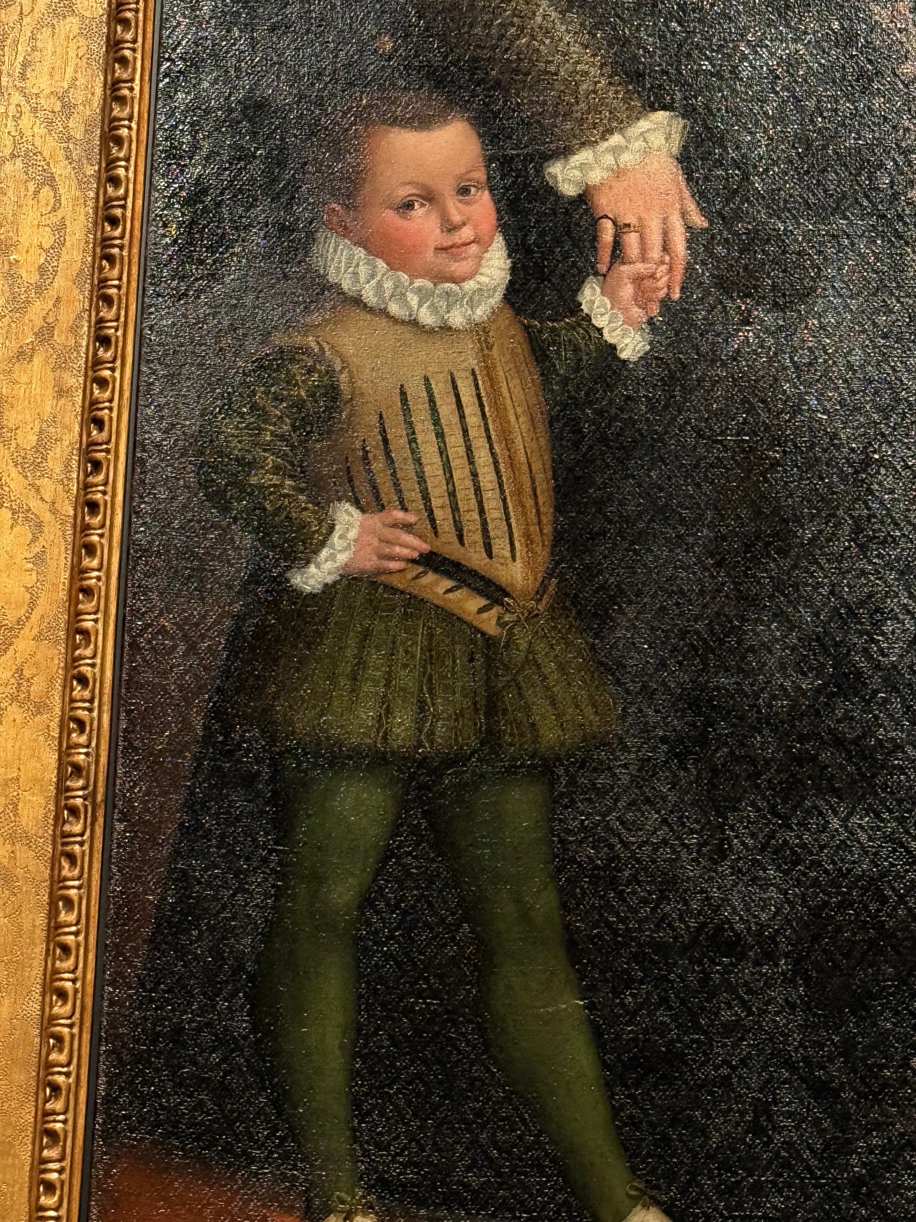
Visiting the Burrell Collection:
While at the Burrell Collection, I couldn’t help but think of my own piece and how I could apply some of the same designs to my work.
Notes from Pav:
Where to next?
What do you want people to take away from it?
It was way too slow; the animation has to be quicker.
It’s about the content; the content has to be engaging to keep people engaged.
A tactile interface for exploring photography.

Leave a comment