Initial thoughts:
QR Code:
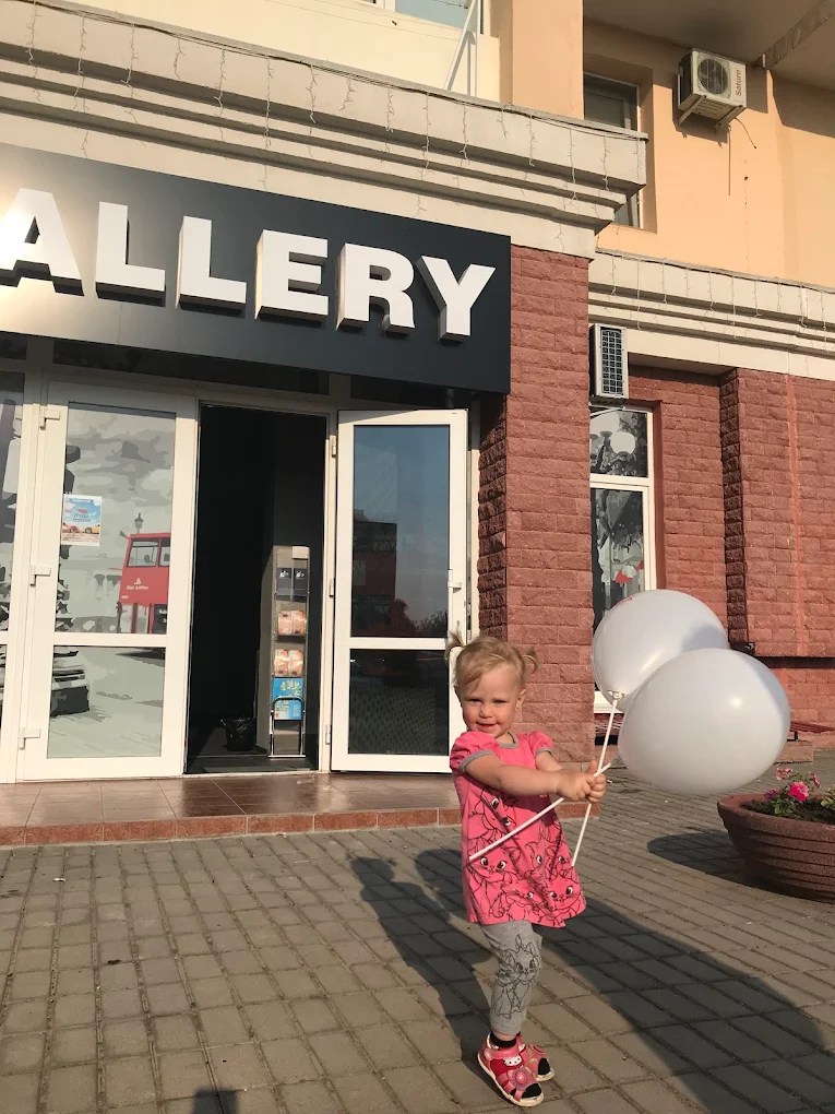
Today, the QR Code is slapped on the bottom of forms, screens, and posters with very little thought, a second thought. With this work, I want to put the QR code at the front, make it the main focus and explore the idea that it is a portal of information.
Idea 01:
With this concept, I want the footage to be just as polished as the sculpture and have the relationship between them to be clear and cohesive.
Idea 02:
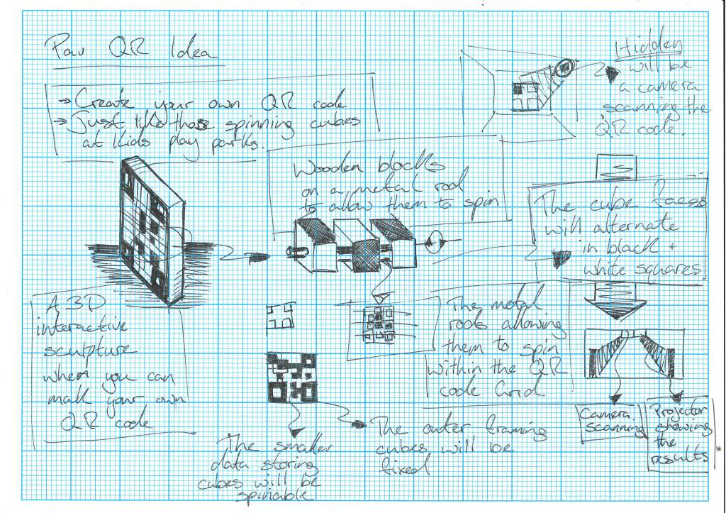
Another idea is to create an interactive sculpture with spinable pieces so users can create their own QR code and see where it leads.
Obviously, the QR codes will need to be tested to avoid accidentally scanning anything rude.
Chandelier:
Idea 01:
At this moment, I think another possible idea would be to carry my Expressive Data project from last year forward as the extended design project.
This button will take you to this project for a more in-depth look.
During the development of that project the idea was floated that this chandelier or collection of chandeliers is more akin to a light sculpture and data visualisation, and that it would be very fitting in places such as the United Nations headquarters in New York or the Nobel Peace Centre in Oslo, so remembering this I have asked a friend of mine, Elias, who might be working with the Nobel Peace Centre in Oslo for his masters.
Possible Locations:
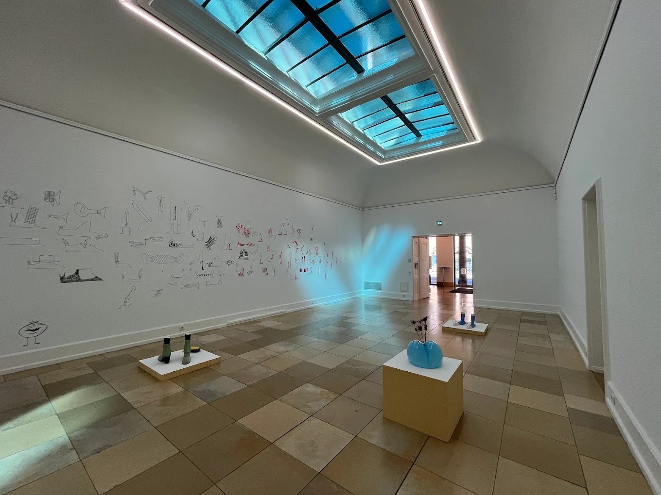
GoMA:
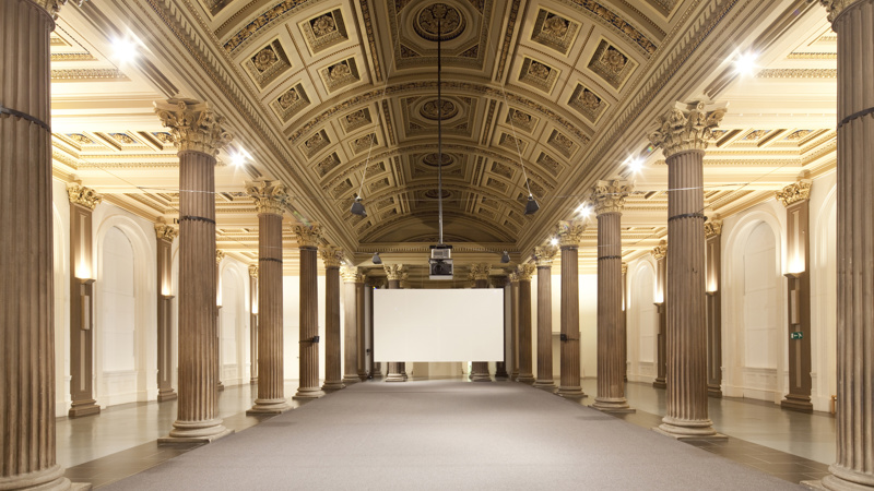
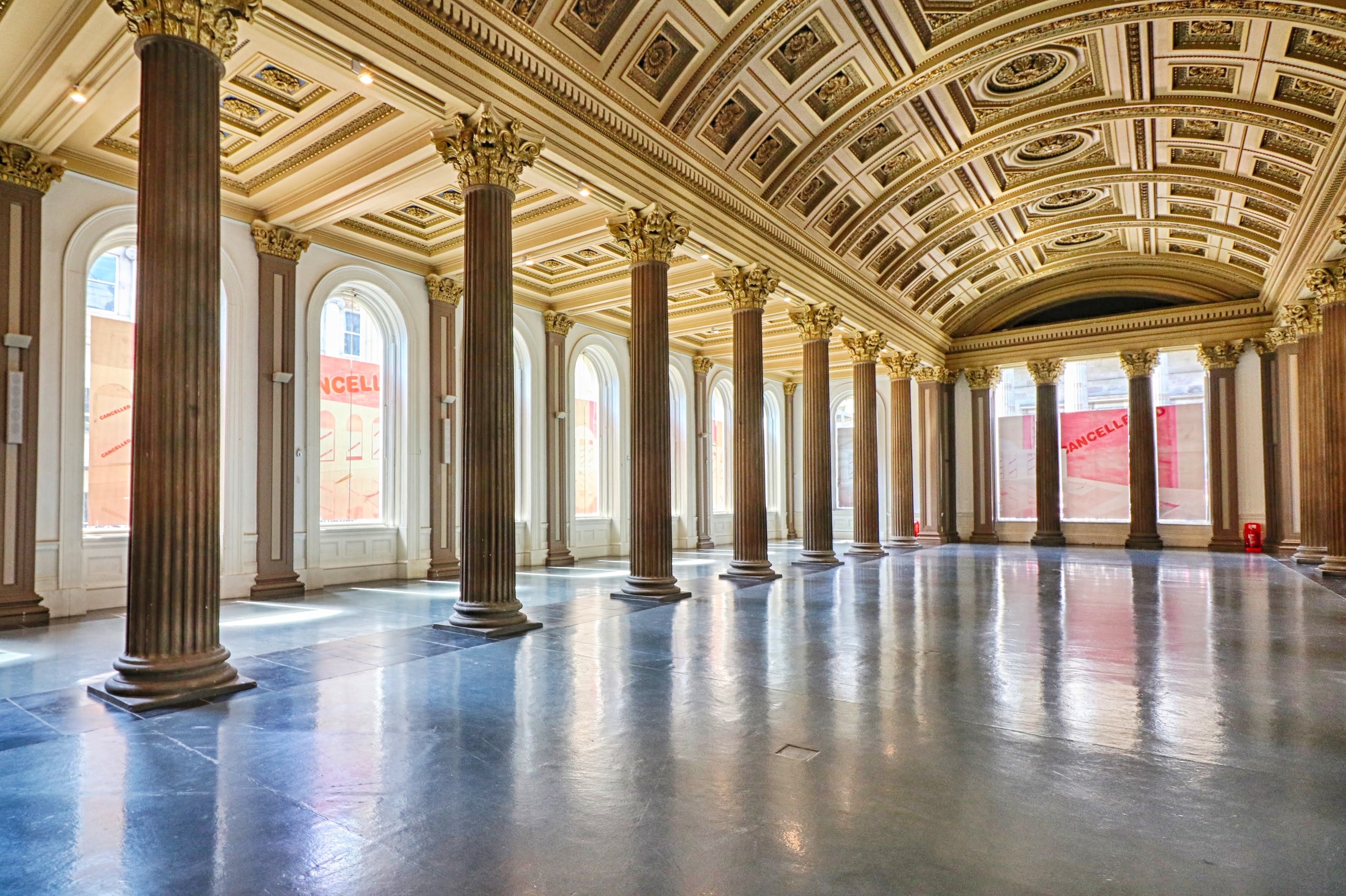
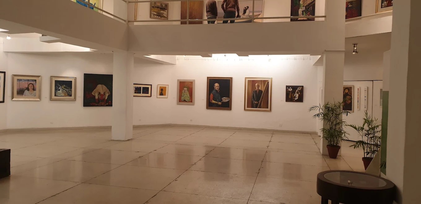
As the GoMA is well known to me, it was one of the first places I considered when thinking about Extending Design. It’s easily accessible, and the space is open and dynamic. Here, I have shown the main hall as I think it would be a space for showcasing all of the chandeliers. Still, as I write this, I remember the balcony area and how one of the chandeliers would hang down through all 3 levels, allowing an up-close look at one of them.
The GoMA would also be ideal for the QR code sculptures within the space, displayed as shown above, completely open and well-lit, with natural light flooding the space.
Nobel Peace Centre:

The Nobel Peace Centre in Oslo was initially mentioned when the project extending the Design was first undertaken, as it focuses on rewarding those who seek to bring peace and improve the well-being of mankind. I feel that a piece focusing on the beauty of the human routine would be warmly welcomed there. The Nobel Peace Centre is also no stranger to hosting art exhibitions that align with its own mission.
United Nations Headquarters:
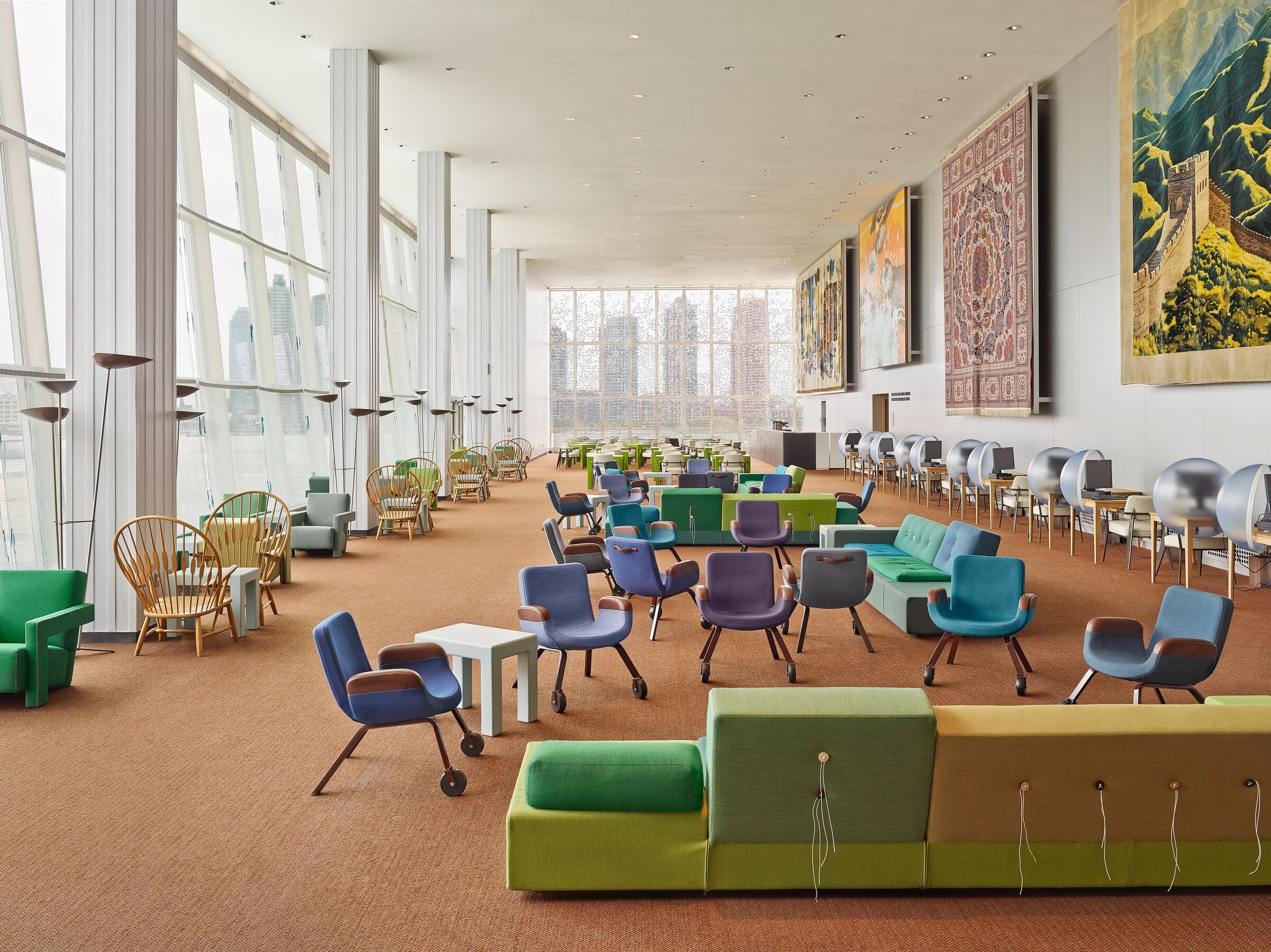
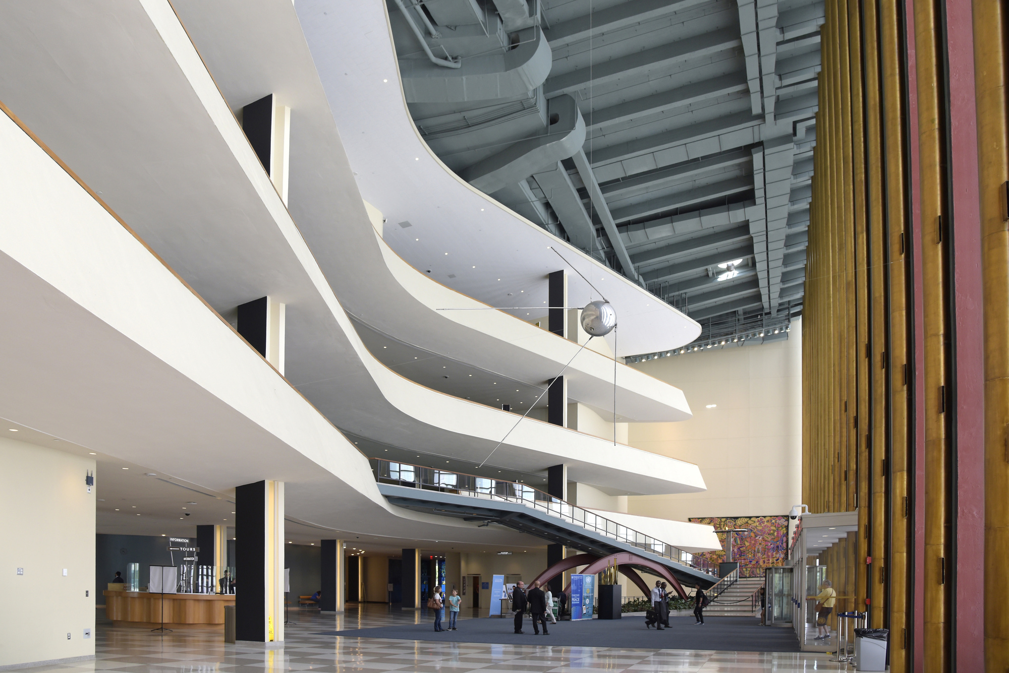
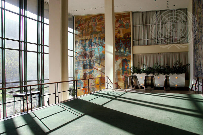
As mentioned previously, the Nobel Peace Centre is an organisation that aims to achieve and maintain peace worldwide. As a place of work, I think the chandelier hanging in the space can be a gentle reminder of why they do what they do, to actively see a small representation of the lives they help.
Start Point:
Now that Extending DesiDesign officially started and I have had time away, I have settled on my plan and idea for it going forward. I will use my chandelier data visualisation, which will be displayed as a long-term light sculpture at one of the previously discussed locations above.
The piece will be a series of data-visualisation chandeliers that use programmed NeoPixels to display the activities of people’s day-to-day lives from around the world. A colour corresponding to the person’s recorded activities will then be displayed on their tube.
Considerations:
Off the top of my head, there are a few things I want to note so I don’t forget them:
- Light – How light is the space, with the chandeliers’ light visible during the day? How bright will the light it produces be? What colours will be used to indicate what actions? What connotations do those colours have to different cultures? Are the colours unified across each chandelier, or are they personalised for each country/region/continent represented?
- Who – Who will the chandeliers be representing? And where are they from?
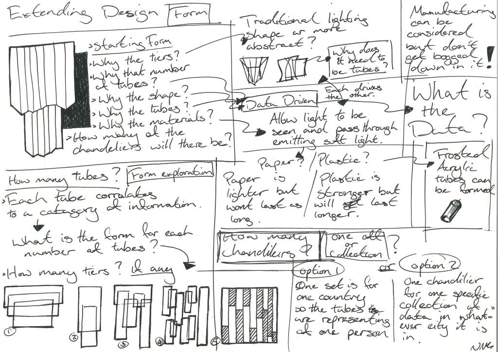
- Material – What material will be used? How long will the material last? The materials need to be strong enough yet light enough to hang, and the tubes themselves must allow light to pass through.
- Construction – If this is long form and it has to hang from the ceiling for several years, it must be built to withstand the usual wear and tear of ageing.
- Run time: As the chandelier changes throughout the day, when will it start, and when will it finish? Will it be 1:1, 100% accurate, or as the organisation’s workers start their shift?
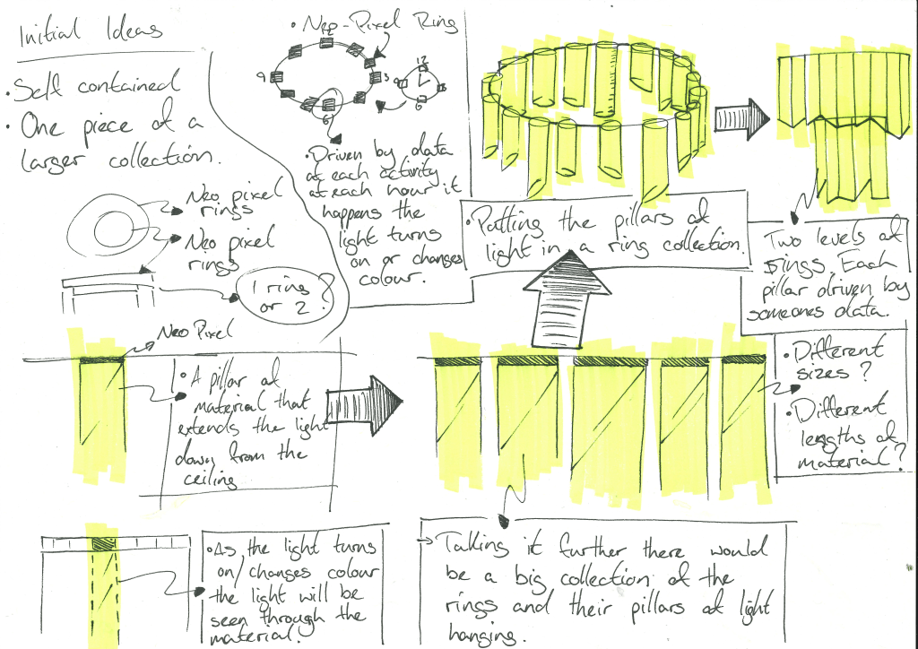
Previous Prototype Sketches:
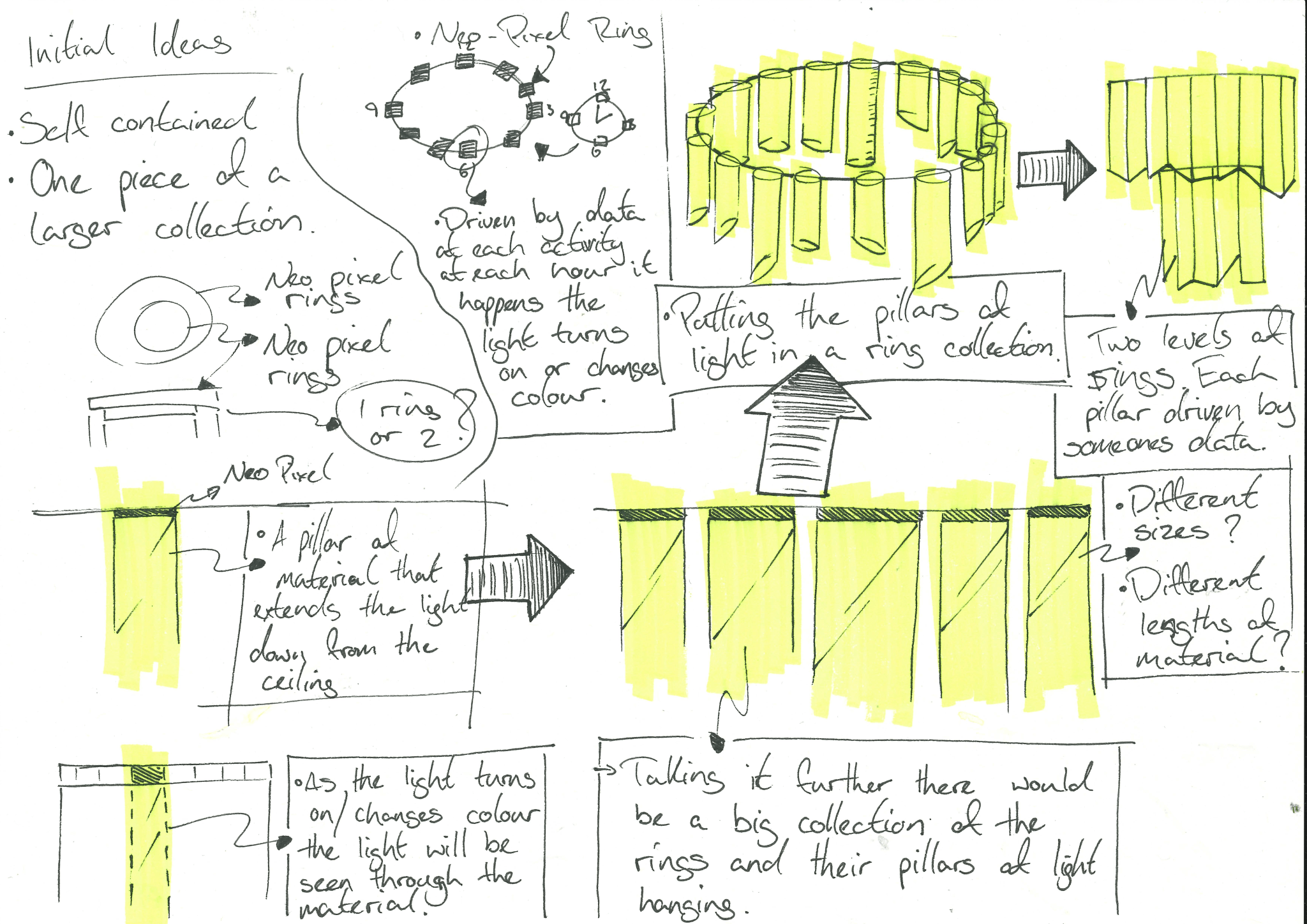
Above are the initial sketches of the chandelier design, with a possible final version in the top right of the page. I was envisaging the final chandelier design to have two levels, or maybe three, with one smaller than the other, and tubes of different sizes to correspond to the different humans, of course, of different shapes.
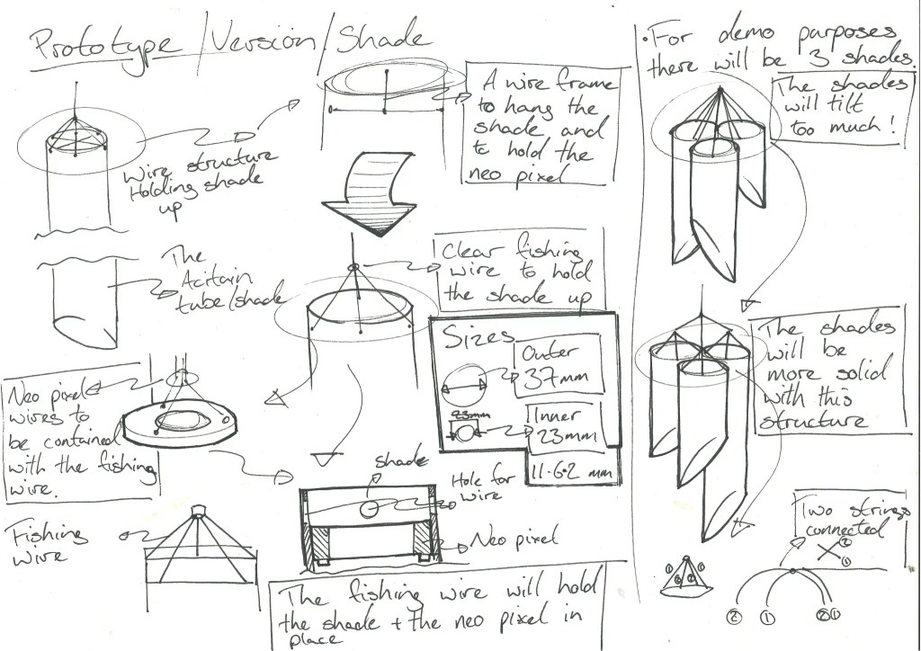
Above are the development sketches of the smaller-scale prototype, with more consideration of how the tubes might be suspended when displayed.
When considering larger versions of the chandelier, the materials and suspension techniques will be closely tied together; the heavier the material or the more tubes, the greater the support required.
Previous Prototype Documentation:
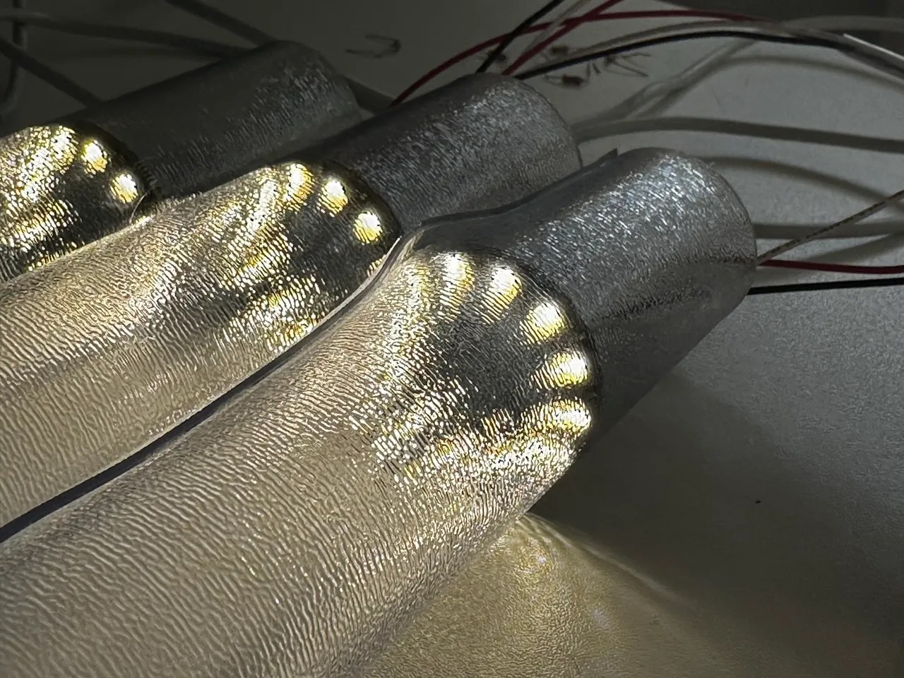
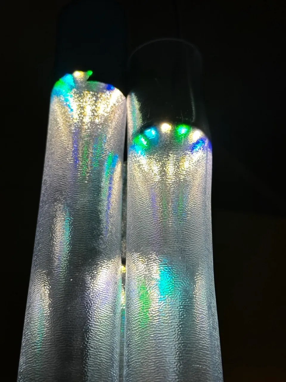
Here is some initial project documentation showing how the light system will start at white and then change to colours as activities are logged throughout the day.
Extending Design Group Tutorial Notes:
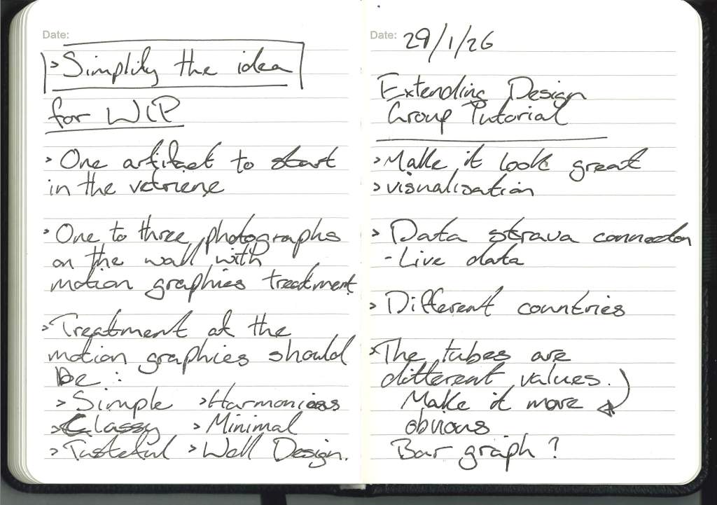
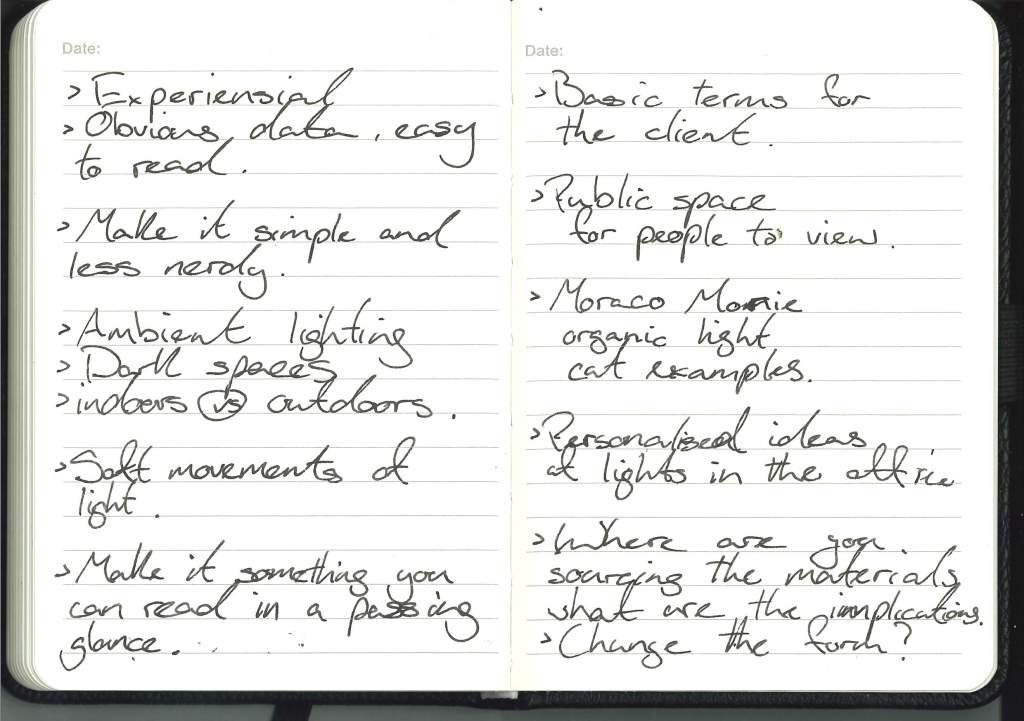
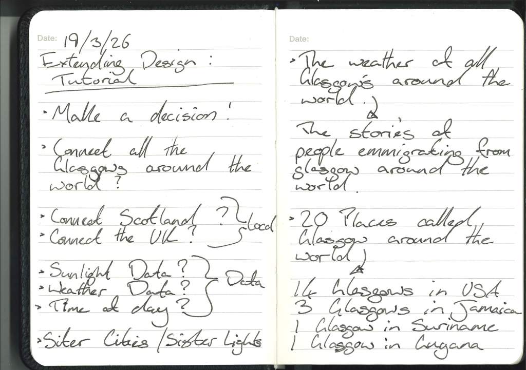
Simplification:
After my conversation with Gillian, it became clear that several questions needed to be answered, and those answers would shape the project’s future direction.
- What is the data?
- Where is the piece going?
- Who is the piece for?
I think these 3 questions are all interlinked, feeding into one another.
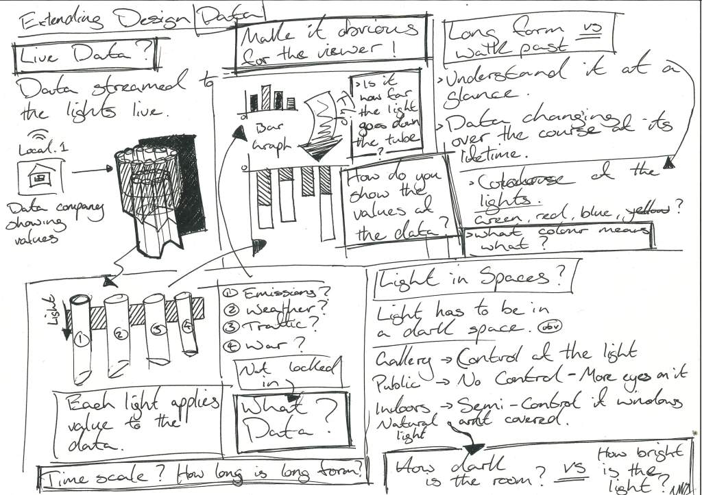
With the new direction, the question of the data was answered with simplification. The data I had was hard to communicate because I was tied to the idea of it being in a public or semi-public place rather than a closed-off gallery, so I had to simplify it so people could understand it at a glance, and if it’s going to be in Glasgow or anywhere else in the world, then what is the simple constant, weather.
When considering location, both in terms of the type of location and its position on the globe, it can be affected by the idea that the data is weather data. What is a meaningful location? If Glasgow, then where in Glasgow or anywhere else in Scotland? East and West? Glasgow and Edinburgh? And what building, somewhere public but open enough for people to appreciate the work. Or, combining those ideas, is a light piece in Edinburgh that shows the weather in Glasgow and vice versa.
And who is it for? This builds on the previous incarnation of the project, which is for the public/semi-public; the piece makes more sense to be seen by others rather than hidden away in a gallery. In this iteration, I’d like to either open the public’s eyes to data visualisation or the weather of Scotland.
Expanding this further, it could encompass more of Scotland and its weather, a collection of chandeliers scattered across Scotland, each showing the opposite ends of the weather, North to South, East to West.
Tutorial with Cat:
After focusing on the WIP for the most part, it’s time to get back into the swing of things and focus on Extending Design and the studio as well.
After the tutorial with Cat, I had a clear idea of how to take my project further, and the most important feedback was to trust myself and make a decision rather than double-guess or overthink each step.
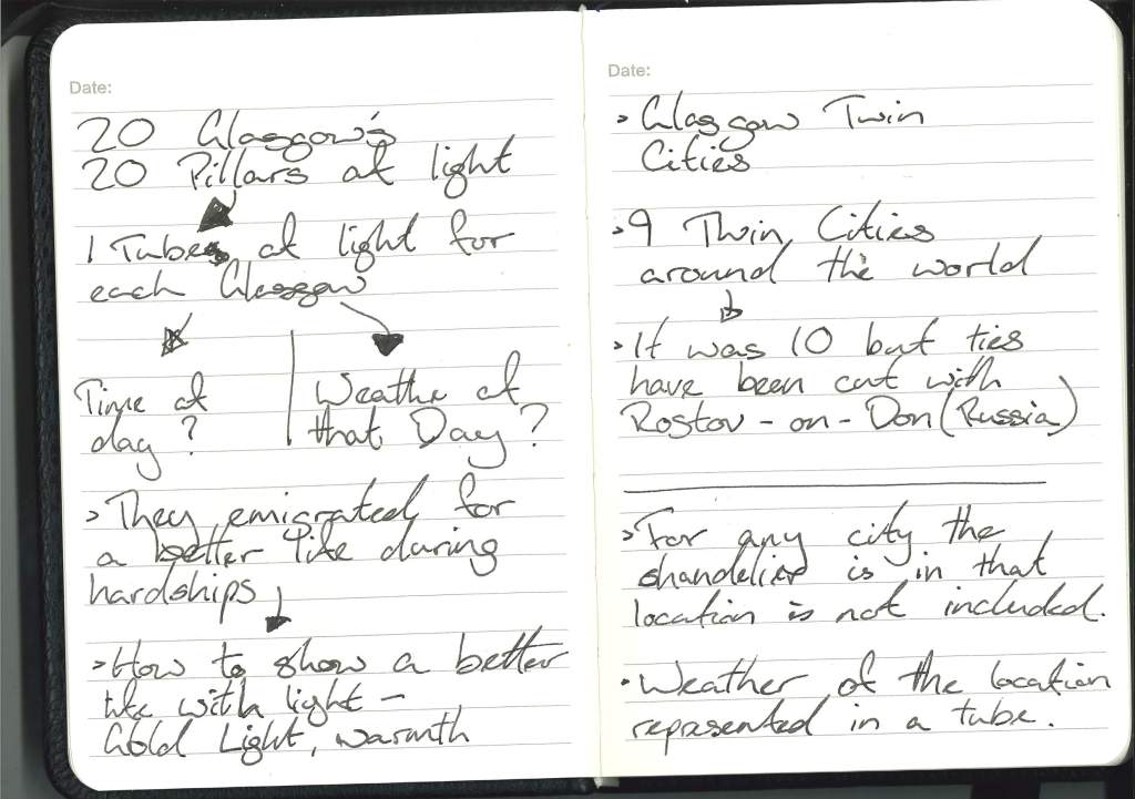
The four paths that developed in my notes were firstly between whether to showcase weather in the tubes of light using light and colour, such as a warm yellow for a sunny day, or to stick to a simple understood colour convention when it comes to weather, or to show time of day with either a warm glow or a deep blue.
And the second was whether the locations represented are places named Glasgow around the world, showing places where Glaswegians emigrated, or Glasgow’s official sister cities, to promote that connection and the partnership of culture and education across the globe.
After my chat with Cat, I think the power of this piece lies in its simplicity: the fewer the data options I have, the more it reveals. For example,s whether it’s day or night. For the locations, I think the more official route of Glasgow’s sister cities will give the piece more focus in terms of creative direction and add a worldwide scope.
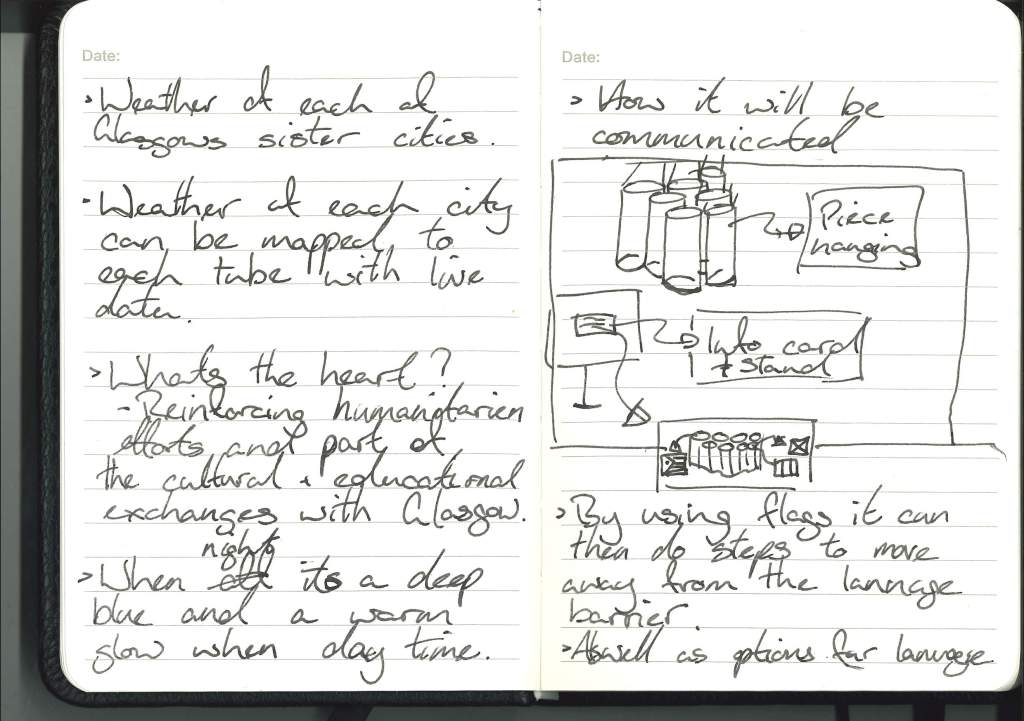
Glasgow’s Sister Cities:
- Nuremberg, Germany -1985:One of the oldest partnerships, focusing on culture and civic cooperation, says the Glasgow City Council.
- Dalian, China -1997: Focuses on trade, port operations, and cultural exchanges.
- Havana, Cuba -2002: A partnership focusing on cultural and educational initiatives.
- Turin, Italy -since 2003: Focuses on tourism, cultural exchange, and industrial heritage.
- Lahore, Pakistan -2006: Focuses on educational and economic partnerships.
- Marseille, France -2006: Focuses on hospitality partnerships and maritime/industrial history.
- Bethlehem, Palestine -2007: Focuses on peacebuilding and cultural exchange.
- Pittsburgh, USA -2021: Focused on industrial heritage, environmental initiatives, and economic development.
- Mykolaiv, Ukraine -2024: A partnership focusing on solidarity and shared shipbuilding history.
- Nuremberg, Germany – 1 hour ahead of Glasgow.
- Dalian, China – 8 Hours ahead of Glasgow.
- Havana, Cuba – 4 hours behind Glasgow.
- Turin, Italy – 1 Hour ahead of Glasgow.
- Lahore, Pakistan – 5 Hours ahead of Glasgow.
- Marseille, France – 1 Hour ahead of Glasgow.
- Bethlehem, Palestine – 2 Hours ahead of Glasgow.
- Pittsburgh, USA – 4 Hours behind Glasgow.
- Mykolaiv, Ukraine – 2 Hours ahead of Glasgow.
9 cities mean 9 columns of light, each changing colour depending on the time of day in each city.
Even though this is prompted by a government scheme, I think it should be held in galleries or Public places in each country. Either central galleries in each town or publicly accessible buildings, government or otherwise.
Where in those cities?
Each of the galleries or museums listed below was either considered for the space they have or their geographical location and that the main goal of this work is to connect these cities and its people.
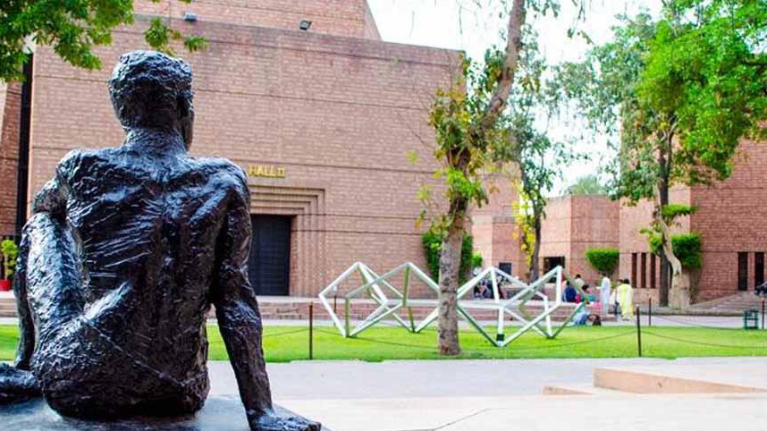
Glasgow, Scotland:
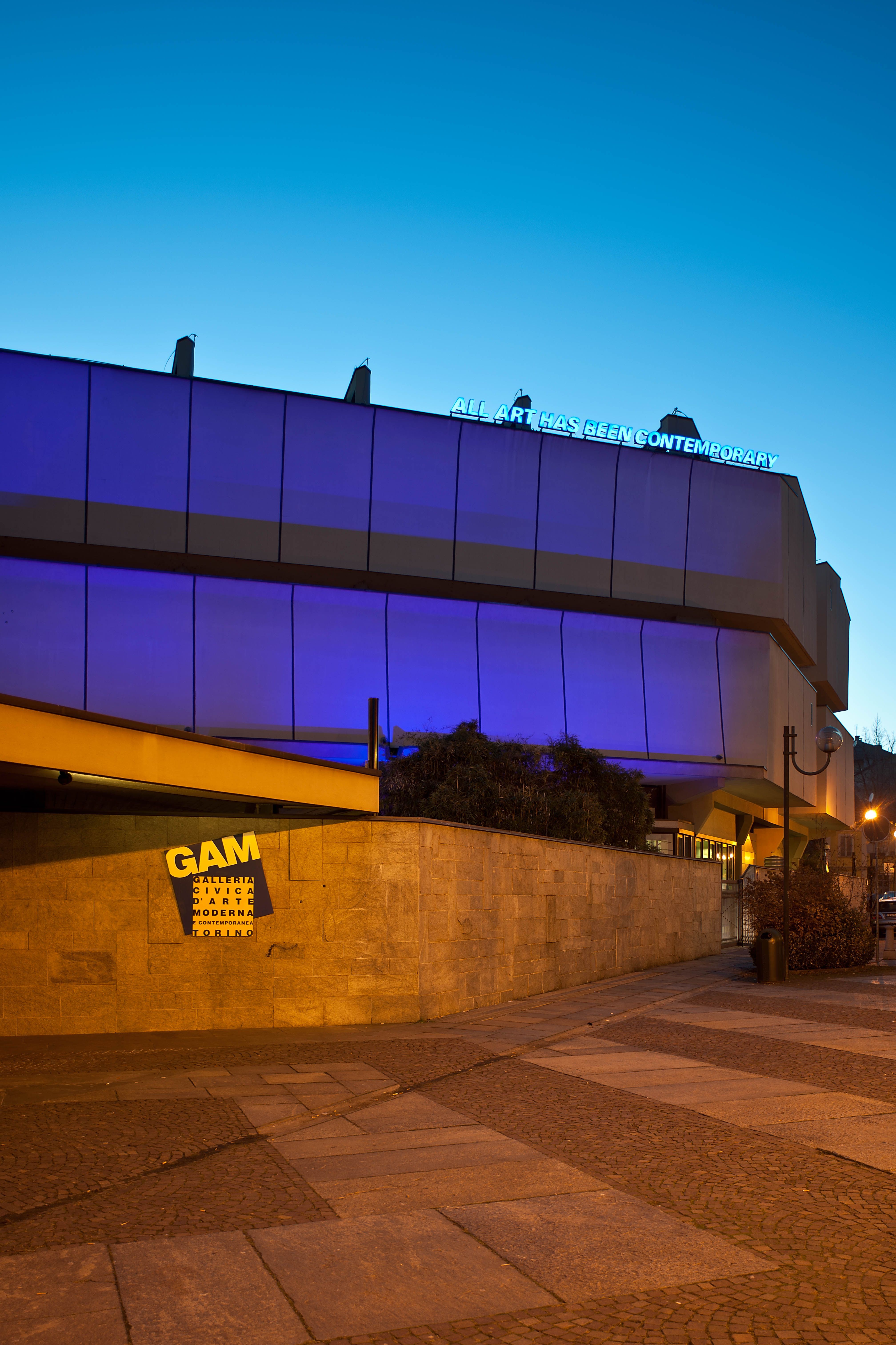
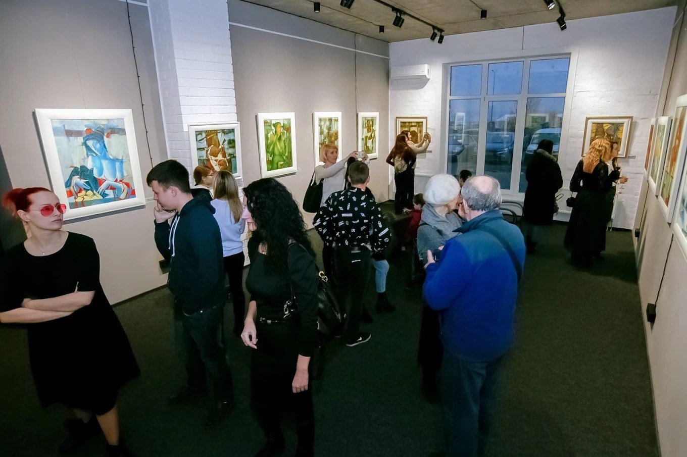
The Gallery of Modern Art
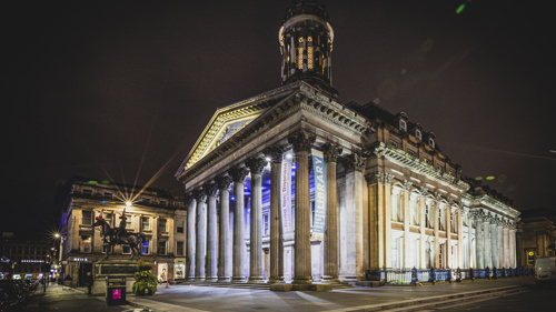

The GoMA in Glasgow was chosen both for its size and its location in the centre of Glasgow, the starting point of this piece.
Nuremberg, Germany:
The Kunsthalle Nürnberg ( Art Gallery)
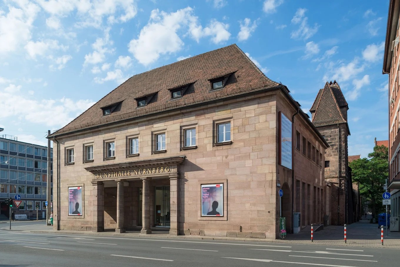
The Kunsthalle Nürnberg was chosen, similar to its Glasgow counterpart, for its size and location.
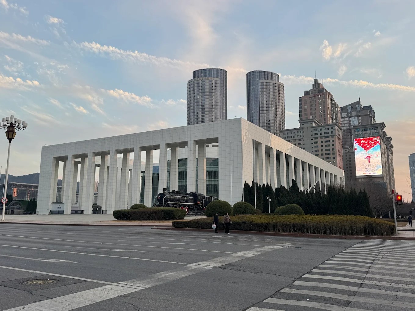
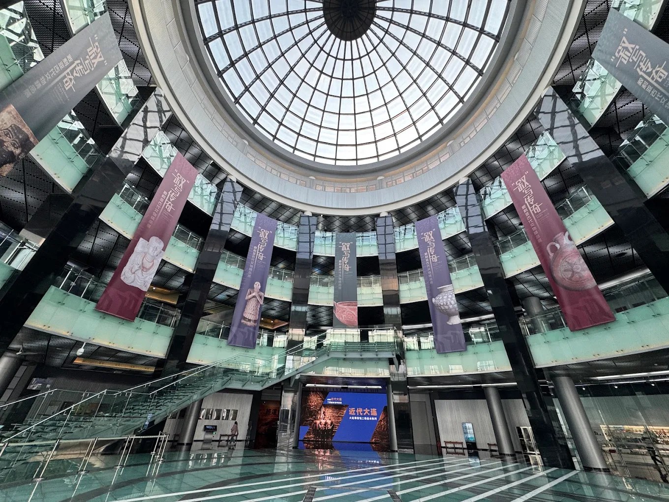
Dalian, China:
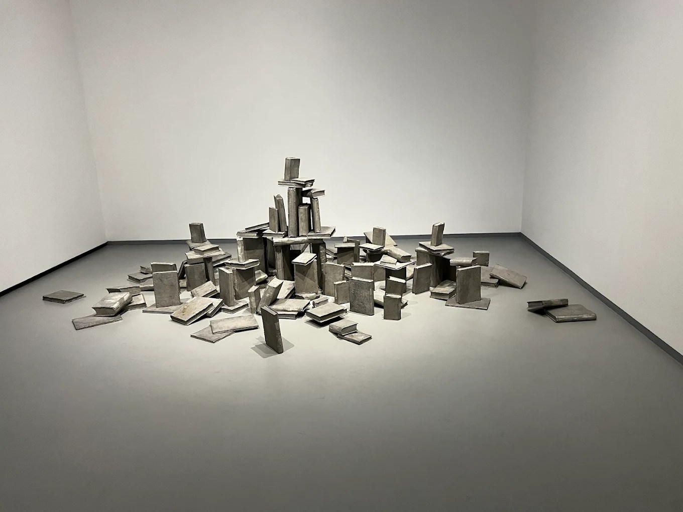
Dalian Modern Museum
Havana, Cuba:
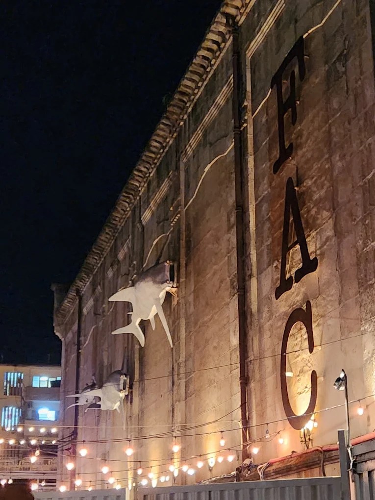
Factoria Habana Art Gallery
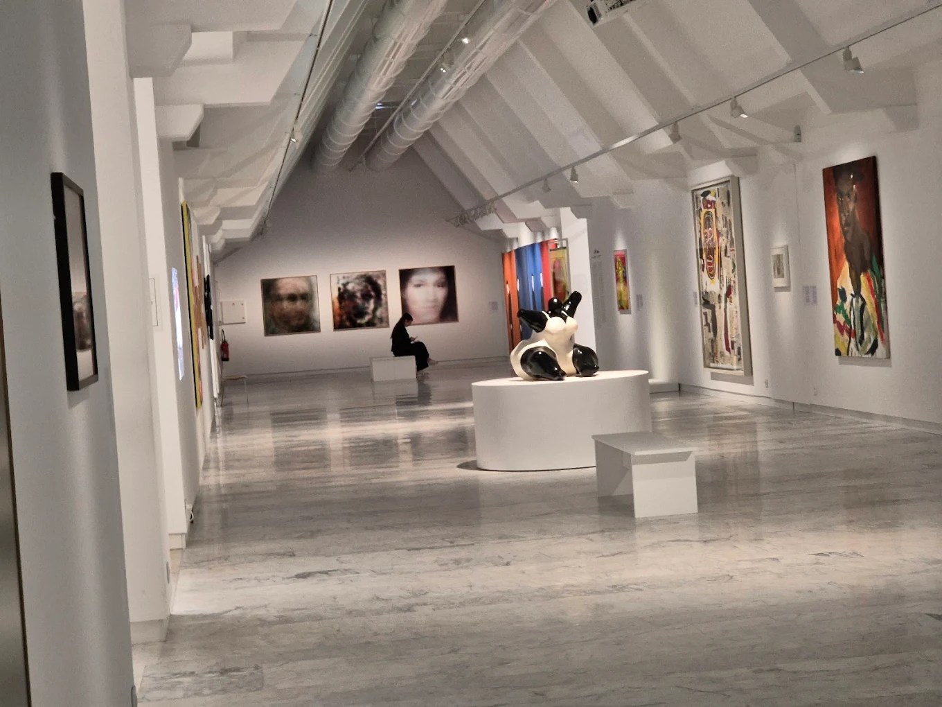
Turin, Italy:
The Turin Civic Gallery of Modern and Contemporary Art
Lahore, Pakistan:
Alhamra Art Center
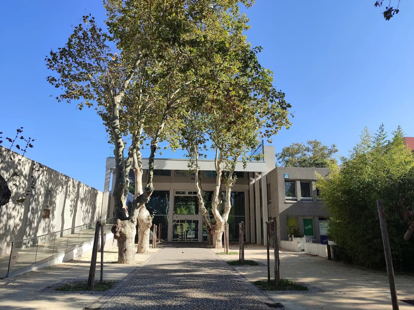
Marseille, France:
[mac] Musee d’art contemporain de la Ville de Marseille
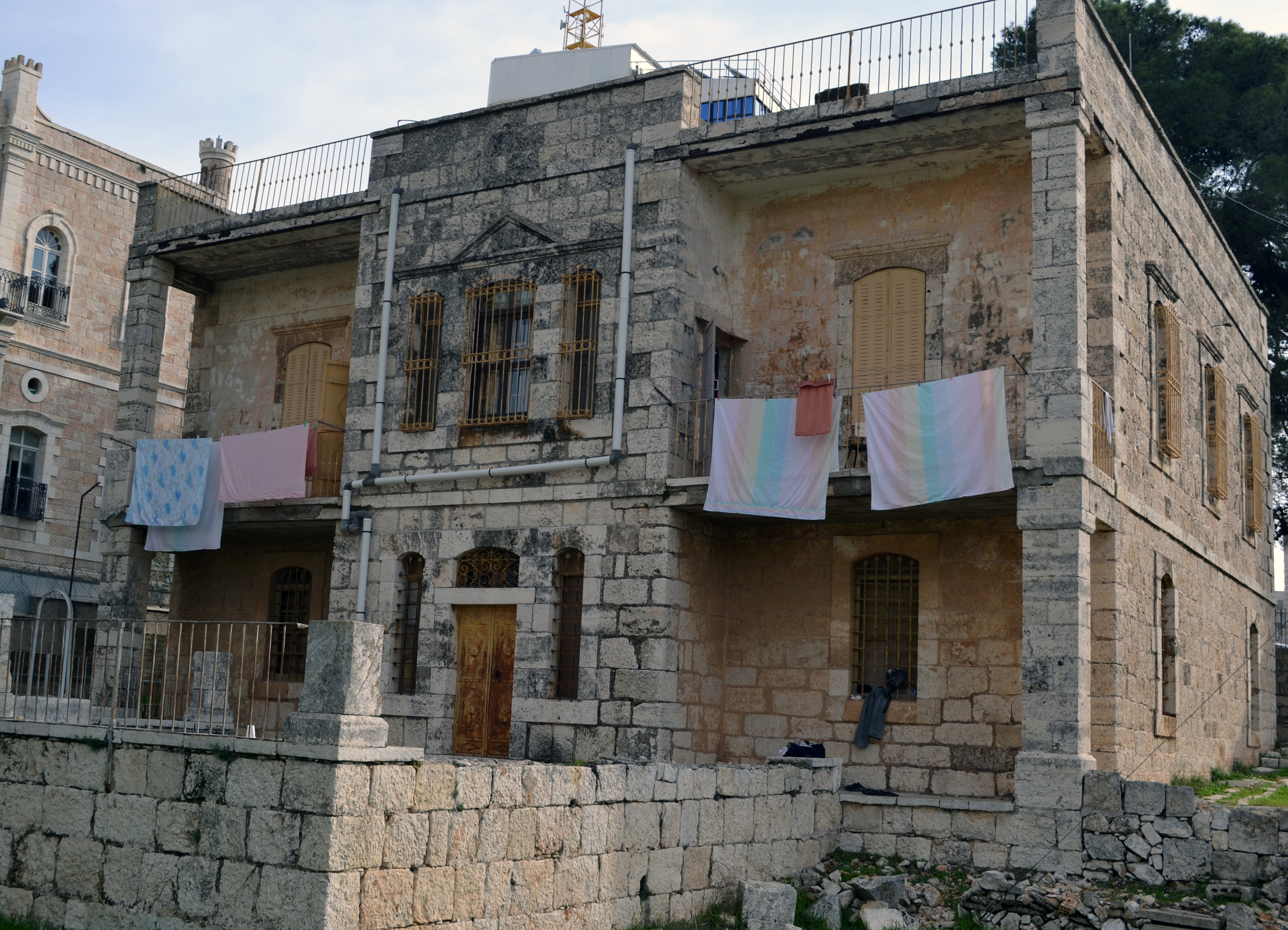
Bethlehem, Palestine:
Dar Yusuf Nasri Jacir for Art and Research
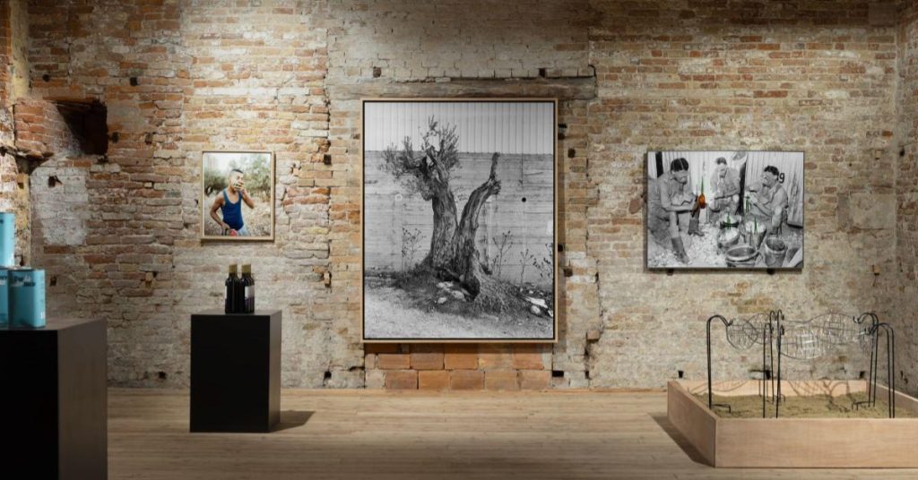
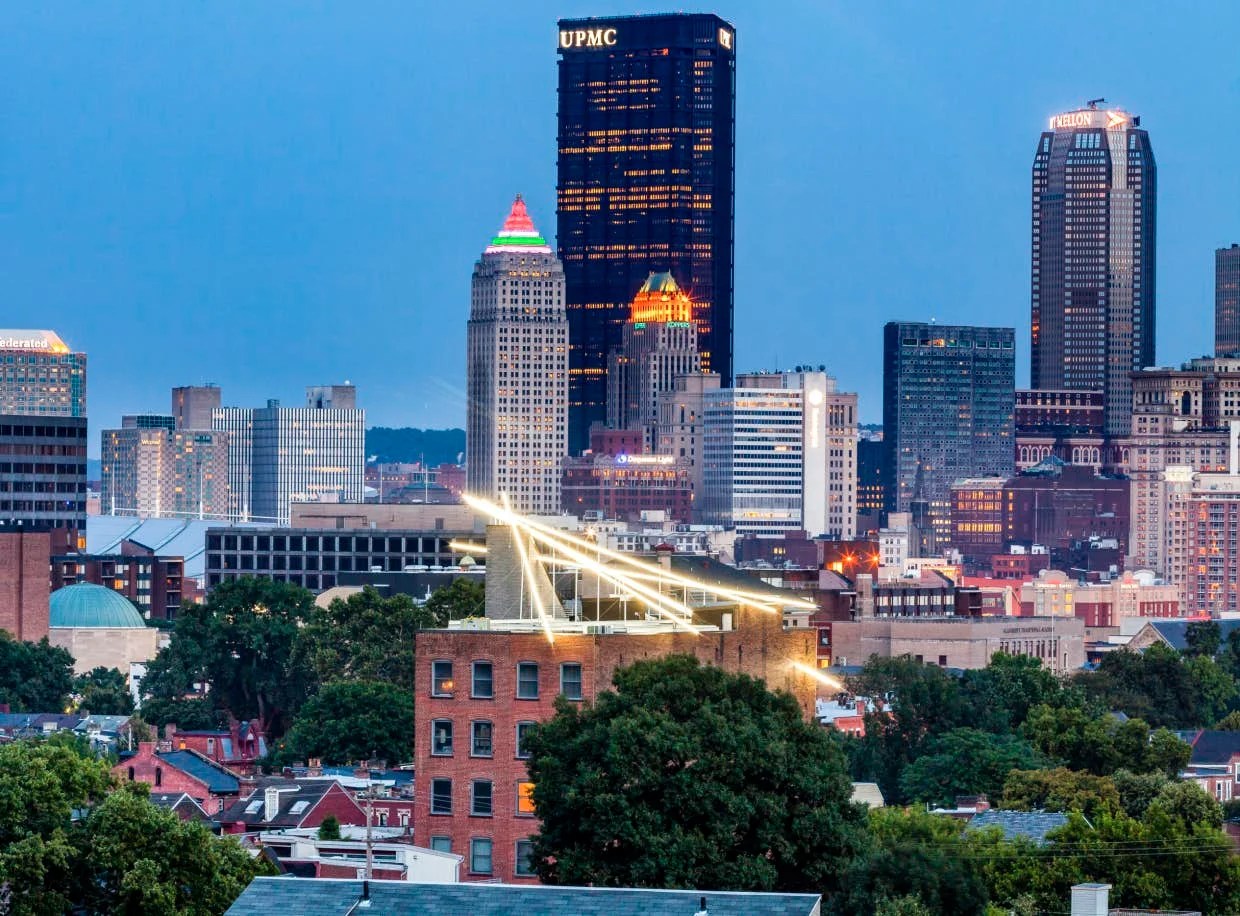
Pittsburgh, United States of America:
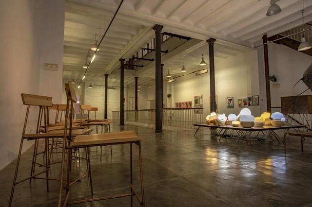
Mattress Factory Contemporary Art Museum
Mykolaiv, Ukraine:
Gallery
Unlike the other selections, the single room in the ‘Gallery’ would be overpowered by the large light sculpture. At this point, I’m considering two options, where each gallery has its own version of the light sculpture, or I lean into the difference and fill this room with the piece. There are other galleries with larger spaces, but they would not be in Mykolaiv, a sister city.
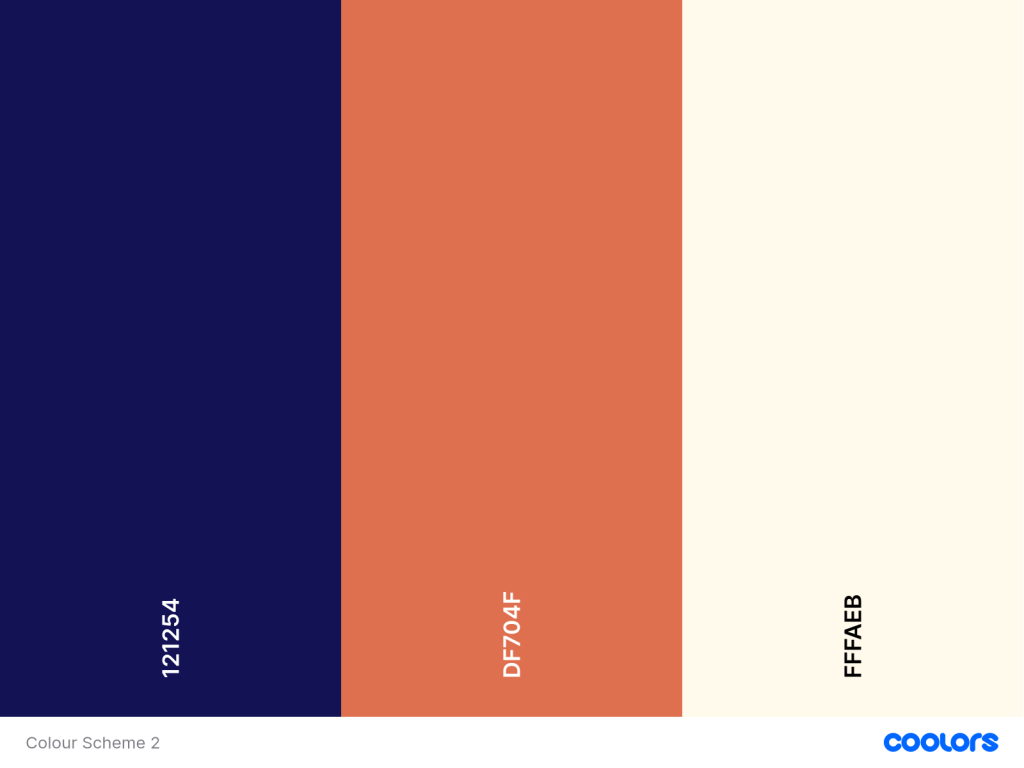
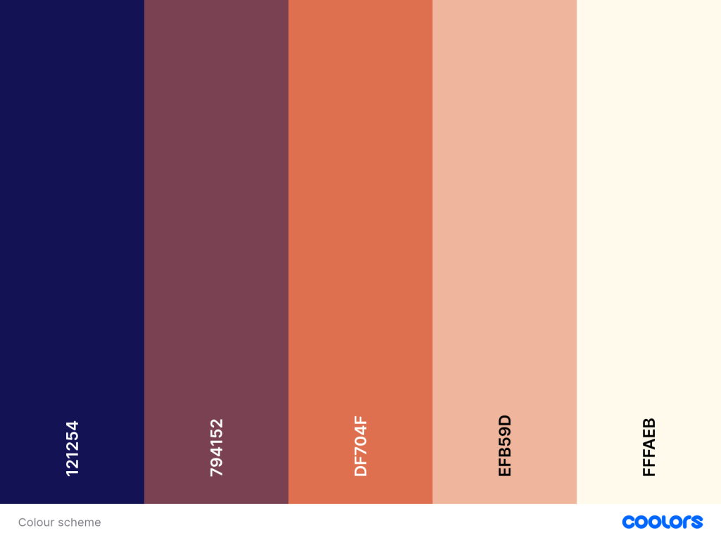
Colour Schemes:
If the data is the time of day, then it can’t be either on or off because that would confuse the audience, not knowing if it’s broken or not, so still considering that I will use some sort of programmable light, then there will have to be a colour value to each stage, night, dusk/dawn and day.
The first image is a simple 3-stage colour scheme for night, sunrise/ sunset and day.
The second has transitional colours between each stage during the day.

Leave a comment