

Research :
At this point I have no clear plan for this project but I want to keep it that was for as long as possible. At this point I’m exploring the links Paul provided for some inspiration.
Also the feedback from my summative assessment thats in my head at this point are trying to widen my search for inspiration and connecting a number of different media, I’m not going to force it if it doesn’t happen naturally but still keep it in mind.
The psychedelic visuals of the classic iTunes visualiser has a nostalgic flair to it and a part of me does love some of the visuals of it but it doesn’t feel like its 1 : 1 with whatever music is played on it.
Take away : However the audio is visualised or represented, its more appealing when its 1 : 1 and you can see what your ears naturally pick up.
An Optical Poem – Oskar Fischinger
With An Optical Poem the visuals have a clear relationship to the music played and convey Fischinger’s personal vision and relationship to colour and music. Even though he was restricted to the media of the times the emotion and energy conveyed still feel indicative of the music. The problem is that this is one mans vision and connection to the music and might not relate to others, that might relate different colours, motions or shapes to different movements or instruments in the piece.
Take away: An Optical Poem is one mans personal response to the piece of music and might not ‘line up’ with others ideas.
Electroplankton – Toshio Iwai
Electroplankton by Toshio Iwai really makes the act of discovering, creating and visualising music obtainable and accessible. The light hearted nature of the program removes the intimidation that some may experience when interacting with technology or music production. Even if it does become a bit mad at times its very forgiving for mistakes and discovery.
Take away: The interactive nature of Electroplankton allows the user to both create a relationship to the sounds they’ve discovered and see a direct correlation to their actions.
Personal Note : I want something that can be moving to the user and to help, in one way or another, create a realtionship between the viewer/user and the music they see/hear/create.
Test Pattern 100m Version at Ruhrtriennale – Ryoji Ikeda
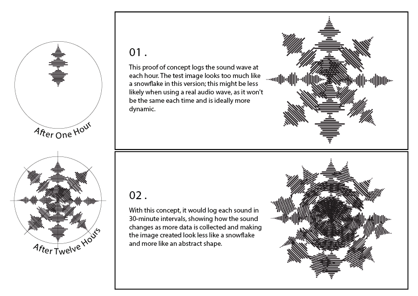
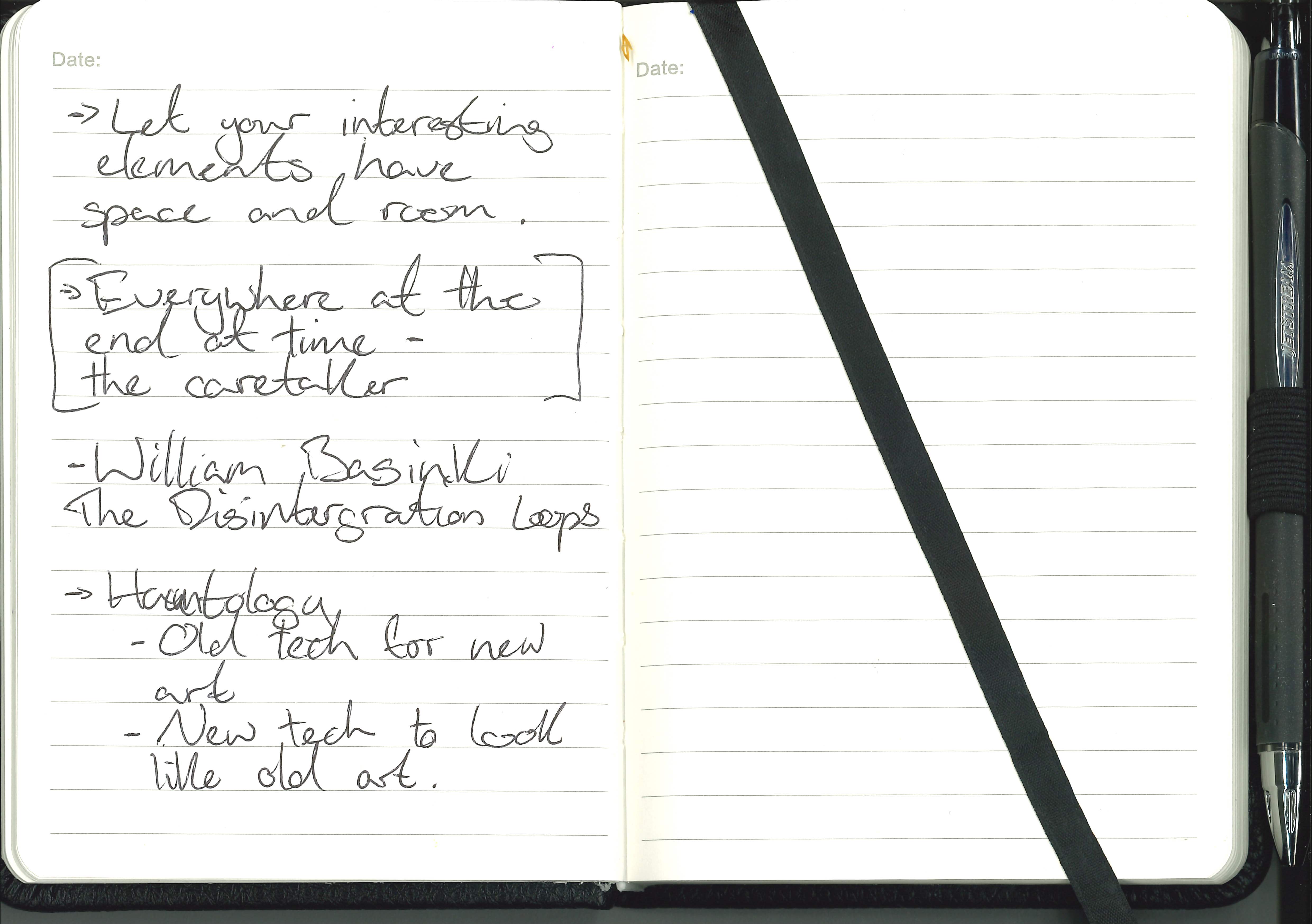
Idea Sketch – Sound clock :

The sketch above in my note book is an idea about logging the sound waves of an area or room and logging it in the formation of the hours on a clock face to produce a collection of prints.
Inspiration – George Crumb, Spiral Galaxy (1972)
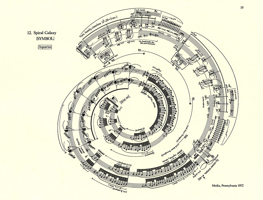
With Crumbs spiral sheet music, it sparked the idea of the music being shown through time and then the idea that the ambient noise of a location at the corresponding time being logged on the sketch, then producing a visualisation of the whole 12 hours.
Idea Sketch – Audio leading Audio :
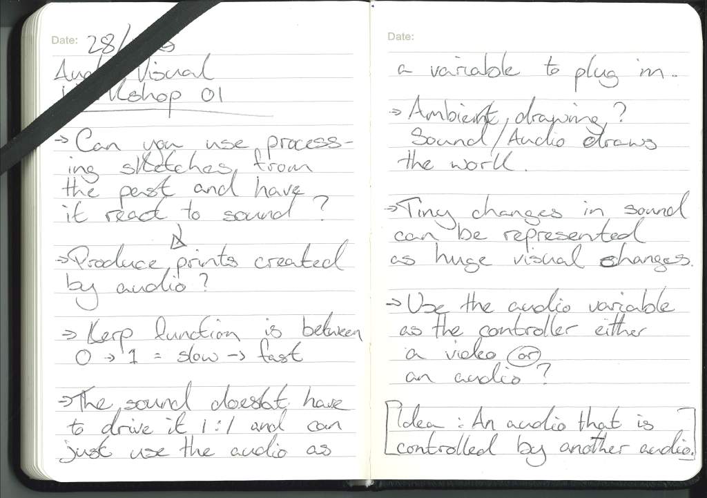
With this idea the concept is to have an audio processing sketch that is driven by an external microphone that picks up the ambient noise of a room and controls wether the music plays or not. Initially the idea was to only play the music when the volume level of the room was below a certain threshold. But I actually think it would be more interesting to invert it and have the music only play when the room is loud enough adding to the noise .
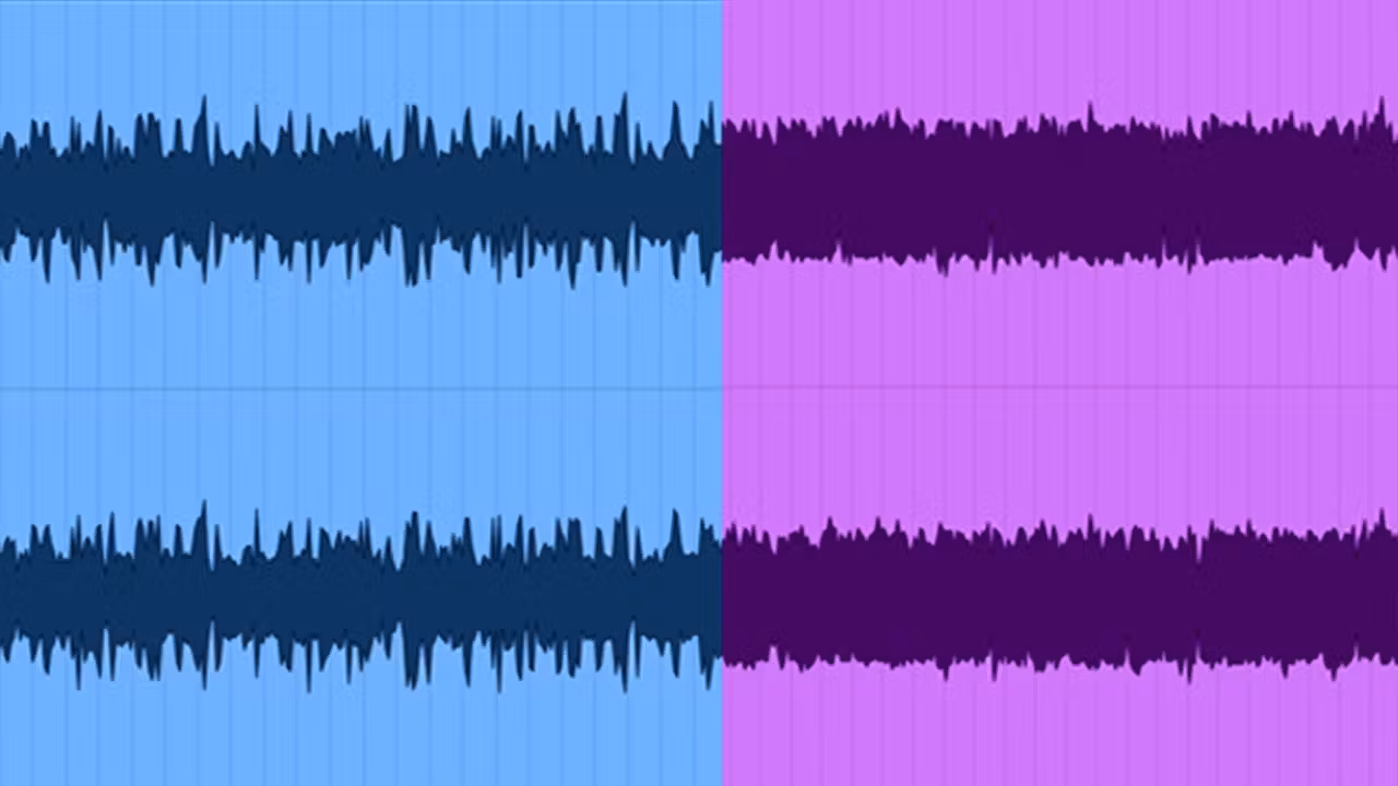
Idea sketch – FFT Relations:
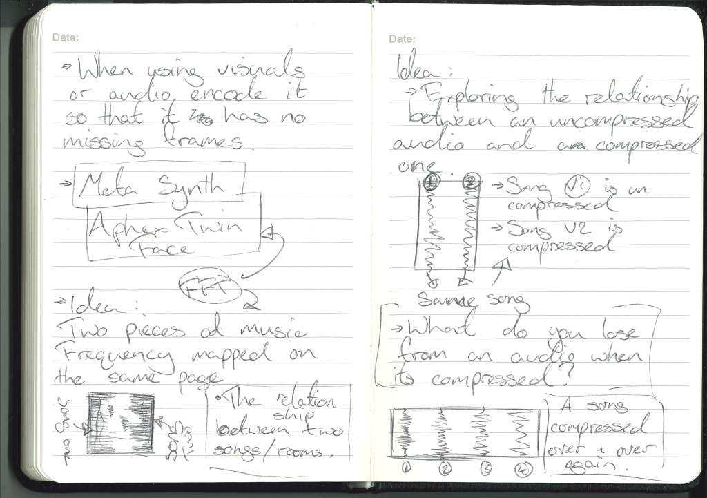
FFT images of two different songs mirroring each other on the same page.
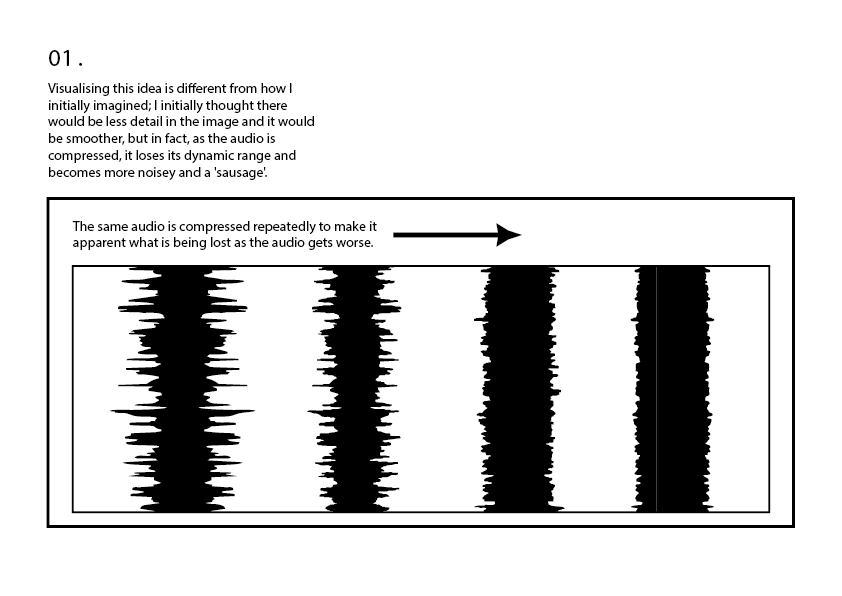
FFT Relationship Development : Instead of two different songs its the same song but the audio waves on the left side of the image is the regular wav file and one on the right is the compressed mp3 file so that on the print you can see the relationship between the two and see what information is lost when an audio is compressed even if you cant really hear it.
FFT Relationship Development : The visuals of the audio could be either the lined edge justified frequency of the audio or the spectrogram visuals of the two audios and allowing them to overlap or reach out but never come into contact with each other.
All three ideas above allow themselves to be displayed in a number of ways and that can be explored in the development of this idea.
Idea Sketch – Three Visuals One Audio :

The first iteration of this idea is similar to the audio leading audio idea but with a video or movie only played when there is audio detected, playing on the convention of being quiet when watching a movie. This could be displayed as a projector and a mic.
Concept Test – Sound Clock :
Inspiration – Albert Bernal, Impossible music #9
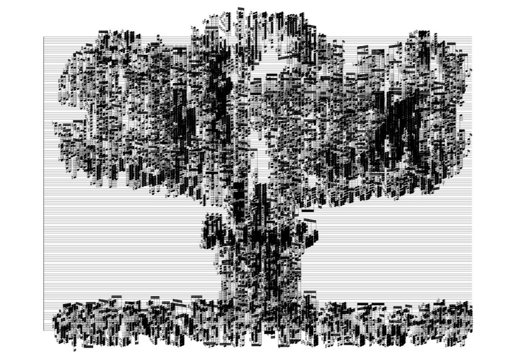
With Bernal’s mushroom cloud of musical notes, I was inspired less with the image its self and more with the density and overlap of the music notes used to make up the image.
Sound Waves + Compression :
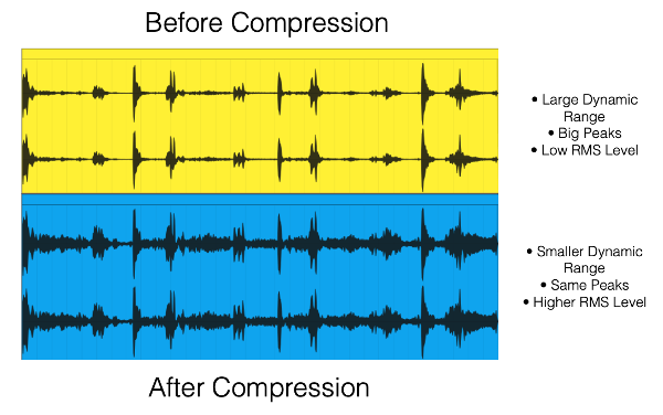
Personal Thoughts :
At this point in the project I am lacking inspiration. I’ve naturally came to the idea of the printed audio visuals, a data visualisation of audio or audio decay. But I cant shake the idea that my work for this project could be more exciting or more interesting.
The Idea : Audible Decay
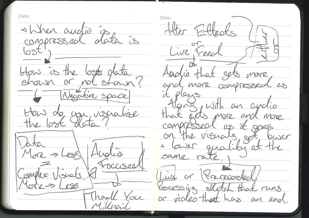
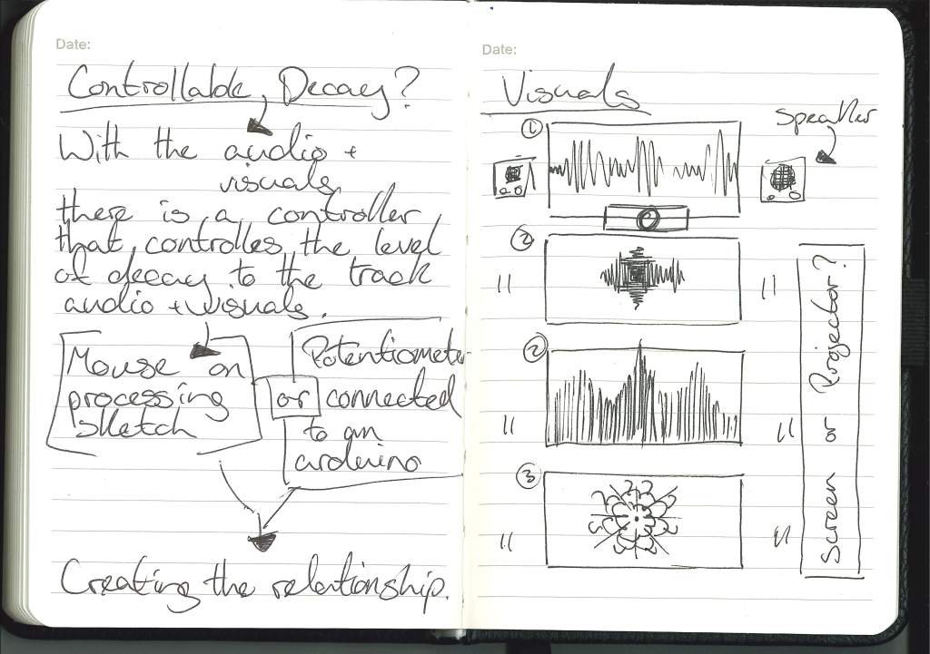
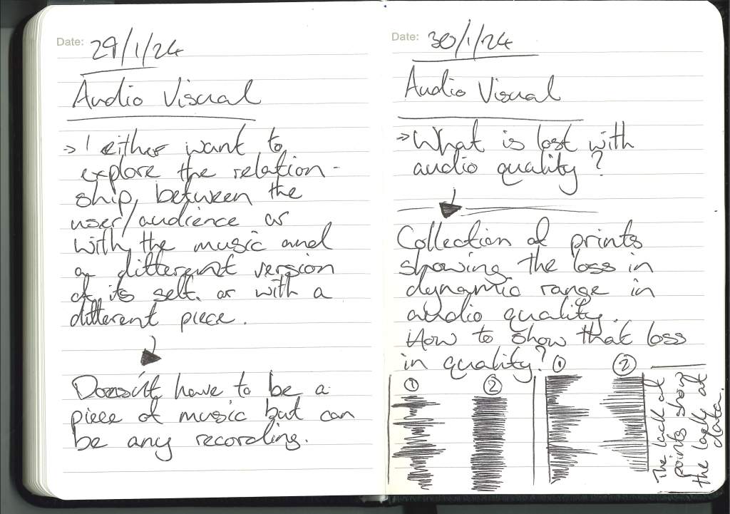
One idea or concept that is really interesting to me is the loss of information or loss of audio quality.
How can this lost data be shown or be represented to the viewer.
Digital Visualising Audio :
Fragile Territories – Robert Henke
https://roberthenke.com/installations/fragile_territories.html
With Henke’s work the striking visuals with the awe inspiring scale was appealing to me. The ability to be both still but still energetic and almost breaking out nature of his works in Fragile Territories.
Minimal Visual Inspiration :
Frank Stella :

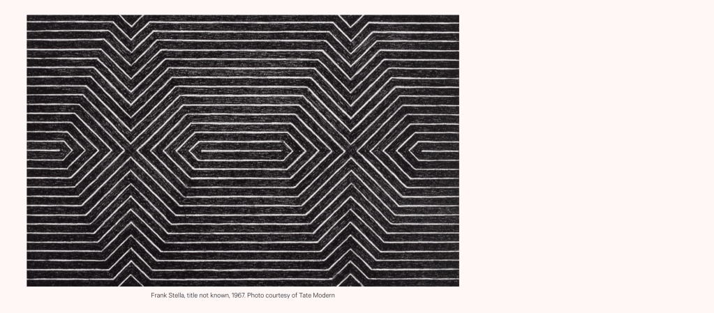
With Frank Stella’s minimalist work from 67, I was drawn to the creation of shapes within the lines as well as the simplicity of the monochromatic colour scheme.
Within my work I was considering a monochromatic colouring as not to distract from the audio. A visualiser inspired by Stella’s work would react and shift with the audio without being distracting.
Dan Flavin – untitled (to jan and Ron Greeenberg)

In this untitled piece by Dan Flavin from 1973 I love the use of contrast in colour and the use of the space, the wash of colour with the inviting passageway of the blue inviting the user in.
In this project, as previously stated I don’t think I’ll use colour as not to distract from the audio as can colour carry its own connotations within a work.
Talk with Paul:
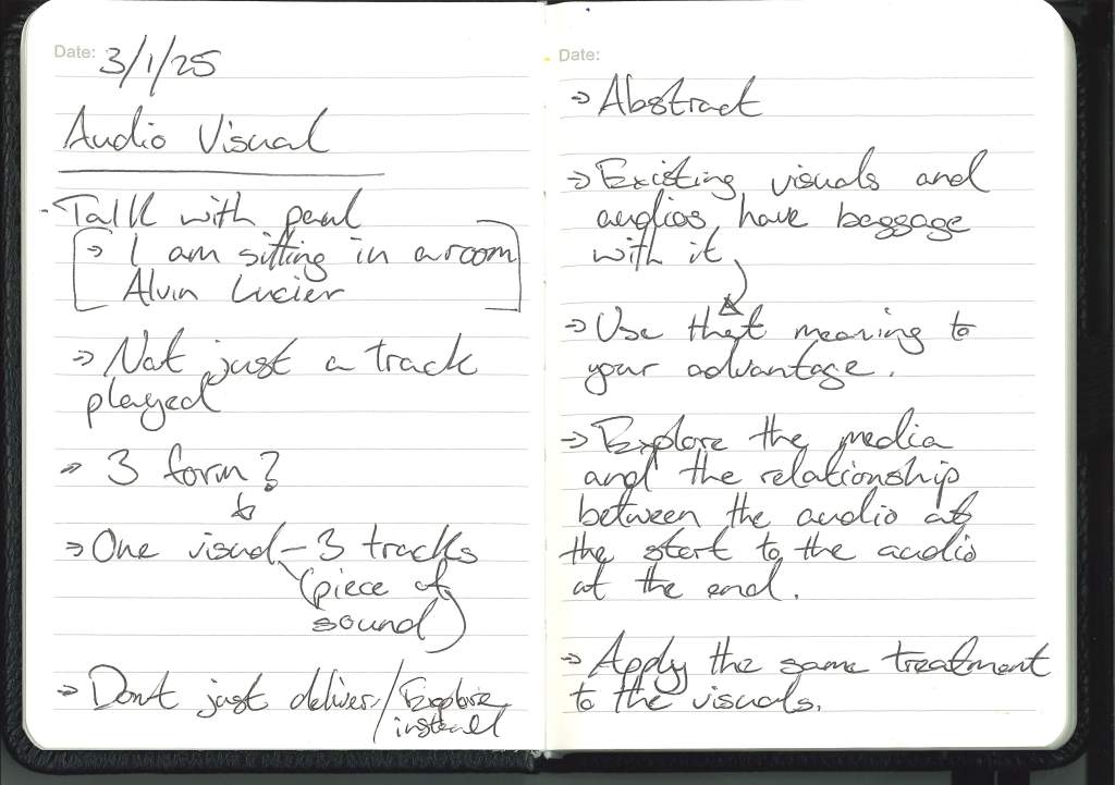

Don’t just deliver.
After my conversation with Paul this sentiment kept rattling around in my head.
I think I keep focusing more on delivering a finished piece or product and less on the creative exploration of the project. I’m thinking like a corporate designer and not like an artist.
Testing Audio :
Original Audio :
I chose the ‘pas de deux‘ by Tchaikovsky for a number of reasons. Firstly it is one of my favourite and most moving pieces of classical music and I was reminded of it through a number of examples that use classical music as well as Paul talking about how music “moves people” and how I was moved by this music.
Secondly I considered how that with my theme of audio data I was emotionally moved by a piece of music first preformed on 18th December 1892 at the Mariinsky Theatre in St. Petersburg, Russia. This piece of music being streamed over the internet from a server in the UK to my phone that is then sending those signals through a bluetooth connection to my headphones and finally to my ears eliciting a response.

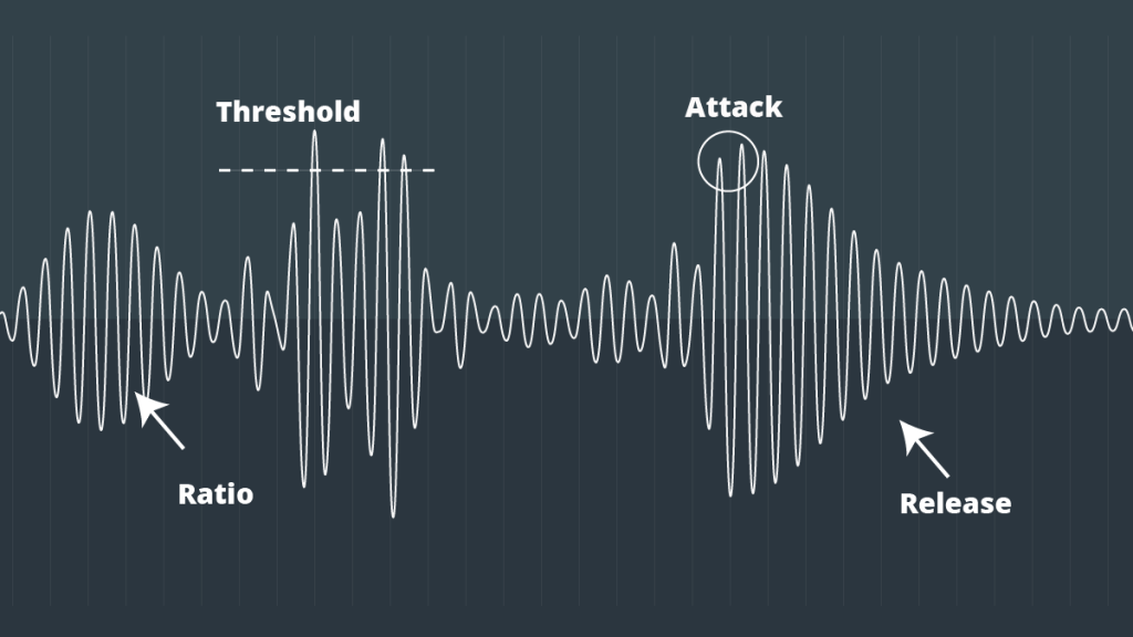
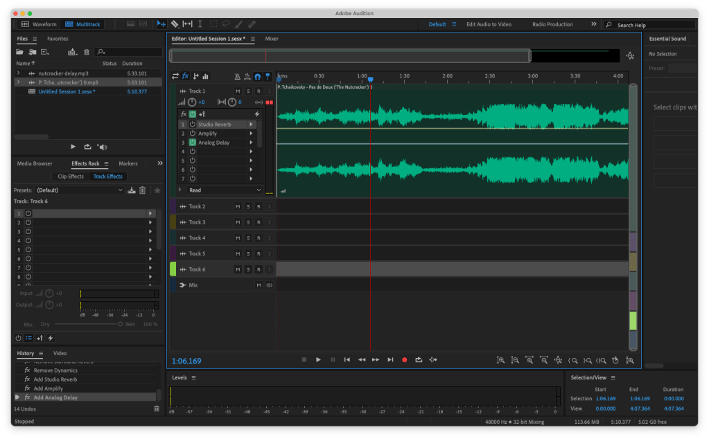
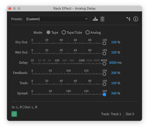
Through my exploration of effects on Pas de Deux and toying with the effects on Audition it became less of destroying the music and more of isolating an element that would catch my attention and pushing that to its extremes.
Reverb to extremes :

Delay to Extreme :

⚠️ WARNING LOUD AUDIO at 0: 30 ⚠️
Different Samples :
Other than a beautiful piece of classic music I want to use other meaningful audios aswell.
Above is the first commercially released digitial audio track on PCM which is the jazz album by Steve Marcus and Jiro Inagaki.
I didn’t decide to take this any further but if this project is revisited then this could be taken further.
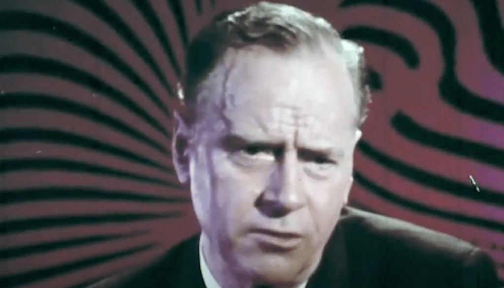
When looking for meaningful quotes, Mikhail had suggested Marshall McLuhan as a known and insightful voice in the world of technology.
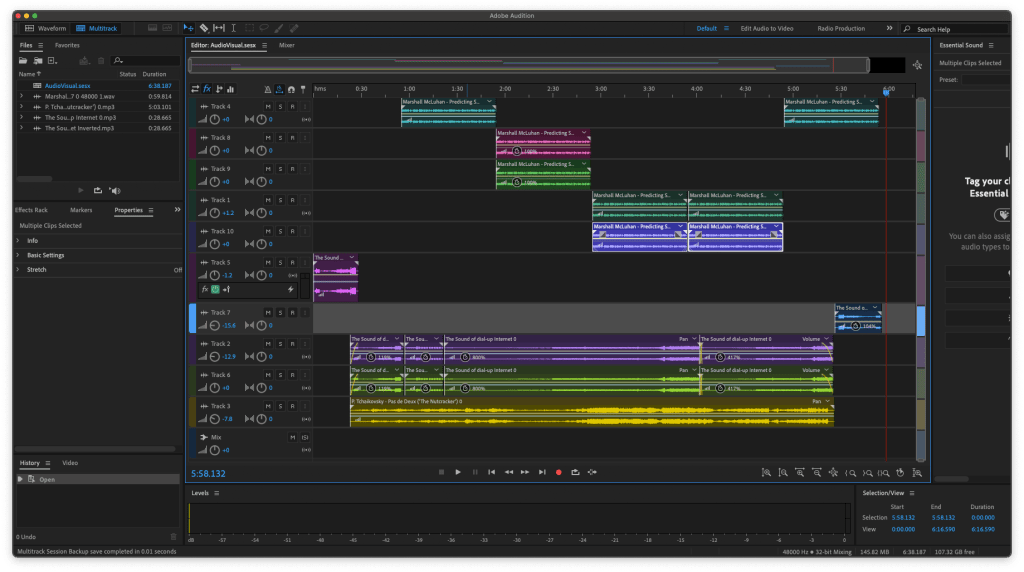
Exploring Effecting the Audio:
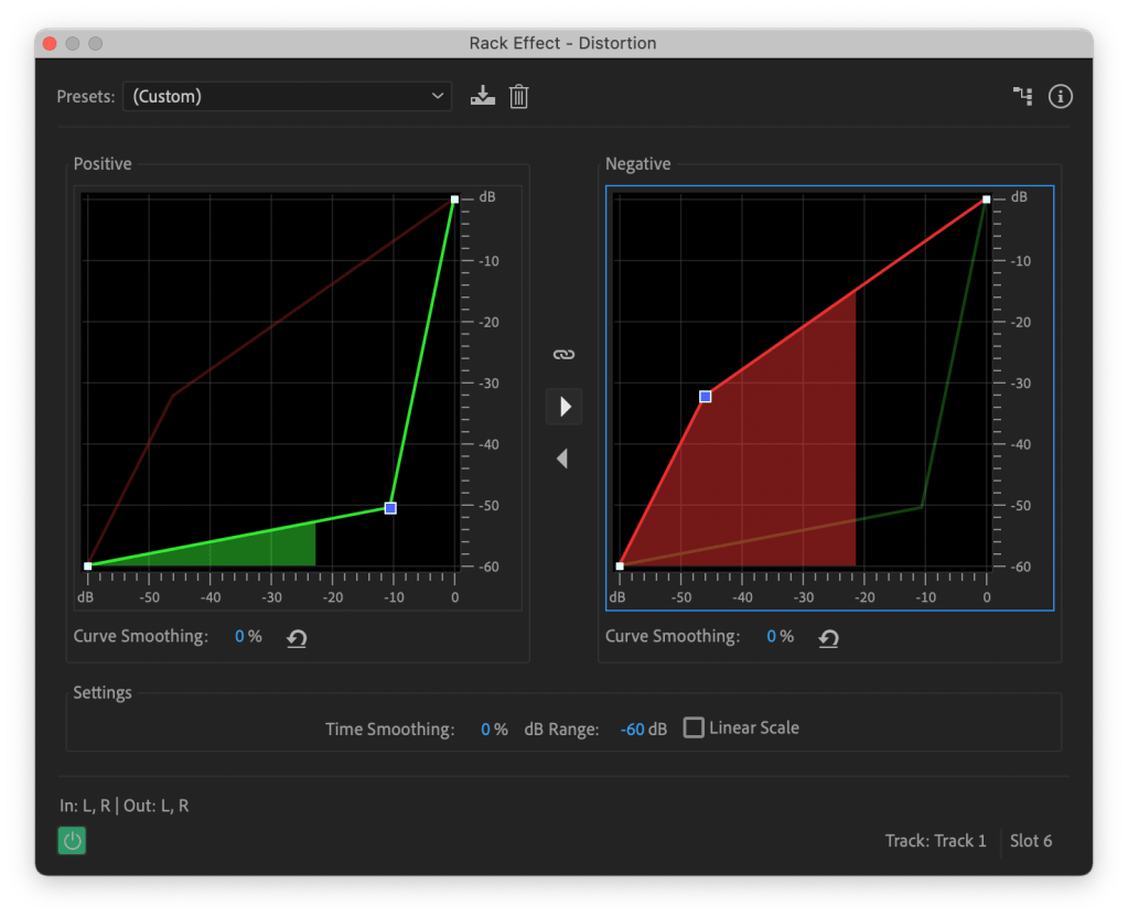
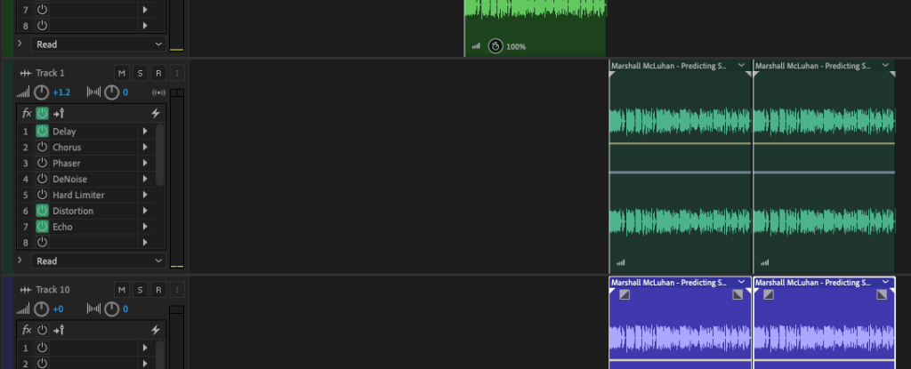
At the most violent moment of the audio, the detached voices of Marshall McLuhan has been processed through the distortion effect to push them to extremes.

Above is the spectrogram is the digital router noise. I personally loved the visuals of the digital messages.

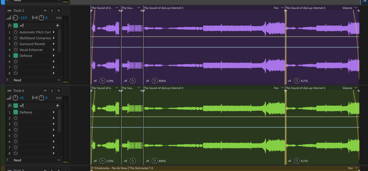


For the time stretched router noise I used the denoise to either extreme and syned up as the bed of the audio.


With Pas de Deux the Studio Reverb on after effects gave the piece of music an ethereal tone with the higher notes dragged out becoming a constant of the piece.


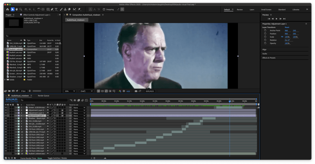


The screenshots above are the visuals of the archive footage using effects to make them unrecognisable.
Final Audio:
The isolated audio without the visuals of the piece.
Taking it further:
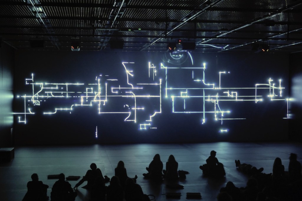
In my head I envisaged this final piece as a teaser reel of a gallery piece that would be more long form and on a larger scale.
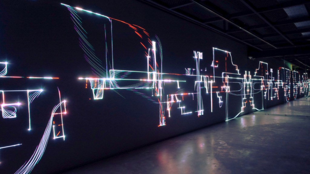
Lost Global Village
With my final piece the lost global village I took the 3 audio elements in the composition pushed to extremes with effects and the visuals are archived footage of 3D animation promo footage from the 90’s with the same treatment applied to the effects.
I had a personal outcome in this project to not just deliver a finished product but to explore.
Reflection:
Feedback Notes:


Personal Reflection:
I came into this project with pre conceived notions of using personal projects and producing a music track and using midi controllers but that felt like what I usually do lock into and idea.
So in reaction to this preconceived notion and after a conversation with Paul I tried to not deliver a clear finished product and which I think I failed at and should have leaned into it more.
If I was doing this again I would listen to Paul and Mikhail’s feedback and allow the work so go to extremes and not get in the way of the process and subdue it. To use one element and let it loop until it becomes ‘difficult’ and allow myself and my art to become comfortable with taking up space.

Leave a comment