Class 01
Introduction to Projection Mapping. My first hands-on experience with projection mapping showed me that using projections for art is a lot more accessible than I thought and they’re not just used for heartless power points.
Self Study 01

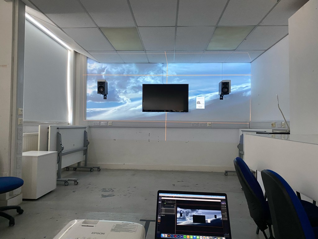
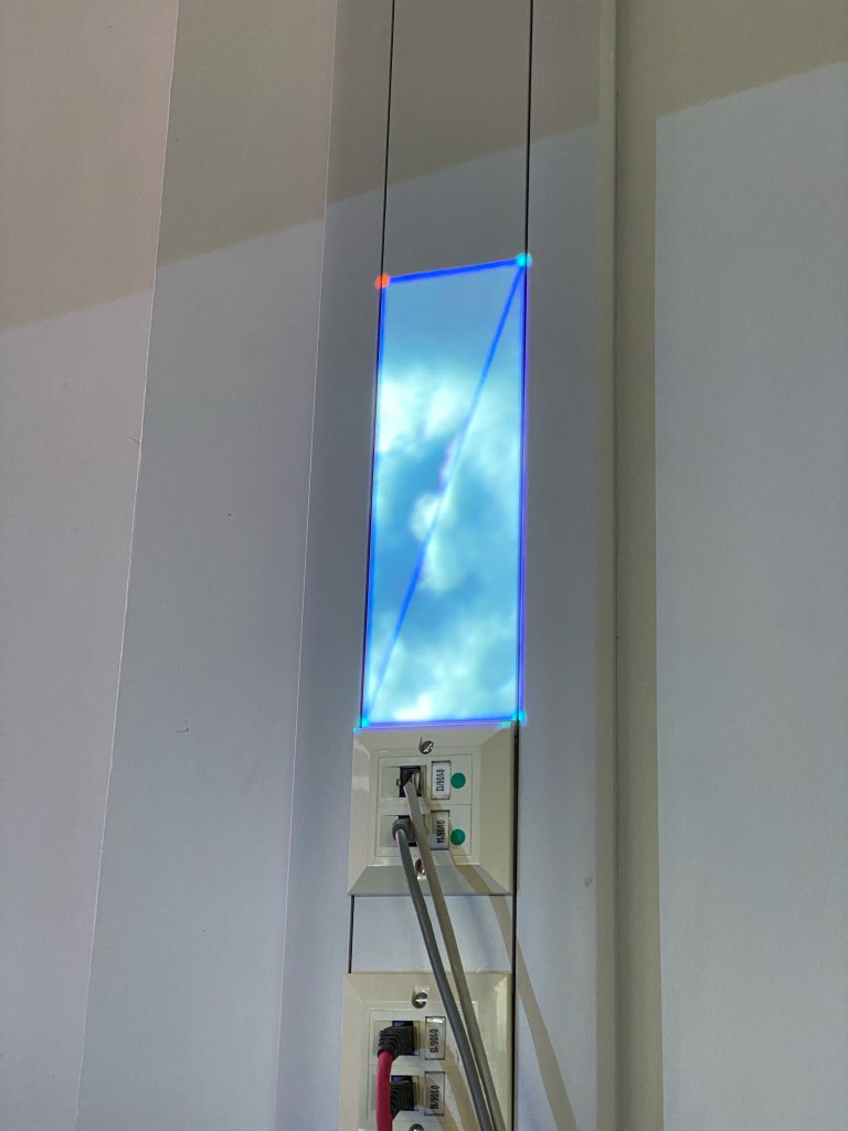
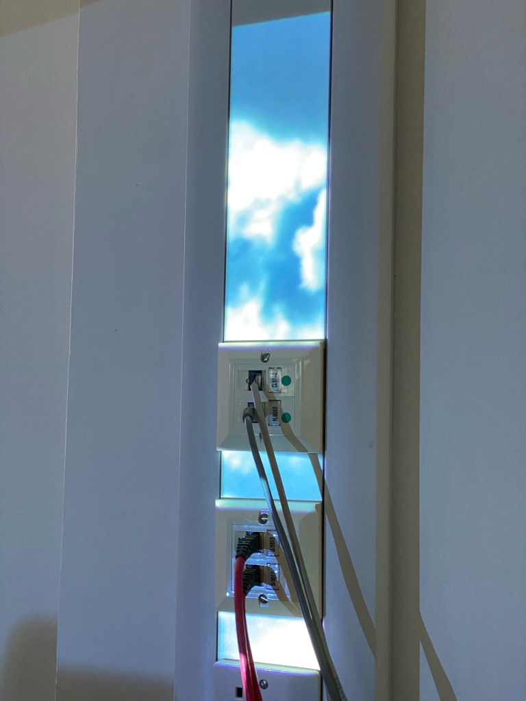
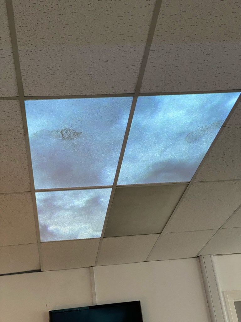
I wanted to create the illusion that I accidentally touched on in class 01, bringing the outside, inside. As Touch Designer is not the most stable software I had some teething problems with trying to expand on the cloudy sky window idea I did in class01.
Class 02
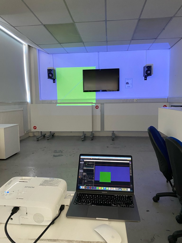
Boxes and noodles and how I can generate images within ToughDesign to use in projection mapping. The first level of Touch Designs UI makes more sense to me and how programs are visually represented as self-contained boxes with webs or noodles connecting them.
I need to shake my basic thinking regarding projection mapping and focus more on dynamic planes and 3D images or visuals, or at least their illusion. The window idea I got a little lost in feels too simple and one-dimensional.
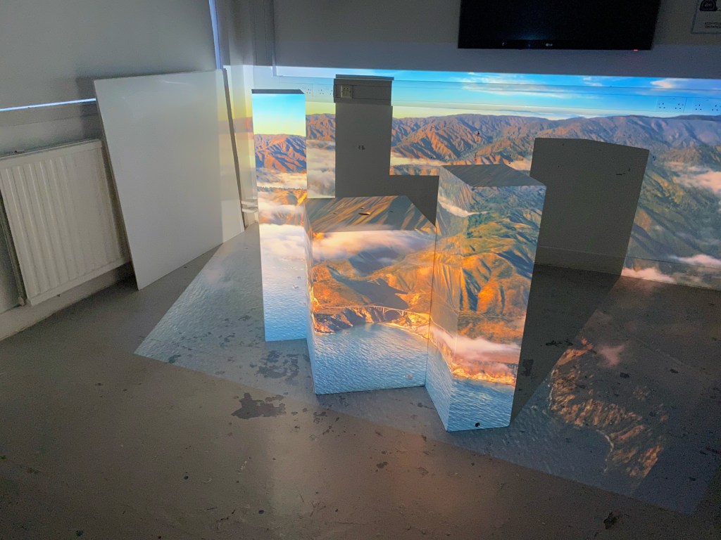
One idea I have is to replicate a plinth surface and use an effect to make it seem that it changes the density or is moving from the inside.
Self Study 02
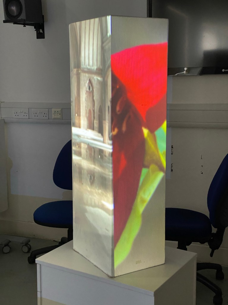
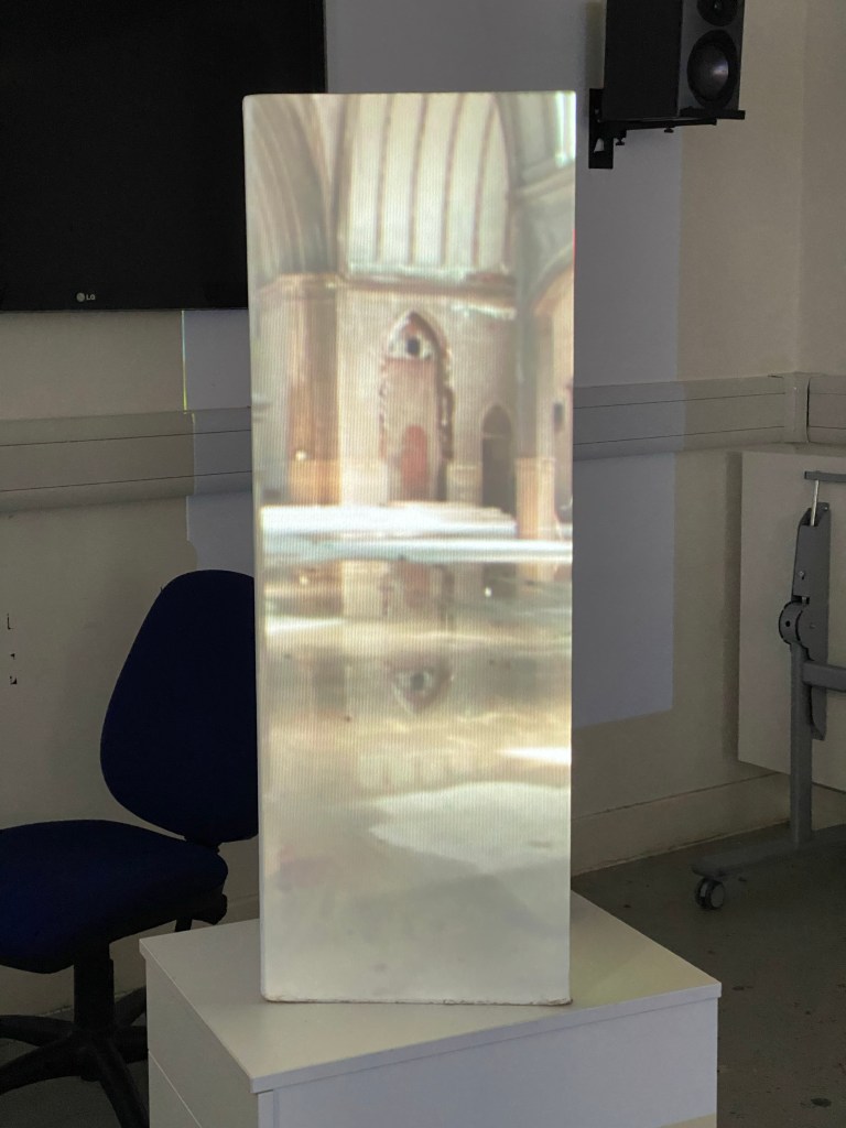

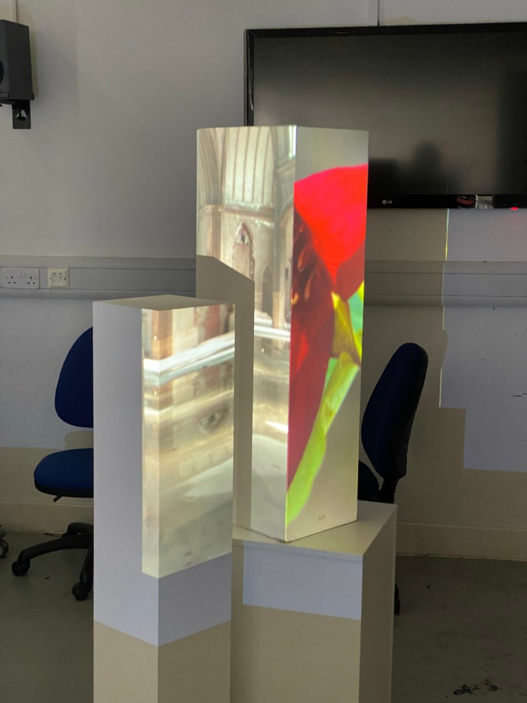
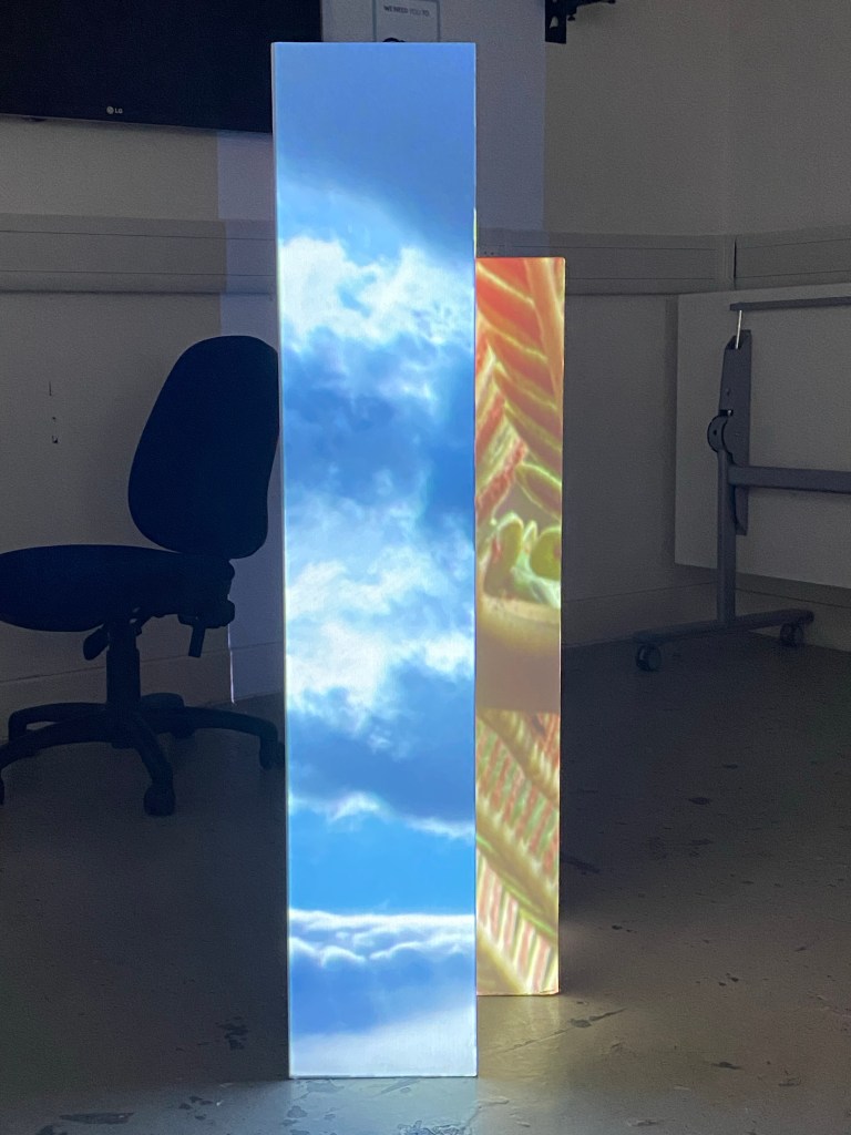
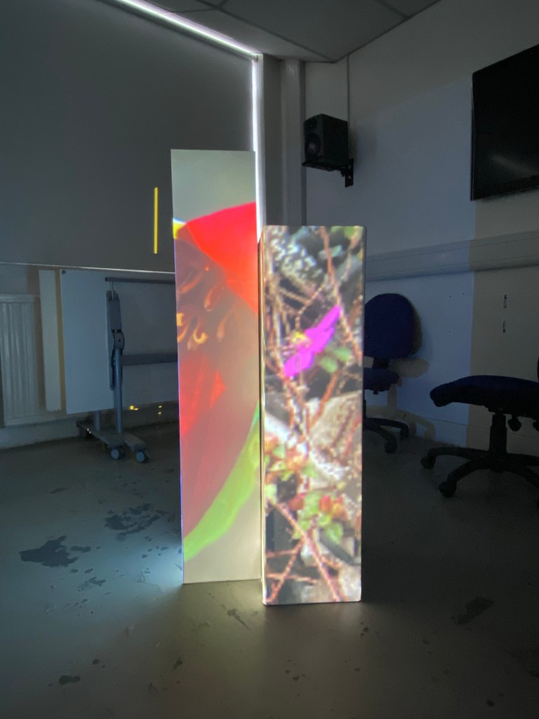
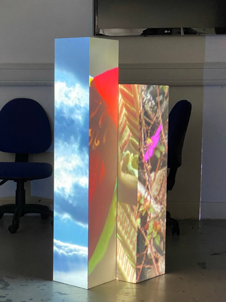
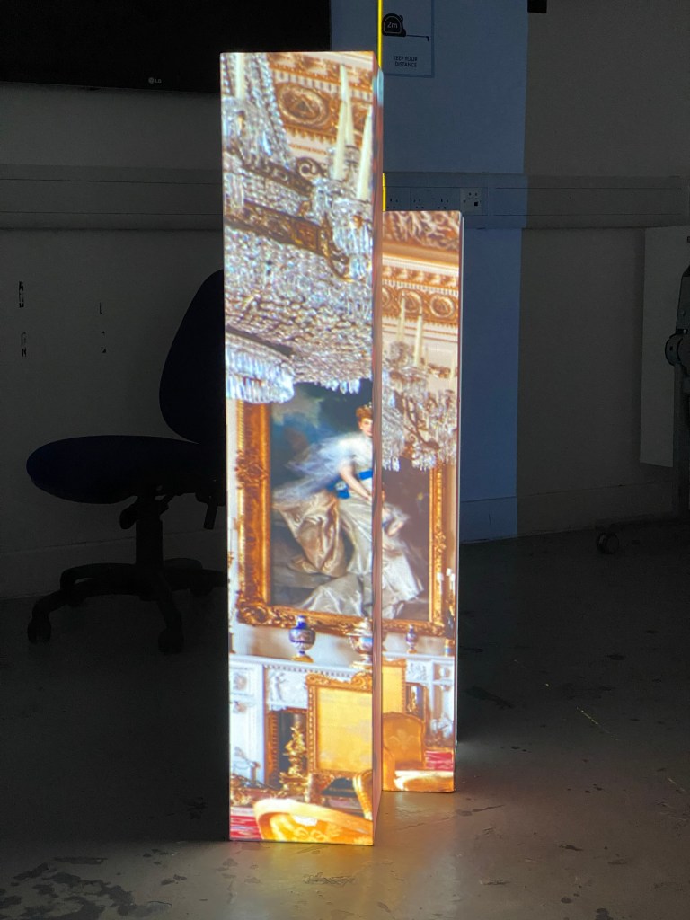
At this time in the studio, I started by experimenting with different boxes and setups, the images used are test images to see how well the perspective worked with different images.
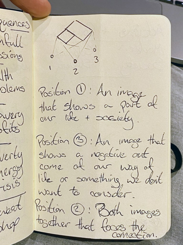

At this point, I was reminded of holographic prints that would change the image depending on what angle you viewed it from. So running with that idea I wanted the images to have a connection so that when viewed at position 2 the correlation was obvious.
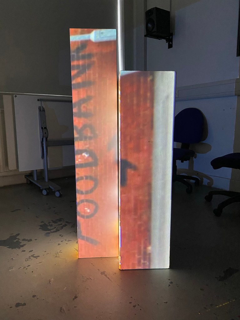
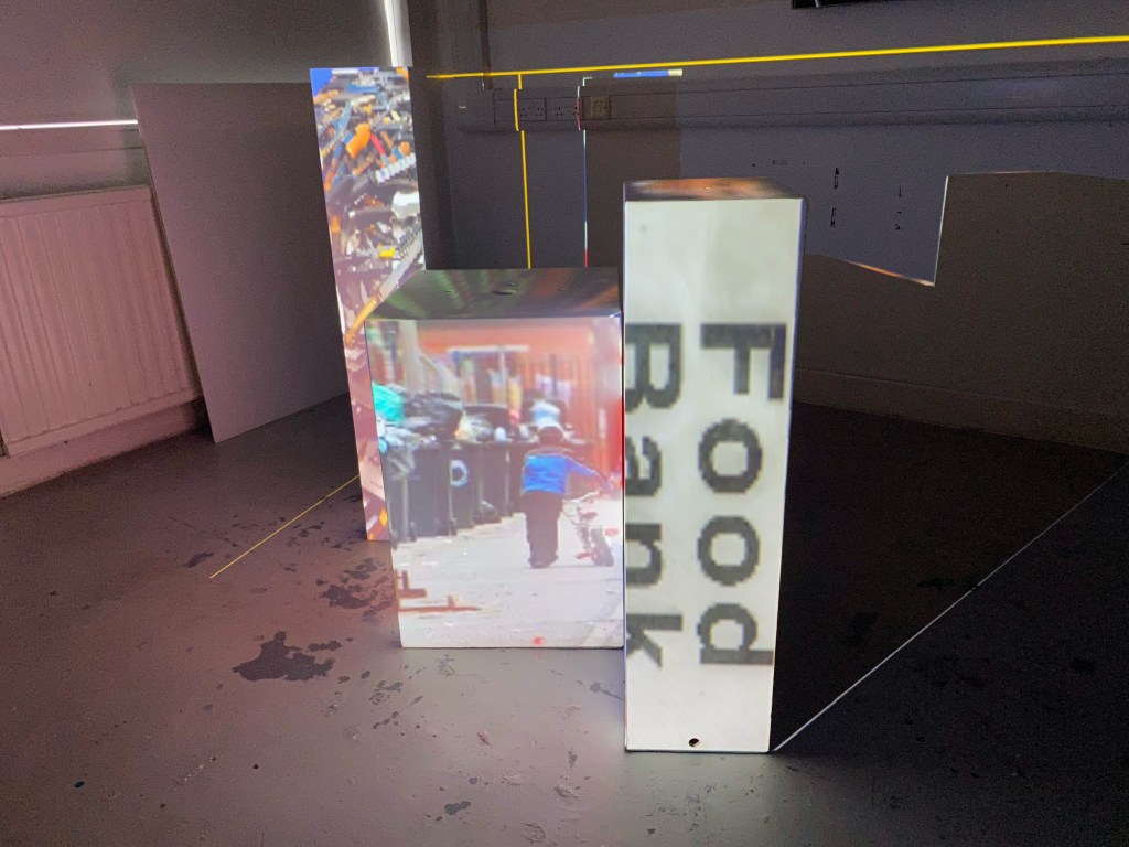
Lifting from recent personal experiences the stark difference between the opulence of royalty and the demand for foodbanks up and down the country came into my head. From position 1 you see the wealth and decadence from the interior of Buckingham Palace and from position 3 you see directions to a foodbank taken from a picture of a neighbourhood wall.
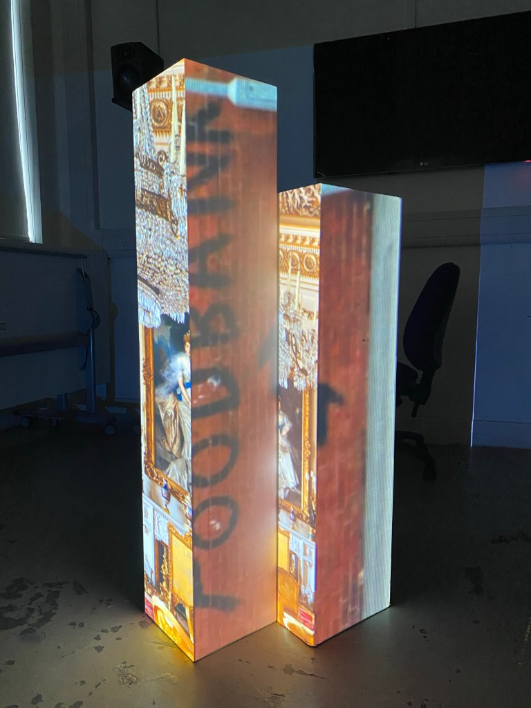
Edit: Since I’m taking this concept further I want to expand upon it, look at other societal Cause & Effect situations as well as trying a different arrangement of boxes and exploring the top of the boxes as well.
Self Study 03
Today I think I was in the studio to experiment (mainly the support session) to see what happened, what would come to me and what I could discover/produce. The positive outcome is that after the support session I now have my heading.
The Actions & Consequences display I had in Self Study 02 is something I’m going to take forward. I was hesitant at first because I got some pushback from people I asked outside of the course but I shouldn’t let that deter me.
I believe in the concept, the medium and the message I’m trying to convey.
Self Study 04
When I go in with a game plan, it speeds up the process. That sounds obvious, but for some reason, I hadn’t planned what I would do in the studio to this point. So let me clarify: I had ideas and suggestions of what I wanted to do but just neglected the logistical stuff until I had to deal with it; the obvious, simple fact of planning my setup left me more time to focus on my project.
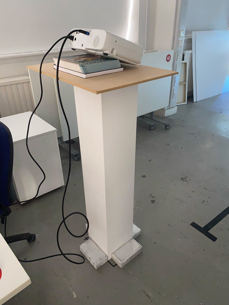
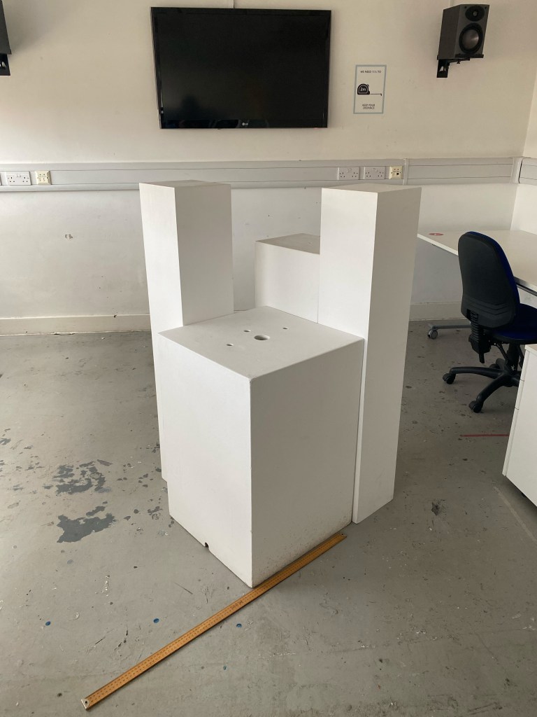
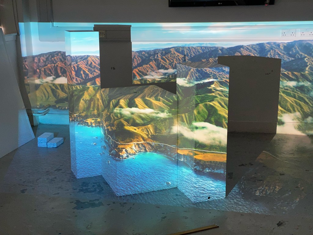
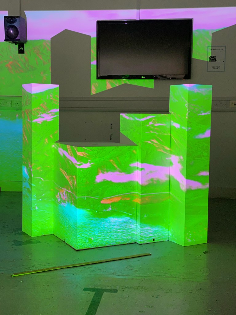
Initially, with my final design, the first step was the setup. I needed to have the correct box set up so that the viewer could easily move between positions 1,2, and 3 to get the full effect of the projection. As well as considering the viewer’s position, I also had to consider the faces of the boxes I was using and give them enough breathing room.
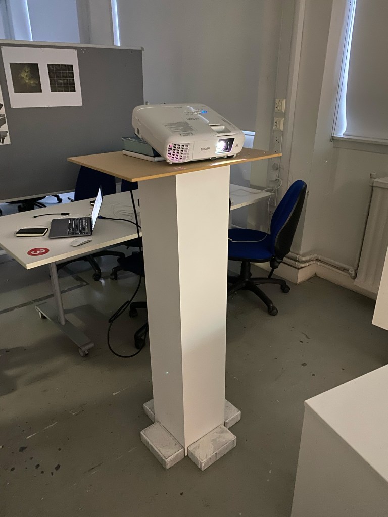
The projector was on the plinth contraption to get as much height as possible. If I had the chance to improve this, I would mouth the projector on the ceiling to allow for a more diverse placement of the boxes and utilise the top of the boxes.
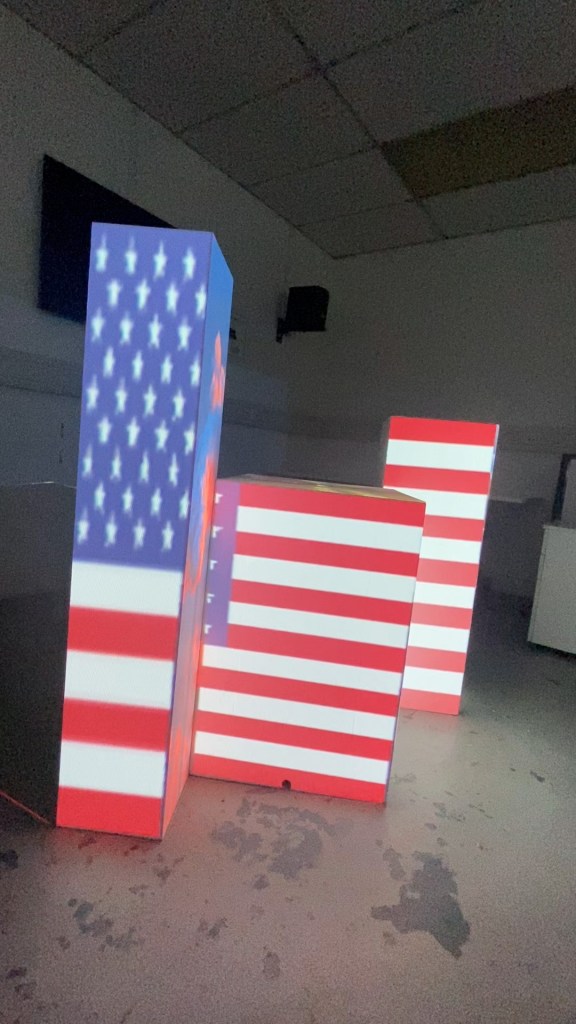
The United Kingdom
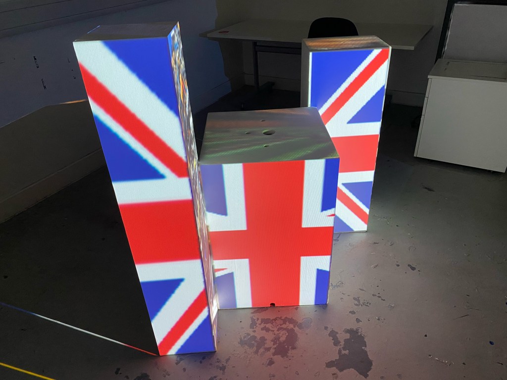
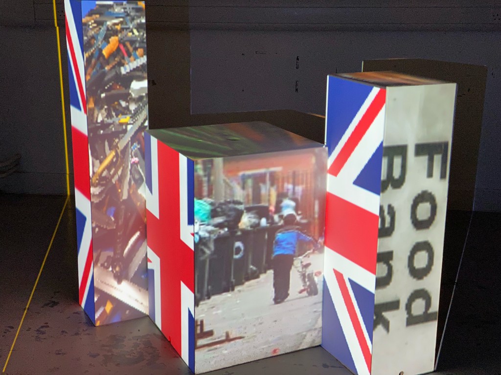
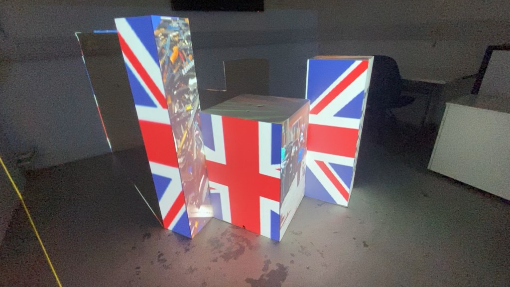
I didn’t set out to make my project political, but it fit when I stumbled into it. The different perspectives of the project mirrored the different perspectives people take when looking at issues of viewing a country. Some people might focus on the flag instead of what the flag hides or condones.
My first take was on the UK because its closest to home and how I can personally see an abundance of wealth in our royalty and our houses of government on any TV or media, but anyone can walk 5 mins from their homes or places of education and see violent crimes, poverty or growing lines for foodbanks.
From even the perfect angle, each flag is disjointed and imperfect. I initially spent a bit of time trying to get the UK flag perfect, but after showing my project to people, I found that the viewer spent more time trying to line up the lines of the flag, trying to solve the puzzle. So I decided against this as a possibility because it distracts from the point and makes the viewer spend more time on the flag, not what the flag is hiding. I should have documented this, but honestly, it was a change done quickly and out of dissatisfaction that the main subject of my project was getting overshadowed.
The United States of America
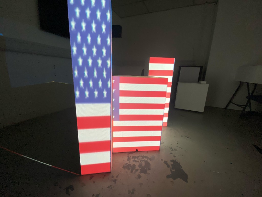
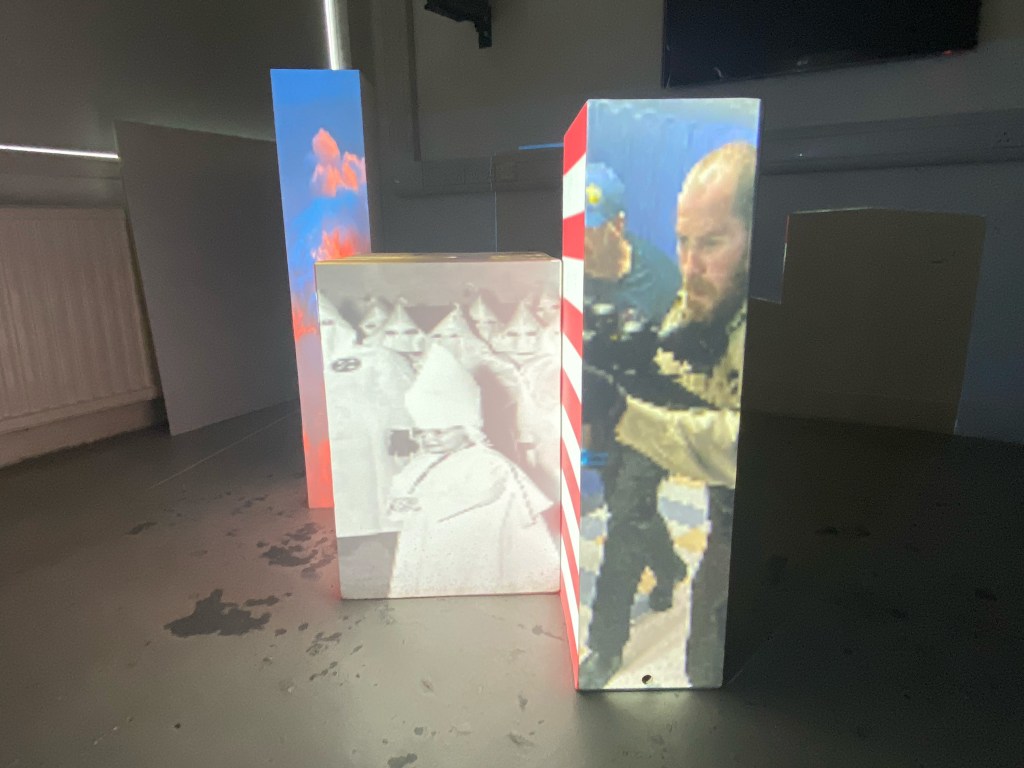
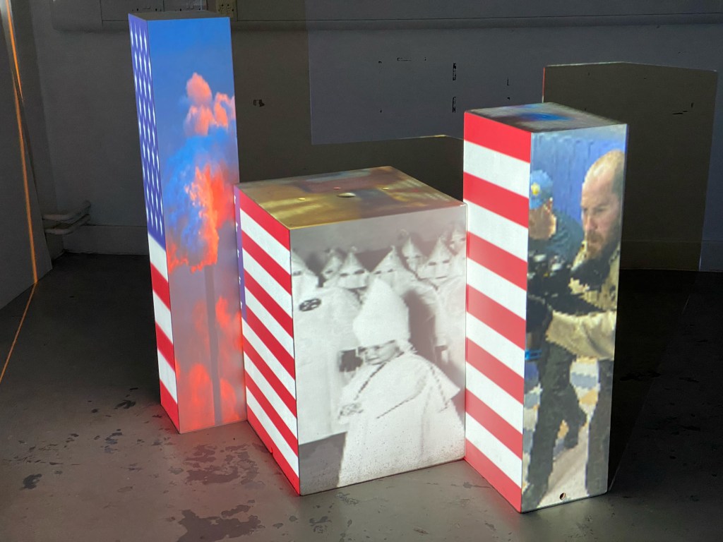
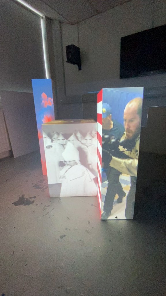
Secondly was the US because they’re always bigger and better than everyone else, even when it comes to horrifying societal norms. Similar to what I did with the UK, I wanted to look at images that would be harder to see, pollution on a massive scale, trained gun-wielding police officers in a school hallway and an innocent young child being indoctrinated into a group of evil and hate.
The Russian Federation
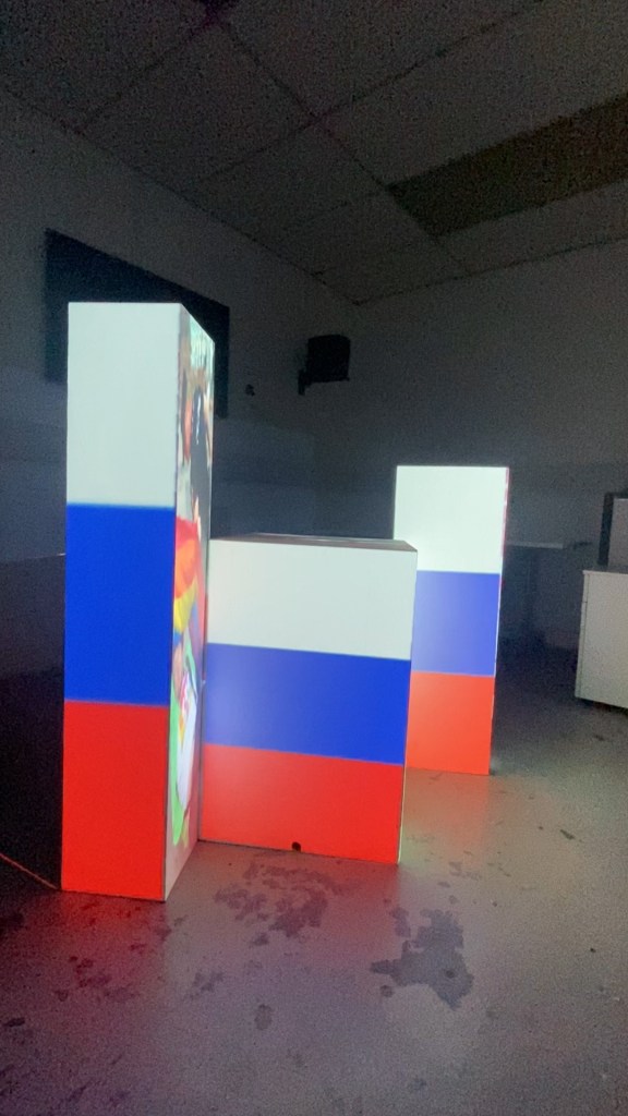

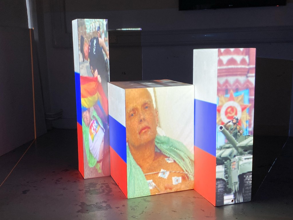
Finally was Russia, which came as a request from a fourth-year IxD student, and once they asked, it seemed apparent. Russia has become synonymous with oppression, corruption, espionage and political grandstanding in recent years. The images I chose reflect the denial of someone’s fundamental right to love who they want, the silencing of Russia’s enemies and the facade of unity and power.
After completing my three projects / unsubtle political statements, I was struck that almost every one of these images are not exclusive to the flag I have assigned them to. Each country varies in their subtlety to the highlighted issues, but they overlap in one way or another. There are still those in the UK that have homophobic views, there is poverty and food banks across Russia and the US, and racism and xenophobia across all three.
Looking at what’s wrong with the world all day puts you in a downer, I’ll be honest. But the thing that it made me think about was the positive similarities between people. The resilience and passion for going against what’s wrong no matter how scary, massive or faceless the opposition might seem. So my project focuses on the negative to inspire the positive.

Leave a comment